Transcripts
1. Introduction: Do you ever feel that you're poses could be more engaging, expressive, and dynamic? Or are you looking for more ideas to take your character designs to the next level? Then this class is for you. Hi. I'm Iva Mikles, and I am an illustrator and designer based in Europe. Welcome to my next class. Creating engaging characters helped me to successfully work on many projects big and small, such as Lego Friends, animated series, which aired on Netflix. Then illustrations for software companies, magazines, other illustrations with characters and explain their illustrations for various clients and their websites and presentations. After taking my class about stylized character design, many of you have shared that you would like to learn and practice more about character designs from me. In this class we will level up, and I will take you through the journey of making your characters more lively, expressive, and dynamic, using simple shapes and drawing poses and gestures. Character design is used in many art forms like feature film, TV, animation, video games, comic books, children's books, as well as corporate visuals and illustrations. That's why when I was starting with the illustration among other things, I really wanted to draw characters. In the beginning it was quite frustrating because my characters just didn't feel right. Attending live drawing sessions and figuring out the core concepts and more dynamic character design helped me to overcome the challenge and make my characters expressive and lively. This is what I want to help you with in this class. By using basic shapes, we will create fun characters with little stories and you will learn the core concepts of creating lively and expressive characters. After finishing this class, you will gain a very solid skill for developing your character designs and style further. There is a lot in this class. However, as in the classes before, you will find the structure that is easy to follow and rewatch. You will learn what brushes I often use for creating my illustrations. How to use a stick figure to draw poses. How to use simple shapes to quickly sketch the body part. How to apply proportions to make your characters believable. How to work with the spine and weight to make your characters more dynamic. How to apply basic perspective to create depth in your character illustrations and how to take and combine inspiration from real-life references for your character designs. We will talk about the importance of gestures and the body language, so you can make your characters appear confident, shy, happy, and elegant. I will show you various style examples of how to color and finish your sketches through. But wait there is even more in this class. You will learn how to approach sitting poses, walking, running poses, jumping, floating poses with lots of quick tips, as well as professional advice from working with clients. Last but not least, we will talk about what to consider when you will be creating group, and composition consisting of more characters for your class project, which is stylized group of characters or a portrait of your family or friends. At the end of this class you will have an illustration you could print out for your home, give to someone from your family, or if you create your own custom design, use it in your portfolio. I will be using Procreate, but feel free to use any other drawing software or medium you prefer. Before we start don't forget to follow me here on Skillshare to get notified when I release new classes and make special announcements about the giveaways. I also invite you to follow me on Instagram where you can see my newest artworks and follow the stories from my life as an artist. Let's get started with expanding your horizons and drawing awesome characters. See you in the class.
2. Class & Projects Overview: The main purpose of this class is that you get more comfortable and confident when drawing character poses and gestures. You can take this class as a stepping stone before you go to sketch people in the live drawing classes, or observe and draw people in the real life. In this class, you will learn how to draw different poses and gestures, so you can create the class project, a stylized portrait of your family or friends, expressing their unique personalities. To focus on the poses and gestures and keep the drawing complexity fairly low, I will be using only one type of body shape; a female body shape. I will alternate the poses, hair, and clothes. You will be, of course, able to apply all the principles to different characters and body shapes too. For example, as you may have already learned from my previous class about drawing stylized characters, to draw male characters, you can use broader angular shapes and for the females, more petite and curvy shapes. When I was starting to learn to draw different character poses, everybody suggested to draw in real life, just go to live drawing sessions. They're really awesome. However, when I saw the real human in front of me, I just didn't know where to start. Do I start with the head, body, feet? It was all very quick, and it was quite overwhelming. This is what I want to help you with in this class. We will practice drawing poses together. While doing that, we will observe and think about the attitude, gesture, personality, and possibly mood of the character using the body language. This will train your observation skills, which in turn will build your visual library like a memory muscle for your character poses. Next time you would want to include characters in a story in your drawings, you'll be like, "Oh, I saw that already, and I know how to draw it." Using fun examples, I will first explain the theory behind the body language, poses, and gestures. Then we will look at the examples of most popular poses. We'll spice it up with using props, clothes, and outfit. You will also learn to use simple perspective rules, composition, and flow to add that to your character illustrations. As I mentioned, the project for the class is to draw a stylized portrait of a group of your friends or family portrait, or other idea for the character story you might imagine. Try to add a little story moment to any illustration you would do as a project; a party, birthday celebration, game night, or a family trip, or just hanging out. Start with one character. It can be one of your friends or family members. Think of their personality or mood in the moment and attitude and express them with the pose, cloth and if you want, the props too. You can also do a brainstorm like describing the character first, even in a few keywords, it helps a lot. For example, my friend Alice is adventurous, confident, and sporty. This already gives me a lot of ideas for the poses, clothes, and props for this illustration. To take your practice further, add more characters using the same process. Then add dynamics and unity to the group together by using perspective and flow. I really believe that we get better as artists with lot of practice and drawing different subjects and topics. Creating different characters can be a nice drawing practice which you can approach also as a drawing challenge. You can follow my examples to practice, but to achieve the best results and see your own progress. Don't just copy my drawings and characters, but try to experiment, customize, and add your own details like maybe special shoes, special hairstyle, and colors because world and the art community needs more of you, even though it can sound a cliche. But most importantly, have fun. In the resources section, you will find the link to the mood board with photo references for your characters and fun practice sheets. These are designed for your practice and educational purposes only, so they are in connection with this class, and please don't share them with others. If you want to share this with your friends, just please send them to this class. Once you're finished with your own custom illustration, you can print it out for your home or you can prepare it as a post for Instagram, or give it as a present to your friends and family. You can even post one of the character poses every day on Instagram or every week as an art challenge for yourself to engage your community and get better through focus practice. If you create your own custom character design, you can also use them in a portfolio for future client projects such as children's books, explainer illustrations, character design, games, and animation. Thank you so much in advance when you share your experience with my classes on social media. I really appreciate it. If you do that, please send your friends and followers to the whole class, so they can have a full experience like you. You will also help me as an artist because we creatives should speak together. When you post your creation specifically on Instagram, please tag me @art_side_of_life in the post image and in the description or in the story, so I get notified and I can share your art with my community. Now, before we move on to the basics of poses and gesture drawing, in the next lesson, we will talk about canvas and brush setup. See you in the next video.
3. Canvas & Brush Setup: In this lesson, I will show you how I set up my brush and canvas. For sketching, I usually set up a canvas with smaller size, for example, 2,000 or 3,000 pixels. My current favorite is 3,000 by 3,000 pixels. So I can have many layers. At this stage, it doesn't really matter how big the canvas is because it's not for production. For social media posts, I usually set the canvas to be around 2,000 pixels wide, and this allows for good enough quality, and at the same time, it doesn't create an image that is too big for sharing on social media. If your final artworks and images which you export are too big, social media platforms might downsize them automatically too much, and you will end up with pixelated posts. For the final-colored artworks in the production level, for example on products or posters and so on, always check what size you need. With the pixel-based programs such as Procreate and Photoshop, you can scale the artworks afterwards without loss of quality. In this case, a bigger canvas is better. For example, for the color, then the final artworks, I usually create bigger canvas sizes. Before posting on social media, I create another file and scale down this artwork. Just be aware in Procreate, you are limited with the amount of the layers with bigger-sized canvases. So think how many you need with the final art and try different settings. If you are very limited with layers, you can always copy the canvas, merge the layers so you don't lose anything, and then continue in the new canvas. One more tip, to keep myself organized, I always try to remember to name my layers. This helps especially if you work with big files with many layers. I work in the same way with Photoshop, where you are not really limited with the amount of layers. You can really get lost there if you don't name your layers properly. Now, let's look at my current favorite brushes. One of my current favorites for sketching is dry ink brush. If you are not sure where to find these dry ink brush, for example, you can go to the inking section and scroll, and you will find this brush. In order to move it, you will tap and hold, and you can drag it to the different folder. You will notice the little plus sign in the corner of the brush. That means you are just copying the brush, not modifying the original. As you can see, you can also delete, share, or duplicate the brush you copied by sliding to the left on the brush. If you want to do any adjustments to any of the existing brushes, try to always duplicate the brush before. When I don't want my copied brush in this folder anymore, I can delete it and I will still have the original brush in the inking section. In this case, of course, I'm talking about the copy of the dry ink brush. Now, the setting for the brush, when sketching, I keep the brush at the streamline around 20 percent. This helps you create smoother lines. If you put it to maximum, it will be very smooth, creating this almost magnetic field with your pen. I don't use this maximum option when sketching because it will influence the looseness in my sketching too much. I would set it to maximum when I approximately know where my lines will be in the sketch or in the illustration. For example, on top of already existing sketches when I'm creating cleaner line art and I want to make sure that these lines are more smooth. Try to experiment with this setting. I use it quite often when sketching or cleaning up the artworks. Now we went through the basic setup. So let's start drawing poses and gestures. See you in the next video.
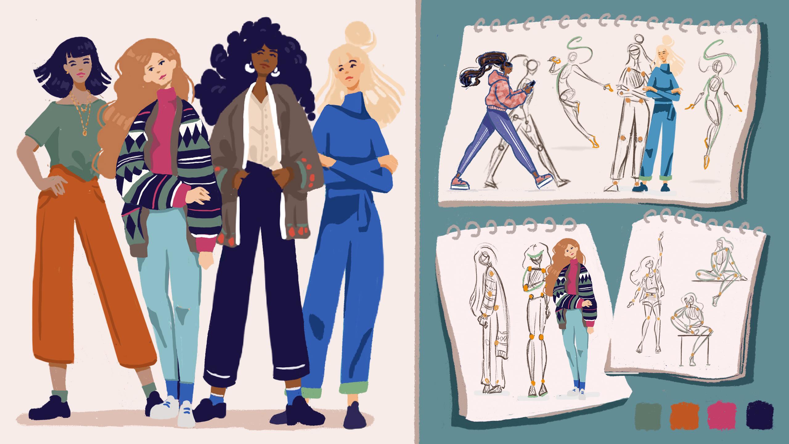
4. From Basic Proportions to a Pose: Let's start with the basics. In this lesson, we will use the ever famous stick figure to talk about the fundamental principles of poses which are proportions, anatomy, and joints. You might be like, "Really, a stick figure?" Just bear with me. I'm using a circle for the head, teardrop shape, and half oval for the face. Oval for the torso, circles for the joints, and lines for the sticks for the arms and the legs. When designing the poses, you can just connect these circles, and it's easier right away. Despite being very simple, don't underestimate the power of the stick figure. It will make your life much easier when you are learning to design character poses and gestures quickly. The stick figure allows you to exaggerate, creating interesting and dynamic poses without losing the balance and proportions. You can move the arms and legs easily to enhance the action and retain the proportions. Most importantly, you can quickly adjust or erase part if they don't seem right without feeling too bad about it and too precious about your sketches. To quickly add more appeal to the sketch of the stick figure in this stage, I would add triangles for the feet and half ovals with the triangle for the hands because you can imagine the whole hand like palm with fingers as a mitten in terms of simple shapes. As a next step in the frontal view, I would add the oval for the pelvis placement and curves for the parts of the legs and for the forearms as well. Plus, I'm making sure that the feet are aligned with the ground basically imagining them on one line. When designing characters, I always consider the proportions and the placement of the body joints. Even when I stylize the characters and exaggerate parts of the body and even making arms and legs bend like spaghetti for example, I always think about proportions. If I want to exaggerate something, it's on purpose. When it comes to realistic proportions, there are a few rules of them. I usually go back to and you can remember too. Number 1, an average adult human figure is around six head-size tall; meaning, if you would sketch six circles on top of each other, that should be the height of the figure. Number 2, the length from the head to the crotch should be the same lines as from the crotch to the feet. Number 3, I usually split the legs approximately in the middle with the knee. Number 4, I would use the same principle with the arms, and I would split them in the middle with the elbow. Number 5, elbows should be in the area of the waist, a little bit different for male and female, and arms with palms usually end in the upper thigh. By the way, if you want to practice more on different examples and learn more about designing stylized characters, you can check out my other class, Drawing People in Procreate. In this class, you will learn about basics of stylized character design. Talking about realistic proportions, you can keep the proportions more realistic or play around with the sizes. For example, making the legs longer or shorter, you can create smaller or bigger feet than usual, or a bigger or smaller head. Like this, you will express your preferences, and this will help you define your style in the future. Now, looking at this sketch, you might be like, "Okay, this is boring and stiff," so what can we do quickly and simply to make the frontal view more interesting? You might have guessed it. Just shifting the weight. If you're thinking, "What? How do I do that?" Or if you're just not sure exactly how to do that, let me show you. It's very simple. Simply, you can angle the lines of your sketch on the shoulders and the hips of your stick figure. When you do that, imagine that the other lines are glued to these parts, so they would follow the placement. In other words, you would want to keep the same length of these lines, same proportions in relation to each other. You can play around with these lines after drawing the line. You can just tap on the "Edit Shape" on the top of the screen and try different placement of the angle, but approximately, the same length as on the other leg. This almost looks like yoga. If you would change this line to be too long or too short, this character might not be able to walk comfortably anymore. Now, let's go back talking about the rest. What about the anatomy? Even if you make stylized characters in simple shapes, showing movement and action is all usually based in real anatomy. There are certain limitations to the movement if you want to keep the plausibility and believability of your character designs, and that's why a lot of illustrators and animators believe that the position of the joint is more important than the joints themselves. This means you should always consider where the real joints are located and where the body usually bends and in which direction is actually possible. That's why using a stick figure is very helpful and easy because you can focus on the placement of the joints, and how the figure turns before applying the complexity of the rest of the anatomy. When I'm doing the initial sketches, I always mark where the joints like shoulders, elbows, wrists, knees, and ankles will be. I'm also thinking about the body parts which are solid and which can bend. For example, the solid parts would be the head, torso, arm bone, leg bone; and the bendable would be neck, elbows, hips, knees, ankles, and the spine. Since I have been drawing characters for quite sometime, I don't always draw the stick figure and joints; however, I always imagine them when drawing new character poses. To keep the character balance, always think where the weight and the center of the gravity would be. An easy way to think about the balance is to align the head and the hips to the ground. Imagine the center of the gravity starting with the head going down, so the character would just not fall over or at least it would look like it's falling over in your illustration. Now, when we understand the importance of proportions and joints for designing poses and gestures, let's move on on the learning about the body language and using gestures to portray the action using character poses. See you in the next video.
5. Gestures and Body Language: Being able to draw gestures and poses is very valuable skill if you want to add characters and tell stories in your art. Gestures, also known as gesticulation, are part of our body language. They make it easy for us to communicate a variety of feelings and thoughts, such as affection, approval, confidence, as well as shyness, content, and hostility. Body movements, postures, and gestures, alongside the facial expressions and eye contact, are actually the biggest part of our communication. Actually, research says that only about five percent of our communication is based on what we say. Forty percent is based on how we say it, our tone of voice, and 55 percent comes from body language. That's why I feel that being able to express emotions and convey thoughts and ideas through character gestures and poses is a very valuable skill we can gain as artists. You can use it when drawing characters in stories for children's books, comics, games, animation, and various clients. Gesture drawing, simply defined, is usually a quick, a very simple drawing which captures the essential energy, movement, feelings, and the pose, or the mentioned body language of a character. This means that we are trying to include the essence of the character using the least amount of art, so to speak. In other words, the amount of details. Thus the concept of the stick figure comes handy here. To train gesture drawing is the best to attend live drawing sessions, where the instructor usually gives you anywhere between 10 seconds and five minutes to draw the posing model. It is a great training to build your character design muscle and a visual library. If you find it stressful, though, to go to these live drawing sessions when you are just learning, the next best thing is to observe from real-life and draw people around you or on TV. There are also YouTube channels dedicated to virtual live drawing sessions, which can help you to draw gestures and practice the poses without the stress of drawing in a group as a beginner, if you are struggling with that. There are a few helpful tips which I learned along the way when drawing gestures and poses, but there are a few which I remember the most and I use the most. The first is that I always focus on capturing what I like the most about the pose, the energy, the dynamics, and the feelings. Then I always try to notice and embrace the curves boiled down to the action line. What helps me a lot when thinking about the action line is the spine of the character and how would it work with the imagined action line, which I just mentioned, of the character and how can I move it and exaggerate this part of the character illustration. Let's look at simple example of a sitting character and focus your attention to the spine here. When exploring the poses and using a stick figure, the central body element, the spine here, also helps you to put more dynamism to your character poses when you bend it. Spine is never really straight anyway, it is actually slightly bent when you study the anatomy. Try to study people and their poses in real life and then imagine, is it possible to exaggerate the pose and emphasize the movement? I believe it's good to know what it should look like in real life and then when you want to exaggerate certain parts of the body, you do it consciously, not by accident. When I was starting to draw the characters, what helped me the most to move from static to dynamic characters was to boil them down to one action line and using the stick figure. An action line is an imaginary line that you draw through your character to depict the main action the character goes through. It helps to exaggerate the whole movement so it becomes more expressive and therefore easily understood by your audience. Remember, try to experiment with pushing the design as much as possible. Have fun with it, but also watch out that it doesn't break. Keeping it well balanced between exaggerated and normal shapes is a golden medal way. It also helps when you memorize the basic shapes for the head, torso, hips, and spine, and how to connect them. This will allow you to imagine how to turn them when connecting them with the other parts of the body in the action line. Like Picasso said, "Learn the rules like a pro so you can break them like an artist." If you push and exaggerate some of the shapes of the body, it creates more dynamic and interesting character design. For example, big or small head, long or short arms or legs, and so on. My characters, for example, will have long legs here and these will help me to emphasize the poses using interesting action lines. Like I'm doing here, try sketching a simple pose. I drew an action line here with the orange color using a separate layer so I can hide and unhide when sketching. On top of this layer, I tried to redraw parts which I can exaggerate using the simple stick figure and simple shapes like circles, lines, ovals, and triangles. Most importantly, don't be afraid to make mistakes when sketching. Dive in with confidence and boldness. As I like to say to myself, I need to get the bad drawings out of my system. The sooner I do it, the sooner the good ones will start coming out. Practicing gesture drawing by using stick figures is a lot of fun. In this class about drawing stylized characters, we'll look at drawing from references and observation. This is great if you need to come up with new ideas and find unique characters. However, with the poses and gestures, I think practicing by drawing from imagination is even more helpful, it could add more of your own uniqueness to the characters. For example, for the character you have in mind, you could imagine a special moment and how the character would feel about the situation, and then you can build on top of the setting. This is when the stick figure comes very handy. The simpler, the better, especially at the beginning of your project. In the exploratory stages, you could come up quickly with a lot of interesting ideas. In the next video, we will take a small detour from figure sketching and we will use a cute psycho flower to talk about weight. See you there.
6. Weight: Let's take a little detour from our figure sketching and let's talk about the characters weight. This is a concept that we can borrow from animation. Anybody who ever studied or will study animation will meet with this concept. You will try to learn to draw gestures and animate using a cute psycho flower. What? Psycho flower? Yeah, you heard it right. The cute psycho flower or beggar flower are very simple shape with a weight in terms of personality. Like this stick figure, when you are learning to draw gestures and poses, it helps you to focus on action lines, simple shapes, and flow easier than if you were to start with full figures and very detailed anatomy. As you can see, I'm using a rectangle shape to start with for the whole psycho flower with few details like elongated corners in a shape of rounded triangle to create little bit of interest here. To imagine that psycho flower has volume, you would just round up the edges where you would imagine the belly of the side would be. Or in other words, where we would imagine the biggest weight or volume, we can add the biggest curve on the sketch, for example, the belly of the flower psych. Here are few examples. Try to think how you can make a psycho flower express joy or sadness. If you think about sadness, you usually would bend your head down. In this case, the top of the flower sack, add a simple shadow under the bend to emphasize the volume of the top part of the sack. Also add the shadow under the whole object; the flower bag or flower sack on the ground, which creates an illusion of a solid ground. This helps us to ground this whole bag on the floor. On the other example, we could express joy by jumping. When jumping, we can add a simple shadow, again, under the whole sac of the flower character, which creates an illusion that the bag is in the air by creating the shadow a little bit further away from the whole object. Again, by keeping the small shadow in the middle of the sack, we show the volume of the top part. How can you exaggerate the joy even more? Let's make the psycho flower jump higher and add a little gesture. Let's push one corner of this bag higher. You can imagine like fist in the air when you are super happy and jumping high. You can also imagine the folds on this bag and add a simple shadow to create these folds. In the areas where you would imagine when we stretch this corner of the bag, the surface of the bag would bend a little bit. Another example, you can imagine this psycho flower sitting in front of the TV like a couch potato, almost melted. You can exaggerate the bottom part with the volume, rounding the edges on the outlines and making the top part of the sack smaller. You would look like it's little bit further away, so we would focus on the big volume on the lower part. Another example, how can you make it look like it's flying? In this example, let's take a side view. You can start by drawing a simple curve to think about the action line as we talked about many times. You can almost imagine this bag like having a spine. Then add the volume to the top and bottom part by creating simple round shapes. Very heavy, it's quite easy to work with simple shapes and think about the weight and volume. Using the cute psycho flower is really fun exercise that will help us to move from static characters, to characters full of life, attitude with also weight and volume. Now you can try to come up with different ideas for emotions, feelings, actions, and use this beggar flower of to illustrate them. For more inspiration and expressing simple emotions without faces, you can watch and study the magic carpet in the Aladdin Disney movie, for example. There are lots of poses and IBS there you can practice. If you're thinking, "Okay, and how do I do the transition from a psycho flower, practicing weight and volume here into a full character?" Let me show you a simple practice which I like to use when sketching outside and I see nice curves and when people are sitting or just reading, and you just want to create a very cute round character. Because you can turn the psycho flower into a simple round cute characters by just adding a head and elongating the corners of the psycho flower into short ground legs and short round arms, and keeping the hands and feet very simple and cute with triangles or half folds as a shape there. To add hair to your quick sketch, you can just add the simple curve line on top of the head, and there you go. This is a super quick round cute sketch based on a flower bag, weight and volume. Now you can already try to imagine how would you sketch these types of characters when you are somewhere out and you have maybe 30 seconds to sketch a pose or an idea. IBM, you can add single shadows to emphasize where you would see the bigger volumes of your character, like under the whole body on the ground. When studying from real life or photos, try to notice the darkest places in the whole object and the figure, because this will help you later on with coloring too. If you have a hard time noticing, you can half close your eyes when trying to see these, squint and scouch your eyes so you notice the darkest shadow areas easier. Usually it is where the objects are close together and the light doesn't get there easily. Like in the folds of the fabric or maybe under the arm which is close to your body. You can imagine our light source in these examples above the object, and our object being the bag of flower here of course. The shadows would be on the bottom side of our flower bags as you can see in these sketches on the right bottom here. As I mentioned, I actually really like sketching with these types of shapes when I'm out in the park, and I want to quickly sketch round cute characters because they are fun to do, they're quite expressive and also very quick to create. For more inspiration for an exaggerated expressions and gestures, you can watch cartoons like Tom and Jerry or the silent comedy sketches of exaggerated expressions and reactions of Mr Bean. In the next video, you will learn about how to use simple shapes to design your character's body and how to alter them to apply gestures and draw dynamic poses. See you in the next video.
7. Body and Simple Shapes: Before we start drawing some of the common and popular types of poses, which you can see in real life, let's take it a step further from the stick figure and the cute bag of flour. I already showed you how I add more form to the stick figures. Now, let's practice the shapes a bit more so you can get comfortable with the main body part shapes as well as hands and feet. Here, I will show you how to use simple geometric shapes to design the characters by these quickly. If you are very new to drawing characters, please also check out my previous class about drawing stylized characters, where I go more in depth of using simple shapes with lots of practice when designing characters and using photo references. Here, let's go through some of my most used shapes when quickly sketching the base for the character poses. For the legs, I'm using half ovals with one side cutoff to express the bony part of the leg and the curved line where the muscles usually are when the leg is turned. Of course, in the areas where we would know and see the muscles from the both side of the leg, we would stylize it with round curves from both sides. For the torso, depending on the style and shape you prefer, you can simplify it into a triangle shape for the rib cage combined with shoulders. The second style and shape I like to use for the simplified torso is the oval version with a flat top for the shoulders. Here, you can imagine the shoulders in the areas where I sketched the circles for the joints. For the feet in the front view, I use a simple triangle shape. For the side view, I use this shape to start with, and then imagine the fingers on the left short line and the rest of the foot on the line going up. To finish the foot in simple shapes in this angle, I would add curved triangle for the heel, and curve for the fingers as well. Let's try this one more time from left to right. Same shape and then adding the curves. If you're thinking, "Okay, what do I do with the front view of the foot?" I would use the triangle again to start with, and then add some curves for the fingers and the heel to create more foot looking shapes. This is not so much the front view now, it's little bit more three-quarter view because the fingers are little bit more to the left and the heel is little bit more to the right. But this view is little bit more interesting on the foot in the illustration, at least I think so. For the front view, you would just keep everything in the middle and centered. The shapes blend together more and it becomes this triangle shape. You can decide if you prefer this really frontal shape where everything is aligned in the middle, or you prefer this three-quarter view with a little bit of fingers and a little bit of the heel in the shape. Here for the front view, I'm using the simple circle for the base of the head and teardrop shape for the face. For the practice sketches, I don't usually add faces for the head because the character is quite small or far away from us so we don't need much detail in the face and also we don't feel too precious about the sketches if they don't work out well. If you would add a face, you might spend too much time just making it right, and then at the end you might not even use this sketch. But when I like the pose and I want to use it later, I might add a face. We will look at it little bit later. When adding faces to the head, I use the symmetry of the face to add the features quickly on these lines. But as I said, we will look at adding faces in the later chapters. Now, for the side view of the head, I use the circle shape again with a simple teardrop shape. In the place where they connect, I would add the neck. Now, let's make a little bit of space by moving our designs with the selection tool, and let's sketch super simple hands. Hands are one of the most difficult things to draw because they have many parts. When sketching quickly the full body character, I try to keep the hand super simple imagining the kitchen mitten, or gloves. For most of the hand poses, triangle shape for the fingers and small triangle for the thumb works just fine. In this example, you can even add a bowl to imagine this pose of the hand in the side view. When adding hands, always try to imagine where the joints, like the wrist joint, would be. Here I'm sketching them with the circles again. What I like to do when sketching hands quickly and to make the hand shapes more readable and elegant, I like to add one finger sticking out from the rest of the fingers by adding lines to the symbol mitten shape like this. Here are two more examples of the hand poses when holding something I use very often. One, when you see the back of the hand or the palm, another one where you see the object covering the palm and the thumb is in the foreground. If I want to sketch the fingers on this palm apart, I would use a round triangle or the square for the palm, and simple elongated triangles for the fingers, keeping in mind that the middle finger is the longest. Please be aware that these are just few examples and just one way to draw hands. Looking at anatomy and trying many different hand poses, imagining their volume and shape, and practicing gestures helps a lot. Overall, I always try to see simple shapes in the anatomy and focusing on curved lines versus more straight lines when sketching to keep interesting flow of the illustration. More on that in the moment. To create poses, let's start with the stick figure, adding joints, and bending the figure to create a more interesting action line, as we discussed before. I like to use the technique of curved and straight lines against each other. In other words, a stretch and a squash. I always look for the ways how I could squash and stretch the body to introduce some dynamism to the illustration. When we stretch some parts of the body, it creates bigger contrast to the bent or squashed part and therefore makes the character more dynamic and interesting. This is also a great technique when you draw clothes. You can think of capes, skirts, jackets, and similar. Another symbol shape detail that I like to use and can make your characters different are the curves or more straight lines and boxy shapes. Notice here on these two character examples, the difference in the shapes in the waist area. You can play with the shapes in a way that you create more feminine look, emphasizing the curves around the waist and hips on the example on the right, or more neutral waistline and boxy shapes like on the example on the left. If you feel like something is too elongated or you just want to make a quick change, I usually select the part with the selection tool in my sketch and move it, like this hand. Also, think about the balance. You can always check it with the line going from the head to the ground. Now, let's briefly discuss the body types. There are many but let's look at few basic examples. The following is my style choice and I encourage you to explore your ideal illustration proportions. For the females, in the illustrations, I like to create smaller torso and the head, and long legs. For the guys, in these simple shapes, I would create wide shoulders, bigger, longer torso, thicker, bigger arms, and lower waist. For the kids, of course, the height, then smaller torso, bigger head, thin arms, and thin legs. When you understand the main concepts behind drawing gestures and poses with simple shapes, and you know how to use and alter these simple shapes to design their characters, let's explore some of the most popular poses using the illustrations and animations, which I like to use quite often. But before, let's go through a mini coloring exercise so you can start coloring your characters already in the sketching phase to have more fun along the way. See you in the next video.
8. Coloring Exercise - Sketch: In this lesson, I will show you a quick way how you can color your character sketches. You can think of it as mini exercise. It's good if you want to color your characters right away when practicing or when you want to present your ideas to the client already with some color in the sketching stage. Let me show you one of my current favorite quick methods. As we have two characters here, let's look at two types of coloring: the pencil sketchy type of coloring, and solid type of coloring. Obviously, the way you add color to your character sketches and the way you finish your illustrations can be part of your style. Some people like to color differently all the time, but others have their way of coloring, which is part of their signature style. Here, let me clean up the sketches with the eraser to get cleaner outlines. Alternative option which we will use in later examples too, is that you reduce the opacity of this layer and redraw the cleaner outline on a separate layer above. But here, I would show you the erasing method. To erase and clean up the sketch and its edges, I'm usually using the script brush or dry ink brush. Another brush I like for sketching, erasing, and the texture is Procreate pencil brush or 6B pencil brush. These are my go to brushes and the favorite way to clean up the outline and the edges of the sketch aside from the selection tool, which I use quite often too. You can see how I use the selection tool to draw, and erase, and build up the shapes in my other class, which I encourage you to check out as well. Here, as you can see, I usually alternate the size of the brush tip to either erase the big parts or smaller brush tip to erase the small details. When the script brush is too big, it can have a very soft edge, which I don't like too much. Usually, I like to keep this script brush deep size, quite small because if it is very big, it is too blurry for my liking of the finished outlines. If you use the dry ink brush also with very big size tip of a brush, it creates these very jaggedy edge, which is okay if you like more the sketchy look of the outline compared to the very clean outlines. Of course, you can notice the slider for the brush tip size on the left side here, and the position of this slider would depend on the size of the canvas you are working in. As I mentioned in the first lessons, I'm working with quiet small canvas for sketching here, as I don't plan to print it out, and so I don't need a large-scale canvas. When cleaning up the lines, I focus on the curves we previously talked about in the section about action lines and gestures. As you can see, some lines are more straight and some are more curved in the areas where I want to emphasize the muscles, and I'm always thinking straight lines against more curved lines. As you might have noticed, I'm going for a simple outfit, leggings combined with a long sleeve shirt, so I don't add too much complexity to this exercise. When you are happy with the lines, choose a brush you prefer and color you like. You can try various brushes. As I mentioned, here you can see some of my current favorite brushes for sketching as well as for coloring and textures. For this first look, I choose the dry ink, or you can take the procreate pencil or 6B pencil brush to create these pencil strokes like I'm doing here. I try to color in one direction for a still sketchy look, but more organized and clean look. If you want to create more messy, sketchy and hand-drawn look, you can keep more and bigger gaps when coloring like this. But I'm always trying to keep some gaps in this style of coloring so we don't end up with a solid block of color, and we'll still see some brush strokes. As I mentioned, for less messy look but still with these sketchy looking, you can keep this pencil brush strokes closer together and you will achieve this nice simple pencil like texture without too many gaps in color. You can try both more messy look and more organized pencil sketchy look, and don't forget to keep the pencil strokes in one direction to achieve this more organized look which I'm doing here. To create your own custom coloring sketch, just test out different colors for the outline to achieve a different look. If you add colors to your outlines, it blends nicer with the artwork and darker outlines or different colored outlines, than your base color would stand out more. For example, if you would keep dark outlines like dark blue or almost black, it would evoke more like a comic book style. To change these outlines quickly, I activate "Alpha Lock" on the layer and just paint over it. The alpha lock locks the pixels, the colors, and objects you already have on the screen, so you are just painting over on top of whatever you have on that layer. If you're not sure where the alpha lock is, you can see it here when clicking on the "Layer". Previously, you saw me using the alpha lock by turning it on just with a quick gesture which I have set up in my procreate settings. To learn more in depth about procreate, you can also check out my class with the topic where I talk about these settings more in detail. For a second figure, let's use a different brush to achieve a more solid colored look. For this style, I usually use a brush without the texture. This gives you more illustrated vectorized look with solid flat shapes. After applying the basic colors, I like to add few shadows to create more depth and interest to the overall flood surface. In addition to the visual interest, adding few shadows helps the character to be read easier and faster, basically to see what is where very quickly. In my other course about stylized characters, I also show a style where you can color the leg in the background and the arm in the background in a darker color, and in this way is much quicker for the audience to recognize where is the back arm and front arm and what is basically in the foreground closer to us and what is further away. When you are happy with the basic solid colors, you can add the hand drawn texture and details like dots, lines, or maybe a flower or interesting shapes pattern you might design for this part of clothing. For example, I'm putting a pattern here on pants, as you can see, still keeping it fairly simple. When you want to try different textures on top of this part, don't forget to keep the texture and details on a separate layer because if you don't like it and you want to try a different one, you can just delete or turn on and off the layer. You can experiment with cleaning up the sketch even more or removing the line art completely. That is all up to you. You can, of course, design your own hair, tie the face, maybe design new clothing if you want to add more details and finish these concepts. Now, let's explore some of the other poses which you can often see used in illustration or animation. See you in the next video.
9. Confident Pose: Now let's talk about poses and to start with, I will take a simple, more neutral pose and use the stick figure to set it up. Similar to what we started with in the first lesson, this pose is quite neutral and I could use it for a simple illustration for a tech or finance client when talking about documents or data, for example, in a presentation or on a website. Now let me sketch another post to compare it with the first pose. Know this, that I will tilt the head of the character, the oval shape. The chin points out little bit. Also I will put one of the arms on the hip and relax one of the legs. You can see that the two poses have a different look and feel. Now why these two feel differently? Because posture tells a story. Have you ever seen a person walk into a room and immediately knew that they are the one in charge? That effect is largely about the body language and often includes an erect posture with a straight back, chin slightly up. Gestures made with the palms facing down, and open, and expansive gestures in general. The brain is hardwired to equate power with the amount of space people take up. Standing up straight with your shoulders back is a power pose and it appears to maximize the amount of space you'll fill. In these examples, we see the more subtle way, chin tilted up. We have more straight back, arms taking up space, and also notice the difference between the first and second example. First, we have the legs more together, taking less space in the room. We are using only one arm to show and express things. The second pose feels more confident because he's taking much more space with both arms further away from the body, and one bend it and relax leg creates overall bigger silhouette. Let's look at more examples. In this third example, we can create even bigger silhouette, and place the feet more apart, taking even more space in the room. In addition, straight legs like these evoke sense of power. Like they are very solid and almost rooted on the ground like a solid strong tree. To create a stronger pose these legs are not bend or relaxed. I know the tree can be also bend, but if you think about it, a bend tree looks less impressive than very tall, strong, straight standing tree. Straight legs naturally look more confident. Adding the wide pans as an outfit helps me to emphasize the straight lines for the legs, opposed to the previous examples. The finisher concept, you could add a simple color to some parts of your characters, so you create contrast and more visual interests. You might find these examples very simple. However, I found out that many times clients who want to see various poses before they make their selections. Simple pose can be considered a quiet sophisticated. Also poses, and simple shapes, and finish like these help to deliver their message. There are many colors and action poses you can choose from. But many times in my experience, clients actually choose a quite simple pose which is not too distracting for the product or the message they want to deliver. Of course, this differs from client to client, then you may see more natural looking poses for tech product illustrations or maybe editorial, and more active expressive poses in illustrations for sports brands. They might be many different approaches and examples of the poses you will create and have approved by the client in the future. Now, let's look at more power poses in the next video.
10. More Confident Poses: Now, let's look at more confident and power poses. There are more ways how we could express these confident poses. As I mentioned before, I always imagine you can play around with various placements of the feet and arms. Overall using straight back, hands on the hips, and taking more space with arms and legs for the confidence poses. Imagine the animal kingdom, when the bear wants to intimidate others, it stands up and straightens up the back. Or imagine some of the lizards which can open the color, the part of the neck, to look bigger, stronger, and therefore more confident to intimidate others around them. We as humans obviously don't have these features, so we tend to use our body posture, move our head and chin up, and use arms and legs to take more space. We will look at more examples like these in the next lessons too. In this first example, I'm using the wide feet and arms taking the space. In the second example, I'm using the relaxed legs, but making the back and overall posture quite straight. When we tilt the back a little bit, it may convey a relaxed pose. But with the hands on the hips, it can still work as a confident pose because the arms take more space. In this third example, the feet are wide and more exaggerated, taking even more space with hands on the hips. In the fourth example, I'm using the relaxed leg combined with the cross arms. But I still think it works quite well as a confident pose. Now let's compare the sketches and think how they differ by observation. What do you think? Do the cross arms also evoke something else or do they look confident to you? Actually, yes, cross arms have a special meaning. Because according to the research, cross arms and legs usually signal resistance to ideas and opinions of others. Even though you can just think that you are relaxing your arms on your chest that way, and you might be doing it subconsciously, it might have a different meaning to others than you want. Think when you want your character to have this pose, cross arms and legs are physical barriers that you suggest the other person is not open to what you are saying. Even if there are smiling and they're engaged in a pleasant conversation, their body language tells a story. We will talk about more examples in the following lessons. In this next example, to exaggerate the power pose, you can combine it with other gestures. Such as a hand in the fist in the air, which can be considered as a power gesture, can be also considered quite aggressive, to be honest. Be careful with research about gestures because they can be very culture-specific and may convey very different meanings in different social and cultural settings. We already looked at one cross arm example from the side view. Now let's compare the cross arm front view with the arms on the hips in the next two sketches and think how they differ by observation. Now, when seeing these two sketches, can you already imagine what these two characters might be thinking and what is their attitude? I would think that the one on the left might have a different opinion, and maybe even keep it to herself and just disagree silently. In comparison, the other one on the right side has a dominant pose and will try to maybe persuade you with her opinions. If you would want to finish illustration like this, you could also emphasize the situation with facial expressions and other elements. But as you can see, the pose can tell a lot for your characters already now. In the next lesson, we will play with another coloring exercise with one of these sketches. See you in the next video.
11. Coloring Exercise - Confident Pose: Now, let's look at another way how you can approach finishing your sketches. I will take the character with cross arms on the chest from the previous lesson. As you can see, I copied my sketch and I played with the proportions. I just took the Lasso tool in the selection tool section and transform the parts of the sketch to change the proportions little bit to have something different. I create a selection around an area I want to change and make it bigger, smaller, or just move it. You can do the same. Maybe you would like to try a bigger head on your character design, or perhaps you would like to try shorter or longer torso. Try to experiment with different proportions and see what you like. But always think about where the joints would be as we talked about in the previous lessons so your design will stay balanced. As I mentioned, try not to get limited by my ideas and just copy the same proportions. Instead, try to experiment with the different proportions and see what you like. As you can see on the third sketch, I adjusted the head to be bigger, hips are lower, and therefore the torso is also bigger. Here I'm thinking simple pens will do quiet nice outfit, and I will create another layer for the color and use the script brush because I want to create solid color shapes and maybe without texture this time. Then I will choose a color. Before coloring though, I would think what type of look I want for this character. Imagine a simple back story. Maybe my character has a confidence attitude and likes to wear comfortable clothes. For example, one color jumpsuit. Maybe she still wants to be elegant, but she works maybe as a lawyer or a marketing person for a startup company. Because I think that this character can be confident and also balanced, I'm thinking which color would represent the balance the best. To create a sense of balance, I would go for a blue color, as this color usually evokes calmness and balance. When I'm happy with the basic solid color shape of the jumpsuit, I would create another layer for the shadow. As you can notice here this time, I'm not using outlines for the part, just shadows to define the shapes on the clothes and the parts of the body, like under the face and lower side of the hands to create more 3D feel and show volumes of these elements, and not only flat color. If you are not sure where to add shadows, try to notice the darkest parts on the reference images and create one simplified shadow area in your illustration from that inspiration. I'm also playing with the shadow and I'm using it here to define the shoulders with a shadow under the turtle neck. Then for defining the arms crossed on the chest, so I'm adding shadow under each arm. Do you remember we talked about the simple shadow areas when we sketch the bag of flower? To create slide variety, I also added a little bit of subtle green at the end of the bands for the variety in color. But not very vibrant color because I don't want all the contrast and focus of the illustration to be there. Also, I like to add interesting elements to the overall simple shape of the jumpsuit, like maybe a turtle neck to add more visual interest to this area. As well, I'm adding a shadow under the belt to define the shape there, with hanging bow or parts around the hips and waist. For the hair shape and skin tones, use whatever you prefer. Here, I will choose a skin tone to which I think works okay with these blue color of the jumpsuit. Also consider the background and the color of the context where you are planning to put the illustration. If the background would be white, like in my example, the skin tone and the color of the jumpsuit still stands out from the background, so we can still see it quite well. Talking about jumpsuits, jumpsuit is a great way to practice drawing clothes because it creates fairly simple lines on the complex shape of the human body. Of course, you can check out Pinterest and find more inspiration for jumpsuit outfits. For the face, think about the symmetrical grid where you can place the eyes, nose, and the mouth. Nose and the mouth are aligned in the middle of the face, and both eyes should be in the same height. If you want to angle the phase little bit, you can curve the symmetrical grid lines. As you can see here, I follow the curved line wrapping around the face for the placement of the eyes and the eyebrows. When I'm happy with this grid, I can hide the layer. The same goes for the sketch. When I'm happy with the overall idea of the colors and the shapes, I would hide the sketch and filling the areas I haven't colored until now. Maybe there are some details you want to adjust and change. For example, I noticed that the neck on this character can feel very long and placed a bit unnaturally, but I decided at the end that I like it in this style and I want to keep very long neck with this character. Try fun details and see if it works for your style and your illustration. Then you can also add details like few loose strands of the hair or deleting parts of the hair to create a more loose, airy feel. In addition to this, you can also add highlights to make some parts of the hair stand out little bit more. As you know, there are many more different ways to color and finish your sketches, but this feels very natural to me. Try to explore, try and see what works best for you. As a last touch, I can clean up outer edges of the pens to emphasize the straight lines of the legs and the pose. In the next lesson, we will discuss on sketch shy, and reserved poses, and gestures. So I'll see you there.
12. Shy Pose: Now, let's move away from the strong confident pose, and let's look at the opposite type, which would be a shy or reserved pose. I will start sketching the head first, thinking that the face will be angled down. Then sketching the torso and the stick figure legs. Notice that I'm using the dry ink for sketching again. Animal kingdom will provide us again with interesting examples. Let's take wolves and dogs as example. Have you ever seen two wolves in wildlife documentary or dogs in your neighborhood interacting? The dominant ones would have more straight back, head up, and legs that are really on the ground. The less dominant or reserved dogs would put their head down, round their back and have legs close to their bodies, and even make themselves smaller and crouch to the ground. People also tend to look down when they are intimidated, avoiding eye contact, putting hair over the face, hugging their body to protect themselves. Slouching, on the other hand, is the result of collapsing your form. It appears to take up less space and project less power. In contrast, maintaining good posture commands respect and promotes engagement, whether you are a leader or not, as we talked in the previous lesson. There are, of course, a lot of poses and attitudes in between the extreme examples. But I would like you to think about these examples as well, more on the end of the spectrum of the emotions and expressions when creating your characters. Let's try to translate this theory into character design and sketching. If we are considering the gesture again here, think about how you can protect yourself or what would you do when you feel intimidated by the outside world? Maybe you would put your head down, but still looking up to see what is happening around you. How would you sketch this? Face tilted down in this angle, you would see a bigger part on top of the head and the face features like mouth, nose, and eyes, would be closer together on the lower part of the face. As you can see, the grid I use for placing the elements on the face, it's placed more on the lower part of the head here. Another gesture you can add here is to emphasize hiding your face behind own shoulder by pushing your shoulder higher in this case. In addition to this, you could put your arm around your torso like hugging yourself and protecting yourself. Or even both arms to hug yourself and push your shoulders up. This is quite different from crossing the arms in front of you when thinking about the confident pose. Some shy people, maybe unconsciously even point their feet and toes together, decreasing the space they take even more. Let's sketch few more examples with a similar idea in mind. I will try to keep the feet with toes pointing towards each other again and keeping the hands together in front. You can imagine her holding a backpack or a bag may be here to add a little story. You can notice this type of a pose used often for school girls and manga characters, very cute, shy, and innocent-looking. In this second sketch, this character's face would be tilted down again. A simple way to help you to show this angle of the head and face tilted down is adding a fringe. This hairstyle can help you emphasize this angle and tilt of the head quite easily because of the curve of the fringe shape. Another example can be a character with the hand on the chest. Some people use this gesture or a pose when they feel strong emotion. For example, seeing a cute dog or a baby, or they just feel compassion for someone. You can also try to put your hand on the chest and see if then would be a pose you would use for some of your reactions. In this sketch, you can try keeping the face and head looking out for a change. It can still feel shy with the feet together, but it's just more emotional with the hand on the chest. Here is one last example in this category. Similar to the first one, with the arm hugging the body, yourself can see that you can experiment with the placement of the hand on the arm to get a slightly different pose, but it's still a similar idea. For example, as you can see here, you can place it higher or lower on the arm alongside the body. Try to experiment with the shy character poses with the head down, maybe arms hugging the body, feet more together, even with toes pointing together, and overall the silhouette of the character not taking too much space. If you would want to exaggerate this shyness and reserved character even more, and you would not keep the standing or walking pose, think when you want to hide, you could try to make yourself even smaller, like hunching your shoulders and possibly even sit in a small bowl, maybe in the corner. As I mentioned, you can try these poses or you can even experiment with new ideas, how to make your characters feel more shy and reserved. In the next lesson, we will focus on dreamy, romantic, and delicate poses. See you in the next video.
13. Elegant Pose: Thinking about elegance, what do you imagine? As probably many of you do, I imagine ballet dancers and classic dancers. I like to get the inspiration from dancers and ballerinas very often for the poses, and in this lesson, I mainly want to show you that the dancer poses are very interesting for overall shape, action line, body posture, and movements, as you probably can imagine. A lot of illustrators and animators like to look at dancers and they're beautiful movements and poses as a reference for their character design. So let's start with the stick figure with the joints again, which helps us so much when progressing through more complicated poses, to sketch these ideas quickly and get the proportions right. In this first elegant pose, I'm imagining dramatic hands in the air beautifully bent back, an elongated leg in the front, while the leg in the back is providing support and balance for the core of the body. Again, imagine the line going from the head through the core of the body to the ground, and watch out that your figure would not fall over when exaggerating some parts of the body. I'm exaggerating here a little bit, creating the front leg quiet long. As you can see when you are happy with the pose, you can simply add shapes on this stick figure like we did in the previous lessons. Nowadays that I'm placing the front foot more to the foreground and the back foot and toes little bit higher in the space to create the slide perspective. Also the foot and the calf of the front leg is slightly bigger than the foot and the calf in the back. The joint on the knee in the front and the joint on the ankle are slightly lower too. Don't worry, I will talk more about perspective in one of the following lessons. If you're just not sure about perspective here, you can place the feet aligned on the ground here, not putting them in perspective on the same level, and the pose would still work well. Now let's look at more subtle examples of elegant poses which don't necessarily have to be ballerinas. You can just borrow parts of these poses for inspiration. As you can imagine, not all clients probably want their characters to look at dancers and especially ballerinas, so maybe they just want them to look elegant and sophisticated. So instead of the whole ballerina pose, we can only use part of it, maybe feet. You can notice elegant feet and hands in some of the fashion shows too, on the catwalk, especially. Therefore, I like to take reference from the catwalk, from the graceful walks of the models, where you can imagine one foot in front of the other in the pose. Here you can see me exploring that idea of the elegant feet. One foot in front of another, tilting the hips and the shoulders to create these movements. Again, I'm using straight lines and curved shapes to create the body mass and the volume on the stick figure. Poses are the same by them altering the arms on the hands here. Maybe one of the characters is holding one hand in the air. The second one can hold a phone, maybe making a selfie, and the last one, just swinging the arms to help the movement and mirror the front leg while walking. As you can see with these small alterations, you can create variety in poses and all can look quite elegant and delicate. How to create delicate looking hands? When relaxed, the hands usually look more delicate with the fingers slightly apart. Just imagine holding yours in very relaxed fashion, like holding even a tiny teacup or just pointing delicately to something. So try to practice with your own hands and try to make them look delicate, and this will help you when sketching your characters too. As you already know when drawing the hands, I usually sketch the mitten shape for the start and then add at least one finger apart from the rest of the fingers to create more a readable shape of the hand, and also to make them look a little bit more delicate and interesting. You can find a lot of references for the delicate looking hands in the paintings from the old masters. To summarize, dancer and ballerina, full poses or parts of the poses can be used and added to almost any pose when you want to add a bit of grace. Sometimes I like to add elements like this to also very dynamic poses, maybe even for superheroes to add nice and elegant posture, depending on the story and the character type, of course. So what type of character designs and projects can you imagine to illustrate like this? In the next lesson, we will explore the happy pose, yay. So see you in the next video.
14. Happy Pose: What do you imagine when you hear the word happy? I imagine doing a little happy dance or jumping around. Of course, everyone express happiness in a different ways and some of us are more extroverted than the others. Let's try to sketch and express happiness with our drawings. Do you remember the psycho flower we sketch before? In one of the poses, it was super happy and jumping high with excitement. Not sure what the bag of flower can be excited about, but I leave these creative story up to you. Now let's look at some active character poses with a little bit of excitement and happiness in them. Still inspired by dancers but not jumping high just yet. Until now we had the feet and legs solid on the ground and now let's imagine that the character is maybe mid walk or jumping a bit. Imagine this character is just lifting one foot and using the arms to balance this pose, trying to basically balance itself, but because the elbows are closer to the torso, it looks almost like she's dancing. Because when really balancing yourself, you would have the elbows and arms probably further away from the body and your torso. Now let's look at another one where we can focus on a lifted leg again. I will use the same balanced arms in the air and lift one leg just a little, the calf and the foot, still keeping the knees not super far from each other. You can imagine this pose also as after jump pose when you just hit the ground after jumping around. Now how would you feel if you want something and you are super-happy? While jumping from happiness, you might even put one hand and arm in the air. To create a nice silhouette, I can put one of the feet in front of the body so the whole figure would create this super nice shape and long, almost straight action line going through these body pose. Now, what if you're ultra-excited than happy? Maybe you would put both arms in the air. Have you seen these inflatable air dancers? I remember them from the US in front of the car dealerships as truly eye-catching outdoors advertising. They look super fun and people notice them from far away. You can get an inspiration here and you can use such poses to draw attention to your characters and express happiness too. Arms and hands floating above the head, and you can just imagine them wave and dance in the air. I think this is quite fun aspect which you can bring to your drawings. To summarize, to express happy poses, try to take inspiration from real dancers or from the air dancers. To keep it more subtle, you can just lift one leg a little bit to create the sense of movement, and depending how you sketch the arms through your drawings, it starts to create a little story. In the next lesson, we will look at more examples with even more exaggerated excitement in the poses and even how you can make them jump in the air, so see you in the next video.
15. Jumping Pose: In the previous lesson, we looked at one way how you can express excitement in your characters, inspired by dancing poses. Connected to this theme to express joy, we can think about jumping poses through. Now let's start sketching. I will share more tips regarding the drawing and shapes with you while practicing. Let's use a similar pose as we did before and this time, let's draw it by looking at it from left side. Even though you can always flip the canvas, it's good to practice to try different angles while sketching. I will start again with the stick figure. First as you can see, I'm starting with the head, then torso, then add more solid parts and I'm afterwards adding lines to the legs and arms to create volume and shapes. I'm also using my favorites thick line shade with two parts to create feet, which would show our character tip toeing and not with flat feet placed on the ground. When clients asked me to create super-excited characters, I immediately think of jumping pose and probably presented as one of the concepts with this requirement. It depends on a client, of course, because they're all different. When working with the bank or financial institution, they usually love a very traditional feel and calm, confident poses for their characters. But again, they are all different so we can try not to put them all in a box and one stereotype. On the other hand, compared to more traditional old-school companies, you might be working with a company which wants to sell to young audiences and they want to express their fresh new product and services with excited characters. You may want to choose to illustrate happy and jumping characters to help them to do so. After finishing the shapes, let's think about adding more interesting elements and details to our jumping character. I think a floaty outfit would do well here. You can simply create a curve on the end of the shirt in the waist area. After adding this curve, simply add a shadow under a part which is higher, as you can see on the left side. Another fun detail to add to the jumping pose are, you might have guessed it. Floating hair in the air because they're always so pretty when they float. Well, at least I think so. When you jump, the hair will travel with you and follow your movement. To simplify the idea, you can create a nice curved line motion for the hair. To create overall volume here first follow the curve of the head and then go down with your shape to create movement. For an interesting silhouette of the hair, follow the placement of the arm here and then at the end of the hair shape add the smaller curve. Because if you know these on the reference photography or if you have wavy hair at the end the hair strands tend to curve up. It is like following natural hair shape by adding this small curve at the end of our silhouette and it also looks really nice as a small detail and the visual interests here. Now let's sketch another jumping pose and let's exaggerate the jump even more by having both hands and the feet off the ground. You can look at some jumping photo references if you want more ideas. In this pose, I am focusing on a nice curved action line going from the top of the arm in the air down to the foot. As well as in the previous example, I would add the curve to the end of the shirt to create this floaty look and the movement to the shirt too. To be happy with the proportions, let's check the placement of the joints again. As in the last pose, let's add fun curve to the hair to emphasize the movement of the character. This time, I curve the overall shape and volume of the hair upwards. First following the head shape and then creating the big volume going up again at the end. Adding a small curve at the top, creating this small detail to add interest to the overall simple shape of these hairstyle. I move the hair up, in this case just to create little bit different silhouette and different movement of the hair than we created before. To summarize, what type of character designs and projects can you imagine to illustrated with the jumping pose? There are many options here and you can have a lot of ideas. I can imagine these type of poses for promoting brands, for an active or a young audience. What do you want to create excitement and happy attitude towards the product or a service? Or maybe in children's books, this will be a great pose for someone after accomplishing a task or a journey and they are very happy about it. If you would add more magical aspect to it, it might work for a forest fairy. When talking about fairies, let's move on to the next lesson where we will look at magical and more floaty poses. See you in the next video.
16. Floating Pose: Now let's compare the jumpy pose showing excitement with more gracious floating poses. Let me give you a few more tips. Here let's start with some examples to compare. First, I will sketch a character in the mid-air jump, starting with an action line from the head through the torso to the stretched leg. She will have one arm and one leg bent during the jump. Here is one quick tip: if you would want to check the balance on the sketch, it doesn't necessarily need to work because it's a mid-movement and the balance line is mainly for standing poses to check if they are not falling over while standing. Here the character is ready to use the other leg afterwards to balance the jump and not to fall over. Well, let hopefully. Now for the second character, I will create the floating character with both arms and one leg stretched and the other slightly behind the first one. Now, what do you notice is different between the floating and jumping pose? First, notice the arms, in jumping poses imagine how the hands are helping the movement and most of the time the arms are inactive part of the pose helping the movement, as I mentioned. When illustrating the floating poses, you can imagine you would have more relaxed hands and arms like you probably would when floating in space or underwater. Other things to know and think about when sketching these type of poses are the feet, are they touching the ground? If not, the toes would be more straight like on the sketch on the right. Otherwise, when you are touching the ground, you would bend the toes or put the whole foot on the ground, like on the sketch on the left. Another thing that would help you to differentiate the jump and the float is the shadow. Also, this will help you to define where the character is in the environment or the space. If your character is very high in the air, the shadow would be far away on the ground from the character. If the character is close to the ground, the shadow would be very close to the character's feet. As you can see, the shadow will help you a lot to create the placement of your character in the environment. Another thing to decide is, for example, is your character levitating or is it flying with a purpose? Think about the direction of the flight or the float in the air. Would the character be a forest fairy or more like a Superman? Fairy would have probably more gracious pose with overall delicately placed arms and legs. Well, the Superman would just have this power macho pose probably when flying. This is just given because he is almighty superhero after all. Maybe we just need to avoid the kryptonite for a [inaudible] Anyway, let's go to the next sketch. Here, I would imagine a floating character lifted by the magical powers again, and perhaps a character holding something by using magical powers, like here, as you can see. Another example can be a character in a space where you don't have gravity, so all the movements are rather floaty. Which means you can imagine this character also floating underwater because that pose might look very similar. For the last examples in this section, let's compare falling in the air and floating. What helps to create floaty poses are also floating here, as we mentioned before. It adds very airy feeling. You can get the inspiration for these in the photos from underwater scenes, as you might have guessed it when I was mentioning all the underwater feel. Also as before, don't forget to let the feet and toes relax in these type of poses where characters are floating. You can notice that the character on the right just floats like lifted by some force with relaxed arms, hands, legs, and hair just floating around. Compared to the floating, the character on the left has a widely stretched arms with one open palm and legs quite wide apart, like trying to hold on to something while falling. You can imagine these type of poses or get inspiration from the skydive jumps when people jump out of the planes for the adrenaline rush. Also in this case, I will use the hair and the shirt to define the action too. The hair shape helps you to create the direction of the fall or the movement in the air. I also added the detail like the floaty shirt to create the sense of the air movement around the character as before. If you want to emphasize the direction of the fall or the flight even more, you can add something like a scarf, which will really help you to create the sense of direction, how the air is flowing around the character. Now, when you learn how to create floating, flying, and levitating characters such fairies, ghosts, or superheroes, let's now move on to classic animation types of poses of walking and running. See you in the next video.
17. Walking Pose: Walking and running poses, similar to jumping poses, are great for active looking visuals. Use them when you want to show action and direction of your story. First, let's talk about walking. Moving aspect in general, in this case, the walking aspect of the both also helps with storytelling directing your audience to some part of your story. It instantly makes you think about where the characters are going or where they came from. Take an example of a character just walking and simply exploring the area. I'm starting again with the action line in this sketch, going from the top of the head to the foot. This action line would help me to create more determined walk even with the torso leaning forward. I'm planning to have the feet wide apart, creating very long steps. In each of the examples, try to focus on the placement of the legs and mainly placement of the feet, and think, how do you place them on the ground? When one foot is flat on the ground while walking, how does the other foot look like? Usually, when people are walking, you don't see both feet flat on the ground. As I mentioned, if this character is determined about where it's going, the walk should seem purposeful. I'm thinking that this character is on the mission. So it will have more straight legs and a long step. The legs are not very relaxed like you might have when just strolling around in the park. I also imagine if the character is determined to get somewhere, the torso would be tilted forward, like pushing through something. Maybe you would even add storytelling elements in the hand of this character, such as phone or a tablet which the character is looking at. Perhaps a map in the phone to find the destination quickly. You can also add a real map like Indiana Jones Explorer-Style character. We will look at more examples and ideas for the characters with props in one of the following lessons. Now, let's look at more ideas for the walking poses. Considering the weight and creating an interesting variety of placement of the feet and legs. Especially when you have more characters, it's nice to have variety in the placement of the legs and how the characters are walking. In this example, I will create more relaxed walking. Compared to the previous sketch, this character's torso is tilted back, like when you are on a very relaxed walk. Like I mentioned, maybe a stroll in the park. Now, what if your character feels defeated or very tired? Maybe the back is bent. When sketching, you can even exaggerate this feeling by bending the back a lot. In this type of pose, think about where you would put the arms and the hands. Is the character more relaxed or just very sad, even with the hands in the pocket? Or completely defeated and dragging the arms with hands alongside on the ground behind the body. Such a pose might be very exaggerated, which would look almost like a monkey. Or you can imagine it like maybe Tom and Jerry animation where they exaggerate the movements quite a lot. You might have seen variety of exaggerated poses like these or different ones in various animated series. On all of these examples, again, think about the placement of the feet. As you can see here, I have one foot flat on the ground and the other one is supporting the movement with the bent toes and is lifted a little bit more. After this exercise, it would be great if you try to notice people walking in the movies, animation, or on the street. Try to notice where in the movement the foot is bending and how they walk. Again, think about the emotion and personality of the character too. Is the character walking confidently or shy, or even cautiously? For example, this lady walking on the street, she has a long step straight back, rushing with confidence to work maybe. When you're illustrating for clients and you need to communicate an idea with visuals, think about how does the character feel and what is their goal? Is it a strong character on a mission or in a hurry to save the world? Or is it a happy character which is on a shopping spree? Or in contrast, very sad character which might feel defeated. Now let's take a short break from the ideas for new poses, and let's break this coloring and finishing one of these character ideas in the next lesson. See you in the next video.
18. Coloring Exercise - Walking Pose: With this coloring exercise, try to be creative and make a design that represents you, your likes and preferences. Try maybe a unique outfit, or at least different colors or new hairstyle, because the world needs more of you, your ideas and your creativity. Of course, let me show you here how I would approach this coloring here. First, let's talk about the idea and the story here. I would imagine that this character is on the mission looking for something. To start with this process, I will create a new layer to sketch my idea of the outfit, using blue for the outline and dry ink brush for the sketch. I'm using blue for the outline because it's less strong than the black, but it's still pretty visible and dominant. I plan to keep the outline in this coloring exercise and style example. Your task here is to think about their character mission. Who is it? Where is she going? Or maybe it's he. What is the location? What is the character wearing? I'm thinking that my character is in the modern world wearing comfortable clothes like sweat pants with a hoodie. Basically, a cool street style outfit of 2020. Maybe her hobby is a modern treasure hunting, and therefore, the sneakers and the sweat pants and the phone in her hands. With using the same pose and the coloring style, your character could be a tourist in a summer dress, maybe with the nice floral pattern on this dress. Maybe she is wearing flip-flops, and maybe she's in Florence, Italy, holding an ice cream in her hand and she is rushing to meet someone. Or maybe you can imagine your character in New York also in a street style outfit, but you might find some cool reference on Pinterest, and this character is going for a coffee with a friend and she is already late and in a hurry, so she needs her smartphone with a maps to find the location very quickly. Or it can be an explorer in a camouflage outfit with boots in a jungle, and maybe with a high-tech GPS device. Let your creativity run loose here. Going back to the process, to add color, I would use the same brush as for the outline, and I would add the basic color on the layer under the line art. As I mentioned before, I plan to keep the line art in this case. I'm using bright colors as I imagined the character very confident and near or in the city. Even though for the hoodie and the sweat pants, maybe some of the trending colors of the outfit of the street styles are more like black or gray or beige, you can bring more colors to the outfit for the stylized characters, of course. Again, thinking about comparing these type of outfit with a jungle type of outfit, in my story, the colors of her outfit don't need to blend with the environment and she can stand out more. Therefore, the bright colors would work quite well here. On the other hand, thinking about the jungle and adventure settings such as Indiana Jones movies, you would like to have the explorers more integrated into the environment. So they are not so easy to spot right away. There, you can use more neutral or green tones. For the hair, you can try to create your own hairstyle or something else you like or it's trending right now. Maybe you create wavy hair, curly hair, short or long hair, or scarf on the head. The finish of the sketch, as you can see, I'm adding the shadows in the areas with less light. I imagine the light coming from the top right corner, so the shadows would be under the arm on the jacket and the shadow is created by the arm. There will be also a shadow under the hoodie, and of course, also in the hoodie behind the neck. There will be also a shadow on the neck and the head. There will be also a shadow under the waste on the hind leg or the leg in the background behind the leg in the foreground. So the leg in the foreground is creating the shadow on the leg in the background. You can add a pattern or other details to your character's outfit like interesting pockets, zippers, or jewelry. You can see my reference idea here for the pattern. For example, you can add a pattern on the jacket, which is very contrasting and stand out from the rest of the illustration. But here, I will go for a more subtle camouflage pattern because I already have very bright colors and I prefer this subtle look of the pattern here. I will create the pattern on a separate layer and I would change the blending mode and the opacity of this layer to make it more subtle. But you might prefer very strong and contrasting patterns, so please go ahead and try out what you like. If I add patterns, I usually add the strong pattern only to one part of the outfit so I can bring the attention there. In addition to the pattern, I did two subtle lines on the sweatpants as you can often see in a real life on some of the branding apparel. I'm adding few loose strands to the hair, and also a highlight to some parts of the ponytail to make the design a little bit more interesting. You can try to add this type of highlight as well. The loose strands of hair add nice detail to the overall silhouette of the hair. Then I'm also adding a simple shadow on the ground like we did with the cute psycho flower in one of the previous lessons. This helps to create weight and plays the character on the ground in this illustration. I can't wait to see your ideas for this walking character exercise. You can maybe even add an animal sidekick walking with this character or maybe sitting on her shoulder. Please upload your projects to the project section or tag me on Instagram so I can see them. If you are interested in more poses for walking, you can search for references of walking animation or search for a term, walking cycle. In animation, a walking cycle is a series of looping frames of illustration drawn in a sequence, creating the illusion of the character walking. The walk cycle is looped many times again and again, and this helps the animator to avoid animating each step again. I quite like my outcome of this coloring exercise. Now, let's move on to the logical extension of the walking poses, which is a running pose. See you in the next video.
19. Running Pose: Running pose, similar to dancing and jumping pose, is an active and energetic pose that creates a high level of interest and focus on your characters. What do you think about here when designing running poses? Think about where your arms are and how you position your legs. Are you trying to run fast? You would probably make very big steps your feet are far from each other and you might have even very determined arms and hands, and maybe the hands are in the fists. Or I noticed in some runners, they have palms very stretched and open. You can also notice the hands and the arms when you see some runners running in the park. You can imagine the difference between the runners may be running in Olympic games or on very short distances, or maybe on the long distances. Some of the runners have palms very open and stretched, and some others might have the hands in the fists. Or you can also notice the runners in your local park or in the forest, they might have their hands very relaxed while running. So the hands and arms are one of the things also to consider when you are drawing the running poses. What if you are trying to run extremely fast? As I mentioned, maybe on the Olympic games, maybe you would even jump over stuff while running, so the feet might be wide apart because you're trying to make long steps and get to your destination very quickly, and also the arms might be far from the body, helping to exaggerate this movement. Again, with these both running sketches, think about the placement of the feet and if the toes are bent on the foot or the foot is placed flat on the ground. I even noticed that some of the runners when they run, they are using only the toes or the front part of the foot while running, trying to stay as much in the air as possible. In addition in these sketches, I'm adding the floating here to exaggerate the movement and to show the flow of the air around the character. Let's look at another sketch. Don't forget that in all the poses, I'm trying to find a nice and interesting action line too and shape and silhouette, which I can simplify or exaggerate. It doesn't always have to be exaggerated action line, but I wanted to remind you to think about it again with every pose so you can create an interesting placement of the arms or a cool movement of the legs when adding movement to your character so you will end up with interesting silhouette in the drawing. In this next example, what about adding a little story to your running character? The same as we did with the girl walking with the phone. Adding an object to your running character creates an interesting element of storytelling. Let's imagine this character would be in the mid-movement just before jumping on the skateboard. In a real-life, the pose and the limbs wouldn't so bend and fluid. But because we have our tool of exaggeration and action line, you can create something fun and engaging like this. When twisting and bending the limbs, always remember to check the drawings and proportions of your character. Now let's move this drawing to the side and let's look at more ideas for the running characters to compare the movements, storytelling, and the silhouettes. This next character is more in the three-quarter view, almost frontal view. In this pose, I would like you to imagine a kid running down the flower meadow, imagine how they would feel and how they might move. I would say they have arms and hands in the air because they are carefree and excited, using long steps and small jumps while running down the hill, maybe jumping over some rocks or flowers. Now let's catch our breath from all the running and jumping and let's turn to the less active pose, a sitting pose. Although it's fair to say not every sitting pose is quite so passive. Let's find out and see you in the next video.
20. Sitting Pose: In this lesson, we will explore the sitting pose in a side view without making it too complex by using the perspective different angles and foreshortening. When you draw a simple character in a side view, it becomes more simple and easier because you could do it without placing it in perspective, which is a plus if you want to keep it simple, nice, and easy. In this way, you will not encounter much of the foreshortening. You just focus on the sketch starting with a line for the spine and getting creative with the placement of the legs and the joints. Because as before, the joints will help us to figure out how to create the pose much easier than if you would just start with the whole anatomy and parts of the body separately. Here, imagine a character with one leg under the body sitting on the ankle in one foot, with the other leg bent in front of the body supporting the weight, and the character's arm is resting on top of the knee. You can imagine the story here; maybe the character is reading a book in the park or holding a phone, or just waiting for the yoga class to start. If I want to create interesting shapes and ground the character on the ground, my main focus here is the line which represents the ground because it influences the use of the simple shapes of the feet and one leg which is on the ground. I'm using this line to place and basically ground the character on the surface. Here, try to align both feet and the calf off of one of the legs on this line, which will help us to position the character in the sketch. The foot in the foreground is flat on the ground and the foot in the back of the body is more upside down. The sole of the shoe or the foot is not touching the ground. Notice again that I'm focusing on placing straight lines against curve lines and the simple shapes we are using for the body are creating interesting contrast and interesting silhouette for this character. Especially the contrast of shapes of the main curve of the back against the straight line, which is the flat ground. When you're happy with these main shapes, think about the details and the overlap of the lines here. I feel like this character is sitting almost like a pretzel, if you ever seen one. This is the reference for it, which is more curved than angled shape. If you think about the leg, the calf here in this pose should be in front of the thigh. I will delete this small line, the end of the curve of the thigh and this small detail will help us to show the overlap even when using simple shapes. The arm is already behind the leg, so the overlap works here just fine. For the other shapes, you can still decide if you want to add bigger belly or if you just want to keep very thin waist. But I will keep the sketch how it is now and we will move on. Now let's practice a similar pose, but with more loose shapes and with less strong angles and less straight lines in the silhouette. This time we will exaggerate the shapes a little bit because you can already imagine how the anatomic can work here. Again, using the pretzel pose, but this time not focusing so much on the solid ground line because we will use more loose shapes and less straight lines. Again, you can imagine what can be the story here. Because we are using more loose shapes and soft shapes, I imagine that this character might be holding flowers instead of a phone or a book. I will place the arm again on the knee so she can rest her arm while holding the object, which is the flower in this case. We can also find an excuse why we don't show a solid ground line. Maybe she's sitting on a hillside with the wildflower field so the field will be placed more loosely. Practice makes it better, so don't worry if you struggle with shapes sometimes, it takes time and practice to get everything right. Just keep sketching and keep drawing and you will improve and you will create more and more stuff which you will fall in love with. Great sign is that you are here and you are learning and trying something new and curious about other arts processes and thinking. If I'm struggling with a pose and I can't find the right photo reference for it, I would just take picture of myself to reference the angles and shapes I want to create. There you go. We have two different ideas and styles for this pretzel pose. You can try these two different approaches, more angled and more loose shapes for any of the poses and sketches you will do in the future. Also, try to see if you can spot this pose when you are in a park or a city center where people usually sit a lot. In the next lesson, we will continue exploring the sitting pose and adding little stories. See you in the next video.
21. Sitting Pose - Stories: Now let's focus on adding a bit of storytelling and think how the characters feel in our sitting poses. I will focus on the spine and the head placement to think about the emotion of the character. In the side view and the sitting pose, you can really tell a lot by using the spine and the head placement. We will compare similar poses with the round back, but with two different looks and little stories. Again, we will start with the line for the ground and this time we will use the egg shape for the main mass of the body. The line is representing the ground as before and it will help us to place the character on the surface. I'm using another vertical line to figure out the placement of the knees and the head. If you imagine placing your head on the knees in this post, it doesn't get much further than the knees for most people. As you can see in this pose, I will place the arms over the knees with hands on the ankles while using the simple nice curve of the back and the spine. If you think about it, what does the round back mean in this pose? A round back can be an expression that the character is very relaxed or tired. Opposed to that, if you create a straight spine, it could mean that the character is meditating or very alert. Here I'm adding wavy long hair to add softness to this shape, to the overall silhouette of the character. Also, this character can feel quite shy, and we can consider this pose almost as a shy pose. Because if you think about it, the character can put the face and the head behind the arms and the knees, almost like hiding in the shy poses we looked at before. Now, let's create a similar pose still using a round back, but more alert with the head a little bit more up. I can just copy my previous sketch to try out this new pose, keeping the round back and the leg in the foreground. Then you can select the head with the selection tool of the sketch and tilt it up. When drawing with the traditional tools, you can just redraw the sketch from the start, and by doing this simple change, as you can see, you can create much more alert pose by just lifting the head. Here we are changing one of the legs. One leg is still in the foreground and the other one is on the ground where the character is sitting on the thigh, and this is where the main weight of the character is. The foot of this leg which is on the ground is close to the core of the character, so we don't see the foot from this angle, and the leg in the front of the character is bent the same way as we did in the pretzel pose. This new pose feels more alert despite of the round back, mainly because of the placement of the head looking up, and we also have an arm which is supporting us on the side. This can mean that the character is ready to get up by just pushing off the ground with this leg and one arm. Because the arm and the hand on the ground can help us push up when getting up quickly. Here, again, you can think about where would you place these type of poses and illustrations? Maybe illustration connected with nature. I really like to use these sitting poses when I'm illustrating characters in nature or in parks. I feel you can be more connected with the natural world when you are just sitting anywhere closer to the grass. You could maybe use this sitting pose to create a little story where the character smells the flowers or just hanging around and relaxing, enjoying the views in the park, or on a hike on top of the mountain. Or you can use various sitting poses if you imagine your friends hanging around in the park and having a picnic. Okay, and in the next lesson, we will add more depth and levels to our illustration using more characters in the sitting poses so you can really create idea for a park picnic with your friends. See you in the next video.
22. Sitting Pose - Levels: To add more levels and depth to your illustration, you can create the composition of more characters in the sitting pose. But let's start with one. With this next sketch example, let's stay with a similar pose to have a smooth transition. We will keep the round back one leg on the ground, bend in the front and one in the air. This time we will place the character on the wall, which already creates interesting flow, new space, and additional levels in our illustration. When you are happy with the basic idea of the sketch, don't forget to check the joints and the proportions in your character. To play more with the levels a new interesting environment for your characters, let's sketch two characters in this next concept. One will be sitting on a small wall or a box, and the other one will be on the lower level, which is the ground in this case. We can make the characters interact and therefore the heads are turned towards each other. Similar to the poses before, even though these both characters have elbows on the knee and bend legs. The poses are very different just because we gave them different surfaces and levels to sit and be placed on in the environment. When creating simple stylized illustrations like these, it's good to place the limbs, feet, and arms and hands, be friendly on the characters in your compositions to create more visual interest and new silhouettes. I also created slide variety in the poses with the spine. One character is leaning more forward still with the round back, and the other one on the ground still with the round back but the spine is little bit more straight compared to the first character. Again, if you consider storytelling and narrative in your illustration, which will be very useful if you are creating editorial illustration or a children's work. Can you think what these characters are thinking about or what is the story here? Are these two, a dog wall curves sitting in the park? Or are these two friends sitting in the garden, maybe with a tea or just two students, maybe we need to add back bags if they are in school. I can't wait to see your ideas if you decide to finish of this sketch. Now moving on to more examples and thinking about the environments of your characters little bit more. What if you want to place a character in a studio or an office? Most probably you would want to use some kind of chair. I like to indicate the chair by either using a straight line or a curve back of the chair. Because the straight line of the chair creates a nice contrast in angles and silhouettes compared with the usually curved shapes of the character, which I like to use. Because the curved shape and the line of the back of the chair helps me to emphasize the curve of the back of our character here. You can approach the style of the chair or the thing the character is sitting on in two different approaches for this topic, either more curved to emphasize the shapes of your character, if you are using the same curved shapes, or you can go more with the straight and more angular shapes for the chair to create more contrast against the character. When adding hair volume and overall silhouette for the hair, you can cover part of the back curve to balance out the illustration and break the big shapes. Here, when drawing the feet on the ground, make sure that they are in the same height as the legs of the chair. In other words, the same height on the ground, to keep the chair and the character on the same level. As usual, check the proportions by looking at the joints and see if you are happy with the balance of the curves and straight lines in your illustration. If we create another side view idea for the sitting character, it can be a character sitting by the table with the computer, because a lot of us spend days like these very often. You can imagine a studio or a office space with a table or a computer, the character is working. This would be a nice for an article or a website or a presentation for a business clients like tech companies, or basically anyone who is talking about people working in the offices. We talked about this before that maybe some of the poses you would come up with are less fitting for commercial clients, and they might fit more for the comic book purposes, for example. But I'll leave that up to you to decide based on the purpose you would like the use your characters for. Always think about the purpose and the context and what the character poses and the gestures are expressing, are they tired? Relaxed? Delicate? Power poses like in comic books? and so on. As you already know, there are a lot of interesting poses, but from my experience in real life commercial illustration for the client projects, I usually use the side view or simple basic poses like we just looked at, especially in the editorial illustration, or if the illustrations are more like a decoration for the text in the presentation, or they need to be very simplified, more like a spot illustrations or icons in an app. If you would want to do more concept art for games, animations, or movies, for example, you might want to focus on more elaborate poses in various angles, more realistic shading, lots of colors, details, and very interesting perspective as well. But of course, it all depends on the type of movie, game or animation. For example, in animation, poses are very often in very interesting angles and you look at them quickly and some of the limbs are very foreshortened. Sometimes they're hard to read but because it's such a short time in animation, it's more okay. Then if you use the illustration in editorial where it's more static. But again, it all depends on the medium and the style people are using. There are a lot of different preferences and I don't want to say that one is better than the other. But just always think about the concept and purpose, how you want to use your illustration. We already mentioned the perspective and the simplification with foreshortening and we will talk about the foreshortening and simple perspective in one of the upcoming lessons. Regarding the stylized and simply illustration, that's why we have to learn to simplify, to help the viewers to look right away where we are creating the interest and grab their attention as best as we can to illustrate our ideas. In the next lesson, we will explore and practice the front view and talk about how to simplify the approach of the legs foreshortening for the illustrations of the sitting poses. See you in the next video.
23. Sitting Pose - Cross-legged: Here I want to give you a tip on how to draw a sitting pose with crossed legs, quite quickly and easily. I would use a triangle composition, and this will help us with this task. First, I will draw a triangle shape, as you can imagine. I will then reduce the opacity of this layer with this shape, and draw our character on separate layer. I will place the head in the top part of the triangle. Torso will be approximately in the middle of this triangle, and the lower part of the triangle will be filled with the crossed legs. For the legs like these my go to tip is to start with the butterfly or infinity sign shape and then add knees. Afterwards, I would add lines for the bone part of the calf, and then think about where the joints are, so we can add ankles and afterwards the feet as elongated triangles. You can notice that I am placing the feet and ankles approximately in the middle of the triangle bottom line. It doesn't have to be exactly in the middle, but they should be aligned with the head and the torso. Imagine again the line going down from the head through the torso to the feet, to get the proportions and placement right. Then you can add shoulders and hands placed on the ankles, and of course, you can place the hands and position the arms how you want. When you are happy with your proportions, you can reduce the opacity of the sketch and redefine it on a separate layer. In this case, with the hands on the ankles, the forearms are a little bit shorter in proportions to the top part of the arm, and this is due to foreshortening, so we see the forearm under the different angle. For example, if you would place the hands on the ground in front of the character, not on the ankles, it could work without the foreshortening because we would see the whole arms and not under different angle. Thinking about these triangle composition have you noticed this before, or tried it before when drawing characters or character compositions? You can actually spot triangle composition of posing characters in animation as well. Once I even did the study of these triangle compositions of characters, while watching the Disney Aristocats movie. Why that movie? They use quite cute characters of the cats, and they use this triangle composition quite often in this movie, and it works so well. But back to our character example here, to sum up the cross-legged pose here, try to use the butterfly shape for the cross legs and elongate the triangles for the feet. Always think about where you place the thumbs in the feet like this. Here the thumbs on the feet are in the upper part, closer to the body and not close to the ground when the legs are crossed in the pose like this. Now, let's copy this pose and look at quick idea for a small story. I can make the shape of the shoulders, a little bit more round and place the elbows on the thighs this time. One hand will be holding a phone, a flower, maybe some food or whatever you like. I will make one foot hidden in this case behind the other one in the front. Here, I can make the head slightly tilted looking down. The hairstyle is helping me to emphasize the tilt of the head with a fringe and the short bob hairstyle cut. What do you imagine your character doing in such a pose? Is your character eating or maybe holding a flower, or even maybe using a stretched arm to play with the dog on the ground, or maybe your character is reading with one arm holding the book and the other one is supporting the back. It's all up to you. Again, try to let your creativity loose. After you try a few quick ideas for this pose, let's go to the next lesson with more ideas for the sitting poses in the frontal views. See you in the next video.
24. Sitting Pose - Front View: When dealing with the sitting pose in front view, the principles of perspective and foreshortening come into play. If you don't know what foreshortening is, this term refers to the way we perceive the depth of the object, like the human body and how it changes in space. But staying here for now, let's sketch a character in a front view sitting on the bench or a chair. One leg is hanging down and one is up. These leg would be slightly foreshortened in the calf area. I will use the butterfly shape for the curves as before to keep it simple here. But this time only for one leg. It actually becomes a teardrop shape here. The foot on these leg on top of the chair is hidden behind the hand, so we don't really see it. We don't really have to worry about it in this pose. To make it easier for practice, you could choose poses where only the thighs are foreshortened. As mentioned before, I usually use references from real life or photos to practice the simplification of the body shapes. This helps a lot when it comes to perspective in character poses. If I want to foreshorten the thighs, I am thinking in simple shapes again. The thighs are similar to a tube shape. I will show you more examples on how to do this in the lesson regarding perspective. In this character pose, I like how the twist of the spine creates these nice curve for the body. The pose we then elongate the torso is relaxed, and elegant at the same time, because the character is not hand over to match. The weight of the torso is supported by the arm in the back, making the shoulder go up, creating these nice angle in the shoulder line as well. As you can see here we are playing again with the nice curved shapes against the more straight ones. Creating these nice overall silhouette for this character both. What the about another character sitting on a chair? The character is relaxed, maybe supporting its head with the hand. Which is often a gesture of relaxation or sometimes even boredom. As before to sketch this idea quickly, I'm starting with the stick figure, and positioning the visible joints like elbows, knees, and ankles to help to figure out the proportions. Then I will add the basic shapes for the feet, hands, legs, arms, and the torso. Afterwards, I will think about the placement of the head supported by one hand, and still using the curve of the back in this pose. The hand supporting the head, will have the palm with bend fingers. The other hand will be more relaxed on the ankle. We'll see this hand more from the side so the shape will be more flat. The other hand, which is placed on the ankle, we'll have a little bit different shape. Here we will probably see only the fingers because the palm is foreshortened. For the fingers, I can just sketch the triangle shape, and it's enough for this pose. Of course you can redefine the hand little bit more if you decide to finish the sketch, and you will add details for the fingers and the knuckles here. The foot on the bend leg is foreshortened. We can sketch a symbol around triangle to represent the toes with the part of the foot. The foot on the ground is supported by the toes. As we previously discussed in the lesson about elegant walking poses, I'm using the similar method. I am sketching one line for the main part of the foot, and one shorter line for the fingers. I'm exaggerating this foot little bit more, so it will be more elongated than usual. Also the curve which is on the leg touching the ground, is little bit longer because I want to emphasize this pose. Make sure that the foot on the ground is again a line with the legs of the chair to place the character on the ground in the same level. Going back to the torso, the weight of the torso is leaning towards the hand supporting the head. You would move all the way towards the direction. When you are happy with the overall proportions after you check the placement of the joints, you can clean up the sketch and think if you like the overall silhouette and the outlines. You can make the character look in one direction or another to create a little story. Maybe she's talking to someone or she's just bored, and maybe she's looking into a book looking down, is up to you. There we go, two character poses, both sitting on the chair that with a different distribution of the weight and volume of the body using arms in different ways to support the torso. What if you want to practice these type of pose is even more? Of course, if you want to practice more, I recommend that you search for photography of seating characters on Google or on Pinterest. But where I find the most interesting poses for the character sitting are not the stock photos. For the new creative pose ideas. I actually search for influencers and especially on Instagram, because you will find a lot of interesting poses with variety of silhouettes, and interestingly placed arms and hands. These influencers usually take a lot of pictures of themselves, and they often come up with very engaging placement of these hands, arms, and hands. These are great references for the figure sketching in sitting poses especially. In the next lesson, we will look at using close, outfits, and probes to complement our characters, gestures, and the opposes. See you in the next video.
25. Outfits - Elegant vs Sporty: Now, let's talk about the clothes and outfit. Outfits can tell a lot about their characters. Do your characters like elegant clothes or sporty clothes? What is the story? Outfits greatly depend on the occasion, of course. Like if you are in a gym, or adventure, or at work, or attending a party, and vice versa. In illustration, we can tell a story by just using the character's outfit. Here, let's start with examples of elegant outfits and work outfits while using the simple shapes and simple sketches. We can imagine here that our character is doing the presentation at work. So we can sketch a similar confident pose as we did before. As you already know, usually, the purpose and context of your illustration will also help you to define the type of clothing, colors, and the simplification you will use when creating these drawings. For example, when you're illustrating for a tech or financial company, think about the outfit which techie or financial people would wear to work. Probably elegant or in other words, traditional work outfits like suits. Here, we have a female in traditional fancy suit outfit. Or if you need another traditional variant of the basic elegant work outfit, we can use the traditional-looking pencil skirt combined with the suit outfit, again, and these can work well together, in my opinion, using the simple shapes. If we still want to use the basic and simple shapes in this type of illustration, and maybe we are creating a drawing for a startup which wants to be more hip and cool, we can think about how to combine modern and elegant outfits together, and maybe even just adding a cool hairstyle to the simple shapes of the elegant outfits would help a lot to create work-like setting, but still adding little bit of cool and modern vibe. Now, let's compare this with the different types of outfit in a different story. Still using the simple shapes and lines when creating these characters. When simplifying this character drawing, we also need to simplify the outfit as you already can see to match the style of the rest of the character, to create a well-balanced illustration. What do I mean by these? If you create symbol shapes for the body parts and you would want to add clothing with a lot of falls and details, this might throw the illustration off-balance. In this case and this type of style, I like the rule of few simple lines are often better than more direct and trying to make everything to look too realistic and then it can become very busy. As you can see in the skateboarder sketch, I still use the very simple shapes and clean lines, but the look and feel of this character is quite different. The shirt is much longer and more baggy compared to the two characters on the left. Although we have white pants on both examples, the characters on the left has small fold on the bottom, which is usually used in elegant pants. Details like these can help you to define some character outfits while still using very simple shapes. When designing outfits for characters, I often think of how to simplify the more recognizable details of the fashion. For example, these folds on the elegant pants or colors which are more iconic for the work shirts and work suits and so on. In the next lesson, we will look at more detailed and little bit more elaborate outfits. See you in the next video.
26. Outfits - Outgoing vs Shy: Now let's look at more ideas for the outfits because it's always fun to dress up the characters. Here, I would like to show you the difference between the outgoing extroverted character and the shy character outfit. In these two examples, we will create a stereotype outfit for both focusing on the main differences. Of course, there is a variety of options for more extroverted characters and shy characters, but I just wanted to show you a difference between the two characters' outfit styling. Here I'm starting again with the stick figure to have a solid base for the character. I am first thinking about the outgoing and extroverted character for this example. Of course, everyone is different as I mentioned. However, for the sake of visual storytelling, we usually work with stereotypes to convey the message of the illustration and story quickly. In such a case, the outgoing characters might have more revealing outfits like short shorts or short dresses to show off the personality. You can find a lot of inspiration for this type of outfit, I would say, at summer festival like Coachella. Here, compared to the examples from the previous lesson, we are taking a little bit different approach because we are making these clothes more realistic here. As you can see, I'm adding more details and folds, so I can make this outfit a little bit more loose and airy to match the pose of the character. You can also think about details like patterns on the outfit as we did before. If you remember, I mentioned that I like to add patterns only to one part of the outfit. For example, the long sweater here, not to overload the character with too many patterns and details because we are already looking at other details like the folds and shapes of the clothing. To expand on the story and the personality of the character, you can also add jewelry and flip-flops or shoes, which can work well for a summer festival. Now let's take another example. A character with an opposite personality and look; a shy character in more baggy clothing. Because you can tell the story and express the personality with outfits as well, with more baggy and loose clothes here, we can suggest that the character is very shy, and this character almost wants to hide behind the clothes as you can see on the real-life reference here. Similar to what we looked at in the lesson about the shy character poses, we can sketch a more rounded back and the arms in front protecting the body. This time we can create a more heavy and cozy sweater with a single line or a tribal pattern if you want to create more details. To exaggerate this loose outfit and baggy clothes, you can create more baggy pants as well, which are almost too long for the character and they are overflowing on top of their shoes. Again, everyone is different and unique, but here we are trying to play with the stereotypes for sake of storytelling, and that I can show you some different examples. The loose and baggy outfits in general evoke a cozy and relaxed feel. Baggy and loose outfits could work for the characters who like sports, skateboarding, or street dance. However, for the other sports like running or surfing, not so much, I would think, and I will draw maybe tight outfits. In general, I really like searching for outfit references on Pinterest as many of us because you can find many styles, whether you are looking for trendy or traditional ones. If you really like the hashtag outfit of the day, you might like to join the challenge and draw actually these type of characters and change the outfits, are actually quite good for Instagram and connecting with your community. If you are looking for more traditional outfits for your characters, history books and old-fashioned books are also a great resource. When it comes to colors, when you use bold colors, it helps the character to radiate confidence. Opposed to this, if you would use more toned-down colors, you are diminishing the importance of the character. This is often used in animation for the background crowds. Outfits combined with poses can make your characters really special and unique to you and your preferences. In the next lesson, we will look at how you can use props to bring even more story and personality to your characters. See you in the next video.
27. Props: By definition, props are objects that your characters can hold. For example, an umbrella, magic wand, book, phone, and so on. They usually add a lot to your character's background and the story. Because every one of us thinks differently, let's approach this lesson as a little storytelling challenge. First, imagine yourself in a drawing class and every student will have a task to draw a character with a prop. Shall we say an umbrella? My first thought would be character which lives in Scandinavia or perhaps in UK because it rains a lot there too. But let's stay in Scandinavia for this one. Very often it's not only the rains but you have to fight with a strong cold Nordic wind too. This would be my setting for the first sketch here. Imagine yourself as the character here. There is a lot of almost horizontal rain and the wind and you are fighting with the rain. How would you express the interaction with the umbrella and the rain? You probably would direct the umbrella against the rain and hold it with both hands, and maybe even support yourself with the other leg to keep grounded. As with previous examples, I'm always thinking about the stick figure, placement of the joints to keep the proportions right. After I'm happy with the initial concept, to exaggerate even more, we can add hair and probably their shirt floating and moving in the wind. On top of that, we can dress our character maybe in winter clothes to emphasize that it's also very cold. But again, it's up to you to choose the outfit which you think fits the best with this type of character. Now try to imagine a different story. Maybe our character just heard very sad news. In the movies and animation, this is usually connected with the rain and gray skies. Have you noticed that almost every time if the character is sad or in a moment of despair, it starts to rain in the movies and animation? Try to notice it next time you are watching something. When I heard this theory for the first time, I started to notice it almost everywhere. Our character just heard sad news and it has hunch shoulders and it's in small ball trying to hide herself or himself from the world. The character is so sad that he doesn't even want to be seen. Well, this drawing is quite sad. I hope that in this story someone will come to rescue our character and we'll have an idea how to get out of the sad moment. After all, nothing is permanent, so I'm sure it will turn around. Because I like positive stories, let's switch to happy moments again. Umbrellas can be also very beautiful and colorful, so let's create a happy character, dancing and jumping in the rain like kids often do. For example, jumping in a puddle full of joy, enjoying the water. We can always take an inspiration from that and try to enjoy the rain too. Well, at least in the summer when the rain is not freezing on our skin. Rain can be actually quite beautiful too, and it's good for nature, so win-win. I actually really like the smell of wet grass after the good summer rain. It can be very magical. If there is a bit of sun afterwards, we can enjoy the bonus of a beautiful rainbow. How many stories can you come up with for your character with an umbrella as a prop? Take these as a little creative challenge and try to fill out your sketchbook, at least one page of the sketchbook, with as many ideas as you can. If you don't want to sketch this character right away, you can just use words as a brainstorm for this idea, or you can just use stick figures. When you have some of these stick figures ideas and you just don't like them, you don't feel too precious about them. After the initial idea brainstormed with the stick figures, you have idea for an interesting pose but you are not quite sure how to sketch the details of it, just search for reference images on Pinterest. Not to get biased though, I would say try to search for references only after you have an idea for a pose. Otherwise, you can get too influenced by other reference photos. When you have the idea for the pose, then you can search for references. For example, for a special position and angle for a hand, or angle you are not sure how to draw for a leg or foot, maybe. I think we discussed this challenge enough. Now, let's move on to the next lesson where we will talk about using hands to tell a story with the props. See you in the next video.
28. Props & Hands: Besides using the props, we can tell stories by also using hands interacting with the props or on their own. By using hands in a pointing gesture, we can bring the attention towards the main focus on our illustration, such as objects, action, and scene. During our evolution, we learn to use and read hand signs and gestures. In the past, it was mostly to avoid danger so it got integrated in our brains. Nowadays, we still tend to observe the hands and arms of others, trying to decode if the other person is trying to tell us something with the gestures or point us towards something important to look at. Therefore in our illustration, we can use the arms and hands as leading lines towards the object we want our viewer to look at. First, I want to show you an idea of interacting with magical object. We had already one similar example like this in the lesson about floating poses, so let's look at another one. As you can see in this first example, I am sketching an idea for a character interacting with a magical gem. Maybe it's a character in a game and she just unlocked a key to the next level, or she is just trying to unlock these magical gem to get to the next level. It can also be a character in a magical storybook, like a fairy or a forest witch. To emphasize this magical object even more, you can take the head and the face of the sketch and direct it towards the magically flying gem. The gaze, or in other words, where the person is looking can be also use as a leading line in your illustration. We'll direct the viewer towards the magical gem even more now. Regarding the other details what we used also before, notice that I am also using the floating shirt and moving hair in this illustration idea to bring more movement and the airflow in the illustration. You can also imagine the magical energy floating around the character like a wind. It would move the things around slightly. If you have ever seen the Disney Pocahontas movie, it's like that magical wind and these nice colorful leaves in the wind moving the elements around. You might be thinking, how can I use this in a non-magical setting, or different illustrations apart from just pointing at things in the most obvious way with a straight arm and one finger? Let's say you are doing an illustration for a magazine next to an article with a medical topic. Maybe you would like to use symbols in your illustration in a subtle way. For example, you can use a pose of someone explaining or doing a presentation and talking about the slides in the room behind them. You could maybe use one open palm in the direction to your slides talking about them. That's what I'm doing here. One hand pointing towards a medical symbol or icon, which is the heart in this case, and this will point your focus to that symbol, and that's what we want to achieve in this illustration. As you can see, I also added few other medical related storytelling details, like doctor's outfit, stethoscope, and doctor's notepad in the other hand so she can take notes. It can be even more obvious that this character is a doctor. If you want to finish this type of illustration without color, maybe it's a flat illustration with icons only, you can also add simple graphical elements and shapes to create nice composition and a background for this illustration. Now when you learn how to use outfits, props, and hands to tell a story with your characters, let's discuss and look at simple perspective to create little bit more depth and space in environment in your illustrations. See you in the next video.
29. Perspective - Outfits: Before discussing the details of perspective, I will show you a quick tip on how to add movement and flow to your characters by using simple perspective on outfits like T-shirts. You can then use this simple technique on different outfits as well. First, let's sketch a simple T-shirt shape as a flat object, keeping it very simple and not adding any details at this point. After I'm done with the initial sketch, I will copy the layer with the shirt to show you the idea. I will reduce the layer opacity and sketch the new shape on a separate layer on top of this one. If I want to add volume and image in this shirt as a more 3D shape in space, I always think about cone or a tube, which is more narrow on the top and wider at the bottom, and you're looking from the top down at this object. This way, when looking from the top down, you will see the opening on the top of this cone and the darkness inside of this tube on top part. Dark area will represent the shadows in your illustrations here. It is, of course, dark because less light gets inside of this tube. When we are looking at this object from the top angle, the bottom part of this cone or the tube will be visible to us only as a curved shape, curved downwards. Then imagine that this tube can be also flexible, like you can see on the sketch on the side, and you already know what that means. You can use this shape for the sleeves too. You can also imagine this tube from the bottom angle. In other words, looking up. In this way, you would see the opening of the tube on the bottom, and the top part of the tube will be visible to you as a curve again, which is now curved upwards. Now, let's combine these two ideas and sketch a tube with a curved bottom line, combining the top and the bottom view, imagining that the bottom part of the shirt is moving, either triggered by the wind or the movement of the character. Here, the right bottom side of the shirt will be lifted by the wind, and we will keep the left side curved downwards. You can add the shadow here under the lifted part, as in the previous example on the left. If you would place and imagine a grid on top these shapes or any other shapes, it would help you to figure out how to place details and textures on top of these surfaces. Imagining grid like this would help you also to add shadows or highlights on top of the outfit. Some artists place the textures on the outfits and the characters in a flat way to create a certain illustration style. However, if you want to express volume, these type of grids would help you to imagine forms and volumes of the shapes you create. In the next lesson, we will talk about perspective some more using simple shapes and character. See you in the next video.
30. Perspective - Characters: Here, let's talk about objects in perspective and the effect of foreshortening. If you don't know what foreshortening is, this term refers to the way we perceive the depth of the object like the human body and how it changes in space. By the way, if you are completely new to perspective, check out my class about basics of perspective too. Now let's advance simple perspective to the characters and talk about few quick things here. Applying perspective will bring your art to another level, portraying the characters better in their environment and space around them. Here, let's simplify and try this very simple perspective on some parts of the character without talking in-depth and details about the human anatomy which takes years of studying, observing, and sketching practice. Let's keep this symbol and take learning step-by-step. Here we will take the simple basic shape again, so it's easier to apply the rules of perspective. Imagine a ball and think about it being placed on the ground in a certain distance from us. It is on one visual line which represents the ground. Now let's make two of them, so we can compare them in perspective later on. What happens if we move one of the balls further away from us, and therefore in perspective? If you have thought it would get smaller, you are right. To imagine the ground in perspective easier, let's say the grid. This will help us with more complex objects and characters in the environment in the future. Always try to imagine a grid on the ground when creating any environment. What do we have little bit more complex objects like arms or legs? You can try to imagine them in parts and try to think about volume in similar shapes like we used before. For example, the tubes, cones, or cylinders. To create a tube in space, you can follow the grid you just created on the ground as a helping guide. Now, let's use the cube sack of flour as an example again. Imagine a rectangle around this simple character, and this rectangle will help us and think about the perspective just in a moment. Thinking about this rectangle and creating the shape around the character. If you have ever seen alerting movie, you can imagine this side key character, the carpet. It's such a cool character with so much personality, the expressions and movements within this simple shape. Actually, if you think about that carpet character, it will help you also imagine how you can move the shapes of a flat character like this in perspective and space. Well, going back to our sketch, after copying this drawing, you can go to Selection Tool, and then adjust the sketch using the distortion tool. I'm scaling down on one side of the box, which is around the character here. I'm imagining the perspective grid on the ground while doing this. In other words, you basically extend this box with a character into the distance. The objects further away from us would look smaller, like in the ball example. In this sketch, the perspective will show on the foot and the hand, which are further away from us. Therefore, they are smaller than the ones in the foreground. Now, if you're thinking, "Okay, how do I do this with more complex characters which are not flat like the carpet from Aladdin and have million shapes and parts?" Well, just imagine a new simple shapes for the body parts of the character again. For example, the torso can be elongated box, arm can be a tube, and these are immediately easier to draw in the perspective than the whole complex and detailed human body. Let's take this further and let's use the simple perspective on few characters, and I will start with walking character. First, starting again with our stick figure concept, head, torso, shoulders, hips, and joints. As a health, I will add the simple grid on the ground so we can imagine the perspective better. Here we already have an idea of a character walking with little bit of perspective. In this example, we are focusing on placing the feet on the grid in the similar way as we did with the ball. The foot in the foreground is bigger and the foot in the background further away on the grid is smaller. Also notice the placement of the ankles. The ankle further away is little bit higher following the placement of the foot as well as following the grid shape, and the same happens with the knee placement. To finish off the sketch, I will imagine rest of the body like legs as tubes with curves similar to how we did in the previous lesson, and then I will just connect the shapes to the joints. Regarding the arms, I would imagine them moving as a swing in the opposite direction like they often do in the fashion shows. Then I will add the flowy hair to emphasize the movement of the character. We are done with this example. Now let's imagine a character as we discussed in the lesson about confidence and attitude. SIV character with crossed arms on the chest. Compared to the previous character in the lesson about confidence, this time we will add a simple perspective to her leg. Starting with the head, torso, and joins again, placing the foot in the foreground, and the foot is flat and solid on the ground line with a straight line for the sole of the shoe or the foot. The foot is simplified into triangle shape again. Then by using few lines, let's adjust the cross arms like we did in the previous lessons. Following the floor grids to help us again, we can place the other leg which is further away from us. If you think about the second leg, you can either place the foot solid on the ground in the distance and just make the triangle like the foot in the foreground. In that case, you would just create the smaller triangle further in the distance for the second foot. Or you can make it a little bit more interesting like I'm doing here, and leave the toes on the food which is further away from us in the distance. This just means that it's similar to a triangle shape of the foot in the foreground, but this one is just pointing upwards. There you go. You added simple perspective to a walking and standing character. In the next lesson, we will look at applying perspective to the character with a probe. See you in the next video.
31. Perspective - Characters & Props: Now let's apply the principles of simple perspective to a character pose with a prop, and let's compare two character poses using the same prop, a skateboard, for this example, without perspective and in perspective. I chose this prop because I used to love skateboarding when I was teenager. Actually, maybe I should get back to it at some point. It was fun. Anyways, drawing a skateboard as a prop is quite easy because it's not super-complicated shape. It's a rectangle shape with rounded ends, plus the wheels, of course, as simple circles. This first character will be in the front view without applying the perspective. Think first, what can be a basic pose on a skateboard? Either facing forward on the skateboard, pushing yourself off the ground with one foot, or maybe balancing yourself on the skateboard, being sideways with bended knees and bended legs, or maybe if you manage to ride quite fast, you can even straighten your legs more and balance the riding that way. Similar to snowboard. Sometimes more bended knees when you are jumping and sometimes more straight legs still with little bit bended knees when you want to go faster. Here I will keep the legs more straight for simplicity of the pose, and let's add some arms wide apart, helping the character to balance. Similar to what we did before, if we have feet on the ground, we will try to align feet of this character with the skateboard. For this illustration, however, let's make it little bit more interesting, and let's turn one foot forward, little bit like on the snowboard, and align the other foot with the skateboard facing towards us. To show a little bit of movement, you can create floaty shirt or other floating outfit and maybe floating hair in the wind, which can be very airy and live hairstyle. You can make the pants float as well if you want. Before moving on, I check the proportions and joints, and I realized that while sketching, one of the arms ended up too long, so I just selected that part of the sketch and moved it higher. Now let's make the same pose or a similar pose more actionable and little bit more cool in perspective, maybe going down the hill and making some curves with the skateboard. First, make a grid on the ground and add simple shape for the skateboard. I'm not following the grid with the wheels and shape of the skateboard exactly here because as I said, I imagine making curves down the hill towards the character on the left here. If you want to be more precise and you want the character to go straight down the hill, align the wheels and the skateboard with the grid line. Then think about the pose with bended knees maybe this time, and add joints to help you start the idea for the pose. When you want to create the character in the simple perspective, it is of course about turning and adding the big elements of the body mass and volume in space and perspective. Again, imagine a box or a white tube for a torso, and you can use the same tube-like shapes as we did when sketching the simple shirt while looking from the top. Then I would add the arm and shoulder, which would come in front of the torso, so the arm of the foreground is more visible, and then we would have the second arm and the shoulder more hidden behind the torso. In general, for the legs and arms, I'm always thinking and imagining a tube or a cone in space because I want to use simple shapes using perspective. In terms of overlap in space, think about which part of the body are more in the foreground in the view you are creating and which parts of the body are in the background, so you would create the overlap of these body shapes. For example, one leg in the foreground covering the other leg, creating the overlap of these shapes. The feet should be aligned with the object in space, the skateboard in this example. The foot in the foreground will be little bit bigger and the foot in the background slightly smaller, like we explore in the example with the simple balls in the space in the previous lesson. Then you can add floating hair to emphasize the movement again, and to enhance the story, you can add different parts of the outfit and accessories such as headphones, hat, or hoody, or have a character in a summer outfit with necklaces and sunglasses, like on a Venice Beach in LA. Or you can maybe make this concept idea work on a snowboard and a full winter outfit, or go to the opposite direction and create a surfer in a cool pattern wet suit on awesome wave perhaps, and maybe you can add some water drops splashing around. That will be super cool to see from one of you guys. I can't wait to see more ideas from you guys, maybe regarding this pose or you can create different characters on the skateboard with different outfits. There you go. Aren't these fun? Now I really feel like I want to go skateboarding. Anyway, now when you have the understanding of basic principles of perspective and foreshortening for the character poses, let's move on to the subject of grouping more characters together and create a nice flow among them. See you in the next video.
32. Group & Flow: Now let's look at the final step in our class project. To quickly recap, our class project is to create a group of characters, such as group of friends or a family to express their unique personalities and attitudes, either in standing pose, such as a family trip in nature, maybe friends shopping, friends on the party, or friends hanging out, and other ideas like that. You could, of course, also create characters lineup for a book, a game, or an animation idea. Try to get creative and come up with your own cool stories. Think about the character settings, story, and personality. How the poses reinforce it? How do they express it with their outfits and props? Does your scene and style have depth or it's more flat? Would you use perspective or not? These are some of the conscious choices you can make before you start sketching and exploring. When you start putting the characters together, start thinking about the overall composition and the dynamics between the characters, such as their relationship. Think about the distance between the characters too, and where their focus is. Where are they looking? Have you ever noticed in the movies how far or how close the characters are relative to each other? For example, when the characters have an argument or are hurting, they don't look at each other and their gazes are averted. They look somewhere else. Also to emphasize the physical and mental distance, they're usually further away from each other, sometimes even quite far away. For example, on the other side of the room. You can also imagine characters having an argument and fighting over it, like a super hero and a villain. They look directly at each other and challenging each other, as well as trying to take as much space as possible like we discussed in the lesson about the confidence poses with their bodies. This indicates that the conflict is imminent. On the other hand, when we want to show that our characters have a close relationship, we would want to show them next to each other. When they're very close, we would even have them interconnected, either with hands or heads close together. This shows affection and even love. Like this, you can imagine family portraits or group of friends who like each other. You can see hands on someone's shoulders or a chest. Or you can imagine two best friends portraits with similar poses, hugging each other or having each other's arm over the shoulders, and so on. Characters supporting each other can be also expressed with a back-to-back poses even if they are not looking at each other, but they trust that the other will protect them. Think of some of the action movie posters where the protagonist do the pose when they are in danger and they want to look epic. Going through more psychological realm, you can use this pose of characters, sleeping back-to-back to each other to portray support and care. Coming back to the sketch with the two friends standing, try to think if you can make your characters composition visually more interesting too. Looking at this, is this the only way we can make the two friends stand together? You can maybe draw a different placement of the arms or hands so they can interact better in the pose. Or if you want to take it step further, even create variety in poses and levels in the illustration to create more visual interest and more interesting silhouettes. Usually, you can notice a better flow in the illustration with characters placed in different poses, because it creates a more interesting composition and the overall silhouette of the characters. There is a lot of information to think about and I hope you will have a lot of fun creating your characters in their poses. As you know, practice makes better so please go ahead and explore, experiment, and create those beautiful friends and family portraits. In the next lesson, I will show you a couple more ideas for your project based on the sketches and concept which we have explored throughout the class. See you in the next video.
33. Your Turn & Inspiration: Now it's your turn to get creative and come up with different ideas for your class project. Think about the characters, their backstories, their attitudes, and settings, or environments they are in. To get your creative energy flowing, I will show you a few more ideas for the project, together with few ideas for the coloring and finish of the sketches, based on the concepts which we have explored. First, let's take the couple we used in the previous lesson about the character flow. Before adding the details and faces, I always check the joints and their placement as well as the lines curved, again straight, using the symbol shapes for the body parts as before. The recap, straight lines for the parts where we have bones and curves where the more muscle part of the body would be. As you know, when creating the face, I use the grid to place the face features. First, I usually divide the head into two halves with the vertical line in the middle, so I know where to place the nose and the mouth, and the horizontal line for the eyes and the eyebrows. You can curve this horizontal line for the better placement of the eyes and the rest of the features. If you would want the head facing down, I would curve this horizontal line downwards. Of course, facing up, I would curve these horizontal lines upwards. As in our practice exercises, I usually clean up the line art. In this case, I created cleaner new outline on a separate layer. For the outfits, I used simple t-shirts, but I added small detail and a little personalization in the form of a baseball cap for the guy. If you are creating this as a family portrait or something for your friends, think about what is special for them. Is a jewelry special part of the outfit, maybe colors, or hairstyle? As a decorative element to finish this example, I would add flowers, and design simple leaves, which I use most of the time in my illustrations, kind of my signature style element for the leaves. Then I colored them with the sketchy that technique I showed you in our first mini coloring exercise. If you look at the flow and composition here, you can see that the poses are very similar, but I added a little variety with the head placement, and turning one of the character slightly, helping the composition to be less static. Let's look at another example. I'm sure you remember this lady from the lesson about sitting poses. Let's adjust this pose. What if we want to turn the torso? Think in a simple triangle shape again. This time, I would move and place her right arm on the ground to support her weight. This move would shift her overall weight, making her back a little bit more straight compared to the example on the left, when her arms are more rested, so the back is more curved. Again, before adding details in the story, I check the placement of the joints and if the proportion seem okay. As I mentioned to you before, I like to use the sitting poses in nature environment. I imagine her sitting in a jungle or a park, and I add simple leaves as a part of my style. In addition to leaves, I use simple clothes for her and add more flowy and airy hair, inspired little bit by the underwater photography, which we discussed in the lesson about jumping and floating poses. As I mentioned with some of the project ideas, you can reflect yourself as a character. Definitely with these type of character and pose, I can totally imagine myself sitting in a jungle, may be interacting with the path, that would be definitely on my bucket list. Anyway, moving on, for the next example, let's go back to our mini exercise with the explorer character and the walking poses. Here you can think about where the character is going, as I mentioned before. A great practice could be observing and sketching pedestrians on a busy shopping street. If you remember, we also looked at example of a character walking with more straight back and a bag on the shoulder. To create a different story, I will take the same character idea, walking and exploring, and redraw the arm from holding the phone, iPad, or a map when exploring to holding a bag. While using the same pose, I changed the outfit for a big coat, where I can apply patterns, which is quite fun. I take the inspiration of the high heels from the other sketch, and I also add the floaty ponytail as a hairstyle to emphasize the movement again. For this finish and coloring, I use the same technique as with the girl in the blue outfit. I'm using a solid script brush without outlines for the character. Again, try to explore your favorite brushes and move them to one folder with dragging and dropping them there, so you don't have to spend too much time looking for them every time you want to use them. To look for inspiration regarding the outfits like these, for example, New York or any big city, just google street fashion style, or look at Pinterest for New York outfits or your favorite city outfits. We use this coloring technique and style in the confident pose on the girl in the blue overall outfit, using the solid script brush without outlines for the character. In this last example idea, it's a bigger project idea if you want to challenge yourself more. Create a group of characters. As mentioned before, these could be your friends, your family, or cast of characters for a story in a book, your portfolio, if you create something special and different, or a game. Also try to experiment with the different body shapes, especially if it would be cast of characters for a game, book, or a movie. For this practice, I will keep it very simple with a similar body shapes for all the characters, as I did throughout the class. First, let's look at the flow of this composition and the slight variations for the poses. You will recognize most of these poses from the previous lessons, the two on the right from the lesson about confident poses, and the second one from the left, from the lesson about shy poses, and I added one more to the left side. As a next step, I would add and think about outfits based on the characters in the same way as I explained in the lesson about the outfits. I would research the outfit on Pinterest or Google, and I try to vary the type of the pants, the type of the props. Each of the characters has a slightly different outfit. I also try different hairstyles. I'm sure for a lot of you, creating new hairstyles is a very fun part. Try to think would you add more ponytails, may be bob hairstyle, maybe you would create a baseball cap, maybe you would put the scarf on the head, maybe you would create braids, long hair, short hair, you have so many colored options, and you can just search for hairstyles on Pinterest again. The choice is yours. For the coloring, I am taking the style from the exercise with the girl in the blue overall, and I add her to the group of the characters. Here you can experiment with expressions, if she is more friendly with more smiley mouth or she's more serious. Here you can just adjust her smile and change her mouth slightly, and you already have little bit different expression. Again for all the faces, I follow the symmetrical grid placement for the eyes, nose, and the mouth. Then I add the eyes and eyebrows in my simple style using very simple shapes. Most of the time for the mouth, I like to define the top lip and only indicates shadow under the bottom lip, or I create two different colors for these two lip parts, one color for the top of the lip and other color for the bottom. Try to experiment to find your own style by looking at different artists, different creators, and also real life, and try out different styles when drawing faces. For the overall coloring and finish of the characters, I use solid color. I use more solid color without textures, using script brush for the base color and shadow on top, and also for some smaller details and patterns on parts of the outfit. Of course, you can also play around with adding textures. Regarding the color palette, I aim to have different color combinations for each of the characters, but keeping some of the colors in all the character outfit to have more coherent illustration. For example, I use the same blue tone for the socks of the shy character on the blue overall jumpsuit for the blonde character. Or I use the same green on the character on the left as the green on the sweater details on the shy character. I also try to create few different skin tones and different hairstyles to have variety same as in real-world. Experiment here with also the body shapes, skin tones, hairstyle, you can feel free to explore even more. When creating skin tones and colors for the outfits, try to think if these two colors work together well and if they stand out enough. Also think about the background color, so the character would not blend into the background. Of course, you can add details like jewelry, necklaces, or earrings to complement the character's personality. When creating details and colors for your characters, try to think about their character hobbies as well, quirks and their work. This will help your design to be more unique and more you. I hope you are inspired now and ready create those awesome illustrations. I can't wait to see your ideas and projects. Please share them in the project section, and I really can't wait to see them.
34. Final Thoughts: Congratulations, you've finished the class. Thank you so much for being here, and I hope you now feel more confident about drawing character, poses, and gestures. You are inspired to draw awesome stylized portraits of your friends and family. By the way, if you want to expand on your knowledge from this class, I invite you to watch my other classes about perspective, composition, and using colors. Just visit my teacher profile to find them. Don't forget to share your class projects in the project section so me and others can check them out, and I can't wait to see all of your awesome artworks. If you would like me to share your artworks and illustrations on Instagram, go ahead and share your custom project and drawings also there and tag me in the post image and the description or in your story so I get notified and I can help you and your art to be discovered by more people. If you like the class, please leave a review because, first of all, I appreciate it so much, and second, you will also help other students to discover the class, and you might contribute to their artistic journey too. If you have friends or family members who would love to learn to design characters, poses, and gestures, please share this class with them. If you have any questions or suggestions, please leave a comment in the discussion section, I would love to help you out. Thank you so much again for being here, and see you in the next class.
 Iva Mikles, Illustrator | Top Teacher | Art Side of Life