Transcripts
1. Intro: Hello, and welcome back
to my latest class. I'm thrilled to
share another class focused on children's
books Illustration. We will dive into a world
of character design again while creating a heartwarming
parent and child moment. This class is perfect for
boosting your skills, whether for personal
or professional work. Hi, I'm Iva, and I'm a
full time illustrator. My experience in creating engaging characters has led
me to a range of projects, including the award winning
Lego Friends concept, which was turned into series
on Netflix, numerous books, magazines, and spoke illustrations
for various clients. In this class, I will guide you through designing a
storytelling moment, featuring parent and
child characters, highlighting differences
in style and proportion. We'll examine
numerous references, while I share tips on what
to notice before sketching. As always, we will
use simple shapes to establish
proportions and poses, and this approach eases the pressure of achieving
perfection right away. I will also share with
you what I'm noticing on the references and what to
think about while sketching. Now, for the fun part, while adding colors to
our character scene, we will set them in a meadow. This will add an extra layer of enjoyment to our practice, and I will be there every step of the way making this class accessible for both beginners and experienced artists alike. So I hope when you follow
and watch this class, you will feel super happy about your project illustration, and you will share
it with others. And if you didn't know yet, in addition to over 40 classes, I also create tutorials
and fun art challenges. So please sign up for my
newsletter to stay updated, so you will know about
upcoming content, and you can also get my free brush set and
explore other cool content. Before we dive in, we can also connect on Instagram
and there you will find my latest artworks and glimpses into my
life as an artist. So let's get started
with expanding your horizons and drawing
awesome characters. So without further ado, let's start and see
you in the class.
2. Silhouettes: As you can see, I
collected some references. I want to share with
you some tips what to look out for when collecting your own references
and we'll take it step by step before
we start sketching. First of all, let me open this reference because
what I want to show you here or share a tip is that
I would like you to try to choose references where you can see the full silhouette. Because seeing full silhouette, which is not the case
in this one, is better, and it helps you with
good sketching practice, and it's important to
start with the clear, well defined images where the entire body of the
character is visible. Because this helps you to
understand the overall shape, also the perspective and proportions of the figures
that you are drawing. Because by seeing
the full silhouette, you can better capture the essence of the
pose like this one lying on the sofa and the interaction between
the characters. It's also useful to study
how the light and shadows play across the entire
form because you can see the light is here
on the left side, and then there is shadow
here on the right side. You can always even
establish the light source. While talking about
light and shadow, this helps you to add depth and realism to your
illustrations later on. We will practice this
in later lessons when we will add color and
light and shadow. Just to mention it here as well before we start sketching, choosing references with
full silhouettes within the picture frame helps you with the sketching and
composing your images. Now, let's talk about
another aspect.
3. Proportional Differences: Another aspect of drawing parent and child
and in this case, mother and the child is proportional difference or
proportional differences. Let me open a different one. For example, I really
like this photo. Also the composition and the colors and poses
of the characters are. You can also see as in the other ph references, some
proportional differences. Because accurately showing
the physical differences between the child and the adult is essential for visual clarity and immediate
recognition of their ages. Because as you can see
already in photographs, the child should be
illustrated with proportional larger head and shorter limbs compared
to the adult. Because adult should display
more elongated limbs, as you can see arms. If you compare the arms on
the child and the parent, here they are much shorter and parent limbs are much longer. Parents should always display more elongated
proportion features. These differences should
be pronounced and clear when you illustrate
your characters. Because that will
help your viewer understand the characters,
roles, and ages. I talked more about proportions
in the previous class, so you can check it out
with more examples.
4. Activity: Now, another point, let me
open a different reference. I can open, for
example, this one. Because I want to mention the activity that we are
going to illustrate here. Because we are showing
the characters engaged in one
storytelling activity. We have the book reading
here, as you can see, and you can add your own story by adding a specific
title on the book. Maybe you have a book that you still like
to read as a child, or you actually like to
read to your children Or if you are illustrating something
for editorial or book, there is a specific title that is requested for
this illustration. Another thing when we are
talking about the activity, which we are illustrating
in the illustration, is that we are also emphasizing the relationship
between the characters. Because the child is
supported by the parent, which means that also the parent is supporting the
weight of the character, their pose, and they're also holding the book for the child. This not only captures
the physical proportions, but also conveys the
sense of protection and nurturing inherent in
the parent child dynamic. You can show all of this in one single impactful
illustration or image. Positioning the
characters within their environment in ways that reinforce these proportions can be effective in
your illustrations. As I mentioned,
it's not only about the size difference when you
are drawing your characters, but also how you pose
your characters is helping you show the dependency of the child and the parent. Also this thoughtful
placement within the composition can make the illustration more
dynamic and engaging. Depending how you place the characters and how they are interacting with each other. When we talked about angles and poses where you
can see the full pose, this pose is a little bit easier than the
previous one that we looked at because here you can see a little bit
more for shortening. Which is changing the
proportions in the perspective, compared to some
of the other ones, where here there is a nice relationship between
the parent and child, but you don't have as much foreshortening because you see only front of the characters. This is an option
if you feel like the foreshortening
and the perspective is too challenging
to illustrate.
5. Consistent Features: Now, let me open
a different one. In this one, you can see that the parent and the child
even have the same clothing, which I think is very cute, especially in the illustrations. In this illustration, we will focus on a traditional
look where the parent and child share
similar physical features. There are, of course, many
different types of families, but in this case, for
this illustration, we'll try to focus on finding similar facial features and
things which parent and child can have in common in
the physical appearance because it's easier to show the familiar relationship in
the illustration clearly. This approach allows for the immediate visual connection between the characters when
you are illustrating them, which is essential in this
single frame illustration. You help the viewer to
recognize the relationship. The future classes,
we can explore more family dynamics and more diverse parent
child's representative. But in this one, we are emphasizing the shared
physical features, as I said, like facial features, maybe the eye color, or distinctive smiles, or we can think about other
biological connection. Maybe we can add freckles, or curve to their eyebrows
or subtlest signal their relationship
without the words beyond the physical or facial features. Maybe the body language can
also mirror the family ties. For example, you can have the same sitting pose if you're illustrating
something like that. Or maybe they can be both laughing because both
faces should light up in similar ways and you
can emphasize sharing joy. These two characters are both focused on finding
the right page. They are sharing
the moment as well. You can think about
similar face expression when you are creating this
type of illustration as well. Because integrating these
consistent features with the overall composition of the illustration
will help you in grounding the characters
in their shared world. For example, in
this one, you can see they are in the living room. But here we don't see many
other storytelling elements, which you can also add later. Because if you create also more family
connection believable, that will help you with
more the narrative and overall visual
theme. Let me see. In these pictures, we don't have many toys or other
storytelling elements. Here we see only generic sofa, but you can see a little
bit of the toys there. You can think about what
else do you want to add as a storytelling
element there. But what you can also do is to connect the
characters further. For example, you can give
them similar outfit, which you don't see
in this illustration, I mean the photo, but we saw
it in this photo reference. You can connect the characters
with a similar headband, so they are both blue, or they are dressed
in the same outfit. You can maybe mirror
maybe the same bracelet, or you can give them similar
shoes or similar haircut, which I think will create the nice connection between your characters in
the illustration.
6. Facial Expressions: Now, if I open this
photo reference again, we can see the connection
in the face expression. Facial expressions help you to convey the relationship
of the characters. In this one, we can see the characters are
looking at each other, but you can also create different storytelling
moment where the characters are both
looking into a book. You can notice that it
has totally different feel to the pose and how the
characters are positioned. Because you can also focus on
different expression where one of the characters is
looking directly to the camera, where you create
different relationship because the character is
looking directly at the viewer. This is something
you can decide about how you are going to
position your characters. Do you display the
relationship between them? Do you want to have
the focus on the story in the book or more
connection with the audience? As I mentioned with the
previous references, try to in the illustration, focus on the facial expressions
of both parent and child? And show their emotional
relationship and overall tone. These expressions should be
clear and strong capturing the moment that feels real
and emotionally touching. Here we see the characters
focusing on the book, and you can see the m
is reading to a child. Paying attention to
details like these within the expressions can make the illustration more powerful. Subtle cues like
the way the light falls on their faces as
well or the shadows, and highlighting the
certain emotions can enhance the mood
and depth of the scene. These artistic choices are crucial in the
illustration context. Where every detail to support the overall
impact of the image. Make sure that these
expressions match the theme of the illustration or the
article or the book. Are the characters happy or what is the mood that
you are trying to convey? Are they calm and relaxed, or are they more joyful? Maybe you can create different moment where the
characters are a little bit more active and laughing more or they are
in the outdoor space. So as I already mentioned, try to also consider
surrounding colors and elements of the scene
to match the mood.
7. Angle and Composition: Now let's talk about also
the angle and composition. In this scene, we can see some white space
behind the characters, and they're placed in
spacious living room, but it still feel
quite enclosed. As I already mentioned, the full body pose lets you to capture the entire
form of the character, how the characters interact, which is the crucial thing for the storytelling,
as we mentioned. So balancing the
composition with a negative space is another
effective technique. As I said, by using the space, we can highlight the closeness
between the characters or create sense of isolation
even or openness, depending on the scene needs and the story that you
are trying to create. For example, in this one, if you want to create
more sense of closeness, you can add more
elements to the scene. For example, this one, has less negative space and it feels a little bit more cozy. For instance, we have
here large open space, and when you even see the sky, you can evoke feelings
of freedom and endless possibilities when
you open the space more. Conversely, a close
tight space as we looked at in where is it? Here, it's more closed up, and we are using also warm
colors and soft lighting. This can create a feeling
of warmth and protection. So if I go back to
this nature scene, I was thinking of
creating the characters, sitting outdoors in a park or or a forest to combine the sense
of freedom and openness. While characters are
sitting together, emphasizing their closeness, because changing the space
within the composition, as I mentioned,
significantly impacts the emotional tone and the
clarity of the illustration, making it not only
visually striking, but also emotionally powerful. So if you look back at this one, this feels very close
and cozy because everything is closed
off and there is not much negative space. Try to consider what do you want to convey with
your illustration. Try to think about
the space within the composition and how it will impact the storytelling
of your illustration. So varying the angles
and the perspective in your composition can also
add depth and interest. But we will start with
more simple pauses, not too much foreshortening
or too much perspective, and we will try to draw the
viewer eye into the scene and making the interaction between the characters engaging. Now let's start sketching.
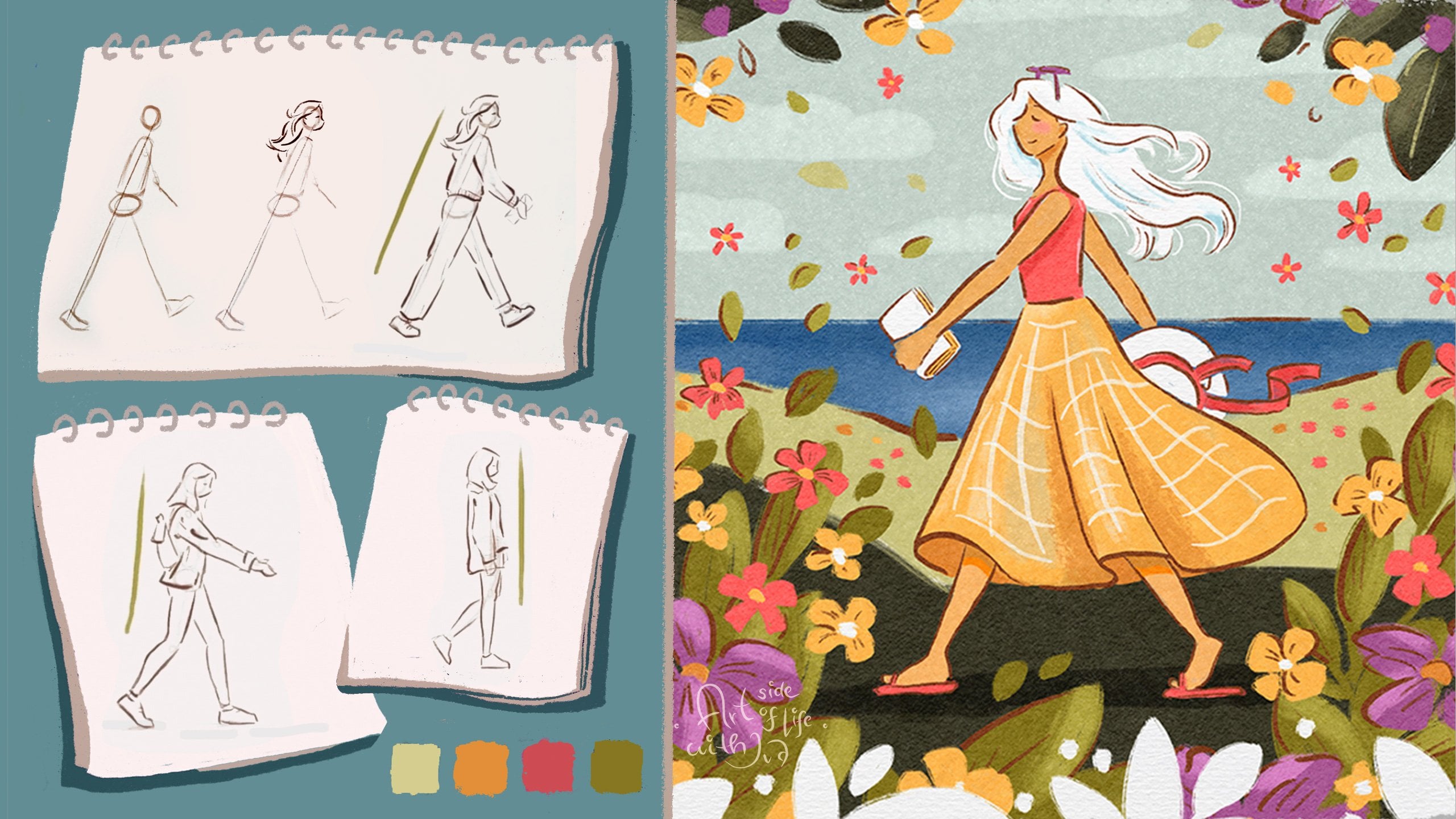
8. Drawing Idea #1: I opened a new document. For sketching purposes, it doesn't have to be
very big document. I opened already the
bigger size document, so I can continue sketching and coloring within
the same document later. And this document is my
water paper, I mean, watercolor paper template where I have all the textures
on the top as well. So I can speed up the process, but you don't need
it for this project, but it just makes the final
illustration more textured. So I like to use it quite often. And the size of the document
is, let me find it. Dimensions. The document
is 5,000 pixels by 3,750 pixels and 300 DPI. I can have the high resolution later on for the illustration. I imported some
photo references, so we will look at them. I will show you how
I look at the poses when I want to simplify
the shapes for sketches, and I will be sketching
on the separate layer. You can of course import
the references or have references in the
reference window and you can import
the image here. But I want to show you while sketching on top
of the references, so I imported them
into the Canvas. Let's open one of the
first references. I need to reduce the opacity. So I can sketch on top of it as well and explain what I mean. We see also the layers, I think I will make
the illustration. I mean, photo a
little bit smaller, so we can sketch here
and then we will see also the layers. It's here. For this part, I will be using
my chunky sketching brush. It has a nice texture and you
can see what I'm sketching. But you can choose your
own favorite brushes for the whole class. The brushes are definitely not
necessary for the project. But again, I like to
create my own brushes. So I can add this
traditional look and feel into the illustrations. But again, you can choose whatever brush you
like for this project. I have also free
set of brushes if you want to explore
some of them. Anyway, this brush you will
be able to see better, so I need to go to
the proper layer. So Maybe yellow would be better, so you would see more clearly
in the color palette. I will use some colors from the previous class
color palette. But of course, I
will upload some of the colors that we will use
for the final illustration, so you can explore more. First of all, what
I'm looking at this photo is the composition. I'm trying to find the shape. Here I'm seeing these
triangle shapes, and also, I'm trying to see
how the faces are positioned. We have one of the faces looking this way and the
other one is looking down. When sketching the faces. Let me go back to the green. I'm trying to notice the
middle part of the face, where the eyes are
and the mouth, and then how the
other face is angled. You can see this one is angled this way
and this one is here. Then of course, we have
the size of the head. I always try to Think
about the head size. As you can see, this one is angled and this one
is looking straight. Then we have the proportions
of the shoulders and the child has much
smaller shoulders. These are some of the
things that I think about when I want to sketch
characters like these. I will move this
reference to the side. And we will start sketching
a little bit more loosely. For that one, I like to
use more soft brush, still with some texture, and I like to use
more brown color, not black or dark color because I think the brown
is a little bit softer. I will start sketching
here on the side. As I showed you, I'm
looking at where the head is Always starting
with just the oval, then I will sketch
the shoulders. And then we have the
child here on the side. We can use these sketches
as just the warm up. Trying to place the ears. The child. They
can be very rough. For the hands, I am just using the mitten shapes and we
want to add the book. We have these turning pages. Again, just the mitten shape. Now because we're not
sketching on the photo, I can make it darker so
we can see it better. If you feel like you want to
sketch on top of the photo, that's also fine too. Now I can add like
suggestion of the hair. Because of this angle, we see a little bit
more of the hair, then if you would see the
character from the front. As I mentioned, it's sometimes tricky to choose
the right reference, if you are not sure about
the foreshortening, But I think like this, it's enough for now, and then we have the good and the child has
this nice fringe. Y. Other point is when drawing the child and the parent is usually
the size of the eyes. You can make the eyes a
little bit bigger later, and also the size of the ears. The parent can have a
little bit smaller ears, and then you can add
bigger ears for the. You can emphasize the size of the head by making it bigger. We can see that the parent has wide shoulders even in
this like a rough sketch. Then we have a little
bit more hair. Maybe it can be cute. If the two characters have similar hairstyle,
as I mentioned, and these catches should
be just like a rough idea, so it doesn't have
to be perfect, but you can add that maybe to the other character
as well, that can be. You will add similar hairstyle. Not sure if this
is very readable. Right now, it might
look like cakes. Maybe this is not the
best in this one, but it's good to try. Maybe what we can do, maybe we can add a fringe
to this character. They share some kind
of like a feature. All right. I think this is
good enough for this sketch, and now we can move
to another sketch.
9. Drawing Idea #2: All right. Let's take another
reference photo. For example, we
can take this one. So I will move it to the
side and same as before, I can hide this sketch for now. I will create a new layer, reduce the opacity of this one. And I will sketch on top. I can show you again what I want to focus on here or
what I'm noticing first. I'm trying to notice the action pose of the character or how the character is tilted towards the camera
and positioned. Then the weight of the character
is here at the bottom. And the whole composition, it's again more triangle shape. So this is something that
I am focusing on here. Then I am also again trying to see how
the phase is angled. The phase is angled downward. Then you can always mark where
are the facial features. The face of the kit
character, it's more forward. Facing, so it's not angled down, and then we have these
elements which are coming out of the silhouette
because overall the silhuette is more closed. But here we have
more visible bump, and of course, we
have also the heads. We are trying to simplify
the silhouette as well. This is what I'm trying
to see when sketching. Now, I will make
this smaller again. I have space to draw, I will switch to the soft brush and
brown sketching color. Here, I will start
with the head. I usually start with
the head because that helps me to position
the character, and you can always change the
size of the head later on. Then I will sketch the torso. Then as I said, we have the arm sticking out, and then we have
the bottom part. This is like the weight
of the character. Then I can sketch the knees. Of course, I have the whole class about
sketching characters. You can check that
out in more detail. Here, we have the book. The child is next to the main character or
the parent character. Then we can add the hair and
the child has shorter hair. Also, as I mentioned in the previous class about
drawing kids characters. You can notice
different proportions on the face compared
to the parent. As I mentioned, we have the
bigger ears on the child, but also you can see it here usually bigger forehead
for the child. I think this is a
very cute pose. When you are happy with
like a rough sketch, you can clean up the sketch on a separate layer
later on as well. I can reduce the
opacity of this sketch, and then I can sketch
on a separate layer. Just to clean up this one. Just to add a bit of
the c to the sketch. And she had curly hair. So I'm trying to add that. She's looking down. Then I can add the nose. And then she will be smiling. Now we have the arm, and we don't see much of
the body th the book, which is fine because
we want to show the sting of the book. Here for the kid, we
will add a big ears. And I'm trying to draw similar facial features
for both characters. We will have this curly hair, which I think would
be super cute. And then the child
has these overalls, which I think is quite nice, and then we have these
small shoulders. That's one of the things
which can help you a lot when drawing the kit
characters as well. It's drawing the
smaller shoulders compared to more
adult character, even though this adult
character is more stylized. We still have more
narrow shoulders compared to the realism. So now let's add some pins. So not such a big brush. And As I was mentioning, you can add the title
of your favorite book, or you can even draw a topic that it's
interesting for you. Maybe we have birds or some other topic that you would like the characters to read. Maybe we have some birds here flying or
something like that. You can invent your own story. You can imagine something
is written there. And then we will just do
some suggestion of the food. We don't have to
draw it in detail. Here you don't have to draw
the rest of the child because maybe it's not necessary
to convey the pose. As you can see, we already have the book and I think that's filling up
the space pretty nicely. You don't have to struggle with feet if you are not
comfortable drawing them. As you can see here, it's not necessary and it's
already looks quite cute. Now I can just emphasize the silhouette a
little bit more. What I forgot to mention is also neck of the child
compared to a parent. Neck of the child
is more narrow. That's one of the things
you can do here is to neck for the child. All right, I think that's nice. We can add a little
bit of shadow here. All right. I think this sketch
is pretty cute already. Now let's look at another idea.
10. Drawing Idea #3: Let's catch another image. Maybe we can take this one. Because here I also wanted
to show you how you can translate this image
into nice composition. Because even though you don't
see the character faces, I think it can be if you have it as one of the
elements maybe in the book. Because the composition is quite nice because it
has this nice curve, and then you have the top part. Then we have the book, and then the characters are
sitting closely. There is this nice flow
in the illustration, which I think creates
very nice shape. Let's delete this one, and let's take a soft
sketching brush. When sketching
something like this, I would exactly start with those shapes that I
want to emphasize, and then I can adjust
the proportions later. I like those flowing movements. As you can see, it's very rough. Here, I will imagine the torso. And sometimes you can
sketch in very messy way. So only you can know or
can imagine where is what? Because these rough sketches
are mainly for you. Of course, here when I'm trying
to explain stuff to you, I'm trying to make the
sketches more readable, so you know what I mean, but sometimes my sketches are so messy that you can't
even tell what is what. You can definitely just
find your way how to sketch and you can do it in
as many steps as you want. It doesn't have to be perfect
or presentable right away. Here, I will focus on the
more readable shapes. I'm trying to now make a little bit cleaner
lines because I already mapped out
what I want to sketch? Also this character, I like the flowess,
also in the hair, even though I really like also more curly hair and all kinds
of different hairstyles. That's something you
can also imagine like, what is the character hairstyle? Are you drawing specific story or are you drawing
your family members? That's something to
think about as well. Here, the child, maybe we
can just simplify the face. We are not drawing it. Here, of course, the
hand of the child is much smaller than the parent. You will see it
here in comparison, which I think that's quite
nice when you are drawing, you can see it next
to each other. But overall, I'm not sure if I would use
this type of pose because I like the poses where you see the phase expression. We have the hair. Maybe we can add the bow
for this character too. Maybe she looks too
childish with the bow. Maybe some other hair accessory. Maybe a smaller bow, or it can be a flower. Maybe that's a
little bit better. But if you want to make the
character look younger, then you can add the bow to
the hair, as you can see, it's making it younger looking. Here, I'm just trying to
align the phase proportions. Maybe we can add the
year. Maybe not. I think that's good. We have this bow on this character. All right. Now we have also the shorts. The kids legs are quite
thin compared to the pent. That's also a
comparison of size. We don't see the other
side of the sofa, which I think would be helpful. I think for now, this is okay sketch. I will do another take of
simplification of this sketch. So it's a little
bit more readable. I will hide the reference
and then we can compare the sketches
that we have so far. So this one, and then I
think we can do one more and I will clean up these two sketches before
we move to the next one.
11. Cleaning up the Sketches: A a I a. A a
12. Drawing Idea #4: All right. So now we
have three sketches. I cleaned up the
other two as well. So now let's look at one
more just to fill the page. I can hide these ones for now, we have place to sketch. I was thinking that
we can take maybe either this one or this
one is pretty cute. Maybe this one is nice, but we don't see the feet
of the character here, so we can use the second
one for the reference. I will move this one
to the side as before. Reduce the opacity a little bit. I can sketch on it as before. Let me take this one
and some green color. What I like on this
reference is that the silhouette here on this
side is almost straight, even though you can see
some curves of the head, the hair, and of course, the rest of the body. Here we can see like a
frontal view of the legs. There is not too
much for shortening. Then here, we can simplify the outside silhouette
almost to these shapes. We have this like
rounded triangle and here is another
round the triangle. You can imagine the overlap
of these two characters. Now when I move it
to the side again, go to my favorite
sketching brush. I will start sketching
these shapes like before. I will focus on this
composition, as I mentioned, we have these
triangles where we can fit the characters
within these triangles. We have the torso
of the parent here, spine, the legs are
somewhere here. The shoes, we can use the other picture for
a reference later. Then we have the arm
and the book, of, and you can customize your character based on
the other references. If you want the
character maybe to look more like you and
you like certain pose. For example, if I
customize this character, to me, I would make the hair straight because
my hair is more straight. Here I can adjust the legs because she has two legs
on top of each other here. Still keeping quite rough. As I mentioned, I
think I will make the hair little
bit more straight. Now I can redefine the
sketch on a separate layer. I like the outfit
because there is such a nice contrast between the stripy shirt and
the yellow shirt, but maybe I will use
different outfit for a child. Maybe I will make
this into a girl, which can look like me and maybe this one can look
more like my mom. You can find different reference when adjusting these sketches. I think I need to maybe move the legs, a
little bit lower. Because I moved them too much
up when I was adjusting it. And I can make the head a little bit smaller because
I started with the head, which was maybe too. Let me delete this part. I think that works. You can, of course,
also tilt the head if you feel comfortable
in different way as well. The head is maybe this way
or looking at the child. Let's test it out. I will start with redefining the child a little bit more
with more generic shapes. And I will add the fringe like we sketched in the
other reference. I think I can add maybe a bow because I think
that was pretty cute. How it was in the other
reference as well. If you need references for bows, and you want to add them, you can find different
references for that. I think this head might be
still a little bit too huge, so I'll just make it
a little bit smaller. I will add a narrow neck as we talked about, small shoulders. The book, let's see, the book is little
bit higher up, so I think we can make
it a little bit bigger. We will have the space for the
ad a character to hold it. Here we have the
hand of the parent. Still using the mitten
shape for the hand. Then we have the legs crossed, but I think we can add the
book on top of their legs. Here, we have the shoe. Don't forget that the
legs of the child be a little bit thinner
than the parent. When we are trying to recreate stereotypical
proportions for the kid and the parent character because both of them are
quite simplified. Of course, there are different body
proportions and sizes. For this one, we are
just going for this a stereo bigger versus
smaller proportions for the parent and the child. Now we will have
the child looking down, reading the book. Maybe we can make her
smile a little bit more. I will make more like a open
mouth for the character. Make sure that the ears are of the same height
and the same size. Now let's catch the parent. Trying to keep the face
proportions in the middle of the face, following that line. As we talked about expressions, that it helps with
the illustration if we mirror the expressions. If the child is smiling, we can make the
parent smile as well. I think we can have like
this cute fringe for both of the characters and
both of them can have this nice hair band
with like a bow. Maybe we can simplify the bow
a bit more. I think this is So let me look at the reference. As you can see, I'm creating this wavy hair for both
of the characters. They are not like curly, but they are more wavy. And this is one of my
favorite hair styles to draw. We can also draw this shirt. I think it's pretty cute, as I mentioned, we
can just simplify it. I need to move the
legs a little bit closer because the
torso is here, so it wouldn't fit the best. I will just draw the legs to
the even on the reference, they are a bit further out, but you want to have aligned. As we stylize the characters, you can see that this older character
still looks pretty young, and you can play with
the proportions. If you want, you can
make the head smaller and limbs in different
proportions. We can still make this
head a little bit smaller, for example, you need to
switch to uniform ops. As you see if you make
the head smaller, it looks already different. So it's up to you how you want
to style these characters. So let me look at
the other reference. So we can see the legs of
the character as well. So I'm sketching here. So What helps you when sketching feet is to try to notice where are the
soles of the shoes. And the shoelaces. I think that all
works pretty nicely. I just need to move this new sketch a little
bit lower. Perfect. On this one, I think I still
need to move these legs blo. I mean, the feet
because they were a bit out there proportionally. I think I can move also
this part a little bit. Yeah, I think this works
a little bit better. Perfect. So we have more
sketches of different poses. Choose your favorite one, and then we will
move on to color.
13. Color Palette: All right. And now it's time to choose your
favorite sketch. I think I will go with this
one because as I mentioned, I like the reference of the character sitting in the
forest or in the meadow. So I will hide the
other sketches, and I will kin group these
two and I will duplicate it. I will make this sketch bigger, so I can use it as a base. Then I will merge these, so I will flatten this group. I will set it to multiply, so I can sketch under it, and I will also reduce the
opacity of the sketch. And I will quickly test
out the colors as well. To do that, I will duplicate
this 11 more time. I need to make this one
much smaller because I want to test the colors fairly quickly on
a separate layer. If I test it on a bigger scale, I would focus more on details which are not
necessary just yet. To do that, I will choose
the watercolor brushes, and of course, you can use
other brushes that you like. I like the textures
on these brushes. So I will be using these. But again, of course, you can use different
brushes that you prefer. For testing the colors, I will take more opaque brush. First, inspiration, if you
are not sure where to start, you can take the colors from the reference images
that we looked at before. While sketching on
a separate layer. For example, here, we have
some nice yellow colors, just to make sure that
I'm on a separate layer. As you see, this is
just very rough test. Then we have some blue color. Maybe I can add jeans in
the same total pink color. But as you see, I
took it just from the photo and it
looks pretty dark, compared to this yellow, I can make it a little bit
more pinkish and bright, and then maybe a
bow in the hair. Maybe the hair is
nice and brown. But as I was mentioning, I wanted to have the characters look a little bit more like me. I will make the skin tone
a little bit lighter. I need to have it even
lighter because it doesn't stand out next to
the hair enough. Always think about the contrast of the hair compared
to the character. The book is quite light. Maybe we can make the
book in gray tones here. Then the shirt is gray, and maybe the shirt of
the kid is also yellow, and we can redistribute the
same colors as we have here. Maybe something like this
can work pretty nicely. I can mark these
colors on the side, so you can see the better. But as you see, it's still and I like this rough
edge of this brush. It's perfect for this
a rough sketching. Nice. Then I can hide
the photo reference. I like the blue tones, so I can mark maybe
different coal palate, maybe a lighter blue tones. You can create more blue, almost turquoise color palette, which can be pretty nice. Because when you create
these shades of blue and green can help you evoke more like
calmness and stability. That's ideal, maybe for
even a moody illustration. When you use more of these
orange and yellow color tones. We can have yellow, maybe even brighter yellow, And even something like orange. That can be nice with
something lighter. And then we would have those nice brownish color
tones for the hair. This is one of the ideas because if you use
more warm tones like orange and yellow that might highlight the
joy and liveliness. I was thinking that I can import another photo reference As we were looking at
this photo reference, this one has nice green
color tones in there. I can use maybe warmer green. If I go to this color palette, more like warmer greens together with the yellow as we see in this
photo reference, I think this can be very nice combination and
Maybe from these warmer tones, I can even move towards
more pink tones. Something like this. I think this can be a nice
color palette just to have another reddish color
next to yellow, even though this pink is cooler, yellow, not warm yellow. I will test out these colors
on the sketch as well. I will hide this reference. We have space to
draw. Just here. I can just move this one. I can make it smaller. Duplicate this sketch and
test out these colors here. Maybe they are just sitting
on the grass and we don't need to make
everything in detail. As we saw in the reference, there were the yellow flowers. And then we can create
maybe this yellow shirt, maybe the book is yellow. Then we need the brown hair, like we tested before. Then we need some color
here for the pent. Maybe we can keep the blue idea. We have more colors
in the color palette. We are not going only for
monochromatic colors. But overall, I am
using yellow color a so that would be
my main color focus. I think this color palette
can work pretty nicely. Then we can add a little bit
of these yellow flowers. Then we can have a red
bow for both of them. Maybe then the book is red. It's actually not too bad, but maybe the book
works in yellow. Like this, you can quickly
test out your color ideas, and now we can move on to
color the whole illustration.
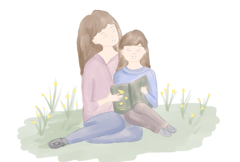
14. Painting Part #1: Now let's color the
full illustration. I will cut this part because
we don't need it anymore. We can hide also this one. I will keep this one for the reference because
it's easier to sketch. I can delete the
photo references because I don't
need them anymore. I will sketch on
a separate layer. First, the base colors. You can choose a brush, which has nice opacity, and I will be using this
more opaque smooth brush, and I can just sample
the colors from the test that I did on the
side, and it's quicker, and I will create the color palette as well,
which you can test out, but you can test out your
own colors because I think it's always fun to create
new color palettes. Now I will just follow the
sketch that we created and I will just fill in the shapes
with this more opaque, but still watery brush. I like the natural
watercolor feel overlap. I don't have to be super precise because I can
always blurry together, but it's fun to use. But as I said, you can use a different brush if you
prefer different look, and you can always
clean up the edges. A Now, I have also brown hair for the secondary
character or for the, not necessarily
secondary character, but the second one
that I co here. Then we have this yellow
color for the shirt. As you can see, I'm just
following the sketch, not creating any
new unique shapes, and we will still add some shadows and
highlights later on. Now we want to have
maybe gray shirt because I think that works
with the other colors. Also for this main character, and you can really test
out different colors. Maybe the shirt here in
the middle is yellow, and then the outside bigger
blouse or shirt is white. You can really test out
different colors and play around here and just to customize
it and make it your own. M Here I'm imagining that the light is coming
here from the top. I can add few of these lighter tones on
the top of the surfaces. We have the hair, the shirt, and we can add more
of the highlights. But you can where the
highlights would be. Perfect. Now, Let's the skin tone and see how it works
in this bigger scale. Maybe I will make the skin
tone a little bit lighter, so it stands out better
against the hair. Perfect. Now the other pens
for the kit character. It's, and then we can
make the book yellow. I think that's nice. Then the shoes can
be this light gray. We need some skin tone here, so there are legs or cs
going into the shoes. Then we can add the grass
like we did before. I will switch the brush. I will take the brush number 30. I will add some shadows and definition around the
face of the characters. I will sample the color from the Canvas and I will make
the color a little bit, and then I can
follow the sketch. I need to make the sketch a
lit b so I see it better. Make sure that you are
on the correct layer. Now I can just add some
shadows around the face. Perfect. We are just adding a bit of
the definition to the hair. I love some of these
brushes with a rough edge. I like to combine different
brushes when sketching. Some are little
bit more loose and some have little bit
like a rough edge, which I think adds character to digital illustrations
because you can combine different textures
and different look and feel when illustrating
the characters. And when you find your
favorite brushes, which I always try to experiment
with different textures, I find it definitely more fun. You don't have to
use too many brushes in one illustration, but if you have at least
one favorite brush, I think it definitely
makes it more fun to play around with textures and maybe different brush
strokes in illustrations. All right. Now when we add a
little bit more of these shadows and
definition around the face. I think the characters already pop a little bit more,
which is lovely. I need to add some of
these base colors. I will swap to the
more opaque brush. Actually, I wanted
to use this one. We need the orange
color for the bow. Maybe we can make
it a bit brighter. Perfect. And then I can add the bow also
to this character. And maybe this nice
detail on the book. I think that's pretty cute. Maybe we can add the
flowers on the book. Maybe they are reading
about the nature. I think that's idea. Now I can add at flowers, And I plan to do a tutorial about drawing
meadows and flowers. So I will go more in detail about drawing
like flower shapes and how to create depth in natural setting when drawing a meadow because when you
are drawing a meadow, of course, there is a lot of things that you need to
balance and to create that depth in the illustration because the flowers
and everything is so lush with the
backdrop of a meadow. So I will create meadow more
in abstract shapes here, so we don't spend too
much time on that one. But let's just add some greenery here and I'm drawing it on the
separate layer. I don't have to be so careful
around the characters. I'll just draw some green here. I think by adding
this green color, it adds this nice extra
color into our illustration. Because the watercolor
brushes are less opaque, I can also a bit of that greenery around the
flowers, they stand out. Perfect. Now I can alpha
log this and maybe we can add a little bit of the
shadow around the characters. We have some shadow
from the characters. Ad. Perfect. That's good
enough for now. I will reduce the
opacity of the sketch. First, we need to
find the right one. Then we can the character
facial features on a sear layer.
15. Painting Part #2: Oh. Now, I will create a new layer for
the facial features. For that, I will
take smaller brush. For example, I can
take brush number 16, which is quite small, so I can create nice details, and then I can just draw
on top of the base colors. So I will take darker color, and I will just
follow the sketch. When drawing the
facial features, just make sure that they
are in the same height, and also that the eyebrows
have the same thickness. Then that the nose, is in the middle of the face, and it's aligned with the mouth. Now I can just redefine the shapes for the
head and the ears, just in the corners. When you press with fingers, you can enter the full screen. For the smiling mouth, I'll just add white
to suggest the teeth. Now we need to add the facial features for
the m in the same way. Just make sure that
they are aligned. Now we have the nose. Depending, of course,
on the styling, how you draw eyes, and facial features,
that's how you can create the facial
features basically. As you can see, they are
quite simplified here. Then you can add details to the rest of the
body and the phase. We need to add outline for the pace and the same goes for these outlines, following the sketch. Y. You can add as much detail
to the hair as you want. And if you know, I also have a class
about drawing hair. So I kind of ex the techniques and how
I hair in that as well. I added more outlines and definition to the
overall illustration that we have so far. I used the photo reference
that we used for the sketch, and I paid attention
to certain lines. For example, this line is
going from her face down. I tried to create
this curve line. Then there is more shadow here in this part. I added that. Then we have some creases
here on the shirt, and then I can add
those with shadows, which we will do in a moment. For example, this line should be angled like this
because Naturally, I might draw it like this
as you saw in the sketch. But in here, the perspective
is little bit different. Then I also check the placement, for example, of the knees. That one is here and
one is tucked little bit lower and further
out of the torso. Here, for example,
I didn't sketch the shoe so much in detail. Maybe we can just add the laces, and this should be enough as
a suggestion for the shoe, and it's pretty cute. And Perfect. I think that works. We can
add also the other shoe here. Other than that, I
think everything works. I need to adjust some
of the color details. As you see now when
I change the sleeve, now I'm missing some
of the color here. Perfect. Now, I don't think
I need the extra sketch, which was here in the corner. Also we can test out how our illustration looks
without the outlines. I think it's looking
pretty nice. You can make a copy
of the whole canvas. I already created a backup if you are running
out of the layers. Now I can also add some
of the textures So I added this paper
texture background as well as some of the
textures for the colors. But it's of course optional. Now I will add more shadows to the layer where we started
drawing the hair, and then we can merge it with the other colors when you
are hay and you can use this reference p as a visual reference where
the areas appear darker.
16. Painting Part #3: All right. To add shadows, I will use combination of
two different brushes, this brush number 17, and brush number 30, because I can do more
details with this one, and then we can blend it. First, let's make bigger
areas with shadows. I can see here on the
reference that there is a shadow here when
the shirt is open. And we can double check. So the outlines are
somewhere here, and I can delete this
part of the outline. So I have the shadow there. I think we can
actually merge it now. So we have easier time
just to work on one layer. Here, I will add the
shadow under the hair. Then I will also make the
neck little bit darker here. Then going back to the shirt. There are some shadows where the T shirt folds. Also here. I'm always looking
back at the reference, where I see the darkest areas
and the lightest areas. There are a highlights
or lighter parts of that shirt
because the light is coming from the top right. So we are working similar like with traditional watercolors if you are using the same brushes, and if not, you will have a little bit different textures. But this coloss is not
about the brushes, but about how you can create this nice illustration with
mom and the child together, or if you are drawing
maybe a father as well. If you found a
different reference that would be e to
see in the project. Please don't forget to
upload your project, or if you are sharing
on social media, you can take me, so I can
share your art as well. Here, I'm just sampling the
colors from the canvas. Now I want to add a shadow here, which is on the shirt. Now, we need to add a little
bit more of this blue. Let's darken it in some parts. Like the legs where they are on top of each other,
there is less light. We can add some shadows here. Maybe I can create lighter blue. We can mark it next
to the colors. This is for the shadows, and this is for the pants. Perfect I ca I want to
sample it again from there. Oh. Then we need some
shadows under the book. Maybe you can add some
greenery on the book cover. People can imagine that maybe they are reading
about the nature around them or maybe about
gardening or basically, you can choose any topic you want to add on
the book cover. That's quite cute. Now let's look at the reference, where else we can
add some shadows. But I think we are
already getting there. What we can also do now is
to add some shadows here. Then we can also add highlights. To do that, I'm sampling
color from the hair. I will switch to a brush
with more opacity. Then I can add highlights with just a
lighter brown color. You can watch my class
about drawing hair. If you want to know a little
bit more how I draw hair. We don't have to go too much in detail into the
topic in this one. We have some of the
highlights here. Then we can add some
highlights also to the bow. Maybe even lighter. The bow doesn't have
to look like a bow, can be more like a suggestion. We can also add nice color to the cheeks
of the character. We can do that with a softer
brush and pinkish color. Then you can softly
paint on the cheeks. You can always
adjust the intensity by changing the
opacity of the layer. Let's see. We can reduce the
opacity little bit. For the girl character, I can higher it up a little bit. I can also add maybe freckles. They seem to have more in
common. So that can be. You can use also grain brushes
actually for the freckles, or you can draw them one by one. Let me create a new layer for this one and then we
can test out the size. Yeah, I think
that's pretty cute. I can just add more and
then delete some of them. Perfect, and I can add some of these freckles on
the um as well. And then reduce the oy, and then I can merge it
together, the colors, perfect. When you want to have the colors even stronger and you are
using the same brushes, you can duplicate the layer and then reduce the opacity perfect. They are more vibrant, and then you can use the blending or smudge brushes to blend the colors better. For blending, I like to use
this brush number nine. And then I can blend some
of the harsher edges. But I like this
unfinished look of the brushes because then it looks a little
bit more painterly. It depends what type
of look you like. If you like blended
and more clean look. But I still like to see
some of the textures. Even these blending
brushes that I'm using, they still have some
texture to them, so it doesn't blend it
completely to smooth colors. We can look at our canvas
here more from the distance. You can analyze if
you want to add more colors or more textures
and more definition. But overall, I think it
turned out pretty nice. You can add more details also to the flowers
if you want and play around with of the finished look of
the illustration. You can also add
loose strands of hair just to a bit more
movement to the illustration as last details because I think loose strands of
hair is always like a nice addition at the end
when you have everything done. All right. That's it. I hope that you like your illustration and
you can of course add more details and textures and shadows if you
prefer when finalizing illustration or you can
leave it as it is with more rough edges because I like that type
of look as well. I hope that you love
your illustration. Thank you so for watching. I'm really looking forward
to seeing your versions. Oh.
 Iva Mikles, Illustrator | Top Teacher | Art Side of Life