Transcripts
1. Travel Art with Sang | Procreate : Today, I'm gonna be
teaching you how to turn your vacation photographs into dreamy procreate
illustrations. Hm. Hello, I'm
Sang Angela Kamar, and I'm here at the beautiful
Luxury Jeep Islands. Who doesn't like
being on holiday? The sunshine, the
beach, the sand, the pristine, green and
turquoise waters behind you. Well, I love being on holiday, and right now I'm coming to
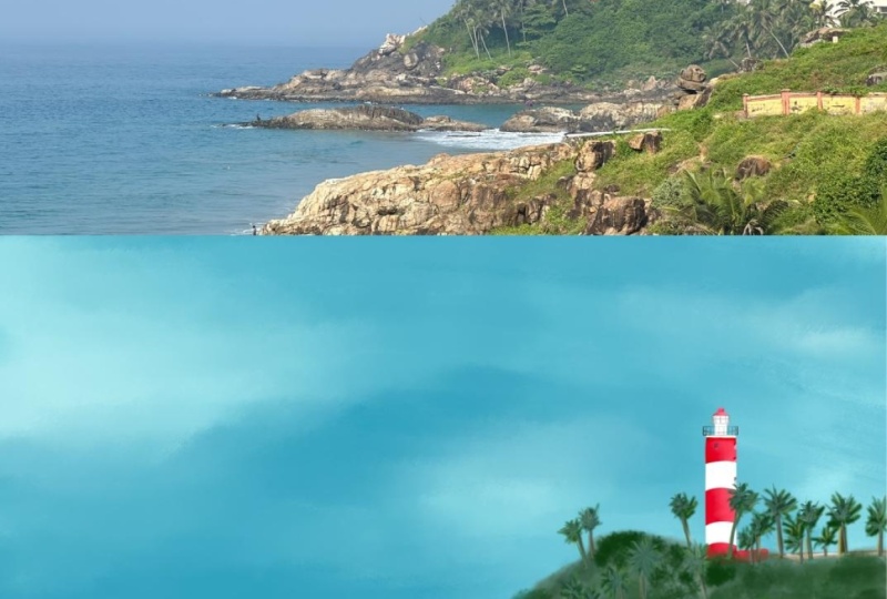
you from Luxury Jeep Islands. Now in my free time, because I have a lot of time on holiday, I sit and do traditional art. I sometimes do Procreate art. I also take a lot
of photographs. So today, I'm going
to be teaching you how to turn your photographs, your vacation photographs into illustrations on Procreate. This class is for beginners or anyone who's on holiday
who wants to create their beautiful photographs into art illustrations on Procreate. It's also for people
who just come from their vacation or who
are on their vacation, wanting to create something amazing through
their photograph. This class is a beginner
friendly class. It is for anyone who knows
basics of Procreate. What you need for this
class is an iPad, an Apple pencil, Procreate, and probably an old
holiday picture, or else just be on vacation and just take a screenshot
of where you are. This class can be applied to
a traditional art as well. However, my focus is
going to be primarily on Procreate and how to create some dreamy vacation
illustrations, which you can gift or just have framed as
memories of your trip. So let's get started. Oh.
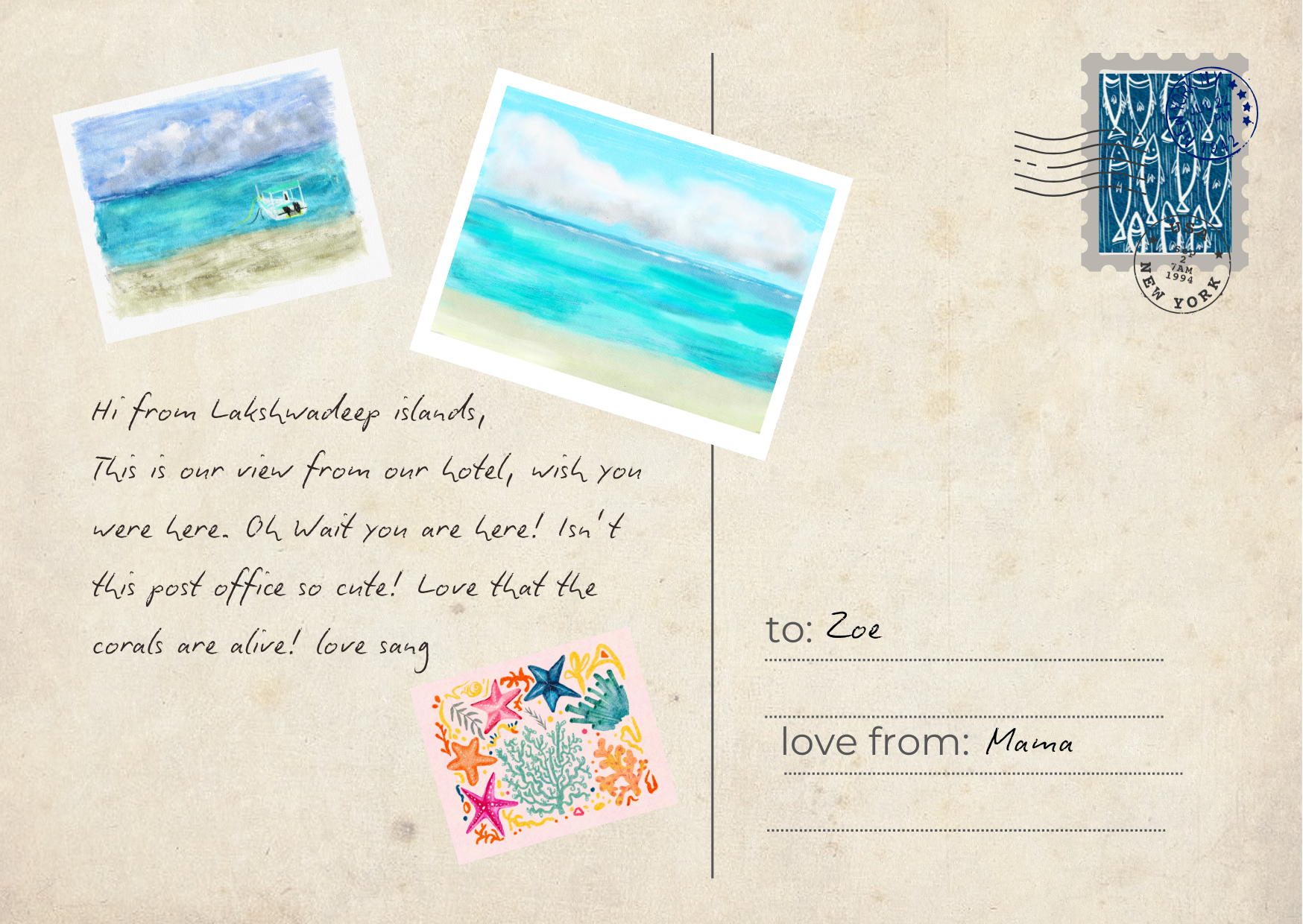
2. Project Ideas: For your project, take
any holiday photograph. Whether you use your current
vacation photographs, or whether you use old vacation photographs, it doesn't matter. The point is to create beautiful illustrations based on the photograph from
your vacation, so you can either create
a postcard or frame the picture or create just memories that you
want to celebrate. The beautiful thing
about illustrations and using your photo references as illustrations is you get an original approach
to something that you have already lived. You enjoyed that memory, and then creating the art just emphasizes that feeling and
emphasizes that memory. I love creating art based on the photographs that I have taken
during holidays. Today, I'm on holiday, so this process feels a lot more nicer. Wow.
3. Demonstration: Create a new document. Add a photo from the gallery. If you don't have a
photo from the gallery, you take a photograph,
wait for the guy to go. Then you take a photograph
of what you're seeing. In this case, it's a nice
overcast sky with the sunset. Now on the corner,
there's a use button, click on use button
and then resize the photo according
to what you'd like. You can make it bigger,
you can make it smaller. You can crop the photo. I decided to crop the sides. Now, the photograph
is in one layer. I'm going to increase the
saturation, the brightness, just to make it a lot
more authentic because the photograph
seemed a little more dull and I wanted to
match the correct colors. After that, you
open a new layer. I'm going to be using the
colors from the photograph, take the dropper and color
and match the color. I'm choosing any brush that
I want to choose the colors. Using the eyedropper tool, I'm sampling the different
colors in the photograph. I'm beginning with,
for example, the sand. I don't know if you
can notice this, but all the colors are
looking a little dull. But that we can change with hue and saturation and brightness. And that's the color of the cloud, and then that's the
color of the sea. You can make it darker or lighter depending
on what you'd like. Now, I did this on
a separate layer. And again, I'm just increasing the saturation,
playing with hue. I don't really like that. I'm just increasing
the brightness. You can play with any
brush that you want. But basically use the
eyedropper tool to sample I basically begin at the top and I sample
the dark end of the cloud. Then I go to a slightly
mid tone of the cloud. Then I go to the almost
brightest part of the cloud. I've sampled four colors of the gray sky, then
of course, the sun. This has different
different colors of peach and yellow and bright
yellow and orange. I'm sampling all those colors
to help me and guide me in terms of what the palette
is going to look like. Now, because I'm drawing the scenery right in front of me, it helps to have this now, sampling the ocean
has different levels, because it's a cloudy day, it's not as blue as it is
otherwise during the day. So I'm playing with different
types of dark tones. So, I'm sampling the boat. I'm working with these colors, but I can change it anytime I can play with a
hue and saturation. But this is just the palette that I get started working on. So these are my colors
that are going to more or less be what I'm going to be trying to draw
on Procreate to make this photograph a
beautiful illustration. So there is, that's my color
palette for my illustration. I've sampled the photographs. Now I can just make the
size a little smaller. For your benefit, break
this down for you. These are the colors
for the clouds. This is the sky sunset. This is the sea, and
this is the beach. I'm going to choose watercolors. I'm going to be experimenting with different
different brushes. So first, I'm going to
begin with the beach. I'm not thinking so much. I'm just adding marks a brown Now I'm going a little brighter to
give it some variety. I'm just experimenting
with the brushes. I'm playing, basically. There's there's nothing
specific that I'm doing. You can experiment with
whatever brush you have. I'm playing with the watercolor set from the native
procreate brushes. I'm going to the sea. I'm
just blocking the colors in. I want to make the
water a little more authentic to what it looks
so I change the color. Of course, increase and decrease your brushes according
to what you'd like. I'm going to the darker tone of the s, again, color matching. I'm not really I'm just
putting the colors down. I'm not thinking so much. I'm not blending as well. Now I will blend and I will
choose I'll use the theme. I'll choose this to blend. This kind of blurs things a bit. I personally like some texture. Again, I'm brightening
the colors a little bit. Now, I know I selected the
color, I sampled the colors, but sometimes instinctively,
you feel like, Okay, wait, maybe this
should be a little brighter. On an overcast day, that probably does happen. Now it's time to draw a
little bit of the sky. I'm brightening it a little bit because I know that
the photographs, even though I've increased
the Human's saturation, they do seem a little dull. This match is a little better. Right now I'm just
blocking the colors. But as I'm blocking the colors, the form is appearing. Like, now, you know,
there's a beach and a sea and the sky. Now, I'm not really
trying to draw clouds. I'm just going from left to
right to mark the colors. It's not like I'm
overthinking this. I'm really just instinctively
going from left to right and adding colors
and adding layers. Now it's time for the clouds. And I'm creating a circle motion to create what
looks like clouds. So I'm playing with
the dark colors and the light colors to give
a little variation. As you can see, even
in the photographs, there's a variation in the
clouds of dark to light. I'm just doing a general
sweeping, circling. I'm not thinking too much about what I'm doing and I'm really
not trying to copy it. I'm just instinctively creating and letting my hands flow. And even though white is not
really in the color palette, I just thought I'd add a
little bit of gray white to add a little depth. So airbrushing kind
of softens the edges, and it gives a nice look. So I think I've covered an overcast day at the
beach really well. Now I can remove the color
palette. And center this. The boat is actually white. Now I'm just painting
a small boat. Of course, my boat,
the direction of my boat is different
from the photograph. But for me, I'm just
enjoying the process of having a boat in
the sea, in my view. I'm also not drawing it exact. And that's the important part. This has to be instinctive and it shouldn't be
about following rules. It just should be about
enjoying oneself. And that's exactly
what I'm doing. I did the boat on a wrong layer. Now I'm doing a boat
on a separate layer. So if I want to move
the boat around, I can and I'm not it's not
locked into the layer. Again, with the eyedropper, I'm marking a color. I'm just adding some shading I'm just creating a shape
using a soft brush. I took a little shape to
show the idea of a boat. I'm going into pens. I wanted a thin line. And I try my best not to stick to blacks and use gray
for darker tones. But sometimes you just have
to use a black for variety. Just smudging it, it wood. And I don't want there
to be such harsh lines, so I'm smoothening it with the airbrush to kind of
give it a painterly feel. And yeah, that's my sunset
scene based on my photograph. I was using the procreate
native watercolor brushes. I'm just creating some
fine line touches. I'm just working on the sky. Adding a little detailing. Clouds are fun
because the bottom of the cloud is always darker
and the top is lighter and brighter because obviously
it has more access to the sun and you just add
finer details if you'd like. And that's about it.
I'm just resizing the art to fit into
the illustration. And there it is. My
illustration is done. That's the scene, and
this is my illustration. It's actually a very
simple process. Oh.
4. Thank You: Thank you for joining
me in this class. It was really wonderful
creating artwork. I hope you all have a great
holiday wherever you go, and you're able to take
your memories and create them into beautiful
illustrations on For field. Thanks for joining
me. I'm really excited to see your projects. I look forward to see them. And if you'd like
to get feedback, I'll be happy to give that too. Thank you so much, and I'll see you in the next class. Bye.
 Sang, Artist & Media Creator