Transcripts
1. Traditional and Digital Watercolor: Fruit : Traditional watercolors
and digital watercolors are very different
from one another, but they're also very similar. Today in this class, I'm going to be taking you
through a very basic look at watercolors traditionally
and digitally. We're going to be drawing fruits and every single
lesson is going to be a different fruit in both traditional and digital formats. I will be using the iPad and
I will be using watercolors. It's going to be interesting. Hi, I'm Sangita Angela Kumar, and I'm so excited to take you through this class
where we're going to be drawing basic fruit. Look at fruit as an
example and learn how to paint them in both traditional
and digital formats. This class is for beginners. It's for people who have
not been exposed to digital or traditional
watercolors. It's a great class to see the
difference between the two. It's interesting. Even in terms of the shadows
and highlights, well, you'll know
more in the class. Looking at how to draw fruit
in watercolors and how to draw fruit in
digital watercolors. I'm happy to share
all the insights that I learned creating
this class for you. Let's draw some fruit both traditionally and digitally.
Let's get started.
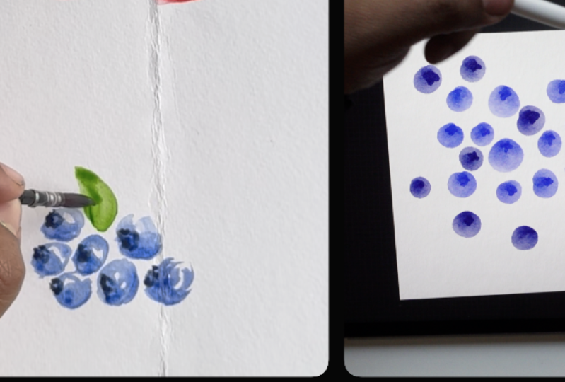
2. What you need for this class: You will need for this class. For the traditional version of this class, watercolor paper, 180 GSM, two, 300 TSM, a set of round or flat brushes. You'd need a mixing
tray or palette. You'd need a rag, pins
of course and water. You'll also need the
Procreate app, iPad, Apple pencil,
watercolor brushes, and watercolor
paper, if you want to do the digital
version of this class. You will need some sort
of watercolor paper. Procrit artists like Nathan, they have watercolor paper. Lisa Glans has watercolor
paper, True Grit artifacts. A lot of people have
watercolor paper. Max has watercolor paper. I will be using Calvin Drift
Studios watercolor paper. So he has many, many
watercolor papers. I will be using a combination of the regular watercolor paper. Or you can even use if
you have Black Sands via. However, if you don't
have a watercolor paper, it doesn't really
matter because, for example, I'll show
you this butterfly. This is through a
watercolor paper. Without watercolor paper,
it looks like this. It's less saturated, but
it still looks nice. I prefer using a watercolor
paper to give a little bit of watercolor texture.
But that is up to you. This is what I do
in my workflow. There are many, many,
many watercolor brushes that are
available on Procreate. There are even brushes that are native to the Procreate app. So, for example, you
can use this to paint. That's native paints, wet
acrylic if you'd like. For a watercolor effect. Personally, I will be
using Calvin's brush, and this is his watercolor set. He does have another watercolor set called the dreamy one. I will not be using the
dreamy one for this class. I will be using primarily
his original watercolor set. And the brush that
I normally use for this class will be
the abstract round, the fine liner, which I
will set to the eraser. So whenever I want to erase, I will erase with the
fine liner brush. And then I will be using the water blender
brush to blend. So primarily these three
brushes are what I use. For texture, I use the
little pine brush, but you're welcome to use the brushes here
in the native app. I will be using Kevin's brush. So this is Lisa's watercolor, which is also good. If you have this,
you can use that. Again, all round or brush. Abstract brush, all round or brush are brushes
that people use. So this will create a
nice watercolor effect. So I'll be using
watercolor brushes. You're welcome to use
whichever one you have. Lisa's brushes are nice. Nathan's brushes are nice. George Vaughn's
brushes are nice. Like his watercolor brush
is also really nice. So whatever brush
you have already, don't buy a new brush
for this class. If you have the brush is great. If you don't the native
Procreate app is good, where you can have options like you can use fern
tree as a watercolor. Principally, it's
the same thing. Watercolor paper and a
watercolor brush set. I will be using Calvin's paper and brush set for this class.
3. Pear : I'm using a lemon
yellow for the pear. Now, you might see
a little bit of guck that comes out
here. That's okay. If you mix it, it becomes okay. So now, this is a medium yellow. I'm just going to put
shades of yellow around because yellow will come in
handy, especially with foods. Sometimes the pear
has yellow tones. This is a yellow ochre. And the nice thing about
boots is that they have, like, splotches of color
here and there, sometimes. So with pear, it sometimes
has splotches of red. Now, as you can see, I've actually not
added a lot of paint, and that is something
that as a beginner, a lot of people don't tell you, but I'm going to
tell you because you don't actually need
a lot of paint. This much paint is gonna
probably last me this whole session for all the fruits
that I'm going to use. And if I need it, I
can always use more, but less is more when it
comes to paints or pigments. So for this, now I'm
going to do a shape. I'm not sketching the roots. I'm going to go
straight for the paint. It's not because
I'm like, brave, because we all know
the shape of fruit. Fun to experiment and
see how the shape is and what to do with it. So I'm going to now take this. So now I know this is
the it's not a circle. It's not a triangle.
It's like a oval blob, but with a fat bottom and, like, a little hat on top. Now I'm loading my Paintbrush
with a lot of water, okay? So when I load it
with a lot of water, it suddenly becomes wet. Now, you see the magic
of watercolors will come alive when I do this. So right now, it just looks like I'm moving the water around. But actually, I'm just
shifting the paint. And I'm creating like a border. So it looks like I've drawn it, but as you can see that I
actually didn't draw it, right? Now I'm going to take
a little bit of red, and I'm going to load my paint with more water, I'm
going to just dab it. This is the magic
of water cools. Now, I don't want
to make a poka dot. I just wanted to show you
because this looks really fun. But obviously, a pear
is not like this, but it's fun to enjoy the joys
of blooms and the colors. So I'm dipping my brush
and I'm a gonna wipe it. And I'm just gonna it's
sad to lose the blooms, but I actually just did it to
show you how fun it can be. Now, you can also decide where you want the shadows
and where you want the reflections in a pair. Now, for example, I've kind of messed up the
shape a little bit, so I'm going to draw
a nice flat pair. I'm going to get the
base little fatism. Okay. So it's a nice
voluptuous pear. Now, a color that
I forgot to add was a bit of green because
some pears are golden, but pears have a little
splash of green. I'm just going to
add a little green. I'm loading my paintbrush
with water again. And I'm going to again
create some blooms around. Now, watercolor is actually dry. It looks wet, but
eventually when it dries, it will be a lot more brighter. But what I'm doing is
I'm pushing the color towards the shadows
that I'd like. So for me right now, the light is coming from here. So I'd like more
shadows in this area. So I'm literally shifting
the color into this corner. I'm going to kind of get
a little bit of red here. If you'd like a highlight, you can get a tissue paper, and you can dab the areas
you'd like a highlight. Now I'm just trying the paint brush because I don't want to load
it with water now. And I'm taking the paint
away from this area. So you see, I didn't
actually paint I didn't draw or sketch
the shape at all. What I did was I
just with my brush, created a shape, and with that, now you have an idea of
what a pair looks like. Now, obviously, for the stem, I need to add a
little bit of brown. I'm taking a very,
very thin brush. At first, I always go light. Now, the danger here is
it might be a bit wet, so it might smudge. And that actually might be nice because it's creating a little
bit of bloom and shade. So it's giving you a bit of
a shadow. That's your pair. One really important
lesson you can do in watercolors is leave a little white space
for highlights. If I have to slice the pear, I would probably load my
paintbrush with lots of water and dab a little bit
of very tiny bit of yellow. Okay. And let's
make like a wedge. So what I'm doing is
I'm dabbing this to create an almost
transparent pair. And then with a
non loaded brush. I will draw a seed and maybe a stick coming out to let people know
that it's a pair. So the thing is that it's
not about being perfect. It's about just letting
the paints have I mean, mostly having fun, getting the ideas of what you
can do with paints. So now, because you're familiar with what
a pair looks like, you're allowing
the Artists, like, your brain is already moving
in a direction that says, this is a pair, and this
is a slice of pair. So it's not always
to do all the work. You have to allow the viewer to their brain to
also understand. So this is a version of a pair. I've shown you the variations. Now, like I showed you that I actually didn't sketch
this. I didn't use pencils. I just use paints, and I pushed the colors
out to kind of give it a border and a line
that if you see here also, it's a line that's crinkled and it looks
like I've drawn it, but I actually didn't draw it. If you feel like being
adventurous, you can splouchprown. Oops very gently. So that's your pair. So with digital is different. There are a lot of very
nice watercolor textures, and Calvin has the
best, in my opinion. Of course, Lisa Glance is there, Nathan is there, Max is there. So you have to choose whichever watercolor texture you'd like. So with the paper that
you see on digital, normally it is
like, for example, this is Calvin's paper,
which I've bought. And this is a paper background with some sort of
texture and treatment. So you can do it yourself or you can create that
texture yourself. In here, I've made two
versions of pears, which I'll show you
the process I did. But this is without
the paper texture. This is with the paper texture. So now I'm going to show you how to draw a pair in watercolors. You open a watercolor texture, your favorite one,
whichever you'd like. I'm using Calvin's. And I'm using a golden yellow. The brush that I'm using is, again, Can's watercolor brush. I'm using abstract round, and again, not sketching, just going by the
shape of a pear. But I'm not lifting my brush. And I'm just like I did
with the watercolor paint. But I'm drawing with the paint and getting
my shape. Okay. Now, if you see
there's a little bit of texture here and here. If you want the texture, keep it, I don't want this texture. So I'm so I'm blending
the texture in. Okay. So if you just want
to do this, that's great. But I personally like I like
having splotches and stuff. But now I'm going to
have fun with it, right? So you've got your shape
and you've got your let's say, brown for the. I'm using the fine liner pen. Now, for example, if I
want some texture in it, I can go to any texture pile. Right now, I'm going
to play around with this blooms texture. So for that, I'm going to
put this on Alpha lock. I'm going to just add
a little texture. Like I said, the light
is coming this way. So I'm going to add this more. So obviously, the texture
is a bit intense. I'm going to add a little more, so I'm going to add a
little bit of green, a little bit of red. Okay. Now, for many people, this
would be very intense. I I have a plan. So now with the watercolor,
blending, Oops. Just dab. Another way to add depth
is you remove colorful. You click on the Select button
and you choose free hand, and you highlight this part and you feather it
out a little bit. And then you darken
it a little bit, change the hue if you'd like, saturate it, and there you go. Similarly, if you
want highlights, select the highlighted area. And feather it saturate
it if you'd like. Brighten it up a little bit. Now, if it's strong, then again, you can use the blender
brush, and blend it. I'm happy with this, so I'm
going to stick to that. Now, this is very clear cut. So I'm going to just add a little bit of
shading to this part. So for that, I'm going to create a new layer and I'm
going to go to overlay. This is my favorite
way to add shadow. I'll click on Black. Black creates like a
darker color, see? Using the mist, I can
add more shadows. Okay. Then I can change the settings and
create whatever I want. I can lighten it a
little bit and merge it. Then if I want to add A brown. It's going to add
liking. Little line. Now, again, it's too
if you want a little more blending, you
can just zoom in, make the blending to a little smaller and
blend a little bit of this so make sure this
line is not blended and only this blending,
you get a little depth. Of course, this is
Calvin's brushet, but if you want to
add more like Lisa, Lisa's acarl has a
lot of fun stuff. So she has blooms. So like, for example,
if I like, I like this, it's loses, but if you want
to add an overlay, and again, like her her overlays are nice, and then you can use a little bit of maybe
soft water blender to blend this out. That gives a nice bloom
like bloom effect. Now, I feel that I feel like
this is really saturated, and it's nice, but it
looks a little fake. So if you feel that way, you can just decrease
the saturation, not have it so bright,
but maybe this. Because now if you
see the illustration that I did with paint, right? And then the illustration
with digital, the difference between
this and this is quite a lot because of the
saturation, of course. But it's not like both of
them don't look like a pair. So now, like, for example, I haven't added a highlight, but I'd like to I've done
it in a different layer, so in case I don't like it, I can always delete it. So here I'm going to increase
the brush and I'm going to smudge this in a way. So my highlight is taking
the shape of the pear. So this is this is giving it an idea that it's
falling in this way. So I'd like to do more of that. So What I like doing is I like creating a
little bit of shadow below. So it's not looking
like it's floating. So let's again, I've
got a little bit of you can make it
gauge and blow. I know what I do is
I go a little darker at the contact point. Then if you feel like it's
bleeding a little too much or you want a little darker,
I don't want it darker. But if you're feeling like
this part is bleeding, again, you can come,
use the water. Water blender really
helps in these kind of. So I don't like that,
so I'll just undo it. I'm going to find lice on this. That's how you can do a pair in traditional watercolors
and digital watercolors.
4. Apple : Now we're going
to draw an apple. So again, not sketching, but just just I like to
kind of make a oval heart. One thing I really like about watercolors is that even
if you make a mistake, you can always go
back and fix it. That is really the best
thing about this medium. So again, allowing
the blooms to come And if I want to add
more color, then again, like I said, the light
is coming this way, so I'll add more
color on the right. And automatically, there's
a white space here, so I'm just allowing
it to enjoy itself. Now, some apples are red. But some apples have a
little bit of yellow, so let's just add a little
bit of yellow also. So it gives a little
variation of color. But essentially, that's it. It's kind of like a
heart without a point pointiness and it's just
around not a circle, but you draw a heart, and then you just follow it
around, that's your apple. Now, again, if I want to
create the stem of the apple. It's wet, so it may smudge. But I'm going light right
now to see what happens. Then I'm going a little
darker, mixing a little. I'm mixing a little bit
of brown with my red. And then I'm just gonna
draw a line here. Hopefully, it won't
bloom too much and create to create a
little bit of depth. Now, if you want to
draw like a small leaf. Let's get a crack. Wipe your get some
of them. Cream. I'm okay with this color. And just press it
down and stretch. Press it down and stretch. So now there's a little
bit of collection of the colors here,
and that's okay. But again, like I said, the
light is coming this way. So you can just dab a
little more color here. That's your apple. Similar to the pear. Take
a little bit of yellow. It's tiny, weeny bit
of yellow, okay? And then just paint
a line and a wedge. Now, it's barely visible. I don't even know
if you can see it, but it's a wedge. Now, try and match
it to this and leave a little bit of
a little white here. Now, it's wet and I'm just
dabbing a little bit of water, and I'm gonna see I'm going to run my brush through
the border of the wedge. So it looks like
it's the skin of the apple That's
bleeding in yet, it looks like a apple wedge. Then On this point, I
want to draw the seed. So I'm just dabbing it
before adding the brown. I'm just doing a
small tear drop. Your app. And that's it. I normally look for a reference. Now, you can download
this if you'd like. So I've downloaded this apple. So now the photo is in. Now, this photo is
under the layer, so it's looking
very watercolory. So I'm going to remove
this and put it up. Now, a lot of people would take a pencil and then
sketch it Okay. But that's not actually
what I want to do. So let's do, do, do, do, do it. I'm going to just
take the paint. I'm choosing the abstract round. I'm going to make
sure I'm in the layer under the watercolor
paper, okay? And another cool thing you can do is when you click on this, you can color match. So, for example, if
I want to shade, I want a darker color, I'm going to stick to
this color right now and then add more shades later. So right now, I'm just gonna Just like I did with the traditional paint, I'm trying to be more
instinctive, right? From what my eye sees, this is more flat.
This is more round. And this is more round. And then this is a
little more flat. So I'm just basing this
on what I see, okay? Now this is a
little more yellow. So now, can I do that. And based on this, I want
to create some lines here. Now, the bottom of this
apple is a bit dark. But hold on. Here's the
water blender brush, and I'm gonna blend, increase
the size a little bit. And I'm gonna stay
within these lines. If I do this, then it
smudges the border. I'm not gonna do that. I'm
gonna stay within these lines. As an eraser, I'm gonna be
choosing fine liner eraser. I'm going to use this brush too move Okay. So the main pen is on
the water blender brush. The smudger doesn't I have
another smudger for this, but I'm not going to use
the smudger right now. I'm just blending the apple in a direction that I
see happening there. Now, I'm not going for
something realistic. I'm going for something I see. Right? Now, to your eye, this didn't look very this looked more yellow
than it looked pink. When you colour match
it, it looks more pink. Okay. Now I want
to get the stick. And for that, I need
a different brush. I'm using the fine liner brush, and I'm drawing the stick from the middle part of the sample. Okay? Now, it gets a bit lighter here. So I'm gonna Now, it kind of is beginning
to look like an apple, just by adding a line. Now, as you see there are small, small lines, if you can see, small, small lines coming out of this line that
I've created here. So using a smaller
version of the brush, I'm going to try and copy that. But I'm not touching
the stick. Okay. I'm increasing it
a little bit, and Now, when you look
at it from far, it's beginning to
look like an apple. But close, it just looks like, what is this blob of
red and a line here. But don't be discouraged. There is method to the madness. Okay? So now this
color is a bit light. So we're going to go
back to this color. I'm going to choose
a brighter part. We're gonna know. Let's get a little textured brush.
I'm using a little pie. Now, I'm gonna draw the
lines that I want to appear. I'm just going in the
shape of the apple, okay? Now, as you see, a little
bit of this is red. I'm keeping that, but I'm
also getting the patterns. There's a bit of yellow, so let's let's see
what happens if we add a little bit of
yellow into this. I'm going to increase the width of the brush a little bit. To draw a little texture. I'm not trying to be perfect because in nature,
things are not perfect. And the more imperfect
you draw them, the more natural they look. Again, I'm going to
take the smudge brush, and at a smaller size, just smudge, maybe
increase it a little bit. Smudge the lime into the apple. When I smudge it
up, I'm bringing the colour back into the apple. When I smudge it down,
I'm adding this color. Now, there's another brush
I really like in his set, not in the same set, but it's in another brush set. It's his feather brush set, which is it's got
a plumage blender, a streaky barb line. So I use this a lot
for my animals, but it's basically it smudges lines that line that I was using to teach
smudging that line. As you can see very closely, it's creating a bit of a line. Just be careful not to do this. Now, it's not the most. I'm using the fine liner eraser to erase parts that
I don't think. I've accidentally smudged
on mistakes I made. Okay. What I'm going to do
is above the layer, I'm clicking on overlay, okay? And I'm creating a
clipping mask over it. Now the fun thing about overlay is when you hit
black, it darkens. Let's go back to the abstract. It darkens. See? And because it's
a clipping mask, you are not drawing
outside the apple. So now I want to draw a
little bit of shadow. So I've just drawn black, okay? So again, with the
water blender, I'm creating a shadow. Again, there's a little
bit of shadow here. So I'm just coloring it in
with the water blender brush, I'm blending it in the
shape of the apple. Okay. There's a little bit of a little bit of shadow here, a little bit of
shadow here. Shadow. Now I'm not trying
to be perfect. Like I said, in nature,
fruits aren't perfect. Okay? Now, the best thing
about overlay, as you can see, now if I hit on white
with the same effect, I'm using my abstract brush. Now I'm just drawing a
little few highlights here. Again using my tender brush. Blending the lines I
drew to create a bit of a Iyight Now I can just close the close that and now I'm not particularly happy with the shape of the apple. I'd like it to be a
little more round. I'm going to make a copy because in case I
destroy this copy, I'll have a copy here. And I'm going to go
to the liquefy brush, and I'm going to
say there's expand. There's push,
twist, world pinch. So like, for example, if I
want to pinch this down, Wow Whereas I want to expand
the top. I can't expand. And Oops let's increase Wow. I'm happy with this. See? So I've made it a
little more bulgy here. A little more pinched here. See? So that is for me, a better shape of the apple.
Now I'll bring this up. This was this was the original shape that I got where the shape was
a little wonky, and this is the shape
that I liquefied. Now, again, I'm not particularly
happy with this border, so using my eraser brush, I was gonna erase
this part because I'm not particularly happy
with the hard edges. Oh Okay. But this is the apple in
watercolor in digital. So I did make
another apple here. And in this, again,
it was something different and this
looks a little more. I've created a shadow. So I'll just show
you the process. So I had made a shape like this, and then I had squished it, and as you can see, that it doesn't really
look like anything, but I've left a little bit
of white for the reflection. So, again, I left a little bit of highlight
here, shadow here. I mean, if you'd like to add
a shadow in this, you can. Just add a layer below. Just press it down.
That's your shadow.
5. Kiwi: Let me do a kiwi. I'm using a bigger
brush for this. And I'm first taking, like, a normal wash of green.
It's not so dark. I'm drawing. Again, I've
not drawn a circle, but I'm just working
this circle in. And I'm removing the
paint from the middle. Then I'm going to again go
back to a darker darker green. I'm going to mix that
with the screen. State next birthday. So the center of the kiwi is, like, light green, almost white. So we're gonna leave that part. So it looks white, but it's actually a very
light shade of green. You've got green
around, and again, you have to wait for this to dry to add the detailing of it. But the fun thing about
kiwi is the brown around. So I'm gonna get the skin. I mean, the fun
thing about a kiwi is not the skin because you have to peel the skin
out or scoop it from it. But I'm creating a border around this shape that I've
made to kind of create that and feel free if you want to add a little, like, fuzz with your brush. You don't need to,
but how much detail you want to go into
your colors is up to you. It. If I want to draw a kiwi without it being
cut, I'd do that. Okay? Again, Filling in
with a very wet brush. The magic and the beauty of watercolor wet is another level. So again, move the colors
towards the right, so you get a little
bit of shadow. But with Kiwi, the
texture is nice. So what I'm doing is I'm
blobbing a few blooms. So when it dries, he'll
try with some texture. But make sure you wait
for the paint to dry. So I played around with
blobs and texture. I blobed some paint
on the sheep, and then I just dabbed my
brush to kind of smudge it and So with digital watercolor, I use round brush and I
created a green circle, but it's not an exact circle. With that, I drew some
bright lines inside, and then I smudged it all
and I created a gradient. It's not a perfect circle, but I made sure the
center is brighter and I blended it outward to give it
a look like it's faded out. And then I added white and did the same thing and
again, blended it out. I added black marks
around the white center. I used the quick pine brush, and I added a quick oval
circle and I colored it in. And what happens with pine
brush is it creates the fuzz. So I wanted the fuzz in this. So I used a quick pine brush. And then I splattered a few dark splatters on the closed kiwi to
create a little bit of texture around the kiwi. I added a light texture and a dark texture to create shadow
and highlights together. And then if you feel
like it's a bit hard, then you can soften
the poky parts. I softened it with the blending brush to kind
of create a softer fuzz. And I go around the whole
kiwi shape and I create a softer fuzz around
the hard edges around. After that, I highlight
the part between the Kiwi and I brighten it. And then I highlight
closer to the Kiwi to darken it to create a
little bit of a shadow. With a feather vein
daughter brush. And yeah, that's it.
So it's very simple. When you see a kiwi, it's brighter in the center, and then it's got
lines around it, and then it's got small
small seeds in the middle. And the skin is a little fuzzy.
6. Grapes: So grapes, essentially,
again, is green. But again, we're not
going to sketch. But essentially, it's circles. But the fun thing about grapes is leaving the
highlight as white. So I'm drawing a circle, but I'm not finished
filling the circle up. So this is dark,
and this is light. So, again, a bunch of grapes. Leaving white. And pressure put
pressure on the brush. So you press it down to get more And like, if you leave too much white,
you can always fill it in. But you can never take
away though you can never bring back the
white that you've left. So initially wanted to draw
a shape that's this way, but I my brush had a mind of
its own, so it's gone level. So I'm drawing it this way. You can always layer the color, but this is the base color
that I'm doing for the grapes. So grapes generally hang, so creating hanging
like a bunch of grapes. Now, if you want to add
more color, you can. Again, like coming from hers. Here, here, here. So now as it's drying, you can see that with drying, it's created a
automatic highlight. Just layer corners. So the white spaces
create like a highlight. Drawing the grapes stem. And when you look at a
reference for a grape, you can see that the
stem goes throughout. With grapes, getting
the green right is important. This
green is really not. I like this green, but I'd like it a little more saturated. So the way I did grapes, so you can either do this. But I think what makes it
interesting is when you leave a little bit of white. Just create a point
for highlights. So I mean, something
you can just release. Da can highlight on the right like this. Right? And then if you want to
go a little darko cream. Now, you can blend
it if you'd like. Don't worry about being
perfect because nature is I'm going to go a layer below and get a wood to give the impression
that it's hanging. Another way to delete
it is select it. And So basically a stem.
7. Watermelon: So I've taken a big dunk of
water, okay, in my brush. It's like oozing with
water. And I'm painting. I don't know if you
can see, but I'm painting like a half a smile. Then I'm moving up
to a triangle, okay? Then I'm filling this whole
triangle with just water. Okay? Then my brush is
still loaded with water. I'm dipping a little bit of
red at the top. See that? Let's get this let's
get the sun into this. So I'm just dabbing blooms. I'm leaving a
little white space. And the water is enjoying the. So I won't do it all the way down because I'll tell you why. Now, the top of the
watermelon is the most red. So let's add a little
bit more color. So it's blooming
into each other. Okay, if you want to get
a little more fine line, you can pull the
water color there. The moment I get a
little bit of green, and again, I go on the border. You've got the bloom of the
green that's being lifted up. If you want to go darker, I do have a dark green. Oh, I'll just go over that. Just to give it a little
more and here it is. I wet the area, and then I let the
water run into it, so it basically created
like a gradient. And if I want to
go darker, I can, but I don't want to
go darker because I actually like the effect. Once it dries, I can
I can add some seeds. Seeds will be like
a light black. The thing is you have
to wait for it to dry, because if you don't let it dry, then it smudges into each other, 'cause the fun of
watercolor isn't just the magical blooming
that happens with wet or wet. But it's also when
the paint is dry, you can actually add details. So to do a watermelon, there are many ways to do it. So I want to get
the right color. So watermelons are red. Let's try this. Okay, so I'm
just creating a shape here. Then with the water blender. Now in this I'm blending even the sides of
the watermelon. Okay. So I've similar to
the wet on wet. I basically dabbed a color here, and then now I'm just
blending it down. Now with a fine liner. Going to create a line
to define the mark. Now using a green, I'm gonna paint below. So there's a little gap. I'm blurring the I'm blurring
one end of the green. What I did was I blurred this part to create
that gradient effect. I want to create a more. I've set the fine
line up in erase. No erase this What you can't see is this bite. So I'm gonna use a select too. I'm just gonna
invitate this bite. I'm gonna kinda darken this. There's a bit of a line. And what I'm gonna do is
I'm going to create like a white using the fine liner. What I did was give it a
little bit of dimension, and I left a little white just to create a
more natural look. I could have left it
a little more jagged. It doesn't really need
to be so perfect. But, yeah, this is the
watermelon in watercolors, if you want to see it close by. So this is a little
more plain and this one has a bit of a bite.
8. Plum: And I'm just adding it to it comes to a nice
light consistency. So again, circle, but I'm
not being strict about it. But here I'm going to just draw a line to leave a little white. So by leaving a line, I'm giving it a
little more shape. Now I'm again coming with
light coming this way, so this will be more dark. So it's getting a
little It's not so wet. Then similarly, let's
create the inside of it. Inside of a plum is
depends on where you are. But I find that when
you dab the colors, you remove the color with tissue to create a little bit of transparency.
Then you add yellow. Okay. Now I need to get a
little bit of brown for the seed dabbing the brown. Now, when that dries up, it'll create a texture. Again, to get the stem, it's a stronger brown. To get the leaf. Again, you can build this
color if you want it darker. I like it the way it
is, but like I said, you can build the color
and make it darker. Now we're going to
look at the plum. So basically for the plum, again, we're using the
same water colour paper. This time, I'm going to add
a reference to the screen. So I'm just drawing some purple blobs with
abstract round brush, oval shaped, kind of round,
but mostly imperfect. The nice thing about this tone of the watercolor
paper is that it's actually looking very different every single time
I draw an oval. So I like the transparency
that's coming. I'm filling the whole
page with these purple, oval imperfect blobs, and
of course, they're plums. They're not blobs.
And I just fill the entire page and leave a
little space if I'd like, but I'm going to fill
those again with colors. Then after that, I'm
taking the Select tool, and I'm clicking on the
freehand selection tool. I'm selecting inside every
single shape that I've chosen, and I'm closing
that selection off. Even if it's off the
page, I'm doing that. So each plum is
getting selected. So what I'm doing is selecting the inside of the plum
and I'm going to lighten the inside in a gradient form to create the tone as
if the plum is open. And the way I selected it, I selected one and I
put the plus button, and then I selected
another one and I put the plus button on
the corner left. Don't forget the small
plums that are around. M. So now I feather it
up to about 18%, and then I go to hue
saturation and brightness, and I play with the hue and the saturation and
the brightness to create a lighter tone, which is a little different. Now, you play around to see
what you're happy with. Because you've selected
it and selected feather, it's giving you a
bit of a gradient. After that, if you'd like, you can blend the gradient
a little more and pull the colors and push the colors according
to what you want. And then choose a
textured brush. Now, I've chosen
another Calvin set, which is basically
drips and splashes. I would encourage you
to experiment with what you want because procreate
is filled with brushes. You don't necessarily
need to stick to one. Whatever texture
brush that you like. Whatever is your favorite
textured brush you can use. Now, in traditional,
this is really easy. But in digital, you
have to add texture through drips and splashes. Calvin has really great drips
and blooms and textures. So does Lisa Glans,
and so does Nathan. So if you have any of these
procreate artists brush sets, you are welcome to use these. Even Itai Monero has very good textured brushes,
even Frankentun have. So if you have any of
these even nature brushes like stone textures
or granite textures, is very nice when
you add that texture into the inside of this shape. As you can see, you can't really recognize
what the shape is, but it's creating a bloom and an effect, which
I really like. I like the bloom, even
in traditional art, so it's nice that
I have an option in digital art to
be able to do this. Now, under the layer, basically, make a new layer
and put it underneath. I'm using the rough mop brush, and underneath the layer, I'm just creating more plums
and creating like a depth, like a darker color below. You don't need to create
more plums if you want. You can just leave it
white if you'd like. I wanted I like the reference, so I'm creating another
set of blobs underneath. And this time I'm being
a little rough handed. I'm not really focusing
on any sort of order. I'm just making circles, and I don't mind if I
overlap the lines as well. But I'm filling the
white space with purple. And then I'm darkening a few of them just to create a
little bit of depth. Okay. I'm darkening the tone a little more. And again, layering It's
not negative painting, but it's basically going
from light to dark and creating a little bit of
depth in your painting. So it looks like there are many layers of colors
below the plums. To give it the impression
that the open plums are on top of another
set of plums. I'm creating a layer above and changing the
opacity to overlay. And then selecting white, I'm choosing another texture, and I'm just highlighting
some areas in the bottom to give it
a texture and a layer. When you use overlay and you
use white, it highlights it. If you use black, it darkens it. So now I'm choosing
black and darkening a few elements of
the same areas, just going over
what I've already done and creating some shadows in the textures that I'm
creating under the plums. I just merged the
layers together. And now on top of
the open plum layer, I'm doing a similar
thing where I'm creating an overlay and I'm
choosing some darkness, and I'm creating
some texture, again, for the bleeding effect
with black to create a little bit of shadow work around what I'd like
to add texture. Because there's already color, it's creating a bleeding effect, which, of course, if
you've cut a plum, you know, that's what happens. Then I'm going over the
darkened area and I'm saturating that a little more with the overlay button
and choosing black. It just looks really yummy
and succulent and yum. I'm experimenting
with these drips. I'm even using the drips. I'm using the quick pine brush, whatever I need to kind of
create that succulent effect. I've merged those layers, and I'm using the quick pine
brush at a smaller size, I'm creating the seeds. I'm changing the color
between light and dark to give it a little
bit of variation. A Okay. And then over the
light color just to create a little bit of
variation in the tones, I'm adding a little
bit of darkness to it. Then again, I'm
creating a layer above it and adding some textures
with a stippling brush. This just adds subtle effects. What I'm doing is
looking at it from different sites just to see
if I've missed something. Now, I merge all the
layers together and add a little texture over
each plum, if I'd like. So basically, now I'm just
focusing on adding texture and splatters and create more
depth onto the plum. And that's it. In close up, you can see that there are a lot of these elements
that I've added, which from far
look like texture. Now, I'm doing another
illustration of a plum, right? So with the abstract
round brush, I created a round
shape in purple. With a fine liner brush, I added a white, and then
I smudged it around. This is the reflection light
that I'm smudging around. The reflective light I'm
adding onto the plum, and I'm just blending it around. He Then I'm creating a little shadow with
the darker purple. And then, again, with
the water blender, I'm blending that around to create a shadow on the right side with the
light coming from the top. A lot of the shadows
and highlights can be enhanced with blending. I drew the stem with the fine liner brush and the leaf with the
abstract round brush. Because of Apopenz's
pressure sensitivity, it was easy to do that. And then the veins in the leaf, I did first with a lighter color using the fine line brush. And then over that, I did a little darker tone
and added the shadows. Next to that, I
drew half a plum, and I filled that
part with paint. And then inside
around the edges, I painted with the
abstract round brush, a darker yellow tone, and then inside a
lighter version. Now I did that because, again, it creates a little
bit of a gradient. And then I added
a few highlights. Then I smudged everything to make it look a
little seamless. I've been careful to not
smudge outside the plum, so all the smudge is inside. Then I worked on the
pit of the plum, and that I first
made a darker tone. Then I added a less dark brown, and then I builded
it with highlights. I'm keeping the fine liner pen a little rough
when I'm using it to create the impression
of a textured seed. I'm adding the
highlights right now. I'm trying my best to be
as close to the reference, but I'm also making
it look like my own. Above the layer, I
create an overlay. I lighten it to create, like, the brightness, then I blend it. And then similarly
with the highlights, and then I blend
these patches of white just to create a little variation and
highlight in the slice block. But this is a different way
of illustrating a blow. And then I'm just adding
highlight marks wherever I think I should to neat in
the blurred areas. So under the layer, I added a stippling
splatter just for effect. So that's how you
do a digital plum. H
9. Banana: Banana is really easy. So you just make sure you've got the right tone of yellow, and you just swoop a
kind of smiley face. And you make sure
this becomes a tip. If you want to make more
than one shape, then again, remember to leave a
space or some white. And then while it's wet, get a black got this
black and create the top of it and then
swoop a line between. It's your banana. A banana is very easy. It's a smile. That's it. I want to make it
a little bigger? And then get a
little bit of dark. Did you find line a pen? If you want to do some blending, Is that your banana? You want to create more? Imagine I'm basically going over the same watercolor to
create, like some lines. And then I parch black. Don't want to smashe it do. You can smh it if you'd like. Now, if you want to
change the color, make it a little
more brighter, can. It's primarily like a smile. Yep. That's a banana.
10. FOR YOUR PROJECT: For the project, you can upload a watercolor version
and a digital version, or you can upload just
a digital version of a fruit of your favorite fruit or just a watercolor version. But here I'm sharing an
example of both together. One is a watercolor, traditional version
of an orange, and the other one is a
digital version of an orange. Whichever way just share. It always encourages people. It's always nice
to see your work. It's always nice to
see your progress. It's always nice as a
challenge, as well, to see if you can
really do that, especially if you love
watercolor fruits. This would be such a great
opportunity to destroy it and post it in the projects we can all see it and
compliment you.
11. Recap and Thank you : In terms of traditional
watercolors and digital watercolors, I found there are so many things you can learn from both mediums and I really hope you got value from
this class and I hope it enhances your
personal artwork, even if you're a traditional
watercolor artist or a digital artist. I've grown a lot doing this
class and I've learned a lot, even in my journey as an
artist creating this class. Thank you so much for
joining me in this class, looking at watercolors in both traditional mediums
and digital mediums. I hope it's added value
to your artwork and continues to add value into
your learning as an artist.
 Sang, Artist & Media Creator