Transcripts
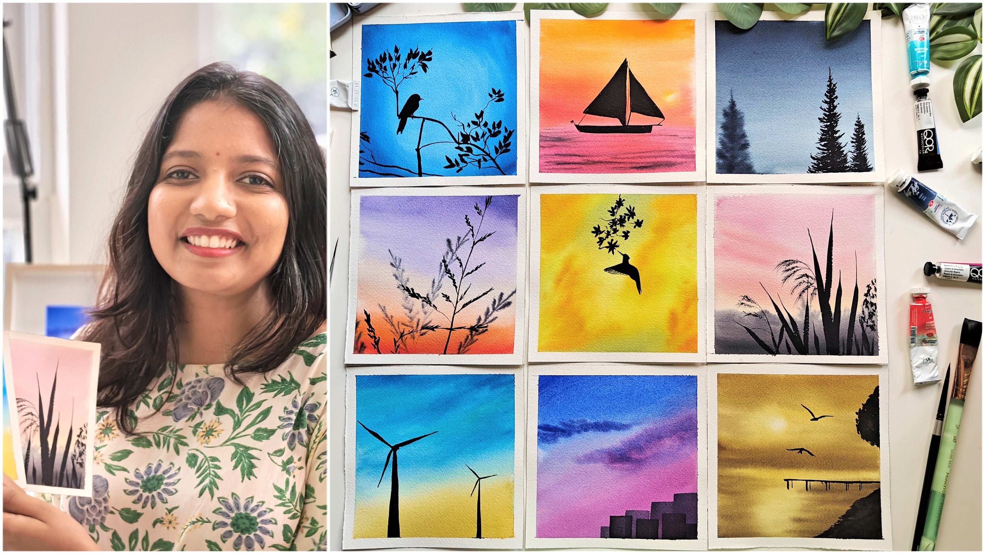
1. Welcome Back !: Hello there, Swati. You're friendly
neighborhood watercolor enthusiast based out
of Bangalore, India. I'm a Product Manager
at Microsoft by profession and a full time
watercolor artist by passion. I go by the handle
tinted toodles on Instagram where you
can see all my latest works thick and as well
as a sneak peek into my studio sometimes I'm a teacher at skill chef
for the past one year, and I'm also brand educator
for Sram stationers in India. I have a little bit of fascination towards
AI, I must admit. I mean, who doesn't
these days, right? Well, I'm not just
an observer though, because I also have a
certification with AI 900, which makes me feel like
I know a little bit of way around AI for the
beginners at the least. Now picture this.
Recently I went on an amazing vacation
where I found myself mesmerized by the jaw dropping sunrise and
sunset views along the shorelines with
traditional boats blobbling gently in the breeze. Naturally, I wanted to capture each and every movement
with my camera. But once I came back and I started to go
through my clicks in order to find a reference
for my sunrise painting, I couldn't find one. I'm sure this would have
happened with you also. That's when I stumbled
upon the power of AI. With a little digital visadry, I was able to transform my ordinary snapshots into vibrant painting worthy scenes. In this class, I'm pumped to
show you how to do the same. We'll dive into the world of AI powered image generation and learn how to take
your photos from me to masterpiece of
sunrise reference. No complicated tech
jargons here we'll be using just Bing Chat
for doing all this. I'll also tell you the prompts,
what needs to be used. And you can use my click only to go through
the entire class. Once we have our stunning
reference image ready, we'll get started with
painting that in watercolors. I'll walk you through all
the basic techniques of watercolors required be Ton, Tony layering with all
these basic techniques, you can get started
with the class along with me and
continue to paint any beautiful pink sunrises of your choice with your
own clicks in the future. If you are a beginner
artist or a season artist, I'm sure reference images
are really important. Hop on this class with me
with your favorite brushes, colors, mobile era laptop. To get started with generating these images and then painting them and
bringing it to life.
2. All you need to know about class: Thank you for joining and
welcome to the class. Needless to say, I'm
thrilled to see you here and we'll get started on a journey
of AI and watercolors. So let me break down the structure of this
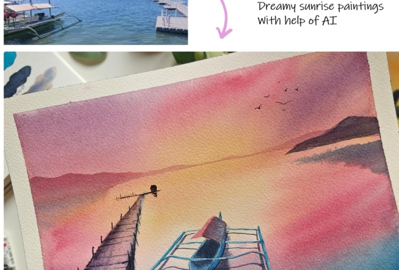
class so that it helps you AI image generation. Fast up, we will explore the fascinating world
of AI image generation. I'll show you how to convert your own photos or clicks into a dreamy sunrise reference image with the sky color
of your choice. For this demonstration,
I have chosen a beautiful, dreamy pink shade. We'll learn all about the proms and steps involved
in this process. And don't worry, it's all
pretty straightforward. We'll be using Bing Chat. For this part of the class, I'll provide all the
necessary resources, including my initial click
and the AI generated photo. In the resources section, you can follow along with the
prop and witness firsthand how AI transfers a simple photo into a stunning
sunrise reference. In future, you can use the
same process to create your own reference images
with your clicks using AI. And if you're curious about the technology
behind this process, you can check out my
other class where I have delve deeper into
Dal and Bing chat. Once we have the AI
generated image ready, we can get started
with painting that. For that, I'll take you through all the
supplies required, the color swatches
that I will be using, along with the basic vertical
techniques required to complete this class project
without any further ado. Let's get started
with this class, where I will introduce you to the world of AI and
the basic prompts.
3. About AI & Prompts: Before we get started
with the class, let's go through basics of AI and understand
how prompts work. Also, I'll be telling the
sequence of activities in which we will enable Bing Chat to generate
the image for us. First question is, what
is AI and how it works? Ai learns from information, be it by reading a lot of books or studying
countless of paintings. And it understands patterns, then it trains its creativity. Just like how we practice on our painting skills,
AI practices too. It learns to recognize
shapes, colors, ideas from difference,
information it has collected. Using its knowledge, it
can train itself and give us different generations
based on its understanding. In this class, we will
make sure AI learns from our images and then respond back to us with the
elements in our image. The sequence goes like this. Step one would be to
analyze the image. After analyzing, we
will prompt it to respond with what all are the elements found
in that image. For this activity,
we'll be using these two images which are added in our resources section. I'm expecting AI
to know that it is Marina Bay Sands and that there is a boat
in this picture. Once it analyzes and shares
back these elements found, I will go to step two. In step two, we
will make sure that the analyzed information
is good enough for us to continue
with our activity. If not, we will train it
back with fine tuning. Say for example, there are
mountains in the back, or it is a traditional
Filipino boat, et cetera. This is called
iterative training, where we will train back the AI with specifications
in our images. Final step is image
generation with the elements already available
as part of our image, along with some
additional prompts. Say for example, a sunrise image or a sunset image with
a specific color, et cetera, which is
something like this. We'll also use
additional features available in Bing Chat to see how a watercolor image would look or how a pixelated
image would look. For this class, I have used
specifically two prompts. One is hi, analyze and share the elements you see in the image shared. This is for step one
wherein we are asking it to analyze and share back the
details it found in the image. Prompt two would be to generate an image
with these elements, but with a sunrise sky. Where sunrise sky are additional
prompts a time giving to it and expecting the result back with the same elements
that it has analyzed. In step one, these
phrases can be used as the accelerators for
getting the image generated. Make sure to add additional
keywords as you wish. Also, you can use
different phrases altogether if it is not
understanding your ask properly. Now that we have
understood a little bit about AI and how it works, let's put all of this into use and start
generating our image.
4. Using Bing chat for image generation: Welcome back. In this lesson, we will see how to generate a sunrise image with
one of the clicks. Currently I am in
Microsoft Edge browser. In my other class, I
have shown how to reach the browser with Mac
as well as Windows. Here there is a copilot symbol. With the help of it, we can
reach out to the being chat. Currently, I can see that
I'm logged in and in order to use this feature,
you need to be logged in. So make sure that
step is complete. As the next step, I'll
write my prompt and shared an image to
analyze the elements. This is a basic click
of Marina Sands. I'm expecting Bing
Chat to recognize, as this is a very prominent
structures around. And also see that there is a water body around there
and a cloudy atmosphere. After some time, it
has responded back and it has indeed
recognized that it's marina be sands and there is a calm water
body in front of the hotel. It has told that it's
a cloudy, bright sky. Now as a next prompt, I will ask it to generate another image with
these elements, but a clear pink sunrise sky after some time, this is what it has given me. You can also see some of the prompts it is
suggesting on its own. We can click on any of it
and observe the magic again. You can explore all this
with different props, with different
colors, et cetera, and just have fun with it. There is one more amazing addition feature in
this. Let me show it. You can click on any
of these images, you see there are multiple
options below as well. You can convert this into pixel watercolor
or any other art. One thing you have to remember
is it is not recreating the same image into a pixilated
or a watercolor image. It is, again, going back to the prompt that
you have given. Based on it, it is
creating this image. If you want to create a pixilated image of the same
image that you have seen, that is not what will happen. Do not be disappointed
with that. This is the particular image. We can see that some of the
perspective has changed, even the clouds, some
of it has changed. Another cool feature is
that you can select any of these elements and make the
background blur or color pop. Once you're happy with
how this image is, you can share and
save your image. I like this image, so I can
click on Safe to Collections, and this image will be
saved in my collections. If I go to collections, all those images
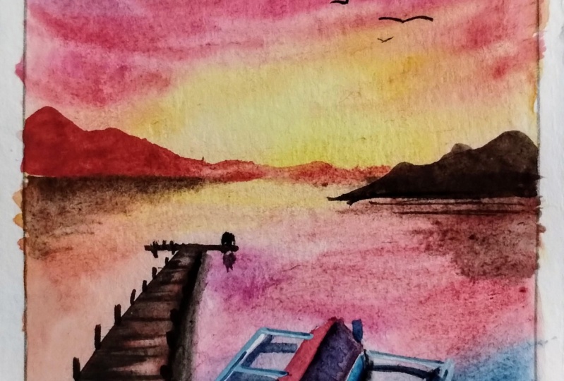
can be seen there. As part of next prompt, I'm giving another image and asking it to analyze the
elements and share its results. After some time,
it has shared that it is a water body
with a boat in it. There is no specifications
on what is the boat or what color of the images are. I want to help it better and that's why I'm telling where this photo was exactly taken. It's in one of the
Philippine Islands. The boat in the picture
is a Filipino boat. This also helps AI to understand the images and update
its back in model. Now I'll ask it to
generate an image with these elements but a pink, clear sky and with the same
boat as that in my image. Now we should always
remember that all these images are
generated on the fly. If I give the same prompt again, there is less than 50% chance that it will generate
the same images for me. Again, in case you're trying, even with the same image
that I have shared, you might not get these same as I will go inside this and ask it to
create a vertical image. Let's see how it will come out. You see it has totally changed the perspective and this is
not what I'm looking for. I'll just refer to this image and continue with the
painting on my own. Now that we have an
AI generated image of the sunrise with a pink, clear sky, let's get started
with painting it in verticl.
5. Watercolor Supplies used : Let's go through
all the supplies required for this class project. Starting off with paper, I'm currently using
Saunders Waterford cold pressed 300 GSM paper. This is fine grain, right? And you can see this is
the tooth of the paper. It is a block, but I'll
be taking out one of the paper and sticking it
to a non absorbent surface, which is this
plastic board right here so that I can paint easily. With that coming to
the watericolors, I'm using Schmike watercolor
tubes and pan set. I'll be swatching out all
this later on in the lesson. As well as white quash for finer details or
highlights in the end. A masking fluid for
highlighting some elements in the painting to show these specific highlights
which are visible here. But this is completely
an optional element. If you don't have,
you can skip this. And in the class I'll tell what you could be doing
if you're not using masking fluid in order to make your painting as
lively as it could be. Coming to the brushes.
Coming to the brushes. I'm using a flat
brush from Princeton, Neptune for applying water onto the paper round brushes
from silver brush, black velvet, series size
four, and size eight. Because of their pointed dip, it really helps me
to keep the painting crisp and it holds very good
amount of water and paint. While I'm doing Onwt techniques. These are the two lineup
brushes I will be using. One is Princeton Aqua
Elite Liner Brush. This is for the finer
details you can use any other sharp pointed small
round brush for the same. This is a little bit
of old brush which I'll be using for
applying masking fluid. And I'll be explaining
why I have chosen a liner brush for
applying masking fluid as well in the lesson pencil for drawing our reference image. And a needable eraser for removing any excess of graphite that is
there on the paper. A plucker for removing
masking fluid. You can use any other masking
fluid eraser or even tip of the brushes like
this one for removing the masking fluid as well. Masking tape for securing
the paper on sites. Since I'm not going to use
the entire length of paper, I'm living a border
in the edges. A ceramic palette. I'm using a ceramic palette
for mixing all the colors. This is the final result
of how it will look. But definitely can go ahead and use any other palettes that you have as well a drawer of
clean water for painting. Make sure to
refreshing your water, as in when you feel that it is turning into a darker shade
that is not expected. This helps to keep the
vibrancy in your painting. A spray bottle for keeping
the paper hydrated, as in when the paper
starts to dry off. This is also optional and you can avoid if you do not have it. These are all the supplies
used in the class. Let's get through all
the techniques and the color fatches and get
started with a class project.
6. Brushing up Watercolor Techniques: Let's go through
all the techniques that I'll be using
in this class. Watercolor techniques, the basic ones which should be used in the
painting as well. Starting off with
ton wet technique, I'm applying Ato to a piece of paper to show this
in wet on wet technique. Both the pigments and as
well as the paper surface, they are both having water. It will be wet on wet surface, we can see a very
seamless blend of colors. In this type of technique, this is most commonly used a, this is more commonly
used within the artists. This is my favorite as well. Once I've applied water, we need to make sure
that water has set in and there is a good amount
of water on the paper. Because as long as
there is water, we can continue to apply
colors and build on top of the elements in our painting, on the surface if it dries
off due to some reason. If we continue to paint with
water or paint in our brush, it will start to create blooms or a layer which
is not expected. That's why make sure to
apply good layers and good amount of water onto the paper Before
getting started. I'm applying water
onto this big surface because it's always easy to retain water in a
smaller surfaces. But for this techniques, I wanted to make sure
we try it out on a bigger size only
for the colors. Let me just take some random
colors on my palette. I have a yellow here next to it. I'll take orange. Now, while painting
in wet on wet, you can see that as
soon as I apply paint, it starts to disperse into
wherever there is water. Right here it is ending because that's where water
is ending as well. Now we want both of
these colors to mix. All we need to do is tilt our, the surface so that
they blend beautifully. We can also bring
them down like this, directly on the
paper itself to get a beautiful gradient or
variegated wash. Now, in cases where the colors don't mix beautifully
with each other, and we are still trying to mix them on paper without
getting muddy colors. Say for example, these two are mixing together
to give a beautiful, lighter shade of orange. But if I try to say
purple with orange, we'll get a muddy shade. So let me try it out here, right? So this is orange. To this, let me try
adding ultramarine blue. You see, we're getting
this muddy shade which might not look
appealing on a painting. For that reason, what
we can do is I'll still start with ultramarine
blue at one side. I'll not mix them directly
on the paper here. But what I'll do is I
will slowly bring it down and let the water
do its magic this way. There is no, this way, there is no such creation
of a muddy color. And also we get a very beautiful gradation between blue and
orange that is used. This becomes our wet on
with technique in this, when the paper is ser, that this is
completely wet, right? It has a lot of
water at this place. The paper is Sidr, which means it has water,
but just the thin, shiny layer of it in this, with the paper is
that that state. I can use it for adding
any other elements, which I want to be blurred
in the background, but also to be a prominent
part of the painting, for example, in our painting. The reflection of mountain as well as the reflection of boat. They are not hard as the
reflection of the floating deck. The reason is floating deck. Now how to achieve it? That is during the paper
is semi dry state. Now I'll take any other
shape, see indigo. Make sure that it is
not too much dilute. It will spread and it will create lumps and
also muddy colors. And this is how you can control if I add a
lot of water onto this. Let's see what happens. Yeah, this spreads a lot and we get to see a
green getting formed. The same is getting
formed here as well, those thread like structures. In order to avoid it
mixing completely, what we can do is
take the brush, remove all excess of water
on a paper, cloth or tall. Now run it along where
they're meeting. This technique is called
lifting technique. Lifting can be done
when the paper is wet as well as when
the paper is dry. It can be done in
both situations. Okay? So this is how we
can do a control it on. With technique and with lifting, we can get these beautiful soft edge shadows
in our paintings. This is next technique what I can show is wet on dry, it applies on both places
where the paper is dry and we are using paint to apply
or fill up that place. Or even paper where there's
already a pigment available. And on top of it
we are painting. I would like to show both here. We can see that I'm
applying water. Okay, let me take any pigment. And so you see the difference. This is wet on dry and
this is wet on wet. The only problem with using this technique is
we have to be very quick, else it dries off very soon. And also, the pigments which are used here will be more in concentrated form
because it's not mixed a lot diluted with water. I let it dry and come
back to show how the layering works as well as wet on dry technique on a piece of paper where there
is already paint available. Now this is completely dry. If I take another color, now I have indigo on my palette. This becomes again wet on
dry because I've added water onto indigo and I'm
applying it onto the paper. Too much of diluted
water onto it. Just add a glaze
wherever required. This becomes layering because
I'm layering on top of another color to
have the final glaze of the color I'm using. You can see in our
final painting, the mountains in distant
they are through layering itself,
they're very distant. A very diluted form of
this pigment is used, but it is also a wet
on dry technique, since we are using
wet pigment on the dried surface,
on the contrary, if I use a very
concentrated pigment directly on the paper. This forms some strokes as
per how the brush is, be it. Whatever brush you are using
with different brush types, we get different strokes. This is nothing but dry
brush technique that is dry, dry because the surface is dry as well as
your brush is dry, it just has concentrated paint pigment and
not water in it. This technique also, we are
using a little bit to give texture onto our floating deck. But we can skip
this and you will learn a little bit more once we get started with our project, because all these are
explained again in detail there wherever
it is being used. Now that we have gone through all the basic
watercolor techniques required for this class project, let's go through all
the color swatches and get started with
our class project. Oh.
7. Color swatches for dreamy sunrise: Let's go through all the
colors used in this class. All the colors
I'll be using from this thin set of Schmike
that it has 24 colors. Also some of them
are from tubes. Let's swatch out all
these colors now, since it's a pink sunrise sky, definitely there will
be different shades of pinks that I'm using. You can be comfortable to use any shades of
pink that you have. First up is Alizarin crimson. Next up is Magenta. You can also replace
this with Racon magenta, or Inacodone rose,
fire line, maroon. These three shades of
the pink I'll be using, you can use any shades of pink that you have
in your palette, trust me, and it will turn
out equally beautiful. Now for yellows, I'm
using this naples yellow. It's a pastel shade
in Schmikeseet, but it also resonates
with coal shade of colors from other brands. If you have any other
pastel shade of yellow, you can use that
chromium yellow. These two are the yellow
shades that I'll be using. I'll also mix chromium deep with crimson or magenta to get a beautiful shade
of Patel orange. Next up is helioserliin and Helio turquoise indico these three shades of blues. I'm using Erlian mainly. It is to mix with these
shades of pink to get beautiful shades and
variations of purple and violet. You can definitely use
the existing violets, like bright violet or
any other shades violet, to get these similar shades, even if they are a little
bit different than how it looks in my painting,
it's absolutely fine. You don't have to be worried that it's coming
out as same colors. Because all these I have
mixed on the glove. Even if I try to mix them
with the same ratio, again it might come a little
bit different. Right. Next shade is tundra violet. This is a super
granulating pigment, which means that it
will disperse into different shades of colors. Base color being violet. This worked out very
well for my painting because it was dispersing
into shades of violet, black, and a bit of tint
of orange or yellow. All these colors were already
there in my painting. I have used this only for
the floating deck to give it a very realistic feel of texture being on
the floating deck, you can skip this color
and you can dally use ultramarine black Sapa instead of using this color
on the painting. So let me mention
that as well here. So you can use ultramarine black and PM. Okay, you can use these three shades as well
instead of tundra violet. If you do not have,
finally I'm using black as well as a white quash for painting
some of the highlights. These are all the colors
used in the class. Now get ready with your
shades of pink, blues, violets and purples and
meet me in the class.
8. Securing highlights with masking fluid: Thanks for joining. I have
sketched out our reference and I've extended that to match the landscape format
in which I'm painting. This is the paper
that I have taken, a cold press paper from
Saunders Waterford. Before I start with the taping, I want to make sure I add
the masking fluid wherever required That by the time
I apply masking tape, it is right and I can get
started with my painting. For applying masking fluid, I'm taking a smaller
size round brush. It's a liner brush so that
the masking fluid doesn't get mixed here at the rim of the brush and it
will spoil the Bristols. That's the reason having
a long line up brush helps because I'll be taking masking fluid only
up until here. And it will not get a
chance to move until here and get dried off
and spoil the Bristols. If you don't have
a lineup brush, I would highly recommend
you to use any of the old brushes that you have and not any of the
watercolor brushes, because it'll definitely
ruin the Bristols. I'm going to apply
masking fluid only to the parts where I want to maintain some of the highlights. That is the outriggers
which are there, the wooden out
these part as well as the pro which is
extending here, right? I want to add it here
to maintain some of the highlights of the sport. If you don't have masking fluid or if you're not
comfortable using them, you can completely
skip this step and use a darker line
for these outriggers. This is it. I'll quickly wash the brush
before you know it gets dried off. And that is it. I start applying
the masking tape. I'm just pressing
these outer edges so that it doesn't lift off
when I'm applying water. If my masking fluid is
dried off, it is dried off. In next lesson, I'll get
started with the painting.
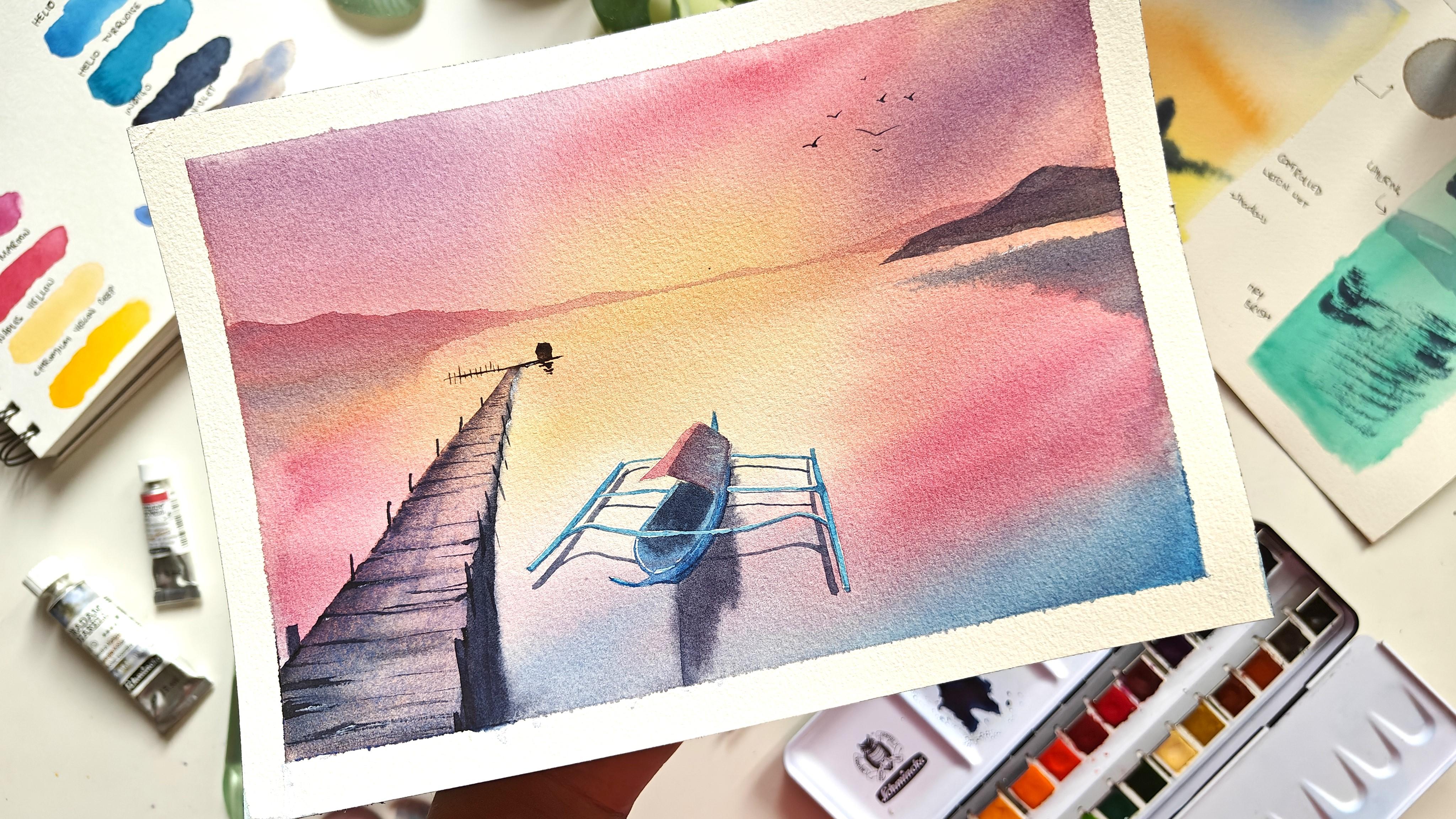
9. Final project | Painting Sky: To get started,
I'm applying water all over it is going to
be a ton wet technique, that's why I'm applying water. And from a flat brush or a big round brush
or a quill brush, make sure to move
the water along so that it seeps in
completely into your paper. It is a cotton paper, right? Water needs to flow in and form that layer on which
we can start to paint. It needs to keep
the paper wet for a longer duration
of time so that we can cover our ton wet techniques
in a very lenient way. Okay, spray portal
is optional here. You can use directly
water from the brush. Now I'll put some elevation so that once I start painting, they all flow down and they don't form any puddles
or blooms in the middle. Okay, I'm using this set
and all the colors in it now with size
eight round brush, I'm going to get started. First up, I'll start
with the lighter colors. I'm activating the
pains as well. Okay. To get started with, I'll start from the
lighter shades of colors. That is Naples yellow. Or you can also start with a coral if you're
using any other brand. Okay, On top of this I'll
take some chromium yellow. Next up I'll take a crimson. Okay, I'll keep it ready now. I'll take some magenta and maroon here. Okay, I'll take this crimson and get started with
painting the sky. The place I am at,
it's really hot here. It's about 35 degrees, so it's going to be
drying up very fast. So that's why I'm just being very quick here in terms
of adding all this. Now I'll take some magenta
and add cereal into it some more magenta to form a beautiful purple. If you have ocon violet or any other shades of
purple that you like, you can directly use it. And here I continue to
use crimson itself. Okay, this looks good. Now, in next lesson, we'll be painting
the below part.
10. Final project | Painting Sea: Okay, here my paper
is still wet, it is still an
inclination angle. I'll apply more water
here just to make sure the water is
there and retained. Right. And I'll bring all
these colors down as well. Okay. Now again, I'll start
with the lighter sheets. That is first first up here applying some
naples yellow, right? And next, following
with Alizarin Crimson. I'll take some chrome yellow, deep, mix it up with magenta that I
had and apply it here. This color is not
prominent in our sky, so I'll not use it very much, but a little bit here
and there to give a good orange contrast here, I'll be applying a blue
shade, that is cline. Okay, so taking more of magenta here, how it helps magenta will mix
with blue to give us a good purple
or violet shade, which is matching with sky. And also it mixes with
the shade of the mix of magenta and yellow and it will not form
any muddy colors. That's the main reason
to use it here. Now I'll take some purple, which we had, and
apply this as well. We have to remember
that this is going to dry one shade lighter, right? So we need to make sure
they are darker in shade. I'll start applying another
coat while it's still wet. So this is our blue? Yeah. And next up we
have our magenta. I'll mix it with
crimson as well. Good. Okay, now near the boat, this is
the center part. It is semi dry. That is, paper is not too much. T what I'm going to do now, I'll add the shadow of the
boat right now so that later on it'll be easy for us, it will look like it has
merged with the background. Right. I do want to give
that look for this. I'm going to any pink shade, make sure there's not
too much water and add it here. It will also
have the reflection of this upper side tent that we have before it starts to spread a lot. Let me just lift off some
of the paint or water next to it and make sure
it retains the shape. Okay, so this looks good. I'll do the same with the
docking station here as well. But since it's yellow, let me not take any
chances with it. I'll just start from here. And so the trick here is to keep less water in your brush and more pigment. Okay, If you have more
water in the brush, it will just spread across
everywhere and it'll form puddles and muddy shades as well. So be very careful. If you're not confident
in this technique, I would suggest you wait for the paper to completely
dry and then add the shadows. It
will come like this. Right here is a sample of
how it will look at the end. It'll come like this
with harsh edges, which is totally fine. Instead of ruining the
painting with madiclors. Right? We should just
be wise and play with our strengths while coming
to watercolor painting. Now this is good. I will wait for it to
completely dry our first layer and come back to paint the
docking station and the boat.
11. Final project | Painting Mountains: While this is drying up, I also want to make sure that the reflection of mountains is captured when
the paper is still wet. I'll take the same pigment
here and started from here. Okay? You see how
the strokes I add. So keep it in this angle and just move it
across like this. Okay? The same one I
will do here as well, but probably with
a lighter shade. So let me take some
more of comes in here. Okay, this looks good. Now, if my sky is
completely dry, I can just start to add
the mountains here. For mountains, I'm going to mix crimson with a little bit of line. Okay, and get started from here. So taking diluted form
of a Lezaran Crimson. While it's still wet, I'll take the shade that we have and start to add
it from the top. Now with even
dilute mix of this, I'll continue to
at the mountains, an extended more hill. So see if you're using masking tape, sometimes the water goes back
and forms these puddles. Right, The best phase, once you're seeing the
puddles are getting created, just add the same color there so that it doesn't
form a white patch. The first step would
be to actually remove the excess of water, but if you have missed
it, you can just do this. Okay. Very slowly
remove this puddle, which was getting created there with minimal
water in your brush. This is how you can fix it. Now, before this dries off. Let me come back to
this at our mountain. Okay, This is good for the
reflection, which I've added. It will be a bigger mountain, so I'll add it once
it is dried off. Now I'll remove this
and make it flat here. Also, you can see that this
paint has gone back up, so let me remove it with the help of a
tissue and a dry brush. Okay, we have added the
mountains as well now. I'm not sure if this
is completely dry, but I do not want to
take any chances. So I'll come back to add the
boat and the deck later.
12. Final project | Painting Floating Dock: To start with the
docking station, I'm going to apply water. My paper is completely dry and so I'm getting
started with this. Okay, Now I'll take this
granulating pigment, which is tendra violet
fresh from the tube, and apply it in the
edges like this. The reason for taking this
sheet is because it has pilot. And once the
granulation opens up, it turns out into other sheets which are used in this painting. And I love how texture, and I love how the
texture it forms on the granulation opens up. Right? So I do want
that on my deck, so I'm adding concentrated
pigment at one part. At one edge. Okay. And then I'm going to take
some water and bring it along. I'll keep a pallet ready with magenta and I start
applying it from the other end. The more water you add
to it more easily, it opens up for the
granulation, right? So I'm just adding water
bit by bit so that it opens up and we get
the three D effect that we want with this
granulating pigment. If you don't have this
pigment, not to worry, you can just use
other sheets and you will still get locking
station something like this. We can then next continue
to add our textures using the lines for the
wooden logs, et cetera. Okay, for that you can
start using Spa and black and the other shades of blue and pink that
we are currently using. Okay, So next up what I will do is we need to add the
wooden lock for that. We need to make sure
that all the lines are parallel to where
it is ending. Right? So it's sending here. What I'll do, I'll
switch pack to a smaller size brush and start to add
these lines here. This is for reference
I'm keeping, right? So if you're good
with references, you can just do it directly. Okay. And of course we need to add more depth to the
edges to show shadow. And the shadow beneath the
surface of water and the deck. Right. That part also we need
to highlight prominently. I'm taking indigo, mixing it with the tundra violet which
is there on my palette. And I'll start with
adding it here. I'll take a dry brush and
remove or merge this, which is getting mixed up. Right. So not
continuing with this, let me try to avoid
this harsh edge which is getting created here. For that, I'll take
a clean brush wipe the excess of water
and turn it across. I Okay. You can see that it has
disposed a lot here as well. Anyways, once we add the
upper other part of deck, I think that will be covered. To get started with it, I'll take some spo continue to add these
talking lines here. Okay, this looks good. So let's paint the
boat and next lesson.
13. Final project | Painting Boat: For adding the boat.
I'll continue with a smaller size rush itself. I'll take some Ceilan
and keep it ready. I'll apply water first. Let's start with our top layer of the shade which we have here. I'll paint this as well
with our shades of pink. Okay, so this becomes the
side which is facing sunrise. Right. This side. I'm going to take a shade of
purple and bring it down. Okay. Now to start painting
the boat, I'll apply water. And I'll make sure to not apply water because this paint is still wet and we don't
want that to mix it. Now I'll take the Serilian, which we have here, and applight everywhere
for the boat. Once this base layer is done, we can add for the more details, shadows and depth
very carefully. I'll also add it to the stern post which
is there in the pack. We might have to redo
this once again. That's okay. We can
come back to it later. Now, uh, take some indigo and marrying it within this creates the depth
effect which we want. Right? So that's the reason. Okay, now I'll start to add the shadows for these
outriggers that we have. And that is also
with indigo itself. We can probably mix indigo with any other pink to form a darker shade of
purple or violet. And get started, I have not drawn the
indigo lines, Sorry, the shadow lines in my initial
painting, initial sketch. But if you're interested, you can add those for
reference before itself. Okay, that is good enough. But for the boat,
we will need to add some more details
once it is dried off.
14. Final project | Adding Final details: Now to start with
the final details, I'm going to take a line and start adding details with it. Let me take some fresh squeeze of tundra violet as well here. And I'll make sure to add all the lines parallel
to our docking station. An stan I'll just take a round brush with a
little of water in it and try to mix or merge all these puddles of
paint which we have here. This is more of a dry
brush technique that we want to try. Okay, now I feel this is dry. Yes. So let me go ahead and take some Indigo on the
same sheet that we have here, Alt and going to add an outline for our ship. Next, I'll take some
Cerrillan and move it in the same direction. Okay, Filling the innermost part of this boat with the darkest tone for here as well. Let me take a very pure violet. A fresh mix of
Alizarin crimson and erlian blue. With that, these crisp lines are what makes your painting
more realistic, Right? These details, it can spend as much as time you
want on the details. Before I start with the outer, let me just add the final
mountain that we have here. For that, I'm going to take
the same shade that we have, leave a bit of space here for the horizon and then at the mountain.
15. Final project | Painting Outtriggers: To start with these outages, let me start by plucking out this masking fluid
that we had added. I'm using tweezers, but you can use any other tool
you're comfortable with. Maybe back off a brush
like this one, right? Or even masking fluid
erasle. You can use it. I'm using tweezers
because these are just straight lines which are there for my
today's painting. Right. It is easy,
but if you have used masking fluid in a different
context in the painting, you might choose a different
tool to remove it as well. Okay, so now to get
started painting this, I'll again go back to my line up brush and take some Erlin. In fact, let me take
turquoise as well. It forms a very
beautiful shade of blue. With this, I will start, let me take a small brush. You see using a masking
fluid might not be required if you're using a darker
sheet of the boat. Right? Since I was
using this light sheet, I wanted to apply masking fluid. Okay. Now for the shadows
and highlights of it, I'll take Er in itself and a little bit
of indigo in it. Okay. With the darker shade lineup, pressures are really very tricky to use. So
just be careful. Okay, this looks good for the very finer details now for all the wooden locks that are holding the
docking station in place. Right, We need to
add that as well. Let me get started with it. I'm taking mix of tundra, violet in blue and pink. You can just take any of the other shades or just the black direct black
that you have as well. Here, I'm going to add some
of the perpendicular lines. Okay, These all lines are
perpendicular, say from here. All these are
perpendicular lines. We also need to add
the reflection of it. But I will it off. We need to add some
final highlights. And for that I'm going
to take white quash. Next up, I'll take
a line of brush and continue adding this highlight. Okay, this looks fine to me Now if there are any
other highlights required. Since I had already
used masking fluid, I don't have to use
much of whitewash. But you can definitely
use white quash if you have not used masking
fluid to add highlights. This reflection which is there, it is not forming a crisp
line that I was looking for. Let me just extend it here and of
course, um, the boat.
16. Fixing spillage : So let's remove masking tip. I had a lot of fun painting
this along with you because this was just a
daylight photo that I had. Right? With that picture, I got a reference for a beautiful sunrise
tattoo in pink shade. Now I have the final result. We can directly fix the outer of shades from our masking
tape using white quash. Let me do that. I'm trying to lift it
off here, if possible. If not, then I'll just apply a good amount of white so
that it is well hidden. Once I feel that the
painting is complete, I would tend to step back and
see if anything is pending. I feel some birds can
definitely be added here. Going back to my line
up brush and the mix that we have here,
I add some birds. This is our complaint painting, I'll see in the next lesson
for some final thoughts.
17. Final thoughts & Thankyou: Thank you for joining the class. We have painted this beautiful,
dreamy pink sunrise. And the reference
image for this was generated with the help
of AI Bing Chat, right? The image that I had as a reference didn't have
a tint of pink in it, and yet here we are. It was a lot fun for me curating this entire class
and playing with, playing around with a, creating different
different images. Hopefully you're having
the same fun too. Make sure to post all your
generation creations, as well as the painting in
Resources section so that we can have a look at
it and see the magic of AI everywhere until I come up with something exciting
and fun the next time shell.
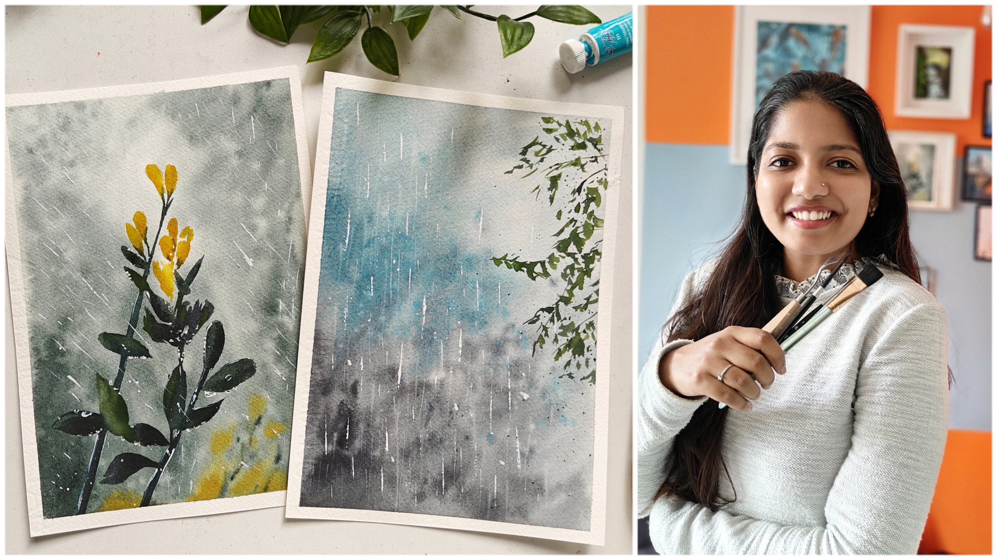
 Swathi Hegde, Watercolor artist | Aqua | Night sky