Transcripts
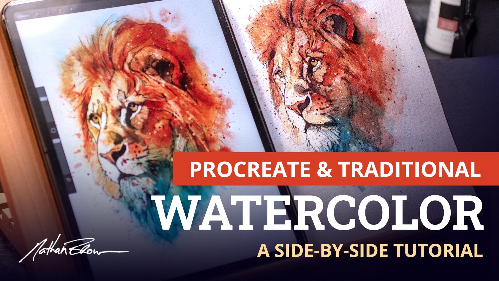
1. Introduction: My name is Nathan Brown. I've been a professional
artist for over 20 years now. Traditional watercolor
painting is a lifelong love for me, and it's a subject
that I love to teach. I've put together this course
to share my passion for this medium and to show you how easy it is to get started. This course is designed for
anyone who has wanted to give watercolor a try but
hasn't found the motivation. Or maybe you've
dabbled in the medium, but were unable to find
your footing to progress. Using my years of experience and helped by real life artists, I've developed a fun, simple process to support
whatever your skill level. It will give you
confidence and help you tackle subjects you
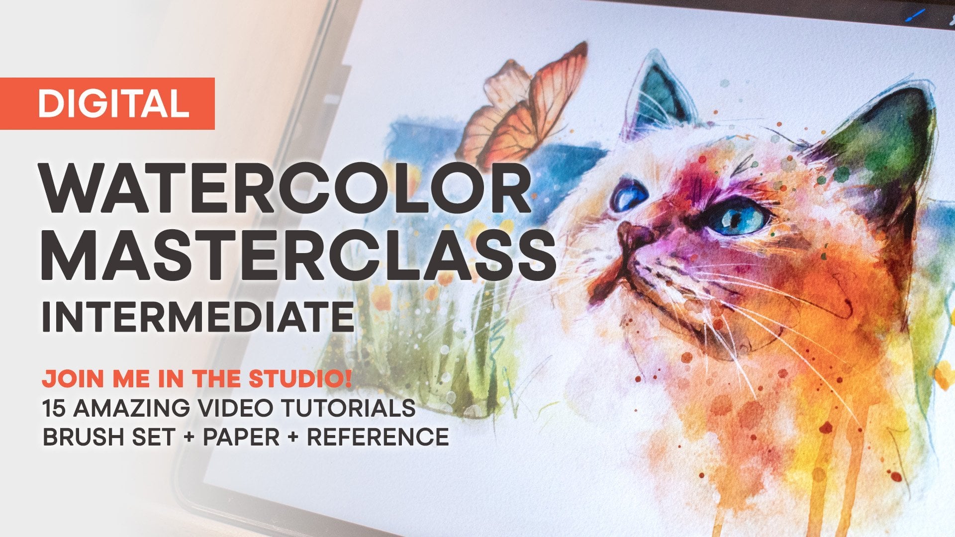
never thought possible. In the course, we'll talk about all of the supplies you'll need, including pricing options to make it more affordable
to get started. We'll cover setting
up a workspace, the characteristics
of watercolor, and what to look for,
different brush techniques, how to select paint colors, how to avoid overworking
and muddy paintings, sketching for watercolor, and
how to study and practice. We'll also walk through
a final project painting together so that you can clearly see every step in the process. I believe you'll be
amazed at how far you can progress in such
a short amount of time. And as a bonus, I've
included several PDF guides, printable aids, and even some of my own sketches
that you can paint. By the end of the course,
you'll not only have the basic skills
and understanding that you need to
paint watercolor, but you'll also have
the right mindset and goals to keep progressing and
learning beyond the course. I'm so excited for you to
get started with watercolor, and I can't wait to
see your paintings, so I'll see you in Lesson one.
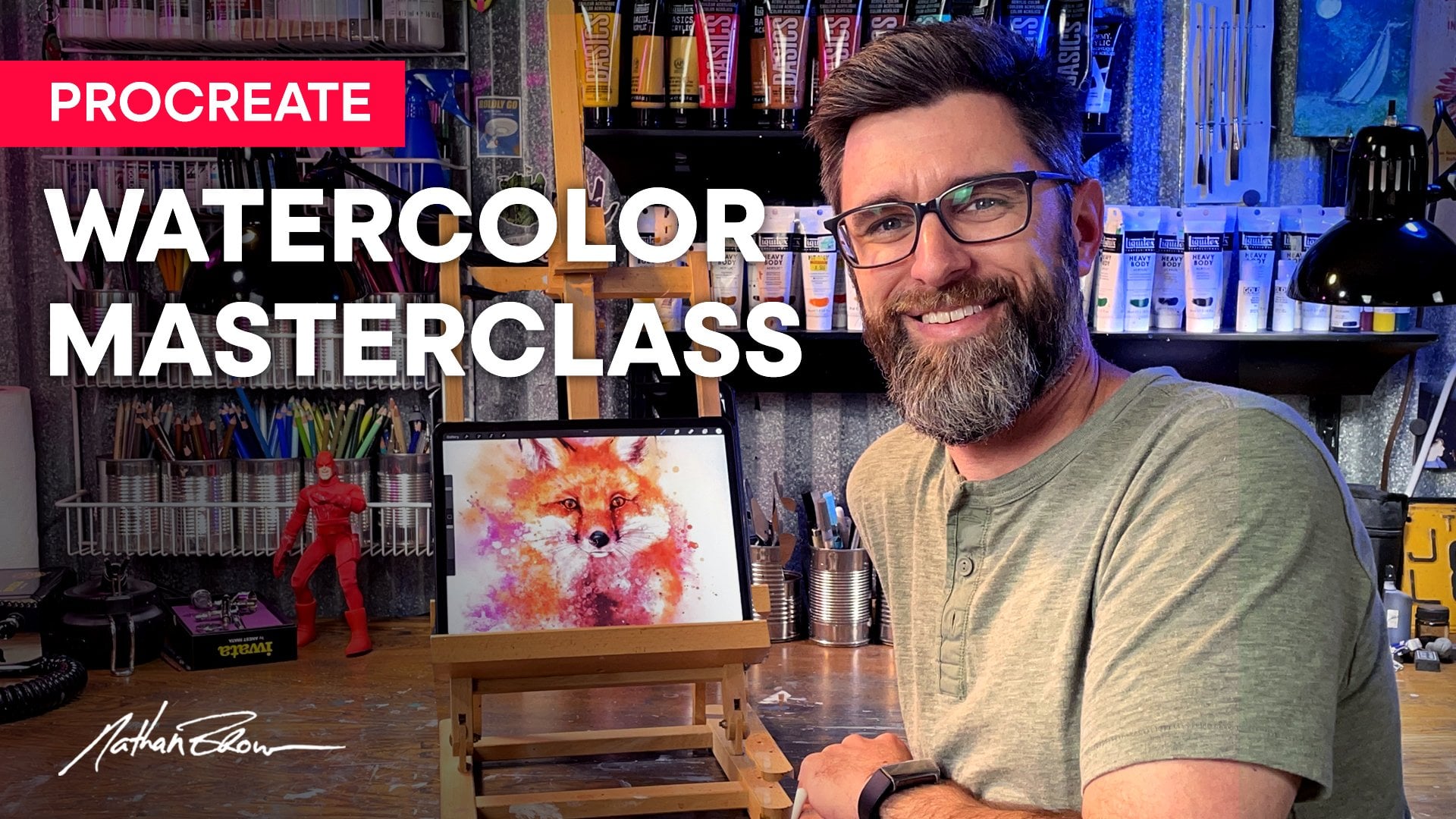
2. Supplies for Getting Started: In this first lesson, let's
go over the basic supplies that you need to get started painting along with some
different price levels. As a beginner, it's easy
to get confused over the different options among
brushes, papers, and paints. So I want to make
sure that you end this video with an
understanding of these options. That way, you can make
an informed decision on exactly what you need when
you head to the art store. I'll also include a PDF guide in the course resources
folder that breaks down the different supplies
and their pricing options. So let's take a look at everything you'll
need to get going. First up, let's
talk about paper. I recommend having two
different types of paper, a good quality paper
for final paintings, and a less expensive lower grade paper for
studies and practice. The paper that I use
for my final paintings is r Cold Press. This company has been
around for over 500 years, and their paper is
a quality standard for watercolor artists. This is a nine by 12 pad of
12 sheets and runs about $20. Now, this paper is 100% cotton, which is what makes
it more expensive, but it does make
a huge difference in the final outcome
of your work. The paint interacts with
cotton paper differently than it does with student grade papers that aren't cotton. Colors are richer and
lines will be sharper. Now, for studies and practice, I recommend a lower grade paper. Lots of brands make this type. They will have a
surface texture similar to cold press but
will not be cotton. The cost is a lot less. This particular pad is 20
sheets for around five to $7. These are the two papers that I recommend for this course. We'll be keeping the size
of our painting small, so these nine by 12
pads will work great. Now let's go over the paint that I'll be using
in this course. This is the Windsor
Newton Cotman watercolor sketchers Pocket set. This is a great
set for beginners. It runs around $18, and it comes in a small palette with more than enough
colors to get started with. A couple of other brands
that I use and can recommend are Daniel
Smith and M Graham. But these are tube paints
and are much more expensive. Some of these tubes can
cost ten to $20 each, but they do last a
really long time. Some of them I've had for years, and there's still color
left in the tube. Now, I recommend that you add these a little
bit as you go. It's far more cost
effective to get a starter pack like the
Cotman set when you're just starting out
than to purchase all of these colors
in individual tubes. As far as what to avoid, I would recommend against these sets of round
palette paints. These fall into the realm
of paints for kids. The paints are a
powder based pigment and would be very
hard to build up a level of color contrast that quality artists
paints will provide. This is my daughter's set
from when she was younger, and you can see that pink
was the most used color. In the Cotman set, again, we get more than enough
colors to start out with and this nice
little mixing area. So we get colors and
a palette in one, and it's nice and compact and easy to store away when
we're not painting. You can see in this sample
sheet that I painted, there's a good
variety of colors. They are very rich and vibrant, and that's exactly
what we want to see in a quality set of paints. I also like to have a bit of white guash or white
acrylic on hand to sometimes add small pits of highlight to a watercolor
once it's dry. The brand isn't as
important here. I can recommend this
liquitex basics tube. The cost will be around $5, and it will last you forever since you'll use
such a small amount. Now let's talk about brushes. When it comes to watercolor, I mostly use round
brushes in various sizes. These brushes can be made of several different materials
from animal hair, synthetic blend, and
fully synthetic. These brushes are by
Rosemary and Company. They're a Series 33 and
our Kalinsky Sable, so they're 100% animal hair. These can cost from
around eight on up to $50 or more
depending on the size. These are silver
black velvet brushes, and are a blend of squirrel
hair and synthetic fibers. These have a similar price
around ten to $20 each, again, depending on the size. These types of brushes are more expensive because
of the animal hair. If you're just starting
out and on a budget, I recommend going with
fully synthetic brushes. This is a Windsor
Newton cotton brush and has fully synthetic fibers. These brushes can be
purchased in a set of several sizes
for less than $25. These are Spirofarbon brushes and are also fully synthetic. These are far cheaper
and can be purchased in a set as well for around $10, which is less than one of what these animal hair
brushes might cost. I recommend these for
beginners because you can get a full set of brushes
without a lot of investment. Now, I've painted with both, and the main difference is that the animal hair
brushes will have a finer point at the
tip of the brush. They'll hold their shape longer, and they'll also
hold more water and paint so that you won't have
to reload the brushes often. But that's not to say
that you can't create some amazing paintings with
these synthetic brushes. I used brushes like these for a long time before
ever upgrading. And if you take good care
of these, they will last. For example, make sure
that you clean them out thoroughly and reshape the tip with your fingers when
you're done painting. If you're not going to
be painting for a while, you can even use a little bit of dish soap to help them keep
their shape over time. Just make sure that
you rinse out the soap before starting
your next painting. Alright, now we've got
the essential supplies, paper, paint and brushes. Now let's take a look at a few more items
that we'll need. Some of them you might even
have lying around the house. Okay, now we're going to
need a few drawing tools. I have two pencils here. This first one is a
six H hard lead pencil from the Prismacolor
turquoise pencil set. These sets cost around $15 and include a variety of
soft to hard leads. The hard lead is good
for our drawings because the lead doesn't
smear much on the paper. It's also lighter and easier to hide with transparent
watercolor if we want to. Now, a cheaper alternative is a regular number two pencil, which I use all the time and can be purchased in
bulk for very little. The only difference when using this pencil would be
that you'd want to use very light pressure so
that your line stays light and we don't get a ton
of smearing on the paper. I also like to use a micron pen for small dark
lines and details. This is an ink pen that produces a steady line that doesn't
change with pressure. These pens can be
purchased individually for a couple of dollars or
in a set for around 15. If you get a single pen, I recommend a size two
or a size three. Those are both good
sizes for small details. A cheaper alternative to a micron pen would be a
standard ballpoint pen. The difference with
these is that they are affected by pressure,
almost like a pencil. So the harder you press, the
darker the line becomes. Another great drawing tool to have on hand is a white gel pen. This is a Nibal Cigna. This is a fine
point white gel ink that works great over
watercolor once it's dry. We'll use this pen to create small white highlights in
details in our final painting. We're also going to
need some paper towels. I like to have these on hand
to soak up moisture from my brushes or to use for
cleaning up when needed. We'll need a couple
of water containers. This is just a plastic container that you can get at
any hardware store. I have these in various sizes, but the smaller the
container you use, the more often you might have to clean out your
water as you paint. So I recommend a bit larger size if your workspace allows for it. I also like to have a
spray bottle on hand. I recommend the trigger
kind over the pump kind because this one
will allow you to just partially
squeeze the trigger, which just releases a
bit of water splatter. We'll use this to create some nice effects and
textures in the paint. Also, grab an old toothbrush if
you have one lying around. This is great for making
small splatter effects, which I really love to do. I hope that gives you
an idea of everything that you need to get started
painting watercolor. Man, I love sorting
through supplies because it always gets me
excited to start painting, and I hope it does the same
for you because it won't be long before we'll start putting all of these items to use. But before we do,
let's take some time to set up our work area
in the next video.
3. Setting Up a Workspace: In this video, I
want to give you a few tips on setting
up a workspace. It's essential that we have
a good area to work in, one that is free of distraction or anything that might get
in the way of our painting. My work area consists
of a good sized table with tons of lighting and all
of my art supplies at hand. I also like to fill this space with things that I love
and that inspire me. So if I do get stuck,
I can typically just look around the room for
some creative inspiration. As I mentioned before, though, you don't need a space
this large to paint in. A good tabletop next to
a kitchen window with good light is enough space
for watercolor painting. We'll need room to have two
water containers close by. There are two because
one is used to clean paint from the brush and one
is used for clean water. I keep these to my right
above the palette. We'll also need all of the brushes and drawing
supplies within reach, and be sure to grab that roll of paper towels and have it
on the table, as well. I like to keep a sheet in my
left hand while painting to dab water from the brush when it's too soaked
after cleaning. We'll also need a bit
of space for an iPad or a printed sheet containing our reference photos so that we can study
them as we work. If you don't have the space to dedicate an area for painting, you can always pack these supplies up and store them away. But I do recommend that
you keep your studies or paintings in progress
where you can see them. This helps to keep the work
fresh in your mind and will also spark ideas
when you least expect it. As an assignment
for this lesson, I encourage you to plan and
set up your own workspace. Take into consideration
the lighting, whether it be a
lamp or a window, does the time of day
you'll typically be working have an
effect on the space? Try to see yourself
painting in the space and notice whether or not it's quiet and free from distraction. I've included a couple of
easy diagrams to follow in the course resources folder in case you need some reference. Once you've got your
painting space set up, it's time to break everything
out and get to work.
4. Characteristics of Watercolor: In this lesson, we're
going to talk about the characteristics
of watercolor and the role that water plays. Your approach to a painting needs to be a little
bit different versus oil or acrylic because of the
paint's transparency. One key factor to keep in mind when you're starting
out is how to maintain control over the
amount of water versus pigment in your brush.
Let's take a closer look. The amount of water to
paint mixture will affect the intensity and transparency of the stroke
you're laying down. Typically, at the
beginning of a painting, you'll want to start very transparent with more
water in the brush over paint because you
want to build up the opacity and contrast
going from lights to darks. The way I like to think of this is sneaking up on
the final painting. This helps me to
remember that I don't want to go in heavy
with the darkest, most intense version of a color. Instead, we want to build
towards it slowly so that we can maintain better control over what's happening. I'm going to demonstrate this
by taking a scrap piece of practice paper and a small
number four round brush. We're going to add
some clean water to the palette and then just add a very small amount of paint. This mixture is
now mostly water. When I add this
stroke to the paper, you can see that it's
very transparent. Now, if I go back and
add a bit more paint to that same mixture and
apply it to a new stroke, we've got more of an even
amount of paint and water. This is going to result in a
slightly more intense color. Now going back again and loading straight from the paint
versus the mixture this time, we're going to have more paint
than water in the brush, and this will result in the most intense version
of the color. Now you can see
that we have three versions of the same color, going from very
transparent to more opaque just by controlling the amount of water
in our strokes. We can also achieve a
similar result by layering. If we maintain a consistent
mixture of water and paint in our brush and allow
each layer to dry completely before
applying the next, we can build up the intensity of the color with each layer. As an assignment, I want
you to give this a try. This is such a key factor
to watercolor painting, and taking the time
to practice this will give you the
essential skill that you need to maintain the right water to paint ratio for
future paintings. Feel free to do
this same approach with maybe three
different colors, but remember to
clean out your brush before switching to a new color. Be sure to try both methods by adjusting the amount of water to paint ratio in your brush
and by layering color. Once you're done, I'll see
you in the next lesson, where we'll be looking
at when to use each brush along
with various types of strokes and techniques.
5. Brush Techniques: As I mentioned
before, I mostly use round brushes in various
sizes for watercolor, and it's very easy to know
which brush you use where. As we sneak up or zero in on the various steps to
completing a painting, I start with big
broad strokes first, using a large size
eight or ten brush. And then step down
to a four or six for smaller details before
finally switching to a very small two or zero for the tiny details that usually fall around the main focal
point of the painting, which is usually the eyes of the subject, if it's a portrait. These round brushes can make very thick or very thin strokes, depending on the pressure
and angle of the brush. But no matter the size of
the brush or the pressure, there are various
techniques that rely once again on water. Let's take a closer
look at them. To demonstrate these techniques, I'm going to paint a
series of bluebirds on these small square pieces of watercolor paper
that I've cut out. So I've drawn a beak and
an eye and some legs, and the rest is going to
be a watercolor stroke. The first technique that
I want to demonstrate is called wet into dry, and the brush is full
of water and paint, and the paper is dry. Let's see if I can draw or
paint the shape of my bird. This technique creates
a very even stroke and a very hard edge. So this is really good for when you want something
to appear very sharp and in focus with a
nice crisp, clean edge. The next technique is
called wet into wet. For this one, we'll need to pre wet the paper with
some clear water. I'm going to give
this a minute to dry so that it's a
little less soaked. Okay, the paper has
dried just a little bit, but still has a nice
sheen on the surface. So this is going
to be a bird with very soft wispy feathers. This is a great technique for creating soft blended edges. And this is probably
the one where you have the least control. You just kind of have
to let the paint and water do its thing. Now, this is going
to continue to spread a bit as it dries. Now, this next technique
is called glazing. And this one we will have a thin layer of
paint over another. So the paper is dry and we have a wet brush that is
mostly water over paint. Okay. Now I'm going to
let this completely dry before applying
the next layer. Okay? This first layer
is completely dry, and now I'm going to glaze a second layer on top
to create a wing. As we saw in a previous lesson, this is a great technique to build up the
intensity of a color. Or if you're layering one
color on top of another, it's a great way to create a
third color in the process. All the next technique
is called charging, and I have a dry piece of paper, and my brush is mostly water. So there's a very small
amount of paint in the brush, and it's going to result in
a very thin layer of paint. I'm going to add some
more paint to the brush. And while the area is still wet, I'm going to drop in
some additional color. This color that I just
dropped in is going to run down and blend a bit with this first layer
that's still wet. So this is a great way to
create a gradient or just to intensify color
in some areas and still have a soft edge
between the transition. Okay, the next one is
called pulling or dragging. And the paper is dry, and I've got a brush that
is loaded with paint. There's a bit more paint
than water this time, and I'm going to start by just creating a line across
the bird's back. Now I'm going to take a brush that is full of clean water, and I'm going to run
the clean water up to meet the line
that I just painted. This is a great technique
to use when you want the color to be heavier
on one side of the shape. It also creates a nice soft edge between the dark color,
and the clear water. All right, the next technique
is called drybushing. I'm going to start by painting
in the body of the bird, and we're going to
drybush the tail. Alright, so I have a brush
that is mostly paint, has very little water in it. Creates a nice broken texture. So this is great for creating
maybe the feathers on a bird or the bark of a tree
or maybe a textured stone. The next technique
is called scumbling, and it involves tapping
the brush back and forth to create a
broken up texture. So I'm gonna get
the head painted in here as a solid shape. Then as we come down the neck, I'm going to begin to tap the brush to create
a broken up texture. This is a great way
to leave a bit of the white of the paper exposed. And it's a good way to get
some texture into your stroke. Which works really
nice for this bird. For the next technique,
I already have a bird painted and
it's completely dry. I'm going to take a
brush with clean water, and I'm going to
lift out a section to create a highlight
for the wing. So, again, this brush has
no paint, just clean water. And I'm going to begin to
scrub out a section of paint, creating a highlight
for the wing. Can I take a paper towel and
soak up the excess moisture? So lifting is a
great way to create a soft and subtle highlight
in paint that is already dry. Also note that some colors
will lift better than others. Now let's take a quick look at some splattering techniques. There's three easy
methods that you can use. The first is just simply painting them in with
the tip of the brush. This is the most
controlled method, but might not look
random enough. You can use this one
sparingly just to apply dots where you feel they may be needed in the composition. The second method is
to load the brush with lots of water and paint and
tap it onto your finger. This gives a good bit of
randomness to the splatter. And the third technique uses a bristle brush
like a toothbrush. Once dipped into paint, you
can flick the bristles with your thumb to create a
nice directional splatter. As an assignment
for this lesson, I'd like you to paint
your own set of birds, giving each one of
these techniques a try. Feel free to go back and watch the video again pausing
when you need to, and try each one multiple times until you feel comfortable
with the technique. We're already well on our way to understanding how
watercolor works. In the next lesson, we'll talk about some basic color theory, how to select colors
for our paintings, and how to mix them.
6. Color Theory: I like to keep color
theory very easy, and I typically rely on one key element when
picking colors, and that is making a
conscious decision on my colors beforehand. You want to avoid choosing colors randomly once
you've started, because that can often
turn into a muddy mess. I think the best way to create color harmony in a painting
is to simply plan for it. We often make the best decisions before getting started and our brains become caught up in the activity of putting
paint to paper. For digital painting, it's much easier to
experiment because we can always work
on a new layer and undo anything we don't like. But for traditional
painting, there's no undo. And because watercolor
is transparent, it's very hard to hide any
experiments gone wrong. Planning can be as
simple as taking a scrap piece of
paper and testing our colors and color
mixtures to make sure that they all work together before committing them to a painting. So let's take a look at some
methods that you can use in picking and planning your color scheme before you
start a painting. I've made this color
wheel and printed it out to give us a visual
reference for color picking. You can find the
same color wheel in the course resources folder so that you can print your own. The most basic color scheme, in my opinion, is
complimentary colors. This is just a
matter of choosing a color along with its
opposite on the color wheel. So red and green,
blue and orange, purple and yellow, et cetera. One variation that I use
is a triadic color scheme. This uses a simple triangle
to choose the colors, so red, yellow, and
blue or purple, orange and green, for example. You can also use a
monochromatic scheme, which uses various tones of the same color or an analogous theme which are colors side by
side on the wheel. It really doesn't matter
the scheme you choose. The most important aspect is that you plan
your colors ahead so that you aren't
having to make these important color
decisions on the fly. Of course, there's also
nothing wrong with reproducing the colors that you see in your reference image, especially if it
was the colors in the photo that drew you
to it in the first place. The choice is always up
to us as the artists. So whether we're creating
our own color scheme or relying on the colors
in our reference, we'll need to know
how to mix them. Remember that the primary
colors which are red, yellow, and blue mix together to form the secondary colors which
are orange, green and purple. When complimentary colors mix, they form a neutral tone, which is some shade of gray. Let's create our own color wheel of primary and secondary colors and try our hand a mixing some neutral tones as an
assignment for this lesson. And let's do this one together so that I can talk you
through it as we work. Feel free to pause
the video when you need more time to
complete each step. First up, let's draw a circle on a sheet
of watercolor paper. Now, split that circle
into six equal parts. For the first color,
I'm going to mix Alizarin crimson and cadmium
red to get our primary red. Now, let's paint a
light mixture of this color into a
portion of the wheel. Let's use lemon yellow as
our primary yellow and paint that color
into another section of the wheel skipping
a space from red. Now we can use serlem blue
for our primary blue. Skip one more space from yellow and paint
that section in. Take your time on
these sections and try to get a nice
even coat of color. Okay, we've got our three
primary colors in place. Now let's concentrate
on the secondary colors to fill in the
rest of the wheel. Let's take a bit of
lemon yellow and mix that into our primary
red to get an orange. And we'll paint this one into a section between
red and yellow. For green, let's take lemon
yellow again and this time mix it with erleim blue and fill in the next section. Now I'm going to
clean my palette with a paper towel to make room
to mix the last color. We'll need a little bit
of a lizard crimson and serleim blue
to get a purple. Let's drop that into
the last section. Now we've got our
complete color wheel, and we know how to mix secondary colors
when we need them. Alright, now let's give
the neutral tones a try. Let's start by drawing three
sets of three squares. We're going to be mixing
the complimentary colors that are opposite
on the color wheel. So red and green, purple and
yellow, and blue and orange. When mixed, you'll
see that the colors will desaturate each other. If mixed in equal portion, they'll make more of a gray. Let's start with a little bit of our purple mixture
into lemon yellow. This is going to
create a desaturated yellow or sort of
a mustard color. Now, if we mix a
more equal portion of the purple into the yellow, the result will be
more of a warm gray. Now going back and
adding more purple to the mix will result in
a desaturated purple. Alright, let's move
on to red and green. In our first square, we
have more red than green, resulting in a desaturated red. Adding a bit of red
to mostly green will give us a desaturated
olive green color. An even mixture will create
a warm brownish gray. And onto blue and orange,
we get the same results, a desaturated orange,
then a desaturated blue, and finally, a
more neutral gray. Given just our three
primary colors, we've now mixed 12 more colors. I hope this exercise helps you to understand how
colors interact and how we can
really mix any color that we want or see
in our reference. In the next lesson, we'll take
a look at value contrast, how to measure it in your
work, and how to know when your painting is complete
before you even get started.
7. Understanding Value Contrast: In this lesson,
we're going to learn the importance of value
contrast in our work. Value in art refers to the
degree of difference between pure white and pure black and the range of grays
that fall in between. Value contrast is important in our paintings
because it plays a big role in creating visual interest and
depth in a composition. By properly conveying
light and shadow, we can create the
illusion of form making our paintings
appear more realistic, essentially giving a sense of three dimensionality to
a two dimensional work. One method that we
can use to measure values for paintings
in progress is to take a photo with a phone
and convert it to black and white so that we can view all of the colors as a
range of gray tones. If all we see are middle tones, our piece might appear muddy and not yet
have enough depth. If we can see a full range
of tones with good contrast, meaning that our darks are dark enough and our lights
are light enough, then we know that we're likely nearing the
end of the piece. At that point, there's
probably no need to push it further and
overstay our welcome. Doing so often ends
up with overworking the painting and risk
muddying our colors. I want to do a quick
demonstration on identifying and measuring
tones in our reference. Then show you how to define them as shapes in a
drawing or painting. This is a gray scale chart that I made and
printed for reference. I'll include this one
in the course resources folder as well so that
you can print it out too. I'm going to cut the scale out
using a ruler and a razor. Now, I'm also going
to cut a strip out of the center so
that we can lay this over our reference and use it to identify and measure
different tonal values. For example, in this
reference photo, we might think that the fur
on top of the cat's head is darker than the fur underneath its chin because it's
brown versus white. But when we check the values, we can see that the fur under the chin is actually darker. This is a perfect example
of painting what we actually see in a reference
versus what we think we see. I want to show you an example
in pencil first because I want you to see how it's really the same process no
matter the medium. I think it's an easier
introduction using the simplicity of pencil before we move on
to our assignment with paint. So I've printed out
our reference image in black and white. I printed it in black and white because I think
it's easier to see the different
values in shades of gray versus maybe being
distracted by the colors. Plus, we can use our value
scale that we printed to check and measure the
different levels of grays. So we've already
talked about how this area of brown fur above the eye is a little bit lighter than the white
fur below the chin. So we can test that
with our value scale, and we can see that it
falls into this range, and then it also falls a bit into this range
a little bit higher. Now, if we go below the chin, we can see that it falls
more into this range, and then closer to the mouth, it gets a little darker
into that range. Now, another area that we
might want to measure is this white fur here above the nose because it looks
like it's pure white, but it's really only pure
white right at the very edge. As it rounds the
edge of the nose, it's actually a very
subtle shade of gray. Same with the fur down here. You might think that
this is pure white, but it's actually
only pure white right at the very edge where the
light is hitting the fur, and as we move further in, it becomes that very
light shade of gray. Another area to take
a look at would be this fur back here
below the ear. Now, this is white fur again, and we might think that it's the same shade of gray
as it is down here, but it's actually a
little bit darker. Falling into this range here, that's probably due to most of the light falling
from this direction, and as it rounds the head, the fur becomes a
little bit darker. Now, my sketch here is
just a line drawing of all the different shapes that I see where the values change. So for example, this shape right here is this brown
fur that we see here. So this shape here
above the eye is this darker tone shape
that we see here. These shapes here around the ear are the darkest fur
that we see here. And this area here
is broken up into all these very subtle
shades of light gray. This is how we want
to try and see our reference as just
different shapes of values. Now, if we were to
take this same sketch and render it with pencil, you can see that
our darkest areas are here where I applied the most pressure with
the pencil to try and get the darkest
values that I could. And then we've got
darker values here, here and here, and
then in the eye, those are the darkest values. And then we've got our sort
of mid tone grays throughout the face here before
we come down to our lightest grays
and pure white. Okay, so these are the
stages that I want us to think about while working
through our assignment, evaluating our reference,
defining values as shapes and rendering those
values into different tones. Let's take a look
at how to do that with paint. All right. Before we begin our painting, we're going to need to transfer the sketch onto
watercolor paper, and this is a printout of the sketch that I provided in the course resources folder. It's been cut to
about six by nine, which is the same
size as one sheet of our watercolor paper
that has been cut in half. So before we can transfer
this sketch to here, we're going to need to apply
some graphite to the back. And I'm going to take
my number two pencil, and I'm just going to shade the entire backside
of the printout. If you happen to have a
pencil set that includes a four B or six B or
maybe an eight B pencil, I would use that instead of the number two because
it will make it a bit faster and a bit easier to get a really dark
graphite shade. Okay, now we need to lay this on top of our watercolor paper. And I'm going to tape it down on one side to hold it in place. And I'm only going
to tape it down on one side so that I
can periodically check to see how well
it's transferring. So I'm gonna take
a ballpoint pen, and I'm going to trace
over the sketch, and I want to apply a
little bit of pressure, not too much pressure that it might indent the
paper underneath, but just enough that it's
getting a nice transfer. You might not be able
to see that on camera, but it's enough that I can
see to go over lightly in pencil again to darken
some of the lines. Okay, so I'm going to go over this entire sketch with
the ballpoint pen. Okay, so that's enough of
the sketch transferred that I can now take a
number two pencil and just go over a few lines just to darken some of the details so that I don't lose
it under the paint. Alright, I've got
my sketch darkened a little bit by tracing over the transfer with the
number two pencil just to darken the lines a bit. And I've got my paint
palette open here, and we're going to be using one color for this assignment. We're going to be
using the burnt umber. So I've got a number eight
or size eight brush. I've got my water containers
just off to the right here, and over to the left, I've got my reference
image here, as well as a scrap
piece of paper to just test out some color
mixtures or paint mixtures on. And I'm going to go
ahead and I'm going to add a little bit of water to the burnt umber and add
some to the mixing area. And I want to add
quite a bit of water. I want this mixture to be mostly water with
just a bit of paint. So we're going to be
focusing on first are the really light gray areas
because we can be pretty loose and just get a lot of
the gray in one go, one pass. And once that dries, we can then begin to
layer the darker tones, the darker values that we see, like some of the darker
grays here above the eye, and then it will take a couple, maybe two or three
layers to get into our darkest values
that we have here. So we're going to start with the very light
grays that we see. I'm going to start by just testing this mixture
a little bit, just to see kind
of how dark it is. It's actually really,
really light, and that's probably
about what we want to get our lightest
values in first. So I'm going to rinse out my
brush and I'm going to add some clean water to the painting just to get some areas wet. And basically, I'm going to
wet the entire painting, but I'm going to leave out the whitest whites or
the pure white areas, which would be along the edge of the nose here and I guess the
forehead of the cat there. And then this fur along this edge here,
where the lights hitting, maybe a little bit back here, maybe, and then maybe
right here under the eye. Just looking at the reference, you can see that those are probably the whitest
areas of the painting. So again, with clean
water just coming in, And just wetting the areas that we're going to
be painting into. And I also want to go
ahead and wet some outside the lines here because in order for
this to be pure white, white of the paper, we need to have some values next to it. So if I leave this outside
area white as well, it's not going to
have the same impact if it's just white
next to white. So we're going to
come along and add a little bit of water
outside the edge. Oh, now it's a good
time to mention, too that I also have a paper
towel in my left hand that I just occasionally will soak some of the moisture from
the brush if I need to. And the reason I'm pre
wetting some of the paper here is just so the paint will spread a bit and we'll
have some real soft edges. And you can always
tilt the paper, if you angle it in the
light and you can see the sheen of the
water on the paper, that's a good way to
tell where you have added water to the paper
and how wet it is. Whether it's pooling
or it's just starting to dry and there's
a little shen left. All right, so I'm going to
begin dropping in some paint. I think I'm going to start
right up here on the forehead. This is a very wet mixture because we want this
stuff to spread around a bit and create some
real soft edges and just give us our
initial base tone. And this is probably loose. The most loose will be
the loosest that will be in this stage because we just want to
get that base tone in, and we're not too
terribly worried about staying in
the lines just yet. Okay, remember we want
to have some outside the edge here. Mm hmm. I'm going to add a little bit
more water just to spread. Spread that out just a bit. Some more back here. And then spread it with some clean water. Okay, now let's take
a look and kind of see if there's anything
major that we missed. We've kept our white here.
We kept white up here. Kind of a hard edge
right there that I'm just going to soften. Okay, I think that's pretty
good for a first pass. It's very light, very loose, and I think I'm going to soften that edge a bit more
with some clean water. And then we're going
to let this dry. Okay. Now that our first
layer is completely dry, let's take a look
at the next pass, which will be focused mostly
on these mid tone grays. So this area below
the chin here, around the eye, around the ears, we're going to make
a pass there and this area behind the neck and maybe a little bit of
these a bit darker grays below the head here on the neck. Okay, I've got a number
four round this time, and I wanted to go with a
little bit smaller brush on this next pass because
we're going to get a little bit more detailed
and we'll need to pay attention to our edges a little bit more
closely this time. Alright, so I also want
to make a mixture that is maybe an even amount
of paint and water. So the first pass was
more water than paint. This is going to be probably
more of an even mixture. We're gonna want to go a
little darker this time. I'm going to just test that
out on my scrap paper. Probably looks pretty good. Add a little bit more paint. This time, I'm gonna be
painting wet onto dry, so I'm not going to
pre wet the paper, but I will be adding
some clean water to soften a few edges as I go. Okay, I'm going to start
below the mouth here and the china add a little
bit of paint here, and then I'm going to pull it
down with some clear water. So that it starts
dark and then kind of gets lighter as it comes
down underneath the chin. Okay, I'm going to do
the same thing this time above the mouth. I'm just going to
add some clean water to just sort of pull
some of that color up. Now I'm going to add some
color in this direction, and again, use clean water to pull it down into
this neck area. And I'm going to use a little
bit of sort of scumbling to account for some of this texture in the fur
that's in the neck here. Okay, so now I'm going to
do the same thing here. I'm going to add a little bit of color to this darker
area and the fur here. It's defined by this
shape, pencil drawing. And then again, use some
water to pull that out. And I've drawn my
pencil sketch with some pretty dark
lines so that you could see it on camera. You don't necessarily
have to make your pencil drawings with this dark of pencil
if you don't want to. It doesn't really bother
me to see a pencil drawing below the paint. So I'm never too
particular about that. But if you are,
you can certainly use a lighter pencil line. Okay, I used a little
bit more paint in that spot just because I know that's gonna be a darker area. And same goes for this spot
right up here above the eye. Use a little bit of clean water to pull that out just a bit. So when I add the
clean water like that, it really softens the
edge of the shape. So we want hard edges in some places and soft
edges in others. And I'll show you a
quick example of that. Right here. So for example, this might be a little
bit more of a hard edge here and then right here at the eye or right here
underneath the eye. But then up here might
be a softer edge. This right here might be a
softer edge, where the colors, the values are real
close together in range, so the edge appears
a little bit softer. This gets to almost white
right here or really, really light gray, and then
it gets a little darker here. So it's okay to have a
little bit of a harder edge there or there or right here
at the edge of the ear. So those are some of the edges that we
want to look out for. All right, I'm going to go
ahead and add some color pure. And I'm going to see if maybe just do a little bit
of scumbling here to leave some of that
first layer visible. This is where the fur overlaps
gets a little bit darker. And I'm going to go ahead and
darkening the eye, as well. We'll come back on another
pass to get that even darker. I'm gonna add some paint
to the ears here to get these get these shapes in. We'll be making
another pass here to make some of these
shapes even darker. So I'm just gonna combine
this all into one big shape. I. Okay. And this area below the ear here needs
to be a little bit darker. I'm going to pull that out
with some clean water. And then we need
to get this area here and some lighter
gray in here as well. So probably going to add a little bit more
water to my mixture, and then we're just going to
kind of do a little bit of scumbling here and then pull it out with fresh water
so that it blends. I actually think I want a little bit more
variation right there, so I'm going to I'm gonna
soak a little bit of that up with my paper towel and just get a little
right there in that shape. And I think we're going to
leave this up here white. Oh, we need to also
darken this area. I'm going to add some
paint to the mixture, a little bit of water. We'll go ahead and make
a pass on this area. Just a little bit
of water to blend that out or pull
that out just a bit. Okay, we'll go ahead and let this layer dry completely
before moving on to the next. Okay, now that our second
layer is completely dry, we want to get started on
our third and final layer. This time we're going
to be focused on all of the darks that we
see in the reference. So this little bit on
the nose here, the eye, this bit of fur right here, and then all of this dark
fur that we see around the ears and this bit on
the back of the neck. I'm going to be starting
with a size tube brush to get the detail in the nose and the small bits
around the eye. Then I'll be switching
back to the number four to get the larger
bits around the ears. We want a mixture of paint and water this time that is mostly paint because we want the most intense version of
this color that we can get. That way, it'll be dark
enough on the first pass. So I'm going to
test this mixture here on the scrap paper, and we can see that it
is already pretty dark. It's probably about as dark as this burnt umber
is going to get. I'm going to get
just a little bit more of the mixture
on the palette. And I'm going to get
started on the nose first. Okay. I've got my
paint in there. Rinse the brush out real quick. And with a clean brush, I'm
just going to blend some of that into the nose or the
upper part of the nose. Alright I want to get a
little bit around the eye. And as you're working on this
assignment, take your time. You don't have to
go as fast as I am because you want
your brush strokes to be clean and confident and take the amount of time
that you need to do that. Don't feel that you need to
keep up with the pace that I'm going and pause the
video if you need to. There's a little bit of
reflection in the eye, and I'm going to try
and leave that bit. It's right at the top here, but I want to blend this area here from this dark to dark just because it's a
little bit darker in the front and lighter
towards the back. I'm just going to add a
bit of water in there to see if I can get that part of the
eye to be a bit darker. I'm gonna let that dry and
come back and probably get one more pass at some of
the darks in the eye. Okay, now I'm gonna
get this dark bit of fur here below the eye. I rinsing the brush. Coming back with a clean brush. I soaked some of the moisture
out with the paper towel, and I'm just going to blend a little bit of that dark edge. Okay, there's also a little bit of darker shadow
underneath the mouth here. See if we can get that as well. Again, taking a clean brush to pull some of the paint down. So there's not such a hard edge. Okay, now I'm gonna switch
back to the number four, and we're going to work this
area up here around the ear. I'm trying to pull my brush direct in the
direction of the fur. So the fur changes directions
a bit here around the ear. So my hope is that these
short little brush strokes will sort of capture
the texture of the fur. Okay, so there's
this little bit of a transitional area from here
to here that's this shape, and it's not quite
as dark as this, but darker than this area. So I've got a little bit more
water into my mixture here. Let's see if we can
get that to blend. All right now, I'm going to
get more paint back into my mixture, darken it back up. We don't want to completely
cover this up because there is a bit of transition
from white fur to dark. So I just want to just try
and get the dark area, but then leave some of that transitional value
that's already there. So I don't want to
completely cover that up. And then let's get up
here behind the ear. Alright, I'm gonna
switch back to my number two and just get the center
of the eye one more time. Just adding a little bit more fur texture with
the smaller brush. Alright, now taking a
look at where we are. I think there's a couple of final adjustments
that we could make. I think that if we
look at our reference and compare that this area under the chin and just right here around the mouth could
be a little bit darker. Maybe just go a
touch darker here. And then the outer
portion around the cat is a much darker
tone than what we have here. But I think if we try to darken this outer
edge a little bit, it's going to wind up maybe muddying or killing our
light source a little bit. So what we might do is just add a little bit of
dark detail around the fur up here by the ear and maybe the head and
the chest here on the cat. So let's give that a try. I've switched back
to my number four, a little bit bigger brush, and I want to get probably a mixture that is not too much paint this time because we don't
want to go completely. We don't want to go as dark
as we have with the ear. So we want to add a little
bit of water to our mixture. I'm just going to add a
little bit at the edge, and then we're going to
pull we're gonna pull it down some with clean water,
just like we did before. And I want to add it up here. Alright, so taking
clean water again. Is Okay, I've added a bit more value and then smoothed out some of
the edges using clean water. Now let's see if we can add a
little bit of dark right at the very edge to bring out the white edge,
like we talked about. Adding a bit more
paint to the mixture. And actually, I think I'm going
to do this with the size, too, because this is really
fine little bits of hair. So let's try it with
a smaller brush. I'm just going to do just a few little just a few little flicks of the tip of the brush. And I don't want to
do this everywhere. I think I want to
skip around a little bit just because I think it
would be a little too much. And All right. I think this is a pretty
good stopping point. And at this stage, we have a good representation of the
values in our reference. So our lights are present, our darkest values are there, and then all of the values
that we see in between. So I hope this assignment has helped you to see
how important it is to recognize and to measure value
contrast in our work. Okay, now we have a good
understanding of the basics. And the next lesson, we'll
talk about sketching for watercolor and lay
some groundwork for getting started
on a painting.
8. Preparing a Sketch: And now that we have learned some of the
basic skills we need, it's time to start
looking at doing some sketches that might
eventually become paintings. The first step is to
choose a subject. Of course, the subject
can be anything you want, but for beginners, I recommend starting with some simple
wildlife portraits. The reason is because
these can be produced easily with good reference
and use of basic shapes. There's also more room for inaccuracies versus
human portraits, which require a bit
more anatomy study or maybe landscapes which would require knowledge
of perspective. Not to say that you can't
try these subjects, but I want your main focus to be on the process of
watercolor for now, allowing you to build confidence in your
painting ability. Let's start by gathering
some good reference. An excellent source
is unsplash.com, which is a royalty
free photography site. It's a great place for finding really good quality photos. When I'm looking for
an image to paint, I try to find something
that resonates with me on an emotional level. I know if it stands
out in that way to me, that it likely will to
someone else as well. Images of birds, dogs, cats, foxes, and owls are among my
favorite animal subjects. It's essential that we look for good quality photos with good lighting and a good
angle of the subject. I've seen beginners try to paint from a bad
reference photo, and it makes it a
nearly impossible task. You can't make a good painting
from a bad reference. To help us in our search
for good reference, I've created five
questions that we can ask ourselves
when viewing images. First up, is this an interesting or flattering
angle of the subject? Number two, is the image in
focus with good lighting? Number three, can you visualize this subject in a good
composition for the painting? Number four, can you clearly see a good range of
values in the image? Number five, does this image invoke any sort of emotional
response from the viewer? Let's have a look at a couple of examples and see if we can determine if these might be considered good
or bad reference. In this first image of a cat, is this angle
particularly interesting? I'd say no, because this
is just a downward shot, which is how we view
cats most of the time. So there's nothing
really unique there. Also, the lighting
isn't very good, and it's slightly out of focus, which would make it harder
for us to pick out details. Could we potentially visualize this image in a good
composition for a painting? Maybe, but it might be tough. Most of what we're
seeing here is the top of her
head and her body, which doesn't give us
much to work with. If we view the image
in black and white, we don't see much
of a value range. There are some
darks and midtones, but the lights
aren't very light. We'd have to invent
some lighting on the image in order
to get a nice range. There's really not
anything special about this image that would make
a viewer stop and go, Wow. So not much emotional
response from this one. Taking a look at the next image, I think this one is at a
much more interesting angle because the camera is at
eye level with the cat. So unless we're on the floor, we're not typically viewing
a cat from this angle. This image also has much
better lighting and focus. Seeing the cat's white chest and the shape that
adds below the head, we can visualize a possible
composition for this one. If we try this one
in black and white, we can also see a nice range of values from the lightest
highlight shapes, all the way to the darkest tone. As far as an emotional response, I think the alert nature of the cat and how
wide her eyes are make me think she's
at full alert or maybe there's some
energy building. We might enhance
that feeling with a bit of splatter or
directional washes. So I think overall, this image would be a better
choice over the first. As we scroll through some
possible images to sketch, let's keep in mind those five
questions to ask ourselves. After a bit of
searching, I think I've landed on this
photo of a puppy. I really like how
soft and cute looks, but I think the
two different eye colors are really interesting. I can also visualize this one in a simple composition
for a painting. So I think this
would make a great subject for a quick study. Now I've downloaded and
saved the photo to my iPad, and I want to walk you
through my thoughts on the overall composition and how I've set up the layered file for you in the course
resources folder. So first up, let's
take a look at our reference photo on a nine
by 12 Canvas in Procreate. It's nine by 12 because that
matches our paper size. Now, if you don't have
access to Procreate, you can always
print the reference photo and cut it out and position it over the paper to help you plan a composition. This method in Procreate just saves us a
little bit of time. So I've divided the
canvas up into thirds, which is a compositional tool to help us create a possible
layout for the painting. For some paintings,
it's more interesting to line up a point of focus along these grid lines
or these intersections. So, for example,
the puppy's eyes line up nicely along
this grid line. As I mentioned before,
it's important that we can visualize our reference in a possible composition
for the painting. So let's take a look
at how to do that. Now, one possibility
that I'm seeing is just a simple
rectangle shape that includes the puppy's head and his feet in the
center of our page. Now, it does include a nice balance of positive
and negative space, and it's just a
very simple shape that we could base our
composition around. Now, another possibility
might be to turn our paper to a landscape view, which would allow us to zoom
in more on the puppy's face. Now, looking at this one
as an overall shape, we might have
something like this. And again, this has a nice balance of positive
and negative space. There's plenty of room for it to breathe with the exception
of this area up here, so we might have to move
this shape down just a little bit just so that it's
not so close to the edge. But giving us a nice room or
a nice breathing room for the shape would give
us the potential to maybe have a little bit of wash and a little
bit of splatter, maybe that comes
away from the head or outside of the main
shape of the composition. Now, one thing that
stood out to me when I first found this photo was this bit of fur below his head that sort of
comes down into a point. And I thought it would
be nice to include that as a compositional element. So, along with the
shape of his head here, we get this nice sort of maybe ice cream cone
shape that just I think would make a more
interesting composition because we want the focal
point to be his eyes. And I think if we were
to include the feet, it might distract a
bit from his eyes. So let's try this as our
overall composition. But let's take a
closer look at it in the layered file in the
course resources folder. Alright, I've included
this layered PSD file, which can be opened in Procreate,
Photoshop or affinity. I've also included JPEGs
of each individual layer. Now, you can see we
have a bit more of a detailed shape that I've
created from my sketch. Looking at our shape,
we can see that it is weighted more
towards the top, but it's balanced
with this nice bit of negative space
towards the bottom. You can also see
that we have plenty of space around the shape, giving it room to
breathe on the page, meaning that it's not
too close to the edge. I've also included
a layer of all the value shapes that I
see in the reference. Now this is similar to what we did in the previous lesson where we're just identifying all of these light and dark shapes. So I've got the lightest light, which is the white of the paper. I've got the darkest dark and then a couple of
values in between. So this will be
used as reference, maybe if we get into the
painting and we want to snap a photo with our phone and convert it to
black and white, and then maybe compare it to these values just
to see if we have a nice range and we're conveying all the values that we
see in the reference. Now, taking a look
at the sketch layer, you can see that I've focused on the value shapes that we just looked at on
the previous layer. I think when it comes
to fur and hair, it's much more
effective to convey the various shapes of values
over individual hairs. For example, you might
be tempted to draw each strand of hair
as individual lines, but all that's
really needed is to simplify that area
into one shape. Now, I did try to
convey the direction of the fur with a few jagged
lines along the edges. I also think it's
interesting to note that the direction
of the fur spins outwards from the face creating some directional lines that point back to our focal point. As an assignment
for this lesson, I'd like you to go
ahead and print this sketch and follow
along with me in the next few steps
to transfer it to watercolor paper and begin
preparing it for paint. If you feel comfortable enough
with your drawing ability, feel free to sketch your
own version of the puppy on plain paper that you can then transfer using the same process. So we've got our printout, and now we want to begin adding a bit of graphite to
the back of the sheet, so we can do a transfer just like we did in the
previous lesson. So if you have a piece of paper underneath and looking
at it from the backside, the paper underneath
kind of helps us to see some of the lines that are coming
through on the paper. So that way, instead of filling the entire backside of
the sheet with graphite, we can just go along and just fill or just go over the lines that we see
that we want to transfer. I bringing in our sheet
of watercolor paper. I want to position this the printout paper
is a little bit of a different size from
the watercolor sheet. My paper is 8.5 by 11. The watercolor sheet
is nine by 12, so I'm just going to kind
of line it up so that it's got a little bit more space at the bottom than
it does at the top, just so that it matches
the composition we had in Procreate a little bit better or a little bit more closely. And I'm going to
tape two top corners A And again, I'm taping these top
corners so that I can periodically lift up
and check my transfer. So I'm going to take the ballpoint pen and
I'm going to go over the entire sketch to transfer it onto the
watercolor paper. One good thing about
this process is you can do multiple paintings
from the same sketch. So this transfer
will work several times before having to add
more graphite to the back. So you could transfer it onto multiple sheets of paper and do two or three practice
paintings from this same sketch. Remember to periodically check your transfer just
to make sure that everything's coming through and that you don't leave
out any lines. Also remember to
press down enough to make the transfer underneath, but don't press down so hard that you might dent
the paper underneath. Just want a good
graphite transfer. Okay, I believe
I've got everything now. So I'm going to go ahead. I'm going to remove
the printout. Okay, looking at our transfer, I'm going to want to add a little bit more
detail around the eyes, just darkening some of those
lines a little bit so that I don't lose them
underneath the paint. Because once we start painting, I want some lines to still
be visible so that I can add more paint with layers and not lose some of my
sketch underneath. So some of these outer lines
and the stuff down here, it may not be as important, but just the stuff
here on the face, the nose, the mouth, the eyes, those are very important lines, and I just want to make
sure that those are dark enough that we don't lose them. I've got the number two pencil, and I'm just going
very, very lightly. I'm not using a ton of pressure because I don't need the
lines to be so dark, dark enough that
they don't get lost. Now, you might be wondering what to leave out and what
to keep in the sketch. I think that most everything that we have in our sketch here, we want to keep because
it's important shapes of values and details
that we want to include. Now, around the edges, I'm not going to go over
them really dark because I might want to lose
some of the edges. You know, we might want to make this line up here because
this is white fur. Maybe we'll erase
a little bit of that just so it's not so strong because maybe we'll want to lose some of that edge
in the painting. But it's there enough
that we can see if we want to keep it if we
decide to keep it. I've darkened the details
around the eyes a bit, around the nose,
the mouth, again, leaving the outer
edge so that we can lose some of that detail
if we decide to do that. I think this sketch is ready
to go into the next lesson. Let's get our brushes and paints out and I'll
see you there.
9. Practice Painting: Alright. You should now have
your sketch ready to paint. In this lesson, we'll
be taking our work from the previous video and producing a quick practice painting. But first, let's
talk about the value of doing simple practice
paintings like these. I wanted to include a video on this topic in a beginner
course because I want you to understand that not
every painting that you do has to be something that
you've spent hours on. In fact, most of us don't have hours to spend
on one painting, and that's okay,
because a lot of times the best watercolor is
quick, simple, and loose. Alright. Before we get
started on our painting, let's take a look at the
colors that we see in the reference and make a general plan for
our color scheme. We see a lot of warm colors in his face like this light brown, and testing a couple of colors
on a scrap piece of paper, we can see that a
pretty good match on our palette is burnt sienna. Also, a mixture of yellow
ochre and cadmium red light is a pretty good variation
of a similar color. Now, looking around his nose
and just below his eyes, we can see a little
bit of a pink. I think we can use
a little bit of a sarin crimson to get
a similar pink color. Now, if you're using a palette of colors that are
different than mine, I would recommend doing some
color swatches like these on a scrap piece of paper to give you an idea of
potential colors. I think most of the colors
that I'll be using from this selection are the ones
on this side of our palette, these warmer colors here along
with these cooler blues. In regards to our values, I think the whites that we
want to preserve are here in the forehead and here on
the right side of his nose. Now, this whole
area is white fur, but this is another
situation where we want to paint what we see and
not what we think we see. If we look a bit closer, this area here and this area here are just a little bit
darker than pure white. So if we were to view
this in black and white, it would be a very
light shade of gray. There's even a touch of blue up here along the
top of his head. Also note that we
don't have anything equivalent to black
in our palette. So to get these
really dark values where the fur is almost black, we can mix ultramarine
blue and burnt humber. We can also use the
same mixture with mostly water to get
some shades of gray. Now we have an idea of the colors we see
in the reference, but part of what gives
watercolor its luminescence and abstract quality is the
variation of colors in washes. So as we lay down our
first layer of thin wash, we might try and mix
in different colors to get a more random
result to start us out. So I've got my
painting set up here. I've got the palette
here to the right, and then just off camera, there's a couple
containers of clean water. I've also got a couple brushes
over here just off camera, and then to the left, I
have some paper towels. I'm gonna be using a larger size 14 brush for
this initial layer. But just use the
largest brush you have. If that's a size eight or a
ten, that's perfectly fine. We're just going to
be moving a lot of water around in this first step. So the larger brush size makes
that a little bit quicker. Okay, so I'm going to
add a little bit of clean water to the puppy's face, just so our initial
layer will have some areas to spread and the paint will
move around a bit. And I'm going to use the spray bottle to
spray a little bit of water into the paint palette
just to activate the paint. I'm going to mix a bit of burnt sienna and
ultramarine blue. Now, as you're applying
this initial bit of color, just be really loose
and just let the paint flow a bit and don't worry too much about staying
in your sketch lines. We just want this initial layer to just flow and be very
loose and abstract. The only thing we
really need to be concerned about is just protecting those bit of white areas that we want
to keep for high light. Now, because we
have a mixture of the burnt sienna and
ultramarine blue, it's giving us this nice, warm, middle or light tone. So now I'm going to take some of the burnt sienna by itself, and I'm going to drop it
into a few areas where the brown fur is very light
or saturated in color. Now when we apply this one, because the surface
is already wet, we're going to see some
of this color bleed into our gray tone that we've already started with, and
that's perfectly fine. We actually want
that to happen so that some of our colors
just bleed together, and it gives us this
nice sort of light or middle tone that we're
going to be working from. This is really one of
my favorite stages in the process because it's
almost like anything goes. I mean, we can just apply these colors and then just kind of let them flow together, and it's going to change
a bit as it dries, and we're just going to let
the paint do its thing, and then once it dries, we'll see what happens and see
what we have to work with. Okay, so I'm going
to add a little bit more ultramarine blue. And I'm just going to apply
it up here towards the top, maybe where we saw that bit of blue at
the top of his head. But. Mix in just a little bit of the serlem blue just to make it maybe a
little bit brighter. Again, these colors
they're running together, and it creates just
such a nice flow and nice bit abstractness
to the initial layer. Remember to keep your
colors really light, so don't go too heavy
with the paint. Keep mostly water in the brush. Adding a bit more of
the serlem blue down here below his chin
to the neck area. So sometimes you see me just kind of tap the tip
of the brush and I'm just adding just
abstract little bits, tap here, tap there, let the colors bleed together. Okay, so now I'm
mixing a little bit of ultramarine blue
and burnt umber. This is a very light
mixture that I'm adding to the left
side of his nose because there's just
a little bit of shadow on this side.
It's not pure white. So some of the painting is
starting to dry at this point. We have a little bit that's
wet, a little bit that's dry, so we kind of have to be
aware of what is still wet. And if we drop paint into
certain areas right now, we're going to have, like,
a backflow or a bloom. So we kind of have
to be aware of that. I've got a very, very light mixture here that
I'm just putting between the eyes just to represent that really light fur that's almost white
but not quite. It's little details
like this that we see in the
painting that give it a real more realistic look
when you convey these values, these really dark values, but also just as important are those really light
ones like these. I've got a little bit of
a azarin crimson that I'm going to drop just
below the nose here we can see in the reference photo that there's some pink
around his nose and mouth. And just like we spotted before, it seems like maybe
there's a little bit of pink around the eyes, and I'm going to just kind
of drop that in and just let that flow and mix together
with what's already there. This is that drop in
technique that we looked at in a previous lesson
where the paper is already wet and we're
just kind of tapping in little areas of color
and allowing it to flow. Now, as I'm working here, I'm constantly looking back
and forth at the reference because I'm trying to remember all the little
things that I see, and the reference is
just off camera here so that I can use it as I'm going to make sure that
I don't miss anything. I'm going to use a
paper towel just to tap out a little bit of
the areas that I see that are maybe
bleeding a little too far into maybe some of the
white that I don't want. Paper towel is a
very important tool. Okay, so I'm using the
spray bottle and some of these areas that are almost
dry but not complete. There's a little bit of a
sheen still on the page, but it's not super soaked. So when we spray it
with a spray bottle, it gives us this nice modeled sort of texture where you get these water droplets
that just create this nice bit of abstract
texture that I really like. Okay, so we're going to
let this initial layer completely dry before
we move on to the next. Okay, now that our first
layer is completely dry, the paint has gotten
a little bit lighter than it was when it
was first laid down. Looking at what we
have to work with, I'm seeing some really
nice just sort of blooms and some places
where colors ran together, and there's this really
nice just mixture of different colors in this overall
wash that I really like. Now we're going
to concentrate on these darker areas,
like in the ears. The fur in the ears
is a lot darker. So I'm going to mix a bit of ultramarine blue, burnt umber, and I'm gonna throw in
just a little bit of a sarin crimson just to give it maybe a slightly warmer tone. Now, we want this paint mixture to be a bit heavier
than what was in our first layer because we're starting from
this point on, we're starting to
build up values. I'm going to test
this mixture on a scrap piece of paper,
and it looks pretty good. I've still got my size 14 brush, and I'm going to just start to apply some of
these darker areas, some of this darker fur, and I'm being a little bit more
precise with my brush strokes. This is wet into dry, so the paint's not
going to move or flow until we add
water to the edges. So I'm trying to keep in mind the direction the
direction of the fur, because I don't want
this ear to look flat. So I'm looking back at the
reference and just trying to get the initial direction
of most of the hair. So all of these shapes have a really hard edge
that I just added, but we're going to
apply a little bit of clean water to blend out
some of those hard edges. This is a bit of
that pull technique that we looked at in
a previous lesson. So we're just taking
some clean water and running it to the edge of our strokes just to create more of a gradient
or softer edges. All right, so just looking
at how this hair flows. The fur flows around the face. So now I'm moving
around the eye, and you can see that
I've combined most of all of these initial
strokes into one shape. So looking at the reference, you can see that the
hair just kind of flows away from the
center of the face. So I'm trying to keep
that in mind as I go. That's why I'm being a
little bit more precise here than I was in the first initial wash. With
each layer that we add, we're going to get a little
bit more precise each time. So most of this
eyes and shadows, so I'm just going to go ahead and paint the whole thing in, and it will take care
of that midtone. So we started very loose, and this layer is
relatively loose. But as we add more and more,
it's like we're zooming in. We're getting finer and
finer with our details. So if the first stage
was the loosest stage, then the last stage will
be the most detailed. Dropping a little bit of
ultramarine blue into this area because I'm seeing
a little bit of blue and a little bit of purple. Plus, it's just giving
a little bit of color variation into this shape. So as you're following along, don't worry about doing
exactly what I do. Just try and interpret all of these shapes from the
sketch as best as you can, because the further
we go into this, the more we're going to start
to lose these sketch lines, and it will just be more about your interpretation of
the overall value shapes. Since this is a
practice painting or what I'm calling
a practice painting, we can kind of experiment a
little bit with the color. And if we do a second
version of this, we might try a different
approach with color. Maybe we would use more reds than oranges or more
purples than blue, just to experiment
and see what happens. So much of watercolor is just experience and
experimentation. The more of these practice
paintings that you do, the more comfortable
you're going to get, the more you're going to be
willing to let watercolor do its thing and just apply
your paint loosely. You'll know where you want to be loose and you'll know where
you want to be detailed, the more paintings that you do. So I need to get in
some of these darks in the nose and on the
right side here. All right, I'm
going to switch to a little bit smaller brush. This is a size eight. If you're already
using a size eight, you could probably just
keep the brush you have. I feel like this area
here needs to be a bit darker, the side of his face. I'm going to add a little bit of burnt sienna, burnt umber, a little bit of lizard crimson and our ultramarne blue again, just to create that sort of dark purple that
we were using. Now, I've got more
water in this mixture, so it's gonna be a bit
lighter than before. Test it out and see
that we kind of have that nice purplish color. Now, you can see at this stage, I've started to slow down. Again, I'm being a bit more precise with the shapes that I'm making and the
color that I'm applying. The beginning stage, again, it's very loose and
a little bit faster. So this has gotten a little
bit more tight and slow. Okay, I'm taking the
same mixture here. Just getting that little shape in at the edge of the mouth. Okay, so I'm getting
a good mixture of ultramarine blue
and burnt umber. And it's a much cooler gray. It's a darker gray. And I'm going to start in
on the nose here. Now, I feel like looking
at the reference, the nose is probably
going to take at least two layers. So
this will be our first. The second layer will
be a bit darker, so we'll get the
really black areas of the nose on a second bass. So don't worry about painting in the nose as a solid shape. Try to leave a little bit
of little white dots, little white spaces,
because if you go fully black or fully
darkened shape, it's going to stand out. It's not going to
look as realistic. Now, I'm taking a little bit of clean water around the
edge of the nose just to allow some of the paint to flow out because if you
look at the reference, there's actually a bit of a light light tone or light
value around his nose. Basically, we don't
want the nose to be such a hard edge shape
all the way around. 'cause I'm just getting in
the shape of the mouth here. And I'm just using the very, very tip of the brush
to get these tiny, little directional
strokes for the mouth. Now, leave a little bit of spaces in between these tiny
strokes because he's got these little white hairs
that come over the edge of his mouth that it's
not a solid shape. I'm mix a little bit more alzarin crimson
into this mixture. I'm going to get a little
bit more of this pink that's in the nose here
and around the edge. Adding these small details
of color like this, to me, it really starts to come alive because it's just these
tiny little details and little color shifts
that we see in the reference really give this
painting a realistic look. So I'm going back to my
larger brush, my size 14. And this is a really dark area. This is really dark fur around
both eyes and the nose. So let's tackle these darks, which is going to require
a bit thicker paint. And when I say thicker, I mean that there's more paint
in the brush over water. Testing my mixture here, you can see that it's a little bit warmer than it
was previously. Okay, so again,
I'm trying to take into consideration the direction of the fur with these strokes, which is kind of going outward. Okay, so once again, I'm
going to be bringing in some clean water just to soften some of the
edges of these strokes. By doing this, it sort of
creates the illusion of that lighter colored fur that darkens towards
the edge of the ear. Okay, just like we did on
the other side of the face, we're combining a lot of these
darker shapes that we see. So all these fur strokes
that I'm making, I'm connecting into one shape. Okay, so I'm adding in some of the darks that
I see in the eye, but I don't want to paint over the entire eye because this
is the one that will be blue, so I want to make sure that I leave some light space
for that blue area. If we look at the
reference, we can see that this brown fur here needs
to be a little bit darker, but I don't want to use the dark mixture that
I've been painting with. Instead, I think I'd rather come back with the Burt
Sienna on this one. And then clear water again
just to soften the edge. You can also think of
adding water like this as creating a fade
out or feathering. Okay, seeing this burnt sienna, I think we can add it
to a couple more areas, maybe right here and possibly
over here on the left side. Adding a little bit more
paint to my mixture. Applying a stroke and then
adding clear water is really helpful on this one
because there's just so many soft edges
in this puppy's fur. It just really helps
to apply some paint, wet into dry, and then
soften or blend the edge. Getting into a
painting like this, you can really see that water is just as an important
element as paint. Now, adding the
burnt sienna like this and then moving it
around to different areas, that's something that
I would do quite a bit because once you add
a color in one spot, it's almost like you
need to add it around to some different areas
to sort of balance it because we're working with
several different colors, and I wouldn't want
a color to just maybe be in one spot because
it becomes a distraction. So if we add a
little burnt sienna, then we're going to maybe go
around and just add it to a few other areas just
to balance it out. And I hope that you can see at this
stage that it's really all about
building up our values. We're at a stage right now where we've got a
good foundation, but we haven't gotten dark
enough with our darks. And I believe we're
at a stage now where we really need to
focus in on those darks. So I've got a good mixture of burnt umber and ultramarine blue again to get almost a black
or a really super dark gray. So I'm taking the
size eight brush here and I'm really
focused in on the details. Where are the darkest values? Trying to get these details
around the eye and some of these different directions
of fur that I'm seeing. And at this stage,
even though it's slower because we're
really focused on details, when we start to add in
these really dark values, it really starts to come
together because we've already got all of our light values and probably most all
of our middle tones. So the majority of the painting at this point is
just bringing in those darks and it really
starts to come together. So, take your time with this
stage and really refer to the reference so that
you're getting in these smaller shapes and
these really dark values. Okay, right up here, again, I added a really wet mixture of the burnt sienna
into this area, and it created sort
of a bloom effect. Now, I could dab this out with a paper towel and start
over again with this area. But instead, I think I'm
just going to let it dry and just see what happens and see what it gives
me to work with. And when stuff like this
happens, you don't panic. Take a breath, let
it dry because sometimes mistakes like this can turn into something
really interesting. So much of a painting
like this is just evaluating your values and
just taking an assessment, how dark does this need to be? How light does this need to
be and planning accordingly, especially with watercolor
because we can't go light again in large areas. So when we plan for these lights like we did with
the nose and the forehead, just makes it a matter of building up the
values towards dark. Continuing on with my darks, I'm letting a lot of these darker strokes
sort of blend together, adding a bit of water,
softening some of those edges. And I think this area
of the ear here, now that I've got some darks in, I think it's maybe a
little bit too light. So I'm probably going
to spread a couple of light washes over it just
to darken the value a bit. All right. Like I
mentioned before, I'm making another
pass here at the nose with our burnt umber and
ultramarne blue mixture. And I'm not going to go
over the entire nose, just the very blackest blacks that I see in the reference. I think leaving the
top of the nose that grayish blue color is really going to give it
some three dimensionality. A so as I'm building up more and
more of the darks, you can kind of skip around because you might
make an adjustment on the right side and
then see that there's something on the left side that you need to adjust as well. I've switched to
a smaller brush. This is a size four that
I'm going to get some of these smaller smaller hair
details or fur details, especially around the eye where we're really getting
into some fine detailed work. Right now taking a look
at the overall values, I can tell that this
area needs to go much darker and probably this
side of the face, as well. We need something under the chin that will make the
chin stand out, meaning the chin is a lighter color than
what's underneath. So we're probably going
to have to darken it just a bit to make it stand out. So again, taking my ultramarine
blue and burnt umber, I'm making a very thick mixture. This is going to be
more paint than water so we can get the super
darks that we need. And as you can see,
this is super dark, and this is exactly what we need to get in our
darkest values. With watercolor, it's
often a battle to get your darkest darks because it's so light and
it's so transparent. You really have to have
these darker values in the few places that need them to make the lighter
values stand out. I can already tell
this is much better. This is really the dark
value that we needed. Y So now I want to enhance that blue that we saw at the top of
the head and the reference. I'm going to take
a bit of serlem blue and just take a light mixture and just
add those blue highlights. And this will also
help to define a little bit of that white
fur at the top of the head. And then I'm just
going to again, spread this out just a bit
with some clear water. Know I've said it before, but
I'm going to go ahead and say it again adding
the clear water is like magic because
it really just blend shapes and blends
colors together in this perfect way that is
really uniquely watercolor. Okay, so we've got to
address this light value below the chin because it's
just a little bit too light. So I'm going to take
some burnt sienna and a little bit
of the serlem blue and just add some of this
color below his chin here. But this is an area that's
really not a focal point. We're just adding value. So it's okay to use some
really loose strokes and just try to make this
kind of an abstract area. Sometimes just quick flicks with the brush like
this just creates some nice variation and
some nice abstract strokes. It looks like it was
done really fast. So in that way, it kind of gives movement
to the painting as well. I just charging in a little
bit more of the burnt sienna. I really love doing this kind of thing in
a painting because it adds to the abstractness
of the watercolor. And this is an area that I think watercolor just
it really shines. At this stage, I think we're
getting really close here. Okay, now, seeing that value
added below the chin here, I feel like I want to add maybe just a little bit of
tone below the mouth. There's that little bit
of pink that needs to stand out. All right. Now, let's address this one
of my favorite elements about this reference
was this blue eye. Let's add some paint there. Taking a little bit
of the serlem blue. Now, to do this, I'm using
the smaller size four brush. And so I'm cleaning out the
brush with a paper towel, and I just want to soak up a little bit of
that paint through the center here to bring back a bit of the
light blue highlight. That adds a whole that adds
a lot to the painting, just filling in that blue eye. Okay, I'm charging in
just a little bitty bit of ultramarine blue
around the edge just 'cause I know that
the edge or I can see in the reference that
the edge of the eye is a little bit darker. It's also a bit darker
here around the pupil. Okay, I'm taking my
larger size 14 brush now because I want to add a few splatters to finish
out this painting, and I don't want to get a lot of splatter on the nose
or the forehead. So I'm going to cover
those areas up with some scrap or torn
pieces of paper towel. So keep a paper towel handy because if some
splatters happen to land in an area
that you don't want or that you feel
might be distracting, you can quickly dab them
out before they dry. Okay, so I want some of
these splatters to be directional and going
away from the face. So I'm going to turn my paper, and I'm going to
try to tap some of these into a directional
splatter, if I can. In order for the splatters
to be large enough, you need quite a bit
of water in the brush. The more water you have, the larger the splatters will be. Okay, so I don't
want those there. So I'm gonna dab them
out with a paper towel. I think I'm gonna add some
blue ones down here below. I'm gonna take some
serlem blue and a little ultramarine blue and quite a bit of water in the brush again. It needs to be a
really wet mixture. Okay, so I'm going
to dab a few of these out with a paper
towel like right here. I feel like too much.
Too many splatters that are the same size might
be a bit distracting. I'm just going to dab
a few of these away. If they don't come
up, you can also wet the paper towel and scrub
them out just lightly. The quicker you
do it, the easier it is because if they dry, they are probably
there permanently. As a last step, I want
to take a little bit of white guash and bring back a few of the
highlights that are in the eye and around the mouth. I'm just going to dip the brush into the end of the guash tube, and I'm going to mix it
with a little bit of water on a clean
space in my palette. This is a last little step that also really brings the
painting to life to bring back in those highlights
that you see in the eyes and just some of the white bits
that are in the reference. I There's also a few white highlights that are here on his lower jaw. So I'm going to bring
those back in with just a few small paint strokes. And gouache is like watercolor in that it's water activated. So you can always soften the edge of your strokes
with a little bit of water, and you can also scrub and dab them out if you decide
that you don't want them, but you have to be
careful because if you scrub it too hard, you'll start to
activate the paint or the watercolor
paint underneath. Adding these white
highlights is also something that you can
very easily overdo. So it's very easy to get carried away
because it's a lot of fun. So I recommend that
you just add a few and then take a look and make an assessment whether
more are needed or not. I'm also going to
take the white gelpin and I'm going to add some of
the whiskers that we see, just real light, real quick strokes to
add these whiskers. Again, with the whiskers,
you don't want to overdo it. We just want a few
light lines to just hint at some of the whiskers. We don't necessarily have
to draw every single one, and you also don't want to
make slow strokes here. You want these to be quick,
just real light lines. Alright, with that
last bit of detail, I think that we can
consider this one complete. As an assignment, I encourage you to try this painting again. Painting the same
subject more than once is a great
learning exercise. On subsequent attempts, you might even be
more experimental. On my second painting,
I used more purple because I like the way it
interacted with Burnt Sienna, but I may have liked
it a bit too much as I was more heavy
handed with my layers. As a result, I
believe I prefer my first try more as it
feels lighter overall. This practice work
is a great way to obtain the experience we
need for our final project, which we'll begin preparing
for in the next video.
10. Mindset and Positivity: And before we get started
on our final project, I wanted to discuss mindset. Up to this point, we've
talked mostly about skills which are easy to
understand and easy to practice. But as artists, we also have to understand our own state of mind how it affects our ability
to paint and be creative. So first up, as you
learn watercolor, the number one thing to keep in mind is to not get frustrated. Frustration is just our brains trying to resist something new. Our mind naturally wants to keep us inside of our
own comfort zone. So when frustration arises, we have to have the
patience to see it through, because it likely
just means that we're about to level up
with a new skill. And secondly, before
you end this video, I want you to promise yourself that you don't have to
be a perfect painter, and it's more than
okay to make mistakes. In fact, mistakes are the
best place for learning. Most of the time, what you
might consider to be a mistake can turn into the
most interesting part of a piece for
someone viewing it. And last of all, take a
deep breath and relax. You now have the skill
and basic knowledge that you need to produce
a watercolor painting. Now it's just a matter of
a little bit of planning, taking the right approach, and being patient with
yourself as you work. Alright, grab your paints and
brushes, in the next video, we're going to
begin tackling our final project painting
for this course.
11. Course Project Part 1: Okay. For a final
project for this course, I want us to paint
a colorful bird. I wanted to choose a bird
because it's very different from the cat and the puppy that we painted in previous lessons. This time, we'll be dealing
with feathers instead of fur, and there's lots
more finer detail that we'll have to
pay attention to. But I wanted to show you
a fun way to deal with this type of detail that
makes it less intimidating. For our subject, I chose a Kingfisher because this is one of my favorite
birds to paint. This bird has great colors, and I think he really has
an interesting shape. He has a larger head
than most birds do, and he kind of looks like
a jet fighter in a way, which is just a
really unique look. First up, let's take
a peek at a couple of possible choices
for reference photos. I found this first
one on unsplash.com, and I really like how
close up the image is. It allows us to see a lot
of the detail in the bird. But I don't really like how he is looking in a
downward direction. I think I'd rather his
head be more level, so maybe more like this. And we could correct
this in the sketch, but I think that it adds a
little bit more complexity than what I want
for this painting. And in some of the other
images that I found, these blue feathers are a
bit more of an aqua blue. This is more of a cobalt
or an ultramarine, and I think I like the aqua
blue a little bit better. Now, this photo does have more of the aqua color that
we're looking for. It also looks like
he's lit by the sun, so his colors are extra bright. I do think this one would
make a nice painting, but he's kind of leaning forward a little
bit on the branch, which makes him feel a little
bit off balance to me. That's sort of nitpicking, but it's just enough to
make me keep searching. This is an image that I
found on Eyes Stock Photo, and this is the one I think we should go with
because ultimately, it has everything that
we're looking for. I think the bird feels
a bit more balanced, and that's probably due to his eye being directly
over his feet. And then his head
is also more level. I also think it's interesting because he's looking
in this direction, but his body is facing
this direction, which just adds an
element of interest. And even though he
feels more balanced, his body still has
a slight tilt, which is just another aspect
that I like about the image. This is a nine by 12 canvas which matches the paper
that we'll be using. If we look at a thirds grid, we could line him up
along this grid line. Now, we could also move
him to the center, which I think would
work just fine. But because he's looking
in this direction, I think it's more interesting
to shift him over to give him some room or some
negative space to look into. Switching our canvas to
a portrait orientation, I think this could also
work as a good composition. He does line up
nicely with the grid, and we have a little
bit more room for the branch that
he's sitting on. For our painting, let's go with the landscape view because it allows for the bird to be a little bit bigger on the page, and that will give
us some more room to work in all the details. Let's also take a
quick look at some of the values that we
see in this image. If we convert it to
black and white, we can see that it
doesn't have a lot of contrast in the values. We can bring that contrast
out with a curves adjustment, making them easier
for us to see. So we can push our
darks a little darker and our lights
a little bit lighter. Now we can see more
separation in the values like the lightest lights here on his chest and these wispy
feathers here on the side. Then we have the
really dark darks around these blue feathers, his eye, and his beak. For the background, we
may not go this dark, but maybe we'll leave
it lighter and really focus in on the darkest dark
so that they stand out. Now, taking a look
at my rough sketch, you can kind of see
the general idea of the shapes that
make up the bird. I started with just an
oval for the head and then chiseled in some straight lines around to get the silhouette. His body is just made up of some angled lines that meet
up at the tip of his tail. Turning on the final sketch, you can see the details
laid in over the rough. I tried to exaggerate a
few of the angles here just to make the
overall design of the bird a little bit
more interesting. So this is the
sketch that we'll be printing and transferring
to watercolor paper. You can find the same sketch
and the resources folder. Now, again, if you feel comfortable with your
drawing ability, you're certainly welcome to
work from your own sketch. All right, I'm going to go
ahead and print this one out and move on
to the next step. All right, I've just completed the graphite transfer just like we've done in
previous lessons. I've also got my reference
image printed here as well. So if we take a closer
look at the image, we can see that there
is all kinds of detail happening around the eye, lots of tiny feathers, this eye reflection, and so on. So in order to preserve all
of this detail in our sketch, we're first going
to outline most of our sketch with a micron pen. But remember, if you
don't have a micron pen, you can always use
a ballpoint pen. As long as the ink is waterproof,
it'll work just fine. So I'm going to start with
the detail around the eye, and I'm going to work
my way out from there. We really want to
take our time here and use a very light
touch with our lines. So we want to pay close
attention to the reference and notice the direction of these tiny feathers as we draw. Even though we can see
a lot of detail in the bird's head like the
striped feathers above the eye, we don't necessarily have
to capture all of it. We can simplify it
to some degree, and it will still read
well and be effective. Now, as you're
drawing these lines, try not to draw
really long strokes. Instead, try to keep
dash lines with occasional space to represent the texture of the feathers. Even short and quick dash
lines will work in places, and the texture
of the paper does help to break up
the lines as well. What this pin work
will allow us to do is get really
loose and crazy with our first layer or two of paint without worrying about losing
all of the tiny detail. The pin marks will
still be clearly visible and they'll become a
permanent part of the paint. I think this will help you feel more confident starting
the painting stage because it's almost like
you can do anything with the paint and not
really lose the drawing. So as I move down the body
of the bird with the pen, some of my strokes
are getting lighter because the details
are less important. You want to remember to use quick and confident strokes on some of these feather areas. As long as you have
the general direction right, you really
won't mess it up. Now, in this area of the chest
that is orange feathers, I'm going to switch to a
pencil because I don't necessarily want black pen
lines in the slider area. So same as our other sketches, I just want to darken some of these lines just a little
bit from the transfer. All right, bringing
our reference back in. We've got the
general direction of the feathers and most of our
value shapes blocked in. Now, let's take a
little bit of time to plan and test our colors. I've got a strip of
watercolor paper here to test on and
a size eight brush. So I'm going to go ahead
and wet the palette with a spray bottle just to get some water mixed
into the paints. Now, I'm thinking that we'll use these greens and yellows to get our overall
background color, plus a little bit
of serlem blue and ultramarine mixed in for
the blue feather color. I think a mixture of cadmium
yellow and cadmium red light will be a good orange for the feathers on
the bird's chest. So I'm going to start
by mixing a bit of viridian and cerrilliu
blue to test out. So this might be
too much viridian, so I'm going to drop
in some more blue just to see what
happens when it dries. I so I like that for the background color, but let's try adding
in a little bit of sap green just to
see what it does. That's probably actually closer to what's
in the reference, but really it doesn't have
to be an exact match. So I'm trying now to get a good orange for the
chest feathers. And I think just using
a variation of cad yellow and cad red to get different intensities of
orange is going to work. I don't think we'll need
yellow ochre at all. It's just not as
bright as cad yellow. So taking a quick
look at lemon yellow, I really think that
this is too cool, and I prefer the warmer tone of the cadmium yellow
better for this painting. Now, if you don't have these
colors on your palette, it's perfectly fine to use similar colors and just make
comparison to the reference. Again, it doesn't have
to be an exact match. We're really just using a
complimentary color scheme of blue and orange with
a bit of green mixed in. Alright, I believe
we're ready to get started with the painting. So I've got my
palette open here. I've got two water
containers off to the right. I'm going to be starting
out with a size 14 brush, and I've got a paper
towel in my left hand. Now, I've got my reference
photo here as well. And if we take a look, we can
see that the whitest whites are these feathers here and a couple of these
highlights in the chest. Now, we want to try to
preserve these areas in our first initial layers so
that they will stay white. So I've got that
viridian sap green and Cirillm blue mixture here, and that's going to be our
primary background color. And I'm going to try to
keep my strokes very loose and kind of in a diagonal direction
towards the top right. I'm going to start by
adding a little bit of water onto the paper. Now, this is just
loose water strokes. There's nothing really here
that you can mess up on, so don't worry about
doing exactly what I do. We just want to get
our paper wet to start out so that
our initial layer will have some abstract areas to run and the paint
will spread a bit. All right, so this
is not an even coat of water across
the whole drawing. It's broken up a bit, and you may not be able
to see it on camera, but there's still
some dry areas, and there's some areas
where the water's pooling and some where there's
just a nice sheen. All right, I'm going
to start adding this blue green mixture into our background wash.
And I want you to go inside and outside of the lines and not worry
about perfection. Just let the paint
drop in here and there using light strokes and
quick flicks with the brush. We're sort of letting it
dance across the paper. So go ahead and allow the
color into the head and the blue feather
shapes because we want the background color to
blend with those areas. And again, we're
kind of going in a diagonal direction because the bird is leaning that way, and it just feels like a natural extension of the
composition to me. Now, again, I want you to
feel confident in this stage. So let this background wash
be loose and abstract. You're not going to
mess it up at all. Remember, we've got our details in place with the ink lines, and those aren't going anywhere. Okay, now I'm
making another pass here with more intense color, meaning there's a
little more paint in the brush than water. And this is just to vary the
color intensity in the wash. It's still going to
spread and blend because the paper is still wet. So go ahead and load the brush with water
and paint and give it a few taps with
your finger to add some splatters into
and around the wash. Some of these will land into the wet areas and create
some soft edge dots. And all of this
really just adds to the abstract background and makes the painting
feel more loose. Can Allie take some serlem blue, and while the paper
is still wet, let's add some color into
those blue feather areas. This works great over
that background color, and it's totally fine if it gets out of the
lines a little bit. It's going to spread some
because of the wet paper. Now, if paint starts to
spread too much, like, into the orange areas, you can always soak it
up with a paper towel. All right, so now I'm just
stopping to take a look at what we've got so far and see what else
might be needed. Alright, obviously, some
more splatters are in order. It's really amazing to me just how adding
them to a painting makes it feel so quick and loose like paint was just
being slung around. The viewers never gonna
know if we were a little particular about
where our splatters landed. Now, while the
paper is still wet, let's move on to the
orange feathers. I've also switched to a size eight brush because
we probably need to be just a little more precise working in these areas,
but not much more. So I'm adding some of
these first strokes in the direction
of the feathers. Still being quick and letting the brush flick and
dance a little. Also, don't forget about these small little highlights that we want to try and leave. Also, don't worry if the orange
begins to bleed over into the background color because we actually want that to
happen in a few places. All right, a few
orange splatters here and there isn't
going to hurt anything. So I'm going to make
this orange a little bit more intense with
some cad red light. This is going to
give us some good color variation in the orange. I'm going to have to
be a little bit more precise up here around the head. And remember to take a look at the reference image to see the direction of some
of the feathers. Really trying to break up
some of my strokes to leave some white spaces and also protect those
little highlight areas. Alright, let's go ahead
and punch up the orange even more by adding in some
really strong cad red light. Really just charging it into
a few spots on the chest. Okay, now I'm going
to take a paper towel and twist it into a point. We can use it here and there
to soak up some of the paint to bring back a few highlights while the paint is still wet. I'm just tapping the paper towel back and forth and not
scrubbing too hard. Right now we need to
let this initial layer completely dry before
moving on to the next. So as my paper was drying, I couldn't resist
hitting it with a light mist from
the spray bottle. The water droplets add a great texture
into the wash. Now, it's best to do
this when there's just a little sheen on the paper and not when
the water is pooled. Adding it too early
really has no effect. Alright, so my paper has
dried a little further, and a good way to test if it's dry enough is to lay
your hand on it, and if it feels
cool to the touch, it probably isn't
dry enough just yet. Alright, everything has
completely dried now, and just taking a look at it, we've really got a
great initial wash. I think these colors look good together and they have
a nice variation. And I think I did
a pretty good job reserving some of
the white areas. So we've really got a
good starting point. Now, taking another
look at our reference, I think it would
be a good idea to tackle the next
layer in sections. So we'll start with the beak
and then go on to the head, then to the blue
feathers in the wing, and then the orange
feathers on his chest. So taking a closer
look at the beak, you can see that there's
a bit of a warm tone closest to his eye before it
gets to the darker black. So let's see if we can mix
this warmer color first. So I'm going to mix
some burnt sienna into the Cirillm blue, and I'll add some
burnt umber, as well, and maybe a bit of a azarin crimson to warm it up some more. Testing this mixture
out real quick on some scrap paper to
see what we've got. I think I'm going to mix
in a bit more just to get the color a little darker
and maybe a bit more purple. So I'm taking my size eight brush and I'm going to
start painting in the beak. Now, with this second layer, we're going to begin to
get more precise and pay close attention to the values that we see in the reference. To get the darker
tone on the beak, I'll mix in some burnt umber and ultramarine blue to get a black. So I'm going to allow
this color to mix in with that warmer tone to get a
transition across the beak. I might try to leave some of
these little white shapes that are made with the
gaps in the strokes, but most likely we'll
have to come back with white guash to get all the
highlights in the beak. So while we have
this darker mixture, let's go ahead and add some
of the detail around the eye. And if using a larger brush like this feels
uncomfortable to you, you can certainly grab a smaller one to get this job done. This is another instance
where we want to pay close attention to the reference to get all of these
small shapes right. So I'm going to add some
more serian blue back into the mixture and start hinting at some of the striped feathers. Now, I mentioned before
while inking the sketch that it's better for us to simplify some of
the complex detail, and that ultimately
reads better in a painting than trying to capture each and
every little line. I'm gonna go ahead and
use this darker color to fill in the eye below
the highlight here. So I'm going to
grab some more of the serle and blue to darken the edges of these feather areas that happen here around the eye. As we begin to layer in
the values on the head, I'm going to start with really
light mixtures of paint, meaning there's
going to be probably an even amount of
water and paint in the brush because
I want to build up these values slowly
layer over layer. Can Alice take our orange
mixture and get some of this orange detail in in a couple of
these little spots? So we want to be careful
here because at this stage, we don't necessarily want our orange to flow
into those blue areas. So if you feel more comfortable, you can certainly let the blue dry first before
adding any orange. I'm going to use
some clear water here and I'm going to
blend the edge out. I think we actually do need a little bit of yellow
ochre after all. Looking at the reference,
there's a bit of light cream colored
feathers under the beak. So I'm going to add a bit
with a pretty wet mix. I think a really light burnt sienna would probably work here, too, but this is
certainly close enough. Now I'm just blending
it with a little bit of water before I soak some of
it up with a paper towel. This is going to give us
kind of that cream color. Okay, let's go ahead and start building up some
of the values in the head with a thicker mixture of serlem blue and ultramarine. As we start to build
up these values, it's going to bring some three dimensionality
into the painting. We will have to come
back, most likely, and just bring in some more
darks once this layer dries. As you add these
smaller details, it's a good idea to periodically come back with clean water and blend any hard edges that you don't want
before they dry. Because these are
smaller little areas, they tend to dry a
little bit quicker. Okay, moving the brush around, working some paint
into the edges of these blue feather areas because if you'll notice
in the reference, some of the darker darks
happen at the edges. I'm probably not going
to time lapse this section because I
want you to see how slow I'm actually going and
how I'm just being real methodical with my
stroke placement. And I want you to do the same. I want you to study the reference and
really take your time. We're not in any kind of rush
to complete this painting. So again, just continuing to drop in color here and there. Okay, so now that the
beak is completely dry, let's go in with
our dark mixture, some of our black mixture and see if we can darken up
the beak quite a bit. Now, it's our darkest
dark in the reference. So once we have it
established in the painting, we can kind of use it to measure all the other
values as we go. Now, I can tell from
this first bit here that I've probably got a
little bit too much water versus paint in the brush. So we'll probably
have to come back in a bit and charge in a
little bit thicker paint. And as I'm working
to the right here, I don't want to
completely cover up that warmer tone that we
established in the first layer. And that's actually a really important
aspect of watercolor is to try and preserve the layers that
you've already created. So as we continue to work, we want to keep that
in mind and not try to completely cover some of the layers we've
already established. I'm just kind of trying
to blend in some of these edges on the beak
with some clean water. Just trying to get a
smooth transition. Okay, this finer detail work, just remember to take your time. You'll notice that
I'm going pretty slow here and trying to be real methodical and just
getting this detail right. Okay, so like I
mentioned before, I'm now charging in a
thicker paint mixture, so I've got more paint in the
brush than water this time. And when I drop it into this
area that's already wet, it's going to spread out
and darken the whole beak. I've got a few of these little
white spaces in the beak that really aren't in
the reference photo, but they do create a nice
little area of highlight. Okay, again, just taking my time with the beak, just
trying to get it right. I'm gonna go ahead and add this dark mixture into
the eye, as well, because his eyes pretty
dark in the reference, dark enough that we really
can't see the pupil. I'm just kind of kind of
move the brush around in these other little areas
to darken them as well. I've just got clean
water in the brush now, and I'm just smoothing out
this transition in the beak. I just don't want this
additional painted area to dry with a real hard edge. So a way to prevent that is too smooth out the
edges with clear water. Okay, there's some darker darks
here around the beak that I'm just going to
kind of touch on a little bit with some
of this black mixture. So I'm going to
clean out my brush, and I'm gonna get a little
bit of this orange, the cat orange and cad
yellow and mix this together just to
add a little bit of darker orange
below the eye here. And I'm gonna clean this
out of my brush and come back with some clear water to just blend that edge out. Let's take a look at
the stripe detail in the bird's head before we
move on down into the wing. I'm going to go
ahead and clean out this darker mixture that
we have on the palette, and I'm going to
start over with some serleu blue and ultramarne blue. Now, as I mentioned before, we really want to try and
simplify these stripes. We don't want to try to paint in every single little feather because they're so tiny
and they're so detailed. It would actually
make the painting a little bit too complex. So we just want to hint
at their existence, and it will give the opportunity for the viewer's eye to
sort of fill in the blanks, because they're simplified
and they're less detailed, it actually makes the painting a bit more interesting
to look at. A lot of times with a
painting like this, it's just as important
to determine what to leave out as what to include. So I'm using the size four brush here just to hint
at these stripes, and I'm using the ink
lines as a guide, but you don't have to
paint them in exactly. We're going to use a
little bit of water here to blend a few
of them together. Now, just by darkening these
ink lines a little bit, you can already see that
the stripes are there, even though they're not
perfectly detailed, but our eye is sort of
filling in the rest. So I'm taking clean
water now just to reduce some of the intensity. So the majority of the blue
feather areas are wet now, and I'm just kind of charging in a little bit of darker
blue here and there, just adding to the
overall darks that I see where the feathers turn under and away
from the light. And this is just a
matter of looking at it and then studying
the reference a bit and just adding just a touch here and a touch there where you
feel like it's needed. Again, we'll probably spend
the most time on the head and the feathers around the head in this particular painting because this is where most
of the detail is, and this is where the viewer's eye is going to look first. Now, as we move down into the
blue feathers on the wings, we have some inclines
that are kind of giving us a hint as to the
direction of the feathers. So we really want to
pay attention to that, and we really want
to look at the reference so that we can try to get some of our strokes
in the same direction. So as we look at
the reference here, we can see that as the
bird's body rounds, it changes the direction
of these feathers. Okay, so taking a look at it, I think we should probably tackle the orange feathers
on the chest first because I think that would
help us to determine how dark we should go with the
values on the blue wing. But before we do that,
let's take a break, grab a cup of tea
or a cup of coffee, and let's come back and pick up our progress in
the next video.
12. Course Project Part 2: All right, as we get started on the orange feathers
in the chest here, we want to mix up quite a
bit of our orange mixture, which is cad red
light and cad yellow. I want to make
sure I have enough here to work in
this larger area. So I've got the
size eight brush, but I'm just using the tip of the brush in these
smaller feathers here, just below the head. So these are very small,
very quick strokes. And I want to make sure that
I leave space in between these strokes and these shapes so that some of that
underlying layer, that lighter highlight
layer will show through. Now, it's better to use these broken up strokes
so that we have the option to show that
layer underneath because we can always combine
these strokes or combine these shapes. If we just do an initial
large shape to begin with, then we don't have that option. So as I move lower
on the bird's chest, I'm going to start to use a
little bit larger strokes, but I still want to make
sure that I'm leaving space. Sometimes you'll see
me sort of, like, make the motion with my hand before I actually place
the brush to the paper, and that's just to sort of set in my mind what I'm about
to do before I do it. Okay, so moving further down the chest here
towards the feet, I'm leaving a lot
of space here to again give me that
option to leave that underlying layer and using much larger
quicker strokes. I'm also varying my
mixture of the orange. Sometimes there's a
little bit more cad red, sometimes there's a
little bit more of the yellow because
I want there to be a little bit of color variation or intensity of orange
in these strokes. There's more water in
the brush than paint, and I'm just softening
some of these edges. Now, the reason that I am softening these edges
is because I want this new layer of
more intense color to blend with the
layer underneath. So there's this sort
of weaving in and out of color intensity
on the bird's chest. Now, there's more water
in the brush than paint, and I'm also adding some of these really light strokes to just add a little
bit more variation. Now, picking up a little bit
more yellow into the brush, I'm just going to add a
few more little spots here and I think this looks pretty good for now
on the chest feathers. Right now, we're going
to start working in this blue wing area, and I want to try to preserve
some of this highlight that I see that was kind of naturally created by the wash. So I don't want to just fill
in a large blue shape here. So I'm mixing in a little
bit of burnt umber, ultramarne blue, and
serlem blue to get a nice, darker, rich blue. And again, here, I'm going to use the tip of the brush and just kind of draw in some of these feather shapes in the direction that I see
them going in the reference. Now, I'm just letting
the brush sort of dance around again and just leaving spaces so that the wash underneath can still show through and be
part of the painting. So this is kind of the
scumbling technique that we learned in
a previous video. Okay, so as I move down
into the tail here, you can really see that I'm trying to leave those spaces
and just trying to be really light because that's
really the beauty of watercolor is that it's
not like oil paint. You know, we're not just
putting in really thick colour. We're trying to always preserve what we've done
in a previous step. As I move down into
the tail here, I'm trying to use a little
bit longer strokes. I've got a little bit
more paint in the brush, and I'm just charging in
a few areas that I want to be a little bit darker,
a little bit varied. Okay, so now we're looking at these two darker
areas in the tail. Alright, mixed a little
bit darker paint to try and get this dark in the tail, and I'm using a little
bit longer strokes here. They're quick, and maybe
there's a little bit of a dry brush effect happening, too, which
I kind of like. I've cleaned out my brush,
and I'm going to mix in a little bit of
burnt sienna with our orange color here
and see if we can get that darker orange
that we see in the tail, that sort of sort of
a burnt orange color. Same as before,
tip of the brush, really light strokes, leaving
some spaces where I can. And this dark actually goes up a little bit into
the bird's body, so I'm just going
to extend that. And I think this
darker color will also help the bird look a little
bit more three dimensional. You know, it's tough
to try and not overdo these shapes
and these strokes. It's always kind of a challenge
with watercolor to fight the urge to go in really heavy with a lot of
color and a lot of paint. So just keep a mindset of having a very light
touch and letting the watercolor sort
of speak for itself and do most of the work like we did in that initial stage. Now, birds kind of have what I would call
sort of ugly feet. So I never want to draw
a lot of attention to their feet because it pulls
away from the focal point, which is usually the
beak and the eyes. So I try to just
add a little bit of just color and try
not to get really, really detailed on the feet. I'm going to do a little
bit of dry brushing here on the branch that he's sitting on because I just want to add a
little bit of texture, maybe, and not be
real heavy with it. And so I've got some
water in the brush now, and I'm just going to blend a lot of these shapes together. I don't think I want the orange in the feet to stand
out a lot, like I said, so just mixing that in a bit with the color in the branch. Essentially just toning
down the orange. So I'm adding just a little
bit of clear water here to these feather strokes and just a little bit
more orange color just so that they
blend a little bit. I'm charging in just a
little bit more paint so that this area
just darkens some, but through a wash and not
so much through strokes. And now that the tail has
dried just a little bit, I'm going to add some darks here with dry brush just to
get some texture in. Now, again, on all of this, I want you to get the
idea of what I'm doing, but don't feel like you have to do all of the exact
same motions. This is a loose and
abstract painting, so it would be
impossible for you to do exactly what I'm doing. Instead, I want you to
have an understanding of the technique and use those techniques to do a version of this
bird that's your own. I'm gonna soak up a
little bit of this dark. I feel like it's maybe
a bit too distracting. So I just I just soaked the moisture
out of the brush with a paper towel and used it to absorb some
of the paint there. I'm just going to add a few more darker strokes to the head. As these feathers turn under
and away from the light, they get just a
little bit darker. At this point, I'm just
looking around and I'm seeing where maybe a
touch is needed here, a touch is needed there with
these darker blue colors. I tend to do that at this
stage with a painting, so I'm just kind of
moving around and saying, Okay, this is needed here, maybe a little bit
of that there. It's really just what
looks right to your eye. Okay. At this stage, we've built up a nice
level of contrast, and I really like how the
painting is coming together. At this point, it's
just a matter of not overdoing it and
not overworking it. So it's just little touches
here, little touches there. I hope that you can see
how the ink strokes, the ink lines have
really helped us in this painting
to make it easier and to preserve all these
little things that we wanted to stay throughout
to the final painting. Okay, so now we're going
to intensify the wash a little bit with more of
this blue green color. And so I'm gonna mix some
serlem blue and that viridian and some more sap green to get our
background color again. And I've got the
larger size 14 brush. So I'm gonna clean
the paint out of the brush and just add some clear water so that the paint will have
some areas to flow into. I'm gonna add this
water here behind the head and then along these lighter
colored feathers here. And another area beside the tail here where there is
already some darker color. Add a little bit more
paint to the mixture just to intensify a little more. Okay, so I've got the brush
loaded with paint again, and I'm going to begin to just drop it in to these wet areas. And it's okay if it goes over the lines
just a little bit, just like it did in
the first layer. Try to preserve these
little fine feathers here and keep the
lights in that area. Alright, I've cleaned
out the brush. I've got clear water again, and I'm just going to
add some clear water around the edge just to help the paint spread so that there won't be a hard
edge when it dries. Got some more paint in the brush and just adding a
few more splatters. Alright, and just looking for just some areas to
blend here just because I don't want
this additional wash to have, like, a
really hard edge. I want it to blend
with the background. Okay, I'm going to add a little
bit below the beak here, but I want to be really careful
and I don't want to lose that highlight that's
there on the wings. Being a little bit more
precise here and just dropping in a really
small amount of color. Alright, I've got
a little bit more Cerlean blue in the brush, and I'm gonna drop in
a little bit of that blue just to add some color variations
to what we just added. Okay. Now that that additional
wash has completely dried, we're going to add
a few splatters around the orange chest area. So I've got the size
14 brush again, and I'm mixing quite a bit
of the cadmium red light, and the brush is very soaked
with water and paint. You need a lot of
water in the brush in order for there to
be enough splatters. And don't be nervous about
adding these splatters because any that we don't
like, we can always soak up. We'll put down a paper
towel here just to mask off the face and
the blue feathers. I'm going to tap
this pretty hard to get larger splatters. If there's not enough
water and paint in the brush and you don't
tap it hard enough, the splatters will be
very fine and very small. Okay, so taking a look, pretty happy with how these landed. I think I will soak up this one right here just because
it's kind of a cluster. And I think I'm going to
leave the rest alone. Okay, now that our
splatters are dry, I'm going to take
a little bit of white guache and I've already added some highlight to the beak and a little
bit around the eye. And now I'm going
to focus on some of these lighter highlight
feathers around the head and some of the
feathers on his right side. Now, guash is just
like watercolor, so it will look a little bit darker or maybe a little more opaque when
it first goes down. But as it dries, it will lighten and it will blend a
bit more with the painting. If you're using
acrylic for this step, you'll just want to thin the acrylic down to the
consistency of watercolor, so some of that transparency
will be maintained. Also, guash will reactivate with water, but acrylic won't. So if you are unhappy with
the placement of the guash, you can always wet it
and then soak it up. But acrylic is going to be a
little bit more permanent. Are you doing this with a size two brush just because these are really fine feather details
or feather highlights? Alright, so I mentioned
before that I don't like to detail
the feet a whole lot, but I feel like
just looking at it, that these could stand
for a little bit of an orange shadow as the edge of the feet
rounds to the branch, and I think that it just will help the feet stand out a
little bit from the branch. This is probably not
entirely necessary, but it was just a little touch that I felt like
I needed to add. Now that I look at
this area again, I'm noticing that
this tail here could probably be a little
bit darker in value. I'm going to take
a little bit of the burnt umber and mixing that into our orange color
again, just to darken it. Let me move it over a little
bit so you can see it. So I'm just taking some
burnt umber, mixing it in. And I'm just going to add some
light strokes here just to make this area have a
little bit more contrast, a little bit darker value. It's little touches
like these and value that will really
enhance the painting. And sometimes you don't
notice them at first, you kind of have
to let the paint dry and then walk away
and maybe come back, and then you'll see
it again and realize, Okay, this needs to be a little
bit darker here or there. I really didn't notice it until I was looking at the feet again. Okay, we're going to take our
micron pen again and just draw in some of these little tiny dark areas
around the head. Now, we could
probably do this with a smaller brush and
some watercolor. But because these
areas are so tiny, I think it's probably just more efficient to do it with a pin, especially since we have some ink lines in our
painting anyway. Now, I'm only going to do this around the head and not the entire body because this is
where most of our detail is. And again, I'm trying
to pay attention to the direction
of the feathers, just like we did in
the initial drawing. Okay. I'm also going to draw in some just tiny little splatters, little dots with the pen. And this is a really great way to control where
your splatters land. And the viewers never
gonna know that these were drawn in instead of
splattered with a paintbrush. This is a great way to
get really detailed with your splatters and really get them to land where you want. So I'm just going
to add a few dots here and there, mainly
around the head. Okay, now we're going
to take our toothbrush and some white guash again, and we're going to add some
really loose splatters. And this might be a little
bit scary at first, but I want you to
not be scared of it, not be nervous because
we're going to put the paint down and we're going to be very loose with it. So in this stage, we'll
really be reacting to the paint versus the
paint reacting to us. And I'm going to start by
flicking it with my thumb and trying to get
some directional splatter off the side
of the head here. So the toothbrush probably
has more paint than water, so we're getting a lot
of little tiny specks, which is just fine. The harder you flick
it with your thumb, the more directional the
splatters are going to be. Okay, so I'm just spinning
the paper around and just trying to add these
white specks here and there. There's something about
these white splatters that really pulls
everything together. Okay, so now I'm
going to take a size eight brush, and this time, I've got a lot of water
mixed in to the guash. So it's going to
be much more wet and the splatters are
gonna be much larger. Okay, so right off the bat, I've got a huge splatter here, but don't be afraid if
something like that happens. It might seem scary at first, but this is going to become a
great part of the painting. Okay, so again, this large
bit here may seem scary, but it's okay because we can soak a little bit
of it up and then leave most of it there and let it dry and see what happens. I'm gonna soak up a few
more random splatters here in just areas where I feel like maybe
they're just too clustered or there's a bit
that seems distracting. Okay, again, this is a situation kind of like our
first layered wash, where we are letting
watercolor do its thing, and then we are reacting to it. We're reacting to what it gives us to work with when it dries. I'm going to take the
Sis ight brush again. This time, it has more
guash in it than water, so the splatters are going to be a little bit
more opaque this time. I'm tapping it pretty hard onto my hand and trying to
get larger splatters. You can see I've
already got some more off the edge
of the head there. Okay, I really like
what these splatters have done here
because suddenly it feels like there's
a bit of motion in the painting or there's
a bit of energy. So at this stage, it might
look a little bit crazy, and some of these splatters
may be standing out too much, but you're really going to
see as the guash dries that it'll have this matte finish just like the rest
of the painting, and it won't be
standing out as much. Okay, so now that
the guash has dried, you can see that it really looks like a natural part
of the painting. And there's areas here that I would have never thought
to paint with the brush, like that large splatter
that landed on the chest. It really looks great and
looks like a highlight, but I would have never
thought to paint that. It's something that
happened by accident, but instead of soaking it up, I decided to let it dry and
become part of the painting. Now, another area that
I didn't really plan for was losing the edge at
this highlight on the wing. Now, it's something that
I noticed early on, but I didn't really
think about really brightening it with guashe
until I saw this final layer. So I'm gonna take some guash right out of the tube and see if I can completely lose
this edge or this incline. So it's going to look
like this really bright, really
intense highlight. Now, again, this
is something that I didn't really plan for, but as I'm finishing
up this painting, it's really become
my favorite part. Now, as I'm looking at this, I'm seeing areas of the painting that were
intentional and areas that were unintentional
that just happened naturally by watercolor
doing its thing. And if we were too
scared to embrace that, if we were too scared
to let that happen, we would be missing out on some of the greatest
aspects of this medium. I'm going to go ahead and
stop right here because I don't really see anything else that I should add at this point. I think the painting
looks pretty balanced and has a
good range of values. But let's take a
look at one final step that may be needed. Because we used a lot
of water on this one, it may have caused our paper
to buckle a little bit. But it's really easy to
flatten it back out by just taking the water bottle and wetting the
back of the paper. Then place it on a flat surface between two sheets
of parchment paper. Then place a book or
something heavy on top. Let this dry for
at least 24 hours. And once it's dry, the paper will be completely flat again. I hope this project
has shown you how to build up a
watercolor painting in stages using all the
techniques that we've learned in a way that is
both easy and accessible. I want you to come
away from this one, feeling inspired
and confident in starting your own loose
watercolor paintings. So in the next video,
let's review some of the key takeaways that we've
learned in this course.
13. Key Takeaways: Oh. As we wind down the course, I wanted to take a minute to review a few of the
key takeaways that I want you to keep in mind as you continue to practice
and progress. Remember to plan your paintings. We're always in a hurry
to get to the fun part, which is putting paint to paper, but the final
results are so much better when we show up with
a well thought out plan. So that includes gathering
good quality reference photos, a solid sketch based on good shape design
and composition, and an idea for our color scheme based on our knowledge
of easy color theory. All of this combines to make the overall process easier
and more enjoyable, and that results in
a better painting. Also remember our mindset tips. Don't get frustrated,
but if you do, take a breath and recognize
it for what it is. Just an opportunity to level
up and learn something new. Also remember to check your need for
perfection at the door. Embrace mistakes,
learn from them, and let them be a
part of the painting. You never know when
your latest mistake will take your art in
a brand new direction. You've come such a long
way throughout the course. I also want to leave you with some daily practice tips to
keep your momentum going. So, number one, whether it's 15 minutes a day or 1
hour, twice a week. Try to carve out
the same time frame for practice or to
work on a painting. Being consistent will
build an artistic habit. Number two, if you can't keep your workspace
set up all the time, place your latest
painting in progress or quick study someplace that
you can always see it, maybe on the refrigerator
or kitchen table so that it calls back to you and stays in the forefront
of your mind. Number three,
challenge yourself. Once you've got experience with one subject over several
studies and paintings, try something new, maybe a
little bit more difficult. Remember that you've
got the skills. Tackling a new subject
is simply a matter of mindset, patience, and planning.
14. A Final Word: Thank you so much for
taking this course with me. We've covered so
much everything from basic supplies and setup to watercolor characteristics
and brush techniques, color theory and value contrast, how to find the right
reference and the basics of sketching all the way to producing a final
watercolor piece. I'm going to leave
you with this quote from teaching legend Bob Ross. He once said, I can't
think of anything more rewarding than being able to express yourself to
others through painting. Exercising the imagination, experimenting with
talents, being creative. These things to me are truly
the windows to your soul. You now have everything
you need to get started on your journey
painting watercolor. If you have any questions or want to share
your work with me, please do reach out through
email or on Instagram. I'm looking forward to it,
and I'll see you there.
 Nathan Brown, Creating digital and traditional art