Transcripts
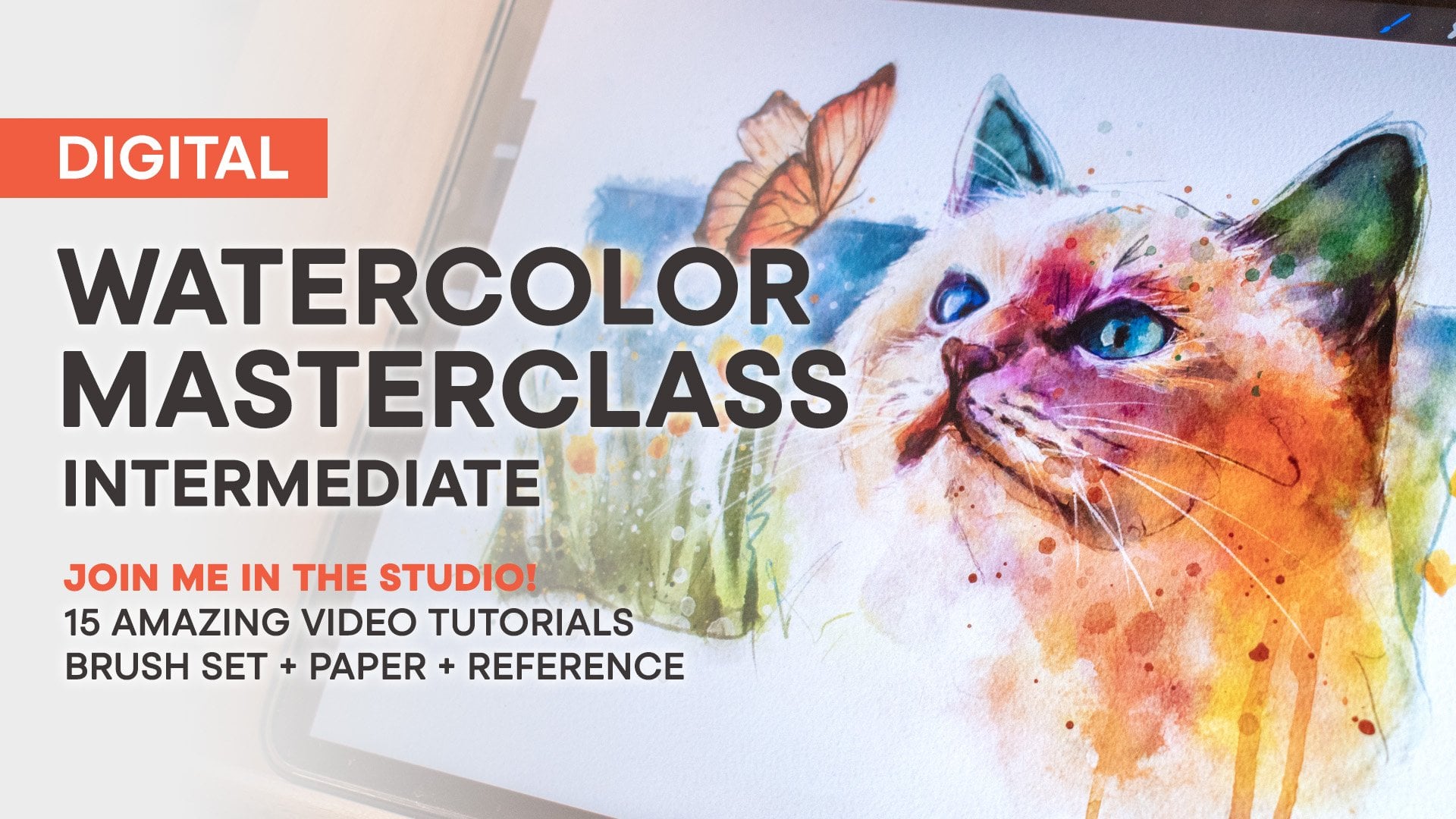
1. Introduction: My name is Nathan Brown. I've been a professional artist for a little over
two decades now. But I've been creating
art since I was a kid. It's a lifelong love
and passion for me, and it's a subject
that I love to teach. I paint with traditional
and digital media and try to incorporate them
both as much as possible. I'm the author of the
Ultimate Bush toolbox and the Master
watercolor brush sets, which were both
created with a love of traditional painting
and realism in mind. I've created this course for
anyone who wants to learn digital watercolor using
traditional techniques on the iPad and Procreate. We'll start from
scratch and cover the basics all the way through
to more advanced topics. So whether you're brand new to digital painting or you have some experience
with the medium, this course has
something for you. I'll be sharing my thoughts and techniques for finding the
right artistic mindset, how to sketch for watercolor, how to plan and compose, how to choose the right brush, and all the tricks
and techniques that I use to achieve realism
in watercolor. By the end of this
course, you'll have confidence and
you'll have learned every step of a watercolor painting from beginning
to final printing. The course is
structured to include both theory and
practical examples so you can watch along
or you can jump right in with project assignments
as you progress. I've also included a set of custom brushes for Procreate specifically made
for this course. So you'll have everything
you need to follow along. There's also layered artwork and examples so that you can
study and review as we work. I'm so excited for you
to take this course, so grab your iPad and
get ready to explore watercolor painting with
a whole new perspective.
2. Artistic Mindset: Over the years that I've
spent creating art, I've come to realize
that there are several key concepts
that I have to keep in mind in
order to maintain what I call an artistic mindset. These are things that
I need to remember in order to create
and be creative. I wanted to include
them in this video because I think that your
state of mind and how you view your own art
are key elements in the creative process
and need to be in the right place before you
even put pencil to paper. You may not realize it yet, but you create best under
certain types of conditions. And I think these conditions
have to be met in order for your creative self
to wake up and take over. I began to realize this
just a few years ago. I started to notice that I
was thinking and drawing and painting better when
certain conditions were met in my environment. I believe these conditions
are unique to each artist. So, for example, someone
might work best in their favorite coffee shop with headphones in their ears
and a fresh cup of coffee. But for another artist,
this may be stress inducing because they fear that someone might be looking
over their shoulder. I'm fortunate enough to have
a studio space in my home, which I call the lab. It's filled with
things that I enjoy and take inspiration
from like books, toys, comics, and art. Just walking in the door
fires my creativity so much so that I
really don't want to draw or paint in
any other place. Now, it's okay if
you don't know what you need in your environment
to feature creativity. Just being aware that
you might require certain conditions is a step
in the right direction. So I suggest that you start with a dedicated space for art, a place that's separate
from everything else that might distract you. So, for example, you may
not want to paint at the same desk that you
use to pay the bills. Your brain already
associates this space with an activity that
may be distracting. If you only have one
desk to work at, try changing the lighting or the music to set a different
tone for the space. As you spend more
time with your art, be sure to pay attention to
what feeds your creativity. Be intentional about creating the right type of environment that is unique to you
and your creative self. Do you ever spend time admiring other artists on social
media and maybe thinking, Why is my art not at that level? My advice is stop doing that. I don't mean stop
looking at art. I mean stop comparing
it to yours. You have to realize and be content with the fact
that art is a journey. You don't always know what another artist's experience has been or what they had to sacrifice to get to
the level they're at. Maybe it's years of
practice and study that involved hundreds or maybe
thousands of paintings. Instead of comparing your art, try looking at your
next piece with contentment and the
understanding that you are where you are in your artistic journey and
you're continually improving. Each time you draw or paint is one more step to
becoming better. Keeping this frame of mind will keep you excited and always hungry to create
that next painting and continue down
the artistic path. As I continue to talk with new artists that are
just starting out, I've realized that stress is
a major struggle for most. I'm referring to an artist
who might sit down to work on a piece and they become stressed about making the right choices. I believe that this
stress comes directly from lack of experience that
comes from experimenting. The only way to
become confident in your art is to
make lots and lots of tiny successes and failures
through experimentation. Later in this course,
you'll see me doing this by placing elements in a painting and then immediately
removing them. I'm experimenting
with placement, and then my confidence and previous experience tells me whether I like that
placement or not. I found over the years
that I love lots of splatters and abstract
elements in my art. The only way that I discovered that was through
experimentation. I made a lot of awful
mistakes during this time, but I ultimately landed on results and techniques
that I rely on in my work. Had I been afraid to
experiment in this way, I would have never made
these discoveries. Have you ever purchased
a new brush set and felt like you weren't
sure how to use it? As a result, you felt like you were using them improperly. Next time you load up some
new brushes, try this. Experiment with each brush, see what type of
marks they make, and then ask yourself, how can I incorporate this into the
art that I like to create? Or how does this
brush work for me? Just shifting your mindset from uncertainty to certainty
will give you confidence, and that confidence will lead to bold steps and
improvement in your art. The question of style
and how to achieve it is an age old question and one that I've seen even
seasoned artists ask. I've always believed that
it's a question not even worth an artist's concern
because I believe style is what
naturally occurs for every artist through
the combination of experience and confidence. Style is what you begin to naturally do the more you
progress in your art. As you gain artistic experience, you'll find there are more
and more things that you do that feel natural and
look right to your eye. These things aren't the
same for every artist. You may render shadows and
highlights a certain way or you may draw hard angles in your shapes because
you like them. These types of choices come
through the experience you've obtained and knowing what
you like and what you don't. For example, I
mentioned before that I like splatters and abstract
effects in my art. I came to this conclusion through lots and
lots of paintings, not because there was a specific style I wanted to emulate. So when it comes to style, I recommend that you not
be concerned with it and start by painting what you like in a way that feels
right to your eye. The more you paint, the more
you'll know what that is. I've always preferred
stories that are open ended, ones that leave you
with a phrase like, and the adventure continues. It captures my imagination, knowing that there's
more to be experienced. And that's actually
my favorite aspect of art is knowing that
I'll never know at all. There's always something new, whether it's a new medium, a new subject, or a new concept. Each time you sit
down to create, it's a learning experience, even if you've done it
a 1,000 times before. So always be willing to keep
this in mind and be content with the fact that
you will always be on this artistic journey. I don't think there's
an end to that road, and I find that to be incredibly
exciting and humbling. As an assignment,
I'd like you to write down these five keys to an artistic mindset and display it somewhere in your art space so that you don't forget them. Be sure to share a photo of it on social media and tell me how these keys have helped to unlock your creative mindset and how
that's affected your art. Alright, now let's break out
some paint and make a mess.
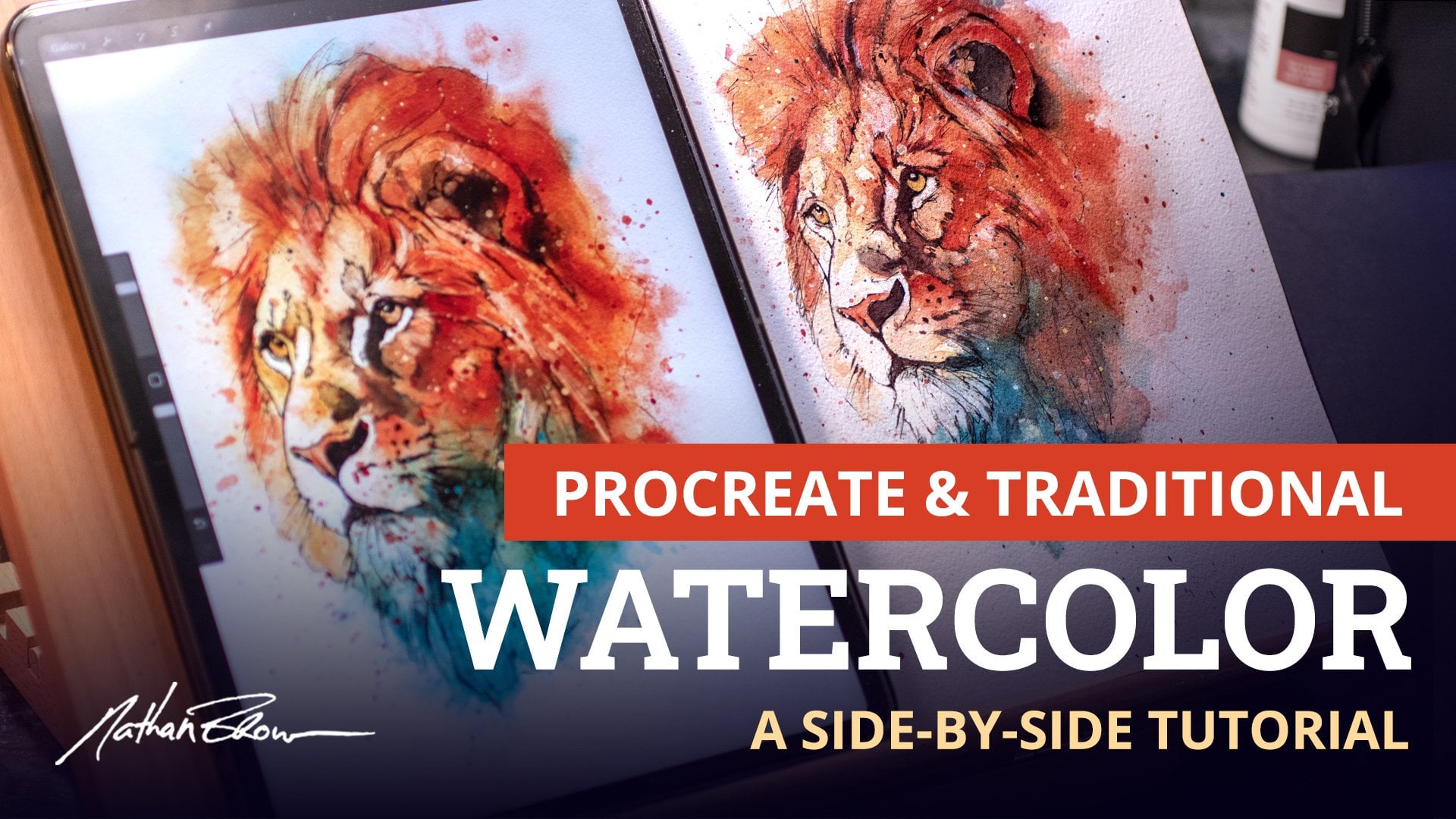
3. Characteristics of Real Watercolor: All right, guys, before we get cracking on digital watercolor, I want to spend a few
minutes taking a look at traditional watercolor so that we're familiar with
paint on paper, we'll know what the
characteristics are, and we'll know what to look
for when working on the iPad. The first technique I
want to show you is referred to as wet
into wet painting. It starts by coating the
paper with clean water. The brush is also wet
and full of paint. This creates a really
soft edge stroke. In this trout painting,
you can see examples of soft edge strokes
on the jaw line here and around the eye. Softer edges like these can suggest roundness and
subtle transitions. We'll be recreating this type of look with soft edge
brushes and procreate. In this example, I'm using
soft edge wash brushes to create a subtle transition between shadows and
the fur of this fox. Soft edges appear a
little more recessed and are not as immediately
noticeable to the viewer's eye. The next technique is
called wet into dry. This time, the paper is dry, but the brush is still
wet and full of paint. This creates a hard edge stroke. In the same trout painting, you can see some examples of hard edged strokes
in the upper jaw here in the eye and this
line forming the gill. We'll be recreating
these types of strokes with hard edge
brushes and procreate. In this example, I'm using
hard edge brushes for details in the fox's face
like the eye and nose. Hard edges are
especially useful for creating a sharp
focus in these areas. We'll be talking even more
about edges in a later video. Another really important aspect of watercolor is transparency. It's not opaque like
oil or acrylic. So when you paint over
an existing layer, what's underneath will
always show through. And typically, a new color
is created as a result. Most all of the brushes
that we'll be using in Procreate were made with this type of
transparency in mind. As you paint, the brush
strokes will appear over each other recreating the layered
look of real watercolor. Transparency is also directly affected by the amount of water versus paint in the brush. This stroke is mostly water, and as you can see,
it's very transparent. This stroke has more paint than water and appears much
darker as a result, but it's still transparent. This is the same as adjusting
the opacity slider on your brush to control the
transparency and procreate. It's also important to note that colors will blend wet into wet, meaning that when the
paper is still wet, colors will bleed together. We'll recreate this
type of effect and procreate using smudge
brushes and the blender tool. These two colors can
be easily blended as if we were painting into
a wet area of paper. This is a great aspect of digital painting because our
paper never really dries. So colors can be
blended together at any point during
the painting process. There are some good examples of blended colors in
this chia painting. For example, this red and
yellow have run together, creating a lost edge
and orange hue. The blender brush was
also used to create these runs as though water
was running down the paper. Watercolor is
oftentimes abstract. It's a little bit loose,
and there's typically lots of textures and
splatters as a result. Happy accidents can occur when you keep these
things in mind and you allow watercolor to
essentially paint itself. I'm really excited to show
you guys how to recreate these types of
effects and procreate as we move through this course. So now that we're familiar with traditional paint on paper and some of the ways
that it behaves, let's wash our hands and
go break out the iPad.
4. Sketching for Watercolor: One aspect of painting that is often overlooked is drawing. Part of us always
wants to skip to the fun part of
laying down paint, but learning the fundamentals
of drawing teaches you to see like an artist and to
truly understand your subject. Spending the time to learn to draw makes you a better painter. I highly recommend
that you spend as much time drawing and
sketching as you possibly can. Let's take a look at sketching as it pertains to watercolor. When I'm working on an initial
sketch for a painting, I try to visualize shapes
as much as possible. I do this because it's
easier to wrap your head around simple shapes than
it is complex forms. Even something as simple
as a bird can be hard to draw without visualizing
the forms as shapes first. I try to think of
shapes in two ways. The first is basic
shape structure, or breaking a subject down into the most simple shapes as
possible as you begin to draw. Let's take a look at
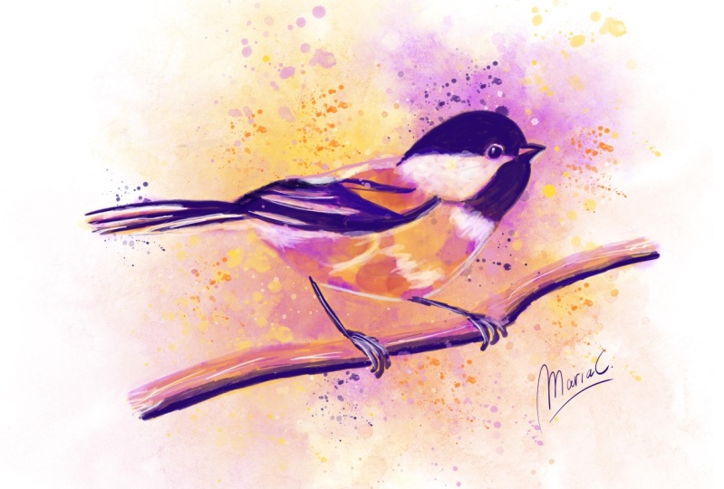
this reference photo of a chickadee and see if we
can find some basic shapes. When it comes to birds, I
like to use mostly circles. So I'll create a
circle for the head and a larger one for the body. I'll add one more here where the tail and wing come together. Now I'll add a few
guidelines, one for the tail, for the legs, and for the branch that
the bird's sitting on. I think I'll add one more to represent the
direction of the beak, and this line will help me
with eye placement as well. Okay, so now we have our bird reduced down to simple shapes. Now, it's a lot
easier to understand the proportions of this bird based on these three circles. Now let's try sketching
this chickadee together with the basic shapes that we just found in the reference. But before we get started, let's go over a couple of basics. For all of my sketches
and paintings, I typically work
on a canvas set to 5,000 by 4,000
pixels at 300 DPI. This is a really large
scale at about 16 by 13 ". You certainly don't have
to work at this size. Even half this size
is sufficient. I do this because
I like to scale my work down to a smaller
size from the original, but we'll talk more about
that in a later video. I'm also using the
pencil brush from the course brush set for all of my sketches in this course. When sketching, I hold my pencil a couple of different ways. You may or may not
want to do this, but I find that it helps me in making different types of lines, which adds some variety
to my sketches. For initial shapes, I hold my pencil with this type of grip because I'm mostly drawing broad strokes with my arm at
the beginning of a sketch. For smaller shapes, I tend
to hold the pencil from the end because I find that
it helps me to be more loose. Then finally, for details, I hold the pencil
closer to the tip. This type of grip helps me to be more accurate with my lines. Alright, let's get
started. Same as before, I'm going to draw a series of circles starting with the head. Then I'm gonna add that
larger circle for the body. Then I'll add that smaller shape for the wing and tail
coming together, and I'll put a guideline
in for the tail. Now I'll build the shape
of the bird by adding some lines in using the
circles as a guide. I'm not going to change
the grip on my pencil yet because I still want to
stay loose at this stage. I'm going to go ahead
and put in a line here for the beak
and eye placement. Now I'm going to switch up
my grip because I want to start to zero in a little
bit on these lines. Basically, I'm making
more finalized decisions about my line placement. As I'm putting lines down, I'm always using my previous
marks as a guide, so it makes each
successive step easier. Okay. Alright, so now I'm going to go ahead and add some
detail for the beak, and I'm glancing at the
reference to help me with the correct size and
proportion to the head. I tend to use straight
lines even around curves. Now, this is just
a style choice. It's an aesthetic that
I like in my sketches. For me, it just tends to make curves a little
more interesting. So let's put in a
shape for the tail, but I'm going to go ahead and
scale my sketch down a bit. I think I'm drawing a little bit too large for the canvas size. So now that I've got
more room for the tail, I'm looking at the
reference to get the length of it in
relation to the body. I kind of want the body to
come to more of a point here just because I feel
like the shape needs it. Alright, so I'm adding some
lines for the legs here. And I'm gonna put in a branch
for the bird to stand on. I think I'm just gonna
add some marks to represent the feet wrapping
around the branch. To wrap it up, I'll drop in a little circle
here for the eye too. Alright, so now here's
our initial rough sketch using basic shapes as a guide. The second way that I visualize shapes is through shape design, building out the details of the subject using as
interesting shapes as possible. This can apply to light and shadows and even fur and hair. This time we're
looking for shapes in the bird's feather
groups and wing. I'm tracing the
shapes that I see so that you can get an idea
of what we're looking for. Our goal is to recognize
these shapes and maybe add some interest to
them by exaggerating the design of the
curves and angles. Now let's finish out
our sketch using the shape design that we
just found in the reference. I'm going to be
working on a separate layer above our rough sketch. Alright, let's start out by taking a closer
look at the beak. Now, again, I usually add more straight lines
than curved ones, but that's something I do by choice just because I like it. Don't feel like you have
to do the same thing. We just want to focus on well designed shapes at this stage. We want to draw
good ones because these shapes will eventually act as a guide for the painting. So I'd like to zoom
in just a little bit so that I can make larger
strokes with the pen. I find that easier, and it makes my lines a little
cleaner, as well. I also tend to rotate the
canvas a lot because I like to pull lines towards me
versus pushing them away, and that's just
because it's more comfortable for me
in the way I draw. So a bird's eye isn't usually round because of the
skin that overlaps it. So I'm defining a
different shape here other than a
circle to reflect that. I think I'm going to remove
some of these lines and redraw them so that they
meet up a little better. Okay, looking at these feather
groups for the wing now, looks like there's a smaller
grouping right here. So the wing turns up and wraps over the body in this spot. Okay, let's see.
What else is needed. I'll go ahead and define
the legs a bit more, and we really only need a
line to represent them. But I'll go ahead and define better shapes for the feet here. And I also need a little bit more
definition for the branch. So let's go ahead
and do that, too. On second look, I
think the tail should be slightly longer in
relation to the body. And I'll go ahead and scale
down the drawing again because I think it's still a bit large for the canvas size. Oh, let's go ahead and turn
off the rough sketch layer. Now we can scale it down. And it looks like I missed a
couple of lines here around the beak now that
we turn that layer off. Okay, now we've completed
our sketch based on good shaped structure and finished it out with
good shape design. Now let's take a look at what a completed painting might look like based on
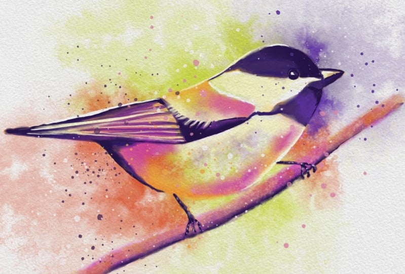
a sketch like this. Even though some of the shapes have soft edges in the painting, you can still see that
the shape design from the sketch is still present and comes through
in the final piece. Bye. Alright, let's talk
about loose versus tight sketches and
where to apply detail. As artists, it's our job
to guide the viewer's eye in our paintings to essentially
create a focal point. An excellent way to accomplish this is through
placement of details. In this fox sketch,
I want the viewer to focus mainly on the eyes
and the center of the face. Everything else is
less important and requires less
detail as a result. I've placed some squiggly lines for where the fur stops
or changes colors, but the details of the
fur around the head is less important as the details
around the eye and nose. You can see this come through
in the final painting. The eyes and nose are the
sharpest and most detailed. Let's take a look
at another example. This sparrow sketch is
completely rendered in pencil. There's nothing
wrong with this, but it does have a lot of detail. Too much detail in all areas doesn't allow for the
viewer's eye to rest. You can see what the painting
looks like as a result. I basically toned the
pencil light brown and added some watercolor
washes to the background. There's more pencil
rendering than paint. Again, there's nothing
wrong with this outcome, but I want you to
understand how much a sketch affects a painting, and as a result, you'll
hopefully be aware and a bit more strategic
with your sketches. Now let's take a look at
this same sparrow sketch with far less rendering. This sketch will basically serve as a guide for the painting with more details towards the head and some lines to suggest
where the feathers, wings, and tails should be. Looking at the final painting, you can see how much different
this version is and how much the underlying drawing can have an effect on
the final outcome. Here there is more focus on the bird's eye and
beak because of the contrast of sharp edges and details compared to the
rest of the painting. That's intentional
because I want the bird's head to be
the main focal point. As an assignment, try
sketching something simple like a bird or
maybe a piece of fruit. Remember to look
for basic shapes in the structure and the
design of your drawing. Feel free to share your sketches
with me on social media. I'd love to know if basic shapes have made an impact
on how you draw. Okay, now that we
have a good grasp on sketching for watercolor,
let's move on. I'll see you in the next video.
5. Working from Reference: Before we talk about
using reference, I want to dispel
certain thoughts or ideas that you may have about
the need for reference. Just because you need
visual aid to produce a drawing or painting doesn't
make you less of an artist. In fact, it makes
you a better one. To give an example, if
you're painting an animal, there's absolutely no way that your memory contains the
information that it needs to accurately portray the
anatomy and characteristics of that animal unless
you've painted it a dozen, two dozen or maybe
even 100 times before. However many times
it takes you to retain the information
needed on the subject. And even still, you may need reference for different
angles or poses. Master artists
throughout history have relied on reference
to produce their art. So don't feel like
reference is cheating. It's actually an essential
tool in any artist's toolbox. So now that we know that
reference is a good thing, let's talk about different
types of uses for reference. This is probably the way
I use reference the most. It consists of
gathering images of the subject at different
angles and different lighting. I like to have this
type of reference open while I'm
drawing and painting. Having multiple images helps me to understand the
forms of the subject. I use an app called Vizaf to keep multiple images
open at a time. It also allows me to save multiple collections of
reference photos for later use. When I'm working from
reference like this, I'm producing a drawing
that is similar to what I see but
not an exact match. This allows for a bit
of creative freedom in positioning and proportions
for the subject. But I still do a visual
measurement as I'm working. I usually do this by
finding a landmark in my drawing and comparing that landmark to the same
one in the reference photo. Then I visually measure portions of the subject using
that landmark. For example, this bird's
eye is one eye length from its beak and about three eye lengths
from the back of its head. I typically do
this in my head as I'm looking for a
roundabout measurement. I find that I'm usually pretty close as I'm so used
to measuring this way. You see traditional artists do this by holding
up their thumb or brush and closing one eye while looking
at the subject. They're using the
size of their thumb to get the height of
a subject's head, for example, and then using that measurement to determine the length of other
parts of the body. Reference can also inform the decisions you make
while painting as well. For an example, my sketch
is closer to this photo, but I like the lighting
much better in this photo. So as I begin to lay down paint, I'll use this photo to
inform my lightened shadow. So as I begin to
darken the shadows, I'll use this photo as reference for placement around
the beak and eyes. Reference can also be used as the subject
for your painting. In other words, you're
making an exact copy or painting what you see either
from a photo or still live. For this type of painting, I would recommend
measuring precisely, especially if you're
painting a portrait. If you're looking to
capture a likeness and the eyes of your subject
or even off a little bit, I promise it will be noticeable. To measure precisely, we'll use the same landmark method
as before, but this time, instead of eyeballing
it, we'll actually make our measurement and copy and paste it around the face. I'll use Luke's eye
as the landmark. Oh, no. Copy three finger swipe
to copy and paste. And it looks like between his eyes are about
one eye length. And we'll also look at the length of his nose from the bridge of his nose to the tip is also about
one eye length. So to his cheek is about one
eye length plus a quarter. To the other side of his face is about two eye lengths
and a quarter. You can continue to make
this measurement all around the face to get precise
placement of each feature. All professional artists
take the time to measure. It's something that
you'll get used to doing, and the more you do it, the faster and more proficient
you'll become at it. Take the time to
measure accurately and see how well it
improves your work. When it comes to art, there's often more than one
way of doing things. A really useful
method for copying a reference that
you might find a bit easier is the grid system. For this method,
you place a grid on your reference and place the
same grid on your canvas. Now you have a constant
measurement to work from. Simply sketch what you see in each of the
squares of the grid. This helps you to produce
your subject to exact scale. I set up this grid by opening my source photo and
Procreate first. Tap the tool icon and
turn on drawing guide. Then tap Edit Drawing Guide. From here, you can adjust the grid size and
change the color. Next, I take a screenshot and crop it in and
around the photo. Then I copy it to the clipboard
and paste it into Vizraf. From here, I can
delete the photo and procreate and start my drawing. I also want to mention tracing. Of course, it's possible
to trace your subject, but I caution you
on this method. Unless you understand the forms you are tracing and you can add a bit of flavor and personality
to the trace as you go, the result can be
somewhat lifeless. If you do choose to
trace your subject, I recommend looking for areas
that you can exaggerate or find shapes that you can
add a bit more design to. In other words, use the trace
to get basic proportions, then fill in the blanks with your own personal style
and design tastes. As important as reference is, I don't want you to
feel constricted by it. As I mentioned before, use it to help you understand
your subject, but always be looking
for areas to add design, shape, and form
into your drawings. This will help you to infuse your own personal
touch on your work, and that will definitely show
through in your paintings. As an assignment,
I'd like you to pick three subjects that
you like to paint and gather a collection of five
to ten good reference photos to keep on hand to use this
reference for future work. Keep them in a photo gallery, on your iPad, on Dropbox, or in an app like Vsref. In your sketches,
practice visual measurement and then actual measurements to see
how close you got. Be sure to post the
comparison to social media. I'd love to know how measuring has made an impact on your art.
6. Composition: Every time you begin a sketch or a painting, you're composing. You're placing elements
on the canvas in a way that you feel is
aesthetically pleasing. I think composition is often thought of in relation
to landscapes where you're placing elements like
horizon, trees, and clouds. Now that certainly
is composition, but it actually
applies to every type of painting no matter
what the subject is. Even with single
subjects because you're also composing
with values, posing the subject, and even placement on the
canvas is a factor. I also want to point out that composition and design
go hand in hand. So when you're
composing your art, what you're really
doing is designing, and good design and art can
overcome all other pitfalls. I'd go so far as to
say that design is the number one most important
element in your art. If your painting
is well designed, then almost everything
else falls into place, and the remaining choices
that you have have far less importance and
become easier to make. Simply planning a
composition goes an incredibly long way in producing a
successful painting. You wouldn't start
building a house by nailing some boards together
and seeing what shakes out. Same goes for a painting. The best way to plan
out a composition is by thumbnail sketching. I never start a painting
without a thumbnail to give myself an idea
of what I'm creating. I recommend that you do three to five quick thumbnail sketches for all the paintings that you do because it gives
you the opportunity to explore and experiment with
little to no commitment. You can try out value placement and layout in several
different ways, and you'll often find that you end up going with something completely different than what you initially had in
mind for the piece. There's a ton of
theories when it comes to design and composition, so much so that it can be a bit daunting to wrap
your head around. But I've narrowed them down
to five simple tricks that I consider to be the most common when I'm working
on a watercolor. And the good news is there isn't a lot of guesswork involved. These are pretty set
rules and ideas that you can apply directly to
whatever you're painting. When starting a composition, I like to boil it down to the base level shapes or the overall silhouette
shape of the subject. It helps to view the piece
this way so that you can compose without the
distraction of details. It's so much easier to make design choices when
viewing the simple shapes versus trying to
make those decisions once you are already
underway on a painting. For example, in
this floral layout, I'm using simple
shapes to determine the arrangement before drawing
or painting any detail. But not only am I arranging
simple shapes here, I'm also using a simple
shape to guide my placement. You can also let simple
shapes inform your decision on angles and placement of
your subject on the canvas. In this angel fish painting, the fish's silhouette is
pretty strong and well defined with crisp edges all
the way around the fish, setting it apart from
the background wash. This fox painting,
on the other hand, has lots of lost edges
that blend with washes, but the silhouette
of the fox is still visible in all the
important areas. In both of these paintings,
a well designed silhouette helps define the subject. Even viewed at a smaller size, you can still clearly
see what the subject is. The rule of thirds
consists of breaking down your canvas into three sections vertically and horizontally. The resulting grid gives you a general guideline
for placement. For example, it can be a bit more visually
interesting to place your subject a bit off center versus directly in
the middle of your canvas. In this example illustration, you can see that the
rule of thirds grid is being used to help guide the placement of
multiple subjects in a way that is
pleasing to the eye. And also notice that
a triangle shape is being used to place
the characters as well. I to create a rule of
thirds grid and procreate, turn on drawing guide and
tap edit drawing guide. Divide the pixel height by three and set the grid
size to that number. My Canvas is 4,000 pixels high, so I'm using 13 33. Then drag the blue dot to the
upper corner and tap done. Now tap a layer thumbnail
and shoes drawing assist. Draw two horizontal lines
to divide the canvas. Follow the exact same step
for the vertical lines, but this time divide
the width by three. My Canvas is 5,000 pixels wide, so I'm using 16 67. The same layer draw
the vertical lines. Now you can turn off the drawing guide
and you're left with a grid that divides your
canvas into thirds. You should always take
into consideration the number of elements you
place in a composition. The human brain, for
whatever reason, seems to find a balance
with odd numbers. The easiest to compose
being the number three. If you want to include
more than three elements, I would recommend 5/4, not to say that you can't
have an even number, but an even number
of elements in a scene tend to compete
for space a bit. Let's take a quick look at
this painting by NC Wyeth. You might think that this is
a single subject painting, and you wouldn't be wrong, but odd numbers are being used
here with focal points. We're also seeing that
familiar triangle shape again. I think part of why the
human brain finds balance in the number three relates
directly to the triangle. Back to our floral layout, I'm using three in
this composition to create a balance
with odd numbers. They vary in size, placing the focus on the largest flower. We've touched on
this one a little bit in previous videos. Movement refers to how the viewer's eye interacts and
moves through the piece. It can be accomplished
through leading lines or shapes that directly
point to the subject, placement of details
or even something more subtle like
contrasting values, which will cover more
in the next video. It's important to consider how the viewer will see and
interact with your work, and if you can be purposeful
about that interaction, it can make your art
more interesting. In the chickadee
painting from earlier, the viewer's eye is being
drawn to the bird's head by contrasting value or the
darkest part of the painting. But we could further reinforce the focal point by framing
it with leaves, for example. Notice that the leaves are
also serving as leading lines directly pointing and leading
the eye to the focal point. Positive space refers to
areas of the painting that include the subject or
areas of importance. Whereas negative space
is just the opposite with areas of less focus
that surround the subject. Oftentimes, watercolor
has exposed white paper as an
element in the painting. This area is typically
thought of as negative space. So it's important
to consider how we deal with this
negative space. I oftentimes use washes to
fill these areas around my subject as it's an aspect
of watercolor that I enjoy. Oftentimes negative space is affected the most in how
we crop our painting. How the painting is
cropped can really change the dynamics of
the finished piece. As an example, I'm placing this bird off center and
cropping the canvas, taking the amount
of negative space in the upper portion
into consideration. Using the rule of thirds also
helps me with placement. Notice how changing the
position affects the piece. Being too close to the edge gives us an off balance feeling. You can always think
of negative space as giving the subject
some room to breathe. Another good example
is this fish pining. The original is not
necessarily cropped with a good balance of
positive and negative space. So I created a new
version and used the rule of thirds grid to
create a tighter crop. The focal point of the
piece is the fish's face, which I kept in the
lower bottom third. There's also a nice balance of negative space all
the way around. I wanted the fish to
appear that he was turning and swimming
away very fast. That movement is
suggested by the fins and the splatters that
move to the upper right. Using the rule of
thirds, keeping in mind movement and a good
balance of negative space, I think this is a much better representation for this piece. Now that we've explored some
ideas behind composition, I hope you now
feel equipped with some newfound confidence when it comes to planning
out your paintings. I think you'll find that with these simple tricks in mind, that the rules of
composition can be easily added to your
artistic toolbox. As an assignment,
I'd like you to pick a subject and do three to
five thumbnail sketches, keeping in mind silhouette, the rule of thirds, odd numbers, movement, and positive
versus negative space. Each thumbnail doesn't have to contain all of
these elements, but if you can
include one or two, then you're on your way to
a fantastic composition. Be sure to post your results
to social media and tag me. I'd love to hear how you've
planned out your painting. Alright, we're
moving right along, and I'll see you
in the next video.
7. Understanding Value Contrast: Contrast in art can refer to a lot of things
like texture versus smooth strokes or small versus large shapes or straight
versus jagged lines. But when it comes to watercolor, I believe the most important
contrast is in values. You need good
contrasting values in your paintings to create a
level of realism and depth. If you ever painted
something and wondered why it seems flat
or it doesn't pop, the likely culprit is a
lack of value contrast. So in this video, we'll
dive deeper into value, and afterwards, you'll see
your work with new eyes. You're going to know what to
look for as you're painting and how to check your work
for good value range. And I guarantee that
these skills alone will make an incredible
difference in how you view your. Value refers to how light
or how dark a color is. For example, looking
at this scale, we see a range of grays
from pure black or 100% value to white or 0% value. Your painting should always include values
across this scale, meaning that your lightest
tone should be found here, your middle tones here, and your darkest tones
somewhere in here. If your painting only
includes middle tones, then you end up
with a flat look, making it harder for the eye
to discern different shapes. Notice in this cat painting
viewed in black and white how all the tones used are found in the middle
range of our scale. The result is flat and it
definitely is harder for our eyes to pick
out any real depth in shadows or highlights. I think a lot of beginner
artists paint in mid range values
because it feels safer. Making extreme
contrast shifts might seem intimidating at first,
like you're going too far. It's also possible that
your eyes are just not used to looking for
value range in this way. When we view the original
painting in black and white, we can see that the full range in the value scale is present. It's very clear where
the darkest shadows are and where the
brightest highlights are. The result is more depth
than more realism. Depth in a painting is created by separation of these values. The painting looks more
real because this is the value range that we see in the real world all the time. Also note that value is relative to its
surrounding values, meaning a value will appear
darker surrounded by a lighter value and lighter when surrounded
by a darker one. This makes more sense when we
view it on the value scale. You can see that the
same middle tone appears lighter at one end and
darker at the other, even though it's the same
gray tone all the way across. Let's look at an
example of this. This is a painting
for a T shirt design that I did for a client
a few years back. When we view it in
black and white, can you pick out
the lightest value? It looks like the small
fish are the lite, but you can find
the same value in the speckle trout below the eye. The small fish actually
appear brighter because the surrounding
value is so much darker. This creates more
separation, depth, and contrast around
these small fish, making them a focal
point as a result. You see the same value
scale in colors as well. Adding more white to
a color moves it up the scale creating a
tint of the base color, while adding black moves it down the scale creating a
shade of the base color. Some colors have a lighter base value while others are darker. Color is what we tend to
notice the most in a painting, but really value is what's
doing all the work. In fact, I believe that
the color you pick is less important than its value.
I'll show you what I mean. We talked before about the focal point of this fox painting being the center of its face because the most detail
is placed there. But it also draws the
viewer's eye because it has the most value separation from the rest of the
painting as well. Even if we change the
color of the painting, it still works because the value separations
are still there. Oftentimes, you
are composing with a range of values in a painting. A painting may be dark, light or mid value dominant. In this example, we can see that the focal point
is created with a dark value object and a mid
value dominant composition, or it can be the opposite with a light value and a dark
value dominant scene. It's important to think
about the value placement in your composition
because focal points are often created
by this contrast. Taking another look at
this angelfish painting, this time in black and white, gives us roughly three values. The white of the paper
is our lightest with the middle value making
up the background wash. The focal point is created by contrasting light and
dark values in the head, not to mention a little help
from some leading lines. At this point, I've shown you several paintings
in black and white. That's actually the perfect way to check your work as you paint. Simply three finger swipe and
procreate and select copy all and three finger swipe again to paste your painting on a layer above
everything else. And then drop the saturation. Look at your current value range and see where you
need adjustment. Compare it to a value scale to see where you need more
of a certain value. Do this multiple times if
needed as you work on a piece. Pretty soon you'll
train your eyes to see colors as values, and you'll see where good value contrast is needed as you work. From this point forward,
I'd like for you to think about values
in your paintings, be aware of them, and how they are used to
create contrast, composition, depth, and
realism in your work. As an assignment, I'd like
you to create a value scale. Use nine squares to create the
range from black to white. Compare it to your
latest work and see if you can find a
good range of light, middle, and dark value. This will likely give you
an idea of where you are currently when it comes to painting with good
value contrast. Now that we've got some
good painting theory under our belts from
the last few videos, let's go take a look
at some brushes.
8. Brush Selection: Let's take a few minutes
to talk about brushes. Brushes are essential
to creating the watercolor effect that I look for in my
digital paintings. My background is in
traditional art, so I tend to look
for certain elements in my brushes that
are important to me, like textures, soft
and hard edges, and certain types of
splatters and wash effects. I've included a basic set of 14 brushes along
with this course. We'll be using this set to paint with in all of the
upcoming videos. Let's take a look
at the brushes in this set so that you can
become familiar with them and you'll
know which type of brush to use for different
areas of a painting. First brush in this
set is a pencil. This one is probably
pretty obvious as it's intended to be
used for your sketches. The brush creates a thin
line when held normally or creates a thicker shading line when tilted to the side. I like to use a dark gray color most of the time
with this brush, unless I'm using it
as a colored pencil, creating a tone sketch. Next is the watercolor detailer. This brush is intended
for smaller detail work. It would be close
to a small round when compared to a
traditional brush. The brush is transparent
and creates a hard edge. Even though the brush is
intended for detail work, you can certainly
scale it up and paint larger areas
with it if you like. The water brush is another
hard edge round brush, but this one is
more transparent as though it contains
more water than paint. It's pressure sensitive,
so the lighter you press, the more water enters the brush. The brush also has
a nice texture that becomes more
visible with pressure. The opaque brush
is equivalent to a traditional brush filled
with paint and no water. I know that I mentioned before that watercolor is
always transparent. But the more paint you layer, the more opaque it
begins to appear. You can do the same with
a transparent brush like the ones we just looked at, but this brush will
act as a time saver, allowing you to lay down
more opaque areas quickly. This one will
become a regular in your brush selection as you will use it to create value contrast faster than layering. The flat brush mimics a traditional brush
that has a whiter tip. You'll use this one to shade
larger areas or to create variation in your
strokes as strokes are not always visible
with round brushes. The soft wash and softer wash brushes
create soft edge strokes, similar to what we created in the look at traditional
watercolor video. These are excellent
for painting washes or adding subtle edges
in your paintings. The alcohol and salt effect
brushes are for creating certain types of special effects that will cover more
in a later video. The water blender is intended specifically for
the blender tool, but understand that
you can certainly paint with it just like you could also use other brushes in this set with
the blender tool. This brush is full of
water and will blend out any stroke as though you
are painting wet into wet. The two wash stamp brushes are for creating large
washes quickly, but have several
other uses as well, which will cover more
in a later video. The drip and splatter brushes
are among my favorites. I almost always finish off all of my paintings
with a few splatters. The drip brush will add
a few single dots while the splatter brush will go crazy slinging paint all
over the surface. Let's paint a quick feather
to give you an idea of what these brushes can do and feel free to paint along
with me if you like. I'm going to sketch
this feather from memory because I want it
to be a quick brush demo, and I think the shape is simple enough that I can
do it without reference. As I work, I'm going
to try to keep in mind a strong silhouette and avoid any repeating patterns
in the feather. I'm also going to keep the
sketch pretty loose because I know in a few minutes I'll tighten it up in the next step. Okay, I'm tapping
the transform tool, and I'm going to scale it
down just a little bit, and then I'm going
to tilt it slightly. So now I'm creating a new layer and moving it below
the sketch layer. I'm using the opaque brush in a dark blue color to outline the silhouette of the feather, using the sketch as a guide. I'm not really following
the sketch lines exactly here as I want to continue
to add variation and visual interest as I work. That's something
that I really try to stay continuously aware of, especially early on
in the painting. The shape that I'm creating
here will serve as a base for our feather selection that we'll paint with
on other layers. It won't actually be part
of the final painting. Now I'm filling the outline
and I'm going to create some more wispy feather
pieces with single strokes, and I'm doing this purely to add some more visual
interest to the shape. So I'm using the
same opaque brush, but this time with
the eraser tool to knock out some areas of
the feather silhouette. In a traditional painting,
these areas are created from spaces between brush
strokes that didn't get wet. 'Cause watercolor
won't flow into these small dry areas unless you push it
there with a brush. So by erasing these spaces, it's like I'm
mimicking that look of traditional watercolor. Now that we have
a feather shape, I'm going to rename
this layer base. I'll make a selection from this layer and turn
the visibility off. Then I'm going to create a
new layer and fill it with a large stroke from
the soft wash brush. And now we have this nice
texture base to work from. Now I'm going to
choos a purple color to paint in some
color variation. Then using the same soft
wash brush with the blurtl, I'll blend the blue
and purple together. I I'm gonna go ahead and create another new
layer and I'll sample a purple color from the feather
and make it a bit darker. Using that same soft
wash brush again, I'll paint outside
the selection, allowing just the
edge of the brush to bleed over onto
the feather shape. This will darken the
edge of our feather, which will mimic behavior of
traditional watercolor again as paint tends to run towards the edge of a shape as it dries. I'll use the blentol
again to blur a few areas around
the edges as well. And on the same layer,
I'm choosing a wash brush and we'll stamp some darker purple to the base
of the feather. And because of our selection, the stamp is confined
to our feather shape. Now on another layer using
the water brush this time, let's detail the edges again. Actually, let's use the watercolor
detailer brush instead. I'm going to paint a fine
detail line around the feather, reinforcing that darkened
edge effect from earlier. As I work around the feather, I'll darken some
edges and leave some out as I want the effect
to be kind of varied. Now I'm creating a new
layer and moving it below our detailed edge layer. I'm selecting a wash damp brush
again and this time using a blue color and stamping
the other portion of the feather just to add
a little bit more texture. On another new layer, I'm
going to go ahead and add some more
variation by selecting a light blue and
painting some texture in using the alcohol
effect brush. To finish off this piece, I'll add a few splatters within the feather selection using
a light blue color again. Now I'm going to undo
the selection and add a few more splatters around the feather using a dark blue. Okay, as a final adjustment, I'm gonna combine all
of the layers and increase the saturation
and vary the hue slightly. And I think that'll just
about do it for this one. The question that I receive the most often about
my brush sets is, how do I know what brush to use? The answer to that question
is, what are you painting? If you're creating a hard edge, then grab one of the rounds. If you need a soft edge or
something with more texture, grab a soft wash brush. If you're detailing
a small area, then use the detailer or
even the pencil brush. I really think that
brush selection comes down to experience because with experience comes confidence
and knowing what you're doing and knowing what you're looking for, and
you're painting. If you feel like you're
not there yet, it's okay. We've got a lot more to
cover in this course, and you'll be there
before you know it.
9. Creating Edge Variety: We've touched a little bit on the concept of edge variety, but I wanted to create
a video specifically on the topic because I believe it to be an essential
part of a painting. It's important to me that
you have a solid grasp on this topic and you know how
to apply it in your own art. I believe there are three
types of edges in a painting, hard or sharp edges, soft edges, and lost edges. These three edge types play
a role in visual hierarchy. This means that we tend
to see certain edges in order of importance
or visual clarity. Hard edges are the
highest in this ranking. Since they have
the most clarity, it's what our eyes
tend to notice first. Focal points in
detail areas tend to have the most hard
edges in a watercolor. Soft edges are typically secondary and contain
some importance, but less so than hard edges. Fur is a good example
of soft edges. Sometimes I'll paint fur very softly with little to no detail. Your eye sees that it's there
and registers it as fur, but it doesn't necessarily dwell or rest on these areas
of the painting. Lost edges are sort
of this magic space where we are implying that something is there without
actually showing it. It's like your brain fills in the space without
actually seeing. That's actually a
really good takeaway and something to keep in mind. In a painting, we don't always
have to show everything. In doing so, we actually
create more interest because your brain enjoys the mystery of filling in the blanks
with imagination. Lost edges can also
be used to add a bit of abstract
quality to a painting. And that's something that
I personally find very appealing about these areas in deciding where
they should be. Et's take a look at how brushes were used to create edge variety in this floral
painting to give it a good balance and
visual hierarchy. The overall shape of the flower silhouette
was painted with a hard edged brush like the watercolor detailer
or the opaque brush. Then the interior
colors on the inside of the petals were painted
using the flat brush. And then the edges
were softened using the flat brush again
with the smudge tool. I chose to lose some
of the edges of the flower shape as though the paint ran away
from the silhouette. I did this toward the back
of the flower to set a bit of depth and combine the shape
with the background a bit. I also did this a
little in the front just to suggest a bit
of depth of field. Depth of field refers
to the distance between the closest and
furthest elements in a photo or painting
in this case, that appear sharp and in focus. So looking at this painting, we can clearly see all
three edges at work. Hard edges give focus and visual priority to the
flower silhouette. They're also used in the details found in the center
of the flower. Soft edges are used to paint the color within
the flower petals, and lost edges are being
used to set a bit of depth and interest to the background and a
little to the foreground. A question that I
often receive is, how do I avoid
blurring my painting? The most likely cause
is that you don't have enough edge variety,
specifically hard edges. You need the sharpness
of hard edges and your focal points
so that your eye is guided there and watch out for over use
of the smudge tool. If your painting
appears too blurry, it's likely that you're just
missing that sharpness. So I recommend that you be intentional about edges
and make sure that your painting has a balance of edge types in order to
avoid that blurry look. As an assignment,
I'd like you to try a simple
painting of a fruit, something easy like
an orange slice, an apple, or a strawberry
like I'm doing here. I want you to keep in
mind edge variety. Be strategic about where you place these three edge types. If the painting begins
to look blurry, then start looking
for those hard edges to bring it back into focus. In my strawberry painting, I'm using softer
edges in the lighting of the strawberry to
suggest roundness. The edges of the strawberry
and the small seeds have harder edges to give
it focus and sharpness. I even have a slightly
lost edge at the base where the shadow begins because no light
is landing there. Give this a try and be sure to share and tag me on social media and let me know how
you used edges to give more dimension and
focus in your painting.
10. What is a Watercolor Wash?: The term wash refers to a
technique where you paint a very thin layer of watercolor into a
large area of water. This results in the paint moving around the pool of water, creating swirls and blooms and all sorts of random effects. Once again, this is
a technique that allows watercolor
to paint itself, since you're giving
up control in a sense and letting
the paint take over. Once the paint dries,
you're left with areas of the painting that really
have a life all their own. The resulting textures
left by the mix of water and paint breathe
life into the painting. I personally love this
aspect of watercolor, and I use it all the time in both traditional
and digital work. There are two ways
that I like to create washes and procreate, and oftentimes I use these two methods together
so that I can have full flexibility and control over how
the washes look. The first method is to paint them using soft wash brushes. Here I'm using the
soft washed brushes from the coarse brush set. Painting washes like this
allows a level of freedom in the shape and areas of light and dark because you're
painting it from scratch. I'll often use the smudge
tool with the same brush selected to spread the wash
or faded out along the edges. The other technique
I use to create washes is using stamp brushes. Here I'm using the
two stamp brushes from the course brush set. These brushes were created using high risk photos or scans of actual washes created with
traditional paint on paper. So the result is as
realistic as you can get. These brushes are
fast and easy and often create randomness
and happy accidents, which I find to be a lot of fun. Washes can be used to
build and blend shapes, and they can also be used to
create abstract backgrounds. Let's try painting
a shape first, and feel free to paint
along if you like. We'll start out by drawing a leaf with the
pencil sketch brush. Next, we'll want
to create an area of confinement for the paint. In a traditional watercolor, this will be equivalent to
a wet area of the paper. Paint will stay
within the bounds of the wet space and won't run
or move onto dry paper. In Procreate, we'll create the same confined area
with a selection. So let's go ahead and outline our leaf shape with
the selection tool. This gives us the equivalent
of a wet area of paper. Then we can stamp or
paint a couple of washes in to give us
our painted shape. This is so easy to
do, and it can be the beginning step in
so many paintings. I love the randomness
of building shapes this way versus painting in
solid areas of color. Watercolor paintings
don't typically have a solid area
of opaque color, like il paintings might. There's usually some
degree of texture. So these wash damps are also
perfect for breaking up those areas of solid color
with a bit of randomness. Okay, let's try another one. This time we're going to
use the soft wash brushes. Action is already made, and I'm going to paint around the edge of the leaf without lifting my pencil tip until I'm ready to start
a new layer of wash. I'm also painting
around the edge, the outside of the leaf
to darken the edges. Let's grab the softer wash brush and scale it up a little. Let's paint in another
layer of wash. I'm using very light
pressure here as well. So darkening the edges like this will help
create the look of real paint because
it tends to move towards the edge as
it begins to dry. Okay. There we have it. There's our second leaf this time painted
with wash brushes. When using washes
as backgrounds, I think of it as
blending out areas that add to or enhance
the composition. With that concept in mind, you don't want to stamp
just any wash anywhere. I'll show you what I
mean in this example. Let's finish out the
background of this fox. I've included this painting in the course resources in case
you want to follow along, but don't feel
obligated to place washes in the same
areas that I do. Feel free to experiment and
see what you can create. Okay, we're gonna
be using the wash damp brushes from the
coarse brush set. I'm going to start
with wash damp two. Our file is layered, and we want to place a new
layer below all the others. That's where we're going
to put our initial washes. I'm gonna sample a color from
the back of the fox's head, and I think I'm
going to place my first wash in this area. Size the brush
down a little bit. Okay, that looks pretty good. Drop another one here.
Okay, I already like this. I'm going to sample a darker
orange, place one lower. Okay, I like that pretty well. I'm gonna get wash damp one. I'm gonna drop another
one in the middle. That works out
pretty good. I like the natural flow that this has. I already it's adding
to the fox's shape, and it feels like a natural
extension of the painting. If I were to throw
another one up here, see how it kind of throws it
off balance a little bit? It doesn't feel as natural. I'm going to go with a cool
blue now or a cool gray. I'm gonna get wash
damp two again, and I'm going to start a
background for the fox's face. Okay? Again, I'm looking for a natural extension of the painting. As I'm placing these washes, my eye is in search of
a balanced composition. Okay, that's a bit too low.
I'm gonna get the blur tool. I'm gonna blur out some of
these repeating elements. The blur tools already
set to the water blender. I have just some of these
repeating splatters that I just kind of
want to get rid of. The wash damp turns
each time you place it, but occasionally, you still get some of these
repeating elements. It's quick and easy to just
erase or blend them in. Okay let's create a new layer above all the others this time? This is going to be
for some highlights. I want to break up some of
these areas of color that I'm seeing Besize the brush
down smaller this time, I want to break up
this area right here. Let's make it a little larger. Okay. I've got another area
here that I want to break up. That's pretty good. I also have this harsh line
that I'm seeing in the face, and I want to break
that area up, as well. It's pretty good, but
maybe it's a little much. Let's try another one. That's a little more subtle.
I like that better. Now let's use the
soft wash brushes to enhance the washes
we've already laid down. I'm going to create a new layer below the highlights layer, and I'm going to choose
the soft wash brush. So I'm looking for these
areas in the washes where it looks like paint may have flowed in the water
before it dried. And I want to sort of enhance
or darken these areas. Every time I pick
up and put down the tip of the pencil
with this brush, it'll darken the stroke, but that's okay because I'll blend those in in
just a little bit. So I see another
area here that I want to add a little
bit of flow too. And another one up here as well. Now I'm going to use
blender tool with the same soft wash
brush selected, and I'm just going to blend out some of these harder edges. But I don't want to blend
them all out because I still want to have some of that
edge variety in the wash. I'm basically just trying
to imagine where the paint would have flowed and where
it would have spread out. It's so easy to overdo the blur tool with
something like this. But the edges of
our wash stamps on another layer are helping to keep things from
looking too blurry. Okay, I think that
looks pretty good. Couple more touch
ups. Okay, let's take a look at
what we've done by turning on and off the layer. What we did was pretty subtle, but it created some
nice dark areas in the washes and it added
some variation to the fur. I think I'm pretty happy
with this fox for now. See how easy painting
with washes can be? We went from this to
this in about 5 minutes. That's pretty cool. I hope the concept of using washes in the ways that I've
described has opened up some new ideas for your
paintings and inspired you to paint more abstract
elements in your art. And now that we've looked
at some watercolor washes, let's move on to some
more special effects. Oh
11. Watercolor Special Effects: A really cool aspect
of watercolor is how it interacts
with things like water, alcohol, and salt when they're introduced just as the
paint begins to dry. Also, the type of paper
used and the surface of that paper play a role
in the final outcome. These effects can give
a watercolor painting a very unique texture. We can apply these
special effects to our digital paintings as well to create more
depth and realism. Let's take a closer look at these effects and
how they're created. Water is definitely the
number one influencer in how a watercolor
painting comes together. It takes water to activate the pigment in order
to start a painting, but it also can
be used to create special effects once the
paint is on the paper. For example, a wet
brush can be used to spread or move paint around
or blended out completely. We can use the
water blender brush to do the same thing
and procreate. Here I have the smudge tool with the water blender
brush selected. I'm starting the
brush outside of the wash and moving
the stroke into it. This is like moving clear
water into the paint, whereas starting the stroke in the wash and moving it
outwards is the opposite, like moving the
paint into water. Another water effect
can occur when water is introduced to paint as it
begins to dry on the paper. The water causes the paint
to spread back onto itself, and the result is
referred to as a bloom. I think blooms are a
nice effect to break up solid areas of color
in a digital painting. We can create blooms using
the wash damp brushes with the eraser tool or by painting them manually using a wash brush and
the eraser tool. Salt and alcohol
are two methods for creating really unique
textures in a painting. When salt or alcohol are introduced to paint
before it dries, it creates a resistance
in the paint. The results create a
rough and random texture. In a traditional painting, you can sprinkle alcohol to create sort of a reverse
splatter effect in a large area of paint. We can do the same in
Procreate by using the alcohol effect brush
with the eraser tool. You can also use it with
the paint brush tool to spread a wash giving it
a rougher textured edge. When using salt on a
traditional painting, it's typically sprinkled into wet paint and then allowed
to dry before removing. This results in a
fine, gritty texture. We can create this look
and procreate using the salt effect brush and a lighter colour paint than
the one we are painting over. This is an excellent way to add texture to a smoother
area of a painting. Splatters are a personal
favorite of mine. There's an aspect to them in
a traditional painting that requires you to surrender the control you have
over what's happening. You can do a few things to aim the direction of the
splatters, but not much. In our digital
paintings, we have a little more control over
where our splatters land. I've included two splatter brushes in the coarse brush set. The drip painter will apply
one splatter at a time, and the splatter brush will
apply lots of splatter at once with pen pressure
controlling the size. I love to apply splatters
to further render the painting in a way because
splatters have a hard edge. It can bring areas of
the painting into focus, meaning that our
eye will see them first versus a softer
area of the piece. I also love them as a
compositional element because they can
provide subtle shape or direction as well. Paper types have a big impact on traditional water colors. There are basically
three kinds of paper regardless of
quality or brand. The three types are cold press, cold press rough, and hot press. Cold Press is probably the most common with a semi
rough texture. Applying paper texture and
procreate is pretty easy, but it has a big impact
on the painting. I've included a basic
cold press paper texture in the course resources. The simplest way to apply this paper texture
is to place it on a layer above all others and set that layer's blend
mode to multiply. The resulting texture will give a digital painting and much
more realistic look and feel. Now, let's take all of these
special effects and use them to finish out our fox painting from the
previous video. Once again, don't feel
like you need to play splatters and effects in all
the same places that I do. The goal is to become familiar
with how these brushes work and how these effects can be used to
complete a painting. I'm going to start with a new
layer above all the others, and I have wash damp two
selected as my brush. I'm gonna sample this
light fur color, and I want to create a little
bit of a bloom here in this area and maybe have
it flow down just a bit. So I'm tapping in the
bloom with the wash damp, and I'm going to use
the softer wash brush to paint a little bit more
as if the bloom spread. Alright, I think that
looks pretty good. Now I'm going to grab the
wash damp two brush again, and I want to add another
small bloom where this white transitions to dark
below the nose here. Alright, now let's create
a new layer again, and I want to use the salt
effect brush this time. We're gonna use this
brush to break up some smoother areas of color
like the one below the eye. I'm sampling this sort
of burnt sienna color, and I'm gonna make it lighter. That's gonna need
lighter pressure. Alright, I'm going to
do the same thing here, so I'm gonna sample
this dark orange, but I'm gonna make it
a little bit lighter. Okay, I'm just gonna look around and I'm going
to place a few more where I just think a little bit of color needs to be broken up. Use a little bit down
here at the gray area. Alright, that's pretty subtle. I think the color
needs to be lighter. Alright, that's better.
I'm gonna look around. It feels pretty balanced so far. I think I'm gonna go ahead
and add a new layer, and let's try some darker ones. So I'm gonna do the opposite. I'm gonna sample
this dark fur color, but I'm gonna make
the color darker. Okay, that's too much. I'm gonna I made
the brush bigger, and I'm gonna try just
a few taps instead of brush strokes,
taps of the pin. Okay, that's good. I like how
that breaks up that white. I'm gonna add a little bit in the head with
real light pressure, just a little bit. Okay,
it's looking good. I like how this salt texture is it's breaking up the paint, and it's a really good match texture wise for this painting. It's too much.
Okay, I like that. A little more. This
feels pretty good. I'm gonna try white again
just to see if I can just add a little bit more
variation in some spots. Going back to that light color. So I'm using the
opaque brush with the eraser tool to get rid of
some of those little spots. Alright, so now this is
full experiment mode, just seeing if some of these white salt splatters
will work in different areas. Alright, looking around, I think that'll do it for
the salt effect. So let's add another new
layer for some splatters. I usually start with
darker splatters first, so I'll select the
darker fur color again and make it even darker. So I'm gonna use
the splatter brush. It's already set to
a pretty large size. Let's just drop in a few
and see what happens. And I'm just tapping
the pin to place these. I want to keep in mind this
sort of directional flow in the fur and kind of want to maintain that with the
splatters if I can. Might try a few around the head. I'm gonna go a little
smaller on the brush size. Remember the brush is
pressure sensitive, so light taps will
make small splatters and hard taps will
make bigger ones. I'm gonna try some dark ones, some dark gray ones down here. And maybe a few up top, as well. Alright, so let's
go ahead and try some light splatters on a new layer and see how
well things balance. I'm using the splatter brush again for these
lighter splatters. Okay, same process as before. I'm going to sample
light colors this time and just tap
the splatters in. Okay, so very light and
small for some of these, you may not even be able
to see them in the video. Okay, I'm taking a look now, and things feel pretty
good and balanced. I think that's
really something you have to decide for yourself. If everything looks right to your eye, you'll
definitely know it. You want these
effects to feel like a natural part of the painting, enhancing what's there and
not distracting from it. As a last step, let's add
a quick paper texture. I'm gonna go out to
the gallery and grab the paper texture from
the course resources. I'll three finger swipe to copy it and head back
over to the painting. Now, I'll swipe again to paste it and set the layers
blend mode to multiply. Okay, I think this
completes our fox painting. I hope this video
helps you to see how easy and fun it is to add special effects and how they can be used to further render
and enhance your paintings.
12. Intro to Color Theory: Oh. Color can be
intimidating at first, but with some basic
understanding and the aid of a color wheel, it's really easy to get a
handle on color theory basics. There are a few color
schemes that I use the most. The first being the most simple. A monochromatic color
scheme is just one color. This scheme is great
practice in understanding value because when you're
painting with one color, you're forced to use
various tints and shades of that color to get all the values that you
need in your painting. Complementary color schemes are an easy way to start planning
color for a painting. The idea is to use a color along with its opposite
on the color wheel. These two colors will always
have good color contrast. For example, you could
start with warm colors as your lights and the complimentary cool
colors as your shadows. Now let's take it a
step further with another type of color
scheme called triatic. A triangle is used on the
color wheel to locate two complimentary colors
from the first color chosen. I often work with a variation
on this triatic scheme. I choose a color and find
its complimentary color plus its triatic scheme and consider all colors within the bottom of the triangle to be usable. But understand that colors in a digital painting can be fluid. The idea of a color scheme
like this is a solid start, but once a painting
gets underway, a color scheme can
be experimented with and possibly
changed along the way. Let's take a look
at an example by finishing out our chickadee
sketch from earlier. Grab your sketch and feel free to paint along
if you'd like. Okay, so I want this to
be a colorful painting. But this particular bird
doesn't have a lot of color. So let's talk about a plan for choosing the colors to represent the
values of this bird. So I'm going to select this from isra I'm like the top image, and I'm going to move it over
let's take a look at it. Let's take a look at
it in black and white. Okay, so you can see
the different values. The darks are here, the lights are here, and then there's
some mid tone grays. So we need to choose colors to represent these
different values. Alright? So let's
get rid of that. Let's talk about
a plan for color. I know that I want the darks
for the bird in the head and in the feathers
to fall somewhere in here in this
purple blue range. So the complimentary would be here in this yellow
orange range. But using that triatic scheme
that we just talked about, I know that all of these colors are fair game for this
particular scheme. So to represent some
of my mid tones, I may go orange or green, and my lights will probably be yellow or off white yellow. All right. So let's get started. First thing I'm going to do is I'm going to change the opacity, take down the
opacity of my bird. I'm going to create a new
layer on top of the sketch. I want to start
painting in some of those mid tone values. So we know from our
color wheel example, that's probably going
to fall somewhere in this yellow
orange range here. I'm going to use
the water brush, and I'm going to begin
to paint in some of those values that I
see from my reference. Now, in a traditional
watercolor, you are painting light to dark. We're doing the same thing here, but since this is digital, we'll probably be going and revisiting the lightest
lights in a later step. Also, I'm painting this
light color under some of these dark areas where I know the bluish
purple will go later, but I'm doing that
because I want to create that layered look since most of these brushes
are transparent. Okay, I'm gonna go with a
little bit darker orange now. And I'm gonna use the
watercolor detailer just because this brush is a little bit more opaque
than the water brush. We, we'll go a
little bit bigger. H now I'm going to use the water brush
with the smudge tool, and I'm just going to blend out some of these harder edges. Okay, now, this shadow
area underneath, it gets a little I feel like it gets a little darker
than what I have, so I'm going to go
even more orange for this area just because there's a nice shadow
underneath there. A lot of times shadows can be a lot of times shadows
can be cool colors, but for this
particular painting, I think I want to try it with just a darker orange,
see how it works out. We can always change. Okay, I'm going to blur the
edges on that as well, just a little bit, on
the inside of the bird. Gonna make that leg a
little thinner, too. I'm gonna use the water brush to just kind of spread
it out a little bit more cause this brush
will also blur a bit. I think that looks
pretty good so far. Okay, referring back
to our color wheel, we know that we want to use a bluish purple for the darks. So I'm gonna try
something like that, maybe go a little more blue,
something right in there. And I'm going to use
I'm going to use the watercolor detailer again because that's a
pretty opaque brush. I'm gonna be using the
exact same process as I did with the lighter tone, so I'm going to speed up
the time just a little bit. I think I want to try a bit
of a pink color to sort of bridge the gap between
this dark and light tone. Now, it's deviating
a little bit from our color wheel
choices. That's okay. It's just for the sake
of experimentation. And if we don't like it,
we can always remove it. So I'm gonna go ahead and add
a new layer to try this on. And I'm going to go with
kind of a purply pink. Something maybe right in there. And I think I'm going to try
a soft wash brush for this. I also have the brush set
at about half opacity. Okay, I like that pretty well, and I think I'm going
to go ahead and merge those layers. Oh. Let's had some washes. I like to use washes and splatters and bird paintings because birds have a lot of
movement and energy, and they hop around and
fly around real fast. And I think that
adding washes to the background really represents that movement and energy. Okay, so I'm going to use
the wash damp two brush. I've got it set pretty high. I go full opacity. And remember that
remember our color wheel. Example, we had some yellow
green over on this side, so I want to start with that yellow green color,
see how that works out. Make it pretty light. And I want to add a new
layer below our paint. Okay, again, this
is experimentation, so I'm going to click and remove until I just like
the look until I think the wash adds to the
shape and the painting. Okay, I think I want to go
with an orange as well, but I want to push it
a little bit more red, a little bit more saturated. Let's try that. Okay,
that's pretty cool. I'm going to drop
the opacity a bit and maybe try one over here. Okay, that looks pretty cool. I'm going to try I'm gonna
try a purple around the head, since the head is
already purple, I'm gonna drop the opacity a bit more and see how that works. Looks pretty good. I
think I'm gonna get one with a little
bit more opacity. Oh, I think I'm gonna scale that down a little
bit. Try that. Mm. Let's add one more. I'm going to go one more
with that red orange again, right here. There we go. Okay, while we're
here, let's go ahead and just throw a little
bit of alcohol into this wash. We're
going to do that with the eraser tool and the
alcohol effect brush, and I've got it on a little
bit lowered opacity. We've got the size
set pretty high. And I just want to just
with light pressure, I'm just going to
bring it across and just kind of bring back that
highlight a little bit in the bird by erasing some of
that wash in the background. Okay let's also go ahead and add a layer on top of
our initial paint layer, and let's throw some
washes on top. Okay? I want to see if I can get
this light purple color. And let's go back
to wash damp two. And let's see I want to
make it a little smaller. Right there. That's pretty
good. Now, let's see. Maybe change the purple
just a little bit. I'm going to go a little
bit more blue with it. Okay, right there. Take
the opacity down a bit. I'm going to go
back to my green. Okay, let's go ahead and bring back some of
our highlights. Let's create a new layer. I want to choose a color
that is a little bit yellow, almost white, not
quite fully white, but just with a hint of yellow. I want to use the Oh, let's probably use let's try the watercolor
detailer again. The idea here is to bring back
some of these highlights, and we want to have
some of them blend out as though we
were using guash in a traditional painting and
using lots of water so that the guash spreads and blends
with the underlying color. Okay. I'm also going to throw
in a little bit of salt using the same
light yellow color. I'm going to do this
on a new layer, and I just want to
add a little bit of texture over our existing paint. Using very light pressure here, you may not be able to
see what's happening. It's just throwing a
little bit of texture in. Now it's just a matter
of adding some details. I'm going to start by
adding some dark details around the head and the wing. I'll be using the opaque
brush to do this. I've got it set to a
pretty small size. I'll be blurring a
few of the details with the blur tool
using the water brush. I'm going to select a dark purple and I'm going
to be working on a new layer. I'm adding these darker darks to add more value contrast
in the painting. So I'm looking for the deepest blacks in
the reference photo. I'm blending out some
of the harder edges so that it appears that
the paint ran together. And this will also create
a bit of edge variety. Now I'm going to
do the same thing again for the light details. This time, I'm going to
be using pure white. And I'll be painting
on another new layer. As I mentioned before,
we would use squash in a traditional watercolor to paint white over other colors. Guash is watercolor,
but it's just opaque. Since it is watercolor, I'm blending out the edges of the white details to make it appear as though the paint
spread into other colors. Now I want to finish
up the painting with a little bit of splatters. And I'm gonna go ahead and close out my reference for this. Okay, my philosophy with adding
splatters is to just add some outward direction
to the piece and just give it a little bit
more movement and energy. And I think I want to go ahead and turn off the
sketch now, as well. And I'm gonna add
these splatters on a new layer above
everything else. And I'm gonna get
the splatters brush. And I'm going to
start by adding a few of the orange
ones over here. Now, this brush is pressure sensitive,
so the harder I tap, the bigger the splatters are, and light taps will
make small ones. Tim to get some of this green, but I'm gonna make
it a little bit darker just so we can
see the splatters. Okay. I think I'm going to add some orange ones down here. I'm just sampling colors around the bird near where I'm
putting the splatters. Get some purple ones over here and maybe some really
dark ones right up here. Some real small ones. Okay, I also want to
add a few white ones. Okay, I like that. I like that. It feels real balanced. Let me see about maybe just
Yeah, there we go. Okay. Yeah, it just feels really balanced and feels like it's just a natural
part of the painting. Nothing is real distracting. You know, you don't
want any splatters to land over the
eye or the beak, just because those are
real prominent features, and a splatter over that area would be distracting
in the focal point. I want to try something
else really quick. I want to flatten everything
down to one layer, except for the splatters. Discovered this technique just a few days ago by accident. But if I use the smudge
tool and the salt effect, so I'm basically smudging
with the salt effect. I can add some really
random just splatters and things that just look like they
happened in the paint, just some real random effects, and it creates a
really neat sort of sort of a texture
splatter hybrid. It's real random effects, and I think it's
just kind of neat to just tap in just a few. It's very subtle
in a few places, but it creates a
really neat effect. Now I want to paste in our paper texture from
the course resources, and I'm going to go
ahead and get rid of our color wheel and
set the paper layer, the blend mode I'm to set it to multiply to add in
the paper texture. Now, remember I said that color can be kind
of a fluid thing. Just because you have an
initial color scheme that you use as your base doesn't necessarily mean you
have to stick with that. And I'll show you what
I mean. I usually do a couple of little color adjustments to finish
up a painting. And to do that, I will three
finger swipe and select copy all and we need to
be on the top layer, and three finger swipe to paste. So now we have the
entire painting flattened on the top layer. And I usually do a
curves adjustment. And I put multiple points
on on the curve line. And I will just
move these around, and it really creates a really nice random
color adjustment. And it also generally creates a bit more contrast more
value contrast, as well. And I just make really slight adjustments on these curves. Okay, that's pretty nice. And one other adjustment I like to make is a color balance. I usually start
with the mid tones, and I think I want
to try to push the mid tones maybe a
little bit towards red. Yellow. And then I want to
push the shadows a little bit towards blue. A lot of experimentation can be done with color adjustment, but I'm pretty happy with this, and I believe that
completes our painting. I hope that by painting
this bird together, you've discovered how
easy it is to build a plan for color in
your paintings and also how fun it can be to keep that plan flexible
and experiment with color as you work. H
13. Project Painting Part 1: As a final painting
for a class project, I thought it would be
fun to do a sea turtle. I've never painted a
sea turtle before, and I thought it would be a great opportunity
for some variation. We've looked at fur and feathers and some previous subjects, and this is a nice contrast
with more hard surfaces. Plus, I thought it
would be fun to do an underwater scene to paint with washes
and various effects. These are the reference
photos that I gathered, and they're all beautiful. I think the lighting is
spectacular in all of them. I especially like this
one because I like the pretentious look of the nose in the air and he's
sort of looking down at us. Plus the lighting effects
of the surface of the water breaking up the sunlight is really cool and will
be fun to paint. Also, the color
variation in this one, I thought was fantastic. It's got some purples and some light yellow green and
some blues against the water. It's a great it's got
great color contrast. The poses in all of
these are great, too, because in some of them, it appears that he's flying, and I really like
that because his fins reminded me of wings, and I think that's just
an interesting shot, especially this one
where he's turning and he's kind of got that same pretentious
look on his face, which I really, really love. Including links to similar reference photos in
the course resources, but feel free to gather your
own photos if you'd like. Now let's take a look at
some thumbnail sketches that I did based on
these reference photos. I tried to keep composition in mind as much as possible
while sketching these, and I also used a rule of Thirds grid to help
guide my layout. And in my first thumbnail, I wanted to try and
recreate these two poses. Now, I like the way that the fin is extending forward in these, but in this one,
it gets cut off. So I wanted to make
sure that in my sketch, you could see the entire fin. I also think there's
a nice balance of negative space above
and below the turtle. The whole thing
feels very balanced. Also by adding the surface of the water and the ocean floor, plus the fins, it kind of gives a nice leading line back to our focal point,
which is the head. So I feel like this one is a strong possibility
for the painting. Now, on my second thumbnail, I wanted to recreate this pose. I like how you can see
the entire turtle. I also feel like
there's a good balance in this composition as well. And again, we've got
those nice leading lines. My third thumbnail, I
wanted to re create one of these flying poses where
the turtle is coming at us. Overall, I think that
this pose is a little bit awkward just because I can't
see as much of the turtle. Based on that, I feel like these two are probably my strongest
contenders for the painting. Now at this stage,
I recommend that you do a series of
thumbnails as well. That way, you'll be
laying the groundwork and making a solid plan
for your painting. Next up, I began some
full size sketches based on my thumbnails. And I'm working on a 5,000 by 4,000 pixel Canvas at 300 DPI. Now, this is a
really large scale, and you certainly don't
have to work this big. 3,000 by 2000 pixels
would be fine. I work this large because
I like to scale down my final piece because it
makes a sharper image. But we'll talk some
more about that in our final steps for this
painting in just a bit. The first sketch that I did
was based on thumbnail two, and I did this one
because I was so drawn to the initial
reference photo of this pose. I think this sketch has a lot of good opportunity
for value contrast, and I think it's really well
balanced on the canvas. But once I viewed
it at this size, I felt that there was a
lack of visual interest, and I think that is mostly
due to the shape of the fins and the head. If we just look at
the basic shapes, we can see that they're very
similar in shape and size, and I think that
they will compete a little bit for the
viewers attention. So I decided to do a sketch
based on my first thumbnail. Looking at this one, it
has good balance as well, but there's more
variation in shapes. Looking at this one
as basic shapes, you can see that there is more
size and shape variation. I also think that
the arrangement of these shapes is just more
visually interesting. I also decided to flip
the turtle horizontally. This is the direction that he's facing in the reference photo, and I think it
feels a little bit better because we read
from left to right. So putting the focal
point on the left, my eye sees it first and then naturally
moves to the right. I recommend that you
do a full size sketch like this based on one of
your thumbnail drawings. It'll allow you to make some
bigger design decisions like I just did before
you started painting. And the more
planning you do like this, the better your
painting will be. Before we jump
into the painting, let's make a little bit of
a plan for a color scheme. Now, I'm seeing
some of these gold, sort of yellow orange
colors on the turtle, so I know that I want that to be my base color for my turtle. So that color probably falls
right in here somewhere. So the complimentary or
the opposite color on the color wheel will be here
in this sort of blue purple, which I'm already seeing some of that purple in the
turtle, as well. Now, based on our
triatic scheme, we know that these colors
will be fair game. So same as I did before
in the previous video, I'll consider these colors
to be fair game as well. Now, I might push this
blue a little bit towards green because I'm
seeing sort of this aqua color, this aqua blue green in the background, the
color of the water. So looking at this plan, I think I may start
referring to this as the sailboat scheme. Okay, so now that we have a
good design and a good sketch to work from and an idea
of what colors we want, let's get started
on the painting. I've got my reference
open here to the left in Isref and I've got my
sketch here in Procreate. I'm going to reduce the opacity of this sketch down around 30%, and I'm going to
create a new layer below the sketch layer. Now, I want to
start by adding in some blue washes in the background to get
started on the water. And I want to choose
a blue that's somewhere between
blue and green, a nice aqua blue color. And I'm going to use the softer wash brush to paint these in. And I want to vary the
pressure up just a little bit, and also pick the tip of my pin up to create some darker areas. Now, I know that my
light source will be coming from up here
and coming in diagonal, similar to the reference photos. I want to keep this area up here a little bit
lighter for now. Okay, this already is
starting to look like water to me. Alright? Now, let's create a new layer and I'm going to choose
white for the color. And I want to use
the opaque brush. What I'm going to do is
create a mask for the turtle. The reason I'm doing this is because in a traditional
watercolor painting, we would have
avoided painting in the turtle shape
because if we did, our turtle would be toned blue because watercolor
is transparent, so that blue would be
showing up underneath. All right, let's go
ahead and add some of that yellow gold
base tone that we found in the reference photo, and that was the basis
for our color scheme. So I'm going to choose a
yellow, but I'm going. I'm going to push it a
little more towards orange. It's a very light orange. I'm going to create a new layer above the white mask layer. I'm going to use the
soft wash brush, let's go ahead and select make a selection
from our white mask. That way we can just
paint it in real quick. And I'm going to use the
water brush, I think, to just darken in some of the
areas that are in shadow. It's just a little bit, make it a little
bit darker orange. So there's a little bit
adding a little bit of tone. Can let's paint in some of
the darker tone that we see. And to do that, we're going
to choose a purple color, and we don't want to go real saturated, kind of
somewhere in the middle, a little bit darker and a little bit more
towards red than blue. And we're going to
paint on a new layer. I'll be using the
watercolor detailer at a little bit larger size. Now, I'm going to speed up
the time as I paint this. But when you're painting, take your time on this step
and be sure to notice all of these areas in the
reference photos that have this darker purple. And also note, as I
paint areas like this, I tend to try and keep
the shape in mind. So I'll paint my strokes
in the same direction that the shape or
the form, rather. And I try to
incorporate the form, the shape of the form
into my strokes. Now I'm going to
use the blur tool, along with the water blender to just blend out some of
these harder edges, but not all of them, just a few. Now, let's take the eraser tool with the opaque brush selected, and let's erase out some of the pattern
that we see in the fin. And keep in mind that
there is form here. So we want these lines to
represent that form and turn over and go back to
represent the shape of the fin. Alright, I'm gonna
take the blur tool, and I'm just going
to blur a couple of these lines or just
in a few areas just because it's watercolor and lines are not always
quite that sharp. So I'm just gonna
blur a few out, but not I don't
want to overdo it. Just so the lines are not quite
as sharp as they are now. Looking at our reference, we see this little bit of a rust color, let's see if we can
add a little bit of that using the soft wash brush. Let's do this on a new layer. Let's select an orange color. It's maybe a little bit more saturated and a little bit more red. It's more right there. Now, let's just add it in
a few areas that we see. I'm seeing it in the
face a little bit. So I'm going to add some there. I see it over here
in the fin and maybe a little bit there in
the neck on the shell. And along the fin there. Go ahead and add some
more under the neck. Okay, this is real subtle, so we don't want to overdo
it. I think that'll work. Let's create another new
layer and this time we're going to be adding some of
these really light highlights. We can see them, especially here in this turtle in his face, around his eye, and
back of his shell here. Let's look for these
really light highlights. Now, I want to use a yellow, but I want it to be almost white but not quite fully white. I'm going to use the
opaque brush for this. Okay, again, this is a step where you want to take your time and
really look for these areas of light and just be slow and take
your time as you do it. Okay, now I'm going
to take the blur tool and with the water
blender selected, and I'm just going to
blend some of these edges. Okay, because we want a lot of good value contrast
in our turtle, let's add another new layer. But this time, we're going
to go back to darks, and we want to add these
darkest darks that you see, like right here in this area underneath the turtle in the eye and in the face here. And some here in the
edge of the fin, these just really dark darks. Now, it appears like it's black, but we don't want to
use black because black can be a little
bit too harsh. So we want this color to blend. So what we're going
to do is we're going to go back to our purple. In fact, I'll just sample our
purple from the painting. And let's just make it a bit darker and a
bit more saturated. But I'm not going
full black here. Okay? We've got our new layer, and I'm going to be
using the opaque brush again. And same as before. I'm going to paint
in the details, and then I'm going to blur
the edges a little bit just so that everything
blends together real nicely. Now, again, take your time. A Let's go ahead and turn off our sketch layer because I think we
have enough in place that we can see what we're doing without the
aid of the sketch. So I'm noticing that
there are a couple of places that my
tone is too light, and I want to just adjust
that a little bit. I also want to blur this line right here,
this purple line. It's just a little
bit too strong, so I'm just going to
kind of blend it down a little bit over the
shape of the shell, just so there's not
such a harsh line. And I think I want
to I'm going to sample a little bit
of this orange again. I'm gonna go to my orange layer, and I think we use
the soft wash brush. I just want some of that
orange to come over the head here just to kind of reinforce that
shape a little bit, a little just a little, and I'm going to blend that in just so that we have a little
bit more tone on the head. Maybe I'll add just a little
bit more on the shell as well and blend that. Okay, I think this would be
a good place to stop and take a break and maybe
go get a cup of coffee. We'll continue the painting
in the next video, and I'll see you there.
14. Project Painting Part 2: Okay, next up, I want
to bring back some of this light texture
that's created by these bumps in
the turtle's skin. And I want to do
that on a new layer. And I want to select a
yellow yellowy gold color, not as light as our highlight was something
somewhere in between. Probably right in there.
Now, you'll notice that we're alternating
between light and dark. We're doing a layer of light, a layer of dark, a layer
of light, a layer of dark. And we're doing that to just build up that value contrast. We're taking it a step at a time so that it's easier
for us to process. We're not trying to do
it all in one layer, we're going back and forth. And we're going to test
our value contrast in just a little bit to make sure
we're in the right range. Okay, so we're looking at these highlight
texture this highlight texture bumps that are
in the turtle's skin. Oh, also, I want you to notice that the light is going to be coming in
from this direction, and it's going to hit
the ocean floor and it's going to bounce back
up towards the turtle. So our highlights
are going to be up here on top of the turtle's head and
its neck and the shell. But these highlights underneath, it needs to be it needs to be not as light as
these highlights. So right now, this highlight is almost the same
as it is up here. So we want to also
take that down to that more yellowy gold
color that we had selected. So let's get that back. And we are on a new layer. And we want to use let's
use the opaque brush again and we'll blur out
some of the edges if needed. Well, that seems a
little too gold. Okay, that's better.
Blends a little better. You know, let's use let's use the watercolor detailer because
it's not quite as opaque. Okay, that's better. One thing I like to do at this stage is to create a new layer and set
that layer to overlay. This is just purely for
experimentation and to add a little bit of
variation in our lighting. I'm going to select
a lighter yellow, and I want let's try
the soft wash brush. I just want to paint in just some areas in that overlay and it
creates some variation. It's real subtle, it creates some variation
in the lighting. Look, I made this
area a little bit hotter the head and on the shell here and a
little bit on the fin. While we're at it, let's
try another layer, and let's do that
gold color again, just backing off
the white of this, just the tint here. And let's try let's try to add a little
bit of a salt effect, just to create a
little bit of texture because this turtle
has so much texture. I don't want to miss any
opportunities to add some. Add some variation
and cool textures. Okay, that's gonna be
real subtle pressure. Yeah, I think I'm
going to sample a darker maybe purple color. Is a real muted purple, and I'm going to do
the same thing just with real light pressure. And I'll zoom in so
you can see it here. This is just super subtle. If you can see that,
it's just adding this very subtle texture. But this turtle has so
much, you can see here. There's so much
texture going on. It's a great opportunity to add some of this
cool variation. Okay, before we start
in on our background, let's check our turtle for
some good value contrast. I'm going to paste in the scale that we created from
a previous video, and I want to three finger swipe and copy all and then paste. Now, let's take the
saturation down. I think this is a good range of value contrast for our turtle. I'm seeing all of the scale. I'm seeing the darkest darks
and the lightest lights. I'm seeing some good
mid tone grays. I think we've got value contrast
covered for our turtle. Now let's move on
to the background. Okay, to start our background, let's go down to the bottom
and create a new layer. And let's sample some of this aqua blue color and
make it a little bit darker. Okay, so what we want to
do is we're going to be using this reference photo
primarily because it's the only one with
the water reflection and the ocean floor viewable. So what we want to do is create this sort
of a horizon line in the back where the water changes color as it goes
further into the distance. We also want to include
the ocean floor here and the water surface at the
top and how it all kind of goes towards a point,
towards the horizon. Okay, so to do that, let's try the soft wash brush, and let's just paint in some of that darker distant water. And I'm going to start kind
of a general direction for the ocean floor and the reflective water at the
top or the water surface. I'm gonna make my color
a little lighter. Okay, now on a new layer, I'm going to sample some of this yellow gold
from the turtle. And I'm going to use the
watercolor detailer, and I want to paint in
start painting in some of this reflective area where his shell is there's a reflection in the
surface of the water. Now, you don't have to be super precise with this because this is just a reflection and it's in the water and it's very wavy. We just want something
to start us out. And I think I'm going to
use the blur tool with the water brush to just blur some of the edges
just a little bit. Now, we've got to have
you can see here, there are some sharp
edges in this reflection, so we don't want to
blur everything. We want to keep some of that. Okay. We can also see that
there's some variation. See how there's a mid tone blue, there's a light blue, and there is a dark
blue in there. So we want to get that as well. I'm going to use
watercolor detailer again. This time we want to
sample this blue, and let's get this darker blue. I'm going to tilt
mine to the side because it's easier for me to draw some of these
lines from that angle. Okay, we want to keep it in perspective where things are
fading off in the distance. Okay, I'm going to grab
sort of a lighter blue. And let's get a light, as well, a light blue. All right. I'm
going to blur a few of those edges as well. Okay, we want to do the same
thing in the gold area. There's also a bit
of lighter yellow. Actually, I'll grab I'll
sample it off of the turtle. And we're still working on
the same layer, same brush. Well, let's make it
a little lighter. Let me blur that
edge a little bit. Okay, and let's grab sort of this purple color because you can see it reflecting
a little bit up here. Let's get a really dark for some detail because if you look really close,
you can see that as well. There's some really dark
areas in this reflection. Okay, let's grab
this blue again. And let's add, let's see. Let's make it a little darker. Let's sample from down here. Let's see if we can add a
little bit of this surface, these lines that are moving
out from underneath. Make the brush a little larger. And I think I'm going to
grab the soft wash brush. There's an area over here that's maybe a little bit too light. I'm going to go to the bottom layer or
the layer underneath, and I'm just going to add
a little bit more wash there back here. Okay, we also see in our reference that there's
this little bit of sort of a yellowy blue or yellowy green highlight on the ocean floor and a
little bit in the water. So let's see if we can
sample a yellow off of our turtle and maybe push it
a little more towards green, I think, maybe a
little bit lighter. Okay, let's let's try
the soft wash brush or maybe the softer wash brush and just paint in a little
bit of that highlight. And let's do this on
a new layer as well. We're going to do it above
all of our water layers. Oops. Let's make it
a little smaller. Make it a little
bit smaller still. Okay, that's really bringing
in some good light. Okay, that looks pretty good. Okay, now I want
to sort of blend everything together
with some washes, and I'm going to do
that by creating a new layer above the
other water layers. And I'm going to
sample a blue here, but I think I'm going
to make it a little bit more blue and a
little bit lighter, a little bit more
away from green. Okay. And we're going to use let's
use the wash stamp to brush, and push the opacity up. I've got it set really large. I'm gonna bring that
down just a bit. And let's just see
if we can blend. I'm just stamping in a
few areas just to see if I can blend some of this
together a little bit. I'm going to sample this blue. And I'm just tapping around a few areas just
to sort of blend things. Okay,
that's pretty good. I think because I want everything to be
lighter in the middle, I'm going to sample I see this really light highlight color. And I'm going to try
this on a new layer, just so in case I
want to undo it. I'm just going to try and add some highlight to the middle
with this lighter wash. Can I make it just
a little bigger? There are light sources coming
from up in this direction. Look, I think that's
looking pretty good. I'm gonna take the opacity down. Okay. I like that. I want to add some
of that purple back into the reflection. I'm starting to lose
a little bit of that. So I'm going to sample
this purple again, and let's get let's
go back to let's go back to the watercolor detailer and just see if we can
actually, you know what? Let's try it with a wash.
Let's see what that does. Let's run the opacity up. Okay, that may work. Yeah, I think I like
that pretty well. I'm actually going to blur
a few of these little bits, so they're blended
in a little better. All right, now let's
create a new layer above all the others. And let's add a few splatters. And I believe these splatters
are going to appear like bubbles because this
is an underwater scene, and splatters are just naturally going to look as though
they're bubbles. So let's start with
some blue ones. I just sampled a blue
from our background, and I'm going to use
the splatter brush. And let's see, we're set
to a pretty large size, and I'm just going to tap in a few to see what it looks
like, go a little larger. Okay, that's looking
pretty cool. Okay, now, I've got one that landed right over the
eye and the nose. That's definitely distracting. So I'm gonna remove that one. Alright, now let's sample one of these darker purple colors
size down just a little bit. Okay. I'm also going
to get a yellow color. All right this is
looking pretty good, and I think we're really close
to wrapping this one up. But before we do so, let's take the eraser tool and let's
use the softer wash brush. And let's go to our
original mask layer. And let's erase back
a little bit of that to blend our turtle into the background
a little more. It's just going to
get rid of some of that hard edge that's being
created by that white mask. I just want to do this
in a couple of places. It's just to help our
turtle blend a little bit. I've been asked before, how do you know when you're
done with a painting? I think the best
answer to that is when the changes that you're making
have little to no effect. So, for example, we could come in and we could add
some more splatters, or we could add some more
detail or some highlights. But at this point, it's
really not doing anything. It's not having a major
effect on the painting. So when you start to make these little fine
tuning adjustments that aren't having much of an
overall impact on the piece, I think that's your best answer. That's your best indicator as to when the painting is completed. Okay. Let's do a couple of
things to finish this one up. One thing that I
always like to do is some final color adjustments. To do that, I three finger
swipe and select copy all. Then I make sure that I'm
on the topmost layer, three finger swipe
again to paste. I'd like to do some
color adjustments through curves and
color balance. Let's take a look
at curves first. The first thing I
do is create a lot of little points
on the curve line. And then I just fine tune those. I just make little
slight adjustments. And when I do this, it tends to add a lot of value contrast. It just really punches the values. I'm pretty
happy with that. Now let's take a look
at a color balance. Start with midtones. And I want to push the mid tones
maybe a little bit warmer. So I'm going to push
towards red and yellow. Oh, actually, I
think I'm going to go I'm going to go towards blue. I think I like that
a little better. And let's try taking the shadows a little bit towards blue. Nope, I like the shadows
better towards yellow. I think I'll keep
Magenta green where it is. Let's look at highlights. I tend to keep the
highlights where they are because it'll throw a cast
over the whole thing. Maybe push towards red
just a little bit. Alright, I think that
gives a nice adjustment. Okay, one thing I'm also
noticing is that in my painting, compared to my reference, his head is a little taller, and you can see it in
these two, especially. His head is my head is
a little bit squished, so I'm going to make
an adjustment on that. To do that, I'm
going to liquefy. Let's see how it's set. That's big enough, I think. The brush's size is big enough. I'm just going to
stretch his head to just be a little taller. This is the beauty
of digital painting. Okay, I think that looks better. I'm also going to paste
in the paper texture from the course resources. And I want to set that
paper texture to multiply. Now, oftentimes in a
traditional watercolor, when you have a painting that
takes up the entire paper, you often have a white
border that's created from where the paper was
taped to a board. So let's recreate that look by adding a white border
around the whole piece. I'm going to create a new layer. And I'm going to create
a rectangle selection. And I want to start close to the edge, but
not all the way. I'm going to leave a little bit of space here around
the whole thing. And I'm going to
invert the selection, and then I'm going to
select white and fill it. Now, we want to
make sure that it's below our paper texture. Okay, for our last step, all that is left
to do is sign it. Alright, guys, I hope
you had as much fun painting this turtle as I did. This was my first sea turtle. I'm really happy
with the result. I think it's a lot of fun. We have a really
cool selection of colors and some nice textures, and I'm really happy with
how this one turned out. Be sure to share your
painting with me on the design cuts
community and feel free to ask any questions
that you may have. I'm always around, and I'm
always happy to help. And
15. Preparing for Print: I wanted to take
a few minutes to walk through some
preparations for printing. I've mentioned a couple of times that I typically work on a large 5,000 by
4,000 pixel Canvas. This is so that I can scale down to a smaller size for printing. Scaling down is an older
printing practice, and the idea is
that the image will appear sharper when scaled down. It works for an on screen
presentation as well. Imagine that you're
sharing an image that is 2000 by 2000 pixels. If you painted the original
at 4,000 by 4,000, then it would leave
more room for greater detail to be created
at that larger size. Another item to consider
is DPI or dots per inch. Most often, I paint at 300 DPIs. That is the most widely accepted among printing houses
and has been for years. I also work in RGB
over CMYK color mode. I do this because RGB is
the medium that we're painting with since it relies on light to produce
color on screen. Most of the printing that
we'll be dealing with will be digital printing
and not offset, so RGB color mode
will work just fine. When I'm preparing a
painting to be printed, I'll remove any paper texture
that was added because the texture will be created by the physical paper that the
painting will be printed on. Then I'll flatten
the layers and do a final sharpening
of the piece by tapping adjustments and sharpen. I do this to just add
a bit more clarity and sharpness to the final
painting before printing. As a final step, I'll export
the file in TIF format. This format uses less file
compression than a JPEG file. The result will be a
much larger file size, but the quality will be higher. When printing a
painting, it's also good to be familiar with
the term Z clay. Z clay printing
refers to pigment based versus the
usual dye based inks. The result is sharper details in a much larger color spectrum. And if printed on
archival paper, the print can last for decades, maybe even hundreds of
years without fading. You can easily find
affordable Z clay or fine art printing
services online. With a little knowledge
and preparation, achieving amazing
print results is easy. It's also incredibly
satisfying to hold a final printed
painting in your hands.
16. A Final Word: I can't thank you enough for
taking this course with me. We've covered a lot of topics from traditional watercolor, the basics of sketching, design theory and composition, all the way to creating and
printing a final painting. I hope you come away
from this course with so much new knowledge
and confidence that you can't wait to
tackle your next piece. I'm going to end
this course with a few words from one of
my favorite artists. Drew Strzen said that
art is necessary. It's for truth,
it's for kindness, it's for goodness,
it's for love. It keeps the world happy, good, and healthy,
it's what we need. I can't wait to see your
paintings and how you've incorporated the ideas from
this course into your work. If you're interested in doing a follow up, more
advanced course, do get in touch with
me and let me know your thoughts by reaching out to me on the design cuts community. Also remember to share
your art with me there and feel free to ask any
questions that you may have. I'm looking forward to it,
and I'll see you there.
17. BONUS Brush Strategy: This course includes a set of watercolor brushes that I
use throughout the lessons, but you can certainly use any other watercolor brush
set that you own. In this video, I'll
walk you through my brush strategy so
that you can see how I categorize and manage my brushes and the
benefits of doing so. This method can be
applied to any brush set, but I'll be using my own sets
in the following examples. One common thread in my brush
sets is that they typically contain a large number of brushes, but there's a
good reason for that. The digital brush strategy that I've developed
for my own work relies on having a variety of brushes of
certain brush types. For example, the
master watercolor set includes five detail brushes
instead of just one. These brushes all serve
the same purpose, but provide a nice variety in brush selection
for that purpose. That doesn't mean
that I use that many brushes in one painting. I typically use around six to ten brushes of
different types, but I switch them
out occasionally between paintings
to create a variety in marks and textures.
I'll show you what I mean. In a traditional painting, I may use only these brushes, but they each have
their own purpose. There's no need to ever
really swap them out because each brush is capable of making a variety of marks or strokes. Digital brushes,
on the other hand, usually have a set texture or type of mark that they make. So if we look at
our course brush set as our core brush types, we have one or two
brushes for all the marks that we may need
to make detailers, an opaque brush, a flat brush, some washes, and
various effects. You'll find the same brush types plus a few more in my
other sets as well. In the ultimate brush
toolbox watercolor set, you'll see brushes
organized from small detail to
larger wash brushes, special effects, and smudge brushes as you scroll
further down the list. For the master watercolor set, you'll find them broken up into categories separated
by these dash lines, detailed brushes,
textured rounds, flat brushes, et cetera. To use a larger brush set with the course or any
future paintings, you'll only need to keep
these brush types or categories in mind versus
the individual brushes. That way you won't become overwhelmed with
all of the choices. For example, if you
have the master set, just use one of the brushes from each category while working
through the course. Keeping my brushes
organized into categories of brush
types and sticking to one or two brushes from those categories
for each painting helps to keep things simple, but allows for an
incredible amount of mark making variety
between paintings. This type of strategy
keeps my work fresh in the process of
painting fun and exciting. Similar to what I would experience with a
traditional painting. And speaking of
traditional painting, remember how I mentioned
that there's no real need to swap out the brushes? Well,
that doesn't stop me. Sometimes new brushes will
push you to do new things. Sometimes it just gives
you that extra bit of confidence for that little
push towards experimentation. The same thing can happen
with digital work as well, and that's always
a good thing. Oh
 Nathan Brown, Creating digital and traditional art