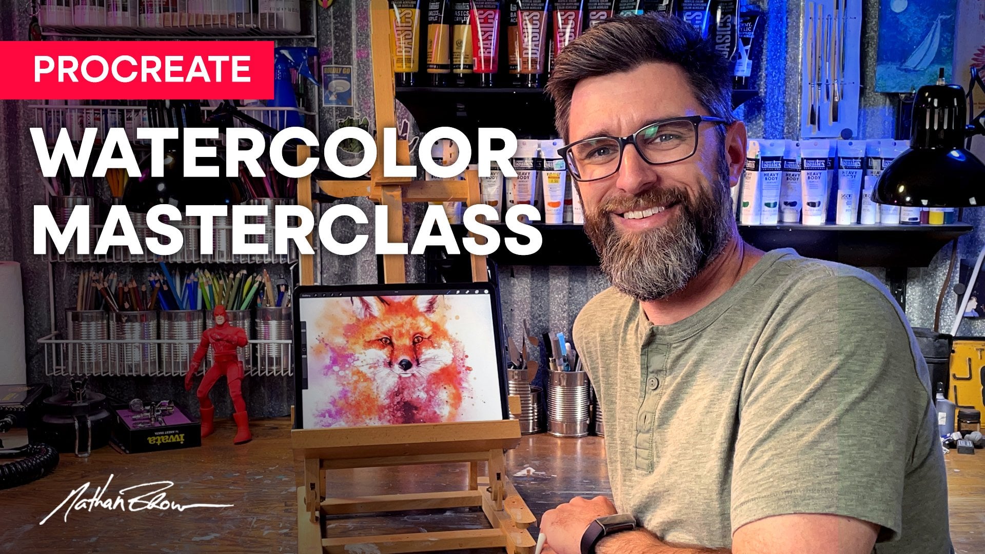
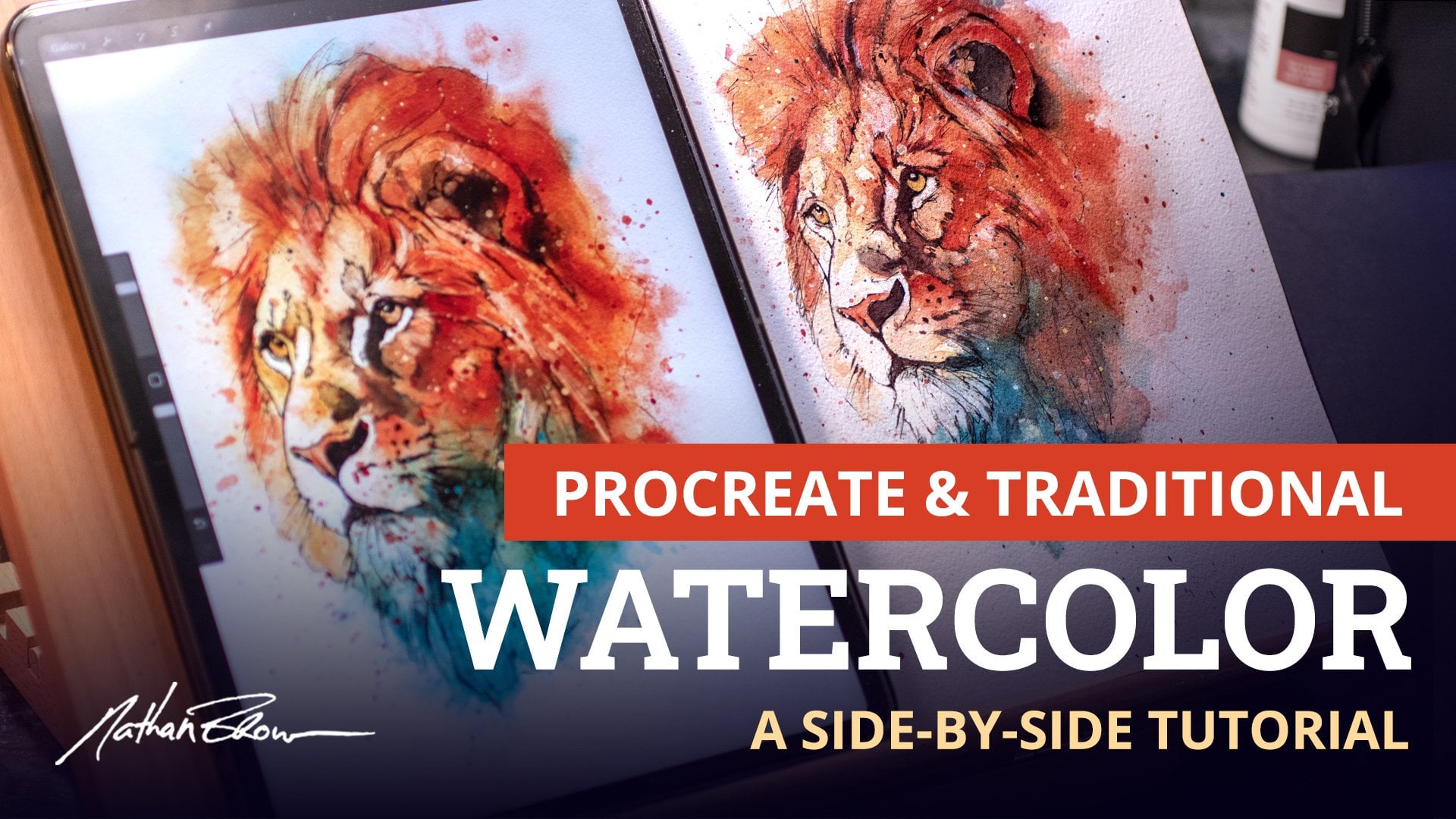
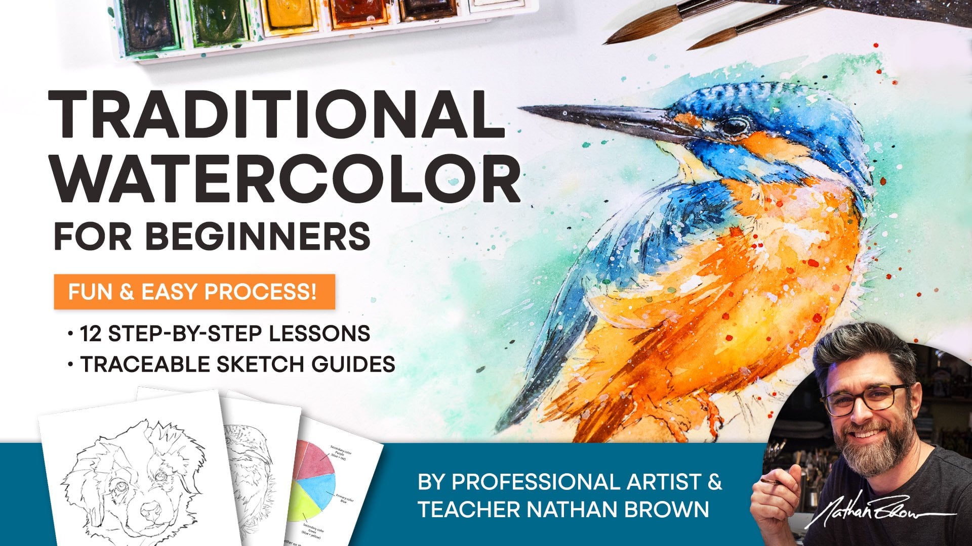
Transcripts
1. Introduction: Have you gotten started painting digital watercolor and have an understanding of the basics, but feel stuck or like
you're not improving? We'll get ready to
take a deeper dive into digital watercolor with my new intermediate level
course. Hey, I'm Nathan Brown. I've been a
professional artist and illustrator for 25 years, and I'm absolutely in love
with digital watercolor. I'm the creator of the top selling Master
watercolor brush set, along with the Procreate
Watercolor master class, both of which were
created to share my experience and
love of this medium. I developed this course to take your watercolor
skills even further. We'll cover everything
from finding inspiration and how to
include it in your work. Look at how to develop ideas and concepts and turn them
into paintable drawings. We'll cover all of the watercolor techniques
that you need to remember along with what brushes and methods are best
suited for creating them. We'll also look at
composition, values, and color harmony from a
slightly different approach to help you cement them
into your process. After a couple of
practice paintings, we'll tackle the
final course project broken into multiple
easy to follow steps. I'll be using the iPad
and Procreate for this course and will include the brushes and canvas
that I'm using. I'll also provide my sketches
for you to paint from, along with instructions
and insight for you to create your own
sketch if you prefer. So join me in my studio for this unique course
on watercolor. I filmed it in a one on
one super relaxed style. This creates a freer, more light hearted experience
helping to immerse you in the creative
process and reduce the pressure you might
feel from other courses. So grab your iPad
and get ready to dive deeper into the world
of digital watercolor.
2. Finding Inspiration: Hello, and welcome to
this brand new course. I am so excited that you're here and I can't wait
for us to dig in. Now, if you're familiar with
some of my previous courses, this one is going
to be a little bit different because I'm
shooting it in a way that there will be
less intercut footage and there's going to be
less scripted dialogue. I've just got the cameras, and I'm hoping that it will create more of an
atmosphere as if you were maybe coming into the
studio and we were just hanging out together
and having a conversation, doing some art and learning. Now, if you've taken my previous Procreate Watercolor
master class, you'll know that that course
started with more like beginner and fundamental
concepts and then gradually move to some
more advanced level stuff. But it really only
touched on that area. So in this course, we're going
to spend more time talking about more intermediate
concepts more in depth. Okay? So in this first lesson, we're going to take
a look at finding inspiration and then how to
apply it into our own work. Now, finding inspiration
is one thing, but then actually applying it
on our own work is another. So I've got some
examples laid out, and we're going to
take a look at them. But first, I wanted to talk about there's really two
sources, in my opinion. There's two sources
of inspiration. There's inspiration that we might find from
other artists' work, and that could be
artist of the past. It could be 100-years-old. It could be something that
was just posted yesterday, an artist that you admire and
that you love their work. And the second source is
just the world around us, inspiration that we would
pull from a walk in a park or a walk in the city or maybe just something
around the house, the way the light
comes in through a window or something like that. So again, I've got
examples laid out of both, and we're going
to take a look at them and see what we can find. Alright, my first
example is from an artbok by artist Bob Peak. Now, Bob Peak is one of those illustrators that I
really love and admire. He did a lot of work in
the 60s and 70s and 80s, and it was just really a
prime time for artists that did a lot of commercial
illustration and traditional style artwork. Now, the first piece that I marked in here that
I wanted us to take a look at was this
one here because it's I think that this is a fashion illustration because the hat has the most detail. But what really struck
me about this one is this just solid
green background, which also provides the
color for the model's face. What really caught my
eye was this bright red, complimentary colored
highlight here. So, green and red are complimentary colors opposite each other on the color wheel, and this red really stands
out as the highlight. So seeing something like this, you know, how would I incorporate
this into my own work? Well, maybe maybe I
do an illustration. Maybe it's an animal portrait
or a portrait of a person, and I just fill the entire
image with some solid color. Maybe it's a cool color, like blue or purple or
green like this. And I use a bright
highlight like this. The complimentary creates a really incredible
color contrast. So with purple,
maybe it would be a bright yellow in the highlight
or something like that. I also really like how this less important detail is
just kind of scribbled in. Like, it's just
done really fast, and it's just this sort of scribble that creates
a really nice texture. So multiple aspects of this image to pull
inspiration from. Taking a look at another now, this one stood out to me and
caught my eye because of the splatters or the way that they're being incorporated
into the composition, and they sort of look like dots of light, which I
really, really like. And I think that's a really
incredible use of splatters. Now, I also think that these were individually
painted in. Like, this is not
an actual splatter. This is, like, intentionally
painted in dot by dot. The reason I say that
is because it's just so perfectly in line
with the composition, and it really just adds
to the lighting of the piece and it
just seems very, very intentional versus randomly tapping
splatters into the piece, which is what I often do. So how would I
incorporate this kind of inspiration into my
own work would be to try to paint some
individual splatters in and just make them
very intentional and very directional to see if
I could incorporate them more into the overall
composition of my piece. So taking another look
at Bob Peak's work, this one also stood
out to me because of the primarily
solid black and red, which really frames up the
point of interest here, the focal point in this image. I also love these
just sort of, like, scribbly lines because it creates some motion
in the piece. I think is really cool
because the characters got like maybe he's diving. I think this is maybe oh seven, and he's maybe diving
or dodging something, and it's just creating this nice motion in what would otherwise
be a static image. So I just love these lines
and what they create. Now, how would I use this? Well, maybe I'm
going to incorporate some sort of scribbly type lines or waves in my next piece that really tries to incorporate
some movement like that. So as we're going through and we are looking at
other artists' work, I want you to notice and
to understand that I am not comparing my own
work to these artists. I'm not saying that
they're better than me, and they're at a level that I will never reach because that is a very unhealthy way to
look at other artists' work. You want to take the approach
with a learning mindset. So you want to look at
someone's work and think, What can I learn from this? What can I understand about
what the artist was thinking? What is it about this
work that appeals to me? What can I take to my own work? Keeping that sort
of a mindset is a healthy way to use other artists work
as inspiration versus, like, a source of comparison. Okay? So let's take a
look at another example. You know, this is
a comic book cover by artist Bilsonkevich. Now, this one uses a lot of really great
really great colors, but what I'm noticing
the most about this one is the
compositional elements, the way that the focal point is sort of in this square frame, and there's these
lines that are coming through and the lines coming in. These ships are
actually going out. But what's happening is the
lines are coming in and pointing at the focal
point or the main subject. Now, something that I do
often do in my work is to frame the main subject
in a box like this. And something that's also
really cool about this is breaking the edge of
that frame or that box. And this is actually happening a couple times because there's this inner box with other characters that
are breaking the frame. I think breaking the
frame like that is just a really nice
compositional trick that you can always
apply in your own work. Taking a look at one more. This one is a TV guide, and it is from June 4
through the tenth of 1983. Now, again, this is sort of like this Golden Age kind
of of the like, commercial illustration because
this is a TV guide cover. This would have
been on a newsstand at the grocery checkout. And it's just this beautiful
piece of art that was just there almost as
something that you would buy and then
eventually throw away. And that's just incredible to me that art
like this was just so just everywhere
and so common. So the artist on this, his last name, his
signature is Dudash. I'm a little bit less
familiar with this artist, but this particular work
is just incredible to me. I think this might be a
water based media, possibly. This could be maybe guash. But it's what really
catches my eye is how the figures are outlined
with this sort of loose, multi colored thick outline. And I think possibly what has happened here or part
of the process for the artist might have
been to take some of this color beyond the
edge of these figures and then to come
back over that color with this white or
sort of cream color. And it creates this bit of an abstract edge of color that is slightly
bleeding beyond the border. I also love how this blue in his hat is going
into the shadow there, and it's also coming into
his eye a little bit. Also the dark outlines of
this helicopter and car. Instead of that being black, it's the same blue again, and I think that's a
really cool little aspect. The orange of the
warm skin tones against the blues is
just a really nice, really nice color contrast. Now, if I were to try and incorporate something like
this into my own work, I might try that letting paint bleed be on the
border and then coming back in with white and
just filling it in to see what sort of
edges that would create. Alright, so that
is taking a look at other artists'
work and viewing it as a source of inspiration and pulling out some
items or some things, some of the process that we might incorporate into our own. Now, in my studio, it is full of artwork
and artists work that I admire and that pull inspiration from
from time to time. For example, if I'm
stuck on something, I might pull one of those
covers or one of those books or a poster or a film poster and just study it
and think, you know, what was this artist thinking when he did this
thing or that thing, and then just try to let that absorb and apply
into my own work. Let's take a look at
some examples of finding some inspiration in the
world around us or in our house or on a walk or
while we're out in the city or whatever it
might be and how we might apply that
into our own work. Alright, taking a
look at this photo, which is easily something that we might have taken
while just out walking on the street and taking inspiration or maybe
what caught our eye was the way that the sunlight hits this wall and sort of goes
across the scene like that. Now, if we notice here, this wall is sort of a neutral, kind of a beige kind of color. So down here is in shadow, and then up here is where
the sunlight is hitting. So if we look the color
here is very warm. It's sort of this
warm beige color. And then sampling down
here in the shadow, look how it jumps
all the way to, like, this bluish gray. Now, looking at it, we know
that it's the same color. This wall is the same color. But just sampling those two, we can see just what
kind of a jump is happening in the shadow
and into the light. So how might we take inspiration from that and use
that in our work? So if we take a look at maybe we've got a sketch of a bird. Now, this could be anything
that is a solid color, maybe the tone of someone's
skin or a brick wall, like we have in the photo
or really anything. But we're going to use the same concept to help
us in our color selection. So maybe this bird is maybe
he is primarily orange. In tone, and then the light
where the light hits, he's going to be this
sort of orange color. And then what falls into
shadow is all blue. Just taking a simple
concept like that, and maybe the light
kind of breaks up, and it's making like a
pattern onto his chest there. Just something as
simple as that, which is inspiration that
we pulled from this photo. Now, maybe we come off the street and we're
in a park and we just snap this simple photo
of a bird on a branch. Now, the colors are all
very neutral in this image. Now, I do like this
sort of brownish, sort of bird sienna kind of tone against all these neutrals. But overall, though,
the entire image, even the bird itself is just
kind of this neutral tone. But what we can take from this, which I think is really
interesting is all of these is all of these branches
make my brush smaller. All of these branches
that are sort of just going all over
the place in the image, just making this sort of
nice um aspect to the image. It could be used, I think,
as a compositional element. Now, what if we were to draw or paint a bird
and we would use the branches to potentially frame the subject in
an interesting way, something that just
might incorporate and draw the viewer's eye in
and frame our focal point. So something like that we might draw inspiration from just to help us in developing an
interesting composition. Right? So now maybe
we are back home. Maybe it's raining outside,
we're stuck indoors, and we've got the windows or
just interesting ways that the lighting is coming
into the room from outside that we might pull
some inspiration from. So looking at this window, we can see it's really the image itself
is framed up kind of nicely because we've got
these plants that sort of make this diagonal view here. But what I think is
most interesting about this image is the color scheme. So if we were to pull
some of these colors out and maybe there's
some nice cool colors. But then we've got this
really great sort of warm brown down here in the
bottom that are coming in. Now, if we take a look at this, you might think that this is black, but it's actually not. It's just this really sort of deep deep orangish yellow color, almost black but not quite.
Same thing with this. In the image, you might think
that this gets lighter, this light color
gets lighter than it does, but it's actually not. We still have a lot of room here before we
get to pure white. There's a lot of room
there for highlights. So just pulling the color
scheme from this image, just taking inspiration
from the colors found in this image just really
sort of ignites a lot of just some
creative ideas or ways to use this sort of cool green color scheme
against these warm browns. So that is just amazing to me that inspiration is
all over the place. It's everywhere all the
time. It's all around us. And it is creative
fuel, knowing that. It's creative fuel for my brain, knowing that I can
just find something that sparks some creativity
just from anywhere. And I want you to try a three part assignment
for this lesson. I want you to, number one, find an artist that
you really admire, that you really love
and take a look at their work and I don't
mean compare it to yours. I just mean find some aspect
that you like and see if you can pull something and maybe incorporate it
into your own process, something just really that
you find interesting. And I'm also not talking
about copying either. I want to be very
specific about this because it's not copying
someone's work if you are just taking some sort of process or some sort of little piece that
you can bring in, and then you can
possibly make it your own that you can add
your own flair to it. And then the second thing is to find some
inspiration around you, like in your home or out on
a walk in your neighborhood. Maybe, again, it's the light
coming through the window. Maybe it's the colors
in a brick wall or maybe it's a bookcver that you have on
the coffee table, just anything like that around you that you can pull
some inspiration from. And the third part is, from this point forward, never leave your home without either a phone with
a good camera or a small portable camera
that you can take with you, or if you're old school, maybe it's a notepad
or a sketchbook, a small sketchbook
that you can jot some ideas or some
quick sketches in. Just something that
you can record some ideas that you see in the moment that you can remember to help you remember and
use later in your work. So these are all
things that are going to fuel your creativity and help you to spark ideas and bring some inspiration
into your work. So in the next one,
we're going to take a look at combining
some elements. So bringing multiple reference
images in and combining those elements to create a single image or idea
for a piece of art. Alright, so I'll see you there.
3. Creating Concepts from Reference: Okay, so we just took a look at how to find inspiration,
where to find it, and kind of how to incorporate
it into our own work and just how to process it in
our artistic brains, right? So now in this one,
we're going to take a look at how to gather some different references
and really kind of how to just generate some ideas
for potential paintings. So we can put that
inspiration to use, and we can maybe have a
backlog of different ideas, different concepts
for future work. So what I've done here is I've
gathered some references, some reference images of
just all different kinds, and we're going to
take a look at them together and see what we can do to just make
them more interesting, to add some interest to them to create a real appealing image. Okay? So let's go
ahead and take a look at the references
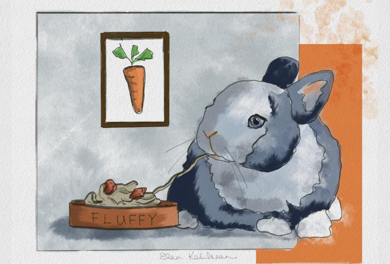
that I've found here. So I've got lots of cats. I've got a dog, a rabbit,
a couple of portraits. Flower. Now, lots of cats
because I'm a cat person. So if you're a dog
person, be cool, right? So I've got a dog here, too. I love doing pet portraits. If you follow any
of my work before, you've seen lots
of pet portraits, so they're just
really fun to do. And I think we can actually
take these and maybe spice them up a little bit beyond the regular pet portrait. Now, one thing about
pet portraits, though, that I want to mention
here is that if, for example, if this is our
cat, if this is my cat, it has emotional appeal to
me because it's my pet, or if it's a commissioned
pet portrait, it's going to have
emotional appeal to the client or whoever it
is you're painting it for. But to a general audience, we probably need
to do something to it to just make it a
bit more interesting, to give it a little bit
of a universal flare so that someone viewing
it might might want it. This is maybe a painting or
a print that we're selling, they might want it, even
though it's not their cat, but it has something
sort of just generally fun and appealing
about the painting. Alright? So let's take a look at how we might
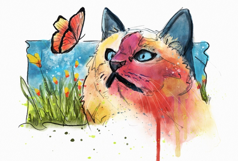
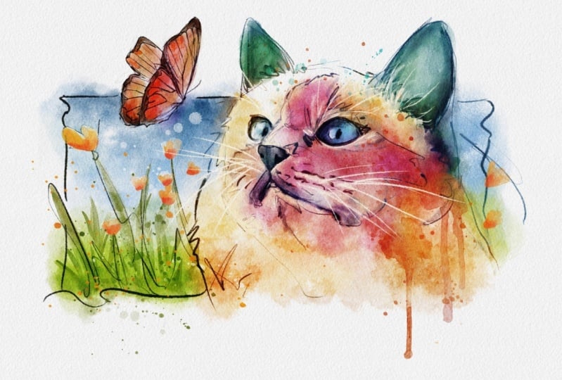
do something like that. So I found this reference
image of this cat. Now, what stuck out to me
about this one, of course, was the the blue eyes. Okay, so those really stood
out against all these sort of monotone whites and
grays in the image. So I save that one along with this one here with the
butterfly because though, Oh, wow, there's a cat with
a butterfly on his nose. I mean, it's incredibly cute. And that's kind of what I mean when I say a more
universal appeal because there's actually
something happening here that is going
to make everyone go, Oh, um, oh, that's so cute. You know, I have to have
this image and, you know, hanging on my wall or, you know, someplace where
I can see it often. Also, the colors
are really great. I like the blues and the
oranges in this one, too. So that really stuck out to me. So seeing both of these cat images together,
I thought, you know, what can I do with both of these to make them a
little bit more interesting? Now, I love the concept of
the butterfly on his nose, but it's kind of obstructing
part of the cat's face. So I thought, Well, what
can we do on this one Because we're seeing more of
the front of his face here. So I feel like a butterfly
on his nose, you know, is going to obstruct a
lot of his face here. So I didn't want to do that. And I also thought, I like the angle that the cat
is kind of looking. So I'm thinking, Alright,
well, maybe we could do kind of this rectangle
sort of composition. You know, where the
cat is maybe kind of in a scene but is partially, like, breaking the frame, his ears, or his head
or breaking the frame. And maybe there's maybe it's
a grassy field, you know, maybe there's some flowers
that are maybe breaking the frame a little bit
here, something like that. And then we could probably
drop that butterfly here, and he's about to land on his nose. It hasn't
happened yet. So he's looking
at the butterfly. And what we've done
here is we've sort of created this interesting scene. Now, this has more
universal appeal to me than just a
portrait of a cat. Alright. Now let's
take a look at one more cat this
one stuck out to me, too, because of the ears. The ears are just really big and that reflection in the eyes there this is a
great cat portrait with really great lighting. But now, what could we do to this one that might give it some of that
universal appeal? So one thing I was
thinking would be to maybe add maybe add some headphones. Maybe he's listening to music, and that's what's giving
him this expression. Now we would probably have to
do something with the ears because the top portion of the headphones might be a little bit obstructing might obstruct
the ears a little bit. But that could be really
fun because it's like, Well, I love music. I love cats. I need this image. This really appeals to me
because it's a cat wide eyed, ears pert listening to music. But another let's try one more because I
really like this one, and I think something else that could work for
this one would be maybe a fun be a fun
hat of some kind. Maybe it's a winter hat. Now, this would probably
this would probably just we would remove the ears completely because they would
be tucked into the hat. And maybe he's got
this big scarf on. You know, something
like that could be really fun to
do, fun to paint. And again, it gives
it kind of that just fun and universal appeal. I live in a cold climate,
or it's Christmastime. It's the holidays, whatever
it is, you know, like, maybe the hat could be red
and the scarf could be green, something like that that just
gives it kind of an appeal, like, Oh, I I want this image. I love this I love
this painting. So this rabbit really
stuck out to me, and mainly I love
the shape, right? That's such a great just full full bodied
image of this rabbit. And I think that also
what caught my eye, too was this expression. And I just think, I'm
giving personality. My imagination is
giving personality to this rabbit that probably, you know, it doesn't
exist, of course. But I can't help but just
imagine these whiskers. I mean, it's it's such a
great such a great image. So I'm thinking to
myself, you know, what could we do to this rabbit that would
just punch it up a little bit beyond the portrait
of a really cute rabbit. So the cause the eyes are on
the side of the head here. I can't help but think, like, he's got these big
glasses, you know, something that a rabbit would never I mean, I
can already tell. I'm probably gonna have to paint this because it's just so fun. And maybe the frames or the sides of the glasses would have to
go behind his head there. It's eraser. Something
kind of like that, I think would be would just
be really, really fun. Okay, looking at our dog here, that's our last animal. So, this one, I think that
the overall shape is great. And I think we could probably
add a frame to this one as well because I'm just kind of my imagination just
kind of sees it there. And I see multiple opportunities to sort of break the
edge of the frame. You know, maybe it's
kind of thin like this. And then, you know, we
probably want to have a good shape. For the head. So you can kind of see I mean, this probably needs
to be painted, too, because I just think that this is such a great image. You know, something
kind of like that where we've got a nice frame, so the composition is
taller than it is wide. And so we've got this
nice composition that would make a great
portrait of this dog. But now, what could
we do to this one that might just punch it up a little bit beyond just
a simple portrait? So let me switch over
to a red color here. You know, glasses
would be great, but we just did that
on the bunnies. So maybe he's got, you know, a big scarf or a big collar
or something would be cool. But I think that would kind of break our composition
a little bit. Maybe he's got maybe
he's got, like, old style motorcycle
goggles, you know, something It's just he's really large. Like, maybe this dog maybe he rides in our side
car to our motorcycle. And then he's got strap for the It's kind of a rough sketch, but hopefully you can see that where I'm
kind of going with it. Like, he rides in the side
car of our motorcycle, so he occasionally
needs goggles, and something about that just makes me really
want to paint it. Just that whole concept we might even have to do a version where he's actually
in the side car, that would be incredibly fun. Okay, so now we've
got a portrait. So this is a little bit
different here because now we're looking at a portrait
image of this woman. So now I'm thinking
about composition, okay? So, like, what portion
of this portrait? Because this is something
like, you know, maybe she's at lunch or
something, and, you know, somebody grabbed a phone
and took this really, just a real simple portrait. The lighting is very even. You know, this isn't like, not lit like fashion photography. It's got very even lighting. So what I'm noticing
here right off the bat is her gaze is off
in this direction, and it's kind of making me feel like we could
do some things over here with her hair and possibly add some elements up
here around her head. But just starting off, though, I want to grab something
some portion of her that would add to the composition or sort
of create the composition. So I'm thinking about
something kind of like this where we're not going
to get all of her arms, but we are going to get her
hair into the composition. Maybe something like that.
Now, she could be some kind of maybe she's like maybe
a fantasy type character. So she's got maybe
these florals, maybe she's got big
flowers here in her hair, different
size flowers. And maybe there's some,
like, floral pieces. Like there's maybe some like
stems that kind of look like ferns coming off here,
something like that. And maybe because of the
florals in her hair, maybe there are it's
attracting some butterflies. Maybe there's one there.
Maybe there's a couple over here that are different sizes. And maybe maybe she's
some kind of, like, a floral goddess
kind of character, and maybe she's got a necklace here that could be
really kind of ornate. Maybe she's got, like, a little bit of a facial tattoo
or something like that, that's something about
who she is, maybe. Something kind of
like that. I mean, that could make a really cool, really interesting
character to paint. I moving over here
to our flower. Now, this kind of
looks like it's a setting that's like aquatic that looks like water back there
in the background. And I'm already seeing like
a vertical type composition, kind of like what we had
up here with the dog. So maybe the flower creates the base for our
overall composition. So it's taller than it is wide, and it gives us some room to maybe create something
up into this area. So maybe there is maybe we probably have
a wash of some kind, and maybe we've already
done butterflies, so maybe this one because
it's a water type setting, maybe there's a drag Whoops. Maybe there is a dragonfly. You can see how rough
my sketches are, and it's just so that
we can get an idea. It's just to quickly generate ideas that could
potentially become something. So you don't have to spend
a ton of time on these. You don't have to put, like, a ton of effort to just
generate a quick idea. Just think of this almost
like a sketchbook. Now, looking at
this last portrait, I see there's a couple
things here that this is a really interesting
looking portrait. Now, my first thought was
because we had talked about what we had seen Bob Peak do with
the overall color, and then the highlights
were this real, just bright,
complimentary color. And I thought, Oh, you know, what if we were to take
something that was just, like, maybe an aqua sort of color that just
feels Let me get Well, I need something more
transparent so we can see I something like that. If the whole base color was
this aqua green, aqua blue, and we had, like, this
yellow that we could use to maybe outline all
of the highlights. This was my initial thought, you know, just doing
something kind of like this. So all these highlight
areas would be this, like, yellow, bright
yellow. Kind of like that. But then I thought, Well, but we're doing all this
other really cool stuff. So what could we do to make
this a bit more interesting? What kind of element
could we add? Because the expression
here is just one that is kind
of I don't know. Kind of it's interesting.
It's peculiar. Like, there's just
something about it that's kind of I don't know. It's just interesting to me. So what if we added something
where I don't know, just a feeling of kind
of like a fantasy type, something to add to this
expression and just give the overall
painting more interest. I'm thinking, what if we
were to add a fish here? It's maybe swimming
around coming around the neck So what
would that look like? And maybe since there is a
fish in this scene here, what if there were bubbles? So now, something about that
is just really it's really it just feels like it
just has this level of interest that was already kind of there in the
portrait itself, but it's almost like it's
enhanced now because there's just this cool visual aspect or potentially cool
visual aspect. Okay, so what we've
done here is we've taken all of these
reference images, and we have added
a concept to them. We've added, again,
this level of interest that could push these beyond just simple just simple
reinterpretations of the reference as it is, you know, without adding
any sort of elements. And I think, again,
this does create a bit of just fun
visual interest. So as an assignment
for this one, I'd like you to
gather at least three reference images like these, and they can just be something random that catches your eye, something that just has a little bit of
interest off the bat, and I want you to
add some kind of cool element to the images
that you find so that you are adding overall
visual appeal so that you're creating this backlog of concepts that you can use
for future paintings. Now, if you have trouble
thinking of something, try to to visualize, like, two unrelated things. Like, we had cat and snow. We had rabbit with glasses. We had Potrit and fish. So you might have,
like, dog in space. You might have cat
on the beach or butterfly in snow or
just anything like that, just two unrelated things or two things that you
normally wouldn't associate together because that can add that appeal and make
for an interesting image. Okay, so give that assignment
a try, and in the next one, we're going to start doing some composition sketches to further these concepts along to
sort of test them out to see if we want to make
future paintings with them. So I'll be there, and I'll
be ready when you are.
4. Turning an Idea into a Sketch: All right. In this lesson,
we're going to take a look at taking a
few of our concepts from the previous lesson and
then refining them into more of a completed sketch that we can then use in our
final paintings. So I have I consider there to be really three different
methods to create our sketches, and they are the
same in terms of you are using some sort of a guide to create the
final sketch from. But each method really kind of has its own advantages
and its own drawbacks. So we're going to go ahead
and take a look at that now. So I've pulled three of the concepts from
the previous lesson that I felt the most strongly about that I thought might make some interesting
sketches or good examples to do our sketches from and maybe even
our final painting. So first up, I have
this rabbit here, and these I've got the
sketches or I'm sorry, the concepts open in
an app called VizRf. So it's an app that I use to manage and keep track of all my reference images
for individual projects. And the way that you can open
a split screen like that is to just drag up from the bottom. And then when this
little menu pops up, you can take Viz Rf and just drag it over until
you see the split screen, and then you can adjust the width of the screen
that it takes up. So back to those three methods
for creating our sketches. The first one I want
to take a look at is just simply the
free hand method. And this involves just
taking and eyeballing all of the shapes and the
forms that you see and creating a
rough sketch from that. So as you can see here, I have use basic shapes and forms to sort of generate
a rough to work from. So I'm just taking
something that's maybe maybe three circles here. Just sort of create
the face from, and then like an
overall shape here. Just studying the reference
and just really roughing in. And you can tell by
looking at it that I mean, it's really super rough, and I'm going to go
in and refine it. I'm going to use the rough as a guide for a more
refined sketch. Okay? Now, the main drawback of this method is it's going
to take the most time. And it's probably
going to utilize your drawing skills to the
fullest because you are relying on your own perception of the shapes and forms
from the reference. But I think that the
benefit is sort of it gives you the most freedom to create
your own interpretation, meaning that, like,
there's going to be it's not going to be an exact
representation of the reference. It's going to be more like
your take on what you see. So to give you an
example, I have Whoops. So my bunny is sort of
looking more at the viewer. And then if we look
at the reference, I think he's probably looking a little more off to the
side, kind of like that. Okay? So it's not an
exact representation. Now, again, I'm
going to take this rough and I'm going to
take the opacity back. And then I'm going to use I'm gonna use the rough as a guide here and create a
more refined sketch. I'm basically going to create linework that is refined
enough that if I wanted to use it and leave it visible in the final
painting, I could do that. Because right now this
rough is probably just a little too scratchy and
scribbly and rough. So I want something
that's a bit more refined that I'm
paying attention to, maybe accounting for
some of the fur, creating some texture
with my linework, that sort of thing. So if I were to go
along and trace the entire rough I might end up with
something more like this. So if I turn the rough off, you can see that the line
work is just a bit cleaner. It's still sketchy looking, and it still has a lot of room that gives it like that
sort of a free hand look. But it's clean enough that I could definitely leave it
in the painting, I think. Again, because
watercolors transparent, you would still see portions of the sketch that are
view are visible. So I also created
another layer here with the whiskers and one more
layer for the glasses. So in order to
create the glasses, because if you'll
notice this is really super clean line work, going
to show you real quick. When you create a
line and hold it, it gives you this little
editing ability here in Procreate so you can kind
of refine that line. Because you're
probably not going to make a curve this perfect. So when you hold it, almost you can almost edit it
like a vector line. So now, if we duplicate that
and then flip it horizontal, we can use that to create the
other side of the glasses. So just a little
quick trick to get more refined shape
in your sketches. Okay. Now let's look
at the grid method. So this grid is on a separate
layer and it's transparent. So you can bring it in. It's a transparent ping file, and I'm going to include it
in the course resources, and you can bring it
into Vizref if you want. And since it's transparent, you can overlay grid on top
of your reference image. Now, for this, this method, I think probably the drawback
for this one is that it's going to take you a little
bit more time as well. But this one does allow for a more accurate
representation of the reference
versus just eyeball and freehand, just
the free hand method. But it does allow for a little bit of room for
your own interpretation because you're still making lines based on what
you're seeing. So there's going to be a little
bit of wiggle room here. So let's just say, for example, this is where I'm going to start looking at these four squares. I'm going to start with this one here at
the tip of the ear. So I'm going to choose
four squares here and just draw the same line here, just draw what I see
there in the reference. And what's cool
about this and you just follow along,
and a lot of times, I'm just going to
leave my finger over the reference to kind of guide my eye as to where I am. And I think that this method
is kind of cool because it does it's giving
me some freedom to sort of make my own
interpretation for the line, meaning I can make
some curves sharper, but it also allows me to be pretty accurate as far
as the reference goes. And I'm just making
shapes for what I see. And the reference, darker fur, I'm just turning into shapes. And just looking back and
forth at the reference. So we would go along and just do the whole sketch
using this method. And if we did so, we might end up with something
more like this. Let me turn the grid off. So the resulting
linework, I think, is probably good enough to use this as a guide for the painting or just
paint from this sketch. But if you wanted to, of course, you could go ahead
and take the opacity back and then on a new layer, start to create your own
more refined sketch. If you wanted cleaner linework, you could certainly do that. Now, in order to complete this, we would need to add the glasses and the whiskers on
a separate layer. Now, looking at the final method is just to create a
trace of the reference. Let me clarify a few, I guess, maybe myths about a couple of
these methods here. Now, I've seen comments
and people saying that using the grid or even tracing is considered
to be cheating. And I can tell you that nothing can be further from the truth because part of being an
artist is being resourceful. And if you want to use a guide, a grid or trace an image to
create your final piece, Your process is
your own business, and how you create an image
is completely up to you. There is no such
thing as cheating. As long as you are putting
your own creative input, your own creative thought,
your own creative imagination into whatever it is
that you're making. I've followed Illustrators of
the past and many of them, especially in a
production environment, would trace a reference. And because it is
faster and you are essentially using that
reference image as the guide, like we did with the rough
in the first example, you're just using it as a guide to create your final sketch. Now, I think that there is
also still some room to play within your linework, your shapes, and your
forms while tracing. I'm going to show
you how to do that. But I just wanted to
kind of dispel some of the maybe negative connotation that tends to follow
tracing around. So looking back, we're going to use the image
itself as a rough. So Again, if I were to just follow these lines
exactly as they are, then we might have an
image that is a little bit more static that has a little bit less life to it because we're just
tracing a photo. So we want to be able to
add our own creative spin. So I tend to want to do this exactly the same way
as I would draw. So that means give you an
example. This is not my line. Instead, it's made up of a
couple of different angles, a couple of different lines
to create that interest, that flare to the illustration, and that will translate
through to the painting. Okay, so I don't want to
just go like that and drag the perfect or
drag a just curve line. I want to add some shape to
it, add some dynamicism. I want to make it more dynamic. So as you can see here, we're going to end up with
something that's going to look a little bit different than
our two previous examples. And again, I want to state
that whatever method that you use and maybe you use a combination of these methods to create your final sketch, it's completely up to you, and I don't want you
to consider tracing as having a negative
connotation because there's absolutely nothing
wrong with it. I tend to mostly use a free hand method
for most of my sketches, but I do measure and I do take the time to try and
get accurate proportions, especially if I am trying to be very true
to the reference. And I will sometimes even open the reference
underneath like this and just measure what I've done to see
how accurate I was. I also think that's a great
way to learn drawing, too, because if you're drawing
from a reference, you can just take
that reference, open it up underneath on a layer and see
how close you got. Okay, so now we can
see that we end up with something
that's closer to the reference and that
has a little bit of a has more of a dynamic linework than just
being just making these, like, straight and precise
lines over the image. So let's compare it here
to our free hand method. And we can see by comparing
these two that the tracing method it's very much
it's more photorealistic. It's it's more true
to the subject. But then the free hand method, while it does take a lot longer, has a bit more of personality
as far as the artist goes. I'm probably adding a little
bit more of my own again, my own interpretation
of the reference. So while both of
these have merit, both of these have benefits, I think it is 100%
completely up to you to decide what you
use in your own process. So as an assignment
for this one, I'd like you to take one or
two of the concepts from the previous lesson and make some more
finalized sketches. Because we're going to
take those sketches into the next video and explore some different options
for compositions and making a finalized
plan for our paintings. Now, don't be in a hurry to make these
sketches. Don't rush. Take your time because I'll be here when you get
back, ready to go.
5. The Secrets of Composition: So at this point,
you may be thinking, Man, Nathan, when are we going
to get to some painting? When are we going to put
down some watercolor? Well, there are steps that we use like this to build
up a plan before we start laying down paint
because a lot of times maybe 80 to 90% of the painting is in
the planning process because we don't want
to take the effort of just of painting
and going through the motions of building an image without these planning stages
because it's sort of like we're setting
ourselves up for failure because that painting
may not turn out like we imagined
in our heads. So this is like a way of
just confirming the idea, what we see in our head,
and to get as close to that as possible before
we start the painting. So in this lesson, I want to look at some compositional
elements that we need to consider because we've got our idea, we've
got our sketches, but now we need to decide
kind of how to place that subject on the page and some other aspects of that
before we start painting. So I've got some examples here that we can take a look at. Now, first up, I've got this just quick sketch
of a bird in flight. Now, I paint a lot of birds, and it's a really
simple subject. It's a great way to illustrate the point of this composition, these compositional elements
I want you to remember. So now, looking at this,
we might just think, well, let's just place them right in the
center of the page, which actually really is fine because it still feels
pretty balanced as far as the negative space
goes above and below. Like that just feels pretty
balanced and pretty nice. So there's really nothing wrong with just placing him
right in the center. But if we move him down
closer to the edge, it tells a little bit of a different story from a
compositional perspective because now it seems to me like he is flying
in this direction, and the composition is
giving him room to do so. But we can do just the
opposite, move him up here. Now it feels a little
different because now it feels like maybe we're on the ground and we're
looking up at the bird. And this space represents the distance from
us to the bird. So it's a very different
painting just from moving him around within the space that we
have on the page. Now, what we want to avoid, though, is something like this. Because now this feels
really uncomfortable. And the reason is because
of this really close edge, like, the subject just
doesn't have room to move, it doesn't have room to breathe. So it just feels it looks and feels uncomfortable to our eye just because of the positioning. It's the exact same sketch. It's the exact same page size, but just the positioning
of the subject on the page has that
kind of effect. So another thing
to consider, too, is how we fill this
negative space, because we could take
the negative space and we could fill
it with a wash, something like this, or
we could do something where we just kind of have a wash that surrounds
the bird like that. Or we could fill
the entire thing, the entire page around the
bird with maybe, like, a light blue that kind of represents the sky or
something like that. But one thing to consider, though, is a border option. And the reason I say that is because a traditional
watercolor, oftentimes the paper is
stretched and taped to a board. And that's so that
the page itself won't buckle and bend as
it gets wet and dries. So when you remove that tape, it creates this white
border around the painting. And I think that border
it helps the composition. It helps to free up some space and give the
painting some room to breed. It's it's a watercolor
technique that actually ends up lending to the actual
look of the final painting, giving it that white
border or white edge. But another thing to
consider, though, is the size of that edge. Now the taped border becomes more of a compositional
element because we could take that border and we
could fill that with a wash or we could fill it
with just a solid blue, kind of like if we were
to fill the whole page, and that kind of
represents the sky. But what's really
great about this from a compositional
standpoint is how some elements of the subject
are breaking the frame. And I think that just makes
it interesting to look at. It just makes it more of an
interesting composition, and just something about it just kind of
draws in the eye. Now, another thing to consider too is the overall page size. So maybe we don't want to do that standard
portrait orientation where it was taller
than it was wide. Maybe just a square
like this might work for this particular
subject because we can see here that it's still the same positive,
negative space. It still fills that very nicely and still
feels very balanced. And if we view it here and just fill in
that negative space, and you can see still
feels balanced, but another thing to consider
too is the silhouette. Now, the thing about the
silhouette is it does help us to make sure that the
subject is readable. So if we zoom way out, we can still tell
that that's a bird. And that helps to just sort of cement the whole
composition and to make sure that our subject is a
good readable representation. So that is also
important as well. Now, if we also take a
look at our sketches. I went ahead and I did a cat sketch based on
the concept that we had, and I like how this one is coming together from a
compositional standpoint. I think that this
overall rectangle really lends well to the landscape
orientation of the page. And I think there's some
opportunity there to we've got some edge breaking
happening here with the ears and the cat's
chest down here. And the whole thing just feels really nice to
me and really balanced. And I think that we'll
probably do something like this or tackle this one
for our final project. Looking back at the
rabbit, though, the sketch from the last video. Now, this is kind
of like the bird. I mean, it's pretty simple as far as the subject goes
and the overall shape. Now, I do think that
there's a couple things that we could probably do here. I think that we could anchor
him with a shadow down here. And then I think we
could probably see if we wanted to move
him further down the page might give us
some opportunity to do something up here to make it
taller, to fill the space. You know, this could
be filled with, like, a wash or a gradient or
something like that. Or we might we might
even try maybe adding a wash that is
sort of shaped like this, maybe, where it sort of comes down and just kind of it fills in the top
half of the rabbit. And maybe we even leave
this area unpainted, or, you know, just let the
sketch fill in the rest. Or maybe if it is painted, it's a very neutral, very light light gray or
just very neutral color. So if all the color was here and the majority of the paint
values were up here, it would kind of reinforce
that focal point, which is the glasses. Now, of course, we could
do some splatters, too, you know, something that kind of extends the wash a little bit,
something like that. So this is a pretty
simple subject and a pretty simple layout, but there's still some
important decisions to consider from a
composition standpoint. And hopefully this demo
helps you to understand that that's really there's things here that you may not
have even thought about, but there are actually important decisions towards creating a successful painting. So as an assignment
for this one, I want you to take your sketches
from the previous lesson and lay them out in a composition on the page that we're going
to be painting on. Now, I want you to keep in mind the page size and
the orientation. So is it landscape?
Is it portrait? Is it square or something else? Make sure that you think about
the borders and the edges. Is it a taped border? If it is, what size
is that taped border? Also, consider the positive
and negative space. So make sure that
everything feels balanced and that the
subject has room to breathe. Also check your subject's
silhouette and make sure that the subject is
readable from a distance. All right, so give
those things a try, and then let's head over to the next lesson where
we're going to be talking about how to simulate some realistic
watercolor techniques.
6. Watercolor Techniques to Remember: Alright, here we are back again, ready for another lesson. And this one, we're
going to be taking a look at how to simulate some real traditional watercolor techniques in a
digital environment. And I'm going to reiterate some concepts that you may
already be familiar with, but I want to sort of make
sure that these concepts are cemented in
your brain because sometimes you need to hear
things multiple times, or maybe you need to hear
it a slightly different way to have sort of that
aha moment like, Oh, wow, this makes sense. I could commit this to memory
and begin to apply it. So we're going to go over
the we're going to go over the brushes that we have that
are included in the course. And I want them to I want you to understand
what they are used for, the different brush types and the traditional technique
that they are assimilating. All right, so let's
go ahead and let's look at some of the
brushes that we have. Now, the first is the
sketch kit pencil, which is just a pencil
that you've seen me use in the previous lessons just
to draw and sketch with. But our first watercolor brush
is the sharp sable brush. Now, this one is used specifically to create hard
edges in our painting. Now, if you'll
remember, the concept maybe from if you've seen previous videos of mine or you've been through
my previous courses, the concept of different edge
types, and there are three. So there's hard, soft and
completely lost edges. Now, this brush is specifically made to create a hard edge. Now, this is good for creating
focus in the painting, creating details that
are sharp and in focus mainly in the focal point where we want the viewer's eye, we want them to see that
first because our eye is automatically drawn to
sharp edges in a painting. Now, this is also assimilating a traditional technique
called wet into dry, where the brush is wet
with water and paint, and the paper is dry. Now, because the paper is dry, the water is not going to flow beyond the wet edges of
the brush stroke, okay? So the result is this
very hard edge stroke. Now let's say we want to add color in this an additional
color into this stroke. So if we choose, let's
get an orange and we paint with the same brush
into this wet area, we're going to get some
blending of the color, and we're going to
get some blurring or softening of the
initial layers edges. So we're going to see that that blue is now mixing
in to the orange. Okay? The reason that's
happening is because we didn't let or we didn't wait for
that initial layer to dry. Now, that's what would happen in a traditional painting as well. The two colors
would begin to mix. We would be creating
a larger area of water or wet paint for
the two colors to flow into. Now, let's say we want this initial area of
color to stay intact. We want to keep all
those hard edges. We want to add an
additional color. So in traditional, in
a traditional sense, we would have to wait for
that layer to dry in order for the above layer to
not affect the edge. So now, when we paint
onto a new layer, we're still getting
that color mix because watercolor
is transparent, but we're not losing the
initial layer's edge. So that's an important
concept to remember because sometimes we
want those hard edges. Sometimes we want
two colors to blend. We want to lose those hard
edges or soften them. And this is a way
this is a concept to remember so that we
know how to do that. We either want to let that layer dry or paint into the wet area. And the way to do that from
a traditional standpoint is to paint within the same
layer or a layer on top. The next brush that I
want to take a look at is the super wet into wet. Now, this brush is simulating a technique where the paper
is not completely dry. It's maybe a little bit damp. So the edge of the stroke is
going to bleed a little bit. So it's got a defined edge, but it's just a little
bit softer overall. So this brush also similar in the way that you can stack
or layer the colors. Now, if we if we paint directly over
it with another color, essentially not allowing
the initial stroke to dry, again, we're going to lose or continue to soften the edges
of the initial stroke. But if we are painting
onto a new layer, same way as before, there is less effect on
the initial strokes edges. So we still have
some defined edges, but overall, they are
a little bit softer. Now, the next brush is similar in that it creates
a softer edge. So it's kind of a wet
into wet technique. But this brush is different because it will continue
to build value. The more layers I apply, it will just get darker
and darker and darker, whereas the previous
brush will only get so dark before it hits
like a max level of value. Like, it's just not
going to get as dark as the pressure wash brush
or the pressure painter. Now let's take a look at how the pressure painter
will build values. Now, I'm applying
and I'm applying more pressure towards the left and then getting lighter
towards the right, and it will go with no pressure, it will just completely blend out to just completely
transparent. Now, if we want to apply
another color over this one, we're going to run into a
similar similar look as before, where the orange is really blending with the blue almost to the point
where you can't detect. I'll go outside the edge here so you can see that
there is some orange, but it's really picking
up a lot of the blue. So if we're on a new
layer and we're again, letting this layer
completely dry, we have more of a
glazing effect. Now the underlying blue
is having a lot of effect from the orange
because that layer is dry. So this orange is just glazing
over the top of the blue. Okay, so same brush, but two very
different effects by just understanding the concept of mixing the colors
wet into wet or allowing that first layer
to dry being wet into dry. Now, this next brush loaded into wet creates a very
soft edge as well. What I like to
primarily use this one for is with the smudge tool. So let's just say we have an area of paint that
has a very hard edge, and we want to soften some
but not all of that edge. So this is a great way to
really fine tune and control. So this would be like we've
got an area of paint here. Our stroke is still
wet and we're taking clear water and we're painting into that area of wet paint, allowing some of the paint
to flow out into the water. So this is a good way
to really control what areas or what
edges are kept and what edges are lost or softened. So the next brush is a
wet edges wash. Now, there is a concept in
watercolor where you are spreading clear
water onto the paper. And then when you
drop in the paint, it just allow that paint to just spread into the water, let it
do its own thing, and it creates this these nice blooms and
watercolor textures. And it's a favorite technique. It's part of what makes
watercolor appealing, in my opinion is
would you let some of these areas paint themselves. So with this one, you can just apply bits of different pressure soft
pressure hard pressure to get some varied or a varied wash within the
area you're painting. Now, another way to create a
watercolor wash is through these effects or stamp
brushes where a wash is applied with just one tap
of the brush or the pin. Now, this is created from a photograph of an
actual watercolor wash. So it has more of a varied, more organic look to it. And what's great about
these is how can we can move these around and position them in the
painting exactly like we want. Like, say, for example, if
we just wanted this area here that has a bit of splatter, we might just leave that
area in the painting, position it exactly
where we want, and then we can
blur out the rest, or we can erase the rest or blend it into the
painting, however we want. So there's a lot of
full control over exactly where these
washes are placed, and it does provide
a very organic look. Now, this last brush here
that I want to go over, there is an aspect of or a technique in
watercolor that I really like where you splatter alcohol into a paint area
that is not completely dry. And so what it does this
alcohol mix brush here, what it does is sort of creates
like a reverse splatter. And I'm gonna first
apply it with a brush to show you
what's happening here. So this would be like this
is almost like just adding texture to this area of paint. But if we use it with
the eraser brush, it's almost like it's simulating what it really does
to a traditional painting, which is just to create
these reverse splatters because the alcohol will act as a resist and will push paint out towards the
edges of the splatter. So this is just a really fun, really creative
technique that I like to use occasionally in some
of my digital paintings. So another aspect of
traditional watercolor that I want to make sure you understand is the role that texture plays, specifically the
texture of the paper. Watercolor paper has a
very rough coarse texture to it so that it holds
paint in a specific way. And if we take a look at our file here that
we're painting on, and this file is included
with the course, it's actually from
the wet media set of the Ultimate Canvas creator. And if I compare it here to
some actual watercolor paper, you can see that the
texture is the same, and specifically because I use this paper to create
this texture. Now, this is a cold
press texture that is common to it's probably the most common
watercolor paper. And you can see here that it
is built up or built up of several different
paper texture layers and a few paint effects layers. So if we go ahead and
we add a stroke here, let's get a couple
brushes in here. And if we turn this
group of layers off, you can see the difference that it makes turning the
texture on and off. It just suddenly gives it
this very realistic texture. Now, here are the
paper texture set, and here's the
paint effects set. Now, we probably can just leave the paper texture layers alone. But these, if we swipe
left and unlock them, we can change the opacity of the paint textures and it gives a very different
look to the paint. So I wanted to make
sure that we went over these texture layers
so that you understand the role that they're playing
in the overall painting. Now, I don't really have
a specific assignment for this lesson, other than, I want you to install the coarse brush set
and just play with the brushes like we have in this lesson and make sure that you understand
kind of how they work, try different
levels of pressure, try layering them on
top of each other within the same layer and
on a new layer just so that you have some familiarity
with how they work and the different
marks that they make. So in the next lesson, we're going to take these
brushes and these techniques, and we're going
to put together a one colour demo painting from one of our
previous sketches. So meet me there and get ready
to sling a little paint.
7. Sneaking Up on a Painting: Alright, so we have
found some inspiration. We've gathered some references. We've built some concepts. We've done some sketches. We've studied our brushes and the edges, the
marks that they make. Now we are ready to do a practice painting
with one color. Now, if you are going to use your own sketch or
you're going to follow along with me with the rabbit sketch that I
provided and the resources, either way, the
process is the same. We're going to be
studying values and just building up
contrasts, building up values. Now, before we get
started on it, there is a concept
that I want to introduce to you that
I think is super helpful for reminding you how to get started
on a painting. So with a traditional painting
a traditional watercolor, you oftentimes are
building towards dark. So you are starting very light, and because the
watercolors transparent, you're building
layer upon layer, and there's areas
that are getting darker and darker
with each layer. So the idea here is that you want to sneak up on a painting. So you don't want to
go in, for example, you don't want to go in with your darkest color and heaviest
pressure and most opaque. Instead, you would want to
start very light so that you can essentially sneak
up. Layer by layer. Getting darker as you go. Okay, because this
method right here, this gives you room to
make decisions as you go. Was this method here, it's like the final decision
has already been made. We've gone in, bam, with
our heaviest color. It's as dark as
it's going to get. We really don't have any
room to do anything else. So this is the method we
want to use to start. Okay? Okay, so taking a
look at our sketch. I've got the reference open over here to
the left in Isref, and a lot of times I
will just kind of use my finger to keep track of kind of where I'm at,
what I'm looking at. Now, again, my sketch is not exactly the same
as the reference, so I won't be able to
match it perfectly, but I can use it just kind of as a loose guide for values. Like, here's this
dark shape here. Here's this dark shape, here. This is a little darker than
the top of his nose here, things like that that
I'm just using as a general guide as to where
my values are going to go. So I'm going to start off
with a light blue color. And I think I'm going to
lay in a wash just to kind of put in a large area
of just light color, and then we're going
to build up on that. I'm going to grab
this wash brush, and I'm going to just lay down a very light blue wash
underneath the sketch. Again, just we're sneaking
up on this painting. So this is just a
really, really light, very transparent blue
wash that I'm just laying in just to give us
kind of a starting point, very, very, very simple,
very, very quick. Now I'm going to add a new
layer above my sketch layers, and I'm going to get a
little bit darker blue, a little bit deeper, a
little bit more saturated. And I'm going to use
the sharp sable brush. Now, again, I'm just going
in here and I'm looking for the places that I see
dark or darker values, and I'm going to start to
paint some of those values in. And these initial strokes are they're going
to have hard edges, and we will blend a few here
and there where needed. Okay? We're going to keep this
really simple and just go along and add in some value. And if you're
following along with me on the rabbit sketch, don't feel obligated to make
the exact same strokes that I'm making because let it
be your own interpretation. You know, you're not
going to be able to make the exact same size and exact same placement
of your strokes. So there's no need
to worry about that. Just evaluate the reference and just where you see
darker shapes in the fur. Make some little loose strokes
to represent those areas. Also, don't worry about painting as fast as I am if you want to pause and catch up. Feel free to do
that at any point. And don't worry about
being super precise. You know, this is watercolor, so it's going to be it's
going to be loose anyway. And this brush, you know, at this size is not going to allow us to be super
precise anyway. So there's no need
to worry about that. And, of course, let
this be fun, right? Don't get super worried
about how it looks. You know, they're going to
trust this process of just going through and filling in, building up these
values layer by layer. So we're not going
to be super worried about what it looks
like in the meantime. The last thing we
want to do is get stressed out about what is potentially an ugly stage of the painting because
they all go through that. They all go through this
ugly stage where it's, you know, not looking
quite right just yet, and you just kind of have
to see it through to the point of it being finished. Alright, so I'm almost
there on this second layer. Now, I'm not sure yet if I
want to leave in the sketch. So we're just going to kind of have to see
when we get there. You know, we're
going to possibly turn the sketch off or
possibly leave it in, but I'm going to go ahead
and kind of roughly outline some of these squiggly sketch marks so that there's
something there if we decide we want to
turn the sketch off. So in the fur, it's perfectly okay to
be kind of abstract, especially down in this area. Like this is our
focal point up here. This is probably where
we're going to have the most values and
the most hard edges. But once we start
getting down here, it's kind of like, Well, there's just some
abstract marks. Like I'm seeing kind
of where some of these darker fur shapes just kind of connect
a little bit. So I'm going to make kind of
some abstract shapes here, just little puddles of color. Of course, this area
here is darker, which we're going
to hit again with another layer to
bring up the value. So this second layer blue, you can kind of think of it as, like, the middle tone values. So this is probably pretty good. A little bit
more right there. I think looking around, I'm just studying
just a little bit to see if there's
any areas that need. We can always come
back to this layer, but I just want to try
and get the value in. No, that's probably. Maybe
something like that. No. So you just kind
of have to experiment. Don't feel bad about hitting the undo. That's
what it's there for. Laying a value, but doesn't
quite work. Always undo. Okay, let's go ahead and
let's move on to a new layer. And let's go even darker here, maybe somewhere right in there. And I'm going to keep the
same sharp sable brush, and we're probably going
to combine these layers and maybe smudge some
edges in a little bit. But for now, let's just go
in with our darker blue. This is just working
pretty good. I like that it's getting
quite a bit darker. This is a pretty simple sketch, I wanted to keep it
simple because I wanted these concepts
to be easy to apply. The more complicated
the sketch becomes, the more complicated it
becomes to lay in the values. So this is just a
really simple sketch that is perfect for what we're doing here because it's very easy to see where
the values are. Okay, now, zooming
in on the face here, this is pretty dark here here size my brush down just
a little bit to get in. And you can see that
I'm definitely not worried about being
super precise. Again, I'm tracing a little bit of these outlines in case we want to remove the sketch layer, which I think we might try. So that means I'm going
to need to go over the Is because sketch is where a lot
of the value is in the I. All right. This is
looking pretty good. You can see how kind of
fast and loose this is. Like, we're not You know, we're not spending
a ton of time. This painting is
not going to take us a real long time to do, so that makes it great
for a practice study. Oh, I can see I did not I didn't do any kind
of outline on the ears, so the edges of
the ears are gonna disappear if we turn
the sketch off. So we're probably going
to have to come back and add those in. And I might might want to, like, let's just add a
couple of splatters outside. Do that with a
different color too. Do a couple that. I'm gonna go back to this layer and just
see if I can just get a lighter blue just to go over the ears here
with some sort of a stroke so they won't
just so the edges won't disappear if we turn
off that sketch layer. We're also going to need to do a layer and darken
in the glasses. I'm gonna go ahead and add a little bit more
value here with this sort of medium blue
because we kind of have a little bit of a
It's just there's too much too much there's too much contrast happening right there between
light and dark. There's not enough
middle value in there, I think. Maybe right here. Okay. Yeah, maybe something like that. Add a little bit
right there. Okay. So now let's go ahead and
let's add a new layer. Let's go back to
that darker blue. And let's just add in the
shape for the glasses. I'm going to use the
sharp sable brush for. This is well here. I'm going to need
to size it down because I want the glasses
to be pretty dark. And I also kind of want to
stay in the line on this one because I don't
want the shape to be super loose initially. We might blur a little bit or soften the edges a little bit, but initially, I want to have a pretty good shape
on the glasses. I don't want that
to get too lost because it's such a focal point. I think this is
going to look great. Here in just a minute when
we turn this sketch off. Oh, we got to do the this part of the glasses here
almost missed. Alright, I'm going
to go ahead and turn off the glasses sketch. So we can see a couple of areas. Let's go ahead and
clean up the edge. Here. Maybe about it 'cause I like how we've still got some sharp
edges in there. I'm going to darken
it right here. Yeah, it kind of looks like Is it looks like
real watercolor, how I could still see some of the edges within the stroke. Okay, if we were to
turn off the sketch at this point here, I can see that we don't have enough we don't have
enough detail to do that, and it still read really well, so leave the sketch on for now, let's go back to the dark layer. Let's size my brush
down a little bit and just get in some of these detailed areas to define it things a little bit more so we can turn
the sketch off. We want to do that. My
end up leaving it on. But overlapping these
strokes like this, it just really really gives it the look and these overlapping hard edges like both of these strokes
have a hard edge. Both of these strokes
have a hard edge, but when they overlap, it kind of it visually softens. And we're actually going to soften it even more here
in just a little bit to see if we can maybe lose a
few edges here and there. All right. So again, this is a great study, especially we're doing
it in one color. It's a great value study. But in the next lesson, when we do the same
sketch in color, it's really going to be a
different kind of experience, but we're going to
be utilizing what we already know about the subject from this
one color study. All right. I really want to
get some detail in around the eye because I noticed
that it was kind of lost. And Then this one as well. And it's still loose and quick. Like, don't worry about
getting too detailed. Alright, let's see kind of where we are with
no sketch here. Yeah, I think that
that's starting to work, let's zoom in on the eye. Let it go maybe a
little touch darker here just to get in because
this is the eye is important, especially in an
animal painting. Really got to make sure that
we have that detail in. And we could probably darken the glasses a
bit, too, but I mean, we may try a trick
for that just to see Probably going to need to erase that
highlight back in. Okay, let's go ahead and let's merge down these two layers. Now we can take the smudge tool and we can blend together
just a little bit. We can kind of change the shape. I'll show you here.
We can just kind of change the shape of
some of these marks. Now, we want to keep a
lot of the hard edges. I'm just blending a little
bit here and there. Don't want to blend out every hard edge because it's going to make everything look
real soft and out of focus. And we really want to
avoid that because it's just not how watercolor looks. You know, there are some of these hard edges are
going to remain, and they have to in order
for it to look in focus. Can I go back to
the sharp sable, and I'm going to define this area of the nose
a little bit better. And we'll soften a
little bit of that. We take the smudge tool. You have to adjust the size of the smudge tool some
as you work to get. Sometimes you want
just a little bit of a detail smudge versus
a really large one. Okay. And for those glasses, let's go ahead and just
duplicate the layer, and they instantly get darker just by
duplicating the layer. So I'm going to merge
those down because they become more of a focal point. I'm not sure what that
little stray mark is, I'm going to get rid of that. See where that's at. All right. Now, looking at the
painting as a whole, let's go ahead and add let's
take the super wet into wet, and let's add a shadow
down here at the bottom. Let's do it on a new layer, and let's get kind
of a darker blue. And let's just paint in size my brush up
just a little bit. And we just kind of
paint in a shadow here. I think we're going to
need to add a little dark to his feet as well. So I'm going to
erase some of that. And I'm going to use
the wet into wet to soften the edge
just a little bit too. Now let's take a darker blue
and use the sharp sable, and we'll just darken in Okay, so now I think
let's go ahead and let's take I'm going to move
this shadow layer up and just combine it with the rabbit. And then I'm going to
take the Smudge tool, and I'm just going to
soften some of these edges that are here just in this area. So there's less less
focus, less sharp edges. And I think also
we might go ahead. Let me add take the sharp
sable again and just add a little bit an outline
here and over here. And then I'm going
to go ahead and just soften some of this outer edge, too. Some of these areas. So we're going to kind of
lose some of the edges that are down here because
this area down here, we're softening it because it's just less of a focal point, and I'm just kind of making some turning some of these into
more abstract type areas. And you can see how I'm working the brush just loosely over everything just kind of
softens these edges. There's still some
hard edges there, so we can we still
know what it is. But overall, it's just a little
bit softer than up here. Okay, so we're almost there. Let's go ahead so see this
is our glasses layer. Let's just soften a
little bit, just for fun. Let's see if we can just
maybe size this down some soften the edge of the
glasses in a couple of areas, so that it looks like it's
blended with the painting. Like it's not sitting on top. And you can kind of see
what I'm doing here, which is just sizing the brush and just kind of working
it back and forth over an edge to just soften it, reshape it just a little bit. It's just a adding a
very subtle effect. And it just makes the
glasses look more, again, they're just
part of the painting. Okay, super subtle, but it does does make a
difference. Okay. All right. So what else can we do
to finish this guy up? Let's go ahead maybe just adds maybe deepen our wash in the background
just a little bit. Try that. Add a new layer above that first wash. Let's get
kind of a medium blue. Go back to our wet edges, and let's just see about just throwing it's maybe too dark, a little bit more wash there and on the edge.
That's too much. Something kind of
like that because now we're going to
have the opportunity. Let's create a new layer
on top of everything else. Let's grab white or shift the color to white
and the sharp sable brush. And now we can go in as
if this were white guash. Like, if you've taken my
traditional watercolor course, you will have seen or how
I use white gouache to get a highlight back over
watercolor that has dried. So we can do the
same thing here. We can mimic that same
technique with digital. And this sharp
sable brush really, really looks like
real white guash. So just a couple places. Maybe we'll throw in a highlight
up here for the glasses. Maybe something
kind of like that. And let's let's maybe soften a little bit of the edge here. We'll
just soften that. I'm using this smudge tool
to just soften some of the edges of my white guash. Oh, and we can also add that
little highlight back into the eye. Something
kind of like that. Now, we could also take the eraser tool and
erase these highlights. But I think this is just
a different way of doing. It produces a little bit
of a different look. Okay, last couple of items here, let's go back to that
additional wash layer, and let's let's take
the eraser tool and the alcohol mix and
just do a swipe or two, just to lighten that wash a bit. I felt like it might have
gotten a little too dark. Let's go ahead and create a new layer above
our highlight layer. And let's use the wet splatter. Stamp here, stamp effect. And let's just got that
kind of medium blue again. Let's just drop it right here. I'll show you Right about here, let's
just move it over a little bit and just add some little bit of splatter,
additional splatter. And then I think that's a good stopping
point for this one. It's not too complicated. Again, we've got a good
level of values here, and I'll show you real quick
how we can test that out. If we do a copy all, and again, we're on the topmost layer three finger swipe
down and paste. Now if we take this and we go to hue saturation
adjustments, hue saturation, take the
saturation all the way down. Now we can kind of see here. That's about our darkest
dark right there. Let me use this
brush. Darkest dark. We've got kind of a
middle value here, or we'll say probably
maybe that's the next to darkest here. And then maybe here. And then, of course, we've
got the white of the paper. So we've got this this nice
range in values right here. So we've got this dark and a few middle tones and all the way to
the lightest light. And watercolor,
the lightest light is usually the
white of the paper. Okay? So that's just a good
way to convert to black and white and see if we have
enough value range. Now, if we didn't see
if we did this test and we didn't see this
and this, you know, if all we saw was just somewhere right
in the middle here, all we saw was the middle without this dark
and this light, then we would know
there's probably some room for us
to go darker with our values or bring back
our highlights if needed. Like, if we don't see
enough highlight in there, we're going to have to go back in and find some highlights. Okay, so that's just a quick
way to test your values. So back to our rabbit, I think we can call
this one done. So as an assignment
for this one, I would like for you to
take another sketch and try another one color practice painting
because as you can see, this doesn't have
to be complicated. It doesn't have to take you
an incredible amount of time. And that's the beauty
of watercolor, is it can be simple but
still be really beautiful. And it's oftentimes, the more
simple it is, the better. So give another one a
try. Choose one color. Remember to build your values and test your values
when you're done to make sure that you have a range from dark all the way
to a light value. Okay, so in the next
one, we're going to take this same sketch
again, but this time, we're going to paint
it full color, and we're going to talk
about some color theory and color harmony along the way.
8. Finding Color Harmony Part 1: Alright, I'm excited
about this one because we're going to
be talking about color. Now, that's my
favorite aspect of watercolor because of
its transparency and the way that colors stack and layer upon one another,
creating new colors. It's just a lot of
fun. And if you have taken one of my previous courses or maybe you've followed
me on a live stream, you'll know that I talk about color theory like
the color wheel, complimentary colors, triadic schemes and
things like that. And that's a great method for choosing your
initial colors to start out with but because digital
painting is more fluid, meaning that colors
can be changed and edited at any point along
the way in the process. Now, I think that maybe
a little bit more of an intuitive approach
works really well here, and that's kind of
what I want to do in this practice painting is just
show you some ways that we can work with color and adjust color to find
a harmony as we go. Now, I also want to
introduce to you a concept of being willing to lose the painting and
then find it again. And what I mean by that is to always be willing
to experiment, to try things along the
way that just might kind of upset where you are or just kind of shake up your
process a little bit, and you might lose the painting, but you can always find it
again and bring it back. And I think that in the end, that allows for a more
interesting painting. Alright, so let's go
ahead and let's take a look at our sketch
again and get started. Alright, so as we're
working through this, let's try and keep the inspiration pieces that
we had from Video one. Let's keep those in
mind as we work, and there may be
some opportunities to incorporate some
of those things. Now, right off the bat, I'm thinking about that box from the comic book cover that was kind of like a square frame, and I'm wondering if maybe we
could incorporate something like that into the bunny here. So I'm going to make
a new layer and I'm going to move it below
everything else. And let's just see if we can
make a rectangle selection. Let me start it maybe right here and we'll position it here so that his ears will break the frame and
a few whiskers there. And we could just fill it with a really light gray
just so we can see it. I'm going to undo the selection. Let's create a new layer, and I'm going to use
the sketch pencil. And if we if we drag a line here or
draw a line and hold the pencil tip to the screen, the line will
straighten and we can kind of adjust it there. So let's do that
for the sides, too. I'm gonna bring it all the
way down to where it meets his leg there. Both sides. Whoops. Didn't get
the first one. Yeah, something like that.
I'll turn this layer off. So now we have that additional compositional
element there. I think that that just
looks a little bit more interesting or adds a
little bit of interest. I'm going to use
the sharp Sabal and race where his ears are
breaking the frame. Okay, cool. So
we've incorporated a little bit of that
inspiration into this piece, and I think it
just kind of added at a little bit of interest
to the composition. Let's talk about some
initial colors for this one because I'm also
remembering that Bob Peak piece
where he had, like, the cool green color
in the background, and then there was
the highlight color was this complimentary red, and it was really striking. And I'm wondering if
maybe if we were to fill our background rectangle
with maybe purple or blue, then we do if we do blue, we could maybe do orange,
some orange in the bunny. So there's like a nice complimentary color
scheme going on. And if those colors overlap, it'll create a little
bit of a neutral gray. So let's just start maybe with let's go ahead and fill some of the
background rectangle. So I'm going to create
another new layer down here. And I'm going to
go ahead and use that rectangle as a selection. So I'm going to select that. So we're going to
be painting inside the rectangle on this new layer. And let's just grab kind
of not super saturated. Let's just go somewhere in the middle, kind of a light blue. And let's use the wet edges wash. And let's just
go ahead and fill in. Let's size this brush up
just a little bit there. Let's go ahead and just fill in some of that rectangle there. I think I'm going to
do one more pass. Real light pressure.
Now, I'm going to use the eraser tool here. I'm going to need the
wet edge wash again, and I'm just going to
erase back some of what is within the
bunny illustration just to kind of take
some of that back out. Okay, so we have a little
bit of the blue that Oops. I got a little bit
of a blue that it's bleeding over the
edge of the bunny, and I think that's
perfectly fine. So just as a reminder too, if you want to take
your time here, and if I'm ever going too
fast, just pause the video. Also remember to take breaks, get some coffee, get some tea. Stay super relaxed as
you're following along. Don't worry about making the exact same
marks that I make. Don't let it stress you out. Again, if I'm moving too fast, slow me down, pause it.
It's all available to you. So stay relaxed and have fun
as you follow along because that is super important
aspect of painting. It's just just to stay
relaxed and have a good time. Okay. So now let's see if we
could add a new layer here. And I think I'm going to keep the wet edges wash.
And let's get an orange, which would be a
complimentary of blue. And maybe something kind of not too super saturated just yet. And let's just do a real
light wash over the bunny. And again, if it bleeds over the edge,
that's totally fine. So this would be a situation where the paper is still wet, and we're adding a wash
in that is just going to freely flow wherever
it wants, basically. I'm gonna take the eraser and just knock back a
little bit of that. Again, the eraser was set to
the wet edges brush as well, the wet edges wash. Okay, I think
something like that is a pretty good start for us. Now let's do a new layer because we're essentially
by creating a new layer, we're basically saying
that this paint, this initial wash has dried. And I'm going to
bump my orange just a little bit more towards red. And we're going to get the let's get the pressure painter
this time because I want this these initial shapes here to have a little
bit softer edge. And again, I'm going to be
using just like before, I'm going to be using
this bunny reference to just kind of inform where my dark shapes are where we
need to start adding value, even though my sketch is not
exactly like this bunny, but it's still going to inform the shapes that we are painting. Okay, so here we go.
Starting in, make sure. Yes, I'm on a new layer and go to start to fill
in some of the darker shapes areas that I see in the reference And we're just subtly sneaking
up on the painting. We're not going in too heavy
with anything just yet. And again, sneaking up like this, like I mentioned before, is also a way to stay
very relaxed about your approach and your process because it's almost
like at this stage, nothing is a really
super strong commitment. I mean, nothing in digital is ever really a super
strong commitment, but it just sort
of gives you room to make decisions
as you're working. Okay, moving up
around the eye here. Okay, go ahead and
go back over some of these areas as other
areas are getting darker. Some of my first pass needs some adjustment.
Alright, up in the ear. And I want you to see, too, also how I'm moving the
pen around once again, and I'm just kind of being
real sort of loose with it. Like, I'm not really
just finely noodling. You know, I'm trying to
be kind of loose and expressive with how I'm
working in the color. And these brushes are great for that because
it's kind of like it's giving me a good mix
of hard and soft edges, and it's a good This brush has
a good amount of blending. So it blends with colors that are already in place or strokes that are
already in place. Okay, I'm going to use
the smudge tool and just knock back a
little bit here. Make sure that some
of that's just going to kind of lead
into the blue some. And, okay. So now let's go ahead and
let's add another new layer. And let's adjust our
orange a little bit to maybe I'm tempted to just see if go a little bit
more yellow with it. I don't know if this will
show up well enough. Let's just try it. Let's
just see what happens. So the sharp sable brush is the one we're going to
use for this layer. And actually, I'm
going to add that back onto this layer because
I really want there to be a little bit more
color variation here. So let's go ahead. I'm going to go over some
of this with that yellow just to add in a bit. If you can see, it's
really super subtle, but there's just a little bit of a color variation
in a few spots. Which is another
trait of watercolor. Just adding just so that that entire layer
is not one color. Okay. Now, let's go
back to our new layer, which is going to be darker. So let's push it back
towards red some. Go in a little bit darker. We're gonna go down this way, maybe a little bit more red. Something like that. Let's try that and see what it looks like. Alright, so because we're
using the sharp Sable now, we're going to have a little bit more a little bit
more sharper edges and some opportunity to create a little bit more
focus some of these shapes. Stray mark there. Whoops. S here. Get the sable brush on the eraser and
get rid of that. Okay, so now going around making some of
these darker shapes. And we've got some different
colors in here that we can play with here in
a sec and see kind of what we have to work with. Okay, I'm using the sharp
sable to paint with, and in the smudge tool, I'm
using loaded it to wet. So I'm going to switch back
and forth as I'm going here and just kind of smooth
out some of these. I want to get rid of
all of the hard edges. I'm just smoothing out
some as I'm working along, and it's also kind of reshaping
some of these strokes. So again, don't want to get
rid of all Of my hard edges. Okay, that's looking cool. All right, so now let
me go up into this ear. Kept that shape in there. And work a little
bit, move it around. So this would be like, you know, we're putting in some paint
and the paper is dry, so it's wet into dry, and then we are going back with some clear
water and a brush and moving that
pigment around or creating some areas for
the pigment to flow into. No, not that you
have to know that, but I think it's
important to kind of understand the techniques
of traditional watercolor, just so you know what it is
that you're emulating here, just so you kind of
have an understanding of what the technique is. It's just it's really
fun and just satisfying to watch a painting like
this come together. I mean, this is not a super complex subject, but it's fun, and it's just a good
time to sort of watch as it builds up and the layers
begin to meld together. And let's go ahead
and real quick. Well, before we
change anything else, let's just add a few more here. Let's go back in and
just continue to use the Sharpsable to just add a little bit more a little bit more
into our darker shapes. Building up value,
building up the painting. I kind of think
for this version, we're going to probably
keep the sketch intact. Like, we're probably
going to not turn it off, let it become part
of the painting. Now, also, when I am
using the Smudge tool, I'm also kind of doing
a similar, you know, technique where I'm just working it back and forth and not
removing all of the hard edges. But I'm not being so you know, I'm not getting in
and really trying to, you know, I'm just
kind of working it over something and then
just letting that be, you know, making the
stroke and then letting it be part of the painting instead of really trying to control every aspect
of what's happening. I hope that makes sense,
because that's also another really good aspect of watercolor is a
traditional painting, you're not really ever in full control of wet
areas or wet paper. Okay, so real quick,
I want to just add a bit of color variation
into this layer as well. And there's a couple
ways we could do that, but let's just go ahead
and just try to paint in a lighter yellow over some of this and just see if it will add a little variation because this brush will allow for a little bit of
opaque style painting. This is such a fun brush
to use because it just really adds such a cool effect and adds such because it
blends over itself so well. Alright, I'm going to leave
this yellow variation just maybe towards the top,
not really carry it down. Into the feet. So let's go
with that for right now. And let's see if
we can manipulate these colors just a little bit, see what kind of harmonies
we can find here. Okay, in order to
do that, let's go back to this layer here, where we started initially
building up our tone. And let's just go ahead and do a hue saturation adjustment. And I'm going to start with the hue and just slide
it back and forth. Green is interesting. But I tend to like the
more kind of red. It's kind of a coral
kind of color there. Let's see about maybe making it a little bit darker or lighter. Lighter is interesting. We push it a little bit. Actually, I'm going
to leave it at 50%. I think that feels about right. Saturation maybe just a touch. And let's try adjusting
the last layer two and just see kind of
what we come up with. So pushing things a
little bit more red really kind of creates
an interesting look. I don't think I want to overly saturate anything at this point. Then if we go darker,
that's kind of cool. About 48%, 49, just
barely nudging it. Yeah, I kind of I
kind of like that. Let's see about maybe doing the same thing with
the background layer. So I went down to
that initial layer that we put the wash in
the rectangle shape. And let's do the
same thing there. Let's just see Yeah, see, that's going a little bit more aqua
with it is kind of cool. So probably don't
need more saturation. I'm gonna leave that alone. If we make it darker, I don't really think you
really dark with it. That's kind of cool. I'm gonna bump it
back up, though, to about 47% there. And then let's see kind of
how we feel about that.
9. Finding Color Harmony Part 2: O Okay, I'm really I'm
liking where this is going because on
these colors here, like this orange and
sort of coral color, like, I wouldn't have
chosen that initially. So this is something
that we've kind of stumbled into by just
being flexible with our colors and just
making some adjustments as we go and looking
for that color harmony. So let's go ahead and
let's just try to see if we can let's add a new layer above the
rectangle wash and let's just sample this sort of orangy color that I've got. And let's try adding in there's a soft wash one
stamp effect down here. Let's just go ahead and drop that in and see
if we can kind of incorporate this
into the painting. And I'm going to move
it around a little bit. See that feels like it's because it's flowing
down into his leg here, and it's also flowing
out this way. And it's just got kind
of a nice just adds a nice unifying effect
to the whole thing. So let's work with this and see kind of what we
can come up with now. I feel like we need to go ahead and fill in the glasses,
the shape for the glasses. So let's do that, too. And I'm gonna's I'm thinking
of, like, a dark blue, something kind of darker than
the background, of course. I'm going to use the
sharp sable brush, and I'm going to
fill that shape in. If it goes a little
outside the line, I think that's perfectly fine. That's what watercolor
tends to do. Alright, so this is looking pretty good and coming together. But remember how I talked about willingness to lose a painting and then
find it again. So we may have to give
that a little bit of a shot here before
we call it done. And let's say, let's try like maybe a really light
blue, like really light. And I'm on a new layer here. It's below the glasses, and let's see if we can
maybe paint some sort of slightly different color or something that's going
to appear like lenses, maybe, so what's behind the glasses would be a
slightly different color. Oh, that's funny.
Okay, so I'm going to take the opacity down
probably to, like, 50% just so that it's there and it's shifting the color a little bit, but it's not crazy. You know, it's not too much.
So, yeah, that's pretty fun. Okay, so now let's go ahead and let's just take this layer, which is the darkest value
that we have so far, all the way down to
that wash layer, and let's just combine those. And before we do any
more color editing, let's talk about we talked
about maybe including the sketch as part of
the final painting. So in order to do that, let's let's take all
of our layers here, including the outline for
the rectangle and Whoops. I'll show you in order to combine layers, you
probably know this, but just in case you
just pinch them down, pinch them together
like that to combine. Okay, so now we have all of
our sketch on one layer. And I'm going to name that
sketch so we don't lose it or squitch Okay. So now let's try
something else here. Let's go ahead and let's do let's tap the thumbnail
and choose Alpha lock. And let's get it's going
to have to be a big brush. Maybe the sharp Sabo will do it. But let's go ahead and I'm just going to
select a light blue here and let's just color the entire having
that alpha lock on, you can just paint within the confines of whatever
is in that layer. So we just shifted
our sketch to blue, and I'm going to
turn off Alpha lock. And now let's do a huge
saturation adjustment there. Now, this is just
another method for us to play with color and to try to incorporate some color
variations into our piece. Because when we do this, it's it flows with the painting better because
it's not stark black, and it seems like
it's more part of the piece versus just being
this dark black line. I think I'm going to try that. I'm gonna put the
hue back on 50. I like the it's kind
of a deep blue now, and I think that just works
better for the piece. Okay, just a reminder
here that this is a good time to stop
and take a break, pause the video, get up, stretch, get coffee, tea, water. And then when you
come back, we'll be finishing this piece up. But I just wanted
to remind you to relax and get that break in
because this is a good spot. Okay, now, I mentioned
before that we're changing the color line or we're changing the color of the
lines so that it would become more
part of the painting. Now, to further that idea, we go to our sketch line here. And we take the smudge tool with the loaded into wet brush, and we can just kind
of smooth out some, not all, but just a little
bit here and there. We especially don't want to
get rid of the whiskers, but we can just create the
look of kind of watercolor. Maybe this was water
soluble graphite or colored pencil or
something like that, and we're just kind
of incorporating that look I'm going to scale my
brush up just a little bit. So we're going to go
around. Again, we definitely don't want to get
rid of all of these lines. We just want to do a little bit of blending here and there and definitely don't want to
get rid of the whiskers. Those are super important. I'm just going around the piece, and it's also a good opportunity
to lose a few edges, create a little
bit more interest. And some of the edges, some of the lines are
just kind of blurred. They're not gone. And now the piece
looks a little bit more has a little bit more
of that watercolor sort of look and doesn't have all of those hard edge pencil
lines, sketch lines. Alright, so now I'm looking
at it, and I can tell. I mean, the bunny is so dark. I think I want the background to be just a little bit darker, that blue in the background, and we still have it
on a separate layer, and we can darken it very
easily by just duplicating it. And you can see I mean, you can duplicate it a couple times, and you can see that it
just really deepens. And I'm gonna go ahead
and combine those. Now we've got a little
bit more color saturation in the background to work with. And I'm also noticing that I did not color in those glasses, the rims on the glasses, the part that goes over the ear. Okay, so it's right
there. I just sampled I'm going to sample this color here and just
paint that in very quickly. Just an oversight. And then this one And, right, so now thinking
back to our reference, you remember the 1983 TV guide that we were looking
at that had, like, some blue that was, like, incorporated into, like, the shadows and stuff, it was in some of the blacker
areas of the painting. I'm wondering if
we could just use that as a way to try and, Try and see if we can use that. Let's just make a new layer
above everything else. Let's use the sharp sable brush and just see if we
can paint some of this lighter blue into
some of our darker areas. Yeah, I already I
can already tell. That's going to
brighten up the piece, and it's going to be kind
of interesting, I think. So you're just using the
same technique as before, painting into some of the darks. And what's interesting
here, too, is there actually is a sort
of a turquoise watercolor and traditional paint that is very opaque and paint we'll
paint over similar to this. We'll paint over existing color. Yeah, this is adding a
nice effect that I like. And we'll do one more step here to this to sort
of blend it in, I think, Blend in
some of the edges, put some down here
around the legs. Alright, I'm gonna
take the smudge tool, and I'm just sort of softening
some of these edges, but not very much.
Don't need a lot of it. Okay. Yeah, that's
pretty interesting. Okay, so I think our whiskers are a little bit lost in here, so I'm going to go
ahead with maybe a really light yellow, almost white, but not quite. We can take the
sharp sable brush, but scale it way down since it's a good brush for details. And let's make sure
we're on a new layer, and we can just kind of follow
a quick that's too small. Brush is too small.
Just follow a quick. I'll show you real
fast, a very fast. Doesn't have to be perfect. Just follow along those
existing whisker lines. I'm definitely going to
want to soften a couple of I want to soften the where it meets the nose
just a little bit so that kind of doesn't
stand out too much. I still something like
that's probably pretty good. Now, I think that one
thing that I hear a lot is people feel like maybe their colors
are a little bit muddy. And one way to fix there's a couple of ways,
actually, to fix that, but I'm going to
show you we're maybe we'll take a look at both here is to go ahead and do. Let's do a new layer, and let's use maybe let's try
the pressure painter, and we'll use that same
sort of light yellow color. I'm steering away from white just because I think
it will be too stark. And we can paint back in some of these highlight areas to just bring back a little
bit of the light. In fact, I might even use, let's try the wet into wet, bring back some softer areas. And I'll use the sharp sb, as well for a couple of
I got to scale it up. A couple of spots
that might need a little bit harder
edge like this ear. Right here on his nose, underneath right there on
his nose, that little space. Just these little
areas of highlight, I just somehow it gets rid of
that muddiness because it's adding back 'cause
sometimes the muddiness is just a lack of
contrast and values. Like it's too it's too
close to the middle tones. I think we're almost there. I'm going to add a little bit of maybe a reflection
there in the glasses, soften a couple of spots here. My highlight. And I think that's going to
be real close here. Maybe we should throw
a little splatter on it and just kind of see
what that looks like. Oh, and I wanted to show
you one other way to adjust the what might
feel like it's too muddy. If we turn the paper
textures off and we do a three finger swipe and copy and then three finger
swipe again and paste. Whoops. Sorry, not
copy. Copy all. And then paste. So now we have a layer with the
flattened image on it. We can turn the
paper texture back on and we can do a
curves adjustment, but we want to do it
a certain way here. We want to pull down right here on this line and then push up a little bit right
here on this line, and you just get a little bit of that contrast back if it's
just real slight adjustment. You don't want to go
too hard with it. If you go too hard, weird
things start to happen. So we stay real subtle and
soft with these adjustments. Something kind of like
that. We'll bring back some of that color. And for mine, I don't think that's
something I want to keep. Yeah, I think I'm going
to leave mine as it was, but I just wanted
you to be aware of that little adjustment. And so our last
little step here, let's get blue sampled, and I'm going to go a
little bit lighter with it. I just sampled it right
out of this area here. And I'm going to throw
this on a new layer. And let's just use let's
use the wet splatter five. And here, it might need
to be a little lighter, but I actually I
kind of like that. So let's try another one. Now, when you use the same splatter effects or
the same washes, you definitely want
to be aware of repeating patterns
like here and here. So just as Any kind of
repeating pattern that you see. Okay, I do want a little
bit of a lighter splatter, too, so I'm gonna
create another layer, push it a little
bit more towards white and maybe make it
a little bit bigger. See here. Yeah,
something like that, but I'm going to erase a lot of this because I only want
a little bit of it. Again, watching out
for any patterns that look like they're repeating because I'm using
the same stamp. In fact, I might just Whoops. I might just paint
a couple here. And remember our
inspiration again, we had some patterns of splatter that were painted in possibly painted in manually, and they were all kind of
going in the same direction. So that's kind of what I'm
trying to keep in mind here. But I think that's probably
enough to call it done. Alright, so now that we
have completed this one, I mean, how do you
feel about it? How do you feel about
selecting colors this way and allowing it to
be a little bit more fluid? I think that it gives
you opportunities to kind of make discoveries
with your colors because if you start from a
good fundamental perspective, as far as color theory goes, like maybe with just simple
complimentary colors or maybe even a triadic scheme. And as you're starting to build those neutral colors
and you're kind of sticking in those
middle range colors, not going too saturated
or too light, you've got room to adjust and
play just like we did here. We ended up discovering
some, like, coral orange, and we've kind
of got a deep red in there. We ended up with
kind of an aqua blue as well that we painted
back into the shadows. And overall, the
piece feels very, uh, unified, and it feels like there's harmonious
colors happening, as well as, like, some neutral
colors that are going on. So I hope that you found
this to be enlightening as far as selecting color
and color theory goes and working with color. So as an assignment
for this one, I would love for you to take
one of your sketches from the previous lessons and
give this a try again. Start with complimentary. Make adjustments as you go. And once you get into a
scheme that feels good, you can just begin
to sample colors right out of the painting to make adjustments here and there. All right, give that a
try, and in the next one, we're going to start laying
the initial groundwork for our final project painting.
10. Project Painting 1 Getting Started: Okay, here we are
ready to get started on the final project
painting for this course. And I'm excited about
this one because the subject is a little
bit it's a little bit more complex than our practice
painting because we're dealing with multiple
subjects in the composition. But I think that
you're going to find, maybe you're going to
be surprised at just how easy it is because we're going to take the same relaxed and simple
approach as we did before. Now, I am going to split
up this project into multiple videos just
to make it easier to access and just keep
track of the steps. So if we go ahead and we take
a look at my sketch, now, I'm going to include
this sketch in the course resources if you want to use the same
sketch to follow along, or, of course, you are
welcome to create your own. Now, before we jump in
with our initial washes, let's go ahead and just
kind of talk about a real basic plan
for a color scheme. And what I was thinking
for this one is to just use maybe just warm
against cool colors, complimentary color scheme, something really
simple to start with. And my thought was because within that
rectangle background, we've got some sky
and some grass, just maybe this blue green over here against
complimentary colors, this red, orange sort of
area, maybe some yellows. I think the worms against the cool background will
play nicely together. So for our cat and
our butterfly, they'll be the more warm colors, and then the background
will stay cool. Right. Looking back at our sketch here, over on the left, I have the original
concept image or the reference photo that we
drew the little concept image on just for reference because same as we did
before with the bunny, I kind of wanted
to use the image of the cat just to
inform our decisions on where to place details in
the cat's face and then where to place our
lights and darks. But the rest is just
from imagination. So we'll just kind of
fill in the background, maybe a little bit
abstract with the grass, and we'll just kind of pull some colors for the butterfly
just from imagination. All right, with all
of that squared away, let's see if we can go ahead and lay in some initial
washes of color. So let's create a new layer, and let's put it below
the sketch layer. And let's get a good
blue for the sky. Maybe just something
a light blue that's not too overly saturated. And let's get the Let's use the super
wet and to wet brush. So let's just go ahead
and lay in some blue. Don't worry if it goes outside the lines. That's
perfectly fine. Also going to vary it
up just a little bit by making my blue
slightly darker, doing an additional pass here. Now, let's go ahead
and get a green. But let's do this
on different layer. Let's do it on a
layer below the blue. And let's get blue use the
same brush, but this time, let's get a green for the grass, which would be get kind of I want the green to
be more yellow than blue. So let's do something like
this. Maybe right here. And we'll just paint in
a loose wash to kind of represent our grass area. So we're going to need
to paint a little bit of a little bit of
abstract sort of detail, I think for the grass
because just a wash, it's going to need a little
bit more detail than that. So let's just try
Let's add a new layer, and let's go a little bit
Let's go a little bit darker and maybe a
little bit warmer. Right now, let's switch over
to the sharp sable brush. I think this will be better
at painting blades of grass. And double check, make
sure we're on a new layer. Let's just start to paint in. So strokes to represent
blades of grass here. Don't worry about
them being perfect. We just want to make
sure that they're not too repetitive. We also kind of want to fill in this entire area down here. I think I'm going to
do maybe one more. I'm going to go a little
darker, do one more pass. A Now, we can also take
the eraser brush, make sure it is set to the
sharp sable as well here, and then we can
sort of bring back in I sort of adds to the randomness of the grass. Alright, let's see. Let me do a couple more
adjustments here. Okay, I think now
let's see about maybe let's go ahead and combine both of
these green layers. Now, remember our
inspiration piece, the TV guide that had the borders that sort of
had the bleeding edge. Let's see if we can
kind of recreate something like that down here because I really
liked that effect, and I don't know if
it'll work or not, but we might give it a
try just to experiment. So we've got our
green layer here and the smudge tool
with loaded into wet. Let's just kind of fill
this in down here. Just so that it sort of bleeds over the edge just a little bit. I actually paint. Let's see. Maybe if I painted
with the loaded into wet just a little
bit here to give us a little bit more more
outside the lines to Okay, back to the smudge
tool just to come back towards the border. Something like that might
look pretty cool later. We'll just leave it
at this for now. It's maybe we can
always adjust it later. We can always come back to it. And the grass looks
kind of cool, too. I think it's definitely
reads as grass. Okay. Now let's take a look
at doing Let's go ahead and do some orange behind the portion of the
sketch that's the butterfly. So let's go with maybe an orange that's not super saturated and maybe it's a little
bit more towards red. Let's try something like that. Let's get the Let's
keep it soft right now and subtle with the wet
into wet brush again here. Oh, and we are. Let's get on
a new layer above the blue. We'll keep some separate
layers for now so we can make adjustments
if we need to. And I think I want to do, like, a little bit of variation
in this color here. So let's maybe shift it a
little bit back towards yellow just to give
us a little bit of difference in color.
Let's go back to this orange and
go even darker, maybe a little bit more red. And then out towards
the end of the wings, maybe have the color be
a little more saturated. All right. Something like that is probably going
to work for now. But wondering if I a little bit more
saturation. Alright, so now. Alright, let's go ahead
and let's do some orange washes into the cat's
faces actually, we can just keep it on the
same layer as the butterfly because they're
already separated. So let's go back to a little bit more
yellow in the orange. And let's use This
is a bigger area, so let's use the wet edges wash see how that works for us. Okay, so remember also that I am looking at this reference to just kind of inform me where the lighter colors are
versus the darker tones. So his nose is the darkest, around his eyes is the darkest. Hi ears are darker, but then we have this sort of gray or more neutral tones out around the
edges of the face. So let's keep that
in mind and use that reference as we work here. Okay. Going in pretty subtle
here with this first pass. And I'm going to go ahead and
get more of a yellow, too, because I think
towards the light, the yellow might actually
work a bit better here. I'll also kind of blend in nice. I'm gonna bleed a
little bit over into that green from the grass. I'm just kind of stacking
these colors here. So you can see what I'm doing. I'm just sort of Let me go back to this
orange we had initially. Make it a little
bit more saturated. Go a little bit
bigger and a little bit take the opacity down just a little bit and
come across the bottom. Oh, let's go ahead and
this first pass too, let's go ahead and make
the I want the eyes to be that bright blue that
we kind of see in the sky. So in order to do
that, we're going to have to erase we're gonna have to erase the orange
bit that's over his eyes. Otherwise, it'll be too
much of a neutral tone. So we've already got the sharp sable brush
for the eraser, and let's just erase
the orange wash that has gone over the eyes here. So now you're going
to see in that layer that we've erased a bit of that orange wash.
Now, let's get blue. Let's get a similar blue
that we had in the sky, maybe a little bit brighter.
And let's drop that in. I'm going to do it with a sharp sable brush
just so we have a good sharp edge. And it's okay, too, if it goes a little outside the lines. Again, don't worry about
being too perfect with it. And I think for now, let's go ahead and
let's stop right here, this is our first pass,
our first initial wash. Let's let it rest
for a little bit. Let's take a little break, and then we're going to come back in the next video and
we'll continue to build some darker
values on a new layer. Alright? I'll see you in a bit.
11. Project Painting 2 Building Values: So now we're about to jump in and start adding some values into our painting and bring in the darks and create some depth. But before we do
that, somebody heard. Somebody heard that we were
painting an orange cat, and unfortunately, Roscoe
has decided to join us. So he's probably not going to let me focus
on this painting, but we'll see how it goes. Okay, taking a look at where
we are at our painting, let's go ahead and
start to bring in some of the darker values. Now, again, I'm going to be
using the reference over here and just looking at all the dark places
around the eyes, the darker fur, and the ears, the nose, that sort of thing. I feel like I want to use blue. A dark blue to start
bringing in these values. And let's just see kind of how that works
to start out with. So let's make sure that we are
on a new layer to do this. And let's use a blue that's just kind of in the middle here, and it's not too that's
like an ultramarine, but then this gets too green. So somewhere kind of
in the middle there. And I'm going to use the
super wet and to wet again because I want these edges
to be soft starting out. And again, we're sneaking up, so I also don't want to
go in too dark at first. I'm just going to
kind of build it and make decisions
based on that. So I'm going to going around
the eye and the nose. I love it when this
orange and blue overlap, and it creates that sort of neutral tone, neutral, grayish. They kind of cancel each other out because they're
complimentary. So up in the ear, et's go. Let's make one more
pass on this layer, and then we're probably going to need to
create a new layer, maybe use the sharp sable and a little darker
blue to bring out the values more or make
them even deeper. Darker. All right, so moving my
blue a little bit darker. And then on a new layer, let's try the sharp
sable brush. See. Let's go ahead and zoom in here and really start to get darker on this pass. And this is probably
dark enough, I think. Like, I don't think
we're gonna need to go darker than this. I'm gonna switch
back over to the wet into wet just to kind of make some as though this
darker layer maybe had a little bit of bleed
into to the orange paint. I also feel like we probably
have an opportunity here to try to add a little color variation
at this stage into what we're what we've added, maybe a little bit of
experimental color. I'm going to take
the smudge tool, and I've got the loaded
into wet brush selected, and I'm just going to soften
a couple of these edges here right here in the eye. Very important detail. And over here in this other eye, show you what I'm doing here. I'm just looking for a few edges here or there that I want to soften just a little. I think that's pretty good. Let me check the ear for Okay. Let's see about let's see about maybe a little experiment
just to see what happens. I'm going to create a new layer, and I'm going to use let's just get let's start
with an orange color, and let's do just
a pass maybe with the wet into wet kind
of over this area, this area where a
lot of his face is this kind of neutral gray, and we want to add
to that value. So if I take this orange, see, I already kind of like
I already kind of like that. I don't know if that's going to need a lot
of color adjustment, but we'll try it and see. You never know what's
going to happen. And that's kind of
part of the fun of it, too, because, well, you know, let's just
see what happens. Let's Let's be curious artists
and see what happens here. Okay, so this layer is that
orange we just painted, and let's do an adjustment
and hue saturation. And let's see about just
moving the saturation a bit. I think this would actually
help us more, though, if we had some variation of color within that wash
that we just painted. So let's do Alpha lock. Let's just shift this
color over to yellow a little bit and just run that over just creating
some variation within that wash. Now let's do a hue
saturation adjustment. Green is interesting.
Blue is interesting. I think pushing
that color slightly I almost kind of want
to try that purple. I wonder what would happen if we took the saturation down. Oh, that's kind of getting
to be a little bit more and took the
brightness down. That's kind of getting to be a little bit more of
what I was thinking. Now that we kind of
have this, like, neutral sort of purple color that that's kind of
what I was hoping for. Okay, that's pretty interesting. I'm going to go ahead
and leave it there. I've got the hue is at 39%, saturation is 18 and
brightness is at 43. But those same settings, it's not going to give
you the exact same effect in your painting unless you chose the exact
same color idea. So you might have to make
an adjustment just to what fits or what
works to your eye. Now, I've got a couple
of hard edges like right there on the nose
that I'm just going to soften that just a
little bit there and then maybe push that
a little bit there. Okay, that's pretty good. I think that's gonna work. Alright, I find that color adjustment to be
really cool and exciting. I think this one's gonna
come out really nice. Okay, so now let's do the same thing to the butterfly
here, and we can do it. We can do it on the same layer, nothing's
really touching. And I'm going to go ahead
and let's combine these. We can have all of our
darks on the same layer, and we can paint the
butterfly there as well. So let's just add some value. Let's just got this
bright orangish red. And let's drop that in a little bit towards the edge
of the wings just to add some saturation or like a little injection of
color to the butterfly. In a couple spots. And now let's go let's
just take the same orange, but let's just go way darker
here and paint the edge. Of the wings. And don't worry
about being super perfect. You know, I mean, you can see as I'm
going along here that my colors or my strokes are not always absolutely perfect. And that's part of the
fun of watercolor. So it definitely
doesn't have to be Perfect all the time.
So I'm going to add a little bit here
to the back wing. This may be all we need
for the butterfly. I probably doesn't need
a huge amount of detail. Okay, looking at it and
comparing to our reference, I'm seeing that there
is a separation here on the edge of his face, the cat's face, where
it's darker behind him. And looking at our
painting where it is, and since we're
adding darker values, it's making me feel
like I need to make the top of the sky
a little darker here. So let's just give
that a try with maybe a a little
bit darker blue. And I'm just going to
use the sharp sable, and I'm going to do this on a new layer just in
case we don't like it. Make the brush
larger and just drop a little bit more deeper value
in here, just at the top. Might be a little bit over here. Then let's just go to blend
the edge a little there. Now, it's going to give
us some room, I think, to bring back a highlight
on the cat's face, the edge of his face there, and it'll work nicely with
that darker blue sky. Okay, so now we have added some additional values
to our painting. And I think now we are going to need to take a look at just adjusting some highlights and maybe doing some more
experiments in the next video. So let's take a
break. Again, let's get up and let's walk around, and let's let this
painting soak in just a little bit
before we continue on.
12. Project Painting 3 Adding Highlights: Okay, we've reached a
point in our painting where we have added
in some darker value, and we're at a spot where we probably need to
evaluate where we are. And I think there's some
opportunities to add some lighter values to
bring back some highlights. This would be like adding a bit of white guash to a
traditional painting. And I think there's some
opportunities, too, to go darker in a few places, especially in the details. And let's go ahead and see if we can make
those adjustments. Now, before we dive
into more values, let's go ahead and address this dark pencil sketch line that we have because
right now it's affecting the way that
we're viewing the painting. So let's see if we can get it to blend in a bit with the
colors that we have. So on the original sketch layer, let's just go ahead and
duplicate it to create a backup. And I'm going to turn
the bottom one off. And on the new one, let's tap the thumbnail and
choose Alpha lock. Now I'm going to get the
use the sharp sable brush, and I'm going to get Oh, let's start with
an orange, maybe. Let's just try. And we're
probably going to need to keep the line color over
the eyes and nose and mouth a dark, maybe a dark blue. But you can see as I'm painting
over some of these lines are blending or
disappearing a bit. Let's get a dark blue. Go ahead and So you can see
when I go over these lines, they just sort of blend. I'm going to go over
the entire face here. And then I'm going to choose
a darker color to come back. I'm going to get a darker
blue for the eyes. You can see where
I'm painting here. Probably go even a little bit
darker for the eyes here. And maybe over here on the edge, maybe even move towards purple. Just to throw in, like, just a off the wall choice
to see how it works. It actually looks kind of
actually kind of works. And on the grass, I think
I'm going to do dark green. Maybe. It's funny how the
sketch lines just tend to they just sort of
disappear into the painting. They're dark blue again for
up here on the butterfly. They get everything just
sort of melts together. Okay, I think that's pretty
good for our sketch lines. And let's see about maybe I feel like in the
background here in this area, like, we need to maybe
create something that just makes the butterflies stand out just a little bit
from the background. And I kind of wonder if maybe
a wash can do that for us. Let's go with a let's do a
layer underneath the sketch, and let's choose, white color. And then let's get I've added some more washes and splatters to the brush set that we could use
in this painting. And let's do soft wash one. And I'm just going
to place it right here and then we can move
it around and adjust it. I kind of want this highlight to be underneath the butterfly. In fact, we may have to drag
it underneath that layer. Well, it doesn't have as
much effect if we do that. It doesn't stand out as much. Let me pull that back up. Oh, it's that
additional layer that we Let's move it
back to the top. I'm just going to erase some of what's over the butterfly. Now let's do just
a white splatter, I think, over that same area. La use wet splatter five. Just move it. Maybe right there. Okay, now let's go ahead and address some of our
values that we have. I'm going to do this, I'm just going to create
another layer maybe above the sketch.
Let's try that. And let's just look at
our reference here. Now, what I'm talking
about is these areas like the nose is not as
dark as it could be. And then this area of the mouth here, the edge of the eye, there's just some opportunities for us to go a
little bit darker, I think in those areas. So let's get Well,
let's not use black. Let's just get a really
super dark blue. And I'm going to use
the sharp sable brush, and I'm going to start
in here with the nose, and I'm just going to
kind of size it down. I'm going to define it
a little bit better. These dark shapes. Then that kind of carries
down to the mouth. There's this nostril shape here, and this whole side of the
nose is a little bit darker. This area of the mouth is darker coming all the way
down here and down here. Up here to the edge of the eye is darker right
here in the corner. And then the pupil in
the eye is darker. Here. And let's
look at this eye. It should be just a
little bit darker, especially on the pupil. And then I'm going
to use the smudge tool and just kind of smooth that edge just a little. Same for the nose here. Get that. Looking at these shapes
and just seeing how they could be a bit darker in value. And I think it's got to probably make a pretty big difference as to where we are in the
painting and the progress. Especially when we come back and we add these
highlights, too, it's just really going to
make a big difference. Okay, there's probably
some dark in the ears. Or this ear, at least. Okay, sharp sable brush. Just a little into
the corner here. And soften that edge. Okay, now I feel like we
are probably a little bit more in line with our darks. Et's take a look now at seeing this little spot here on the nose that needs
to just darken a little bit. All right, so back
to highlights. Let's just start by adding
these highlights to the eye. I'm seeing here that this
sort of blends up that dark. But then it's very
very light down here. And I'm just doing this all on the same layer for right now. Because I'm gonna
need to switch. That needs to be
a little darker. The eyes are just really
important, you know, so I just I want
to get that part that part right because the eyes are just generally
a good focal point. We're going to need to go a little bit darker there into the blue The blue comes up. It was basically too white. I just create a little bit
of a transition there. See about. That's
probably better. It's still probably
a little too white. You know, it's taking the time
to get the eyes right like this is really sometimes that's the main
aspect of whether a wildlife portrait turns out is how well you
got the eyes right. Getting that shine and the different colors go less
intense on the white here. A Okay. That's pretty good, I think. Okay, while we're here, let's go ahead and address
some highlights. Actually, I'm going
to use a yellow, really light yellow and not
completely white for this. But this line here
that's underneath his eye where there's just
some really light fur and then right above the eye, let's just go ahead and
get those two spots in and maybe a couple of
others before we move on. So let's just just paint this onto let's go ahead and
do this on new layer. And it's just this area. This is back to, like,
white guash again. Where else? Maybe right here. I'm going to soften a
couple of these edges. Can I see where that gets us? Yeah, that's pretty good. I think let me just
add that line back. And I do I'm looking at this white fur here along the edge of the nose and then right here along
the edge of this eye. I'm going to add that
in real quick before we move on. Is up here. A and where else do we need a little touch
of highlight at this point. Now, this is probably not the only adjustment
we'll make to values. We'll probably might have
to come back in a couple of times and make some
adjustments if we need to. Okay, one spot here that
we might address right now is the hair that's
going over the ears. And I don't know if we can maybe recreate that a little
bit and just try to see If that's something
that we want to add. I'm going to blend a
little bit of the edge. Okay, I think we're at a
pretty good spot to take another break and then
we will come back, and we're going
to begin to add a few what I would call,
special effects. Maybe we're going to
add some drips and maybe a few splatters and we might do a little bit of
experimenting with our colors. And then I think we're
going to be really close on getting this one to
a point of being wrapped up.
13. Project Painting 4 Pushing It Further: Alright, here we are again, ready to continue our painting, and we have reached a point
where we're kind of at an interesting spot because we could call this
painting done, and I think I would
consider it a success because we've
got good values. We've got good colors that
are working nicely together, and it's a nice composition.
We could stop right here. But we have an
opportunity to go ahead and push things a little
further and to experiment. Now, I introduced
the concept earlier of being willing to lose a painting and
then find it again. And basically, what that means is to be willing to experiment. Now, I say lose a painting because with
a traditional painting, there is always the
risk of just ruining it because you've gone too far
and you can't recover it. And that's largely due to watercolors transparency
because you can't just paint over mistakes because you're always
going to see them. But with traditional, we have the safety net of
the undo button. We can always take away
what we don't like. So we can just experiment
and experiment, and it really just
opens the door for just all kinds of opportunities because you're
not really going to lose it. So let's go ahead and let's make a few
more modifications, and let's try a few experiments just to see how far
we can push it and see if we can go from good
where we are now to great. Alright, so let's try some
things and see what happens. Okay, the first thing I want
us to take a look at is based on my original
doodle sketch here, it looks like I
might have wanted to or had the intention
to put some flowers in, which I think is a
really great idea, just given the fact
that we've got this orange here and
some orange here, and it might be nice to kind
of carry that over with some flowers and
some splatters and maybe even over
here or down here, just some opportunities
there that I think we could add some more interest. So in order to do that, let's go ahead and I've got a new layer here above
everything else. And so if we use the
sharp sable brush, it's going to give us
some pretty sharp edges, which I think is probably fine, given we've got some sharp
edges in our grass down there, and it seems to work
pretty well for that. So let's try that
with the flowers. But the problem that
we're going to run into is that let's get a
little bit more yellow. Is it's going to be kind of this drab yellow because it's
mixing over the blue. So first, let's paint some white in for that brighter
color to go over. And I think that's going to
help the flour to stand out. And let's add a few
kind of random. Maybe one down here. Maybe here. Here. Maybe up here, maybe we'll turn this
splatter into a flower. Maybe this one too.
Something kind of like that. Then let's grab
that yellow color. Maybe something kind of right in here, a real bright yellow. My go a little bit more orange. Let's try. Let's try that. Maybe we'll add yellow and
orange to the flowers. So if we go over, now
we've got a much brighter. There's less mixing with
the blue, so that's good. My go a little bit more orange. Let's see. Yeah, I think that blends Blends with the cat and the
butterfly a little better. And these are very, these
are very abstract flowers. They don't need to
be super precise or be identifiable as a particular
or a specific flower. Something kind of like
that I think will work. Let's go ahead and let's
throw a couple off to the to the right over here. And don't worry if
there's no stem. Because this is kind of an
abstract representation. So every flower doesn't
need to have stem. Let's get a bright orange
and maybe just kind of shade the bottom portion of each one and I'm going to take
the smudge tool, and I've got loaded loaded into wet, size it down, though, and just kind of blend a
little bit of the edge or soften the transition
between the yellow and the orange. Alright. Now, it looks like early on we had some white
splatters that we dropped in, and I think there's probably
a good opportunity to add some additional splatters and just maybe around just
in various spots. Let's see about we
might paint a few in, but I've got a couple
splatter brushes here. I added this additional
heavy splatter, and I'm almost wondering
if we could create a little bit more
of an illusion of flowers of different
sizes with a splatter. So let's just experiment
with that idea and see. I'm going to sample
this yellow color. I'm going to drop
this on a layer above the flower layer,
and let's just see. I'm going to put it
maybe right in here. And I may want it
to be a little bit more yellow, just
a little brighter. But I think that's
going to work. I'm going to size it
down just a little bit because it's just kind of making it look like
there's just maybe a few more flowers
or smaller flowers. And I'm going to
erase some of these. I've got the sharp sable
brush as the eraser, and let's just get
rid of some of these so that it's not so heavy. One thing I do like about using a splatter brush like this
that's got a lot of splatters. It gives me room to remove
some because it added a lot, so there's plenty of space to remove and sort of make
it a custom splatter, because if we use
this splatter brush again in a couple
of other spots, we don't want to have a
repeating pattern of splatters. Okay. So now I like
that pretty well, and I like the addition
of the flowers. I'm wondering if the
size of the flowers is competing a little bit with the size of our white splatter. So let's see if
we can find that. It's on this layer here. I wonder if we size that down maybe so that it's a
little bit less prominent. And I'm going to
go ahead and race. A couple of those. And then, now I'm looking for other spots for some potential splatters. Let's see about maybe just
adding a little bit of green. So let's go back
up here. I'm going to eventually put all the
splatters on one layer. But for now, let's add a new layer just so that
we can move them around. Let's do the heavy
splatter six again, and let's just put
it right here. This time, I'm going to
rotate it a little bit. And again, I want
to remove a lot of this that we don't need, so it's not quite so heavy. Removing the splatters
is just kind of at your own discretion because we don't want them to be
distracting in any way. And sometimes that can
happen with splatters. Let's add up one more layer. This time, I've
still got the green, but I'm going to use the
wet splatter five brush, and I'm going to drop it in here these splatters are a little
bit more transparent, so it's giving us some variety. And again, I want to
remove a lot of that. I really want I
wanted this part down here just because it's
adding a little bit of splatter beyond the border or beyond our
pencil line border. Okay, so now I'm
going to go ahead. I like these, so I'm going
to go ahead and combine. Let's see what we've got.
I'm gonna go ahead and combine the splatter layers. So we've got all of
those on one layer. Now let's see about maybe
a few around the cat. So I'm going to sample sample this kind of pinkish
orange sort of color. And let's get the
heavy splatter brush, and let's just drop it maybe right here over the cat's face. Actually, I'm going to sample
the colors a little dark. I'm gonna sample a little
bit lighter color. A even lighter than that. Let's try something like
that. Okay, that's good. I got, like, a really
light orange whoops, but I do want to put
it on a new layer. Alright, so I don't want
any splatters to be over the cat's eye or
really over its nose. And some of this down here. I'm going to remove that's
that's pretty good. See how that just feels
it feels more balanced as far as nothing is really,
like, heavily splattered. You know, it's not distracting. It feels like it's a natural
part of the painting. So let's get like
one more, maybe. Let's get maybe some of this
blue color from the ear. And I'm gonna go
lighter with it. And I'm going to
get the drop it on a new layer and I'm going to
get the wet splatter five. Add it up by the ear. See about just moving it around to some different positions. So I'm going to get
rid of a couple of bits from that one. And I think that's
pretty good for now. We can always come back and add some more if we decide
we want to do that. And so I'm going to go ahead and combine all of my
splatter layers right here by pinching
those layers together. Let's see about maybe
I thought about doing some drips as well,
because right here, this edge, I think we can probably remove this
part of the sketch, those sketch lines that are
just they're not doing a lot. I mean, they're adding
a little bit of shape down here to
the composition, but I think it would
be a little bit more interesting to do some drips or add some drips here
to essentially do the same thing that these
sketch lines are doing. So let's remove I think
it's on this layer. I'll go ahead and
turn off Alpha lock, and I'm just going to
take the eraser and just erase these sketch
lines down here. And let's add let's add
another new layer up here. And I've added some drip brushes to the
brush set as well. So I've got these two paint
runs down here at the bottom. So let's get the first one and
maybe just sample a color. Since the paint's going to be running from this
part of the cat, let's just sample a color there. Add that first one. And then let's create a new layer to add the second one so that
we can move it around. Maybe sample a slightly
different color. Let's move that one around. I'm gonna combine those layers. And I'm I'm going to smudge this hard edge right
here just a little bit. But this feels like a pretty
natural part of the painting because the colors match pretty well and they're slightly different
from each other. And I also like,
like I said before, it's serving the purpose that those scribbly lines
were doing for the composition because it adds something down
here to this shape. And you really kind of you want to consider that when you're adding
effects like this, when you're adding a splatter, does it feel like it's a
natural part of the painting, and does it feel like it's
adding to the composition? It's not serving
as a distraction? Okay, so we added
some splatters. We added some flowers. We've
added some paint drips. Now, what about if we were to just add some
experimental colors? If we were to just
just throw caution to the wind and just really experiment and see
what just shakes out. And again, if we don't like it, we can just simply remove it. So how do we do
that? Well, let's add a new layer on top
of all the others. And let's just get, like, a wild color at this point. Let's just try I always
tend to like purple. I think purples kind of
a good starting point. And let's take something real
soft like this wet edges wash. And let's just paint a wash right over
the cat's face here. Make my brush a little bigger. And let's let's
try maybe a green, something really kind
of off the wall. And maybe let's leave it. Let's just leave it like
this for a minute and see. I kind of want to kind of
want to smudge my purple around just so it's
a little softer. Maybe something like that. Maybe I'll smudge those in
together. So that's terrible. But maybe hold on. Maybe it's going to
get better. Let's see. Let's see what happens.
I'm continuing to kind of smear these
washes around. Okay, so let's give
it a shot here. Let's see what happens
when we take this layer. Smooth it over so we can see it. If we take this layer and we
just try maybe color burn, that's probably a little strong. Let's try yeah, those
are too strong. Usually overlay is pretty nice, which I can already see
that's that's pretty nice. Let's try soft light. Now, see, now, soft
light it's kind of similar to overlay, but it's just a little
bit more subtle. I just feels a little
bit more natural and somehow that purple
and that green is kind of itme's
more natural looking like these colors mixed to form those colors
versus it being like, it's not standing out
as hard or as obvious. So hard light is also not bad. See Vivid light's
getting a little bit. I mean, it's cool. It's a cool effect,
but it's starting to look a little unnatural as
far as a watercolor goes. Same with linear light.
It's got a nice look, but it almost
starts to take away from the natural
watercolor type look. And then as we go further down, I think it's going
to continue to give us less desirable results. So overlay is nice. Soft light is nice. I think we're going to go
with soft light for now, let's just see about
maybe painting within that layer with some
additional colors. So let's just try to go
a little bit more pink. And we've still got
that soft wash, the wet edges wash. So if I add a little
pink here, on the nose. So let me show you I'm
just going around and just kind of adding a little
touch here and there. And it just has this very nice, subtle effect of these colors just kind of blending together. Add a little bit to
the butterfly up here. I mean, it feels like we
mixed these colors in a way. I'm gonna try a yellow as well. Get back to, like,
a brighter yellow. It just has a really nice effect of this blended watercolor. Part of me wants
to try a darker. Let's maybe get the purplish pink back and go a
little bit darker, maybe just right in
here below the eye. I just want to see what happens. And again, I'm just kind
of going around and making just real subtle
shifts of color. Of course, if you don't like it, you just hit the undo and
it's like it never happened. Alright, I can keep doing
this for a little while. Let's see here. It's just fun. It's fun to see kind of
what happens, you know, I just starts to take on this
sort of life of its own. And you're just kind
of a viewer, you know, like we're just sitting back
and watching it come alive. I'm gonna go with a little bit darker green over
here on my grass. So, one last thing. I just want to see what
a bright red would do over this area. Or maybe a real light pink. I don't know. It really
doesn't have an effect. It's really the
darker colors. Okay. I think right there,
I'm going to leave it. So this is where I'm at.
Alright, at this point, I want us to take another break. But let's make it an
extended break this time. So a few hours or
maybe even overnight because what's
going to happen is we need to see it with new eyes, so we need to walk away
from it for a little while. When we come back,
we're going to notice things in the reference
and little things about the painting that we
can maybe adjust and fine tune to complete
the painting. So it's hard for us to
see those things right now because we've been
looking at it for so long. All right, so let's
take that break and let's meet back here a little
bit later to wrap it up.
14. Project Painting 5 Finishing Touches: Alright, here we are ready to wrap up our final
project painting. Hopefully, it's been
a little bit of time since you've looked
at it. You're coming back. You're seeing it
with those new eyes, and maybe noticing a few things that you didn't see before. Now, for me, that's
definitely the case. I'm looking at the reference, and I'm just seeing
a few little areas that we can probably adjust a little bit before
we call it done. So let's take a quick look
at what I'm seeing here. Now, if we look
at the reference, there are there's
some highlights right here on the cat's chin, which I really don't have. There's a little
bit of lighter fur in between the whiskers here, which we can probably bring out a little bit and maybe even lighten the edge here to separate the cat
from the background, but just a little
bit, not too strong. And then a little bit of
highlight around the eyes here. And just kind of right here, the fur is probably a little bit lighter than what I have. I can probably adjust
that a little bit. And then also in my sketch, I feel like this line, this sketch line is
a little strong, so I can probably soften
that, maybe this one here. Maybe a little bit of
this down here as well, kind of just to
kind of soften some of those lines because the
cat's face is very soft, and then I've got this
very hard sketch line, and I think we can just kind
of cover it up a little bit with some white guash. We're going to use our sharp sable brush
again to do this. But we're going to imagine
that it is white guash. Alright, so let's
take a look here. Let's do this all on a layer
above everything else, which I think I've
already got there. Yeah, a new layer
above everything else and sharp sable brush. And I'm going to start with maybe a real light yellow here, maybe not go full white with it. Something right there.
Okay, so going in here, I'm going to start with
just this area here next to the nose and just lighten that. Come down in between
these the whiskers, maybe a little bit,
just looking back and forth at the
reference just to make sure I kind of oh
and right here. Now, we'll probably soften
some of these edges as well. Now coming underneath the eye. And then right here,
above the eye. Okay, now coming up to
the top of the head, I want to soften this
line just a little bit. I'll still be there. It
will just be softened. I'm going to go ahead
and sample a dark color. Maybe go over that. That
may not work, actually. Okay, to soften that one, I'm gonna have to go down to the original sketch
because I don't want to add a lot of highlight right
there. I just gonna do that. Come back up to my
highlight layer. Make sure I've got
my light Yellow. All right. So coming
over the top of the nose over the
top of this eye. Okay, now I am looking at
this edge here, right here. Maybe just come in, probably go full white for this. Just come in here and
just soften those lines. Kind of add that little
bit of a rim light, kind of sort of rim light. And lose these gribble lines.
Knock those back some. We'll get this area here. I may switch back to
my yellow for that. So it's not so bright white. All right, blending out some
of those new highlights. Okay, now I am
looking at the ear, these lighter colored lighter colour fur in front of the ear. I'm going to add or
soften what I have. Go ahead and paint
over that splatter. And that might be a pretty good adjustment right between the
eyes, softening that. Okay, that probably Let's
take the smudge tool, and it's still got the
loaded wet into wet. Size it down some and just soften some of these new edges. Not so much, though, that we lose that we lose the edges or that we completely smudge
out what we've added. Okay, that's pretty good. Let's let's turn it on and off here and see what
we've got. Okay. So looking here, yeah. So overall, the face
is just softer. And I like that way better. It's just a little thing
that was needed. Okay. Now, let's go ahead and look
at some final detail here. And I think we can do
this with the pencil. So if we go up and let's get white and let's get
our sketch pencil, now, there is some
really fine detail here in the reference,
like the whiskers. But here's the thing with the whiskers that I
want you to notice. These are not just
lines that are going out from the edge of the face. The lines they
vary in thickness, they vary in direction, and they also
overlap each other. So when you are doing whiskers, we don't want to do something where it's just everything
is very uniform like this. We want there to be a change
or a difference in length. So some of them are
shorter, some are longer, some are going to overlap
and change direction. Something kind of like that,
and it doesn't have to be. Okay, so right here, if I
were to do a mark like this, maybe those two right there
are too close to the same. So that's just the kind of thing that you want
to watch out for. They're just going to look
more natural if we try to avoid those things there
that I just mentioned, just the overlap or non overlapping and same
length, things like that. Okay, so I'm going to
add a few lighter hairs up here around the ear. Real soft up here above the eye. And then if we see
in the reference, we've got some up here, these that are up here
in front of the ear. And then on the
side of the face? Make sure that I have enough. That's pretty good. Make sure I've got a couple
above the eye here. And then if I wanted
to thicken them up, if I duplicate that layer. That's probably pretty good. Just makes them stand
out a little bit more. I'm going to do that. And then I'm also going to
just where they meet the face, I'm going to just smudge
a little bit there. So you can see what
I'm doing here, blending a little
bit of that so that it's not just a stark line that ends right at the face. Okay, so now we can take this. Now, I consider that
to be a color pencil. If this were a
traditional painting, that would definitely be
done with a colored pencil. And there's probably
an opportunity just to touch up a few really
small details. I'm going to do it
on a new layer. Just like right here at the eye, take my colored pencil and
just get in that sharper edge. The edge that I'm looking
at is right here. And just some of these details right around the eye just to make sure that we've got that. We were accounting
for some of these details and some of this fur. And when it comes
to stuff like this, this fur detail less is more. You know, we wouldn't want
to just do this all over the cat's face because it would just become a distraction. It wouldn't it would be a lot of work for wouldn't
be very effective. Okay, some of that little bit
there in front of the nose. And then I'm just
right here in front of the next between the
eye and the nose there. Just double checking
some shapes. Reinforcing some
edges. All right. Now, I'm just searching here. Is there anything else? Anything else I want to add? And I really think that
we're we're there. Really not seeing a whole lot. I've got this little this
little highlight right there. Maybe we can get that just
a tiny little detail, but sometimes it's
those little details that push it over the top. Alright, I think I
think that's it. So I found this painting
to be a lot of fun to do, and it just came together so well from the initial concept, all the way through
the sketch and the layout and then throughout
the painting process. And I hope that you
found it just as easy and enjoyable
as I did because it's such a great way
to work like this to base our decisions on our knowledge of
the fundamentals, but leaving room to
experiment with values and color and effects
like splatters and drips and things and then incorporate that
into our process. So hang with me for
one more video. We're going to talk about moving forward and ways to get better, and then we're going to
wrap things up from there.
15. The Key Ingredient for Improvement: Before we end the course, I wanted to share with you what I consider to be the secret sauce for continued improvement. And that is simply curiosity
to be curious as you work, and what I mean by
that is to simply ask yourself while you're painting,
what would happen if? What would happen if
I add this splatter? What would happen if I
add this colored wash, if I put a squiggly line here, if I make this shadow
blue instead of red, if I just fill the
whole thing with a solid color and change
the layer blend mode, things like that that are just it's where you're going
to find the most growth, simply just because
you were curious and you wanted to see
what would shake out, what would happen if
you did an experiment. And you happen to be working in the perfect medium for that because you really
aren't going to mess it up, so why be afraid? All right? I also want to say thank
you so much for being here. Thank you for coming
and hanging out and painting with me and
learning along the way. It truly means the world to me. I want to leave you
with a quote from legendary teacher Bob Ross. He said, I believe every day is a good
day when you paint. All right. See you next time.
16. BONUS Finding Your Own Style: Okay, wait, before you go, I want to include this
bonus video and talk about how to develop your
own style and process. Now, I receive a
lot of questions and feedback about
developing your own style, so I know that it is a
stress point for some. The first thing I
want to say about it, though, is don't stress. Don't let this be
something that worries you because it's actually not as hard as you might think to obtain what you would call
your style of painting. Now, I'm going to
give you a couple of actionable items to begin a process of finding
and developing your style. Okay. The first is
to go back and watch the first video in this course
on finding inspiration. And I want you to find a list of inspirations
from other artists and inspirations from the
world around you and incorporate those into a
series of 12 paintings. That's right. 12 paintings. That's a lot, but
give yourself time. Don't rush. Just
give yourself months if you need to. But
here's the key. At the end of each painting, I want you to take notes
on what you liked about the process and what you
like about the end result. So over the course of
doing these 12 paintings, your style will begin
to develop out of what you like to see
and what inspires you. And when you let
that soak in and you acknowledge it through
your own notes, again, your own feedback,
then your style and your process will begin to develop through that
self reflection. So now, when you
approach a painting, you're going to have an idea of your general process and what you like to see
in your own work. So remember, to be patient
with yourself and have fun in the process. I
 Nathan Brown, Creating digital and traditional art