Transcripts
1. Skillshare Class Intro Daily Sketchbooking: Hi, I'm Ali. I'm a Scottish artist who works and range of media including painting and printmaking. My sketch books have become indispensable and allowed me to develop my art practice. However, it hasn't always been like that. And that's the reason I decided to share this class with you. So you have your NACA inspiration or never seemed to find the time, then this class will benefit you by practicing drawing and painting. Every day you'll learn where to look for inspiration, how to maintain a working practices so to, to you. And then lots of tips and techniques along the way. Collection of sketches can be the stepping stone to creating lots of pieces of work. Or simply be a beautiful journal that you could keep under fair to blame the materials will be using in the next section. So we look forward to seeing you there.
2. Welcome! Materials and Class Outline: Welcome. I'm glad you decided to join me. So I'm just going to start by telling you a little bit about how working in an E6 sketchbook has helped me. I'm an art school graduate and I worked roots all through my studies. And then eventually I started to just work mainly on finished pieces of work. So I didn't sketch with much at all until a few years ago when I decided I wanted to try binding. So here, let's just small E6 sketchbook. And this is because I didn't want to waste any watercolor paper and piece, it went wrong. However, this changed everything. And I think mainly for two reasons. First of all, it's small, so it's easy to carry around with you. And this also means that you can fill pages quickly. And the second reason is because like me to just be and have some fun. So sometimes I would have an idea of something I wanted to join the page. And other times I just drew anything for the sake of drawing a sketch group because where the magic happens and it's all about Luka in CNG on through core dying. So I would encourage you to work from your own experiences however, you want to follow along. And then you can download the PDF and the project description and other texts I would like to share with you is that I like to choose my interest at random. And this just prevents me from trying to force an idea. So if it develops much earlier than fair enough, and if it doesn't, then I just move on to the next idea. I will be giving you tips, getting ideas down quickly, and suggestions on where to look for inspiration. I'll be including seven tutorials which you can follow along with your own ideas too. I'll be using a double-page spread for each tutorial and usually spend between ten minutes to one hour on each of the double pages. If you're lacking the time, don't worry, just do what econ tonight you have. Just make sure that you draw something every day. The main purpose of this class is to draw daily and to have fun. The materials you'll need will be a pencil and Elisa, a selection of fine liner pins. I use a selection of grey, black, and brown pins with different widths, naps. You'll also need a white paint, fine liner, or jail pen. You'll need watercolors, and these can be in pants or in tubes. Watercolor brushes are water felt brushes. And I'm going to show you the waterflow brushes, kitchen paper or roll some white garage or chair saw, masking tape, scissors, paper, glue, tracing paper, found papers. And they could be from magazines or newspapers and ephemera. And a sketchbook. I use an E6 sketchbook, which is not much bigger than my hand, and it folds out into an A5 spread. Now you can use any sketchbook you like, and it could be landscape or portrait, but I recommend that you keep it small to make it easy to fill the pages. Now there are some desirable materials that I'll be using. And you don't need to have those, but you can use them if you wish. And these are a few finder carbon paper. Later stamps. Letter stencils and ink with calligraphy pens, with nabs fit or a range of different knobs you can use. And I also use a Bamboo Pen, which you'll see you won't need all of the materials at the same time. So unless the ones that you will need for each section, these are my water-filled brushes. As you can see, the water is contained within the plastic bottom of them. And then the brushes screws into the top. When you give it a squeeze, the water starts to flow so you can mix with the paint. And as you can see here, paint has quite a vibrant consistency when you squeeze it, and that will add more water to it. So then you'll get a peeler tone. And you could wave but just onto the kitchen table just to get rid of some of the excess water. But the paint will still be on the brush so you'll get a lighter tone. When you're ready to change color. Just wake the brush onto the kitchen towel and give it a squeeze to get the water to flow and this will remove the paint. Then you're ready to move on to your next color. So this is my art supply back and it's great. It's a small air travel document holder, but it works perfect for my needs. So inside I have a pencil. As you can see, I have a ruler here as well. And I have all my Pixel phone papers. These are some more fun papers. And these also include some stamps. I have an eraser, and this is my watercolor palette. I also have some swatches of the colors that are in the water color palette and some swatches of colors that you can make with these, and some little test strips as well. So inside this part of the case, I have all my pens and pencils. And these include my watercolor brushes for traveling, washy tape and pencil sharpener. These are scissors, really small craft scissors. And I have some more measurement devices. This is a folding measuring tape. There, my trace and paper, carbon paper and kitchen paper. Some glue to keep some glue with me. And this is some spritz. This is water, which is great for using watercolor. And my sketch book. And this is just a piece of watercolor paper, and this is my viewfinder. So this is great when you're traveling as well as the viewfinder just helped to frame the images that you want to draw. So I have a selection of different A6 sketchbooks and near range from portrait to landscape. And I have Project books, whichever stapled spine and I have other books which have a stitch spine. I've made books myself. I have books with pockets, books without pockets. You can also make corrugated book. And if you don't have paperback enough that you can use role of Langdon Wolpe part. The next section is a tutorial, if you would like to make your own book. And I've included just enough pages to cover the project. This is a view finder that I've caught from a piece of mountain card or mat board. It's basically just a piece of card which is cut around the same size as my sketchbook. Then I've got a rectangle in the middle so that I can use it to free my images under slots just inside my sketchbook to carry around with me. The items that we will cover in our tutorials are starting with pen, as it's a more permanent medium. Starting with paint in order to block and shapes, gluing and paper, again to block in shapes and articulation. And this can also be useful to cover any unwanted mistakes. We will be using a restricted pilot to simplify and stylize continuous line drawing to get details them quickly. And I'll be showing you ways of using text and looking at design elements. If you don't want to make your own sketchbook, then you can skip the next section and go to the first tutorial. See you there.
3. How to Make a Sketchbook: So if you've chosen to make a book, here are some of the tools you'll need. This is a paper folder, but you can use a ruler if you don't have one. You'll need a pencil and a razor, sharp knife. Paper Glue, a ruler, some clips to hold their pages and please, these can be bulldog or full back clips and LB sticking some Robin paper onto medium thickness cart for the cover of your paper's not too thick, then you can find it with the long arms stapler, but I'll be using bookbinding thread with a strong, fairly large needle anew couldn't use an all or a compass to make the holes. I'm using a 300 GSM watercolor paper that is slightly thicker than what I normally use in a book, but it's all I had at home. And the moment, you may also need pliers to help with the threatening. So this paper is A4 size. So I wanted to cut that in half to make it a five size. And once it's folded, it will be an E6 book. We need it if I've pieces to create enough for 14 double pages, but you'll need for this project. I'm lately score and then fold in each piece. You want to have to score it if it's not heavy paper. But you'll know if it starts to buckle when you fold it. Once they're all done, you need to cut out a cover. I'm using one of the pages as a template here. Then I'm cutting out the decorative papers slightly larger than the cart. Glue the cards all over. This is a strong paper glue stick. Pleased to paper over the card and smooth it out. Then we can trim off the excess score and FOLDOC down the middle, just like we did for the pages. The paper may tear at the Qis, but don't worry about that as we'll cover that partly to now you can clip the pages on the cover together securely and use the stapler of your book is thin enough. Habits thick like minds will need to mark each of the pages and then create three holes on each page or the needle to go through the middle of each page and one centimeter from the edge of each side of the page. And use an all over campus to make small holes. Once each piece has holes in it, thread your needle with at least three widths of the bit of binding thread and then push it through the metal hall of the CVD. Repealing the thread starting at the decorative sites through to the back of the cover. And leaving a tail, you'll need to secure the statue and later on. So I'm using a clip just to hold that in place, continue with each of the pages. Once it's through all of the pages, we need to put the needle through the whole one of the sides. And we'll start from what will be the center of the book to the backup the spine. If you find it's hard to get the needle through it, then you can use pliers to pull it out. Or you can make the whole slightly beggar pull the thread tight and go back into the metal hall the same as you did before. And it will be tight her this time. So you'll probably need grapes are pliers to pull the needle through. Then we need to go through the last tool, just the same as we did with the other site. Starting from what will be the center of the bit to the outer spying. Pill, the thread tight and secure with a good not nine-fold a big shot, and use a very sharp knife with a ruler to cut the pHs so they're nice and neat. And you can try many bets that are protruding sites. I'm just trim in the cover so it's the same size as my pHs. Now measure a strip of decorative paper around three centimeters wide. And the length of the BIC. Glue this around the spine with the book closed, unsecure with the clip on a bond until try just to keep the bit closed. If you want to include a pocket, then measure the height of the book and adopt two centimeters, that's one centimeter for each site. This will be the width of your pocket minus 13 centimeters wide. Then measure the width of the front cover and deduct one centimeter. And then double that. My measurements are 20 centimeters. Cut this out and then fold it in half. Next we have to fold the edges n, one centimeter each. And then trim off the corners. Now fold it the right way round and token the flaps. For the size we need to cut the strip, which is one centimeter shorter than the depth of the pocket, which is 7.5 centimeters were made and other site should be five centimeters. We're going to fold this in aquatic gated fashion with the first fold at one centimeter, a second fold at 1.5 centimeters, and the opposite direction on the third fold at 1.5 centimeters and the opposite direction again. And do this with both sites. We want to glue the one centimeter strips at the site and stick that to the inside of the pocket. And then glue the flaps of the pocket to the end site. Then you could glue it into your book to hold your bits and pieces in place.
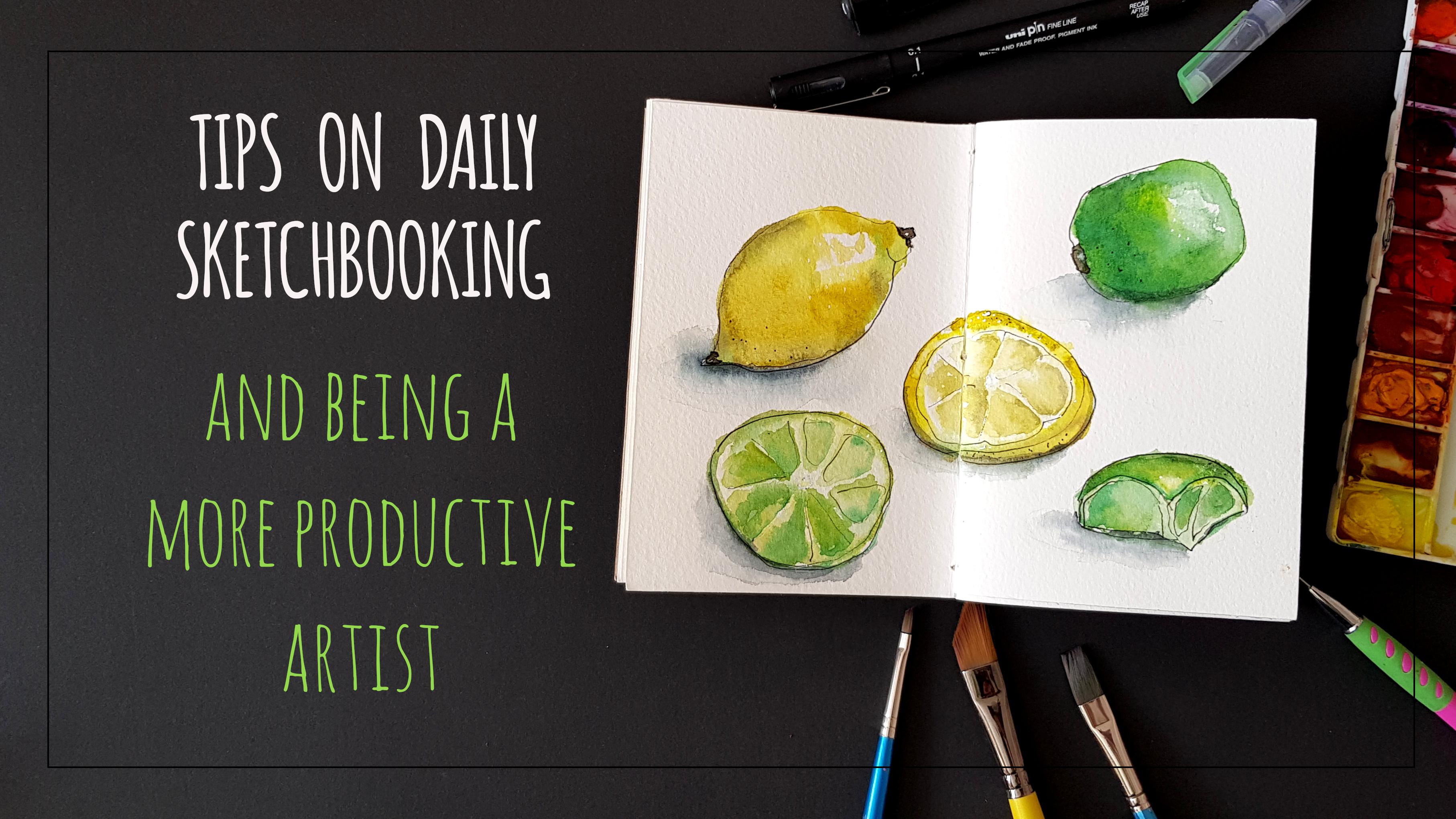
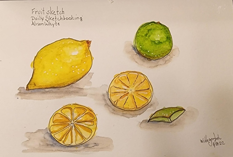
4. Starting with Pen - Sketching Fruit: Welcome to the first page of your sketchbook. We're going to try not to use pencil here. We're starting with fine liner, and I recommend using 0.4 or 0.5 pen. You'll also need a white paint, fine liner, and some paints, a kitchen towel and brushes. I've chosen waterfall brushes for this project. We're constraints and magnifying leaner, and we're trying to make a continuous line of the shapes. You can lift the pin here and create some artistic gaps in the line. Just try to keep it fluid. Don't go over the line more than once. Unless you make a big mistake, small mistakes toward matter at the stage. Now I'll speed up the video here and I'll do this throughout the lesson. So if you're following along with me with the image inside pervaded, then please pause it sections, just allow yourself time to catch up. So I'm filling the layman ship with some lemon yellow and I'm leaving the white area for thy light. Now, we'll drop in just a little bit of green on the ends. This is masculine I've used, and we'll do this while the paint is still wet. This is a wet in wet technique and this allows the colors to blend into one another. For the darker shaded areas, I'm using a little bit of raw sienna mixed with burnt sienna. And eventually I did just a tiny bit of Moscow Lean that we used before. And this will just help it to blend together. I've added a warmer yellow and I've chosen cadmium yellow for this. And this'll just to help the colors fluent to one another while the paint's still wet. Now further line, I'm just doing the same and fill in the shape with viridian green and leaving highlighted deity of white. And then I've dropped into the little bit of lemon yellow. Well, the paint is still wet. This will just create a bit of variety. For the shaded areas. I'm using ultramarine and just drunk or not. And again, while the paint's still wet. And you produce kitchen paper to lift our Any ideas as I'm doing here. So to say that too much variation with blame in here. So f x to little lemon yellow with cadmium yellow. And I'm just using this to blend the colors together on the page. Next, I've Slate some of the fruit, and this includes a wage of wine, which we'll use to fill the rest of the page. Again, we're just going to draw the most basic shapes here. I'm starting with the basic wash of yellow and keep an appeal in the Santa and molten tens where the Reinders. Then you could pull polite Walsh and two of the segments are use green with a touch of raw sienna for the line, yellow with a touch of raw sienna for the layman. Now, we have to wait for the paint to dry. Now you can go ahead and add some definition. I've added a little bit of raw Sienna to the yellow mixture that we made before and use this just to finish the layman. Then if I added some raw sienna for the NHS for the line, I then added a touch of meridian and to this mixture. And I'm using that fairly light with the water brushes just defined in the edge of these lines with a more intense cutting. Now we can add in the shadows. I like to start by using a wit brushed, put some water into the areas where you want the shadows to be, then mixing a grey color. And I find that ultramarine works well with burnt sienna or orange. And you want to put this closest to the edge where the shadow is darkest. The pin will then run into the water. If it's dry them a little bit, you can just use your brush again to guide some of the printout. Or add a little bit more water into the area just until you get a graduated effect. And you could add just a little bit more of the darker color to the edge just to give it a bit more definition. Shadows helped set the objects onto the page and make it pop. Now for the finishing touches. And Martin, a few highlights with my white paint liner to show the temples in the skin and the shaded areas as well. And amusing the black frame lane there for this. Don't go overboard, just the fuel too. Now it didn't like the circles in the center of the slices, so I'm just going to cover them with some of the white pin. I'm using it on the ends here, which I've created by mixing the colors together, which we've been using throughout this exercise. And a few more dots on the wedge. Congratulations, you've just completed the first page of your sketch book.
5. Starting with Paint - Sketching Plants: Hi, we're on location today, but we've only managed to get as far as the Garden as we run locked down here. I'm just going to open my sketchbook or a random page and a picked some dandelions from grassy patch just outside of the house. So we are going to be used in those today. We will be starting with paint and then working on top of that with some ink. We're basically going to be just blocking in the sheep's. However, we're starting off with the dandelion that's gone to seed, which is a kind of white. And obviously you won't see that on the paper. So we're good to peace blocking and the negative ships are this. So I'm going to make a kind of a blue Getting. I'll use the viridian, which is a cooler Green and just mix a little bit of blue and without an won, quite a waterway mixture, we're just going to paint around the circle cheap. And just let that sort of blend out at the edges. You could use the adventure that I've provided in the PDF. You can place the flow arrowheads anywhere that you want on the page as we'll be painting the stocks in the last men coming in with some burnt sienna mixed a little bit of green and just where they're centered here. And then there's some green coming down around the site of the stock. So I'll just paint that and as well, it will bleed into the blue color, but that's fine because we'll tighten all that up and becoming with the pen. So now that that one's kind of block ten, I'm going to then look at the volatile, but we want to put that neither of the bottom of the pages, that's kinda true pencil, I think that would look better there. And I'm just gonna tackle that exactly the same. I'm using this blue-green Max and just painting the negative shapes. I'll then use some moss green for the bits on the end here surrounding the bugs. And that'll just bleed into the blue, which is what we're wanting to do. For the yellow hats on the dandelions, I'm just going to block in roughly the shapes now. I'm a slightly different angle from what you'll be seeing that. So I'm further down. So it looks like a more circular shape to me. And then there's obviously some petals coming around the sites. So I'm just going to sort of hen to laws with the lemon yellow. And then in the center, I'm using some cadmium yellow where the color slightly darker. And I'm going to take this one, say dawn, just to get a different perspective. And I'm dropping a little bit of the green and the yellow again. Just hinting at those shapes. And we'll allow the colors to run into one another once again and to be able to find the edges later when we go back in with the pane. For the leaves, I'm just going to add a little bit of Floridian. And here I'm just try and paint some of those shapes. It's kinda like a spear head at the top, then it's common in sight. And then it's a bit Jackie again at the ends. We will now I'm putting this onto the paper and I can already see that I should have added more yellow into this mixture. I'm gonna stick with it and I'll just drop the yellow n after a painted the fill shape and try and get those crinkly edges. And then I'm going to leave a white part in the middle where the stock is. Did a bit of yellow and just went for doing the other side of the sleeve. And once it's painted, I'll just drop some yellow into the wet paint on the lifetime site. The motor brushes, they're agree if you just give them a squeeze, then produce more water and we really want to water down the paint. But just remember, when you're changing colors just to give you the tip of the brush good white. Can I'm just using the wet brushes just to blend that. He had shows again. So I'm putting it in the last leaf here, just, just did exactly the same. And then I'm going to quote him with stocks. Now as you can see, there's a touch of sort of read near the top SNP where the heads out. So I'm just going to put a little bit of that. And to there onto the graphene. You can decide yourself and which direction you want the stocks to be. Once you've got the stocks painted and then we'll leave that to dry and then we'll come in with the pen. So I'm just going to start with the seeds. Let's link the small sort of circles and then the legs come out at the site. So I'm just trying to draw on those shapes. I want the seed flower to look delicate, so I'm just going to keep that quite liked. And then I'll draw on the topics that are coming around the site of the stock. And then I'm just gonna draw the outline of the leaves now it's always good just to leave a little gaps in between length. And then just allow i to make up the rest. When I'm outlined in the stalks, I'm just doing the bottom side where the shadowed area B. And then for the petals, I'm just hinting at a few petals that don't want to mark in every single one. We just want to give an impression here. And the same on the front view. Now, stuck in the middle. So I'm just trying to make that Mona patent. And then I'll just outline this Lastly Eve. So now that I've outlined all the flowers and the leaves here, I'm thinking that the left-hand side of the page is maybe needed a bit more color. So I'm gonna do is I'm just gonna make a till more of the blue green wash. But I'm gonna use a spinner. Just hint at a few more leaves in the background. And just want to keep the paint really fun here. As I wanted it to recede into the background.
6. Restricted Palette - Sketching Landscapes: And it was my intention to draw on location here for this section. However, as you can see, it's a relative Wendy's who I'm just gonna take some photographs and we'll work from photos per this. It took a viewfinder along with me as these are great for drawing on location. You can use a mobile phone, however, a viewfinder as a great tool and it's easy to make one out of a piece of card. Again, I've provided the image for you if you want to work along with me, how I would advise you to get some of your own images or try sketching or location. Once it was walking home, the sun was setting and the trees. And unlike this view, so this is the image that I've chosen. Now the materials you'll need for this section are your sketchbook, pencil, variety of pans over pen she would like to use. I'm going to use on plot finally linger on, maybe use some highlights. A paint marker or the ruler. You'll also need your watercolors and some Russia's. Now, the idea of this section is that we're going to be limiting our pilot to just three colors. So it's a choice of a red, a blue, and a yellow. I've chosen an ultimately Clemson Lake and cadmium yellow. I'm just going to put some masking tape around the edge of these pages. This is just standard masking tape. Now, I've sliced them in the middle to make it slimmer. As you can see, I've sketched out the image on the left hand page. I'm also going to do the same on the right-hand side as I'm gonna show you, two different ways to restrict your pilot. And as always, we're just sketching and the basic shapes. The idea of restricting your pilot is that it brings harmony to European tanks. And it stops you from having to make decisions about what colors to use, allowing you to focus more on the tones. You can also achieve a more stylized approach. Limiting your color choice works well on location as you don't have to bring along a big pilot with you. It's a good idea to plan with your leaders are going to be. And further firstly, I'm focusing on the sky. It's a graduated series of colors. So I'm going to use a wet in wet technique for this. I am placing the blue at the top, bringing in red, then finally the yellow at the bottom. And I'm allowing the colors to run into one another. So as a basic rule with watercolor, I like to use just two or three layers to keep the image vibrant. I usually finish up with some marks and highlights on top of that. And then at the bottom of the pH here, I've added a bit of cadmium yellow where the grass and the distance is more yellow, green. And in the foreground and going to add a slight touch of ultra limiting. And then at the bottom left-hand corner, grass looks a bit of a kind of yellowish green again. So I'm just going to add another touch, all the cadmium yellow and to this corner. And then I'm going to use a hip dry out just to blast it. So for the second layer, making really kinda yellowish green, quite light. And I'm going to work on all the leaves on the tree and the foreground. These are just going to be the sort of highlights on the leaves and then, and the distance of the cheese. You could see that the light's shining through. So I'm just going to sort of debits appeal on the outside of the cheese to, to show that. And then I've just dropped in a few lines given grass sheets just to the bottom and at the front. And then making a darker green and some ultramarine. And then I'm gonna drop that into the paint. Now, some of the paint's still wet, so that's disclaimer to bleed into another and that's fine. Some of the pins dry or can onto the dried peaches. Well, again, just working on the leaves in the foreground and then I'll go on to end fell. The cheese in the distance. Was this color slightly watered down because it's sim, slightly more fainted in the distance. And then I'm going to work into the grass. So just keeping that yellow line and the distance is very clear, straight line. And then I'm just using some of this could bring down some grass ships. So trying to sort of keep where you can see there's actually some mold models. So we have some lines or so just by pooling the brush down, I'm sort of hinting up those lanes. And again, there's quite a clear shadow. Hurdles and have the grass minutes the foregrounds. I'm just dabbling in some dark paint. And then added a touchy yellow. Now a want to create a variety of tones within as grass. So I've made a really wait to mix with the ultramarine, the yellow. And let's just go and get dabbed around and about. It's going to be very transparent because it's so wet. So if Fan difference to one's in this area and then I'm just going to try all that and we'll see what we'll put on for the third layer. So I think that looks quite good. I'm just going to walk through a little bit into the glass, just a little bit more shadow. And then I'm going to comment with the fine line and just draw the branches from the cheese. I'm also I lightning some off the leaf shapes. And then the tree trunks of trees in the distance. And then there's the offense post. So I'm just going to draw those in as well. And then some of the grass and the daffodil. And then I'm just using the chain rule just to create some off to a sim highlight to stalks of the deaf adults as well. Just a little bit darker until the feeling where the defenses. Lastly, I'm just going to make an even stronger Darden cleaning to put into the leaves. Just to give it a bit more depth source the act, the leaves appear more than the foreground. She's P of more than distance. And I'll just finish with just a few more strokes in the grass. And I think we are done. I'm using two colors for the next method, and I've chosen turquoise and burnt sienna. We won't be mixing the colors together, but you can achieve a nice dark tone, but the turquoise and buy ads and water, it can create much lighter tones. You can experiment with your own colors. So I'm just going to make a light wash. And again, I'm just going to do the gradient in the sky. However, I'm only using this one color for this. No. So I'm just going to try that with hair dryer and then I'm going to mix up some nice turquoise tab. So I'm just putting some of the turquoise wash onto the grass. And then I'm just adding some water on the brush. And I'm just going to track that down to the bottom of the page. We're slightly lighter. Now I'm working on with the burnt sienna, just quanta painting. The distance change shapes. Just trying to leave a few gaps in the color just so that you can see that plate still common through the trees. Now I'm going back into the grass and just as we did before, I'm just trying to get a difference in the variety of the tones within the grass. And then I'm just dabbling in a little bit more of the app's almost straight out the chip M, turquoise just to give some shadow. M with the water they mix that were made before. I'm just going to make some of the leaf shapes where we have the yellow line. I'm going to use burnt sienna here. Then I'm going to paint in the tree trunks a 100% happy, but Louis might need to be darker, so I'll just leave it on for now. But I'm going to come back in with leaves with some of the darker turquoise. And then I'm just going to paint the branches and this time just using turquoise color just from the tube tip of my brush. So I've decided I'm going to try and paint the branches of the trees and the trunks back and this time with the turquoise color. And then I'm just going to go in and highlight some of the grass shapes and deaf adult stocks again. So try this and I think that's just about done. Just gonna take the tip-off. Note. If you start to tear the paper when you pulled this off, just use a hair dryer, this soft in the glue on the back of the tape. And oh, come off much easier. And now we've got some nice clean edges. K. So I'm not a 100% happy with those tree trunk school. I'm going to use some sepia ink with my bamboo. And I'm just going to draw in these trunks. Nothing that's looking better. And there we have two different ways of using restricted pilot.
7. Continuous line drawing - Sketching People: For this section, you're going to need your sketch book. Finally now Penn and some paint and also using some watercolor brushes here. We're keeping it really simple here. And we're going to be doing a continuous line drawn. This is great for drawing complicated shapes or things that are moving sorts really good for drawing people, however, socially distance and at the time I'm making this video, so we're going to use a photograph for this project. So the idea is to keep the pen on the paper and just draw the most important details. Now, I've just lifted the Pantheon and that's instinct to do the same. But just try to keep it there as much as you can. Just following down the outline of the shapes, you're going to have to go over the lines a couple of times and places to keep the pen on the paper. And if you make a mistake, just draw the correct lane. Don't worry about the wrong line because once we pit paint onto the paper, you won't really see the mistakes. Give me it. And it really doesn't matter. It's all about keeping that quite loose and just getting down the main details. It's a very useful technique if you're an app gallery or a part, or a coffee, and you want to sketch people down really quickly. So I've used a different photograph and other desk. And the reason I've chosen this as because it's a profile picture and I wanted to get some details on the face. So as you can see, I'm just dealing with it. Very simply condemned I and the nose. I'm highlighting the cheek but coming about ground for the lips. And as a combat ground to the back, you can see the admit the back of the head to white. So I'm then drawn the correct line and coming down for the hoot, denying the bug and the chuck. So as I'm drawing the corner, and I could see that made the women to slim on the left-hand side. So I'm going to poke a little back for the pictures. I'm just dealing with them very simply. They are landscape pictures, so I'm just putting an lines later on quantity particular color. Don't focus on details here because they really don't. Hand me the mics here by using Selenium blue with some orange. Then I'm going to paint into the shadows that are cast onto the wall from the spotlight screen and onto the pin tanks. And then there's a shadow cast from the people as well. So I'm going to make a slightly more intense color for the lady's jacket. And I'm just gonna block this colored in blue, just dabbling in a little bit where there's maybe going to be some shadow. And then I'm just gonna copy this into the man's shirt for now. I might go over that with the blue, but we'll see how it looks. And I'm adding a little of the Gray MX tear, some cad yellow for the ladies blonde here. Moving onto the pictures, I'm using warm CPI for the themes, for the trees. Then drop again at touch of crimson lake, cad yellow on Moscow eating just to hint at that image. And the L1, the colors to run here. For the rest of the landscapes are in generally using pseudonym blue and adding CO2 yellow to make any panini Aeneas. For the sandy area here I'm using the mix that we used for the belonged here. And I'm using integral for the dark areas. I'm just dropping in and little of CO2 yellow here for the Sun. And on the last painting, the gray areas that I'm using as just agree that we used before. Then I've dropped down a little bit more screen just for the grassy area. Very, very simple. Let the colors Leighton to one another. There's an area when you really don't want the post bleed. What to do is just try to leave white space in between them. Now for the guy on the left hand side. And I'm just going to keep using this same dark gray color for his trousers and jacket. And I'm using civilian blue for the bug and his fees. I'm just gonna use the blonde color that we used in the beach. Again, just try not to have the colors bleeding into one another. So I'm trying to keep a gap at the Edge, however, as running a little bit into the jacket. And I'm quite happy with that. So I'll just put a little bit of Cuddy onto the frames. Then I'll just take stock. The shadows and the paintings here. There's also a shadow on the corner here. So I want to put too much, I'm just going to take that back with some water. And then I put more water just for ten. That's better. And I think lastly, we might just be to add yellow until that painting. And I'm also just going to add a little bit of shadow here and to the back of the ladies here. And gives it a bit more Forum. Since I'm doing that, I'm gonna go into the guy with Iraq sack and just do the same. Just the back of the neck and the heroic top here. I think that's probably enough. I'm not going to do anything more here. It's going to let that dry. That took about 20 minutes. And you've got completed colored sketch and European.
8. Sticking Paper - Sketching Architecture: So today we're going to need some pencils, pens or NK. You're gonna need scissors, glue on some found papers. So I have got some newspaper here and some pictures, some tickets, and these are stickers. This is just a little bit unbelievable from bawl wind quite light text on it. And there's a little sort of stamp, postage stamps and small X0 t. And then the papers, I'm just plain color paper. That's cartridge paper. And then we've got sugar paper here. S was actually from a magazine. Paper, packaging, paper, tissue, just some patent papers from an envelope. You can just check the paper as suitable for drawing and painting on forehand poorly start gluing. And to the book. I've selected these three papers here. I've got some sugar paper, patterned paper, and some newsprint. So we're going to start cutting out the general shapes of the buildings. This one is going to be the small bell Tang in the background. That's the right-hand side. For the patent paper. I'm going to cut out the chart shape. You don't have to use scissors. You can Tierra epi Welsh not gives you some interesting lines. I'm going to tear the paper on the left, on the right hand side for the two buildings. Just fold the paper slightly and then that will give me a fairly state similar to when you're painting and block shapes except we're using block pieces of paper, that is time. And this belting left-hand side, I'm just kinda almost a square shape. And I'm going to go to glue them into the book. Now, I'm using just a glue stick. However, you get glue rulers, I tend to keep a gluteal and my pencil case all the time so that I've, I'm traveling around somewhere. I could just glue something into the book. There are other glues you can use as well by light to use these ones per sketch become because they're, once they're glued, you could close the book that's not going to glue the pages shut together or anything like that. Just glue all those. I like using paper in my sketch book because I quite like collage artwork. But it's also a good way to cover up any mistakes that you might have made. Now if you're gluten over the crease, just make sure that you tuck the paper write in. And that's all stuck down. The paper is just hanging off the side of the book here. So I'm just gonna start drawing. I'm just going to sketch the general drawing with a pencil. And once I have the main details, then I'm going to go into that with some ink. Just for kicks in on the main shapes. There's lots of things on the site of this building. However, I'm trying to just ignore them and just work on the very basic shapes of the building. So I'm just looking out the windows. The bits are now against the, along the sides. Above the window. There's a few pillars. Okay, so now that I've got this pencil sketch and I'm going to use some sepia NC. And I've got two different pens. I have a Bamboo Pen and this gives me really sortable 2pi lines. Sometimes can get beg and explosions with this pen, but I really think it's quite sort of express f, have another pin which has a finer NAB. And that's good for just the small bits or little bits of detail that I want to add. Then it will also depend on which paper you're using as some papers will be more absorbent than others. I'm using the API. You can see it's just a really fine line. And I'm using those on the buildings. Okay, so just for fun, I'm also going to use a bit of the golden ink on the church building. And how this is going to it S I'm just using island to the other built-in as well. Yeah. Effect. That's enough. Just now aren't so try and mix up some water color and just going to use blue for this guy here. Don't want to use too much color on this at all. And I'm just mixing up orangey color with some cognitive lead and cadmium yellow. I'm just painting that onto the bell Dang. Now it does have a kind of funny finish. This is because I'm using newsprint, but once it dries, it will be fine. So no mixing up at dark gray. Just using Simulium, blue and orange. And I'm just going to use that and some of the detail on the building on the left and just pin tanks on the shadows and the windows. Okay, so I'm also use it in some of the green texture and the people. And then I think I'm actually going to comment to this. But some more of the gold That's dry and I've just come back and was a little bit more of this. So Julian blue books, it was quite pale. And now that the grease dried and play around with some of the gold NK. Now wants to anything else you think that's absolutely fine. I'm unhappy with that.
9. Using Text in Your Sketches - Various Techniques: Text as an element which can often be included in your artwork. And there are various ways that you can add this. I'm going to show you a few different methods. So this lesson will be a bit longer than the others. You don't have to do all of them. Just select one or 2.5 ago. The materials, I'll be using a tracing paper, carbon paper, a pencil, pen, ruler, watercolors, goulash, masking tape. Some papers can be magazines are older, and a white marker pen. And I also have access to a printer. You can also use some stamps or stencils as well if you have them. And they'll be using NC and an ink pen or brush. So we will start with tracing. Just in case anyone's forgotten how to do this. You take the tracing paper tear image so it doesn't move. And then trace out the drawing using a pencil. Use an HB auto softer pencil, that's best. I've hand-drawn an image of a local coffee and tea shop. I liked the old fashion, sanely Tang, but hand-drawn at just to show you how it looks, as opposed to using a more accurate type font. You can choose to draw a shot from a bureau ONE if you find one that's got nice sane rating, and you could just draw this directly into your book Freehand. Or you can trace the image that I've provided in the document. Now that we've traced out that outline, we can flip the image over, then draw over the lines again on the back of the image. Be careful when you're moving the tip so as not to tear the paper. The lines that we've drawn now, what will be transferred into your sketch book? Now that's done. Tip the tracing paper and tear sketchbook the right way up where you want the image to be and draw red lines again. As you can see, this is a fairly time-consuming method of copying, but it does work well, if you take your time and you could copy text from newspapers, magazines, labels, and you can even copy from photographs. When you remove the tracing paper, you will see the faint outline of his image in the book. And I'll go over this with a pen. Another way to put text in your work is to use a stencil. I bought these stencils online and they're really cheap. I got over 20 type fonts and the pocket here. I'm just using the site of the stencil to draw straight line for the text to fall off. Now I'm going to use length to n fold the letters. When you're using, I think it's best to check that the paper can withstand it and that doesn't lead to throw it to the other site if you already use. And I think it's often a good idea just to ensure that the pages behind what you're working on are blank, that we, if it does bleed through, you can then use the gluon and paper technique on the other side of that, just a cover up. I'm using thick watercolor paper, which is usually fine. But in this case, as you can see, it's gone through to the other site. So I'll show you later on how we can rectify that. There are a whole load of type fonts that you can create and whatever word processor up that you use. I've chosen a couple of older fashioned type fonts and printed them onto tracing paper directly. You can go into your sketch book or you can trace them as we did before. I'm just placed in some items on the page just to see how they're gonna look together. I'm going to put the date the company was established and the bottom right hand corner here, using some stamps. Again, I'll draw a line to keep that straight. I've got some goal dank and I'm using the little stamps. A little bit wonky, but I quite like the quirkiness of those. And I'll use some handwriting just to write the word sends before the date. Handwriting and calligraphy are good ways to fill up space on a page. And it's a good way to record details of places, events, and details about colors, or just something that you want to remember. You can also write out recipes or instructions. So I've got an idea. I haven't gone to lay out the page, so I'll just remove the pencil lines with another. Then I'll glue in this piece of pocket Jin. I'm going to put a thin wash over this text just to knock it back, but to still show through once it's dry. I like splash marks, so I'll add a couple of levels as well. Then I'm making a burgundy color and painting the shop front. I'm just using the color lightly at the moment, but I might go and darker later. So now we have mixed a day colored and I'm placing that in the windows and the walls. Then I'm putting some in the doorway with its darker. And I'm using the same color here on the pavement as well. And on the top part of the window. I've mixed at Brown for the shop window, and I'm just gonna put that around the outside, leaving space with them. I'm dropping in some cadmium yellow, two colors, they'll run into one another. And this will create an effect to show that the light is glowing. So I'm going to glue in some items. I have the text on the tracing paper and some bits of paper from packaging and magazines. A family, such as old letters, book pages usually look good as well. But you can find any text that you like and just stick it in your book. I'll show you how to use their carbon paper here. You could use it with a stylus, auto pencil. And at similar to tracing, except it's quick and dark outlines with workout, where do you want the text to cool? The carbon paper has adult site and the shiny side. And you want to put the shiny side facing down. Underneath the text and then trace. The effect is much darker as you could see. And I'm MPhil in touch with red watercolor. Once that's done, I'll use the white paint marker to highlight some areas. Other types of text that you can use on your page are things like street signs, labels, packaging, road signs, and vintage text. And a family always looks good. And put in some paint around this ten can. What Jill stamped onto the page to look like tea or coffee, Steyn. And another couple of glimpse. Then lastly, I'm going to go over the shop front again. So thank you. Look in a little bit wishy-washy on the page now that I've put the darker colors on top and a lot some color to the sign, and it's done. So I'll show you how you can fix the bleed in the page. You can either glue and paper or you can use JSON or goulash. Locally, the white areas ok here. So I'll use goulash with the Blue and mix them together to cover the ANC and mixing the crash with the blue until it's about the color of what's on the pH. And I'm keeping it a water they mix. I'm going to use a darker color which I'll mix up with some goulash, just straight out the chip and quite a bit of the colored water color. I'll put it close to the edge where the sea traders and then I'll let that bleed into the center of payload color. You can tease along just to help it. I actually like how it looks now. Added some more dark goulash around the front-facing flow ahead unbelief and just teased out with a little bit of water. So I'm quite pleased with that. If I wasn't happy, I could glue a piece of paper on top and then work on top of that.
10. The Wonders of Surface Design - Repeat Patterns: For this section, we'll be using pencil, some definite pans, TPP, tracing paper and watercolor. First of all, take a piece of tracing paper which is square or almost square, and fold it diagonally across, then fold it in half again to create a triangle. And measure each of the shorter sides from what will be the center of your square. I'm gone for seven centimeters. I like to add different elements to my peaches. And that can be anything from geometric patterns to floral paisley patterns, tails. You can also recreate textures such as wood and concrete. These things are all around us and the foliar home, so it's easy to find and you could copy them, are traced them into your sketch book. But today I'm going to show you how you can create your own repeat patterns. Use a straight edge connecting the two marks together and cut. This should give you the perfect square. Now we'll open it up and fold it in half along the middle. And do the same the opposite way. Each of the eight triangles that you see, what will be your repeated pattern. Now you can draw any shapes within one of those triangles. And it's a bit similar to what you probably made a snowflakes when you were a child. Once you've done that, diagonally fold the paper in half, and then copy the pattern in the next triangle. And then fold it in half and copy again. Remember to try to keep your pencil lines on just one site of the JSON paper of what will be your square. So continue this round by folding in half again to finish. Now you can take it into your book and trace it out. I've chosen tiles for this page. So I've drawn and painted part of another image that had just default page up. But you can choose whatever you want to draw in here. Once it is drawn and you could go over it with a pen. And you could experiment with different pens or pencils to outline your patterns. Calligraphy pens are quite good for this two. So I've chosen a selection of blues to color my design, and I'll peel them and allowing it to dry with each color so that it doesn't bleed. So I thought I'd try a chunky line for my design. And I added a little bit more paint on the pen was dry. So you can also use this method on tissue paper as well, and then glue that into your sketch book. I made this pattern in the same way as before, but on a smaller scale. Then I pleased to tissue paper but on top and painted directly onto it. Following the image below. I made three of these unused, orange, yellow, and blue. Once the paint dried, I tried different colors of finely Nazis looked the best. I like. So a carefully toward these into three. Then using a glue stick, stuck them into the book. Always test your glue on the tissue first. Some glue sticks don't slide very well and can replicate. It is possible to use PVA glue. But please make sure that it's completely dry before you close the pHs or your risk than being stuck together.
11. Putting It All Together and 7 Day Project: So I've put together a few pages from my own sketchbook where I've used some of the techniques that we've been learning. I hope you've enjoyed the class and that you found useful over the next seven days, I challenge you to use a variety of the techniques I've shown you and mix-and-match some of your own reference material, host your completed pages and the class project, as I'm sure there'll be inspirational for everyone taking the class. Ever you choose to post them on Instagram, please use the hashtag, skill share with ALI, Wait to ensure that I see them. I also be taking the challenge and will cause my images in the class project too. But don't stop there. Once you've completed the Seven Day Challenge, continue to draw in your sketch book every day until the end of the month. By then, you should have formed a daily drawn habit that will stay with you. Thanks for taking the class and I hope to see you for the next one.
 Alison Whyte, Painter and Printmaker