Transcripts
1. Introduction: Why is making an introduction
video so difficult? I want to share with
you to two things. Do you also fear the black page? I do, And I also fear
making introduction videos, except when I make some falls in this class to make
each other street, I want to share with
you a combination of two things that changed
my creative journey. It's the making of
temp nails and it's the five perception skills for drawing on the right side of the brain, by Betty Edwards. I hope that these
two things will also be change makers for you
in your creative journey. I love them also so
much that I make the second tumpnail class with
a focus on drawing skills. Because usually when there's
a problem in the painting, it's related to drawing skills. Hello, I'm Barbara. I'm an architect and artist, still working as an architect every day restoring
monuments as a living. In my free time, I make art
drawings and paintings, and I published three books. Two of my paintings in Japan
and one about Brussels. I also volunteer in an art workshop in Rest Home
for people with dementia, and I draw paint with
them and give them human connection and a way
to express themselves. But most of all, I want to
commit myself in sharing my love of making art with
as many people as possible. In this class, we
will use the magic of Uber sketches to boost
our drawing skills. We're going to do this day
by day, over five days. I will give you a new prompt
each day and show you how I approach them in my work class is inspired by Betty
Edwards method, drawing on the right
side of the brain. Applying these perceptual skills and discovering how
the right side of my brain work help me to make better drawings and to
enjoy drawing more. It works like magic for me. We will do this in the
form of thumbnails, because thumbnails are
about play and fun, and making a thumbnail
is less intimidating than making a bad drawing
than making a big drawing. For those of you who prefer
to paint, at the end, I add watercolor and color
pencil to the thumbnails.
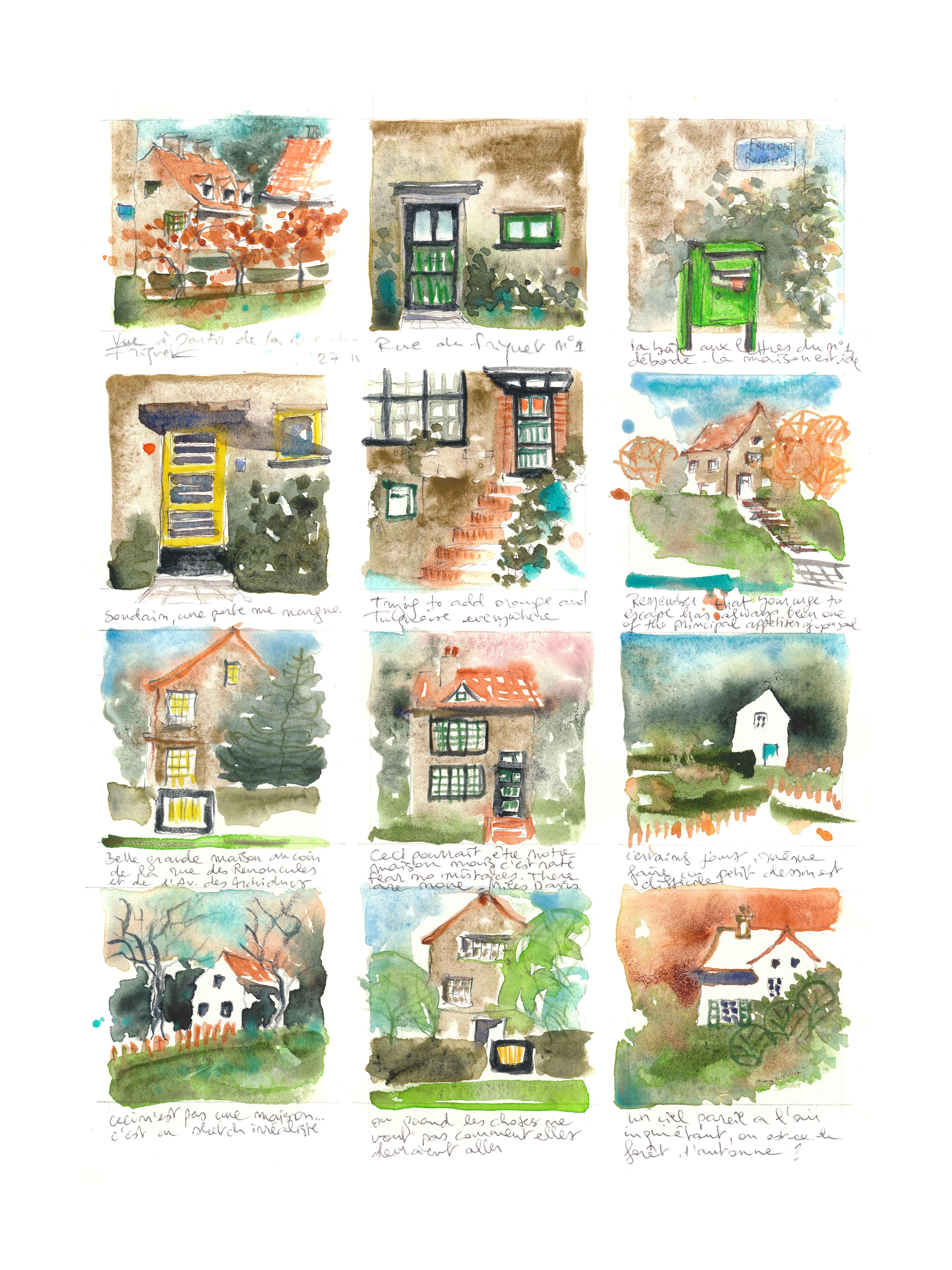
2. Class Project: Welcome in the class, let's make a Tmp nail page together. I divided a four sized
paper into five temp nails, but you can make more. Of course, if you have
a smaller sketchbook, you can make a spread on two
pages on the double page and make five or more temp
nails on a double page. I want to show you
drawing techniques. I have made larger temp
Milton in my previous class. You can see it better, and we can draw some details. As a class project, I invite you to choose a subject in your surroundings
for you to sketch. I have made my kitchen, but you can sketch
anything you like. It can be the favorite places of your home, of your neighborhood. Or you can illustrate
your holidays, your childhood, a
book you're making. Anything that means something
to you is a good subject. Draw something that
means something to you and something that
you like to draw. The purpose is to
have fun and play. If you have fun while drawing, you will make better progress. If you draw something
you don't like, you will be bored and it
will show in your drawing. Think about what story
do you want to tell. Your terminal page
will tell a story about you a bit like
a comic script. Please please share your work on the platform in
the class projects. So everyone will level up by seeing and sharing the
experience and who knows. Maybe you will discover
some new tips from someone. Maybe you can help someone
and motivate someone. I hope this class takes away the fear of making
a bad drawing, takes away the fear
not having talent, and will help you on your way to find your unique
sketching style. My purpose is not to
make you sketch like me, but to make you sketch like
you. Let's get started. And don't forget to subscribe to my skillshare
channel by clicking Follow here on the page. I can contact you if I have an announcement or a giveaway. If you tag me in your posts on Instagram with your
class project, I can share your art
with the whole world. In the next video, I
will tell you about the art supplies we will use
and also about our brain.
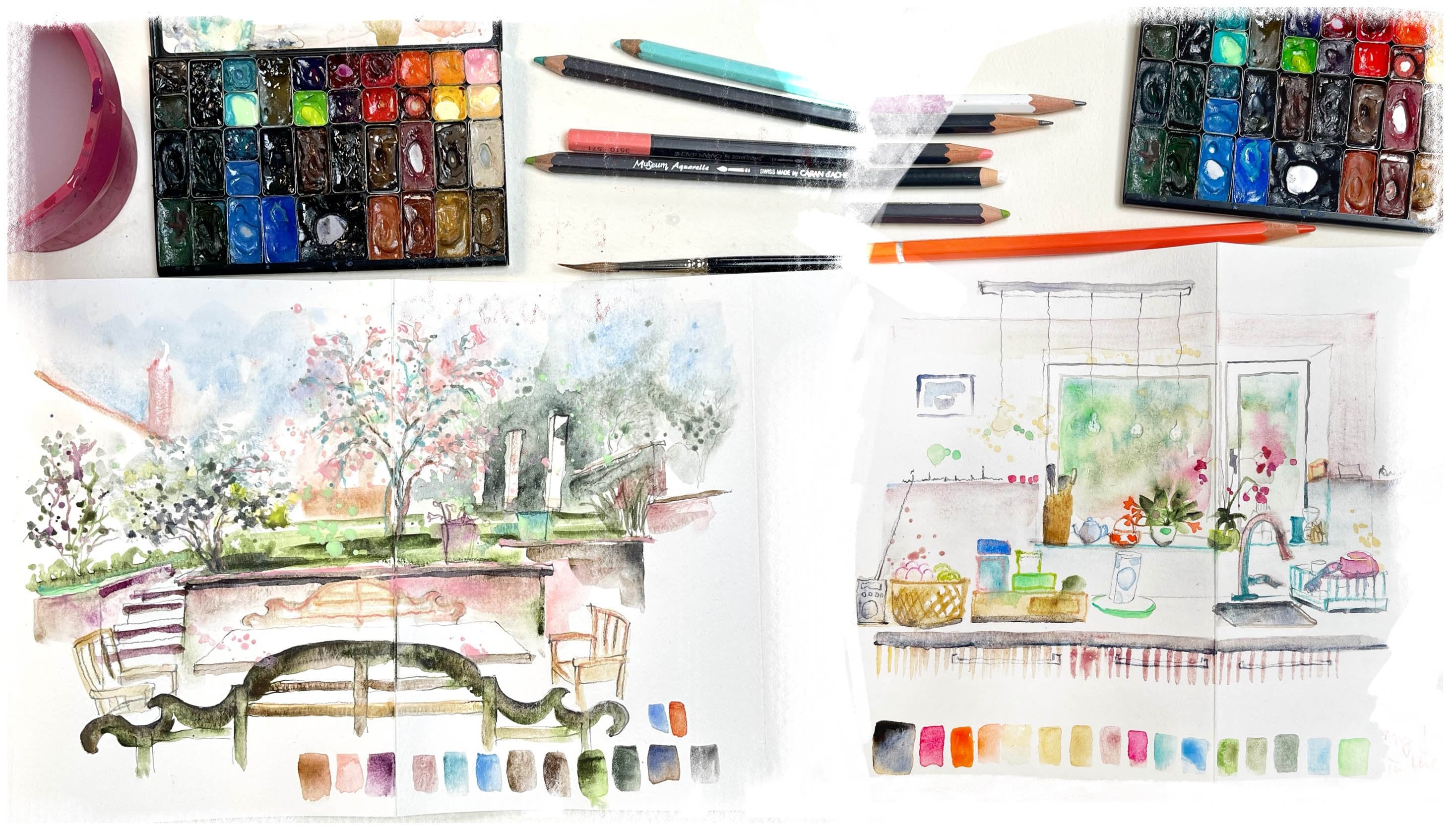
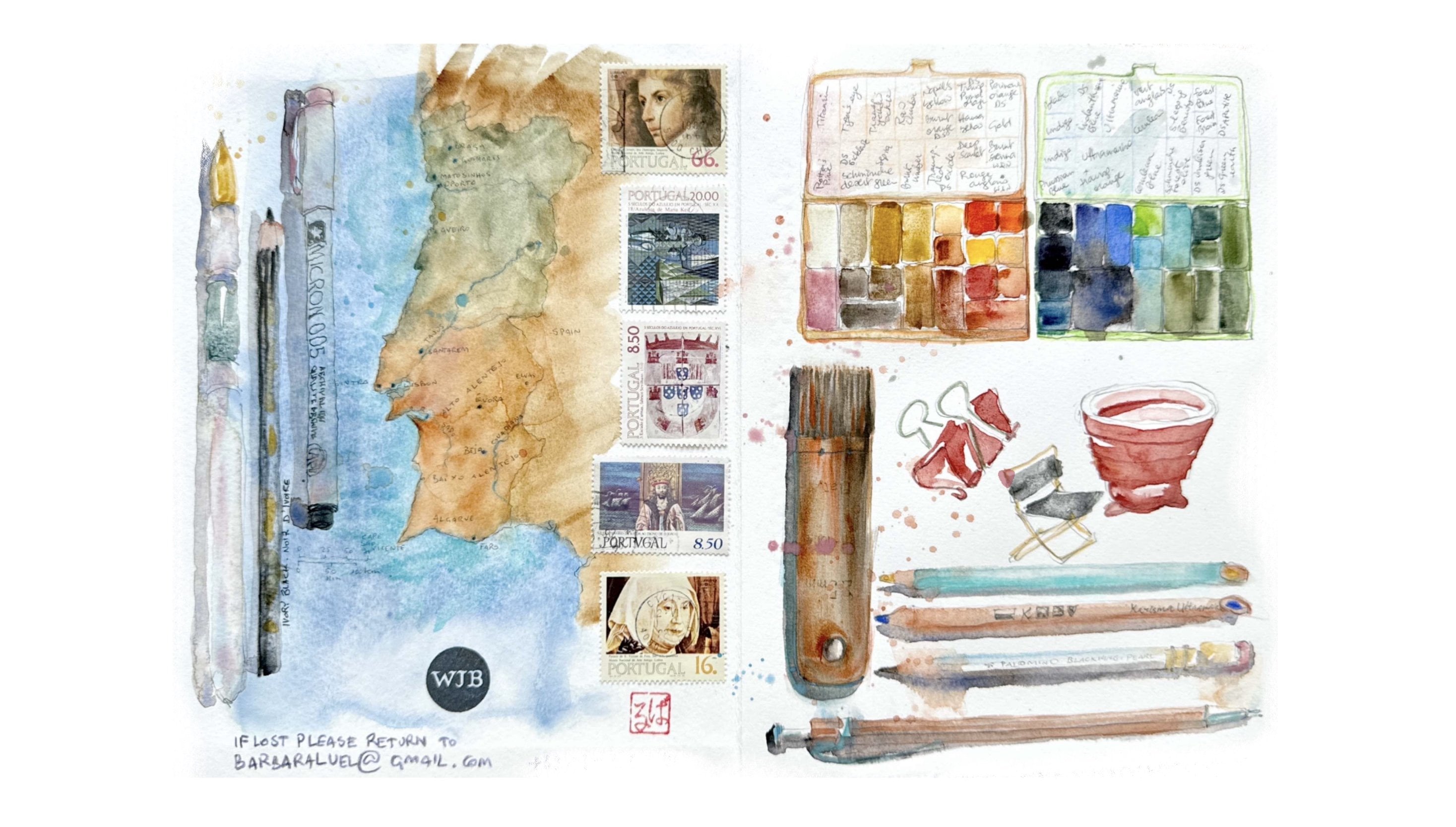
3. Materials: Welcome to the class, the materials I
will use to draw, of course, my Skacebook. Then I will draw with
soft graphite pencil. Don't take two hard graphite
pencil like HB or H, or two H, because if you take
a two firm hard graphite, it's difficult to erase. I have an eraser, this
is a plastic eraser, or you can use a
needable eraser. Also, be sure to take an eraser that doesn't
damage your page. I pencil sharpener, I will use a lot because I like real pencils and not
mechanical pencils. Because when I do the shadowing or when I press hard on it
because it's soft graphite, I like to press hard on the pencil and
make really black lines. With a mechanical pencil, it's a bit difficult, but you can use a
mechanical pencil and make your shadows
by cross hatching. Of course, that's
also very beautiful. You can also of course, draw in ink if you prefer to draw in, in, at the end, in the last video, I
will make a watercolor. I will color the nails because
I love watercolor so much. A lot of you do as well. So I will add some
water color to the um, nails and some color pencils. Feel free to color
in any other way you like with garage or color
pencil or don't color. That's also perfect. You can also just make the shadows with
crosstchingor ink. Have funds here in
class and please feel free to ask me any
questions you like. I also have materials list
in the resources step and also there's texts and tips in the resources
step for you to download.
4. The Righ Side of our Brain: This is our brain. Let me
give you a quick explanation about how our brain
functions and how to get in a
beautiful drawing state. Also, an overview about the five perceptual
skills we will train. The drawing method I want
to show you is based on the five perceptual
skills developed by Betty Edwards in
her fabulous book, Drawing on the Right
Side of the Brain. If you haven't read it yet, I want to encourage
you to do so. Betty Edwards has
worked together with neuroscientists to write book, The Key to Improve
Our Drawing Skills. Now I'm giving you a spoiler. The key to improve our drawing skills and
to have more fun, enjoy and drawing is how to learn to get into the
right side of our brain. It's hard to learn how to
see in new ways to do so. The right side of our
beautiful brain will help us. Our right side is the intuitive, emotional, and artistic side. And the left side
is a rational side tells you can draw
the drawing exactly, and you should be doing
something more useful instead, like cleaning and working. To make a good drawing, we need the rational side
to leave us alone. There are several tricks
you can do to bore your dominant left side into
dropping out of the task. The first important thing
to do is to be silent. Because the left rational
analytical side of our brain is also the verbal
part related to language. To quiet it down. It's better not to talk why you draw and not to name
what you're drawing. We are not throwing
a house door window, we are throwing a
bunch of lines. And also in order to access
to the right hemisphere, we will present the left side with a task that
it will turn down. These five perceptual
skills we will learn in this class will help us
to do that in class.
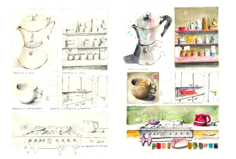
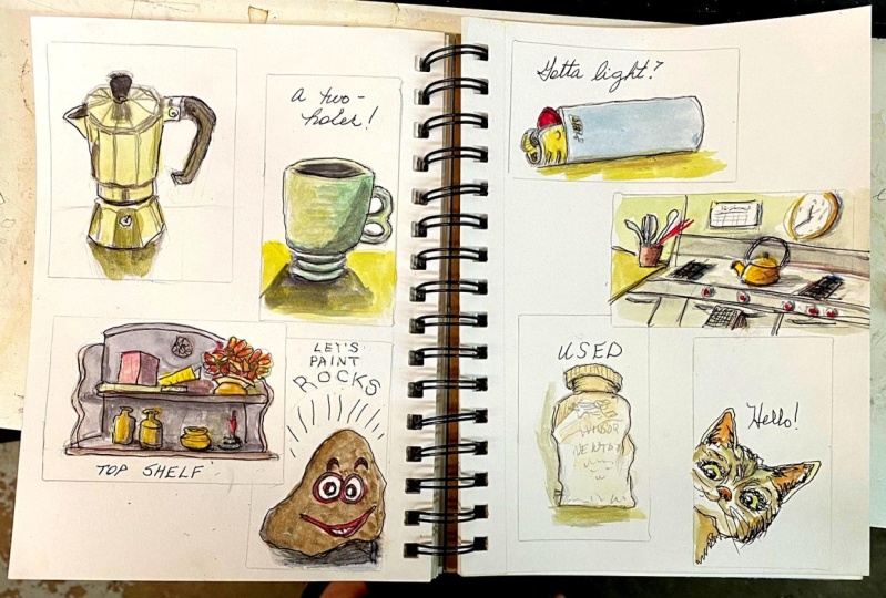
5. The Perception of Edges: Hello, welcome to day one. Let's start our Tempa page. Divide your page in
five temper nails, bigger one, small one. Draw anything you like to
tell a story on your page. I want to focus on the first perceptual
skill from Betty Edwards, which is the
perception of edges. I will draw my favorite, most beautiful object,
I think in the kitchen, which is the Italian
Vialetti coffee maker. As you see, the edges are
going in all directions, as Betty Edwards advises us, is to just focus on the perception of the
edges in the object. To make a contudrawing, we will draw the edges and look specifically in what
directions the lines are going. I'm not drawing the
alt coffee maker, I am drawing just
a bunch of lines. Have fun on this first day, and I look forward
to see your drawing. I will be drawing in pencil, which means that as I don't
want to smash my page, I will draw my Alt here. Because if I start on
the bottom of the page, I will be smatching my
page by drawing here. The graphite will be all over. I start at the top of my page, but if you're drawing ink, you can start anywhere you want. Let's start. I first sketch with my finger
to make sure that the volume of the reality will fit into the small tamnail, because I have a tendency
to draw too big. The first perceptual skill we will work on is the
perception of edges. These five perceptual skills
are basic skills of drawing, which Betty Edwards has
developed in her book, Drawing on the Right
Side of the Brain, during all her
years of teaching. And these five basic skills are essential for learning
to draw from perception. These skills are designed to shift from a symbol
based drawing, drawing what you think
something looks like, to a perception based drawing is drawing what
you actually see, for which you need the
right side of your brain. As I know this Pialti
machine very well, I have a idea of what
it should look like, but it's not really what
it looks like in reality. This first skill, the
perception of edges, involves seeing and drawing
the lines where objects are part of objects meet and where there's a
determination of space. It's about understanding
the contours and boundaries of the object. This reality is a perfect object to exercise the
perception of edges. Because the lines, the edges, objects are really going in
all kinds of directions. If you don't see very well
where the lines are going, you could use a grid that
you draw on a plastic sheet. It's also a grid that Betty
Edwards uses in her book. You can make it yourself. I made it myself. It's a simple plastic
sheet on which I g divided in two thirds. I show how to use it in my first skillshare
class drawing made easy, but the Edwards
concept of drawing from the right side of
the brain is based on the idea that the
right hemisphere of the brain is better
suited for visual, spatial, and perceptual tasks, for art, like, for music,
drawing, painting. These tasks are
crucial for drawing. According to her theory, the left side of the brain is dominant in language and
analytical thinking. She worked for this theory and for her book with
Neuroscientists. I think it's quite
scientifically based. When drawing, people
often struggle because they rely on the
analytical side, which is symbolic and
it leads to drawing. But we know, rather
than what we see, this perception of edges engages the right brain's attention to the visual cues of where
objects end and begin. Rather than relying on
symbols like a door, or a window, or the lid
of the coffee machine. Just look in what direction
the lines are going. When I started to look
this way at what I draw, it really worked
like magic for me. You have to force yourself to make your analytical
brain shut up. And then you will have much
more pleasure in drawing. You can draw without judgments and be more present in
the present moment. Be more mindful of what
you're looking at. Tell me in the discussion if you have questions
about this subject. And don't forget that
in the resources step, you can find a whole
explanation and also images to help
you with your drawing. The samp nails are very small. I would advise you to pay special attention
to your line work during the whole
class and throw with a fine line either a
well sharpened pencil or waterproof fine
liner if you want to watercolor afterwards
a fine ballpoint pen.
6. Perception of Spaces: Hello, welcome. Today, today we will focus
on the perception of spaces. The perception of negative
space around positive spaces. Where the positive spaces are the objects we want to draw. The negative space is the
space around the object. Make our brain think differently and to make us observe what
we want to draw differently. This is an excellent concept
of perception to focus on. We will draw the negative space of the object we want to draw. This is a very difficult concept in the book of Betty Edwards. I think she says
the most difficult, but she didn't find a
better word for it. Negative space is nothing
negative actually, it is the space
around the object. When we draw and focus on
the space around the object, and we draw the
edges of that space. Then at the end, we will have our object. To illustrate this, I will draw a piece of
my kitchen shelf. I will draw the green space around the objects
which are on the shelf. I think this will
best illustrated. I will draw all the edges of
the green space of my wall. At the end of the drawing, I will have some of the
objects in the shelf. Tell me if you have
any questions. You can ask them in the
discussions of the class. Thank you. This is definitely the
most complex perception, the perception of spaces, which is also referred to
as negative space drawing. It involves perceiving
and drawing the spaces that are around
and between the objects. It's a way to help the artists focus on shapes that are not the
objects themselves, but spaces in between
and around them. Which will definitely make your left side analytical side
of your brain close down. Because it's space
that you can't name, It doesn't have any name. Well, I could say it's the green wall between
the pot on my shelf. But my analytical
side doesn't have knowing information about it because it's very complex shape. I advise you to pay
special attention to this exercise and I'm sure
that after some minutes, you will get really in a flow of concentration of
mindful drawing. This focus on shapes of spaces around objects is
not something that the left brain typically processes as it's more concerned
with objects themselves. It's the perfect way to get into the right side
of your brain. Please also take the
artistic freedom to move shapes to make them fit into your page,
in your thumbnail. For example, my whisker, I moved it a bit to the left to make it fit into my thumbnail. And also take the artistic
freedom to leave things out of your drawing that you don't like or that
you find ugly. That's the privilege
of making a drawing. Also, please don't worry if your lines are not
correct because nobody is going to come and check if your
drawing is correct. The purpose is not to make a correct drawing like a
photographical drawing. The purpose is to be able to draw what you like
to draw and to draw something which is recognizable and which
you find beautiful. And that way to exercise your hand drawing like
you have handwriting, you can develop
by drawing a lot. You can develop your
hand drawing which is your personal line work which will be
recognizable for you. This is an excellent
perception skill, to draw clutter and complex
shapes and to have fun, like if I would have drawn
the pots on my shelf, it would have been much more difficult than what I am doing. Now, once the contour drawing of the wall is finished, I complete the shapes of
the objects on the shelf. I add some details which
I find interesting to make the shapes
recognizable that way. I will finish my drawing there, where I see darkness
of some shadows. I already press harder
on the pencil to give some volume in the drawing. I draw with a normal pencil, not with a mechanical pencil, because I like to press on the pencil to
accentuate shadows. I like to draw with this soft graphite that when
I press the pencil harder, the line becomes more black. And please don't forget your first perception
skill which we exercised earlier
with the palti, which is just look in
what direction the lines, the edges are going. And find a basic
measuring unit that you look which length the line has compared to a
line next to it. Look in what direction the
lines are going and how long this line is compared
to the other line. Also, try to draw
with long lines. And try not to lift your
pencil off the page too much, because then you lose contact
with what you are drawing.
7. The Perception of Relationships: Hello, welcome to the tree. Today is a bit scary, maybe because we will talk
about the perception of perspective and proportions
to illustrate this part, which is very important. But don't worry,
like Betty says, Betty Edwards says, we have to know about perspective and then we have to forget about it. I will explain to you some very basic things you
will see, not complicated. Then we just move
on with looking in which way the lines are going and drawing
a bunch of lines. A bunch of lines. I
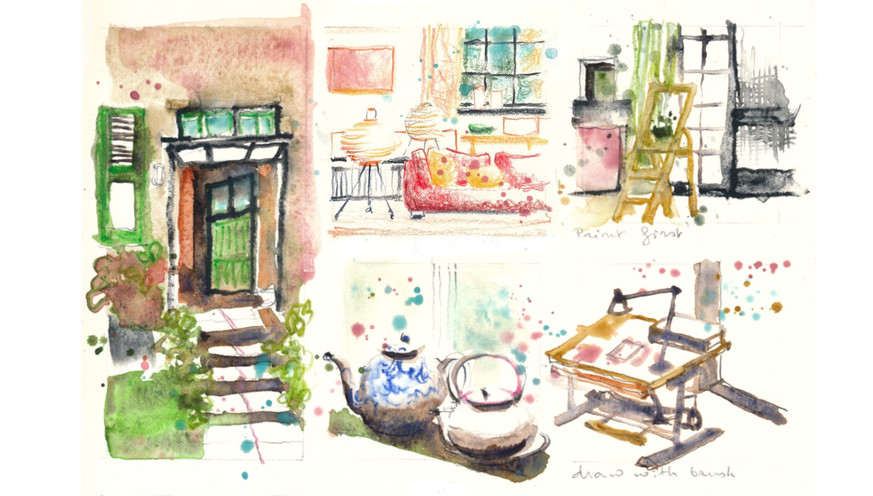
will draw today is the entrance of my kitchen
with these cupboards, Black corner with
tiles from the '60s. I quite like it. I think
these cupboards are the perfect way to
explain your perspective. This perception of relationships involve the understanding and drawing with the proportional
and spatial relationships between the lines and
edges and objects. It's about seeing how objects
and lines relate to one another in space with their position and size
relative to each other. Let's dive into it. The most important
perspective rule to remember is to look at the horizontal lines
compared to your eye level. The basic perspective
rule to remember is the direction in which the
horizontal lines are going, which are above and
under your eye level. Your eye level is the
level of your eyes, it's your horizon
line, if you will. If you're sitting, it will be lower than if you're standing. All horizontal lines above
your eye level are going down. All horizontal lines under
your eye level are going up. The horizontal lines
that are going down above your eye level are going down to
a vanishing point, which will be point
on your horizon line. Then another important part of this perception skill
is the proportions. That's also related to the relation of lines
compared to other lines. You should find a basic
measuring unit that you can use. It's a measuring
unit, for example, in this drawing of my kitchen, it could be the titles. That measuring unit is a
reference in your drawing. For example, for the
head of a person, person which is adult, his head will fit seven or
eight times into his body. If you draw a bigger head, then you would be
drawing a child. The head of a child is bigger compared to the
height of his body. You could also, for example, look at the door. How wide is the door compared to the height
like this door? The height would be
two times the width. If I draw like a door
which is twice as wide, then it would be
like a double door. I hope you have fun
with this drawing, and I'll see you
in the next video to see the light and
shadow in your object.
8. The Perception of Light and Shadow: Hello, welcome to day four. Today, we will focus on the perception of
light and shadow. Without a shadow, you don't have any
light in your drawing. Today, I made myself
a nice cup of tea. This is a very particular cup. It has these two rings to put your fingers
very comfortable. It's from Ben. It's Finnish teacup
I brought from Finland when I lived
there in the 1990s. It's more than 20 years old. I will sketch this up because as some of you
might know, I love teacups. I have a whole class about it. Teacup is the ideal object I think, to exercise shadowing. To exercise how to bring
more light in your sketches. I will sketch this tea up. Before we move on
to the next sketch, let me explain something to you more about
light and shadow, because maybe you won't
sketch a tea cup. If you sketch a
building outside, you will have shadow everywhere. Under window sills,
under balconies, roofs. When you sketch an
object outside, like a building,
the light is always coming from up the sun, the sky, if it's not
sunny, if it's cloudy, you will always have shadow from the light
coming from the sky. You will always have strong
shadows like in canopies, balconies, and window windows. When it's light
outside daylight, the windows are darker. Of course, the night,
it's different because the light is coming
from inside buildings. But when you have
artificial light, when you sketch
an object inside, you will have to think
carefully where is the artificial light coming from or is it natural light
coming from a window? Your up will have more light on the side of the window
or do you put a lamp? Is the light coming
from up the ceiling? Look carefully,
where is the light? When you have your object, you also have a cast shadow
on the surface of the table. Look carefully where the
light is coming from and attach the shadow
to your objects. Have fun for this thumbnail. You can find something to draw which has strong values in it. Light and shadow.
I talked already a lot about values in watercolor
in my previous classes. The perception of
light and shadows in drawing is known as
value perception. And this skill helps to see and render the lightness
and darkness of areas in a drawing and contributes to the illusion of a three
dimensional object. It will really bring life to your drawing if you
don't draw any shadows. If you don't color any shadows, you will have a rather
flat object actually. In this drawing, we will immediately render the values by pressing harder
on the pencil. You can do the same if you draw in or if you have
a ballpoint pen. If you press harder,
the lines are darker. Also in in, you can make thicker lines
where you have shadow. Another exercise,
what we could do for this perception skill is only render the shadows
without drawing lines. When your thumbnail for the perception of light
and shadow is finished, what you can do is go and add shadow in your
other thumbnails. Now I go to my kitchen to add some shadow to the previous
drawing for the perception of relationships will also
add shadow in the first two. Thump nails. Have fun with this. And you will see
that this really brings your drawings to life. The darker your shadows are, the stronger the light
will be in your drawings. Try also to have a
look when you draw, to have a look at the
values in your shadows. The shadows are darker in some places than
in other places. It also depends of the lights. You have darker
shadows when you have stronger lights and if you
have a rather diffused light, cloudy day, your
shadows will be very soft and without strong edges.
9. Perception of the Whole: Hello, welcome to day five. Last perception skill is the perception of the
hole, of the style. Like we say in German, the perception of the hole is applied to every time
you want to make a sketch. What do you want to
say with your drawing? Shadow, Will you apply? Which will tell you how light
there is in your drawing? Is it night? Is it dusk? Is it Dn, is it sunny? Is there a strong artificial
light if you're inside and which colors are there, especially, what is
your focal point? What is the most important
part in your drawing? Where do you want people to
look at in your drawing? Your focal point
is also important. For example, if you
sketch a tea up, what is the most important
part in your tea up? In every object you sketch, there is a focal point. Usually that focal
point will be more accentuated by vivid color or by a very strong
shadow point. Because when you look carefully, also at the shadows, the shadows are not uniform. Some parts of the shadows
are darker than others. It's important to take time to make those nuances
in your sketch, because it will make
your sketch more lively and it will make
your lines more lively. In this thumbnail,
I suggest that we take a lot of time to
think about the layout, the story we want to tell, and about the shadows,
light and shadows. We will revisit other sketches to add some more life in it. For this sketch, I will
sketch my coping place. I will try to sketch this
and simplify it a bit. Of course, I won't
draw all the details, I try to simplify. Simplify is amplify. When you think about
what you want to sketch, take time to think
about your story. How will you simplify it? Because if you draw everything, people don't know where to look. As you see, I'm not drawing in my kitchen because
that's just a bit too complicated to draw in the kitchen and make
good quality videos, well as good quality
as possible. I took a picture and I'm
drawing on my table. This perception of the whole, as I told you, it involves seeing a scene and drawing a scene as a whole. Understanding the
whole composition, the relationships of the
object and the overall design. Let's think about in what
direction the lines are going. Find a basic measuring
unit to measure the length and the relationship of one line next
to another line. Try to see where is the
light and shadow already. And press harder on your pencil, where you see shadow, and press less hard
where you see light. I made the edge of my cooker at one third
approximately of the thumbnail. I will start the tiles approximately at one,
the upper third. So, in this drawing, think about what story
you want to tell and leave out what is not
necessary for your story. The five skills
we have worked in the stamp Nils
will work together to improve our observational
drawing abilities. And make it possible
to draw more realistically by seeing
more accurately. And by drawing what we see instead of what
we think we see. And by drawing without judgment
of what we are drawing. This way of looking
at things allows me to draw from a place of joy and playfulness
with my brain. And it actually is
like meditation and a way to empty my head of all the worries of the
day and of daily life. Again, if you find yourself thinking too much
in an analytical way, try to just look in what directions the lines
are going and tell yourself you're just drawing a bunch
of lines and we're not drawing coffee
machine or a tea cup. When I do my crosshtching
for the shadows, I tend to like to go in all different directions
with my crosshtching. I even make some curls. Sometimes I really
do cross hatching, Hatching in one way and then
hatching in another way. But then add some curls and
re coloring with graphite. I advise you to try
some different ways of hatching and to see what
fits best to your drawing. I mean, to see what
you like most.
10. Shadows in Watercolor: For those who love watercolor, I will add some watercolor. Now I start by wetting
first this let drawing. Because it's a metal object, I want to create some
very different shadows in this object. As a shadow gray, I use a mixture of
ultramarine blue and transparent orange can also add burn sienna to
the ultramarine blue. Which is nice as well to
have a beautiful, warm gray. The advantage to make
your shadow gray yourself is that when
the watercolor dries, you can see the blue
and orange pigments separating and it's
very beautiful effect. I think if you don't want to watercolor,
please don't worry. You can also use color pencil or any other art
supplies you like or just leave it black
and white for the cup. I also wet the pitch first. When you wet the pitch first and you paint on a wet paper, you get soft edges. When you paint on a dry paper, you get dry edges. If you want soft edges, then you should wet the edges of your shadow the same way as we did with
the drawing skills. I try to look in what
direction the edges of the shadows are
going to paint that. What I see, don't forget to add your cast shadow
on the table. And don't forget that all the cast shadows
must be attached to the objects for the shelf with the pots. I will now put the shadows
between the objects and under the shelves with the cast shadow on the wall behind
the little pots. Then I add small shadows
to all the objects. As on the right of the
shelf is a window. All my shadows of the objects will be on the left
side of the objects. That way, I get a lot
of depth in my sketch. When you put color
to your shadows, try to look the way we learned in the drawing
skills from Betty Edwards. Where is the shadow darker and where is the shadow lighter? And try to look to the
shadows in an abstract way. If you put too much paint
and too much water, you can of course, use tissue to absorb the
excess paint and water. But you can also
do it with a brush by cleaning your
brush in the water and then pressing the hairs in a tissue when the
hairs are dried. That way you can
dip the hairs in the excess paint or
water you want to absorb has will suck up the
excess water and paint. That way you can lighten
your watercolor. So don't be afraid to go
really dark in your shadows. And the you go, the more light you will
have in your sketch.
11. The Perception of Colors Part 1: Let's add some color now. Well, for those who want, I'm going to add
water color now. This is definitely not
the purpose of the class, but I just can't help it. I just want to add water color. I know a lot of you
like to water color. For those who want, please continue your
Thumbnl sketches in color. You can also add color
pencil for the reality. I add different colors on
a wet paper because I want to suggest the reflections in the metal of the coffee pot. I add Torqui because for
me it means a cool metal. I also add some potters, pink and some splashes, and some raw amber, and also some green earth for the handle and the
top of the lid. I use black. It's black from Daniel Smith's which is quite granulating. I also leave some white paper in the alt because it's the reflections of the
metal which are very light. I leave white paper to make it breathe and to
suggest the shapes for the shelf. I will paint the green of the wall green because
I love that green. I do that also to remind me
of the perception skill of Betty Edwards that
we exercised in that still the perception of spaces. And if you remember, well, we have drawn the negative space around the objects on the shelf. And I try to think about
that when I'm painting. Remember the light and
shadow perception also, when you put color to make
the shadows stronger, I use less diluted watercolor
paint in the shadow. So I will dilute
watercolor paint, wear the slides were the
shadow a stronger color? I put the color over the shadow, gray, which I painted
in the previous video. It will connect the
shadow to my painting. If you want, you can soften the edges with the
synthetic brush, but be careful not to
damage your paper. I use synthetic brush
by rosemary and coal, which is called the eradicator. But you can use any
strong synthetic brush. But be careful, make some
tests on your paper. Be careful not to damage
your paper too much. What I'm doing with that brush to soften the
edges where there's light. It also takes away some paint to make it a bit
lighter where there's light again in this
stronger watercolor in the shadow paint. With that brown watercolor, which is Tiger's Denine
by Daniel Smith, I paint over the shadows to connect the shadows
with the color. And I paint a green
background for the cup to connect the template of the cup with
the tumpnail of the shelf. If you want to connect different objects on a page
together in a painting, it is easy to do by repeating the colors
all over the page. I add a dot of potters
pink to connect with the pink in the
shelf and in the Alt pot, I add some watercolor pencil. Because I find the structure
of the shelf is too weak. I find it stronger and easier to do with a
watercolor pencil, to have a strong line
with a different texture. I'd like to mix
watercolor pencil with watercolor for the
objects on the shelf. I'm using random colors
that I use somewhere else. In other term,
nails on this page, they're not really
very realistic colors. Anyway, about realism, this
is not really my thing. I prefer just to use
colors that I like, even if they are not
there in reality. Eventually, all these
colors that you like that you use in your painting are
very personal to you. And by the time when
you use them long time, they will become part of
your own personal style. Together with your line work and your brush work and
your way of painting, don't worry if the colors
are not there in reality, just use whatever you like.
12. The Perception of Colors Part 2: Hello, welcome to
this last video. Now, I put some water
color on the tumpnail for perception of
perspective and proportions, perception
of relationships. I invite you to revisit also other tumpnails to add some
colors here and there. That's what I'm doing because
I want to have a repetition of some colors from thumbnail to thumbnail
to link them altogether. But this thumbnail
with the cupboards, I will leave it very simple, with few colors, because it will give some air to the page. I mainly will keep
the shadows there, will immediately move on
to the last thumbnail. I love my red water cooker, which looks a bit
like a chicken. I think I add some darker red. Where are the shadows? I mean, with darker color
is a less diluted color. It's water color
with less water. The more water you add, the lighter the color
gets because it's more diluted for the background. I will put some green
colors. Different greens. I add some watercolor pencil to suggest the Mosaic
tales as you see, I don't add it everywhere, but I add it in the corners and around the object
a bit to the left, a bit to the right,
I add some torquas, splashes because there are
some Tq shades in the mosaic. There are different shades of green and some bluish shades. I do it this way because
I don't want to have a uniform heavy grit in
the back of my thumbnail. It's always good, I think, to not throw everything because
it makes your sketch more loose and it leaves quite much for the
imagination of the viewer. Person who looks to the
sketch will fill in the gaps with things of their
imagination that they like. I usually have to force myself not to sketch
and paint everything, because when I'm having
fun with my sketch, I have difficulty to stop. Knowing when to stop is
usually the most challenging. Usually, I think I should
stop when I like the sketch, but that's when I don't want to stop
because I'm having fun. I like the sketch. I
continue and continue, and suddenly there's too much. And sometimes it happens that I kill a sketch because
I had it too much. Know when to stop. Usually it's best to stop
when you like to sketch. I think I will stop here. I hope that you have fun
with your thumbnails. Please sketch what you like and what you find interesting
in your surroundings. And that's where
you will learn the most when you sketch something that you like instead of
copying my reference pictures. But of course, if you
don't have inspiration, I add my reference
pictures in the resources. You click on resources and
you can do everything. Please tell me if you
have any questions, please post your
sketches in the project. That's always so inspiring. Thank you for watching my class. Please share with me in the class projects
your takeaways.
13. Thank You !: Congratulations, thank
you for taking my class. I'm so happy to
be here with you. We exercised the five
perceptual skills for drawing on the right
side of the brain. I hope that will give you more joy in drawing
like it did for me. And we made a page
full of thumbnails. I hope you think it looks good, I promise The more you do it, the better your drawings
and paintings will get. It's not about talents or gifts, it's about skills that you
learn and get better at it. I hope you enjoy this class and that you'll
continue sketching. I hope that these
exercises gave you a different point of view
on perception and drawing. Please don't hesitate
to reach out. You can do that in the class
discussions on the platform. If you'd like to
see more examples, you can follow my
work on Instagram. And if you want to get from
time to time new tips and free tutorial videos
on my Youtube channel, you can subscribe to my
newsletter on my website. Thank you again, Please leave a review to tell
me what you think because leaving a
review is the best you can do to help a teacher better, and also for your
fellow students to find a class that
they like. Thank you.
 Barbara Luel, Architect, Author & Artist