Transcripts
1. ✨ ✨ INTRODUCTION ✨ ✨: Hi, I'm Anna, founder
of BilkaHmes. As a virtual interior designer, I use sketch up and layout every day to create professional
presentations, technical drawings, and realistic interior
design concepts for real client projects. Over the years, I have
developed a workflow that completely changed the way I design and present my projects. But getting here wasn't easy. First started learning
sketch myself, I spent hours watching
random tutorials online, trying to piece
everything together. But still, I felt unsure about my workflow and whether it was even doing
things correctly. And honestly, that is exactly
why I created this course. So let me show you what you will learn inside my sketch
upp and layout course. This is a complete
beginner course. So even if you have zero
experience with sketch up, you will be able to
follow long step by step. We basically begin by
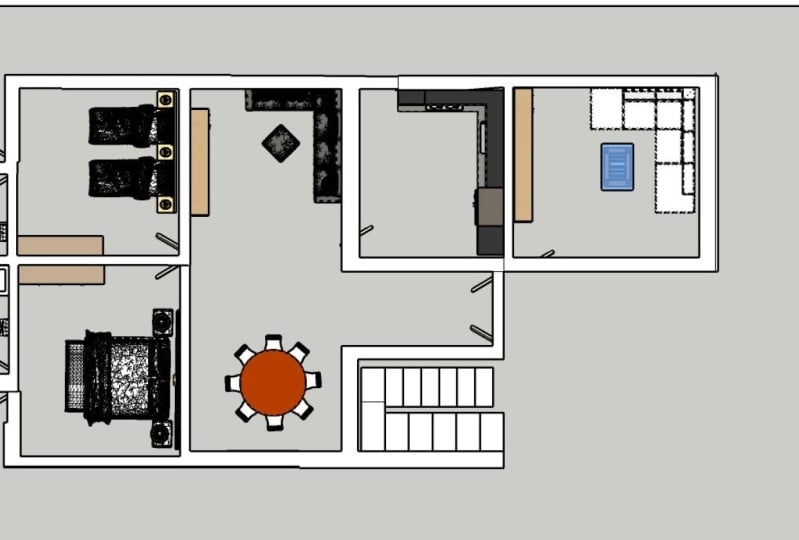
creating a floor plan using three different methods before moving into spatial planning, which lays the foundation for both the interior design process and for our future
three D model. From there, we gradually build the entire project together,
starting with walls, windows and doors before
moving into furnishing and designing each space from simpler rooms to
more detailed areas. Throughout the course,
you will essentially recreate this complete
house project alongside me, although many students also choose to create
their own versions, which can become a great
addition to their portfolio. Once the three D
model is complete, I will teach you how
to create scenes, refessional presentations,
different visual styles, and walk through animations
before moving into the technical
documentation stage where we create
elevation drawings, lighting plans, and electrical layouts using sketcher layout. And because I'm teaching from a real and tereer
design perspective, I also share my
design knowledge, workflows and professional
templates throughout the course so you can apply them to your own
future projects. But more importantly, you
will learn how to build a clean and efficient
workflow that helps you work more
confidently as a designer. So if you're ready
to finally learn sketch up in a more structured
and professional way, I'd love to welcome you inside my course. O.
3. Downloading SketchUp Software - Updated - 2026: It Hi, guys. Let's get you
started on SketchUp. In this lesson, I will
show you on how you can get SketchUp software
onto your computer. If you have already purchased the SketchUp PRO license or signed up for the 30
Day trial version, you must have received multiple emails directly from Trimble. For instance, that you have created a Trimble
identity account. If you haven't created one, just head to sketchup.com, click on the sign in CN
and create a Trimble ID. Just make sure to use
the same email address which your license was added
to once you purchased it. Now that you have signed in, please click on
the little icon in the bottom right corner
and select My Apps. From here, you can view all included applications
in your Pro license. You can download the sketchupP and choose the Mac
or the PC version. After downloading, you simply install your program
as you would install any other programs
within your Mac or PC version. After installation, just go
to your application folder, and from here you can
find your SketchUp icon. After starting the
SketchUp software, another window will appear wanting you to sign in
into your Trimble account. Don't get confused here, since it forwards you to
the Trimble website. Just sign in again as
you have done before. And once you see the window that says you are all
signed into SketchUp, head back to your
SketchUp software. It will then
automatically update your log in and show
you the welcome screen. Don't worry if after some weeks, you may suddenly are
locked out from SketchUp. Just repeat the log in
through the Trimble account, in case SketchUp asks you to. I guess it's just for
security reasons. The next video, we
will start on how to set up SketchUp
correctly. See you there.
4. How to set up Sketchup - Updated 2026: Great. Let's get
started with SketchUp. When you open the program
for the first time, you'll be greeted with
a welcome screen. To get started, you
need to sign in into your Trimble account
at the top right corner. This will activate
your license and ensure you have full access
to all of SketchUp features. At the bottom of the screen, you will see a list
of recent files. As a beginner, this area may
be empty, but don't worry. We will get you started on
your first project in no time. On the top area, you
see the templates. The default template and
SketchUp is very simple, but there are many
other templates available to choose from. Simply click on more templates in the top right corner
to explore your options. At this point, I need
you to decide if you would like to work with
millimeters or inches. So just so you know, in
the following videos, I will use millimeters, but I will provide you
with the imperial measures wherever it's needed so
you can follow along. For now, I would
recommend selecting the interior's template in
millimeters or in inches. This will give your project
a more professional look with thinner lines and the
light gray background, which I like because it makes it just
easier to work with. I also recommend clicking on the hard icon to make this your default template
for future projects. So let's go ahead and
choose Interior's template. Once you have selected
your template, you will have a working window that you can resize as needed. If you work on Windows, you may see your screen
as a full screen. If you are on a Mac, you have this extruded window, basically. So when you double click on
it on the top of the window, it will expand to
the full length. You may also notice
some open windows, such as the instructor, or if you work with
windows, the default tray. You can keep them open or
close them as you wish. We will open them when
we need them anyways. On the top, you see
your settings menu. You can just click
around to explore a bit. To make sure you
have a straight view of your three D model, please go to camera and
choose perspective. You may also want to adjust your tool palettes by going to view and selecting tool
palettes and large toolset. This will provide
you with another tab that open up on the left side. Now let's go ahead and
customize your top tool bar by clicking on View and
select Customize toolbar. You now see all of the tools
SketchUp has to offer. And as you can see in the top tool bar and compare it with the
large tool set on the left, you have many duplicates. So we don't really
need duplicates, so you can just remove
them by dragging them out. Please bring the standard views, styles and undo redo
back into the bar. You may want to adjust
your tool bar with your learning progress and
add more tools when needed. Finally, it's always
a good idea to save your model early and often. So here's the first shortcut
I would like you to learn. Command S on Mac or Control S on Windows
to save your file, or you can access file and
save through the upper menu. Please give your file a name and save it to your
desired location. And speaking of shortcuts, don't forget to check
out the Crick fen sheet for a list of helpful shortcuts. It doesn't contain
all the shortcuts, though, what you will
learn the others from me. I really love shortcuts, as you will see during the
duration of the course, they are a timesaver. So I encourage you
to learn them. They will really make
your life easier. Alright, let's move on
to the next chapter.
5. Moving around SketchUp: Some of the essential
tools in sketch up are the Orbit the Pen,
and the Select Tool. In this lesson, you will
learn how to use these. Let's have a look
at the Select Tool. You can find the Select
tool by clicking space bar on your keyboard or selected from the
bar on the left. The Select tool is used to select entities
in your models, such as lines, surfaces,
and grouped objects. I'll explain more
about groups and even components later
on this course. When we start with Three
D modeling for now, you can click on the
entity you want to select. Or you can also create an invisible box that's
going to select whatever is inside that box by holding your mouse key and just hovering over whatever
you want to select. The orbit tool. The
orbit tool allows you to change the view of your model by rotating
it in three D space. To use this tool, you
can press the O on your keyboard or you find it also on the left side
on your toolbar. To use this tool, you
have to click and hold the left mouse button
and then rotate around. Next up is the pen tool. The pen tool allows you to move your view of the model without
changing the orientation. Select the pen tool
from the toolbar or press H, H for hand. Basically, on your keyboard, you click and hold the left mouse button and move your mouse in the
decided direction. Now what I like to do is
when I use the orbit mode, or I am in the orbit mode, I like to switch
between orbit and Pen. Instead of clicking O and H, and again O, I just stay
in the O the orbit mode. I use the shift button that temporarily is going
to activate the pen tool. By that it's just going to
make it easier to move around. Please go ahead and
try these tools to get a better feeling of how to use them and see you in
the next lesson.
6. SketchUp Files & Backup: Hi guys. Once you have saved
your file a couple of times, you will notice that there
is a copy of your file with this wavy symbol that
was created automatically. Let me explain. In Sketch Up, when you save a project, it creates two main
types of files. The sketch up model
file and a backup file. The file with a
small wavy symbol is a backup file and it has the same name as your
original sketch up model. The backup file is
essentially a copy of your sketch up model saved at the point in time when you
last saved your project. It serves as a safety net in case your original model file becomes corrupted or if you need to recover an earlier
version of your work. If sketch up crashes, there's an unexpected issue. You can use the backup
file to restore your project to the
last saved state. If you wish to keep copies of certain steps
in your project, you can save and move the backup to another folder so it
doesn't override it. Once you save it again, it will generate another
back up and so on. Since occasionally
sketch up crashes, I usually move my back up file in the evening to
a daily folder. And once I continue
with my project the next day and my file crashes or breaks
for some reason, I still have my backup
from previous day. It's a good practice to regularly
save your work and keep both the main sketch
up model file and its corresponding backup
file in a safe location. Now let's move on
to the next lesson.
7. Adjusting the Units: Hi and welcome in
this quick lesson, let's talk about units. Depending on your
country of residence, you may need to adjust
your unit settings. To change or adjust your units, you need to go
into the settings. You can find it under Window, model info, and
navigate to unit. For most countries, you
will be using millimeters, which is automatically
said when you choose your interior
template in millimeters. What I would actually just do here is to set the
precision to zero, there's no need to showcase
any digits or anything smaller than 1 millimeter
or 0 millimeters. If you are from the US, you may want to adjust your
settings in fractional, if you prefer to
work infractions. But just note in this course, I will continue
providing you with decimal inches since it's the
fastest to type in for me. Just to continue this course, please use that unit and
select 0.00 " for precision. This will give you two
digits after the comm. Later, when you start
working on your projects, I would suggest you
use a unit that you are comfortable with working. Even though we have selected a template in
millimeters or inches, we can always change the unit. We want to work in
anytime at any stage. Whenever you feel
you need to switch, you can just suggest the unit and continue working from there. Okay guys, see in the next video. M.
8. Bonus Video - Length Snapping: Actually something else that I still want to show you real quick is that when you are basically
selecting your units, there is a checkbox that
says enable length snapping. Make sure that that
one is actually not checked on unless you really want to have length snapping. So let me show you what
that basically means. So let me start first
with the millimeters. Let's say I choose my
millimeters and I enable length snapping and I
place here 5 millimeters. As my setting. And here, for example, when I
use the tape measure, which you will learn
in the course, but just for you to see, basically it's steps
5 millimeters, and that's basically not what
I want because of course, millimeters you want
to work very exact, so you want to disable that. So this way, you can really
go millimeter by millimeter. Yeah. At the same
goes for inches. This can be useful, however, if you work for example with
fractionals and you choose, let's say, a display of 116. You could, however, have that exact same length snapping that way your model or
when you start building, basically, you are not
building smaller than 116 or when you start
drawing anything, if that makes sense to you. So basically, it's
now it's stepping in, in 116 of precision or well, depending on the
precision that you select here and also enable
the length snapping. So that is your
personal reference. If you need it. I recommend to not use it for millimeters. However, a, for inches, this might be useful, but I would probably use a little smaller
fraction to showcase. All right. That's something that I forgot to mention
in my last video, so just wanted to include that.
9. ✨ ✨ MODULE 1 (2D Floor Plan)✨ ✨ : Hi guys, welcome to module one. Now that we have
set up sketch up, it's time to investigate more about how to create
two D floor plans. So, over the next
couple of videos, I will show you three different
ways on how to do that. And by the end of this module, we will start creating our two D floor plan for our Eden Springs house.
Let's get started.
10. The purpose of a 2D Plan: Hi everyone. In today's class, we will be diving into
the world of floor plans, a crucial component
of interior design. Before we embark
on the journey of creating a floor
plan, spatial plan, or three D designs, it is essential to
grasp the purpose of a floor plan and why
it is indispensable. What exactly is a floor plan? A floor plan serves as a two dimensional representation of an interior
space or building, typically depicted from
a top down perspective on a flat surface, such as paper or a
computer screen. It offers a simplified layout of the space encompassing
all the rooms, windows, walls, and fixed
features like fireplaces. Architects, designers and
builders frequently utilize two D floor plans during the planning and
construction phase of a project to provide an
accurate portrayal of space and identify potential
issues that require attention before
constructing commences. As interior designers, we can create a simplified version of these building
plans to establish a foundation for our
work to build upon. Subsequently, we employ
spatial planning, also known as space planning. Spatial planning
specifically refers to the process of organizing and arranging the
physical space of a room or building and
fill it with furniture, display bathrooms,
or kitchen designs. It entails determining the most effective
and efficient use of the available space, taking into account factors
such as traffic flow, accessibility, and the
intended purpose of the space. After finalizing our floor
plan and spatial plan, we can then determine
the products we need to purchase and at the same time start building our
Three D design. Using the drawn walls
from our floor plan, you can see that a
detailed floor and spatial plan is key to a
clean and good workflow. In the upcoming lessons, we will dive first into the fundamentals of
surfaces, edges, and groups. Following that, we will explore realized scenarios on how to create two D floor
plans using sketch up. By the end of module one, you will be able to create
our Eden Springs floor and let's get started.
11. Fundamentals of surfaces & edges: Hey guys, before we dive in into the various methods
of creating floor plans, is crucial to understand some fundamentals about
surfaces and edges. Let's have a look first at
the axis that you see here. The blue axis
indicates up and down. The green axis shows
forward and backwards. The red axis is to
move left and right. In Sketch Up, we have ten different tools on how
to create two D surfaces, depending on what shape you
are looking for to create. Let's start with the line tool. You can find it on
the left tool bar or by clicking L
on your keyboard. By clicking once and
releasing you create a dot which then is attached
to a rubber band effect. The rubber band shows you the direction in which you
will continue your line. You can use now
the arrow keys to fixate it in a different
axis direction. The up arrow will let
your line go up and down. The left arrow will move
forward and backwards. The right arrow will let
you move left and right. You don't have to
fixate your direction, but sometimes it's very useful as you will see over
the next lessons. Now I want to draw in
the right direction, so I can simply move my mouse, or I lock the direction by
clicking on the right arrow. If you click the
right arrow again, the lock will be released. You see on the right
bottom corner that sketch up calculates the
distance of that line for you. You now have two options. You can move your mouse along the axis until you have
your desired measure, or you can simply type
in the measure you need. Let's stride is out
with 500 millimeters which equals 19.7 ". I will also show
you on how to do that in inches template. In just a moment, we click
and release the mouse. Then we type 500 and enter. Now our line is 500
millimeters long. Let's try this with inches, you click and release and
type 19.7 " and Enter. If you prefer to
work with fractions, you can always change
your unit preferences by going to Window
Model Info and Unit. You can choose the format
and also your precision. I will continue providing
you the measures for inches, since it's the
fastest to type in, you can obviously change the precision for the
metrical version two. Let's continue
drawing a rectangle. Now, when you forgot what you measure was on the
bottom of your line, you can use the inferencing
snapping option by simply hover over the
point and slowly move up. You see that sketch up
creates a dotted line which indicates you're
drawing straight in the same line as
your bottom dot. This is very helpful as
sometimes you don't always see the lines that car and this will make sure that
your lines are straight. Once you close your
rectangle in Sketch up, it creates a surface in the
middle of your rectangle. Now this is very important to understand that in order
to have a surface, your loop of edges or
lines need to close. Very often I read commands by users not knowing why their wall disappeared or why
they can't fill in their surface is
really just somewhere, the loop is not closed,
that's really it. Always make sure your loop is closed in order to
have your surface. Thankfully, we
don't have to draw all our lines with
the line tool. There are other tools on your tool bar that create
predefined shapes. Let's have a look at
the rectangle tool. You can click R or see
it on your tool bar. Once you click and release, Sketch up already shows
you all four corners. At the bottom right
you see two measures, one is the width which indicates also the
direction of the red axis. The second one is the length, which indicates the
direction of the green axis. Let's say we want to
create a 500 millimeters wide and 200
millimeters long shape. We do this by separating
those two measures. With a comma, we type in 500, 200 and enter the coma in
between is very important. Otherwise sketch up
doesn't know what to do with it now, inches, you would type in 19.7 ", 7.8 ", and Enter. It's easy. You just need to
remember how to type this in. Next, have a look at the
circle tool by clicking C, or you can find it also
on the left tool bar. Once you click and release, it provides you the
radius of your circle. If I want to create
a coffee table, let's say that is 600 diameters, which has obviously radius
of 300 millimeters. You could simply type
in 300 and enter. If you wish to re check
your measurements, you can use the tape measure by pressing or selected from
your tool bar on the left. There's one important thing
I want to mention here. When you select the circle tool, it shows you a number on the
bottom before even clicking. As you see here, 24 means that your circle will be
made of 24 segments. If you create small circles, this might work just fine. But if you do create big
circles like we just did, you literally see the corners. To avoid this, you
have to tell sketch up how many segments you
want your circle to be. Let's try this with
60 instead of 24, and you will see the difference. Now I type in 60 and enter
and start my circle. Do you see the difference? This is super important, Many don't know this and wonder why their circles
look so undefined. Now the next tool I use
is the two point arc. Click A or find it
else on the toolbar. Here we have the same option
about choosing our segments. Let's increase it and
say we want 25 segments. Then I click and
select my first point, and click to find
the second point. Now I just move my mouse and see it does
create an arc for me. This is useful when
creating arch doors. For instance, if you want to
exit an active drawing tool, you can use the escape
key or the space button. What you may have noticed now is once the shapes
overlap and sketch up, it automatically
divides the surfaces. When you select the
surfaces or the edges, you can use your shift
key to select multiple If you remove a line by selecting it and then
use your backspace key or the erased tool on the
left side of your tool bar, the surface is
going to disappear. Which now, in conclusion, is important to understand, that we really need to have a closed loop in order
to create a surface. Now that we know how
to use the line tool, the rectangle tool circle, and the two point tool, let's just quickly jump
to the other tools. To be honest, some of them I
never used for my projects, but maybe you might
find some use of them. Now that you know how to
draw shapes and sketch up, please go ahead and try
all of the ten tools. See you in the next lesson.
12. Create Groups & Move 2D Objects: Hi guys. In this lesson, we will talk about
how to move shapes, meaning lines and surfaces. And how to copy, group, rotate, and scale them. For this lesson, I have created some basic
shapes for you. Now, when I select my move
tool from my toolbar, or clicking M on my keyboard
and start moving a line, for instance, you
will notice that the line is sticky to the
whole rest of the shape. If I click on the surface,
I can then move it. It helps to use your arrow keys to fixate an axis direction. I could also select the
parts I want to move. Only when it comes to selecting. You will see that there's
a difference when I start selecting from left to right
and from right to left. Left to right only selects everything that is within
the selection rectangle. If you go from right to left, it selects everything that
the select tool touches. If I want to move my circle, now I have to press Escape or
click outside my selection. Let's now say I want to make
a copy of this rectangle. I select my whole shape, then I use my move tool by pressing my option
or control key. You see a little plus sign appearing underneath
my tool symbol. This indicates that I create a copy of exactly
what I have selected. Now if I want to
make another copy, I have to press my option
or control key again. I could also decide to copy this shape and move it
to a certain distance. It always calculates from
the dot you were selecting. Let's talk about groups
now and why they are so important right now. You see that once lines
and faces overlap, they merge together
since they're sticky. Let's see how the same process
would look if we would have grouped our lines and surfaces into one
contained group. Let me now select the rectangle again by clicking
command G or control. You see that now I have
gotten a contained group. If I start copying my group now twice like we just did
on top of each other, you will see that now they won't interfere with each other and they are not sticky anymore. There are two separate
contained groups. I can always ungroup my
groups by clicking right. Explode. This way
they're an open source. Again, let's have a look now at this room with
those two windows. Let's say I want to copy
this window to the right. I could either select
all surfaces and use my shift button to add more surfaces and then
move and copy it. Just be careful to move it
within the correct line, since right now you know
nothing is grouped. It means if you move
it by accident, here your plan starts to divide. It helps to group your
windows before moving them. This way you can freely
move them around. Now if you haven't
created any groups yet, you do that while the windows are combined with the walls, you will see that the area
underneath it will be cut out. If you don't want
this to happen, you could start creating
your walls first, group them, and create your
windows and group them. But sometimes it
might be useful to do the other way around and only group the windows after they are already drawn together
within your walls. You will find more about
this in the next lessons. When we start building
our main floor plan. I could now copy my window
to the other wall and use my move tool to rotate by hovering over until I
see the dotted red line. I can also use the
rotate tool for that, even though I think
it's a redundant, since we have this tool already integrated
in the move tool. If I was to make
this window bigger, I have to go inside my
group by double clicking. You can see the
dotted line around indicating you are currently
inside your group. Now my lines and surfaces
are sticky again. I could then select the
surface and move it further away to make my window
bigger with escape. You can leave your group and you are back to
the normal level. The last thing I
would like to show you is the scale tool. Now when I select my group, I can see eight
green dots around my group showing me which direction I could
scale my objects to. It's easy to scale
rectangle shapes, just be careful when scaling round shapes as they
start to distort. We will discuss the
scale tool further once we start working with
furniture later in discourse. Please go ahead, try out
what we have just learned. And I will see you
in the next lesson.
13. Creating a 2D Plan (Situation 1 Sketched Floorplan): As an interior designer, you may come across
different situations when it comes to
creating a two D plan. Now that you have
learned on how to draw surfaces and
edges and sketch up, it's time to have a look at
those real life situations. Let's talk about the first one. Imagine you have a friend or a client who has asked you to redesign a kitchen
for him or her. For the purpose of
this discussion, I will refer to your friend as a client as it's essential to maintain a professional approach even when working with
family or friends. Suppose your client does
not have any plans from an architect or a
builder, in that case, you would go and visit your
client and you would start by sketching the rooms
on the piece of paper or maybe your iPad. Maybe your client
doesn't live close by. In that case, he or she may provide you with a sketch
that they already created. In either case, you would end up with something that
may look like this. Obviously, you can also
mark electrical sockets, water outlets, sewage
pipes, et cetera. For this purpose of
understanding the approach, mainly, I only drew doors,
windows, and walls. You can find the PDF document
in the download section. Now, this is obviously
not a scaled plan, so it doesn't make sense to
import this into SketchUp. Instead, we use guides
to build our plan. We have two approaches here. As I mentioned, we start with
creating guides by pressing the key or you find the tape measure
on the left tool bar. It doesn't matter where we start drawing since SketchUp
has the infinity ground, but it makes sense to
draw close to the axis, since we can use those
as our anchor points. We know the measurements
of our kitchen. You can always have
a look at the PDF that is provided in the download
section, as I mentioned. Now we know our kitchen has a
width of 3,690 millimeters. We snap to the green axis
and we type in the measure. This will create
our first guide. Now, we snap to the red
axis and we type 6,930. Now that we have our guides, we can use the rectangle tool to simply create the inner
rectangle of this kitchen. Now we also need
the outside walls. Let's say this wall is
150 millimeters thick, which equals 5.9 ". We again use our tape measure
to create outside guides, and then we can create
the other rectangle. We now have the
frame for our walls. You can remove the guides
by selecting them one by one and use the backspace
key to remove them. Or you can remove them all at once by clicking
Edit, delete guides. Let's have a look at how
else you could create this. We select the rectangle tool, but this time, we
don't create guides. We simply click with
the rectangle tool once and we type in 3,000 696,930 or the inches
measurement, and we enter. Now we already have
the rectangle. So instead of creating
another rectangle, there is another tool
I want to show you, which is really amazing. It's called the offset tool. You can find it by clicking F or you select it from
your left tool bar. Now we click on the surface
that we want to offset, but we don't release the mouse. We simply keep the mouse
on and hover until we find the measure that we
need, and then we release. Sometimes, as you can
see, it's not that easy to find exactly
the measure we need. So as I said before, as long as you don't
move your mouse again, you can always type in the measure and SketchUp
is going to fix it. Let's type in 150 or 5.9 "
and then we click Enter. Since we did create already the inner rectangle
of the kitchen, we actually need
the outside walls. Let's go back by pressing
Command Z or Control Z on PC, or you can use the undo and
redo on top of your toolbar. Let's now select the offset
tool again by clicking F. This time we move to the
outside of the rectangle. We offset the surface
outside of this rectangle. And here we go again, type
in the measure we need, we enter, and we can use the tape to recheck
the measurements. You will see that you
may use a combination of those ways to create
your lines and surfaces. It doesn't really matter
which way you choose. You prefer to work
with guides or use the rectangle or the
line tool right aways, it's just a matter
of your preference. When it comes to
showcasing windows, I usually measure
a 50 millimeter or a two inch frame to
create a simple line. I can also duplicate
a line that already exists by selecting it
and using the M tool, you can also find it
on your left tool bar, and I can duplicate this line. Once I select the line and
I'm within my MOV tool, I can press Option when using a MAC or Control
when using a PC. Now you see that there is a
little plus sign showing up. This indicates that
you're copying the line. Here we can also type in the measure we want
to move the line to. Then I would need a middle
glass panel for my window, so I snap into the midpoint of my line and use the
line tool to create it. When we advance a little
further in the course, I will show you on
how to find pre made two D symbols like doors and windows and how to adjust them. For now I would recommend
you learn to draw them from scratch to
understand how they work. Be careful when you
move lines or surfaces, since right now they are not grouped, meaning
they are sticky. So if you move a
line or surface, it can mess up your drawing. So in case you move somewhere
where you don't want to be, you can always use
your escape button. When it comes to
creating the door, I usually use the Pi tool. So I click on one point, then to the other, and I
open the door 45 degrees. Okay, guys, we're done for now. This lesson was to only
showcase how you start with creating the really basics and drawing based on
a sketch layout. Feel free to recreate this if you are a
complete beginner in SketchUp you move on if you already know
how to create this. The next lesson, we will dive in into
situation number two, which is on how to import digital plans like
JPEGs, PNGs, PDFs, and how to scale them up to have a base that we can use
to create our floorplan.
14. Creating a 2D Plan (Situation 2 Digital Floorplan): In the previous lesson, we have seen how we
draw floor plans only with creating
guides and reading our measurements from
a piece of paper or a scan sketched floor plan
that your client has sent you. Now let's have a look at
situation number two. As an interior designer, you will often receive
digital floor plans created by architects or even some
that may be very basic. These plants may come in
different file formats such as Jpegs, PNGs, or PDFs. The quality of the measurements
can also greatly vary. Some may be very detailed, while others may have a
few measurements only. Although it is ideal to receive building plans directly
from an architect, this is not always possible to effectively work with these
digital files and sketch up. It is important to
know how to import them and how to scale them
to the correct measurements. Be informed that we need
at least one measurement on the plan to be able
to scale them up. Let's see now how to
import these files into a sketch up and how to scale them to the
correct measurement. Let's start by importing
a very basic layout, which has just a few
measurements available. I deleted the previous drawing
from situation number one. To make room for this
file, you can do so too. Or you can create a new
file by clicking file New. This will open the
default template that you chose as your favorite. Just so you're
informed, you won't have to withdraw this example, since you will definitely
get a chance in the next lessons to create
the actual house plans. What is more important
here is for you to at least see and maybe try out how to import a file and
how to scale it up. Also, I want to show you
a couple more things before we dive in into
the actual project. You decide whether you want
to recreate this plan for another practice or you feel
already fit to draw plans. So you can just watch
and make your notes. Okay, we start by
clicking file Import. Now you see all the
supported files Sketch up can import for you. You choose your file and import. Now the plan is floating over the working space and we need
to ground it to the bottom. We can do so by selecting
the midpoint of the axis and move the mouse and click another time
to fixate the plan. When I use my tape
measurement tool now and recheck the
length of the measure, you will see that
it's not big enough. We need to scale it While
we have the plan selected, I'm going to use the
tape measure again. I fixate the measure
with a tape measure by clicking once at the beginning and clicking another
time until the end, until we see the measure appearing on the
right bottom corner. Now we simply type in the
number we need. We enter. As you see now we
have a pop up that appears that is asking us if
we want to resize the plan. Here we just click Yes. Sketch up is scaling up the plan in the correct
measure that you selected. You can recheck the
measurements also, again, just to make sure
before I start drawing, I want to show you some
predefined view sketch up offers on the tool bar that
we have adjusted previously. This you can select and it's going to automatically
orbit to the predefined view, the O view that is
showing the three axis. Then you have the top view, you have front view and all the side views
of your project. It's going to save you time to, instead of orbiting there, we select the top view to
make sure Sketch up draws our reliance on the ground and not underneath or above it. Then you see another blue
icon which is called x ray. This is a very nice
preview as it lets you see your project in an X ray version where you are able to make the
surface invisible, or let's say less visible. This way you can see underneath the imported file and you can draw your
lines on top of it. In the next few minutes, I will use the tools
that I have already shown you in the previous
lessons to create my walls, and we will come back
for the doors again. Let's have a quick look into what grouping is
within Sketch Up. In simple words, it's like sketch up is hugging
your lines and surfaces and doesn't let go of them until
you explode them. Meaning whatever you
select and group, you can move as a
combined object while it's not sticky anymore. For this example, I will
start grouping my walls and the surfaces
by clicking twice. You see it does select certain surfaces and its
edges that surrounds it. By clicking three times, it selects all surfaces and edges that are connected.
This is what we want. We click three times. Now let's say I want to
group these into one group. I click command G
or control for PC. Now it's a contained group
that we can move as we want. If we want to make changes
inside this group, we need to double click. And you can see that
the preview slightly changes and that is indicating that you
are inside the group. By clicking Escape, you can go back or outside the group
again to your main level. Let's now create the
windows and group them. Since I have this
window below as well, I can simply copy my group with the move tool and move it to
the spot I want it to be. I can also do the same for the doors in case I have doors
that have the same size. Now if one of the doors
have a different size, you can either create
it from scratch, like created in the beginning, or you can copy
the door that you have and adjust it accordingly. I will copy this
door now and move it to the spot where
I need it here. I can use the move tool to it using the four red
crosses that appear. Then I can click right and
flip it along the axis I need. Then I go inside my door group. Since the lines and the edges within my groups
are still sticky, I can simply select the
surface and then move it. And with that, I
automatically adjust the door with if at this point
when selecting the door, trying to flip the object, you don't see the option
flip when clicking right. It means you are
already working with a sketch up 2023 version. When I recorded the first
part of this video, I have used a 2022 version. And they got rid of
this function in the 2023 version and replaced
it with this flipping tool. Let's see how it works. I have to select the
object I want to flip. Once selecting the flip tool
from the left tool bar, you can see it has
created three axes. Note that these axes are not
the same axis as globally, meaning the object has been
assigned to its own axis. In this case, the red axis will flip the object vertically
from left to right, and the green axis horizontally
from top to bottom. You can also use your left or right arrow key to navigate. Don't mind the
blue axis for now. It will concern us later when
we start using three D. In two D we don't need
it since it will flip the symbol upside down
and we don't want that. If I want to open my groups, I can click right
and say Explode. Now you don't have
a group anymore and you're having
an open source. Again, where the lines and
the surfaces are sticky. I do find it easier to start working with groups
as soon as you can in your model to keep
it clean and also organized and to not mess up
your lines and your walls. As you will see in
the next lessons, it makes things very easy
to work with groups. Feel free to import this J pec file into your
class project and scale it up, just so you have done
it once. At least. You can also practice creating the groups as
seen in this video. The next lesson we
will have a look at situation number
three where we will import a DWG file before
starting our final project.
15. Creating a 2D Plan (Situation 3 Importing a DWG File): In the more rare case, when you do receive a
Cat file or so called DWG file from the builder or the architect of
your current project. You may be able to
use this file to save yourself some time when it comes to
building the floor plan. I don't really come across
of those files that often, since many are subjected to copyrights and the
builders or architects, they are not so willing
to always share them. But if you do come across one, I still want to make sure you
know what to do with them. The same way as we
import J packs or PDFs, you can click File Import. Here, you select
DWG from the list. But before importing your file, have a quick look
into the settings. I don't want to go
too deep into this. What you need to know
is that you can leave out the preserve settings as you want your DWG file to be positioned
close to the axis. Then the geometry. You can select all
three options. When it comes to unit, I always select model units, since many times
I don't know what the original size was when the architect created the file. This way, sketch
up automatically detects it and scales it up. It works in most of the cases. Sometimes I do have
to resize the model, but I will talk about
this in just a second. Now, after importing,
which may take some time, depending on how
big the cat file is and how much detail
there is in the file, it will be placed like this, Very close to the
axis, I have to say. Unfortunately, there
are many cat files that are not very
nicely prepared, which may lead to unfinished and broken lines when
you import them, some have suddenly
some three D objects in them or they just look messy. What do I use those
DWG files for? Usually, I like to
draw my plan from scratch to be in full
control of the measurements. But what can be important
are, for example, the window heights in case you are provided
with a Cat file only. This is the only way
you may be able to see how much space you have
underneath or above windows. Sometimes I use the
frame of the walls. If they are clean, just expect
that with those cat files, you may have to
clean them up first before being able to
actually use them. One of the first
thing I do is I check my scale and see for instance, if my ceiling height is correct or any other
measure that you may have to be able
to scale a cat file, you need to go
inside the cat file, inside the group
that was created. The difference with having to scale a J Pac
file in comparison with a cat file is that
you need to literally go inside the group
to scale it up. Let's go inside the
group. Let's say I know my ceiling height is 2,700 millimeters or 106.3 ". Now I can see it is
not up to scale. For some reason I can use the exact same technique that I actually used when scaling
up a Jpec file or PDF. Only with the difference
that now I have lines, meaning that my tape measurement automatically wants
to create guides. I need to click the option or
the Alt key while selecting the tape measurement to remove the little ruler that
appears under my symbol. Now it won't create the guides, it will simply measure. Then I click on the bottom, and on the top and type
my ceiling height in and then enter this will then scale my plan to the
correct measurement. Don't be scared if
you have imported a cat file and suddenly
it's too small or too big. Just make sure to check with any reference
measure that you have, like a ceiling or a door with, or can be anything
that you have. In most cases, the files
come without the surface, meaning you only have
lines to work with. The next I recommend
is to your file by clicking right Explode so you can access
your lines better. Some groups may still
exist for some objects like the chairs or the tables or whatever is drawn
on your files. That's okay, we can
keep this grouped. Then I delete unnecessary
lines and objects and basically clean up my file
so I can work with it. Now to build up walls
in the later stage, I do need a surface, meaning I need to get somehow
my white surface back. I can use the line tool, I can draw over existing lines. I can try the rectangle tool. Sometimes it's a mix of both. Really, there's no exact way of how to get the surfaces back since files can be
very complicated once they are produced. With time, you get a
better understanding if it's worth to use the Cat file or if it doesn't make any sense and just to
create the floor plan by hand. Now you can see that some of
the surfaces turned blue. This means that Sketch
up for some reason, decided to use the back
side of the surface. You just have to click on the surface and right click
and then say reverse. Then you have the white front
side again of the face. Since most Cat files are
subjected to copyrights, I cannot directly share a file with you that
you can import. But believe me, if you want to exercise this and have
a look at some files, simply Google free DWG files, and you will find
multiple websites that provide those for
educational purposes. Always check the license usage when you download a cat file. As you have seen now
while I was talking, I was able to create
some walls which I could potentially use to
build up my walls later on. Let's keep this lesson short. If you want to try
importing a cat file, please go ahead and find one of the multiple that are available. I just wanted to
show you that it is possible to
import those files and that you need to
know that they may come with certain
problems and adjustments. We are finally going
to start building our house project
in the next lesson. I'm so excited. I hope
you are to see you there.
16. Introduction (Eden Springs Floorplan): Hi everyone. I'm
thrilled to share with you the floor plan that
we will build together, the Eden Springs Project. I have a fondness for giving
projects unique names. As interior designers, our task goes beyond creating
aesthetic pleasing spaces. We strive to evoke emotions and sensations
through our design, making sure that every corner of the project reflect the
intended atmosphere. With the Eden Springs, I aim to create a tranquil and
serene environment that provides a
resort like feeling. I firmly believe
that the name of a project can set the tone
for the design direction. And help to inspire
not only our clients, but first us as designers, since we need to come
up with a design, but we will talk more
about designing later on. For now, let's focus on the
Eden Springs floor plan. Upon downloading the module one zip file from the
download section, you will find a variety of
useful documents in here. Included are two
sketch up files, one in millimeters
and one in inches. This is like your master
plan or backup floor plan. Let's say you can
open it and have a look at how I created
my groups for doors, windows, and walls so
you can recreate it. Additionally, the folder
contains PDF files with a complete floor plan and all the necessary
measurements in the folder. Import J Pac. I have
included two images as J Pac files for
you to import into your sketch up file when
rebuilding your floor plan. For this plan, it doesn't make sense to use
technique number one, meaning building your plan
solely by creating guides. As this house is too big and
has too many measurements, you would have to look up. We do have a digital plan,
let's make use of it. Technique number two involves importing the floor
plan as an image, scaling it up, and
drawing the elements. Please be informed that I
recommend always uploading a Jpa file or PNG file
instead of a PDF. The problem is that sketch up
does not do well with PDFs. You can certainly increase the quality for import
in the settings, but in my experience, that is still not enough to be able to see the
measurements that well. I always make a screenshot from my floor plan in
case I get PDFs. If you feel confident in your ability to create the
outer walls, the doors, and the windows without
additional practice, you can simply use
the master file I provided and continue with
those for the next video. Ultimately, the choice is
yours if you want to practice more floor plan building or skip this part and work
with the master file. The next video, I will
draw the floor plan by importing the JP
file one last time. It's still worth to watch the video since I want to show you a couple
more things there. All right, see you
in the next chapter.
17. Creating the Floorplan (Eden Springs): Let's begin by
creating a new file. Now if you have chosen the default template with the hard icon in the
template section, it will automatically open
once you click file new. If you haven't done so, I would like to open another template, Then you can click on
file new template. Once the file is
open, please save it. It is important to
save your work as often as you can to avoid
losing any progress. In case of a sketch up crash, Next, import the ji pec
file and scale it up. Now select the x ray mode and you can start creating
lines and surfaces. As we have learned in
the previous lessons, I start with creating
all walls first. Now this is how your
walls should look like. Have a look specifically at
the surfaces of the floor, the walls, the windows
and the door area, and how they separate
from each other. This is super important once
we start building our walls up to be able to separate
those surfaces from another. A good base will save
you time in the end. Make it a habit to create detailed floor plans
from the beginning, especially if you're
going to use this one and build up your
three D from it. Now I create my windows, you may be able to copy some and adjust them to
save yourself time. You may notice that the
window representation differs slightly from
those in previous videos. Some windows have three lines, while others have five. I chose this display
to represent whether my windows extend from floor to ceiling or have walls
underneath them. This visual cue will help
during spatial planning, reminding me which windows are full height
and which are not. Let's now adjust those windows
which are full height, and simply keep three lines
only instead of five. Now I start grouping
my windows by selecting the surfaces
and click kanji. Once we have finished
grouping our windows, I would like to demonstrate what will occur underneath
the windows. This area is essentially cut
out from our floor plan. This step will prove beneficial when we begin
constructing our walls. Trust me, and follow
this workflow. It will all become
clear in the end. Next, we need to
group our walls and floors before proceeding
to create doors. Otherwise, the same
effect will occur where this area will be cut
out from our floor plan. However, in this case, we will want to preserve
the surface for our floor. To accomplish this,
select all surfaces and exclude the windows by holding shift and
clicking on them. Since they are already grouped. Now we can group everything
else that is remain. Now we can proceed with
creating the doors and make copies since they
are all the same with you can obviously decide on how you want to
represent your windows. That makes the most sense
to you and your client. There are various ways
to depict two windows, depending on the specific type of window you want to showcase. You can search the Web for examples of how to
display fixed windows, sliding windows, and
other variations to create them accurately. Now, in this case, in our
Eden Springs floor plan, I have incorporated fixed windows with
additional divisions. This means that
some windows have an extra vertical frame within them to indicate
multiple divisions. Then I also have incorporated
letters for my windows. This is because I want to
provide you with more details about the divisions and wall heights that may be
underneath the windows. You can have a look at how I displayed that
within the PDF plan. Or you can also see it here. Since we imported the
first page of the PDF, we're going to need
those informations once we start building
our three D walls up to create letters
or words in general, you can click on
three D text there, You can type in your
text or letter. You can choose your alignment, your fongs, and its size. If you click Fill, your letter will be
filled with the surface. Otherwise it only lines. You can leave the
extruded part out. Since this will create
a three D text, we don't want that in this case. Please note that sketch up
usually inverts the text. For some reason you may
need to reverse the faces. You can do so by going inside the letter word with
a double click. Then you click command
A and select all. Then you click right
to reverse the faces. I have also incorporated sky lights and arch
door openings, which I usually display with dotted lines
within Sketch Up. Unfortunately, there
is no current tool which automatically
creates dotted lines. I hope Sketch Up will
incorporate this in the future. You have the option in
sketch up layer though, but in this case I want to showcase them
within my floor plan. Let me show you now quickly how I would create
this sky light. I start by creating guides to set my middle
point for my circle. Then I know that my skylight is 800 millimeters in
diameter, or 31.5 ". I create my outer circle, then I use my offset tool to create another
line in between. The middle part
would be my frame. You can use the standard
frame size we have used for the windows of 50
millimeters or 1.97 ", or you choose another thickness. Then I click on the
explode curve for both circles and remove
the lines in between. Then I also group both lines to be able to copy
this Sky light to another place for lines is very similar, only that you need to click
Write and say Divide. By moving your
mouse up and down, you see that it shows a previous of how many faces you
want to divide it into. Let's say I choose
16 to be able to achieve a similar look
like the circle version. Then I also just
remove the lines in between on top of my floor plan. You will see that I have copied all my doors, windows,
and openings. This way I could
potentially save time for future projects and just copy this box from one
file to another. I may need to adjust the size of my windows depending on
the project obviously, but I will definitely
save time by this. You could also build a completely separate
sketch up file to collect all your two D symbols to be able to use them later on. It could be like a master
file for your two D symbols. Just so you know, since you
bought discourse with me, you are free to use
all my symbols and all my furniture
and even textures I have built for all
your projects. Don't need to worry,
please go ahead. If you want to practice this, you can recreate the whole floor plan just the way I
showed you in this video. If you already know or feel
comfortable doing this, you can use my master file. In the next video,
I will show you how we do the spatial
planning for each room.
18. ✨ ✨ MODULE 2 (2D Spatial Plan) ✨ ✨ : Hi guys, welcome to module two. This module is all
about spatial planning. I will show you how to
create a two D spatial plan. How to make use of two D symbols from the
sketch up warehouse. How to create your own symbols. And how to depict certain rooms, showcasing wardrobes,
bathrooms, kitchens and more. So let's get started.
19. Introduction to Spatial Planning (Eden Springs): In this lesson, I would like to provide you with a
brief introduction to spatial planning and
explain why it is crucial to engage in it before commencing
any three D design. Let's begin by
answering the question, what is the spatial plan? In simple terms, as
interior designers, we determine the specific
types and sizes of furniture pieces required
for particular areas. Additionally, we must
consider situations where existing furniture
pieces are to be incorporated and
combined with new ones. Now, why is spatial
planning so important and why I typically undertake it soon after drawing
the floor plan? Reason number one, determination
of furniture types. By engaging in spatial planning, we gain a clear understanding of the furniture pieces needed, which greatly assists in sourcing the
appropriate products. For example, when
considering the entryway, I would know that I require a custom made or ready
to purchase closet. Along with these, I
need a bench, a mirror, a console table, and perhaps an excellent chair with a small coffee
table on the site. This enables me to determine exactly what needs to be
sourced for this room. Reason number two, determination
of furniture sizes. With a correctly
drawn floor plan, we can measure the walls and spaces where the
furniture will be placed, allowing us to define the
maximum size of each piece. This narrows down our search, ensuring that we only
consider furniture pieces that will fit within
the designated space. For instance, we
can determine that a bench in the
entry area can only be of this certain size based on the measurements
we have obtained and so on. Reason number three, estimation of furniture and
accessory quantities. Special planning
helps us estimate the number of furniture pieces
and accessories required, providing an understanding
of the time investment needed for sourcing these
items for specific rooms. For instance, let's say
we determine that we need approximately ten pieces for the entryway, excluding
light fixtures. Now we can estimate how much time we need to spend
sourcing all these items. The time required for
sourcing each piece varies dependently
on the country and availability of options. You can conduct a
time trial exercise by attending to source
specific styled furniture, pieces and accessories
for this house. Noting the duration
it takes to find all pieces in a suitable size. And then divide the
total number of minutes by the amount of
products you searched. Then you have your approximate
estimate for one piece. This is just an example
of how I usually provide this to my clients
when it comes to estimation. As you can see, incorporating spatial planning
before diving into three D offers
significant advantages. Therefore, I highly encourage you to include this
step in your process. It's important to know that
you have the flexibility to decide what elements you want to showcase within
your spatial plan. You can choose to
incorporate carpets, light fixtures, and
other details as well. However, for the sake of
simplicity in this house, I have focused on
the core elements to avoid overcomplicating
things for you. In the upcoming lessons, we will discuss each area and how I have represented them. I personally have created
all these symbols, but I will show you on
how to find more to these symbols within the
sketch up warehouse. Depending on your experience
in spatial planning, you may want to build
further knowledge within this topic as each room
has its own challenge. Obviously, designing
bathrooms, laundry rooms, or kitchens need more in depth knowledge than designing
an entry, for instance. But with each project, you will gain more knowledge
and you will feel more comfortable speaking
of knowledge by enrolling in
this video course. You have also gained access to my epoch bathroom
measurements cheat sheet. This resource provides you with standard measurements
for designing bathrooms. Rest assured, more
books will follow as I understand the challenges
faced by new designers. When I began my journey
in special planning, one technique greatly helped
me was literally stocking large furniture stores and meticulously examining
their products. I would study sofa sizes, coffee tables,
consoles, and more. Taking notes along the way. Since humans are generally proportionally similar globally, you can determine standard
sizes based on what you need. I also have always a small
measuring tape with me. Wherever I go, I just
measure anything that I found especially good or
even not so well executed. And just keep taking my notes. Remember, learning
spatial planning takes time and practice. It won't happen overnight. Be patient with yourself. Embrace the learning journey, and gradually build
your expertise with each product
you're working on. The next lesson, we will have
a look at my two symbols I place within this plan and how to find more
for you to use. We will also learn
to work with tags, or so called layers, and discuss how to display
custom made furniture. See you there.
20. Working with tags & 2D objects - Updated 2026: Hi, everyone. Now, if you
have created the floor plan, your file should look like this. I would like you to
open the master file provided within the
Module one zip folder. Let's begin by
talking about tags, also known as layers. In all the versions of SketchUp, they will refer to as layers, which actually makes more sense. However, they are
now called tags. To view tags, please click
on Window and select tags. So what exactly are tags? In SketchUp, you can assign
objects such as geometry, groups or components
to a specific tag. Each tag can be
toggled on or off, allowing you to
control the visibility of objects in your model. This feature becomes
particularly useful when working on large projects
with multiple areas, since it can lower your
loading time when you only turn on one particular
layer at a time. By assigning objects
to a different tag, you can easily
show or hide them, making it easier to focus
on specific parts of your model or temporarily
hide elements. For instance, you
can assign all your furniture and accessory objects to a Spatial Planning tag. Then you can easily turn it off or on to show or
hide these objects. In the videos, I may
refer to tags as layers, so just so you know what I
mean when I mention layers. The untagged layer is always present and
cannot be deleted. It acts as the bottom layer. You can create new layers by
clicking on the plus sign. If you have drawn
your floor plan yourself, at this point, you can create a new layer and name it Spatial
Planning, for instance. Another useful feature is the ability to copy objects
from one file to another. So let's open the master file. Turn on the Spatial Planning
layer that I have created, and you will see
that I have placed all the furniture
on the new tag. To copy these objects
into your floor plan, you can simply select
the upper part, copying it by using
Command C or Control C, and paste it into your
current file using Command or Control V. You will notice that SketchUp recognizes the
layer I created for these objects in
the original file and automatically generates
them in your new file. Additionally, you also
have the option to paste the object in the exact spot from the original
file by clicking, edit, and selecting
Paste and place. This can be quite
useful at times. Creating a separate layer for Spatial Planning
can be very useful, especially if you plan to use your floor plan with layout. In SketchUp layout, you
can easily hide layers, making it convenient to
display your floor plan on one page and your floor plan with Spatial plan
on another page. That is why I always
create a layer for Spatial Planning objects or
even for my electrical plans. Now that we have a
Spatial Planning tag, we can start creating
our Spatial plan. You can decide whether
you would like to copy the symbols
from my legend into the Spatial plan or be super creative and create
your own design for our Eden Springs home. So what options do you have when it comes to two D symbols? Well, the easiest
way is to search for two D symbols within
the SketchUp Warehouse. For that, I like to actually open a new file so I don't start importing all the layers and unnecessary materials
into my own project. Now, the SketchUp
Warehouse can be found on the left to bar. Another window will appear. And this is the
SketchUp Warehouse, and it's packed with furniture,
accessories, materials. They have been uploaded by people who wish to
share their models. It's the only way we can
all benefit from each other by sharing our objects
into this warehouse. You will learn later
on how to share your own objects within
the warehouse as well. You can use these objects
in your projects. Just don't start
sharing them yourself with others or start
selling any objects. That's the reason why I had
to create all my furniture, all my materials, and
all my symbols for this course in order to
share them with you. But since you have
enrolled in this course, you are free to use
them as you wish. For all your projects, there's
no need to worry about it. We can now type in to
these symbols and enter. Just click through
all four categories. They may not all be
super organized, and sometimes it takes a minute to find what
you're looking for. Let's say I have found a
collection of two the symbols. We can download the
file to our computer, open it, and copy the
symbol from here. Or we load it directly
into our current file. Place it with one click and start using
the symbols from here. Keep in mind that
these objects you downloaded have been produced
by different people. So the files can
be messy at times, can be unscaled or
just weirdly produced. Make sure to check the size
of the symbol you want to use if it has the correct scale of your future furniture piece. If I were to use this
chair in my special plan, I can toggle inside the
whole group if it has any, check the measurement and
scale it in case I need to. Sometimes the object
can be grouped. Sometimes they
have a surface and sometimes they simply
don't can try to fix symbols that don't have a surface by toggling
inside the group and just draw a line over the existing line using your line tool, and
it will be filled. I also make sure that the symbol I'm going
to copy is a group, or basically a clean symbol. I also delete all the
layers in this file, so I don't start accidentally copying layers into my new file. Now that I have
prepared this symbol ready to copy with
Command or Control C, I can move back to my
project and paste it with Command or Control
V. From here on, we can move it to
where we want to. If you need to draw symbols
or areas to display, such as custom wardrobes, kitchen or laundry rooms, most likely, you won't find those symbols in the
SketchUp Warehouse. It's they're very
specific to your project. You may want to use
the line tool and the rectangle tool to
display those areas. Now let us talk about what
the tagging tool does. Let's say we create a
rectangle somewhere with a crossed line inside
to represent a wardrobe. Don't forget to group the lines and surfaces by tricky clicking, by triple clicking
and then grouping it. I just want to mention
something here. This pencil should always stay where it is on
the untagged layer. If in the future videos, you see me actually moving it to a specific tag, just ignore it. Back when I created the video, I didn't know it was
actually better to just leave the pencil
on the untagged layer. That means that all lines and all surfaces remain on
the untagged layer. Then basically define on which tag we want this
object to be placed, for example, by using
the tagging tool. So this is where you can
find the tagging tool. Right now, when I
toggle that tag off, it doesn't disappear,
but in order for it to be actually on that
tag, it should disappear. So this way I can decide if I want to display this
specific tag or not. So it means it still
is on the untag layer. In order to tag this object, we use the tagging
tool by simply selecting the object
you want to tag. Then you highlight the tag you want that object
to be placed on. Then you use the tagging tool and basically click
over the object. That means that SketchUp now has the information
that the group itself is going to be displayed on the
Spatial Planning tag. And as you can see now, when
I talk in it on or off, it disappears or appears. That means that it is
now on the correct tag. So sometimes it can
happen that by accident, maybe you click outside
of that grouped object, and by accident, maybe tag
another object that is below or next to it to the
Spatial Planning tag. So it can easily happen, but in order to avoid this, I actually like to use Aecond method on how
you can place object on a specific tag is basically
using the entity in four. You can find the
entity info tray to going under Windows
entity in four. Using a Windows computer, it should be already on the right hand side under
your default trace. So basically now I can select
my object and choose from the dropdown menu on which specific tag I
just wanted to be. Or you can simply
typing in the tag, and it appears if you, for instance, have many tags. So again, sometimes
this can be very useful by using the
entity in four Window, especially if you
have multiple objects that you wish to place
on one certain tag. For that, let me actually show you one of my current projects, working on the Gallatin
Gateway project. So you better understand what I mean and how to
better organize it. So as mentioned, this is my Gallatin Gateway project that I'm currently working on. It does look very complex. Yeah, at the same time as
the Eden Springs project, I'm actually going to show you the Gallatin Gateway project. So you have another yeah, view on some other project. So in that case, yeah, you can see that I have created many tags in order to
display certain things. So, for example, I actually want to have
a floor plan tag. And right now you can see that
I have some for examples. These are showcasing the beams. I actually want to place the
beams on a separate tag. As right now they are
on the floor plan tag. What else do we have?
These are actually lighting symbols that I
later use for layout, just some crosses
so I can actually want to place them also on
the lighting symbol tag. So right now they are
not correctly tagged. So that's what we're
going to basically do. So this one, I can see that
this one is correctly tagged. It is on my floor plan tag. Then what else? My Spatial Planning tag, my Spatial Planning tag does
look correct at this point. But, for example, this one are actually for my floor plan. So this should actually
be on my floor plan. So I just select
multiple of them. I can just over over
them like both, or I can use my shift button to select multiple ones.
This one, as well. This is supposed to be, there's supposed to
be a door opening or basically an yeah,
an entrance opening. So it actually should
be on my floor plan. So I simply select
my floor plan. I could use the tagging tool, as I have shown you before,
but I don't like to do that. I actually like to just
use the entity info. So I have a bit more control of what goes into which tags.
Right now it's untagged. It's on the untagged layer, so I simply choose my floor plan by typing
it in and enter. Now you see that
disappeared because simply because I have not
toggled it on and off, but now they are
correctly placed. So yeah, this is
how it should be. So let me see what else I have on my Spatial Planning tag. This looks all correct.
This seems to be. This one actually, this works. This is the bookshelves. Yeah, the bookshelves should be on my Spatial Planning tag. I mean, there is
no right or wrong on how you create your tags. I actually like
to use one tag or a floor plan to display
basically my walls. I like to use Spatial
Planning tag where I simply just all my basically
my spatial plan in it. You could also make another
one to showcase plumbing, and I don't find it
yeah, really useful. So I'm pretty fine with just the basic plans,
the basic tags. Sorry. So in that case, the Spatial Planning tag
just shows me everything. So why do I place
Spatial Planning on a different tag simply
because later in layout, which I'm going to
also show is that you can just toggle all those tags, you can toggle them
off in layout. So whenever you want to display something specific, for example, like a spatial plan
or like a floor plan, I recommend to place
the floor plan on one tag than the Spatial
Planning symbols on one tag. And then maybe you have
lighting symbols that you don't want necessarily
on all of your previews. I like to actually place them
on, lighting symbols tag. What else? Maybe some beams because beams can be
a little distracting. In that case, you can just make two different views
later and layout, one that shows this room without the beams,
one with the beams. So in order to disable them, you can just toggle
them off on and off. So yeah, that's the
idea behind it. So let me actually see
what else we have here. For example, this one, let
me actually group them. They're not really
grouped. So this one should be on the
lighting symbols. And then what else? These guys, this is a beams. Definitely should be
on the beams tags. Here we have more
lighting symbols. Placed here, and I like to toggle them off in order for me to see if they
actually disappear. If they disappear, that means they have been tagged correctly. There's more lighting symbols. Just use the shift to
add them all in one. And then lighting symbol. This one, too, so actually
open sewer still. I'm just going to group them. So this and this and this. And that's why I mean
that sometimes it's easier to just use the entity
in four because otherwise, I start using that tagging tool and just maybe by accident, tag the floor plan or something. I don't want that.
So this really helps to have it very clean. And then let's see
what we have here. This looks already pretty clean. Yeah, this looks good. I have my lighting
symbols on one tag. Then yeah, what else? Actually, doors. I like
to place doors also. On one tag, you see here, this one is actually still on the floor plan, so it
should be on doors. I mean, I specifically let this be very messy just for you to see and
how you can fix it. So let me just
select all the doors and then place them correctly. These are all the
doors. Here's another. This, this one more here. There's one more. And
these just enter. One more time, so you can
see if they disappear. Yeah. So now, basically, let me check if we have
toggled all doors, tagged all doors, sorry. This should look good. Yeah. So my doors are fine. How about my beams?
Looks good in here. There's one beam here. Were there. This looks
correct, as well. And then my floor plans actually easier to view to
view it like this. So this basically should
be all on the floor plan. So now there's nothing. Well, we have the floor plan. We have the spatial plan or actually next would
be the doors. Then we have you could
also do windows, but I don't think that's
really necessary. So I don't usually place
windows on a different tack. Then I have my beams, so
I could make one view later to showcase my floor plan with all the doors,
all the walls, all the windows, and maybe the beams and make
some dimensions in here, and then later turn it off and maybe showcase
the Spatial Planning. So that you will
definitely learn in the layout module where I'm planning on also creating videos for the Gallatin project, so you can see this
project also and how I utilize the floor plan
and the tags later on. And this layout the
lighting symbols. So for now, I can just to
them off, Sir used later. So, yeah, now we
are basically have a clean file and I simply wanted to show
you how to correctly. Yeah, use the entity info
instead of the tagging tool. Some people like to
use the tagging tool, but yeah, I just simply wanted
to show you both options. I prefer to use the entity info, as I have more control over it. Lastly, another tip. If you just can't seem
to find a specific to D object from the warehouse and you need to
create it yourself, what usually helps is
to find a JPEC file, import a file as an image, scale it to the
correct measurement. Use the X ray mode, and just trace over it to create the specific
symbol that you need. From there on, you can just copy this symbol
into your project. Okay, guys, I would recommend you pay a visit
to the SketchUp Warehouse, try to find some symbols, and use them for
the spatial plan. You are free to use
my symbols as well. And if you're up
for a challenge, try to create some
symbols yourself. Over the next videos, we
will go room by room and see how I displayed certain
areas. See you there.
21. Working with tags & 2D objects: Hi everyone. Now, if you
have created the floor plan, your file should look like this. I would like you to
open the master file provided within the
module one sub folder. Let's begin by
talking about tags, also known as layers. In all the versions of sketch, they were referred to as layers, which actually makes more sense. However, they are now
called to view tags. Please click on Window
and select Tags. What exactly are
tags in Sketch up, you can assign objects
such as geometry, groups or components
to a specific tag. Each tag can be
toggled on or off, allowing you to
control the visibility of objects in your model. This feature becomes
particularly useful when working on
large projects with multiple areas
since it can lower your loading time
when you only turn on one particular
layer at the time. By assigning objects
to a different tag, you can easily
show or hide them. Making it easier to focus
on specific parts of your model or temporarily
hide elements. For instance, you
can assign all your furniture and accessory objects to a spatial planning tag, then you can easily turn it off or on to show or
hide these objects. In the videos, I may
refer to tax as layers. Just so you know what I mean
when I mentioned layers. The untagged layer is always present and
cannot be deleted. It acts as the bottom layer. You can create new layers by
clicking on the plus sign. If you have drawn
your floor plan yourself, at this point, you can create a new layer and name it Spatial
planning, for instance. Another useful feature is the ability to copy objects
from one file to another. Let's open the master file. Turn on the spatial planning
layer that I have created, and you will see
that I have placed all the furniture
on the new tag. To copy these objects
into your floor plan, you can simply select
the upper part. Copy it by using command C or control C and paste it into your current
file using command or control V. You will notice that Sketch
Up recognizes the layer I created for these objects in the original file and automatically generates
them in your new file. Additionally, you also
have the option to paste the object in
the exact spot from the original file by clicking Edit and selecting,
Paste, and Place. This can be quite
useful at times. Creating a separate layer for spatial planning
can be very useful, especially if you plan
to use your floor plan with layout In sketch up layout, you can easily hide layers. Making it convenient to
display your floor plan on one page and your floor plan with spatial plan
on another page. That is why I always
create a layer for spatial planning objects or
even former electrical plans. Now that we have a
spatial planning tag, we can start creating
our spatial plan. You can decide whether
you would like to copy the symbols from my legend
into the spatial plan, or be super creative and create your own design for
our Eden Springs home. What options do we have when
it comes to two symbols? Well, the easiest
way is to search for two D symbols within the
sketch up warehouse. For that, I like to actually open a new file so I don't start importing all the layers and unnecessary materials
into my own project. Now, the sketch up warehouse can be found on the left to bar, another window will appear. This is the sketch up
warehouse and it's packed with furniture,
accessories, materials. They have been
uploaded by people who wish to share their models. That's the only way we
can all benefit from each other by sharing our
objects into the warehouse. You will learn later
on how to share your own objects within
the warehouse as well. You can use these objects
in your projects. Just don't start
sharing them yourself with others or start
selling any objects. That's the reason why I had
to create all my furniture, all my materials, and
all my symbols for this course in order to
share them with you. But since you have
enrolled in discourse, you are free to use them as you wish for
all your projects. There's no need to
worry about it. We can now type in to
these symbols and enter, just click through
all four categories. They may not all be
super organized and sometimes it takes a minute to find what you're looking for. Let's say I have found a
collection of two these symbols. We can download the
file to our computer, open it, and copy the
symbol from here. Or we load it directly
into our current file, place it with one click, and start using the
symbols from here. Keep in mind that
these objects you downloaded have been produced
by different people. The files can be messy at times, Can be unscaled or
just weirdly produced. Make sure to check the size
of the symbol you want to use if it has the correct
scale of your furniture piece. If I were to use this
chair in my spatial plan, I can toggle inside the
whole group if it has any, check the measurement and
scale it in case I need to. Sometimes the object
can be grouped, Sometimes they have a surface, and sometimes they simply don't. You can try to fix
symbols that don't have a surface by toggling
inside a group and just draw a line over the existing line using your line tool and
it will be filled. I also make sure that the symbol I'm going
to copy is a group, basically a clean symbol. I also delete all the
layers in this file so I don't start accidentally copying
layers into my new file. Now that I have
prepared this symbol ready to copy with
command or control C, I can move back to my project, select my spaceship lining tag, and paste it with
command or control V. From here on we can move
it to where we want to. If you need to draw symbols
or areas to display, such as custom wardrobes, kitchen or laundry rooms, most likely you won't
find those symbols in the sketch up warehouse is they're very specific
to your project. You may want to use
the line tool and the rectangle tool to
display those areas. Make sure your pencil is on the correct tag before
starting to draw. And always work with groups so you can move your two D
symbol freely around. It can easily happen
that you start creating a symbol and for cut to
be on the correct tag. In case that happens, we can
start tagging our symbols. Let's talk about tagging, which basically means
that we move objects, surfaces to another layer, or tag if you wish to move certain objects to
another tag simply because you forgot to draw
on the correct layer, or you have suddenly
a weird tag in your file that you basically
copied from another file. You can use the tagging tool, which is located in the
right upper corner, to move your object
to the correct tack. It doesn't matter where
the pencil is located. If you use the tool, you could
leave it at the tag layer. But what is important
is to select the correct layer before
assigning objects to a new tack. If I were to select our two symbol that currently
is on the untagged layer, while having our spatial
planning tag selected, you will notice a
violet bounding box. Once you start clicking with
the tool onto the symbol, everything that is within
this group you click on will be moved to the
layer you had selected. Be careful with the tagging tool as you can sometimes
by accident, move or group objects
onto other layers. Now, if for some reason the
tagging tool didn't work, meaning some lines or surfaces still appear to
be on a different layer, you have to
investigate deeper by opening window entity info. This window will showcase on which layer your group
currently is on. If you toggle deeper
inside a group, it can even show you where single surfaces and
edges are located. It can happen that a group is
on a different layer while one of its single lines or surfaces is on a
completely different tag. Whenever you encounter
suddenly that a line still remains
on another tack. Let's go deeper
to investigate if this specific group has a specific line that may
be still on another tack. You can just reassign it by
selecting all objects within your group and using the tagging tool or selected from the Entity
Info option here. Lastly, another tip. If you just can't seem
to find a specific to the object from the warehouse and you need to
create it yourself. What usually helps us
to find a Jpa file, import a file as an image, scale it to the
correct measurement, use the X ray mode and just trace over it to create the specific
symbol that you need. From there on, you can just copy this symbol
into your project. Okay guys, I would recommend you pay a visit to the
sketch up warehouse. Try to find some symbols and use them for
the spatial plan. You're free to use
my symbols as well, and if you're up
for a challenge, try to create some
symbols yourself. Over the next videos, we will go room by
room and see how I displayed certain
areas. See you there.
22. Entryway Spatial Planning: Hello everyone. In
the upcoming lessons, we will dive deeper into
spatial planning for each room. If you're already an
experienced interior designer and feel confident
in your ability to handle spatial planning and effectively present your
spaces and sketch up, feel free to proceed to module three in case you
are short on time. However, please
keep in mind that my intention is to provide
all of my students, regardless of their
experience level, with not only sketch
up knowledge, but more in depth information on interior design
and spatial planning. I want to help you grasp the
connection between sketch up and interior design
and learn how to seamlessly integrate
these two worlds. When it comes to
spatial planning, creating a road
map is essential. By this I mean generating
ideas on how to design each area within the room the best way to
spark those ideas. You guessed it.
Inspirational images start by collecting
images or creating multiple pinterusboards
for each room and fill them with ideas that align with your
vision for the space. At this stage, the ideas don't necessarily have to conform
to the same interior style. Instead, focus on the
technical aspects. For instance, you can admire the placement of a table in the middle of an
entryway from one image. Or appreciate the concept of a console table with two stools underneath
from another image. Some areas may also be influenced by your client's specific needs and preferences. In such cases, incorporate
the ideas and seek inspirational images to assist
you in the design process. The objective is to
create a digital map that effectively displays your idea within
the spatial plan. This allows you to communicate your concept more
clearly to your client. By doing so, you
give your client an opportunity to
provide feedback on the overall floor and design before investing too much time in the three D visualization. It avoids situations where
the client might later say, I never wanted an ax and share
here I prefer a bookcase. Instead, by presenting a
comprehensive spatial plan, you can address
potential changes and modifications earlier
in the design process. This way, if significant
revisions are needed, you can communicate to the client that
additional charges may apply since they have already approved the initial
two spatial plan. Let's say I have gathered all
the ideas for the entryway, including a bench
with a large mirror, a custom made wardrobe, a console table with artwork, and an excellent chair
with a small side table. I would then start creating my two D symbols and simply try to visualize the ideas that I have gathered
in my Pinter S board. Within my spatial plan, I could draw my own symbols or find some to use within
the sketch up warehouse. It does make sense to use pre made symbols
from the warehouse, as it will save you time. But make sure they
have a correct scale. Meaning you would
need to know about what standard sizes are for
certain furniture pieces. Otherwise, you may end up placing a chair
which hasn't been correctly produced by the person that has uploaded the file. Now the chair is suddenly
1,200 millimeters wide. If you are unsure
about the width of standard and shares or any
other furniture pieces, you can look up
measurements from various online stores to get a better understanding
and take your notes. If you were to adjust the
size of the symbol you have created or gotten from the warehouse and wanting
to make this bench, for instance, a little deeper, be aware of some
scaling issues that may occur if some cures are
involved in your drawing, you will see that you
may start distorting your symbol when scaling
them to a different size. To avoid this, you
have to sometimes move lines instead of
simply scaling them. It works great with scare
or rectangle shapes, Not so much with rounded shapes, then you need to move
the lines instead. Now let's take a
closer look at how I presented my custom
made wardrobe. You might wonder why I have provided such
detailed information. Well, I have experience
in designing custom made furniture and I know how I want to display them
on my spatial plan, so they can be helpful when transitioning to the
three D design phase. You will have to find
your own workflow or just adapt mine
if it works for you. There's not a specific rule on how to display
your spatial plan. Make it in a way you can communicate it best
possible to your client. Now, if you're not familiar with standard measurements
for custom wardrobes, I recommend spending some time researching
different stores and examining how they
construct their products. Specifically, pay attention to the number of boxes they use, the thickness of the fillers, and how wide each box can be
without bending Ikea packs, for example, has been a valuable resource for
understanding good measurements. With their years of expertise, they have honed their
designs to work effectively. In the wardrobe drawing, you can see that
I have positioned a custom made water
consisting of two boxes each metering 1,000
millimeters, or 39.37 ". And additionally, I
have included the door which has a thickness of
20 millimeters, or 0.79 ". To indicate the door
opening direction, I utilized the Pytol. The lines across symbolize that the wardrobe is
tall or full height. Furthermore, there
are side panels, or fillers, as I
like to call them. In the adjacent
more detailed view, I have showcased the inside
frame with dash lines. This level of detail
is not mandatory, but I have included it to
help you understand how the wardrobe will be constructed
in the three D model. If you lack experience a
custom made furniture design, or struggle to grasp the concept because you
are new to three D design, you can simply place a
basic rectangle with a crossed line to indicate
the presence of a wardrobe. As you gain experience and
delve into three D creation, you will become more
familiar at effectively displaying custom made furniture within your spatial plans. As you start designing
them in your head, don't stress it if you can't create them like I
did at this point. After the full course and having to recreate
this in three D, you will exactly understand the process and why I have
displayed them the way I did. Lastly, you have the
option to display artwork or mirrors by using
basic rectangle shapes. If you want to take
a step further, you can even indicate
the placement of panels. Okay guys, let's
wrap it up for now. Feel free to take
notes and explore these symbols by entering the group to see
how I created them. If you're up for a challenge, you can certainly recreate
some or all of them, but it's not necessarily, since I have provided the master file for you to
continue following along. I'll see you in the next lesson.
23. Office Spatial Planning: Hi everyone. In this video, let's shift our focus
to the office area and take a quick look at what I have planned
for this space. As you enter the room, you will notice a long shelf positioned on the right side. Currently, I haven't finalized the detailed design
of the shelf yet. Depending on the
width limitations imposed by the carpenter, I may need to split it into multiple shelves to
ensure it won't bend. My client, who is an
interior designer herself, requires this space to display her interior
design samples. In that case, this shelf
will serve that purpose. Across from the shelf, there's a large window
where I intend to place two accent chairs and a small table and
a big house plant. This arrangement will provide a comfortable area
for my client to host her own clients and engage in discussions to optimize
the workspace. It's always a good idea to position the desk
vertical to the window. This way the sunlight won't interfere with looking
at the screen. And my client can still enjoy a pleasant view while
looking outside the big window if she
wants to behind the desk. I plan to install
consoles along the way. They won't be too tall, and I vision a wall
panel behind them. Currently, the console
is attached to the wall, and the wall panels start
from the top of the consoles. I have represented this in the detailed view to
provide better clarity. That's why they are placed
on top of the console. There's a filler piece that is needed to be able to open
my doors more easily. Followed by two boxes
with the front, an open small box with shelves, another wider box with
open shelves as well. Then we have the same set
up on the other side. What is important to consider
replacing furniture, I need to ensure that there's enough walking space in general. And sufficient room behind
the desk is crucial to become familiar with the
amount of space required for comfortable
movement within the room. Usually 750 millimeters
to 1,000 millimeters, or 29 to 40 " for walking
distance is sufficient. Opt for more, if possible,
behind the desk. Leave at least 1,000
millimeters or 40 " of space. Now what you can
also see is that I have included some
detailed view of the carpentry from
the top view to provide my carpenter with a better understanding
of the design. This is the reason why I create all my drawings for
custom designs, so detailed in my spatial plan, as I use the exact same file to create my top
elevations and layout, I will obviously create more elevation views from the front and the side
of the cabinetry. Once I have designed
it in three D, it's important to know that it's common that during
the design process, you may need to adjust your
spatial drawing a little bit. If you notice that your design may not work as planned
or your client, ask you for some changes. At this stage of
the design process, the primary focus is on
presenting your initial ideas and getting your client excited by showcasing the overall design
and flow of the space. Now let me quickly show you
another way on how you could create dashed lines to
showcase an inside frame. For instance, in the
past video we have divided the lines and removed
the lines in between. There's another way
on how you can do it. First, let's create
another layer and call it dashed lines. Now I can simply create
my inner frame using the offset tool and move
the line here to the front, since I won't have
any frame in here. Then I select my three lines
with the shift key and use the tagging tool while having my dash line tag active until I see the
violet box appearing. I recheck if the lines have
been moved to the tag, then I simply use the
dashed function within the tags and select the dash
line I would like to use. As you can see, this is
another way of how you could create dash lines by
using a separate layer. Just remember that
whatever you will place on this new layer will
be automatically dashed. Okay guys, let's move
on to the next lesson, where we will discuss the
bedroom and closet area.
24. Bedroom & Closet Spatial Planning: Hi everyone. Now let's take a closer look
at the bedroom area. The bed typically serves as
the focal point of a room. It is often placed
parallel to the window, which works well in most cases. When considering the
size of the bed, it's important to ensure a
minimum of 750 millimeters, or 29 ", of walking space to the left
and to the right side. I have also worked with
bedroom spaces where 600 millimeters or 24 " of
walking space was possible, but I wouldn't recommend it
as it can feel quite tight. As you can see here, I have
nearly twice the size of the recommended walking
space for the walkways. I suggest having a minimum
of 1,200 millimeters, or 47, ", to allow two
people to pass comfortably. In addition to the bed, you might have another desk, or a makeup table, or an accent chair with
a small bookcase. In my design, I have chosen to incorporate
a bench as well. While I could place it
in front of my bed, I decided to utilize the space by the
window for the bench. Then I might consider placing two artwork pieces
in front of the bed, or I could also choose
a big mirror instead. I'm still open to
the possibility of change at this point. Moving on to the bed area, we have the wall panels, some artwork, and
a king size bed. Now let's see how we could
adjust the bed size. In case you have a project
where a king size won't fit. Suppose I wanted to make
the bed 1,600 millimeters, or 63 " wide. I can create a guide using the tape measurement tool and input the
desired measurement. Please note that I select the outer line from
which I want to measure. If I were to use the scale tool, you will notice that the bad side tables are still grouped within
the bad group. To ungroup them, I need to
explode first the group. By clicking right Explode, you will notice that some
groups may still be there. You will come across
this quite often when maybe downloading symbols
from the two de warehouse. Just remember that you can have multiple groups inside
one main group. And you will need
to explode them individually if you want to
go back to your open source. And then you can
group them as you prefer to have only the
bed in one single group. I select all the lines and
surfaces by triple click, ensuring they're all connected. And then I create another group with command or
control G shortcut. Now I have each product
in its own group. If I were to use the scale tool, now it would work. But what I don't
like is that the bed frame thickness
changes on some sides. To avoid this, I can hold down the shift key while
using the scale tool. However, this will also make
everything else smaller. Let's create another guide first to mark the total length, since that length usually
don't change much. With the guide in place, I can use the scale tool. Again, scale it in the width
using my shift button. Then I go inside my
group and select all vertical lines at the
bottom that need to be moved. Then I move them back
to its original length. Another approach is to skip using the scale
tool altogether. I could simply go
inside the group, select the outside lines
if cures are involved, I recommend selecting the
line along with its corners. When you want to move it, then I simply move them to my guide, I have the perfect width. I could then adjust
the pillows slightly doing the same. That's it. As you can see,
both methods work. It's just a matter of
personal preference and how the two D
symbol is constructed. Sometimes it works, We're
scaling it with a scale tool. Sometimes you need to
move lines instead, or even a combination of both. It's always helpful to have your master file
where you can save multiple bed sizes and then simply reuse them with
every different project. You won't have to
scale them again. Now let's shift our focus
to the closet area. It's important to note that not everyone has the luxury
of a walking closet. However, if you or
your client has one, it's crucial to ensure
sufficient walking space. Particularly, if you plan to place two wardrobes
across from each other, aim for a minimum of
1,200 millimeters, or 47 ", of walking space, and if possible, consider
opting for even more room. In this particular design, we have approximately
1,335 millimeters, or 52.2 ", of walking
space available. When determining the
depth of a wardrobe, it's helpful to have a look at ready made wardrobes
available from different online stores just
to see which depth they use. Typically a depth of
550 to 600 millimeters, or 23 to 24 ", is great. When it comes to the
width of each box, they can vary 500-1
thousand millimeters, which equals 1732 to 39.73 ". I have used two boxes
with a wardrobe door, then another open box with shelves which will be
used for shoes and backs. Additionally, I have included
some filler pieces on each end to be able to open
the door more conveniently, especially if you plan to use handles that kind of stick out. It is necessarily to
incorporate filler pieces. They might not be necessary
if you have open shelves, boxes like on this side. But since I used it on the
left side of my cabinet, I included them here as well
to make the look complete. What really helped me
understanding how to design custom made furniture is by literally scanning
inspirational images in a very technical way. I had a look at how they
used filler pieces, how they combined boxes, if they have used kickboards. With time you will
gain experience. We will definitely talk more
about designing them once we start building in three
D for the spatial planning, it's more important now
that you get familiar with standard width and depth
of wardrobes in general. That's all for now guys, feel free to recreate
these symbols. But at least I would
really encourage you to try to experiment with
rescaling the bad. For instance, using the scaling and line
adjustment methods to gain a better
understanding of the process. I will see you in
the next lesson.
25. Bathroom & Powder Room Spatial Planning: Hello everyone. We have covered a lot of ground when it
comes to spatial planning, but now we are diving into
more challenging areas. Let's talk about bathrooms. Designing bathrooms
can be quite a task, which is why I have created
an E book just for you. You can find it in
the download section in the module two file. The bathroom measurements
chi cheat is a valuable resource packed
with important measurements. It covers so many topics, from needy sizes to
standard shower dimensions, space needed for toilet
areas, and much more. It's a comprehensive guide that you can refer to
whenever you need it. I'll be creating more
E books in the future, especially focused on
the more complex areas, since it's impossible to
cover this vast topic. In just one video, we will focus on how I designed the bathroom and powder room within the ten
springs floor plan. I recommend that
whenever you have time, get familiar with
important measurements reading my E book to
build up your knowledge, let's begin talking
about the Powder Room. A smaller but important space in our design to create a
visually peering entrance. I have placed the wall
hang toilet out of sight. It's always more pleasant
to be greeted by a beautifully designed vanity rather than a toilet
when entering the space. However, keep in mind that the placement of
both fixtures can depend on your project's
plumbing situation and the location of the
pipes and water supply. Obviously, for
comfortable usage, toilet areas typically require a minimum clearance
of 900 millimeters, or 35.5 ", if possible, it's advisable to opt for more space to enhance
comfort and accessibility. In this design, the
toilet roll holder is positioned 700 millimeters, or 27.5 ", from the back wall, providing convenient access to maximize storage
and functionality. I'm planning to create a custom made vanity
for my client. It will feature a
divided design with the main area equipped with drawers for storing
various items. On the right side of the vanity, I will incorporate open
shelves in my vanity, specifically designed for
storing fresh gas towels. I did keep the drawing
here more simple. Since I found this is sufficient
to show it to my client. I could, of course, add more
written information within my PDF spatial plan
for the client or the builder to understand
the layer better. I have also included an
integrated shelf in the design, which will be built as an
addition to the main wall. When considering wall mounted
spouts and mixers for your projects is crucial
to recheck if they are compatible with your
specific requirements. Factors such as the existing plumbing
system, the wall structure, and thickness, water
pressure can all influence whether concealed
options are even possible. It's advisable to
have discussed with a professional to determine
which type of tab ware, toilet, and other fixtures can be installed
in your bathroom. These considerations
should be made before embarking on spatial planning or creating any three D designs, as they can significantly impact the final design outcome. Okay, then I will consider placing a mirror on the shelf
or potentially hang it, although I haven't made
a final decision yet. Additionally, I will incorporate a towel holder above the
vanity for convenience. Another important aspect to
note is the thin lines I have created throughout the bathroom representing the tiles
and the tile glue. In the showcase design,
the tile thickness, including the glue or
else so called water, is 12 millimeters or 0.47 ". This can obviously depend
on the product you choose. Typically, you can add
three to 6 millimeters, or 0.12 to 0.24 ", to the tile thickness
for the tile glue. However, it's essential to remember that the
actual thickness may vary depending on various
factors such as type, tile size, brand, and the
specific adhesive being used. It's always advisable
to consult with the manufacturer's
instruction or the Tyler for this precise
products you're working with. To display my wall tiles, I have copied my floor to not mess up the
original floor surface. Then I left my group and I
placed it on the same spot. Then I use my offset tool to define my 12
millimeters, or 0.47 ". I remove the
unnecessary surface in the middle to not get confused later with
my floor surface. Lastly, I placed it on the
correct layer in my design, I have maintained a
consistent tile thickness throughout the house
for simplicity. While it's not necessary to showcase the tiles in
your spatial plan, I personally find it helpful to visualize the areas where
tiles will be installed. Additionally, when discussing
the kitchen later on, it assists in understanding how the tile placement may
impact the width of the bench top in
this powder room. The thickness of the
tiles will indeed have an impact on the dimensions
of the custom made vanity. Therefore, I may need
to delay ordering the vanity until after
the powder room has been tiled or make sure I get
decent expected information about the total installment
thickness from the tiler. Being aware of the
potential impact of the tile installment
thickness on the design, we can ensure that
the vanity and other elements are properly accommodated within the space. Now let's proceed to
the bathroom area. As we enter the arched entrance, we will be greeted with a
stunning long vanity and a freestanding
bathtub positioned on the right side
by the wick window. The vanity follows a similar
layout to the powder room, but with slightly
different dimensions adjacent to the vanity. The freestanding bathtub
features concealed and wall mounted spout
and a separate mixer. Additionally, there
is a hand shower with its own mixer for
added convenience. The window design
showcases a half had window where the walls are positioned below
the window frame. A separate space is
allocated for the toilet, providing privacy and
keeping out of direct sight. Continuing further,
we have a walk in shower with a
beautiful skylight above. This inclusion
enhances the ambience and creates a beautiful
spa like atmosphere. To ensure a comfortable
shower experience, I have placed the mixer for
the rain shower head on the left hand side rather than directly beneath
the shower head. This allows the
client to turn on the shower and wait for
the water to warm up, avoiding the initial
burst of cold water. Moreover, I have incorporated an integrated niche
within the shower, providing a convenient
storage space for toiletries. Again, if the existing
walls of your project meet the necessary thickness
requirement and condition, this niche can also be installed seamlessly within
the existing walls. All right. Everyone, feel
free to get familiar with the comprehensive bathroom
measurement guide provided in my E book. You can either read it now or refer to it once
we start designing the bathroom in three D.
Throughout my experience, I have found it a bit
challenging to find high quality two D
bathroom symbols within the sketch up warehouse. That is why I took
the initiative to create the most important
bathroom symbols. Just for you. You
can find the bonus sketch up file with the symbols also within
the module two zip file. It is called two D
bathroom symbols in both millimeters and inches. Feel free to use them in any
of your future projects. Okay guys, we're done for now. See you on the next lesson.
26. Laundry Room Spatial Planning: Everyone, In this video, we will discuss some
important considerations for designing a laundry room. Firstly, it's crucial to determine the purpose
of the laundry room. Will you need to incorporate additional functions
such as a pantry, ironing station, mud room, or any other feature? Secondly, it's essential to
identify the position of your plumbing and
electrical connections to plan the layout effectively. For instance, in this project, the water supply for the washing machine is
located in this area, while the water
supply and sewage for the sink are situated here. These aspects are vital
to consider early on as relocating plumbing can
be costly or impractical. Additionally, my client
requested an open pantry, and I found a perfect wall to separate it from
the laundry area. Now I have created
a U shaped layout combining both the laundry
area and the pantry. It's important to know
that you should allocate a minimum of 900
millimeters, or 35.5 ", of working space between
the cabinet front, the washing machine
front, and the wall, or any other carbonetry directly
across from each other. This ensures
convenient access and comfortable movement
within the laundry space. Once I have defined
the placement of the washing
machine and dryer, I typically start designing the rest of the room
around these places. It's important to
leave a minimum of 25 millimeters, or 0.98 ", gap between and around these appliances to ensure there is enough
room behind them. Approximately 50
millimeters or 1.97 ". Next, I add a bench
top above this area. I would like to
include a hanging rod. This allows for convenient
hanging of clothes that can't be dried in the dryer
and should air dry instead. Since the hanging rod provides better support when
attached between carbonets, I will position a
spacious broom closet on one side and two tall
cabinets on the other side. In the corner, I will
incorporate open shelves for additional storage
above the sink area. I will install closed cabinets, again for a need to look
and more storage options. Let's talk about the bottom
cabinetry If you're having difficulties
understanding of how wide you should design
your cabinet doors, your drawer fronts, or
width of cabinet boxes, I couldn't recommend visiting
a kitchen design showroom. Designing laundry
rooms is very similar to designing kitchens when
it comes to their cabinetry. So have a look at real
life dimensions of cabinet fronts to get an idea
of how wide they can be. I'm definitely going to create a laundry room design
cheat sheet in the future, or by that time you
will see this video, it might be out already. In this design, I
decided to create a big broom crosset
with 1,000 millimeters, or 39.37 ", of width. That provides sufficient
space to store an iron board, rooms, and cleaning supplies. When it comes to the
bottom carbonetry, you can see that I
kept them quite slim. I also tried to use the same
width of cabinet fronts, if possible, to ensure
a unified look. Here I'm showcasing
the difference between a single cabinet box and a double cabinet box as
demonstrated underneath the sink. Given the size of the sink, it's evident that I need a double front cabinet box in this case to
accommodate it properly. Designing corners
can be a bit tricky, especially when aiming for
a clean and modern look, without using outdated
sideways or corner fronts. In such cases, filler
pieces come in handy. If you have drawers, it's crucial to incorporate
a filler piece that is at least as wide as the adjoining cabinet
front and handle depth, just a little bit of extra. This ensures that the
drawers or doors don't collide with the
other cabinet door or drawers when opened. In this particular design, I won't be using
handles and instead I'm going to opt for
a shark H opening. But I still need some space to open the cabinets conveniently. That is why I have included
the filler piece in here. As you can see, I have
used a 1,000 millimeter, or 39.37 " wide box to access the corner storage by opening this cabinet front. I have employed a similar
approach in the other corner, which will be combined with a cabinetry from
the open pantry. If you're a beginner,
this might all seem a bit confusing to follow
completely, but don't worry. Once we start building
the design in three D, it will all make sense. And you will also
understand why I have provided such detailed
drawing in the first place. Having this two D
road map saves me time during the actual
three D modeling process. Okay everyone, the next video we will discuss the final
area, the open space, living, dining, and the kitchen, before we dive into the three
D stage. See you there.
27. Dining, Living & Kitchen Spatial Planning: Hey everyone, Welcome to the final episode
of this module. I sincerely hope that the information I
have shared so far has given you valuable insights into special planning
for each room. While some may not find special planning
particularly exciting, I personally consider
it an absolute must. It has proven to be immensely helpful when sourcing products, presenting my ideas to clients, and offering numerous
other benefits. We have just one more lesson on spatial planning before we dive into more exciting aspects. Just bear with me a
little longer and we will kick start your sketch up
knowledge in module three. Let's talk about the
dining area now. I did keep this
area really basic, since the table is surrounded
by a big window front. I have kept about
1,000 millimeters, or 39.37 ", of space from the table to
any wall or windows. This works for
those three chairs. But if you want to create a bigger table with more
people sitting in this area, I would definitely
make sure I have a minimum of 1,200 millimeters, or 47.25 ", of space from the table edge
to the window or wall. People can get up and walk in comfort if there's
no chair on one end. Those 900 millimeters or
35.4 " are sufficient. I could consider now planning a bigger dining
table than this one. Let's try to make it bigger by moving my lines instead
of just scaling it. When it comes to comfort, you can say that every person needs about 750 millimeters, or 29.5 ", of space. I could potentially place two more chairs on
each side to extend my table for another
1,500 millimeters, or 59 " in length. Let me show you now a little copying trick here
for the chairs. When selecting the
midpoint of my chair, I could start moving it
to the next midpoint, which would be 750
millimeters or 29.5 ". Do not have to copy this
chair another time. What I could have done in
the first place is once I start copying the chair, and I still see the measurement
at the bottom right, I simply put in a little star. Depending on where your little
star is on your keyboard, you may need to press
Shift to get it. Then I need to decide how many
more chairs I would need, including the one that I'm
currently trying to copy. In this case, it would be two. I type in star two and enter. This trick is quite handy. Let's do it on the
other side as well. I select my chair, use the copy function
and type in 750 Enter. And without moving or
clicking anything, I simply press my
shift to create my star and place the
number two behind. Now I have created
the bigger table and incorporated
four more chairs. Let's transition to
the living area. When choosing a sofa, it's essential to consider the number of people it needs to accommodate and
familiarize yourself with standard sofa
sizes and shapes. You can explore additional to these symbols in the warehouse, ensuring that you have
the correct measurement. If not, you can
easily scale it or adjust the lines to create
the desired size you need. Determining the optimal
distance between the sofa and the TV is another
important consideration. It's helpful to search
the Internet for recommended viewing
distances based on the size of the TV. In my case, I have a TV
that is 1,350 millimeters, or 53.15 " wide, which correspondence
to a 60 inch TV. It's important to note
that the main number for TV's usually represent
the diagonal measurement. Therefore, when a client has
mentioned the 60 inch TV, it's actually refers
to a width of 1,350 millimeters of 53.15 ". Checking the dimensions in the product information can
provide for the clarity. After researching, I found
that for a 60 inch TV, a minimum recommended
viewing distance is about 2.5 meters, which equals 98.5 ". Since I have an
additional arm chair in the living area that
reaches that limit, I choose to move my sofa
slightly further away. This adjustment is perfectly acceptable considering the
substantial size of the TV. When it comes to choosing the right dimension
of the coffee table, there are some rules involved. I will definitely create a cheat sheet for
that in the future, since even that can
be a little tricky. It depends on the shape of your sofa and the shape
of your coffee table. Obviously, you can start investigating on that
further using Pinterest. For instance, make sure you have about 300
millimeters or 12 ", of leg room, which
helps identify if your table is too big
or too small as well. Generally, coffee tables come in ranges 600-1 thousand
millimeters, or 23.5 to 39.5 ". Then I also incorporated
a console table behind the sofa where the client could place some
books or decoration. Here we will install
a fireplace, which will be completely tiled. Now let's proceed to
the kitchen area. The layout follows a
galley style design, featuring a substantial island that can comfortably
accommodate four chairs, with the possibility of adding additional chairs around
the rounded edge. There's a pillar strategically
placed underneath the island for support
within the space. I have incorporated both a
dishwasher and a double sink. Additionally to provide clarity, I have indicated the
opening direction for any fronts that
are not drawers. As you can observe, I have intentionally created
130 millimeters, or 5.12 inch of air gap
between the back of the cabinet and the front panels beneath the bench top to allow
for pipes and connections. Typically, it is recommended to have approximately
300 millimeters, or 11.81 ", of space for
comfortably leg room. This ensures that individuals
have ample space to move their legs and sit comfortably while
using the countertop. I highly recommend leaving a walking space of
1,200 millimeters, or 47.2 ", between
the different areas. This provides a comfortable
and spacious environment. However, if you
have limited space, a minimum of 1,000 millimeters, or 39.37 ", can still work. On the opposite side, I have designed a pantry
storage area with numerous tall cabinets offering both functionality and a
delightful view of the garden. On the master file,
you will find three different ways how
I showcase the kitchen. These range from a
basic representation to a more detailed
depiction where you can even see the inside
frames of the cabinets. The level of detail
you choose to include in your spatial
plan depends on the time you can
dedicate to creating this and the level of
precision you require. I recommend opting for a
layout that allows you to at least visualize the number of cabinet boxes you will need. This will greatly assist you in designing the kitchen
more effectively. Okay guys, if you're
filling up for a challenge, you can try to recreate this kitchen using only the
PDF measurements provided. However, don't feel
obligated to do so. You are also welcome to create your own unique kitchen design within the space if
you're feeling inspired. Alternatively, you can simply continue watching the
videos and follow along. Congratulations on
completing this module. In the next module, we will dive into
constructing walls, floors, windows, and truly
begin working with the exciting realm of three D. Looking forward
to seeing you there.
28. Bonus Video - 2D Phase Gallatin Gateway Project: Hi, guys, before we start
actually the three D phase, I want to take this
opportunity and to just create
another quick video, showcasing you again
the two D spatial plan for my Gallatin Gateway project. So just to summarize basically
what you have learned, in Module one and Module two. So initially, I used, yeah, basically an image or a
floor plan that my client provided me and this house
is actually not built yet, so that this actually is the plan that the
architect provided. It's very simple at this point. And yeah, my client
basically wanted me to recreate it to see if
there's any layout, maybe improvements that I
would suggest because what I experience is that oftentimes architects use standard
dimensions for spaces. And yeah, when you actually
start to do spatial planning, you then realize that yeah, some walls can be moved or some areas are too
big or maybe too small, and that is something
that you notice once you do a really good and
planned spatial plan. So this is basically
what I did here, as you can see here when
I turn on my remote, is that the original floor plan that was by the architect, there are some areas that I have adjusted just based
on the design. Like for instance, here, making the pantry a little bigger, as this I felt was
kind of unused space. So you can better
use the pantry here. Or just this whole entire
living room dining room, kitchen situation was
a tiny bit too short. Once I started doing the spatial planning,
I noticed that. So those are things that you notice when you
do a spatial plan, and especially if
it's a new build, that's wonderful if you
have the opportunity to do a spatial plan before, they actually start
building because this way, really you can
create a design for your client that has
everything the client needs, everything the client wants,
and you actually are able to also place the
electrical sockets. That's another topic
because oftentimes yeah, sockets are just weirdly
randomly placed, and then you have to basically
design around the sockets. So in this situation, I have a new build of my client and everything
is still open. There's still time. So that's the perfect situation that
you can basically have. So, yeah, that's for the information when it
comes to the spatial plan. So in the same way as
we did in Module one, I imported the PDF plan in here. Unfortunately, I didn't have
any dimensions on this plan. What I did have was I asked the architect to give me at
least one wall dimension. So that way I could basically scale it up and then
later, of course, create a detailed floor plan of this with dimensions that I can go back and basically give the architect
either the plan, the sketchup plan,
exporting it or just, yeah, basically, create a
PDF plan with dimensions, so the architect can
continue from there. So yeah. So I have
created my walls first. So let me just remove this together so you can
see a little better. So in the same way, as we
have done in Module one, you start by creating guides. You know how thick your walls have to
be, things like that, and you create a very clean and detailed floor plan with walls. So I did use some texture here. You can see if you're going to learn how to apply materials
in the next module, just for now, know that
this one was white before, and I just gave
it another color. Don't want to mess with
that right now, ignore it. What I want you to see here is a clean separation between the walls and the
windows at this point, and also my surfaces. So this will help me a lot when I start doing
my three D phase. If I have those areas separated from each
other, actually, I forgot here because
this is opening just to separate this area
as well and here too. Mingle from here. Yeah. So now I'm
inside my group. I group the entire walls and the windows and basically
where the doors are going. This is, this is basically
where the doors will be, or this is yeah, an opening. What else? The staircase
is here as well. So this is inside my
group is all open source. And at this point, you could I have shown you
this in the video, you could group your windows, but it is not necessary. You can just also
leave everything just open source
within one main group, one big group, just
to save your time. Because in that case,
I can also move windows by selecting this area and move them somewhere
else if I have to. So it's not really
necessary to group them. It's just an option.
And for the windows, I did actually sorry
for the doors, I did actually create my
doors on a separate tack because I don't want them to interfere with my floor plan. Because if I had, for instance, created my doors in here
and started doing my frame, so just do it like
randomly so you can just see what I mean
and then start doing this. That would happen because
I'm basically inside my open source main group
of my walls and windows. If I start placing my
doors inside here, it will cut out my floor. And once we start
building the three D, this will become a problem
because I actually want to use this clean surface and maybe apply a different
material on it, and this is going to
be done in the way. So yeah, I recommend
to not do that to just simply have only the
walls and the windows. Inside this group
and then go on and create your doors
outside of this group, then group them separately
and place them yeah, on a different tack like here. So this is just a
freely movable, yeah, to the symbol of a door. And what I also want to
mention here as you can see, again, this is how
I like to work. I like to showcase
the five lines. If I have, for instance, a window that is not
full height that has a wall underneath and if I have a floor
to ceiling window, I just like to leave
out these lines. That's just my personal
preference to showcase. This way, I know for
sure. Okay, these are full height windows, full height. This is a bathroom. This has a wall underneath. So I'm actually yeah, be able to I don't know, place something on the wall if I wanted to have wall fixtures. That case, I don't
have wall fixtures. But yeah, it helps me
in the spatial planning a lot to remind me which
of the windows was yeah, has some space underneath it. And then what else would
I wanted to show you for the floor plan? Yeah, that's it. Basically, I just
create my lines and surfaces with the tools that I've mentioned
the ten drawing tools. But really mainly I'm just using the rectangle,
the line tool, maybe sometimes to the
arc two point arc tool to maybe just create some arched
or some rounded openings. Let's say that. What I
want to show you next is the spatial planning
that I did after that. It means that once I have
finished my floor plan, I want to I created a new tag, call it spatial planning tag, and started placing all my
two D symbols from here. So you can use the symbols I have already shared with you. Again, you can search the
warehouse for more symbols. You can create your own symbols. And yeah, basically have my
Pinterest collection for each space and then
display my symbols in here to showcase my client later on what I'm
planning to do here. So here we have, for
instance, just a carpet. Carpets are not necessary
to showcase. You can do it. However, I did it in here, just to remind me of the size of the carpet that
I'm going to need to source for the client. And then we have
a bench in here. Then, actually, I
will have an opening inside under the staircase that leads towards the mudroom, which is going to be here. You also have an entrance from the outside to go
inside a mudroom here, and we have a small
water closet. Then here is a small
another closet that she can use for
her for more storage, maybe some shoes, for coats. And then here is the laundry room where
I basically displayed my single boxes that
help me later to or already here define how many fille pieces
I'm going to need. And this certainly depends
very much on the design. I'm planning on showing you also the actual three D. Design of this entire
project might take a while before I
can upload them, but I recommend you
always come back and check again if I have
added some more videos, and you will see them that I'm actually going to display on
how to create this treaty, and we will go more into
detail there as well. And then here we have
the office number one, which is going to be her office.
She's going to use that. Here, I'm planning to
have all like, yeah, open glass front in here
with a glass door as well. And deer is leading
towards the open space, living, dining and
kitchen situation. Here, I actually want to create another coffee bar and maybe
with some wine coolers, wine fridge in here as well. And they also have a
small little pantry. And here we have a cinema room
with even more cabinetry. So that's a big project. And yeah, there's going
to be a lot of Tree D, a lot of custom
cabinetry involved, and I'm happy to
share all of this once it gets finalized. And then here we have
basically the guest bedroom. And there's another
office in here. And here's the guest bathroom,
another powder room. So yeah, this is a big project. And to finalize this, they also have
their private gym, which I'm very excited
to design as well, and even a spa with their
own sauna and yeah, the bathroom, a shower and even a coffee
bar in here as well. And then on the second floor, which is just consisting
of basically the master, I did place it towards the big window where they
have a nice balcony as well. And that's just the main feature of this bedroom
and as well, yeah, maybe a makeup table or
they can even use it as some study nuke or just if
they prefer to work from here, they also going to have a small coffee bar
area on this side. I did place a TV that will be
suspended from the ceiling. And here's the big
walk in closet, which they have and a big bathroom with a
separate toilet area, a shower where you can look
outside to the garden. So yeah, this is a very
nice and exciting project. And yeah, I just wanted
to let you know that I do find that spatial
planning is very important. The beginning of the
three D phase because I noticed that many
interior designers like to actually just go ahead, jump right into three
D and then realize, Oh, what sizes do
I need actually? And this can greatly
save you time if you do a proper spatial plan before even starting
your three D design. So you are already
prepared and know, Okay, the sizes I'm going to need
for my cabinetry boxes, or this is the size of the sofa that can
fit in this space. So you already know
what to source for, and those things
are very important. I highly recommend to do a special plan the beginning
of the Tree D process, and you're good to go. So yeah, excited
for this project. And yeah, feel free to send me a message if you have
any question about this. I'm happy to share even
this file if you want to. Yeah, just send me an email. And, in the next module, you will actually start learning three D, and I will
see you there.
29. ✨ ✨ MODULE 3 (3D Framework) ✨ ✨ : Hi guys and welcome
to module three. In this module, we will finally start with our
three D framework. Building our walls,
arched openings, windows and doors.
Let's get started.
30. Fundamentals of surfaces & edges (3D): Hi guys, Welcome to module three where we will finally delve into the world of
three D modeling. In module one we have covered the basics of flat
surfaces and edges. Now let's talk
about how Sketch Up handles the surfaces and edges. To begin with, I will demonstrate by drawing a
simple rectangle shape. To understand the
construction process, I will start by creating lines that extend along the blue axis. To lock my direction, I simply click the up arrow, and then I can put
any desired value. Next, I can lock the line on the red axis by using
the right arrow key. I hover over the bottom point to match the length
of the bottom line. Once I close the loop, we have another vertically
placed to the surface. We repeat the process for the remaining surfaces
and combine them all. Alternatively, we can also use the rectangle tool to
achieve the same result. When the last
surface is combined, sketch up automatically generates
the top surface for us. In total, we now
have a three D box composed of six phases and
they're connecting lines. Removing a line would also delete the surface
that depend on it. Similarly, deleting a surface would create a three D
shape with a missing face. Fortunately, we don't have to manually draw all the
lines and surfaces, because Sketch Up offers a
powerful tool called push, you can find it on
the left tool bar or by pressing P
on your keyboard. Let's go back to
our flat rectangle. Select the push pull
tool and simply hover over and select the
surface we want to extrude. By moving our mouse up and down. Sketch up automatically
generates all necessary
surfaces and lines. We can enter the desired
hate and press Enter. Additionally, we can push pull from the sides to further
extent or retract our object to gain insight and to the
internal structure of our three D object. We can activate the x ray review which allows us to see
through the object. Doing so reveals that the object is completely
hollow on the inside. X ray review can be helpful when examining an
object's construction. I could now divide each
surfaces using lines or create further flat shapes on the surface and move
them in or out. Now let's remove one
line as it could happen by accident to anyone
and see how to fix it. Once removed, you can see
inside the three D object, but my surface is missing. How do we get it back? In order to create a surface, you need to see if one
line is somewhere missing. In this case, this straight line that combines the
whole structure in order to create
your surfaces is missing. Let's put it back. What it also does
now is creating a new surface on the area
where I had my window. And now it's suddenly
merged with the whole wall. It happens as Sketch Up likes to create ingenuously surfaces, even though we might not want
them in order to fix this. Now I have to tell Sketch up, please divide this area again. By doing so, we can redraw the window using
the rectangle tool and simply remove the face. What is important to mention
is that if you create multiple objects that you would like to move
freely around, I recommend creating
groups whenever you feel the object needs to be
separated from the rest. If I was to move this object now selecting its five
surfaces and start moving it, it might work if you
are on the same height, but if I was to
move it up or down, you can see that
the bottom lines are attached to the top surface. To avoid this, I
should have grouped my whole object before
creating another rectangle, which I also group. Then I can move
it freely around. If I was to change something
within my group object, I have to double click
to go inside my group. With escape, you can
leave the group again. Always ensure that you're working within the
correct group. It's worth noting that
drawing a line outside the group won't have any
effect on the selected object. If you want to make changes
to a grouped object, you need to go inside the group and start
making your changes. Lastly, I would like to mention
that you will come across objects that have multiple
groups within one main group. This is usually the
case when downloading three D furniture from
the sketch up warehouse. In order to be able to
manipulate those objects, you need to go inside
the main group to see if it consists
of further groups. This way you can go deeper
and deeper into the levels. Grouping is crucial, and in the upcoming videos we will explore when it makes
sense to group objects. And we will definitely
see groups within groups when we start building
our custom made wardrobes. Al, right now it's your turn to experiment with
a push pull tool. Creating shapes, removing lines, and fixing missing surfaces. You can also start creating some three D groups which
can be moved freely. See you in the next lesson.
31. Differences between Groups & Components: Hi guys. In our
previous lesson we have explored different
techniques for organizing geometry
and sketch up. We have discussed
the importance of using groups as a way to
keep things organized. However, there's another option
we haven't explored yet, and that is using components. Today, we will compare
all three options, open source groups
and components. To help us understand
the differences. I have created three rectangles using the open source method. Now let's move on to creating a stair shape using
the push pull too. Once we have our first stair, we select the whole
object and then we can make copies using the
move and copy function. Remember, you can also
use the shortcut. We have learned
earlier by typing in the star and the number of stairs you need and pressing Enter to
create your copies. Now we have an open
source staircase where each step sticks together. There are some limitations to working with open
source geometry. If we want to make
changes to just one step, it affects the connecting
lines and surfaces as well. This lack of flexibility
can be a bit challenging. That's where groups come in. Let's build the same staircase, but this time we will group the stairs before making copies. After creating our first stair, we can select it and
create multiple copies. Again, this will give us a group staircase where each stair can be
moved independently. Although we could
group all the stairs into one main group by
selecting them all, let's leave them
ungrouped for now. Lastly, let's create
another stair and selecting the entire shape. Instead of grouping it, we will write Click and
choose Make Component. We will give our
component a name such as Stair and Skip the
other options for now, these additional options are
more relevant when sharing files through the
sketch up warehouse or providing additional
information. Now let's compare the
open source geometry, grouped objects and component objects with the open
source geometry, everything is
interconnected and sticky. Modifying one part can affect the connecting
lines and surfaces, making it challenging to
make individual changes. In contrast, the grouped stairs
provide more flexibility. Each stair is contained
with its own group, allowing modifications
to be made independently without
affecting the others. Lastly, let's have a look
at the component object. Components act as clones
of the original object. When changes are made
to one component, all its clones
automatically update. This means that modifying
one component stair will result in changes being applied
to all the clone stairs. To summarize, open
source objects are sticky and not
very flexible. When it comes to changes, groups maintain individuality within
their respective groups, while components act as
interconnected clones. When to use group
and components, groups are very often and commonly used and it's a
great way to be able to separate different
objects or areas from each other's components can
be useful when creating multiple identical
objects that require simultaneously
modifications such as windows, doors, or stairs. I usually use it for doors or a staircase,
like in this example. In the case that for
some reason you need to isolate a component
from its clones, you can select that particular
component and choose unique Changes made to this specific component
will only affect itself. But when we copy this unique
individual component again, you create another
clone and it retains its association with the original unique component
it was created for. Hope. That makes sense
to you personally, I tend to avoid working extensively with
components because sometimes I may forget
to make them unique before altering a window
to a different size. This oversight results in unintended changes
to all the windows. However, if you find
a use for components, feel free to incorporate
them into your workflow. Sketch up models
can become heavy when they contain numerous
unique geometry instances. By using components, you
could potentially reduce your file size as instances of the same components
are stored only once. This optimization helps
maintain better performance, especially when working with
large and complex models. To view all the
components in your model, you can click on Window
and select Components. Here you can find our stair and the newly created one when
we clicked on Make Unique, as it creates a new
component from it. We will come back to this
window at some point again, just so you already know where
to find your components. Remember, while components
may offer many advantages, it's essential to use
them appropriately. They can be ideal for
objects that have repeating or modular characteristics
required frequent editing. By understanding
these distinctions, you can choose the most suitable
option for your project. Now it's your turn to
experiment and create a staircase with multiple stairs using open source stairs, group stairs, and
component stairs. You can also try making
one of the stairs unique and see how they behave once to
make changes to it. See you in the next video.
32. Creating Walls & Cut Outs: Hi guys. Now that we have a
good understanding of how sketch up constructs
its three D models using surfaces and edges, let's move on to building the three D walls based on
our created floor plan. In this process, I
usually prefer to work with a separate file for
the three D visualization, keeping it separate from
my two D spatial plan. The easiest way
is to simply copy the two D file and rename it
into three D visualization. However, this approach is entirely up to you and
your personal preference. I find by keeping
the floor plan and the two D model separate, I can maintain a cleaner and
more organized workflow. Since I may want to include
additional scenes or layers for certain purposes
that might interfere. We will talk about scenes later close to the
end of the course. For now, if you feel like just go ahead and make a copy of your two D floor
plan that you have already drawn and rename it. Or just use the three
D framework file, which is included in the
module three Sip folder. As you can see here, I have built up two
different frameworks. They look the same
at the first glance, but they have a difference. Let's turn off the
spatial planning layer for now as we don't
need it for some time. In the past videos, you have basically seen two different
approaches, framework. One should be the result
that you have gotten. Meaning you have created
walls and windows together, and then you started
grouping the windows. The space underneath will be cut out from the floor
and wall surface. This is usually
the way I built up spatial plants and use
them later for three D. Now what I also see many times from other designers
is they create the walls first and
then they group them and then they create
the windows And group them. You may be more flexible
in moving around windows, but other than that, I don't see the benefit
from doing it this way. Let's start building
our walls from this drawn floor plan and see the benefits
and disadvantages. Before we start
building our walls, I want you to open the PDF plans from the
module one zip file. We can see that our
internal ceiling height is 2,700 millimeters, or 106.3 ". Let's go back to
the framework file. Since this file is a
copy of my special plan, I can now simply use this framework I have created
to build up my walls. Let's go inside my walls
and floor group that we have created and double
click to go inside. Then I simply select the wall surface and press
P for the push pull tool. We know our ceiling hat and simply type in the
hat we need and enter. We can then double click on the remaining
walls as sketch up saves the last hat that we have used when using
the push pull tool. If it doesn't work
for some reason, just type it in again or
use the walls that you have already built as a guide by
hovering over the endpoint. Sometimes they might occur
some straight lines like this. Depending on if you have used
lines or rectangle tools, when you build this structure, we can just delete the
lines to keep it clean. We now have our wall
frame by escape. We can leave the group just
to see the difference. We will do the same
for framework to, you can immediately see the
difference in the build. We don't have any door or window cutouts in framework two. Let's build a cut out
for a full height window and one which has a wall beneath to see how we
would approach this. I chose window and window J for this example.
Let's start with window. Depending on if your window goes literally to the
edge of the ceiling, or if it has some wall above, you can either keep it open like this if it goes full
ceiling height. Or in this case, you can
see that we only have a window height of 2,500
millimeters or 98.43 ". We can now use
guides to mark this, or we simply copy
the bottom line with a locked blue axis and
place it as its height. I usually copy the
lines as I won't need to draw a line
when using guides, but both approaches work, then you simply the wall and use the interferencing
endpoint like this. If the lines bother you, you can just remove them. Let's do the same for
framework number two. If we want, we could turn on x ray mode to see better
where our window is placed. We could now create guides for our cut out and then
use the rectangle tool. Now we can push out
the newly created cut out and hover over an endpoint. Again, It can happen that
by accident maybe you go a little too far and
then your wall is extruded. This case, just go back
and try it again until you selected the correct endpoint and you can see
through your wall. I find it easier to work
with frame work number one, as I already have my
cutouts and I just need to add the walls I need
above or below the window. But you can do it both ways. Creating window J
is very similar. Let's check the measurements. Height under the window is
1,090 millimeters, or 42.92 ". Window height is
500 millimeters. Height above the window is
1,110 millimeters, or 43.69 ". Rechecking. Then I just push, pull out the walls
and that's done. Let's do it for the other
window in framework number two. Now you can see, I forgot to
do it within the same group. It can happen, sometimes if you see that
nothing is happening, you cannot pull out
or in that wall, it means that you are
not in the group. I simply now can triple click on all my surfaces
and edges that I created and then press command X or control X to cut it out. Then obviously I
go inside my group and use it based in place. Now I can just
push, pull it out. Again, both approaches work. But I do prefer to
work in framework one, since I already see
where my window is. This way I don't forget
a window or cut out. That's it. It's
really that simple. This way you can pull out in
and in whatever you need. Okay guys, now it's
your turn to finish this framework and create all cut outs for the
windows and doors. It doesn't matter
if you prefer to work with framework
one or framework two. See on the next video.
33. Creating Arched Openings: Hey everyone. Now that you
have completed your framework, let's focus on creating
the arched openings. To begin with, you
can consider placing your three D walls on a new
layer named three D walls. If you're working
on the same file as your two D spatial plan. This allows you to easily turn off the three D walls
layer if you need it. However, keep in mind
that working with too many layers can
sometimes lead to confusion. Remember that even a
single line can end up on a different layer if
you forget to click on the pencil when
making changes within the layer causing you to
draw on a separate layer. In such cases, you will have to reassign the line or use
the Entity Info option. Overall, I recommend avoiding overcomplicating
things with layers unless you are working on a large file with
multiple floors. Ultimately, it's
your decision what you choose to place
on different layers. Now let's move on to creating the arched openings based on
our ten springs floor plan. I prefer starting outside the wall group to maintain flexibility
and moving the arch. As you know within my group, everything will stick together. We have previously set the
openings for the doors at the height of 2,200
millimeters or 86.61 ". Let's create a guide for this. I will then select the two point Arc tool and
increase the number of sites. Remember the more
sites you have, the rounder your arch will be. However, avoid
going overboard as more sides result in increased information that
sketch up needs to process, potentially impacting
your performance. Let's choose 40. In our example, I'll click on the left
and right points. Then I move my mouse along
the locked blue axis upwards. Here I will choose
the bulge value, which represents the distance from the bottom to
the top of the arch. I can now freely move this
line to the desired hate, aligning it with our guide. Remember to lock the axis
with the up arrow key to ensure the line moves down correctly and doesn't shift
to the side or to the end. Once the height is set, I will complete
the upper surface by adding a rectangle
shape around it. Be careful to select
the correct end points. Afterwards, I can
remove the bottom line. I only have the upper surface. This is what I need
to finalize my arch. I triple click to select all connected surfaces
and edges of the shape, and press command or
control X to cut it out. Then I click inside my wall
group and paste it in place. The only thing
that's left to do is out my surface and remove
any excessive lines. Note that the bottom
line should not be removed as it holds
the arch together. If you find the bottom
line distracting, you can click right on
it and select height, Should you want to
view the line again, you can go to Edit Unhide. All you need to be inside the group to use this function as if you try to unhide
it outside the group. Nothing happens as
this information is stored inside the group. Finally, let's move on to
the other arched opening. This opening is wider
than the previous one. The same bulge value may not
yield the desired results. You may need to increase
the bulge slightly. Just make sure you stay within the opening and don't
extend beyond it. Repeat the same steps as before. Create a rectangle. Remove the bottom line, triple click to select all
connecting surfaces and edges. Cut it out and paste it
inside the wall group. Finally, use the push
pull tool to extrude the shape and clean up any excessive lines
for a neat appearance. There are multiple ways
to create an arch, or any shape that you want. This is just my preferred method for achieving clean
and round arches. Feel free to experiment
with sketch up drawing tools to create the surface you want
and just pull it out. Now it's your turn to create those arched openings
within your framework. File. See you in
the next lesson.
34. Creating Windows & Applying Material: Hi guys. In this video, we will be diving into
the process of building windows and applying
textures to the glass pane. We will focus on
window G for now. To maintain consistency
throughout the project, I have chosen a
frame thickness of 50 millimeters, or 1.97 ". However, feel free to adjust this measurement according
to your preferences. Keep in mind that
when it comes to representing windows
in general sense, exact measurements
aren't always necessary. As long as the overal appearance conveyed the presence
of a window, you can stick with your
standard measurements. Let's get started
by constructing the outside frame before moving on to the
rest of the window. We could potentially use the suprase we got from
the two D special plan, but this is not 100% necessary. You could simply
suggest use this as your reference and create another rectangle
outside of the group. In this example, I will use the existing surface we
have from this symbol, we double click into the group and select the outside
frame surface. Then we use our
push pull tool and hover over the
endpoint and release. Then I select my left window
frame from left to right, as this will only select everything that is
included in my selection. If I select from right to left, it also selects the bottom
lines, which I don't want. Then I group this part and copy this object to the right
side as it is identical. I could use my flip
tool to flip it, or if you work on older
sketch of versions, you can use the right click and flip it in the correct axis. Then I copy this frame again,
move it to the middle. And use my move
rotation function to move it horizontally. I place one corner next
to the left frame. And since it's a
rectangle shape, I can easily use my scale
tool to make it shorter. Make sure to select
the middle point so it doesn't scale it midpoint. And use again the
snapping function to one of the corners. Lastly, I copy this again to the top and
do it the same way. Note that we are
still working in the window G group that we have created back when we
created the spatial plan. Now let's have a look at some more details
about this window. It is horizontally divided with one plane fixed window
and one louver window. It has a horizontal division.
Let's see where it is. The plane window without the
frame is 1,750 millimeters, or 68.91 " high. Let's place the guide There is always make it
a habit to lock your axis as it can easily happen that you will create
a guide somewhere else. Then I select the
bottom left point of my frame and copy it to
the end of the line. I reject the remaining height, It's 600 millimeters or
23.61 ", so that's correct. What I also could have done is selecting the bottom left
corner and move it up. But I would have to do some math here and
add my frame height, it is 1,800 millimeters. I like to trust the guides as some mistakes can
easily happen there. Now that I have my frame, let's create a basic glass pane by using the rectangle shape. Since I group my frame, I don't have any issues with this surface
sticking to the frame. Now comes the fun part. We click B for bucket or select the bucket
tool from the left tool bar. You can see that immediately
another window appears. Or if you work on the windows, it automatically opens up. This window will always appear if you click
on the B shortcut, which is very useful anytime
you close the window. Don't worry, it will, can easily come back. Once you click B, you can
also find it on Windows. Materials, Colors, or materials is literally
the same thing. It might look different
if you work on a PC, but still your window
will open automatically. You have some options
to choose from. For now, click on the right brick or select
it from your selection. If you work on Windows, this will open your
texture palettes. There are many materials
to choose from. For now, I don't want to overcomplicate
things for you as we will discuss materials in full detail in
some other videos. Now just select glass and mirrors and choose the
translucent glass gray. You can see that it's selected as it will appear on
the bottom left corner. Go back to your window and
simply click on the surface. Let's triple click now
and create a group. Let's go back inside
the glass group. Remember we are now inside
a group of a group. If you can select
a single surface, it means you are in
the correct group. We select at the panel,
push, pull it out. Let's say we make the
glass 5 millimeters thick or any decided glass thickness that
you would prefer. Then I leave my glass group. I'm back to my
general window group. Now I realized that my
tint is a little too dark, since now two translucent
fronts merge together. Optically, I use
my B for bucket. I can just change the opacity
of the glass material. Now when I try to add the
material to my glass panel, you see that nothing
happens as I really need to go inside
my group again until I can select my surface instead of having to colerate
each surface by itself. There's an easy trick. If you press the shift key, you can see three little
squares appearing. This means that
Sketch Up will apply the whole material on all
surfaces within this group. We can then leave the group
and copy this panel again. If we would like to have a
double glass window front. You don't have to
work with two panels. If you just need one
panel, that's fine too. It's up to you on how you
construct your windows. I choose this only for you
to see some more features. I didn't specify
the lure panel had. But let's say it's 100
millimeters or 3.94 " high. I could create it from scratch using my rectangle
tool in the same way. But let's copy the panel
we already have as we won't need to pull it out and then apply the
same material again, we just need to adjust its head. We could use the scale
tool to move it down a bit and use a guide to tell
us where our 100 millimeters, or 3.9 ", is. Then we push, pull it down. Now as we have a
repeating panel here, we could make use of components. Let's make a component
out of this panel and call it lure panel, window G. There's one important
thing to mention here. If we start making clones from it and start rotating
its opening, you will see that it only applies to this
specific geometry. While it works, changing the surface rotation
doesn't work, it's merely because
Sketchup need to know the direction that is applied
to it within its component. Right now you rotate
the outside shape. In order to be able to rotate
all clones simultaneously, you need to create something that sketch up can work with. Before we copy those
component panels, we have to go inside
our component, create a group within
its environment, leave the component and then
start copying the panels. Now, if I want to
rotate my component, I have to go inside
my component. Since it's a group, nothing sticks together here. As otherwise, all
the components will be lined up together and
they merge together. We have to group them this way. We can just use
the rotation tool, All of my clones
simultaneously move. You could obviously work
with grouped objects merely and rotate
them one by one. But again, it's the flexibility
that components give you in case you need to change something and also the storage, as this panel is
only saved once, which will improve my
sketch up performance. Okay guys, feel free to watch the next full video where I create all of the remaining
windows step by step, you can practice creating as many windows as you like
until you feel confident. If you need to reject something, you can always have the option to open the completed
frame work file. Okay guys, see you.
35. Full Video Creating Windows: Hi guys. On this video, I'm basically going to show
you a quick time lapse video of how I created all the windows in the
Eaton Springs house. Yeah. The first thing I did
is copied the window here. You can basically move the
outside frame and start adjusting single groups or single frames that you can use based to
the specific size. You can also adjust the
upper and lower window frame to make it fit to the
actual measurements. Whatever you can copy, try to copy to save
yourself time. Now what's left to do is
to adjust the bottom size. Copy it to the top. Here we have the
adjusted frame already. Now we can just adjust
the panel sizes. Since this one are components
from the previous video, we need to make them unique
in order to adjust them. As otherwise we would
be also adjusting window G. I'm just
going to rename it this, copy it to the bottom. Remove the other panels
and then adjust my size. And now we can use the multiple copy
function with the star. Here. We have the
adjusted window. Just move it back
here in the front. Now let's create window H. This is split. We have a door on the left and a window panel
on the right side. I'm going to leave out the
door for now and just create window H, create a frame. Copy the frame to the side. So whatever you can make
use of, just try to copy. And it's always
important to lock the axis to help you
with the location. Be careful when scaling always scale from
the middle point. Now let me group the
frames toggle inside. Now we can create
our window panel. And then we can
fill the panel with the transparent gray
extruded a bit and group it. Now make use of the
interferencing tool, basically snapping onto the
point that you have close by. Okay, now window
should be fairly easy. Can just copy parts
of another window. Place it with control here. The same again. Now, window is a little special because it is basically
one big window, but it has a division
in the middle. That's why I define the midpoint and place the middle panel Yeah. In the middle area,
to be able to create one single window
which has two panels, obviously, you have to define or decide yourself
if it's going to be faster to make use of
the windows that you have or create the
window from scratch. But in most cases, it's better to copy what you have already
and just adjust it. Now the same again,
we need to make this panel unique as
otherwise we would be adjusting the other
window from which we have copied it, just a property name. If for some reason
you are not so sure if you have basically
adjusted that panel, you can always open the entity in full where you can see under the definition which kind
of component that is. Then, you know, okay, we
need to delete those. Just make copies of this panel. Let me turn on X ray to see
if there are any hidden. Then just select the
panels and it just decides now we can copy everything but the
middle part and the outside. And copy it again. That's it. If we want to change the
direction of the openings, we can do so by just selecting one of the
component panels. And since they are all copied, we can simultaneously open
the window if we want to. Let's copy this
window to window. Since very similar, I
don't have to adjust much there as you can see. Basically it's always
the same process. If by now you know how
to create those windows, just feel free to skip. One additional point I'd like
to emphasize is that you're not limited to working
exclusively with components. It's entirely feasible to construct these windows using
straightforward groups. My intention was simply to
illustrate the purpose of components and
highlight instances where they prove beneficial. Now I will just continue
creating the windows, the process remains the same. You're welcome to stay along or start practicing creating
your own windows. See you in the next class.
36. Creating Internal Doors: Hi guys. In today's class, we will create the
internal doors for our Eden Springs project. To start with, let's create
the outside frame for our doors by creating a
rectangle over the empty space. And use our offset
tool to offset our frame by 50
millimeters, or 1.97 ". Then we move the bottom line
down as we won't need it. We remove the inside
of our frame. We pull out the frame to
the correct thickness. Usually frame stick
to out a bit, therefore we need to push, pull it out to your
desired measure. In this example, I
choose 25 millimeters, or about 1 ", but the
other side as well. Then I select everything by triple clicking and
create a group. As you can see, I have selected
all surfaces and edges, and nothing is left behind. Let's now create the door. We are drawing another
rectangle and push, pulling it to a thickness of about 40 millimeters, or 1.57 ", but it's up to you if you
prefer a thicker door, then I group my door and I can move it more inside as well. To create my door handle, I measure a hat that is
about 1,080 millimeters, or 42.52 ", which is usually the standard had in which door
handles are placed. You can obviously adjust
that as you prefer. Then the midpoint of my handle is located approximately
80 millimeters, or 3.15 ", from the
edge of my door. Let's create the handle now. You don't have to use
the same measurement. Feel free to adjust it or find some door handles
within sketch up warehouse to download
and place inside. You can see that I always try to group the objects
separately from each other. This way I can be flexible
in moving them around. It helps to lock the
axis when moving too. Make it a habit to
toggle between groups by clicking inside and using the escape key to
leave the group. You can be very creative when it comes to
creating shapes. Finally, we can group
our handle to be able to move all three objects to the other side of the door. Use the flip tool to
flip it correctly. It may take some
adjustments until you have the selected correct flip axis. Always use endpoints
as your reference. Now we can group the whole door. Remember, you now have
groups within groups. We could also open up our door. Finally, we create
another main group and create a component. Since the new component
is saved within our file, we can easily click
on it and use it for the rest of our doors as
they have the same size. This is what I meant in
the previous videos. That sketch up now
only has to save one component for the doors instead of three
identical geometries. Now that they are components, I can easily adjust all
doors at the same time. How about we change the color
of our handles into black? Don't forget to go inside each single group and by
escape, you leave the group. Again, let's toggle
inside the group. Each part I want to colerate, leave the group, and so on. As you can see, all handles have been adjusted. This
can save time. If you prefer to work with tags, feel free to create
the necessary layers and use the tagging tool to place them on
the correct layer. You can always turn the layers
off for easier workflow. Okay guys, p, f to recreate
this internal door, create a component and place them three times
within our house. In the next video,
I will show you on how you can work
with doors from the warehouse and make them
work for you. See you.
37. Using SketchUp Warehouse Doors: Hi guys. Before I show you on how to make use of
the sketch up warehouse, let's create a frame
for the front door in the same way we have done
for our internal doors. Again, I always like to choose the consistent
frame thickness, as usually doors are only
for visual purposes. If you need to create
a custom made door, which will be produced by
the carpenter later on, obviously you need
to adjust the frame thickness regarding to the
standards of your carpenter. Okay, let's now copy
the finished frame with command C format or
control C for PC. I have already created
another window. As you know, I like to
use another file to not mess up with my original file when working with the
sketch up warehouse. You can also see that
I already downloaded a couple of doors to choose from and placed them in a row. Then I paste my
copied frame with command V or control
V. Let's use the first door and
have a look at how this was constructed by
toggling inside the groups. It obviously is a component. As you can see, it
appears under components. Usually, I never
use the frame of the files I get from
the warehouse as again, I like to use a consistent frame size to make
things easier. You could use
command or control X to cut it out or just copy it. Once pasted, I can
combine it with my door frame and use the scale tool to adjust
its width and height. If you don't mind the
distortion here, that's fine, as doors are just a visual add on and usually don't
have to be exact. I would like to show
you on how to select a foreign material when opening my colors
using my B for bucket. There is a little pad below. If you select this pad, it selects all colors you
can see within your monitor. But this is not what we want. We want to select the material by simply
holding down command. Using your bucket tool, you can see that a slight
different result will appear. You now chose the material
and not the pixel color, even though it's also a p pat, it's still a
different selection. We can now select our frame and colorate it
with the chosen texture. What's important to mention is if you open your
components list, you can find all
components that you have downloaded from the
warehouse in this file. Here's the thing. If
you remove the object, the component still
remains within your file, which can really slow
down your performance. Therefore, we could use
the button perch unused, then it will be gone forever. Now you know why I would like
to work in a separate file. Imagine all the amount of components you may
save in your file, and every time you try
out another three D file, you would have to always
click purge unused. That can be a little annoying. Okay, now my door was originally copied from
a component, right? It still has the connection to the original component
as it's a clone. To remove this connection, if you would like to, you
simply click right Explode. Then we need to also remove
the original old component. Let's see if it worked. By removing unused
components, it's still there. We might have to do
it again somehow. There's still a connection. Now, I do have an open source for my door, but that's okay. I can just regroup it
again by triple click. Let's see if it works now. Or control it still
has some connection. Let's remove the whole
component altogether. As long as your object
doesn't disappear, it means that the
connection is gone. Now what's left to do is
adjusting the backside of the door as it doesn't have the handle or the same
profile is the front. I could copy the door
and place it behind. If it's just to visualize
the door, that's fine. We could, of course, also adjust its thickness and
combine them together. Then we can copy the handle with a locked
axis to the other side. We group the whole thing
and combine it with a frame to practice another time. Let's create a unique
component from this door. We then copy it and paste
it into our three D file. As you can see now it
appears as a new component. We could now change
the color again. Sometimes it may not colerate all surfaces
for some reason. Always recheck if you have
colerated all the surfaces. Okay guys, this is how you
could use objects from the warehouse and make them work for you to save some time. You're always free to
create your own objects. Everything that is within sketch up warehouse can
be used for any projects. As long as you don't share
the files with anyone else because I can't
share this door with you. Feel free to use another door
from the warehouse or watch the next video where
we will create our own Eden Springs front
door. See you there.
38. Creating The Eden Springs Door: Hi everyone. Let's create our
ten Spring store together. We will begin by
creating a new file. I have already designed my frame and applied the
color of my choice to it. If you prefer, you can
create the frame in your main file and then
copy it into the new one, or simply work in
your existing file. The choice is to start, let's create a rectangle
and pull it out to approximately 100
millimeters, or about 4 ". This will be your
door thickness. However, feel free to select a different door thickness
that suits your preference. Once you have created the door, make sure all surfaces and edges are selected
within the grouping. If there's any
issues, don't worry, you can undo with command or
control and try it again. Next, let's go inside
the group and copy the color from the frame by
holding down the command. Alternatively, you can select a different color
from the color charts or use the spectrum of colors available adjusting their
darkness as desired. Now let's add the vertical
stripes resembling VJ panels. You can choose the number
of stripes you would like. For this example, I made
ten vertical stripes. Now let's do some quick math. If my door is 820 millimeters, which equals 32.28 " wide, each slim break
between two panels is 10 millimeters, 0.39 " wide. With nine breaks total, the deduction would be 90
millimeters, or 3.51 ". This leaves me with 730
millimeters, or 28.77 ", which I then divide
by the number of panels I would like to
have in this example, Ten, Each panel would be
approximately 73 millimeters, or 2.88 " wide. Now let's create the panels, copy the line, and move it
to the calculated distance. Duplicate the line to mark
the slim lines in between. After that, we select the surface and copy
it multiple times. Please consider the
panels with and the slim line with
when moving it. If you prefer, use guides to
assist you in the process. Select the vertical panel
surfaces by holding down the shift button and copy them to the
back side of the door. You may need to reverse
the faces if necessary. Now the limb lines to give
them a more three D shape. In this example them for about 10 millimeters
which equals 0.39 ". This should be efficient
by double clicking. You can apply the
same setting to the rest of this side and
the other side as well. Congratulations, you have
created a unique door. Let's move on to designing
the half moon door handle. This handle is quite large, measuring 300 millimeters,
which equals 11.8 ". It's helpful to start
building from the ground up and visualize
ultra transition from two D to three D. Start by creating a circle
with the radius half, the decided handle size. Divide the circle in half using the line tool and remove
the unnecessary half. Now pull it to the
thickness you prefer. I chose 25 millimeters
or 0.98 ". Create another line with the same thickness
inside the circle, ensuring it divides the
surfaces correctly. Then push, pull this
part out by let's say 25 millimeters or
0.98 " as well. Finally, group the
entire handle, rotate it to the
correct position and place it on top of the door. For accurate placement,
Consider that the center of the door handles is usually positioned about
1,080 millimeters, or 42.52 ", from the ground. Create a guide at this height, then select the midpoint of
the handle and move it up. When it comes to the
distance from the edge, a position of approximately
45 millimeters, or 1.77 ", Should work fine
for this example door. Now let's create the
handwritten letters to make it super fancy
and insta worthy. But of course, I want to show you how to create
extruded text mainly. Click on the Text tool and
open the funk section. We will need it
in just a second. Choose how wide you want
your text to stick out then. I'm not sure if this is
a sketch up 2023 bog. But for some reason, right and center
alignment are exchanged. I write my text, choose my fong hate and then you need to press Enter
in order for it to apply. After that I can select
the fong of my choice. Then we place the
text on our door. As you can see, text always
comes as a component. If you don't want that,
simply explode the file, remove unused components, and regroup it again.
There you have it. A fancy extruded text on
your door, looking great. Finally, let's group all
the objects that belong to the door together and place
it inside the door frame. If you forgot the handle on
the back side, no worries. Just click inside the group and copy it to the other side. Be sure to use your arrows to lock the axis for
precise movement. Feel free to group
objects or areas separately to avoid
interference. As you find useful, we could make a component
from the store if we wanted. For instance, we
would like to share this file with others in
the sketch up warehouse. We could include our
names or our website. I will cover this
in the next video. I hope you enjoyed this tutorial on creating your
own unique door. You can either create
the Eden Springs store, as we did in this video, or challenge yourself by finding an inspirational image and recreating it using all the
tools we have covered so far. See you in the next video.
39. Upload Files to the SketchUp Warehouse: Hi guys. In the previous lesson, we successfully created
our Eden Spring Store. Now I would like to show
you a quick and easy way to upload any files you created
to the sketch up warehouse. This will allow you to
share your work with other designers and contribute to the growth of the
sketch up community. To begin, it's a good
practice to create a clean new file and include only the object
you want to share. This ensures that when
others download your file, they won't receive any
unnecessary baggage. To upload your object, simply write click on it and
select Three D Warehouse. Then click on Share Component. This action will automatically open the sketch up warehouse. Here you can fill in
details such as the title, A Description, and
you can choose a category that fits
best to your object. There are several
categories to choose from. Just browse through to find
the most suitable one. For this example, I choose interior design and residential. If you want your model
to remain private, only accessible to you, you can enable the private
mode before uploading. This way, the file will
be saved in the warehouse and you will have access to it, freeing up space
on your computer. Once you're ready to launch,
simply click Upload. The rendering process
may take a few minutes, but once it's done, you will see a preview
of your model. And it will be available on your public page under Models. To find your uploaded file, return to the main page of the sketch up warehouse and
use the search function. For example, type in Eden
Springs or Valica Homes. And then click under Models. Here you can find all the
files I have uploaded so far. You can now download them
directly into your project. Keep in mind that the file
format, millimeters or inches, doesn't matter when downloading from the sketch up warehouse as sketch up will automatically adjust the file to
your chosen template. Sharing your creations
is essential for supporting and enhancing the sketch up experience
for everyone. By contributing unique objects, textures, or other resources. We can all benefit from each
other's work and foster a sense of cooperation
within the community. Let's continue embracing
the spirit of sharing and make the most of the
sketch up platform together. Okay guys, see on
the next video.
41. ✨ ✨ MODULE 4 (Materials & Textures) ✨ ✨ : Hi guys, welcome to module four. In this module, we will learn how to make use of textures, how to apply textures, how to adjust them, and how to create your own
seamless textures. So let's have a look.
42. ✨ ✨ MODULE 5 (3D FURNISHING) ✨ ✨ : Hi guys, and welcome
to module five. This module is all about furniture, equipment,
and fixtures. You will learn how to
create baseboards, crown molding, or wainscoting, how to apply wallpaper or a
paint color to our walls, And how to furnish the
entire Eden Springs home. So let's get started.
43. ✨ ✨ MODULE 7 (3D BATHROOM DESIGN) ✨ ✨ : Hi guys and welcome
to module seven. In this module,
we will learn how to create a bathroom
in sketch Up. If you are a complete
beginner when it comes to bathroom design, I would recommend you start
reading my book that was in the download folder to gain knowledge about
standard measurements when it comes to
bathroom designs. And please take your time, as it's not so easy to grasp
all the information at once. If you are ready, let's get started on our bathroom designs.
44. ✨ ✨ MODULE 8 (3D LAUNDRY DESIGN) ✨ ✨ : Hi, guys. Here we
are, Module eight. Module eight is all
about laundry rooms. So if you would
like to see how I created our Eden
Springs laundry room, please visit this module.
Let's get started.
45. ✨ ✨ MODULE 9 (3D KITCHEN DESIGN) ✨ ✨ : Hi guys and welcome
to module nine. This module is all about designing a kitchen
in sketch up. I will share with you
standard kitchen layouts. We will talk about
key measurements and important considerations
when it comes to joinery. By the end of this module, you will see a full
time lapse video of the creation of our
Eden Springs project. You get inspired for your own kitchen design.
Let's get started.
46. ✨ MODULE 10 (STYLES, SCENES & VIDEO PRESENTATION) ✨ : Hi and welcome to module ten. Now that we have finalized
our three D designs, it's time to showcase our
designs to our clients. So we will learn how to use
scenes, styles and shadows. And how to create creative
elevation images. And by the end of this module, you will also learn
how to create a beautiful video
presentation to truly impress our clients.
Let's get started.
47. ✨ MODULE 11 (DOCUMENTATIONS WITH LAYOUT)✨: Welcome to Module 11. This module is completely
dedicated to sketch up layout. You will learn how to create beautiful design documentation, creative elevation drawings, and scaled floor
and spatial plans, as well as electrical plans and GPO plans. Let's get started.
48. ✨ MODULE 12 (INTERIOR LIGHTING)✨: Hi, guys, and welcome
to Module 12. In this module, we will talk
about interior lighting. Discuss common terms such as lumen and looks levels,
called the temperature. And we will also make some calculations for
you to know how to calculate the required
lumen in order to define how many light
fixtures you need per room. We will also discuss some frequently asked
questions about why it is beneficial to create
a lighting plan like this. Let's get started.
49. BONUS New approach on working with tags!: Hi, Rowan. Welcome back. Today I'm sharing a quick
video about text and Sketchop. One of my students kindly
shared their file with me, which helped me understand a common issue that
many of you may face. Lines or surfaces disappearing or not being assigned
to the intended tag. I want to share a more
effective way to handle this issue. What is the problem? It's easy to forget to
work on the correct tag, which can result in
lines, surfaces, or even parts of your sketchup file being
assigned to the wrong tag. Sketchus tag structure
can be quite complex. Lines surfaces, groups and components can
have multiple connections. Assigning an object to a specific tag doesn't
automatically ensure that all the lines surfaces inside that object are
on the same tag as well. Parts of the surfaces might
end up on a different tag, and when you turn this tag off, this can cause
unexpected disappearing of lines and surfaces. What is the solution to this? If you are tired of constantly switching the pencil
between tags, the simple rule is this always leave your pencil
on the untag layer. Never ever move it
to any other tag. Keeping the pencil on the
untag layer ensures that everything you create remains
on this specific layer. Instead of tagging
individual lines or surfaces and
just making all a mess focus on just taking the outside group or
component as a whole. This way, the internal aligns and surfaces stay
on the antag layer while the shell or the shell of the group or component is assigned to the appropriate tag. If you're working with
an existing file, ensure every object
has its own shell. If you have some
open source object, make sure to group them first so they can be assigned to a
different tag later on. Once everything is contained
in groups or components, delete the existing
tags to place all internal lines and surfaces
back on the tag layer. Then start creating the tags you need like walls,
for instance, and assign the outside group to these specific tags you
using the tagging tool. By following this approach, you can avoid issues
with lines or surfaces being misplaced or disappearing when toggling tags. At the same time,
you will remain the ability to hide specific
objects when needed. If I have previously
suggested a different method, feel free to disregard it. This new approach is
far more efficient and eliminates the common problems
associated with tags. I hope you find
this video helpful. If you have any
further questions or run into challenges,
let me know. I'd happy to create
another video for you. Have a great day
and see you soon.
50. BONUS SketchUP 2024 - Ambient Occlusion Style: Hi guys. So we're so excited to see the
news that Sketchup has just released
their 2024 version a couple of hours ago, and I wanted to
immediately try it out and of course give you
some feedback about it. In this video, I will talk about two new implementations
they have added. We'll talk about the
new graphics engine and about the new ambient
occlusion styles. The first and I guess
best implementation, they have upgraded to a new graphics engine
that is supposed to provide faster
navigation and responsive. While I opened this big file
with multiple texts on, I did notice some orbiting
improvements already. However, let me quickly
go to my settings. Under the graphic settings, we can now choose between the new graphics engine and
the classic graphics engine. I suppose they kept
the old one too in case some older computers
may not handle it that well. As I mentioned before, I could already feel an
improvement in orbiting. But once I turned off the
use maximum texture size, it was way, way better. I did notice a huge
performance improvement compared to the 2023 version. It took maybe one or 2
minutes to be applied, but definitely they have done
something wonderful here. I don't have those
bounding boxes when orbiting around as before. So I wanted to
check the new speed for the sketch up warehouse. As I remembered, it
got slow in 2023. Even that has improved
and now it's faster than before to get models
into already big files. Anyway, for those of you
who know me from my course, I usually tend to download
furniture in a separate file. But you could see importing from the warehouse directly
is faster already. Now we can also switch between scenes in almost light speed, even clicking on
layers become faster. Well guys, there's
nothing left to say get the 2024 version,
Speed has increased. That's great. Now let's have a look at another fun update. They have incorporated the
ambient occlusion style. For those of you who are not familiar with styles in general, usually when selecting a
template and sketch up, it automatically has assigned a specific styles to your file, but you can always adjust
the style afterwards. Open the styles in your Mac or on the Windows you have fit already with the rest
of your windows. On the side you can see that I have the default
template activated, which is under default interior. Now this tap here is new and it's called
ambient occlusion. I guess they want to try to make the views more realistic
by adding shadows. I have tried out those styles, Most of them wouldn't be something I would
particularly use, but I had a closer look to the interior specific and
the exterior specific style. They definitely look
more realistic in general compared to
the standard style. However, you need to reduce the shadow transparency
and update it temporary. Now to make it look
even more realistic, we can turn on our sun. Change the sun direction. Now I noticed my lines
seem a little glory. I can adjust my edge setting color maybe to something darker. Now let's compare both styles. I found this great. This adds so much
dimension and shadows to the overlook and pretty much
looks like a rendering. So yeah, this is something I would definitely
use for my project, especially after making
those small adjustments by decreasing the shadows
turning on my sun. And yeah, this
combination works great. Now I think those two new
improvements make it already worth it to download
and install the new thousand 24
sketch up version. Maybe in the next couple
of days I will create some more videos talking about
further implementations. Hope you like this
video and can't wait to try out the new version.
Have a wonderful day.
51. BONUS SketchUP 2024 - Create a sharable link: Hi, guys, as promised, I'm back with another
video showcasing the exciting Sketch
up 2024 update. This time, I want to highlight this seamless process of sharing your sketchu projects
with your client. A now you can effortlessly generate a viewable
link that your clients can open and any browser to explore the project
in more detail. So let's get started. Here, have one of my
kitchen projects, my Santa Monica project that I want to share
with my client. And as you can see, I have multiple scenes in here as well. I obviously used the
new ambient occlusion for my scenes to make
it look more realistic. Now, let's have a look at how I can share this file
with my client. First, select file, Trimble
Connect, share a link. A new pop up will appear, saying that you need to
actually save this file first to Trimble Connect
in order to share it. So let's save it to
Trimble Connect. Usually, this should
be P if you're just starting to save anything
in your Trimble account. I have previously tested this, so I have another
project in here. I'm just going to save it inside this one, just as a test. It doesn't matter
that much right now. I just want to show you
quickly how it's done. So I double click inside the
project and save my file. Notice the right symbol on here. Before it was a document symbol, meaning I had it
saved on my desktop. Now it will change to a cloud. Be aware that once you do that, your file will not be updated on your desktop any longer
if you click on safe. It will be now saved in
the Trimble Connect Cloud. But you can always
log in back into your Trimble Connect to download the file if you wish to have it saved on your
computer as well. Okay, now that my file is
saved in Trimble Connect. Another window automatically
opened up here where I can simply click
on Create a sharable link. Now I can just copy this
link, send it to my client, and he can easily view the kitchen project in
his or her browser. This is the file opened
in a simple browser. It took a bit of time to load, but once it did, this is
exactly what you will get. Let's have a quick look
what options we have. We have a select tool. Then this is nice. The
client can actually use the tape measurement tool to reject some measurements
in here as well. Then we have the hand
tool, and orbit tool, and some Zoom options, and of course, the
camera position tool. You can see it's a view
only version of this file, so your client can't really move or break
anything in here. On the right side
under entity info, you could let the animation
of your scenes play here, even though it is
a bit slow for me. I could try another browser
maybe that will speed it up, but just so you know. You can actually choose different
scenes under my scenes. Certainly, if your client
is not so computer handy, maybe just stick to a
top down perspective where he can just use the
orbit tool and move around. I'm sure he will be
already impressed. You could even display
tags if you have some and some more
information about your model. Now, let me actually remove the table with the chairs
in my sketch up model. Save it and see what happens. Okay. So after making some adjustments
and saving my file, moving back to my browser
and refreshing the link. You can see it does update new changes you have
made previously. So for instance,
if your client ask you to adjust something
in the project, you can now easily
make the changes, save the file, and since it's
saved and Trimble Connect, it will be reflected for your
client using the same link. Okay, guys, I hope you like this quick video and can't
wait to share your projects. Now, super easy with
a sharable link. See you soon, have
a wonderful day.
52. BONUS Boost your SketchUp Performance: Hi guys. Have you ever felt that using sketch up
gets slow with time? Some people face this challenge, especially if they're
new to sketch up. There's some reasons your sketch up model can become slow. In this video, we will
talk about what is causing the slowdown and how to improve your overall
performance and workflow. This is the house
I'm teaching in my ultimate sketch up
course and it's a great example as it is a big file with multiple rooms,
furniture, and materials. In my course, I
basically teach you from the beginning on how to create
and maintain a clean file. First of all, let me show you the computer
I'm working with. I'm working with an Imac
from 2020 with a 3.36 score. I five processor. Not the newest, but
still works Great. My graphic card is an AMD Radion Pro 5,300
with four gigabyte. Those are pretty standard
for this type of Imac. Now in 2024, I'm sure you
even get better computers. Tip number one,
increased memory, Ram. If you have the budget, I recommend to upgrade
your Ram memory. I think my Mac came with four or eight gigabyte,
I can't remember. But I was able to upgrade my Mac with a total of 48 gigabyte Ram. It was truly a game
changer and helped me in handling huge sketch up files without this constant
loading symbol. My next tip, number two, work with tags or layers. I see some people like to create tags or so called
layers for everything, for doors, for
windows, for floors. That is very excessive and won't help you
with your workflow. If you're taking my course, you will see that I create certain layers that
make sense to me. For instance, I create
tags for single rooms. I place all my furniture
on this single tag. When I'm done working
with one specific room, I turn off my tag, then start creating a new tag for the next room, and so on. You don't have to follow
exactly this workflow. You can define your own tags. What I mean is to make it in a way you can turn them
off when not needed. As the more furniture
and accessories sketch up needs to load every
time you orbit around, the slower your file can get. Tip number three, perch unused while working or
before saving your file. At the end of the
day, take a moment to navigate to
window model info, choose statistics and
hit Perch unused. If you are doing this on
an older file and have never cleared unused
components, materials, styles, and tags, the process
might take some time, especially if you
have directly loaded furniture and materials
into your working file. In such cases, it's best to let it run and complete
the cleaner process. So do not run into this issue. I recommend tip number four. Don't load furniture and accessories directly
into your file. As I mentioned earlier, the temptation to directly
grab furniture from the sketch up warehouse
and insert it into your ongoing design
project can be strong. However, there's a significant
drawback to this approach. Those files come from various creators and they
might be quite messy. When you load a furniture piece, you are bringing in
not just the item but also its styles, tags, materials, and components. For beginners who
might not be familiar with regularly perching
unused elements, this can lead to a
great deal slowdown of your project file. Here's the helpful
practice I follow. Instead of directly placing furniture into my main project, I open a separate file
alongside my project. In this separate file, I load all the furniture
and accessories, giving me a chance to
tidy up the file by removing unnecessary tags and
perching unused elements. Only after this cleanup, I do copy and place the refined furniture into
my actual design project. It's crucial to note
that if you decide to remove a piece from your
project after placing it, the materials and
components from that piece might still
linger in your project. That's where a regular use of the perch unused function
becomes essential to both your sketch up
warehouse importing file and your current
design project. If you notice that loading some furniture pieces from
the warehouse becomes slow. In general, consider
downloading it to your desktop and import it from there instead of placing it
directly from the warehouse. Tip number five, anti allized texture in the window
Model Info section under the rendering tab, you will find a small
checkbox related to using anti allaized textures. This option is
designed to enhance the visual quality of textures
by smoothing their edges, reducing the jacked or
pixilated appearance. Here's a practical tip. When actively working
on your files and smooth texture previews
are not a priority, you can uncheck this option. This can help speed up your workflow and preserve
system performance. However, when it
comes time to create video presentations or showcase
your file to a client, it's a good practice to turn
on anti ellized textures. This setting ensures a more
polished and refined look. Smoothing out texture edges for visually appealing results. Just remember, toggling
this option based on your current task can contribute to an optimized
performance experience. Take a screenshot, so you don't forget about this setting. Next tip, number six,
Open GL settings. Now the next setting
you can adjust is under Sketch Up Preferences. You can find it under
open GL or Graphics, depending on the sketch
up version you're using. Be careful, this
setting is going to be set for all future
sketch up projects you will open as this is a general setting not related
to one specific model. These two check boxes can
slow down your performance, especially the used
maximum texture size. If you have a
normal sized model, you can consider keeping it on, but if you're working
with huge files, you can turn it off. During your time of
your design process, you will notice that images or materials may be
lowered in quality, which will help during
your modeling process. Again, if you need to showcase your file to your client,
just click it back on. Take a screenshot so you don't forget about this
setting as well. Lastly, tip number seven, adjust the current style depending on the
template selected. When creating your
model initially a specific style
becomes activated on sketch up to check
the active style. Navigate to window styles
and select in model. If you're working
on the windows, you find the window within
your other windows. On the right side here, you will find the
current active style. In my case, I have my
own styles active, which I also share in
my course with you. They have been adjusted to
look more crisp and clean. However, you might have chosen an interior template
or another version. Locate the surface icon, which is the second one typically shaded with
textures is active. If you are not currently
working with textures and are focusing solely on
modeling for building, consider switching
to just shaded. This turns off the
materials and you can always switch back to shaded
with textures when needed. This adjustment can strongly contribute to
better performance, especially when
handling large files. Another significant factor
in the style setting is the setting for edges
represented by the first icon, while edges enhance
the visual appeal. They can slow down your
model when there are too many edges that sketch
up needs to render. Therefore, you can turn
off this setting while actively working and switch it back on before
presenting your project. Now let's take a look at the notable improvement in my
performance while orbiting. I'm working with an
increased Ram memory with nearly all tax active, I'm confident that selectively enabling only the tax relevant
to the rooms I'm working on will further enhance the speed after perching
unused entities. Turning off the
antialyzed unchecking, the use maximum texture size and adjusting my style,
particularly the edges. I can already witness a significant boost in the fluidity of orbiting
within my file. Okay guys, feel free to
share your thoughts. I believe this insight can
immensely be beneficial, especially if you're
facing speed challenges. And sketch up for me, maintaining a clean file
is the top priority for a truly enjoyable
design creation experience. Wishing you all a wonderful day.
53. BONUS How to fix broken materials: Hi, guys. So today's video, I would like to
address something I'm sure you have all
come across with. Let's say I wanted to apply
this texture to my blanket. Once I import my material into my colors in model
section and apply it, it becomes distorted and broken. When I started using sketch up, it was so frustrating
and I was in fact impressed how easy I can
actually fix this problem. So let's have a look how. The key lies in creating a similar size rectangle and
place it to the next object. It has to be somewhat in
similar perspective and size. So in this case, it's top down. Then I apply my material to this rectangle and
here comes the trick. We select the surface, click, right, texture, and
choose protected. Now, we select the
bucket tool and use its integrated sampling
function by holding down the command key on a
mac or the t key on the winners computer to sample this new
projected material. Now we can go back inside
our blanket group and apply the seamless material
that is now projected. T, we got rid of
those broken pieces. I could now change the scale of this material by editing
this material in size. Now, let's have a look at how I would do that for
a throw pillow. The problem in most cases is that we don't have a
singulars texture, especially if we
need to showcase the specific pillow that we
want to purchase later on. So we need to create
a screenshot or cut the image in a way that it
only has the material visible, not a white background
or other backgrounds. Then I import this
screenshot again and create another rectangle or square that has a similar size and place
it next to my pillow. Then I apply material again, and of course, change it
into a projected material. Now, you can see it's
not a seamless material, so we might see the corners, and we need to position
it in a way that it will be projected on
our left pillow correctly. This maybe moving
the rectangle to to the right to the top or sometimes scaling it
a tiny bit bigger. Somehow sketch up is saving those information
and the placement. As I said, it's only needed when not using
seamless materials, and we only have a certain
size that we need to project. It's visible once I start applying my material
to the other pillow, you see it's saved the position of the
previous seamless texture. But you can certainly
just copy this ready one. But of course, just for
you to understand how to fix the problem by simply moving the square a little bit to
the sides or scaling it up a bit until you get the projection of your materials that
you're happy with. Alright, guys. I hope this trick served as an epiphany
moment for you all. Catch you my next videos.
54. BONUS Why are my tags (layers) are jumping up?: Hi, this is Anna. Today's class, we will have a quick
look at why your texts, or so called layers, are jumping when you toggle
them on and off in sketch up. Let's have a look if you have encountered
the issue of tags, formerly known as layers, jumping to the top of your
list when turning them off, there's an easy fix. During your modeling process, you might have
accidentally clicked on the small top left
corner causing Sketch up to sort your
tags by visibility. This way once you turn them off, they jump to the top. To fix this issue,
simply click once on the tag name until you see
a little arrow appearing. This action will sort
your tags by names. Eliminating this
problem. See you soon.
55. BONUS Create seamless texture from any image: Hi guys, it's Anna from
Bilikahams Design Academy. In this class, I'm going
to reveal how to create seamless textures and sketch up using an image
of your choice. For those who don't
know the difference, basically a seamless texture that you can use and
sketch up can be applied horizontally
or vergically in an endless loop
while looking clean. The problem in
sketch up is that if you simply import an image as a texture that
wasn't prepared in a way that the edges
align well on each side, you end up with something
that looks like this. You can see that the
pattern here is not aligned and we have the small border on the
side from the image. That's because
Sketch Up is mapping this image multiple times
in a row and above. How do we create
something that looks like this texture and make use
of the image that we found? Let's have a look.
The very first thing you would want to do is to
import your image using a mag. You can simply track and
drop it inside the window. It's best to know the actual
size of the tile in order to scale it up to its
correct size and sketch up, you can use the tape
measurement tool for this. My single tiles are all 77
millimeters by 77 millimeters, or three by 3 ". I'm going to switch to the top view by
clicking right Explode. The image becomes
automatically a texture and can be now found in the
colors in model section. Now we can select the surfaces. Let's create a rectangle
over the correct size of one of the tiles and
move it to the side. I will actually add
the grout thickness in here by moving my lines. Obviously, it depends how thick you want your grout to be. This can range, In this example, I choose 3 millimeters
or one of an eight inch. I'm also using the
scaling tools to make my material look
a bit more straight. Now that it looks clean, we can do the same
for the wide tile. After that, we can copy both
to the top and to the side. Now let me pause
here for a second. What you need to understand with seamless textures is
that the corners will be mapped by sketch up and repeated on the other end.
Keep that in mind. When creating seamless textures with a C tangle of square
shape, this is very easy, but if you have a
more complex shape, you need to think how the edges will be repeated or
mapped on the other side. Have a look at this
herring wound shape. You can see that I have
placed the piece that is cut on one end and placed
it on the other side. The same for the
top and the bottom. This way it aligns sketch up, can handle this
kind of texture and will map it
automatically in a row. Back to our checkered tiles. I select all surfaces and edges. If I click right, I need to find the option that says
combined textures. If it is not visible, it means Sketch up can't
merge the faces together. We need to make them unique by clicking right, Make
Unique Texture. Now once we select all
surfaces and edges, we can click right again, And now it appears and we can
select Combined textures. Click Yes, and now we
have a seamless texture, just as a comparison with the image that we
previously had. You can see that it's
not mapped correctly, and our seamless texture now can basically map the
image in any size we want. We can now select
the material with our color picker using the old key on a Mac or
control key on the windows, and apply this material
to our wall surface. Now there's another
way if you wish to change the grout
color, for instance, you need to copy the squares and don't move your
lines for the grout, simply leave a gap and then you can create
a rectangle over it. Since it's going to be mapped, I only need the grout on two edges as otherwise
they will be duplicated. I removed there in the
lines if there are any, and since it's a surface I can choose any
groat color I like. Now as this is a texture and the color surface sketch up
can handle those better. And immediately shows us the
option to combine textures. I have to say it does look a bit flatter than the left one, but if you need
your grout to have a specific color or you have an image that doesn't
have a grout at all. This is the way to
go. Make sure to visit my sketch up warehouse
by typing in Palica Homes. Move over to the
collection folder, and here you can find multiple furniture and
accessory pieces and also seamless textures
that you can use freely for your
projects. See you soon.
56. BONUS Scaling with SketchUp: Hi guys. Today I'm going to show you a quick and handy
trick and sketch up. I literally use
this all the time. Let's imagine the following. I saw this kitchen on
social media somewhere and I was wondering how
wide are the cabinets, especially for the upper part. Maybe you're new to design, and wondering how
other designers have constructed their
kitchens, their cabinetry. But you don't have
access to their plans. So let's say we want
to know the width of this upper cabinetry and also how much backsplash
this designer used. This example is not
the previous kitchen. I know I had to use some
royalty free images, but anyway, it's enough
to showcase how it works. Also know that you need to have somewhat a frontal
perspective of the image, unless you are a genius
at math, which I'm not. So I use sketch up to help me. The first thing is to import this image you found
into sketch up. Now find any reference
that is pretty standard. Obviously, this is a standard oven and I believe
most of the countries, they use an oven which is about 600 millimeters
or 23.4 ", for sure. This is a great reference, we can use sometimes. It can also be a door height, but this is more
different at times. An oven in this example is
the perfect reference to use. How do I scale my image? Show this oven is
600 millimeters. First I click on my image, then I select my tape
measurement tool and start clicking on the
very left edge of my oven. And click another time on
the very right of my oven. Obviously, it is not
up to scale right now. While I don't move my mouse, after I have done my two clicks, I can simply type in the
correct measurement of, in this example, 600
millimeters or the inches. If you're watching
from the US Now, Sketch up understands
you wish to scale this image. You click yes. Now we have our image scaled. We can recheck the measurement
by creating guides. Anything that falls along this perspective line allows us to examine the
measurements in more detail. We can now create
some guides with the tape measurement tool to check our upper cabinet width. As we see most likely, the designer has used
the upper cabinets in 500 millimeters or 90.7 ". The back splash height is
about 770 millimeters, or 30.3 ", which makes sense since this
is a gas cook top. How about the drawers? I'm
curious to know the height. The kickboard is 17 millimeters. Okay. Next they use a
drawer of maybe 300 or 305. Then some space in
between For the shark he pole of 30
millimeters and so on. Now let's have a look
at how high they actually hung those
island pendants. As this is not the same
perspective line anymore, it's more to the front. We have to have a new reference
in order to scale it up. Again, we actually know
that standard kitchens have a standard benchtop height,
880-930 millimeters. Let's see what I
got in here, 915. This makes sense, as the
countertop is super slim, that must be about
50 millimeters. We can now use this reference
to rescale our image as islands usually have the same height as the rest
of the kitchen benchtop. I can delete my guides and start scaling the image the
same way we just did creating guides again. And now we can see they
have used the space of about 760 millimeters between the bench top height and
the bottom of the pendant. What do you guys think?
Scaling images in Sketch Up is a powerful tool to extracting measurements from
inspirational images. It's a great help for
planning and designing, especially if you're
new to interior design. I hope you find the step
useful in your projects. If you have any questions, feel free to ask.
Have a wonderful day.
57. BONUS Preventing Furniture Distortion: Distorting furniture
while scaling and sketch up is a common issue. This lesson will guide you
through the steps to avoid such distortions and ensure more accurate adjustments
for your furniture pieces. Here I have a boucle
bench I created myself. You can find this bench
and other furniture and accessory pieces
in my warehouse. Simply search for Alka homes, head over to my profile
and find the piece under the collection
folders, important. Always check the scale first when downloading from
the sketch up warehouse. Since some creators
start building pieces without actually building it based on real furniture
measurements, they can end up
being huge or tiny. The challenge lies in navigating in the
three D space with a sketch up where objects
can appear normal sized, no matter if you zoom in or out. Therefore, it becomes crucial to employ guides and
precise measurements. If you are very unexperienced
in understanding standard dimensions for
certain furniture pieces, I would recommend to search for examples of certain
pieces, like a bench, a bed, and investigate standard dimensions
for those furnitures. To address this, I initiate
the creation of guides and sketch up using the
tape measurement tool, by holding down my arrow keys, I can meticulously establish
the furniture width, length, and height
of the objects. Now imagine a scenario where
a piece of furniture appears either too large or too small upon retrieval
from the warehouse. Though such issues won't happen if you download
some of my pieces, but occasionally you will meet those oversized dinosaurs
in the warehouse. So let's say this bench came out to huge
from the warehouse. I can now scale it down to a standard bench height of
450 millimeters or 70.7 ". Have my future guides in place. And I uniformly scale it by
holding down the control key on Windows or the option key on a Mac until it is
properly sized. When it comes to its height. Now that it's somewhat
realistically sized, I can start adjusting it
when it comes to its length. I would like to make this bench longer to match my future
measurements length. Let's say this bench is going to be 1,800 millimeters long. I'm sure the first thing
you will want to try to do is to apply the scale
tool on the whole group. Sometimes it can work for
certain furniture pieces. I don't say, don't use it. The problem of that is, once you start to use the
scale tool on the whole group, the material starts to look distorted and also the bottom
feet start to get wider. You know what I mean?
What can you do instead? Start investigating
how the component or group that you have retrieved
was actually built. Meaning, click your way through the groups or the component and investigate if there are more groups or if the whole group or component
is an open source. If it contains
multiple groups and signed the main group on
component, that's great. As you can start moving
those single objects like the feet to another spot without sacrificing
them to get to wide. Then you can even go deeper inside one of the single group, like the middle part here, until you can select
the surfaces and edges, ensure precise selection by
choosing the correct sections of the surfaces and edges while excluding the
upper surfaces. In some instances,
moving the lines along the edges can automatically
move the surfaces with them. If materials are already
applied to the surface, they will remain in
place and sketch up will seamlessly continue within
the existing texture. Remember, always
begin by examining the overall measurements of the piece obtained
from the warehouse. If adjustments are required, consider scaling
uniformly up or down. Keeping an eye out for
the possibility that the item may already be
in its original size. In such cases,
tweaking the width or length alone
might be sufficient. Instead of relying solely on the scale tool for
the entire group, delve into understanding how the furniture piece
is constructed. Experiment with moving
individual objects or lines and surfaces. Sometimes it's a matter of strategic combinations of those. My experience, the aesthetics
of furniture often better preserved this way instead of scaling the entire
group as a whole. Hope this little tip will help you in rethinking
your process when it comes to adjusting furniture to a different size. See you soon.
58. BONUS Create 3D Panels around curved structures: Hi, everyone. Welcome back
to another video tutorial. Have you ever wondered
how to create fluted panels around
a circular structure or a kitchen island? Well, in this video, I'm going to show
you exactly how to do that. Let's get started. Here's the kitchen
island I have built, and we will be placing
fluted panels all around it. We will also create
a round pillar to support the island benchtop. I have already duplicated
the kitchen island to the left side to give myself
some more room to work. Step one, outline the
area for the panels. The first step is to create and outline where the
panels will be placed. I'm basically copying the
existing circular shape, pasting it in place and moving it to the side to use
as a future guide. Next, we will draw
a straight line and copy it next to
our circular guide. Then we also need a
line for the side, where the panels will
be wrapped around. You can either draw
this line from scratch or copy it from
existing geometry. That's totally up to you. The goal is to create a guide, so SketchUp knows where to
place the panels later on. Right now, these
lines are separated. So let's select them all. Then we click right
and choose weld edges. This will connect them
into one continuous line. Now when we select or click on the line, it's
all interconnected. Step number two, let's measure the total length
of the future shape. The next step is to open
the entity info panel, where we can check
the total length of the welded line we
have just created. In this example, it's
4,166.7 millimeters. Now we select the line tool and create a straight line
with this exact length. Essentially, if
you were to extend the curved guided line we have just created into
a straight one, it would measure the
exact same length. I will now group this
straight line, as you know, lines are sticky, and I don't want it to
stick to my panel. We can always ungroup
it in future steps. Step three, create
the panel shape. Now let's design
our panel shape. I'm going with a 35 millimeter wide and 20
millimeter deep panel. You can use guides to
help you draw the shape. Whether you want a rounded, a square triangle panel, it's entirely up to you. Use sketch, drawing shapes, and line tool to create a flat two D representation
of your future panel design. Mine is going to be rounded. Once you have created the shape, select it along with its edges
and generate a component. Then use the star symbol option
to create multiple copies of this component along the length of the straight line we have just created earlier. Select all the components, but deselect the guided line and group the two D panel
components together. We now have a group
of components. Now we can the line we have just previously grouped by it. Step four, push pull the
panels to their full height. Next, we will use
the push pull tool to give the panels their
full future height. In this example, the panel
will be 900 millimeters tall. Just below the benchtop, since the panels are components, they will all be pushed
out at the same time. And Step five. Use the
shape vendor extension. At this point, we will use an amazing and free extension called Shape vendor
by Chris Fullmer. You can download it from
the extension warehouse. Just search for Shape
vendor and install it. Let's see how to use it. The first thing to do is select the group of
panel components. Then we start the shape
vendor extension tool. You will notice a little
line on your selection tool. However, over the straight
line we have created earlier, and click once. It worked. Once you see the end text appear and a wavy symbol
on your select tool. With this ave symbol active, click on the curved line. Don't move your mouse. Wait for a few seconds as sketch up needs to
generate the panels. Once you see the panels
appear in green, press enter, and there
will be created. And here we have our finished
panels. Isn't this easy? Just follow the steps
and you can create fluted panels around
any round edge. Now let's move these panels and place them around
the kitchen island. I took me actually a while
to figure all this out, but I'm so happy to got to know this little secret that now
I can share with you all. As I remember before, it took me forever to move one panel one by one
and rotate it manually. This is so much easier. Now, since our
island is floating, we will actually need
to add a round pillar. We will follow the same process. I'm creating a circle with 160 millimeter radius and remove the face
inside. Quick note. Shape bender doesn't
seem to work with closed shapes as
far as I have tried, so we need to break the circle
by exploding the curve. I will then draw
a tiny small line to break the circle by
removing a piece from it, creating or generating
a tiny gap basically, which won't be
noticeable later on, but just so the tool can
work with this line. After breaking the circle, we need to melt the edges again to form a continuous line. Now we do or repeat the
same steps as before. We generate a straight line of the same length as the curve. We copy an existing panel shape or create a new one as we
have done in the beginning. Generate components. Group the components and use the push pool to extend the
panels to its correct height. Then we select the
grouped components. Use the shape bander tool, click again on the guided line. Then onto the curved
line and wait a bit. Now, what we see here is that our panels are actually
facing inwards. If this happens,
just press escape, ate the panels just to the
other side of the guided line, and repeat the steps again. This time, they should have
bent correctly outwards. And here we have
our rounded pillar. May not be perfect, but I
think it gets the job done, especially for
presenting your idea to a client or a builder. For the final touch,
let's move the pillar and place it under the kitchen
island. And there you have it. In just under 10 minutes, we have created fluted panels around the curved structure. If you want to see the
full video on how I built this entire
kitchen in just 1 hour, be sure to sign up for my interior hub
through my website, where I share not only
more sketch of tutorials, but also all my furniture
and material files with you. I hope you enjoyed
this tutorial, and I'll see you
in the next one.
59. BONUS How to fix blurry imports: Hi, everyone. I'm back
with a really quick video. One of my students lately
mentioned when she is importing a JPEG or
PNG file into sketch, she always ends up having a really bad display
quality that makes it impossible to
read the dimensions. Well, guys, there's a
very easy fix to that. By default, some of the sketcher versions tend to
have one setting unchecked. Let's fix that. Simply go to your sketch references head over to graphics on
the left section. And simply check on the
use maximum texture size. This will immediately
increase your disp quality. However, another tip
I want to mention, if you were to work with PDF files instead of
JPEG or PNG files, by importing this
with the checkbox on, you won't gain the same
results as sketch up tend to work better with
image files instead of PDFs. Those cases, I would strongly
recommend just taking a screenshot or saving your PDF file as a
JPEG or PNG file, and import that instead. You will definitely see
better results and now you're able to create this floor plan and sketch up with
clear measurements. I hope you find this quick video useful. Se and the next one,
60. ✨ ✨ FINAL WORDS ✨ ✨ : Congratulations on
completing the ultimate sketch up course for interior
designers and students. Throughout the course, you have mastered sketch up and layout. And I'm sure with this
new set of skills, you will not only elevate your
interior design projects, but also impress your clients
with beautiful designs. I would love to see
your new projects, so feel free to tag me in
one of your new creations. Boy, share your file with me
for a personalized feedback. Don't forget to follow
me on Instagram, Facebook, Youtube, and
subscribe to my channels. Thank you for being part of
this learning experience. May your creativity shine through all your interior
design projects.
 Anna Rangel, Instructor & Interior Designer