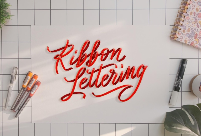
Transcripts
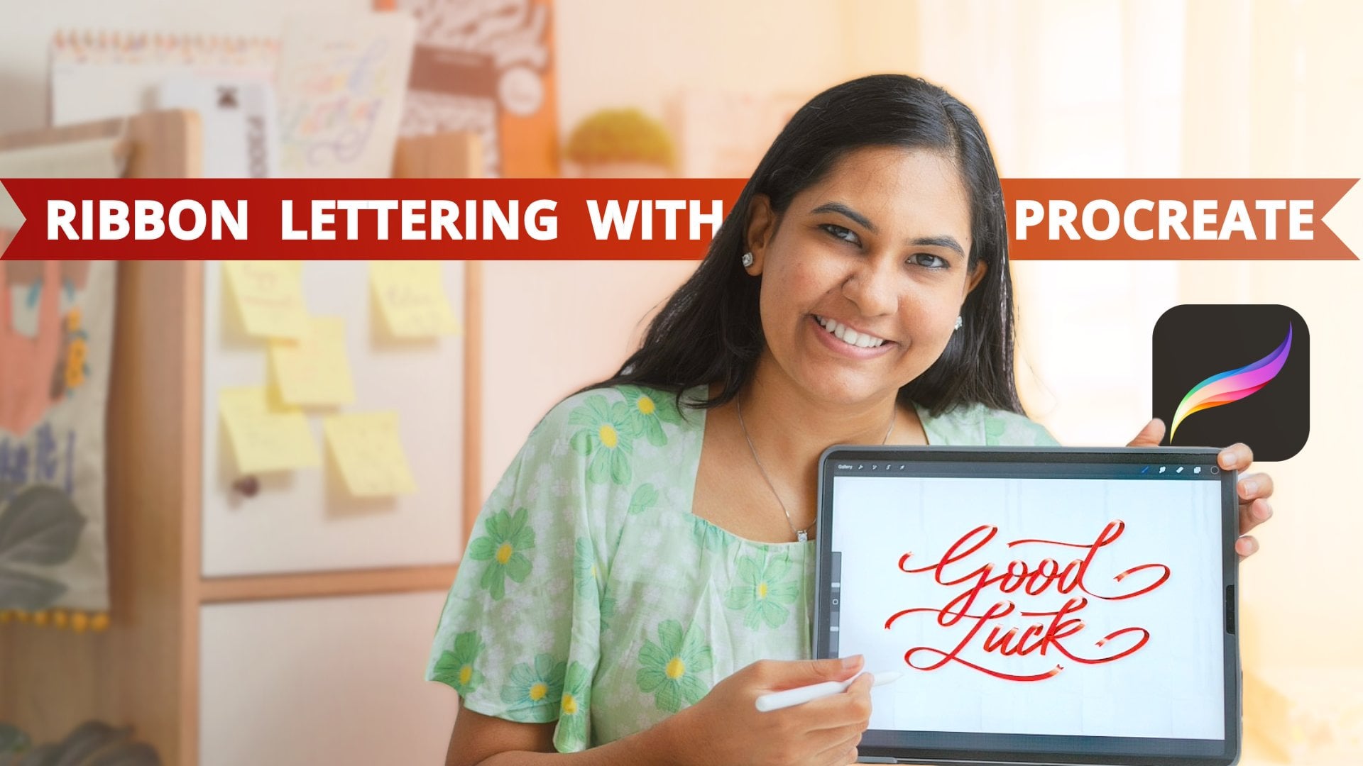
1. Introduction: Welcome to the world
of ribbon Lettering, where every stroke folds into
your ribbon of creativity. Are you ready to let your ideas flow and twin stunning
lettering designs? Hi. A Mati, a Cigrapher and
lettering artist and your partner in this ribbon
Lettering adventure? So I have been passionate
about lettering for years now, and I'm super excited to
share my knowledge with you. In this class, we'll dive into the enchanting world of
ribbon inspired toning. Just like wrapping
a gift adorned with ribbons fills
me with excitement. Ribbons have always fascinated
me since childhood. Whether it's the paper ones
or the silky satin ones. And now we'll bring the same joy and fascination into
our lettering journey. This class is not only
for calligraphers or lettering artists who are looking to have fun for a break, but also for very beginners
who are interested in letters and ribbons as all the lessons are
designed from scratch. I have broken down the class
into six easy steps each designed to guide you through the process of creating
stunning ribbon lettering. Plus, we'll have a live
demo where we'll bring all these steps together to create a word ribbon
and spare lettering. Together, we'll unlock the
magic of ribbon lettering and discover the joy of bringing letters to life in
a whole new way. Let's dive in and embark on this creative
journey together.
2. Class Project & Supplies: Our project for this
class is to create your favorite word all words
in ribbon favored lettering. I chose this project
because creating your favorite word allows
you to personalize your piece and explore
the unique term of ribbon lettering and about the supplies that we
need for this class. I'll be demonstrating
majorly with brush pens, but you can apply the
concepts using any tool you prefer from colored pencils to sketch pens to
anything that you have. All you need is paper or a
sketchbook to get started. If you're already into
the digital world, feel free to use appropriate or any other app that
you're comfortable with. And feel free to gather any
glitter pens or sparkles for additional embellishments
or decorations you'd like to incorporate
into a ribbon design. Before you begin, think
about your favorite word and how you want to portray it in ribbon inspired lettering. Get creative and
don't be afraid to add your unique flare to
your lettering pieces. All right. Get ready to bring your favorite word to life in
ribbon inspired lettering. Whether you are using brush pen ski pens or colored pencils, the possibilities
are just endless. Come, let's dive
into the next lesson and start creating
stunning pieces together.
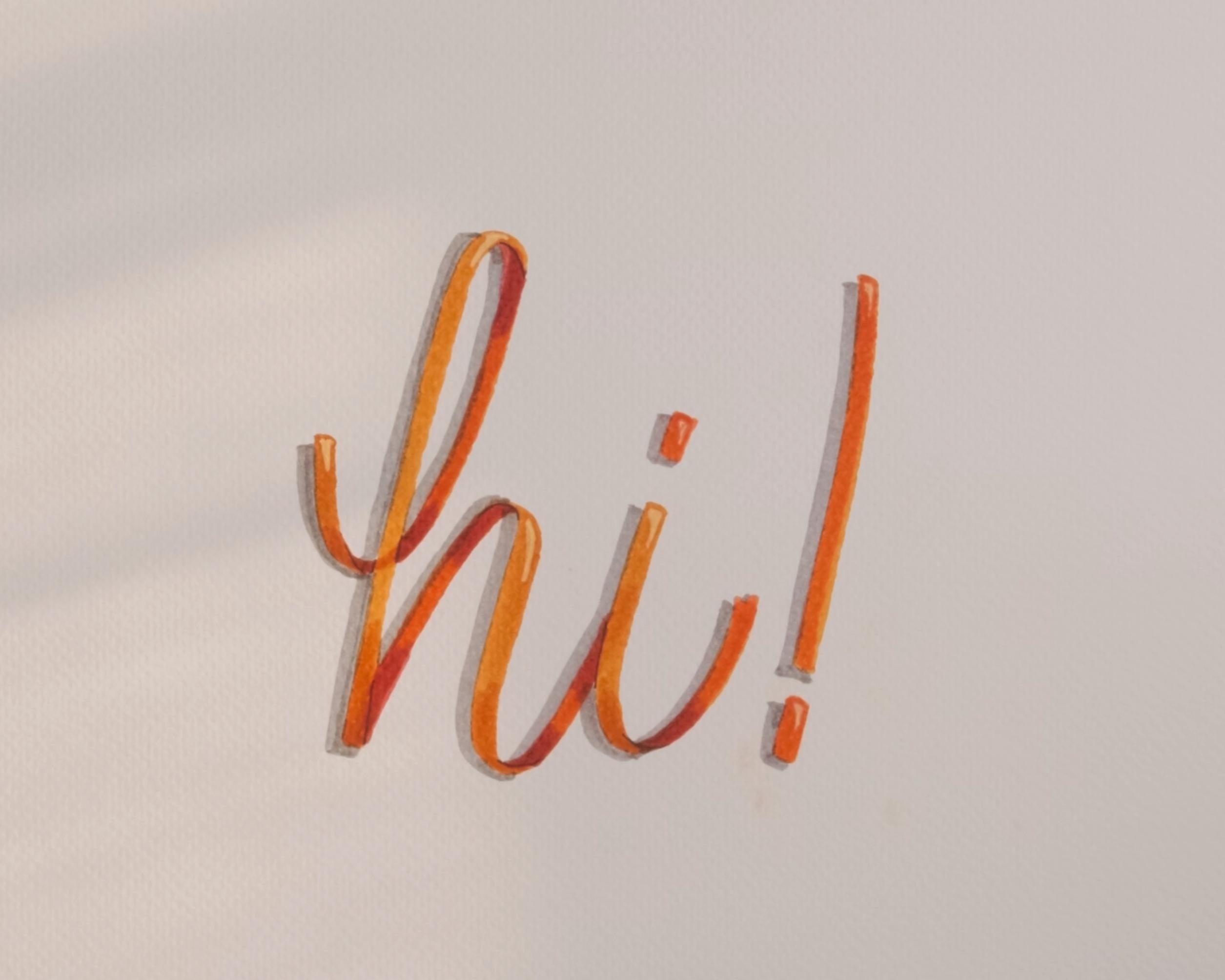
3. Understanding Ribbon Lettering Forms: In this lesson, we'll delve into the fascinating world of
depth in ribbon lettering. Our goal here is to
understand how folds of a satin ribbon contribute to the dimensionality
of our lettering. I have a satin ribbon here, and I thought it might
be interesting to use and show how ribbon
lettering actually works. So I'm going to do the word high using the satin
ribbon and see how folds play a role in adding depth to our
letters. All right. So as I am folding this
ribbon to form the high, Notice how the folds overlap and create
shadows and highlights. This is what gives ribbon
lettering its unique look. Another important thing
to keep in mind is that the size of the ribbon
remains uniform throughout, eliminating the need to
apply the traditional thin up and tick down formula
that we use in calligraphy. Now, let's talk about how to incorporate these details
in our lettering. By understanding
how the folds work, we can create letter
forms that mimic the same depth and
dimensions as our ribbons. I know it might feel
overwhelming at first. But remember, all these
intricate details have been broken down
into six simple steps. As you follow along and
practice all these steps, I'm sure ribbon lettering will be a piece of cake for you. In the next lesson,
we'll dive directly into spiral warm ups to understand the interplay of light and
shadow. See you there.
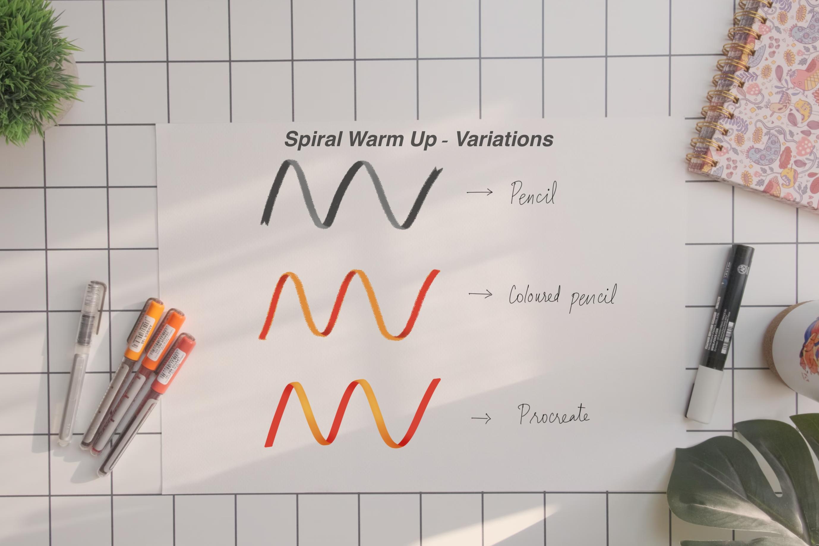
4. Spiral Warm Ups: In this lesson, we'll
explore how to create ribbon like effects for
demonstration purposes. I'll be using brush pens. But you can use any
medium that you are comfortable with,
for reference purposes, I'll also be attaching the
same ribbon done using pencil, colored pencil brush pen and one on procreate
for you to get an idea as to how this technique can be adapted
in different mediums. All right. First, let's visualize how real
ribbons spiral, and have curvy edges like
this due to the folds. Now, we'll apply the same
concept on our spiral ribbon. I'm drawing the
spiral stroke here. Instead of traditional thin
up and thick down strokes, the consistency of the ribbon
is uniform throughout. Now, about creating depth, we can refrace it as
dark up for the back, that is the upstroke and light down for the
front of the ribbon, that is the down stroke. Not familiar with
up and downstrokes. Here is a simple way
to identify them. When your hand moves
upward while writing, it is an upstroke and
when it moves downward, it is a downstroke. I'll be using a darker shade for the upstrokes to create
the ribbon illusion. Whenever your hand movement towards up, it should be dark. Whenever your hand
movement was towards down, it should be light,
dark up and light down. You might wonder why dark
up because the front of the ribbon casts a
shadow on the back, resulting in a
darker appearance. Understanding this foundation
is very essential. As we progress to applying these techniques in
our upcoming lessons, join me in the next lesson, as we start working
with our letters.
5. Step 1: Creating the Base Layer: Let's kick off our ribbon
lettering journey with the foundational step that
is creating our base layer. We'll start by writing
the word high. I simply chose this
word because it is welcoming and it has
quite a few folds, which will be the perfect
opportunity for us to understand the interplay of light and shadow
in our lettering. So I'm sketching
the word high with a brush pen. Here is a tip. The wider your base layer, the more pronounced your
ribbon effect will be, providing ample
space for light and shadow to create the
illusion of ribbon folds. If you are feeling a bit
overwhelmed, don't worry. Check out the resources
tab for a handy worksheet. You can refer to
the step one page which illustrates the base
layer of ribbon letters. Use these resources as references to guide you
through the process. Fantastic job creating
your first layer, that is the foundation
of the lettering. In the next lesson, we'll
start building up on this by adding depths and
dimensions. See if there
6. Step 2: Adding Shadows On Upstrokes: Now that we have laid down the base layer of our
ribbon lettering. It's time for us
to add depth and shadows by creating
shadows on the upstroke. Remember our principle,
dark up and light down. We are going to
apply the same here. First, let's identify
the up and down strokes of our base layer. You can mark them using
a pencil if you prefer. Next, we'll draw curved edges to indicate which strokes should be up and which one
should be down. Okay. This step is crucial for creating the
ribbon like illusion. Using a darker shade
of the brush pen, I'm carefully tracing over the up strokes to create
the shadow effect. Ensuring to maintain our dark up and light front principle. Notice how the simple
technique adds depth and dimensions making our lettering
resemble a real ribbon. You can refer to the step two
page of the worksheet for guidance on applying
this technique to other letters if you prefer. Already, our lettering
is beginning to take a three
dimensional appearance. In the next class,
we'll try to enhance again with more shadows and more dimensions.
See you there
7. Step 3: Adding Shadows on Overlaps: Now that we have created shadows on our up
strokes of our ribbons. It's time to enhance
the depth of the ribbon lettering by adding shadows to the
overlapping areas. As we know, the edges and overlaps of ribbons
often cast shadows, creating a sense of
depth and realism. We'll replicate this effect in our lettering to make
it truly come to life. First, take a moment to identify the areas where the ribbons
overlap in your lettering, These are typically
the curved sections or areas where one stroke
crosses over another. Using a darker, in fact, darkest as 90% of the times
fall in the upstrokes, which is already dark. Carefully trace along
these overlapping areas to create shadow effects. Okay. Also, remember
to still maintain our principal dark up and light down as you add shadows
to the overlapping areas, the shadows should be the
darkest where the ribbons overlap and gradually fray
out towards the edges. You can choose to blend or
just leave it as it is. In certain letters like k and R, the overlapping occurs
within the down strokes, presenting a unique challenge
in ribbon lettering like this to create the
ribbon illusion and differentiate between
the overlapping strokes, it is essential for us to
add shadow strategically. Notice how in the close up
of from our title card, shadows are applied to
the overlapping areas, clearly indicating
which downstroke is on top and which is beneath. This attention to detail adds depth and dimension
to our lettering, enhancing the overall
ribbon effect. By mastering this technique, you'll be able to create stunning ribbon inspired designs with precision and clarity. Take your time with this
step and focus on creating smooth and even shadow This
may take a lot of practice, but it will be worth it. As you work through this step, refer to the step three
page of our worksheet for guidance on applying shadows to different areas
of your lettering. With each shadow added, our ribbon lettering will become more dynamic and lifelike. Join me in the next lesson as we refine our ribbon
lettering masterpiece.
8. Step 4: More Dimensions With Light: Step four of our ribbon
lettering journey, we are going to
add another layer of dimension to our letters. To achieve this, we
are going to add light to the top of all
the downstrokes. This subtle touch will
further emphasize the three dimensional quality
of our ribbon lettering. You can choose to use a white white glass marker or
white pencil for the step. Apply a small amount
of white along the top edge of each
down stroke like this. Okay. Alternatively, if you don't have access to
any of these materials, you can achieve a similar
effect by carefully going over the downstrokes
with the same color. That you used for
the base layer, leaving the top
portion untouched. For specific guidance,
feel free to refer to step four of
the worksheet provided. By incorporating this technique, we are adding a
sense of dimension and vibrancy to our
ribbon inspired letters. Now it's your turn to
put this technique into practice and see your
letters truly shine.
9. Step 5: Deepening the Shadows: In this step, we
focus on enriching the shadow along the bottom
of all the downstrokes, that is the front
part of our ribbons. By intensifying the shadow here, we create stronger
sense of dimension as well as realism in our
ribbon inspired letters. Using the same color that
you used for the base layer, carefully go over the bottom
portion of each downstroke, adding additional
value and depth. This simple yet
effective technique will help anchor our
letters to the page, giving them a sense of
weight and presence. For reference and guidance, be sure to consult step five
of the worksheet provider. This will assist
you in identifying the areas where additional
shadowing is needed, ensuring a cohesive
and polished result. In the next lesson,
we'll dive and deepen the shadows for one last time before creating our masterpiece.
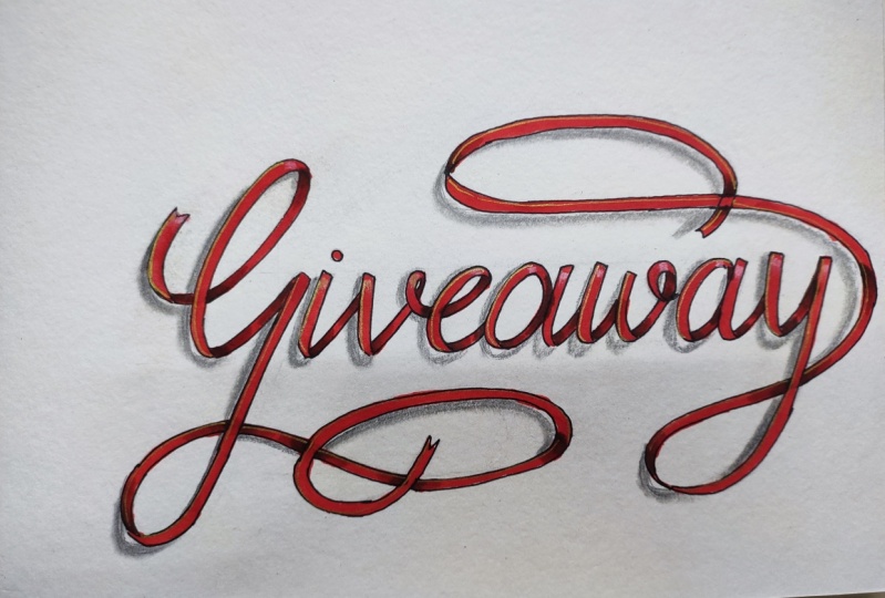
10. Step 6: The Wholesome Ribbon Effect: Welcome to the step six, which is the final step
of our ribbon lettering. In this step, we are going to add overall shadow for a
truly wholesome effect. While step six is optional, I highly recommend
you to give it a try as it takes your lettering
to a whole new level. In Step five, we just concentrated on shadow
in the downstrokes only. Here, we'll be creating
the overall shadow that will truly add three dimensional
quality to our letters. Using a gray brush pen or
simply a pencil will create an overall shadow that adds depth and dimension to our
entire lettering piece. Considering the light source
established in step four, we'll position our shadow on the bottom right of each letter. As you may know, shadows fall on the opposite side
of the light source. Therefore, by placing the
shadow on the bottom right, we'll achieve a realistic
and balanced effect that complements our
ribbon inspired letters. Be sure to refer to
the worksheets for visual guidance and inspiration
as you navigate step six. This will help you to identify the areas where overall
shadow should be applied, ensuring a cohesive
and harmonious result. Here is a bonus tip for you with this Congrats ribbon that I made specially for you on
completing this course. Many congratulations. If you would like to add extra flare to your
ribbon lettering, considering incorporating
elements like lace or accents, you can use any tool you have on hand to
achieve this effect. For example, I'm using
a gold pen to trace over the edges of the down strokes of
this congrats ribbon. Adding a touch of elegance and sophistication
to the design. While most ribbons won't have
gold on the wrong sites, you can also feel free to
experiment on the upstrokes as well and express your creativity in any way that you like.
11. Conclusion: Congratulations again on
completing this course. I hope you had fun exploring the world of ribbon
lettering as much as I did. And now that you have
mastered ribbon lettering, I would love to
see your projects in the project gallery below. Your unique designs and
interpretations will help and inspire other
lettering enthusiasts. So don't hesitate to
post your works below. Throughout this course, we
covered everything from creating the base layer to
adding depth and dimension, all while infusing our lettering with the charm of ribbons. If you would like to
stay connected and continue to explore the
world of lettering. You can follow me on Instagram at the
handle letter is the. Thank you once again for
taking up this course. I'm so grateful for
the opportunity to share my passion for
lettering with you. Keep practicing, keep creating,
and most importantly, keep spreading the joy with your unique lettering
designs. Have a wonderful day
 Mithila K S, Calligraphy & Hand Lettering Artist