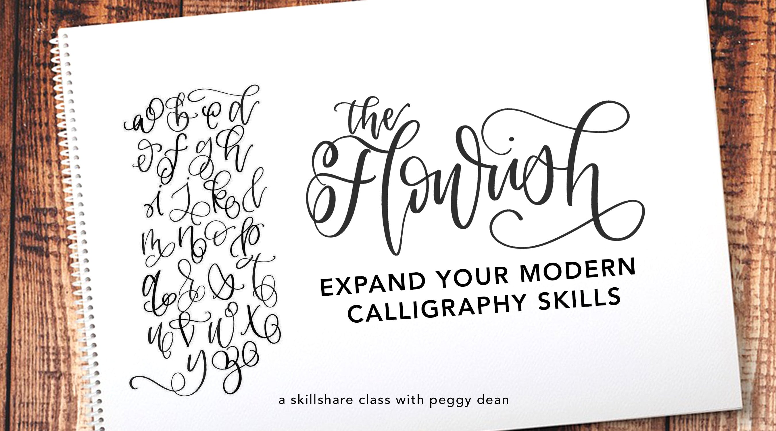
Transcripts
1. Welcome to Brush Lettering FX: Welcome to a quick
and actionable class on enhancing your
brush lettering. In this class, we will
be covering six of my favorite ways to breathe more life into
modern calligraphy, including bre lettering, enhancing letters with
outlines and shadows, Mark making for pop. Color washes for backgrounds, banners, and even
some line doodles. This class is for
you if you feel comfortable with the
foundations of brush lettering. So you understand how to form a cohesive alphabet with proper spacing, with
downstroke placement. If you want to jump into some digestible lessons
on the fundamentals, I recommend the course
that I have created and eventually formulated
into a best selling book. Class is called
modern Caligraphy, four easy steps to
go from beginner to brush lettering pro.
I'm Peggy Dean. I am a bestselling author, award winning educator and
world renowned artist, and I'm here to teach
you in the easiest, most bite sized way
so that you can immediately implement
what you learn. It's my favorite thing to do. In this class, after you learn, all of the fun effects that you can apply to your lettering, your project will be to
create a one word reminder that makes you feel inspired
or relaxed or motivated. You know what you need most. Let's turn that into
something beautiful. I'll see you in the class.
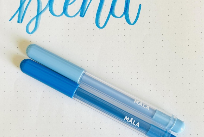
2. Supplies & Brush Pens for Blending: Right, I'm not going to
overwhelm you with supplies. I am just going to suggest a couple of colors
of brush pens. I'm going to be using a larger brush tip just
so that I can get a nice flow with words and
different blending effects. This is the Tombo
dual brush pen. It has this other tip
on the other end, which we're not going to
use. I mean, you could. But we're primarily going to
just focus on the brush tip. Another one that
I really love is the brush marker pro
by Karen Markers. So I'll just quickly sample both of these so
that you can see how they They're both going to
give you about the same size. You can see that's
nice and bold. So these are ideal for
making your words larger. But that's what we want to do in this class in particular. These are the Tombos, and then the Karen marker. Okay, I have to say, I I did not, I swear. I did not look at
these colors before. I pulled them out and I didn't think they would
match, but I was like, my nails were that color, so I just wanted to try, but look at how similar
these colors are. I'm so proud of myself. No. It's like a happy accident
I'm very pleased about. But anyway, both of these
brush pens are my favorite. There's obviously a ton
of supplies out there. Just grab what you have.
Grab a couple of colors. So I might do like
a monochromatic where I have a lighter
version and a darker version. Same with these two colors. And if you do multiple colors, you have almost
like a, you know, I usually call it a sunset
because I usually go from like a pink to yellow or, you know, orange to
yellow or something. But that's the kind of effect
that you can get from it. So and then I would suggest having a light color. It
could be a light gray. Anything that you can do
like a drop shadow with. The other thing I'm going to
be using is a monoline pen. I use the pigeon
letters, monoline pens. They've been formatted
specifically for drawing, so they have a slightly rounded
tip so that they're not, like draft pens, like
most micro liners are, you're able to draw,
which is ideal. But any felt tip pen
will do just great. Just note that if you use one
that is not permanent ink, that it will bleed because
these markers are water based. If you use a permanent
one, it will not bleed. I can lay this down
and have no problem. Assuming it's dry. Yeah, so
it's not going to bleed, whereas some pens
would you know? You know how it goes?
Okay, so from there, paper, I recommend having
at least mixed media paper. So this is mixed media
paper. It's pretty thin. This is just one of
my scrap notebooks, but you'll see how that
performs as we get going, but I would suggest at
least 90 pound paper, if not, watercolor paper, but don't go crazy. We're practicing, and
you don't want to destroy a bunch of
paper during practice. So fther than that, grab a few of your brush pin colors, and
let's get started.
3. Create That Swoon-worthy Ombré Effect: Welcome back. Now,
we're going to get into all those special effects
that are just eye candy. The first thing that
I want to share with you is how to blend colors. And this is a little bit tricky for a lot of folks
because of a number of reasons. The first is you can't really use typical paper that you would use for
lettering, otherwise. I won't really hold up,
and the reason why is because most brush
pens are water based, and when you go over the same area over and
over and over again, it's adding more
moisture to that area, and then the paper will start to pill up and it won't give you
the effect that you want. That's where we move over
to mixed media paper. And this is just a
heavier weight paper, not quite watercolor paper, but it's going to be able to withstand that blending
effect that we're going for. So I'm going to show you the
way that I like to do this. And then I'll show you
a couple other ways that are just as effective. The first way is taking my
lighter color that I'm using, like so and laying it down, taking the darker or more
saturated color and just coloring over that more like a third of the way or
even a arth of the way. Then I actually like to
use water in a paintbrush. I'll come in and get this wet, and then I will pull that color down and I don't want
it to be to too wet. If you see it start to pool, make sure to rinse or
swipe your brush on the side so that it doesn't
get to out of control. That is my blend. It's very, very simple
and easy to do. I essentially works
like watercolor. You could create a full piece with the same effect and then blend them
together like that. This way right here is
pulling a color down, putting that new
color on top and actually using a blender pen, which is just clear ink, and then you'll pull
that color down. The reason why this it
used to be my favorite. The reason why it's not so
much anymore is because the felt tip is no matter
how moist the pen is, it still can create a little bit of
pilling because you're just pushing and pulling
that paper fiber. Whereas with the brush,
it's a much softer effect, more water on it, and whatnot. Now, the third way is by
putting your color down. Your next color and
then going back in with that same color and
pulling that down. The problem with this
is that you don't have a super seamless blend
unless you go over it again, which darkens that
initial color, which is fine, but
that's the third way. Those are the three
ways to blend. For this exercise, what
I want you to do, is, we're going to letter a word and I will just
choose the word blend. I'm going to do this
with a paint brush so I can show you how seamless
and easy it can be. Note, if you do it
a different way, I recommend not finishing all of your strokes before you start blending because
if it dries too much, your brush tips will not like
to try to reactivate that, whereas with the paint brush and the water, it'll
be a lot easier. I do the word blend. It will actually allow me to do the whole word and go back in and set this
all where I want it. I basically I am just choosing the tops of where
my down strokes go. You can do it
wherever you want to. Then I can take my paintbrush, make sure that most
of the water is off, but it's just wet
start to activate that color and
then pull it down. Like so. Come over to this side. I'm using a large
paint brush for this. I mean, it's doable for sure, but I should have grabbed a two. This is a six. But then I
would have had sharper edges. I'll actually grab that now. Okay, then I'll continue picking up some of this color
and just blending it in. And then if there's any,
harsh areas like right here, I'll just grab water
and soften it. You don't want to too much water because it's going
to make hot spots. So that's one of the
reasons why I didn't do this method for a while
when I was learning. But it also made me a lot of paper because I was really
going crazy with the The felt tips of
the blender pins. Go with either and figure out what works best for
you. They both blend. That's the idea of
what we're doing. Then if you see that the color
is pulling down too much, just rinse your brush again, and then you'll be able
to just blend that down instead of pulling color and pulling color
and pulling color. You'll notice that
I also start to push up into it rather
than pull it down. That's because as
I push into it, I'm picking up some of that blue but not
like a ton of it. Whereas if I pull down, it's really grabbing
a lot of that blue. So that's just a little
trick so that you don't. Basically, so you can
maintain the blend. Then if you see too much is
getting on there, same thing, just rent, and then
pull down to blend. And I like to sometimes pull it into the hairline
stroke just if it looks like there's a disconnect
because I do want that to be like a seamless blend. I'm looking back and finding any hot spots and before
they're all the way dry, just smoothing those out.
It's bound to happen. You could be brand
new at this or seasoned and you're going to
see them start to happen. That is just fine. Don't sweat. You can just smooth them out
with more water. But the whole point is
the reason why they're happening is because there was too much water on our brush. The other thing to
keep in mind too is to try to really stay
inside of the lines that you of your letters because otherwise it's going
to start looking really shaky and choppy. But you can always clean up
later after you blend it, but it's going to be harder. Okay. So that is a really
lovely blend, right? That's how to blend in that way. Let's look at two
additional ways to do this blend effect. The first is to take a non porous surface like
this blending palete, and this is essentially just
a laminated piece of paper. So you can do this
with a Tupperware lid, even whatever you
have lying around. And what I will
do is just color. To put the ink down, and
then I'll take this brush, which is the lighter one, and I'll pick that color
up and you're like, Okay, you're mixing
color, what's the deal? These are self cleaning. I have that blue ink on
the tip, but as I go, it's going to
gradually disappear. What this does is
it's a method to make it so that you
look at the shakiness, so that you have that blend that starts from the
beginning and then goes. Something you'll probably
notice is that if you're lettering longer words or bigger or anything like that, then you'll start
to lose it sooner. So you might want to dip in for the first two
and then let it disappear, but that's another option. Some people also will, you'll see letterers that
will pick up a little bit. Letter, their first letter, and then go back in to
start that blend again. And this is just another way of effortlessly
doing what we did. It just presents a
little bit differently. So those are different styles of blends and three
different ways to blend. So I can't wait to see
which is your favorite.
4. Draw Outlines to Make Your Words Pop: Now, while this
is a cool effect, sometimes we want our
words to pop even more, and so I'm going to show you a few ways that you can do that. The first is by adding outlines. Two different things
I like to do. One of them is to add an
outline only to one side, and then the other is to
outline the full words. So I'm going to start with one
side and show you how that builds up because it really
adds a lot of interest. One thing to note, the size of the tip of your pen matters. For example, if I'm using the pigeon letters
monel line one, one, it's going to be
a really fine line. If I use an 03, that's bolder, but it's still really fine. If I use an 05, I've
got a much bolder line. You can always use a marker to, or if you grab the other
end of a brush pen, If you want a major
or major outline. The first thing that I
like to do I pick a side, and I typically put my shadows on the right
side in the bottom. They're offset to the right and down or just to the right. I'm going to do just
to the right and show you what that's
going to look like. Basically, I find the
right of every stroke. And I just start to add a line. That will follow. Everywhere that
there's a right side. This is just a subtle way to
bring these letters to life. But it also makes it so that it looks like almost like a pinpoint type of a shadow.
That's what that looks like. Now, if I wanted to
outline the entire thing, I would just continue. I'm doing this a little bit fast because I don't want you to have to sit there and watch me. It might be a little imperfect, but I'm okay with it for now. I am just finishing all the areas that I
did not get to yet. But this is what
that looks like, and then you have It's almost like the color
inside was the fill. And then a quick tip. Don't do this right after
you had a ton of caffeine. But this is what your
outline looks like, and that already makes it pop, and it's so very much fun. So I'll do a bold outline on this one just so you can
see what that looks like. But I decided that instead of doing three different ones to show you what it looks like, I'm going to show you a
different technique to add a shadow instead of an
outline on the bottom one. Okay. Now, I'm pretty
shaky right now. That is, again, caffeine,
be nice to yourself. But you can see the point is, this makes it pop way more. This is just like that
subtle little addition. Now, this is w, this
one is this one. So imagine it getting
even smaller to go here, that's going to be I'll just
do this side of this one. It's really pinpointed. It's just so subtle
and almost elegant. If you do decide to go smaller, that's going to be the
difference it will make. Now, I'm going to show you
another way to do this though, you can do this with
any lighter color. You can do with a darker color, you just have to be more
careful and you won't be able to go over other strokes, but this is a
really light color, and I'm just going to
go to the right the same way that I did with
that black pen before. This is just going to create a subtle shadow. On one side. And it looks really, really cool when it's against
something dark. So for example, if I was to have something
in a darker color. And then I come through. My ink is not quite dry, so it's pulling
some of that black. But the point is, it's going to add
a bit of a shadow, which is going to
look really cool too. That's a way to kind
of make it lift off the page depending
on what you want to do, and it makes it super fun. And our next video,
we're going to bring it even more to life, so I'll see you shortly.
5. Add Character & Interest With Mark Making: If you are working
along with me, then you have
blended and you have outlined and maybe you've
done an additional shadow, but we're not stopping there. We're going to keep going,
and I'm going to show you how to add some mark making to give even
more mph to your letter, and I'm going to do it with my boldest point just
so you can see it, and then we don't
have to sit here. Ur. But let's say you can have or not have
an outline to do this. But what I start to do is just create little dots and
you can do this all over, but I like to do it to one side just because I think that
it adds more character. You'll notice that my dots, for the most part, are
pretty evenly spaced, and that's to start out with. What we're doing is a
technique called stippling, and it's going to
create noise and depth. But until We start to overlap. It's going to look just
like dots. That's okay. I would typically pull this
a little further down, but you'll get the idea. And I'm just doing it
toward the bottom. These are all about
the same separation. But this is where
the party starts. Once that's done, now, I like to go in and
do the same thing, only don't pull it down as far. I'm overlapping the dots. To about maybe just the bottom
where the bounce happens. But same spacing. As I was doing before, it just looks smaller
because I'm doing it in the same spot. All right. Once I do that, I'm going
to do the same thing again, only this time, make it even less of a distance
that it comes down. I'll probably go
to the baseline. In some letters, that means not really going
beneath it at all. And then we'll do
that one more time just toward the very top, to where it gets nice and dense, and I'm going to
do my dots really close to the bottom
of the letters, to the edges of them, almost to where it looks like
it's connecting into it. Okay. So I'm going to
pull some of this out this direction
just so it kind of scatters off and it's not
concentrated on the edges. But then you can
kind of see what's happening and as it
gets further out, the des get further
and further away, and I'd probably end up adding more right here
just to balance that. I'll do that really quick
or it's going to bother me. But the best way to build it up is to do a first layer and then a second layer
and then a third layer because it's easier to keep track of the
density that way. But you can also go in and fill and just know the areas that you want to overlap. That's better. That's
a fun technique to do. You can also go in and create a second outline where
it hovers next to it. You can do this the
whole way down, but because I stippled,
I'm not going to. To where it just creates a little more interest,
that's another option. You can do that again
and again and again, whole thing outlined,
maybe just the sides, whatever you decide to do. Then as far as the
stipling goes, you can do that
with any technique. Maybe I want to come in and add some lines and that could look like something like this where I have three
main lines and then a break and then a longer
one and then a smaller, and then those can
go through the back. A. I'm doing this fast, so it's not going to
look too perfect, but I don't want you to have to sit here and watch me do it. Then I have some that'll
break inside of there. You can see how the more
interest that you add, the more it's going to make
your word pop even more. My suggestion would be to get creative with this because
there's not a method. There's not one thing
that you can do. It's really completely
up to you what you end up doing to make it pop. But these are just some of my favorite ways to do
that and continue to play.
6. Use Brush Pens for a Background Color Splash: Okay. Now that we have played with the
letters themselves, I want to show you a fun way to add a little more interest
with a background. You can use brush pens, like we mentioned as watercolor. So for example, I can just lay color down like
this and then take a brush, get it wet with water, and then come through
and just move that around so that it becomes
like a swash, if you will. It does take a little
bit to work it out. But that's where you can kind of play and make these
like wash effects. So this is also really
pretty to do behind, you know, let's say that
you have a place card. And you want to have a splash of color
coming from the side. You can do this to that side or you can use a
non porous surface, lay that down and then use a brush like a water color brush and paint with paint with the pigment as if that's
the paint palette. Then I can line up
and create that wash, and I just want it to be
edging the side of it, and then I might want to
add a little more pigment. You can go directly onto it, or go back into that palette
and just drop some pigment in and then I'll let that dry and then I can write
somebody's name over it. Once it dries, this
is not fully dry, do not do as I am doing
because it will bleed, but you're going
to get the idea. It's going to bleed a
little bit, but I'm fine. It just makes for
a fun background. This one is also not fully dry, but let's do it anyway. I'm so. I'm just going
to use my own name. There we go. And so it just
makes for pretty place cards, you know, if you had some, like, fold over, and maybe even add a little
more pigment to that. And overall, it's just
a fun splash of color. And in our next lesson, we're going to be going over something a
little bit similar, but with more shape by creating different
types of banners. So I'll see you shortly.
7. Banners That Make Your Letters a Focal Point: All right. Now that
we've done blending, so much blending and different
types of special effects, we are going to move into integrating different
types of easy, simple illustrations
that will bring your lettering to life
even more because, yes, it is possible to in this case, believe in the mores More. So the first thing I love I just love always is to
incorporate a banner. I'm going to show
you the easiest banner that you'll ever draw, and that's basically
this shape right here. So just like a rectangle, I'm using the pigeon letters monel line five and
the reason why is because I do like that it has the slightly rounded tip for drawing and also
has archival ink, which means that if I color over it, it's
not going to bleed. That's a big one for me. Because if I want to add
any wet media at all, I don't want this to budge. Once we have this down, I basically eyeball the
measurement from the top to the bottom and I'll
draw a line here about, and then from this
measurement, I'll eyeball it. But I'll basically make
another line about the same height and this is
probably a little wider, but it's not a big deal. I'll do the same thing
to the other side. Then from here, I'm going to I'm actually going to bring
this in a little bit more. These ones will go
underneath and then they'll connect upwards like this. Then these can just be V. And then last thing
to make this a true banner is to
connect the corners. This will connect here. This will connect here, and
then you have a banner. You can do this in an
arch arc, and an arc, where it comes up like this, and then you have basically
a mirrored point. This is uneven, but
you're going to get the idea, they connect. Then the exact same thing, I'm just going the
same direction. Bring this down same direction, so it's about the same
height as this is. Then I'm going to
bring this down drop about the width here, my V. And then bring
these corners to touch. This is a one key
one, but that's okay. Then the other one that I love, a lot a lot a lot
that I do a lot is a wavy line like this, and then a wavy line
underneath that. I connect the edges. Then instead of drawing
the lines to start, because I know those
are going to connect. I'm going to do one on the
top and one on the bottom, and I do them in the dips, because that's where
if you think about it, that's where you're
going to see it waving. All you need to know
is to just make a line in the dip and
a line in the dip. From there, I'm going to
follow this curve like this, and then find the same
height with whatever. It's about here in
between these lines and follow it, basically mir it. Then I'll do the
same thing here. I'm following this curve. And then same width. And then I'll bring my VN. Last thing, connecting
these corners together to make it look
like it's all one piece, and then I have a
really cute banner. Bring this up a notch, do
another one underneath it. I wouldn't have added this part. Let me show you I'm just going to show you real quick what that
would look like. If I don't do the flags yet, and I just do this part, and then I treat the top of the top one and the
bottom of the bottom one, the same as I did this one, V. Then I connect
those, connect those. The only thing I
have to do that's left is because this
is on the top right. I should have one
on the bottom left, but because it's not going to go out and it's going to connect, I'm going to take this corner
and tuck it somewhere here, and then find the same amount
of spacing so about here. And just tuck that here. It looks like I did
not mean to do that. What I meant to do is grab and bring it to the corner here. Pretend this is not here.
It's going to be hard to do. I know that right here. I'll just color this
in a little bit. You can see that that
would be the background. It is okay if you mess up
and it's okay if I mess up. Basically, if this was
colored all the way in, that would be The
part in the back, this right here would be
the part in the back. And this right here would
be the part in the back. So you can see how
it would be flowy, and you can stack
those as many as you want. That is very fun. And then from here, you can add any sort of lettering
inside of that space. So if you want to do
a real long banner, you could do a quote or
a few words or just have a banner and then have it say one word that's
important to you. Like that. And then
it brings it to life. And in the next video,
I'm going to show you a fun little way to bring that a step
further, 'cause why not?
8. Adorable Doodles That Add Interest: Banners, what else
can we do with them? Lots? One of the things
I really like to do is add florals.
Lots of florals. You'll find them
all over my work. One of the main things
that I like to do with them though is
just plain leaves, and leaves make it so easy. You can do this with ink or
you can do it with a color. But if you do like a vine. I'm just going from
the back and I'm just creating a main flowy line, I can do this with shapes like this where they're like
upside down tear drops, and those are going to act
like leaves along this line. I'm just going to fill that up until I get to the end and then I'll do the other side, which of course, is
going to run into this, I'll just tuck them behind the banner as if they're
being tucked behind. Had I drawn this first, I could have also had it overlap the banner and then
tucked the banner behind. But doing that and then
maybe one right here, We'll also add so
much more character to my banners with these
greenery elements, and then maybe I have a
peekaboo coming here. As long as my leaves
themselves don't overlap, but you can also have it come in because it's like the
stem it's just a line. Who says it can't talk. That's fun. That's
one way to do it. You can also do leaves
at a point like this. Instead of going around, it's the point at the end, they're a little more
elegant maybe, like this. They might look like that,
and then maybe you have a pea boo one here. You don't even have to draw
it coming all the way out. You can just draw some
peekaboo leaves to give the illusion that it's
behind there too. You can also put
them in the folds. So that might look
like a longer stem, and obviously you can't do a leaf that's
overlapping the lines, but if you can keep
them inside there, it looks like it is
coming out s up. I can't put one right here
because that line is there, but I could Tuck one in
the fold right here. Creative choices. Okay. Now, let's say
you want to do florals. This is something where if
you wanted to do a banner and pencil first so that you can erase some of the lines
to overlap, you could. But if you don't have or
want to overlap anything, you can also your flowers
have little peekaboo. I'll just have a couple
of sprouts here. And just like these
imperfect circles, and some will be obg, like this. Then I'll just add some little stippling
marks to the center. Then I can add little
leaves coming off of those like mark making leaves. Then maybe some longer
leaves like this. Maybe even some vines, peekaboing in the back, just a little bit. Things like this. If you filled up that entire
space, it's really cute. But these are just
imperfect shapes. They don't have to be intricate because the whole
idea is that they're just accents to the main point, which is your lettering
inside the banner. You can also do this where
they have more form, but that's a different class. But there's always a time to
get more into botanicals. But, for now, we can create, see how this one I just did
an oval or a semicircle with some imperfect spots toward the top to make it look
like the flowers upward. And then some
random leaves here, sideways, and
that's just a curve with a choppy line.
And that's all. And then I have a little bit of dot stippling toward
the top of that. Add some leaves, call it a day. Maybe a couple of
little lines up here. And then maybe you have
one coming from the side. You can make this as
wild as you want to. And then add whatever
you want on the inside. You can even do pho calligraphy so that your pens all match. Of course, you can do
the banners and drawings with the color pens or
the brush pens, too. But this is just another
way to bring it to life. Remember that you
don't always have to fill in ph calligraphy. You can keep that
little space in there, which also adds interest. And it just makes
it fun. Very fun. Create a banner, any kind, and let's see what
you end up choosing. You can choose one
word, or you can make it longer and choose a few, but very excited
about this part.
9. Your Funwork: I hope you had so much fun
in this bite size class. There's truly no limit to
how you can bring your brush lettering to life
and what better way to do it than with color. And of course, doodles. Now that you've learned some
fun effects you can apply, Your project will be to create
a one word reminder that makes you feel inspired
or relaxed or motivated. You know what you need the most, so turn that into
something beautiful. Thank you so much for
hanging out with me, and I will see you soon.
 Peggy Dean, Top Teacher | The Pigeon Letters