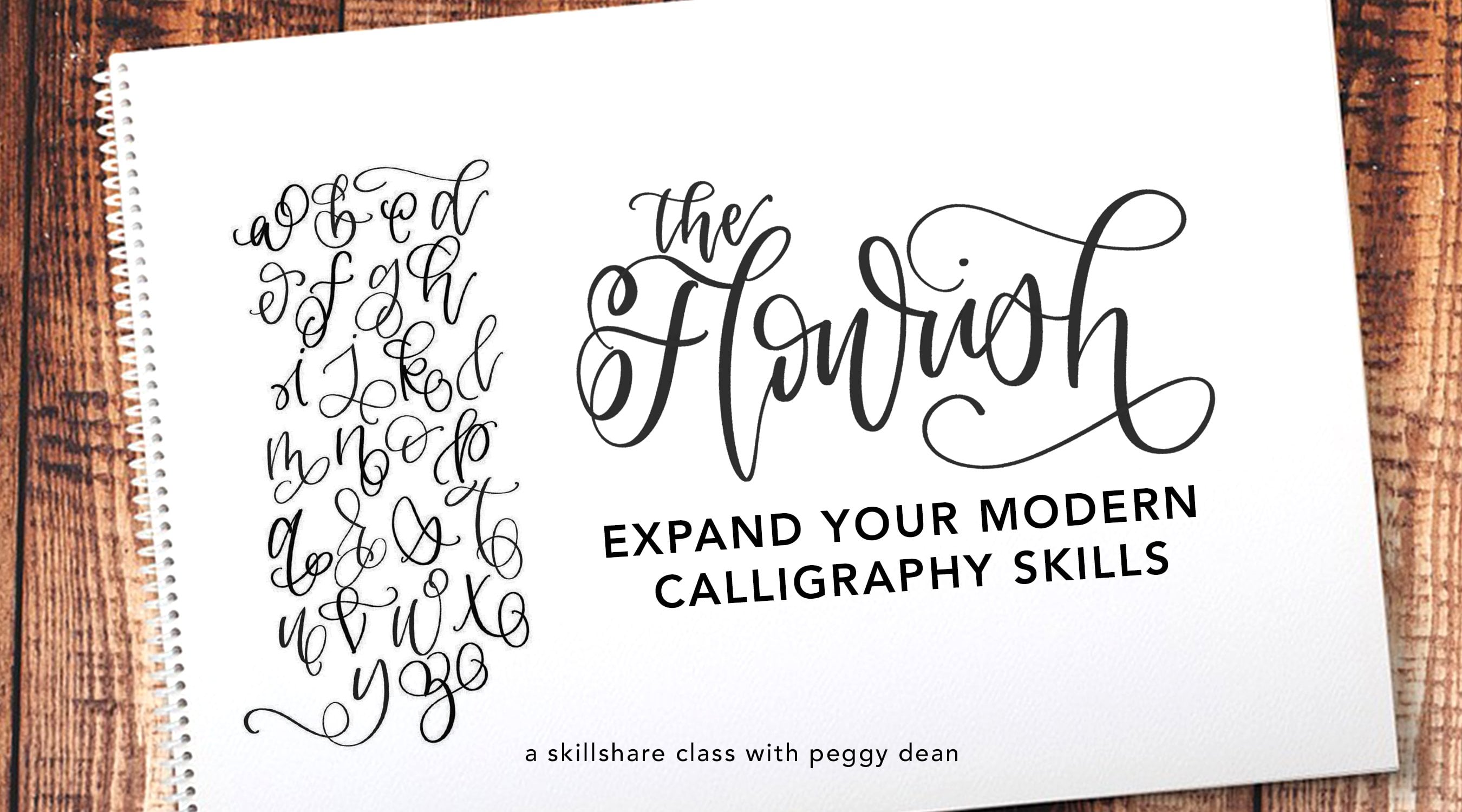
Transcripts
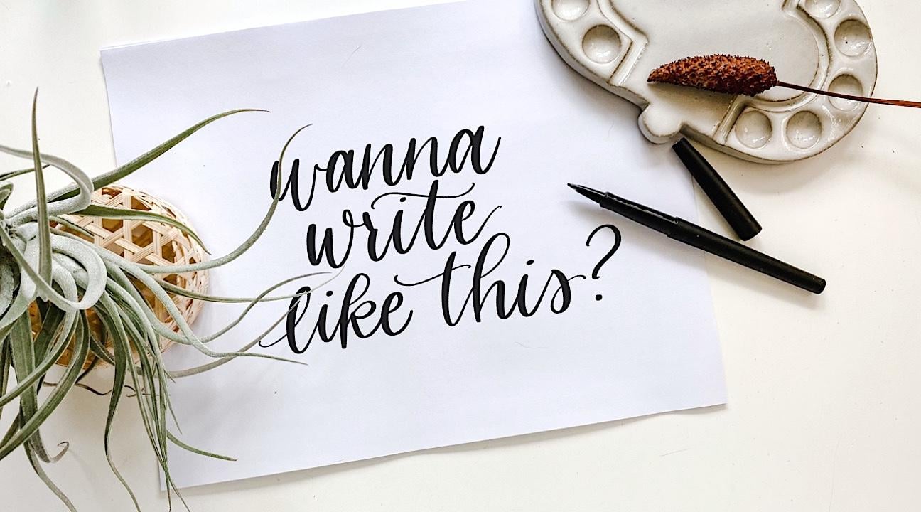
1. INTRO to the First Day of Your Awesome New Hobby: Listen, modern calligraphy, brush lettering, this gorgeous art practice is not a trend. It is glorious and it deserves our attention. Look. Yeah, it's real good. You know what's even better though? I'll tell you. When you can say that about a gorge calligraphy piece that you created, and you can make it happen in less than 30 minutes. What? I'm about to walk you through my coined method. I'm about to walk you through my super easy three-step, three corner method for creating the easiest faux calligraphy that looks like a million bucks each and every time. Here's a sneak peek. I will be walking you through how to nail your own unique-to-you cohesive alphabet that screams, insert your name style. You will learn the foundations that you need that will allow you to break those rules to render beautiful original results, and you'll be set up to conquer Pro Tools should you love this art form and decide to take it to the next level. That sounds pretty cool. Yeah, it sounds like a class I'd want to take. I'm Peggy Dean, I'm not your average teacher. No. But I'll tell you what I'm good at, and it's so that I can empower you through your journey. I'm a bestselling author, award winning educator, and world renowned artists. You want to known why? It's because I'm a rebel. They're like systems, but not theirs. I built my own that works better than traditional ones. Follow along with me here so that I can help you rock your faux calligraphy one cute pie letter at a time. Why are you still watching this? Let's go.
2. Class Project: Your project for this class will be to create a cohesive, unique-to-you alphabet. That means in your style. Now, don't get me wrong, it does take a while to build up a style, but I want to challenge you to just attempt to do that right off the bat, so follow along with me. Create your cohesive alphabet, and then I want you to pick a phrase that is just a short, live laugh love, or it could be something that is a little more profound. I don't want you to get too big, because this is just the basics. Keep that in mind. Let's get started.
3. MATERIALS: Use What You Have!: All right. The materials for this class, we will need a paper and a pen, or a pencil or a marker, or a crayon. You really don't need anything special for this class. I do recommend if you're using markers of any kind that you use marker paper or you can use a LaserJet printer paper. This is HP £32 straightforward. It's actually a great paper when you're in a pinch. You don't have to buy any fancy marker paper. The only reason why is because if you want to increase the life of your felt-tip marker as this one, yes, it's felt-tip. It will just help so that the tip stay nice and sharp and they don't shred on the many fibers of your paper. But otherwise, this class in particular, it really doesn't matter what paper that you're using because it doesn't matter what pen that you use. The reason I have three colors out is just so that I can show you very easily how we're going to form our weight lines. You don't have to have those at all. In fact, it'll be even better for you to see it all filled in one solid color. I also have a black pen. This is an archival pen by the pigeon letters, which is mine, meaning that it will not bleed if it gets wet with water media. Just as an FYI, it does have a rounded tip, which basically just means it's like a micron, but it's actually intended to draw with not for drafting. I'll make sure that all of these supplies are linked for you in case you're wondering where to snag them. But otherwise it really, really doesn't matter. Just grab what you have. You'll notice that my paper is dotted. This is a guide that I've created that I will go over as we build our letters. I do have this as a download for you guys. If you have a printer, go ahead and print some of these out because they work really, really handy as we build our letters and make them cohesive. Otherwise, if you don't have a printer, not to worry, you can draw out a guide as well. Without further ado, let's jump in.
4. That LETTER STRUCTURE, tho...: If we look at the basic structure of letters, you will notice a uniformity about them. This is what really creates their particular focus on having that nice structured calligraphic look that makes it so that we're drawing letters rather than writing. A lot of people will say oh, I could never do calligraphy because I have terrible handwriting. But that is not the case whatsoever because we are not writing anything. We are drawing and we're learning a new way to shape and form these letters as they come out. What I like to do is, I was self-taught and I want to teach you the way that I learned because it really, really helped me. I took what I was able to see and I didn't start all over the place with bounce lettering and all these stuff. I really worked on the foundation of what it was that was going to help me build up to a space where I was then able to let lose and let these letters come naturally to me. It really is one of those things that takes some time and some practice. The more and the more that you do it, the more your letters will start organically forming and your style will come out etc. Don't worry about getting into that too much right now. The main thing is that you really, really get the hang of the letter forms themselves. To do that, it's a lot easier than you might think. Real quick, if you don't have a printer to print this stuff out, all you need to do is grab any piece of paper and just draw four dots, and that's where our letter is going to sit. Notice that these are just a little bit closer together horizontally than they are vertically, that's just because I don't usually stretch my letters out to a complete circle in that wide letter form. That might be something that you want to think about as well, but you'll see as we go. The first thing that I want to point out is that in these shapes, what I think about it as is I pretend that each one of these circles is a magnet. For example, if I was to draw an A, I said draw not, write, if I was to write an A, it would probably look something like this. But if I was to draw it, I want to be really deliberate like so. Now how did I form this shape and what did I think about as I was forming it? Well, if I was to put the four squares right here and put that A inside here, it would look like this. Where it goes from the top right to the top left, down to the bottom left, but then it wouldn't go to the right, it would shoot straight up into the top right corner, and then it would come straight down, and then the exit stroke would come up toward that top right again. If I was to loosen that up, it would look like this. If you can see it, these are basically magnets where I have curved along those areas, they're not super sharp, but my letter is very, very structured. I don't want to bore you with the details of the anatomy of letters, but if I was going to, this line right here is considered the axis line of a letter. Essentially, any diagonal that I do on my letters are all going to match up with that axis line. Practice sheets-wise, you don't have that in this dot version, which is okay because you are creating it on your own. As your style begins to form organically, you might choose to make this angle a little more extreme, or a little less extreme. But for now, I just want you to humor me and do it this way so that you can really get the basis of your entire alphabet. Let's continue. We'll move into additional letters now. For B, I'm just going to show you how this could look. I don't usually bring the tops of my letters up all the way. I usually go to about two-thirds of the way, or so. That's just a personal choice and personal style preference. You could easily go all the way up, but remember, these are acting as magnets. They're just our guide. If I was to do my B, notice how my A goes straight across, and then down, and then up like this. Well B, if I was to do it that way, it wouldn't make any sense because that's not the B's shape. The B actually comes up and around like this. I can come straight out like this to the diagonal, down, and back. What I would do to make that looser and act like a magnet is this. You can see the magnet comes up toward the top right, it curves down to the bottom right, and then back in. If you wanted to do this with a loop, it would look the same. It would just have that ascending stem-loop there. It could come down lower. It really doesn't matter. The thing that does matter though is let's say it comes down from right here I want to encourage you to pay attention to the size of that, because if I was to do a G, or something like that, if I was to put a G in here, I would want it to be the same-ish. You don't have to be too specific, but the same length and the same width, because otherwise it would lose that cohesiveness, the cohesivity. I know it's not a word, but I use it a lot because it makes sense in this form. It wouldn't make any sense if this was super, super large and this wasn't because that turns into more of a handwritten style versus a lettering hand-drawn style. That being said, we have this structure in place. In the next lesson we'll go over the full alphabet and draw it together.
5. Ooo COHESIVE Too, Dang That's Hot: Now that you have the structure idea in mind, we are going to go over the general shapes of these letters. You already know A. If we look at four of these corners, I'm going to have the magnet start here and then go down and then go straight back up and then come straight down, and then my exit stroke is going to match up with my angle here. Those are going to be equal. These lines are going to be equal and then the rest of it is a magnet to my guide. Doing b, we've done that so you know that we can have it come straight down and then it's going to shoot across all the way, and then through. As we get into this, I'm going to share with you, just remember that there's a reason why there's such a gap right here. I want you to really pay attention to making sure that you have that nice 45 degree angle in there. It's going to make sense as we get into adding our weight lines. Our c, I'm going to bring it up, around, straight down and through. That's going to look really weird to you. I understand that. But what I care more about, and this has happened time and time again as I teach this to people is, people will say, wow, this looks so choppy or it looks shaky, or it looks really structured, but I would rather your letters look structured right now and have this pattern started than having it be too loose to where it's not going to actually follow guidelines. Don't worry about that right now. D is similar to a, the shapes, so it's going to go straight across down and then shoot back up. A good rule of thumb to help you remember where and how to form the triangle, if you will, the triangle box within these four squares would be to think about where it's connecting. If I just bring this back in real quick, I know that my g, so actually when I flip this over and do chicken scratches. G, it's going to connect right here. H connects right here. Anywhere that the connection happens, that's where the line will shoot across rather than come straight up like this. You don't want it to come straight up. You want it to go out like that, so keep that in mind. For our e, I'm just going to softly bring this up and back and down and around. That is extreme also, but I don't want you to hold on to that, we're forming right now, so it's okay. F is always one of those tricky ones. It's like, am I doing a cursive F? Am I good doing a regular F like this? I usually just keep it along the same line as, my ascending stems and things like that, as long as it is in line with it, there's not like a super crazy structure to it, and then of course course can do your cursive F, and we'll get into alternates as well. G, it's just like an a, only this time it's going to come down. Then if I go into h straight down and then this is where it connects. It's going to go across, down and then the exit stroke goes out along the axis line. Notice that the exit stroke matches up with the rest of them. J, I have it along the same line, like the f, but I could add that descending stem-loop if I wanted to, and I could add the ascending stem loop, I could do anything that I want with those letters, so please feel free to add those and just remember the width and the height should be approximately the same. K, I'm going to bring that down like this, and then this is one that people have a really hard time with because of the loop if you do a loop and your k. But my trick for that is I come up like this. I still have the axis line going here, but then I treat the k, the little loop as if its in its own box, and it goes up to the top down and in. Which makes it work out really well to have that nice form, so a little bit of a trick. L, just make sure that axis line is the same. Then when we get into m and w and things like that, this is where it can get tricky because people will try to do one of the overturns in one of the boxes, and the other in the next box, and that's fine if you want your letters to be that wide. But this is where I want you to keep in mind that the guide, which acts like a magnet is there, just for a guide. I actually don't bring them out quite that far. Instead, it's like I fit them inside there, but it's like one and a half maybe before the exit stroke comes out, whereas the exit stroke here is after that bottom letter, so just keep that in mind. You don't have to stretch it the whole way. Just remember as your letters are taking form, they are along the same axis line and they're working cohesively. We're getting into n, come down and then straight across because my connection is right here. Diagonal straight down, and then my exit stroke is along the same axis line. O is tricky, but I do it as my shape of the a basically. So it comes across down and then loops back around. It's a little bit at a harsher angle, so you might play with that a little bit, but that's how I structure my own. That's what I think about as I structure it. P comes straight down and then the same thing. Now, this is another question that I'm going to get a lot is, well, as the p you come down and usually as you write, you come from here all the way up. Does that mean that you separate from here or does it mean that you separate higher somewhere? I usually come up to about halfway and that's where I start that separation. But there's nothing wrong with starting it down here. I would just keep it close and then go and create that loop. This is where, as you see, your style can develop as you go. It's just right now we're really developing that structure, which I care about the most. The q, is like the a with a descending stem straight down. Your r would be that separation here. Again, don't worry, we're going to get into alternates where we're actually going to incorporate more of a cursive style, but it's not cursive because we are still forming, drawing our letters. S is one that can be tricky, but I just keep it on that angled line. It's like a magnet, but then it comes in and it doesn't go all the way to the right and then down. You might say to yourself, wow, this is not turning out the way that I wanted to, but I promise you, this s is something that I formed over time. Like this isn't even really the s that I use and most of my lettering actually alternate between three depending. We're going to get into that and don't think that your letter has to look perfect straight off the bat. You're going to see the cohesivity, which is not a word billed as we continue. T, I just worry about that axis line and then my cross. U is very simple. It's going to be that straight down and then that diagonal because the connection is here, straight down, diagonal exit stroke. V, since it is usually in, I bring it down like this and then come up so you can see like straighter line and then slightly curved. That's just a style I also developed. W is going to be like your m. See how I didn't bring it all the way out, but I did keep it on that axis line. My x, I'll bring it down, have an exit stroke here, and then have a cross. Y, just like my u, except it's going to come down and then z, really simple z. That is your basic structure. I want to do this again with you, but I want to do it in more of a like a pretty way, the way that you probably see calligraphy and you really want to do it so that your letters aren't so plain. But I encourage you to write these out just like so a few times so you can really get that structure down first. I have included sheets that have all of these letters that you can build that up as much as you can, and then you'll be able to really get that structure in place.
6. WORDS: The Perf Spacing E'ry Time: Look at how many colors I grabbed for no reason at all. I swear sometimes I think that I took this hobby up just so I could keep buying pens. Listen, now we're going to connect words together, e'ry letters, excuse me, to make words. I know that we haven't done e'ry letters with our weight lines yet. But I don't care because we're going to put words together and then we can talk about that. This is my order, you're in my house. I'm kidding. I have a method for why I teach the way that I do. Sometimes it's the way that other people learn too. When it comes to words, you know how to make a cohesive alphabet. Now, we just went over it. Now, how do words line up? How do letters line up to make words? I'll create the word, word. I don't need to explain this function here. First of all, what I just did was just a loop. I'm going to air quote cursive even though it's not cursive because we're lettering. However you want to. You don't even have to do that. You could create just a basic letter form and then come off of it like this and then continue into the next part. I did do a cursive MR and then this right here, this is called your exit stroke. Notice that I'm not using these corners as a guide. When you do your words, they don't have to stay in between these. That is just when you're forming your letters. I like to use that just as letter formation. Right Right now I'm just using it as a top and a bottom. This is technically called your x-height and this is technically called your baseline. That's what those would be according to this lowercase word. With this exit stroke, what I do with the next letter is I come across the same way with my structure and I just overlap it. That's it. I just overlap it. Everything else is structured the same. There are different ways that you can incorporate different styles in your letters. For example, instead of coming straight down, once I get to this point, I could come up and around and down and then come through. That is called an ascending stem loop. You don't even need to know that, we're faking calligraphy right now, but just an FYI. That's what that is. Now, this looks really far apart and stretched, not to worry, our weight lines fix everything, but right now we're just looking at how they connect. Let's do another one. Let's do the lowered. Just make sure I was in frame. Let's do the word flower. Let's do this all in our air quote cursive. What I'm going to do is come up like this and then come down and around. I have this mainly just focusing on a slight angle. Then what I'm going to do is an exit stroke. This is what we're focusing on when we're creating words. The only thing you need to worry about with connecting letters is your exit stroke. Here is my exit stroke. Now, from here, I'm going to overlap my next letter over that exit stroke. Notice that it's pretty long. I did this on purpose because I want to show you. Hear, I'm doing another exit stroke, but I made it just as long. I'm going to do my O and then I'm going to make my exit stroke just as long. My W. Then I can come up like this and create an exit stroke that goes into the E and then an exit stroke and my R. See how spaced out that is? What you're noticing here, look, it's like I grabbed two color pens for a reason. What you're noticing though is that the exit strokes are essentially the same length throughout or close to. Really it's this part in between where the letters have spacing. This spot, this spot, this spot, here, and here. That spot, all those areas are nice and even. Let's do the same word but squish it. I have F, my exit stroke O. See how these are much closer together? My letter form has stayed the same. I haven't changed anything about it. It's just that now my exit stroke is very thin right here. That is your spacing. Your spacing is actually what ends up creating a vibe. Creating a vibe, whether it be something airy or something playful and together. You see this axis line that we created. I'm going to show you in a following segment what you can do to make this even more your own, aside from just spacing. That's how to create your words. It's pretty straightforward. I want you to play with that and create five words before you watch the next video.
7. Add WEIGHT to Your Letters for that Faux Look of Dreams: I trust that you have five words down, unlike me because I only give assignments, I don't do them. Do as I say, not what I do. But here's the deal. We're going to add weight lines now to the letters or to the words that you just created. Now, I'm going to choose a lighter color because I want to show you the difference. But the weight lines, basically all that means is you're going to create downstrokes that are thicker than the upstrokes. If you hover over your word, you will know because you can trace like air. What it is? This is your downstroke. You're coming down toward yourself and then you're coming up away from yourself. Every time that you come down, that's where your word or your letter is going to thicken. When you thicken it, I usually just come out a little bit and then come down, come out, come down, and then I come up, and here's another downstroke. Downstroke, and what I want you to notice is that I have made the distance between the second line and the main part. I've made them consistent and you want to make them consistent the entire time On my O, notice how I came off the O into that thickness and then I rejoined with the O. I went along the same movement line. My R, I can come off right here and do the same thing. My D, it's a nice smooth transition and then right here, now this is where I'm talking about why we have that nice separation there and that is so that when we add these lines in, it's not a pile of mush. Let me color this in and show then you what that looks like as if it was fully filled in. See if that was a normal calligraphy. D, it would look nice. It would be well spaced out. It wouldn't be towards two together. Because if it was, let me show you what a normal D might look like if I did it like this and then I added my weight line right here and I fill that in. Do you see how it just turns in to mush, it doesn't look consistent. It just doesn't look right. That's because I didn't have the form and I didn't have that separation. So do not do this. I have to er or else I'm going to feel like you're going to see that on my paper and judge me. Once that's done, you're going to fill in those areas with ink and that is going to form your faux calligraphy. It's just that simple. A couple of things that I will share that are going to help you are to make sure that, obviously your thickness is the same throughout. But when you have harsh corners, like let's look at an M. When you have something like this, rather than coming down soft like this and then coming down hard, just pick one. I know it's really minor, but the difference between that and something soft can help with consistency. When you can make that consistent, it's even better. That is how to add weight lines. You can also put a little bit right here. That's how to add weight lines, super easy. In the next video, I'm going to show you how to really make this style yours and the ways that you are going to break, not even break, just kind of liquefy the rules.
8. Obsessed With Your STYLE: Welcome back. You've got some words down. I'm stoked. We're on our way to calligraphy. But now let's take this one last step and apply your own twist so that you have your own unique style, just like that. It might change over time and that's great. But I want to give you the tools to be able to make this yours. That doesn't only exist in your spacing because, that does evoke a vibe and what not, but let's say you want to take it a step further and maybe you want to change the angle up. You remember the structure with my four-corner method. You remember that. Let's make it so that my tilts, instead of it being like this, let's make it straight up and down. I'll choose the word. Oh gosh, why is it so hard to choose one on demand? Let's choose the word sparkle. No, that's too long. I'm looking around and I saw this ring. Aren't these magical? Oh, they are magical. Let's go. I don't know why water, maybe I'm thirsty. I'll go with water. Straight up and down. We've got the same structure going with the letter forms that I know, but instead, it's just like that. Instead, I'm going to go a little bit faster just because I want to show this example and you already know what it is I'm doing. Instead of like this. See how that's such a difference already. Now, what if you were to make your letters even more narrow? Remember that four-corner method, I'm still doing it. You can see that my a is still on that form, but it just looks different now. It looks more sophisticated, I guess. Then you could make them wider, etc. That's one way to manipulate to make it something that's more you. Now, don't let this freak you out because this could be your next step if you decide, if you feel good about your structure. Obviously, maybe not right in this moment, but you're going to practice after this, and then you might take it to a point where you're like, okay I'm ready to go into XYZ now, and one of those X or Y's or Z's might be bouncing or coming off the baseline. Remember I talked about the baseline, and what that might look like is something like this. Don't let that freak you out because I know that it's not exactly entry level, but I want to just plant that in your head as an option. You can watch my class on bounce lettering. I have abundance of worksheets for you in it. If you want to take it to that next step, totally should. But in the meantime, before you get to this point, I don't know if you can see that, there we go, try playing around with different spacing on your exit stroke. Play around with your tilt. Just remember the entire time to keep your letters, here's your a, here's your b, keep your letters nice and consistent. In the next session, we're going to talk about what you're going to do now.
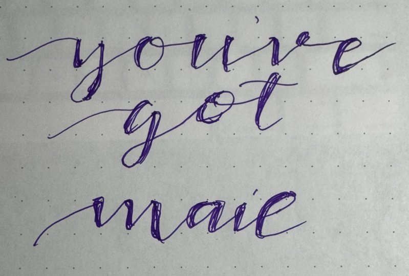
9. ACTIVITY TIME!: Now, that you have pages of words, at least five words, if not more. This might freak you out, but don't worry, we're going to have you do a phrase of 3-5 words. They don't have to make sense even, but if it's a quote you love, that would be great. Don't worry about necessarily doing any sort of balance. I just want you to get it down on paper in your preferred style. I don't know what is coming over me right now. But you've got mail is what came up, so that's what I'm going with. Let's say that I want something that's super tilted. I come in and I do the tilt and I want really long exit strokes. I'm doing my really long extra stroke. See I'm not perfectly even on the page and that's okay. You've. How funny would it be if you guys are working along with me and everybody ends up doing "you've got mail". Oh, my gosh. I almost want that to happen just because of how ridiculous it would be. Don't do it. Come on. It's fine. There we go. I've got that place. One of the things I like to do too when my exit strokes are long, is to come back in and add long strokes to these letters. I just think it's a nice way to complete it. While this might look real pooey, when I add my weight lines on all the places on my downstrokes. Remember, downstroke and then it goes in the upstroke. Downstroke. Upstroke. Downstroke. Upstroke. This is a downstroke. This is a downstroke. While I'm adding these, I want to also mention that I get asked this when it comes to faux calligraphy and you might have been wondering yourself or you might have heard something as far as what side of the letter should my downstroke be on. Sometimes people will tell you an answer as if it is certain and I disagree. I don't know if you noticed, but I have put them on both sides depending on balance and I look at balance. When this occurs, let's say I use m every single time as an example. Let's say this is what I did with m. This right here is not enough separation. I should've done it like this. But let's say you have this beautiful piece that you've already done so much from, and then you make this wonky m. It's not the end of the world because balance, think balance. I can put my weight line on this side of there. I'm going to start with the middle, put my weight line there, and then put the next one inside here so that it creates a nice balance. Then I can see. Okay. This one would go well right here and then check it out. I just totally salvaged that m. Whereas, if I'd put the weight line on the other side, it would be smush, smush, smushed. Okay. You can salvage stuff and it's just about looking at where the balance is. When you fix the first one, that's where you determine the rest. Or maybe you have a space like, let's see this one. My o was pretty far away from my t, so I ended up putting the weight line of the t on the left side instead of the right side. That was just to create some more balance so that it wouldn't look so ridiculous. It's like problem-solving. I would keep that in mind. When you're finished with your quote, "you've got mail." I'm going fast and making a lot of mistakes. But anytime that you have this happen where it lifts, no one's saying you can't go over that area again. Anything with lettering because you're not doing cursive, you're drawing letters. When you're drawing, you can do whatever you want because it's yours. All right. When you have that done, I want you to upload it to the projects so that I can see what you made and I can see how creative you are with your quote or a lack of creativity. You wrote "you've got mail". That was a jab at myself. Okay. If you played along with me, that's just fun, but it really was just a jab at myself. I'm not sure where this came from, but doesn't it remind you of Meg Ryan, and isn't Tom Hanks in that movie? I don't know. But anyway, you get the gist and see how that's really coming together. Quite lovely and it's nice and airy. You pick the style that works best for you. That's your project. I can't wait to see it.
10. Ready Set GO: You have reached the end of the class. It's a bittersweet moment, but I want to see what you guys have created. Please continue on, create your quote or phrase. You have learned the basic fundamentals of calligraphy. You've learned how to create faux calligraphy. You can take this if you want to run with it and choose to learn more and expand more, you totally can. You are fully in control because you have some tools now that allow you to have a structure to build off of or to break a little bit. Be sure to check out my other classes, I think that a lot of people from this step really want to get into brush lettering, say, and that is a total other beast. Learning how to use brush pens and learning how to form letters. Those are two very separate things, which is why I like to learn or teach the structure first. Continue on with this, put a little bit of practice in there, don't hate your forums, it does take practice. I hated my forums for a good six months and then I was like, ooh, I'm good, and then a year from then I was like, ooh, I was bad when I was good. It just takes some time, but just enjoy the process. That's what it's about practice five minutes a day, that's all you need, and I'll see you in my brush lettering class as we continue on. Just saying you're going to want to. It's an addictive art form. It just is. Plus, it's fun. All right, you guys, I will see you soon.
 Peggy Dean, Top Teacher | The Pigeon Letters