Transcripts
1. Introduction: Are you an art enthusiast
who keep saying beautiful calligraphy all over your social media
and probably fields. It has some special skill that only a few
artists can process. The good news is you can
do it to this course, especially designed for you. All you need to do is to master a few basic strokes to
practice consistently. Hey, I'm a dealer, a calligrapher and hand
lettering artist from India. I have been practicing
calligraphy and hand lettering since 2018. And for the past few years, I have also been
conducting workshops. So I began my calligraphy while I was recovering from
my knee surgery. I found that writing
inspirational words and codes helped me a lot and maintaining a positive attitude. And I also started
getting a lot of time in queue messages and
notes reading. I needed to see this
today and all that. And even called suggestions and expressed in both
Facebook and Instagram. And that's when I realized
I could keep doing. When I first began my
calligraphy journey, I would see other people
who were way ahead of me with distinct
and consistent style. But I don't know how to get to that point because there were not many resources to
learn from back then. Calligraphy was super
intimidating for me at first. But after five years
of constant practice, experimentation and
lots of London, of course, I can now
create beautiful things. I'm excited to teach this
class because I know how frustrating and overwhelming
it is to be as a beginner, not knowing how or where
to start with calligraphy. Now, I also know what
it is like to do to get comfortable with calligraphy and all the
tier that comes with it. In this class, I will show
you what calligraphy is, how it differs from
conventional handwriting. The various tools used in modern calligraphy guidelines,
basic calligraphy strokes. How to utilize the basic
strokes to make alphabets, and how to connect
them to form a word. We'll also go through some of the most typical rookie
mistakes and how to avoid them. All you have to do is trust
the process and stick to it. I believe calligraphy is both addictive as
well as healing. And I don't want you to miss
out on this opportunity. This is something you must try. And believe me, when I
say, it is quite simple, this course is perfect
for beginners because it covers everything you need to know about this pen calligraphy. Literally from a to Z. You'll have the knowledge
and the abilities to do any type of telegraphy by
the end of this course, I really can't wait
to see what you create. Let's dive in.
2. Intro Modern Calligraphy: Let's start by talking about what calligraphy
actually use. The word calligraphy is derived from the Greek word kalos, which means duty and graphing, which means the way of writing. So basically, calligraphy is the art of writing beautifully. Calligraphy is one of the most traditional
forms of art that is being practiced across different countries
and cultures. Like Indian Bashir in Greek, Arabic, Chinese,
Japanese, and so on. Depending on the
cultures, languages, places under style, the tools
also varied accordingly. Now you may wonder how
modern calligraphy is going to be different from traditional
calligraphy, right? So traditional
calligraphy follows a certain set of
rules like the angle, the ratio, the proportion contributing to the uniform
structure of the letters. The script look the same no
matter who attempts to do it. The tools are also
used appropriately. For example, lips,
oblique holders and inks are used for
copper plate calligraphy. While modern calligraphy still
follows the basic rule of calligraphy that is
thin up and thick down. It gives a lot more
creative freedom, resulting in a free state
that this a modern look. Each of our calligraphy
works can be unique and we get to develop a style
or how cool is that? Also, the tools for modern calligraphy can
range from pencils, pens, get spins, brush pens
point that Ben's chocks to Apple pencil on
iPad and just whatnot. However, this course will focus more on brush
calligraphy only. I prefer starting with modern calligraphy because
modern calligraphy, unlike traditional calligraphy, allows you to have some fun. Also, you may change the
style to match the project. For example, if you have to
make budget cuts for kids, it would look better and modern
calligraphy with stylish, bubbly and colorful letters than neutral and monotonous letters as in traditional
calligraphy, right? The point is, modern calligraphy allows you to make changes, break the rules,
suit your own style, and to have fun, of course, now about
the final project. As this course is meant
to be for newbies, I've chosen a very
simple project. It is to create a
beautiful piece of calligraphy off your most favorite word
in your own style. Easy-peasy. Now,
also, I would love to see your before and after
of the same word as well. It is super helpful for all the students to see each
other's work and progress. And I would love for you to
get creative with the style. And I'm really looking forward
to seeing what you create.
3. Handwriting vs Calligraphy: Now, you may ask, men, calligraphy is the art
of writing beautifully. Someone's handwriting
is very beautiful, is that calligraphy to know? Handwriting is something
that we usually write using a pen or a pencil while
taking notes and so on. But the purpose of handwriting is to
write big glean flow. And in the case of
cursive handwriting, it is to current letters
without lifting off the page. Whereas calligraphy
involves writing letters using specific
strokes with varied pressure, making few strokes
thick and thin. Also, since each stroke
is done individually, the pen lifts off the page
for each and every alphabet, making it slower than
because of handwriting. Now let's see a quick
demonstration of the same. I'm writing the word
handwriting Inca. So first, as you can see, it takes less than five
seconds to write the word. Now, the same calligraphy
in calligraphy. While plainly writing the
words convey the meaning. Calligraphy conveys the
meaning that it's full spirit. From as simple as making a greeting card, place
cards, billboards, and so on, to designing an eye-catching logo to create a brand identity to
attract customers. Calligraphy has a lot
of practical uses. Of course, it helps to relax
and get us to a survey. Calligraphy is even referred to as meditating with strokes, just considering its
therapeutic nature. So the prominent difference, you would notice this
with the strokes in Gaza. All the strokes
are of same size. Violin calligraphy. Strokes are big,
can view our thing. And of course, the
consistency of the alphabet. Calligraphy looks much more
consistent than handwriting.
4. Supplies: In this module, we'll
be seeing about the various supplies used
for brush pen calligraphy. I'll also be sharing my views on beginner
friendly brush pens. So firstly, we'll see about the different types
of Crispin's. So brush pens obviously are flexible and that allows us to apply varied pressure to
create thin and thick strokes. These can be classified based
on the size of the tip. We have large the brush pens. This one is Tombow
dual brush pen. So as you can see, the size of the
brush tip is large. Now coming to beginner
friendly brush pins, we have small brush pens like
this, Tombow Fudenosuke, a small tip brush pen salaries here due to
its ease of control, native to firm, not too soft. However, it's purely a
personal preference. There are also
medium-term brush pens, like my all-time favorite
Karin brush markers, which comes in various
kinds like water-based, pigment based metallics
and also neon. So these are the
popular ones and that available in the
city that I live in. But then there are
numerous brands that you could explore. Just make sure that
the tips are flexible. Next thing to be addressed
is about the papers. So I generally use Rodia
Grid Pad paper for practice. So this is all VAT DSM. I also use this to compose and finalize the layout designs
for my calligraphy works. As the paper comes
with square grids, we can use this ASA guidelines with saves us a lot of time. And then for my final works, I use Canson watercolor sheets, which are of 300 GSM. These are bleed proof
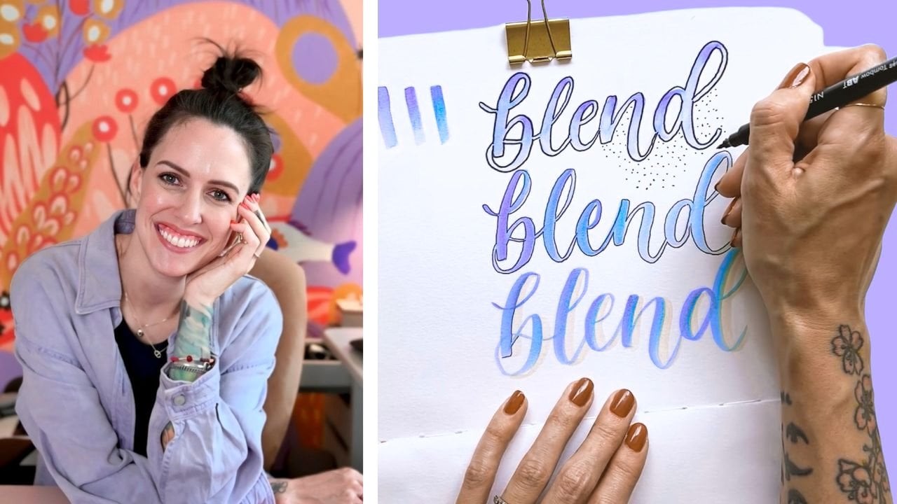
and are ideal for blending two or more colors
enough calligraphy books.
5. How to Hold a Brush Pen: You might think it is not a worthy topic to be made
as a separate video. But when I just started
best calligraphy, I couldn't find any resources
on easy fixes like this. Also, when we make
small changes, that will be a bigger and better impact on us calligraphy. So when you watch this video, I'm pretty sure that you
are learning time is saved. Let's first see the difference between holding the brush pen in 90 degree versus 45-degree
angles to the paper. First is 90 degree angle. With minimal pressure,
the stroke is thin. And with maximum for sure
the stroke is thick. But in this angle, the chances of your
brush pen step getting free this more. Now, in 45-degree angle. The downstroke is
thick as we can use the full potential of
the brush pens tip. And the upstroke is still with minimal
pressure obviously. So in this angle, the possibility of your brush
pen getting fetus very low. So the next is at
hand position being straight versus
sidewards to the paper. So first we'll see
the straight one. So the stroke is again. The point here is
you will not be able to see a prominent
difference between thin and thick strokes
right next to sidewards. I'm doing an upstroke
that is thin, the minimal pressure obviously. And downstroke is thick. And here you can see a prominent difference between
thin and thick strokes. The next is writing speed. First time writing it fast. So I am writing the
word fast as well. Now I'm writing it slowly. So I am writing
the word slowest. Mindful about the strokes
enough and they don't. In the fast. You can see many variations in
the upstrokes itself. They are not even. And since we wrote
slowly mindfully, the strokes are
consistent and even. I end up bonus tip. Now, when you're
holding your brush pen, don't hold it very close or very far away
from the brush tip. Maintained somewhere
in the middle. You are comfortable. So these are my preferences
and I encourage you to try it out yourself and
see what you like the best.
6. Working with Guidelines: Guidelines are very important in the process of calligraphy. So they help us keep
patterns a bit in proportion so that they add in a harmonious relationship
with one another. So let's get started. So first one is the baseline. Baseline is nothing but the line on which the
alphabet sit down. And the next we have
the waist line. So the waistline marks the top of the
lower-case alphabet. And the distance
between these two, that is the waistline
and the baseline, is known as the x-height. So the basic structure of alphabets will fall
under this x-height. We can take the examples of C, E, E, yen, and so on. Next, we shall see what
is called an ascender. So the ascender line falls
above the waistline. And the examples will include b, the head, k, and so on. Now, moving on to the descender. Descender falls
below the baseline. And the examples will include g, j, p, q, y, and so on. Exceptionally,
lower-case alphabet yes. Covers all these three
that this ascender, x-height and the
descender compare. I have done the
word guidelines in calligraphy, but
without guidelines. So you can see an
obvious difference in the consistency
of the alphabets. So in the case of the
one without guidelines, as there is no baseline, you can see the alphabets hanging here and
they're randomly. Unlike the one with the
guidelines about the slant. Slant helps us
maintain a consistent. And also, if you look at
that angle of alphabets, the one with guidelines is
in harmony with each other.
7. Basic Strokes of Calligraphy: As we already saw, the prominent difference
between handwriting and calligraphy is the
pressure in the strokes. So before that, if you are
going to use plain papers, makes sure you draw
the guidelines. There are certain
rules in calligraphy where the strokes have
to be thin and thick. So wherever your
hand moves upwards, the stroke has to be thin. And wherever your
hand moves downwards, the stroke has to be thick. So the thumb rule of
calligraphy is thinner. So there are eight
basic strokes, including up and down strokes. So let's tap the
top stroke first. The upstroke is always thin, which means the tip of your pen. So just touch the paper
with little or no pleasure. Next is downstroke. Those drug is always thick and so you'll have to
apply heavy pressure for the tip two bonds its maximum in order to achieve
the thick downstroke. Next is under turn, starts with a thick
downstroke and transitions up into
a thin upstroke. Next is overdone. It is the undertone in reverse. So this truck stops
with a thin upstroke and transitions down
into a thick downstroke. Next is compound curve. Does the combination of
the underturn, overturn. This drug starts with
a thin upstroke, transitions down into
a thick downstroke, and again transitions up
into a thin upstroke. So next is woven. It starts with a thin upstroke and transitioning into
a thick downstroke, and again, transitioning into a thin upstroke to reach
it starting point. This is quite difficult stroke, but with consistent practice, this can be done easy. Next is ascending loop. The stroke starts in
the middle to go up forming the loop and then transitions down
to a thick stroke. Next is descending loop. This is just the reverse
of the ascending loop. So this stroke starts
with a thick downstroke, slowly transitioning to the
loo up with a thin upstroke. Any alphabet will be a combination of these
eight basic strokes. In the next video, we
can see how to build alphabets and words using
these basic aid strokes.
8. Writing Lowercase Letters: All the alphabets
are a combination of one or more basic strokes that we saw in the
previous module. So let's get started. So first is E, starts with an upstroke and then unfinished undertone. When we connect all these
thick down and then up, they don't, and we get done. Eight. Next is B. So starts with an upstroke, downstroke, and inverted oval. And then upstroke to finish it. When we can take this enough. They don't thinner and thinner. So we get the next is C, starts with an upstroke
and unfinished over when we can this down and we get this c. So next we have D, starts with an upstroke and then unfinished undertone. When we can make this the nub dig down and the
nuff, they don't. And we have our D. Next is E, starts
with an upstroke and then a thin upstroke again and then unfinished
over Lake see. Okay. So then we can take
this thing and signup. We have our E. Next is EF, Starts
with an upstroke, and we have an ascending loop. And then upstroke, another
upstroke to complete it. Then we can add these. They know. They know. They don't, they know. And then up again. So we have REF next we have g, starts with an upstroke. We have an oval. Next we have a descending loop. And then upstroke though,
finished with it. When we connect these
thick and thin up, thick down here, the number n. Again, we have our
next moving on to hit starts with an upstroke
and ascending loop. That compound curve. Okay, So when we come to this, they don't, they don't seem now. We have our next eye starts with an upstroke and unfinished
under the dot there. So when we collect all these, we have, all right. So next we have j, starts with that stroke,
descending loop. And then upstroke to finish it. And we have r dot. So when we connect all
these big dome, enough, again, we have this k
starts with an upstroke. We have an ascending loop and an inverter over a downstroke
and then upstroke. So they know they don't know. Don't think, don't signals. We have our key next to CL, starts with an upstroke. We have ascending loop and
then upstroke to complete it. So when we connect
all these things down and we have our yellow, next we have yum, starts with an
upstroke, a downstroke. And while we're done,
compound curve. So when we connect
all these thinner, dig down, dig down, dig down deep enough. Again, we have REM. Next is yellow and upstroke. Downstroke. And the compound curve. Now, dig down, dig down, and didn't know we have our yen. Moving on to o starts
with an upstroke. We have an oval. And to connect this
with the next alphabet, that is to finish off this row, we have a comma dot here that starts with a downstroke
and ends with an upstroke. Like this. An upstroke. Thick don't they? Don't and thinner. So we have our moving on to p. We have an upstroke, a downstroke, and inverted
over like we did for me. And upstroke to finish this off. When we connect
these thick down, thin up, thick
down, and thin now. So next is Q, starts with
an upstroke and over. And this can be
pointy or curved. A descender in flip manner. So that is up to you. It can be either
pointed or an upstroke. So then we can add
these thinner and thinner and thinner
and thinner again. Next is, starts
with an upstroke, a comma dot that be used in all. Or if you want, then over there, that is up to you. You can choose to do
any style of art, but just make sure the stroke is thin and the
downstroke is thick. So here we have a Commodore and underturn
that this unfinished. So when we connect
this did not dig down, dig down, and then up. Next we have Yes, starts with an upstroke, a stylist descending
loop, and an upstroke. So when we can take this
thing up, thick down. Now, moving on to t starts with an upstroke and unfinished
underturn, horizontal line. And this line can either be thick or thin,
that is up to you. But I like it to be thin so that the emphasis will be on
the downstroke more. So that takes us more legible. So thin, thick down, thin, thin line here. Next we have u, starts with an
upstroke underturn and an unfinished undertone. Again. When we can take
this thick down, thin, thick, and thin. Now, we start with an upstroke. Here, we have a downstroke. So usually we would
have practiced downstroke straight
or in this angle. So here it is going to be
in the opposite angle. And an upstroke here. And Commodore to connect. So thin, thick down, thin. They don't and thinner. So next is W, starts
with an upstroke. Underturn. And underturn again. Come on dot. So thin. Thick don't think, don't. They know, they don't end up. Next is EX, starts with
down-stroke click V and upstroke. And this line can be stylized or straight
according to your wish. So thick down, thin up. And the nuts like this. Next is why an upstroke,
underturn, descending loop. And then upstroke
to finish this off. So thin, thick down, they not take down. Then up and then up again. And finally z or zed, as you call, starts
with an overtone. Another war we're done. Let us to be continuous with the descending loop like this, and then upstroke here. So to collect this thinner, dig down, dig down, and then up again. This overturn is slanted. And the second one is to be connected with the
descending loop like this. And to finish this off, we haven't, I'm stroke. So this is my style of doing z. You can choose it to be pointer or any way that you
prefer it to be.
9. Writing Uppercase Letters: Data, numerous styles to write
each and every alphabet, and you can choose to write
them in your own way, but just make sure that you are upstrokes and
downstrokes Arctic. However, I'm sharing my style of doing uppercase alphabet for your reference in this module. First is starts
with an upstroke, a downstroke, and a
horizontal line like this. Moving on to B, starts
with an upstroke. A downstroke. Upstroke again, an
inverted repeat the same, and then upstroke to
finish it off. Next is C. So both lowercase
and uppercase C are similar and upstroke and then
incomplete or like this. Next is D, starts
with an upstroke, a downstroke, and then inverted
oval like we did for b. And then upstroke
to finish it off. Next is E, starts with an
upstroke and incomplete oval. And again, an incomplete
over like this. So basically it starts with
the lowercase e like this. And then the last stroke
of the lowercase c. So next SCF start with the
horizontal line like this, a downstroke and then upstroke. And then a horizontal
line in the middle. D starts with an upstroke, lowercase e there,
and descending loop, and then upstroke
to finish it off. Next is hit, starts
with an upstroke, a downstroke, and
another downstroke, and the horizontal
line to connect them. Next we have I0 and upstroke. And upstroke again,
a downstroke. And then upstroke. Next is J. J is just like the eye, but it just has descending loop and then
upstroke both finish this off. Next we have k,
starts like the F, and we have a downstroke. Downstroke again, and
then upstroke to finish. Alright, next we have yellow, starts with an ascending
loop like this. And another loop to connect
the horizontal line. Next is yum, starts with
an upstroke down stroke. And we don't end up
compound go to finish. This. Vote. Lowercase as well
as uppercase looks similar. That's why I had to create one small difference
so that it's useful. So I had created that curved upstroke in
the beginning alone. So it is the same for actually many alphabets
like yen or B. And we have U, V, W, X given Y. So it is that next to cn starts with an
upstroke, a downstroke. The compound curve like this. Next is all starts
with an upstroke. And they have created a slight variation so
that it looks different. Next will go to p, starts with an
upstroke, a downstroke. And inward dirt over. Q starts with an oval and a diagonal line
that is similar to x. So next we have our upstroke, downstroke and inverted oval downstroke
and then upstroke. Next we have Yes, starts with an upstroke or descending loop that
is slightly stylized. And to add verity, I have just left a gap here. So you can choose to do
the same as lowercase. Yes. Next we have d. This one is just like the Yaffe without the horizontal
line in the middle of you, starts with an upstroke
and undertone. And then incomplete undertone. Next is v starts
with an upstroke. A downstroke, upstroke. And a comma dot. W starts with an
upstroke underturn. Again, and I have
added a loop to create the next STX starts
with an upstroke. A downstroke, just
like the lowercase x. Okay? Next is y, starts
with an upstroke, underturn, a descending loop, and I'm finished in this
width or downstroke. Finally, z or zed. So a horizontal line, a downstroke, and
another horizontal line.
10. Connecting Letters to Form a Word: Now let's see how
to form a book. I had chosen the work
create as an example. So C starts with an
upstroke and unfinished, or whether the upstroke that is thin and the entry
stroke that is still again. So the whole idea of
connecting alphabets is that the exit stroke off one alphabet becomes the
entrance stroke of the next one. Like for example,
the exit stroke off, ie becomes the entry stroke off. So T downstroke. And E. They know they don't. And so the best way to practice is by connecting
each alphabet with other. Acid, AA, AB, AC, AD, and so on. And we are done. Now about the final project. I would love to see your most favorite
word in your own site. And I would love for you to
get creative with the style. And I really can't wait
to see what you create.
11. Conclusion: Many congratulations on
finishing this course. I hope you had fun and found this course useful on your
journey to calligraphy. I would love to see your works
as I actually cannot wait. So make sure to post your work in the
project gallery below, and I would love to see them. And also you can follow me on Instagram or the handle
letter with Nikki. And I also have few videos in my YouTube channel
later with mathy, but just in my original
language summary is due. Thank you again for joining
me. Have a nice day.