Transcripts
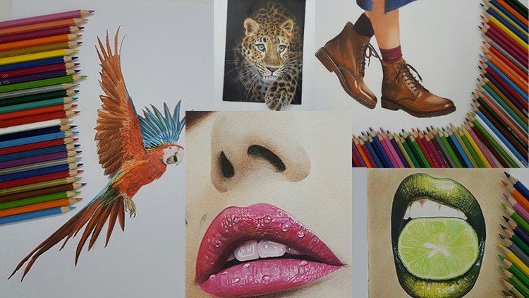
1. Introduction: The chiaroscuro technique and painting, especially paintings in deciles of rail and hyperreal, has received a lot of attention from audiences and art lovers today. Learning this beautiful technique with relatively simple and low-cost tools is possible for anyone with even a little sketching knowledge to carry screw technique is one of the best techniques to correctly start painting and enter the fascinating forward a visual arts. Due to its attractiveness. The fact that the student can easily communicate with it in this technique to students deal with the spectrum of gray and black colors. And from the beginning they're not involved in coloring or color techniques. And this actually causes that this student are focused on lights, shapes, and compositions of the work. To high contrast that can be created in black and white paints using count and colored pencils is one of the attractive features of this type of painting that actually doubles to beauty of your work. By learning the Keras true technique, the students can create very beautiful works. Join us in this course to get acquainted with the general principles of carers crew in creating FaZe spots. And of course, learn how to volume to face and create beautiful flowers.
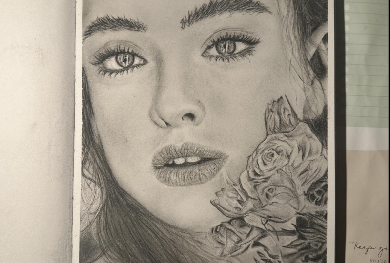
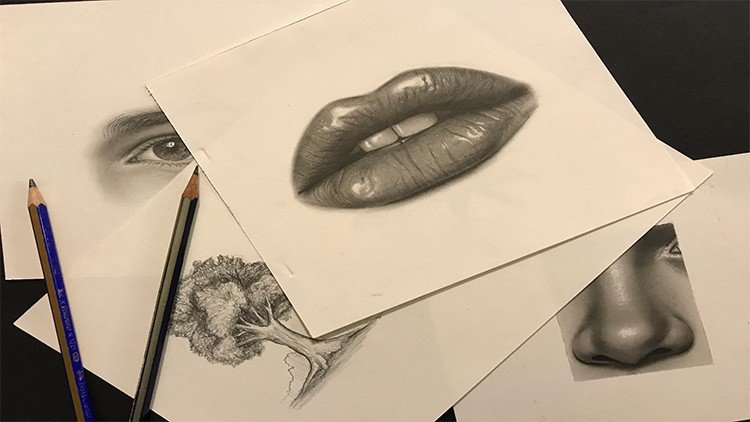
2. Introduction of tools and basic explanations: Hello to my dearest friends, and good evening. For this part of our tutorial, we are going to work on this face with actually a colon count. For the first sketch, I've chosen this one because it has the parts of the face. So clearly incompletely. And beside of that, you can learn how to sketch flower as well. Because I taught you how to sketch the parts of the face. And so we have a skip this part for you now and we've already done the primary sketch. So if you need to learn how to sketch these parts, you should refer to our previous courses. I'll tell you the equipment you'll need during our work. But generally we need hard and soft pencils. Fabric castle brand. Aside of dead, we have our erasers and the normal one, or the mono 0, or the one with the brush or the Dell for a CR. And also the electronic racers rich or some other erasers that are being used to us. And we have the sander for cleaning our fe, the faders tip or other things and brushes. You should just prepared these equipments and then we can work all together. And I'll say You should have a 0 brush as well. Prepare your equipment and your sketch so we can start.
3. Right eye drawing with Conte pencil: Hello to my dear friends. We want to start our work from the eyes. In this complete phase. First, you should observe your eye from the photo completely and then you should start working on your sketch. The parts which are too dark, like the iris of the eye. You can use your soft pencils. And for sharpening these pencils, you can use your cutter. But if you feel that it's hard for you sharpening your pencil with cutter. You can provide some special sharp nerves which are made for cons, pencils. So it's up to you. You can use either one of them. That I want to explain for you. In the beginning is a difference between my hard pencil and my soft pencil. I'm going to use my hard pencil to create lines in my eye. As it's so obvious from its name. It has a very hard tip and it's more firm. And then the soft one, the soft one is the opposite. It has a very self tip and it's actually very, very more fragile. Then our hard won. The part said you should use your soft pencil. Are the parts that you want to apply. Darkness in a spot sense, things like this part. It's huge or small. Darkest spot. Or you want to give a very intense darkness to a place. But in the parts that you need to show lines on your work, you should use your hard pencil. That as it says, it has a hard tip and it will actually make sure that your lines would not be faded in your work and there'll be shown. Very good. I want to work on the ear is a little than my soft pencil. I'm just applying some darkness. Also here in this site. Of course, our friends that's been with us when we were using actually the pencil powder. It will be so easy for them because they've already practice this with pencil powder. So just some materials have changed and it should have more control on their hands. But it's going to be easier for them because they've already practice this one. These parts that we have more darkness and it's not completely lines yet. I prefer to apply to dark spots and darkness with myself pencil. And now I'm going to switch to my heart pencil. Okay. Generally in creating iris, there so many different ways. Instead of, for example, doing this details and little by little. First you can shaded with coal and then you can detail it. Anyone have their own way. But it also depends on the shape of the eye. So you should try to do that in different ways. Unless you figure out which parts is better with what? For this, because I can see my, I have too many details. So I decide to start with the details. Not to do the shadings first and then apply the details going the opposite way. Of course, you should not forget that after shading. Even if you've tried to apply details from the first day, we'll just get faded away a bit. So in some parts you should need to do that again. There is no rush. So, so slowly each line and each spot you seen the areas, you should just apply them in the correct place. Should have patients, and you should do it very slowly. If you pay attention here in my model, there are some lines over here. These are for the eyelashes and for now we won't work on them. But when we are applying the eyelashes, we will bring those lines into. So don't worry about them. So I want to increase the dark, darkness of these parts. A little bit. My soft pencil. As you can see. Also from this side. Be careful that in the parts that you see light, if you try to keep them white and untouched, It's really better. It's true that you can use your eraser for creating those light parts. But if you keep them untouched from the beginning, your work will look more clean and more beautiful. So try not to get into that parts. Here's also a light part here. Try to keep it light. And also here. If you've, if you've shaded all the background and you've added detail later, you could add the lightly after that. But when you're working with your pencil and you're adding details first, try to keep the light parts untouched. Because erasing the pencils are hard or actually they may leave a trace. Okay, We should complete the lines which we have in here. Okay, we go to the eye lid, the upper eyelid. And we created with our pencil. Be very careful in creating these lines. Because we do not want these lines to be. To think. Remember that you're working with and cons, pencils and the darkness and the trace of these pencils are much more than graphite pencils. So if you make a mistake, del, leave a trace even if you erase them. So try to keep the lines fine. No, we don't want them to be thank images. Create the lines that we've already sketched. The price set you can use your pencils on it should be determined on your work. For example. This eye has so many dark spots. So we can use our pencils for here. Pay attention that I'm still using the hard pencil. It's actually more useful than your soft pencil. Anyway. We are using our hard won. And we also have a medium pencil, which, which is actually between hard and soft. But I personally think it's more like hard pencil. And in some places you can use it instead of hard pencil. But it's, you know, it itself there then this one. Be careful, you should not use your pencil if freeware on your work. You see, for example, in these parts, I do not want my pencil trace to be left over here. But in this ending polar, I'm creating a line, okay? So we do not want pencil everywhere. Don't forget that in this part because we have so much darkness, but we cannot see any separate lines. But I'll create a very fade line there. And then I'll go over there and complete them with eyelashes. So the wrinkles are enough up to here because eyelashes are coming over them. Just a little in here. We should add to the wrinkles. So little and so cautiously, just like this. And of course a line over here. Okay? In next step, we want to use our brush and spattering the shadings and farming it.
4. Completing the iris and whiteness of the right eye with a brush: Okay, my friends, we want to start the shadings of our work. Just a point I need to mention here for shading we use are created color col. As you can see, we make them into powder. And for actually creating the either of them, you can use some filters for t that can make them into powder. Or you can use very soft sanding, or you can use good cutter. But when you use actually a metal net, metal surfaces, it can give you a very soft powder. Now I'm using a very small brush, for example, a size two brush. And we try to fade and spattered a darkness is v, have a plight. We still hadn't got any coal powder. I'm still using the darkness of it's to create these shadings. Now I'm going to use my 0 brush that I've told you before. We can use this and to create the shadings for the inside of the eye because they're in a finer. So for fading them, it's better to use this 0 brush. Try to keep the lights. Again, I insist. This side part is dark and it's it needs a bigger brush for fading it. You should definitely, definitely always blow off the extra powder of your work. Don't be concerned that some parts may got out of your hand and get darker because these parts are dark parts. And when you are using your pencil, you kept the light parts. So even a little it got out of your hand. Don't be worried because you can bring them back. When they use severe erasers. Again, a smaller brush. Worry, all match up. And if you're seeing this course means you're not a beginner. So it doesn't have anything to really worry about. It. I'm sure. Just like this, It's so easy. And this darkness which is actually referred to the pupil, it gets the upper a little bit. And from the pupils toward the outside, we have some lines like this. Be careful about these, and you're good to go. I should turn my model around. Remember that we always have a trace in halo around the iris from the inside to the outside. That the existence of this actually makes our eye look more real. That's why we always have it. Alright. Now we take our eraser and we add the lights to our work. It's better to edit your work part by part as you go forward. This way, at the end you will have less work to do. In some parts the edges should be faded bit more. Then we added if the places where too much dark and you couldn't, you couldn't create delight. You want the light that is needed. You can actually get help from your electronic eraser if the places where too dark. But now for this amount, this eraser is very good. Creating these lights is very, very effective in the clearance and shine of your eye. This part got too much light now. So we'll take a bit of that powder and I will decrease the light. And I feel this part of the eye needs shadings more toward the outside and get a greater shape. Now we can work on actually the inside of the eye. The white part of the, I want to work on that. We take quite large brush. This is 1010 brush because we want to make a cohesive shading. So we use a bigger brush. As you know, the best way to use the brush is to move your hand in circularity values and put the brush on your work like this vertically on your work. If I'm not doing that right now is because you can see that what I'm doing better. There is a light in this part of the eye so we don't shade it too much. And we take our eight brush for shading this part because we want to make it a smaller shade. The sun is actually in the shape of the ball, so the corners should be darker and this part should be lighter, but it actually depends on the angle of the face and the head and also the angle of the light. We had a very intense shade over here that I take a bit of coal and I created here. It's intense comparing to the other parts. And as easily as you've just seen, it's done V-shape this lower lid as well. Just like this. The lights should be increased in some parts, in decreased in some other parts. According to the model. You can easily see that if you do not lose sight of your model, it's very easy to recognize. We have a light here inside of the eyeball. It's just like a triangle up to there that we created. So it will give that shine to our eye. And we can show it. If you pay more attention, you can see the in some lights in these parts. So little lies that we can create them with our brush eraser. We also work on this corner of the eye. We want to complete it here. That for this, we need to darken this upper part. And we try to create the volume of our model. So creating the volume is very important. As always. It is what makes your work looks 3D and real. Actually. We have a wider space, so I'm using a bigger one, bigger brush. I'm using a brush size two. Later. I may not say each brush I use because just when you see it, you will understand yourself by practicing a lot and exercising a lot and working. After a while without even thinking. You will pick the appropriate brush for the part that you want to work on. Just be careful that when you're working on the background, you will pick up the biggest brush that can, that you can use there. And when you want to work on the details, you will use a smaller brushes. Almost have the general shape of the eyeball. Some details left that we will work on them when we go forward. And after shaping all of the, I will add details here.
5. Shading and creating the texture of the right eyelid: Okay, My dear friends in this is to everyone to work on the islet of our model. Before anything. We want to work on the parts that we have done with our pencils. So I'm just going to go over them once with my brush so it won't make any extra lines with the powder that has been left on our work. Just to fade them and take that extra power, they're off. Now we'll take a bit of pencil powder and a clean paper. See, let me put it in a place where you can see it. Here. Place the pencil pattern here. It should be definitely from, you should definitely put down and put it on a paper. And then you should get your brush into that. And take the extra pattern on a place in case of you're doing a light shadow. And then you should apply it on your main work. The thing that I've told you is very important to do because when you take the powder directly from your bowel that you have the powder in, it may really ruin your work because you don't have any control of how much powder you're going to get. So it may ruin your work and the lines you can drag the brush plenary. But generally you should have that circulatory movement in your hand so you will actually create a soft shade. Will just shade all of these space. The parts which are even above the upper lid. And we have the eyelashes here actually, you can use a smaller brush and create a darker shade. Just like this. See so many of friends and we'll do that. And they create the eyelashes from the beginning. And DEI work at this same time, but for our beginner friends, it's easier to make to making creative volume of your work first. And then you will go to the eyelashes or the hair which are on the face. It's easier for you. Now that we have a little color on our eyelid. We will want to work on the volume of these lines which actually show the textures. There are some big textures over here that we've determined in air sketch. We drag these shadings downward. It shouldn't be just a line over here, you see favor and you've created a deadline there. Definitely, depending on your model, you should continue that line and faded into different directions so you can create the volume and you should apply delight above it. For example, here should be above it. Just to make the correct volume. This line should be completely darker. Also continues up to here. And this line which is actually above the other one. You can create these lines reduce 0 brush as well. Because we were going to shade this part that brush number 2 was working well for me, but you can use 0 brush for these two. Generally for getting these lines and these kinds of textures. There is always a question that first we should apply the darkness for the light parts. Because in these first we should apply our eraser as well so we can use them. We can create the volume. And it completely depends on you and your model. For example, in this sketch, the first thing that come into my site was the darkness. So I've applied them first and then I won't to work on the light parts. But in some other works, it might be opposite of that. Meaning, first you see the light, then you see the dark. So you'll work in the same order. So it completely depends on how you see your work and how your work and actually is. As you can see, our eye is getting a very, very good volume without having any extra troubles. There is another point about the call I'm using. As I told you before, I'm using the color KOL have different kinds. They have two kinds of soft and extra soft kinds that in both kinds are good in their own places. But the one that I'm using here right now is the soft one, not the extra. And there is another one of another kind of these cols, which is in the shape of a cube. And they have actually more darkness in themselves to more black dance. I'll tell you more about them later. Or sometimes instead of all of these, we use a smoke that you can provide it from the source and we don't need it right now. Now in this step, I want to create light above these textures so I can get that volume that I need to. And some of these parts, they shouldn't actually stay that white. So we will apply more black and darkness to it. So it will stay natural. You see when we're adding these lights next to these dark parts. It, it's like we're giving meaning to that textures that we've created. Now they're showing completely. You can see the difference completely that will show on popup your work. Generally creating any texture in our work is the result of putting the lightness and a light and darkness together. And how to do it in your work is actually your technique in creating that texture. These parts, they don't need dark lines. Here, work on them so little. And we create these lines. Normally do Takes sure. The upper lid is not shown like this. But in here because it's actually the shine of Cosmetics. That's why these are showing this much, which actually makes it more beautiful. The lower parts because we want to work, we want to bring eyelashes over them. Snot data important, but these upper parts are very important that I'm just creating the lines 4 and k. And we're going to work a little on the space of between the upper lid and I braille. And this model has very good eyebrows that can help you learn for your other works as well. It's a very good model for practicing those eyebrows. You should do it so softly and so slowly. You should not rush through it and try to keep your brush clean as much as you can in this step. It's better because you're working on the skin. On skin that doesn't have any freckles or stains. It has some textures, but it doesn't have that much spots because it's the skin of someone who is young. So if you keep it clean, eight's better. We drag the shadings or right until we meet DI Brown. Here we go. So softly and once in a while you should blow onto your work so it will take the extra pattern of your paper or cardboard. Here, we need more color, so I'm just going to add some to it. Remember that my friends, except that what we're doing. And you can see I tried to explain all of it, but some sometimes a because it's very easy, I'll escape it and I'll tell you later. And I'll tell you where the DEI work on it. So you will keep your attention onto it.
6. Right eye eyebrow drawing: Okay, My dear friends and this is stamp. Before we go to the eyelashes, I've decided to work on the eyebrows. And to tell you the points for that. Because for these lower eyelashes, it's better to shape the lower part and then we start the eyelashes. So now I want to work on the eye brass and for creating debt, makes sure that you use your hard pencil and the tip of your pencil is completely sharp. This is very important that that are more thin retry to create them with a lower hand pressure. I think it's better for me to do it from this angle. So you can see it better as well. For the Braille. You can use also different ways to do that. Sometimes you can use general background for the eyebrow and then you apply the hair. Or in sometimes it's better to create the hair first. For me, this is more comfortable and more convenient to first create a hair. Then I add the shading and then edit some hair that needs editing. Them just implying some of the lines that I've already sketched. And then I'm going to intensify them and darken them. I just I mean, we just need to remember that these hair lines should be sharp at both end. Exactly like the same exercise we had for creating the eyebrows. First you can create the bigger hair, the ones that are showing more. And then you can go to the details. So first you generally shaped the eyebrow and create the hair that are showing more. And then you will go to filling the empty spots and going into details. It's very important that your hand can move easily and comfortably. Because when your hand is in the right angle, you can have the correct lines. Meaning lines that are sharp at both ends. You should constantly rotate the pencil in your hand so you can find the sharp edge of your pencil. And if you felt like right now that it's not sharp enough, you can always sharpen it. You see how I'm using it? I use my cutter for sharpening it just like that. And it's very easy, very good. But wildly are working and you want to sharpen your pencil just a little. It means it is a super sharp, but it needs more sharpening. You can also use you're sending. So you can do it either rate depends on the condition of your pencil. Because we've already sketched these lines in our sketch phase. And they've been carefully applied. We denote, think about it too much and we just go over the ones that they already have. But if you didn't have enough attention and care while you were sketching, you should pay much more attention here. As I told you, you should use your account. Your heart can pencil. If you're not using a fabric castle pencil you can use. You should use actually, that depends slow with the harder tip or a command you, these ones, because they are much more convenient and comfortable and they really look better in your work. So it's better you provide these end. He used them. You have other brands for pencils. But if you've provided them, not the fabric castle, you should compare it and see which number is better for your work. Which number of hardness actually. Now we have almost completed the background hair for our eyebrow. And you can come over it with a brush for, for phase. And in next step, you will intense them and you will darken them more so you can give it more volume. We didn't want to fade these hair completely, which is one to shape and color the background a bit. So we'll just go over them once with our brush. And the brush should be moved in the direction of the hair, not in a circular way. Do not forget that the tip of the eyebrow that doesn't have too much color, right? If you pay attention to the model, you see this inside of the eyebrow is darker, so I will take a bit of my coal powder. Again. I don't work on it. Sir Clery. Just going in coming to give a color to the background. That's it. Okay. Up to here is good and it's getting a very good shape. I want to make this lower part more cohesive with the skin riches actually below my eyebrows. Just going to make them look more cohesive. I'm going to shade it a little, not too much, just a little space because it has actually a prominent part. It's lighter, but it doesn't mean that we should keep it white. It should have a very, very light gray so our areas enough colored. So again, I go back to my hard pencil. I drag it a little on my sanding so the tip of it would be sharper. And then again, I will work on our model. The pressure of your hand is very, very important in creating hair and eyebrow. Because even how much you sharpen your pencil, it doesn't matter that much that your hand pressure, your hand pressure actually decides that this hair that you're creating is thick or thin. If you put more hand pressure, you will get a thicker line. If you imply less, you'll get a finer in a thinner line. That's pretty much how it works. As you can see. We will complete the lines in this step. These parts, because they don't have any shadings. We don't go over them too much because then it has the shading of the skin. We should work on more and the hair should be done again. So we don't put too much time for that because it needs a redo. So we are going to put more time on our main parts of the eyebrow. These hair needs to be thicker that you can give it to them with implying your hand pressure. Like this, we keep the sanding and we drag our pencil on sending. So it will get sharper. It's in the way that in case of that, the tip of your pencil is sharp enough that you can drag it on the sanding. If it's too short or it's not sharp enough, you should use your cutter or the special sharpener for a company sells. These will actually, the background that we've applied will help your work to have great volume. Because when you apply these new hairs that I'm doing right now, it looks like the day or in front of some other hair which are in the back. So it's pretty much better. Generally, when you want to create eyebrows or hair, you should put a lot of time for that. So you can get a great shape out of it and you can simulate because sometimes you want to create famous person's face or an acquaintance. So simulating might be very important for you. So when you are doing a face like this for exercise, you may not give that much care about. Simulating are saying that it's exactly like model. But when you're working on a real life person, an acquaintance, a famous phone or whatever. It's very important for you. Sometimes they might be a place for changes and little mistakes, but it should not change the face of that person. It shouldn't be in the main parts of your work. K, I need to use my brush a little. You need to work on here. Just a bit more. We've done work on this upper part of the eyebrow and little. But we need to give a little color to our forehead so we can get this upper part as well. Because when we want to color the whole skin, the hair which are existed in this part make it faded. So I'm just doing it right now. It's enough up to here. For now it's enough so we can complete the hair and complete our Ibram. Let me sharpen my pencil again. And I create the hair that are existing in this part that come actually out of the eyebrow. I'm just going to create them right now. Heard at, are showing in my work. See some very little details, but these are the things that makes your work extraordinary, different from the others. Because of the brush that we dragged through it, it goes a bit darker that we needed. So I'm just darkening these hairs a bit more. We complete the eyebrow like this and we go to the next step.
7. Eyelash drawing: Okay, My dear friends, I've worked on the eyebrow a little bit more just to shape it completely. And for making it even more complete, you can add the bright spots. And that might be in your work with your eraser. Okay. Actually, the brow is one of the things that as much work as you do on it, it still needs work. So we may work on it later. Now. I just want to give a shade for here beneath the eye so we can work on the eyelashes. So I put my brush into the coal powder to sit little and I start shading care. I shouldn't mention a point that for shading these kind of spots, it's good for you to rotate your work upside down or sit in the angle that you will be off-site. That meaning from this angle, if you shade from that angle, it will be better for you. It will be very easier for you and you'll get a cleaner shape. But it doesn't mean that you cannot do it from this angle. You can. It's not an error or mistake. It doesn't mean that, but in that way it has better and easier for you. That's why I recommended because this barn has a very light shade. First, I drag my brush on a clean paper and then I applied my brush over here. Just like this, we continue the shadings. This part should also get a bit more shading. We add to that too. These sparse then have a lighter shading in this part of the eye. So we tried to shade it less. So we can add the lights with our eraser Later. We have a wide area for shading here. So as larger and bigger our brush will be as good for us to shade it. So it's enough, I think, but enough background color for here, just a little bit darker here. And then we are ready to work on the eyelashes. The inside of our eyelid. We will darken it more. Just like this. The parts that are a little texture beneath the eye. They're far away from the eyelashes we can work at later. But as long as we are working on this area, I'd like to do it. You see I've cut the tip of this brush as you can see. So if caught the tip of our brush because it was so soft and we didn't want it to be like that. We wanted to be in the shape that we can work on it. If we have kept that soft tip, we couldn't get these very financing lines that we're getting right now. We work beneath the lines so slowly. We erase it here. And we add Y to spots. Now we want to work on our eyelashes. For creating the eyelashes, we start from one corner of the eye. Our pencil should be very sharp. Don't forget that. And so South Leanne is slowly you is start creating the eyelashes. As you've learned before. The parts that it's crowded. We will add to the number of the eyelashes so we can get the concentration that we want to do some specific lines in some parts. Just sue, show that there are some specific ones and they are showing off. This will help you to find the placement of the hair and the allyship is much more better. Creating the eyelashes with count and coal is exactly the same as the way of creating them with pencil. The difference is that this kind of pencils, they have more darkness and their control is a bit harder than a normal pencil. And you should continuously sharpen it so you can get good lines from it. We do not forget about the parts which that came into the eye. We're just going to determine them perfectly. Just like a very natural I did. Direction will change a little in here. It comes more to the inside and comes out more. Because the shape of the eye is that it's half wide open. It's completely open so the eyelashes will come downward a little. You should be very careful in creating these kind of eyelashes because the shape of them are kinda different. And the directions are much more different that you've seen before and we've done before. So you should go with them very carefully and shape them. And take the eyelashes towards the inside and shape them. Usually. The eyelashes, especially when they have makeup on deface, the eyelashes, will stick together. Three or two of them. It will look better and you can show it more easily and more naturally when you sketch it. In this part, the eyelashes was so much coming down to the eye. First, I will determine the ending parts of them. I will create specific eyelash first and then the ones which are lighter and they don't show up that much. Again, I will tell you our pencil should be sharp, especially in this step. Always. Because in the eyebrow it doesn't matter that much because sometimes they are some thick lines. But indeed lashes because each one of the eyelashes will be seen and showing, you should not take their risk for creating them with a pencil which is not sharp. And D eyelashes which are in this side of the eye. They should be thinner. We have an eyelash here, which is in a different direction. So it created to have the form of the model done. And here dead darkness and the thickness of the eyelashes, There's more. So I will add to that. Be careful that if there's a part that has been darkened by the eyelashes, you shouldn't not color it with your pencil and darken it. Because it will take away to tract of your work and it doesn't get, give you a result. There are some lighter lines to that. After VIV brush, this part of this, we will create them as well. Now I'm going to the eyelashes of the lower lit. Because the eyelashes here are faded in our model. So try to create them lightly. And days eyelashes are much more thinner than the eyelashes for the upper eyelid. Tried to keep the shapes if they're coming on top of each other or next to each other, what however they are organized. Again, I should sharpen my pencil. Should do it on Sunday. Alright, now the color is much better. Some parts are shorter and some parts are longer. You should pay attention to your model about that. On the contrary, of the upper eyelashes, the lower eyelashes did not go together and did not came on top of each other that much. They didn't stick together as much as the upper eyelashes. I surely. There is a point here that you can use your lighter pencils for this part. And I want you to use too many equipments, but you can use this colors. B2 or B3 carbonic pencils. They are lighter than air. Comes pencils. So if you want to provide something more den, I told you at the first, you can buy these pencils there are adequate for here, but there is no essential need. The NFL, he can do it without them. See, you shouldn't not to rush through it. And you should have a sub-image patients in creating the eyelashes, especially the ones which coming toward the front of the eye. This corner of the eye delegates thinner in finer. Now again say our eyelashes are almost complete. Just some parts Shouldn't, it should be faded more. For example, this part, I need to dark in here a bit. Because a d inner parts of this eye has this shape and has these darkness. If you pay attention to model, there was a dark line that divided the eyelid. And in here into GMB of the eye. There's a very, very fine line that I can see that it continues up to the middle of the eye right here. And we take a brush on it. Just sue. Take it with a 4k d edges of this lower eyelashes. They should get blended into this darkness as well. Eyelashes are different from I to I. In this I D, eyelashes are almost from one eye lid line. But in some other eyes, for example, the ones we'd have which have too much eyelashes, they might not be honest. Same line on 19 day might be in different lines. Some of them should be downer or some of them might be upper body, as we have in this model. Day all started from the same line. And the edge of this eyelash, sorry, I LET try to keep that in mind. We've just created the ones that are main and then tours showing more. It looks like an eye really. And little brush on here. We don't want it to over do it as you know. And we just want to shape the eyelashes which are at the end of the eye. More. We can shape them more. In here. This corner. I mean. Okay. Does to get a good shape over here. And it doesn't have to be all the same length. I mean, the eyelashes shouldn't be all the same length. Sometimes there should be longer or shorter than the other ones. So the shape of our eye will be completely natural. It looks rail to me. Then we will move on to the next step. This eyelashes should be faded a little, just so little at the end. We don't want it to get faded completely. With just one them to be faded just a little is ending one's. Okay? Then I'll use my eraser a little because I don't want it to get too dark, still need some light parts. So the color of this part is important. And we should check is, and we should add some lights if they're needed. Feel look into the person's eye. You can easily see these lights. We can also use our electronic eraser. And I've got the erasers tip so thin as you, as you could see. But if you want to get it, c tried to get the ones with this tip. The ones that are similar to Mono Zero erasers because they're much more useful for you. This, I lead. They have some very, very small textures that are shiny, that we use are electronic eraser for here to show that there's some glitter on the island. As kinda glittery. It's for her makeup. As you can see, its will work very good on that. It looks, it looks perfect. Alright. Okay. It's up to this bards. And we're going to next step.
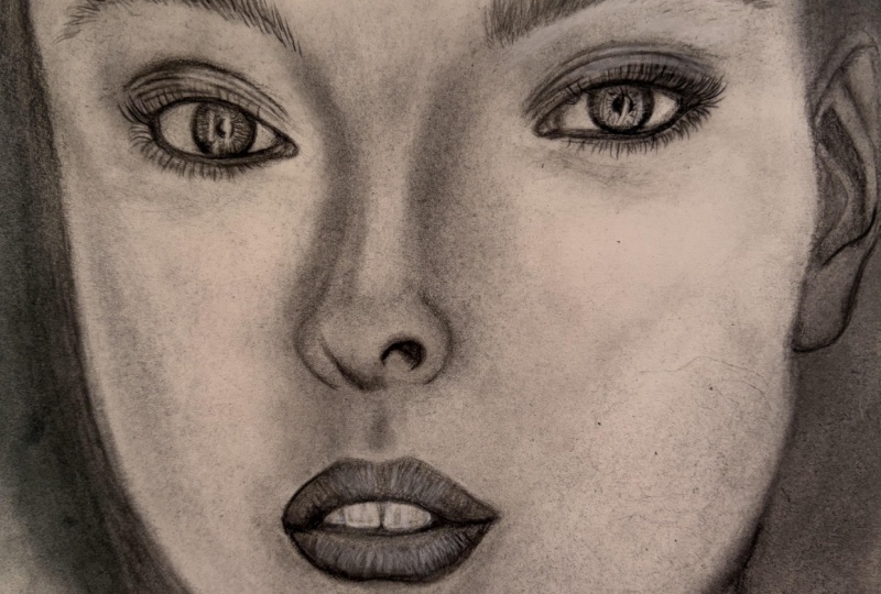
8. Drawing the iris of the left eye: Okay, My dear friends and this step, we want to go to the left eye. And we do exactly the same things that we've done for the right eye. It's exactly similar. But just for having a review, again, I'll tell you. We start with darkening the iris with our soft pencil. Completely black because it's the darkest part of our eye. We also work on the surroundings. Then it also has too much darkness. We create a shading without any hand pressure with our soft pencil. And also from the opposite side here. Processes the same. Equipments are the same, so don't worry about it. You might actually this one better than the other one. It's 0 second training. The part beneath the eyelids that create a layer of it with our pencil. Then we get to our heart pencil. And we try to create the lines that we can see. As we've told before. We try to keep the white parts whiten light and we do not go over them. Just leave them be and untouched. This spurred, it's actually might be the shadow of the eyelashes are a reflection of the eyelashes or they might be deadlines inside of the eye. Anyway. Reaches create the lines that we can see. Try to keep your pencils sharp. The Smart has more darkness. While fading. We should pay attention to that. So we can create the darkness as it is. Now, more, not less. These parts will also come to an outside. These lines that you see are actually the spaces in the eye. If you look at a photo of the eye from a close up and, and I have been for the microscope, you will completely understand the thing that I'm saying. These are actually muscles and lines inside of the eye. It's good to have a review on real life photos as well. Try not to go around the white parts as well when we don't want to create a shape. After that because it will actually look. It will make our work look not surreal and not natural. So do not let it happen except this part that it is actually a line in our model as well. It's the shading which has turned into a line. So in the parts that we don't have any lines, try not to separate our shading, our light parts with lines, okay, we don't want it to look natural. We should also create the lines over here because this part is going to be faded. I'll go on this part light because it should not be seen. Bus in here, we can press our pencil more so the line can be seen. And in this part also as the same one as the other eye who do not create a very thick line. So after we create the eyelashes, it would not look bad on it. You know, work on this part too much. And circle, kind of a circle at the corner of the eye. And the lower lid has a bit of darkness. So you can create a pencil a little, not too much. Just like this. We create the lines of the eyelid. Insist that these lines should be very dark from this very first step. Because if the darkness will be less, in next steps you can add the darkness to it. But if you make it too much dark and too dark from the beginning, then you might have problems with taking it off of it, making it lighter. So it's better to keep it lighter. And we darken the lines. The lines that we did I'm sketching. And the rest of it should be done as we are adding texture to our eyelid. And of course we can emphasize on the eye, on the line which is in the corner of our eye. To emphasize it's a little, making it a little bit more bold. This part is a bit darker. Okay. So Sardar shadings with our brushes inside of the iris, the eye, on the eyelids and the y part of the eye. The explanations are the same as way. And again, I say the process is the same as the same way that we've did up to here, will go on like that. Similar to each other. Shaded with our brush. Do not worry about the darkness of these files. Because why we're shading the eyelid this parts will have less darkness and a won't get in your way, so don't worry about it too much. And we can get these darkness, drag it downward together. Darkness, that is, they actually did dgamma of the lower lid. I'll take a bit of my coal powder and I'll darken this part while we're working on here. It better do this. Now I want to darken this part a little bit more, meaning actually fading, get more. And then I will go to the parts which are inside of the iris. The parts which are needs to a spattering. If you pay attention, there are parts that have lines inside of the circle. So I fade them in the same direction of the lines. So it will keep your lines and they won't get completely faded. And the shadings will come between these lines. Well, it also says you should work on the lines again, but as the background, it's better that you do not completely fade the lines around the iris submit toward outside. Have a trace sort outside. Just like this. This part should look more cohesive. And inside part of our eye should be shaded a bit. The white part. And actually it's not completely wide as this that before. So I will shade it just a little. Because this eye is not from is a straight angle. We will need more darkening. With a circle or a movement. I increase the darkness in that part toward actually forward. We weren't come. The part says we did fade them. Fading the lines so the lines would not bother our works. And they don't suddenly get an amount of darkness into our work. Who will pick a smaller size brush? I'm using a normal size two brush because as I'm saying, normal because it is a number to size it being used for y. This will put to use for getting fading the parse in two lines or lines into the shades. But when you're not doing lines, it's better to use a brand new brush. We're done. Okay. Tip. So you can get to shadings correctly. So based on the parts that you want to work on, not even you can use different sizes of brushes, but you can use the same size but different stages. Now we use our eraser and we create the light parts inside of the iris. Do not rush through it and be very careful with that. And see, we should take more outside. The edges of the Eris should come more outside. So the shape will be more natural and more realistic. I'm better looking like that. Okay. My friends. For now, async tile completed and I'll come back for you.
9. Shading around the left eye with a brush: All right. My friends, I've done the I part for you. Just darkened it a bit more. And I figured out that this ending part of the AI has been darkened and It's been closer to the iris. Now we want to film shading our eyelids. We start to make div volumes and shading the eyelid. In this part v hat, we need more darkness that I will use my coal powder. And I will add more darkness into this area. Generally. It's very easy work to do. So don't be scared, Don't be nervous about it. This is a darkness that I've told you. Not to try not to create it with pencil and try to create it with your brush and colon shading. And simultaneously we did darkness that you bring out to your work and read the eyelashes. We drag this towards the upside. We get a very little shading and we can defer are shadings for each one of them. Because if you pay attention to the model, each line that we have, for example, this line, if you figure it d. And there's actually a light above the lower line. It depends on the angle of the light. Meaning that in this model, when we have a line beneath it, we have darkness and then we have light. In other models, it can be different. So it depends on the angle of the light and your photo and newer model, these shapes can be different. This part has more darkness, so I'll take a bit of my powder and applies here. The ending part of the eye because it's a bit caved. It's darker. And be careful that the left is more in the shadow comparing to the right eye. So this makes it darker. And this line should be coming down a little. But the pencil is slowly, just drag it a little downward. This will be okay when you add the eyelashes and this part will be shaped. So don't worry too much about it right now. Again, we go to the shadings of this. We dip our brush into the powder and I'll take a bigger brush so I can cover more area. Now, I'm using the brush size 16. This way I can cover more area in a shorter amount of time. This line above the eyelid, which should have. Of darkness. And this darkness will combine from the one which is coming from here. From these below parts. Alright, for not rotating my work and I just change my plays. But you can easily rotate your work and the start shading from the opposite angle. It will give you a very clean and great shade. Because I don't want to mess Award for you. I changed the place. I sit wherever you want to come in, in a column to your work. Again, start from the dark part and then come to the part beneath the eyebrow. Don't go straight into the lighter parts. You see? I'm moving my hand from the down part's turned here. Especially each time I put my brush into the powder. Because we don't want any sudden darkness in our work. And just like this, we gave a bit of color to the area above our eye and we made the shadings. There is also a very deeper shade that comes from this side of the nose toward the eye that we will complete it later. But now, because we want to focus on the I envy one to complete the eye and get the lights of it. We just determined this shading just to this amount for now. Later, we'll work on it again. Until it's also looking like a nose here. It will look much more better when we're done with this part. When you want to put your brush in the middle of your work, somewhere like this, you shouldn't just suddenly put a press your brush into your work. So softly and a slowly touch the paper or the cardboard. And then you'll go to shaping and forming it. In the same step. I want to give color to the lower, sorry, below the eye. Just a little bit more. So when we want to work on the eyelashes are work with have enough color. I also go to this side of the face. And simultaneously we can add to darkness to it. We need to take a smaller brush for here. I chose a brush size eight. And I'll go work on the darkness of this part. Just like this. We start to making these very great volumes. So slowly from the part that you have, darkness, you will feel this upper part. Very small lines which are related to the texture of this part. And I'll just emphasize them and dark and dim a little. So later we can work on these textures here. Of course, because it's a face of the young Glady. You should not emphasize too much on the textures like this. You should pay so much attention on these kinds of textures. Because even if you make it a little, just a little darker than they need to be, it will make your work look way more older nanotubes. It will show an older age and it doesn't look good in the result and it will be different from what it should be. So pay extra attention on that. And this shading and loss of the darkness that they've put for AI is kinda gone. So I add the darkness for the lower part of the eye and the upper part of the eye. And maybe I get the textures for these parts. It's exactly the same as the other eye. I'll use my eraser and my electronic eraser. Just like this. Beside our prominent parts. Or wherever. The lines or less. I create a line with my 00 brush. Or you can even use your fader. If you want. You should get very, very financing lines in parts that we don't have too much lines. We create these lines very finely and determined the parts with the lights, with your eraser did is and shape this area completely.
10. Completing the eyelid texture and also drawing eyelashes: Okay, my friends, we are going to continue our work. And this is i1 to sketch the eyebrows and the eyelashes for you. But first, I'm going to complete some of the darkness that are existing in this space are 0 brush for here. This part has a light that we created with our electronic eraser later. And this part, again should be shaded a little. So we can separate the parts from each other. And also this inner part. It needs some darkness because it's almost cohesive. It all, it almost has a cohesive darkness, but the upper part is a bit darker so it can show us the depth. You can also use your electronic charger to create the light. In this step, just like what I did. Just like this. So easy. That goes into this upper part. Are better now to be created with our electronic charger. Because the light that it's given to our part is to light. And because here we have a shade under the eye, it's too much it's too much light. Even even if you did it with your electronic charge or you should go over it with your brush and shadings ones so you can take a bit of the light of it. These parts need more shading. This lower part has a bit more darkness. We drag a little bit of the upper darkness to the down. Arrow shadings are enough for this step. Now we move on to the eyebrows and eyelashes. First I want to create the eyelashes, complete the shape of the eye. And then I'll move forward to my eyebrow. Again, I insist the tip of your pencil should be completely sharp, as I told you for the other eye. And we use a hard pencil for creating the eyelashes and ridges. Create the eyelashes like this, showing my hand of the cardboard at the end. The way of creating eyelashes have no difference. The ones that we did before in exercises with pencil powder or anything. Here. Just your equipment is different because it's a bit darker and you have to work with much more cautious and care. So the process is the same. And I highly recommend you that before you work on the eyelashes or anything on the face. With Kant pencils, it's better that you have done the eyelashes. Eyebrows, hair or anything like this before with a normal pencil. So I highly recommend this because it's going to make your work way more easier and cleaner result, of course, painting, sketching. It's all about the exercise. I came up to here. And here we have a change of directions. We have a gap between our eyelashes. Okay? Just like this. See, you can work on these eyelashes so fast and move on. But because we want to simulate and we don't want it to have too much differences with our model. I'm doing it so slowly and with patients. So as beauty and as the likable would be exactly like our model, mean they won't. I want them to be so similar and also beautiful. Again, in this part, we have a change of direction. They come toward up. Just like this. Let me sharpen my pencil for a moment and then we'll continue. You should do that too. Whenever you thoughts that it's not sharp enough, you should go and sharpen it. It's very important. We continue again. You see in these parts the eyelashes are not completely clear because the eyelashes in the beginning of the eye, on this side of the eye are so thin and they're not as a city as they are in the other parts. So that makes the eyelashes look shorter as we move forward. So today, the faded are not completely clear. Even if you look at your model, you can easily see that K, just like this. They've created the eyelashes which have came out. And now we're going to do the completing parts. If somewhere they have came back in or there's some little eyelashes. Or for the part that the eyelashes are going to come into the eye. With this pencil, the Paris konnte pencil, carbonic pencil. You can use it for creating these eyelashes. It doesn't mean you have to use this color and this pencil, but if you didn't have it, you can use your hard pencil with a lower hand pressure. But if you have that pencil that I showed you, it will be easier for you. Your work gets easier, but you can do it with your hard pencil as well. In these parts, the eyelashes will be seen less, but they still exist. So we should create some darkness. According to our model. The coming back of the eyelashes, actually the part where the eyelashes has, have grown. These parts should be darker and a bit more crowded. And with more full. And you can use your brush and little for this part. And the spatter it here. Just to make your space and area looks better. So you'll have a great background as well because it is important. And then again, you should determine the lines on it with your pencil. It looks so beautiful. In the set we have created the eyelashes. And it's faded. Here. You can use a fader or a 0 brush, just a little over them, but not too much because we don't want the eyelashes to get faded. So we just want we just want to show the very little eyelashes and make this part more darkness with a hard pencil or our Quranic pencil, carbon pencil. In some places we have eyelashes in the opposite directions. Are here. We have an eyelash that came into the eye. These are so fine works. You should do them so slowly with a lot of patience and a lot of attention. Don't worry. If something would have make your work become oddly or a natural, yes, you should worry about it. But in the places like this that adding some little details will make your work more beautiful. You should do it. So I've sharpen my pencil so we can work on the lower eyelashes as well. These ending eyelashes here, they are not completely clear. And later we should fade them with a fader or a brush. And this part needs more darkening because it got brushed cell many times and darkness of it. God away. Almost up to here we have this spot of darkness that we will created in next step because now we are focusing on the eyelashes. So I want to keep our focus right here. We'll work on the other parts later. Don't worry about it. So finally we create the hair, actually eyelashes. Kind of here, I think. Doesn't make much difference. The process of creating them are really the same. Puts too much pressure. Do tip of the pencil so he got broken. But it's okay. We can easily just correct airline. If you've got any problem like this during your work, don't worry about it. You can make it correct. Again. Again, all the lower eyelashes are coming out from one line and one line only. Do not forget to blow off of your work. This will help you to have a cleaner work. Of course, you know that just like this, we finish our eyelashes. Wherever it needs correction you can easily corrected. Do not be afraid of your work. Do not worry too much. These parts should be faded a little. So I used my brush. And in this part that we need darkness. I'm just going to add a bit of powder and I bring a little bit of darkness into this part. Who'd our coal powder. And of course, the corner of the eye needs the same thing. More, looks like it tried to keep the other parts clean. So you should do it slowly with patients like this. And we have a beautiful, beautiful, I just like the other one. K. And again, I use my brush for the price that are needed. But these should not be that much faded because in the model they are not. So just going to keep it low, but yet used. Good, leave them be just like this. Okay. Iri is almost done and shaped. It might need a little eyelashes that can add it later. And then we go to the eyebrow.
11. Left eyebrow drawing: Okay, My dear friends in this is that we want to work on the eyebrow of our work. Again, it's just like the other eyebrow. The same process, same equipment, and the same colors. With the help of these kind of lines, we will get the general shape of our eyebrow. We start with this and then we add the details. First, we work on the lines that we have we have had in the primary sketch. But I've told you before that did tutorial for these kinds of sketching has been, has been said in previous sections and lessons and courses. So we have done the sketches before. And you can just go in the IVR have zone. And you can also do the sketching and actually drawing these lines simultaneously. You can do them both in the same time, but for not wasting time and actually for saving time. For the videos. I've tried to create a primary sketch from our models, so we just have to go over them right now because that would take time. Should compare it to the model. Look at the model. I have the primary sketch here. So I've did it for you. And now you can just shape the eyebrow as it is. It's very, very easier for you. So don't worry about it. Okay. As you can see, a part of our sketch has gone, but doesn't matter that much because we should always keep our eye on our model. Never lose sight of it. And we can create them. Comparing our work to the model, makes sure not to misplace any of these. Most of the lines that are in the main part of the eyebrows are in this direction. So as you can see, I'm doing them in the same direction. Most of them not all. Be careful about my words. The main hair that came actually toured up, they shaped general shape of the eyebrow. You just determine them and create them. These are related to the hair that are existing in the eyebrow, just like this. As I told you before, in the eyebrow, we can have hair in different directions. It completely depends on the shape and our primary model. The beginning of the eyebrow. It has some hair, but they're just so pay lend light and they're just so solved. But it doesn't mean they don't exist. They exist, they just different from the rest of the eyebrow. Again, just like the other eyebrow. Recreate the hair for this part as well. Okay. Because we need to fade out our work. Once and then again. Reshoot. Do they hair over 8 again? So in this step, I don't create too much detail because we need to work on and again, so why we should do this? Again? So I take a bit of coal powder and I drag it to the background and I create the eyebrow. So we will leave it to white. And in next phase we can complete our Iran and our hair. Adding the details, again. Actually add darkness is much more less than it should be right now. So I take a bigger brush with more powder and I just want to make these space inside of the eyebrow darker. And then I'll go back to creating the hair. This actually increases a pace of your work as well. But you can actually do this darkness back ground and this shading even before creating your hair. Before sketching those lines, you can first shaded, then a sketch the lines, but I prefer this one, but both ways are correct. There's nothing wrong with it. I'm up to here. Again. Linear pencil. We create our hair. As I insisted before, do not work be the append so which is not sharp enough. It will ruin your work. So I've sharpened is again and I want to continue on my work. You should do the same. The hair that is started, Elizabeth outer. From where we started. We just determined them with a sharp pencil. Alright. These bars do not have any special explanation because the eyebrows is the same again. But again, I say that for creating hair, eyebrows, eyelashes, you should just have so much practice on it. So you can go and it easily. Do not imagine it's something impossible or so hard that you cannot do it. Everything is possible and gets better with practice. So I do no work on the upside of the eye braille because he forgot to shade it. So first I should shade the background on the forehead a little. Then I'll go back to creating the hair of the eyebrow, which came that time. So just keep practicing. And the things you doing. Especially for creating the hair. Because they might seem a little hard at first, but when you have enough practice, just PCK, Q and K. We can still add a bit to the thickness of our eyebrow. And for this, we come from inside to the outside. So we can have the sharp end of the hair and also we can control the thickness of our eyebrows. It's all in our hands. Okay. Just a little tap is enough for here. I don't want to fade anything. I just wanted to make it all blend together and be more cohesive. And I create some light between the hair. It actually have enough light left between the hair. But if you felt that, dare not enough, they're less than you seen the model. You can always add it to your edit eraser. Just like what I'm doing. Or I can use the eraser with the brush. Of course, you know this. But for the friends that haven't worked before, is that the erasers should be sharpened by the cutter, but the brush or eraser should be sharpened by a sharpener. But you should use a different sharpener for your sharpener, which you use for your pencils. Kay? We want to move on to the next step. The upper side of the IRA have some here into this direction that after shading I will create them. If they're shading the forehead, we can complete it.
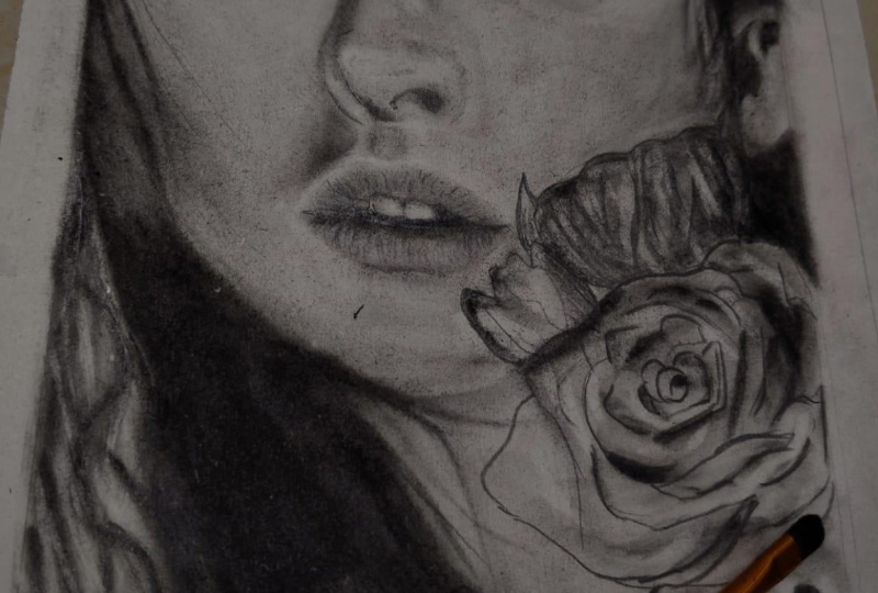
12. Starting nose construction: Okay, By really great friends. In this step, we want to work on the nose of our model and we want to create a volume of our nose. For this. I start with my hard pencil to first create these lines that we'll separate the nostrils from the other parts of the nose. For the darkness. Inside of the nose, we can use a soft pencil, but try to use your hard pencil for these lines. So you can create a border and separation in this area. And this side. If you pay attention the model, you see this area and this is space is kind. It's that from darkness to the light parts, it didn't just got separated step-by-step. It got faded. So we do not create line over here. We start the darkness from the inside part and then we will keep his face so the shade will be faded towards the outside. If you do not take it into consideration. It will show the nostrils bigger than they look. So be careful about that. So we don't create a line in that part. And I'm going to use my soft pencil for this inner darkness. And step-by-step, as I come towards the outside, I will make it lighter. But actually, when I say here, I use soft pencil there, I use heartburn or sell. It doesn't mean that if I use them instead of each other, there will be a disaster and it would be very bad, and so on. No, you might just easily forgotten during your work or make a mistake in Peking their pencils. If you have created this darkness with your hard pencil, even it was okay. But the soft pencil is softer as it sounds. So it's better for your work. It's not a sin. Here we have darkness to, it comes down, it gets slider. And here he had a bit of darkness, which is shown by the nostril. When you're working with pencil. Again, it's very important to blow the extra powder of your work. And it's even more serious here because we're working in, when we were working with a normal pencil, the darkness where less than this, but here we have a lot of darkness. And these pencils are too dark. If they live a powder, extra powder day will definitely affect your work. So don't let it happen. Blow tough to darkness from pencils are enough for now. But before shading, I will go to the brushing stage. So first we should just fade these lines with our brushes. And lines that we've created. The space that we've created was for that you can actually drag and continue this darkness of the nostril tore down and you can get a very natural and realistic shape of it. Also from this side, it's the same as it comes toward outside. It gets a bit lighter and you just drag the shadings to the right. You just need to guide it. From above this line. You should create a very, very, very thin line toward the outside. So when we want to shade the area completely, the darkness above the line would not make our work look dirty. This part and this part also have shading, but it's not as much as we can create it with a pencil. So just determine its placement with our brush. The darkness behind the nose. And of course from now on, the rest of our work should be done with our coal powder. So I take a bit of powder on my brush and I start shading here. Not too much of it. You see slight. We start to determine the placement of the areas around our work surroundings. As the same time as we are creating the shadings. K. This part also should be worked on. Cages length is, and we work on the opposite side of the nose as well. We work on the NAS trills. Because as I said, the darkness of this part was not that much that we can use our pencils. So we'll just try to create it that this Sadat heart really used to it. Okay. I will take a bigger brush. I've chosen the 16 size. And from the shadings that we've already applied next to the eyes, I took a bit of powder with my brush and we start from the corner of the eye and we drag down to shadings. We start to shape our nose. Little by little. We add to the shadings and we increase them.
13. Shading and creating the volume of the nose: Little by little, we add the shadings, take a bit of powder and at the shadings. Also in this area, I start from the nostrils and I come, I come inside a very light shading to this direction. I've shaded it. Okay. Now that we are completing the shadings of this area, it's better to Shays the lower part of the nose as well and create the shadings of here too. Now for this, I pick the size 8 for slowly I start from this lower part of the nose. We drag them from here and we get them from here and drag them toward up. Tried to connect the shadings that you've got from different directions together. So your nose will look more natural and more real. We take a bit of powder again. And of course, complete these areas as well. Maybe it's better to use a smaller brush for this part so we can control our hand easily, more easily. Just like this. We go to this upper part here. We take a bigger brush and we shade this area. That's pretty good. Just keep going like this. Try to blow the extra patter of your work. You should pay attention to the volume of the nose. It depends on the shape of the tip of their nose. If it's so long or it's short. And it depends on that, your volume Ising depends on that. And that's what makes your work more realistic and natural. You see we have a shape like this here. It looks like a circle larry, like a circularity shape. So you should pay attention to these things while you're shading. And it's differ from person to person Model 2 model, you should be very careful with that. Okay? This line should be lighter. That we will do it in this step that we will add our eraser and adding the lights, we will make it lighter as well. And here is the darkness. Depending on the left nostril. Sorry, really related to the left nostril. We have more darkness in here that we get it by shading. Also these corners. They should be done as well. We can create a very thin and fine line over here, but we'll leave it for now. And we do it when we have covered the skin near the nose and on the cheeks. When we've shaped those parts, we can create it so we won't drag our brush onto it. Again. That would be a better line. And for this side of the nose, we start again from the corner of the eye and we saw shading from here is almost big. So I can, I think I can use a bigger brush and then I can change it again forever. It was needed, so I choose a 20 brush, size 20. And as the research shading from this side again, again, I'll remind you, you should get your brush on your work in a vertical position. I do not take a completely vertical, so you can see clearly while I'm making the video, but you should take it completely vertical. Become downward. We control our shades. Be don't overdo it. And v simultaneously. Pay attention to the shape of the nose. Do not take too much powder on your brush and put it on your work because this model has actually a very lightest skin. It's not too dark. So we just want to have it trace and have a light shading. Because in our work, mostly the contrast of these kind of faces are way more better. This is actually MyType. Most of people will like the contrast of these kind of black and white works to be more. And they think it's just much more beautiful. I do to these parts have so much light, so we will be careful. While we are creating color in these parts. We try to keep our area light. In here. We didn't work on the, on these corner of the eyes as well. Pay attention that there should be textures over here, so don't worry about it now to volume of our nose is actually getting into shape. Maybe if we darken this part a bit more. Again, we can show this volume way more better because still have a capacity of darkness here. We can make it a bit darker. So don't worry. It's okay. We give color to these parts are little seed. The correct way is like this, the one I've told you. Actually the more correct way to keep your brush like this on your work. That would be the correct way of taking the brush in your hand. So the shadings would be much more clean and much more beautiful. Okay, up to here, the volume of our nose is almost done. We have too much lighter over here, so it needs more shading. Again, we want to work a bit on the tip of the nose. And we will give it a bit more color. For example, this area. It's so light and so pale. So it needs more color, but not too much. Of course. Just try just try to keep it imbalanced. Or this area as well. You should pay attention while you're working on the nose. These area of the news, because it's the lower part of the nose and it's faced down. This part should be darker and it should get less light unless the light is shining from beneath it. Otherwise, this area should be darker. Up to here we can say we've almost got the correct volume for our nose. Just This line has been darker debt with anticipated. So I take a bit of it with my eraser, so is we'll have a more natural shape. Now I do not go to the textures. I complete the volume of the noise, I add some darkness to that port. And the comeback to add textures to the nose and we move on.
14. Completing the nose volume and lighting: Okay, My dear friends. Now I think the shading of the nose is almost complete and done. But just wanted to add some textures on it as well. But of course, in this work, in this course, the first one that we're working on, the creating of the texture is not our main goal. Our main goal is to work on the parts of the face and create a good shading. But anyway, we need to add some textures in these parts of the nose. So it will look unreal. Say what I mean. There is also another point that should be explained here. The parts that we are working then, and they shape little by little, step by step. Then you will figure out that the darkness of some places that you've worked on before our lists and you will add to them or why you're working. You just drag your brush onto some parts and they get lighter and so on. Exactly the eyes. Especially the high, sorry. Because we have went on DIs, so many times with our brush, the darkness as we're somehow faded away. So I added darkness into that, those parts. And you can check your work continuously, a step-by-step as you move on. Or you can do it all at the end or wherever you feel. It needs darkness or light. You add them again and you create them again. So you can do this step-by-step or you can do it all at the end. There are some very small and thin textures over here that I'm using my eraser with the brush. For that. Which eraser you should use for creating the texture is depending on your experience. As much as you have practice and experience and you've worked before, you will, and figure out that in which parts, for what textures, what erasers do you need? And of course, the size of your work and model is very important. For example, if it was smaller than this, I would not choose this eraser and I would use my eraser. But for this size of my work, it's almost big for this space. I prefer to use that eraser for here, the eraser with the brush, because I can easily control it in these spaces. So depending on the size of your work, again, you can decide which erasers you take. We'll also add some shading to these parts. We create the shape that we can see in the model. Details that V haven't pay attention and we didn't put my time to it in the first step that we were getting the volume right. But now we can easily add these very little but important details on to our work. We can add the textures which are here. After we've shaped area like this. Also the light which exists here. And because this light will engage to the background. After we've done the shading for this skin behind it. We should complete this texture. Again, adding some details. Because we kept these parts light. Our work is way more easier. If you have done too much darkness in here. We had to use more eraser on here and the shape would go out of its natural way. But if you keep the light as it's needed, it will give you a better result because it's natural whiteness of the cardboard or paper. So it would make your work looks much more attractive and better. I am using this as small Bosch, So slowly, so finally, to complete the shape of the tip of the nose. And it's good to get a very, very, very light background color to this part. So the lines we've created for the eraser will show themselves. And again, we go to the eraser. We shouldn't get it too much crowded with lines and stuff. And try to get a good variety to the lines that you're creating with your eraser. Day have to show the direction of the skin being a stretched. But they shouldn't turn into the parallel lines of it. So much order, order behind, they should have an order behind it, but it shouldn't be too much. Because if it's too much, it doesn't look natural anymore. But you should pay attention a lot for that. If there was any sharp lights in your work, we don't have it here, but if there was, you can also use your electronic eraser for that. These parts do not need any special texture. Maybe some very little lines on the bridge of the nose. We get them. So because if we want to do them, our work would not look natural anymore. Almost all of the lines in this area are in a horizontal way. The ones that come to this side take them out of the straightway little bit. So they all have a correct shape. And when I pay attention to the model, and when I compare my work to them and we should just drag a bit of darkness over here. In this area again, we need a light texture. If the darkness of your work gods tried to actually. Tried to solve it with the eraser. If it could mean adding texture will draw away some of your color. But if it's that much that you should erase it completely and go color it again. It doesn't give a good result to us. Some say it's not a problem if you erase the color of your work. But I recommend you to pay attention while you're shading works so it won't get too dark. So you'll get a better result out of your hand sometimes, for example, this side, this part gods, out of your hand. You should take a bit of powder from bottom of the sea and just throw it a little on your work and drag it so, so slowly with your hand with no pressure. This will work. Actually. How can I say it take off and layer from your cardboard. So that part will get lighter, but do not use this way until you're really forced to. Okay. Now that we've got to take stroke the nose up to some point, let me create the textures for the corner of the eye. For now. See the corner of DI has a bit of light here. And it's because of the way this I was make up the makeup of this. I will make it like that. We should get to surroundings if it darker. So when we add the shine to this bars, it will look much better and it will show itself. But last time I checked, you will see the work that I'm doing actually lighter than it really is. Because it's because of the light of my RAM. But from the pictures that I will upload for you during the work, you would know how light it relays. Use a sander on your electronic chart, electronic erasers so it will be sharp and try to add the shines over there. Again, I say, you're seeing the lights of my work and the shades of my work a bit lighter than it really is. Don't worry, I'll upload the pictures focused on the center and as they go down and they'll become less and less. Wallets even. You can see the trace of these shines between them. Eyelashes to area of here should be dark in a bit more. Do not worry about the eyelashes. I will edit them at the end of their work again. I mean, generally at the end of your work, you should go over the parts that you've created with your pencils. That's unnecessary. Edit at the end. Some parts needs this light. C for sharpening your eraser. You should turn it on and you should drag it onto your sander. And you'll move it on the Sanders so it will get sharp enough. If you did have very small erasers, it's okay. You can use a bigger racers, bigger electronic erasers and the process doesn't. I have so much difference. Here is that venue take day your electronic eraser in your hand do not allow to move for itself. You should control it. You should say where it should go, where it shouldn't go. You should get it. You should then let it get out of your hand or you won't get the shape you want. Again, we'll color this corner of the eye as well. So we can add delight. And this part as well. Both eyes should be similar. All right. Now a little light and shine. The left eye in this group, I zoomed in so you can see it better. Say like kinda see the eraser. Touch the cardboard. We take it off the cardboard. That makes this a tree. Takes sure that you really want the one that has exactly in your model. Try to keep the balance of them. Meaning that there's so much de, these line dots on our work. But if you put them so close together, it won't look like a glitter. It will look like a separate light. Spots as tain of light. So we should spatter these dots. In some parts. These need to be turned into lines, very, very short lines, but still lines. Good. In each step, our work is getting more complete. Well actually, deadlines and D, I got lighter because of the brush ran over them. But I'll come back and edit them and emphasize them again. The completed the eyes and a nose and a nexus that we want to work on the lips.
15. Shaping the teeth: Okay, My dear friends, we've moved on up to this part and now we want to work on the lips and teeth. For starters. First, I want to create a background for the teeth of our model, especially this front teeth. So it can keep that softness and coolness of it. I create a background color with my silk coloring movements. Now, the parts which have darkness, The Darkness can be applied by the pencils. We start and work on them. We're adding these dark parts with our pencils. Pencil I'm using is a hard pencil. K. Screening these lines. First bond, the second bond. And it's been formed like this here. And this part downward. M2 here. Actually, but the thickness as well. K. Now I go to the lower lip, the corner of the lips. We don't pay that much attention to it. I just create the lines with so much caution. We do not press our pencil here so much because they're not that much line in our work. Just the inner parts like in here and in here. The lines for the lower teeth are showing. We create these lines. And of course, in this area, we have to do a separation. This little tooth, which is at the side. It completely got separated from our work from the other parts because darkness in that area is so much. We can add the darkness with our soft pencil. In my model. This part is completely dark. So we will darken it as it is. The area between these upper teeth are also dark, so we can use our pencil on them as well. If the inside of the mouth was completely dark wood, create the lines with our hard pencil and we would feel it by our soft pencils. But because now in some parts we have dark shadings and in some parts we have light shadings. We should pay more attention and we cannot completely dark in it. Okay. This part also have darkness here. I can say it's for what tooth exactly. But depending on what I'm seeing in the model, I will create it. Now it's time for us to change our brush into a smaller size. So we can fade these darkness that we've created and we can spatter it all over our work in the parts needed. I mean, maybe these parts of our work will look boring, especially in the video that you're watching. But it has very, very small points that if you do not pay attention to them, the shape that you're creating won't be natural. And mean. Generally, teeth are the part which are so important in our face. And this should be done with so much caution because even an extra line can deform them and make them in a very unnatural shape. Because if you cannot get the shape of the teeth correctly, the lips and the mouth also would not look. Her Yellen, natural and beautiful. We do not leave any line and we will fade all of the lines that we've created. Just like this. And of course, this line that should be done from the upside. I manage, I should fade, faded from the top on this angle so the darkness would not be dragged into the teeth. I cannot rotate it now. So I will try to fade these lines toward upside from this angle, but if you can, it's better to rotate your work. I cannot right now. It's easier for you to do so. Okay. Now we go to the teeth itself and the details on them. This next sorry, this corner teeth is darker, so I use the darkness which is already existing in this surroundings. I use it too dark in it. Just like this. Actually it has some light. That's when we want to add lights generally, we will create them. This part of this part has a very, very light shade, which is actually beneath the lip. And in the beginning of the teeth, It's actually the shadow of the lips so you can easily drag it onto the teeth like this. So firstly, we work on these teeth. The line between the teeth. We can work on it with a pencil later a little. But in this step, I'm just preferring that we can use our brush for it. So softly with various small brush, for example, size two, brush it, take it and we start shading. The shading of the teeth is better to be in a linear way. And the first step of creating them, we shade our second tooth and slowly start to create the darker parts. On our background color. First the side of the tooth, teeth, in the part that we are, that they are separating from each other. And in here, they definitely have more darkness in them. K. And the other side of our right tooth. If you pay attention, there is a line in the model and this area that this line helps you to get the correct shape of the tooth. It's actually a shading, It's not completely align. So we take a brush that has been used so much and the tip of it is not that soft. And we work on this line again. Actually, these lines would not show themselves until we add the lights onto it. But then does step that we add lights, you will completely understand that the shadings that we are creating here, how effective they are and how they've shaped our teeth and make them look more natural. And then we go to our eraser and we create some of the lights of our work. Delight beneath the teeth. In here. The line between the teeth, I'm just going to create it. We didn't know create it all in one motion. And we do not create a completely first firm a little from the top and a little from the bottom. We leave the middle parts and then we completed with our brush. Okay, that looks more like it. And in this part, we will add the colors that we can see here on our teeth. We create some of the lights that they will leave a trace. It should recall, we want to get the very faded shape of the texture which is creating, which has been creating on the teeth. It's enough for us. And so if the lights are even lighter and more pale that we create with our eraser, with the brush brush Reiser. Like these lights that I'm creating. But the light which is here is a bit stronger. So it's better for us to create it with our eraser. Of course. The teeth needs to be even darker than this. So the volume of this part will look much better. But up to here, to this point, the teeth are shaped. But we will edit it later again, as you know. And now we can move on to the next step. And at the end, when we were finished with creating the lips, we can edit our teeth again because any way during our work, we might drag the brushes on the teeth. So some of our work and details might get faded, but we will come back and we work on the darkest spots or lightest spots on the teeth. Again. Generally we work on the details again. Kay? The darkness we have here should be more than this. If the light of the teeth were more than this. We can recruit, use our electronic eraser as well. And if the lights are too much, we tried to keep it white.
16. Shading under the lips: Okay, My friends, now we want to work on the lips of our model. We want to actually create the volume of delivery. And at the same time we create the textures because this lip has too much lines on it. Before recreate the textures of the lips is better to determine these lines exactly. If you have paid attention to our previous tutorials. In them, I've told you that where, wherever delete does not have too much texture, the preference is to first create the volumes and then we add the textures. But when our lips are like this, which have too much texture and lines, I prefer, and I recommend that first you create these lines and textures and then you go to volume Ising it. So in this way, we create the lines which IC2 there are deep or they showed so much. Are there so long, like this, it's better to create them and believe the ones that are not showing that much alone. Now that we do not create them later, but not now. We work on this upper part of the lives. You see, if you look at your model, this upper parts of our lower lip, they don't have any texture, it's just shades, and they just created the volume of the lips. So we do not go to that part completely. These parts should be done. These have textures in different directions. Now I should, the majority of these lines when we are creating the volume will be faded. So do not worry about that. If you've created a line in and little out of its place, do not worry that much because it will be a serious error for your work. This corner of the lip that the lines will complete leak out of here. Maybe it's better to get some lines finer. And of course, the curved parts and prominent parts that are there that after creating the volume of the lip, we will create them as well. Now we work on this upper lip. I didn't say that. I'm creating these textures with our hard pencil. And that these textures are being created without any hand pressure. So pay attention that you do not need hand pressure for this because they're not our final lines. And at the end we should complete these sketching. We didn't, we didn't create lines that have went all the way up because they are so fine that we should create those textures after shading the lip. If you pay attention, these lines have all started from the inner part of our lives. And also this one. There is a very important point in creating the texture of the lip is that to create the lines in the correct direction, mean if they're too crowded or after a bit misplaced, it doesn't matter that much, but the direction of the lines are very important because they actually help you to figure out where parts are more prominent, as vertical as they are, and they show that your lip is more prominent. So it will, it can actually shape the whole lips. It's enough for now. And you can go to your 0 brush and use it to fade these lines. Go over the lines just once to know, leave them like just be lines. As I said before, every line should be faded. Of course, because we do not have so much light in our lives, meaning that the shape of the lip is normal. It doesn't have any extra shine or glitter on it from the makeup. But if there was like that, you should have key kid, the light parts white. But here because we do not have such a shine like that, spattering shadings would not create a problem for us. We add a bit of powder and cold powder to our brush envious start from this upper part of lower lip to create the shadings and create the volume. Again, I tell you it's better for you to create, to keep your brush in a vertical state so you can have a better shading. I just take it in this angle so you can see what I'm doing, but you should keep the brush in your hand. Vertically. We drank these shadings a bit more downward. And then I will use a smaller brush to color this part below our lip. I want to show the darkness beneath the lips. So when I'm shading the lip, this line would not get completely faded in our work. And we can still see varied ends. She is her beautiful lips, of course. Beautiful girl, beautiful lips. Of course, these corner parts should get faded, but this lower part is definitely a border. Again, I take a bigger brush and we shade this area little. Now from the lower part. This time. You see I've just created a border without actually sketching one. The corners of the lips are always darker, actually generally the inside of the lip. And the corners and the inner parts of the lips are always darker than the other parts. We drag the darkness to this side. The best angle for shading this part, this kind of fluorides is that you take your hand from the AP because I didn't want to rotate my work so you can see it better. I tried to move around my work and to not rotate, don't work itself. So you can see it better. Just lengthen three shade these areas as well. The data we are applying in these parts should be in the way that when you want to create the texture of the lips and at the darkness next to the lines. And you should have place an area so you can add the darkness. So in the background, the darkness should be less than it needs to be. So for now, it just give a color to work generally. And we let our lib to get a general volume. So then we can create a texture of the lips little by little. The color of this, but definitely should be more than this. It's darker than it is. And of course, the darkness and inner side of the lips should be more. And then we add them. At the last phase of our work when we create all the shadings and we don't know what to drag our brush to our work anymore. We will add them later. So it's okay, we can keep it In this amount for now. Just go over the lines on the upper lip. One says, well, if it's better to get smaller brush, you can go little by little. For example, you color that part of the lip, create the volume, and then move on to the next part. This is a possibility too. If you've watched our tutorials, you could see that there are different ways. Some work phase by phase, part by part, or some like me. They do their lives generally. And then we create the texture part by part. And for here again, we start with creating the background. Because the upper part is prominent. Here. In the middle, we don't have that much darkness, but in the corner, you should have a bit more. We do not make these parts so dark. Because who should make a place for creating the volumes and we can add darkness then. So don't worry too much about it. The darkness of the work is enough up to now.
17. Shaping the lower lip texture: Okay. Where DR. Fail, we want to start from the corner of the lips to create the textures of the lip. Okay? You should look at your model and see that, in which case, which side of the texture you see the light and Enrich site. You see the darkness in this model. And deadlift side of the textures we have delight. So depending on what we can see more generally not work, we do this. So in this part of the lip, we create the lights in the left side of each volume data we have. And it's actually the right side of the line and the left side of the volume that we have made. Some parts we need more light that you can use, more thick lights. Or even if the light was a stronger and bigger, you can use your electronic charger for creating them. The thing that do you want to create the light first or create a darkness first? It depends on your opinion and also on the thing that you see on your model. In work. And dark lines will show at the first sight, but it also have light parts as well. You can take here or a smaller brush. And next to the dark, darkness you have, you can bring some powder. And actually we can give volume to the lines that you've made. We've got our work two layers darker that of our real model. Because I think it's more beautiful this way. So also delivers going to be darker. Comparing to our model. We'll see next to your darkness you should bring some patterns so it's will blend it in. Of course, the light of our work needs to be added bit more than this. And we still have work in that. Are coming to the lighter parts. You should be very careful. We are using the coal powder. You should take so much more little than you've used to do. So, so little of the powder I get on my brush in and create these things. We take. So I love it that almost so soon the powder on our brush will end and go away. But it's okay because for keeping the light of this area, it's really necessary for you to get very little of the powder and apply it here while you're creating the volumes. Alright, in this phase, we just created big textures. We do not go for details or a small textures. In the first phase, we just create bigger volumes, bigger textures, and then after V-shaped them, we can move on to the little volumes and it'll take pictures, show them, and shape them and complete them. So we're just creating the big ones over here. For now. I take my size two brush and because my area was bit wider, I'm creating my shadings with this one. I told you before, as wide as your area is, you can use a bigger brush. Depending on the work you want to do. These parts. We can create very good volumes over here, but as steel, we can shade near airlines so we can get as much as volume as we can. In some parts we need to create shadings on both side of czar lines. It depends on your shape, on your volume and on your model. So it's not like that. Always there should be a light at one side and darkness at what site. We can have shadings of both sides. Now I want to complete the dark parts of the design as well. The left side. As I can see in the picture, the lights are in the opposite way of our rights site. So if at the right side of the lip, the light was at the right side of the line. In this part, the light will be at the left side of our lines. Now we are creating these lines linearly. But sometimes these lines need to be in other shapes. Then we can complete it with our brush eraser and create our y to stains. For now in this phase, and beta of eraser. And the left side are lines will be enough. We also have some horizontal lines over here and have some lights next to them. It depending on how prominent those lines are. The towel tell you during our work. Okay. In these parts, the volumes of the lips are showing very well, meaning the curved parts and a prominent parts are showing very good. But we should give all of these parts equal curve or equal prominence. Because some of them needs to be more curved or less. So it depends on your model. You should not lose sight of your picture. Pay attention that you can apply darkness in this lower part of your work as well as you can on the upper part. Then again, I take my size two brush and I will add the darkness over here because it has so much darkness. So you don't need to we don't need to be so specific about them. It has a lot of darkness and it's a wide area. So we can go over it by a bigger brush like this. Again, the 0 brush and moving on to details and the lines on the lips so we can complete their volumes. Almost up to the center of the libs. Like here. If you pay attention in the model and the lights are on the left side of the lines and a darkness is on the right side. Should pay so much attention to your model. Because we are simulating here, here, not improvising anything. So it's better to cry to keep it similar to what we have. As I told you before. We add more darkness next to some of these lines and less thanks to others. If you've misplaced some of them, darkness or light, do not worry that much. If it misplaced a little, it's okay. Don't worry about it because it's the texture of the lip. Try our best to keep it so similar to the model, but sometimes it happens zeroing the workset. Just like this, we complete all of the volume creating for the lower lips. 70% is almost done. And I will complete during COVID. To save time and nodes being boring for you. The lights and textures have been left, but I'll come back for you.
18. Creating fine dark textures on the lower lip: K. In this phase, there are some lines that have been coming in, not seen as special order on the textures. So I start from a coroner and create them. I'm using a small fader for creating them, but use whatever you're more comfortable with. Some people are okay with the 0 brush. Some are good with the fader or some or even good bid paper cones. So your choice totally and creating the textures you should actually have so much creativity. You can choose different equipments and different ways to create these textures. It's different from people to people. I cannot say you must use a fader or you must use a 0 brush. Because each person is more comfortable with her own or his own way and get a good result that he or she wants. So I'm comfortable with the faders. So I chose this honestly so tight about creating these kinds of textures. But now I'm putting that aside. I'm looking at the textures generally to get the things right. Generally, again, so uptight about these kind of things, but being or not being like that depends on the time that you have for creating your piece. Now because I want to save time for you and teach you more. I will reduce my obsessions and tried to work faster. But for you, who is doing it at home. And if it's important to you that it will be so similar to your model, you should pay extra attention to the details. And because you have a lot of time, you can do it way better. Misplacing some textures may not be very important generally in our work. So if you misplace them, you won't have any problem generally. But sometimes you are so engaged with the work and you're obsessed with getting all the details of it, getting the exact same as you've seen your picture in your model, whatever it is. So then you should pay so much attention to your work. You see a handful number of lines can just change your work completely. I mean, it's that we haven't even worked with the erasers. So we can complete the final shape of it yet. But still, it looks really great. I mean, right now compare the lower lift to the upper left that we haven't worked on it yet. You can see that her friend says, well, this kind of the lip is so wrinkled, it has so many textures, it's so crowded with lines. So we can just leave it plain and say, Oh yeah, we did it. Should put time for it. We should create the dark parts, light parts, the depth, the carved parts, the prominent parts, everything we should put time for every and each one of them and get them correctly. This way, we can say the stimulated, our model, which has been our goal. Here, improvising, that's a nother story that we're doing this. So keep on with it. Darkness, our work is actually the way I'm one way I wanted it for now. Maybe it's a bit lighter when you're looking at it on the video. But when I take a picture for you, you see the darkness of our work is not less and it's even more than what we wanted. There are also some horizontal lines here. The slower parts can just easily create them. You just need to pay attention. Now we move on to our entity research so we can add to the lights in our area the lines existing here. So finally, it shapes our work. If you felt that delight of these lines are too much, you can go over them with a brush one so you can take the light away. But you should definitely use this. So you can have a great texture on your lip. Just like this. You can create the volume for the whole area. And wherever you felt like it needs a stronger and more light, you can use your electronic eraser. I do a part where you say can see how it works, see just by tapping it, not dragging it over my work. Be careful about that point. It's very important I am creating lines, but not by dragging my eraser. Putting a small lots next to each other. But we don't keep them. This light, of course, it's too much and it looks too shiny. Who will reduce the light of it a little with my brush. And then we will move on to our upper lip.
19. Shaping the large textures of the upper lip: All right, My dearest friends, we are going to continue our
work on texturizing our lip. And we are working with
brushes on our upper lip. We are just adding
the shades here. And we are trying to
complete the volume of deadlift very slowly from
the corner of the lip. We are going to create a texture with our
pen Salaam brushes. We are empowering the darkness. And then from the
darkness toward up, comparing to the part that
we are working on and the direction of our
shadings being stretched. We spatter our darkness. Then we use our smallest edge
eraser to create the lights next to these darkness
that we have here to complete the texture
and to show its depth. And for the lines which
are to finance is small, we can use our brushes. And even for the lightest lines, we are going to use our brushes, a small brushes that day don't
need any pencil working. And we try to add
some lights next to our darkness after we've
created them with our pencils. And we can also use fader for creating the
lines which are dark, yet small and too
fine and delicate. You can also bring
some powder on the tip of your fader to make it darker. We will apply more darkness in the parts inside of the lip. And as we come up, it will be lighter. So we apply some powder at the bottom of
the upper lip and then we try to drive it up
and lead our smallest brush. We did cut tip. Then, as you can see, we are just creating
a continuous line of the darkness in the direction
of our lips texture. And then with the use
of our integer e sir, smallest edge eraser, we create some lights on the right
side of our textures. And then with our fader, we create this small
textures on our lip. Now the left side of our
upper lip is almost complete, both in the terms of
volume and textures. Now we want to work on the
right side of the lip. At the same time we are going to create the volume
and the textures. So we start emphasizing on the textures that
we've determined their placement with
brushes and powder. We come on these parts
and we darken them more. We actually shape each
prominent parts and each curved part one by one. You should definitely pay
attention to your model and you should move on based on what
your model is telling you. And put the direction of
the darkness and lights. For example, here,
we should apply the darkness on the lines
and then fade them upward. To point that which part you should apply the darkness
and which part you should apply their
light depends totally on the direction that the light
is shining on your model. That's what determines it. Therefore, you should pay so much attention to your model. Then I'm going to use my brush with a medium size to create the line of our
upper lip, the upper lip. And in these parts between the textures you just
complete the darkness. And lips area is almost shaped. And with the use of our small entity
researcher are going to work the textures
which need more light. So on the right
side of the levee also apply the light parts. The light lines next to our darkness or
wherever we need them. So we can also create a randomly light lines in
different parts of the lip. And then we will use our
fader to create very, very small stains and spots on different parts
of our upper lip. And in some parts we need a stains and in some other parts we need lines, a small lines. Using the fader in this stage of your work will help your
work to be so more natural. You can just continue the lines to make
them more natural. You can create different
stains in different parts. Or you can create very, very small lines that help your textures to be completely cohesive and one in your lip. As you can see, the texture of our lip is developing and it's
being shaped perfectly.
20. Lighting with etude eraser on the lip texture: Okay, My dear friends, as you've seen, I worked on the opera live and I've got the lights and the darkness of it up to some point to process and the ways the same as the lower lip. And I'm just adding some extra light to the ups and downs. Because in most places we've created linearly lights. So there are less like a spots or stains. And that's what I'm creating over here. Just like this, we can continue our work. It's the same for the lower lip. There are some parts that they need. Some linearity line, sorry, linearly lights and some stains of lies or spots of light. If you pay attention, I've worked a bit more on the volume of our lips. I've increased the darkness tenant in some parts so I can get a greater shape of the lip. You should add some lines into your work. So it will look greater shape and in a way more natural shape. Because as the same time as you want it to be, like your model, you should consider that. Does it look real or not? And some, I go with my fader and the work to create the textures of these parts. And then with our brush eraser, you can give meaning to these lines a bit. It creating did disorder lights that you will apply in these areas? I think it's enough for this part because it's a kind of darker space and we do not need light. As you are creating the lights are work. Looks better. If you pay attention, you will figure out that we need a bit of darkness underneath our lights. As you work on the shapes, more work. Work on the details more. The volume of your lip will look way better and way more realistic. Try not to leave any lines separately and without shadings. Because if these lines will be seen alone and separate, it will reduce BOT of your work. And I'll get my eraser and drag these lines downward and create this very little texture at the end. You do not need to have so much or they're in them. You just need to keep attention of your model and have the same directions. Directions are way more important than the order of them. We complete our work more just like this is still needs work. You can keep working on it, but I'll finish it now. So we can work on the other parts as well.
21. Shading and volume of the face with a brush and teaching how to use the template: Okay. As you can see, they've worked on the parts of the face. Now I want to work on the volume of the face generally. For creating that, you can use very big brushes, for example, size 24, like this. And if you can, it's better to get the brushes and these sizes, this is for example, size 40 or size 30 is okay for this size of the face. Now for beginners, I want to work on the side of the face, the outer side of the face, which has a dark color. So I want to shade it that later this shading should look like hair. But for now, for starters, I just apply some darkness to separate the face from the background area. There's an empty parts in-between and you can add more darkness. Now for creating this, I'm using the powder of Krita color coal, which is not in shape. Powder has has a darker color comparing two piped coal. And it doesn't give us a good gray, but it gives us a very good black. It looks so soft. As you can see in this area. Creating these darkness is in a literary way. And I'm not doing this in a circular way. Pay attention that simultaneously as we are a coloring, our area to shape the face generally. Watch for the parts which are more gray. We keep them light and we do not give them too much darkness because this part is going through the neck. It wants to connect with the neck. Group, bring the darkness more carefully. These parts should be completely dark. We as spattered a darkness in this phase a bit. So we can complete it in next one. And when it comes to these flowers, we do not work on this area so we can apply it later. This actually shapes the whereabouts of the face. And a little on this area above the air, above the ear of our model. We can add a bit of darkness there as well. We can almost say this part is completely dark. Just be careful about the ear area. So you won't get it darker than it should be. Just forgetting the space I'm surroundings, correct? We add darkness here. We can add a very light. Darkness is like this over here. That they are going to be here. Just like this. Very easy, isn't it? To part beneath the year and can also add a bit of darkness to that. While we are completing our work with this brush, we can complete it and then we can move on to the next part. Just be careful about flowers here and try not to give color to it yet, because color of our flowers are. Light. So if it gets that of the scholars, it will make our heart, our work way harder. Just be careful about them like this. And then you work on this part. We darken here. So in next and next phase, you can create the hair in it. Try to create a darkness in a linear way. So when you want to use eraser to create hair here, the work would be easier for you because it's already in a literary way. We blow the extra powder of the work and the parts that are left between the flowers add darkness to them later. Now we go to the main thing that we wanted to work, meaning coloring the face. For this, we start from the corners of the face, the sides of the face. Again, I take my brush under darkness that I've created over there. So the extra dark will be off my brush. Now I start with a big brush like the 24 that I've told you before. N is start from the corner, exactly from here that we've left. Shadings of I halfway. Now very slowly. I take the darkness is from outside of the face to face. Very slowly. I drank them when I was sure that there is no extra powder on my work that can bring me any trouble or mistakes. I can brush over it more easily and drag the shadings more comfortably to my face. Now, I'm using my brush, which has size 40. If you keep the tip of the brush. Tip of the brush, sorry. Titan in your hand. It's okay to according to the volume that your face have. We start from the corner of the face and we drag the shadings inside. Is actually anything the easiest part. But still you need to be careful. In the chin area. I guide to shadings a bit to the lip. The model that we've chosen and have very, very light shadings on the face. And so soft and so light shading, so we need to move carefully. Do not rush anything, and control the amount of power that you take. From the beginning of our work up to here, I just put my brush into coal powder once. But be careful because we have Fabriano cardboard. It to limit, it can limit your work in different cardboards. Because we have Fabriano cardboard. We can have so many times going over the faced with our powder. But when you're working with a 160 grams as symbol cardboard, it has a lower gram then this one. And it actually allows you less for brushing. Meaning that D-ring once or twice of brushing, you should get the color that you want. So it differs depending on the cardboards. Kind. K the sun, this part should not be this white. Just going to drag the shadings. And a little from the nose become downward. As I've told you before, you should be very careful about the curved parts of the face. So because all of these shadings being created on the face will show you the ups and downs of it. I take a smaller brush and I complete the shadings over here to darkness left on my brush was too much for here, so I've cleaned it. I took the extra powder and help go over it. Now we have to have more darkness that I wanted here, but it's okay because you can create some textures and stuff over here and we can reduce the darkness with that. I should insist on another point for you here that in the model it was way light. And in our work, we got our work darker than we have in model. So our work is one or two degrees darker than the model we've chosen. So the light of this skin should match that as well. This is why we're darkening it a bit more than you can see in the picture. I've almost forgot to tell you that for shading as skin, which is this light, you should only and only use your piped shape. Coal. Okay. Just pipe shape because it has a lighter color, especially for this scan and more especially for this kind of a skin which is not dark and it's so soft. So we want to Great Grey. Therefore, we should use our pipe shaped coulds. The chin is a bit darker because it faces down. And this part beneath should also be darker. The shadow of the LED. And this part is the prominent part of the chain which needs to be white, sorry, non-white lights. So we are at the same time creating the prominent part of the K. You see when you're shading the skin of the face, wanted or not, your brush, we'll go over some parts of your face. So after shading the face completely, you should check the whole phase again and edited into parts which are needed and create the darkness or light parts which were needed. So you want to turn out your Rush will go to those parts. The darkness near the face again should be done with this brush. Pay attention that you should not directly have a your powder on your work, except in the times that you want to create complete darkness like this, sides of the face that I did. But venue or shading, especially, especially on something light like this, the skin. You should not bring the powder directly to your work. If you've been paying attention. I'm dragging it from the dark sides and cheeks. We need some more darkness so it can show its cheeks. Again a bit with our big brush is spatter the darkness. Okay? Now in this part the shadings should rotated it and comes to the lips. I change my brush and I choose the one with a medium size. So I've chosen for coloring this area. I start from this end to this darker. And I drag the colors or darkness is torn up. Fade this area a bit. The shadings should continue up to here you see, we want to create this part behind the lips, above the lips. From, for creating that. The search trading. Creating curve darkness. From the nostrils to the left side. We created darkness in this area. And we spatter it. Because this area is darker than the other parts of the face because of the shadow of the nose. We should also have a bit more shading XOR nostrils preceding my work simultaneously. But you can do it in different steps. First, you can use a background color for whole of your face and then you come to the details and completing works. But if you can, It's better to do them both at the same time. So you can have the results sooner and better, but it depends on how much practice you have got. So do not worry, do not rush. You should do it. Patients do it part by part is way more safer. And also in this side, we will have a light here. The shading of this part like this. Be careful that the shading would not be darker. And then you wanted to of course, if a little space will get darker, you can correct it. But if it's too dark, well, it's not good for having enough caution, enough care from the beginning. So you won't ruin any place that needs anymore corrections. Now we want to work on this side of the face. It doesn't mean that this opposite part is complete. But because we're doing things at the same time, it's just better that we give this side at color. And we continue to shop loans are good for the parts that you don't want a you do not want them to get color. It's not completely effective in everywhere, but for now, for here I think it's good for having it here. I've created some like this. You can put it, meaning you can sketch your shapes on this cardboard and put it on the part. You do not want it to be colored and they can just put it here. So when you're shading the face, you would not shake the flowers and they will stay uncolored and untouched. It's a very good way for here, but I do not recommend it everywhere. So I start from here, just adjusting it. So I would not have extra shading. This way. We can easily shade our work without being worried that they might get into the flower. I'll make it too dark or whatever. We keep the prominent part of the chin away lighter. This part is been shadowed by these flowers, so it should be darker. And pay attention that you do not move your hand, which is keeping that paper because you don't want to mess it up. So this part is actually darker the way I wanted it. We also shade this part. So the flowers have been a shadow on the face. And as we go to the corners of the face, because it has angles, the color of the skin should be darker than the other parts. So we have two reasons here that makes it darker. So I'll give a bit of color to this upper parts as well. And then I can easily remove this and do the rest of my work. This part is lighter. So I prefer to complete the shadings of this part as well. Before I remove that paper. So I just shade here then. I can easily remove that cardboard or paper without worrying that I might have my flowers. When we are coming down. We change the direction. And okay, hey, I'm sorry. They should still keep it. And I was saying when we are coming down, remove our brush in the direction that we have in our face, according to the directions of the face. So it can have great shapes. As you can see, the flower as a state untouched and uncolored. So later we can apply the shadings of the flower without any errors or mistakes. This looks really good. Now if some shading go to it doesn't work, you work. And these shadings two, it looks really good. I do not take that much powder from my ball. I'm still using the darkness which has been left on my brush. Shape the chin a bit. We need a little light and shadings in this area. So they can have those shaping that we want. But I will work on them at the end probably. And I will show you how we can shape these lights and shades because they're so detailing in there so fine. Just going to keep that. The shading of these parts are a bit more. And of course, the shading of the forehead in this side. So we can complete this phase and they move on to the next one. You're going to be finished with this skin, mostly these shadings or darker at deciding corner. And as they get to the center, they will get lighter. And always when you want to work on these kinds of parts, when you finish your shading at the light part, you should not go and drag it back because it will ruin your colors. Again. You should put the brush at the beginning, at the dark side and then drag it to the light side again. Just the way I'm doing it. Say disparate should have the same color. It is part of the nose. Say it looks cohesive now. For a year, it's better that because it have too much darkness. I use this brush because it keeps the darkness more in the area. See this, as I said, spattering these beautiful shades. And we have very good propulsion and face over here. Accomplished so much. And when it's done, you're gonna love your work. I promise you. As you can see, the brush, we'll get into the eyebrows. So as I told you before, we should edit all of them at the end and check the whole face after we've created the skin tone. It's not actually editing. It's actually are doing what you've already did. Just to show it more and not to fade any details. Okay, our face is almost done. Some parts still need some shading to be added. Here is a possibility that I'll do them and you do it at home. And then we come back for the next phase of our work.
22. Shaping the ears and hair on the right side of the face: All right. As you can see, I worked on the eyebrows again and I've completed the shadings of the face more. I worked a bit on deadlines of the eye. And the parts of the face can be done more than this. But because I want to pick up the pace on our work, I want to create the corners of the face and then go to the textures, the light parts in here, the darkness around a nostril and other things. The general idea up to here, I think so with a bit of attention, you can easily add the details and complete your shadings. Now we want to create the volume of this ear. Be careful that you should not create too much details over here because this part is actually in the flu part of the picture. So not too much details here. And background color is enough. Or they're just some hair that have been reading over it that we will create them. I'm using the darkness of here. And we gave a general coloring to this part, but still have a y to spot, so we shade it again so that when we create the darkness around it, this area should be shaved 12. Again, I say, I create the parts from the dark. This tour delight was here because this area is actually flew. I kinda decided to work under dark place as sorry, we're kinda light places first and then we go to the darkest spots. I got my brush, size number 6, and I got a bit of coal powder and I applied it on my work direct SLI. But you should spatter this darkness very slowly under borders and on the lines. So the amount of darkness would not get out of your head and be careful about that anywhere you working. I pick a bigger brush so I can inspire the darkness here. We have a curved part over here that determine it. Smaller brush is way more better. There is a border. The border is faded so slowly. We drag this darkness toward upside and before reaching this, we will fade our darkness. Which are generally day looks simple because they do not have details. But it needs practice that you can create area for keeping it flew. Should be careful. Despite them having borders, should drag some of the shading stored outside. Just be careful that you would not destroy the shapes that T of created. Keep the shapes. Dark. Part stats we have here. If you pay attention to your model. In this part of the air, we have a dark spot. I'm using a smaller brush for that. So we can control it. This side of it is lighter and it's suppress this area for us. We can add to the shading for the upper part of the ER because it's thickness of the air has got Cinematch. So you're creating a border here and we are adding to the shadings because the thickness of the ER got so much here. So we're going to fix it by doing this. I do not use too much circular movements in here because later I want to have my eraser. And these parts need more darkness. And light should be remain on this part of the ear. And it should be shaded. And of course, this area should be dark and more. So the prominent part of here would show itself. You should use cleaner and smaller brush. In this area. Emphasize shadings of here, making them softer a bit. There's a problem with them that you can know completely recognize how the volume of it is. So should pay too much attention to your model and apply it exactly as it worked on here. I want to create these hair a little as well. I will use my eraser. As you can see, my hand creating the hair. As if you pay attention in here. The hair is so flu and faded and hair would not show that March you can use your brush eraser. But these ones which are showing more, it's better to use your end. So they're a surfer that but for the back ones, the brush or eraser is good because it's faded. And of course flu. We just create some hair like this. And then this front part we can add to the shadings and then create. The shading should be completely linearly. As you can see. Now that you've completed the shadings of the ear, you can create the hair just like this. Very easy as we've done before. But because the hair on this part, our flu, we can use a brush for them. And I'm using my pipe coal powder because the other things are too dark for here and they're not super suitable for areas like this which are too light. There's a hair that came down here and they're all fluid and faded. So I'm using my brush for creating them. The brush that I'm using now is size six, but you can't just try your brushes to see which one is more better and more comfortable for you. It's not that I say because I'm using this six. You cannot use anything but it it depends on you. Some people like the bigger ones, some of the smaller ones, the soft ones, and so on. So you should try your brushes to see which one is better for you. On this area, there is a shadow of the hair that we've forgot to create the shadings for it. And now I'm going to create it. I guess a bit of powder and then I'm applying it. Shadings are the ones that we can add at the end of the work. Do not worry about it too much. K Now it take a bigger brush so it can fade it into this space. And when they come next it, the shadings will look more natural. Actually had a bit dark, but it doesn't make any problems for us. We can lighten it with Dell for a CR or brochure Acer. Just like I did. I take a bit of a surround that has well, it's good. Then the hair will come next, so it will have a natural shape. We've gone too far. Let me use my eraser, brush eraser and add some hair down here. Because in this part, Let's also flew and hair should not show so much. Can just created a bit and then we go over it once with our brush so it can blend in our area. We need to sharpen our hard pencil before using it. So do it. It's better to sharpen it with a cutter, but because now we don't have that much time. I've sharpened it with our sender. And after sharpening it, we use it a little on here. Of course we haven't create, sorry, we haven't applied the eraser over here. So first we should do this and then we should use our pencils switch or we do not work so much with our eraser. But these parts that is showing more need to be done with our eraser. More work to do here. Of course. It should be more concentrated. Meaning the concentration of the hair is not enough as V1 to be as it is actually. Our model. Try to have a variety into degrees of darkness or lightness of the hair. Even if it's in a flu area, it will help your work to get a good volume and make it more realistic. As you can see, the area is being shaped. The blow of the flow of the work. And create our pencils. Hard pencil and the other pencil I showed. Drag your pencil into this flu parts. When it's not too sharp. This beneath part was a bit lighter, so I'm going to use my eraser on it first. And we can create our eraser. We should create some hair with our eraser in this direction. Generally to hearing this area are not too dark and light. I create the finer hair in the center here with my carbonic pencil. There is a long hair here. Find its direction. And we created just like this. It needs more than one layer, so we go over it multiple times. A bit. In this area. They can say that this area has been almost shaped. They can work on it a bit more. So I will do, I will add some jazz has been left here on the ear and I will come back for working on the other side.
23. Drawing the hair under the left side of the image and volume the shoulder of girl: Okay, in this phase you want to work on this part of our work and shade this area and give it volume. For this. We can first add the darkness, which actually includes the HER2 and in severity bolt darkness. And then we move on to the background area and a hint, or we can do it vice versa. Well, I recommend to first create a darkness because it's a huge area. We will go to the pipe coal because it's darker then piped coal and reasserted. I told you before, but I'll tell you again that we do not move our brush in circular movements because we want to add haired later here. And that I work on the borders with that brush. Brush size number two. I've created the Diggs borders with the same powder I got away that faded like from it. Now because this part is so dark, you can bring good direct slates your work and you spatter it. Well, just pay attention that movement of the brush should be in the same direction as the hair. So when you want to create them, you won't face any problems. Denotes go so much over the little hair. It's enough up to here because there is some advice should create her neck first and then we will continue the rest of the hair. Let me continue these darkness. Up to the shoulder of our model. Almost. Okay. Here we do not go too far. So we will have a place for creating those gray color as well. So we proceed up to here. Maybe we can go forward a little in this area. So we can create the shape of the hair, which is blow the extra powder of our work. Then we get a smaller brush. And then with the pipes coal, we continue our work. In this phase. We want to separate this area. And the next area that should be separated is the part behind the arm. It actually separates the arm and the shoulder and the hair from the rest of the area. Because this area doesn't have that harried look. And it's just it's just being seen as spot and sane of darkness. If you use circularly movements, it wouldn't be a problem. I think it's the time that we create gray color for here so we can show the hair which are existing here. If you've created a sketch before. And you're worried about that few first, shaded primary sketch will be faded and gone. You can easily create hair, read your pencils for not losing their places, but for not sliding this pencil to be a problem for us, we just drag our brush on at once easily. Just like this. We take the extra powder of our work. And from this upper side, for example, Veda, brush size 30 or 40. Or if you don't have them, size 20 to 24 will work too. We start from this upper part and we shade tore down. And as you can see it, as far as that completely dark, it's gray. Actually. Control the amount of power powder that you take. It shouldn't be too much. Because if it's extra, n is will actually darken your work. You do not have any option except darkening the whole area. So do it one by one. Say you won't get out of control for it. So slowly. You can even drag your brush to the gray color of the sorry, to the dark color of the hair and drag it to the outside. So it will look more gray. It needs more darkening. Still. Increase the tonnage little by little. I think they've got enough darkness. And we work on this part, this lower part of our work, and we fade it. Okay. If almost get to the color that we want to shade to shoulder a bit too, and then we will move forward to the hair. The area behind the shoulder is almost very dark area. And for shading these parts, try to use a piped piped call. Sorry, because as I told you before, using the other Cole would not be appropriate for creating the tone of skin. First, use your big brush and color the area of it. I'm doing it so slowly. You should do it so slowly as well in the parts that you're going to go from the dark side to light site. So be careful about taking the powder and darken it little by little, step-by-step. This lower part of the hand is too light in our picture, but because we have an increase the darkness of the skin tone on the face. So we'll take a bit of this scholar as well. As you can see, our area got the color that it needed to get k. Now we should complete this part and move on to the next direction. In our model, these parts do not need so much eraser, but forgetting the great shape, I preferred to apply evocative eraser in my work. And then again, I will add darkness over it. Because I think it just makes our work look that looks better and it will give direction to our hair. There is a slight light over here lift that it's not shown too much, but this is actually showing the placement of the ear. So the trace of this slide here. Okay, Now we move on to the hair. Pay attention to your model and see where are the hair. The hair is not that much showing it's flu. They don't have too much details. But the darkness that you apply actually makes the face to show up more. And it actually works as a frame for the face. So in this area, and in here we have darkness like this. Near to very light area, which is probably the ear buds. We do not have any details on that. And we reached this sound part. About these hair there exactly done as the same as we did on the other side. And as they were faded, these are faded to apply the darkness in the correct direction that it's showing. The smaller brush keeps a smaller amount of powder. So you should keep putting your brush into the powders so you will have enough darkness when you're working. Creating the hair is actually one of the most enjoyable things. Then your hand gets used to creating the hair and works. You can easily work on the hair. And you would not have any problem for that. Of course, the model that we have chosen because we wanted to concentrate on the parts of the face. The hair was so easy, It's so simple. So in our next courses would try to find something with more complicated hair to work on that. I am creating hair with coal and cons. Pencils do not have any much differences with creating hair with normal pencils. So if even continue those tutorials, you can get a good, sorry, a good result. Okay. Now we go to the other brush so we can complete these hair. This brush is size two brush that the tip of it is pretty much gone and it's too thin. As you can see. And this tip of the brush being God, has actually made our work way more easier for creating the hair data. You want them to be so fine and so thin. It's just going to do that for us. So it would take to pattern and we go over our work with this brush. We do it for the parse set, have faded hair. So we can get to a point and continue our work with the pencil. Guess it's working. The hair that have income at the end of the other ones, they came to the body actually, we should create next to them. I insist once more because these hair and have a faded look, we are doing it this way. Otherwise, we could easily create all of them with our pencil. Without a hard pencil or our carbonic pencil. No difference really. The, even at the end, we use our pencils to add some hair like that So they will show more, but generally, we're not using them. They hear that spoon coming from here. See as much more as you work on it. It's, we'll look more attractive. Day hair will look much more better. They have a better shape. It's spurred to do this with old brushes. Or you can use a paper cone. Meaning you fold paper with a cone. And with that sharp tip of the paper, you can have shapes like this. So you should do that. I should complete this area and I'll come back.
24. Completing the shadow under the neck: Okay, In this phase, I want to create the shadings for demonic. That, for creating that. Again, we want to use our big brushes. The brush size 40 or 30, if you have. First we put the brush into our pattern and then I start from the hair, and I start shading from the hair and drag it to the outside. Be careful about the flavors as you did for here. And you kept the flowers unshaded and use it for here. You can do the same for the neck part as well, but because the flowers on this part are a bit faded and flu, I didn't create anything for here. I try to drag the shadings for word, so at the same time, I try not to cover the flowers so much. So I just drag them as slowly and add to the darkness and the spatter, it varies slowly. I changed my place. You can rotate your work to get a better shading. Are under neck. The debts you sit in when you want to work on the parts of your work is very important because each part needs a special angle to shade, where you feel comfortable and it's very easier angle for you to shade. This way your shadings will be more clear and more bitter. So not forget that, please. Wherever you felt uncomfortable, you can rotate your work. And in this time-lapse that we had, I worked on the shadings of the face, for example, here, especially here. I worked on the face and I edited the shading, I made the volumes better. I darken some parts. You can do the same. You can work on your shadings and get your shapes in a way that you want. Now I'm going to choose a smaller brush for creating the darkness in this part. In these parts we also have darkness that we should create them separately with so much patients and little by little, so the flowers won't get harmed and touched. Because this is actually a line that separates the neck from the flower. So you should do this but with a very smaller brush. And so cautiously, It's better for you to create it with coal powder. So if you had any mistakes, you can fix it easier. So just like this, you can easily separate your neck from the flowers. But now we're not going to work on that. Okay. I'm just going to determine the lines so you'll figure out where it is here. And in this part is almost faded. Up to the line beneath this flower, the stem of the flower actually it should be more shown. This is actually the area of underneath leg, but it has some curved parts. So it will get darken. But now because we're just doing a background color that we do not enter the details yet just to determine the parts for not misplacing them or color them in the wrong way. Complete the shadings of these areas. And then we'll come back and work on the other parts. Okay. As you see, our neck is almost done. The background color of it, of course. Just like this, do they hold neck?
25. Completing the hair with eraser: Okay, As you can see, I've colored this area as much as I could and I added the darkness is I created the shading for the lower part of the neck. And we added a background shade for here. And then after Ve created flowers, it will be complete. You can feel these darkness over here if you want. But for now, I'm just going to start creating the hair that came in that neck area. For this, I'm going to use my eraser. So first we sharpen our eraser because it's hair. It should be sharp. And then we start creating very financing lines on the hair. I told you before. And I say it again. To hair in this model is not a clear shape. Meaning that day here, one by one day do not show themselves clearly because they're a bit flute. But for making our work looking more beautiful, we're just going to add them. And then I'm just going to add down with my eraser. And then I go over them with a brush because I don't want it to look like just so black spot. I wanted to look like hair because when you drag eraser on this call pattern and then you brush it, runs it, and a brush doesn't completely took the eraser trace away. So it will just create that constraint. Constraint. And, and the contrast will look, will make your work look way more beautiful. And it gives a better volume to a work looking like it's real hair. The same way that we did for this corner parts that we created on clear hair. We did is same for these parts and create them. The difference is that in this area we have more possibility of using pencil here. I create some of them with my brush and then I'll go to my pencil. The hair debts are existing here are more with pencils then brush. And you can create day here, as I told you before, for the eyelashes and eyebrows. You can create them with a hard pencil. Or Paris contain or, or, you know, any pencil that have a harder tip because we want sharp lines. Okay. Or you can use cabinet pencil for the hair which are lighter because the caraway council has a lighter tip, then they hard pencil. This whether T is a hard pencil anyway, you can get the best use of this background hair with the ones that you're creating with your brush. Try to use the best of your brush and create these background hairs. Because again, it gives you a work, a very good volume. It makes it more attractive. Just try to control the powder that to take. You shouldn't do it too much. I'm creating these hair with the use of my pipe, coal powder, but a steel and it was slider, but still, you should be very careful about the amount of powder you take on your brush. There are also some hair over here that are in a different direction. You create them as well. Now that this area got a bit crowded with these kind of hair, then we can go to our pencils. All right. I go to my hard pencil and take it and our carbonic pencil. We sharpen our heart pencil preferably with the cutter, because it's better. It makes it sharper for creating the hair. And start creating our hair. Even in this area, we should create the hair so it's fool, get a good shape. There shouldn't be any place untouched and on worked. Don't think that if you just create I created the hair shape with the powder is enough. No. Whenever you want to create the hair for this kind of work, It's needed for you to use your hard pencil. The parts that the hair are curved and curled. You should create them because these will look, does, will actually show in your work. Some may think that our work is dark. It doesn't show that much, but it's not like that either. And in that dark area, these hair one by one day show themselves. That's why we are creating some extra shapes with our pencils. These parts are not so much curl then they saved. And of course there are not any extra shines on our hair, so we can apply. Some times you have shiny here and they will show themselves more. But here it's not like that because the hair are in a place that the hair are in the shadow. So there's no such shine on our hair. Of course, in next courses and ONNX models, I will choose phase for you. Dad have a better hair, more clear here. So we can work on that as well. Don't worry about it at a k. You see, it's totally showing. You think, because the heart is completely dark and event thread with pattern doesn't show much by the deaths, especially when your work is completely done. Day will show. You can see the shapes getting better and better. I changed my pencil to my Paris count. The LIDAR hair that are spattering in this area. Actually said we should go over them more than once. We can say it's just done with one phase, like for example, then we've done two eyes and eyebrows and lives. After we created the skin, I said Michigan silver. We should go over them again. Here is the same because we haven't done the flowers yet. So now we give volume and shapes as much as we can. And then after working on the flowers and completing them, we should again come back to these parts and edits them. Then also edit them actually emphasizing and some parts creating some better shadings. And we can just completed what way more better. Even some hair has gotten into flour that will work on them later after we've completed the flowers. Okay, now, let's work on this side as well. This side of the face. In here. You can use your pencil so little. Do not overdo this part with pencil because this part is flu. Just for making, gets a little bit more attractive. Just create some lines, several lines to sue, create a better shape for it. Not too much. Okay. Just like this. Do not push it too much. This area that we've created here. It needs some hair as well, so it's who'll look more natural. Okay. We're good. Just doing some work here. Not too much again, I insist. And these are shouldn't show so much. So you should go over them with brush and just get they should just get blended into the area. Even this part. We brush it so we can take the extra powder of our work at the same time as we're blending them. I wanted to talk to you about the shoulder of our model. In this picture we see a bit of texture on the shoulder. If it's your first work or second work in, It's not necessary for creating all the textures over here. But if you're experienced and you're in advance a student, or you have done things before. Use your Russia, sorry, sir, to create so little textures here into direction of actually the curve of the shoulder in that direction. Just so make a little texture for our work. Do not rush when you want to create textures very slowly, very small, step-by-step. When you create the lights, you can easily see that the texture of the skin is showing itself just like this. And from here of course, it went down. So slowly. Proceed these with cautious. So up to this light part at the end. And you can also create darkness with your 0 brush or your fader next to these light parts. The light that you've created, you can create a darkness above it. Very little darkness, but yet the sea, I'm just doing this randomly. I don't want it to be so big and so clear. I don't want it to show that much, and I don't want it to be in a special order, so I'm randomly doing it. Okay? We've proceeded up to this part and next, next phase we are going to start with the flower.
26. Drawing flower buds next to the face: Okay, my friends in this phase, you want to work on the flowers and slowly create them. And the first is, I start with the flower which is on top of the others. And first, I'm going to create the parts which are too dark with my pencil. I am using a hard pencil right now from and I can also use carbonic pars pencil for the parts which are lighter than this. I can get help from that and use that as well. But the one that I'm using right now is my hard pencil. The edges have so much darkness. I'm creating it with my pencil. And I color it so little. To the side. There is a curved part here and it has a very, very small darkness here that doesn't have the special shape. But I'm just creating the things that I seen my photo. And still there is a light part here that we will create with our eraser, but this beneath part has a darkness. And this side of this petal is light, so we do not use our pencil for it. Let me bring my model to myself so I can see better. Okay? Also this part has a very small darkness. You should not press your pencil too much on your work in the places which are not too dark. So when you try your brush over it and you drag it on that, the lines will get faded as they should be. If your pencil and lines were misplaced just a little. Do not fear about it or do not worry about it that much because it's a flower. And in flowers if you just misplaced a little, it's okay, it doesn't destroy the proportions of it. And we can also create a line here with our pencils for just suppressing this from the lower flower. And it's not a necessity that you keep a same ton of color into whole line. You can make some parts darker, make some parts lighter and lighter parts. Try to just leave a trace. It's better to not rush through your work. We do not want to just created so fast because the flowers are so soft and smooth and for creating that. And you should be very careful in creating the darkness is in the way that they can be well faded and they can blend in your work very well. And they should look more smooth. So do it with patients. Do not want to ruin our work. Comes up like this. The shadings beneath the flowers are existing here. I mean, there are some shadings in this area which are beneath the flower. And we can work on them as well. Just like these who drag that part downward and we start from here going up. Spin curved here. That in this area should be filled. Kay? This will be the shape of our first and top flower. Actually the outside shape of the flower, the outer shape. Of course, we've already sketched the sketch, these areas at the primary sketch. But because we spent a lot of time and we got browses on our work. Day goes a bit erased, but don't need to worry about it because we can easily create our flower again, sketch them again. This side have a very light, darkness that it needs lights next to it. This bar doesn't need pencil, but we have a petal here that has been separated, so we can just create its placement with our pencil and little. We have to tell here. Okay, very good. The upper nettle is better. Actually being a bit. Why did it's enough pencil for now? We move and get a small brush. And we're just going to shape and fade the darkness we've already applied. First, I will spatter them. And simultaneously, be careful that you should give volume to your work as well. These pedals and stems should just get volumes because they, they shouldn't look like flat. Because I'm fading these parts. So in a literary way, I'm using this brush, which is a size two brush, but it has the tip of it has been sanded and caught. So this will be easier for me. And this darkness should be faded toward the face. Is actually the shadow of the flower. That's been done has been appeared on the face. You see? And we shade this part that has been left. We can use another brush as well. Because we want to shade this part a bit more. And there are also some samples that are going to shade them later. If just lended this flower. And it looks good. You also have that kind of shade over here too. Okay. We can actually create the darkness of the sepal which exists here. So slowly. It has a very fine thin curve and it comes down, of course, said bit faded and it's not it doesn't have a clear shape. So we're just gonna do the same. The lines that we've created in our work. We're just going to fade them so they won't leave as lines. We can create the darkness of these sepals. In this step. I'm using the powder of piped code. In the right side of the sepals, we have some light, just going to give it a background color. So later we can shade it and have details on it. Here. It's not that important that you create a very imperfect shading and clean shading because this sample is full of lines of rate. So if you can even try to create some linearly traces while you're shading, it's even better for your work. Have a depth. Carved part here, and we have a prominent part above it. So careful about this part. Shade that part very carefully. Slower part of this step well needs more shading. So again, it can show that the other part is prominent. An undisciplined that you've created. You can go over them and create some lines over though we do our eraser or brush your history. And of course you can do it at the end of your work, but just to inform you and show you how it's going to work. And what do I mean when I say it needs to look more prominence? I will just do it in this phase. So you can see this side has less lines. But of course our darkness has been over done a bit here. So I use my eraser to reduce it. Then we can use our 0 brush or your fader to create some lines on your work. So it can make your sepals looks more natural. If the lines were too dark, you can use your hard pencil for creating them. But or even they were if the lines were light but still they were showing too much. You can use your carbonic pencil. Okay, now I'm using my brush to give a background color to my petals. So I get a bigger brush. The tip of this brush is the same as the other ones, but the difference is that this brush, it has longer tip. But it doesn't have any effect on our work just because of its size which was adequate for our work. I chose this one. So don't worry if you see me using it some other places. It's the same as other brushes. Just got the right size for a here. You just give this area color as much as of a background color. And then we try to create the volumes in our work. I want to work with a smaller brush and add some details over here. Small brush is very good for here, for creating the details. Because you can easily shape here area. The problem about this small brushes is that dip powder it can contain in its tip is little as it should be. And you should just take the powder more rapidly than usual. So just keep the powder near to yourself so you can tap it into the pattern and create the shapes that you want. To just create a depth over here so it can separate the petals from each other. The ad to darkness. And then after that, we will use the eraser so you can see the shape of the area in separation. And individually. This part needs more color. I'm going to create. Okay? This part needs darkness as well, but we didn't go there for now because it'll be distracted from what we're doing in this phase. These parts are also more curved inside, so they need to have a darker color. The match to darkness of two parts together. We also use our powder in the area of this petals because they look a bit literary sale. So I'm just going to color them with our powder bit. Okay, keep going. And then breathe our brush size 2. Again, we Shea days and we emphasize the colors of here and is better the shadings that we've already created. The shading in this area should again be dark and a bit more shading that we've created here. We tried to not keep it not sharp. Now we go to our eraser and we try to create delights which are existing here. First, the very sharp light, which is existing here, and it shows so much. And then next to this darkness we have a light. It came up to these parts and then it got on this spell. Next to these darkness is that we've created here. There are some lights. If you pay attention to the model, it's pretty much obvious. You can easily spot them. I clean, I erase behind these part a bit so it will match the color of the skin. Maybe it's better for me to use the brush eraser on this part. You see. The shape of our flower is getting complete. We just create some texture with our brush jury serve on the pedals. Wherever it needs darkness, we add it, and wherever it needs light, we added as well. Also on the petals of this site. Their needs, they need more work. It's about creating the textures of whatever it is. It's the skin, is the fabric, clothes or flower, anything. As more time as you put for it, you can show more details on it. So in creating the textures, spending time is so much important and everything else. For example, in this work, we haven't worked so much on the textures of the face. But after finishing our work and our flower, I will work on the textures more so you can get to know how to create them, how to fix them, and so other things. So in our next courses, you will learn how to create textures. You can easily do them. Recreate some more definite lines with our pencil, like this. Proceeded darkness and allied day will have meaning when they are next to each other. And they can create a very beautiful scenery. Do not be afraid of darkness when you're working with this colon, these kinds of pencils, you're doing black and white. These contract contrasts make your work beautiful. You can use your carbonic pencil for the parts which need to be created by pencil, but they are light. In this bird, I think. I don't, I'm not sure what it is exactly, but I think there is a pedal that is being separated from the flower is falling. But I'm just going to show it as I can see it. It created a volume over here. So I'm just going to show it. Most of the times in the models, especially when dare get too complex and complicated. There's some parts that you do know to understand. What are they exactly. If if they do not affect your work and they're not that important, you leave it and eliminated from your work. But in some parts. For example, the one right here, it is important if I deleted, it doesn't look like my flower anymore. It may be the continuing part of this sepal or it might be a drop of water for something else. So do not worry about it. Creating something that you do not understand is not that hard. You just need to sketch and coloring create a thing that you can see. Of course, when you know about something, when you understand, I understand texture of something, you can create it way more easier, but it doesn't mean that if you don't know, you cannot create it. We can also use your fader here, four here. And the whole thing will go on like this. I may not talk too much about the other parts because the process are the same.
27. Drawing the rose petals: K and this is set, we want to work on the rose flower. We'll start from one corner and this start to create the volumes and shadings. I start from this corner. Because this rose comparing to the one that we've created above it, is lighter and have less shadings and darkness. I've used a cleaner brush for shading it and I'm creating the shaded, the shades little by little, slowly. If you pay attention to your model, you can see a light on these edges and try to keep that part light. You can use your pencil on those corners a bit. But I've decided to first create some parts of the volumes, as I can see the model. And then I'll move on to the pencil. Be careful that the shadings do not get separated from each other and they just blend into your work completely and well. So this part has a strong darkness, so it's better for me to create it in this step right Now. Be careful about creating the volume of each petal. These petals have some curves and some arcs that you should create them in the same step. So try not to suddenly were color all of your work. You should just change the way you want to shade and color things, depending on the shapes that you see on each and every petal separately. Creating a flower. It's so simple, but at the same time, you should be careful that you create the lines, the shadings and everything you see very smoothly and softly. It'll make your work pop-out and it will make your work looks more beautiful. Because when someone is working on a face, J put dare hole concentration on deface serif, focus only on that. But the things that are next to that face or the extra items in the background in the area surroundings are the things that are actually two important for creating your work looking more beautiful. We just dark in these parts and as we come to the upside, we will lighten the colors. Of course, issues separate this pedal so lightly, I drag my pencil so it would not create so much darkness in my work. And I will spatter this darkness behind it. And again, I go to my brush size to which was almost clean. The parts that are somehow carved in. And it wants to show that. The petal has been bent over who will be dark. And of course, the edge of the petal has some light that we will show it again for you with our eraser. This but should be the shadings of this part should be spattered and reshape it. So as you can see, I use it a dark shade, a light and a dark again. So this petal has been continued also here. So we create a very light darkness with our pencil that needs to be done. Do not rush through it. Go petal by petal, each one at a time. But you prefer that you do all the separations that can be done by the pencil and then you will work on the other parts. It depends on your opinion on your way of work, but I prefer this way. I think it's more clean. But again, it's up to you because beneath the petal have more darkness. I can so easily work on that. But this part is comparing, so light comparing to the other parts. So I'm just going to give it a very smooth shade. There is a line which is being seen in this petal over here, is actually the k. My fader on that side was not sharp. So I rotate it. It is actually to continue part of the petal in which I told you it's bended over. In this area. If you pay attention, there's a darkness resulted by being curved in. Again, I spattered a darkness over here like this. So I can show this part of the petal is more prominent. It has prominence just like this. Okay, in this middle part that we've done a bit of pen cell, it needs to be shaded. A darker shade comparing to the, comparing to the surroundings and the areas next to it. And again, we separate these parts with our pencil. Some parts which are lighter. You can then create those lines with your 0 brush or your fader. This smart is a bit darker. So I'm going to use my hard pencil over it and give it adequate darkness. As I told you before, in next phase, I'm going to create the parts that needs darkness with my pencil first so we can pick up the pace a little and we can move forward faster. It doesn't need that much explanation because the explanations will get to be the same as these ones. So I'm just going to do it faster. And we reach to the phase of erasing using the erasers. And we continue that. As we come from the inside of the flower to the upside, we come from actually the darkness to the light part. And I'm just doing good linearly. Pay attention to this waved and shaped part on the edges of the flower for showing that you need to add a bit of darkness in today's edges. But not all parts of him. Some parts of them are facing the light too much so they don't have this darkness that much. Sorry. And we just add this color to these parts. We add the darkness. Show that arc will show it. Show itself very well. Again, we need to emphasize on the darkness in this middle part. Again, I'll told you the use of equipments will be known to you as you practice a lot. And to darkness that they've applied here. If we bring a bit of powder with our brush to it, it will be very, very good shaped. Look better. And this area, death, I feel like if we darken the upper pedal a little bit more, the shape will be better. Because this pedals still need shading. So K, yes. You can know that whether you're shading is enough or not, by looking at your model, do not lose sight of it. You should shade and color despite all of it. Use a bit of eraser, and then we will continue the rest of the work a bit faster. See it's a hard job to create flowers. It just needs a bit of patients and attention. That's all it needs. Of course, it needs that you've done your primary sketch very well. Because if you haven't done it here, you might just be a bit confused and you lose the places, you misplace things and you get confused about how you should do these. Okay, here we need some light and the edge of this petal and a bit on this one as well. And the edge of this one, when this lower part gets shaded, this darkness should be covered by it. And this petal which is more clear then the petals behind it. You can create some textures that are related to the petals. You may see a little over here as well. If you've paid attention to their real petals of the rose flowers, you may have noticed that day have very financing lines that you can create them like this. And if it was even needed, you can even use your fader and drag the darkness from down to the upside. Or places like this that needs a bit of dark lines.
28. Adding darkness to flower petals: Okay, and just keep doing it. It looks very natural, very realistic, and very beautiful, all at the same time. Okay. Just going to create these lines as I've told you, so we can move our work faster because we want to save the bit time for you and teach you more work. Instead of teaching you to same thing. Keep doing it. And it needs a bit of coloring here. Goes up over here. And there. Again, I say you should not lose sight of your model. So you can see all of these happening in here. And again, I say that after a while you just go, just know that in while places, while a cavemen see should use and how you should use them. Because it's very important.
29. Spreading the shadows and shape the petals: As you can see here, for picking up the pace, I've already worked on the parse speech were possible to be done by the pencils. So I've created deadlines and now you are going to work with our brushes and start shading from the center of the flower. Start our creation from here. Pay attention my friends that day shadings a ship go in which direction. And it's possible when you pay attention to your model. Generally they have shadings to outside, toward the outside of our petal. Or each petal. That according to the darkness that they've already applied. We can create the shadings where evil and we can get to get the volume of the pedals perfectly. When you work on the parts which are more clear, at first, you can the spot the areas and determine the areas very fast, that in what parts what volumes do have and departs, which are clear and determined, will guide you and show you how you should do the parts which are a bit more complex. Again, we are doing the same thing that I've told you before. First we are adding the dark this, and we're creating them. Who will the spot our lights parts. These inner parts are a bit lighter, so who go on with more cautious? And of course, when we have a smaller place for fading, we should be very careful. So we do not suddenly lose the color of our work and we do not feel it too much dark shadings because it's a very smaller, yeah. Smallest spaces. We have brought some lines into our work. But at the end you will see that there are no lines left in our work. We've created these lines with a goal just to determine the places. And at the end you'll see that all of them will be faded. So when you want to add lines in some places, you should not do it without any purpose. It should bring the lines in a place that you know, which shading delegate faded away. And a parse switch. We're in a very light area. We try to not use my pencil over those parts so much. And tried to volume those parts mostly with my shadings, not my lines. This pedal which is above this area, is somehow so light. I'm using this small brush to give it a background color. And there is an arc in the curved part over here that I will create it like this. And again, I continue with shading. This side is darker and this left side is kinda ladder. Especially when it comes to the edges of the petals. To cite this. Also this place. Of course, this work needs. They use of eraser, the very main use of eraser. So the shapes will be in their places. But for picking up the pace for here, first we add all the shadings and then we will switch to our eraser. Because that way if we switch our equipments rapidly, We'll work slower. It'll decrease our speed. Parse the textures and lines of the petals will show more. But because it's a very small part of the pedal that is being seen. First, we try to create the volume of it, and then we will go to the details. And then we might add the textures. This part needs to be separated. Okay? We've almost completed the petals of this area. We call them. Okay. We have a very, very almost light petal over here as well. It gets darker. In here, the lower area. I take my powder and I add darkness over here. The area beneath this petal is also dark that I use the same brush for here too. Now, it needs sedative pencil here underneath. Because it should get connected with that part like this. And in here, it separates from this area, fit a darkness. But we did not create the line completely images guided with the shading. See, now it looks better. So a slowly we drag this darkness toward upside. Let me take a cleaner brush. Just like this. The dark parts. Even if they are so little, It's important that you create them. Even though your flower is almost light. These very small and little darkness is, we'll create the volume of your work. So do not miss them and create a very nice smooth darkness. This part have a bit of color and the upper part of it will remain light. We should show that this petal has also been bent a bit over end. It has curved parts. And of course, later when we add those lines and textures to direction of this curve and venting will be seen way more better. You'll see it. These parts needed to be dark and more so the light parts pop up more. We should separate these inner part with creating shades. Creating darkness. Of course. I didn't create deadlines which, which are related to this front flower because it's a bit fader. So I just wanted to complete this rose, flower, this one. And we will work on the front. One. It needs a darkness. That point. It's looking very good. Can already see it. In some parts, as I told you before. And you can drag your brush like this so you can create that linearly shape in this small places. Now I go to the other side of my work. I forgot to create a pencil lines here. No worries. I can just do it right now. And then we will add to darkness below to bend of this petal. We need darkness here. And again, try to keep your brush vertical for some parts like that you've seen. And also in here that this darkness have been continued right underneath and below the upper PEDOT. And these parts should be done with eraser so we can get the volume of that. Don't worry. We're not done yet. Still have the surface. Become lead this part as well. And we are going to work on our left side. We can color it up to here for now. This side as well. It's the same darkness that they've already applied. We should spend R0. As I told you before. If your primary is sketch will be correct, creating the flowers are not a very hard task to do. Just with a bit of patients. You can have a great local VR flower. And yet we haven't used our eraser in next steps when EV serine, you see how much it makes a difference and how much more beautiful your flower gets. I should tell you that I'm using my piped coal for now for this part because it's light. You can't use my flat coal. In these markets, we can add more darkness. Just like this. We move on to our brush and we darken some petals that need to be dark-skinned. Create their colors. Despite all is lighter, so we do not cholerae too much. Behind pedals. Still have a place for being darker than this. Thank these two. Color, whenever it's needed to be colored down, push it too much. We also give color to this petal over here. And for this, we should first create dam behind flower. For that one to show itself, show its shape. K. Two or three pedals have been left from this side. We create them, and then we will move on to use our eraser for creating the very great shapes over on this flower and see how it works, except which I'm pretty sure it's going to be great. I see my friends. Good equipments fill different, definitely affects your work. But you should notice the usage of the equipments that are old. For example, the brush and I'm using I was using was an old that's the tip of it was a sends a way it was gone. But it has its own use. It you just know where to use it. This far. It should be dark and more so we can have the volume and the venting of this flavor, the pedal. Okay? Of course, this part is actually related to our next flower, but it's being covered by this flower bit. They blended together a bit. I've created that color. And we gave a very, very light color to this petal here because it's very, very light. Just give a little color to it, just to not leave it. So white. Cane and parts surrounding good. Whitney, which needs to be completely dark. That's why I've created these lines here because the surroundings of it or too dark. And we can easily create the lines. Okay, we've done this flower together. I complete my work and I come back for the using of eraser. And a next face.
30. lighting, make texture and completing the large roses: Okay, As you can see, I've worked on to shadings and the volume of the flower. And now I want to add the lights on my flower. If you pay attention, you can see on these edges we have some lights. Also these edges. There are some lights over there that we want to create them now. And wherever we had extra darkness, you can just easily take it away. You can use both of your erasers. Meaning both brush or a CR or into the eraser for your work. I use my Treasury SAR mostly for the situations that we want to create lines on pedals or other parts. And the eraser is more compatible for the edges. It's better for the edges. Actually, I've, I should darken this part more. Let's say, because it's a crowded and concentrated flower, they might miss some parts that vile you're doing on the other parks, other parts. You should also pay attention to these things and find your errors and the things that you have forgot to do. And you add the lights or the darkness. Pay attention to our surroundings should not be all in one color you see, it shouldn't be like that. So it will look at your work. Sorry, it will make your work look more beautiful. All the parts do not need these lights. Pay attention to your model and see wherever it's needed. You should apply them, for example, this side. Just light in one direction only. We shape this area as well. Disperse have light, but this light where we were shading so it doesn't need that much Edit. Delight, which is here. It continues, continues down or and he's still have a shape in that upper part that they will create later. Should not get distracted. Of three are mainly doing. The edges of these parts should be done to. And of course, up to this board that we have worked, do not think that it's completely shaded. Know you can work on it for hours, adding much more details and working on it more and making it more beautiful. Okay, now I want to use my a small fader and create some lines. In some parts of this flower. It looks like the veins of the flower. Kind of. And of course we should have a light in this end. Now that we've applied the eraser, the volume of these parts are showing more and you can see some errors and mistakes. I think this part needs more darkening. And also here, meaning that the petals which are showing more surface, the veins and deadlines can be seen in the more or this big petal. That even why we are shading recreate as some shapes for these lines and veins. Just like this. We worked on this petal as well for some time. We can come stated more or this big pedal which is at the top. Try to get a very small portion of powder under 25 your faders, so you don't create very strong darkness. As very, very small traces and shades are enough for creating your pedals. Or this pedal which has a very light color. And we can say it's almost untouched for shaping get better. We're just going to add some of these very fine lines here. Can shape this color, this pedal more so these two will be separated. And some darkness here that we can create our fader. Just the TAT would be enough for them. Do not overdo any part, please. The lines that we are creating on the petals, you should pay attention that they should, these lines should be in the direction of the petal, for example. This one has been bent over and curved out. So when you're adding the lights, you're also showing the direction of this curve. So be careful about that. To ending of this petal got too dark. That I should take advantage of its color because it's the rest of that. So it should have a correct color. Comparing to the other one. You can add the details just like this and do it more and more in your work. And erasers that you want to create to apply on your work for getting a better shape or showing these vanes more. You can use your airbrush eraser and create some lines in these parts which have been shade it. Just remember that because our flower is really small in this part, you should be careful. D-ring, adding this details. Your use of eraser should not be so big because it makes it look natural and unrealistic. So in small spaces tried to keep it as small. You see, they should be in the direction of the petal getting curved. This one also is showing some veins and lines. And of course on here. We should pay attention to that too. We can see more light and this prominence part. And just like this, we shape our area. It's very, very simple, still. Attractive. It fun and simple. I mean, you don't need to push yourself so hard for it. And you should create contrast in these parts, definitely because the difference between these dark and light parts are the things that make your work looks better. So the process is exactly like this. Work on the details so carefully and try to add anything you see on your picture to your work. We finished the details of this part and then we go to the next parts of the flowers which are less.
31. Shaping the second flower bud: Okay, in this phase we want to work on this. But for moving forward faster, I've also, I've almost done the parts that they should. They should be done by pencil. Some parts which are completely dark like this. You can darken it completely with your pencil or 3D or powder. Your choice. Should just fake deadlines completely VD or brush. Just depends on which side and which direction you're going to. For example, this darkness will come to the outside, actually to the inner side of the BOD. The spatter it in this direction. And again, we take a bit of powder and we spatter this one. And we create the darkness of here. Actually, it's the same liked bought that we've created at the top of it. The first one that we did. And there are some lines on this sepal that after recreate the shadings, we create deadlines. Process for creating these flowers are pretty much the same. Maybe there are different some details but they're the same. The outer corner have more have sorry, more darkness. Then this is a very little part of the civil that I'm going to use a smaller brush for that. And I'm going to shade it dark and it actually just like this. And now are creating the lines that we want it up to some level. Recreate them with our brush. While we are working on this. Circles around the flower. Let me complete this as well. It's the same material, same process. But it gets a bit into the face. So try to be careful in this area. So because it's entering the face, is coming over the face. Tried to use it. Try to use your equipments and be cautious with them. Because when someone is looking at your work, these parts that have came to your face are a scene at the first site and there they look more important to viewer's eye. So be extra careful with them. I don't want to rein them because it also affects our face as well. It continues almost to deliver. See, like this. It looks really beautiful. I'm sure your work is even more beautiful them this. So just keep on going and don't ever forget to take the extra powder off your work. Now that we are holding the eraser, we can also add delights to these parts. Of course, this side, because we haven't created the outer part, the side of it we haven't shaded yet. Who should work on this? Again? But just for shaping to area of it, I use it a little bit this and a little bit of debt. Now the DEA was its side, which is in here. It also has a very strong darkness that we've created with our pencils. Now, we want to fade our pencil tour inside of the butt. As you can see. It's very important that the darkness that you've created in which direction you are going to fade it. For example, if you have faded this in the opposite way, the border was created will be just a bit kind of faded. And your work wouldn't be as beautiful as it should be. So have enough care and attention while you want to fade your lines wherever you've created them. And here it is. Up to this point. The pedals are being separated with a very fine line, very thin. And before we do anything, again, we should Fei these into our work and weed a bigger brush. Also clean our brush, will give a color to our flower. Pay attention to this Sainz that you see on the flower and try to make it similar. As you can see. The top of our work, which is darker with darker saints and spots, so we go just that way. Okay. As you're paying attention, you see that debits are on the same bucket, but they are darker than the other parts. So we should not decide that, okay, they are in one. So it should give them all the same color. Now, we just do as we see in our model. These are darker, so we're going to darken them. This corner part should be dark and more. And as it goes through the center of the work, we can see lighter spots in our flower. For example, in this area. Something like this. And it got dark. And over here, you can use your 0 brush and create these parts just like this. See, so smoothly, so easily. And like this. Create a line. I've told you multiple times up to nabobs. Again, I insist that this is a picture of a flower. And for a flower, misplacing the lines a little in the area, it doesn't ruin your work or it doesn't create a disaster. You should work freely, but it doesn't mean that it should completely not care about anything and do it as you as whatever as you like. But there's as much, you know, you shouldn't be as up ties as you are. For example, in the eyes and the eyebrows, in the parts of the face. But unconsciously, when you're doing a high parallel, your focus will increase. And you just in joy of creating the details as exactly as they are. So will be a problem. But just saying that if something went wrong, don't freak out. It's going to be okay. Considering the area that I have. And I see some spots over here as well that we can create them with our pencil. And it's better that we fade this with our brush. No worries. The parts that we have dark and they should have darkness toward inside. It's more correct. And from outsize shouldn't be this light of goals. It needs a bit of light that we will create it with our eraser. Okay, my friends, I complete the color of this flower and the process is the same as v of gone. So far up to here. I can delete it and come back so we can work on the risks of our work. Don't forget that we should shade this part a bit so we can show the shadow of the sepal on the face.
32. Make volume of the third flower: Okay. As you can see, I've completed the dark parts and I filled them with our coal powder. The parts which are related to the darkness behind the neck and they're completely black. Now we want to work on this flower. Actually. I've created the set Paul's around the flower with my pencils. That it's not complete yet. So I wanted to complete it together. This part also have darkness, but about this, but it should pay attention that it's a bit flew in our picture. So it's will make you to use your pencil on the work very more carefully. And you should try to keep the area faded more. You continue to darkness from here with our brush. And then of course this part. First we determine the parser which are dark, so the shape of the flower will show itself. And then we are going to work on the light parts and recreate their volumes. You see there are also very fine works over here. You should do them elegantly, selflessly and with so much patients putting the light and dark together and create the volumes, It's not a hard job. Okay. It just needs time and patients, That's it. It's a piece of cake for you. Pay attention to your model completely. Try to apply these as the way, as you can see that in your picture. They have shaped the darkness in here with our pencils. So the pedals will be separated from each other a bit. The power set, I couldn't use my pencil for it. Now, I'm using my brush to separate them. Separating the areas from each other actually shapes your work better. And you will know that, that what exactly you're going to do. Because generally the shapes like flowers or the things are more complicated and complex. It might confuse you that you would not know where to start, how to continue, and so on. For these kind of shapes and works. First issued fine, look for the dark parts and put them in their correct places. And then they will guide you that if you go on what way, you will get your result easier and faster and better. So keep that in mind as C, when we are applying the darkness, the inner side of the flower is getting shaped. It separates itself from here this part which has darkness. So with these separations, we'll actually helpless so much. These parts are a bit gray. Just like this. We shape this area and v separate the background part. Just like this. Okay, now we can work on are these parts and we can even give them more volume. It's better to use a bigger brush for here. For the background color. We'll start from the darkness that we've created at the side and we drag it to the opposite side. As you can see, I'm using that darkness, I'm spattering it. You should also pay attention to the prominence, shape of the flower. Of course here this petal is continued, but because it's so light, it doesn't show that much. So first we generally give a color to the whole parts, and then we give it a volume and shape it. And then we will separate the petals from each other. Now that we are creating the color of our work and the volume, It's good that we work on these parts as well. So we do not leave them behind. We have a very slightly dark part in here that it did it start. This is actually engaged and cohesive if these edges, as you can see, I've started from the edge, also from this side. Okay. We've applied our pencils a bit. We go over them with our brush. So the pencils will get a bit faded and we can shape our area. K shouldn't be a hard job. You can see as we're moving forward and a volume of our flower is showing itself more and more. So it's just matter of time. Don't worry about it. As we come down here. And a light of flower is so much in this area, he can easily spotted in your work, in your picture. So we try to keep our background light and we do not add too much darkness in this area. The opposite side of this pedal, very small pedal which exists here. It has darkness from this side. And as it comes to the left, it gets light. Just like this. Now of course, as I told you before, her just working on the background for now. In these parts we still need more darkness because these parts are so flu. We couldn't use pencils. So the preference was to use our brushes. So we can blend these darkness into the area and they would not look separately. Now that I am creating this darkness, I can see this one here. That it has been to toured inside a little so the line would be continued. And this inner part is darker. K. And say while you're working, if you pay too much attention, you will, you will notice these small details. Of course you should pay attention that these edges that we have already gone them with our pencils. You should use your powder with your brush. Just a little bit. You should use your powder just a little bit on them so the lines will fade very smoothly. So I take a little bit of the coal powder and then I will work on the edges. Do not drag your brush so much with your brush. Because if there is too dark, too dark color, for example, you've used your pencil on it very, very much and very dark. And you go over it with your brush without enough powder, without enough coal powder, it starts to decay and send your cardboard. So not only you do not get to darkness you want, but also your line will be completely fade. It came in spite of this area having a very light color. But on this edge, we need darkness. Just like this. We darken this, spit at this a bit more. So when we want to use our eraser on it, it would have the enough darkness. And our eraser will get affected. In these edges. Again. We need more darkness and it's better to use a smaller brush so you can control your hand more easily and do not go into the other flower. Just a bit on the edges. Not too much. Here we go. Just like this. We apply color in these areas as well. And of course, deadline, which is here, it will fade it with creating darkness in our work. And we need a vision of darkness. And this upper side of my flower, it needs to be more faded with the creation of darkness around it. To say as you can see. And it gives it a better volume. As you can see. There is lies petal left here that I'm just going to give it a bit of color. Not too much enough to show that it exists. We should fade this darkness. Well. So there will not leave a border between these days darkness and its surroundings. As I told you before, we have a until separation of the pedal in this area. I use my carbonic pencil, jazz the little very lightly as you could say. And then I went it, I went over it with my brush. And then behind the line that we've created, we add a bit of light. So this slide would actually separate these spaces from each other. These inner parts need to be dark and more. So it's will get a good, a better shape. Also the petal of here. Now that we've done the background, we can go over it in literary movements. So the texture of the petal and the sepal will show themselves more. The showing of the lines would be more. And it gets really near to what we want. There is a separation here. In this pedal. It needed a very strong darkness that we've just created. And this lower pedal, which is actually darker from the upper one. Sometimes I say we shade, sometimes I say we give color. Both of them meaning the same. Okay? But when I say when I say we are coloring, it means that you just want to shade it cohesively, k. But when you, when I say we are shading, It's more for giving the area good volume like what I'm doing right now. So when I color and I say color, I mean, do it cohesively when I say shade, mean, put the darkness in one side and drag it to the other side. Now that we've created the darkness in here, I can see that these parts of these upper pedal has been so much faded. And for showing it more, we should add to the darkness of the edges. Now, this way, it will show more and it will be separated with creating lines. Of course. Let me give this a background color to this ending petal. And then we should create the texture of the flower. Of course, up to here of the work. You've learned enough about creating and coloring the flowers. Because whatever point that existed, I've just told you up to this point. And there is nothing really new. And you can actually complete the other parts yourself because it's very easy job the process is the same, but in case of we're not missing any illegal detail. And any legal point. I will, I will be teaching you the end of the flowers. We have a border between two things, flower or any other things. You should pay attention so much about them. Because these parts can play a great role in making your work natural looking natural or unnatural. If you don't get a good border in here. If you, I don't know, use very strict lines or whatever. They can make your work look very unrealistic and very unnatural. Now I want to use a brush which has a very flat tip, like our number two brush or this one. That the tip of it has actually been almost gone and destroyed. But we can use it. Now I'm using my brush eraser and creating some lights, which actually can pop up, pop out our work and make it look better. But it actually makes more texture. Instead of creating so much light in our work, it's more about making textures. In this area. It takes chars are stronger. And actually the shape between these two pedals should be emphasized. And then we should apply the light here. There is a strong light, almost a strong, and coming up. The light will fade away. Also in this lower one, this lower part. It's the same. We will decrease our hand pressure. So when it goes down, we will have less light on this pedal randomly because this part is almost flu. And it shouldn't show that much that takes shares will not be seen perfectly. So just randomly create some lines on this part. So we can just show it has some things, but not too much. This area has more light. And in this area as well, so we have light and shading should be more spattered as well. And it has more lights. I'm going to use my brush a little. And I take out this area from being just in one color. It got too much dark, but doesn't create any mistakes because I can easily erase it with this. Okay? Now it's more balanced and we can continue our work. So I'm using a bit of lines and colors just like this with my brush. In this area. We also need a bit of shading that we add.
33. Exposure to flowers with a variety of erasers: Okay, there's still some parts of our work that needs to be done. So now we are going to work on them. First, I want to work on the stems of this flower, which is located in this lower part. First, I'm going to work on the stem that has actually been continued up to here. And from the lower side is up to here. And we determined thickness of this stem as the same time. The leaves that are in this area, some of them that are in the front. We can use the pencils for creating them because they're so clear and there have been zoomed in our picture, but the leaves which are behind and are in the background almost in in our picture there just so flu and we cannot use our pencils for them. And in our work we should just get them really faded. Also, this part should be faded to her down. You should have created this way along the body, which is above it. But before God, but it's okay, we can created right now we fade this line a bit for right now. And what I said right now, sorry. We just give a very, very light color and little color to this sepal because the color of this civil is very, very light. If you can see, I just gave it a color in literary movements and then we use our eraser and add some lights lines in it. Okay? Just like this. And at the end, you can use your small fader and create some lines. Should be headed outside. Some more darkness needed that after recreated the lines, we can apply the darkness to cite this. Of course, adding these lines is better. You can use, sorry. Of course you can create these lines with your brush as well, but it's spinner for you to change your equipments so your hand will get used to different equipments. And you can work with everything. It needs a bit darkness here. And of course, in this area that we've lifted alone a bit, it should fade this border a bit. So these pedals can have a natural and correct shape next to each other. Adding deadlines, which we've already done two other petals as well. In other flowers. It's better to create them in this pedal too. So it will make it look more natural. And I figured out we didn't work on this petal as well. The one which is located here. We should work on it a bit too. I told you before We do not leave any part just as they be. You see, we have so much details in our work. If you want to put time on it, you can work on the flower so much. It's actually one of the things that have a very complicated texture. And as much as you work on it more. It will get more shape and volume will get better. Because actually, the volume is the result of putting these darkness and light next to each other. You're actually applying textures, but it will help your volume Ising and it completes your volume. A little bit faded and flu. But it seems like there are two pedals in here that they have been separated in this part. Now I've just seen a very flu and faded shape that I want to show it to my work. It looks like these two pedals are separated. And we should add a bit darkness for behind and back of this pedal, which is on the above. And it shouldn't be too much or unnatural. It should just blend in with the darkness of the sepal. That like this. The separation of these spaces will be done as well. You see completely the slide part has been separated from the dark parts beneath it. That we can also continue to darkness. These parts up to here. The amount of the areas being faded should not be equal in every, in all parts. Just to have a separation is enough. This part is so flew in the picture so we do not work on it so much. I just want to use my fader in this part to getting help for creating very, very small lines and spots in this area. In this area, the lines that carried it takes true of the flower can be seen. And that these lines are both dark and light. So we will create both two. If you pay attention so much, you can see the lines in this area as well, but it's so faded and flu. So it needs extra attention in here and there is a very fine light. You see. Just like this, a slowly, your flower is becoming more complete. Step-by-step time by time. We can use your brush eraser or even in places that have very strong light, you can use your electronic racer. For example, I hear in this area we have a very strong light. And first I need to take the tip of my eraser a bit more to the outside. Okay, Now it's better because it's not very various smallest space. Even if I erase there is not that sharp. You can use it. Well. You can even use normal electronic erasers. Like this one that you see is the tip of it is very normal. And it doesn't have that much thinness, sharpness and anything. You can use it. Of course, this eraser, which I have is very old, but definitely the ones that you buy. New or having very stronger motor engine, and so on. I'm just telling you that you can use different equipments. For example, if you couldn't find mano 0 electronic eraser, you can use order erasers for that. Normal erasers. You can do them, but it needs more care and more cautious and more time for you. So you can get them very correctly, okay. You can use different equipments. We can work on this area even more than this. And getting it more similar to our model. But let us put our time for working on the other parts. So if there's any new points lift, I'll tell you. Now we can work on this area to just creating the shapes and the colors. There is almost a strong darkness in this ending part of it. And it comes down slowly. Gets lighter. Lightest spot here. In this area in our model that we try to keep that whiter spot according to our model. So we create a border in this shading that we are creating. In here. Let me work on the lines which are possible to be created by pencils like these lines. This line that have darkness behind it. The dads came into the face. We also have a dark line here that we can shape. We can shape its area and form it with our pencil. The shape of the sepal in here. There is a small darkness here too. That would have very little shape. It comes to the make. Our sketch is a bit gone, but no problem. This lines is being created lightly. As you can see, I'm not putting him pressure. These forests are sue flu and faded. So you should not create these lines very strongly and clearly. Create them very light and create the rest of it. The shapes, the forums are shadings. With our brush, mostly. Just like this. Now we pick a brush and compatible and adequate for our space. I mean, by the size of it. And start creating the darkness of these areas. Pay attention to the direction of the shadings if they come inside or they go outside and try to create the darkness in the same direction. K, you completely dark in this area behind this flower, which is completely dark. And when you want to create a dark space like this, which is so small. When as short as the tip of your brush is, is better for you. Because if the tip of the brush is long, it will be hard to control for spattering the darkness. But then it's it has a short tip like this. Tip has been sanded away. It's very, very better for your work. You can easily control the darkness you're spattering. Keep that in mind. These parts should get connected together. We shade this part from the inside. And of course there is a very small shape, small shadow from this on the face that we've created, that very small the shading that we've created in here. It can both contains the arc tour down and toured up. We add the darkness beneath this sample of the flower, which is above it, that it can even get darker in this area. Now, I am choosing a brush which has a bit longer tip. And I give color to this area. And also like this from down to the up. And with circulatory movements, I'll give color to this petal as well. After creating color in this area. For creating a bigger volume for my petal. I'm just going to add a bit of darkness in this area. You see it's so little. And also here. And I try to create a feeling of pedal in here with creating these lines. That when you look at it, you can feel it's natural pedal. And this part is dark. And it has a shape. So I'll do the same. All looking good together. And so far we've done so good. If almost created a mold of the flower, the general shape of the flower. I tried to make the lines of our work more clear and I do the background color, background color, and I come back.
34. Volume and construction of flower buds under the chin: Okay, My dearest friends, we are going to continue
creating the flowers together on these pedals. And we are working on the
petals of this flower, but we are working on the
edges and the border parts and we apply darkness
with our brush and powder because
it's almost so faded. This pedal that is here in the back and it's a bit
mixed in the background. We will separated with our
brush and with our eraser. Forever we have
petals or sepals. And then we use their views are at eraser to determine
their placement. Then we use our small brush
to work on the pedals, details from inside
towards the outside, and then the shading zone, the petals which are placed on the lower parts or
on the inner parts. Try to use a small
brushes over a year. Therefore, you can have more control on the lines
that you want to create. And for shading,
your brush can be a little bit bigger there. But generally, you should use a smaller brushes for this area. Unless you want to create a general shading and give a general color to
your whole work. But when you want to
work on the details, it's better to work
with a smaller brushes. As you could see. Now, we've gave a background
color to the all area, to all of this area. And now we can determine
the different parts of the flower with brush, with the eraser, with fader. And you can use many different
tools to shape your work. You can just shade
it, takes tries it, erase it until you get the result that you want and the result that you can see it. So similar to the model. I add the darkness in
these areas a bit more. Then we just a sharpened tip of the darkness with
our pins a little. And this is a part of our pedal, which has darkness beneath
it, underneath it actually. And there are, there are pedals are separated
from each other. We create the borders. More. We dark shadings. And then we just fade
these darkness upward. Then we are going to
work on each one of the petals and sepals in order to get the
result that you want. You should not just go through them without paying attention
to the details of them. And then the background of this flower will be
shade in this way, which is related to the sepal
that has went a bit back. And because it's in the
lowest part of the flower, it has almost a strong
darkness so we can create its border
with our pencil. You should pay attention
that there are very have some parts that are
on the lowest areas or there are some parts which we have
something above them. They would be so
darker because of the shadows that are
applied on them. Then we can use
our ETA dairy sir, smallest as a dairy XHR
to create more details on these samples that we've
created in this lower parts. And then we can even
show the thickness of these sepals or pedals
with our erasers. We can also use airbrush eraser
to create some textures. Again on the sepals and
petals of this small flower. Then we will have very small and fine
and delicate textures according to what you
can see on your model. And very, very you
feel it's needed. You should shaded
again, therefore, it's darkness would not be gone. You should be very
careful that in some parts you have to
shade and you have to use your eraser and then
shade on top of it because this will actually
add another layer of texture to your work. And your work would
be more developed in this way and it would be
obviously more attractive. Try to keep the lights. I mean, try to keep the
lights wherever it's needed to be completely
white and light. You should erase
those parts with your eraser to keep the contrast
of your work perfectly. And then in some
parts you need to add your darkness with your
pencil and empower them. And then I will go over
them with my brush. Therefore, they can be
completely one with my work.
35. Completing the stems and leaves: Okay, My dear friends, we are going to work on
these stems of our flowers. We shape the stems and we
get to volume out of them. And at the same time, we are also shading these petals and sepals
which are behind this stem. They should also be shaped. Careful. These might be a bit obscure for you and you could
not see them clearly, but with a bit of attention. And we did with determining the placement of the
darkness and the light. You can create the volume of these sepals or petals which are at the
back of this part. Behind this part, actually, we erase the sharpness
of this part of my flower and
then we shape it. And we use our brush to
shade this area from the bottom part to
the tip of our sepal. Then I'm going to use my
pencil to add the darkness, which are so strong. And then for the
rest of the border, we create them with our small
brushes like this area. For the parts which we
have so much darkness and shadings or the parts which
are underneath another part. For example here, which
is under our sample, will definitely
have more darkness. Therefore, we apply it. And even if we see
some lighten it, we can apply it with our
brush eraser or our iterator. We should also dark and
the stem a bit more. The lower part would be darker and the upper part
would be lighter. And if we need any light, we will use our editor
research to create that. And there are some very dark, small dark parts that you can create them with your
Periscope pencil, or your small brush. Pay attention to the details. Because even in
these faded areas, these are the details that will add to the beauty of your work. Or the darkness which
would be placed next to the lightest areas and actually separate
them from each other. You see when you apply the darkness with a
very simple shading, you can get the shape of this
leaf or pedal or simple. You can easily do that. Then we have also field
around this big rose. We've applied the
darkness of this leaf and these parts are completely
separated from each other. Then we apply some small
lights on the leaf. Therefore, it can show
that veins in the leaves. Then I'm going to created darkness on it again with my
pencil and with my brush. Then I will create the volume of the leaves which have
been left here with our brushes and are shadings and wherever it needs, lightening. Very, very finally,
we use a tuple of our eraser to create them. And we move on just like this.
36. Shaping the last buds of flowers and stems and small leaves : Okay, My dearest friends, we want to work on
this lower BOD here. First we move to
the petals and we create it's a strong dark bends and also the borders
of the petals. Very, very feel like it
has a complete darkness. We use our pencil
to create them, and then we use our
smallest brush and some pencil powder to spread darkness from our pencil lines. To the other parts, of course, according to the direction of
the pedals being stretched. And then we will spread
the shadings from the darkest parts toward
the lighter parts. And we try to create
the volume of these beautiful
small petals of r. But then about the lines on the texture which
are on the pedals. We can use our brush
to create them. Tried to use a brush which
has a very short tip. Either it's damaged or
it's cut to create, to be able to
create sharp lines. Be very careful not to
lose the light parts. It's obvious that
it would not become legally white because
it's dark flower, but you should keep the
lights as much as you can. So the volume of your
flower will be shown. You can also use
your smaller brushes to create the textures. Then we are going to work
on the smalls as sorry, sepals and the green
parts of the flower. And we are going to use our
brush to create some lines. Then this lower part is darker. Therefore, we add more shadings. Well, by adding the shadings, we try to create the volume of this part and this
part of the neck, which is visible among
all these flower, needed more darkening
that we applied. Then again, we come
back on this and this area on the shape
of a flower stems, which are visible here. And then comparing to the texture that we
can see in our model, we are applying them. Now. We will darken this part of
the skin which is visible. We can even use flat gold
powder that has more darkness. And on this upper part we will determine the
border of this system. And then with actually
determining the borders, we need to give some volume to the stems or leaves
of our flowers. Then we start different
parts of the amine way, start shading different parts and these lower
parts of the leaves. And although it's too dark, we should try to keep its volume and it would have a specific
volume for itself. We can also work on these parts which have been
left in these lower area. And at the same time as
we're texturizing it, we try to keep its shape. Try to create your darkness
as much as it's needed. Therefore, you will get
the volume Daddy can see in the model and you would not have to do it over
and over again. Because these parts are
in the shadow and they are actually below
the upper flowers. These lower flowers
and stems and leaves have more darkness
comparing to the other parts. With the use of our eraser, we can create the borders
of this beautiful, but it's sepals and its petals. Then under flower
itself wherever we feel like we need more light. We will use our brush eraser or our eraser to
create that light. Then for this part, for the, for this
part of the leaves, we've used our small
the sharp tip brush to determine the borders. And then we are using
our other brush to apply the darkness and separate
these leaves from each other. You should pay attention that your shadings would have enough difference
from each other. If you dark and all
the parts too much. These parts cannot be
separated from each other. They look all the same. And if their difference
would be a lot. Well obviously heyday, look so separated and not
natural at all. So you should keep
it in balance. Really. They've covered the stems and now we are covering the leaves. You should be very careful
about the twist and turn of the leaf about
their direction. You should see which
parts should be darker or which parts should
stay more gray. Now we want to work on
these parts on the back. And some parts might not be in the shapes of them might not be
too visible for you. You might not a really
understand adapt, shape. But in those parts you just need to pay attention
to your model and just transfer it into your work as the way
as you see them. And these upper areas, you have smaller leaves
which are coming out of the flowers and it's
being shaped very well. You'll also work on the leaves which are
coming out of here. So we can have the result of our work and we can enjoy it. Because I know the
outcome would be great. To see. If you apply the
darkness in there and placement just with
a simple shade. You can shape that area and get the volume of the leaves or
anything that you have there. And in this stage
and in this phase, we're using our small brush
to create the textures on the petals or leaves which
are next to these main areas. We can also use our
counterparts pill so to create very fine and
small lines as well. Be careful to work on the more faded areas and keep them fade and do not bring your pencil
too much in them. I mean, we just go over all the parts that
we've shade over here. And then we complete
their shapes, which we are just
checking and editing.
37. Additional information about drawing flowers: Okay, My dear friends, as you can see, they've completed this part almost completely. The lights and the shadings can be done, can be worked on more. Just wanted to say this part of the neck, we needed more dark that I did it with bigger brush size 14. And I added the darkness into these parts of these lower parts of the neck should work on these details too. And we're getting to the end of our work. We just need to work and create texture and some parts of the skin and we're done.
38. Completing the facial textures and lighting: Okay. My dear friends, our work is almost done. It's going, it's getting to the end of it. In this phase, we just want to have an overview and review on our whole work. And we want to work a bit more on our textures and we finish our work. In this area. In this eye, if you pay attention, you can see that you can add even more details to it. Sharpened tip of the electronic eraser. With your sander, you should sharpen it. And I add the lights just like this. I create some light both up and down, mostly above the eye. I also increase the shine of these parts with our eraser. These parts, because they're kind of faded. The lights are not that strong. And you can use your brush eraser or your ETA there a surfer them. But simultaneously you should separate the lines from each other. So the texture of the I will show itself to it and not want to ruin our other textures while creating the new ones. These lower parts of the eye. And we've created some light for it with our electronic eraser. Now we use our brush eraser and recreate them. And so slowly and small, we continue some lines on it. So these details beneath the eye will be created. Pay attention that if your hand is not really comfortable and used to creating the textures, do not create them on this face yet, okay? First you should do the parts of the face separately on separate papers. And then you should work on here. Because if these kind of textures would not go well, and they know they wouldn't be correctly. Not only they don't give attraction and beauty to your work, it actually can ruin your work. It can look like unnatural spots and stains or it can age your model. So all of these things should be very focused and width cautious to not overdo the textures in a young face, okay, Never. Because if you create the texture so much more than enough, that face actually loses that kind of youth and smooth the skin will go away because the textures of the ischium are so cohesive. I won't go to the textures for this one. I'm just creating some around the eye and around the lips. Just to show you that how you should do in the face of these kinds of textures. Now we are entered eraser. You just create the textures which are very small and they're above the eye, up to the eyebrows. Create variation in your text. Shrink, not create them all the same, okay? As it goes this way. Like this. It doesn't look linear anymore. It looks like dots, okay? And it's better for us to create that with our brush eraser. Can see the lines that have been created with the electronic eraser. You can blend them in a blend them in with your other erasers and make them look more natural. But if you leave them as they are, if they're dots, there is no problem. But if there are lines, it's better that you work on with your other erasers and shaped in a better way, okay? It will make them more natural and it will make it blend in. I think up to this point my lines are enough. I sharpen the tip of my and not actually sharpening. I'm cleaning bore. I'm cleaning my fader. The tip of my fader, it my sanding and I'm rotating it at the same time so it gets clean from every angle. They got completely clean. We get a very, very small darkness from the area. And according to our model that we can see darkness above or below some lines. We added to them very, very little. Okay, the lines which are located in this lower parts, in the darker parts, and the textures are showing more. So the darkness will show more to probably do it for some lines. We do not do it for all the lines. Okay. And it's not always like lines. If you even pay attention in this picture. All the textures are not linearly. Sometimes their circle, sometimes I don't know, during other shapes, emphasize on some of them and do not overdo some. Okay? It's all about keeping the balance. It's a very important point for not doing anything. In this area that we can see some wrinkles. I take a little bit more powder and we add these wrinkles to our work. Also. We can continue these lines. See most of the lines that we are creating our tests. A trace and a tad. Ok. We do not emphasize on them so much because it's because of the low depth that these wrinkles have, because it's a young face. The wrinkles do not have that much depth. Okay. This is the reason. We can also use our pencils on the eyebrows again and just complete their shapes. These upper parts of the eyebrows in here, this upper mart. They needed to be done more. That can be created like this. And it a fader or with a 0 brush. You can make the Incan continue them from outside to the inside. So the stretch shape of the eyebrow and the little hair in the eyebrows will look and show more. Even some hair that without going over them with your pencil, you should just drag them and continue them. So it will give us that feeling of little hair in the eyebrows. Be careful that you shouldn't not overdo any parts, okay? And you should not lose sight of your model. You should keep looking at it so you would not add any extra lines or anything to our model to your work, sorry. Okay, Just like this, we have completed data AI and let us work on the right eye as well. Because we don't want them to not match to get at her. We should work on these textures as well. And I put a clean sheet under my hand, so I will miss volume work. And as we've done for the other eye, we're just gonna do the same for this i2 for making the shapes more complete. Basically the process is the same. First I'm using my electronic eraser and using it more. Also recreate more shine with the lines. And on this prominence which is existing here. Okay? To not be as scared from misplacing the light and the light lines in your work because we can easily fix them and they will make any special problem for you. Here, we have a light that actually shows this prominence more for us. We can continue this slide. As I told you before, go over the electronic eraser lines with your other erasers to also add lines for the islet in these areas. That it doesn't have that much great and strong light that we want to show it with our electric eraser. So our editor racer is enough. Again, work on the lines that we've created with the electronic eraser so they blend better. And of course, these areas which all of them are linearly lights, we make them more. So the shape of our work will be better, will look better. And also similar to what we can see. Again, we can work on It's islet. Islet. Actually. We move on to the eyelid area and in the directions that we can see on our model, we create some textures. If these textures have curves and arcs, you should pay attention to the curve and arc of the face and create them in the same direction. And be careful about putting your light. Okay, again, I insist it's very important that how you create these lights. Because if you do them too much, if you overdo em, overdo them a little. The shape of your work will lose beauty. If you overdo them, it will ruin your shapes. It will look your model older than it is in old age. It here it has actually unclear. She takes Sure. So the preference is to make a texture with my brush eraser up to these parts to get to the dots that we've created with our electronic eraser. In this area. If you pay attention, still have some very little textures. The inside areas of the eye like this that have darkness. Pay attention that we do not lose these dark parts, okay, because they're needed. Get some texture beneath our eyes. Just like this. So so so small Soviet do not overdoing creating it. So slowly with our hand pressure, without any hand pressure, we create some textures over a year to, in these parts, these prominence part takes chose which are below the eyebrows. I don't want to proceed that much further about the textures. So we should complete the texture of this area and our skin. See next to these lights. There's some little darkness is that we're adding like this. They actually completes this texture. We just shade it here. So small. Just to blend in these light parts that we've created on our scan. This is why we're doing this. Just like this. Of course we do not forget about this part. That we need to add darkness next to some of our textures so we can see the shapes of them. If in any case you felt like the textures are more than enough and it's actually are ruining your skin. Before you add the darkness, you take a big brush and try to create the volume of your work. Again. It's, It's the easiest way. For example, in here. I prefer that the textures will be less and it gets to an, it blends into our work more. So from here, I start with my brush and in circular movements, I go over them. So these textures will show less. And I think for now, the textures are enough and it's better for us not to create more textures than this. And we can teach you how to create textures in next tutorials, next courses. And we try to pick the faces with more texture, more points, maybe even older faces. The next thing that we want to work on it more is about this part of the lip. That can be done a bit more. We can work on the lights and darkness is a bit more. In this area of the lip. The parts actually above the lip here. You have more darkness than this. Now, you can add this darkness with so much cautious to not push. Press your hand on your cardboard, okay. You should create it so softly. So as you get the darkness, you also have the volume as well from this side of the nose that the shadings is dragged to the downside. We can add more darkness here too. So we can dark in these areas well, more than it is. The nose itself has a bit darkness in this area. It has a very, very small texture that if you like, you can slowly create this and work on it and create some textures on it. Are these farce which was, which were in the nose. And we've of course worked on these parts. But during our work because we put papers on it so we do not miss the colors up or anything else. It gets a bit light and pale. So again, we give it a color. Also in this below part of the nose, beneath part of the nose. It should get more color. Just like this. Now the area above our lip is the color that we want. But as you can see, the lips are a bit light and pale. During our work. I want to darken this area more that anyway. In anything that you're working on, at the end of your work, you should come back and check the parts of your work. Here. You should check the parts of your face again and any parts of the Pull work. Okay, you should check your work always at the end and work on the stack got faded into whole process. The darkness of the lip is better to just pay attention to that. When you're working on these dark parts. It also affects the textures of the lips. So again, you should go over the textures as well. And whenever, wherever it's needed, you should overdo the textures of the LIT. Some might say that it's frustrating, it's over doing something, it's repetition. But that actually helps your work. The things that got faded, you can do them again, or even some things you might miss when you were first doing your work. But now you can find them and you can add them to your work. You can add more details that you might have missed. And it will just make your work look more beautiful, more natural, and more similar to your model. These are actually complimentary. Phases, which we do at the end. The lines that have came out. In some phases, that came out from the lip. You can just create them with your eraser depending on the direction that the lines of the lip have. According to them, you can use your pencil and create these light lines. It will give more volume to our work from outside to the inside. And if the darkness was a going from inside out, you can change the direction of your eraser to going from inside to out. This is actually a connection between the lip and the area above it. And it's not like that in all kinds of lips. Okay. And in some parts it is like this, but in some other lips they're not. Depends on your lips. Okay. Some parts they can be seen in some angles and some can't. I still think that these parts need to be dark and more. Okay. As I told you before, some parts got faded. When we were creating the other parts. The textures has been gone. That you can easily work on them and complete the shape of your area. Just look for the parts that got faded in our process. By comparing your work to your model. You see, as we add to the darkness, the volume will show more in the area. In these areas, the parts above the lip. Thank here. We can have some textures like that. So slowly with our eraser. You just go over these parts a little. Just moving your hand randomly. That's in a special order or not creating any special shape. In this phase, the best eraser to use is the same eraser that I'm using the brush areas, sir. Because because it can create a very fine texture in our work and still it can take a little bit of our darkness, okay, it doesn't take that much color of our work. And of course, the corners of the lips. If you pay attention, you can create a very small continuous line from the lines which are existing in the corner of the lip. So little to not overdo it so your work won't look bad. And you can add light next to them so they can get a great volume. The thing that how much we should create these textures, the answer is that we should keep them in a balanced way, okay? If we overdo them, again, is we'll have a negative effect on our work. It can show age or can make it on realistic, not similar to your model. So be careful about them to keep the balance. Do not do them so much and not so little. Just say enough amount. The opposite side of the lip is the same thing. And the coroner, if there is something left or can create them, but we've already showed these shapes when we were creating the lips. So her is not much to do here. We can take this part a bit more up. And of course these parts needs more darkness because of the existence of the flowers and shadows that they have on the face. The shading of this part of the lips are more just like this. Again, I say that a few cannot control your hand very well in the smallest spaces. And you haven't done this. Textures in a small Bork's separate words and you have not practiced, then you should not go that in these big work, we're almost done. And after adding some details, I'll show you the results. I hope you enjoyed.
39. The final step of training the girl's face and flowers: Okay, My dear frames, as you can see, vf completed our work here and there, parse that. I've worked a bit on them. And it wasn't in the video, was this part of the nose that again, I shaded behind the nose and use the eraser there and add it to the shades over the bridge of the nose. And he worked on the lips and the flowers. I've tried to work this part, work on this actually 90 percent in the video. And you will be my companion during this. And I can tell you all the points. I hope that you've enjoyed this tutorial and it was useful for you and the result was good at, I hope you will send me your work so I can see how you've done. And thank you for being there. Goodbye.
 Homa Choopan Tayefeh, Drawing Teacher