Transcripts
1. Introduction: Hello there and welcome to the course. I'm really glad to see you here. And here are some few words of introduction. I know the feeling of expectancy and somewhat nervousness. One starting discourse. I mean, people have been telling you that you can't draw. To be able to draw or to be able to cartoon. You need to have a knowledge of anatomy. You need to go to schools. You need to take complex courses and spent years and years during that. Well, I'm here to prove all these people wrong. And even your own critical voice who've been repeating this nonsense in your head, stopping you for discovering who you really are as an artist and who you can become and explore this immense potential that you have inside with yourself. Well, why? I'm saying that the fact that you're here and you've purchased discourse is everything I need to know to understand that you have this desire to draw and you have the passion for cartoony characters. And this is what I had when I started. So in this course, I'm going to get rid of number one, enemy, REO talent. And this is your fear of failing. And how am I gonna do that? For those of you who have been taken my previous courses, you probably already know. I am going to use just two pencils, one bill benzyl and one black pencil. And I'm going to throw away the erase dominant going to use an eraser. Why? Because or fear of drawing mistakes, of putting the wrong line during the wrong step is basically freezing us with fear and stopping us going ahead and exploring the most amazing characters altogether. So what I'm going to do here is just encourage you to have an open mind and to trust that you can draw, to trust your instincts. And I promise you right here, right now that you cannot fail it, this is impossible. I mean, you can try to fail, but you're not going to end here. I'm going to talk in particular about farm animals. Because even if I've talked about character design and cartoony characters before, every species, every new animal is special and it has facial features. So for every animal, you can have some new guidelines and some new tips and tricks. And I am going to encourage you as well to study character. Or what is character? What makes an animal looking cartoony is adding human features to it. So we basically apply even human characteristics to this animal. And that's what makes the animal cartoony. So it's basically a caricature of an animal and the person put together. So I'm going to teach you how you can do that in the best way. How you can explore the best characteristics of that particular animal and put a, put it together with a human characteristics to get the cartoony character that you desire. And if you are an aspiring character designer, if you want to learn to draw and design children's books, or if you want to make animated movies? Or are you just loved drawing anyone to draw for fun? You've come to the right place. And one thing I promise you is that on top of all the knowledge you're going to get, we are going to have fun. I'm going to tell you besides how to draw this particular animal about many tips and tricks from my personal professional career that will build up your knowledge, your overall knowledge of how these things work. I hope you're motivated, I hope you're encouraged. And let's get you started.
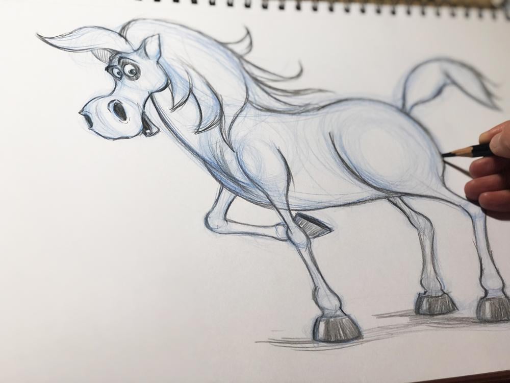
2. Materials: Hi there and welcome to this course of how to draw farm cartoony animals. Now, before we start, I'm going to talk a little bit about what material are we going to use. For those of you who are familiar with my other courses, drawing cartoony characters and drawing cartoony humans. You already know that we have a very limited amount of materials that we are using paths. Many have asked me exactly what kind of pencils I have used. So what we're going to use here is just a blue pencil and a black pencil. And I'm using different brands. There are a lot of different brands of it. So this one is that went for artists and this one, as I don't want to run its Rembrandt pencil. When I go to pick up pencils, I don't necessarily look at the brand. But what I do look at is how they draw what kind of lines that you love. Let's, let me show you this. If you see, if I have a loose hand like that and they see what kind of line this pencil make. You see that it has a very thick line. And I don't have to push too much with my hand to make a good line. And if I push too much, it makes a clear blue line. And let's check this one. This one is even a little brighter and even a little easier to make a line web. And it goes really solved the nicely. So both of these pencils are okay. And then I'm choosing a black pencil. And what I want the black pencil to do is basically to make a thick line above this blue line. If you see that this one is very visible. And this one is also there, went and I have another one here or Hs all saw it. This one is a Faber Castile. And look at what kind of line this maze. It's a little thicker, but it's very similar. And it has, it makes a dark line. And if you see, for example, another kind of pencil, which is more of a drawing pencil and it's three b, which means it's not very soft. It makes a slightly more grayish line. And here I have another one that is a to B. And this one is a little thicker. But the drawing pencils that have this kind of mark here, they, it means that they are more for drawing and they're a little more. Glossy. So and the other pencils, they're based on crayon, on creosote, Altair, little bit more dry, and these ones are a little bit more oily. So if you have an oily pencils above the DRI line, it may be more glossy, so just for a feeling of it, just for your own e-mail. Nice cozy feeling with a drawing. I suggest that if you have a crayon pencil or a more dry pencil, you have a black dry pencil as well, a rather thick like that. So you have more of these blackness and you have a similarity in the line. Well, this is, this can get a little bit too technical. So I'm going to leave up, I'm going to leave you with that. But any pencil will do really. You can take pencils from your children's door. And if your kid's mom, for my youngest students here, I welcome you. If you have crayons, if you have pencils, that will do, you have just given, you only need one blue pencil and one black pencil, whatever you have. So another thing is that how to sharpen the pencils. I used to sharpen them with a knife. And you have a pencil sharpener and you used to, that's fine. But if you want to be more picky, so it can sharpen it like dots at an angle. If you're younger, just make your parents sharpen it for you. And you don't want to have too much sharp, sharp because you don't want to have our very pointy edge, especially not support the blue one. More about what the black one, because black one we're going to use for the details. And the blue one we are going to use to create the base form. So you want to have at loose, you don't want to have too much precise and I'm going to show you exactly what I mean with that. So approximately like that. And you can have different thickness here. You can use the sharp spots here, or you can use the soft spot of the pencil here. I'm going to show up about that later. And eraser, we're going to throw it out. We are not going to use an eraser. Because it is important here that you lose your fear of drawing. So you will not going to be making any mistakes because you can't make mistake. And this is what this thing is all about because everyone can draw, you can draw and you don't make mistakes. It's impossible. And I'll show you how. So. Now, let's get on with the lecture.
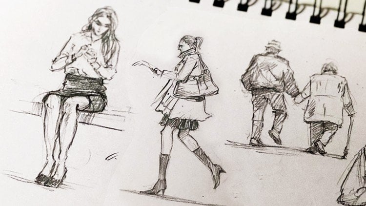
3. Warmup: Hi there. Are you ready to get serious? Or I should better say, Are you ready to have fun? Forget about the seriousness here. Forget about what you've known that you can't draw, you've never drawn, you know, I'm not an artist. All these silly thoughts like that will not help you here. And I'm going to show you that exactly you can draw in a matter of your experience and no matter what you think about yourself. So we are going to start by having thumb and just getting used to have a loose handling that. So you hold your hand a really loose, just shaken it a little bit like that. And what we want, what we want to do here is try to draw perfect circles. Now how is that possible with the loose hand? You just scribble. So you start moving your hand as it loads you, you move it from your shoulder down. So you dance, move it like that. But you instead just move the whole arm and just scribble, scribble, scribble, scribble. This may look completely pointless, but you see as you continue scribbling, there is a thick line forming a perfect circle. And when you see it, just make another one. Very little science. You don't have to try to make anything does move. You move your hand and inCircle movements and you'll see, how are you. You hand makes a circle either without even you trying yet. And the circle is not in just one line, but you see it's forming after many lines. And this is an important exercise to start with because it will loosen your hand and it will lose on your mind to be able until freely experiments and where the characters that you draw and like that. And what I'm meaning when I say that you form a perfect circle and how we're going to use the black pencil. Well, basically you see that when you have a circle, it's very easy to see where it is. So you can just follow the feeling you jab of where the circle is probably in the middle of this blow thick line that it's formed and just form a perfect circle. And here you go. Without you even trying, without ever, you've ever drawn before. You can see that even my my thick black line is not just a power of a client like that. You don't have to do it. You can. The point here is to form a perfect circle to get your brain, your mind, and your hand to follow and form this circle. So another thing we're going to do, just do an ellipse. So not a circle, but just up and down, up and down. I'm going to show you what we're going to use those forms for later on. Up and down. A loosey-goosey I'm not moving my hand at all. I'm just holding a band and moving my arm from the elbow down or from the shoulder down. And just quickly like that. Scribble, scribble even uses screens to do that if you're too picky, if your frame, just make it really, really fast, go ahead and make it really, really fast because then you don't have time to think, you don't have time to be scared. That set. Now, we've warmed up a little bit and now let me show you how we are going to use this exercise to design cartoony characters.
4. Drawing a cartoony Chicken - Part 1: Hello there and welcome back. So in this lecture, we are going to learn how to draw cartoony chicken, one of the farm animals, you know. So you know the procedure. And I'm going to guide you through one of the ways to draw chicken. You can then come up with more designs yourself. But let's start. So I'm going to draw the chickens have, again very loose arm. So drawing the chicken fat are rather big. And what I'm looking for here is the main characteristics of the chicken, its body and the tail and the beak. But also, I'm also looking for a character because personality is even more important than character. Personality of the character is what makes it look cute, What makes it look attorney? And the exaggeration of this character. Exaggeration means that you enhance the features that the animal or the person already has. So we're going to exaggerate the chicken and I'm going to make a really, really large body. So the chicken has this big fluffy body. And what makes something good to needs-based being simply the simplification of its shapes. So I'm not going to go into so many details of the chicken, just simple, simple shapes. So this is the body. And now let's connect the body or with the head with one rather curvy line. So it's going to be here and you see, I don't draw the line, like trying to be super, super neat. Know, you just keep your hand blues in here in this place. It's going to be where the chicken connects. The chicken's neck connects over the body. So I'm just going to market with another sphere. And now again, let signify now the middle of the chickens had, and again, I'm going to draw it in three-quarters. Three-quarters, it means that it's not the complete profiles are the peak is not going to be here by the chicken is not either looking straight ahead. So this is basically a kind of a middle solution that is very popular of drawing characters on. And porch was basically to start with, is three quarters where the line of the phase is over here. So let's draw where the big is going to be. Approximately over here, almost in the middle of the screen. So it's almost a straight line. It doesn't matter where you put it. You can actually have a big given lower down. It's up to you. I'm just giving you one example. So now let's draw the chickens eyes less have this big, big is funny, funny eyes. So one eye here, another one here. And because the I have to be on the sphere for this design, this one will be slightly more squashed, so to say, because there is a perspective change. Because the sphere terms this way, like doubt saw the eyes. The eye will be more squashed and this one will be wider or be more open like that. And now let's make very small pupils for the chicken. What I'm looking for here is to have the chaconne looking a little bit more scared or a little bit more stressed out, you know, that chickens are just running around and they're easily scared. So I want to pull this characteristic, our folder chicken here. And now let's have the beak being exactly in front of the eyes belong. So I'm just going to do another just an ellipse here for the beak. And I'm going to let the face be this long face. And, and here are these two things hanging down from the chicken again, I'm signifying them with a long, long ellipse again, loose hand. And let's do this top of the chicken. Of the chickens had with three kind of hair like ellipsis. You'll see that I haven't drawn a line that is really very stiff or anything. Everything is really loose. And the way to learn to draw is basically to keep, to keep your drawing really lose until you find the shape and even after you find the shape. Why I'm saying that you can't make a mistake because you can always redraw it. You can always start a new. And the basic of the good drawing, as the more you draw, the better you become. And now let's find the middle of the chickens body over here. So it's the same way to read Quarters. And on both sides of this chicken is going to be the chickens legs. Let's signify them again with two ellipses, more squashed spheres like that. And let's decide. How long will this chicken legs B. And why? One, I want to make something big and something small. I need to give the proportions in relation to the head. The body looks big. And now how I want to signify that the chicken has this large body is either to give a short legs or I want to give a really, really tiny small legs, but long legs. And so I'm going to make the length being a little bit turned this way. Because I want to have this chicken to look a little bit silly, a little bit funny. And you see that I have undecided why the legs are. So I can draw a line like here, like here, and I can see that which one suits at best, I don't have to decide. Well, I'm just going to draw it here and then I'm gonna say, while I made a mistake in our whatever, I'm going to, I'm never going to be an artist. I'm worthless. It's pointless. Why would you say this to yourself? You should quit saying this to yourself. I'm just going to try I'm going to try where the leg look best. And these are just preliminary lines. These lines are going to be overridden by the black pencil lines afterwards. So I'm going to say approximately here. And the length of that chicken is going to be like approximately here. And how I'm going to draw the legs. I'm going to decide this later. I don't have to do that now. And let's have the, the wings of the chicken on both sides, again, a sphere and now the other wing, as you see, this is the middle side of the body, is going to be on the other side. So if I draw another wing here, this is going to, I'm not going to see the wind at all. I'm just going to see a little while doing. So. You see, I'm drawing it on this wing here, which is going to be a little bit more squashed. But I'm not going to draw it later on because when we are not going to see it, if that chicken Missouri. And thus what we are trying to do, we're trying to make a chicken as if it's real. And let's have this kind of feathers here for the tail. Just roughly draw roughly. Yes, this is the secret of good drawing, is to draw messy, not to draw, to tidy. Now we have kind of a chicken here. And now let's define it with a black pencil. And now we have so much freedom to use our creativity on top of what we see, on top of what we already designed for ourselves and specify this chicken. So again, I'm going to start from the eyes and see what kind of character I can get. From this chicken and from the beak, because I want to know how the beak is going to be sometimes in the beginning, because there is a perspective here, the beak can be challenging. But you can never, ever make a mistake. So you know that whatever you peek look like, it's fun and this is a specific one character. And when you design this character, you will get so much ideas of who this character is. If you want to put it in a book or if you want to put it in a movie and animated movie, you will just come up with a lot of ideas who this character is. And when you come up with these ideas, who this character is, that will also change the way you draw this character. It will change certain shapes and designs about this character. Next time you draw it, you say, well IL-1, this chicken to have 12. So you just add a tooth for a chicken. It's kinda, it's kinda maybe a chicken that talks like that for FIFA with, you know, a little funny, funny talk. So a tooth will add to the feeling that this chicken has no teeth. And of course chickens don't have to give. But it's a cartoon. So you can do, you can use your imagination. You can do anything you want. And I want this chicken to have some kind of a puffy eyes. Puffy eyes. That is, you can see puffy eyes for example, people who haven't had enough sleep, it means they're stressed out. And if you put that in a cute little chicken, I mean, cuteness and stress doesn't go well along. That makes the Chicken Look even funnier. It gives it different kind of personality. It makes it funny. It may fit. It makes it appealing. You wonder, what is chicken is? Let's make this hair like that. And you see that already. What I do is basically define what's already there. What I've already drawn with a ramp lines and this red hanging years or I don't know what you call that on a chicken. And the chickens face like that. And now let's draw the neck. And you can decide now which lines you want to draw you, which lines you want to live out or to connect. The character will suggest to you how you want to continue it. And now I don't need to draw the whole circle behind that because while we don't see through the neck, this is just a helpline. And this kind of spheres are also defined. What a perspective is where the, where the neck is altogether. Maybe I can, I want to define even this line here from this sphere to define more that this chicken has a Mac. It's basically up to me to decide what I want to do from here. And let's define the body around body. And now we see this leg in front. So we want to signify this leg here, just a house VR and this one is behind. So I don't need to draw even this part of the leg. I'm just going to draw this one. And let's draw the wing here. Later on. I'm going to give this Chaconne, even some graphic elements and patterns to enhance the look of the chicken, like feathers and so on. But right now I'm just going to define the shapes. So and let's also define these feathers. And now we have an element here that is repeating because we have this kind of shapes here and we can repeat that over here. So we have, in a way, a unity of this character, of the, the elements of the character. This is something that if you want to be a character design now, it's also important to, to basically repeats different elements and not have too many different elements. That will also be important. And now I'm going to draw the leg here. And basically just tried to have this thick line. Because now I decide that I like that. I liked it to have this thick line even though I didn't plan this in the beginning. But now it feels like he just sits this chicken. And now here I'm going to give a 33 chicken nails or tacos. I don't know why you call this for a chicken. And the chicken has also a back part of the nails. So I'm just going to define those. And they are they have a perspective change on the ground. So they are basically overlapping one another. So you don't see all the males. You'll see one here and one behind that. This is something that you can, you're going to get used to the more you draw. I mean, how to place these things. I can go from very advanced perspective lecture. But that's, is going to boil out and because it's too technical. But thing is that the more you draw, the better you will become a new fetus. Things. So, so this is, or a chicken. So now what we can do is also add some feathers on here, on the wing. Like a doubt. And we can add some elements from the chickens. Feathers. It doesn't have to feel all the chickens with shapes like that to signify that their feathers, usually in Graphic Design, in graphic work. It's now just to do a couple. Those to give a feeling that the chicken has this kind of pattern. They had a, has a feather of this sort and also on its back. Now, why is important to do it on his back to, and not just on the neck. Because the feathers on the chickens body are slightly, has a slightly different directions than that. For example, the feathers of the neck. They follow the, the length of the body. And even here you see they're all pointing down. So they are not really the same way. Like they are on the neck that you can't draw them in one direction. That will look mostly like a pattern from maybe a decorative part pattern. But here you want to create, in a way, an illusion. Does this chicken has real fathers. And you can do or something like that. You can find a different way to do the patterns. And this, you can color, maybe we can shade it in a different colors and you can shade this one to, you can even leave a little bit of white as if to signifying that the texture of this chicken is little bit more glossy. It has a different texture to it, a different material of the skin of this part of the chicken. These are just elements that adds, adds to your character. It is not something that has to be there. You can find a different way of doing it. Here. You have a smaller patterns on the legs. Because again, you want to define that the feathers on the chickens legs are slightly smaller than the feathers on its body. And on, in this, this wing here you can just color red because this wing is on the backside, so you don't need as much details as significant for this this kind of drawing. If the drawing is in a different angle, maybe you will need to also give some kind of a texture. But this is more of a taste. Now we have, I'm a chicken character, cartoony character, which is funny, which is why it looks stressed out a little bit the way we wanted it to be. And now the next thing I'm going to do is I'm going to show you how to move this chicken around, how to give life to it. And I'm going to do it in the next lecture.
5. Drawing a cartoony Chicken - Part 2, Draw poses: Hi, I'm here. I'm going to show you how you can have this chicken in motion and how you can draw the chicken in different poses. So I'm going to come from the same design, but I'm just going to move it around and show you how you can do that. So the first you want to know what kind of poses you want to do. So I'm going to do a roughly triples is here and I'm going to do to use kind of a guidelines what I wanted to come to do. So here, I will now have the chicken peaking on some somebody on the ground. So I'm going to have to come like dots and signify very, very roughly. While I follow the same proportions. This is the main thing is that when you want to move a character is to stay in the ink character. It means that you want to draw the same character, not some other character, as well as you keep the proportions. And another thing is that you want to follow the perspective, perspective changes of this character. So I'm going to roughly draw what everything should be. And I'm not going to have everything defines because I'm still trying to find out while the chicken wants to do. I'm going to even spread the wings a little bit on both sides. And how do I find where the wings are? I approximately know, splits the body into. And I tried to imagine this line where the wings are, from the point of the middle of the body to where the wing is. And to have that on the other side, which is going to be on the backside of the chicken. And you might not want know this precisely in the beginning. That doesn't matter because the most important is, is to eyeball it. You don't have to be precise. So now this is one pulse. One pulse is the chicken will span in one leg. So I'm just going to start with the body. And the chicken will scream. I'm going to have the head a little bit up. And really roughly signified that they had chicken is looking up. And I'm going to draw one leg on the ground and another leg a little bit twisted in the air and in the chicken in distress. Again, as we draw the character, we already decided that the chicken is a little bit stressed out. So the bosses I will use for this chicken, there are more applicant to this character. And another polls always going to be this chicken. Perhaps. Laughing. Let's say it's laughing. So one wing will be spread. The body, the neck will be a little bit tilted down. The body will be to the down and the other wing, well basically hold hit stomach the way we love it. And the chicken will be, the head will be leaned forward and the legs or be a little bit as if your tree, you're going to pee on yourself in that soma, so funny that you kind of life feel like being on yourself. So the legs will be in this way. So these are the three poses. And you already see that already from these three poles, we have some kind of character, even though you don't see what the chicken is him here. So let's define the poses a little bit more with a blue pencil. So this is the head. And what I'm seeing here, I'm going to even talk about the mistakes I see here. One out along with the drawing as dance a while. I don't know whether this wing is big enough. That's why it's important to sketch first, to know where it or everything is. There is no artists in the world, or maybe there are some, but they're very rare. What they draw everything from the get-go and they know exactly what everything is. Most of the artists, especially character artists, they draw a couple of drawings until they know where everything is. So approximately like that. And this one I'm going to have again the three-quarters look. But this time I'm going to have the beak, like screaming. So and I'm just going to signify that with just a few wines and signify where the eyes are like that and where the chickens top S. And I'm going to even make the the neck a little bit more straight up and a little bit more bent this way as if it's trying too hard to scream. And the leg we see over here. So I'm just going to draw the nails like that, very, very sketchy. And here, here is going to be the middle of the body. Again, you see this circle and the middle of the body here. How do I find it? Is basically also in three-quarters. This is the common ground and fighting. I'm posing characters in three quarters. So the body is going to be, the middle, is going to be around here. And also, I'm using a guideline here for this sphere of the neck and the chickens middle of the body is going to be approximately the middle of this sphere, considering also the perspective changes. And this leg is going to peel like that in the air and it doesn't matter if it's short, it's going to be our hysterical kind of chicken. And now I'm going to even spread its wings a little bit. And I'm going to use the same method as here. To, with ellipses like dots, to have the chicken. The chicken wings spread as if it's in, in distress, as if their fingers like that. And the rest of the chicken, I'm going to keep the chicken wing. I'm going to keep a forum. And I'm going to have a heap, have its tail a little bit visible like dot here, like in this array. And the eyes are going to be looking up and a little bit more. Cross died. Now that makes it took a really hysterical here. I'm also going to bring the tongue of the chicken like that. And I'm going to have this chicken also might be the beak over here. And the chickens top a little bit on the ground as if it's nodding on the ground. And the eyes are going to be in perspective like dot here or here. I forgot the chickens lower parts like dots. And I'm going to keep it a little bit twisted here, like belts. And this one. Now, now we said that this chicken is going to be laughing. So how do you do the laughter? I mean, you have to point on the beak, so a place where the beak is, and because we decided three-quarters of the head and the chicken is looking down. So the beak will be pointing down a little bit. And here are going to be the line that where the eyes are placed. And let's draw the eyes. The eyes are going to be closed here and the big is going to be large. But at the lower part and have to design a smile here. This can be challenging, but open mouth and a larger beak as the mouth. Like dad and the squinted eyes, they're going to be squinted upwards like that. And let's signified that one of the beak is the low bar of the big by shading in a little bit darker. And this time the top of the chicken fat will be tilted this way. Because everything is going down. This chicken is cracking up, laughing. And the head again, keeping everything loose because things can change until, until I go into defining it with the black pencil. And let's do the feathers here again is if it's fingers. So that chicken is keeping its stomach. And here we have one ellipse, two lips. It doesn't matter if you give it three or four fingers. And I mean, because there's like feathers. Doing kind of a gesture that only humans do. So you want to kind of signified with, in a way that humans do it but with feathers. So even if you do four or five feathers, it doesn't matter. The most important is to have their overall pose looking like if it's the way humans do it any. Now, if you need to see like a loving pulse, one thing you can do is photograph yourself or are you just standing the spouse? And here are three pulses. Now, let's grab the black pencil and let's define those poses. See what we've got. Any note that while we have two, c is approximately the size of the neck, in proportions of the size of the body and the size of the head. And also the size of the legs, like everything, is in proportional to something else. And now you don't have to be super, super tight and Greg, because there is a perspective change as well. So if you exaggerate something, they might vari, but you have to be approximately correct. So does this is what you have to be careful about. So now we are drawing the backside of the, of the chicken here poking something on the ground. And we'll see the eye a little bit in perspective here. And we'll see those. The upper part of the chicken's top like on the ground as if It's kind of laying flat. If you don't want on to that. It can be like steel in a nice haircut, but I've decided I want to do that. And and now I see that the bottom part of the chicken, they're a little bit wrongly placed one I sketched, so I adjust that with a black pencil because they need to be closer to the beak. And, and here I draw the body. And I can see that from the body, I see that while this leg is going to be approximately here because it's not here. Here is the Dell though, from part of the chicken. So it's approximately here. And what will I see from that part? Maybe just a little bit to something like that. And from this part I'm not gonna see anything. I'm just going to see the leg. So I adjust that with the black pencil and I draw the nails. And now they can just be it likes to strip those because I can't get the same thickness as this balls because the chicken here is much smaller in size. And I need to watch for the proportions of the legs according to the other parts of the body. And now I can have. Here down the wings close together. I don't need to have any finger-like stuff. Shapes coming out because the chicken has gathered its legs, its wings in one house. So I just want to mark them where they are. And tail, like dots. And now I don't have to have the same amount of graphic elements. I can just add sound because you see this pose is much, much farther away from us and much smaller than these chickens. Chickens are really giant on the paper. And even according to the distance. So let's make some food on the ground that chicken is after. So we have these kind of poles and illustration complete. And now let's have discriminant. You come ready. We have one beaker here, the lower bottom of the beak. We can have some part of the beak a little darker at the edges so you can see it's up on Vk. And then we have the eyes and the other one here, the chicken is completely hysterical. You have del bags under my eyes. Enhancing the history of the chaconne, hysterical and the lower part. And now, when you have a pose of something, you can use all the elements and all the body parts of the character, enhancing that both. Now this Bose is hysterical, so I'm going to try to enhance it any way I can. I'm going to spread the elements that top of the chicken. I'm going to have those parts, separators and in disarray. So when something is in this array or straighten up, you can see, you can add more intensity to the post to it. And now let's draw the feathers or finger-like Bathers as if it's spreading the headline. Again, you add a human-like emotions to the character to, to have them. Appeal to us in the same motion. We do not understand how the chicken feels really. All we know is how humans feel. So cartoony characters with emotions are imitating the human, human emotions and human the way of behavior. So in that way is funny and really easy to draw cartoony characters. Because if you have to draw emotions of a chicken, well, that will be challenging because who knows how she can get stressed out or maybe some null. But the more human-like emotions we add, the more global appeal to your audience that this chicken is hysterical. And then you draw feed like that. And now you add some elements just to add more character to it. Here. You don't have to repeat it as much here. And this is I just directly go and kind of take gum. It looks like it's going to mean to this one is teaching even though it's the same character. So you see how keeping the proportions right, keeping the character right, even though in movement, you kind of try to sketch on here, I forgot the tail of course. Also a little bit in this array to show that that Japan has completely wild. Yeah, so the way you keep the proportions, he known the body according to the head, according to the feeds. And you kind of try to eyeball it. When you learn how to eyeball, things will get much easier. But this is the hardest part in the beginning to eyeball stuff because your eye is not used to seeing the proportion measuring that way. In the same way that your, you decide if you're driving a car. For example, the same way that you estimate how long the distances between your car in the next one and you make a decision whether to speed up or whether it's your weight. The same way that when your parking on the parking lot, you estimate how big your car is and whether you can squeeze in between two cars. This is the same way basically. And if you don't drive a car the same, I would estimated the way you practice it is basically on and if you can bike or the same way, you decide how to cross the streets and you decide how far a car is if it's safe to cross the street. You're not waiting for all the cars to pass and you're not waiting for non precise estimate to measure the distance between the car and yourself to decide how to pass. Is the same way with measuring in eyeballing the proportions. When you design a character. This comes with practice. And we basically observing, observing these or the other character. So the more you practice that, the better you will become. Thus why I suggest you do not measure, um, with with a pencil or any kind of measure Me too. I would suggest you eyeball them and gets used to do that. Draw this exercise a couple of times. Now I forgot to do the tail here. And you will see that each time you draw it, it, you'll get better. And the proportional small much, much more than the first time. So practice, practice. Every day. I used to. I have a notebook and I use this notebook to sketch whenever, wherever. When I see it at a coffee shop or water or watch TV. Now, if you buy my lecturer. In these times during the one on the worst pandemics we've been through. While you're not so Martin, on airports, Obviously. I mean, I love to travel a lot and I use my free time to, to draw characters and to draw people. But now the, the free time, especially when I sit in front of the TV, I do something when I don't have to think a lot. I just draw these characters over and over and over. Not exactly this one, but whatever character I have in mind, or a woman I know if I draw, if I prepare a movie, animated movie. And that's what I, that's what I do to just train your brain to get used to disproportions. Because even I was drawn many years and can get out of shape in drawing if you haven't drawn to him too long. So if you've pursued this, this course, you have this orange does his desire to draw and to become good at it. So I would suggest that you use it as much as possible to do these exercises C10 free time, because their desire to drum will just get you ahead much more than if you try to force it, to push them. To say, I'll have to do this or have to build. No, you don't have to do anything. You do it because you want to do it. You do it because you like to do it. And because you, you, you improve. Otherwise, you don't have to do anything. You don't have to, you don't have to be that. But it's so much enjoyable and so much fun, so you will never regret it. So this is how you draw the three poses of the chicken. And this is how you do it when using the blue plant cell and refer doubts and using spheres, using lines really, really loose. And then you go and define now all the things with the black pencil. I hoped you enjoyed this lecture and I'll see you in the next chapter. Bye.
6. Drawing a cartoony Dog - Part 1: Hi there and welcome back. Now let's start with the most fun part where we actually are going to design a cartoony characters. And because these lectures about farm animals, we are only going to do farm animals. And let's start from favorite the dog or maybe it's 95 rate. Well, for many people, it is. Well, so how do we use this technique that I showed you to design? Especially dogs? So we got the blue pencil and you see that? So far. I haven't sharpened it. And just start by doing a circle. Dance like doubt lasagna, arm, loosen your hand. And let's start by drawing the head. And just make a circle, my circle. Don't be afraid. Your thing house dots. How will that be a dog? Well, this is the head of the dog. Now let's design the body. And because the cartoony characters, when you have something being cartoony, it looks more like a kid in on because we see like kids look cartoony. They look cute. Anything that looks like a kid looks cute to us, or a puppy or a little kitten. We tend to think to like them very much. And even the cartoony characters, because they need to be likable, we will stylize them. So they look like small children. And what is the characteristic of kids or purpose? They have larger heads than their bodies. Which means that if we have a dog that have a small body and a large head, it will look more cartoony. So let's make another circle here for a body. And now, if this is the body, now we have to find the line, the middle line, where the phase separates into, which means that from this line, it's the face is symmetrical for the eyes, for the nostrils and so on. And if we're designed this to be in the middle, a straight line, which means that we are looking at the face straight ahead. The more goals to words, the ending of or sphere or a circle, the more around the gate it gets. So if this is a straight line and the dog will look at straight adults, the more rounded this, the more Father it goes to the ending even goes with this, and this will be the ultimate turning. From here, we're just going to see one eye. But every time the dog moves its head. There is a perspective change to it. So to find the middle of the head, we need to apply this kind of a perspective change, which means that if we imagine splitting his head into or disappearing into, because splitting the head of a vowel that sounds really Crow. We don't wanna do that. But it, it means that the middle line will be approximately here. It will not be a straight line as this one. It will not be a completely curvy line. So the dog is in profile. But we can find that around here. And this is up to you how you want to choose that if you want to have a straight had, just use this line. You can use this line, you can use this line. Doesn't matter. It depends on how you want to pose your dog. How where do you want the dog to look? And now I'm going to show you as well that you can do any kind of approach and you still will get a cartoony character. There is not only one way of doing that. So we assume that this is the middle line of the head of the dog from wire we have our perspective. There is another middle line on also for where the nose is going to be and where the ice is going to be. So this middle line will describe where the nose is going to be. So we have this similar thing here with an ellipse. It not a full circle because if it's, if the dog is in the middle, the line will be completely straight like that, but we will have the head a little bit tilted down or perspective be a little bit lower. And now what we wanna do is apply the two eyes on each side of the sphere. And those eyes are well going to have a slight perspective change. Which means that this eye here on the other side will be a little bit smaller than this side. That's why everything that is in perspective this way, you just rings a little bit. This is a detail that you can get used to later on, right now, all you wanna do is design a cute little dog. And you, again, you make a circle or sphere. And here you make another sphere for the eye. And this eye you see is a little bit smaller. Because it's smaller, it applies the perspective. That's why it looks real. So you understand what I mean can be a little tricky in the beginning. The farther away goals in this way, the smaller the ice gets. Justice slightly, not too much because of perspective is not so big between two eyes. It's a very small change. And now let's design the nose of the dog lens, having a round nose. And ask my Canada's sphere, like dot in the middle of the face. And we said that the mouse is going to be around here. So let's make another sphere here. And now, because this mouth is, it's sticking out a little bit, is not exactly on his face. Here is going to be the middle of the dog's face. And so will we split this mouth area of the dog into as you know, that dog have and will make him a smiling dog. And the lower part of the sphere here, we'll just make as his mouth like counts. So now you'll start seeing a little cute characters here. And now let's make the eyes, the venues that, or when you see poppy. So maybe kids, their eyes are so big in proportion to their heads, up to their nose and their mouth. And sometimes they look cross-eyed, but they're not crossed. Ict is gels that they look like doubt and that feeling dot crossed I think makes them look cute. So let's just put the eyes of this dog in the middle, very closer to the nouns. Like dots, more circles. And let's have another for the pupil. And you see that it does not look, Ross died even though does how we draw it redrew him. But it looks really, really cute. Let's pull up when blue, just to make the iris. So now we continue with the ears. And the ears are approximately over here on both sides of the dog. And one of the year is not going to be visible because the distance between the middle line and this year, and the distance between the middle line in or if it's over here, it's not really correct. So it's going to be on the other side of the sphere, approximately here. If we imagine that we can see behind this line behind this sphere. So let's now do another sphere or nodal sphere about ellipse and another one here or with different direction. And let's have the IRS be a little bit floppy. So on top of this sphere or an ellipse, just draw another one like that. And this one like DOD, you don't have to worry if it's before or on top or behind this year. And this is just a sketch of where everything is going to be placed. And later on, we're going to use the black pencil to define where they are. And now let's do the same thing for the body. Let's find the middle line of the body where from which the body will be symmetrical. And if we say it's around here. Now let's draw another elliptical form for one Paul. And the next one here is going to be a little bit behind this one. So they will overlap a little bit like that. And the puppy has big pulse. And this one, let's have another long or ellipse here for the leg and another one here. Now, let's have the puppy being sitted down. So when the puppy sits down and it has one, the leg becomes like a small sphere, like a ball basically. So let's make that over here. And Amanda, Paul, very small one because we can see just a part of the pore of the dog beneath this other sphere. And here is going to be approximately that tail. And we can just make it with a very rough line. So here is our first dog. And now let's grab the black pencil and just define the features or refine them. We pretty much have the dog here. So from now on, we have the guidelines where the head is, where the ears as everything else. And we have a we have the dog looking cute already. So our job becomes really easy from, from this point on. So you just define the spheres as we did in the exercise. And the Now's here. And let's make him black already. And the nose is a little pointy hearing know when meat starts, when it splits the nulls part into like that. And it doesn't matter now from whale start, you can define the eyes or the nose. But when you start from the eyes, what you get is you get character immediately. You get, you get to see a dog looking because ice, even in animals, is the window to the soul. So as soon as you have the i's defined, you don't becomes alive and from now on you can see the dog's character needs like completing him. It's very easy and very enjoyable. Because the most important part when you draw is to have fun. Because if it feels like a task to you, if it feels like you have to do it, or if you have some demand that while to be an artist, you have to do this and DAT. And it's tough. Well, it's not going to keep your soul long drawing. You're going to give up. And the thing is that an artist. Is ever becoming, it never ends. The artistic approach or your artistic journey is never complete and thus the fun of it, because you can always improve, you can always draw in a different way, in a new way. And that will keep you interested in going and going. So now we just define the nose. And if you want, if you don't want to complete this sphere over here, you just don't, because you now you see where the dog is. So let's just define the head like a doubt. And the sphere, as we said, you can see where the sphere is. And you see that the blue lines don't disturb you that much anymore. And now we don't have to draw all the way like this line because we see that the floppy ears go underneath and this part of the year is on top of this part. So we're going to define it as a real year. And we're going to use these blue lines just to guide us of what to draw and where to draw it. And you see how easy it is. When you have the basic line, we just shapes. And now we have this inside the ear if we want with just simple shapes. How you can have this character coming to life. And now, because this year it's tilted on the other way. It's the other way around. This part is beneath this other part because this year is facing the other way. It's flopping the other way. And we don't see the inside of the ear here. So let's just continue defining the head. And you see that I stop and pick up different parts of the dog to draw them to define it. Because it doesn't really matter where you start from. And what do you what do you do first and what you do second, your dog is pretty much defined and dam. And now let's do this two blobs or two ellipses for the legs. And let's define even the pulse. And now we don't have to have to use now a completely round spheres here. We can have the dog just this part of the pore on the ground. So I'll say a little bit flat. And now let's define the other one. And let's do some tools here on the poll, maybe just two lines to separate the small tours of the dog. And now you see that it has like really nice fluffy legs. And this part of the sphere of the body that we saw on the Drew seconds after the head. We can just have this part here sticking out because in front of it here, It's the leg. And now let's define the back of the dog. And this part, what a dog is seated like that. And let's do the other pole. Here. Again. The law part of the pore can be flat on the ground and it's much smaller ones before because we see it a little bit farther away and because part of it, it's SHE them from the dog sitting down. And now we have a cute cartoony dog, like DAT. And now our dog is ready. Now on top of that, what you can do is, for example, add eyebrows. The more human-like features you add to the dog. Dogs, cuter. It's going to be because we see or sell something we humanize the animals. So we see them really skewed babies and we apply human characters to them. So the more human features you give them, the cuter there will be, and the more appealing, they will become two people who are going to look at your drawing. So what you can do is maybe even gills some kind of a hair, just a little bit of chunk of hair. Here. For example. The S, darker and darker. If you want to, if you don't want to, just undo that. But you see belt, it already has more of a human features. And if you want to give them details here on knows where the whiskers are of the dog. And here we have our first cute little dog here, starting from spheres.
7. Drawing a cartoony Dog - Part 2: Hi there. Now let's do another dog. Another kind of character here, using different kind of approach. That was, I wanted to show you that there is not only one way of drawing a dog. So let's do a dog that has a longer a longer body tax tax year. I don't remember how this is called. So we'll start with the head and we'll start, we'll have the nose here being a little bit longer. So let's just use the other shape that we drew, an ellipse here. And let's decide that the middle of this dog's face is going to be over here. And then the middle of the nose, we'll start where this shape meet the middle part, this line here. So from this one, you just gonna draw the line along with this. Nows, that's going to be the nose of the dog. And here we can do a longer part of this dog. So notice fear. But a line like that. And now it looks a little bit like a duck actually, but it's going to look like a dog. And now let's place the ears. They have a little very floppy ears. So I'll sphere here. And another floppy of this one is not going to see it. And it has a very small length. So let's just draw small balls for the length. And this dog is going to be standing. And because it's a cartoony dog, we can allow ourselves to tweak the real anatomy of the dog. Doesn't have to be precisely correct. You can stylize it because none of these dogs look like exactly a real dog, is a stylization of a dog and thus was cartoon characters. Are there stylized forms of something that we've seen in nature? And these Dong there have also just kind of tails. So when we have this basis, now, we can draw a short lines here for the legs to know why the legs are. And now we can define the dogs features. We can have some around the eyes here, both sides. Much smaller eyes as you see that the head of this dog is much smaller than these dogs because it's completely different character. And we have the eyes looking at us, for example. And let's make the nose of the dog now is going to have a big nose. So let's draw this north being so big. Why not? You can draw the way you wanted. You can draw a small nose as well. That's going to be a different character. But that's because there are so many different ways of drawing cartoony way. In a cartoony way is freedom, is freedom above all. And here, below that is below the nulls, is the mouth of the dog. And here we'll have a sphere for the neck. And we have kind of aura dog already there. So now let's refine that because now if you have the ground, you can see what you can tweak, what you can keep, what you can change. So let's go with a black pencil and define these features. Will start from the head. And this floppy ears, again, this part of the year is in front of the one behind. So let's keep him big floppy ears and the eyes. Now I have my pencil being too little. The thing is that you need to draw a bigger character so you can have more scope to make the details. That's a good rule of thumb. Goes, if this one was bigger, it will be easier for my pencil to make even smaller details. But this is pretty good too. Because I can see, I can see where the eyes are. And now let's make the other floppy year and it's going to fall behind the dog. And now let's have the noun house with this beak, big nose, like that, and it ends up below. Below the dog belongs this sphere or our n watch we can see, and here we can even leave a little blank thing for the glands of the dog. And the thing is, when we are ready with the design, what we can do is draw it on another piece of paper, clean it up, make it nicer, and basically color it. Or do it with a two, with a pencil. Now we'll have a smiling little dog. Let's defined the neck. And let's define these large body. It's like this small dogs. They are like tubes, a little waves, tubes with legs, right? You see these dogs and they're really, really funny. And now we're going to draw the front form gels define it. And one of these lines will be the leg. And we can have small, small toes of the dog. Let's also have his dummy here. Same thing here. Charles define the legs like that. And here is a little meatloaf, basically a funny, fluffy meet love of a dog. And simplifying the forms is very important and enjoyable. When you do cartoony characters, you don't have to have muscle or muscle here. You don't have to have the dog being anatomically correct, but are rather simplified. Thus, dot-dot-dot will give you a more fun kind of character. And so this is another kind of dog using the same principle to draw and dogs. So here you can add a shadow underneath. And even here. So when you add this shadow, it looks like a really like your dog is standing. Just a little bit. So now these are two different approaches. I'm going to show you another one here in the next lecture.
8. Drawing a cartoony Dog - Part 3: Hello there and welcome back. Now let's give you another example. Our dog. And this dog will be even more a human read. It will look more like a person, one like a baby, and it will be seated like a baby. Now, let's start with the head. Again. Lose spheres, very low dose and it will be sitted down a little bit like a baby does. So just make the body behind it. And how the baby sits like is like with spread legs like that. And their, their arms on the floor. So let's make that lens have this puppy sitting like a baby basically. So with the pose on the floor, like a doubt and the pulse behind as their own the floor. So we're just making these spheres, kind of like spheres. So ellipsis where the other legs are and with another sphere or ellipse, we kind of draw where the leg is going to be all going to be connected to the poll. And now we have kind of our posts here already. Now, let's make the dog with a tilted head a little bit so the hand will look straightforward, but the middle line is going to be a little tilt. So you just draw a line that is a little bit straight, but in diagonal. Now, tilted shapes of a character gives more life to the character. Every time when we have symmetry or too much symmetry, it just gives stiffness to the drawing. To break this down, you can have the line, the lines a little bit in diagonal, a little bit tilted. That will give your drawings more life. So let's make the face, the middle of the face over here. And this time, let's make some pointy ears. So four upon two years, we'll just do the placeholders out to say where they are going to be. So we will just draw it as small sphere, so ellipsis here. And now let's do the nouns of the dog over here. And let's do another character. I mean, do you have to do always this way? Let's have the MAO being over a year. So we'll have this really, really wide or long nose with a very small nose on the top. What I want to show you with this example. Is that what matters the most one unit Draw cartoony characters. No matter what you choose to do, how to choose the shape to be the character of the character, that it's personality is the most important. As long as you have personality, you can basically design your character the way you wanted. And this time, let's have the eyes farther away and see what kind of character this is going to give us. What kind of dog this is going to be. And width smaller eyes. So and let's have the malarial beds cross-eyed. They don't lacrosse, I, digitals look very, very cute. And let's give this dog, may be a mouth that is his tongue coming out. So let's draw a tongue here. So you see that with a very brushstrokes, just with these few lines, we have a completely different character. A very cute dog that sits like a baby and looks cute because of dots. So just let go with the black pencil and define those features. Now this is going to be a point here. So instead of following completely the lines here, we're going to see a point in this, in this sphere and this elliptical. And now, because the dog is turned towards us, will go on and see inside of both years instead of here where we can just see this part of the year. So why you do these lines in the middle of the phase is basically to define how the perspective fails in this character. Where are the ears and the other parts of the face and the body according to the middle of the line. Now let's have, let's give him smaller nose. And let's use apart from this sphere to fight, to shave the nose. Then maybe or just shape and lag. And this time it's going to be longer because we have this new character where we decided and the last minute to do it with some longer nose area. So this gives us a completely new chapter. And this part here is just a dog's tongue. So let's split it in the middle to have it more like a tongue and feel the ending of the mouth more about black. Because when we have the tongue, we see the mouth being just a dark inside the mom being dark and that enhances the feeling that we see the mouth being opened. It's an illusion. Whatever we draw here is basically an illusion. We create an illusion for the observer who is watching this drawing. That whatever we draw the perspective and everything looks real. And basically it's not real, is just a manipulation of the mine. And that is what drawing is basically. It's trying to manipulate the mind that we have a two-dimensional perspective, three-dimensional characters, which we see as a real. And even this part is the face. And now let's give him some eyebrows. Now again here, let's decide something else that the eyebrows we will see connected to the nose and the ears. So let's draw this part darker each, which means that we can see that this part of the dog is deeper. It just weeks the perspective. It goes inside the dog's eyes like that. And you see that we have a new kind of feeling to it instead of this IS kind of like stick out. So let's continue that with the law part of the eyes and just have the eyes of the dog being globes inside a sphere or a sphere, dot-dot-dot goes inside. And it gives us a new kind of feeling to it. Now let's do this kind of graphic thing. And you see even without me drawing the rest of the body, we have a new character here, a new dog. And let's now continue with the pulse. And again, we can do this pose the way we knew me now already. But they're a little bit that here because as if the dog is standing or sitting down as a baby. And here are the legs. So we'll round them up a little bit so they're not completely straight. And now what we see actually here is the bottom, the lower part of the pulse. So let's make another sphere like that to signify that, yes, we see the lower part of the pulse here and just draw some tolls in the same way here. So this part is the lower part of the pulse. And we draw them like that. And now we can even add some shading to it to signify that they are the law. And we can even add some shading around the front pulse like that as if the dog is sitting down. So so now we have three completely different dogs. I encourage you to do more drawings with adult like that. You can even add patterns to the dog. Like for example, the CR can be partly black or shade it. So you do some kind of a pattern here. You can even have a pattern here of the dog having different kind of coloring term it's for. So it adds another extra level of cuteness and character toilet. And you can experiment with different kinds of designs using the spheres in this way, in this approach. So I hope you enjoyed this lecture for the dog, and I'll see you in the next lecture.
9. Draw a cartoony Duck - Part 1, Duck as a Middle-aged female: Hi there and welcome back to the next lecture of how to draw farm cartoony enemas. And now we're going to look at how you can design a duck. And there are many different kinds of ducks, but we are going to focus on farmed ducks in the white kind of ducks. So you can check some images online on Doug's to see how they look like. And what we are going to talk about here. What besides how to draw a duck? I'm going to teach you how to draw a cartoony older duck and a cartoony younger dark. So you will not get only the specific lecture of how to draw a doc, but how to design a character that are similar in their features in the way that you can put them, for example, in one book. And you can say that these designs come from the same book. So how do you do that? Now, Let's start with designing a duck or a grown-up, the UK. And as I talked before about putting a character in the animal. So here is something very specific because ducks are very funny animals see now they look funny. The looked like a little bit like Lady see now like a chatty ladies. Old ladies or like walking and walking families. So you would associate a may be aware that with a neighboring lady who has this funny kind of habits. So I'm going to use that as designing like a mom doc, I'm a chatty mom duck. So starting from us, from a circle again, drawing in and I'm going to focus this time on bringing the face of the dark or it's cheeks lower down. So I'm going to do another sphere or ellipse load down as if this is going to be the cheeks of the dock. And I'm going to use a three-quarter line, again using splitting the circle into almost like here to design where the face is going to be. Now the next thing I'm going to do is design where the body is going to be and I'm going to peak, is large bodied and no like a fat little duck or not little, but they have this large bodies in comparison to the faces. So I'm going to exaggerate that even more to make it look like in this kind of goofy, nice little lady who gives you cookies and cooks well, invites you for lunch and dinner. So I'm not really sure now, as you see how big I can do this body. So I'm just going to expand the circles more. To give it more, to get a, more of a feeling how, how big I want this duct to be. Because later on I can use this circle, the ending of this circle or this one here, but just scribbling like that, doodling like that. And having the thickness of the circle being so wide, it gives me a perception of a guidelines upon which I can decide where I want this record to end. And now the ducks have some kind of an e-mail, this floppy feet. So I'm just going to have the ellipses here as a placeholders. Placeholder, meaning I'm going to approximately decide where I want the feet to B. And one feed foot is in front of the other. And I'm going to mark it like that approximately. So what I want my proportions to be is that I want the face or the head being smaller in proportion to the body. So I can have this look of that drug being like an anti. No. So and now there is a thing with duck where you have a front of the body sticking out a little bit so I can split this circle of the body in two parts. One being the main body, but even this one, I can split as having the chest area poaching out with another sphere. So I'm just going to decide approximately here. Again. I can do large circles because I don't need two things. Don't need to be black and white here. They're not going then don't have to be put in stone yet before I really decide it was, i'm I'm just going to doodle doodle dot NIC. Okay. I'm, this looks fine to me. And I'm going to leave all the other details for the next parts. Like for example, whether the upper part of the legs are going to be approximately here. He know that the same as the chicken. They're like puffy kind of part over here where the legs are going to be. I can even decide out because I can decide that three-quarters here are going to be also three quarters for this sphere. The circle where the body's splits in two and they're symmetrical parts. And maybe even for a body which is the lower part. I'm going to pick up this sphere, this circle here, and split it into as well. So I'm going to estimate that is going to be one part of this boat, of this upper part of the legs over here. And another r is going to be a little bit above this leg. So approximately over here, but there's going to be on the other side of the body. So again, we may not see this in the drawing. Now, let's leave it a dot, the sketch. And let's start to design the face, which will give us a more I'm feeling or who this character is. And it will guide us towards deciding the other features of the body as well. So, you know, dogs have this beak which is quite different than, than the chicken. So let's make the base of the ducks beak here, and it's slightly larger. And here we want to have another ellipse form for the beak of a doc. And you can use again this line here to decide where the middle is going to be of the beak. So approximately here. Let's leave it roughly at dot. Now, let's design the eyes of the dark. Mi, want to have this goofy, goofy eyes, cartoony eyes. There are meeting kinda towards the middle. If this is the middle of the face, on both sides of the face. And this one is going to be rather squashed because it's on the other side of the face. And I'm using a perspective change, which is defined by this sphere approximately. Again, you don't have to worry about being completely correct. Just know that this perspective change will squash the eye and we'll make it a little bit much smaller in perspective than this one. And this is something you're going to get used to the more you draw. So now let's have the eyes again. Maybe just goofy eyes, cartoony eyes. A little bit Cross died, which gives it this goofy, cute little baby look, even though it's an auntie. We want to have this design and the baby design being from the same illustrated books or to say from the same movie. So we're going to put a similar elements on this dark and on her child or the baby duck. Now that we have these features done, now let's make the neck of the duck. So if there is a line, there's not a straight line like that, but it's curvy line because the neck of the dock is connected approximately here in the middle of the chest in, and we've decided, as we know now, this sphere here is the chest area, is very easy to find. The middle spots where. Neck connects because in on the neck doesn't connect on the side of the chest, right? So it becomes more logical and that way when you have the guidelines. So you have a sphere here, which is also in perspective a little bit because that this half of the sphere and this Hao needs to be symmetrical. But here you take into consideration the perspective change because this sphere here, terms turns around it, It's around that. So this year is going to be shorter and more squashed. And the same matter as the I is. And now we can connect. We can use this line here to decide, okay, the neck is going to go in this direction. And it's very easy then to to connect the neck using maybe I'm a part of the head like here. And just drawing these lines here to this sphere that connects the sphere. You don't need to draw all of the lines. And now again, this is again just approximately where the Nike us, we are going to refine this within the process of designing the character. Now that we have already in something that looks like a duck. I mean, uh, let's go and design even the feet. And again, we are talked about that we want to tilt things in diagonal little bit, the, the feet. And this one as well with, we want to avoid straight lines because straight lines give us stiffness. It makes, it makes it look unnatural. So to say, there are not many straight lines in nature. Even if you see trees, if you see Okay, them perspect the horizontal straight line, but there is a different kind of way if you draw a Eva Drucker tuning various characters or if you draw organic characters and organic features, how to use the diagonal and straight line. So now we have the betas of the duck. Let's start refining it. So we've said we want to have the cheeks of the dog being this sphere here. So I'm just going to enhance that still loose and use this part of the sphere to you to have the other chick. And I'm going to continue even lower here. So, and now let's define the beak. And the beak is like the nose. So I'm just going to use the part of the sphere here to define the beak. And the lower part of the big will be just like really low. I'm not gonna see a t one because I have this. And now, a matter of fact, kind of look something maybe a little soaking and little worried, a little chatty. So I'm just going to use even this part here to decide the ending of the ducks beak. And even just around the sphere here. And use. The ellipse placeholder here to around up the beak. If this is hard for you, just do with a couple of times. It doesn't matter if you don't have at the 41st time, you might be even have a different kind of character. It doesn't matter how you deal with it. I'm just going to show you this example of how to make this cartoony ducks. And now I can see exactly where the beak is and how to design the lower part of the beak like that. And now we have already a big forming in here and pretty much in the, in the right place. And now let's have their eyes a little more defined. And this one here, because it follows the perspective change. Let's refine the cheeks, even pulling them lower down, still with a blue pencil. And now we have the top of the head like that. And let's have even now the neck. Now, do I want to continue the mag up to here? Now? I don't want to I'm just going to keep it loose like that so far. Let's bring the chest. So I'm just going to refine, yields the guidelines of this sphere here to find the chest of the dark. And now maybe it's time to find the wings. And because I want the dark to be more humanized, then usually I am going to make one ellipse for the front part of the wing and one for the back part of the wing. And as a humanized character, because we humans have or arms on our shoulders, I will assume that whatever the chest that the dark is here are the dogs shoulders. So I'm going to use this bar of them, sphere here of the dock as the shoulder of the dock. So my ellipse here, who will align 40? The upper part of the ducks wing, which will be used as our upper boarder of the arm, simulating arm. That's going to be this part basically attached to the ducks shoulders. And the other shoulder will be on the other side of the dock. So I'm going to do another place holder and this shoulder, again, this arm is going to be shorter than this one because of the perspective change. And this one, I am going to bring this arm as if pointing, pointing stuff. And now I'm going to do something a little bit more advanced and give this doc, even fingers. And we've had this experience now with them. In the chicken. How the fingers look like using the feathers as fingers. Just draw, draw, draw really quickly. These feathers and these federal psi going to be in the polls, you know, like dots like that. So all I'm an anti, and I'm a matter of fact, very important and I have Beida, why very important things to say in our, feel yourself into the situation. Maybe bring some pictures of this kind of ladies, how they pull their arms and imitate these poses. We very rough spheres here or ellipticals. And here all mine, I have something very important to say. Listen to me. This is something that this character would say. You see, it doesn't have to be necessarily correct for the time being. And this is now oppose that we can work from. So let's continue with the rest of the body. Now that we have this placeholder, we can see some wings here, we can see some feathers. So let's just refine them as, as wings, as feathers. Like darken this feather is bent this way. You see how easy it is when you have the blue pencil and we are not afraid. This is really the basis of your starting to draw, is not to be afraid. And you can redraw. You can draw on top of the drawing annually fine lines. But the soon as you start, like deciding that this line is forever and forever staying there and does define my final line. And I'm never going to draw another line and engulfs wrong. My career's over. And I'm never, ever gonna draw again because I'm worthless. I did it wrong line. I mean, listen how ridiculous this sounds, right? But that's how we think, and that's how people has made us think that, you know, as soon as you do one drawing and it doesn't work out, you are out of the question, you are out of the business, and so on. But this never happens. I mean, how how many times have you gotten into a car and driven from the first time? I mean, it never does because I'm running a real learning to drive a car now, funny. Anyway. So now I can choose to refine the ducks feet here. And this one. So I'm going to do, to use the par of this fear or this elliptical ellipse. And I'm going to use a part of this body to define the duck's body. And you see, I already know what it is. Just follow the circle that you see. Because even if I draw it as a very, very thick line, I can clearly see what a body's, my mind is searching connection. My mind is connecting the dots itself. And now here, let's use two spheres to define the legs. And it's so easy you can see where were the nails out of the dark? Like here and here. And here they are connect, they are contained within this ellipse. And now we just connect them. Connect this line and this one, and this, we have one of one in the back like that. And this is like that too. Similar to the chicken. They have similar legs. One thing you can get to learn how to draw is basically to observe, to observe how things are done. And here is already the dock and now we have the duck's tail. So just make another ellipse here. Total doodle dot 0. It doesn't matter that you have already drawn. You can also do the lead, mess up the drawing, mess up the drawing down. Keep it clean. Think about learning. Don't think about single drawing. And now you can refine it by cell. Okay, this is the tail. And here you have it is the duck. And now you, now what we're going to do, because we've set that this is going to be a humanoid character, is going to be very close to humans. And we've set up without this to be a lady may bar, Let's give her a funny hair counts. I know she just fix her hair. So let's make these kind of what do you call it? You know, she just came out from the bathroom. They are always curling their hair. And this is an archetype of what this kind of von neighbor lady does in, and they'll something we've seen in films. We've seen maybe ladies in the neighborhood. But this is an archetype on. Archetype means that this is a person that we've assigned a certain, a certain attributes to how we see the, how we see these kind of people. They are not true all the time. But this is something that we use in films or, or in books in illustration to just lead or audience to fill in the characteristic of a certain character that we haven't put there. Like for example, with this lady. And usually these Samba. How we can categorize different people. And when we do character design, we can use this little tips and tricks. Even though they're very general and generalizing for people to say that all the ladies are like that to all the middle AJ, these are like dot or all of them bay color, all of them are chatty. Well, that's not true obviously, but when we do the outset, we know exactly what kind of type it is the story is about. And now, you know what else we're going to give her. We're going to give her a little dress just on the upper part of the body, or a little bit on cooking dress. So I'm going to use this fear to design the, the dress and to use it as to find the perspective of it. So I know that this sphere here, that perspective that is suggesting to me why the dress is going to be. He's around here and it is going to be around her neck. So I'm just going to use dot and this one as a stripe for her. And I'm going to use this fear to design some kind of bomb, some kind of dress or I don't know what is it called when you're cooking, you know, you have this kind of dress as a noun, give her some kind of ornament here. An old fashion dress. And I'll have that neat outside. The back with a little stripe here on the back, like that. And now we have a really nice character or little middle-aged lady who likes to bake and cook and is chatty. You know, you just got, immediately get this, get this feeling from this character. Now, let me go with a black pencil in the next lecture.
10. Draw a cartoony Duck - Part 2, Define and refine the design: So welcome back. Now let's continue this drawing with a black pencil. Now not we clearly see where or DAC character is. Let's refine that M here is just very easy to see what to do. When I saw you just, you can start from whatever corner of the picture you want and refined it. And here I want to see, I want to have like a piece of towel. So to have this material, I'm just going to give it, um, some wrinkles here in a way in some thickness of the towel. To see that there is a texture to it. She's just come up from the buffer wrong. She's done her hair. There is a thickness to some kind of a possible hair, which I don't know whether she has a nod. But again, we're trying to create an archetype of a character of a chatty little lady who gave us candy. Coke sells food, and so on. And this is the duck. And that's because it does because the duck, As an animal or with quacking all the time is giving us a suggestion of what kind of personality we want our cartoony duck character to have. So just to refining the eyes. And you see you don't have to be super precise even with the black pen. So on till you find where the I-bar, it's about character. It's not about clean drawn. And suddenly as you get hold back, as soon as you get used to it, you see how much there is to discover within character design. How many different characters you can, you can design. But now we're concentrating on farm animals because I mean, each animal has specific. So even though we've designed the other animals in my other courses, there is always, always a new way to design more getters. So because many, our view from my other lectures has asked me to draw different kind of animals. So, which has inspired me to do this course specifically on farm animals. Because they're closest to us. Most of you have seen farm animals, except if you're not living in the city or the size, there are different kind of farm animals better depending on which country you come from. I'm just going to do this. Well-known farm animals and wisdom, which are kind of general for the area that I live in like Europe or United States or something. Of course, there are different farmers in Australia for example, like Alamo something. So let's do the lower lip here. And that just leaves lady and you know that dogs have this kind of nostrils here. So let's put them already at the graphic elements. They are giving us more dark kind of type of character. And let us define the chicks that we've started with. More chicks, Let's bring them even lower down to define that sheaves a little bit older and the skin are already hanging. She's not a young doc and let's give her even eyebrows here. She is. Always a little bit too worried, a little bit concerned as this jelly ladies are. They are all, they want the best for you. But it's a little bit there, a little bit too concerned about things. So let's give this to her personality. It will just add up. And now let's design the neck. And it's very obvious worry days. And now the sphere here that we've designed, it also give us a suggestion that her shoulders are not ending up here, the chest, but they're continuing on the other sides of the neck. So we need to design the, we need to put in this line here to give it a more three-dimensional look. Let's just continue with her dress. And and now that I see here, well, maybe I don't want the stripes to be there. I want this to end up on behind her neck. While it's easy, I don't need to repeat this line even though I put it there. So let's quickly changed the design. And you see how easy it is gets when you have the blue pencil and he doesn't really disturb you. You can change that. Then you can add some kind of our extra elements like this one here. The ending of them not on the backside. And give it some volume like that. Now let's continue with the wings. And the wings are moreover arms. So let's put those fingers in and now we see what they are. We'll only have to do is refine them with the black pencil. So, or a character comes to wife. You can give her a name as well. Name helps to define a character. I would say this duck is named Betty. What do you think? Look like a body? It does look like a battery to me. And who else is named Betty? This not a bad thing. I mean, we're designing a very, very likable character here. It's not an archetype. Even though I'm talking about those in my, in my other lecture of how to design cartoony humans. I'm speaking specifically about different art archetypes and how to design evil character. I mean, if I tell you this character's name, I know. Our luck. I don't know. It sounds more evil. It doesn't suit her. Characters that has a R or with too many like argon sounds evil. The names are important when you're designing book or a movie. So let's just use now these feathers to, well, I don't like this one, so I'm just going to draw over it like that. And these feathers here, the continuum of these fathers, they don't have to be o defined. They can just be defined as graphic element. Or if you want, you can even draw them. It doesn't matter. Because we see that our arm is forming, that this is the wing is forming a humanoid and human rent hand. So I didn't freak out that I change this finger. I hope you don't freak out. If you think your drawing is not exactly like mine. And if you think, well, it's too difficult, come to it, please. Don't think like that. Do it four times. If you haven't done it. If you don't, if you're not satisfied from the first time and you'll see what happens after the fourth time. You will even be better than that. Or you'll have a very nice chapter that is different from mine. Everyone can design a character that is very specific and very unique for themselves. Because we're all different and we are all unique. And that's why we design and design things that only weekend See, there is no only one way to design characters and thus the fun of it, I mean thing give every movie looked exactly the same, every animated movie or every book look exactly the same. How boring would that be? So I'm just going give you encouragement and guideline how to design characters altogether and how to design this kind of human with characters. Now this tail here, I know I see what it is so I can just. Have some kind of a for animals and elements, some kind of a feather elements to it. Splitting the tip of the tail to be a more a duct like. And let's have the feet here. And this one, it is very easy now to decide where they are. We just drawing on top of the other drawing and the nails that are connecting this one. And this one. Now I made maybe 12 or too many or maybe not. That looks good to me. The most important is to design a believable characters. Something that you see when your audience will see, will decide that this is believable to me from the spouse and from this perspective. So we're getting there. Here is one could treat duck, which is an County. And we can even put some more elements on it. We can design some flowers on the dress. We can give her textures and flowers. And what else does she like? Does she have like striped flowers? Look striped clothes or does she like flowers or dots? We can even color it. We can enhance or drawing. We've elements of this kind of archetype of a duck. And what we can do here, and we can shade it because you are using only two pencils and this is a sketch. We can shade it and give us some kind of a glance over here. Just to note that this skin, the BIC, is different material from the body, from the feathers. It as darker, shading, darker and different kind of texture. So that will give her more character. And even the length. And they are darker. And then the white feathers, because the feathers, when the feathers are YTD enhances even more if we give a different shading to the other body parts where we know the shading is and darker even though we don't see it now, orange, which the beak and the legs are. And we feel that they are separated from these fathers. They are different textures. And we can even enhanced by giving some shading to the dress. So we can see that it's on top of her body. And its different texture, different material than her body. And we get a nicer drawing. So this is like work with contrasts. We got contrast makes your drawing will look nicer. And now even if we have this blue line here or drawings does to look nice. And we can see the character. And you see it doesn't matter how much we mess that up the drawing, we still get a nice drawing, nice character. And this one, we can easily, easily redraw, put it on a postcard or on a book on as an illustration. We can work from here and design some poses for our character if you want to. The way I showed you, I get for the chicken. You can practice on that exercise with any other animal. Or we can just leave it at that and be happy dot now we can draw a cartoony dark and just maybe redo it. So, so this is our doc. I hope you enjoyed this lecture. Now, let's draw the duckling per child. And I'll see you in the next lecture.
11. Drawing a cartoon Duck - Part 3, Designing a cartoony Duckling: Hello and welcome back. Now, are you ready to design back-end of this lady saw designing a duckling. We're going to again, user features, a human features that we know of a human child and apply it to a minimal using the features that the minimal have, but tweak it. So it looks like a kid. So we'll start from the head again. You know, the procedure. Drawing a large have, because babies have large hands in proportion to their bodies. And maybe we'll have a tiny body compared to its head. So it's going to be completely the opposite of the mom or the neighbor. About what they have in common is the way the beak is, the way the proportion is the make and the feet. So we can't have two large feet here because It's not going to look like a duckling. So let's again use the three quarters line of the sphere. And gels design does, do though the ellipse that splits the head into three quarters. And let's design. Let's also draw the middle line work or biggest going to start from order lines in length. Decide that we want the beak of the kid to be over here somewhere. So let's do an ellipse here like that. And this already looks like a beak. So let's split even the body into, let's say that this little duckling will be, will be facing towards us. But he's body will be a little bit and lean in one side. But the head so we'll be looking at is Lady. And so instead of having the same line going like here, like here for the body, will have the body turned towards us, which means that the line that splits the two halfs of the body will be more robust trade line and not an ellipse, but not completely straight. So if we split this body into, the ellipse will be solved fin. And you see the ellipse here is much wider and that's because the head is turned more on this site. And lead design and the small legs on both sides of this line. And because this is kind of our almost straight line, the legs will be almost a similar distance from the line to each leg. And let's have now defeat, not being too short as the lady, but a little bit larger any now, puppies and ducklings and normal they have larger, larger feet. According to their bodies, that makes them look floppy and funny and cute. And let's have the neck being approximately here. Now, the duckling, because it looks more like a kid. They it needs to have a little bit more more gentle features, more of a childlike, those straight back and more lively poster. Like a young, a young kid would have. So let's connect with a line approximately a wider neck. We're going to connect to the head, like here. And again, let's design where the eyes are going to be and the eyes of the duckling are going to be much larger because kids seem to have this wide large eyes. But one eye is going to be shorter than the other. Because you see the perspective is over here, so it's going to be slightly shorter. And let's have the duckling looking at the lady. Will design the spheres again a little bit more as an ellipse because the eyes also have perspective, the pupils, everything has a perspective. Everything changes and guess, this is the most challenging thing about also designing and believable characters because you have to follow the perspective. You can't scale rid of it. I mean, the illusion of life. What we see are real life is just an illusion is just what or perception takes in. Obviously, you know, things are not smaller than how we see it. So we have to adjust to how we humans see things and how their reality appears to us. And as an artist, That's what's your role is to trick the eye to have the observer believe that what you draw is real. What else that we are going to do is also use an area of the law part of the face to use as cheeks. Because babies have this small chicks and the heavier their mouth really lower down. And what else do they have? They have a larger forehead. So if you want, you can just do another sphere here just to define what a forehead is. Maybe extend this sphere here, the main sphere to be slightly larger and just lift it up a little bit to design, to give on an illusion of having a really, really big forehead. Because that's what, that's what babies have. And now what we're going to do is let's design also the pauses for the wings. And let's connect. Let's say that one wing is going to be here, is going to do something like DOD. But another wing is going to be here. And, you know, children, they have a more expressive. Body language, they don't stand too much with their hands or arms in the proper direction. They are like all over the place and that's a sign of you fan of curiosity and, and liveliness. So let's have this little kid duckling spreading its wings, explaining something. And again, let's design these small, small ellipsis here to define that this is his fingers. You can place them here and there, and this one is like the index finger. So it's like, wow, you see that when you do that, usually the index finger is leading whatever we gesture something. If you do something like that, you see that the index finger is always more apart from the other fingers because it's really hard to do actually that you see that it's very hard and it's very hard to keep all the other three fingers with the index finger. And this is kind of something that you can think of when you gesture your character, when you put your character in different poses. Even if it's an animal. You can use that principle to give them a nice gesture that looks more like a human kind of gesture. So now let's start defining these features. And here I'm going to, I'm deciding to have the kids beak opened. So I'm going to roughly rough out the upper lip. If I assume that the beak ends over here, I'm going to assume that the upper lip and the lower lip are about. And I'm going to let give a sphere for the upper lip and a sphere, I mean for the lower lip and appear for the upper lip. And you see already here we have or a duckling open with an open mouth. And I can define it a little more now. And find the middle line might just like over here. And for the upper, for the lower lip is over here. Again, even the beak is three-quarters. And I'm going to have an ending over here. And I'm going to leave it at that. I'm going to fix that later. And I'm going to define the face, the cheeks as we said. So over here and connecting the chicks with a forehead. Forehead is over here. And even connect this sphere here above with the chicks. Now we have this head to the left connect and make. The make is much smaller than the lady. And let's define the body. And the body is much smaller. And maybe we can see his little tail there in the back. And the legs here. The upper part of the length. And let us define the feet a little more with more Alliance, not defining too much yet. And in here, let's also start giving it some definition where the black pencil. So what is important now is to find, to see the lines within the lines to fill it. So I can clearly see why this upper lip S upper beak and even give it some smile. And the lower lip. This is something that it was actually obvious already before I started with a black pencil. And I'm going to even define a slight lip of Val, of the duckling and fill this part of the mouth with black as if it's a lip, giving more human features. And let's have this smooth nostrils hears the mom. It's a feature of the dock, so we're going to enhance the ducklings look. And let's draw the eyes here. I'm going to enhance the eyes even more. Choosing the outer sphere of what I've designed, just extending the sphere little more to give an even wider, bigger eyes. And now I can just draw the pupils and give it some kind of a glance, live a little spot. Because I'm going to get immediately some cuteness of the character. And I'm going to make the pupils a little smaller than I've drawn them initially. Because it makes the eyes look bigger. And something like God's slightly crossed ICT, even though he's looking at the mom, it looks like a slightly crossed I redefining the other part of the beak because he know the VQ actually ends up over here on the other part talking about, again, perspective change. The law of them hated one perspective change. Don't worry about it. You're gonna get used to it. You can do a couple of times and then you see it. I promise you, you will see what things are. Everyone started from there. I really thought I can never ever, ever learn to draw. I also thought that I can never ever, ever understand another language than mine. You know the feeling, right? Well, it's the same thing about drawing and about everything else. So don't you worry, just have fun. If you have the courage and if you have the desire to draw, things will come to you, they will happen. And you'll be a great character designer. So and now let's refine the fathers or fingers. And what we see here that these two characters current of come from the same world. And why is that? It is because the eyes, even though they're different characters the way withdraw the eye, the way we draw the body. Similar. And the proportions of the character, we follow a similar principle of how we design the proportions. Even though we are using human-like features. And one of the thing is that we are applying really a human-like features. We're stylizing and, but we are keeping it in a way photo-realistic or real. So to say. This is one is the little tail of the duckling. Now if you compare that to Donald Duck, for example, you'll see that it is completely different design. And these characters don't come from the same film book if you want to say it that way. Because in Donald Duck, duckling is standing up even more and has even more clouds. So there are so many different ways of designing the characters. In here we using the same method as we used for the mom, where we design or we put the males of the duckling as or tos and just connecting them, there is a little membrane between those toes on nails that is very specific for decoy ducks, which chickens don't have. For example. And you'll see that our design here of the duckling is completely different from the design of the chicken. And let's give him some boyish hair cut les dot v avoid. So we'll have kinda like a two chunks of hair sticking out, giving him a voice look and it does look like a baby, right? Like a child. Not really like a baby because we could push those features even more to have him look like a like a baby. What would that be? Maybe we'll have him had been even larger. The eyes being even bigger and the beak being much smaller. Now, I can round up the head a little bit more to give him even bigger head because kids have this very large heads compared to the lower part of their, of their faces. When I have small mouses, a small mouth. Now our character has kinda big mouth to be a baby. If we're drawing a baby, you will have the mouth may be much smaller. So this is another step of stylization. And let's have the chick coming over on top of the eye. And let's have these eyebrows going up on the head got enhances even more than that. The forehead is large. And here a one in the posing of this character being live, being like spreading it swings. It gives it more our childish look of a voice, look of an patients vivid child and a kid. So it's not really on, on only about the size of the character. It's also about the characters features and the characters posing. So this is something that I want to, I want you to get from this lesson, besides from their ability to be able to draw or cartoony dark. And I hope you have, you have enjoyed this lecture and your pap fund. So I'll see you in the next lecture. Bye for now.
12. Draw a cartoony Horse - Part 1, A complex design: Hi there and welcome back. Now we're going to talk about one of people's favorite farm animal and maybe one of the most difficult one to draw, whether you want to draw a photo-realistic drawing or cartoony drawing. And this is the horse. And wise that is because of the horse specific proportions. They are very difficult to balance in the first place too. So you can have something to look like a horse. You end up having something like that, looks like a dog or like a cow or anything. So it is challenging even for artists to draw this animal. So I would encourage you, if you find a difficult or really, believe me, I could draw people before I could draw horses because it is challenging. But here I am going to give you some very, very easy steps. And I'm going to show you two ways of designing cartoony horse, because maybe you don't want to have very complicated horse. So maybe you say like, well let's start with the easy horse. But for you, for those of you who want to have a challenge even later on when you know how to draw better or you, where you practice more and more. I'm going to give you difficult horse, a more cartoony, more Disney lie course if you want to say so. A horse that has more human features and more personality and character. And then the water most simplified horse. And again, the easy technique is to use spheres. So now we're going to split. We're not going to have only one sphere forehead. But we're going to start with two spheres. Start with one's fear here. Very loose hand, and one sphere little farther away. Again, we're going to do a horse in three-quarters. So the middle line of horse will be somewhere around here of the face. But now this is the horse's mouth because the horses have very specific mouth and it looks like there are two parts of the face. And because we are going to make it cartoony, we will enhance this feeling that we have as if the phases along and if there is a like, as if the mouth is farther away from the facial features, the eyes and the eyebrows. So we're going to exaggerate that to make the horse look more like a horse saw, you find the middle line and line of the face and three-quarters, which is around here. And the middle line of the other sphere, which is approximately a little farther away. And what to do now is just connect these two lines with a small If you said two lines like that, that they're very, they designed something like a dumbbell if you want to say so. As if it looks like for now. So now this is the horse's halved, and now let's design the horse's body. So you have again two spheres. One sphere S Porter front of the horse. And now we are going to focus on a grown-up horse, so not a baby horse. And another one is here for the back. And this is going to signify the front body on the horse and the back of the horse. Now, what is specific about the horse? That the legs of the horse, they have different directions, the front legs and the back legs. So let's use spheres again to put a place holders of where the anatomy of the horse is going to be. That's going to make our life much, much easier as you know. So here, if we split, if this body of the horse is facing forward, this direction, this, Let's have that, let's have the balls having this as a middle line. So it means that we are not going to see a three-quarters middle line, or very, very small one, like maybe around here. Like that. Now we'll have one ellipse for the front legs here, which means that the other leg will be on the other side of this line. So it means almost overlapping this line, but it's going to be slightly forward, like two eggs approximately. Again, we're designing these things here as is if we see through the course. And these are just help lines. Now the back leg of the horse have this very chunky muscle on the back. So let's signifier it with another large bowl. It's almost the same as this ball, but slightly, slightly smaller, very slightly smaller. And the other one is again because we receive on this, this pole, this part in three-quarters. Imagine that being a transparent, and where would you place the other one, the other leg. If if it's completely straight, you're going to place it exactly on the same spot as this one. But we want to see a little bit of the other leg, so let's bring it a little bit forward like that. So you have two spheres that almost overlap each other. So this is basically the upper part of the backside of the legs. Now, don't get confused, just follow the steps and you'll see what we get. Now. There is this specific thing with them and the niece of the course. And it's, it's ankles that are alike. A little bit bony saw. And they have, here We have to watch the proportions of the horse. Now, again, because this is just a sketch, you are free to move this around until you find the right position. So ledgers design the first leg and we having the bone, the knee of this leg being approximately here and the ankle being approximately here. And now they're the legs of the horse that we are going to make like big chunks because it's cartoony horse, so we're going to exaggerate that. And also this will enhance the cartoonists of the horse. And this is just one design in there. Many designs of horses like that. So this is just 0, 1. That is not as exaggerated, but it is not as simplified either. So this one, now here is the specific thing that I talked about, that the back leg of the horse is just turning. It's not as straight as this one. So just make another sphere where to signify the knuckle or DOM, the bone which connects the and the upper part of the horses back leg with the lower part. And let's have another one on the same line because the horse needs to be standing and on the same grounds on NO to NO2 higher up, not to lower down. But we signify that this is the ground that the horse is standing. And just make another sphere here to signify that the horse, the horse's foot, back foot. And now let's connect these lines like here and here, and here, and here, just with a simple straight line. Now me won't you have also the holes have an interesting position, so we don't want these late to be exactly on the same position like dots. So now that we know what is back leg is standing, Let's turn it around a little bit. So draw on top of this ellipse and turn it around in diagonal like that because we want one of the horse's leg to be up in the air. It looks more horsey. He now, it breaks up the symmetry because we don't like too much symmetry, right? We want to have our drawings to be fun and to look lively and to look nice. So what do you do here? Is, again, fine. The knee of the horses front leg and measure approximately how long is this line for this course is formed leg and apply a slight perspective change because this leg is slightly further away. And for a perspective, the farther away something gets, the smaller it gets. This is a rule of thumb without going into too many details of perspective and confusing you one step more. Besides all the horse anatomy and bla, bla, bla follow up the steps. So now this, this lower part of the leg will be. Bend forward like that. You know how the horses do it? They bend one leg forward. And now the NGO won't be maybe approximately here behind and here is going to be the foot of this horse. Just do another sphere here. And this one, we're going to make slightly, slightly before this back leg. So just design and others smaller bowl here because this is the knee and another one here and there is a perspective change. So this foot will not stand on the same spot as this one, but was then a little bit further away. Not so much because we still don't have that exaggerated perspective just a little bit. And you don't have to put the right spot and just do the wet enough. Tried to find a spot before you really decide, well, here's going to be, you know, the steps right from the previous lectures. You keep things loosen until they are not lose anymore. And that's how you do it. So you scribble here, you kind of see almost like a fluffy, fluffy ball. That doesn't matter, That's the way you do it. And now you have this kind of a skeleton of a horse as if it's made out of wood. And if it's Dave, they look like metal cores here. Something like stop-motion artist have. So now let's connect the head two to the front of the body. So weights and the horse have this curvy, curvy neck. Of course, it doesn't have a straight leg. And even if it did, we would go with a little bit because we know that straight lines are not good for us. Stray straight lines in design, it makes it immune stiff form. So if in case you don't want to design a stiff robot, tried to curve the, curve it up a little bit. So here is where the MSc connect. So I'm going to do another ellipse here. And I'm going to preliminary design a nice curvy, nice curvy neck. Just brush it off like that. You see? I'm not having a Steve hand at not having active arm. Just brush it up if you want, just move your arm like that around the paper just to remind yourself that you have to keep it loose people. So now we have horse-like and form. Now let's go ahead and connect these forms that we have and adjust them a little bit with a blue pencil and see what we've done correctly, what you've done wrong, what can we adjust one? What can we better? And now this ending of this sphere here is going to be the horses behind. Like that. And this one, this sphere here is going to be the muscle of the horse's back leg. And remember, this leg here is the leg that is standing next to us. That's what we've decided so far. So adjusting this fear of the body of the horse, even a little bit lower down. And this leg is going to be, this ellipse is going to be the muscle of the front leg. And now let's connect, connect, spear and define this little ball here being the knee of the horse. So just define the knee again, connect them with some curvy lines like that. And let's have the angle being the other around bow. And now here we have the foot. And you know that the course doesn't have around food. So let's try to specify it. Instead of rounding up thinking here a little bit, let's have some curvy lines that just to signify that it is harder material. It's not. And this is not the same material as it's the skin here. And that's the horse foot. And now just a very simple steps. We have a one horse leg. And now I think I'm going to round up the horse's body. And here is the time, just very rough and the stomach. And here I can pick up any place that I want from the horse's body. Now let's go and define the face. So this is a cartoony horse, so we need to just kind of make it look like, look like a horse and also apply human features. So what I'm going to decide to do to have this part of the circle here. Let's make it something looking like a, like Google's. I want to decide that this part of the horse is going to be where the eyes are going to be. So he's going to have eyes closer together like humans have which horse of course don't have. But this is a part of a cartoony cartooning and stylizing a horse, making it look like a human. So I'm going to do long eyes, long. And you know that the perspective does that one eye is smaller than the other. And I'm going to make this part of the so-called Google's here to signify the eyebrows of a horse. As if we have a middle line that go all the way from here. It just splits even this part here. The thing that we did like a, like a dumbbell, is splitted into almost on the same place, three quarters. And it designs some eyebrows. And now let's put the Earth here so we have the horse or live already. So we know the horse is looking at us saying, well, complete me, make me look alive, macula, good. Here, hips. And with such a few brushstrokes, we already have a horse looking kind of skeleton. I don't know. And now the horse also have a very strong job. So let's have this part of the bowl, of the upper part of the face being the jaw of the horse. So I'm just going to enhance dots and I'm going to leave it at that. Instead I'm going to continue where the line that connects though, the front part of the horse with the back part of the phases of the face of the horse. And now this is a good time to design some ears. So just let's make some large ellipses here. And on the other side you see that the horses has a his head a little tilted. So I would rather eyeball the other ear being here. I can always move it if it's not correct, but I'm eyeballing it being here. So now we have a placeholders for the horse's ears. Now let's continue with something else in dust, the thing you design, you do something, you live it, you work on something else. Because if you work only one thing and you start from 1 and continue downwards, you don't have a sense of the whole. So the right thing is to work on something delivered a little bit, work on something else, and then go back and work on the future you've started with. And here is the horse's front of the face, like the nose. And he has rather large nostrils, but let's, let's exaggerate them. Let's have them being really loud because it's cartooning. So this is the middle of the horse. And let's apply a perspective change and have the other nostril be like over here, approximately. A role, a rough sketches. And let's now have the lower part of the lip. Let's have it here. Any, it's much smaller. And we can exaggerate it as well. And here we are going to also suggest the horses care because we want to have horse looking goods even in sketchy form. Let's have this be big hair thing falling. Let's see, Does it look good on the horse? Of course, it does. And now let's clean up some stuff. Let's start connecting and clean up some stuff. So the one here where we connect it, where we design the nostril, that's complete dots and maybe design some little bit of flesh here. So to point out that the nostril has volume and the other one here, let's. I'm just round up the nulls using the placeholder, the sphere. And let's design the other nostril here like that. And let's do the lower part of the mouth. It's a little loose. Maybe have some teeth. But let's leave it at that. We're going to go forward and fix that later. Now I can see that the neck of the horse is a little bit too much father in a horse or i1 the neck to start a little bit from higher up. So what do you do? You just adjust it because one sketch is just a sketch. It's a search for a character. And what you see me doing here is designing a horse from, from scratch basically. And now does connect the knee with a little curvy line and connect the ankle, which is like, Oh thoughts over here. And signify where the food is. Just to make a little nicer pose for this horse like that. And let's enhance this ball being like more chunky. So it gives him a chunkier chest of this horse. And continue with finalizing, you know, this kind of this fear being the buttocks of the horse. So I'm continuing with the backside of the horse, like dots and enhancing. And I mean, now I see that maybe I want the horse to have a bigger backside. So I'm just enhancing dot and I'm connecting. And here I've already connected some of this chunk of the horse, the bank muscle web though. Nice on back leg and with the ankles. And again here I'm connecting this one with the nice and going down with the back ankle. And here, the same manner as the front leg. I'm just defining the feet of the horse back feet. And again, what I'm, why I'm saying that you cannot do Rome because you see that this is something like you adjust and readjust when you draw, while you're drawing. And as long as you keep it loose and you allow yourself to make mistakes, you can never make mistakes. If you understand what I mean now, the blue pencil keeps you flow and keeps you working until you feel like you've reached to a point with this character where. You cannot do more and you decide to go up and go and adjust that with the black pencil. Now let's do the tail. I've decided to have this lively little tails. I'm going to use this spheres just to define what I've seen in my mind, what I'm looking for. And you know, that tail has this curviness to it. And I'm going to design it so it's a little bit more cartoony. Of course, the horse doesn't have a tail like data doesn't swing this way, but the cartoony minus allow us to do that. Let's have the chunk of the hair here as well. And the chunk of the horse, Let's having this kind of hair. Yes. A very cartoony hair where you don't draw each hair, but you draw the chunk of hair and it has a certain volume. I'm talking more about that, about drawing hair in my lecture, drawing this new like females, where I'm giving a concrete example how to draw chunks of her. But you don't need to know specific chair because it's is just an example of a design I'm giving you. And it continues here. Maybe it has some chunks of hair flying in the air, like dots and lines. I have some expression, some surprise expression now that we see all the horrors coming together, let's design the ears using the placeholders, some pointy ears, and using this chunk of the, of the line of the sphere that we got here to use it as an outside part of the ear. And now we have pretty much over horse done here. So even though it's just so scratches and doodles, you see we've just scratched and doodle ourselves to horse, which is pretty advanced for you who are beginners. Sometimes I have people who, on my other courses, which are beginning courses telling me it's too difficult, but you know, distinct sinks time. But also what takes the most of your effort is the courage to do though, and the courage to keep it messy. Because most of the time when I see something, you cannot give me clean drawing. No. Clean drawing is nothing you're looking for here because when you learn how to draw, you need to be messy. And this gives you an enormous freedom. But because people have been telling you how you need to keep your drawing clean, do not go outside of the line. Things like that has getting really had been keeping you from exploring. The drawings and from exploring the anatomy and to evolve really. So you see how easy it is. So now let's go with a black pencil and see what we get here. What kind of horse do we get? And even at this stage, because horses, a difficult creature, you can make adjustments. You can think, how can I make this better? What can I do? Can I keep some things smaller or or larger? It's not done until it's done, and even then it's not done. You can always, always renew. You can start a new, you can explore different kind of approach. Having larger feeds, smaller legs, larger legs. It's endless. The possibilities are endless. I am just showing you one of them. So you can enjoy your drawing, you can enjoy your skills. And you see the line that you drew first here and here. It doesn't disturb us at all. We see that this line defines the horse already and we see what we did more as well. I drew this sphere to start with, but I felt like in, within the process. And how I saw is that the chest of the horse needs to be larger. So I did this sphere here, doodle that out and it's much more correct. It just gives the horse flashiness. And even this sphere here that is actually a part of the back leg. When I see it like that from a distance, it suggests to me that, well, this is kind of like the chest of the horse from the front. So I'm kind of like, Okay, Mom, I'm just going to enhance that and gets a more fleshy kind of chest of this horse. So I'm going to continue with drawing the front legs here and continue with DLT. Now, again, I'm telling you that if you are finding this complex and complicated and difficult to remember one thing, the horse, horses are some of the most difficult and the most to draw. And again, I found that difficult. One I start drawing to draw horses and still it's a challenging, challenging to me. I need to draw in a couple of times until I wonder right design. But with this method, it's easy to experiment. To start experimenting. How you want to control the horse to be. And if you want to start drawing, maybe you can start sketching some horses. If you leave me in nature, or if you find some images online where it can sketch some horses. So now you see. What I'm doing is just enhancing everything that I've already drawn. And now let's inhale, enhance the facial features. Now, it's like a Christmas candy when we have the facial so already in place, enhancing them, giving them some specifics. It's, it's like Christmas. So that's why placeholders starting with spheres. And so it's, so, it's so nice and it's so forgiving. And now I even not only do I want to have eyebrows, I want to enhance the eyebrows just given real human shape. So it looks like a really nice human horse, a horse, whatever it was, a dots, dot swap cartooning is giving him COP 20 features. Let's enhance even the chunk of this hair and giving you the nice, nice shape like that. And and the ear. And just make it nicer. And here is other year they're behind. Just let's shade it. So we know that this is a year is not another chunk of hair. And when you have an object being behind something else, shading it darker. Puts it immediately on background. This is just a little drawing trick that I can teach you. So while I'm here, let's him, Hey, enhance the nose, the jaw, and now the mouth of the horse with the nostrils coloring it black. And even the other one, I can even just bring some fleshiness here on these bottom of the nose just to, instead of having just this line here, I'm just bringing a little corner out to give him some more freshness of the nostrils as if they're really coming forward. The same way here, this is like small tricks that you can use to form the shape of something to make him look like how like something is coming out. And another thing is going aim. Of course, you, as you already know, coloring something, feeling something with darker color makes it look like is there is a depth to it that it goes with insight or behind something. And let's define this nose kind of thing of the horse. And now let's have the mouth here. They have this really funny mouth. And maybe some to TIF. Let's see how it looks like. Experimenting, experimenting until it feels right like that and just shade it a little bit so it looks like the mouth. And this part of the horse. They are not on the same level, but then at different levels. And now also, let's give some shading now around the eyes because we have this eyebrow feature and we want the eye to have even more volume. So maybe we can just shaded here. So we can have the eye sink in imine, in this flatness of the horse. It looks nice, right? It's such an easy, easy tricks of how you can define and change the shape and enhance one feature or the other to give more life to it, more cartoony illness and, and depth. So let's continue with the rest of the hair. Chunk of the hair is like very brave horse kinda well. We really brave and nice. And you've been doing it. If you, if you do these steps with me, you have been doing it step-by-step. Building int from the ground up, from the skeleton. From the skeleton up. And seeing how, how easy it is. Actually, it's easy. And I'm encouraging you to do it over and over again and then try different features. Try enhance the dry my eyes smaller, bigger, smaller, bigger in and see what you get. I mean the same principle. Just to play with the features and see what you get. Maybe it's something that it's not quite the same and needs not as nice as this one. That doesn't matter. You have to try it because the whole new way you'll learn what's better than something else is by trying it. And now we have these chunks of hair flying around. Let's have the tail. All sum. And now here we have one part of the tail coming up front here. So let's have even this line of our ellipse visible or defined. Because this is something that is important for all shape. And let's have a chunk of hair flying around here. Just you. To be more consistent with this design of the horse, where the chunks of hair flying around. So just a little bit. We don't have to go crazy with it. We're not drawing each hair. But maybe just here, maybe another one here, just for the balance. Right? This is kind of nice. And now we can actually again shade some parts of the horse, even if we are going to make you on this one as design look nicer, just shade them darker because we can signify these another material. And I'm leaving a little glands here. So it just gives more life to it really loosely like that. And here you see I've made another thing that I'm just doing, another ellipse here, which signifies that I can actually see the lower part of this horse. As you remember, we did with the dog. How would we have been able to design discourse without the help lines, with all the insecurity of where everything is with down scribbling all of this without getting messy. I mean, for most part, if you've learned how to draw this as possible. But when you start drawing in evenly via, when you are a good artist, you kind of need this help lines. You need your insecurities to be able to define a character. That's, that's, that's a must, I must say. And you will see dot exploration process of a character is what is the most fun. So there is or advanced horse design. I hope that you liked it and have a have a glass of wine. It has been too hard. No, I'm kidding. About don't worry. If you haven't been able to do it for the first time. And now I'm going to show you a very, very simple cartoony design of a horse. That's something that if you're not able to do that you can say, Well at least I can do a very, very simple cartoony horse. And then when I get better, I can come back to that and just try this design, this horse out and see how I'm doing. So let me show that in the next lecture.
13. Drawing a cartoony Horse - Part 2, A simple design: Hello there and welcome back. Now, let me show you one very, very simple horse design, which is basically based on this simple shapes that I've shown you. And we are not going to split the face into, you're just going to make one phase and teach you how you can use the horses features to design a very simple horse. So just do one long ellipse for horse's face. Angels do one long ellipse for the horse's body. And here, because we'll simplify extremely a lot. I mean, we're not going to follow a horse's anatomy. We'll just have a very simplified design. So if you're drawing a children's book and you want a really simple, simple shapes, simple childish horse. It's not childish. It's a nice design, is just much more simpler. So you can use just ellipses for the legs. And you can use ellipses for the back legs. You don't have to make the muscles and anything else, but you have to do. You can put some small ellipsis four feet and they need to be standing and long ground like dots. And now you can have just the curve for the tail. And here, let's have the middle part of the face, again in three-quarters being here. And let's have the eyes over here. So we'll just split this part where the ISR, and this time let's have the front of the horse. Just having another shape here on top of this, of this ellipse. And now, let's, let signify where the nostrils of this horse are going to be. Maybe, hm, some here just designed to smaller ellipses like that. Let's have the mouth being dealt like that. Like justice stretch and have another Marla horse smiling. All contained in this shape. And this is very stylized horse. And now let's have the horse's eyes being in front of his face. Dots on both sides of the line. And the eyes looking at us. So we have a soul already, a soul of a cartoony horse. And let's design the horse's ear. So I'm going to exaggerate them and make them law rather large. And let's make the hair in a different kind of way. Just make the hair closer to the body, to the head. And maybe just more simplified like that. And the hair just falling on his back. And the hair can be as long as it must have an ellipse form approximately here. And now, let's define, or a little, a little horse that is very, very simplified. Again, we'll have the ears being pointy and on the other side. But this time half of the ear is not visible because the hair is on the way. And let's have the hare having this very stylized kind of look. I mean, as a children's illustrator, many of you might actually like and prefer this kind of horse. There are so many different styles. And I want to show you that each style has its advantages and its beauty. You don't have to have a very complex horse to have some fun. Something look like a horse. Now what I'm going to do, I'm going to use this kind of manner of chunks of hair here that I've split or rather close to one another to even give that chunks of hair here on the back of the neck and without ones. Also show you that when you when you choose a manner, you can be consistent without manner and choose elements of that manner that will be consistent with the design. Because if, for example, you draw a horse that looks like that or with the horse we designed before. I mean, they're completely two different manners and they will not fit in the same book. So you have to be consistent when you choose the design and just stick to that design. It's not right and wrong, is just a different kind of design. And as long as you do the design similar or the same throughout the book or a movie, people just accept and Buy dot design as if, as if real. And now let's make the horse's teeth here. Maybe just give him two TIF like that. And this is also having this kind of manner of having the horse's mouth on the site is also a little bit stylized. Look. And now let's have this horse being just like one whole body. There are no muscles here. And we'll have these legs. We will not do any nice. So it's just done though, this length. I'll straight and we can have the feet being closer together. Like as if it has small shoes. And here is the other one. And let's have the front feet, the front legs being the same. And again, looking like small shoes with a little bit with the front of the shoe being bigger. And let's hit have this shoe here. And let's have these leg closer together, but with a little bit more round it, around it. Legs, the lines of the legs. And here we can even keep a closer together as a way, as a style in the style or book or character. Now let's have the manner that we will design this tail with. Kind of simulate the design of this, of this hair on his neck. So we'll have maybe a horse tail like that. Just alpha design and small chunks of hair being designed in this manner. So it looks like it's a very well thought through design. It's a consistent design. Not elements of the same design apply to especially this horse. And now, let's go ahead and define the horse with a black pencil. Like that. A chunk of hair here. And let's have the ears defined. Of this horse. You see everything is much more simplified and there are no muscles here and much easier, easier to draw. So if you feel comfortable with those going on, going with this kind of design, you are free to do that. But as you see, there are many different ways of doing that. And yes, i'm, I hope that it's not only that you learn how to draw farm animals, but you also have the different approaches and a different set of How you can see how you can look at design and design work. And here, enhance dot and this nostril. Now I can see that I need to enhance the perspective here so I don't draw all these nostril, but I make it a little bit smaller. And now I don't draw this middle line because I don't need, this is just a helpline for me to see the symmetry of this design of the horse or the face. And when I redraw it, and especially when if I put it in the book or in a movie, while I'm not going to draw this middle line. But it does feel nice when you have the blue lines like that and you can kind of experience the work behind the design. It's nice when you see work of orcs of artists like that. And you see that the scribbles and their uncleanness about their design, you see that tough process, how they've gone about, that. It hasn't been just with one stroke and you done. There is a creative process behind it. And that's what I'm encouraging you to do. And the way to think is how you can approach the creative process of your design rather than how you create only one design. Because eventually, this is what's gonna matter for your work, how you approach it. And the more you are a beginner, the more frustrated you are with the way you work, the more you draw and you explore different designs, the more you will understand that it is not about one piece of work. It is about DA, approach and the mindset of an artist. It is something that you learn with more with practice and with a lot of desire as well. Because if you don't have the desire to do that, if you don't have the desire to put in the work, if you don't have the curiosity, to find out what kind of design is hidden behind these scribbles and this student, the lines and behind your struggle to draw. If you don't, if you lose these desire, well, it does not gonna be fun to start with. And then your not gonna continue. Because the more important is, the more important than getting, getting a clean drawing is, is to feed this desire of yours and feed this passion of yours. To draw and to explore different characters. And two, to help them come to life because that's what you doing. The characters that you draw that later become films or books or, or illustration for the kids that you draw them for, for the audience that you draw them for, they become real, you know, they become real characters with their own lives and what they won't own worlds. So this is something that you give them. So your struggle and your effort is what, what creates those things. So you should feel pride in that. So this is another kind of design of a very, very simple horse. It's farther away from the other course, but you see, it is also a very cute, cartoony horse. And that's also nice to do and to experiment with. So I hope you'll like the lecture and I'm going to continue with the next one. See you there.
14. Drawing a cartoony Cow - Part 1, A simple design: Hello there. Now as a natural, continue to the lectures before about the horse. I'm going to continue with a similar structure animal and notice the cow. So the cow has also does a complex way of drawing if you want to be more anatomically correct. But there also other different styles where it can avoid these complex drawing into to accomplish an easier look at the count. Now here I'm going to draw two examples where it can go a very cartoony or very simplistic, and one where you can humanize the cow a little more used the features of the cow, but give it a more human-like look. So I'll start with the face. And again, the cow has these two elements, like a front of the face and the back of the face, like 20 elements of the face. So let's start with roughly just drawing these spheres. This is for the front of the face, like the mouth. And for the difference with the horse is that the cow, if you look in real cow, it has a larger mouth area. So let's do, let's take that element and exaggerated and hear what the cow has is a much larger body. So I'm going to use dot elements of the larger body and really exaggerate this cost body. So I'm just going to draw a really, really big, big body, big sphere. And if you want a little bit more of a square kind of sphere. And instead of giving it like a really complex legs, because it does have the same structure like the horse legs. I'm going to make the legs are really, really small. Because if you have these kind of small elements, this exaggerates the largeness of the body. So I'm going to say that the legs are so small. And cartoony, cartooning them a lot. Give them this kind of cartoony look. Like very, very small. But still keep the structure of the, the real cow's legs. Very simplified. So I'm going to stay at that shape and just refine the features. Now I'm going to design the face and I'm going to make a really cartoony eyes, very, very strong cartooning of the face. And I'm going to give it again these features, exaggerated feature of the eyebrows. Unlike God. And because again, the cow is kind of, is a lady, I'm going to use this characteristic to give her a more of a cartoony look with a strange kind of haircuts and the features of the cow without homes, although they don't have horns. But I'm going to draw them anyway because it's an element that we know about that you can recognize all well does the cow in all with Holmes and this kind of floppy kind of ears. And here I'm going to give this cartoony cow. Let's draw her eyes so she comes to live immediately. And let's give her some really big nostrils, exaggerate them. With this, I want to show you that there's so many different ways of drawing of cartooning. And you can explore these kind of all these ways of working with. And now let's find the middle of the couse from face. And this was the middle of the upper phase. And now let's just bulges out a little bit here. So we have this kind of a little bit of a squashed face and mouth like that. And let's have the mouth a little bit twisted because this is allowed in cartooning. Little bits on the side. And maybe let's give her some hay or a grass here, chewing. And I'm going to leave it at that. Now, let's, let's shape the body are completely around body. And let's shake the legs. And this leg is going to be behind, behind this around or rather square shape of the cow. And I'm going to enhance the upper part of this body to be a little bit more hunched like dots, a little larger than the lower part. And it just gives the cow are more stable and more chunky look. Which I think for this design integral enhance the look. And now let's make a really, really tiny legs. And it's completely disproportional to the real cow has. And now I'm going to give up. This is part of the milky Cao, very stylized. But this is very characteristic. Of course. That's how we know. Mostly the cows is because that they are having this function for us. And here are the legs. And here I'm going to give us a very stylized front legs with stylized feet. I'm going to split it in the feet into like a graphic expression for the cow. But otherwise, I'm going to keep them rather simplistic, like dots. And here I can give her a really big bell, something that many farms have on the cow bells. So I'm just going to create another ellipse and connect it with a shape to her neck. And the cow's tail is of course, completely different from the one of the horse. So it's a rather long with fluffy ending, a chunk of, of hair on the end. And I'm going to round it a little bit like a chunk of a hair like that. And immediately, I'm going to give the cow these black spots because many recognize the count from the white and black patterns. Even though most of the cows, especially cows on the farm costs, are actually Browne. Bob, this graphic elements makes it so much more believable that it is a cow because it's something that we recognize. Something that we've seen many times before being portrait. And it's generalization again of cowl species that they all have this black spots. But we're going to put them there because it gives us more character. And now we have a very general life, very simple cow, which went much faster to do then the horse. And now let's go with a black pencil and define these cowl. And the, I are going to be really funny. And I'm going to give them these little dots, white dots, which is a glance as if they're glossy. And it gives them more life. Infant, if it's a cartoony did give them more life. And I'm going to give her his eyebrows, again. A wonderous in wonderous expression. The eyebrows. And I'm going to enhance even HIREC hair cut of a curly, curly hair, fluffy hair that will make her really funny and will give a different kind of character to it. And I'm going to do the homes here. And the years. Like that. And now let's do the front of the cow's face and even enhance the nose drills. Again, as we said, the cow doesn't have such big nostril, but it's all about exaggeration. Exaggeration. What does it mean? The exaggerate is to take a feature that something and someone half and enhance it, makes it larger, bigger. In just you. To characterize this dispersal notice, specious. So exaggeration in, in cartooning is a must. We always just exaggerate when you're cartoon character. And let's give her the hay or grass in the mouth. And then we're not going to draw all the mouth. We are going to draw just where the hay or order grass is not. Let's continue with the body of this cow. And you see that it, even though she is not anatomically correct, it has the features of the cow. And immediately it gives an impression of a real call. Even though if it is not a real cow. And shape the back legs. And here shape the milking area and the body. And now here is the backlog. The backlog. And here it becomes many, many elements. So it's good to just draw it in, shaded in black, sought to signify that it's behind something. It gives, it gives it just more volume and more perspective. And the front legs. You can, you can exaggerate that even more. You can even skip this curviness here and just make it straight, straight legs like we did on the really, really simplified horse. So you can take another step on that design and simplify it. So it's up to you really how you want to simplify your design and how you want to continue. And now, let's have, let's make the tail here and curve the tail nicely like dots. And now let's first make the bell. On the neck. Like that. It's this large kind of bells. This is also designing and cartooning and stylizing is also by what we know, what we've seen. A cow is sometimes these elements that repeat in every design. That's why they do repeat, because we've seen them in so many designs that we associate them with, with a cow. Like the horns for example. I mean, the cow doesn't have horns. But we put them in because we've seen them somewhere and they've become a part of, a part of this animal is cartooning. So here is the belle. Let's have it shaded it as if it's a really, really hard to dark metal to sign this kind of material to it. And now let's, let's color the dots. The patterns, the black patrons of the cowl. Black and white patterns, coul, just shade them a little bit. A roughly like God. And we are almost done. Maybe make another pattern here, but you know that the stomach of the cow is rather pink. So living It's spotless without any patterns. They're giving more of a characteristic that the cows upper part of the body is Radha patterned. But the law bar is pink because they don't have further. So now, this is a very simple cartooning. What cow? And here I'm going to show you another way of designing a cow moral standing now as if it's a human with clothes and everything. So let me do that in the next lecture.
15. Drawing a cartoony Cow - Part 2, Designing a cow with more human features: Hi there and welcome back. So let's do another design here where the cow will be very humanized. Because maybe you don't think this is possible. So if you want to have a design, something that I did with a duck, for example, where you have the dark girl having really human features. I can show you that this is possible also with the car. So let's start with the front of the face and let's split the face again into, and have a smaller Ball, smallest sphere here for the upper part of the face. And again, I'm going to use the same principle with the face being the front part of the phase being larger to exaggerate the cows features. And here I'm going to split again the face into and this one. But because they are two separate shapes. So to have almost the same perspective, this is kind of the right split out the face. And I'm going to I'll go ahead and make that her body standing and she's going to be a little bit hunched. So I'm going to design two parts of the body. The upper part is going to be for the, the chest area and the law part is where the stomach is going to be. So it's going to simulate a little bit of a human body, even though I'm going to try to use the Calls features with a chunky body and having her standing in her two feet or legs, buckling back legs. Here, I'm going to immediately splits this chunk of disuse fears into, again in three quarters. And here I'm going to have one lips turned in this direction as the leg, one leg of the cow and here one ellipse don't in that direction as the other leg or does the upper part of the cow because they have the similar in like this part, similar like the horse here. I'm going to have one ball here as I did for the horse, where the cows knee, back knee is. And here I'm going to bring now the cow's feet in front as if she's standing on her two feet. And I'm going to exaggerate this bar of the feet here. I mean the feet altogether to be larger feats and give her this kind of features as she'll, she'll be able to stand in her on her two feet and they will simulate or a represent. Shoes. So I'm going to connect this area here with the upper part of the body and the shoes. Ordered feeds with that ball here that represents the need. And this is now my cow spending. And I'm going to enlarge the face. And here I want to give it again like a female on to kind of look. So I'm going to enlarge the upper part because now when I designed the body, I said, Well, I, I do want to have a larger, a larger body and a larger face of the cow. And now I'm going to decide that this is where the cows shoulders are. I mean, they're they're pretty much there. So I'm going to make a line across this fear that splits this fear also in one ellipse like that. And in equal apart from the central of the body, I will allow eyeball where the the upper legs are going to be. So it's going to be like one here. And on the other side is going to be hidden from, from us, from the head, is going to be the other leg. And now I'm going to have the other feat of the cow being her arms. So I'm just going to go and make a sphere here and one sphere here. And I'm going to choose again a human-like gesture. And Postgre in a gesture like a like a lady, no, like she's holding something. She's holding her bag of grocery under her arms and so on. And here I'm going to use the upper part of her or D, the front feet. I'm going to use them as arms. And I'm going to design where where the knee and now the elbow Welby and connect the shoulder with her hand now. So it's going to be approximately here. So I'm going to roughly connect this part or this part and this part with this part. And now we have a skeleton of the cow. And now let's continue with her features. And I'm going to choose to make her a cartoony eyes like doubt like a female. And the eyes would be a little bit leaned, mean, diagonal at the middle line. And I'm going to immediately make the pupils little bit crossed. I'd like that. And now let's make the nostrils, and the nostrils will be large. I choose them to make them large on each side. So I'm just going to make this chunky being nostrils and define E1 here, where her mouth is going to be, her lips. And just do the little bit little bit of this. Rounding out the mouth here. And now I'm going to give her even law and a lower lip here. And now. Let's have her horns, ears. I'm going to make one for the horn here, one here, one for the year here, and 14 here. And now we're kind of like seeing the cow coming into life. And I'm going to maybe open her mouth a little bit. And now let's continue with the refining the features. Before we go in with a black pencil. Just a little bit. Kinda of a surprise look. And we find though nostrils and shade, I'm a little beds. They are going to be darker in here. And we find the years, the face. And now let's continue with the body. And now we are going to give her some kind of dress. Let's have her arms defined. And now we know that here is going to be DL ball. So let's just refine that from that ellipse here. Connect the elbow, connect this part with the feet, and do the same here. And now let's use this part. You see one ellipse is here and the other one is the sphere here. Looks like already we have their leg here. So just refine it. Follow that line and follow that line two. And now make a little bits of our split in here and to use that as fingers like that. And now let's do that for the other leg, you see this part of the sphere here defines like the hand in a way. And the other one is the lower part of that hand splitted into. And here we have the shape of the skull. And again connect. This place here and this is going to be an L. Also, the law part of the arm comes before the upper part of the arm. And these we're not going to see that part. I've taken us, so now we are already seen or cow. And now we'll have this milky area here. Not we can do, but because we are going to have a clothing on the col, Let's first decide her clothes. And let's have her have a nice dress like that. Just on top of that elemental draw, a kind of dress. Notice little Lowe's. And now let's give it these patterns again. These are patterns that are very common in farm Yahtzee know like, like farm clouds. They are very romantic and remind us of summer, of hay, of dots one, we are at a farm, usually people who are not living on the farm. Of course. This gives us a kind of a romantic feeling of a farm living on a farm in the summer. That's why giving, giving the characters kind of like a flowery clouds also enhances the feeling of the farm, of code is farm animals are, or how doing, how do we know them? So now let's connect this part with the, with the feet a little bit thicker. And let's split this one into. Here we see what it ends. Let's use these ellipses. Ellipses here to define the foot. It's everything, all the struts, they're already there, so we're not, we don't need to think much about it. We just need to follow it then to connect them. When we put them there at once, there will guide us to the rest of the design. Like dots. And now you see that or a cow is coming to life. And now what we can give her here is some, some patterns of the dress. Let's have our maybe small bag because we said she's going to be a lady. Let's have another ellipse here being this little small, funny bag. She's coming from, from the village. She's been shopping something. And we can give her maybe a nice jewelry like that. Just make her more cartoony, which means more human is like that. So now let's go with a black pencil and enhance curve features. Just the eyes, really nice, expressive eyes. And. Kind of like concerned worry eyes. And maybe here we can give her some curly, curly hair. Just you may incur to give her some character. And in a way, repeats an element that is of this element, curliness and the jury, her necklace. We repeat some elements to make the design being more aligned. 0 and the horns. And her floppy floppy ears, which are maybe also black and the nostrils 0. All we can do now is follow the guideline. And, and this one. Of course you can do them in different ways. You candles draw them like that. Here. It doesn't dead. They don't have to stick out. Play with the design, play with the shapes and forms and with a caricature of the cow. That's what, that's what diagonalization or also is, it's a caricature enhancing features of the cow. And here we have her mouth open and hear her lower lip. Kind of like looking like a human. That's why it gives it some this human Luke. And now the dress now dealt with, put the dress on her. We don't have to we don't have to enhance the body underneath. But we had to kind of find her anatomy before we went went on and dressed her up, we had to find how big her body or was going to be where everything was going to be. And that's why we needed to start with all the spheres really, really loose. So we could see before we had the character where the character was going to be. The more complex the character is, the more spheres and help lines you can put yourself to find the characteristic of your character. As you see with this cow, we had very, very little help lines. We didn't have too many circles because it was very simple. But the more you're in, increase the complexity of your character, the more you will need to have more help lines and experiment with the shape. So don't worry about it. Just do it just as many, as much as you want, as many as you want. And now you can, you can go back in for fun. And do whichever feature or your wants. I mean, your cows are kinda done in what you do now is just and the good work, that nice work of enhancing it, making, making her look better and better. And so it's a little on t and t, l and little dress like that flowing in the air nicely. She's been shopping, shopping for her jewelry or for a lipstick. You can imagine things like that when you draw your characters. What are their habits? What, what they eat for breakfast? And this, every single thing that you think about them will give you a suggestion about a feature to put him in your character design that will enhance your character, make it more believable and more funny, and it will just get better. And so what do we want this cow eat for breakfast? Well, hey, obviously or maybe not. Maybe if it's a human cow, she will have, she'll have something warm though. She'll have maybe porridge for breakfast and nice borrowed chin. In white cup with flowers and white bowl with flowers. Something that smells really good, maybe with some pinch of cinnamon. Sure, love flowers. Of course, show have a garden or a very nice flowers on her window. You see, the more I'm telling you about this cow, the more you can see that while she could do things like that, That's dots the cow that we have a. Now if you want to leave this feature here with the milk area, this is maybe something that you don't have to enhance because or maybe cover with the dress because this is something that maybe is not necessary. You can live it out, but just enhance her feet. And now she looks like she has a really nice shoes, are really, and there is a big difference between the size of this feat and these arms, but they have different functions now. So I can do whatever I want in cartooning and adjust the sizes of different elements when he sues my design and what I wanna do with it. And how I want and tweak the design to fit my purpose of character design, what I want to tell with a story. So let's have her little bag being black, darker. And now instead of having black spots on the com, you can maybe have flowery dots. Maybe she can have a yellow dress with some red dots or something. You can think of patents and that she can have to just enhance her design. And you see that a cartoony design of a farm animal, of in particular of a cow can look both like dot, which is also very simplified. But balsa, also very humanoid. Ligase it as if it's a real human in cow form. So this is the design of our cowl. And I hope you have enjoyed, you have enjoyed this lecture and go ahead and design some more cows may be, you can find in, can think of some much simpler design then this one, to design. Do your work and design your call. So I'll see you in the next lecture and continue with the next animal. See you there.
16. Draw a cartoony Goat: Hi Pam. Now let's use the same principle as we did with the horse to design a goat cartooning gout. And let's have the face split into this dominant going to design a cute little goats. So the features are going to be kind of like a kid again. So let's make the face a very big, to give a scope to make very big eyes. And the gold has some kind of smaller knows. It's similar to the horse structure and anatomy, but still it's kind of different, of course. So let's have a very, very tiny sphere for the nose area of the goats. And let's have the head, again being in three-quarters, but not so much turn this side is going to be slightly looking at us. So let's have this ellipse splitting the head in three quarters, and let's have the mouth having it in the same way for the front part of the face. And now let's design the other features. Let's have one ball here, approximately, one sphere for the front part of the body, and one ball for the upper border for the back part of the body. And the difference, what the horse and the goat, is that the goat has four on its legs. So we can stylize doubts and have the four look like a little bit like as if there has small boats. And it's going to be super cute on small goats. So let's have, again the nice. And here we have a back leg muscle similar to the one with the horse. I can share with others the same principle with, for this four legged creatures. And here we can have the need for the back leg. And here we can have the ankle for the front leg and the ankle, back leg. And here we can have the foot and the other foot, something. Why there are? Because we want feet to be a rather big and goofy because it's a kid. And you see that the distance between the body and the distance between each part of the leg is much shorter than in Guassian the horse. First because the go dos have shorter legs. And another thing is that we are trying to make a kid and the body of the kids will be smaller than the head. And now let's have maybe similar pulse like the course or one for being in the air. And let's have the ankle here. And the foot maybe being even farther out instead of having it here, like the horse just diving in a little further out. And let's have similar to the horse. One leg here and one NCO here. And the other name behind it's almost in the same line, but this one is slightly smaller. And now let's connect that and out and out. And we're not going to see the backside of this on his leg. And let's connect with a smaller line, these chunky part of the goat and this leg. And here, this part or this part with a line. And let's decide where the neck is going to be approximately here. And let's attach the head to the neck. And it's kinda, we have a very small little horse that we see now. I mean, because the skeletons of these animals are very similar. So let's turn that into a cute little cartoony goats. While I'm going to also do the tail, they have much shorter tail. So I'm just going to put a place holder of an ellipse here. And now let's design the face. So we've decided that the face is going to be a child's face and his garden to have big eyes. So I will assume this is the middle line where the eyes are going to be placed. And there are many ways to go about it. You can design the eyes here. Here you will get different characters. Wherever you place the eyes there, there is no right or wrong way of doing it. I'm going just to pick up a design where the eyes are rather hear an equal distances from from the middle of the face. And the other one is here. Even why there. And I'm going to even given some eyebrows and some eyebrows area. And here I'm going to immediately draw the eyes, the pupils to bring out the character and the cuteness of the goat and a little goat. And this time I'm going to make a larger pupils and even I'm going to bring the iris. So having it or even more human-like features, you'll have it even cuter. And I'm going to enhance this area as if it has an aisle lock. Here. And now we have a cute little face already without having any features yet. So I'm going to round this health sphere here as if it's a part of the face. And I'm going to keep this area of the sphere as cheeks. Even though goes down, have chicks, they don't have got that shape about. We're taking features that are from the goat and extending them and having them as features of, as human features. And now the Gulf has this nose here. It's like God is not likely in the horse. So we are going to use this feature to place a nose here. And it has this nostrils that looks something like that. They're not as wide as the horse's nose. And the front. The middle line here is going to split the face into, and we can use that to design the face and the front part. And now we can have the mouth here. And immediately we have an animal or creature. Now let's connect this, this sphere here on this ellipse. And we have the front sphere with a curvy line. And we see that we have kinda like or character here. And let's connect to you on the now sweep the upper part of the AIS to enhance the gold like look. And now that we have dot, let's design the upper part of the head. And the goats, they have horns. And because it is a little goat, let's design some, some cute little horns here. They are not grown up yet. So you can do a placeholder like down to design this. Arms and legs have floppy ears for the tiny gold floppy ears, just another place holder. And this time, let's the neck be a very gentle, tiny and like so I'm just going to make it look like that. And now let's connect these features and we find them. So I'm going to even make the goats face and a little bit bent in the middle does to point that these two halfs are where the placement of the of the homes are within the skeleton of the code. And I can give them IV on features like doubt like graphic elements. And define the ears really, really soon because I can definitely see where the ears are going to be any, it will give me minus direction to know that I have those in place. And now let's design the little goats MSc. And this time because it's more different design, I want to design the neck being some kind of skinny, skinny neck and define the goats throat. Some of them, they have this specific throat and refine the eyes a little bit more like that. Maybe I want to give him an eyebrows. Off the price look on the little goat. And now let's design the body of the code. And now this goat has more for than the horse. So it doesn't have to have this defined body as the horse. But you can stylize the body a little bit more as if it has four. And we can design the tail being this pointed tail that we had for the smaller the move. The most dire white horse. And with this kind of element here. And now, let's connect this part of the leg with the backside of the sphere. And else around up this part of the leg with a sphere. And now here, as we talked about that the gold has more for on its legs and it looks like books. Let's do that. Let's have, this part looks like as if it has boots. And let's defined the shoes and the goat have split toes, which is very typical for the goat like that. And let's do that for the other leg. And just connect up and define the the fluffy part of the ankle. I'll see if it has boots. And the feet. Same here, same thing here. Just not on this, on this sphere, but focus on the stylization of the leg and having a, being cartoony and much larger and much thicker than the one we did when the horse, you see immediately that you can use the same principle, the one that you used for the horse with building this kind of skeleton and add different size and different features to it and get a completely different animal. So it applies to all four legged animals in the same way. This is an easy way to do it because it is hard to draw four legged animals. And the same thing here. I'm going to just round it up and I bullet where the other fluffy ending for the ankle is going to be and the other part of the leg and not almost not going to see, but you see this ball here. This sphere is giving me a suggestion where the goats chest are here. And let's design dot shoe like feet like that. And as we did also for the horse or you can like shade it. And here we have a nice little goat. And now let's grab the black pencil and define, or goat, or cute little goat and floppy ears. So this is just one way of doing it. You can use the same principle that I showed you for the horse. And applied even afford a goat adjusts instead of having just add some features of the gold like the smaller nose and the horns and the floppy ears. And nostrils being not so much farther apart like in the horse, but closer together. And you get a goat like that. And continuing with the other 0s here. And now the eyes just start with drawing down, drawing four legged animals. And using this fierce to get used to it, to get used to the cow you pose your character because as soon as you loosen yourself to draw with his fears without having any fear of doing anything wrong. You'll be, you'll get the courage to even post them in different poses and move the spheres around a little bit, depending on what kind of pose you want to, you want to have. Using maybe. Human-like poses or seeing a goat image on Internets, like a reference, collecting references and posing them in that pose, using the spheres in the same position, following the perspective or the posing and just, just build the skeleton before you even add any other features. So I'm going to enhance these nulls here of the little goat. And it looks cute and looks very cartoony and stylized. And maybe I'm going to add some shading, one ear. And here I'm going to add the neck and the body. From this point on. Cleaning up is enjoyable and easy. Ease just defining what is already there and looking for enhancement of some of the features of are already there. And when you start drawing, for example, when you start each day drawing, just do some exercises. Both maybe with them the way I showed you and when it does fears. But also draw a couple of drawings, gels with the blue lines. Just to roughly don't try too hard. Just to loosen your hand. Because you will see that after tertiary drawings you become better. And it's not that you in particular have forgotten or r is bad from one day to the other. This is a normal thing. It happens to me as well when I start drawing, even though I've been drawing for many years, each day, when I start drawing, I need to warm up. And every artist do that. I mean, especially the professional artists do that because they know about it. They know that you need to warm up the same way if you go to the gym and you need to warm up, you cannot start with by lifting heavy weights, stride away, or running a monotone before warming up. Even if you don't believe it is the same way in withdrawing, you need to warm up and you meet me. You need to focus your brain to, to see these lines and this, these shapes because your hand is only following what your brain is perceiving. You how your hand is not a tool that draws, it is your brain. And how your brain draws is by observing something. And when you have this, your subconscious mind, just relaxing, endows do is start trusting. Not what you observe is correct. And trust your own inner guidance there is that you have this inner guidance of designing, of how everything should be about proportions, about design and so on. So when you're relaxed about that and you start drawing immediately without even an unquestioning itself. Used are doing better drawings. But to do that, you need to relax and you're relaxed by your aimlessly drawing some, some characters on paper without having the expectations of them being perfect or good or anything just for the warm up. So now I'm maybe going to enhance, is this character's eyes like that. Just shading a little bit around the eyes will move immediately. Have this part of the body sinking in the flesh. As we talked about, if you shade something, it just puts it in the distance, just makes it sink in. Gms go to the background and in this case is just shading. It makes the eyes just pop up immediately. So, and maybe I can make an even eyelashes of this character just to make him cuter, like that. And so shade a little bit where the goat is pending. And here we have, or a young little goat using the same principle as the horse. So I hope you enjoyed this lecture and see you in the next lecture.
17. Drawing a cartoony Pig - Part 1, simple design: Hello again. And I hope you're still motivated to draw another farm animal. And this is the fun one. It's the pig, piglet. It's a very fun anymore to do. Very cute and very, very easy, even though it has a similar structure as the horse and the sheep and goat hits a rather fluffy and its character allows to draw the character with just around shapes. So let's start with having one round shape, one sphere for the head, and one big chunky sphere, or an ellipse for the body like that. And here we might even combine these two, or just in Hansard, make it rounder. You'll see that I haven't really decided what it's going to be. Like an ellipse or is going to be around. So I'm just trying it out. I'm drawing a larger sphere or smaller ellipse and kind of like get the feeling what will be best for my little piglets from my little cartoony pig to have an, I decide, I mean, junkie MMOs, chunky shapes are cute, cartoony. So I'm going to have that. And now I'm going to design the peak. Let's head looking at the front just for change. And so I will have the piglets nose being around here and the pink Let's mouth being below the nows, some doors going to market with a line. And I want him to have the surrounding had. And I'm going to mark the piglet feet. So they're going to be very, very small, small feat because I want him to look rather chunky and have this large body. And as you remember, how we can have something look big, it is always in comparison to something else, being much, much smaller. So exaggerating whatever else or diver, features it has in comparison to the other feature, exaggerated and make it unnaturally small. So these are going to be the tiny legs. And I'm going to mark where it is going to be a tiny tail. And you know, they have this curly, curly tail. So this is basically the base of our piglet. Now let's start refining the features. Now, in this is the place of the nulls. If signifies what a nurse is going to be now. Won't this front part of the North to be where the nostrils are gonna be and this part of nas is rather flat. So let's have another ellipse here to signify the front of the piglets, nouns like that. And let's have the piglets eyes. And in here we're going to have one eye only because it's going to be in profile. So let's have one large I, being cute and funny. And here where we put the mouth, Let's have the piglet smiling. Let's extend this mouth. And now the sphere here suggests to us where do face starts? And are you just going to have a little bit up front of this curve being, being curved outwards as if it's the mouth of the pig, as if it's the lower lip and just connect the rest of the head. And now we're going to have the piglets ears somewhere over here. And we're going to have floppy ears. So I'm going to make another ellipse on top of this one. As the other part, the outer part of the piglets year and the other year or you're not going to see because it's on the other side. So let's have the piglets I immediately another ellipse here, and this one is going to be rather squashed because there is a perspective change. And now let's also make define the piglets nose. And they have this kind of wrinkly knows. So let's put the wrinkles in on top of this shape of the sphere dot v of already drawn. And we'll have three Winkle, a Ringo's dots connect the front part of the nose with that adult side of the sphere, which is now clearly the head of a piglet. And now let's have two smaller ellipses here because this is in perspective, so they're going to be rather squashed ellipses and the front one will be bigger than the one behind. Your guess. Why? Because we have the perspective change or loved and hated perspective change. And you know what we're gonna do here, just to complete that drunkenness of these piglets, we are going to design a cheek. So just puts another sphere here, even overlapping the mouth a little bit. Because you know, when you smile and if you have cheeks, It's kind of like your mouth pushes up the cheeks a little bit so you get this boldness. If we look in the mirror and try it out yourself, you'll see that you get this kinda cute little cheeks, the boldness of the chicks. And let's give that to the piglet. Maybe we can even open his mouth a little bit like that. We'll have the piglet eyebrow like that. And let's have some kind of I lock here for the piglets. So the upper part of the eye can be kind of like Iraq, just to look more natural. And this part of the piglets chick can be like bulging the eye of the piglet. And we're going to leave it at that for the time being. Let's shape the years. So the outer part of the year is not going to be ellipse, but we're going to use the ellipse shape Just to form kinda like a triangle, triangular shape of the outer part of the year. And we are going to design even the lower part like that. And let's, let's do the body now. Here is the body are the big lead. And now you can decide which part of the lines of this fear you want to use. I'm, I'm going to use the outer lines. I'm not going to use these inner lines because you'll see that I really, really want the piglet to be with this chunky, chunky little body. Because it may seem, it looks much, much cuter. And now I'm going to shape on top of these ellipses, the front legs. And I'm going to give the piglets, these cute little feets, just split this one into and the round them because they look extremely cute. And the one on the back, because we want both fit visible. It's much better for the silhouette. Why? What I'm talking about silhouette is how we perceive the design. How not only how the anatomically correct or how correct in the perspective of something is, but also how it's, how appealing it is to the eye when we're looking at this design. And if you see both fit, it's much more appealing than just having 11 leg visible and the other one not visible. If you do that, you have kind of like more of a static kind of character and not very appealing. So I'm going to shade it, this one. And less shape that tail, just make the tail a little thicker. So always see it. And now maybe we can give some hair, some chunks of hair or just just two hairs basically for the peak because they do not have hair and they have rather thin hair. So just giving him a look like that makes him look tooth already. Now let's go with a black pencil and enhance those features. The mouse and the nostrils. And this wrinkles on the pigs nows. And now let's shape the eye. And I'm going to leave one like white spot as if it's a glance on the peak lips, eyes. And which makes him feel more alive. And I'm going to thicken the upper part of the eye as if it is a part of the aisle luscious. To give more life to the character and more personality and the eyebrow. A happy little piglet. And also have childish look. And maybe we don't need to continue the, all the cheek. Maybe it's enough to just have this part of the cheek. And now the lower part of the nose. I'm going to curve it up a little bit as a part of the mouth. And now I may be even open the mouth a little bit like this cute little smile. And I'm going to curve this part of the mouth instead having the curve over here, What I had the mouth closed. I'm just going to pull the curve down because I've opened the mouth now a little bit, so the lip falls down a little bit. So you gotta be consequent where the design and what you're doing. And you see there is no right and wrong. I adjust. Things, are in the process of drawing up, creating. And I'm not disturbed of my previous decisions of what to do with the design. Because you don't see really this mouth as soon as urea adjusted with the black pencil and you give this definition, immediately, it becomes clear to the viewer that there are new rules applied. And you don't really see how it was initially. And now I'm not going to give this body among going to draw all the body, but I'm just going to use the outer shape of the piglets body of the sphere that I initially drew to shape the platelets body and the feet and just shade the back bit darker because you want your mom wanted to look as if it goes in the back of the other leg, any of the body. And the next one and the other foot. When you when you go to this process of just shaping up the forms. It's very enjoyable. And you'll see that I can do many stratus with the black pencil. I don't have to go just one stretch like that because if you go like that and do just one stretch of your of your hand or your arm. You will wobble. Your hand will wobble because you want to have the perfect stretch and you will get insecure. So rather than doing that, just go with many, many stretches on top of each other like that. And golf slower to shave this black and this shape with a black pencil. And now let's, let's define even the piglets, tail, cute little tail like that. So m here is our little piglet. Now I'm shading a little bit this part of the body because I want him to be more around the more cute. And here we have a nice little piglets design, which is pretty easy to do as you've seen. So here I'm going to give you some examples of how you can make some expressions for this character and how you can apply these expressions overall to all of your character. Basically, what makes the character looks sad? What makes the character looks angry? So this is something that I'm going to talk about in the next lecture. See you there.
18. Drawing a cartoony Pig - Part2, Draw facial expressions: Hi there and welcome back to another lecture of how to draw cartoony farm animals. So now I'm going to take this piglet shape and I'm just going to draw the head so you know how to draw the body. And I'm going to show you three different expressions of how you can have this Pyglet have different expressions. So let's start by drawing the piglets head. And here now one follows, just draw three heads, one below the other. And it's good to have them on the same paper or nearby you piglet. Because what you want to see here is the piglets features and the size of those features. Because they need to be kind of the same. So don't freak out if they're not M millimeters exactly the same, but they need to be a rather the same. And you have that, it's, it's useful to have the piglets design close to you so you can compare the features to this Pyglet. So here we have the piglets head and mill still have all these three pulses in profile. What profile means is that we see the piglet completely turned four, so we see only one eye. So let's design this shape here, which was the mouse. So I'm going to do this for this head. And this had, and this had, and here is also a nice opportunity to draw more heads, piglets heads so you can practice it. Again. Don't have to be super precise, but approximately. And now let's have these three piglets. B, have different emotion. So here we have a big letdown, slightly smiling. Let's have this piglet angry. So an angry mouth is when the mouth pose. It's pulled downwards like that. And the upper lips are slightly curved up and the corner of the mouth is put down. So if it's a TIF like that, the the mouth usually curves. The upper left curves this way up and the lower lip curves the way down, pulling the corner of the mouth down. So let's repeat that for all piglets head. Let's assume this is obviously here, the mouth. So this is the appellate lip. Just curve it up, curve the upper end up. And pull the corner of the mouth down. And now you see that we had the mouth being exactly on this sphere. Now curved this lower lip down to give this angry expression of the piglet like that. Let's leave it at that. And this one, let's have the piglet said. And when inside expression is almost like the angry expression. But this time this corner of the mouth is not pulling up, but all the mouth is just drag down. It's, everything is sad. Saw, saw these muscles is dragging down. So if here to illustrate it from the side, is going to be like that, like just a triangle. Less applied it to the piglet. So don't curve down, up. Just push everything down. And now we have a cellular tomorrow off. And now this one, let's have this big lips laughing a lot. So it's kind of like the smiling, but the mouth of the open a lot. So if you draw it at a site, you'll have one curve, curving up and another one, a really, really open mouth. And this time the top of the mouth will curve up really, really, a lot. A happy little big, and here are the teeth. Now let's do that to our piglet. So let's curve the mouth up really. And let's have the mouth open a lot. And you see that this sphere defines where the mouth is ending. So you know where you can put the lower lip. Here. You use the curve of this sphere here to end up the lower lip like that. And now, what we can do here is now defined the nose, the front of the nose, this bot here. So let's do that. For piglets have number 1, declared, had number two, and they're kind of the same. The nows is not moving. And piglet have number three. And now let's have the nostrils here for peak number one, peak lead number 2, and piglet number three. And now another thing that we should do first is like let's put the teeth, the teeth on what part of the T4 you're going to see here. If you see in this example, the angry, you can see a part of the teeth here and a part of the lower teeth. So just do that. And you have to have a little bit of space here for, for, for the silhouette. You remember the sewer B1 to see this curve clearly. So we don't mix up this expression with a set expression. I mean, angry is different than sad, right? So just leave the teeth a little bit unfinished here. And now here is the other way around. Let's draw the front teeth like that. They meet with a curvy line here and we slightly see the lower teeth. Like got a really sad little piglet. And here we see a lot of teeth. But the other way around, we see the teeth on the upper part. And we see the teeth on the lower part, or the happy little piglet. And now, let's define the face. Now. Can, you can get away from the expressions and it's nice to do something different. And meanwhile, so you can distract yourself from the head. You don't have to need the head up. Like last year needing a clothing or something. Or you want to take your attention away from time to time to ensure what you're doing. Because as soon as you drag your attention away from what you're doing and your anion, just summarize what you are doing. It becomes clear to you what to do next. While sometimes if you just do one detail at the time and you just want to continue with the same detail. You will the perception of proportions. Sometimes some things get really, really small. Something's got a really, really big, maybe you've had this experience when you're trying and started drawing something and you start with the head and you continue on with the ice. And you kind of like finish all the head before you've done the body. And you notice that the body guard disproportionately large or disproportionately small. And this is because you focus too much on one detail and you lose the sides of the hole. So this is an important thing that I want you to remember, that you need to bring your attention away from what you're doing for a while and focus on other details to be able to be precise with all the details. It's a funny thing, but that's how we function and thus how our perception function. Muscle. It is good to know. So let's do the gnosis again before going to doing the eyes. And now we can focus on the eyes. Now, the eyes also have different expressions depending on our mood. When you have an angry, I am angry. I is usually two to four to have this kind of angle of the eye. You squint with the eyebrows. Eyebrows are pulled together, the muscles are pulled together. And you really like, well, look at someone or something from underneath your eyebrow, from underneath your squinted eyes. You're just does the expression of rage. So let's have, or piglets here in rage. And let's take this eye and copy it to our little piglet. And what we have to do here is try to keep the proportions approximately the same with this big, Let's just do that approximately. It doesn't have to be super precise at the moment. And now, even though or piglet. And is angry, is still has these cute little cheeks. So let's bring the cheeks forward. Have him looking cute. I mean, angry, cute little piglet. Cannot be taken seriously. It always will put a smile on your face, right? So here is our angry little big lead, the eyes looking angrily and let's bring this pupil down. And the closer you get the pupil to the upper upper lid and you have them overlap a little bit. The piglets, the piglets pupil, the more angry the look is going to be. So we're going to bring the eyebrows down a little bit like that. And here we have a certain little piglet. So the I here is exactly the opposite of this psi. So you have the eyelid turned in the other direction, and the eyebrows are also said it turns in the other direction like dots. So let's apply that to the piglets. I. Let's have the eye here again, and let's have the eyebrow Testing upwards. And let's have the eyelid in the other direction. And let's have the pupil kind of also being covered by the eyelid halfway because does how we look said, and here I'm going to even bring the cheek over here. So it just drags all the facial down. So I'm just going to mark the cheek little bit here. But then I'm just going to pull down this chick over here. So we have this sad little piglet. And let's have the piglets ears as well. Let's place them here. And another one for the floppiness. Another ellipse on top of the first one, on smaller one. And even here, again, I'm taking away my attention from what I'm doing because I want to keep site on the proportions. And I'm doing that by just grabbing some other elements and doing that instead, just for awhile. So I'm making sure that everything is in good proportions. And now here is our happy little piglet. What we do here, Why me love is really almost closing our eyes. So we have the eyes squinting and we have the, the eyebrows in the position upwards almost as if we are said in Odessa, say pleasure and pain, they're almost the same. And this is kind of true in a way of expression and how the muscles are pulled. So heavier, laughed so much until your stomach hurts or your Mao hurt. So there is a truth to it. So here we see just a little bit of the pupil and the eyes are completely squinted. One we love so much. So let's give that to our piglet and less pool. The chicks really high up and loves bulge them a lot here. So we'll have this bulging cheek, almost coloring even the eye. And we'll have the eye, eyeball over here. And we'll just have the eye when the pig is squinting and it has almost clauses closed eyes. And let's bring the eyebrow here up. And we have our peak length. Laughing, laughing out loud, loss, that loss a lot. And let's bring this hair here just to give or piglets characteristics. And let go with the black pencil and refine these features now that we have them. And here you can try even other expressions. I talk more about it in my lecture of how to draw cartoony characters and the people who have discourse, they're familiar with this expressions. And for you who are new here, I mean, this is the Pergamon scores and there are so many expressions. I mean, think about how many emotions you go through every day and how many emotions there are to explore. But when you know how you behaves, when you are sad, or when you are happy, or when you're jealous, or when you're suspicious, or one way you are tired. Think of this emotions and see how your eyes change. And then take this shape for simply simplify expressions in just having one sphere with one eye here and seeing what, how these changes. And then put it in this subject. Let's just do more of this hands with the nulls in the same way that I did. And just do some more expressions. You see how easy it is. And let's have the little pig. The central pink over here. And the nostrils. This is just a repetition of the head that we already have. And you see that I'm not having a millimetres correctly. I'm not worrying about that. But as that design, as a character, this piglet is the same as the original one. We are just applying all these features. And I hope you've learned a lot nom how to make expressions. And you're having fun. Because having found is the main thing, is the main thing in drawing. And when you start drawing these things yourself, you see dots. You notice that time disappears. You forget your IDS, you forget to sleep. Don't do that too much, but I know how good it feels. That's why drawing and learning to draw is so enjoyable. And now that you have this knowledge and that you can do those things, It's gonna, it's gonna get even better because you kind of get a clarity. If you've been drawing in, you've been struggling and you don't know what to do. And now you've gotten some clarity of what you're doing. And when you can see your drawings get better and better. And this will just give you so much pleasure and they'll give you certain inspiration To continue doing dots, to continue drawing. And now I'm going to cover the lower part of the piglets I, with the cheek because this is a really, really wide laughter. And so we're not going to see that part of the mouth. It's continuing like over here as you see about the chickpeas hiding it. So we are doing that. Yeah. So if you want to redraw these characters and put them in a book or in a design. You can grab them and redraw them. Again, maybe colorism and see what you get. So I hope you enjoyed this lecture and I'm going to continue with the next one. See you there.
19. Draw a cartoony Sheep: Hi there. In this lecture, I'm going to teach you how to draw a sheep. And this time I'm going to use a very, very simple design. You can, of course, use the same principle as we did with the gold and the horse to design a more believable or more photorealistic. And I'm atomically correct ship. But this time I'm going to give you a stylized version of worship that is simple and easy to do and fun. So I'm just going to have this sheep have very large ellipse for the face. And I'm going to place the ships eyes kind of on top of the ship space. Just to do have to have it look funny and goofy and a little bit something like a, like a stop-motion ship, like Armen ship like that. And the ship was going to be looking at us. Now we have already the head with just a few brushstrokes. And now I'm going to make this huge, huge fluff. So the shape is kinda like hidden in these large fluffy body. So you see, I'm drawing me the whole arm. I'm not tightening the arm. I'm almost using my hand, just fall to follow my arm and letting the Belt Movement bells the rest to draw this huge, huge sphere. It's easy. So, and this is going to be the shapes body. And now when we already see where the body is, we can just find the middle line of the sphere to be the sheep's body. It's not the complete sphere. This one is a slight ellipse. But the more lump one. And now I'm going to have the eyebrows of the ship being in the air as if they are not attached to the face. Because this is also a cartoony expression that you can use for your characters. And here I'm going to make the nose of the ship, which are going to be around here. And the mouth of the ship is going to be much higher up than its face or it's going to be like here. And I'm going to make these ice, coffee, puffy eyes. And now I'm going to draw even the ears of the ship. And I'm going to give the ship very, very tiny, tiny feet. Because you know, when you want something to look big and large, you have to draw something else that you can compare with web in proportion. So I'm going to give him tiny feet with almost ridiculous kind of straight shape. Kind of feet, legs that are hidden in the sheep's body like small sticks. And I'm going to signify this on their legs with justice fears. And I'm going to have the ships tail being also rather small in comparison to the sheep's body. And left define the feet or the legs. They're going to be very, very simple. And the way we design the legs for this other simple horse, in the same manner. Like that. Kind of like sausage legs. And already here because the design is so simple and it's so easy to do already here, I'm going to give this graphic element as this big blob. That is, the body is actually a giant four. And this is an element that we've recognized from other designs of being an element of curly hair, which represents that the sheep has this currently four like Belt. And now let's define it with the black pencil and enjoy the easiness him and thus implicitly on this design. Because it's pretty easy to do. And you can have also the goat being designed in this way. You can always use this kind of shape to design phases. It's not, it's not difficult. And all these animals, animals there kind of similar in structure and in anatomy. So you can play around with their shapes to see what defines a go to what defines sheep and so on. And use some traits of their personality like sheep, we used to say that someone is shipping out or it's behave like a sheep. It means that it's scared. So you can, That's why you can have these puffy eyes. The way we did with the duck or with the chicken, will cost. There also. There's also this expression, checking out means that you are scared. Same thing with the ship. They are known to be easily scared or running around in distress. Yield that in the design to enhance it. Small mouth. And now the body. And you can now start from whatever you want. I'm, I'm just gonna make this look like marshmallows. I'm not gonna draw any other features because I think it's kind of funny to have this field looking like sticks with marshmallows. It makes that the ship looks funny and silly. And in cartooning, having silly characters makes people smile and make them like them immediately. So silliness in the design, not too serious about your design. We'll just benefit your character design. So don't worry, if you struggle to design this very more complex characters that I'm showing you. I'm just wondering. I just want to give you a variety of different designs and how to approach it when you get better L or end, so that you have a choice of approach. But the simplicity of the design, it's not at all bad in any way. And he doesn't make you worse of an artist. No quad, quite the contrary because when you have so little features, so a few features of the charter, you need to be precise. You need to give it more character and you need to do it in, in a very good way to be clear with your design. So it's not easy that either. But it's about balance. And it's about feeling here more than anything else. It's about feeling. And sometimes just the feeling is the hard part. Because if you have something for the realistic, you can look at the image and you can draw exactly what you see. But guessing the gut feeling about a character design and following it no matter how simple it is. And that's hard. Because so for example, you can have a ship looking like that. Even. This is another funny design. Just a little shape and you have two eyes and the mouth. I mean, this is kind of fun too. You'll say, well, it's childish, but put data in animation and you'll see what kind of fun animations you get. An even m in the design. I'm dot. It's kind of fun. Any adult look like ship. So here is another design that you can do in just seconds. So follow your instincts and don't be afraid to simplify everything. This is key to good design as well. So I hope you enjoyed this lecture and I'm gonna continue with the next one. See you there.
20. Drawing a cartoony Turkey - Part 1, Young Female Turkey: Hello there and welcome back. And here we are going to look at another farm animal. And it's actually are not a bird, a turkey. So in this example, besides teaching you how to draw Turkey, cartoony Turkey, I'm going to give you another tips and tricks of something else. Like for example, how to use the same features of an animal and design a female and a male character. So I'm going to start from the female character of a turkey. Now again, as I talked about, for all of this lecture, what you do is you combine the features of this particular animal or a bird and combine them with human, human features plus the characteristics of the specific gender or specific personality of the character you want to design. So while designing the female character, what we know about, that's what we want to design is a gracious young female character for this turkey. So I'm going to start with the head. And here, I don't want the hair to be so much disproportional according to the body. But another characteristics is basically the characteristic feature of the turkey who, who has a larger body to start with. So I'm going to design the ground shapes for the head and the body as we always do, and just have them in this kind of distance. Why? Because another characteristic of the turkey is that they have long neck. So we are going to consider dots. And I'm going to immediately designed the Mac. And I'm going to say again, the head being in three-quarters, which means that the perspective change or the line that separates the two halves of the face from wider face is symmetrical, is going to be around here. And the same for the body. The line is going to be approximately here, which means that if the sphere is transparent, you can see through it the line that will split these two house will be approximately over here, will form an ellipse and this one. But what we're most interested in is especially baseline. And on this line we're going to have another ellipse, also a little bit squashed because of the perspective change where the neck is going to connect to the head. And now I've drawn this line for the neck. But what I want actually is to exaggerate it a little bit. So the neck of the femur female being slightly longer. So I'm going to curve the neck. And this curvature also give the character a more gracious look. So I'm going to ignore this line and just take into consideration these new line. So what else do I want to do? Well, let's design the legs or whether legs are going to be because the poses of the feats of each character, the main shapes of the head, the body, and where the character is standing are some of the most important points which we need to, to find and to connect. So even the turkey has this kind of puffy upper part of the legs as the chicken and the duck. So let's design those. And there will be approximately here. So this one being the back leg. And it will slightly overlap with this leg, but compared to the, to the chicken, for example, because of its bigger body and the legs are slightly more separated from each other. So there will be kind of like the distance from the legs will be beaker. And now this female turkey will have long legs because we want to have this gracious look at the turkey has this kind of a curvature of the leg. So the knee is maybe over here and then it has a mango that ends over here where the food starts and the same one here. So let's design a slight knee here, which is very, very tender and small. And here we can have the other ankle of the turkey. Just very, very loose spheres. You see I barely touch the paper. And the difference between the two bars or three birds with the chicken, for example, it's more similar to the chicken then it's similar to the doc. The turkey have larger feet. So I'm going to signify that with just one ellipse, approximately like that. I'll say that I want to feed to be around here and they can be larger. And so far, I'm not quite sure how big I want the feet to be, so I'm just going to undo these placeholders as an ellipsis and leave it at dance. And I'm going to connect this upper part of the leg with D, the need like data with a line. You see that the way we build the skeleton of everything else if done so far. And the same thing here. And now I connect this sphere here where the ankle and with just a line and this one here. And we have a skeleton of the turkey. And in a way, just in these two brief strokes, we kind of have a basic shape to build or character on. What else does that Turkey has to and watch his or her characteristic for a turkey eats. The puffy and the nice tail. Now, so it's, let's do that. This is very characteristic. So that's element is important. And I'm going to enlarge it because this is going to be some kind of like gum, nice elements to enhance the elegance of the female as if having a nice haircut. And now I'm going to signify that the feathers and you know that the feathers start from approximately if this is the back of the turkey, like something that we don't see it on the other side. So I'm just going to roughly draw. And their feathers like that. They connect at 1. They don't have to be completely symmetric or they can be a little bit in disarray. And again, you know what the asymmetric gives us, gives us more wife, more character. And this is just good things or you don't have to keep things super, super neat, incorrect. And now we're going to use again the, the wings of the Starkey being her arms. So we're going to use the same thing as the duck. We're going to assume that her shoulders are over here as if this is a real person and it is in a way that's dots where the shoulders of the turkeys thought. But now we're going to lift them up a little bit and just use them as arms. So I'm going to design with an ellipse, the front, the back part, or the upper part of the wing. Or in this case, it's going to signify the arm and the front bond part of the wing. And here I want to have a tender gesture. I mean, how do, how do young females gracious female gesture. They have their hand like slightly relaxed. And you see when you relax your hand, it just builds these kind of all this kind of align with your fingers. So I'm just going to design her gracious, rather small feathers as Justice fingers. And I'm going to just line them up a little bit like as if I have my hand like that. So you can pose your hand in this position and you see that you have a slight space in-between fingers and the line up like dots with the pinky finger being mostly bent. So I'm simulating this kind of gesture and I don't even need to continue though, all the feathers along the way. Again, as with the duck, I'm just going to live. The rest of the wing being without feathers in dealt wave does because we want to illustrate on possible arm of a bird that don't have arms, they have wings. And now I'm going to give the other feather, which is going to be on the other side of the body. So. I can eyeball it and see it's approximately here. So I'm just going to draw on top of all these fears, all this mess you would say, but you see if you are not afraid. While you can draw on top of everything and research and tried to find the shapes. So the front arm is going to be talking. He says as if it's like, you know, you know, I told you so, you know, explaining in a gentle voice with a gentle gestures. So I'll have this spread fingers or feathers like dots. To illustrate a hand, a hand gesture. That is typical gentle female gesture. Not not tensing the fingers too much, not tensing the arm. In male, they you know, there might be more concrete. So I told you, so I sold your zone not to do that. But characteristic for females is like a little slower, gentler, and lady-like. So now let's define the features of the female. Now, let me say that this is going to be the head. Now let's have the proportions of the character's face being also rather gentle. Saw what does an young female has while House large eyes? It makes them look. Very young. Large eyes are a sign of youth. Because the larger the eyes, the younger you get, but also, you know that females in hence the proportions of their eyes using make-up. Now not talking about turkeys but human females saw, saw the larger the eyes. It's going to enhance her female features and let's give her a real smile. And this is the big, so I'm going to make the beak more triangular because of the turkey. Turkeys have different beak than the chickens. And let's define the lower beak like that. Just a stretch to enact this, these two parts. And something does turkeys have they have this red thing. I mean, I don't know. Something like some red thing hanging. So I'm going to give this thing here as if she's has piercing or earring on her nose because this is something characteristic for Turkey's. But we don't want to be too disturbing on a female turkey. We want her to look very perfect and nice. So this can be something considered as a defect. So now let's give the female turkey some eyes and gentle large pupils. Because the larger the pupils are, the more normal the AI logs. If I have the pupils being very small, this character will look rather stressed out because, you know, when we are stressed out or we're scared or pupils. Dilate and they get smaller. And this gives this stressed outlook. That's why I had smaller pupils on the chicken because I wanted to have this distressed outlook. Another thing I wanna do here is designed some eyelashes for this female. This is again, trying to take characteristics of human female. And they do a lot of makeup. Anyone at touching fake eyelashes, just you have their eyelashes lot bigger in, in that way enhance their the female look. So this is kind of the way to do it. And then I'm going to enhance her head and I'm going to just have her some cheeks looking gentler, not to exaggerate it. And now I'm going to give her a nice chunk of hair, kind of like a part of this, of this silhouette here of the curvature. This is something that I've talked about. The silhouette like how odd a silhouette looks more pleasing to the eyes. And when we have these chunks of hair going backwards, it looks like she has fixed hair counts. Like she's she's not her hair. Gout is not in disarray Like in the other direction. So it gives them more tidy look. And now let's design the neck. And the neck is going to be smaller on the upper part. And it's going to attach to this to her body in this way, which makes it more proportionate because that's how the neck is. It's like smaller on the upper part. And a touch us nicely to the body. And in that way creates a better proportion for a character and need the proportions are slightly and not as exaggerated it gives the character are more gentler look. It's more forgiving to say that, okay, this is not such a caricature of this character, but we can accept that as being a nice e-mail. So now I'm going to do the feet here. And let's have the toes being larger but gentler. So they're in proportions to the leg. Not too large and not too small. Again, for the purpose, to have a rather proportionate body and to have this female looking, looking nice and gracious and this one like that. And just extend the the males, maybe I'll have another nail here. She has three nails. And they look more like if you've designed and banana. So if you have difficult to do that. So I'm just like a, like a banana. Now let's sum, define the features like that and their feathers. And you see that we get a female character here of a turkey with all the characteristics that Turkey has in proportion. But also, we recognize this turkey as being a female. Very easy and this is also a false I've already used previously, so it shouldn't be so difficult for you to, to accomplish. So let's go and outline dot where the black pencil in the next lecture.
21. Drawing a cartoony Turkey - Part 2, Refining the feature of the female Turkey: So let's continue with this lecture and let's just define or female character of a turkey or refining the features. So let's have this thing hanging down, whatever it is. It's like a year or something for turkeys, It's weird thing, but they have that. And we need to put it there. And a gentle, be gentle and nice, big gentle features of the head. Not to, not to exaggerate it. Not too big cheeks because if you have two big chicks of the, of this female, She's going to look grotesque and we don't want that for this character. In particular. You always have to aim of what you want to accomplish with your character. And you should study people in, because we, we judge people all the time. You know, it's our natural natural way of thought. If you go out on the street, even if you don't want that and you don't want to be judgmental because I mean, you know that if someone if you judge some someone someone needs also judging you. But they don't mean any, any bad thing is just how we are. We're like to observe people and to compare ourselves to other people. But why we do that is also is because we love, we love people. I love the variety and it keeps us, it keeps our tension alive. And even though you don't realize it, sometimes you are like, what does she has? You know, why does she have this dress and why does he has this pans or whatever, it's looks ugly. But the thing is that it's because of the variety of all peoples in shapes and forms and everything that we are so unique and that makes the life look interesting. And when you design your character, that's like a gold mine. Observing people from different shapes, from different cultures and having different behaviors. Because you can, you can learn who these characters are. Characters are. Explore them more in a curious way, in a way that Who is this person? Why do they have their arms or their hands like that? What are they telling us? What? Without behaviour? And Just build your mental database of different poses, of different characteristics. Because this will help you when you design your characters. I mean, right now we have phones and I mean, of course it can be a little creepy if you go around US, Australia have photographing people. Meyer would suggest maybe you draw them because when you draw people, he also studied them. I've have on a whole lecture how to draw people from real life and how to actually sneak in and pretend that you're not drawing them. Because people will come and they'll see that you're watching. And they're all 10. See why you're drawing them. And in today's culture, you know, it's not very nice to be exposed on the internet because there are these possibilities like or what does he or she want me put me on Facebook or anything. So people are more cautious but drawing people for the purpose of studying them. Alpha, finding different characters. It's very, very beneficial for your designing other characters because you see all these features that I'm taking now and get, I've gotten them from observation. From observing how young people, how young females behave. For me to naturally go for that pose and remember that, okay. They have rather relax spouses of their hands. So I'm going to pick that up as a characteristic for my design. And it is important to just gives another level for your of your design and makes it better. It makes it more alive. So now what you see is just, I'm just going over all the shapes I've done. You can see underneath all the ellipses I've drawn all those, all the spheres. I've drawn the connection of this fear, of, this fear of what I'm doing now is just going with the black pencil, enhancing and drawing over this features. And thus how I don't have to think so much. I can just go with the flow and talk about something else. And if you're drawing, you can now listen to podcast after you've done this lecture and you redo this exercise on your own. Without looking at the video. You can listen to a podcast and do this exercise a couple of times. To, to learn the technique and to get, to get used to this kind of way of building in character. And this is cell does how, when it gets enjoyable. And thus how you see that. It's very, very easy to design characters. And it's usually the first step. The first step of doing that is just actually saying to yourself, I can do that accurate. Also design characters. And now you've done, and because as you've come so far in this lecture and you've enrolled in this course. You have the desire and to become a nice character design and to be able to even design farm animals. They're not very different from all the other characters that I've shown you. But observing how I'm doing it, it gives you a different direction of what you can do on your own and what kind of different character design you can do on your own. But also giving you the confidence that when using this simple technique with spheres and ellipsis, everything becomes so easy. Because as I promised you that you cannot make mistake, you can just improve more and more. M here is owned or Turkey design. If you want, you can add some kind of ornament even though it becomes another bird now. So I don't know, maybe I'll keep that. It's not this kind of suspicious. And now I can have these graphic elements on the feathers that on her body that have this kind of feathers. A, you remember we signify feathers in this way. And that if the body has a texture like a gout and maybe some on the neck, not as much. And now we have our nice female character. So let's go ahead and design now on DOM. And a male character.
22. Drawing a cartoony Turkey - Part 3, Drawing a middle-aged male Turkey: Hi them. So let's continue on with the male character of Turkey. Now let's do another fun thing with this character. Let's not have the perfect milk, a character. Let's draw maybe her father or an uncle. So it's going to be a middle age man, Turkey. How funny is that? How you're gonna do it while, let me ask you, how would you describe a middle aged men? When you think of middle age, the word Applies. Some carnival, overweight, even though in today's, in today's times, middle-age men dell don't look like that. I mean, look at even Arnold Schwarzenegger. He is not middle aged, he is much older, but he trains and he's right. And many people are now conscious of their health and their bodies. So they dance, look over white. But let's just use this prejudice. And, and the way we describe middle aged man engines to apply the features of DL2 Turkey. So we'll have a junkie male with his cheeks hanging puffy eyes. What else you have? Radha, big, fat body. So I mean, she has the same body, but that's also a characteristic for the turkey. So let's have that, that body is kinda of like similar, but you see the head is already much larger than the female. And what else can we have less puffy up even the legs. And let's bring them slightly forward. When we bring the legs of this junk is slightly forward. We may kiss back, appear a little bit more hunched as if he doesn't, he doesn't have the same poster, the same gracious posture as his daughter or this younger female. And what else can we do any now, remember to have some, one part of the body looks big. We need to draw another part of the body looking and a relatively smaller in comparison, in comparison to the body and in comparison to this specious proportions of different body parts. So, so his leg, legs will be shorter, which will make him more clumsy and which will also enhance the feeling of him being chunkier. His body will look chunkier in comparison to her body. So let's have the and the feed being around here so we can keep them almost on the same ground. Alright, like dots. So you can see the difference between her legs and his legs. And now I'm going to bring the body even lower down to enhance the skilling of his legs being shorter. And I'm going to also put the ankles here like dots. And he's pose will be more like legs spread apart. Because this will signify that he has more fat between the position of the legs than the female has. She'll be more gracious. And his legs are going to be chunkier in the way because he's going to be this onco, these overweights uncle who is kind of like really, really serious and matter of fact, kind of all clerk, this is another prejudice that, you know, all the middle aged man. They they work as a Clark's and they they are out of shape. They eat sandwiches in. Now this is the same kind of prejudice or about police. Policemen and donuts. In the US. You have that in every movie and in that way you kind of like strength on this prejudice or you kind of like lots of dots. The prejudice are not a good thing, but in form of character design. Prejudiced or just putting some elements or something generalization of something that society has implied that this is this and this, and that is something that is actually very useful for your design. Because when you design a character in that way, you signal to your audience who this person is without having any description. I mean, if you see a policeman and Adele and those are Well, that makes sense because Dotson, real policeman, even if it's not saw in real life. So let's have the neck connects the head with an MSc. Like that, not as curvy as this one. And let's have the neck being chunkier than the female neck. Everything shall be more shouldn't be chunkier, but still following the turkeys, unknown to me. And this is the tail look like much smaller than the females, mostly like on proportion. So let's design this uncles face. And what, how I want to have Hemlock, middle age than skin hanging, having double chain and so on. Again, as I told you, to have something a little big, you need to have something else. That is smaller in proportion. So let's have his beak being really, really small. And because they are not no rules. And as we are different, as people, we all have mouth's bought or a mouse look different. We are allowed to have the Turkey's beak also look different from one character design to the other. And this is going to be the ankles, mouth. And now let's have the eyes smaller than the female and kind of placed together. Let's have this hairy eyebrows. Instead of having even eyelashes, we'll have this hairy eyebrows. This is something another generalization we have about middle age man. They have hairy eyebrows. Let's have doubts as a character design. And let's have his pupils being small because now we've had the eyes being very small and we want to enhance the puffiness of the eyes just by having him look more grotesque instead of this female that is gentle and pretty. And let's have his type puffiness of the iris enhanced with some bags under the eyes. And let's have the mouth now being rather in a serious kind of look. So drag down the lips. The, the corners of the mouth are hanging. Something that would imply an age kind of thing. And let's have maybe a human-like chicks that are dragged down by the muscles by the age. And let's even have this puffiness of the neck. So double of the chin, double chin, much slower down because we don't have a human face. We need to simulate we did to put these features in a turkey. And this is one way of doing it is just like groundwater and he has they still have a face. So let's just exaggerate that and even get some wrinkles on the neck altogether. So to enhance even more the look of the of the ankle and the law. Now let's give him this long this hanging thing that they have. And let's have a being longer, an already coloring like a belt. And let's have him have shorter head, maybe with some feathers that would signify a little bit. She's age. And also, let's have the chunks of the hair going forward in this, in this array, in that way, giving him this rough look. And here we have kind of our turkey middle aged man. And now let's have him. Also having his arms in this position, arms in a fist. Like he's really, really determines he knows what he's doing. And now I'm going to have his wings here, the backside of the wing or D, all of the arm and the front side of the wing like that. And now let's have the arm would just one big sphere here. And you see that this line here already suggests to me where the hand is going to be. So I'm just going to draw feathers like dots on top of that. As if he's having the wings in, in a feast. And just slight win here as if he is like having this in a feast. And I'm going to continue this line for the feather and the backside. And now she, he's going to lecture this young lady. Listen to me. Young lady. I'm telling you, do not do that. Do not go outside as your father. I know best. So he's going to have this gesture where his arms are actually determined and stiff. So listen to me, young lady. So what do you want to do to accomplish that? Well, just draw one finger here. You draw the placement of maybe two fingers here. You can put them all together or you can just make 11 after one and even just fake it and bring another feather here as as the thumb, just to enhance the feeling of D is pointing a finger can do anything you want in, in cartooning design. That's the best part of it. And you see that this actually looks like a wing and a hand, right? It's amazing and it does look like sulking, sulking little uncle of father was strict father. And now let's enhance his features and his drunkenness. Make even this Legs 11 a wider, even bigger, making clumsy, and enhance even the lower. Even though the legs. And Kim has done with his legs spread apart of some kind of a determined uncle. And now I can shade even the beak. I can have the beak a little bit open here just with a single line. I can accomplish that. And let's bring thus males. Again. As if you join bananas, does, do some of these shapes. And you have one shape in the back. And some bananas on this sides, they are overlapping each other because we are still having the character standing and we have this perspective going on again. And it has this perfect tile. So maybe we don't have a spread like dot like this beautiful female. It's also enhances his personality. He's a guy who is gathered together and he knows what he's doing. He has experience, he has found those. He has everything and she has nothing. She's just a young lady that needs to be taught a lesson, right? I mean, even when you talk like that budget character, again, you come up with new things to do, draw on to enhance. Awesome. Now this is our male character, a middle aged male turkey. Now let's go in with the black pencil and inhale enhance these features.
23. Drawing a cartoony Turkey - Part 4, Refining the features of the male Turkey: So time to enhance the features of this uncle Turkey. Let's go ahead and do that. And you'll see that you have also kind of like a fun illustration because you see a relationship between these two characters. And you see how different they are, even though they are from the same species. And you've thought like, Well, I will never be able to draw a cartoon in Turkey. And even more, draw to kind of characters of a cartoony turkey that have different age. But now you've done that. So you know that you can do that too. And it's all about observation. And it's all about creativity. And putting the elements together. It's all about the elements and how you know what the elements are. Named them out loud. Like if I tell you a clown, what kind of elements you would think a clown half while a big nose, a red lips. And what else has like white around the eyes. And you can now even having in consideration these characteristics, you can even design a clown turkey. You should try it, even though I haven't shown on that. And you can also have like a middle aged woman as a we've already talked about characteristics that you already know from our previous lecture on the duck, was your, what kind of characteristics do you want to have them while you're going to have, again, the puffy face. And you're going to have still a large eyes. Because this middle aged lady, she likes to fix her hair. She's rather goofy and nice. You'll have maybe the eyebrows. In a wonderous expression. You will maybe have this puffy face and the same length of this ankle. And you can have a curly hair. And you can have a chunky body. You can even put a dress on top of a body or a necklace. And you can have her hands being in a worried position because that's what the signify. This lady in worried position. So a little bit like, oh my, oh my, you start going to happen. Well, it is important to even find the dialogues that this character would have for the sake of character design, of a good character design. So. Let's have this uncle. And now you see that we're using the characteristics of the turkey, which are long-neck, larger body, longer legs, and especially the tail. So if you use DAS to design a turkey clown or a turkey lady, you have to take Gaussian to consideration. And on top of that, for those other features, large eyes for the lady, curly hair, chunky body, maybe eyelashes. Your concentrate also on the body expression. Arms that signify I'm more it. Smaller eyes, small pupils because they're worried, look we'll look better. If you have a smaller pupils, saw that her eyes are not too relaxed. And you're going to get a completely different character then. So this is something you can practice on. And if you want to design our child turkey, what you cannot do while you know over your ear now that for the kids, they have larger heads then their body. So you own hands, dots, you have a larger head, bigger eyes, larger, foreheads, big, wonderous eyes. Yau also balls them in a pulse that is more a kid like. It will not be contained, but it will be a little bit playful. And arms in this array, maybe standing on one leg. Maybe you can use the pose of four chickens than the one leg. Having done via post for the kid. Turkey. You can, the, the opportunities are endless, endless. And until you find the right design for your book or your film, you should do a couple of takes off those, I mean, there because the variations are so many, we can still enlarge the body, make the body smaller a little bit. You can place the legs a little bit farther apart. This is also a different trick. And you can use all kinds of tricks to enhance the character. And now let's shade the tail on this character just to make them different from the female. Now this eyebrows look a little bit like big eyelashes Psalm just going to unify them with a black color. If I if I draw them in the waived, if I color dose, maybe the old better to have like this hairy kind of eyebrows. And I'm just going to put the hair over here just to signify that they are not eyelashes but their eyebrows. You see like a beauty. Beauty tricks like that for your character can come after you've completed the character and you see, well, now it looks even more like an uncle. And he is very, very strict and very serious. He's not to be job width. So everyone knows a person like that from maybe your family and something. I mean, look at your family and just maybe draw their characteristics, both their characteristics in an animal and with the animal features to see what kind of animals will have. It's not about being mean. I mean, if you think of character, if you think of generalization, this is nothing about being, being mean. I mean, we all have certain characteristics. And this is the beauty of us that we don't all look like robots. We're not just a copy of each other. We are different and that's the beauty of being different. How boring would it be if you're all the same? And how boring? Boring would movies B, if all the characters are exactly the same? I mean, what frozen work or if every character is like Elsa and of course not. I mean, we need to have different characters. Does the whole point? We need to be different. It's good to be different and it's good to explore this difference. It's a beauty of it. So here we have. And now let's, let's have this. Also feathers. Let's get the feathers being chunkier in a way to signify that he has chunkier body. And what I'm doing here is I'm putting his feathers a little bit more contained as a part of the personality. He is steady, he's contains, he he might be have, if he has stood, for example, he will not go out without iron in his suit. And let's assume his fathers are his suit. He's not going to go out without making sure the up his father's are properly iron's. They're not in this array. While this female, She's like natural email. Her father's unnatural. She doesn't need to do anything about them and they just stand in a perfect pulse in a perfect placement and see if and naturally curly hair of a young girl or a young lady. So let's shade his feet. Also, just to signify it's another color, unlike down. So so now we have the turkey and you know how to design turkey. On top of that, you've got some really good tips and tricks of how to differentiate too. Cartoony characters of a turkey being different sex and different age. I hope you had fun and you enjoyed this lecture. And now let's move on to the next lecture. See you there.
24. Drawing a cartoony Bunny - Part 1, Simple design: So welcome to another lecture of how to draw cartoony pharma animals. And now we are going to round up with the cute little bunny or a Rabbet. So I'm going to do two designs to show you that you can do an easy design, very simple, and you can also have a rather complex design. So I'm going to start with an easy to sign. And you know what? You can do a design of a bunny without even drawing a head. That's right. You can do a very, very simple design. So just go and do with this exercise, a big ellipse like imag, like that. And this is going to be the body and the head of the bunny. In now sometimes when you look at bunnies, they're look like if they don't have heads, they're big fluff with eyes and mouth. So we are going to take this characteristic and they'll design a bunny or with facial features and the body altogether. So we're going to split the body into as if you're looking at the body straight ahead. And we are going to have the bindings eyes being over here even though he doesn't have head. So just big round eyes and we're going to have big round pupils looking at us. And we can have some eyebrows. And we can have some little, little mouse. And we can have this, this nulls these teachers who are the bonnie ham, these cheeks and beneath the nose. And we can have a large TIF like doubt and split the teeth into. And then we can have large ears. And then we can have tiny, tiny head hands. So I'm going to do 11 sphere for the arm and one sphere for the poor. And here one's here for the power and one sphere for the arm, just a little bit overlapping each other. And here I'm going to do one ellipse for one leg, M1 ellipse for the other leg. And that's it. So let's round up this bunnies body. You can see already dealt we have some kind of bile budget looking shape and like Bonnie looking shape. So just less surrounded up. Oh, I've done thicker lines. And here we have the legs. And we want the legs to be to be flat on the ground. So we're not going to completely around up this ending here, but we're going to have a rather flat leg. And we're going to just make a little line here to signify that the bunny also have taus. And the same one here. The beanie, like doubt. And Justifying the other one. So and less puffy mapper little bedside decided like Well, why not be a little bit puffier, a little bit chunkier here at decides, well, I'm candles do the out because this is also a sketch and a place holder where I want everything to be. And now let's connect these two spheres here just with a little curve. And let's have some lines here signifying that this is the binding spot. And here too, like that, just to very small pause. And he is going to look very, very cute. And let's just make this big teeth that are very typical of bunnies. And his round eyes. And the round eye here and the eyebrow. And he's already in looking cute. Let's have the ears just around the Doppler little bits at the corners like that. And let's use this line that I've drawn here to have the inner side of very large ears. It doesn't have, it doesn't split them into like that, but they are like pointing your tasks these two years. So, and this one too, and just do, and just use this thicker line here to signify the enol side of the ears like that. And let's have some whiskers, little bit like that just make him cuter. And this we have our very simple bunny. And now let's go ahead with the black pencil and define these character. You see that the character can be approached in so many different ways. There's not only one way of designing characters. And as long as you keep without characteristic of certain NMR, you can play with them in different manners to design your character like that. And let's have the ears and just define everything that you've already drawn. And now I'm going to go ahead and choose this outer line that I sketched for the bonnie does have this lower part of the body. Look chunkier because it's cuter. And on their feet. And the tiny polls very, very small. And this one in such kind of a position, you know, if bunnies down on their two feet, they kind of do that with their pulse. It looks extremely cute. And teeth here. And these dots where the whiskers are and just dab the two whiskers and two whiskers here. And here you go. And you have a cute little bunny with very few lines really. So let me show you another way of doing a little bit more complex.
25. Drawing a cartoony Bunny - Part 2, Complex design: So are you ready to do a more complicated Bunny? Bunny has had and that looks more like a human. So let's start with the head. With a large head because we want our bunny to be more like looking like a kid. And let's have the upper part of the bunnies, bar j. And let's have the lower part of the bombings bulging. And now let's have the bunnies feeds being rather large on two sides of the sphere. Now let's immediately find the middle line and we are going to do this bunny almost straight ahead. Looking at the US. Now, let's design the bunnies legs as if it's sitting down. So just do two big spheres like that, approximately 400 bunnies legs. And let's have the bunnies spouse being like put together almost in the same position. But now we'll have a completely different pulse. And now we'll have two spheres to signify why the arms are going to be. So these are the shoulders. So this is the upper part of the arm and this one for the other arm. And here another ellipse to signify that we're going to have a law part of the arm. And now let's design the death phase of our bunny. And we are going to have a kind of like a good to10 dB SNR, like Bonnie. So we're going to split the face into, and it's almost on the middle. And we are looking at the sphere or the face straight ahead, which means that these lines are straight. Thus the perspective thing we were talking about, that we have the sphere straight line that splits the sphere and Joe will look as a straight line from where we're standing. And now let's design first the Pope to put the nouns of the bunny, which is going to be approximately here. Let's have the two parts of the eyes, the bunny, with large spheres or ellipses, slightly tilted in diagonal inwards. And let's have now these part of the bunny, the bunnies cheeks being a ball like that. And also, let's have the bunnies mouth as a sphere as well. Everything can be resolved with spears. And now the bunnies going to have some teeth here. So it's going to be a little messy for you to see, but I'm going to put some teeth over here. And now. Let's have the bunnies ears. There are ellipse here and another ellipse on the other side. You see him kind of doodling it, um, everything is lows and nice. And another ellipse here for the floppy ears and a mother ellipse here I'm going to have this year being slightly straight, so I'm just going to have the lips being more in this direction. And the thing is now I want to design the bunnies eyes being kind of dyspnea like ice. So I'm going to have a nodal sphere within this whites here, and another sphere here also within this white sphere. And now our third sphere for the bunnies pupils. And I'm going to have another sphere here and another sphere here. And maybe now you'll start seeing a bunny from all these shapes, from all these spheres. Now let's go ahead and define whatever we have. Well, it's just a rounding up the spheres and the lines, the messiness of the lines while we have here. So we have some guidelines to see what we're doing. And this part here of the bonnie I'm going to use to connect to the nodes. You know how in Disney character that have this white spot around the bunnies eyes that looks really, really cute and defining the way the cheek, their chicks over here. So I'm going to do that here. And I'm going to define the little nows, this ellipse here I'm going to use as a nulls. And I'm going to round up the upper part here. And this lower part, I'm going to have it slightly shaped this way. And I'm going to put some nostrils here for the bonnie, the side, and the start. See when you have this perspective and you have these spheres, how easy it is to form to keep even the symmetry of the shapes rather correct. And now let's have this puffy cheeks over here. And let's have the TIF split into, this is kind of the same bunny, but just more complex. And it's going to be like smiling as this other Bonnie. But just more complex, more broken down in an anatomical shapes. A combination between a bunny and a human and a kid. And also here I'm going to give him these chicks. You know that Disney characters have the Spanish cheeks and maybe have this cheeks like because they're not cheeks. They're kind of like for pore free form of the bunny. So I'm just going to round it up a little bit like having it look like a cute form of the bunny. And the lower part of the sphere here. I'm just going to round that up and use that to connect with this. For ordered cheeks of the bunny. And like that. And now let's design this white shapes around the bunny and the eyes. And let's leave some white here for the glands of the eyes. So it just will give the bunny QTL look and be more alive. And another one here that connects the nose and the eyebrows. Just follow the steps. If you think it's too difficult to think about it, it can be confused as low weight moments. Which sphere walls for what? And you kind of can't get lost. Just follow the steps. And that's the best part. With having a video on that thing goes. You can stop it and you can rewind. And you can watch it again. And let's design now the years. So just I'm going to pick up this stuff and these bar of this ellipse for the year and this part. And I'm not gonna draw this one. And I'm just going to connect the spot around up a little bit more this part. And now I'm going to have the inner part of the year being over here because the year is flopping in this direction. So the inner part of the year will appear somewhere here. And let's have this here as well. And let's just leave out this part here and just have the line turning just before it reaches the line of the upper part of the year. If same in here. And maybe I'm going to see the inner part of a year over here, like dots. And I'm going to share that a little bit. So to signify that it's going inside, that there is the depth in there. So, and this is the bunny's head. Now less. Let's continue with the, that their arms. And you see this here it was one ellipse here, one ellipse here for the front pose. Just connect this line and this line. And just yields this sphere here to design the pulse and this one here. And now you can just have this fingers, two lines, kind of the same way, but these are more complex, more defined. And yield the lower part of this ellipse here to connect with the elbow. And this one here you, it's already suggests that CI suggested for you with this features and also the cyclical elbows. And now let's do the lower part of the body. And now. Let's do this. These legs or the feet. And now the same way here. It can even do more ellipses in this direction to see where the word tolls are. One here and one here. And it has like three toes. And just define them. And define the one that is on top of all the other tools here. The second one is just on top of the first one here. And then the third one, we're not going to see the most of this ellipse here. And maybe here we see a little bit of the third one. And the finite like dots. And it has large feet. And now we can have the bunnies and legs, maybe just as curve like over here. And this part of the sphere. We can take in consideration this. But maybe we can bring the body more like that. So the body is more visible rather than the legs. And the legs are like inside there, within the body. Like doubts. And here we can continue this element here of the performance of the body and continue and give some kind of bomb white spots on the bonding stomach and continue this spot even over here. So just mike another sphere on the stomach and you dot sphere to define this kind of a puffiness of the bony or four. So you know how to make a four or some kind of a like a triangular things on some spots. Just follow the sphere though and have this around ending up on the stomach. They don't have to be, they don't have to be symmetrical because four is unsymmetrical. Like a doubt. And now we have a cute little bunny, which is very different than this one. Now we can have some eyebrows here like that. And now let's go with a black pencil and define the bunny even more like that. I'll start with the eyebrows water I finished last. And as you know, are you doesn't matter now From whale start because you already have your character in there. And as a rule of thumb, it's good to place your attention on different elements because then you can keep a site of the proportions of the character and not get lost in only one element and have the other elements of the biennial disproportion. Not so just given the little glands of the bunny making him look more alive. Like a dot, and it's already starts looking cute. Let's have here one chunk of hair here just to enhance that even more. And this one falling down and the little chain here. And defining even this one some more. The white spots. And I can define the eyes a little more. Now I can even see that. I mean, one eye is a little bigger than the other. But so I'm just gonna define that and refined it. Because I have the character. As you see when you have one element bigger or smaller or you can just readjust. The most important is that you are done, you have the character, them. This is number one priority. And the character is the most important. Even if you have disproportional body, if your character is looking good and appealing, that will be forgiving for your audience. And the ears. And the other year. And this one. So I'm, I'm hoping that you've learned a lot from this course on designing cute farm animals and designing characters. Altogether. I have a lots of tips and tricks, even on the other lectures. But there is always more to learn. It's never ending because even the most experienced designers, there have always something to learn. And not the fact that you can always explore new styles and new ways of working is just the beauty of it. And as you get better, as you get more secure with your skills. And because in the beginning, That's what stops you the most. It's not the fact that you can't draw. It's the fact that you are insecure that you think you control. And I hope without, with this exercises in this lecture, you've become more secure and you can trust yourself and your inner guidance that you can design a really nice characters. And that will open the door for you to explore even more and to be on your own and just take a note pad and just scribble some characters, doodle them out. And You don't, you don't have to set anything in stone. Because if you, for example, write a book or illustrate a book or you want them for that. He now, even for book illustrators, they do the design over and over again. And before there are certain for which design they want to go. And that's how I approach my designs for my books. I draw them over and over again. I just do a different, different takes. Like even if I would have a bunny outside with a half-brother is kinda bunny or this kind of bunny. And what does it depend on? What design do you prefer to choose? There is no really a roof or it is more like a feeling. You see like, Well, I want to have a simpler design for this book. It doesn't really matter what design you choose. It's up to your gut feeling. And sometimes being a character designer or an artist. Because it's so much about trusting your gut feeling. That's why it makes the profession even more difficult. I mean, it's different. If you're a mathematician. There is one solution to the problem, or maybe not just one, but, you know, it's about numbers and they must sum up. So, you know, you've done it wrong if the numbers don't sum up. But, uh, for designing, this is completely the opposite. There are so many ways of expressing yourself and doing character design that sometimes you become insecure because you think that your way is the wrong way. And you start wondering, you start thinking, well, this doesn't look good. Or why would it doesn't look good? What, what is it in your head that society doesn't look good? Often the thing is that you have in your vision, in your inner vision, and certain design that you think you need to, you need to multiply. You may need to draw on paper. And it's either about the proportions or it is about that, whatever you have in your head. It's not complete exhaustive fragments of other design. And you don't know what the other parts of the body and the other features are or something that you don't see the character altogether. And this is a part of the process. Actually, it's never difference. And you start with one design, you start with one approach and you take it from there and engulf or another approach, and you take it from there. This is the process and it's never wrong. It's always about your own approval of your design. And at some point you have to say, while people, I'm happy with this design, I can see this character coming to life. And for the time being, for this time, I'm going to be happy with this design and I'm going to put that in my, in my book or in my film. And for the next time, I'm just going to do another design. I'm going to have a different approach. So that's the main thing, trusting yourself. And it's the basis. It's the beauty and the struggle of the designer, of the artist does how it is. So now let's put the whiskers as a graphic element. Like the whiskers here. And now you see that we have another bonding design. You see how different they are, and they both look like bunnies and they both cute. So I hope you enjoyed this lecture, and I hope you enjoyed this course, and you've learned a lot from it. And you can take a lot of tips and tricks from it and explore your own designs on your own drawing farm animals. So thank you for joining in and I hope to see you in my other courses. Have a great day. Bye from me.
 Maria Avramova, Illustrator/Animator/Filmmaker