Transcripts
1. Challenge Intro: If you're looking for
guidance on ways to create believable textures in pen
and ink, like fur, fire, metal, moss, you'll
see that when you apply just a
few key concepts, you'll be able to make any
subject look convincing. Hi, I'm Chloe, a
learning specialist, turn full time artist. Pen and ink is my passion. And in this class, we'll be rendering some of the
most challenging subject. A surprisingly simple way. This course is structured in 22 lessons designed to take less than 30 minutes
each to complete. The lessons are set up
to see you succeed. You'll start with a
practice exercise so that you can
better understand the purpose behind
each technique and how they progress to
achieve great results. In the day one lesson, we go over key concepts, prepare the materials
for the project. The next day, our
challenge begins with the first of 21
different subjects. Each day you add a piece to
your final project because they build on each other progressively it's best
to do them in order. At the end of this class,
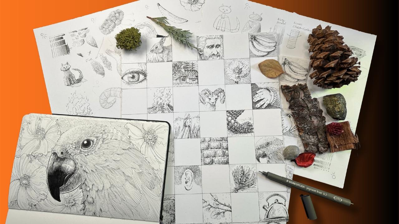
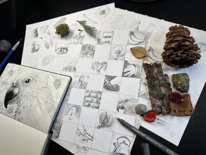
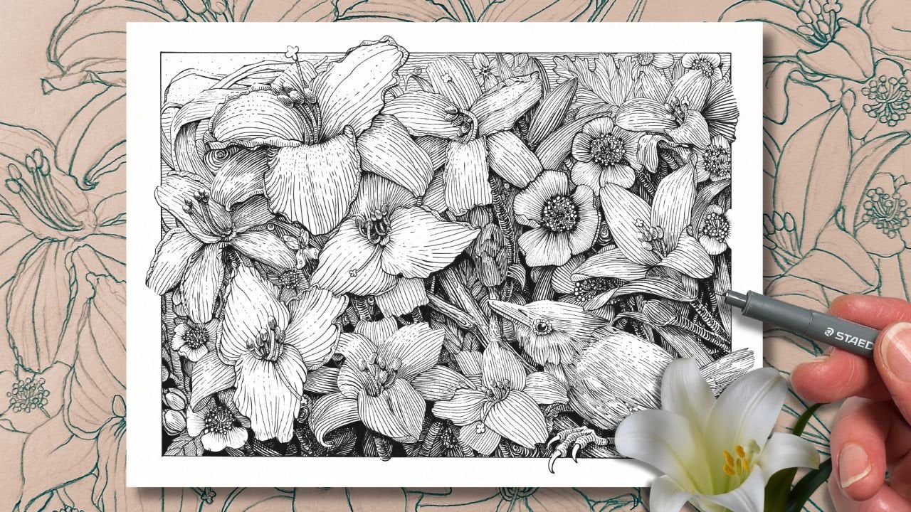
you'll have what I call a subject textures
chart that you can refer back to for ideas
whenever you're planning a new project and to help build your memory bank of techniques. For example, I did
this one in 2019, and this one more recently, and they're great to have
for comparison year to year. You can repeat the same
subjects, do new ones, or even elaborate on some of the textures to really get the best out
of this challenge. This class is for all levels. You really won't need much drawing experience
because we'll be using the the grid method
for sketching the drawings. It is helpful for you to take my shading class first so that you get a
better understanding on how to layer values, but it's not a prerequisite
to take for this one. For supplies, you'll
want a ruler, an eraser, HB lead
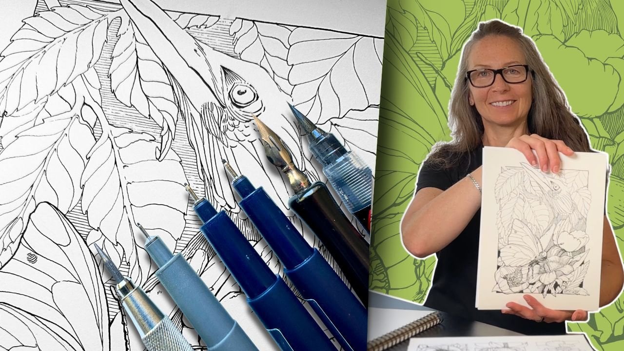
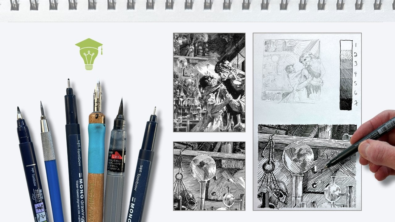
pencil, fine liner pens. We're using primarily
a small tip, like a 01 size, a bigger size for the exercises. Optionally, you could
go down a size. Whatever inking tool
that you do use because we're
working at condensed format for this challenge, want pens that make a
uniform line for paper. I'm using bristle
Smooth inking paper. It's best to go for
a thicker paper than a thin sketching
paper for durability. You'll need one sheet
for the project and one or two spare sheets
for the exercises. Attachments, you'll
find a ZIP file of the photo references and a PDF workbook that has more information
about the supplies, the project format, and other resources that
you'll need for the class. I look forward to building this super meaty
project with you. Now, let's get
started with day one.
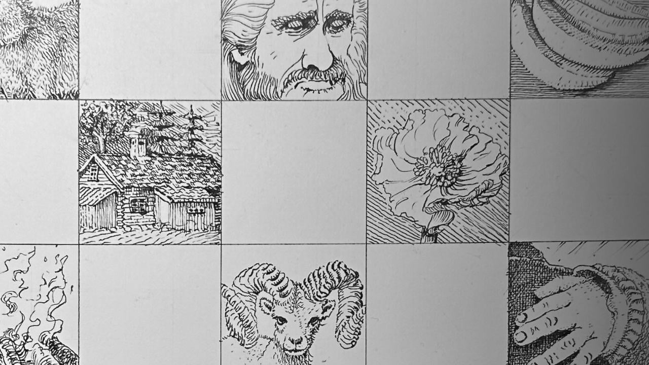
2. Day 1 Challenge Prep: The grid method is quick
and it makes drawing complex subjects in
proportion incredibly easy. The project is nine by 10.5 ", and it's divided so that each square measures 1.5 inch
around all around square. You can do it in a
different format as long as your drawings are perfectly square to match the
reference grid. For the purpose of
this challenge, I don't recommend going larger. Keep it tiny. Otherwise, it'll take much longer to complete. The size is strategic
because it forces you to really focus on practicing
effective technique. In your workbook, you'll see the final grid with
exact dimensions. Once your grid is complete, six squares across and seven squares down
begins the tedious part, which is to overlay
the sketching grid, dividing the squares again into nine equal squares,
half an inch each. This grid method was used by the great Albrech Durr
and Leonardo Da Vinci. So I don't consider it a cheat. It's just a quicker way
to our final purpose. I like to draw in every
second square for clearer outcomes rather
than side by side. Now, set that sheet aside for now and grab your
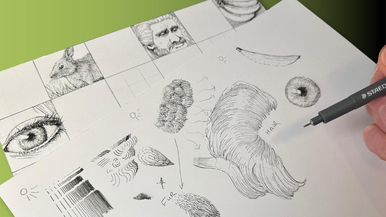
exercise sheet. We will briefly go
over the key concepts. So we jump right in and this
section is just to give you a quick overview of the key principles
to get your started. We will be applying these
same methods 21 more times, so don't worry if you
don't catch on right away, we'll get a ton of practice. Another thing, the
exercise sheet like this is for your eyes only. It doesn't have to be
neat and organized. Take notes, make
it work for you. Let's first establish
that texture is a mark making technique that describes to the viewer
how a surface might feel. With pen and ink, we can
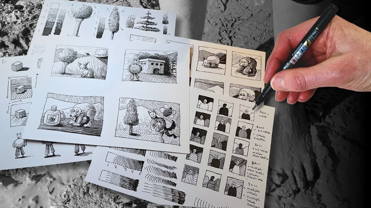
make marks with a dot, a dash, a hatch, a stroke, or a line. We can create values
with those marks. Values are ranges of gray
between white and black. You bring the dots
gradually closer together, and you've created a texture
that goes light to dark. Same idea with dashes, gradually reduce the
space between the dashes until the marks are touching
to create a denser tone. Varying the length of the mark creates a different
effect, light to dark. Changing the direction of the
marks changes the illusion. Now the tone describes a plane
direction and perspective. You change the
design of the mark, give them a curve or squiggle, and you can describe
forms and dimension. You can build these
illusions with marks by varying their size, direction, and design in
various degrees of tone. But what determines whether
to use short or long marks, curved, straight
or how far apart? Two key things. First,
the source of light. The closer the subject
is to direct light, the lighter the marks. Second thing that
determines what marks to use is the
shape of the subject. I call it a container. When you draw an outline
around your subject, you're describing its shape. You can take that
opportunity to also describe its texture by giving
the viewer cues. A broken outline
made of dots and dashes means it's closer
to the light source. A solid edge means it's further from the
light or in shadow. If we look at only the
container without the texture, it's essentially a oval for the head on top of a smaller
cylinder for the neck, a bell shaped tube for the body, tall cylinders for the
legs and the tail. First, we consider how the light would interact
with this form. The side closest to the light
source would be more white, less rendering than
on the shadow side. Also, the roundest parts would catch more light
because that's protruding. Whatever's sticking out will
catch more light and also obstruct light from whatever is positioned behind or below. Our fur texture needs to
describe those same forms. That's where the change in direction of the marks happens. Where the marks are
smaller and further apart, that says it's
receiving more light. Where the marks are longer, closer together, that says
receiving less light. Where the marks change
in design and direction, that says the shape of
the subject is changing. One more thing. You can also
overlap marks to create a denser texture going nearly black by
crossing the marks. Those were the key concepts
and for the next 21 days, we'll be applying 21
different textures to different subjects. Tomorrow, come to class ready, download the references
and let's get started.
3. Day 2 Rabbit Fur: You'll notice that the fur is organized in clusters over
the form of our subject. Similar to this pattern, there's one large cluster. Then inside that cluster are
smaller clumps that overlap. Almost like scales. The fur pattern bans out. That's the container of the fur. Before rendering it, we
consider the source of light. There's a gradation,
light to dark, and we saw that with texture, we also pay attention to the size and length
of the marks, dots, dash, hatch, stroke,
varying the length, based on the source of light, varying the direction, based
on the form of the subject. If we apply that same principle to the rabbit's cluster pattern, each tiny scale overlaps the
other in the same pattern. Dot, dash, hatch, stroke, each gradually, plus varying
the direction of the marks. In the sections that overlap, some of the marks
cross over the other. This naturally creates
a darker value, telling the viewer,
there's a shadow or a divot or darker fur. Think of this exercise as the extreme zoom in
view of the pattern. It doesn't actually look
like scales on a rabbit, but we practice this to deepen our understanding
of how to create a fur texture so
that it does look more believable when we
apply it to our subject. In your workbook
is the switch to the grid reference and zoom
in to the bunny subject. Starting in the first
top left hand square, place a dot on the grid
where the outer edge of the subject's head
intersects on the grid line. It's at the very bottom
right hand corner. Then estimate where the bottom of the head crosses
the grid line and where the tip of the nose is in relation to the negative
space within that square, then connect those markers. Follow the shape of the subject. Then we focus on
the next square. Put markers where the outline of the subject crosses the
grid line and roughly estimate how to
connect the dots by gauging against the negative
space in that same square. We can't really see the legs, but we see a shoulder
for that hind leg. We can see a bit
of the underbelly. Moving up to the middle square, we can find the neck and
top of the shoulders. The front shoulder
attaches to the front of the leg where we can make
out a darker outline. The far side,
shoulder, the back, The ears, top of the head. The eye is top left corner
of the middle square. I exaggerate the size a
little bit of the eye. You'll see that I'll be
drawing the subjects in a more cartoony or
simplistic style. But for the most part, I'm keeping the same proportions
as in the reference. I placed a small
highlight in the eye, added whiskers, and a
suggestion of grass. Try to erase some of the grid
lines so that we can see the subject a little better
for the following step. As an extra guideline, we can map out where the
major highlights are and emphasize the sections of fur that look like
the biggest clusters. For the ink application, fill in the eye with solid
black, leaving the highlight. Use short dashes that
radiate around the eye. Then short hatch marks for
the inside of the ears. Fill in the nose, use
lines for the whiskers. And now we can focus
on the fur texture, starting with the broken
outline and dots and dashes on the highlight
side of the bunny. We know that it's in
the highlight side because there's more shadows on the opposite side
of the subject. We can reinforce the
illusion by bringing the marks closer together
in the shadow areas. A, For the inside of the container, the form of our subject, will render the
clusters in sections. Also staying mindful of
the subject as a whole, like we did for the cat,
going light to dark. Dots, short dashes, then paying attention
to the darker sections. We can achieve a
darker tone by making the marks a bit longer and
bringing them closer together. We vary the direction
of the marks. So are curved, some straight to give the fur a more
natural appearance. On the body, the
clusters look more like the ones that we
practice in the exercise. We know that if we
zoomed in super close, these bigger clusters would likely look like layered scales, but because this
is a tiny format or has a bit more
of a gradual blend. For the legs,
similar to the cat, we know the form is
tubular, cylindrical. The belly section is more round. Before continuing
the fur texture, let's add in a
supporting background. Then we can assess the values of our texture in relation
to one another. The background can help with completing the outline
of the rabbit. Wait a few minutes
for the ink to dry, then erase the pencil marks. A trick to see the values
really clearly is to reduce the size of the reference
to very tiny, as well. Then it's also a closer
match to our sketch. In the tiny reference, we can better see
the white hallo around head and the top of the shoulders and
front of the chest. We had already left some
white space for the halo, but we can emphasize it by
bumping up the contrast in the darker areas below the jaw line and around
the shoulder divots. Then it's just a
matter of blending the mid tones by adding a
few marks here and there. The danger here is
to over render, and we can avoid that
by keeping our whites white and deepening
the darker tones like at the underbelly, the grass there would
be nearly black. The blades cast little
shadows so we can punch up the contrast near the outline of the subject, and we're done. We successfully built the
structure of our subject with textures working in clusters and following the direction
that the fur grows in. Tomorrow, our next
challenge is hair.
4. Day 3 Hair: Looking at the hair reference, we can see clusters fairly clearly because of
the high contrast. The longer strands of
hair have a ribbon shape. Around the face, the strands radiate out almost
like surf waves. I drew my sketches a bit too close together
here. Forgive me. Maybe draw yours further apart, so it's not confusing. But we're using the
same principles as for the fur with the values except we build our texture
using much longer strokes. For this strand of hair, the highlight area is the concave and therefore
receives more light. The convex part
receives less light. You see, the convex parts are further from
the light to reach, so the tone is darker. Same idea with the tubular
cat that we did earlier. We just find the highlight
area for the wavy clusters, and it makes the inking
part fairly simple. Here's what we already
know. We know that bringing the strokes closer together achieves a darker tone. We know that varying
the length of the strokes makes a more
natural looking texture. If we want a darker value, we add more marks between the marks until they're
touching to achieve a nearly black or we overlap the marks if you
wanted a solid black. And we also know to leave white space for
the highlight area where we can gradually add more tone with dashes and dots. Now, this is one style of hair, and we will do variations of hair further
into the challenge. And we know to
follow the form of the container so our strokes flow with the shape
of the clusters. Back to our grid line, starting with the left
eye in the center square, using the same method as before, we find where the
outline intersects with the grid line and roughly estimate the rest by gauging against the negative
space that is around it. So I got the eye and shaded in the black part around it
to make it more obvious. Moving onto the
bridge of the nose, then the other eye socket. Then defining the
edge of the face, completing the nose, shading in the nostril and shadow
areas right away. Estimate the length of the mouth by the position of the eyes. And then roughly where the mustache is and a
line for the bottom lip. He has a lot of
lines on his face, but we're more
interested in the hair. Let's get those clusters in now. We can put an indication of the eyebrows and his shoulder. Let's see, the hairline meets up with the
wrinkles around his eyes. Um, There's a wavy strand of hair covering his
ear and above that, top of the hairline,
we can build the remainder of
the hair clusters. Moving on to the bottom
portion of the ear that we can see and defining
the shadow areas. Um, Then that's where the longer hair strands that we practice in the
exercise can go, which also works for his beard. Go ahead and erase the
pencil guidelines. We'll begin the ink
application with the eyes, filling in the
shadow areas first. Again, we are more interested
in the hair texture. The face is there just
as a placeholder, though faces are pretty challenging on their own and
it's good practice for us. H. I use the cross hatch to shade in the eye
sockets and eyebrows and using a solid
outline for the nose. The light seems to be
shining directly above, giving his face hard edges, why we're still
using solid lines to describe his
features to the viewer. For the moustache, we're
getting into our texture now. Using the cluster method, adding marks between marks at the bottom of the mustache
where it's darker, as well as below the section
and shadow below his nose, giving his mustache and lower lip some volume
and dimension. A few of the main wrinkles
with broken lines, and I fill in the nearly blacks for the
shadow areas around the ear. For the beard, the hair there is more rough
than the hair on his head, and the strands are a
little closer together, so it matches the mustache
texture except longer strokes. H. For the hair on his head, space the strokes further apart. The hair is more white
and softer looking. It's also a convex
shape towards his face. So we leave a lot
of white space for highlights and a broken
edge around his face there. The rest is, as we practice, working the clusters
in sections. Onder the ear would
be more in shadow, use solid lines closer together. We finish by suggesting
a background using a dark cross hatch to
contrast against the hair. A erase the pencil once
the ink has dried. In tomorrow's challenge, we will texture a smooth surface. M
5. Day 4 Bananas: Okay, so far, we've rendered textures following the
form of the subject, strokes along the form, also called a parallel hatch. For our next subject, it will be more convincing if we render our marks
across the form, also called a cross
contour hatch. Our subject mostly has
a curved tubular form, which could work with
a parallel hatch exam, but it also has a
very distinct edge, which would work better
with a cross contour hatch. Just by adding those few
cross control lines, the tube becomes a banana. What's really going
to sell the texture, though, is how we
treat those edges. Because the banana skin
has a smooth surface, we could get away with
no rendering at all, just using an outline, and we would still
instantly know that this is a banana because
it is a well known shape. But if we want to give that
banana volume and shade it, the edges play a
super important role, especially because we're
rendering a bunch of bananas. See how some of the edges are in shadow and look more sharp, and other edges catch the
light and appear almost soft. Keep that in mind,
and let's go to our grid reference and get
the pencil sketch down. Starting with the top
left corner square and the edge of the banana
in the very forefront. But The next banana over sits over top, so we'll draw that one next. The next two are tucked behind. The one in the back is
slanted towards us. It's at a different angle. Now for the inside edges
of the banana bunch. You can add a few
directional hatches so that it's more clear
for the inking stage. Starting in the corner,
outline the stem with a solid edge and fill it
in with a diagonal hatch. For now, at this
size of the drawing, that part is mostly in shadow. The center banana
is the star here. So we'll define the edge, looking at the reference. The bottom edge is mostly solid because it's overlapping
the other banana, and that creates a hard shadow, except where it's
at its roundest. Still thinking about
convex and concave shapes and how those interact
with the light. The top portion of that banana is in shadow and it's flat. And we can see part
of the bottom edge. The side closest to
us is in the lights, so a few dots will work there. The banana that's
tucked beneath it, it has a slightly darker tone. So bring the strokes
slightly closer together. The edge becomes sharper where there's more cast
shadow from the banana above. Then the bottom edge closest to us in the forefront
gets direct light. We can put a soft edge there
using dots and dashes. We'll complete the edge
when we add the background. A solid edge for
the next banana. The one in the back
catches the light, so a broken edge there. The side touching the
center banana is in shadow. That section of the
banana is flat. So our hatch marks
help describe this. M. We add marks between the marks where
the shadow intensifies. The top panel of that banana
does not get as much light, so a mid tone there. Pay particular attention to its edges because that one is, as I said, slanted at
a different angle. So the light lands
differently there. The background has
an active role helping to define those edges. Let's use horizontal strokes. Then we can layer a cast shadow and bump up the
contrast to finish. You can see how the
background strokes interact with the edges. The eye automatically
closes the gaps, and it's called an implied edge. And in my opinion, one of the most captivating
techniques in pen and ink. In the next challenge we render something
round and shiny.
6. Day 5 Eye: In pencil on your
exercise sheet, draw a circle and another
smaller in the center, and we'll practice
a radial gradation. Just needs a little highlight
reflection in the corner to transform the shape
into an eyeball. On the opposite side of the highlight would
be a shadow ring. Begin with a linear
hatch for the pupil, we build the tongue gradually to nearly black by
layering the marks. So a cross hatch. Leaving white space for the highlight and
increasing the contrast with more black in the pupil center to give
that reflection more pop. Next, we section the eye. Same idea as using the cluster pattern we practice with the
fur and the hair, except our marks travel
in a radial pattern, varying the mark length, short and long, so
it's not uniform. Don't bring them all
the way to the edge. We want to preserve a white gap around the middle of the iris. The outline is loose
and partly broken, from which we
reverse the pattern from the outside edge
towards the center. Mindful to preserve circular
space for the iris. Then another layer of
shorter dashes in between. Some touch the outside
edge, and some don't. Next, bridge the gap using sparse dots in a linear
pattern for the iris. Normally, there
would be a shadow for the eyelid and lashes As you can see from
the reference, there's a cow shadow
at the top of the eye, and the eyeball is
not pure white. There's definitely a lot going on with the highlights
and the low lights. Let's give it a go starting the sketch with the top eyelid. Then the bottom eyelid. I pupil the reflection highlight, the eye, and the darker
areas of the iris. Note that the iris and pupil are not perfectly round so that it
looks more natural. A, An indication of hair on the corner, just a few strands for context. In the reference, there's
a thin white halo at the edge of the top eyelid
beneath the lashes, and this is where we will attach lashes at
the inking stage. Hard edge for the top of the eyelid because it's
dark and in shadow. A broken edge for the bottom because it gets
more direct light. Will render the pupil
same as in the exercise, building the tone gradually with more contrast
in the very center, preserving the
highlight reflection. Quarter the eye then onto the radio hatch from
the center outwards. Add an outline soft on the light side and hard
on the shadow side. For the radial hatch
going towards the center, we'll go a bit shorter
than in the exercise. Now we're addressing the cast
shadows for the eyelids. To make the iris
look more around, we'll weave in a core shadow. It sits in between the edge of the white iris and doesn't reach the outer edge
of the eye's outline. And we can build the shadow
values directly the top of the eyelid and on the
dark side of the eye. The edges are a
little bit darker in the reference than the
linear dots for the iris. And more dots as midtones to
blend in the values a bit. The squiggles make
the surface of the eye look hydrated and shiny. Now we can build the
remainder of the subject, the lids and hair. Then the bottom lashes. I start by pressing down on
the tip and flicking it. The lashes there are short, and they're growing
in flaring clumps. A few strands are
bunched together. They're jetting in
separate directions, growing progressively longer
towards the outer corner. Then add a row of
lashes beneath, but without pressure
this time on the pen so that these
are lighter marks. They're thinner
than the row above. Then the thin layer dashes to create a subtle gray shadow. Same process for the lashes
above one row at a time. The lashes sprout from
above that hard edge, where we drew that small
white gap as a guide. S. The second row of lashes is above that, and the lashes also
get progressively longer and thicker towards
the outer edge of the eye. Some are curling towards
us and into the eye area. Using linear dots
and tiny dashes for the skin of the eyelid and
for the white of the eye. Finishing with a few random, subtle marks on the skin. And in the next challenge, we're doing shingles and trees.
7. Day 6 Wood Cabin: In this reference, we have a few competing
textures to coordinate. I say competing because they appear to be
in the same tone, but minimizing the image helps us narrow down the key things to illustrate in this scene. We'll focus on the roof and
a couple of the tree shapes. Those two textures
tell us that it's a rusting cabin and in
a densely treed forest. From far away, the roof has a checkered board
sort of texture. Every second square with
a vertical linear hatch, then squiggly horizontal strokes that describe an
undulating tile. Um, throw in some dark spots to indicate cast shadows and irregular marks to make
the tiles look weathered. As we get into it, you'll see that adding
case shadows and contrast really
sells this texture. The trees are far
in the distance, but the main features that
we're familiar with are the bushy shapes
and the branches or the prickly looking branches
with the slender trunks. A scribble works well
for faraway leafy trees, working in clusters which
we're already familiar with. We know to bring
the marks closer together on the
shadow side and to leave white space and broken
edges on the highlight side. Once the main structure is in, we can bump up the
contrast where the light is obstructed
from the branches above. A And then the trunk, a cross contour hatch
for the bark effect. The spike tree gets a hatch
following the direction that the needles grow in plus gravity weighs
down the branches. Layer in darker tones to
create more depth and shadows. Um, parallel lines for
the slender trunk. I'll start with the cabin, moving on the grid
from left to right. I'm just capturing the main
structure of the building. And then an indication of windows and the larger stones that are used for
the foundation. It's helpful to make
a checkered grid for texture and roughly
sketch in a few trees. Starting with a broken edge
for the outline closest to the light and solid outlines for the edges that
would be in shadow. Everything is tiny. So even though it's
tempting to be faithful to the reference
and add a bunch more detail, working tiny forces
us to think about the values and the
effectiveness of the textures. And it really is a formula. We keep the values light and the edges soft on
the sunny side. The edge is solid
and the textures progressively deeper in
values on the shadow side, or wherever something is
obstructed from the light. There's a lot more midtones and textures in the reference, but if we tried to
put all that in, we would get mud. It's a really busy
scene as it is, and what helps make each
element more clear in these situations is
monitoring the contrast. Like for the two smaller
rooftops of this cabin, I didn't put in the
checkered pattern. And you'll note that I'm varying the direction of the
hatches for each layer, adding cast shadows and deeper contrast where
more clarity is needed. For the trees, style
them as you like. I'm not following the reference there because it's
just too busy. Our goal is to create
the illusion of a densely treed forest using the textures
that we practice. H As long as a few trees are
reasonably distinct, the background can
just be, you know, a few irregular lines to suggest more trees
in the distance. Finishing with a gradual hatch, at the end, a few dabs of solid black to
boost the main elements. In the next challenge, we'll
have another texture combo. Oh,
8. Day 7 Wrinkly Poppy: The centerpiece is highly detailed and the wrinkly
petals complex to draw. That's if we were aiming
for a hyper realistic, large scale portrait
of this poppy. But our goal is to present an illusion of the poppy
so that at a quick glance, the brain knows what it is. From a basic structure, we suggest a centerpiece with half circles sort
of in a cloud formation. Around that we have
these little ovals that radiate around
our cloud shape. The ovals closest
to us are slightly larger and stack
more half circles, closer together in
the back to give a sense of dimension
and perspective. It looks like there's a lot of these little circles
squeezed together, and in the front, they're
spaced further apart. For the little stems, it's the same technique
as we used for the eye with the
radiating hatch marks. And deeper values
on the shadow side. For the wrinkly petals, I'm using long
irregular strokes, more of them on
the shadow side in the direction that the petals are unraveling from the center. Now, I'll admit I didn't look at the reference
for this texture. It's from memory,
and it's basically from repeatingly applying
the key principles that we've been practicing. Now we can sketch the
main subject again, using the grid to get more
accurate proportions. Though it does look pretty close to what we did
in the exercise. We'll repeat the process with our cloud like center
using half circles, then sprinkling some
of the little ovals. Larger ovals near the front. Then stacking the half ovals that tells the viewer that
there is a bunch more. Add the stems in a radiating pattern
and the cast shadows. For the petals, it's wrinkly, broken edges on the sunny side, and solid edges for the
petals on the shadow side. Also for the areas
where the petals are folded over or obstructed
from the light. A Then layer some wrinkly looking strokes on the shadow side from
the center outwards. A few shorter wrinkles from the outer edges traveling
towards the center. Then a linear hatch for the petals that are folded
over and in shadow. We did not need many marks to
create a believable texture here because the values work and the stroke
directions make sense. It all fits together to describe the structure
of the subject. O. In the next challenge, we'll again use
minimal rendering to describe something
super complex.
9. Day 8 Fire: The reason we can create
a texture here with minimal marks is because the design is what
describes what it is. And the viewer knows that
fire is not a solid object. Rendering a non solid
substance like fire, water, wind is more about the
design and the context. Even just a few non
descript scribbles can suggest burning logs. Now we have a campfire, a bit of contrast
to give the hot, glowing flames some
dimension, and we're good. As you can see for this subject, the photo reference
gives some guidance, but I'll say it again, a realistic looking fire is one that has been shaped by design. Even exaggerate the shapes, larger at the bottom,
as it billows, thinner, dancing, twisting
flames at the top. Some break apart like flickering tongues consuming
the wood logs in a blaze. We can add a few more
strokes where the flames separate to give the
fire more depth like there's layers of flames
and the center is thicker it's more
blue than orange. A cross contour curve hatch
works well for the logs, leaving white space
for the highlights, which comes from
the glowing fire. Then a ground plane with a gradation of
horizontal strokes. Now, bring your thinking
hat for the next challenge. We have an interesting one.
10. Day 9 Ram Horns: For this next one, let's think it through
together because there's twists and
turns with our subject. The horn has a similar
construction to a banana. It's cylindrical, but it
curls like a pretzel. We want to plan this out what stroke direction would
look more convincing, and how will this shape interact with
the source of light? And then there's a center edge like a seam plus
various textures. There's several
problems to solve here. If we establish the seam, then decide where to
place the darker values, the midtones, and
the highlights, and then we can
overlay the texture. Altogether, this
could get really muddy and confusing
for the viewer. So let's try this again. First, the shape of the ram's
horn in the reference is more like this and we'll
practice a mini section of it, and we'll focus on the texture. The horn is not smooth. The edges follow the pattern. Using the techniques
we've practiced so far, we know about convex
and concave shapes, how those receive the light. Similar to the strands
of hair we did earlier, we used long and short
strokes that follow the form. We know to leave white space
for the highlight areas. Anytime that I come across a new or extra
challenging subject, I focus on what I already
know here and together, we're experimenting and
resolving pen and ink problems. It's twisty, lumpy, but
it's also cylindrical. These lumps that stick out, we could use vertical hatches to make them look more
three dimensional. That's a lot of marks. But we can simplify this
with our tiny project because we now have a better understanding of
how to render this subject. Starting at the top
left hand corner grid, we can have the horn
starting from the head. Also the horn as it twists
back towards the front. Okay. I'm really paying attention to the negative space in the
little squares of our grid to construct the horn in proportion and where it connects
to the body and head. Then the second horn, you'll notice that you'll notice that they're not
perfectly symmetrical. Then the ears Moving down to the eyes. The snout. Oh, it's too
big. That's better. Then I use the needed eraser to clean up the grid
lines and tighten up the drawing before adding in
the details for the horns. Now it's a lot easier to
put in that center seam, and we can follow the pattern that twists around the horn. So I'm just capturing the directional lines to
guide the ink application. I'm not copying every
line from the reference. This part is more This part is more like the poppy
and the fire that we did. We want to suggest the pattern as realistically as
possible through design because we already saw in the exercise that
too much rendering, putting in too much detail
does not achieve clarity. I would say, even this
is too many lines, but we're only using
these pencil marks as a reminder for the stroke
direction at the inking stage. Let's start with the
familiar, a short, tight hatch for the nose, dots and dashes to build
a structure of the snout. Moving on to the eyes. Continuing with the
construction of the beast using the fur
texture going around the form. Longer curve dashes closer
together under the chin, where there is a cast
shadow from the head. Moving on to the
horns to achieve the effect that we want
using an economy of lines. We won't use an outline yet. The goal is to
emphasize the texture without over rendering like
I did in the exercise. The purpose of the exercise was to better
understand the subject. But for the project, we want
to describe the texture in a convincing way using as
few marks as necessary. A so we're back to
concave and convex. Convex lines will be thicker, and we can augment this illusion with a
short vertical hatch. And thinner, fewer strokes on the planes of the horn
that are facing the light. We want to convey three things. The horns have a tubular shape. The horns, they curve and twist, and they have an
irregular rough texture like wooden folds that
pinch and expand. Also, we observed at
the drawing stage in the photo reference that the two horns are
not symmetrical, and it's even more prominent now that we're inking because the light lands differently on the planes around the
seams of the horns. M After erasing the pencil lines, it's easier to see where to close the edges
and add contrast. If you have time, adding a background would make
the edges even clearer, but I'll leave mine as it. We have another
tricky drawing and the next challenge we
need to rest up for. Y.
11. Day 10 Baby Hand: We're skipping the exercise and going directly to the grid
drawing for this one. The baby sweater
is a new texture, and we also practice a
nearly black cross hatch, and we can easily do both
directly in the project. The star of the project
is the baby skin. And we've already done a smooth skin texture
with the banana. The real challenge
is selling it to the viewer that this is a
pudgy little baby hand. That means we need to be
successful with the container. So our main focus is to capture the shape and the proportions
of the subject accurately. I'm really taking my time
one square at a time, getting some initial marks down, then making small corrections. The fingers are essentially
short, pudgy tubes. Because the surface
is mostly smooth and there's very little shadow
directly on the skin, what's going to make the
biggest difference in successfully
communicating volume for that plump hand is line width. So this one is all about
soft and hard edges. F Starting on the thumb with dots for super soft edge, we can get away with
just dots for that edge because you see the
background is nearly black, and we already know
that the background can visually complete
a broken outline. We call this an implied edge, and it's the awesomest
pen and ink technique. Hard edges, so the solid
outlines are on the shadow side. The hard edges are also
wherever we want to emphasize a divot or a convex fold in the skin or the indents
of the tiny nails. So Any feature on the skin that is not totally smooth and catches the
light gets a mark. The deeper the indent,
the thicker the mark. A I simplified the design of the baby's
blouse for clarity. I'm just using a hatch for the cast shadow inside
the cuff of the sleeve. The knit sweater texture,
we can make it up. I think a combination of
squiggles and hatches will work. As long as the values
make sense and the stroke direction communicates
the planes accurately, the pattern will look legit. Um, I'll go ahead and add a loose background. We want it light, so the values on the
sweater make sense, and it's light at the top, then rounding to darker tones. For the adult's shirt that
creates the background, we'll build the cross hatch in stages first with
a diagonal hatch, keeping the strokes
evenly spaced apart. You can do these in sections, and the second layer is
the opposite diagonal. So you get a little
diamond pattern. I left a small white
halo at the top under the collar and also at the bottom of the baby's arm so the shapes don't get lost. The third hatch
layer is horizontal, followed by another
vertical hatch, pushing the tongue
to nearly black. Now we can better gauge the values in relation
to one another. The hand looks a little bit stiff coming
out of the sleeve, but a few dots can suggest a case shadow and make the
hand appear more round. Finishing off with
another thin layer of hatching directly
below the hand. It frames the hand even more and creates a
natural drop shadow. The next lesson, we're
going to look at moss.
12. Day 11 Mossy Log: It is helpful when we can reference a live subject because the more we understand what that subject looks
like in three D, the easier it is to
shade it with texture. And this technique to shade
the moss is similar to the radial eye pattern and
the leafy tree texture. Combine. We start with
a radio star shape. Add a few more bold strokes, fold the shadow side. The main container
of the moss has this cloud like shape and the values gradually light to dark based on the
source of light. That means we'll have
broken stars closest to the light source and white space to create
a highlight area. Moving down to the midtones, we can see more of
the little shapes, and they are spaced
closer together. The space becomes darker as the little stars
curve into shadow. Like the tree leaves, we're not drawing every little star. We draw two, three clear stars so the viewer knows what it is. The rest is suggested with dots and dashes in
the radial pattern. We increase the tone in
between the pattern gradually. Avoid hatching directly over top of your pattern
to build the values. We want to preserve
clarity of the textures. Y. The only time, in my opinion, that it's appropriate
to cross marks is either to create a
cow shadow knowing that it makes that part of the
subject less clear or when you intentionally want
to cross hatch as a pattern for a
nearly black value. For the drawing, aim to capture approximate shapes for the
moss and placement of the log. When drawing nature, especially, we want to exaggerate the
features that provide clues to the viewer of
what the object is. The log's bark is quite dark
and almost featureless. So being faithful
to the reference would not actually give us a
realistic look in drawing. We'll bring out the
features of the subject. As Michel Angelo would say, every block of stone
has a statue inside it, and it is the task of the
sculptor to discover it. The moss is the
main subject here, so we begin at the midtone line, establishing the pattern
of the texture with our tiny radial stars and breaking the edges of the
pattern in the highlight area, dots, dashes and white space. It's a tiny container, so we can quickly build
the structure with our texture pattern and
fill in the values, increasing the tone in the shadow area where
the light is obstructed. The source of light in this reference is on the
top right hand side. Continue building the moss using the same sequence on your own. Now for the little
pieces of lichen, using a broken edge on the highlight side and
bold on the shadow side. We'll use horizontal strokes for the cast shadow and also to establish the barks
structure on the log. Then layer a vertical hatch for a darker tone and texture. The next challenge will
practice rendering drapery. Okay.
13. Day 12 Drapery Folds: Soft fabric will often look like it's wrapped
over cylinders. This fold shape changes when you bunch the fabric
from a tension point, like wrapping your
belt over a dress. Depending how you
pinch the fabric, if it's hanging straight down, the cylinder folds
change accordingly. If you add a second
point of tension or pull the fabric out,
the folds respond. And what we see is
lighting and shading. I think a fabric less
like a container, but more like a moving surface that the light interacts with. Otherwise, there's nothing
entirely new here. We already know how to shade
concave and convex shapes. Even if those folds
bunch and spread, the concept is still there. We just respond to it with different mark
making techniques. If the cylinder is more flat, we can just use line
weight to describe it. If the cylinder is
more pronounced, we can render it with
texture and tone. If you're thinking, Ah, but Chloe, at the
very beginning, you said that texture communicates how a
surface might feel. So yes, there's that
to consider as well. The type of marks and the quantity of marks
we use to render the fabric is a decision that will determine the
fate of this fabric. Again, our project,
drawing is very tiny, and there's a lot going
on in this reference. So we'll once more need to be judicious with the
marks we commit to paper for a successful
illusion of drapery folds. I want to capture the position and proportions of
this reference, and like in the
previous drawing, simplify it down to
the main features. M. It's helpful to pencil in the direction
of the convex concave folding pattern in relation to the point of tension
at the belt. You can be creative
with the background. I'm replacing the balcony
with some simple vegetation. Leaving white space
for the highlight at the top of the convex area, then a gradation, light to dark, dots to dashes, bringing the marks closer
together and adding marks in between for the shadow area in the
concave sections of the fold. Oh, the cameras out
of focus there, but the key thing to
note is the open edges. This is basically the only
clue that the fabric is soft. Having a soft edge like
the baby's fingers. There's hardages on the extreme
left of the skirt where the folds are more closely bunched together and in shadow. For her top, the fabric
is stretched out, which creates pinches at the
belt and at her armpits. The shoulder straps create
two points of tension, which in turn creates a droop in the fabric
at her lower back. So we just need a few light
marks to describe this. Long strands of hair
we've already practiced. The lines are closer together
in the area of shadow. We'll keep the bushy vegetation in the background quite light, so it looks like
it's further away and doesn't compete for
attention with the main subject. The front grasses or reeds or giant weeds
in the foreground, maybe she's a tiny fairy
princess in the giant garden. Anyways, for the tall grasses, thicken the shadow side of each, then dab a tiny drop of shadow
on the grasses that cross behind and blow as you draw in more blades of
grass front to back. Finishing with horizontal
strokes to establish a ground plane so that she
sits slightly above eye level, same as the viewpoint
in the reference. In tomorrow's challenge,
we're tackling lizard scales.
14. Day 13 Lizard Scales: Back to our trusty cylinder. Imagine this is a lizard leg
and on the highlight area, we position the first scale. They fit loosely together, roughly the same shape, but
not identical, each unique. They progressively get smaller as they wrap around
and down the leg. The gradation of
values from light to dark wraps around the leg. I apologize again for
the out of focus video. But we already know to use missing edges for
the highlight side, broken edges for
the midtones and thicker bold hard edges
on the shadow side. The position of the
shadow side changes angle as it wraps
around the leg. The scales are not flat. Looking from a top you, they are convex,
like a half dome. We know convex gets more light, which equals to more white
space and sparse rendering. A simple hatch texture works well following the
form of the scales. So parallel to the dome. The hatch gets longer and darker as the pattern wraps
around the subject's leg. Similarly to the moss, we darken around the pattern, not directly over top to
keep the marks clean. The scales in the
back are extra dark. And I said earlier that a cross hatch makes a
nearly black texture. So aim to isolate your layered marks to the nearly black areas of
the creature or lizard. This fellow is pretty easy
to draw, so go on ahead. You'll note in the reference that the belly of the beast is darker and the scales travel opposite angle than
the scales on the leg. So we can pencil in a grid with the scale pattern that we practiced on the tube. The body is just a
larger cylinder. Oh We'll also follow the same gradation pattern to
render the project sketch, starting with the open and closed edges around the scales, changing the position
of the bold line to the shadow side as it
wraps around the tubes. There's a skin fold at
the bend of the wrist. And for the very tiny
scales around the fingers, we use half circles, like for the poppy center, we did earlier in the challenge. For the hatch texture, same
formula from the exercise, short hatch marks on
the highlighted scales, then longer hatches
progressively closer together as the scales get
darker circling the leg. Then fill in the skin with
a consistent linear hatch. We'll layer darker values on the shadow side to
create a denser texture. The subject is dark
to begin with. The scales that appear white, those describe a reflection
from direct light. So our viewer can guess
the scales are hard, dome shaped, and a
glossy dark color. The skin itself is likely
rough and non reflective. For the belly portion, maybe there's
darker scales there or he's standing in the shade, maybe his head is
blocking the sun. We can deduct a lot
from texture alone. So the white highlights
are nearly choked out. There's just a smidge of a reflected light on the
belly scales that are closer to the top where there would logically be
exposure from the sun. For the skin, change
the direction of the strokes for a
visual contrast, which gives more
clarity to the layers. A subtle background,
maybe a desert scene. Then finishing with a
dense cache shadow, a hard dark shadow
tells the viewer that the lizard is
close to the ground, so he's not very tall, but likely quite wide. And the next challenge will go to a completely
different texture.
15. Day 14 Fluffy Clouds: Clouds can be
challenging to render in pen and ink because of
what they're made of. Fluffy clouds look sort of like balloons
grouped together. Even with just an outline, we can still visualize
the balloon form. So this is a good way to
remember how to shape them following
this balloon form. When there's a bunch of fluffy clouds, a
few things happen. First, clouds are very close
to the source of light and the sun shines through some of them
because they're not solid. The darker areas that
we see on a cloud are likely cast shadows from the overlap of clouds
layered over one another. Plus the clouds are
in constant motion, and that's why my preference for texturing clouds
is a hatch mark because directional lines are a lot more dynamic than
dots and dashes. Also, when there are
many layers of clouds, it's easier to
create softer edges. A hard edge around
a cloud can look heavy for such an airy surface. If you opt for a sky
in the background, you also gain implied edges, which keeps the effect airy
and celestial looking. For this texture project, I'm not too fussed about
proportions or position. As long as you have many layers of clouds
that are balloon shaped, we can practice the
shading from the exercise. Note that the sun is on
the right hand side. So if it's helpful for you, map out in pencil the boundary where to save white space for
the highlight areas. Still thinking about
our balloon shapes. On the left side of
the picture plane, the values are darker. All the layers overlap. The sun can reach only the
top portion of each balloon. The right hand side
gets more sun. So lighter values
less rendering. The marks are smaller and
spaced further apart. Use dots and dashes to round out the balloons in
the highlight area for the lighter mid tone gray. It M Then we can also increase the contrast by going
darker on the shadow side, adding shorter marks between the marks for a gradual effect. Adding a sky background, as you saw in the exercise
creates the illusion of outline around the clouds in the background as
the final touch. In the next challenge, we're switching back to
a hard surface.
16. Day 15 Stone Wall: On a basic cube, the side facing the sun is in high light with
sparse rendering. The side further from
the sun is gray. The side for this from the
sun is the darkest value. The bottom is absent of light. Therefore, would be solid black if it were visible
from this viewpoint. Shape design is important
in describing a subject. The cube, it looks
like a hairy box. It's easy to shade a
shape like this flat box, but a stone looks
more like this. The principles of shading remain the same for
the stone shape, but the design gives
it more contacts. Now that same texture looks
more like a stone surface. Without the container,
this texture could be a lot of
things, maybe fur. When it's fur, the
texture looks more convincing using roundish
curvy marks for the pattern. When it is a stone,
a stone is rough, so the exact same pattern would look more convincing
using angular marks, like the dark, dot, the hatch. That exercise demonstrates
that there is not necessarily one single
mark making technique unique to each subject. What we've learned so far is
that the result of what you create is influenced by the source of light
and the values, the shape of the
subject, and its edges, the direction or
angle of the strokes, the style of the marks,
and the context. So this stone wall design, even without any rendering, the viewer will know what it is. Our job is to make
it more believable. As a wall, the stones are
cut like this flat box. So that's something to keep in mind for the
gradation of values. The wall is upright. The sun is above to the left. That means the top left front of the stones will
receive more light. The features in the
stone are jagged and irregular and little bits will catch the light
and cast shadows. So we dab solid black
here and there, more on the shadow side. Each stone is similar yet
unique in shape and texture. They're not uniform
like fabricated bricks. We're creating the
illusion of cut stones, sort of rectangular in shape, and they're not
flush to the wall. They have a thickness to them, and the darker values
communicate this volume. We can emphasize the
dimensionality with the background treatment if we make it a lighter
value than the stones. Using a gradation,
dark to light to dark. Lighter in the
center of the wall, it amplifies the effect
of a vertical wall. In the next challenge, we're switching back to
a soft surface.
17. Day 16 Parrot Feathers: No The technique for
feathers is similar to fur. It's just a variation
of the pattern. There's clusters and
within the clusters, groups of mini clumps
layered like scales. In these clusters of feathers, we see the veil and
for the bigger ones, we also see a acus. The whole cluster is
affected by the light. Let's say the
highlight is on top, the cluster then has volume and the stroke direction we choose will communicate dimensionality. With this guide in mind, we can build the
individual feathers. As they increase in size, we can see more details. We said the top center of the main cluster
receives more light, and the overall stroke pattern fans out to
look more three D. The bird is round. Each little feather
is stacked on top of another and that
creates tiny cow shadows. We have this beautiful
parrot profile for our feather project. Take your time for this one, going square by square
to get the proportions. Beak is cropped out a little, but we can work with that. I always exaggerate the
main features a bit, so I'm slightly
enlarging the eye. From there, map out the
major clusters of feathers. You can draw in the little
feathers or leave that for the ink application since we already practiced
it in exercise. We've also already
done an eye design, so have some fun with it. This bird's eye has tiny
feathers raiding around. So go ahead with that section. The source of light, by the way, is top left corner. Okay. Above the beak is
another radial pattern surrounding its nostril. The feathers there
are more delicate, so dots work well here to structure that little ball
shape of the bird's nostril. From there we see sort of a lip that wraps around the beak. Short ******* work there. For the beak itself,
render it as you prefer. I used a vertical stroke, but a cross contour
would work equally well. The goal is to communicate
the form by minding the values and using a mark making technique
that tells the viewer, this beak is hard, smooth and has a
reflective surface. For the bottom
section of the beak, I did switch to cross
contour to show you. So curve strokes emphasizing the core shadow and
reflected light. The core shadow is that
darker tone we see. The reflected light is
the thin hallo of white. This makes the beak
appear more three D. It's dark because it
receives less light, plus the subject is dark
in color in that area. Top of the head is
in direct light. Therefore, we see less
of the feather detail. I'm using dots and short dashes. As the tone gets
slightly darker, the dashes start to
get more organized, slowly revealing the
feather pattern, which gets more pronounced as we travel to the shadow
area of the bird's head. In the reference, we can see
a pattern variation above the nostrilaa shorter
vertical hair like feathers that
cast strong shadows. So dabs of black
create that effect. Then we begin the feather
pattern that we practiced. Much smaller though. You'll see the feathers overlap slightly. They're staggered in
a way that naturally makes a slightly darker tone, creating a soft
shadow as a result. And we want this effect. Keeping it subtle
on the first pass as we work in
sections on the bird. Following the form, the
feathers increase in size gradually as we travel
down the head of the bird, also further into
the shadow side. So there we see more detail, and the tiny cow shadows from the overlapping feathers
are more defined. Okay. Under the chin, those feathers
are from the underside. We angle the stroke pattern in the opposite direction
to communicate this. Plus, they're darker because
the beak blocks the light. Then finish off by smoothing the mid tones and increasing contrast where
more clarity is needed. I'll see you again tomorrow
for the next challenge. Okay.
18. Day 17 Lake Water: Starting from the horizon line, traveling towards the forefront, what do you notice
about the pattern? It's similar to this
linear gradation. With the boat for contacts, these strokes look like water. So we don't have
much more to do here except to give the
viewer a few more clues. The boat casts a
shadow on the water. Small waves usually have
a triangular pattern. From far away,
perspective stacks objects closer together, creating darker values, and the waves are therefor
less defined. Those objects, the waves
spread further apart and increasingly become
more defined as the eye travels closer
to the foreground. Here I did a study of Master
Edward Gory's textures. This is how he does water. This texture is also water. It's the same
pattern, just darker, which also works as a
night sky and a jacket. Or a log or a bird or fur coat. This just confirms what we've
already established so far. That texture is sometimes less
relevant than the context. And we set the context in different ways with the
shape of the subject, the values, edges,
stroke direction. We're constructing a story
with marks on a page. Okay. You'll note that I used a
vertical hatch on the boat. That's because the
water that surrounds it will have a
horizontal pattern so that we can clearly see
the boat in the water and the water from the mountains that are
in the background. It's effective to
make the mountains in a different pattern
and a different value. So darker than the boat
and darker than the water. A cross hatch then works well
for a nearly black value. I'm arranging the values on
the picture plane so that the viewer can clearly see what's in front
and what's behind, but also adding a variety to the mark making
layer by layer. Same pattern,
different direction. And here, same
values, same pattern, but changing the
direction of the strokes can be just enough to
bring that clarity. The cast shadow from
the boat is important. Also important that linear
gradation from far to close, which gives the scene a
sense of perspective. The features of the
water become more detailed as the eye travels to the front
of the picture plane. As Master Gori did, we can repeat the
same texture in the sky for visual continuity.
19. Day 18 Ear Short Hair: We're jumping to the project
drawing because this is a texture variation of
subjects we've already done, skin and hair, a
different container. Feet, hands, and ears are
typically challenging to draw, but we've had enough practice
with the principles of shading and mark making techniques that inking
this will be a breeze. Map out in pencil where
the darker values will go. The inside of the ear does
have a few hard edges, but the rest is soft, which means that we can use shading to structure the shape, keeping those edges soft. Starting ink application
top left corner with a short hair texture. Similarly to how we
hatched the feathers, small clusters, short hatches, evenly spaced apart to
give us a neutral value. I'm using a combination of short and long hatches within the mini clusters
to create a natural look. Slant the hatches at a slightly different angle
for each min cluster. The head has a round shape. The head is the container, so we're following that
overall form as we travel. The hair that frames the ear
has a slight curl inwards, going a bit darker there to indicate a thickness
to the hair. Keeping the top
of the ears outer edge soft with a broken outline, but we can come
back here later and adjust and a hard edge
on the shadow side. A bold shadow to show that
the lobe hangs and that's sticking out more at the
top portion of the ear. Resume with the back
of the head with the hair texture. Okay. A few short dashes in the back enhances the illusion
of roundness to the head. For that side burn, shorter dashes to show
that this part is trimmed and it's rough and it's more
sparse than the head hair. I then layer in a darker value at the
edges to add volume. Then a few dots to give
surface to the face area. Back to the ear, soft and hard edges for
the inside, fold. Then a directional hatch
to shade the inside parts. More strokes closer together, where the tone is darker,
keeping it subtle. A tiny hatch for the
lobes drop shadow. Another light shadow to suggest the forms finishing by
smoothing the midtones. In the next challenge,
we'll look more at layering and perspective.
20. Day 19 Pine Cone Needles: The tricky part here is how
to feature the pine cone despite the crowd of needles in front and in every
direction everywhere. Let's break it down
into manageable parts. The pine cones are oval shape with another cylinder shape
for the flowering top. There's two, actually.
Those are the containers, and each are made up of
small clusters of pods. So for shading, as a whole, the subject shadow
side is on the right. For texture, we then consider that the marks will
progressively get longer, tighter, denser, as we
travel left to right. Working our way around the form. Okay, that's one problem solved. Now, what do we do
about the needles? We'll address those
similarly to the grasses, these tall grasses
we did earlier. We outline the first row, the needles that are the
closest to the viewer first. The shadow side has
a bolder outline, then add the next layer
that's tucked behind. Then to stay on track as we add layers and not get lost in
the intertwining needles, immediately thicken
the shadow side of the overlapping blades
and add a cast shadow. This keeps us organized as we layer more
needles front to back. Before getting carried away
with a bunch of needles, we need to render the pine cones while there's still
space for them. Minimal rendering, just
a vertical hatch in a half crescent pattern to show that the little
pods are spherical. Then needles stuck behind will have lighter edges to suggest
that they're further away. In this case, the reference
is more for inspiration. There's just too much
going on in this photo, and our objective is to
visually describe a pine cone. So just the main shape
of the main subject. And then map the boundary for how far the pine
needles will go, and that's for position only. Begin with the front
row of needles. Again, it doesn't need to
match the photo reference. We actually want to
place them so that the arrangement leaves a clear
view of the centerpiece. The shadow side of the
needles is in bold. The shadow area is on the right side of
the picture plane. Oh. Add in the little
case shadows as you layer in the needles from
behind the front row. We'll position a couple of
needles directly in front of the pine cones for more
realistic effect for those two, introduce a broken edge so that they're a little
less distracting. Before adding more, let's
render the centerpiece, starting with that flowery top. I'm making the little pots on the shadow side considerably
darker than in the exercise. I'm pushing the
contrast so that this grabs attention away
from the pine needles. H, h For the gaps between
the needles, I'm using a checkered hatch that similar to what we used on that cabin roof to create a value with the texture
to minimize the details. The bottom of the
plant has, like, a spiky appearance
and it flares out. We can introduce more
needles on the shadow side, make them 100% solid
black. This creates depth. And then the few needles
in the very background, very light with broken edges and less details so that they
appear further away. But a few more single strokes in the background to
blend the mid tones. Finishing with a soft, abstract background or a bit of rendering at the bottom of the needles where they
curve into shadow.
21. Day 20 Mossy Rock: Sometimes you need to draw a nature scene that is very busy or that doesn't have any standout features
like this image. Everything is equally
bland and non distinct. We know what it is in the photo, but drawing it means we need to over emphasize and
exaggerate the features. So I'm not introducing
any new textures, just a variation of what
we've already practiced. So let's draw the rock more like a box with a little crack in the middle and an indication of vegetation at the
top for context. Start the ink application
with the moss pattern across the top with a
bit of a broken pattern. Oh, maybe map in pencil the boundary for
that blanket of moss. Then ink around the edge, really exaggerate
that moss pattern. So it looks like it's growing
over the top of the rock. Then in clusters,
build that blanket with some more distinct
clumps and just dots, dashes and tiny squiggles
to build the value. Mm. The sun is at the left, but more to the front, it's shining straight on. That's why everything looks gray and even toned in
the photo reference. It's what photographers
called a flat light. But we're going to bump
up the contrast more. And for the gray values, we can do that checkered
pattern between the textured moss features vertical and horizontal
gray checkers. This builds a tone
adding visual variety. So anywhere that there's just
a little too much white, but we don't want to overwhelm the viewer with more features, you add tiny dashes here and there while changing
the plane direction. So it gives a little
bit more contrast. It smoothes without
overemphasizing. Oh, but we do want more contrast to emphasize that
overhang of the moss. Okay. Now for the rock feature, leave white space where
we just mapped in pencil. Then a gradation towards the
midtone with a rock texture. Same texture we did
for that stone wall, just slightly longer hatch
marks and more angular. H. Vary the tonal density as you travel across
left to right to suggest convex and concave
features in the rock. Still preserving
that white space near the top for
that highlight area. We can add more marks
later. If it looks off. It's easier to add
them to remove marks. Et's render the vegetation. Then we can assess the values
in relation to one another. Same way we did everything else, soft edges on the sunny side and hard edges on
the shadow side. And we finish off with
a subtle background. We're on the
homestretch now with two new textures to finish
off our challenge next.
22. Day 21 Snowy Branch: No. These shapes. They're mysterious at first. Now they look like
mountains above the clouds or Wa, no, it's snow. So for a snow texture, we rely heavily on the context. The start of this lesson
did not record properly, it's time for new camera
or blame the cat. So we're jumping in
where the video starts. Take a moment to sketch
in the branch and map out the boundaries of
where the snowy areas are. We are inking section
by section using the edging technique for the branch all down
the shadow side, and a broken edge on
the highlight side. The light is shining
directly from above. The key is to leave white space on the branch
where the snowballs are. You'll note there's also frost. So for the branches
that have frost, the edge of the outline
becomes these tiny spikes. You create the tiny spikes with vertical dashes
of various lengths. Even the snowballs
have little spikes. So mix in a little frost
with your snow texture. Those of you who love stippling as a technique,
this one is for you. In the reference, the branch
is quite dark and contrasty, and we'll address this with
rendering once all the snow is defined so that we can assess the values in
relation to another. The very, very bottom branch is at a slightly different angle
than the other branches, revealing more of the tiny
twigs beneath the snowy cover. As well, this section
receives less light. So the values for the
snow are slightly darker, especially at the
core shadow area. I went ahead rendering the branches with the
cross contour hatch, starting from the bottom edge, but leaving a white gap at the top for the highlight area. And this ensures that
there's enough contrast, creating a wintry
afternoon kind of feels. Dabbing a bit more tone on the bottom branches
in the snow area, finishing off with the context, fresh snow flakes from the sky. Some are star shaped and some just tiny
flecks of the pen. For our final challenge,
we have metal.
23. Day 22 Metal Kettle: Metal is reflective,
so the values land on the object differently than
on a nonreflective object. The quick version
for metal texture is that you place
the black first, then you leave an open
space for the white, and then you place the
grays light to dark. Depending on the
shape of the object, as we know, the
container matters. Our subject is a
kettle. It is round. The reflective texture therefore
follows that round form. Solid black, a white
space, then the gray. The spout is cylindrical
shape, something like this. Squiggles if it's extra shiny. Let's keep the table in the foreground so that
we have a mix of textures. This kettle subject is more technical to draw, do your best. I'm opting to simplify this
to just the main shapes. This keeps our focus on
the surface texture. As mentioned, keep the table and the angle of the kettle so
that we can see its underside. Now, let's map the
boundaries for the areas that will
be solid black. In the reference, the
reflection is skewed because this reflection also mirrors the objects
that are in the room, and we're not going to go there to avoid distracting textures. I'm concentrating on the reflective pattern
that we practice. If you're wondering where
to place the black, it's a little bit experimental. Try different combinations to see what looks more convincing. Just remember the
subject is round, which means we're shading convex form with a
reflective surface. And for a reflective surface
like metal, we said, solid black, a space
for the white, and then the grays, and we just keep those
principles in mind. Eventually, you land on
something that works. For the edges, a hard
surfaced object calls for hard edges except for
the extreme harlot area. So at the very top
of the handle, I left a tiny open edge with
a little sparkle on it. The underside can be nearly
black or solid black. The vertical hatch makes the
bottom lip appear roundish. Use any texture that you
prefer for the table. Keep it in the darker range of the value scale so that the emphasis remains on
the shine of the kettle. And this wraps up our
textures challenge. In the conclusion lesson, I'll share ideas on
next steps for using this challenge for your pen and ink
practice in the future.
24. Challenge Conclusion: No, no, no. We began
by establishing that texture is a mark
making technique that describes to the viewer
how a surface might feel. We made marks using dots, dashes, hatching,
strokes and lines, varying the design
of those marks to achieve different effects
based on the container, the container being the
shape of the subject. We created values
with those marks, understanding that values are gray tones ranging
between white and black, based on the source of light. We control the value
levels by gradually increasing or reducing the
space between the marks. And we enhance the
illusion of form and volume by using
soft and hard edges. We also explored how
small variations of the same texture could be applied to
different surfaces, placing more emphasis
on the role of context. I hope that you enjoyed this challenge and
this course format. So as mentioned, this chart, it becomes a useful guide, refer to it whenever you want to recreate any of
those textures or want to explore a subject in more detail using
the same references. For more ideas on year
round challenges, you'll find an art challenges guide in
my digital products. I look forward to seeing
your textures charts in the student projects
tab. So do share those. If you enjoyed this class, I appreciate you
leaving a review. Thanks again for taking the class and joining
me in this challenge. I wish you all the best
with your future projects.
 Chloe Gendron, Pen and Ink Illustrator