Transcripts
1. Introduction: Without light, you
can not see anything. However, with light, you can see everything including unnoticeable beauty,
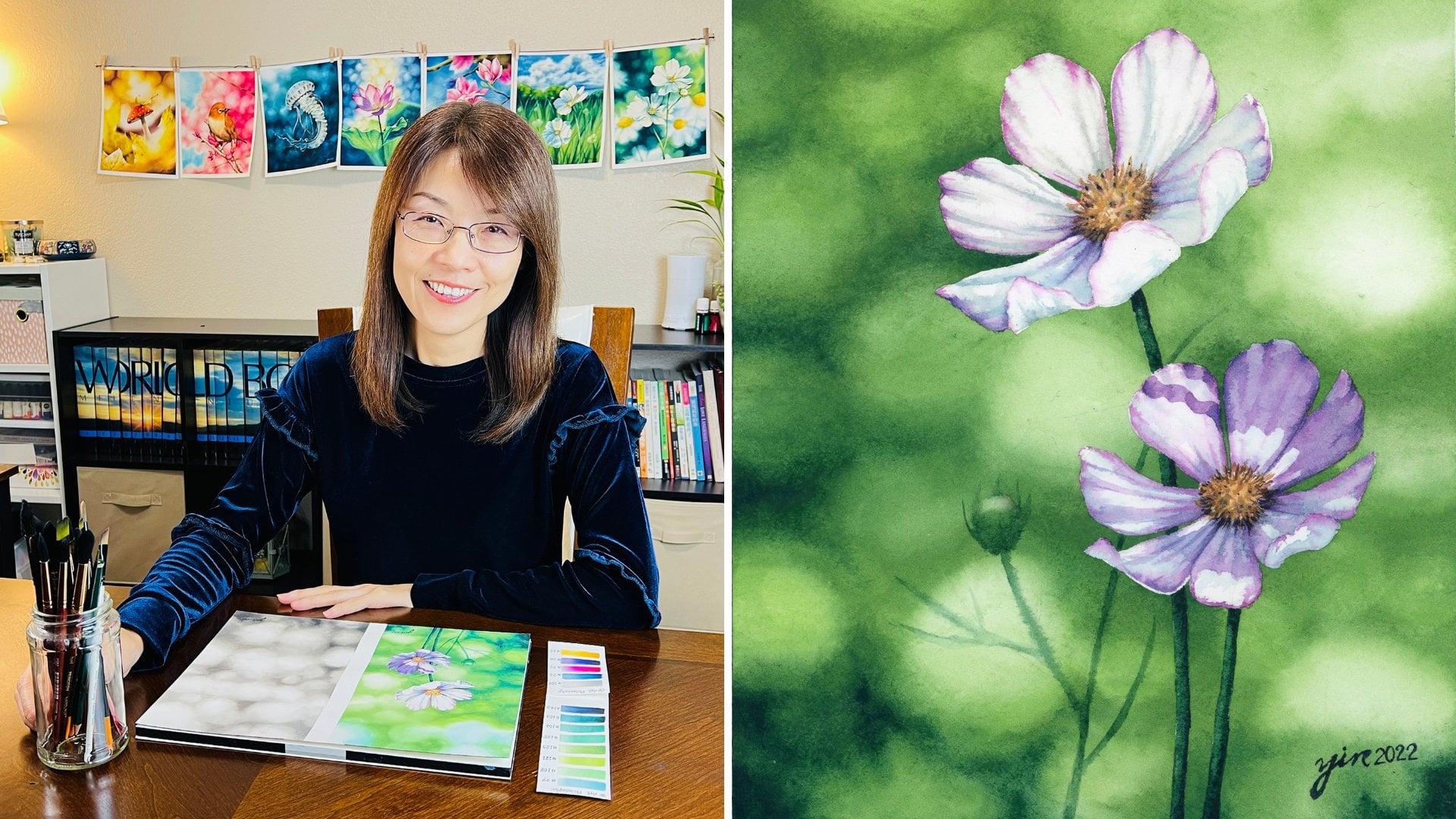
like shadows. Hello, everyone. I'm so glad to see you all here. My name is Yu-Yin Lin and I am the artists at Yin Creative
Studio on Instagram. Art has been a big
part of my life, I have a lot to draw and
paint since I was a child. That's why I have learned
a Bachelor Degree in Oil Painting and a Master
Degree in Art Education. I have applied my artistic
skills and knowledge to my design career and later decided to devote
myself to teaching art, which is my true passion. Light in art, creates
the illusion of depth. However, in realistic
compositions, if there is light, then there is shadow. Creating different layers
of shadows can also help your viewers to visualize
the space in your paintings. In this class, you will learn about the basic concepts
of cast shadow in art. I will show you how to
create cast shadows from one simple single layer
to multiple layers. Also, you will learn
how to observe shadows. Cast shadows. I will talk more about
cast shadows by showing my paintings how I
use it. Art supplies. I will show you
what art supplies that you need for this class. Composition. You will be running
how to compose an interesting painting by
creating an unbalanced layer. Shadows from the
further objects. In this lesson, you will
be learning how to create abstract shadows formed by the further objects on the wall. In order to achieve this effect, I will show you how to create
watercolor bouquet in fact. Shadows from the closer objects. In order to create
space in your painting, I will show you how to create a second layer of shadows from the closer objects on top of
the first layer of shadows. Details of the wall. After adding shadows
on the wall, you will be learning
how to create the cracks and the scratches of the wall in order to achieve the realistic style painting. Painting Virginia creeper. I will show you
step-by-step how to paint Virginia creeper in
a realistic style. Cast shadows on
Virginia creeper. How to take a European
paint to another level by adding cast shadows
on your leaves. This class is for everyone of all levels in
watercolor painting. After this class, you
will be able to apply the knowledge and skill to
create depth in your painting. I cannot wait to see
what you create. Let's get started.
2. Class Project: Painting unnoticeable
beauty shadows with me. In landscape painting, artists
have to create effects of aerial perspective to indicate
distance and the depths. What is aerial perspective? It's a technique that
creates the illusion of space in your painting
by modulating colors, having less distinct
edges, and blurry details. The viewers can
feel the distance created by the artists
in their paintings. I have applied this
concept to my painting by creating watercolor
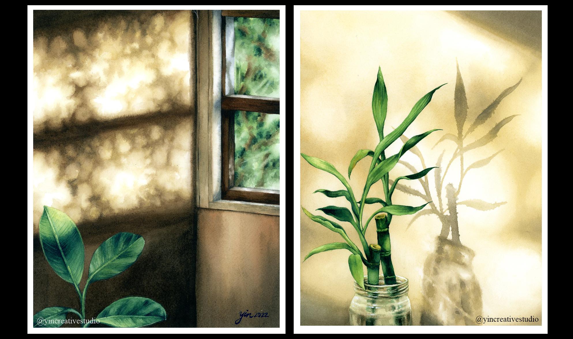
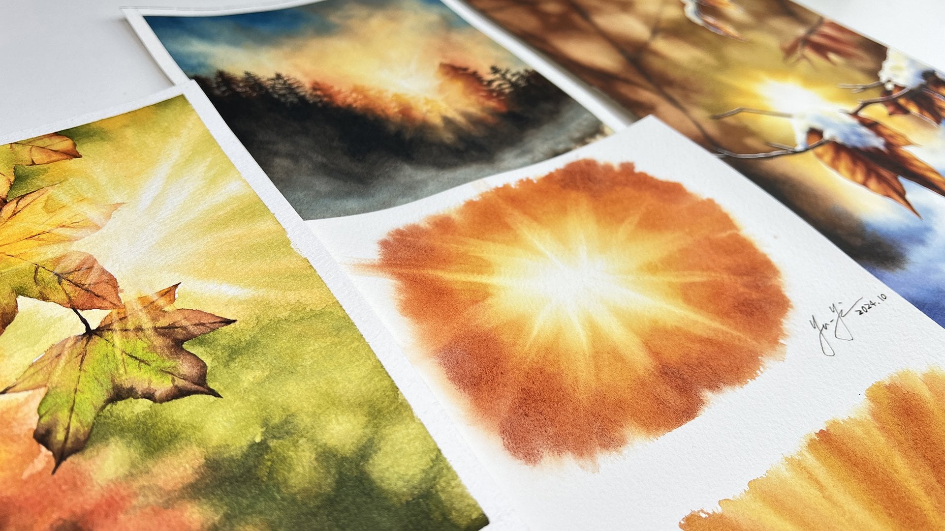
bokeh effect background. Here are some examples
of my painting. As you can see, I'm making the front
object really obvious, like a pop into your face. But the background, I'm making very blurry so
you can feel that distance. However, I wonder how can I create more depth
in my painting? That's why I realized
cast shadows are actually very important
element to our paintings, that can help you create
the illusion of space. For example, here is the
maple tree painting. You can see I painted
the main trunk in the front with some
clear details. But the trees behind it, and even farther one, I'm making them all
blurry, and blurry, and towards the end
is bokeh effect. However, on the main trunk, I added some cast shadow
from another tree. That creates the
illusion of space to remind the viewers
there actually are different trees
not included in this painting but
right in front of me. That's how you can create illusion of space
for your painting. In this class, I
will be teaching you the relationship
between light, and shadows, how to observe shadows, why cast shadows are important, define different
layers of shadows, art supplies that you
need for this class, how to compose an
interesting painting, how to add the cast shadows from further objects by creating
watercolor bokeh effects, how to add cast shadows from closer objects by combining attract and the object shapes, how to add more
details of the wall, how to paint Virginia
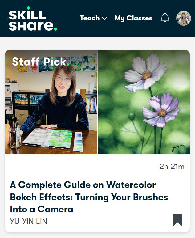
creeper in a realistic way. I published my first-class, A Complete Guide of Watercolor
Bokeh Effects last year, and received lots of
feedback and suggestions. Also, after sharing the series of my shadow paintings
on Integrant, people have asked
me how I created the atmosphere and space
in my watercolor painting. That's why I decided
to design this class to share my knowledge
and techniques with you. After this class, you can not only
create the space, but also the atmosphere
in your paintings. Are you all ready? Let's get started.
3. Observe Shadows: [MUSIC] Before painting, I would like to mention more details of shadows and the way I see
shadows as unnoticeable beauty. First, what is shadow? A shadow is the dark
side of an object not facing the light
that reveals the form, a mess of the shape. Next, let's talk about
different types of shadows. There are two main
kinds of shadows, a cast shadow and a form shadow. Cast shadow refers to a
shadow that is left by the object and is not
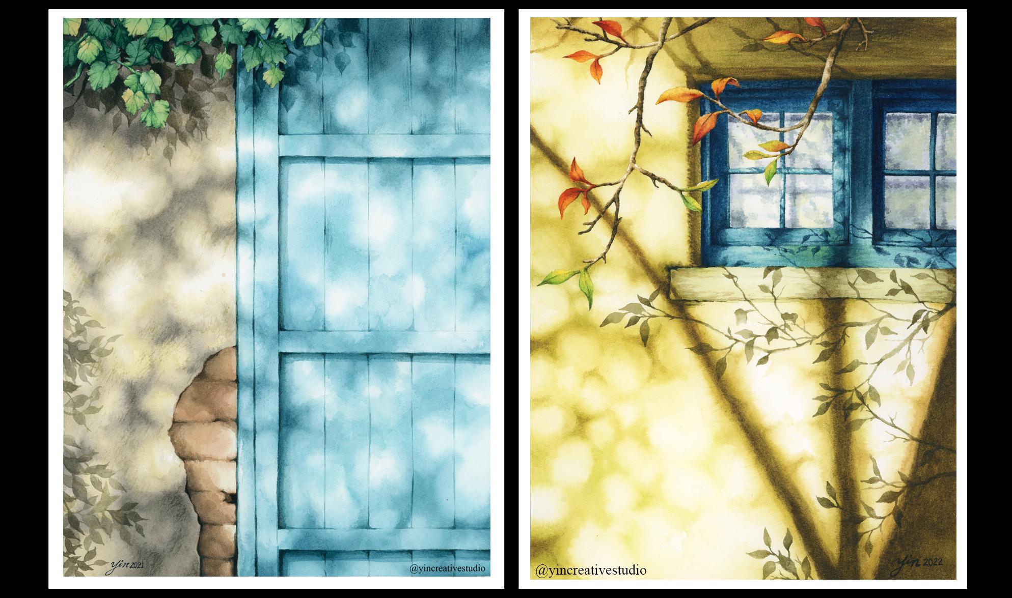
on the object itself. Form shadow refers to the area of the object that is in shadow. For example here is
my pumpkin painting. As you can see, the lines doors is from
the right top corner. That's how we find
the form shadow right over here
inside the object. Same as this pumpkin. You can see the form shadow
here for their cast shadows which is right here is on
the ground, on the leaf. That's how we create this distance and the
space of your painting. Another example is this
maple tree painting. You can see the form
shadows on the trunk here, this area, and also in the
back which is in the object. However, I added some cast
shadows from different tree. It can give you the illusion
that you can feel okay, there is another tree
in front and that's how those cast shadow
for this tree, so you can create the
depths of your painting. In this class I will
focus on cast shadow more by creating two
layers of shadows. One is formed by further
objects like a tree or leaves and the other is
formed by the closer leaves. [MUSIC] If you're ready, let's jump to the next lesson.
4. Cast Shadows: [MUSIC] After learning
what shadow is and the two main
types of shadows, let's learn more
about cast shadows that we're going to
focus on in this class. First, how do cast shadows form? Cast shadows occur
when objects are blocking the light
from hitting surface, such as grounds or walls. For example, the leaf are blocking the light
from hitting the wall. Next, the relationship between
light and cast shadows. In reality, if layer is
light then layer is shadow. Cast shadow imply the shape of the object in the
direction of the light. There are three elements
that affect cast shadows, including the angle
of the light source, the shape of the object
casting the shadow, and the topography of the surface where
the shadow is cast. Finally, shapes of cast shadows. The shapes of cast shadows
depend on the object's shapes, surface quality, and the distance between the
light source and the wall. The further objects from the wall will show
nearly abstract, circular shapes of shadows that look like a bokeh
effect in photography. The close one from the
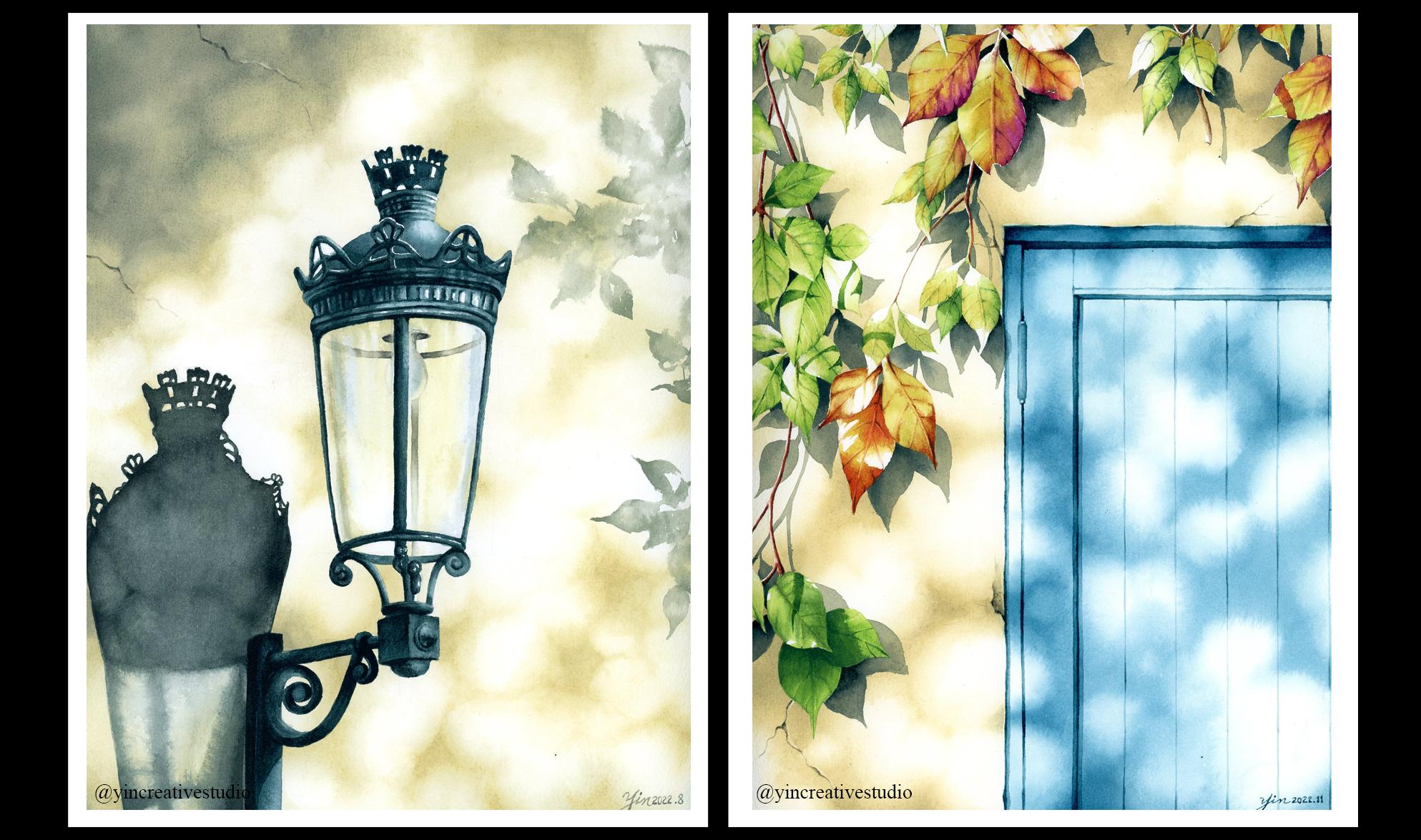
wall will show the sharp, hard edge of the object shapes. Here are some example. In our daily life you will see all different kinds of
cast shadows around you, including the ground, the wall, windows, buildings,
trees, and even leaves. If you pay close attention
to your surroundings, you will find the unnoticeable
beauty everywhere. There are so many
helpful resource online. You can find all the
information that I mentioned in this class in the project
and resource section. You will find all
the website that I mention or I use those
information from. You can dip in more details. Don't forget to check that
session for all the links. After knowing more information
about cast shadow, [MUSIC] let's get
our supplies ready.
5. Art Supplies: [MUSIC] Here are
all our supplies that we need for this class. Let's begin with
watercolor paint, for this class, I choose
the art philosophy brain. There are so many different
set you can choose from. In this class I choose
Vintage pastels and terrain. However, I'm not going to use all the colors from
two sets, instead, I pick the colors I
want and then make my own color palette right here. I make the color
chart so you can find it in the projects and
resources section. I also mentioned which in number that I use for this class. If you don't have the
same brain as the mean, no worry, just based
on the color chart, you will find any
colors similar, wherever you can find a whole, you can ping along. Next, let's talk about the
basic a pencil and eraser. I'm mainly just use them for the first step which is sketch. I use two edge and just the
regular eraser for you. For the water brushes, I have a whole set here. I'm going to tell you group by group based on which
part I'm going to paint. For example, the first four, I have the brain, princeton, neptune, quill size 6, I have a 1.5 oval wash, the round brush size 10 and 8. These four brushes
I'll use them to paint the first layer of shadow, which is bouquet effect. In the quill size 6, you will see me
use all the time, not just the background, but even from the leaf, so you will see me use it a lot. For the second layer
of cast shadow, which is darker one, I will use this group. This group is from
the Schimoni art. I will use layer quill
size 3 and 1 plus the round brush size 6 to do all the details
for the cast shadow. Next for our main
Virginia creeper, I will use these four from
the same brand Schimoni art, and I have a long brush size 8, 6, 4 and 2. These brush are mainly used
for the details of our leaf. These two brush also I
use for the leaf part, and also the cracks and
scratches on the wall. These too mainly is
for lifting colors. Bigger area, I use this big flat brush and a
smaller area like leaf, I use this small one, size 2. That's all the brushes that
I will use for this class. Next, let's talk
about the palette. I use it a two palette,
one bigger one, just regular mixing colors, and a small one I use
it for masking fluid. You will see me use it for
masking fluid and liquid soap. Now this one we call residue eraser is mainly to
remove the masking fluid. Next, let's talk about
watercolor paper. In this class, I choose
the brain arches. It's cold press, 300 gm, 140 pounds and the 100% cotton. The reason I chose this one
is really good for washes and create a good water
bouquet effect bigger. Next, of course, we need a jar for watercolor
and also the old towel rag, whatever you can find at home. The last, not list, some people may use the
tape to put your paper on solid wood board or
table, it's up to you. For me, I use this one, it's called stencil tape. You can also use the washi tape, which is a prettier, have all the different
options and also in space. It's up to you, any tape, if you want, you can use it. I think that's all
of our surprise that we're going to use for
this class. [MUSIC]
6. Composition: [MUSIC] Here are some
reference of Virginia Creeper and cast shadows that I'm
going to use in this class. Two images of Virginia
Creeper are from istockphoto.com and
the cast shadow one is from pinterest.com. I usually simplify
the reference or just add the different
elements to my painting. In this class, I'm going to
query the unbalanced layout. In my first class, a complete guide to
watercolor effects Lesson 5, I taught about composition by applying the principles of
art, including balance. If you would like to know more
about composition and what slope principles of R please
head to my first class. In this class, I'm going to show you a different way to create unbalanced layout in order to make your painting balanced. Let's do the sketch now. You can use the pencil number 2H or HB to sketch the layout. I like to do a rough
draft first to see for the proportion and the position of Virginia Creeper are good. Then I decide where I'm
going to put the cracks. I'm going to add one down here. As we talked about earlier, I'm going to draw
the crack mainly on the right and broaden
to keep a balance. Now the position already, I will just add the
details of the leaf. If you are following along, you can make our line
a little bit darker. Because later on when we apply the masking fluid and remove it, it might leave
some pencil marks. I'm just letting you know it might make a sketch a little bit lighter after removing
masking fluid. Now let's just continue
to finish all the sketch. [MUSIC] I did another leaf or down. Let's check the
crack, the first one, second one and then let's
add another one on the left, bottom corner, right layer. Now the layer looks balanced. All of them. Now let's apply masking fluid to the Virginia Creeper area. First, let's squeeze some
liquid soap in the palette and then pour some masking fluid into the palette
right next to it. Usually, after I pull it out, I clean the lid right away. Just make sure the
glue doesn't stick on the opening area so next time it's easier
for you to open. For the brushes, I use just simple
synthetic brushes. Not very high-quality one, just in case you might
ruin your brushes. Then once you dip the
brush into water, make sure to take
your brush all the way completely into the soap. Make sure the whole brush is
covered by the liquid soap. Now you just dig into
the masking fluid and carefully cover
the leaf area. Now we can just repeat the same step to
cover the whole area. [MUSIC] Next we have to do is wait for masking
fluid to completely dry. Before that let's meet at
the next lesson and get ready to paint our
first layer of cache.
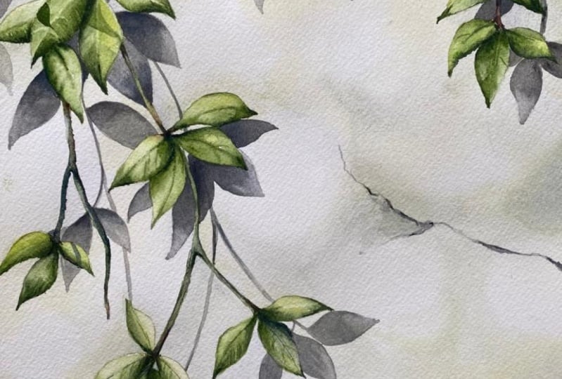
7. Cast Shadows from the Further Objects: [MUSIC] In this class, you will be learning how to create not only one
layer of cast shadow, but also two or three
if you would like to. The first layer
of cast shadow in this painting that we're
going to create is an abstract shape formed by
the further objects from you. This kind of effect we call
bokeh effect in photography. If you are not familiar
with the term bokeh, you can head to my first class, A Complete Guide to
Watercolor Bokeh Effect, where you can find
more information including what is bokeh and how can you create this kind of effect by using watercolor. First, let's get
the colors ready. In this layer, I use three colors to create
the bokeh effect shadow, including number 111, number 113, and number 114. First, let's wet the paper. Since the left bottom corner
is the lightest part, let's start from there. When you apply water
to your paper, make sure it cover
all the texture. Now we use the first color, 111. Move your brush in circular
way to create the pattern. [MUSIC] After you apply the first
color to a certain area, use your coil size
6 with water only to gently bury the edge, make it really smooth. Just carry the colors
to the lighter area. [MUSIC] Now the
first layer is done, let's go back to add more
colors in certain area. Since the paper is still thin, that's the best time to
add the color so it will well blend in smoothly together. You can see the first
layer of the shadow, where it's formed, is there. Now we use a coil
size 6 more time, water only, just
smooth out the edge. [MUSIC] You don't need a lot of water in your brush
for this step. [MUSIC] Now I'm going to add a little bit 113 to make a certain area
a little bit darker. [MUSIC] I usually paint this
effect section by section because we really need to
make sure the paper is wet, is stained enough for us
to blend colors smoothly. [MUSIC] Now let's move
to the next section. Same steps: apply water first, use first color 111 to
create the basic pattern. [MUSIC] The certain
area behind leaf, I'll go and make
them darkest one. That's why I apply
color to all the area. So same thing after
you apply the color, use a coil size with water only and just make sure
the edge is smooth. [MUSIC] We can always
add more colors to a certain area you
want them to look darker. [MUSIC] Now let's
add a second color 113 in certain area to
make sure they are darker. [MUSIC] We still can go back a little bit down here, I feel here it can be darker, and then use the first color
to smooth out the edge, just carry the color
to different area. Same here, you can
use the first color, just smooth out the edge, blend two colors
together better. [MUSIC] Let's smooth out here a little bit. I feel this area
going to be very dark so I can smooth
out here first. When you see
something imperfect, it's better to fix it right away when the
paper is still wet. [MUSIC] It can be a
little bit darker here and now we use the
darkest 114 to certain area. [MUSIC] Same step, use the second color
like the previous color. Just carry color over, make edge smooth, not like a sharp edge. Now they're blending
well together. I'm going to make a shadow from the lighter
part to the darkest part. Same step, apply water first. Then make sure you
don't leave out colors from previous layer; the previous paint
we just finished. [MUSIC] We can use the first color, the same step. Let's continue creating
the shadow patterns. [MUSIC] For the shadows pattern, you can create your own. You don't have to 100% follow
mine or the reference. As long as you get
your effects out, the pattern doesn't
really matter that much. Don't worry that you
cannot 100% follow mine. [MUSIC] For this effect, dyeing is the critical key. You have to have
your colors ready and control the
water really well. Once you have a water control
and the dyeing control, you can make a pretty
good bouquet effect. [MUSIC] Once you find all
the paper is not wet enough, just apply more color down here. Now I just continue
adding more color in certain area to
make them darker. [MUSIC] Same step here; add a second darker color, [MUSIC] top here as well. [MUSIC] Now let's use a coil with water only to smooth out the edge when you
see anywhere is not smooth. Just to have the coil brush on side by your hand
is very important. [MUSIC] Down the corner here, it can be darker. So I add the Color 114. [MUSIC] Something not smooth you use a previous color
to make it smooth. [MUSIC] Now when I see certain areas
not dark enough, I try to add more color when
the paper is still thin. [MUSIC] Now let's keep going to the top corner. Let's apply water. Try not to touch the
paint you just did. You don't want to leave out
color or leave low watermark. To gently bring water to the
edge, not really touching. I'm going to add
a lot of color in this corner since for me
they are the darkest area. I cannot just cover all
of them with first color, [MUSIC] smooth on the edge. It's always the same
step, apply color, smooth out the edge, add a darker color, smooth out the edge. That's the basic steps, you can continue to create
this bouquet effect. [MUSIC] If we use a coil brush
to carry some color out, once a while, I still
will wash it just in case you bring certain
color to the lightest part. Now I'm going to continue
to add more darker color to the right top corner since
it's the darkest area. The cast shadow not only follows leaf but also from some
leaves outside this painting, which we cannot see. That's a way we can create another illusion of the
space for your painting. [MUSIC] Let's do the final review. Certain area, I want
to make them darker. When you still can get them, you still can do it. Now I'm going to add the darkest one to those certain area, like the top corner here, make them much darker. [MUSIC] Maybe a
little bit more here. Now we use a second
color to smooth out the edge to bring the
color well together. [MUSIC] I think
it's almost done. The first layer, looks
pretty good right here. [MUSIC] That's looks pretty good. Final touch here. Now we just create the
first layer of cast shadow.
8. Shadows from Closer Objects : [MUSIC] Before painting a
second layer of cast shadow, let's think about where the
light resource is from. Why? The direction of
the light resource will determine what angle in shapes that the shadows
will look like. When the leaves are
closer to the wall the edges of the cast shadows
are sharper and cleaner. That's the effect that
we're going to create for the second layer
of cast shadow. First, let's get
the colors ready. The colors we are going to
use include all colors from the first layer of
shadow plus 96 and 92. The reason I added
some blue and green to this layer is because
of the surroundings, which are the green
leaves and sky. Adding lesser
refracting colors to the shadows can make your
painting more coherent. Next, let's decide where
the light resource is from. Based on our reference the light resource is
from left top corner, going all the way down. That's why we're going to create a shadow on the right side of the leaf and around a 45-degree
position from the leaf. As for the shadow shapes, don't stress out
too much you cannot create that is that
shapes as your reference. As long as you make the similar shapes in
the correct position, then you still can
have the same effect. Finally, if you pay close
attention to the cast shadow, you will notice
the cast shadow is not actually even
throughout the whole area. For example, here is darker. All the way down
here can be lighter. Last one, we're going to add more depth to your shadows by creating the graduation of colors to make your
painting more interesting. Now I think we are all ready
to paint the second layer. Let's start from the
left top corner from here and I will show you step-by-step and the
finishing this session first. Then you can repeat
the same step for the rest of the cast shadow. Before we start painting, I have a tip for you about how to choose the right
cast shadow colors. Here I have two colors ready. The first one I use
three of them to mix together right here
and the second color, I use the third one, which is 114, and then I add some 96, which is the dark
green right here. Then the tip is, when you have your color ready, you are not sure they
are the right color. Maybe too dark, maybe too light. My tip is, you can grab another piece of
paper, the small one. You can just simply,
for example, you put it on here simple leaf shape and then you add the darker one here
to see how they go together. You can testing out to see if the color
goes well together. Then you can put it right next to where you
want to put it. We can decide, maybe too dark, maybe too light but for me, I think that is the right color for us
to add the second layer. Let's start from the
small simple one here so I can show you first
color the lighter one. Based on the line we can
follow that and just gently draw the
shadow right here. Then for the leaf area, since is on the right
side, the 45 degrees. I will say maybe around here. That's at right
here and they have the same leaf and the longer one here and the last one
that could be right here. Now we have a whole
shadow ready. Now we use the
second darker color to emphasize a certain area, for example here, I feel like here can be a
little bit darker. Maybe around here can be darker too and you can just bring
color in all together. Here can be a little bit longer. Now we finish with this group
let's focus on next group. Based on the angle
you put it down, the first leaf should
be right over here and the second leaf should
be all the way right here. Then the last one
should be right here since we don't really see. I just fill in this space, indicating there
is one shadow over there and the same thing. Certain areas are
darker like here under. We can emphasize. Here's a much lighter add on it. When still wet that's the
best time you can add some darker coloring and then maybe just leave some
unnecessary color out, all these colors branding
in better so same as here. There you go. That's the
first shadow we just create. Let's continue this group. Same thing. The vein, the by can be right over here, and of course, up
here is much darker. We're going to make this shadow much darker so we can see, and the leaf since all
the way down here, the first leaf would
be right over here, and second one,
the biggest one it could be all the way down here. Sometimes a leaf
might overlapping, which is totally fine. As you can see, this area is dark already. What I'm going to do is add the darkest one
all the way here. Also here, this area is
darker so I'm going to bring some darker area here
and just carry over. Then let's continue the
second one here at the end, all the way here. It's covered as well. Sometimes you might cover
your original painting, which is totally fine because all the leaf when they
cover each other, that is normal so 1, 2, 3 stones let's work on this one, which are these all
the way up here. You cannot really see. I'm going just to indicate
there's one shadow here. Here's a much darker. This area is done. Now it's time to
add on this one, which is a darker one. That's why you're
using this color. You can just go straight. [MUSIC] Here we go.
9. Shadows from Closer Objects: Adding Depth: [MUSIC] Now I'm going to
create a certain color by using 114, 117, and 92 to make
the darkest one. Because I noticed some
area here when you're close to the leaf
can be even darker. Now I'm going to add the
even darker color here. This way you can really create the depths of
the shadow as well. It's not just the
front ground you can make the depths
of your painting, but also by using
gradation of color, you can make on your shadow have some depths of
your painting too. That part is really pushed down, so people can know
here is really dark. I would like to add
a little bit here, since here's also the first
layer is darker shadow. You can add another one here. I'm going to do a little
bit here as well. As you can see, the best time to add it is when the color or the
paper is still wet. But now I just use a
coil without any color, just a little bit water
to blend those colors in. That will be it for
the first session. Same here, we can then
repeat the same step. Before I let you
all do the rest, let me show you one more time. The vines are right here, so the angle should
be around here, that's how the shadow form. You go all the way down, then you can see the leaf
should be around this area. In this area, I'm going to
make it a little bit darker. [MUSIC] Same to here, we can make it a
little bit darker. [MUSIC] Now we can
focus on the leaf, a little tiny leaf right here. I'm going to do the
first one right here. [MUSIC] You can continue to the second, [MUSIC] the third. [MUSIC] Last part, let's add another one over here. [MUSIC] I think that's the whole session here. We forgot this group. I just noticed that. There is another group of
leaf we're going to add in here. Let's do that. First one, we are going
to do it right over here. Almost forgot this group. I'm going to add
another leaf here. [MUSIC] First one here, [MUSIC] another one right here, and there's another one
all the way up here. [MUSIC] There we go. Then now we add
other darker one. Since here is all
under the leaf, so I'm going to make
them all darker. Here, I think that one is good. I just add the darker
all the way here. [MUSIC] All the way in here I'm going to
make the darkest one. Over here in this area I'm
going to make it darker. [MUSIC] Then now we can take care a whole
group of leaves here. Now we can just repeat
the same step for the rest of your cast shadow. [MUSIC] Now let's review one more
time to see if you're happy with all the leaf
shadows that you add on. For me, I will feel
like there are some leaf is outside our paper, but they're still
in the same area. That's why I'm going to go
in to fix certain area. Still we'll see the shadow even though we don't see
the leaf in your painting, which is in this area
or some over here. I might add a few more, even though they are
not in our painting. That I can show you
how we can do it. But if you don't, you feel like you're just
happy with whatever you make, you don't have to do this part. For me, I just feel
like in this part, it must have another
leaf or shadow. That's why I'm going to
just add a few of them. I just fill in the space, is now feel like it's just
serving empathy layer. I will add one layer, maybe another one here. It's all up to you. You don't
have to do this if you are happy with your second layer. But for me, I want to
add a few over here, just give you the
option if you would like to add another
leaf shadow here later. Overall, I think
we just completed the second layer
of cast shadows.
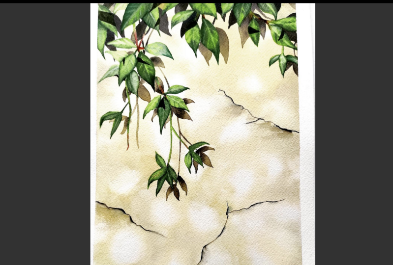
10. Details on the Wall: [MUSIC] In order to create a realistic style
of this painting, let's add some cracks
and scratches on the wall including
where, when, and how. First, let's figure out where we should
add a little texture. You don't have to add too
many cracks or scratches. Here, I'm going to
add three cracks on some open areas including
the right center, the right bottom, and the left corner one. This arrangement, you can
lead your viewers to go through the whole painting
by catching these details. Please feel free to add more or less based on your own painting. Next, when should we
add some textures? It's not necessary
to add a texture to the wall all
the time, however, when there is some open space in the background and the
layer is out of balance, you can add the cracks to
attract the viewers eye to go through each
corner of your painting. Finally, how can we create
a texture of the wall? In this part, I'm going to apply lifting colors technique to create the cracks and dry-on-dry technique
to create scratches. In this part, I will use the quarter flat brush to leave some colors and then round brush size four and flat
brush size two to add darker colors right next to the lifting area depending on where the light
resource is from. Let's start painting the crack. I have one, two, three colors from
the background. We use the first color to
outline where is the crack. By the way, here's a tip. You can try to color on another paper and next to
where you go into paint, so you can see if
it's too dark or not. So now we just follow
the sketch we did before and use the first color. So you can see
where the crack is. Towards the end,
if it's too sharp, you can always use
a brush with water only just to bring the
colors in to the background. Now we're using a second color, second dark gray color only
add it to a certain area. So same thing if it's too sharp, you can always use a coil with water only to blend them in. Then here I feel like I can
be a little bit smoother, that's why I use coil
brush to blend them in. Well, okay, and now I think this
is much better. Now we're going
to use the third, the darkish gray from the background and just
emphasizes certain area. So that's the same step. Add a dark color and blend
them into the previous color. Now it's time to lift color
like we mentioned before, to add the lightest part. So the flat brush
with water only, lift color, and remember to get rid of the colors
each time you lift. So if it's too dry, add some water so you can
lift out more colors. You don't have to
make it a strong contrast as long as you can see it's lighter right
next to the darkest part. So you can repeat,
keep repeating, lifting until you like
the final result. Maybe a little bit here. Just emphasize a
little bit here. That's why here I
think it looks good. Now let's repeat the same steps
to create a second crack. So use the lightest color
from the background, just follow the sketch and then you know
where the crack is. Down the border here, I'm going to add
scratches later on, that's why I extend the
color to the near area. So later on, I'm going to
add some scratches here, that's why I extend that area. So now we use the second gray just emphasize in certain area. So same thing if you
feel is not enough, use either the first
color or you can use your coil brush with water
only just blending in. Here, I'm going to emphasize more and then extend all
the gray to the side. Now we use the darkish gray
to emphasize certain area. Maybe a little bit out here. Since I'm going to
add a scratches here. So that whole area is darker. Now I also add some
darkish color in here. Now it's time to use the
flat brush to lift colors. So make sure you
remember where is the light source so you know which side to lift colors and get rid of the
color each time you lift. Now you can see, I don't make it like a big contrast
but at least you can see the edge is lighter. Also remind yourself, where is the light source so you
know which side to lift. For me since I'm right-handed, so I like to rotate my
board which is in my paper. The reason is that
it's easier for me to control how to lift, how much to lift, and also the direction
my brush is going. So take a look and now
I think it's all good. Now let's repeat the same
steps to add a third crack. So use the first gray, first color from the
background, outline the crack. Here, I'm going to
add more scratches. That's why later on you
can see darker area. I'm going to add more so I can carry the
color out a little bit. Then I use a second
darkish color to add more. So this part, this area, I'm not only going to
add the scratches, but only I can make some kind of uneven surface of the wall. So you can use either a second or darkish color to tap on it to make it uneven. Then we add a darker
color to make it more obvious so you can see
now that whole area. Now let's do the last
step which is lifting color to make the edge pop out, and also inside here, lifting. Sometimes you might need
to do few times in order to get the result you want. Especially the previous layer, we don't put a lot of paint on it and the color
is pretty subtle. That's why it takes a
while to really lifting colors to be the way I want. So just take a few steps, and now it's done. Now let's add some scratches. I use a flat brush, size
10 for this effect. So we just use whatever
is left on your palette like a first one we use the
very light, this one first. Just want to make sure
it's not a big contrast. Another way kind of a tip, you can just brush on different paper to see
how it looks like. So just remember
not too much water, like a dry-on-dry technique. So just slowly brush on and I feel it can be
a little bit darker. Add a second darkish color and then just brush it through. We can see the brush strokes
on here which is perfect. Now we're going to
add it to this area. So same thing, just
gently brush it through. Don't put too much
pressure on it. Now we just add the cracks
and scratches on your wall. Usually, I don't add
too much scratches. But if you would
like to have more, you can add anywhere
you want to. [MUSIC] If you are
happy with this result, let's move to the next lesson, How to Paint Leaves
and Branches.
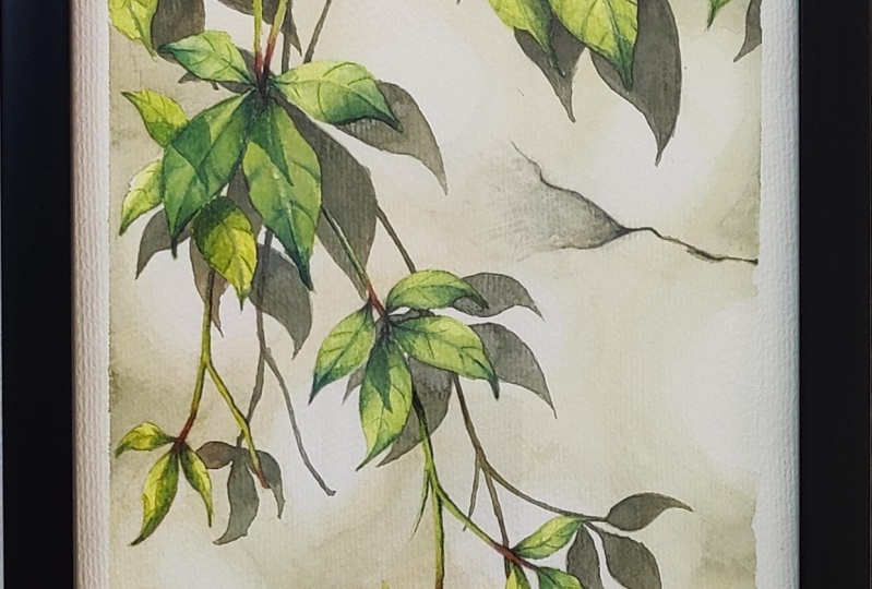
11. Virginia Creeper: Individual Leaf: [MUSIC] Before
painting the leaves, let's remove the masking fluid. If you are not familiar
with masking fluid, you can head to my first-class a complete guide of watercolor
bokeh effect Lesson 6, where you will find all the helpful tips
of masking fluids, including you can
prevent ruining your brushes from
using masking fluid. Let's use the residue eraser
to remove masking fluid. Make sure that you
remove all of that, including the small
tiny corner [MUSIC] Now we just remove all
the masking fluid. Before we start painting, let's double-check one
more time to see if you do remove all of them,
all the corners. If everything look good, let's move to the
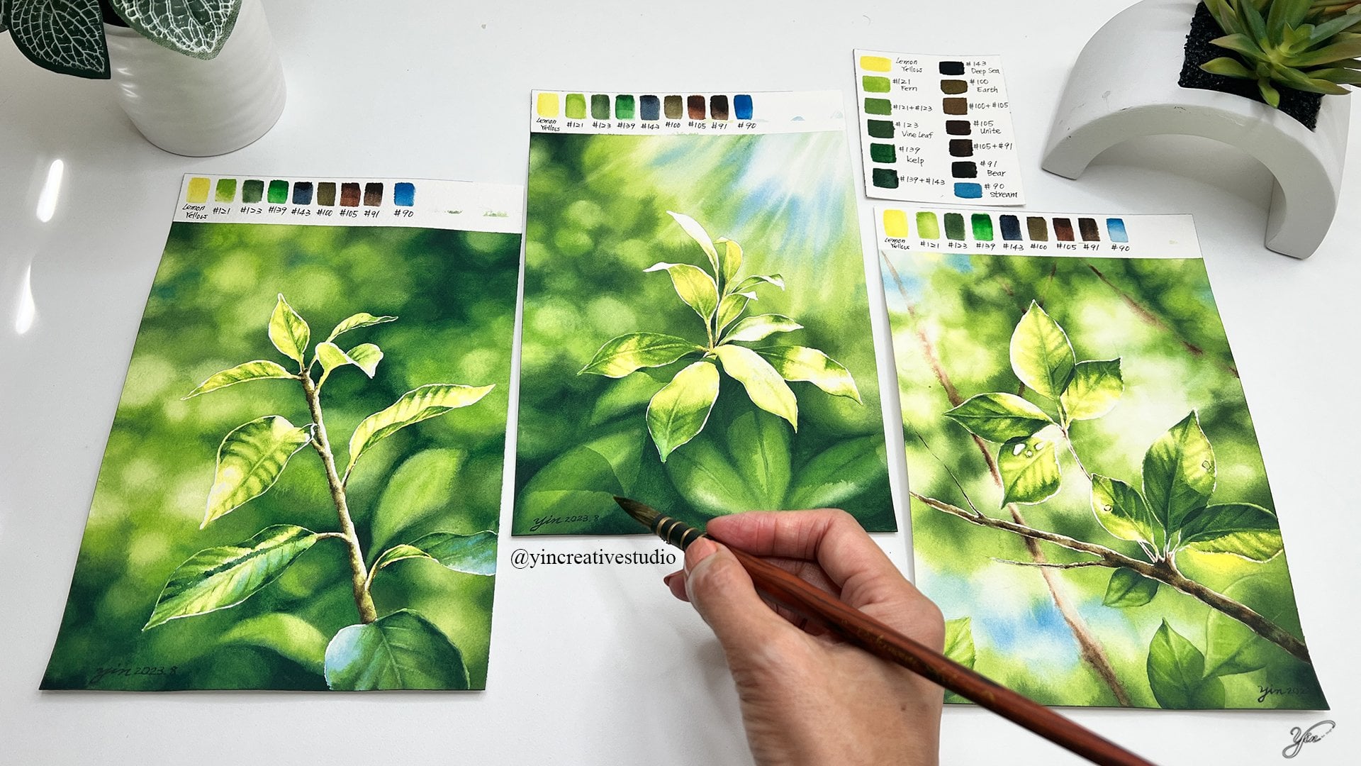
next painting part. For Virginia creeper, I'm going to use a few
colors from my color chart. I make three groups. The first one I miss, 122 is 121, which is the lightest
one and the second one, I use Number 123, add a little bit, 125 to
make, the second color. Then the last one I use, 96+193. Just mix two of them
to see which one's closer to the Number
2, the second color. We can make a grid deviation
of all the leaves, of course is some
part of like here. I add more 122 making more yellowish and up here can
be a little bit darker. And then I will add the 96, 92, maybe certain area, I will add 127. So when I get there, I will let you know. As a follow-up brushes, I choose the coil Number 3. In the second color, I use Ron Brush Number 8, and the darkest one, I use Ron Number
6, but later on, when we get to the smallest one, I will use the Ron Size 4. That's the main
brushes I'm going to paint, the Virginia creeper. Let's start with this group. I will show you few leaves, how I paint it and later on
you can repeat the same step to all other leaves so let's
show you the first group. We have a lighter, the light is green
you color this area. Always keep in mind, where is the lighting resource. Which is the front,
the left top corner. This area is going
to be lighter, you can extend all
of green right here. Then you can use
it a second green. Since here the light, here is really strong so I'm not going to cover the whole
area with darker green. I'm going to just
use a little bit here and then just
brush that in. Each leaf might look
different based on the lighting so now you
can see here is lighter. I'm going to use a second
color maybe add this one little bit darker, here too. Also when the paper
is still wet, that's the best time you can
add some darker pasture, for example, here, a little bit here too. That's initially they're
just blending in. Now I'm going to
use a flat brush, no color, just water. You can lift in some colors for certain inserting area
to make it lighter. That's the natural
way you can make this three dimension of
your leaf lighter here too. Also, right now still wet is
the best time you can make a sun area lighter as well at the vein area,
make it lighter. You can do it later about
Wednesday is the best time. You can leave some colors, make it lighter, over here and now I'm going
to use the darkest one. Just emphasizes through
a certainly area to be darker like here [MUSIC] The first leaf, we'll
let it pretty much here since it's
still wet and we'll let it dry and
then we can always come back to emphasize
a certain area, like lift here more colors. Here feel it can be lighter, so I'm going to just
lifting out and carry some colors to a
lighter area like here. It may take some time, but the result is really worthy. When you add the more details, you can make all the
leaves look like real, since we are trying to
create a realistic style. I think that's the first leaf. For the second leaf, I'm going to just
apply some color water to this area since I want to
make this leaf really light, lighter than this one, since it receive more light. You apply some water here
and back to the first color. Since we have water as base, so we can see the color is
lighter than this one already. Very strong lighting
from here for this leaf. Then when you fold
into that way, we can make it darker, which is a second color. Another thing about
painting leaf, you can always create
your own pattern. It's just based on
how you see it, how the viewer see it. But when you're painting it, as long as you remember the light resource is
from the center rushing, then you don't have to
worry that your leaf doesn't look exactly
like your reference. That's the thing that you know. You don't have to
really worry too much, that oh, it doesn't look
like the reference. Don't worry about that too much. The first base is done, so now, the same thing. Use the flat brush,
just some water. I can lift off certain
area like here, make it even lighter. Emphasize this area. You can see the middle part
is popping out and then use the darkest one just a
little bit down right here. You don't need a lot. Use a
second green to carry over, and then you can see the
patterns right here. You can use the first green, add some texture here. The second green, some from here to
a little bit here. Now, you come back
to the flat brush. Lift some colors here, some colors here,
make it lightest one. It takes time, but results are not really good. I think the first, second leaf are down. If you will like to just apply those steps to all
of your leaves, you can just paint
along with me. [MUSIC]
12. Virginia Creeper: Cast Shadows on Bottom Leaf: Okay, now we have a finishing
in the first group. I'm going to show you
a little bit tip, when the two leaves
are together, you feel like the colors
might be very similar. How can we separate? Which means I can add
some sun cast shadow on the bottom one that's
why I use the darkest one. You can just emphasize the bottom leaf a little bit
here to make it much darker. We're using a second green and now that one is so much darker. I can really separate the
top one and the bottom one. [MUSIC] That's a tip for you. Now that's finished the
rest of leaves together.
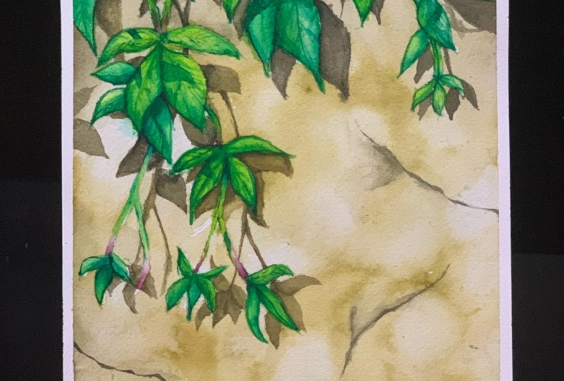
13. Virginia Creeper: Branches: For the branches, I add the two more colors 131 purplish color with
130 which is orange. I'm going to mix
both of them to make a conjunction between
leaf and the branch, so let's do this. If you don't have
these two colors, you can find something like
an orange or brownish orange. Just use that here as well. Since it's dry here already, so I'm going to just
apply some water here. The best time to do
this to add this color is when you just finish
the leaf but here, I'm going to just show you
another way you can do it. Now, you just add this
color, right around here. You can see the color just
breathing out to the branch, which is perfect, and you can use the first green. Just carry the color, will carry the cover
out to rest of branch, and then if you feel
here is non-natural, you just bring the second green, just mix them together and
then that's pretty good. Since we have a color here, I'm going to just finish
this part of branch as well. I'm going to just
show you here you can finish all the leaf
and compare for that but I have this color ready as I'm going to
just show you here. Like I said, the best
time to do this is when the paper is still thin and wet, and then you can
easily to branch, to mix the color
here with the green, which is a perfect here. [MUSIC] Now you have the first branch done. You can apply them to the
rest of the branches.
14. Virginia Creeper: Painting the Groups: [MUSIC] Some leaves
are brighter than others since they
receive more light. That's why some
leaf I'm going to use only 122 for
the lightest part. For example, this one, I'm going to just place some
water here and only use 122. Make them really light. This area will really see
much lighter than others. Since it us so bright, some area mainly be white. I can leave it blank. You will see how much
lighter than others. This area, I'm going to
leave it really light. Then we're back to
the first green, make a certain area darker. As you can see, comparing
with other leaves, this one is so much lighter
because of the lighting. Sometimes that's also
the way that you can really separate different
layers of leaf. For example, here
this one is lighter, you can make the one behind
a little bit darker. Basil area can make
it pretty bright, so you're making a big contrast to make your painting
more interesting. [MUSIC]
15. Virginia Creeper: Emphasizing the Leaves: [MUSIC] Now, we have just finished painting all the leaf. Let's take a look. Certain area I feel
like I would like to emphasize the details of leaves. For you is extra, if you like the way you paint, you don't have to do this part. But if you're just like me, like here, the main leaf, I want to add some details, you can follow me to
do those additions. For this part, I'm going
to use a round brush size 4 for the
lighter, which I use. The first screw of
green add a little bit 123 to make a little bit
darker than the first green. Then I will use the round
brush size 2 for a darker one, which I will miss the second grew of green with
a little bit third group. I will show you what
I'm going to do. For example, regular
small tiny leaf here, if you will like to you
can add some details. For example, I can feel here, I want to add some details. You can just gently ally the texture of the leaf. You can see some details here. In the for a darker part
for example this one, I will use the second green. In the certain area
I'm going to use a darker green, right over here. I want to emphasize and then
you can just add on there. It's a little bit details. You can apply these steps to your leaf anywhere you feel like I want to
add more details, then you can do that. For me, I'm going to add more, for example, this group. I want to add some
right here too. It's all up to you
you don't have to do it but if you feel like, you prefer little
bit more details, then you can do the same thing as quiet
I'm doing right now. Sometimes you can feel that
might be too dark. No worry. Use a flat brush. Just water and just brush out. [MUSIC] Just go
over your painting. You feel like you
needed to do it. If not, then I think we're
almost finished here. Now the leaf looks pretty good. However, I'm going to show you another way to make the
depth of your leaf. Now we just finished painting Virginia Creeper in
a realistic style. However, how can we take our
painting to another level? Let's move to the next lesson. [MUSIC] I will show
you how to add a cast shadow on those
leaves and branches.
16. Virginia Creeper: Cast Shadow: If you pay close attention
to our surroundings, you will notice that cast
shadows are everywhere. In this lesson, I'm
going to show you how to add the cast shadows
on Virginia creeper. All the leaves are actually in the different layers if
you take a close look, leaves that can help you create the illusion of space
in your painting. First, let's remind ourselves, where is the light resource, which is from the
left top corner. Just imagine there's
a leaf outside the painting from
here, from this angle. If lighting comes here, a shadow can fall on
any of these leave. So that's the cast shadow
we are going to create. Then here, let's use this
leaf as a symbol right here. Right in front here, the
shadow can fall on this one. That's why I'm going to add, the sun cast a
shadow on the leaf. Usually I use a
darker green from the leaf and then since we
have some level over here, and then based on the leaf, it can be right over here. We're going to just add
a sun right over here, so that'd be the cast
shadow from that leaf. That'll be one. But
how about this one? This one might
fall on this leaf. That's how we're going
to add another one here. Based on the angle right here, so you can add a shadow here. Just indicate that sun cast a shadow that is
falling on here. So now we make a two. Even the cast shadow
is still [inaudible] with some darker area. Now I use the 96 plus
a little bit 92. We can make a
certain area darker, for example, add to here. We emphasize a certain area. Even the cast shadow has some
depths right over there. Then let's continue.
Maybe another leaf outside of painting
could be right here, so the shadow can
fall on this leaf. Let's create another
one right over here. This time, I'm going
to make it bigger over here and you can follow a leaf texture, some of them are going here, and then try to avoid this
one that's going higher. There we go. Now,
same thing that added darker one in this
area and here too. There we go. Some highlight can be lighter, which means we can use lifting color technique like
even smaller flat brush. Just leave out certain
area right here. You'll make this area later. There we go. Here just
naturally darker. Now, if you look closely
all those cast shadow to make more like a
space right here. Let's just continue, take a look and add more
cast shadow on your leaves. [MUSIC] Some of the cast shadow
might fall on your branches, so that's another
way you can add a certain cast shadow on your branch to make
it more interesting. For example, I'm going to
add the sun right here. There we go. The sun cast a shadow on the
branches as well. [MUSIC] Also, adding cast shadow
is another way you can separate two leaves that
might have a similar tone. Like this one if I add
one cast shadow here, make it so much darker
so you can totally push this leaf back
from the top one. That's another way you can create the space
of your painting. [MUSIC] Certain area you make it darker so it can
separate from the big one. [MUSIC] [inaudible] this one. Let's take a look, step back and take a look all of your leaf and see if you
are happy with the result.. It looks pretty good. We can see here the darker
and some shadows, some cast shadow on
this leaf and here too, I think that looks pretty good. I always like to step back
to look at my painting. Why? Pulling back from it and viewing it from
a distance allows your eyes to relax and take in the whole composition at
once, in its entirety. I step back few times
during the process, so I know exactly where
to fix or continue. It's one of my tips for you. Hopefully, it will
help you as well. Now, it's your turn to step back and review your painting. You can pause right here, give yourself few minutes to see if you need
to fix anything, and when you come back, let's sign your name
to your painting. [MUSIC] Congratulations. You just completed this class.
17. Final Thoughts: [MUSIC] What a joy
for joining to share my knowledge and
skill with you all. I truly hope that this information will
help you in some way. Please don't hesitate to
contact me for questions, comments, or any suggestion. I can be reached
@yiincreativestudio on Instagram. Direct email through my website, www.yincreativestudio.com. Or the direct way is
to really come on in discussion session and
post your projects in the projects and resource
session at Skillshare. It would be a good place we can communicate, ask question, leave a comment, share why you have a run or
I can also run from y'all. Please post your project, I would like to see all
your final artwork. Also in the resource section, you will find all the reference, the image of the final art work, and the color chart for you. Again, [MUSIC] thank
you so much for taking your time and
joining my class. I hope I will see you all soon. Happy painting.