Transcripts
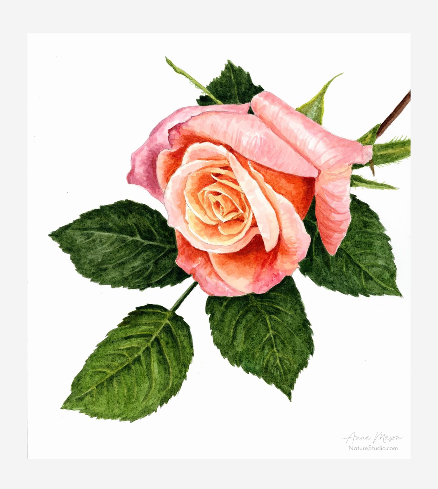
1. Introduction : Did you know that watercolors
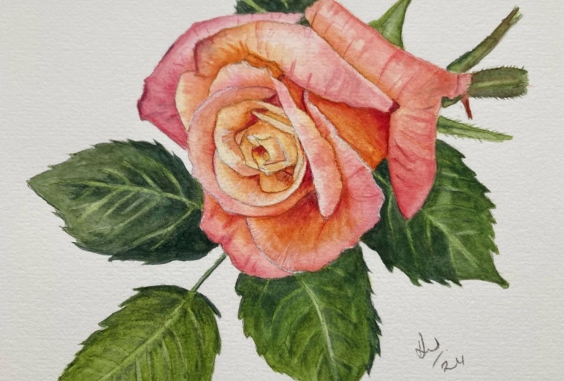
can look like this? And did you know that
you could learn to paint with this level of
realism, vibrancy, and pop using my
four stage method, that's a lot easier than
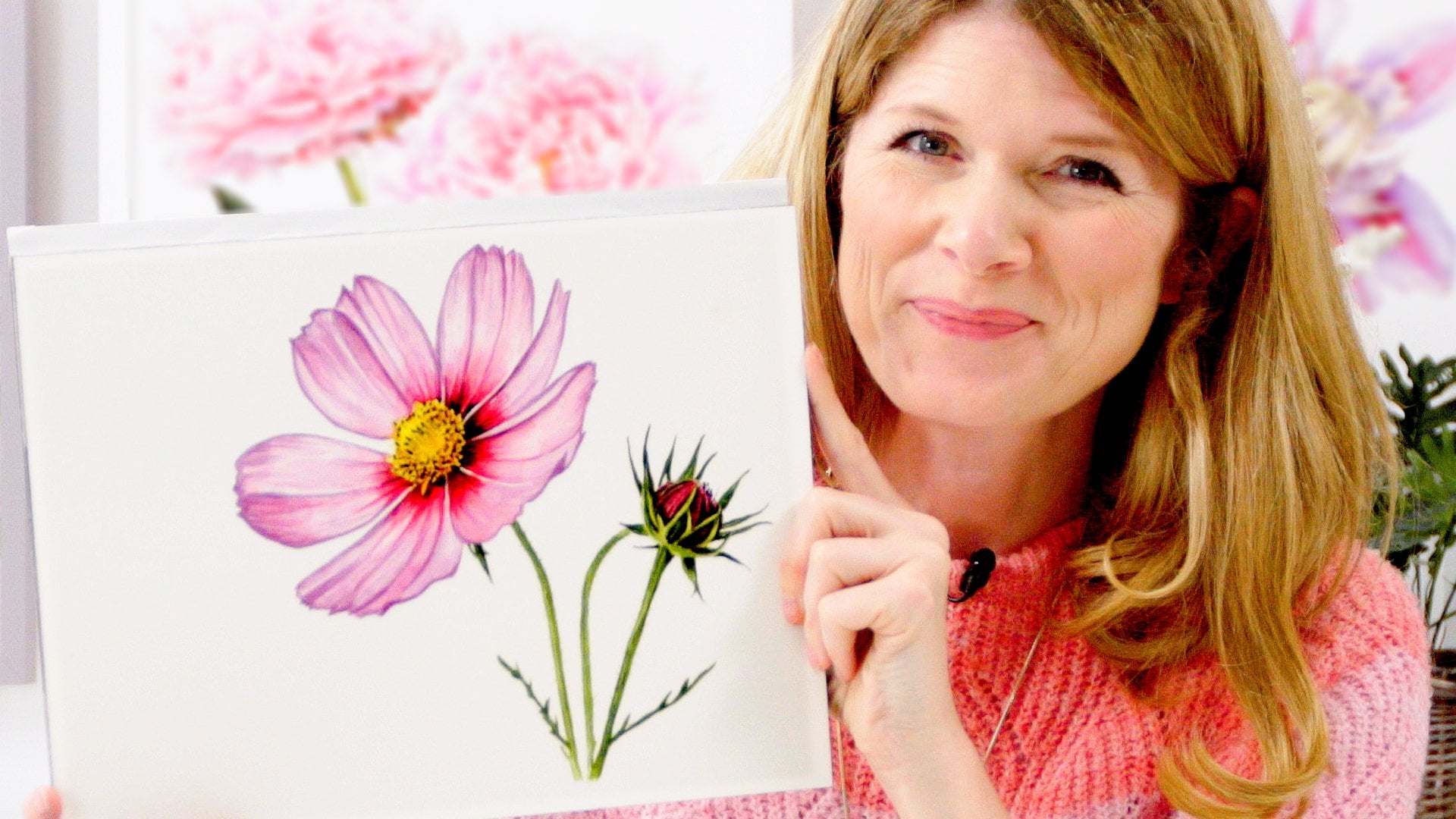
it looks. I'm Anna Mason. I'm an award winning
watercolor artist and published author with
books in six languages. In this class, I'll show you my unique tried and tested
four step method. Which places you
firmly in control of your paint and has
given confidence to tens of thousands
of students from over 100 countries over
the last ten years. You'll learn to
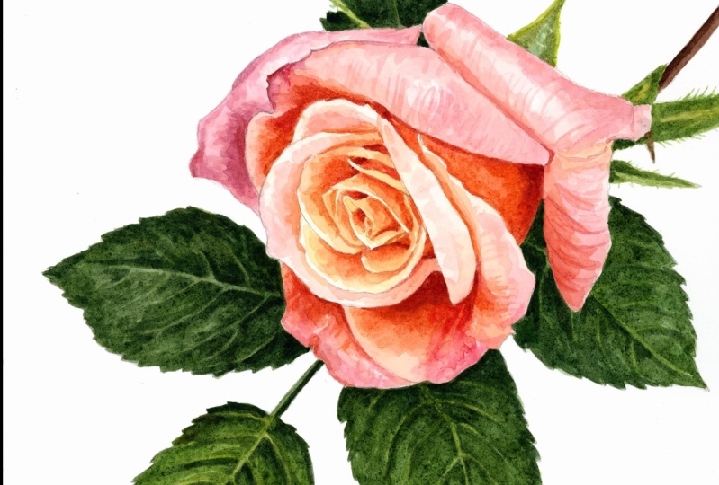
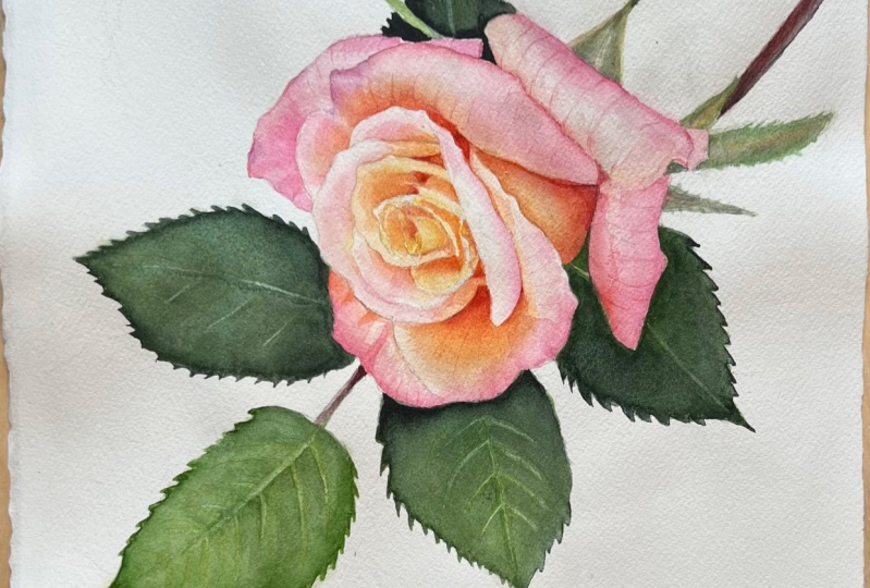
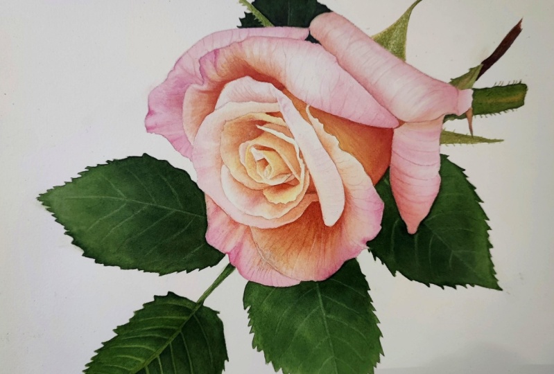
paint this gorgeous rose flower in water
color with me. I'll walk you through
it step by step, and I'll give you the
Y as well as the how. So that you come away with
a method you'll be able to apply to other flowers
and nature subjects. You need zero power
experience with watercolor. You don't even need
to be able to draw. And if you've tried watercolors before and found them
tricky, don't worry. I've got you covered
in the class. We'll begin with an
accurate pencil drawing that you can simply trace
from the one I supply. Next, we'll map out where all the colors go using
pale versions of them. I'll show you exactly how to mix the colors using
just five paints. Then we'll be brave and
paint in the darkest tones or values in the flower
before bringing it together. By painting the mid
tones in layers, I'll be showing you
exactly how to color, mix, and apply the paint so you feel really confident in
what you're doing. We'll do the same
thing to the leaves, and then we'll spend
some time making the kinds of final adjustments
that will give our flower an extra hit of realism
and have it pop off the paper to produce a painting. This detailed, it's likely to take you about three to 4 hours, depending on how fast you paint. This is about slowing down
and enjoying the process, but you don't need to
do all this at once. Working with
watercolors means that you can break off
whenever you need to and simply rewet your paints when you're ready to come
back to your painting. This style of artwork
might take time, but once you've been
shown how it can be deeply relaxing
and really enjoyable, once you've completed
the project, we'll recap the method looking at how it applies
to other flowers. You'll have honed
your observation skills and we'll be ready to apply these new skills to your own paintings
going forwards. You're already a better
artist than you think, and I'll show you
that in this class.
2. Class Orientation & Supplies: I'm so glad you're joining me
to paint this rose flower. I've chosen it because it's
actually easier than it might seem to achieve the
really three D look of these pretty petals. There are a lot of colors within them when
you really look. But what you'll discover in
the class is that getting how light or dark the colors are within your painting, right? What we call the tonal
or value range is far more important than getting
the colors mixed Just so. And my step by step
method is going to really help you with
those tonal values. This is a class
suitable for beginners. I know know that if
you slow down and follow my instructions,
you're going to do great. But it is a complex subject, so I ask that you're
kind to yourself and attempt the class again if you're not satisfied
with your result. If you do find you struggle, hop on over to Nature
Studio.com where you can take a free class that's
a little simpler and might be helpful to take
before attempting this one. Again. Before we dive
into painting together, let's take a look at the
supplies you're going to need. First off, to make your drawing, you're going to need
some tracing paper. I recommend that you
paint the rose on paper that's at
least nine by 12 ". That's 23 by 31 centimeters big. You could even work
at 12:16 inches. Working larger is often a little easier, but
it takes longer. Whatever size you work at, you're going to need
your tracing paper to be at least that size. You also need an HB pencil and an eraser to make the
drawing for the painting. You'll want some
watercolor paper. Again, mine is nine 12 " big. If you can get hold of
some hot pressed paper, then that's perfect for this. It's smoother and it's going to allow you to
get crisper lines. You can paint the rose on some textured, cold pressed paper, but be aware that
your result won't be quite as smooth and
realistic looking. You'd also want the
paper to be 100% cotton, ideally because that makes it absorbent and means that your paint is going
to dry quickly too. Thickness is also
important for this, and I recommend you
get paper that's around 300 GSM, or 140 pounds. My paper is part of a pad of paper that comes
glued as a block. And you release each sheet with something like a palette
knife after you paint. But you can use a single
sheet, if it's thick enough, it shouldn't buckle, then you're going to
need some brushes. You can, of course, try
using any you have, but the brush techniques
I'll be showing you will work much better
with shorter haired, teardrop shaped
spotter style brushes, like the animation
set in the class, I'll be using all five
sizes from my set. From the largest size five down to the smallest
treble zero. If you're not used to working in this way with water color, you might be surprised
at how small these are. Their small size actually means that they hold
less water in them, which means they
don't get the paper too wet and it will dry quickly, which is really important
for my layering method. Oh, and another thing
to note about the brush is we're going to be using
them for precision work, so we want their
shape to stay intact. So try not to leave
them tip down in your water pot when
you're not using them, as it's going to bend the
hairs and damage the tip. Instead, just lay them flat on your desk when you're
not using them. You'll also need a water pot. I just use a small
clear glass or jar so that I can monitor how dirty my water is getting as I paint. And you'll need a palette
to mix your paints on. Specifically a
white flat palette, where your paint will spread out nicely so you can see it. So a china dinner plate
will work really well. And of course,
you're going to need some paints for this class. You're only going to
need five colors, and I use ones by
Windsor and Newton as part of their professional
watercolor series. You'll only need a tiny amount, so the small five
milliliter tubes will be far more than you need, and you can squeeze them out onto the edge of your palette. It doesn't matter
if they dry off. In fact, it can be better for mixing the darkest
colors with them. Firstly, we have permanent rose. This color is a vibrant
and almost purplish pink that when we water it right down creates some
lovely pale pinks. Secondly, Windsor lemon. This is a really
transparent bright yellow. Don't be tempted by any cadmium yellows
or cadmium lemons, because although they may appear very similar
in the palette, they're more opaque and they won't work as well
for this technique. Thirdly, Windsor
green yellow shade, a really vibrant and transparent green
that will be mixing with other colors to create the botanical greens
of the leaves. Fourthly, we have Pains Gray, a very dark and
transparent blue gray which is excellent
for darkening mixes. And lastly, burnt sienna, a rich red brown, which when combined
with pains gray creates some really great
neutrals and blacks. You may be able to
substitute for colors you already have if you
are substituting. Remember, we're looking for
colors graded as transparent. And please avoid
students quality paints like the Cotman Range by Windsor and Newton
because they don't contain as much pigment
and they don't layer well. So they won't get
you good results. If you're new to water color, you may not fancy
spending money on quality supplies before you know whether this type of
painting is for you. That's completely
understandable, but I'd urge you not
to waste money on inferior quality
supplies because they just won't work the
way that we need them to. And they'll leave you
feeling frustrated with your results through
no fault of your own. So if you don't want to buy, ask your friends
to see if anyone has any spare supplies
that they could lend you. It's amazing how many
unused paints are sitting in cupboards or draws
out their gathering dust.
3. Getting Set Up & Making the Drawing: Once you've got your supplies, let's take a look at how best
to set your workspace out. You're going to be referring to the color reference photo provided in the PDF
when you paint. So you'll want to view the
color photo on a screen when you're painting
to make sure that the colors are reproduced well. In order to do that and watch
the videos conveniently, set up your workspace with your computer or
ipad close at hand, and an easy viewing distance. You'll be able to
view the videos and the reference image
off the same device. So unless the screen
is really big, you won't be able to see
both at the same time. Which is why if you have
two screens available, try watching the videos on one and your reference
image on the other. When it comes to
making the drawing, we're looking for pencil
marks that aren't super dark, so they won't be too visible
through our watercolor. And we want the drawing
to be really accurate. It's pretty complex as I've included the outline
edge to the petals, plus an outline
edge to the leaves, and a tram line to the
central veins of the leaves, as well as a single line for
the secondary veins on them. The reason you want to
get all these lines in the right places is so that when you're painting
and looking back and forth from the reference
photo to your paper, it'll be so much easier
to keep a track of where you are if your
drawing matches the photo. So to make the drawing easy, I recommend you trace from the mirrored drawing provided
in the PDF I'm supplying. Print that page off
so that you can trace it straight onto your
watercolor paper. Here's a quick reminder of the tracing process as it may
have been a while since you last did it take the printed
off mirrored version of the line drawing position
tracing paper on top of it, keeping the tracing paper
in the same position. Draw over the lines with
regular graphite pencil. Take the tracing paper off, turn it over, and position
it on your watercolor paper. Keep it in place as you
scribble over the back of the tracing paper to transfer the pencil line onto
the watercolor paper. Check it over, tidying, darkening up, or even lightening with an
erasor where needed. Then you're done
and ready to paint.
4. Flower: Lightest Tones: In this first stage
of the painting, we're going to map out a lot
of the different colors in the painting using very
pale versions of them. We'll begin to train
our eye to see much more detail in the rows
than we normally would. And we'll begin to
learn how to match the colors we see
with our paint mixes. We're going to begin with
the petals themselves. When we take a look at the
rows in black and white, we can more easily identify the lightest parts
of the petals, which are these areas here. Let's turn them yellow. If we flip the photo to
color again and really look, we can see that there's
a little bit of hue variation between
even those areas. The lightest parts on the
top petal are more pink and the lighter areas
lower down have a more apricot
orange type color. These are the areas
we want to make sure that we don't
take too dark as they're effectively
the highlights and will be really
important to preserve. To make sure that the
flower seems three D, let's create some
pale mixes for them. Now, I'm going to use my
biggest brush, the five brush. We'll start to create the mix by using what's the
most logical color, and that's our pink, which is the permanent rose. But as we take a look at
that here in the palette, and the flat palette is
great for being able to spread it out and
take a good look. We can see it's two purplish, it's two towards blue. Let's mix with it a little
bit of the Windsor lemon, the yellow, till we get something that's
a more peachy color. Now, we've got lots of
different variations of color within this rose, but I think something like this, if we dilute it right down, look how much water
is going in here. Loads of water, super pale. I think something like
this looks about right. Let's test it out first. I'm going to apply it somewhere
that's actually darker. I'm going to come
down here because I know then that
if it isn't right, we'll be layering up on top. But actually I think
that's a good match for the high light color.
I can see up here. What I'm going to do
is apply this color anywhere that's this
hue and tone or darker. What it means is
I'm going to hold off of applying it into
any areas that are, for example, a
lighter yellow color. Now there's a little bit in here that's slightly more yellowy. Let's have a couple of
mixes on and go at once. Because what I want to
do at this stage is get a layer of paint
down everywhere, but I want it to be really pale, a match to the palest versions that we can see within
any of these areas. I'm just popping a bit more of the Windsor lemon there and
just applying this here. But look how pale it is,
it really is really, really pale back to
the more pink mixture. I try to apply the paint in what I call the
direction of form. I'm imagining that this rose
is really here in front of me where that would
curve like that around. I'm applying the
paint like that. Now the reason is because
if I get overlaps, then with my paint, as I'm applying those overlaps are
going to create little lines. Those lines will then be
in those curve shapes very similar to the veins that
you can see within the rose. They're actually going to
really help in terms of creating a sense of
shape to the petals. Now this same mix I'm
going to apply over here. I think the hue
and tone is good. Really, really pale. I'm
working within each petal. I'm not going across it all. I want to start to build up the separateness
of these petals. I'm just remixing there. I'm trying to remember to work
in the direction of form, even though at this
stage I'm not really getting overlaps with my paint, because it's all merging
together on the paper. A little bit more of
the permanent rose. Just to go on to this back one. Yeah, I'm matching to the lightest colors
within each petal, but I can apply it into the darker areas within
those petals too. It won't matter
that we've applied this pale mixture under this
area here, for example. That's going to be darker. But what it means
is we can leave little gaps through our paint into patches that are lighter. And we can build up lots of what I call visual
texture in here. There's lots of little
shapes of color and if we leave this
lighter mix underneath, we'll be able to leave
gaps through to that. Coming in here, we've got
loads of different colors. Actually for this first stage, the one I've got here on my
brush is going to be fine. But as we move over here, there's a little bit more of
that almost orangey color. It's an orange hue
in here as well. Let's add more of the
Windsor lemon to the mix. As we come in here. I'm just using the tip there to
get a bit more control. This is already drying off. If you're using a good
100% cotton paper, then it will dry really quickly and it just means
it won't spread into it. Let's remix here. We need basically a few
versions of this on the go. I'm going to use one that's
a midway peachy pink here, just for the edge here, but just keeping things super pale. And this is a really pale, but again, that peachy color, if you're in any doubt,
just water down some more, add more water in, and just
keep it really, really pale. We can always
darken up later on. It's so lovely having this pencil drawing
really accurate here, because you should already start to notice that as you look back to a reference photo. Because you need
to be looking at the reference photo to
get the colors right. You can just find your
way so much easier because that pencil outline is in the right
place on your paper, just creating a more yellow
version of this mix. I'm going to use that here. This is much darker orange. But this yellow
could sit underneath that darker orange
without any problems. I'm actually going to
apply this yellow color. I'm going to add even more
of the Windsor Lemon. I'm just going to apply
this right the way over this section here because it's a match to those lightest
yellows I can see within it. And then looking over here, I'll pop this more orange
color in this section. By making these hue changes
to the actual color element, whether it's permanent rose or windsor lemon or a
combination of the two. By making the
changes, right now, we are already starting to
map out what colors go where. Again, I'm going
to have quite an orange version down here, but it's a match to
the lightest color. The lightest color is on the
edge of this petal here. But I can take it into this much darker
section here as well. And then it gets more
pink at the edge here, so I can change my mixture. I don't want to go
too dark actually, I'm just squeezing
off that brush there because this
is my biggest brush, but I don't want to
get the paper too wet. This technique is
really about keeping the paper fairly dry and letting it dry off between each layer. Let's go back to a peachy
mixture for this section. This is really
pale, peachy color. This is part of our highlights
that we identified. When looking at the photo, this bit is going
to be much darker. I can just pop some of this
on there, that won't matter. This is a orangey bit. I'll try and get that in place. You can see this hasn't
completely dried, so it's bleeding into that. But that's okay
because we're working. So P, this is the
peachy color as well, so we pop that in up here, and then tricking around didn't quite get my
yellow mix over that bit. So I'll just go
back to that then. We've just got
this one here, and again, there's so many colors, it's really enjoyable
actually when you start to tune in to see this
isn't a pink rose. When you really look, there's just so many
different variations. So we can already start
capture a little bit of that. I'm almost going to use some just of the neat permanent rose there to just reflect that slightly different
brighter hue. But again, I don't
want to go too dark. And then I'm just going to
check over have I got a mixed down everywhere
within the rows? Just to check, I haven't got any big gaps. I
think that's good.
5. Leaves & Stem: Lightest Tones: Now with that drying off, let's pop a pale layer
down to the leaves. The leaves contain a
few different hues. There's the lighter, more
yellow greens towards the edges on the sea pools and in some
of the veins in these areas. Then there's the darker, more
blue greens which are in the shadow areas closer
towards the flower here. Even within these darker greens, there are some lighter
flex of color and there's lots of visual
texture to achieve. We're going to work
in layers and again, start with a fairly pale one. Let's begin with
the yellow greens. I've gone down to my size
three brush for this. I'll start with a mix
of Windsor lemon, our yellow, and a bit of
which is really potent, the Windsor green yellow shade. So I'm just going
to pop a bit of it there on the palette
and take from that, which is a good tip, so you don't overwhelm
your mix each time. Now it's so vibrant that
it's just a bit much. We need to mute it down, so we're going to use a little bit of our
burnt sienna to do that. Then I'm going to add in
a bit more Winsor lemon, perhaps a bit more burnt sienna that looks really vibrant. But I'd actually rather we were too vibrant at this point. And we can always mute
our colors down and darken them up with future
layers. Let's go with this. A color which is a
match to the veins. I'll start actually
up in a, up here. I don't have to be too
precise where I paint this. I'm going to have
darker greens around. Actually, this can go a little bit into those
areas, that's no problem. But obviously, this stage is about marking out where all of our
different colors go. It's a good idea to try and get them in roughly
the right place. Go a little vein
there, actually, this whole little bit, which
I think is another sepal. When I'm trying to
get a precise mark, notice how the angle
of my brush goes up. I rest my hand. Ideally I'll be doing
it on the table, but I'm doing it on the palette here because it's so close. Then let's just mute this
down a little bit more. Perhaps this is our pains
gray, which is really potent. Again, a little bit of that there because the veins over on this leaf are
definitely not as bright. But I do want to be
able to see them. And this stage, painting them in early on is going
to help with that. I'm just using my pencil
lines as my guide. And at this point, I
don't even need to be too precise about which side of the pencil line
I'm working on. We've got a double like
railway track pencil line for the central vein there, but these secondary veins have
just got one pencil line. But we don't need to worry
at this point and we just apply this quite
liberally all over. Now this actually
is a little bit lighter or more
vibrant down here. I'll use that here again. Get these in place. So I'm just going to go ahead and
do this to all of my veins. I'm just applying
it over the whole of that little bit of sepal. Now, I want to go
into the other areas that are slightly lighter green, but they're not as
yellow as this. Let's create a more
green version of this. I'm going to add in some
more of the Windsor green yellow shade and
more of the Windsor lemon, but again, it's far too vibrant. I'm going to add in a
bit of burnt sienna. A little bit of this
pains gray again. Let's take it from here.
Take a little bit in. All of these areas are a bit
darker within the leaves. Even the lightest highlights
are not that dark. But nevertheless, at this stage, it's always good to
go on the side of caution and have them a little
bit lighter than we think. This slightly thicker but still very watery
consistency will be good. You can always test out
again in a darker area, but for example, I think all of this leaf
needs this color. I'll test out in a
dark part of it. Up here. Yeah, that looks
like a good hue mix. At this point, I have to make a decision around the veins. Do I go one side of the
pencil or the other? It's going to depend on
where I had my paint, but basically I
just need to leave. Those veins. Now they've
already dried off. If you work fairly
methodically round, you'll find that they've dried by the time you come
to work on them. Again, it's worth just really getting
into the zone here and just relaxing into it. You can use, this is
this size three brush. It's got a lovely
sharp point to it. You can go carefully up to the pencil line that you've
got at the edge of your leaf. This work that you do
in this stage will make it a lot easier
when we come to work on darkening up
these leaves later on. Yeah, you're just leaving
a gap for the vein. You can leave it quite big. We can always make
it smaller later. But it's a good idea
to nip in a bit. I'd said you could apply
the vein color liberally. You may end up with quite
thick lines at this point. It's a good idea
straightaway to try and net those up and make them
a little bit smaller as you apply this darker
paint around them. So I'll just go ahead and fill in the remainder of this leaf you're going to find
that you need to remix and maybe you're in the middle of the
leaf like I am here, because I only tend to mix a small amount at
once, but that's fine. Don't get too hung up on Oh, it needs to be exactly the
same, it really doesn't. We're going to be layering
up the color here so we'll be able to correct
our hues as we go. But what I'm finding
is, as I remix that, it's that Windsor lemon and
a bit of the Pines gray. That's almost enough actually because we're working so pale. But I've just added in the other two that we did have
in the mix before. Just a little bit
of the green and a tiny bit of the burnt
sienna. But let's see. You know, I don't
think that is a completely perfect match
to what I had before. It really doesn't matter.
Yeah, don't worry. Don't worry about
getting overlaps either. I know that people can get concerned if they
come in in an area, is dried off and
they're going to get an overlap like this is
turning into an overlap patch. I'm just doing to
demonstrate here, but that doesn't matter again, because we're going
to be darkening up the whole of this leaf. This first layer
is about giving us some light colors
that we'll be able to leave gaps through
to, to create texture. And it's also about
mapping out our colors. Don't worry at all
about overlaps. It's worth me just explaining
what I mean by texture. Because obviously if we
were to touch these leaves, in reality they'd
be pretty smooth. But when we're looking at the visual texture and
what they actually look like, there's actually quite a lot of little shapes within them. These leaves are actually fairly out of focus in the photograph, which is helpful
for us actually. It means all the attention
is on the flower itself. We don't need to put in as much detail as if these
had been completely in focus. But nevertheless, there is
a bit of veiny texture to these leaves that
we're going to try and capture just looking
at this color again, I think it's present
down at the bottom of this leaf in a few other places. Let me just place this color in the same way in those few other places where
I think we need it. I'm just filling in
around the petal here, but the petal is totally dry. Now, this green isn't going
to bleed into that color. It's worth just saying there are some little green lines here, but we're going to
apply that level of detail towards the end, so I'm not going to
worry about that now. Then on this area of sepal, I'm just going to
get some more pains gray and then water
it right down. And I'm going to
just stipple a bit. I'm just dabbing really
at the paper and leaving a few gaps through to the white of the paper as well. But I want to create that
slightly furry texture that you can see to
that seal there. I think though that
that's everywhere. With this more yellow green mix, then let's makes a darker green. I'm going to go with
more pines, gray. And I'm going to put in
some Windsor lemon and then bit of burnt sienna,
that's too brown. Let's bring some
more panes gray in. I'm going to put in some of the Windsor green yellow shade, which is so vibrant. Let's mute that down again
with a bit more burnt sienna. This is looking closer. I'm also using this again. It's darker here in the palette. I'll apply a little
bit more water to it, but I'm quite happy with it
being a bit darker still, because these areas of
leaf that I'm going to work on now are darker. Let's work up against
the rows here. This is all dry and we
can just use the tip of the brush to make sure that we get a
nice, crisp edge to it. Going around the vein though, again, where it transitions
into the lighter green. We can just use little lines to do what
I call feathering. We don't want a hard line there, we want to smooth that. But most of that
smoothing will be done with the next
layer of our paint. We don't need to, again,
worry too much at this point. Hopefully you're seeing,
if you're new to this, just how much fun
it can be to use the brushes really very much. Well, like pens or felt
tip pens, pencils, even. That's what we're doing
with this technique and it gives you that great
level of control. And it's just really fun to
be this precise Sometimes, especially when we've
got this pencil line to serve as our guide. If you do go over, I just
went fractionally over. There really doesn't matter. We can eaton these lines up
in our very last stages, and in fact we will for now. Let's just go ahead and
block these colors in again. Let's just look at
that transition. I'm just doing
little lines in to the lighter color so that
it's not completely uniform. And if you see other
areas like in here, it's going to probably
need to be darker. So I'll pop a little bit there. But really, we're
just wanting to make sure everywhere
has got a layer of color on looking at this, I'm going to use a
very pale version of this to just go over
that little bit of stem. Now I'm going to use this
color with actually perhaps a little bit more of
the burnt sienna and pains gray in to try and match to the lightest
colors within this leaf. You may be struggling to see these shifts in hue
that I'm identifying. Obviously, I've got loads of
experience of doing this, but it is something that
as you work in this style, your brain starts
to be able to do. It's quite phenomenal. You just see more detail and you see a wider range of colors. This is seeming like
a more of a match, more grayish green in there, although it will
need to be darker. This feels good to have as
an initial layer there. If you go over the edges, you can just use a finger or a piece of kitchen paper
to just wipe paint off. If you've got good
quality paper, it's really amazing how much you can make
adjustments like that. I'll go through and apply
this mixture to this leaf. Then just moving
over to this leaf, I'm going to apply here as well. It's just this darker mixture. It's the same color. It's the
same four colors actually. But you can see it's
this darker version. But the main thing is we're
still working really pale. If you compare it to how
dark the leaf really is, we're going to have
to take this darker. But as I say, there
is method to this. We're going to do
this light layer first and it's
going to mean that we can really achieve some
good texture to these leaves. I'll go ahead and fill this one in and I'll also work
up here onto this one. Another reason why we're working pale like this with our mixes, even though like this whole
leaf will need to be darker, is that I want us to have built up the color in
the flower first. If we had really, really
thick paint up against thick, dark green paint up
against this flower, and then we're to paint that, it would possibly bleed in. It's another reason to just work pale at this early stage. Now finally we've got color everywhere apart
from this bit of stem. So let's mix a color for that. And that's to be, let's start with the burnt sienna brown, but that's too red. I'm going to add into
it a little bit of our permanent rose
that's far too bright. So let's add in a tiny
bit of the pines, gray. Again, I'm keeping this lighter, but I can see that slightly
more reddish color to it. So I'm going to pop
this one on first. I'm just having to rest my hand. Hopefully you can rest it
on the table or paper, because we want to
work really neatly within our pencil line and get a nice
straight edge there. But we can come and
neaten up later, so don't worry if it's raising the angle of the
brush higher up. You've got that
additional control over the tip is a really
good idea too, Then I'll just mix that in to some of the
yellow green there. I'm going to paint
this a little bit, which I don't even know what
that is. It doesn't matter. I'm just going to
pop that in as well. Then everywhere has got
a layer of paint down. Now we have a really pale and washed out
version of our rose, but we can at least see where the main areas of color are. We're in a great
position to bring our rose flowers to
life in the next video.
6. Flower: Darkest Tones: We're going to
start with the very darkest colors
within the flower. This will feel a
bit strange as it initially makes the painting
look very disjointed, but I found that it puts you in the best position to then
work on the mid tones. So let's be brave and go for it. The darkest parts
within the flower are the areas of a
reddish brown color. In the deepest crevices,
which you can see here. I've cleaned off my palette, so no greens will make
it into my mixes. And for these darkest
colors within the flower, I'm going to use my one brush. It's really quite
small, straight away. And we'll start with some
fairly thick permanent rose. But obviously it's far too
bright and it's too bluish. So let's add in
some burnt sienna. But that feels too
bright as well, so I'm going to add in just the tiniest bit of
that, paints gray. Let's pop a bit there and then add a little
bit to it here. I'm just going to add
some of the other colors. So I've got a bit more paint. Obviously, I'm using
a tiny brush here, you can mix with a bigger brush, which is probably
better for your brush. A little bit lazy like that, I'm just using this one
that looks quite good. I don't want to go too dark. It's always a bit of a
balance at this point. I want us to have a really
dark color on the paper, but I don't want
us to go too dark. Let's just try with this. I'm going to go into
this crevice here. You can always test these
colors out, by the way, on a piece of sketch
work paper or something. Actually, I'm quite
happy with that. If anything, it could have
even more of the brown in to make it a
little bit duller. I'm just watering down
a little bit more. When we're applying this dark, it's about as you're coming out. Is this going to an area
where it's lighter? It does feel like
it starts to do that quite rapidly
because it is so dark. I'm just restricting this into that very corner and I'm just going to look for a few other
areas that are this dark. This is the other bit down here. It is nice working
with the small brush because you've got
so much control. And of course, hopefully going without saying
at this point, but this is completely dry, it's just sitting really
nicely as a layer on top. And I want to
follow that around. We can neaten all
this up later when we're in our more final stages. But here I'm going to just again feather the edge
of the transition, little lines coming out, and that's going to transition
into the lighter oranges. There's another dark part here. Where else do we have
really dark colors? We've got them in here, just right in the crevice. Trying to concentrate here, you have to check your drawing. Can you imagine if
your drawing is out? If you opted not to trace, then you're going to
have to concentrate even harder because it's just highly likely at this point that you're going
to have some differences. Actually, there
is that dark part then there's like
a dark line there. I think that's enough. But I immediately want to just extend this out
a little bit more. This is going into really
the darker midtones. To do that, I'm going to
add in some Windsor lemon. Now, we were using
that for the greens, always usually
actually have a couple of blobs of the Windsor
lemon on the go, so you can keep them separate because we just don't want
that green to go in here. But if we just add that in, then let's try
extending that out. It's a little bit
more watery as well then that feels like
it's a good match to come further out. I feel like I can take it all the way down to
the bottom here. Again, I can feather
the edge where it's going to get lighter above it. Follow this along here more. Now, I'm going to just apply
this into a few more areas. Using the tip of the brush
to make sure I'm here. Whenever you're working
up against another petal, you're defining it
using the tip of your brush or you're
keeping a nice crisp edge. That's so much a part of what this type of
painting is about. Again, I'm just feathering
that transition where it's going to go
into different colors and lighter colors looking
for anywhere where I can see this color again on the transition here
into that darker one, it's just drying
out for me there. So, I'll just add a
little bit more of the Windsor Lemon into this mix. I've got some more and there's almost a slightly
darker ridge there. Just concentrate
on where you added the darkest colors before
and just those transitions. If you're struggling to
see where to apply this, that's the areas to focus on. I think this whole
section in here can have it initially thought my one
brush might be too small, but I'm really glad
we're using it. Now we're working on
these smaller areas. It's along the top there. Perhaps further along here too, does tend to dry a
little bit lighter. That's always the case when
painting with watercolors. They tend to dry a
little bit lighter, so you have to
compensate for that, but that's hard to do. I often just do this like compensate for it by
applying another layer. When it's dried, I'm just going to go back
to that dark mix. I've got a little line in
there which I want to capture, and perhaps a line
under there too. I think that's enough
for this stage. There probably are other
bits that are this dark perhaps around here
would be nice to have, but I think for now
that's good enough.
7. Flower: Midtones: In this video,
we're going to take our flower from its
current state through to a much more complete
and three D version with those darkest
tones in place. We're now going to work with
some more watery mixes. Again, to build
up the mid tones. I'm going to keep adjusting my mixes to match the different
hues within the flower. Let's create that
core mix again, I'm going to use the
three brush for this. I'm going to start with
the permanent rose and winsor lemon. And I'm going to take this mix back to a really
pale consistency, similar to how we were
working with the first layer, maybe just a fraction darker. I'm starting off with
this slightly mid mixture where I can see this color quite a lot in
this petal and this petal, which is where I'm
going to start with, what I'd like to do is isolate the highlights
within those. When we very first started
to apply the pale mixes, we've identified on the
photo the highlights. And they're obviously,
this is and this is some. But for now, just
looking at these, I'd like to isolate those and make sure
we work around them. I'm going to work with this mix. We can adjust the hue
a little bit as we go. If I come in here, I can see that it feels quite
dark initially. If you're in any doubt,
you can water down, but you can also
spread the paint out. If you deposit a great
big blob from your brush, you can always spread it. And that will have the effect
of lightening it as well. I'm going along
that crevice there, along that pencil line, but I'm holding off from here. Now I want to slightly feather that edge or just make
it less of a hard line. I'm going to do the
same on this side. I want to darken up here, but leave that gap in the center where it gets
a little bit lighter. And that's really going
to create the sense of this petal curving back on itself, which is
what's happening. It's so pretty, these roses at this
early stage of opening. Then we can change the
hue of the mix a bit. If you're struggling
with that, just remember that getting the
tonal value of it, how dark it is correct, is going to be more
important than the hue. If this all ends
up being this mid, peachy pink color,
then that's fine too. But obviously as you
practice with this, you're going to start to
see these changes in hue. Now, that had just created a bit of a hard
line edge I didn't want, so I'm just softening
that by working into it. And we can do that and we
will do that as we layer. I'm going to apply this. It's the same thing as before. I can apply this
anywhere I think is this hue and tone or darker. So I can apply it right
down to the bottom here, which is all going to be much darker then I think all of
this section can be dark. But the benefit of
having the light color underneath is that I can leave
little gaps through to it. I can start to create some of that texture we've got there. Let's go onto this one again, work in the direction of form, trying to get the sense of
it curving around if I can, but then I watering down, but holding off from
this lighter patch here, but applying up here, got more of an orange color. Let's have this orange
version we've used here. I'm going to just
water that right down. I can use that as
I come over here and here. Then I'll
go back to this. I'll have a more pink version with just the permanent rose in just a little bit of this
for working over here. But again, I'm just
going to leave a few gaps through to
that color that was there behind and that can
start to create that texture. You can see I'm almost painting
the little veins here. Going to go up to that
edge there of that petal. Going to do a little bit
on the very edge there. Just having a little
bit less on my brush. Sometimes it's assigned
to go down a brush size. If you're getting the paint coming too dark because there's too much
paint on the brush, then you can always move a brush size and I'll
be doing that soon. I'm just going to use this
more pink mix down here. Here. I'm looking around
when I've got a mix on the go for any areas that I think would
benefit from it. I'm going to have
a bit in there, start to connect it up here. This is all quite a lot darker. If I have some of
this pink here, get some of this on the edge. It's such a lovely,
vibrant pink. Again, that's that red
and more yellow color that we need to put in there. If that's most of the pinks, Let's just look for that
more neutral version again, which has a bit of the
winsor lemon in it. I'm just going to use this very pale on
these petals here, pop working little lines there to create some of
that veny effect. Then I'm just going to pop
a bit more winsor lemon in. We're going into the
more orange color here, but this is a pinky
version of it. I'm going, I'm going
to pop that across. All of that, the dark had dried. I'm being gentle with my brush. I'm not scrubbing in to move
it, but it's not moving. If it's dried, if your
paper is a good quality, particularly a cotton on it, the pigment will absorb, it won't move so easily. I'm just going to pop a
little bit of that in here. Now I'm going to
move to work with the more yellows, winsor lemon, and just a bit of
the permanent rose that was too much because I
took it straight from here. I need to put some on the
palette and take from there. I want one that's
really yellowy. We can always make it
less yellowy later. We're going to keep it very pale and just apply it in here. I'm going to hold off of
any area that's lighter. I think that little tiny
edge of a petal is lighter. This little one is potentially
lighter. I'm not sure. Probably it's this
color actually, just leaving a couple of areas
with the original wash on. Like this bit is lighter, I can leave that edge, but I think all of this
can have a layer on top. This down here. Yeah, there will just be a couple of areas
with this lighter color. This is this light color, but we can apply this nearly
up to the edge there. Looking at this one, this
can have some more on. I just want to connect it up, create more of an orange color. And just connect it up
here with that dark color. Going back to the yellow, I'm just going to apply a
little bit of that there. The orange I'm going
to take in here. Then again, that orange I'm
going to pop on all of this, what we've done is by
using the paint water. Again, not quite as watery as the original wash, but
still really pale. We've basically applied
the lighter mid tones. I'm going to just use this just to pop a
little line down there. I'm going to use
this to just come out and work over
the tops that dried. Now I can just gently work
over and it just creates a smooth transition very
naturally without really having to work at it here. Just paying attention
to the direction of form and looking at
how it curves around. We need a darker red in here, but for now I'm going
to put that down there. Then I'll just use a little
bit of this over here. I'm just looking out
now for anywhere else where I want to
use this orange Y mix. I'm going to use
some here. We've got lots of darker colors. I can't wait to apply up
there. It's going to be fun. Maybe just a little bit at the
edge, perhaps a bit there. It's nice to see as you start to work on this initially
that felt dark there. But of course, I've been
darkening up over here. Now we start to
have this situation where we can see more because the way we perceive tone is relative to
the tones around it. Now that we've got
darker colors here, it's much easier for me to
see that this line here, for example, will need
to come much darker. That's part of this
process and it's another really good reason to
work in layers because you can gradually make these
adjustments as you see what your painting needs more as
you build up the colors. What I need to do now
is just let this dry off before I work to
darken up some more. You can always use a hair
dryer to speed this up, but I'm just going to
let that dry off now. Once that's dried off, let's build up the
darker mid tones. The way to identify these
is just to look for the broadest shapes that need darkening up, so
it's almost a case. What I do anyway
is stepping back, you could blur your eyes. You're looking to
take in the whole, it's this area in here. It's this area up here, dark bits here, dark
here. Let's go for it. Let's start with this section in here, providing it's dry. Mine's not perfectly dry,
so I'm going to start here, because this is dry, I'm going to stick with
the three for now. But I expect I shall
swiftly move down to one. Let's use some permanent rows. And we'll mute it down
with some burnt sienna. Water it, perhaps some
more burn center in there and water it
down some more. Just going to test that out. See what that seems like.
That actually seems quite good to me as that darkest color in there for some
of these veins. So I'm just going
to use the tip to almost mark out a
couple of these veins. Then I'm just going
to water it down even more to come out
and just darken up, leaving a little light a bit at the end, slightly lighter there. Let's water down even more. Perhaps a version here
that's got more of the permanent rose in. Again, if you're finding
this a little bit much with all these
color variations, just focus on trying to
keep the mix really pale. You can't go wrong. You
can't really be too pale. If you're too pale,
all you need to do is add another layer later. That is the thing to do. If you're feeling concerned
that your mixes aren't right, just make sure you water
them down a bit more. I'm going to apply this up here to darken this a little bit more, darken up here. I want to put just a little
bit more along this edge to trying to work my brush strokes to be in
the direction of form. I'm just going to work over
that line I'd applied before, it was looking a bit like
a hard line edge there. Just using this mix, which is that slightly different
hue to darken up. This is the beauty
of working layers. We can correct our hues as we go whilst we've got
this mix on the Go, are there any other places
that have this color where we've got some really
vibrant pinks down here? We could pop some
of this in there. We've definitely got some
vibrant pink over here. So we could pop a
bit of it here. Then I'm going to use some of it over here that
looks really dark. But look, I can just spread it out actually, the
color over here, I'm going to add the most
tiny amount of that pains gray to create a
more purplish color. I have just gone
over my edge there, but we will meet in
the edges at the end. Don't need to worry
about that thing. I'm just trying not to go
over that lighter yellow. They're just darkening up here. Darken up that edge. Come along the whole edge there. Now let's just return
to these dark oranges. Let's mix up a permanent
rose and winsor lemon mix. It's thicker, maybe a little bit of the
burnt sienna in there, which mutes the color down,
makes it less bright. I'll try that in here. That looks quite good to me. Over those transitions into the darker colors, I
can just apply this. They've dried off now, so
it'll just sit on top. And I can create a nice edge
to that petal in front. And to use that here, we've got some other
colors to get here. But I'm just going to put a little bit of
this in here too. Let's get that color. Let's
make a more red color. That's just bleeding in a
bit because it's not dry. But in actual fact, that looks fine, because
we need it to blend. Anyway, that's really
nice and vibrant there. Then back to this orangey mix, and I'm going to
apply that in here. I'm going to go down now to the one brush as we're working
on these smaller petals. I'm going to work on darkening
up in here a little bit. Got to pay close attention to reference photo,
looking back and forth. You don't want to go
over areas that should be lighter but don't forget, you can lift this off
quite easily as well. If you notice that you do this, I'm going to pop a
little bit of it there. It's even darker above that. Pop a bit of that there. But just going
back to the orange working on that
transition there, working in here, there's
a darker patch there. This is darker there,
darker line here. This is darker, this
is quite a lot darker. I'm just using some
of that darker mix to just adjust that, but we can do that later. We can pick up any
little bits we miss, we'll just darken up later. Again, this is a darker bit which I hadn't painted before. We'll just do that now. It's got slightly more red hue, but the hue, as I say, less important than how
light or dark it is, that is a more orange color. I'll try and capture
that. Just squeezing off the brush so
it's not too loaded. Just work into that transition there a little tiny bit there. He's using the tip of the brush. I'm hoping you've got
some small brushes for this because it does really require that really precise tip just darkening up around there. And I'm going to use this mix to just soften
that transition there. Just working into that and we're taking that
right to the edge. I think I went a
little bit dark, so I'm just drying off that brush and just going to lift a bit of
that paint there. Pop it down here in around here a little bit there. Just trying to leave those
lighter edges to the petals. I want that all to dry off before I work in there anymore, let's just return to these other petals and just
do they need darkening? There's a there's an edge actually there which I
hadn't got drawn in. And then there's a
darker marking there, but overall, this one's
actually really pale. If I go back to a pale mix, I can add a little bit of
detail just at this point, just a bit of hint
towards that texture. I think that helps.
Similarly, I'm going to do the
same to this one. I'm going to just add in a little bit of
liney detail there just to help show that
it's got veins to it. And then using the
orange mix just there, and then just using these
mixes down here to darken up this petal almost
doesn't matter which color, trying to give a good
match to what I see. But as I say, you just don't need
to go to this length. If you just make
sure that you get this distinction between
lighter and darker. This petal here is significantly darker than the one in front. If you get that right, it's going to throw that
petal in front forwards, and you're going to get a
lovely three D looking flower, which is really
what you're after. I'm going to use that slightly
more purplish mixture. That's got some pines, gray. I want to keep it
nice and bright but just darkening up here, a couple of veins there. Just some neat permanent rose, that's the brightest pink. I've got really a little
bit of that there. Again, we want a line there. Let's look at these pale colors. I'm going to just darken
up again in here. Super pale and get some
of that veiny texture there. Just work on. So now we just need to
clean the brush off, but just softening that
hard line edge there. Easy to do this by just scrubbing in
lightly with your brush. I'm going to continue
to darken up. This is dried off to
come back in here with the pink and a bit of
the pains gray in it. That's too much. But yeah,
that looks about right. Keep it watery.
Darken up over here. That by the end of
this stage we've worked on our lighter midtones, now we've done our
darker midtones. And really the flowers starting to come
together and we can make some adjustments just using that to this darker edge here, again, this really
vibrant color. It's nice having all
these mixes on the go now because we can come
back and use them. I can see that this darker
color would work really well. This vibrant, ready,
orangey red can go in here, perhaps even a bit more there, perhaps going along that
line, just reinforcing it, darkening it up
and it just again pops that petal forward. It's such a fun process as you start to have this
really come to life. I'm starting to
make adjustments. So I'm going to try and
hold off now because it's a whole next stage I
want to go through, but let's just concentrate
on these darker areas. Are they dark enough?
Do a little bit more there and use that purply
pink here a little bit more. That needs still a
bit of brightening. You can see just working
in these pale layers. We've just got so much control
and we can just do this gently step by step
in relaxed way. We're not going to take
it too dark, too quickly. This really is getting
into such a fun stage. We've done the hardest bits of the flower now at this point, and now we can start
making adjustments. I'll just pause there.
8. Flower: Tonal Adjustments: To help us see where
to take darker. I'm now going to have us
step back, literally. Or just adjust your area of focus to take in the
whole of the flower, comparing it to the photo. Which areas need to be darker? This is the adjustment
stage of the painting. All of ours may need a
slightly different treatment when we make our adjustments. Depending on how dark our previous mixes were and where exactly
we applied them. Do check yours for
yourself on mine. I'll start looking at
the lighter areas. Again, it's really jumping
out at me down here. I'm going to go back to
three brush and just use a mix that's a peachy one of the permanent
rose and Windsor lemon. And just go over that, making sure it's
nice and watery, but just knocking that
to be a bit darker. Similarly over here,
this bits too pale, but I don't want to
go too dark with it. But just going in again
with this peachy color and just a real subtle adjustment. It's all dry, it's sitting
nicely as another layer. I'll keep it nice and pale here. This really is pale at the edge. This whole section
is pretty pale. But even within that, I'm going to make the smallest adjustment. And dar, down at the bottom, I know it's hard for you to
see if you're new to this, but hopefully you can
start to get a sense that these really subtle adjustments are how we achieve the realism
up here on this section. This bits looking much darker now that I've
darkened up around it. Let's come over and right
into that highlight even. But I'm going around and over into the darker
areas as well. I'm slightly darkening those and slightly darkening
the highlight. That means that I keep that highlight areas being relatively lighter to
the areas around it. Then again, just going back to this more pinky
version over here, Just going over that then here, the same like this
is a big highlight, but it's looking to pale. Let's go in with this. I'm not even sure this had permanent rose and
maybe just the tiny bit of the Windsor Lemon. Don't think it's got the
panes gray in that bit, but just slightly darken that. And then this bit
here will be darker. If we work in on that
direction of form, we can just smooth those
transitions there as well, so we haven't got
those hard lines. Then I can see this bit in
here needs to be darker. Once that's done, just
by knocking those back just makes it so
much easier to see. I think these other areas
that need darkening up, I'm just going to darken around
there this whole section. Let's go in with this mix that's got a bit of the pains gray but just keep
it really watery. And going to go
over all of this, I'm just slightly smoothing those markings I've got
there as well because they seemed a little bit harsh
and darken along here. You're always comparing
to what's around. This edge looks too pale, but I'm going to go with
a more peachy color and just darken that a bit and just soften
those transitions. We need to darken
up in that bit, it's just making it
feel more solid. But now we can start to
see areas that need to be darkened up on the darkest end of things to bring
things in balance. So this is our tonal
adjustments phase. So I'm going to make a darker orange there just
using the two colors, Permanent rose, Windsor, lemon, And actually I'm going to add in a little bit of the
third because I think that was in there
of the burnt sienna. And I'm just going to darken
this whole section in here. It's all about keeping
it all in balance and, and relative to each other. I want that to throw
this forward a bit more. But then that makes me feel like I can darken up in
there a bit more. Take this down here, do a little bit more
darkening up there. Again, I want to come back to those reds and darken
up with those more, a little bit more detail just using the tip of
the brush for that. Let's get a more pink
version of this on the go. This whole section here
can be darkened up. Then along here, I want to
start adding more detail, but I'm just going to
hold off from that for a while and darken up down here. Right up against that edge. Then let's go down a brush size, let's go down to the one I
want to darken up in here. I'm going to go in with a much darker mixture,
An orangey mixture. Let's just mix
something up that's fairly thick so it's got
the winds or lemon in it. To lighten it, I'm
just going to re, I'm looking on my ipad, I'm going to make
it a little bit easier to see and just pick
out these darker shapes. Darken up in here. Darken
up in this corner, in here, up around here, Going along there,
creating that line. When you're working
with the color, you can get a sense of
how dark it is appearing there on the paper and you
can just work with it. As you get more experienced, darkening up round there, I got the darker lines. It's so much fun to
work with because obviously applying
these darker lines, which you can see in the photo, they just really the
petals forwards. And then a bit more here, a bit more along here. We can just water down, blend that there's
the same down here. Really satisfying to go
around the edge here. You're just mixing
up another yellowy orange darkening up here. I'll darken up in just
a couple more places with this darker orange mixture. Then I'm going to mix up a more yellow version of
the orange mostly wins. The lemon just a little
bit of the permanent rose in there taking it water. I'm just going to
make an adjustment to these lighter yellows in a few places where they're now jumping out as a
little bit too light. Not everywhere because we've got the lighter line
there, for example. We want to keep lighter, there's a lighter bit here. I want to keep that
layer underneath, but almost everywhere else, I'm wanting to darken
up just fractionally. This is this gradual,
gradual process. So long as you're working
quite methodically, you're not working
onto wet paper. Hopefully, you're getting
a sense of just how gently and smoothly and gradually you can
build these colors up. Working with the small brushes, we're not putting too much
paint on the paper at once, and it's not making our colors
bleed into one another. There's a little
darker bit there. I've just spotted. So I
could leave it till later, but I'm just going to darken
that up now as I've seen it. I want to carry on and carry on, but now is a good time to pause. There's going to need to be more darkening and detail added. But before we do that,
let's darken up the leaves. They're the darkest part of the whole painting
and darkening. Those will make it much easier to adjust
the flower again. We'll look at the leaves
then in the next video.
9. Leaves: Darkest Tones: Just as we did with the flower. We'll now complete the next
three steps for the leaves. We already have our
lightest tones in place. Now we'll work on the dark mids and then make tonal adjustments. Let's mix our darkest green. Then I've cleaned
my palette off, so I've got rid of
all those pink. So we're refreshed to
work on the greens. Again, I'll use the three
brush and we need to create a really nice dark green,
quite thick mix. So we'll start with that green. It's obviously far too vibrant. We'll chuck in some pains grain. I'm going to put it there so
I can take from it there. Plenty of burnt sienna. Two, but it's coming up to blue. So let's add in some of
the Windsor lemon as well. That looks like a nice color. Looks about right, but let's test it in an area that is really dark and
just check it out. Let's come in, say over here, I'm taking it right
up against the petal so I can judge
it fairly well. If I let it be fairly thick as I apply it,
then I think that works. As I say, we're not
got much detail to these leaves because
they're out of focus. And actually that's really great because it allows the viewer
to focus in on the bloom, which is the most
beautiful part. It means that we don't
need to get too caught up in the most minute
detail on these leaves. What I'm going to do is block in the color where we had it
before but not everywhere. I'm going to use
that layer that we had underneath to stipple onto in a few places and leave a few gaps through to
the color underneath. Look as it's drying
it really lighter. I'm adjust for that now just to try and save
a little bit of time, we could just pop
another layer on. There's no problem with
going a little bit lighter, but it will take us longer. Let's just making that mix even darker by taking it thicker and having more of
the two dark colors in it. And let's just try that again. I think that's better. Yeah, for time as I've noticed it's
drying so much lighter, I'm going to go in with it here, but I am going to try
and pay attention to some other little
shapes of color. For example, it's a
bit darker there. There's a patch there and a little line up
against the vein. I just went over that
vein by the way, and that's completely fine. We don't need every single
bit to be perfectly done. It's also just slightly
darker in against that central vein there, just having that little
bit of dark either side. You can also see there's
almost a dark line above. When you're just tuning in
to the details we have. We don't have masses,
but we do have some if we can just
concentrate on those. If I go in on those
first and I'm just going to try and take that central vein a little bit, a little bit narrower because
it was looking a bit wide, but I can take that line there. There's a bit of a
line under this vein. Just concentrating on the
darkest shapes I can see. And just picking a few of
those out because that's just enough detail that'll make these leaves seem nice and real. I can see that there. I'm
going to go around now with this dark color and just
pick out the areas. I think it'll work to
have this applied to.
10. Leaves - Midtones and Adjustments: Now let's work with a
milky consistency mix to darken up the mid tones. I'm just going to
take this mixture and add some more of the
Windsor lemon to it, and a little bit
more of the Windsor green yellow shade to lighten it up and
brighten it a touch, then water it down a bit. I'm going to test this out
on this dark leaf over here. That's pretty good,
I feel like it could do with doing a little
bit more vibrant. I'm going to put a
little bit more of the Windsor green
yellow shade in. It's worth pointing
out at this point like this is often a
stage of painting where students can get really nervous because
it looks so disjointed. This is what people refer to
as the ugly duckling stage, but this is actually a really, really
good place to be in. We've got the darks, the lights
now we're going to bring things together with
the mids and it'll soon start to feel much, much more solid
and a lot better. But you just have to
tolerate it looking really disjointed and not as it does
in the photo at this point. Let's just take this mix and
I'm actually going to just apply it over everything. I'm still using the three brush, but I'm going to go over
the veins because none of those veins are anywhere near, as light as we had them. But if I apply this over
the dark areas too, it's going to darken those up
a bit because I can already see as it's been drying,
it's dried lighter. Having another layer over the top of that actually
works really well. If I apply this over
the whole thing, we still see a little
bit of that vein work, but it's more unified. Now the leaf is more brought together and feels more solid. And I can apply it more up here. I can come back and work
another layer over this. And I can bring back
some of the vein detail. If we feel we've lost too much. Quite a lot has been lost
there, I have to say. But we can definitely build it back in with the next layer. Just looking at, say,
this one down here, I'm going to hold off
from applying onto these veins because some of these are a little bit lighter than the ones on this one here. I'm just going to stick
with using this mix. I can go over the darks, but I shall just apply
it around the veins. Leaving the veins, I can always alter the mix
as I come down lower. I might need it lighter, but actually probably
because it's going to be on top of what was a
lighter mix underneath, I think it's going to work fine to just use the same mixture. Let's just skip
through as I apply this to all of this leaf
except for the veins, okay? So I really want to
darken those veins up. But obviously key to
this technique is that we apply our paint
on paper that's dry. So I need that leaf to dry off. In the meantime, I'm going
to do the same thing. I think this vein I'm going to also leave the veins just because I do want
to be able to see them. And I'm going to
add a little bit more of pains gray
and burnt sienna in the mixture to just reflect the slightly more muted color
on that leaf down here. I'm going to use this mix, but it's going to
have a little bit more of the Windsor Leminine. Just slight
variations, but again, I'm going to work
over and just leave the veins So we can kind of skip through
this as it's very repetitious in terms of
the brush technique. Okay, so that one's now dried. So I'm going to go in and adjust these veins
and make them darker, but I still want to
be able to see them. So let's take some of this, but add some more of the Windsor and a bit more of
the burnt sienna, I think, and then
that source of a mix. And then water it down. I can apply this
quite liberally. Now, what does that look like? That's still standing
out too much. So let's mix the more of that green mixture in
there to just darken it. But this mixture can go into other parts
of this leaf too, because we don't have that
sharp focus on these leaves. It's fine that it
merges a little bit. Then I'll do with these ones
I'm picking that's dry, but it's dry enough then I also do the same
with these ones, but for that I'm going
to mute the color down. I'll probably just water
down the mixture that I was using before with perhaps a bit more of the pains gray in. Let's just go around and make these adjustments to the veins. We're now ready to
make more adjustments. And let's start by looking
at the darkest tones again, having darkened up the veins. In comparison, the
darker parts of most of these leaves now seem like they need
darkening some more. And we can also slightly redefine the leaves a
little bit more as we go. So it's just a round of
adjustments at this point. I've let it dry, I'm going
to go down a brush size. I'll be working
with my one brush. This is time consuming. Leaves are time consuming when you're trying to
do them realistically. But it's well worth
it because they are going to just really have the rose sing and just provide that lovely backdrop.
Let's go round again. I'm going to create a nice dark mixture
using the pains gray, the burnt sienna, a
little bit of the green, very potent, and some
of the winsor lemon. So I'm trying to
get that balance, but nice and rich and dark. And I'm going to go back in here and just go back
to these darkest areas. Go over them again, we're going
to go around these veins. Everywhere will need
to be quite this dark. In fact, that's probably too dark for almost everywhere else. Perhaps this bit here is
this really rich dark color. And perhaps a few other places, let me pick out a few places. Want this really
rich dark color. And then we can go from there. I'll just pick out a few areas. Now I'm going to go back
to the three I think, then I'm just going
to make a mid color, mid consistency mix that's looking far too brown and needs some more of
the green in there. And then plenty of
the Windsor Lemon, a little bit of paints gray, that just gives it
a more blue hue. Let's see what this is like. Let's just water down a bit
bit more. Windsor lemon. I'm just going to work in
these broader darker areas, holding off from the veins, again, just darkening up. It's all dry, so you can
work back over on top of any other dark
areas if you think that they could benefit from
being a little bit darker. I think this mix on mine, I feel like I can take it pretty much everywhere
it starts to get, I'm not sure here, I might
need to just water down. This is a good idea to have a couple of these
mixes on the go. Now I feel like it's just
getting a bit saturated. So I'm going to go
down to the one brush. It's finding that
balance. You want to cover quite a large area, so you're wanting
the three, but then. If it gets the paper too wet, then it's counterproductive. I'm just going to
work around these, leaving the veins
and just trying to have that nice balance
of a little bit of detail but not too much so that it
detracts from the rose. I'm just making sure with this small brush that I'm also just neatening up my edges. We can come back to those in
the finishing touches stage. But it's nice to keep them neat as we're working
at this point too. I'm just going to go round with the same mix to
all of the leaves. Any areas that I feel need to be a little bit dark
in the process, just neatening up any veins, I can isolate them again if
I feel I've lost them a bit. But we're just aiming
for that general darkening up and having
them feel nice and solid. And then we'll do
a final correction of the veins where we need to. On this bottom left leaf, it's just a little
bit more vibrant. So I'm having a mix
here that's got more of the winsor lemon
and a bit of green, Although I've overdone it there a bit with the green
because it's so potent. And then just mix a bit of
that in to balance it out. But won't you just keep
the color nice and fresh? Looking down here if I can, Sometimes this is taking the overview and perhaps
using the side of the brush to just darken up a broader
patch that needs darkening, then sometimes it's
coming in and just darkening up where
there's a bit of detail building back in a bit
of definition to the veins. And just generally doing
a bit of darkening up. Again, just using the
side here to darken a wider area and
doing that neatening up of the edge at the same time. But here again, I'm
leaving the veins and I'm going to do a slight darkening up
of those if I need to. Once I've done this little
round of darkening up, so just checking
that things are dry, I can come in and just use these same mixes
I've got on the go. Now I've got this
more vibrant one, which is quite useful for
working on the veins. I can just darken
those up a little bit whilst keeping them
bright enough to see, but they're just receding into the background
a little bit more, which is what we want
because certainly in the photo you can really
can hardly see these veins, particularly on this leaf here. I'll just go round
and darken up veins and then with veins darkened, we can just do final
little adjustments. I'm going to get a
really dark color and just pick out any areas within the leaves that I think
need to be darkened. Remembering of course,
that we can go back at the end and
do this as well, but if you can
already identify that there's any areas that need
darkening and to do that, don't forget you can
do stepping back. It's also really good idea to potentially turn your painting and your reference
photo upside down. That can help you tune
in to see what areas of your painting need
to be darker to have them better match
the reference photo. Good place to start
is definitely like up against these petals. Do the leaves look as strong contrast wise as they
do in the reference photo? We don't have to
do it everywhere, but I just want to try
and pick out and darken up those areas I think still
need to be darker again. You want to make sure
your paper is dry and this is where
you're going to really be pleased that if you've got some 100% cotton paper because it's going to be
absorbing that pigment. And if you're working on regular paper that
isn't 100% cotton, you might well find
at this point that the paint is starting to move and shift underneath
as you're applying, it's lifting off and you're just going to have to
be really gentle as you apply your paint to avoid the worst
of that movement. I'm just trying to keep the
color looking right here, the hue, don't
want it too brown. Again, don't worry if
your mixes are slightly different in terms of the hues. Each time there is a load of subtle variation
within these leaves. That's absolutely fine, but then just tuning in. This is overall up at the top, I'm just gently going
over those veins because they're ever so slightly darker up there where
they're underneath the rose. I'm just going to
go round once more, a little bit of extra
darkening up in a few places. Definitely going to
darken the upper side of that stem there. But yet I'll just do
one more round of darkening up across them. Now let's talk on the
sea poles and stem. Let's just start with that
stem with some burnt sienna. Bit of that permanent rose. A little bit of paints gray, slightly overdone it
because it's so strong. That's about right. It
doesn't really matter. Just when it darkened up, there is a bit of distinction. It looks slightly darker along the top, strangely enough to me. So I'm just going
to then water down and just slightly
darken the bottom to then coming in to look at these seapolslet's have
a mix I can use, what I've got here on the
palette are yellowy green. And I'm just going to
use the tip here to darken up here in towards
the center there. I'm going to leave that color
that I've painted before, that might be a little bit
on the brown side that mix, but really doesn't matter. Too much, can always adjust with a bit more
of the brighter green. Then the edge seems very yellow, gets more of the winds, the lemon and dark
that up a bit, and then it goes darker along the tip where we can
capture that as well. Just making sure we're getting a nice crisp edge up
against the petal. We can use the same mix to
just darken up this bit. Might even want to go
down to your zero brush. For this slightly smaller brush, then I'm just going to
use the same mixes. We've got to darken
up the midtones, and then here's a brownie, yellowy brown, I should say. That we can take
over the middle, perhaps a bit of
the permanent rose, maybe that's probably
taking it to brown. Actually, none of it
really matters color wise. It's just really to
darken up and keep it looking roughly
how we can see it. Just taking that green there, maybe a little bit more of
the vibrant green in it, we can add in those
little hairs. We could do that. Now go down to perhaps treble zero even, or let's use the zero
because we've got it. But something small. Something very tiny. So you can just pick
out those little lines. They just really nice for
a bit of extra realism. We can do a little bit more
darkening up and we can do even more adjusting
but definitely feeling like it's time to
get back to our flower. So let's just darken
the upper touch. A few more little hairs darken that bit under there trying to keep a nice
edge to the petal. And then I'm just going to use some of this, I
don't know, pains, grayish green mix to
just darken that up, it feels like that's
popping out as too light. Similarly, with that bit there, I'm just going to go over
that and a little bit there. With those leaves darkened up, you'll probably be
able to notice that your rose is looking too pale
in comparison with them. So we're going to do
some more darkening and add lots more details
in the next video. Now is actually a great time to take a strategic tea break. Get away from your painting
for at least 15 minutes, and then come back to
it with fresh eyes. And take in the whole of it, comparing it to the
reference photo. Let's stick the kettle on
and I'll see you in a few.
11. Final Adjustments and Details: In this video,
we're going to add the all important
finishing touches in the form of more tone
and hue adjustments. As well as adding extra details to enhance the realism
of the painting. This stage can be
surprisingly time consuming, but it's really worth
the effort as it can be what takes your painting
from good to great, plus the heavy lifting of
the painting is now done. So I find this stage can be even more fun and
relaxing to lean into. Hopefully you've taken a
break and as you come back and zoom out to take a look
at your painting as a whole, you can compare it
to the reference photo and see which areas of yours need to be darkened or perhaps even have
their hue tweaked. Remember, you might need to do something a little bit
different to mine. In terms of these
adjustments, do check. When I look at mine having done that darkening
up to the leaves, I can immediately see
that the darkest areas within my rose flower need
to be darkened up some more. That's where I'm going
to start and then the rest of the adjustments
will flow from there. I've cleaned off my palette
and I've refreshed my water. I'm going to use a zero brush just to make sure
that's clean as well. We're getting more and
more precise as we continue to progress
the painting. I'm going to use permanent
rose and some burnt sienna, and I'm going to use a tiny
bit of the paints gray. I just want a really
rich dark red. I think I might even add
though a little bit of the Winsor lemon in there. That looks quite good to me. I'm going to pop it in here. Yeah, that just really gives
it that extra bit of pop. And I'm going to
darken over here. You use it in here. So let me just apply this
in a few other places now. Naturally, we're
going to need to make some adjustments
coming out of that. Let's just add some
more Windsor Lemon. Just making sure you don't
have any green in the mix. You can just squeeze some
more of the paint out. If you're worried about that, then we can just use
this to just dark. Now, I think that mix did have a tiny bit of the paints
gray and it didn't it? Let's have a more vibrant
version on the go as well. That's just the
permanent rose and the Windsor lemon that will
keep it super vibrant. I think this one can come up in here, just help blend that in. You can use this to define
some edges a bit more as well. We can have a more
watery version to then blend a little bit. I'm going to go ahead and
place this in a few key areas. I'm also using this
to just define edges a little bit
more where I see this color and adding some extra little vein
details again where I can see them and they look like
they're this sort of hue. And then just going to make
up even more pink version, it's darkening up here, that really vibrant color that might have been a bit much. I can always blend that in. Now I'm going to
go back to working on some of the other
slightly darker areas. Going to have a mix that's more of just the permanent rose, maybe the tiniest bit of some
of the pines, gray in it. Just use this over here
to darken up again. It's adding extra
details as we go, and you can mix and match the
colors you're working with. Then I'm going to create that
mid, slightly peachy pink. And I'm going to
have it water again, but I'm going to start adding
a little bit more detail because we've got extra veins
that I haven't put in yet. I've been holding off till I felt totally that
the rose was right. If we get the angles
of these veins right, they're going to
really help with giving that three D form. These extra details can
always be quite helpful just using some of that light more pinkish mix to darken
up a little bit here. These are subtle differences
that we're making now, but they all add up. I'm just going to
have a bit more of a yellow mix to darken
up that section. We're into adding
the final details. It's like this a
little bit in here, I hadn't put in before, you might have done, but I'm
just going to add that now. Yeah, they really
just help with giving it shape and that wow
factor, that realism again, just popping in some veins here, nice and pale with the mix
king up the edge there, darkening up
slightly under here. Got to just darken
that up some more. That really is a dark detail
a little bit more here. It's almost a blemish though. If you don't like it, you don't have to pop it in. This is your rose.
You get to decide. I just tend to find that all these little
details all stack up. To give it that realism look,
I'm just checking over. I'm going to do a bit of
stepping back again to look for other areas
that need darkening up. Taken in the whole
spending the time on it. It is a long process when you're working
in a realistic way. But as you get more confident with the
method and how to do it, you can really get
lost in the flow. Doing it this way and just
taking your time with it. It's really, really
enjoyable to do. It's just worth just slowing down and enjoying this process. Now let's make a few last
adjustments to the leaves. I'm going to go in with a dark leaf color paints gray, burnt a bit of the green. I just want to, when
I'm doing this, be neatening up the
edges of the flower itself plus doing any darkening up that
I think is needed. Then I'm just going to
spend a little bit of time just picking out
some more details. You might get to this
stage and think, well, I don't want to
mess it up, it's okay. I don't want to keep
working at it. I get that. But I would urge
you to just spend a little bit longer looking back and forth through
the reference photo. Are there any bits that stick out as needing to be
a little bit darker? Could you do a little
bit of extra definition? Because it often just
really pays off to spend that time when you're
going for a realistic result. I'm just going to go
through and darken up a few places online and then I'm just going to
return to the flower and just make a couple of little adjustments
there where I see them. Just spend that
extra little bit of time picking out bits. Even go down to the
treble zero brush, if you haven't used that yet, just gives maximum control. My zero had a nice tip
to it, so it was okay. But just for these final
little details in here, I'm just going to
use the most kind of precision brush I've got areas to focus on are
definitely the edges. And just making sure
they're dark enough, have they got enough detail. Just finding that like
this bit here just needs a little bit of extra darkening. I'm just using
really watery mixes so that they're subtle changes. They just really help. I'm into these final details of adding in these
extra little lines, veins that I had not put in as strongly as
they were needed before. And there we have
the finished rose. I really hope that you've
got a result that you're satisfied with and that you're
being kind to yourself. If this is a new set of skills that you've only just
started learning, don't forget to upload a picture of your rose. I'd
love to see it.
12. Conclusion: I hope you've found
this a new and empowering way to
enjoy watercolors. Don't forget to upload a picture of your rose. I'd
love to see it. Were you surprised
at how much control the small brushes gave you and how well the layering
process worked? The great news is that
the same technique can be used to paint any subject
in a realistic way. Let's take a moment to recap the method we use
by applying it to a couple of other
flowers so that you can see just how it can
be put into practice. These flowers are
available as step by step classes at Nature
Studio.com It's my online art school and
community where there are hundreds more long
format classes from me and selected
other artists, all with traceable
outline drawings. Though I also teach
drawing there. Let's start by looking at this really simple little,
forget me not flower. Step one, I begin by painting the lightest tone colors to each area of the flower
with watery, pale mixes. Step two, with that dry, I go straight in with the
darkest tones to the petals. With the lightest
and darkest ends of the flower's tonal
range in place, I can start step three, which is to work
on the mid tones, beginning with the
darker mid tones that connect up with
the darkest tones. Then working on the rest of the midtones before
beginning step four. Which is to make
tonal adjustments. Because we perceive tones as relative to the
tones around them, it's only when we
gradually darken up that we can see what areas
need darkening more fully. Which is why after darkening
up the dark center, I do another round of tonal
adjustments to the petals. Now let's look at a
more complex flower, this vibrant sunflower. To see, the four step
process is just the same. Within each distinct color area. I work through the four steps. Step one involves using watery, pale mixes to apply the lightest versions
of the yellows to the petals and the
many different shades of brown to the center, already starting to achieve the texture to that area
with my brush strokes. With that dry, I go in
with the darkest tones. For step two painting the
black browns to the center. I then work on the mid tones
of the dark flower center, which was step three for
that part of the painting. Next I did step
two to the petals, applying their darkest tones. And then step three to the
petals their midtones. Starting with the
darker midtones, and then applying the
lighter midtones. Getting these tonal values
right was a lot easier because I completed that
dark flower center first. Next I did step four, which was to zoom out and make tonal adjustments
to the whole, as well as adding extra
details where I saw them. This is always so
much easier with the lightest and darkest
colors established early on. Practicing using this
method will enable you to tackle any
subject with confidence. As nature studio
member Wendy put it, Anna's method of
painting gives me a roadmap so I know the
next step I need to do. Regardless of what I'm
painting or how complex it is, I really hope this class has whetted your appetite
for creating watercolors with wow and capturing the beauty of
nature on your paper. If it has, do come and
check out Nature Studio.com My online art school
and community where there are hundreds
more long format classes. And I have a watercolor class you can take for free there too. So hop over and
sign up for it now. Thanks so much for
painting with me and I hope to see you
for another class soon.
 Anna Mason, Artist & Educator