Transcripts
1. Welcome to the 30 Minute Bouquet: Hello, and welcome to a class that helps you skip
the pressure of drawing and dive straight into creating
something beautiful. In just about 30 minutes, you'll learn how
to build a bold, modern still life in Procreate. No drawing skills needed. You'll work with a
free, ready to use color palette and 18
stamps and brushes, so you'll be able
to relax and enjoy the creative process instead of just staring at
a blank canvas. You'll follow along as you
play shapes, build depth, adjust color, and
pull everything together into a finished piece
like the one you see here. It's low stress, it's relaxing, and it's surprisingly easy
once you see the steps. I'm Kelly. I'm a digital
artist and educator. I bought my first iPad in 2017, and I was a total beginner at
Procreate and digital Art. Well, that one move
changed everything for me. Few years later, I started
teaching and since then, over 7,700 students
have taken my classes. Fast forward to today, I've created over 20 procreate
classes and I've built a library of digital
assets like collage kits, procreate brushes, stamps,
and color palettes. If you love creative play, you are in the right place. If you fall in love
with this style, you'll find a link from my
full botanical silhouettes kit in the class description. That kit has 70
brushes and stamps and four beautiful color
palettes and that adds up to so many
creative possibilities. Settle in, open Procreate, and let's create
something beautiful.
2. Class Project: Create Your Botanical Bouquet: Your project for this
class is to create your own botanical
still life and to upload it to the class
project gallery. You can follow along with
the exact composition that I make or you can switch things up and make your
own botanical art. I chose this project because still life are such
an easy way to explore color and composition and layer management without getting stuck in the details. You don't need to draw
anything by hand. You just get to
play with shapes, try different color
combinations, and build something
beautiful step by step. Before you get started, make sure you download
the class resources. You'll find the link
in the class PDF, which is in the class
Project and resources tab. Password for that page
is pretty blooms. Once you have everything, you'll build your still life
right alongside me. I'll walk you
through every step. When you're done,
save your artwork and then upload it to the
class Project Gallery. Don't overthink this
part. Your project doesn't have to be
perfect or elaborate. I check the gallery
on a regular basis, and I'm always happy
to leave feedback. So go ahead and download your class resources and we'll get started. I'll
see you in class.
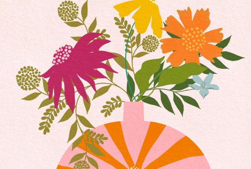
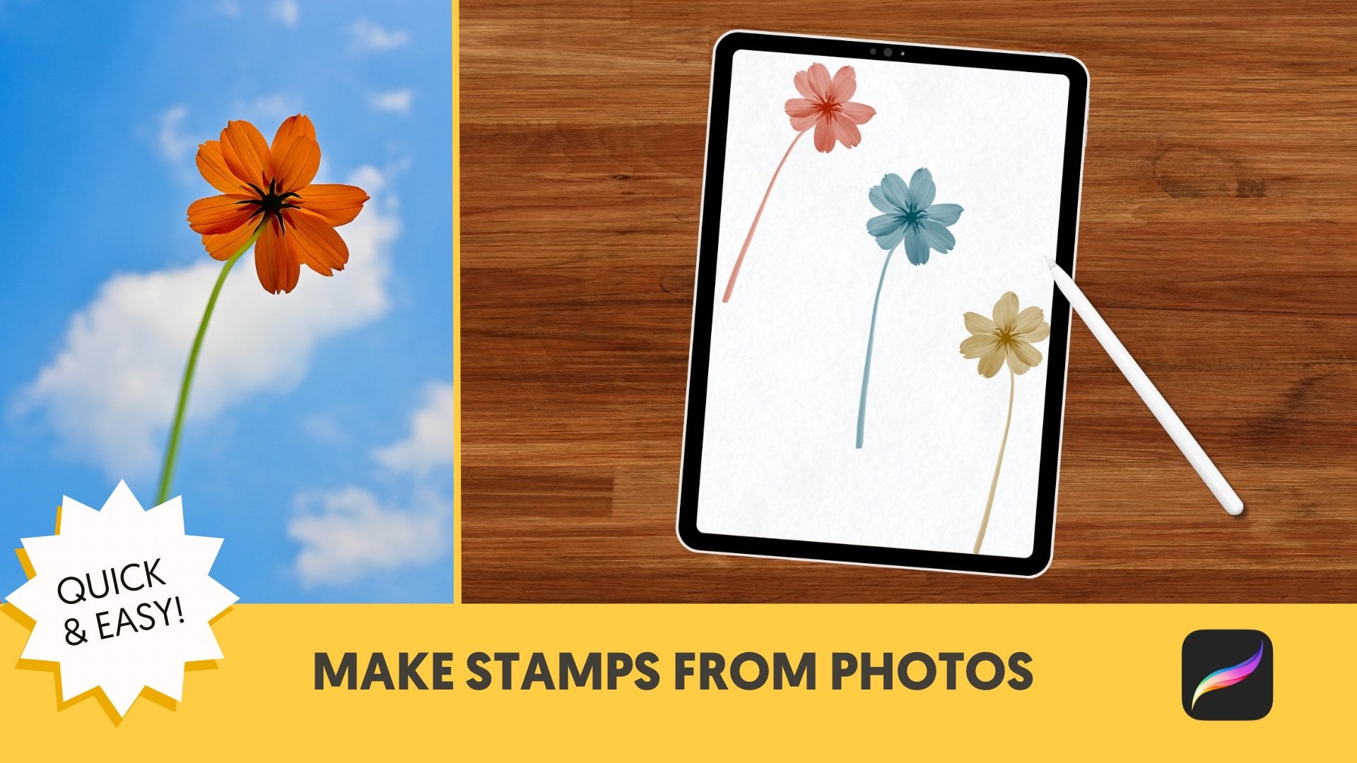
3. Stamp the Vase and First Flowers: Welcome back. This is an example of the still life that we
are going to make today. It is almost all stamps that are provided for
you in the class. The stamp set is right here. It's a sample of my larger
botanical silhouette packet, and it has everything
that you need to create your still life. We are also going to be using color palette
that comes with class, and it's called Autumn Ember. You are welcome to
follow along and recreate what I'm doing or
do totally your own thing. Whatever you are moved to do, I am all about that. So let's start making
our still life. I'm going to go to the gallery. I'm going to tap on this plus, and I'm going to tap
on that little folder and I'm going to make a canvas that is 3,000 by 3,000
pixels, 300 DPI. If you are layer challenge, you could make a
smaller canvas that's 1,800 by 2,400 pixels
as an alternate, but I'm going to do
3,000 by 4,000 pixels. As far as layers for this one, maybe we'll use 30
on the high end. So let's just hit
that blue checkmark, and here is our canvas. So I'm going to tap wrench. I'm going to add a
subtle paper texture. I'm going to tap Insert file. You'll also get this for class. I always like starting
with a little texture. I am going to stretch this
out because it's a square, so it fills my canvas, and we are good there. This is the color
palette I'm using. You can use this or
whatever else you want. I'm just going to show you a
thing about the colors here. So these are the reds. You can choose these, or you can keep it parked right
here on the outer side. I could stamp that color or I can do that color,
I could do that. So that way, you still have
a harmonious color palette, different options
to choose from. Or you can stick to the color
palette that I provided. The same goes for the greens. You would just leave that
parked right there and move around in the center
to get different hues. And still be harmonious. I'm going to clear that and we are going to
set up our layers. I'm going to tap Add
layer a bunch of times, and let's start with 15 or so. I'm going to group one,
two, three, four, five, six layers together
for the bottom, and I'm going to label
this below vase. The reason we are stamping
everything on its own layer is because it'll make it easy for us to move
and change colors. So two layers for the vase, and then I'm going
to group the rest of these layers and
call it above vase. So I am going to grab
all of these layers right here above
vase and below vase, and I'm going to
group them together, and I'm going to call
them still life. So if we needed to move them
all together, we could. And I have this
background layer. I'm going to add a
new layer above that. I'm going to choose this color right here, the lightest green. I have that above
my paper texture, and I'm going to change the
blend mode to multiply so that way you can see the
subtle paper texture below. I'm also going to
bring down the opacity of this to about 50%. So it's just a little hint of color that we're
working with. I'm going to swipe
these together and label it background. Didn't always start out being
so precise about my layers, but I have been
creating digital art for about eight years now. And when I go back to a piece, it really helps me to have everything organized
and labeled. So that's why I do it that way. If you don't work
that way, that's cool, too. Get started. Let's stamp our vase. I'm going to grab this gold
color and I'm going to grab this vase and I am going
to stamp it down here. That is really big, but
we will change that. One thing that I
forgot to do is add at the top here a rule
of thirds stamp. If you've taken my class before, I love the rule of
thirds and I have given you a three to four
ratio rule of thirds stamp. I'm just going to make
it gray and stamp it at the top and drag it
across my screen. This is a composition trick that I use in just about everything. I'm going to bring the
opacity down to about 30%, hopefully you can see it,
but it's not distracting. We're going to use that to guide our vase, which is too big. I'm actually just going to
clear this and resamp it. It's too big, but I'm going
to tap that transform arrow and I'm on uniform and I'm going to center it and I'm going to do it about there. The rule of thirds line
is right through there. We're going to do this in group. First, we're going to stamp the flowers to help us
with the composition. We're going to have
three main flowers. I am going to make my
first flower be this one. Stamp it right there,
and it's a color that's just a little bit
lighter than my vase. I'm going to take
that transform arrow. I want this flower to be in the area where these lines are intersecting right here,
the rule of thirds. The rule of thirds deserves
its own class, but for now, I'll just say that a lot of times you want things
happening along these lines or especially
where they intersect. So that's where we are stamping
that gold flower for now. The next thing we're
going to do is tap this sunflower and
I am going to grab this red color and the sunflower is flower number seven and I'm going to stamp it. It's facing the wrong way, but I'm going to grab
this transform tool and I'm going to just angle it. I'm going to make it
a little bit smaller. You can make it
larger and smaller by grabbing the blue nodes. You can make tiny adjustments in the angle by
choosing this one. I'll just move it in tiny
little increments or this way, it'll move it in, I
think it's 15 degrees. So I want this to be, smaller than that flower, and I don't want it to
be perfectly aligned. I want it to be a little bit lower than that other flower, and so we'll leave
it there for now. I'm going to grab this
bright orange color and I'm going to grab flower number four and
I'm going to stamp it in this vicinity and again, use this little arrow or
this little green nodule, sorry to move it
around and get it in the position that I want
it and the size I want it. I do want it to be
overlapping the vase. I think that's
going to look good. If you are overlapping the vase, just have it be a color
that's bright enough to contrast with the vase. Or different enough, I should say because I don't know
what color your vase is. I could make it just a tiny bit brighter. Let's
see if I want that. Change colors by doing
Alpha lock and fill layer. Yeah, it's just a
tiny bit brighter. Okay. From a composition
perspective, odd numbers look best in design. So we are going to have
these three large flowers, and in the next lesson, we are going to stamp
three smaller flowers. And don't worry,
we're going to be giving these flowers
more details. Like I said, we're just working on the composition to start. Let's take a quick break and I'll see you in the next lesson where we are stamping
three smaller flowers.
4. Building Depth and Adding Details: Welcome back. Now
we are going to add three smaller flowers to this
composition as promised. But first, I'm actually
going to add a large leaf, and I'm going to grab
leaf number six, and I'm going to grab a darker green and I'm going to
stamp leaf number six. I want that to be the bottommost
layer below the vase, so I'm just going to stamp here, grab my transform arrow, and move that around. I think that looks good.
As far as overlap, I'm having a little
bit of overlap, but I'm also conscious
about wanting to fill in the gaps like I did right
here with this larger leaf. Just taking a glance
at it right now, I think I want my vase to
be a little bit smaller, so I'm tapping on my vase. I'm on uniform and
I'm making it just a tiny bit smaller
and still centered. A word about moving
things in Procreate, if you move an item
too many times, it can start looking
pixelated. We don't want that. If you move something once or twice, you're going to be okay. With this project, because
you're working with stamps, you can always restamp an item if it got to the point
where it got too pixelated. Really, you would just need
to worry about that if you wanted to make a
print or something. Move around things
as much as you want, and if you're concerned
about the quality, just restamp it on top of
there and delete the Okay. Now the little
flowers as promised. The reason we're doing
these behind the vase is because if we did this big
leaf in front of the vase, you could see the stem,
two fingertap to undo, which isn't the biggest deal. We're just going to be erasing stems later that are in front, but if we can have
them in back, why not? I am going to have the stems in the background and leaves
be a little bit darker, but I also want them to contrast because they're going to be overlapping a little bit. So I just got the color
a little bit brighter. I am grabbing flower
and stem number four, and I'm just going to
stamp it right there, and I will put it. I think there looks good. The green is bright enough to contrast against that
leaf, so that's good. I am making all of my
little guys the same color and we're going to be
coloring in the petals later. But for now, I'm just stamping the stem and I'm just going to stamp again and I am going to grab this and think it would be nice
if this could be like that. I know the stem
doesn't work for that, but we can make it
work by choosing warp and bringing the
stem around here. That looks good. Using warp selectively
can help you with things like this to make a
project look less digital. These are the same flower, but you wouldn't necessarily know that you stamped
the same flower. I can also see that this one has some stem coming
out from the back. I'm going to grab the monoline, which I'll be using
through this class and looks like that. Press on eraser so I can get the monoline as an eraser and I'm just going to erase
that and I'm going to erase this stem over here. New layer, same
color, same stamp. And I'm going to stamp it
again. I'm still on warp. I want to be on uniform, and I'm going to bring it
in place around here. I think I'm going
to flip horizontal so it is facing a different way. That's a good spot for it. Maybe I can warp
it again a little. Like that. I can see here that it's not exactly
in the vase here, so I'm just going to warp
the stem a little bit. Good. We are almost done
with the composition part. I'm going to be
turning off my rule of thirds grid in a little bit. But right now I have all
of these grouped together, the still life, and
I think I'm going to move it down a little bit. I want to be on uniform.
They're all grouped together. And I'm just going to move
it down a little bit. And I'm going to turn
off Rule of Thirds. We're done with that for now.
I'm actually going to label that too just so I don't
forget what that was. So we have seven elements here. So we want odd
elements, remember, we have three large flowers, three small flowers, and
then the big leaves. We are going to next start adding some detail
to our big flowers, including centers and
stems and leaves. So let's take a quick break
and in the next lesson, we will add some more details to our three flowers. I
will see you there.
5. Using Clipping Masks to Color Your Flowers: Welcome back. Let's give our
flowers some details. I'm going to tap on still life here and I'm going to
tap on this gold one. I'm going to add a layer
above there and below there. I'm actually just going
to give more layers here because we're
going to need them for the other flowers, let's go. I'm going to grab this light color again and
I'm going to grab the center, and I'm above the gold one and I'm just going to
stamp it a center. I think that actually
looks pretty good as is. As I go to change it. I just angled it a little bit. If you've watched
my other classes, you know that I'm a
recovering perfectionist. I have stems here that you
can stamp if you want, but what I'm going
to do is draw them. I think it's easier. I'm
going to use the monoline. I'm going to grab a green
that's lighter than that green. I want my stem to
be a little bit thicker because that's
my biggest flower. Here we go. I'm below the gold flower and I'm just going to draw a stem, like so. And I'm going to trap eraser so I can erase this
where it goes over. Erase fast, and
then I erase slower as I get to the point where
it's meeting this vase. We'll give that leaves
later, but for now, I'm going to carry on with
the stems and other details. I'll actually group
these together, and I will call this Goldie. Let's move on to our sunflower, and I'm going to group
these together, too. I'm going to give
it three layers, and I'll call this sunflower. So I have my modeline in
a bright yellow color. I'm on the layer
above the sunflower, and I'm just going to draw here, and I have a clipping
mask on here, so the color will clip
to the sunflower. I'm going to color fill it by dragging that yellow
there. There we go. That is color filled. I'm just going to erase it here. I think this is our first
clipping mask of the class, so I'm going to slow down
and show you how to do that. A clipping mask when that's on, the colors will clip to the pixels on the
layer below there. So I'm going to turn it back on. It's not very obvious here, but you can see it
when I do it and undo it. It's very helpful. And again, it's non
destructive editing, so that way I can
change the color. I can change a lot
of things about it. So that is a clipping mask. We'll be using them
throughout class. This is how color fill works. If you draw a shape and it has a little tiny, it keeps fixing it. Leak right here and
you try to fill it, it'll fill the whole page. So you want to back
up and make sure that that's connected and then it will only fill
that little thing. I'm going to delete that layer. I'm doing my stem on my
sunflower and I'm going to grab this color and I'm
going to make it a little bit different and I'm
just going to draw a stem. I still have my monoline, and I'm going to erase the
part where it overlaps. And now let's grab a brighter green and draw
the stem on our orange one. So I'm going to group
those together, label this orange, go
underneath there, draw a stem. I'm actually going to make it
just a little bit smaller. So there's some variation in
stem size. That looks good. Erase it, go above here. This time, I don't
want a clipping mask, and I'm just going
to draw this little thing where the bud would be. I think I'm sure it has a name, but I don't
know what it is. So you could do a clipping
mask for that or not. If I did a clipping mask, it would just look a
little bit different, but I think it looks
a little bit more realistic not to have
a clipping mask there. The next thing we're
going to do is add some color to our little guys, and I'm just going
to delete these extra layers that
we have right here, and we are going
back below the vase. I'm just going to
label this big leaf. And I'm going to group
our little guys together. And I want some
layers above there. So I'm just adding layers there. Okay, so we have this
flower right here. I'm going to go above it. I'm going to do a clipping mask, and I'm going to
draw in the orange. I'm just gonna do it real big
and messy and then erase. A lot of times, I
find that easier to do than drawing precisely
or coloring precisely. I've been working on these botanical silhouette
stamps for a while, and I've made a lot of
different still lifes, and I find it to
be very relaxing. I'm on the layer
above that orange, and I'm going to
grab this gold and make my monoline smaller and just draw a little
oval center here. That doesn't pop enough, so I'm going to grab
this bright yellow here. We have these three
little flowers because this one
is near the vase, I think I'm going to have
it be this orange color. There it is. We're on the
layer above, clipping mask, monoline, make a big erase. I'm going to give that a gold
center on the layer above. There's the right layer. That's not popping enough. I'm going to grab
that yellow again. Then I'm going to
make this color, this last flower, this color, but maybe a little bit darker. So there it is,
clipping mask, erase. Grab that yellow, maybe make
it a little bit brighter, make my monoline smaller,
the layer above. So that is looking cute
if I do say so myself. Oh, you know what? I made
all the flowers red, and I wanted to make
some of them gold. Well, that is easy
to do because we are working with clipping
masks. Let's grab. This is the one on the left. Alpha lock, fill layer to make it that bright
yellow. I like it. And then we'll grab this color, Alpha lock, the
center to make it. Let's just make it
this bright orange. That's good for now. I could futz with color for
hours and I do, but let's keep it moving. So this is where we are at. The last step is just to add some leaves to our composition
to kind of flesh it out. And we will do that
in the next lesson. We'll take one
quick little break, and I will see you in the
lesson. We're almost done.
6. Finishing Touches on Your Still Life: Welcome back. We are going
to take our still life and we are going to stamp
some leaves to this one. I can see that there's a leaf
here that's kind of odd. I want to erase that. There
is the flower right there. I have my eraser, and I'm just going to erase this leaf away. I'm going to grab
this bright green, and let's go to our stamps, and I'm going to grab
leaf number two, and I'm going to stamp
that on a new layer here. I'm going to take the transform arrow and I'm going
to flip it around, and I want it to be like so. If you have a leaf
overlapping the vase, again, you just want it to be
a contrasting color, so it will pop against the vase. Because this stem and this leaf are the same
color for the same flower, I'm going to group
them together by pinching them like so. Let's move on to our sunflower. I'm going to grab the
color of this stem. I'm going to add a new
layer above the stem. I'm going to use the same
leaf number two as a stamp. And where do I want it? I could have it here
or I could flip horizontal and have it here, maybe just a little angled. I probably just put
it right exactly where it was before,
but, you know, whatever. You know, I don't
love the way that is I'm going to warp this.
I'll show you what I mean. There we go. That's
what I needed. It doesn't exactly connect, so I'm grabbing my monoline, making it small, and just having it connect
to the stem there. I am going to leave that
for now, but first, I'm going to pinch
these two together and move on to Goldie. I'm going to add a
layer above the stem, grab the stem color. I'll do the same leaf again. Actually, I'll grab leaf
number seven and stamp that. I'm on warp. I want
it to be on uniform. I want to flip horizontal. And connect that to my stem. So this leaf is going over the maroon one and
it's not connected here. What I'm going to do
is I'm going to just group those together,
grab my monoline. I am going to move this
stem to the bottom, so it will be in back
of that red sunflower. I'm going to name
this one goldie stem. The next thing I'm
going to do is add some more leaves to
the little guys, as I'm calling
them, and they are all grouped here
together below the vase. Because they're all grouped together and they
are the same color, I'm going to grab the color. I'm going to add a layer at
the top of the little guys. I'm going to make my monoline small and I'm just going
to add some leaves here. You could also stamp on leaves here or draw on
whatever you prefer. Again, I'm just looking for
some bare spots here and filling it in and trying
to make the leaves look the same but different. Add a few more leaves
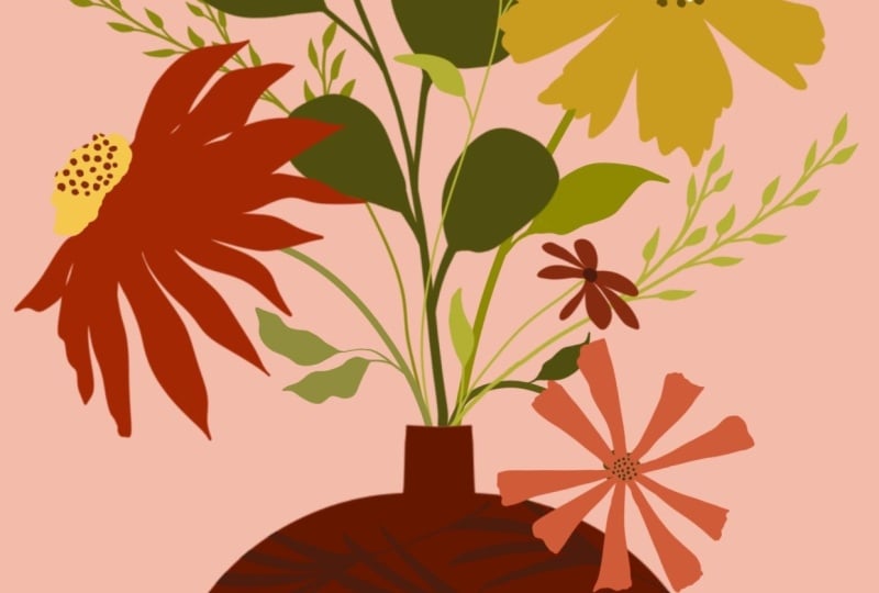
here, maybe just this one. You guys, I think we are done. I think that looks really good. Just to show you how
easy it is to take this and make it look a
little bit different, I'm just going to go
to the gallery here. I'm going to duplicate
this by swiping left and we could decide, for example, to choose a
different color palette. These are some other
color palettes with the larger kit and
I could decide, for example, to make
all of the reds blue. Because they're on
different layers and we have a whole new canvas here, we could just start
filling the layers. This one, I could make
a different blue. Alpha lock, fire,
and go on like that. I could make whatever is yellow, purple, fi layer, and change
the whole thing like that. It doesn't look great because we haven't changed everything, but you get the idea. I could make the vase.
Purple. Anyway, that is one of the reasons why you'd want to work with different layers and have the flexibility to
change colors later. We are almost done with this
class. We're this close. The last lesson is just
a couple of minutes and it's right ahead,
so meet me there.
7. Next Steps: Hi, it's Kelly again
and my puppy Maze. And we are here to say, thank you so much for
taking this class. I'm so happy you decided to
spend this time with me, and I hope creating your project felt relaxing and
creatively satisfying. If there's one takeaway I want you to remembers
that you don't need mad skills to create something
beautiful and procreate. All you need is a
few simple tools and a willingness to play. When you're ready, upload your project to the class
gallery so I can see your work. And if you enjoyed this class, you'll find a link in the
class project description for the full botanical
silhouettes kit. It has 70 brushes and stamps and four beautiful
color palettes. It opens up so many
creative possibilities. You're also welcome
to follow me for more Procreate classes
and resources. Thanks again for joining us, and we can't wait to see
your still life. Aye.
 Kelley Bren Burke, Artist & Educator