Transcripts
1. Botanical Wreaths in Procreate: Hi. I'm Kelly Brenberg. I'm a digital artist
and educator. In this class, you'll
learn how to create botanical wreaths in Procreate
using stamp brushes, a simple placement system, and a curated color palette. This 35 minute class is
quick and beginner friendly. No drawing skills are required. If you're a more
experienced artist, this class gives you a really
fun base to explore color, shading, texture,
and your own style. We'll cover how to build
a balance wreath layout, how to use clipping
masks for color, and how to add those
little finishing details that make everything feel
polished and complete. One of the most useful tools in the kit is the wreath stamp map. It takes the guesswork out of placement and gives you
a structure you can reuse again and again for different styles,
colors, and projects. If you enjoyed my 30
Minute Bouquet class, this is a great next step. I think of them as
sister classes. Let's get started.
I'll see you in class.
2. Class Project & Resources: For your class project, you'll create your own
botanical wreath. Before you begin, we'll do
a quick walk through of the free brushes and the evening wildflower
color palette. These live on a password
protected page on my website, so you can come back
to them anytime. The password is blossom with a capital B and an
exclamation point. So capital B
LOSSOMEcamation Point. Hi, it's Kelly. I am
going to walk you through the process of downloading
a free asset from me. And so let's get started. In this case, I'm downloading
my free wreath starter kit. I am on this page and
I'm just going to enter my first name
and my email address. If for some reason you
didn't see all of this, it might mean that
you have a pop up blocker that would
be blocking it, and so here is an
alternate way to sign up. You can also contact me through my contact page if you
have any questions. The next thing I'm going to
do is go to my email and grab the link and here is the email. I've clicked the
link in the email and the email also
gives me the password. In this case, the
password is blossom with a capital B and
an exclamation point. B, LO SSOMEclamation
point, Enter. I will verify that I'm human
and here is the freebies. There's also a little
quick Start guide. You do want to do
this on your iPad. That way you can get the files
directly into Procreate. I'm going to go to get
your free wreath Kit. It's going to ask me if I
want to download it and I do. At this point in
time, clock what the Zip file is named so you can find it in your
files if you need it. This one is named
Wreath Free Bie Kit. I'm going to hit Download and it will go directly
into your files, or you can just tap
right here and find it. And like I said, it's
not right up here, so I'm just going to
search Wreath freebie. I've already downloaded it here, but this is the new one that
I just downloaded today. This is the zip file,
so this is what it will look like
for you and you can preview the content
or you can just hold on it and you
can uncompress. Here it is. This freebie kit comes with a quick Start guide. We are going to download
first the color palette, and it should go
right into Procreate. This color palette is
called evening wildflowers. A lot of the times it will put the palette at the
very, very bottom. I scrolled all the
way to the bottom. If you want, you can put your finger on it and
you can move it up. You may not have as many color palettes as I
do or maybe you do. You can put it way at
the top if you want it. That's the color palette.
Now let's go back to the files and we're
going to tap brush set. The brush set should
go in to the very top, which it did right here. This is the free
brush set right here, but you could also search
for it within your brushes. Floral wreath free
kit right there, and here it is again, and the brush set will
go into the very top, unlike the color palette
which goes into the bottom. So there are your brushes. Let's go back to the files and let's open up
the textured gold. The iPad automatically puts
it into preview. That's fine. I'm just going to tap that arrow right there and move
it into Procreate. And then when we go
back to Procreate, it's importing, and so it will be outside of
the stack right here. Let's just do it one more
time for the silver foil. This textured silver
foil is here. If I press and hold on it, I can bring up the share arrow right away without going into preview and I can just swipe and bring it into
Procreate that way. Let's go back into Procreate. And it imported both
of those files. This is my stack for my
botanical wreath information. So if I wanted that
within the stack, what I could do is
hit Select here, tap on both of
them and they have that little blue
checkmark and then drag them into this stack.
3. Canvas Set Up & Wreath Guide: Before we jump into
building the wreath, I want to talk about the differences between
the Apple Pencil Pro and the Apple Pencil. This is just a real quick
lesson and it's going to be helpful whether you have
the Apple Pencil Pro and you'll know that it's a pro because it will say
Apple Pencil Pro or whether you have the
regular standard Apple Pencil, which just says Apple Pencil. That is something we're going
to talk about real quick. I'm going to add some
new layers there. I'm going to group all of
these layers together, and I'm just going
to name this wreath. This is going to hold all
of our wreath layers so we can move them together in
unison if we needed to, for example, make
it smaller later. I am going to choose
this peach color. You can use these colors or
any colors you would like, and I'm going to choose
flower and stem number two. My first demo is going to be how we would place the
element and we could do this with either the
regular Apple Pencil or the Apple Pencil P.
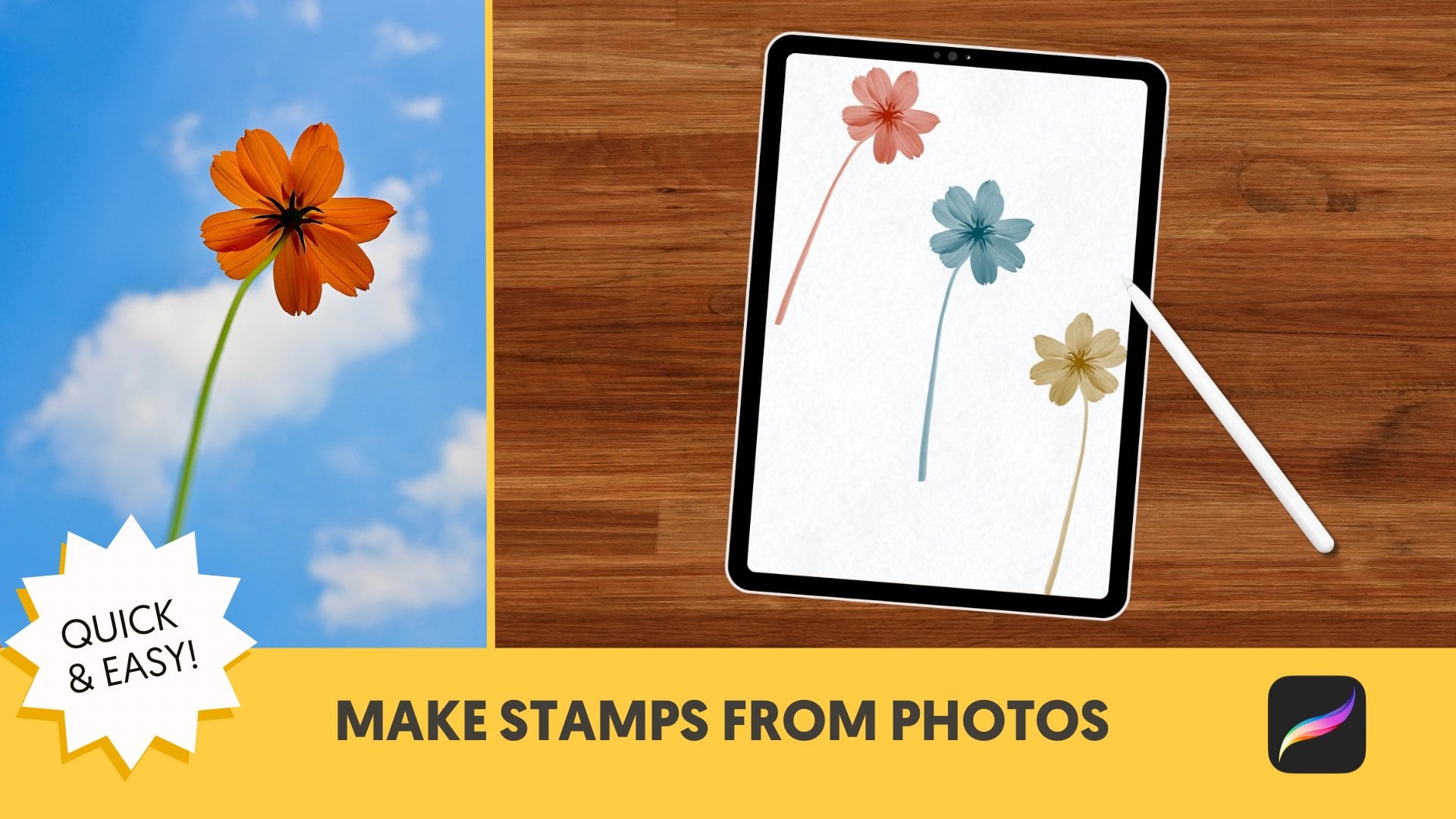
With the stamp map, this flower that we're
choosing right here, flower plus stem
number two is going to be going on
these solid lines. The solid lines are longer, the dotted lines are medium, and the triangle
lines are shorter. That's going to help
us with our placement. But first, I'm
just going to show you how I would place this. Typically, I would
place the stamp, I would tap on that arrow. I want to be on uniform and I would just rotate
it into place here. And I want it to be roughly
centered along this line. If you want to move in
15 degree increments, you can tap on this green dot. If you want to move
it more subtly, you can first tap on that yellow dot and then move it more subtly
into position. That looks pretty good there. We can always reposition
it if we want to. That is how you would
place the stamp. New way that you can
place the stamp, you do it with only
the Apple Pencil P, and I'm going to choose
that same stamp. I'm going to go onto a new layer and I'm going to look for
these solid lines again. If you see here, I can twist the stamp in any way that I would like it before setting it. I can also pinch
with my left hand to make it smaller or bigger. This helps with getting placement really dialed
in the first time. I'm going to go like this here and I'm just going to stamp it. And I can still
move it if I want. That's why I want to be
on a different layer so I can move things easily while I'm in the
composition part of the class, and I think that
looks pretty good. In order to have that ability, you do need the
Apple Pencil Pro and you need to turn on a
couple of settings. It's under wrench, gesture
controls, and hover. So you need this toggled
on, and it says, hovering with an Apple Pencil
and finger touch adjust brush opacity and pinch
zoom, adjust brush size. For our purposes right now, we're just doing the pinch
zoom to adjust the brush size. So I'm going to show you
again how we would do that. We would go to a new layer using the same stamp and
get it close to the screen and choose these solid lines and just
stamp it where we want it, again, making it smaller
or bigger, like so. One of the things that
you can accidentally do is stamp it multiple times. So you just want to make
sure that you're just touching it once because
it is sensitive. We may want to slightly move
this stamp here and I'm just going to nudge it right here and that looks pretty good. I have snapping on
here and I think I might want snapping
turned off here. With snapping, it will snap into place and without snapping on, you have a little
bit more control about where you put it. Snapping can be really helpful if you want to center
the wreath map, or you might want to
turn it off if you just want to move something
really precisely. That's under snapping and
you can turn it on or off. With the Apple Pencil Pro, you can have that ability to preview stamps in
any stamp brush, and this is the setting
that turns it on and off. It is right here. You go into
brush studio into shape, and then you want
to make sure that Azimuth and barrel
roll is turned on, not these other ones. It's the Azimuth
and barrel roll. And I'm not sure if I'm saying Asmuth correctly, I think I am, but that has to do with your pen acting like a calligraphy
pen and how it works. The barrel roll is how you're twisting it around before
you're placing it. So if you have any of
my current stamps, all of these current
stamps will have that turned on Asmuth
and barrel roll. If you bought something of
mine or receive something of mine in the
past, for example, if you took my 30
Minute Bouquet class and you have those stamps, I didn't know about this then. The input style under
shape was touch only, and in order to make it have that ability to
cover and preview, you want to turn Azimuth
and barrel roll on. With this leaf, if
it's touch only, then I only have the ability to do it like that.
There's no preview. I can make it bigger
and smaller this way, but I can't preview it. But if I go to that and
just simply toggle on Azimuth and barrel roll
and hit that little arrow, then I have the ability to
preview and also to make it bigger and smaller while
pinching with my left hand. That's how you turn any
stamp that you have int one that you can preview if you have
the Apple Pencil Pro. You tap on Azimuth
and Barrel roll check and you are done. Again, you don't need the Apple Pencil Pro for this class. Everything works
beautifully without it, but if you do have it, it's a nice upgrade and
it's fun to play with. Let's take a quick break, and in the next lesson, we are going to continue on with the composition
of A wreath. I will see you in
the next lesson.
4. Complete Your Wreath Layout: Welcome back. We are going to continue laying
the elements down for this wreath
and we're going to adjust some colors and
add more details later. But for now, we are just working on the composition
of the wreath. In the last lesson, we laid
down these pink flowers, and I'm going to
group them together, and I'm going to label
these stemmed flowers. Because I have them where I want them and
they're all the same color, I am going to just pinch these together so they're all on
one layer to make it easier. The next thing I'm
going to do is create a grouping of three layers, tap group, and I'm going
to label this leafy, which is going to be
our next element. I'm going to go to the wreath sample
kit and I'm going to grab leafy number 16, and I am going to choose
this white for it. Leafy is going to be a
medium size element, so it's going to go on the
dotted parts of the stamp map. Then the third element is
going to go on the triangle. So again, I'm going
to be working in this class in
two different ways, the way you could do it with either Apple Pencil and
with an Apple Pencil P, like we did in the last
lesson. I'm on white. I have leafy. I am going
to go to the dotted area, and I'm going to stamp
leafy down and I'm going to go to this arrow and I'm going to
move it into place. This is the way that works
with either Apple Pencil, the P or the regular. And that looks pretty
good right there. I'm going to go onto a new layer and I'm going to do it
again in the same way, stamp it down and have it on uniform and move it into
place here along the dots. Composition is the hardest
part of these wreaths. This stamp map has incredibly sped up my process and I'm
actually really proud of it. New layer. Now I'm going to use
the cover technique to place my stamp on
the dotted lines, and I'm going to
pinch it to make it a little bit smaller and I'm going to place
it right there. And that looks pretty good. I am going to turn off that map for a second and just take a look at it.
It looks pretty good. If we want to move
something later, we can. I'm going to put it back on. I'm going to pinch
these together because I like the way
they look right now. I'm going to add
three new layers and label this flourish, I am going to choose this yellow color and I'm going to grab
Flourish number two, and I am going to put it on the triangle lines I placed it right here,
old school way. That works for either Apple
Pencil, have it right there. I think that looks pretty good, and then I'll do
it the new school way or I don't think I don't
think that's a phrase, Apple Pencil Pro way
and just set it there. You do still need a little
bit of finessing here. I think that's a
little bit too close, so I am going to rotate
this a little bit and move it so it's not
touching the pink flower. New layer, new school way, I'll just say new school way. I don't know if it's a
thing or not, and hover, make it a little bit smaller, and there we go. Let me turn off the wreath. I think that looks pretty good. How did I got an extra stamp
here. It's right here. I'm going to go to the
freehand selection and just circle
around this stamp, three finger drag
down, and cut that. I'm not sure how it got there. At this point, we want
to make sure that our wreath looks
pretty circular. It doesn't have to look
like a perfect circle. We just want to eyeball it. I might want this flourish to be off a little bit this way. I think that looks pretty good, and I might want to make
it a little bit smaller. I have the whole
wreath together. I'm going to tap on
that arrow and I'm on uniform and I'm going to make it just a little bit smaller. I'm going to turn snapping magnetics and snapping
back on so then I can make sure that it is
centered when I make it smaller. Now that we have the
composition down, the next step is for us to
be adding more colors and details and we'll take a quick break and we will
do that in the next lesson.
5. Color With Clipping Masks: Welcome back. We have our leaf
composition done, and if we want, we can go ahead and just
delete the stamp map or you could tuck it underneath or just
leave it there turned off. I just like deleting
layers that I don't need. Now we're going to be adding some more colors and details in the same
order that we started. We're going to start with
the pink flower right here. I'm going to add a layer above
that and I'm going to do a clipping mask and I'm going
to choose a green color. And I am going to grab
this monoline here. This is our first clipping
mask of the class. I'm just going to
show you how it looks with a clipping masks,
to make that bigger. You will only draw on the pixels that
are right below that. If I turn the clipping mask off, then it looks like that. If I turn it back on,
then it looks like that. That is a clipping
mask super handy and I am just going
to clear that and start over again and I am
going to clipping mask and then just draw green
onto the stems here. I'm going to do that with a larger monoline and then go back and work
on some details later. I think that's colored in. I'm going to tap on
this eraser so I can also erase
with the monoline. Now I'm going to make my
monoline smaller so we can zoom in and just I'm still an eraser. I'm going to make my
modeline smaller so we can zoom in and just give it some organic details there and I'll double check to make sure everything's colored
while I'm doing that. I'm going to erase
this a little bit and go on to this one.
I'm still an eraser. I want to go back to the
modeline and there we go. If you've taken
my other classes, you may know how I
work with color, but just in case
you haven't, I'm going to go over it real quick. I start with a palette like
this and then I will add to it with colors that are the same hue and let
me show you what I mean. I'm going to tap on disk here. Right here, for this color,
let's look at the orange. With the orange, the hue
is parked right here. With the green, the hue
is parked right there. Within that green staying there, I can change the hue saturation
and brightness and get any infinite number of colors that will still work
great with the color palette. If I wanted to do, for
example, a darker green, I would put it down there, and then I would
have more options. That still is working within color harmony and
a limited color palette, but gives you a
lot more options. So I'm going to see if I like
that other green better, and I'm going to go
to that clipping mask where the green is,
hit Alpha lock, and then hit fill layer
with the new green selected and see if I
like that any better. I don't know if I do.
I'm going to leave it. But if you find a green
that you like better, then you could
certainly do that. Let me try this Alpha
lock, fill layer. I'm going to stick with
my original green, but that is just something really handy to know
about color palette. If you don't love
the exact color, then I'm just going to clear these because
I don't have them used. You can choose, for
example, this orange, keep it parked there, and use any different
color within there. And when you find
a color you like, I like to save it to
the swatches here. But for now, I'm just
going to clear that. It's a good time
for a quick break. When we come back, we're going to keep on building our wreath. I'm going to go to
the leafy section and fill in those colors. I will see you in
the next lesson.
6. Add Color & Fine Details: Welcome back. We are going to continue adding more
details to our wreath. I'm actually going to use a stamp here and I'm going to stamp a little message
in the center. I'm going to choose with love and I'm going to do it
with this white color. But you can do
anything you want, and I'm going to
put that right in the center of the wreath. I'm just going to add a
new layer on top there, and I am going to make it smaller here and
park it right there. I want to make sure
it's centered. I pretty much was. I might
make it a little bit smaller. And that looks good. I have different stamps that
you can choose from here, or you couldn't add
your own message. I'm going to go with Love. You can do any message
that you would like. If you're wondering
about what font this is because you want to
use it in the future, it's Playfair Display and it's a free Google
font, Playfair Display. Let's move on to the leafs. With the leafys we are going to with that just
sounded funny to me. With the leafy layer, we are going to use
a reference layer, let me show you how that works. I am going to go to the leafis and I'm going to add
a new layer and I actually want that new layer below the leafys I'm
going to make this real big so you can see
what's going on here. I'm going to choose this
green color for now. I don't know, maybe I'll
make it a little different. Let's just see if
I like that one. I'm going to tap reference. Once I do that, I can color fill the leafs and
tap continue filling, and it will go right in to
these little areas here. Whoops. If it isn't working like that, that just means that I need
to change the threshold. My threshold is
generally at about 96%. You can see I can change
the threshold right here. For this one, I just might
want a smaller threshold. I'm going to undo that
and use color drop. You also want to make
sure that you're not dropping your
color outside there. Otherwise, it will color
everything except for that. Which is something that could
be handy in other ways. I'm just pulling it right
into here and my threshold is seven right there and you can see that it doesn't
fill in all the way. I'm just moving my
threshold up there. It was at about maybe 50%
there and that works. Reference is really handy and
you want to turn that off when you are done so you
don't keep on doing that. But that's a really
handy way to do that. Otherwise, you could also,
I'm going to add a new layer, just color in with
a small monoline or anything and just color in this way if you
wanted to do it. So. But I'm going to go
back and I'm going to turn that layer back on and I'm going to turn
reference off here. I'm looking at this green color, and I think I want it to
be a little bit deeper. Let me just play around
and see so Alpha lock, and if I hit fill layer, it will change it to
that other color. I'm going to undo
it and redo it. Yeah. I think that looks better. I have a color
that's about there, and we can always
change it later. Again, you change the
color by Alpha locking the layer and choosing
a different color or choosing a different saturation
or brightness within here if you want to use the
same color harmony and hit Filayer. I'm going to undo it because
I'm going to stick to that color that I
just had for now. You know me, I futs
around with colors a lot. The next thing I'm going
to do is I'm going to add little dots on the flourish. I'm not sure if this is
a flourish or berries. I'll look like berries
when we finish it. But I'm going to pinch these
three gold layers together, and we are going to
add a little texture, which you are going to get
for free with this class. I'm going to go to wrench,
add, insert a file, and go to my resents and I'm using this textured
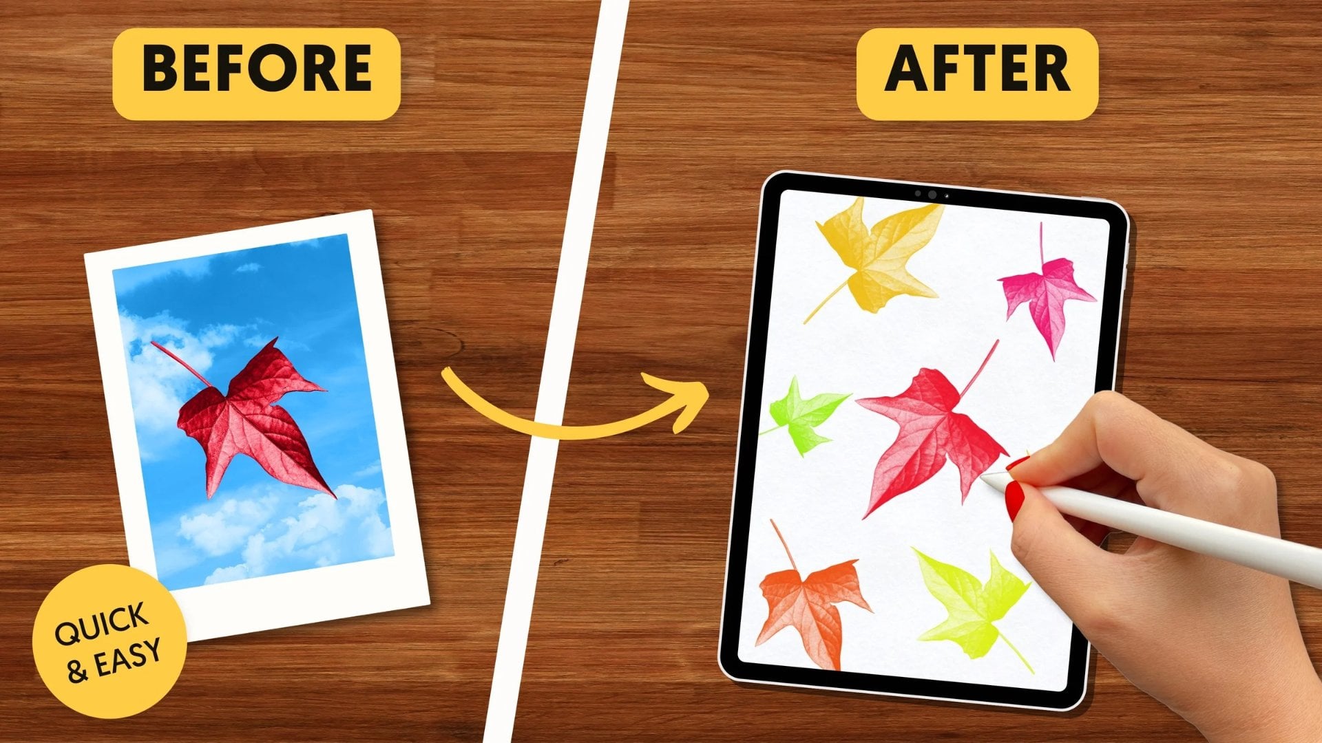
gold foil for Unsplash. It is an element
that is free to use, and I'm going to do
a clipping mask. We used a clipping mask before. It works the same way, but it's a little bit
different application. Once I tap clipping mask, it's going to add that
gold foil texture to anything below there, and you can move it around and make sure
everything's covered. I think what I might
want to do with this is make it a
little bit darker. I'm on this foil layer. I'm going to go to
hue saturation and brightness under the magic wand. I think I might want it. Do I want it more
saturated or darker? I'm just upping the saturation
a little bit for now, 57%. Again, with a clipping
mask turned on, it clips to the
layers below there, with it off, it does
not clipping mask on. I'm going to add a new
layer, grab this white, and I'm going to grab
this dotty brush and I am going to start adding
dots or little berries here. I actually think that's
a pretty good size. I might want it a little
bit bigger. Let me see. So this is set at 8% and let's see how our
dots look with that. I'm going to zoom
in a little bit, and we're just going to add
these little white dots. Boop, boop, boop, boop. So do I like that size?
I'm picky, you guys. It might be pulling
focus a little bit. I'm going to bring it down to what I'm going to do here is
these things are set here. I'm going to subtract that
and I'm going to bring this down to 7% and I'm
going to add it here, so it'll be parked
at 7% instead of 8%. So in tiny difference, but I think it looks
a little bit better. It was pulling focus for me with the light color and the large dots. I
think that looks good. I feel like this one
is just a little bit of I want it position just
a little bit better here. What I'm going to do
is grab this eraser and erase these little
dots and I am going to go to this layer and
I'm going to choose the selection free hand and just move this
down a little bit. The spacing between the two things is a
little bit better. I'm going to go back
to my dotty brush. I still have it, go back to my white layer and go like this. And the reason everything is on separate layers is so we can easily adjust the colors later, and I'll show you that
at the end of class. I feel like the composition
looks good now, and we are just going to
continue adding more details, more flowers, and some texture. I will see you in
the next lesson where we finish up this wreath.
7. Final Touches & Color Variations: Welcome back. Let's add some more flowers and color
and finish up this leaf. I mean finish up this wreath. We're going to go
to flower eight, and I'm going to choose
this orange color and I'm on flower eight and I'm going to add a
new layer up here, and I'm just going to stamp
these little flowers. Some of them will be
inside and some of them will be outside the wreath. I think that size
looks pretty good. I might want to make it a
little tiny bit smaller. Let me just see what
it would look like. No, I'm going to keep
it the way it was. So stamp. I want that to
be outside and inside. That looks good, and
we are going to add a layer above that and grab our dotty again in the white and give those
little centers, or you could draw them on or do any kind of center you want. But I have the dotty, and I'm going to
make little dots, little white dotties here. Cute. And I'm going to label
this six petal flower. I'm going to add a new layer and I'm going to go to
flower number two, and I'm going to
choose this yellow, and I'm going to add three
layers here and I'm going to position this in a similar way that we did these
three orange flowers. Some will be inside the wreath, some will be outside the wreath. If you've noticed, we're
using threes a lot with this class and that's
because odd numbers are really good for composition. That's why we have I think
three of everything. And so this one, I am going to bring it in
here by going to the arrow. I'm on uniform. I'm going to make it just a little
bit smaller there. Go to a new layer. That one's
inside. That one's outside. Maybe I make this one inside, make it a little bit smaller. And outside. I'm on the same layer as that
other one, but that's fine, so I just go to
selection free hand, circle this around, and I
make it a little bit smaller. I think I might want it a
little bit smaller yet. I think that looks pretty good. We have the yellow one set now, so we are going to
pinch them together, and now we're going to
give this more layers to make it look really cute. We're going to go
on the layer above and use the same
flour number two, but go to this white and make
it a little bit smaller. I'm just going to add
three layers just to help us with positioning
here so we can change it. We're just going to
stamp with the white in the center here to give
some interesting details. I actually only needed
that one layer. I like it. Those are
all on one layer. I'm going to go to the layer
above, choose that orange, make it a little smaller yet, and on a different layer. Add orange in the center here. I just think when I made
this flour the first time, I didn't really
like it that much, but when I started layering, I thought it was really cute. Ok do, these are
on three layers. I'm going to group
them together, and I'm going to
name this spiky. The last thing I'm going to do, there's two last
finishing touches here. I'm going to add dots. Then I'm going to add at the
very top this gray that's right here and I am going
to go to a texture layer. This is called Jen's
handmade paper. It's by Jennifer Nichols and she has kindly
gifted it to us. For this class, she has a lot of great freebies.
You should check it out. I want gray and I'm Whoops, I'm on that flower still. I'm going to go back
to the handmade paper and just whoosh it across
there in the gray. Then I'm going to change
this blend mode to multiply, which is at the very top. I'll zoom in here so you
can see the texture there, and I'm going to do a second
layer of the same brush. In gray below there, and I'm going to set
this one to color burn. You can see this has
a lot of texture. It's great texture. It might be too much texture
for my taste here. So I'm going to play
with the opacity first of the multiply
blend mode layer. That's not really
changing anything. So we're going to go to
the color burn layer and turn that opacity down, and that will change
how it looks. I'm going to zoom way in here so we can see what it
looks like here. So bringing color burn down
I might want that at 25%. I think that looks good if we group these together
and label it gins, handmade texture, we can
turn it on and off and see what it looks like the
difference between how it looks with and
without the texture. It does make it just
a little bit darker. I can bring the
multiply layer down a little bit to affect that. That gives it some great texture that makes it look a
little bit less digital. That was a little side track. I'm going to go back to the
dots and use this white. I'm going to go back
to dotty and we are going to add some white
dots around here. I'm going to do the dots in groups of one, two, and three. I think I want it just a
little bit smaller here. I have it at 3% and I like that. I'm just going to
fill in some spaces here with the dots and white, so I'm going to go
one, two, three. It's easy to overdo the dots. Sometimes it feels like
less is more with this. I have one, two,
three, four, five, six, seven, an odd
number of dots. Do I want some right here? Most of them are on
the outside here, so I'm going to add just
more on the inside. We're done. I'm just going to turn out this dot
layer so you can see how much those
little white dots do. I just think it's really amazing
how much work they do to really brighten up
the whole thing and add some movement
and details. One last thing I'm going
to show you real quick is just how easy it is to
change colors for this. I'm going to go to the gallery, and I'm going to
duplicate this by swiping left and
hitting duplicate. And with my full
wreath builder kit, it comes with
different palettes, including this one we're
using evening wildflowers. If instead I wanted to change it to this ink and parchment set because everything is on its own layer, it's really easy. So this would be the
background color, tap on it, fill
layer with the dark. I could make all of
the pink flowers, this beige color, so Alpha
lock, fill layer beige. I could make the stems blue. Alpha c fill layer blue, and it's a mishmash right now, but it's just to show you how
easily you can experiment with colors once you have
them on different layers. That's why I work in
different layers. I am going to change the
orange flowers to yellow, alpha lock fill layer, yellow, and so on. That's how you would change
colors really easily. I wanted to show you real quick some of the
other wreaths I've made with the full wreath
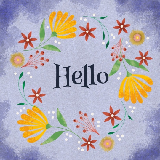
Builder kit that's available. This is one using one of the
color palettes that comes with the kit and it has these
different options here. This is another one. This is the ink and
parchment color palette that I was just showing you when I was doing
the color change. I really like this one.
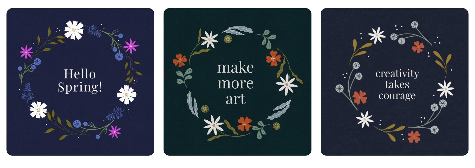
It's really dramatic. And then here is another
one in my brand colors. This is another wreath I did. Quick plug if you
liked this class, you would really love my 30 minute bouquet class
if you haven't taken it. It is very similar
to this class, and it uses stamps
to make a bouquet in a vase and thank you
for taking this class. In the next lesson,
that's really short. We're just going to wrap
up this class real quick. We might even have a
cameo from my dog, Maze. Stay tuned. I'll see you in the next lesson and thanks so much for sticking
with this class.
8. Thank you & Next Steps: Hi, it's me again
and my puppy, Maze. Thank you for the kisses. We wanted to say thank you
for taking this class. I hope you had so much fun
making your botanical wreath. If you create a wreath,
I'd love for you to upload it to the
class project gallery. I love seeing student projects and I look at every single one. If you enjoyed this class, I think you'd like my 30
Minute Bouquet class. It's the same stamp
based workflow, but in that class,
we're creating a still life with a vase
rather than a wreath. You can also find lots of
free creative resources at my website,
Kelley brenberg.com. Thanks so much for joining
me. I hope to see you soon.
 Kelley Bren Burke, Artist & Educator