Transcripts
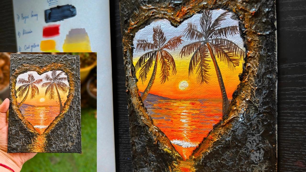
1. Intro: Behind every rugged surface lies a story waiting
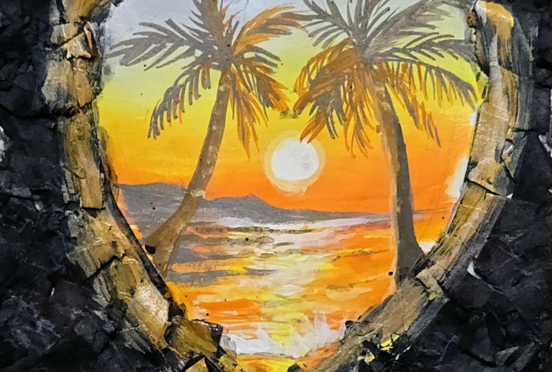
to be discovered. Through this texture heart, I wanted to capture
a moment where the golden sky gentle waves and swaying palm reminds us that
even after the darkest days, the horizon is always
painted with hope. In this class, you will
learn how to create a beautiful heart
shape tropical sunset, starting from drawing
the heart shape to the blending of
the background. Then the foreground then creating small glowing
sun, then the textures, how to create water textures, then the palm tree detailing how the leaves are being
detailed slowly one by one, everything step by step. After finishing the painting, we'll start doing
the texture part, how to create the perfect
texture with acrylic colors and creating some nice effect onto this texture using the
same acrylic color with a dry brush method. And lastly, the final
touch to our painting. So let's start with
our beautiful, heart shaped tropical
sunset acrylic painting.
2. Materials Required: Welcome back. So let's see
what materials we need here. So the first is the base. The base which I'm
using is the canvas, which is five is to
seven canvas board. I have already primed it two, three times, and then I
will be using this canvas. And after that
comes the brushes. The first brush is
the round brush, then a rigor brush, which is of size one, then of size zero. Different different sizes
of rigor brush you can use, a flat brush of two
different sizes, one small and one big
and palette knife. So all these brushes
we will be needing. And apart from that, there will be one more brush that will be the Bristol brush and technical this is
the Bristol brush, technical pencil for drawing. St, eraser, all these things. These are the color brands
which we will be using Windsor and Newton,
then Liquitex, Camel. Then Bebio brand. Different different brands you can use for acrylic painting. There are so many
brands out here. Apart from that, we will be
needing this palette knife. I will be using glass palette, then the water container. After that, the tissue paper or cloth, anything you can use. Now, let's discuss
about the colors, how we will use the colors, what colors we will
be using here. So the first color
is pains gray, then Azarin then cadmium yellow. Then the fourth one
is the lemon yellow. Different different yellows. Almost three yellows we are
using here, naples yellow. Then the sixth one
is cadmium orange. If you don't have
all these yellow, you can just use
one yellow and mix white accordingly to make
the colors different. Then black, titanium white. Then comes the raw umber, which we will be using
for giving the textures. Then all these colors, which we will be using here. So the first color
is pains gray. That is a little
bluish grayish color. If you don't have pains gray, just directly use
dark blue and mix a little bit of black in
that. That you can use. Then Azarin crimson. If you don't have
Azarin crimson, you can use any red
whichever red you have. Then comes the cadmium yellow, then lemon yellow,
and naples yellow. Naples yellow. Now, if you
don't have naples yellow, you can make naples yellow
just by using lemon yellow, white mix, and little
bit of zarin to it. So like that, you can
make naples yellow. Then cadmium orange. Again, if you don't
have cadmium orange, mix Azarin and the
cadmium yellow, you'll get a nice
cadmium orange, then black, white,
and raw umber. So how we will use the
base of the colors will not use
directly the colors. So first, we will mix the colors and make that light, grayish, bluish texture, and then we will add to the you can see the
above sky, which is there. That is a very
grayish, bluish color. So how we will make that, we'll
take Pains gray and we'll mix white in that and a little bit of
lazarin added to it. So it is a very light color, so maximum amount should be white and less amount
should be the color. Then you will get that color. So this is the first color
which we will be using. So the second color will
be the naples yellow. So this naples yellow, we will blend with
this grayish color. So when you will blend naples yellow with this grayish color, the color will not become dirty because this is a
quite whitish yellow. Then comes the cadium
orange, but in between, we will add the cadmium
yellow, as well. In between cadmium yellow. So this is the background
color which we will be using. Every time blending should
be done with lighter color, that is the naples yellow. Whenever we will do blending, naples yellow will
be pushed downwards. So this is how we have
to do the blending part. Then comes the sky part is done. Now, the below part, which is mostly orange and
the dark grayish color. So again, we will use a mix of orange and the naples yellow, and this will be a
foreground color. That is the watercolor. And there is a nice
mountain which is there, which is a very
dark grayish color. So mix of black and
paints gray and white. So this is the color which
we will be using there. So all these mix of colors we will be using
in our painting, and all the tree part
and all these tree part, we will be using the same color and all these
textures with black, the burn tumber, all these
colors we will be using here. So this is the
black, this is pak. This is ivory black
which we will be using for the textures. Any black you can use, it's just the ivory black which I was having, so
I have used that. So all these colors we will
be using for our painting. So let's start with our
beautiful warm painting.
3. Color Blocking: Welcome back. So
let's start with the sketching and
the color blocking. So sketching is very little. We just have to
create a hard shape. That's it. So this is the canvas which I
will be using here. I have already primed
this canvas two, three times with chess, as you can see, and it's a nice canvas board
of five is to 7 ". So whenever you
prime the canvas, the canvas becomes
a little smooth. That's why priming is important. So first, I will draw
a small heart shape, very small heart shape
from the center. So try to make, like, rough center and then
start from the above and just a heart from the V shape and then try to
make both the side equal. Just as much drawing is needed and just one horizontal
line. That's it. Rest, we will be doing
directly by using the colors. So this side, I think
it is a little thin. So I'll make it a little broad so that it becomes
a little more thicker. And other side also, I will
make it a little broader. So like this, the
whole this shape. So try to make it equal size, then only it will look nice. And also one horizontal line. You can use scale also, you can use directly your pencil or your
technical pencil for drawing a nice horizontal line which divides the background
and the foreground. So we will be drawing here
sunset beach painting. So let's first discuss about the colors which we
will be using here. The first color is white, then paints gray, naples yellow, cadmium, orange, cadmium yellow, lemon yellow, Alazarin
crimson and black. So all these colors we will
be needing for our painting. So let's start first
with the background. So here I will be
using my flat brush. So starting from the top. So just taking first white, little bit of pains gray and mixing it with a
little bit of Azarin. So I'm making it a very nice
grayish, purplish color. So if you don't have pains gray, you can directly use black also, or you can use Prussian
blue also for this. So starting from the top, so just checking the color. So it's a little
bit more darker, so I will just add
a little bit more white and make it
more lighter color. I'll start from this heart part, which is there giving
a little shape to it, and I'm just filling it with this first grayish,
purplish color. After this color, we will
be adding the second color, which is the naples yellow. Just washing off my brush and
taking naples yellow with a little mix of white and just blending it with this
purplish grayish color. I'm pushing this naples
yellow toward this color. When you will add naples yellow to this purplish grayish color, the colors will not become
dirty or a different color. It will really blend very well with this purplish
grayish color. Then I will again add this cadmium yellow with
a mix of naples yellow, and again, I will add below. After that, I will take orange
and a little bit, again, a little bit of cadmium
and naples yellow, and I'm just trying
to blend the colors. Again, I will take
naples yellow and try to blend it with
this cadmium yellow. Every time when you are
blending the color, use the lighter color to
blend your background. After that, the very nice color which is there in the below part is the orange color
which is there. For that, I will be
using my cadmium orange. Taking my cadmium orange and just mixing it
with this yellow, and again, a little bit
more of cadmium yellow, I will add to it a
little bit white. And then I will add
to the below part. When you are adding
to the below part, it will create a line. Again, you have to blend
it with the lighter color. So it's better to blend it with either cadmium yellow
or naples yellow. Every time try to
blend the colors with the lighter color or
if your color is wet, the background color is wet, you can just blend it
with a damp brush also. The upper part is blended now. Now we will do the lower part. So one coat is done
for the upper part, we will be adding
second coat to it. But first, we will
do the lower part. So now we will start
with the lower part. Here I will be just adding a little bit of
this grayish color, same that purplish
grayish color. And then to the entire area, I will just be adding
the orange color. That is the mix of orange and little bit of cadmium
yellow and naples yellow. I will just completely fill that entire foreground
with this same color. We are done with the
blocking of the background. We will add one more coat to it. This whole blocking is done. I'll just give a little outline to the shapes so that we can easily fill the colors if any
shape has been disturbed. For creating the shape, I will be taking this color which is a mix of orange and little
bit of black mix. I'm just outlining it nicely. So very thin outline I'm
just trying to make. It's not a very smooth line, it's a very crooked line
which I'm trying to make it. And wherever I feel
the space is left, I will just try to cover
it up with the same color. I'm just trying to give
a little shape like a crooked shape of
the heart because the outside is the rocks and inside through that rocks
that view is visible. It's like that painting. I'm just creating the line
and rest crooked lines. Don't make it very like
neat and clean lines. So the lines and rest, I will just fill the same color, and then again, we will
add one more coat to it. I've just created the lines and the same color you just need to add there once your
background has dried. Try to cover the areas which
are leftover on the top, and then we'll add
the second coat.
4. Color Blocking Second Layer: Welcome back. Let's start
with the second blocking. First, you have to check that your first layer
should completely dry. Once it has completely dried, then you can add second
coat to your painting. Mixing same color that is
the purplish grayish color. Paints gray, white,
and a little bit of alzarin mix and covering
again the same color, applying the first coat. On the top. When your coat, the first coat dries completely, then only add the second coat. Otherwise, your color
will start coming out. I'm just taking naples
yellow and trying to blend it with this
grayish color. After that, I will take cadmium yellow and apply it on the top, then a little bit of
orange in the bottom. This time, I'm not mixing
too much of color. I'm directly applying the color and after that with
naples yellow, I will try to blend the colors. Every time whenever you
are blending the color, use the lighter color
to blend your colors. Here the lightest color
is naples yellow. I'm using naples yellow
to blend my colors. Also a little bit of
colors on the sides, I will just apply it so that each and every area
is covered nicely, even the pencil lines
are not visible. So try to cover it as smoothly
and as nicely as possible, especially to the sides. So just taking again this
orange and applying it to the horizon line because
that line is quite orangy. After that, again, taking
naples yellow and a mix of orange and covering
this below part, which is there, the water part. So it's a mix of orange
and naples yellow. And the sides are
mostly grayish. I'll just take the gray
color directly and apply it onto the
horizon line first. There is already orange on
my brush and just take in that pains gray and I've just applied it and
also to the sides. This is the second coat which
is done for the background. Now we will start
adding details to it. For the details, wait
for the coat to dry, or you can use it
on a dry coat also, but it's good that if you will wait for the
first coat to dry. Now I'm using the size one
number rigor brush and taking this lemon yellow and white mix to create the center circle, which is the sun part with mix of lemon yellow
and titanium white. More is white, less is yellow. Then only that sun will become very bright
and very clear. Try to make it as
round as possible. Now I will just take
a little bit more yellow and a mix of this cadmium yellow to give
a more circular shape to it. A little bit more of white in the center to make
it more glowing. This is how we add the
colors to the sun, especially white and
lemon yellow makes a very good combination for
creating a bright sunny sun. Then I'm using a
smaller size flat brush using Alazarin crimson
and orange mix. I'll create the details. Try to use the tip of your flat brush to create
a nice lines like this. Try not to use too much
water on your brush. It should be a damp
brush and then use the tip of your brush to create
these textures all over. I made the color a little darker than the
background color. That is the mix of
orange and lazarin. That's why the colors are
more visible as you can see. Just adding these
textures all over this below area, which
is the water part. Slowly, slowly try to add the textures just with
the tip of your brush. Don't press the brush too much. Use it with a very
light pressure and just the tab technique and just do it randomly
these textures. There's no pattern here. I'm just doing it randomly
and filling each areas. A little bit of this mix of
gray and this Azarin mix. I'll just try to create
some lines over this area, which is the darker
area where we will be creating a nice slanting
mountain over there, making it a little bit more lighter and adding the
same textures which we have added with the lazarin
crimson and orange mix. Same. This side,
it is a little bit darker and the other sides
are more of the warm colors. So now I'm using the
same flat brush that we used for blocking
the bigger size brush. Again, I'm taking
this color which is a mix of naples yellow and orange mix and making it now a lighter
version of orange. Now I'm adding the layer of another texture to it
with a lighter versions, just applying it all
over to the areas onto the darker areas as well so that the color starts mixing with each other
through the textures. Now taking this lemon yellow
and adding in the center. To give a nice
reflection of the sun. You can see I'm not
doing it till the end because there will be the water ripples which
will be there, that area also we will
be giving over there. That's why I have not
created till the end. Just mixing white and again
adding the same textures, just using the tip of your
brush and a damp brush. This is the area
where there will be the ripples of the water which we will be doing
with our rigor brush. Now taking the rigor
brush and first, I will just create the line and here will
be the mountain part which will be there very small mountain shape with a mix of that dark
grayish color, and I'll just fill it
with that grayish color. You can make that grayish thing a little bit more
darker if you want, or you can leave it light. Just adding a little
bit more paints gray to this mix of color and making it a little darker and just filling it
with the same color. This is done the mountains, the reflections of
the mountains, yeah
5. Tree Painting: Welcome back. So let's start
with the trees painting. We will be adding two
palm trees over here. But first, we will add some
more details to the water. I'm just taking
cadmium yellow and adding some more cadmium yellow to the sides of this shadow part which
is in the center. So a little bit more of this
cadmium yellow to the sides, then a little bit
lemon yellow in the center using my rigor brush, taking a little bit white and adding it to
the center just to make it more bright and vibrant. Now also I will add
some ripples here, just taking white
thick white color. Don't mix any water
in this and just add some thick textures
onto the area. Again, I will just be
outlining it with, again, this same dark color, that dark raish
color just to give a nice effect of these
ripples which are there, these water waves
which are coming. Now taking the color which is the Same dark grayish color and just making it more
textuus over there. Taking a little bit more
of this orange color and a little bit of white and adding a little bit more
textures to the sides. The more textures you will add, the more water
feel will come of. Acrylic is all about
adding textures. The more and more
layers of textures you will add light colour
then dark color. Then on top of that,
more lighter color. That will create more
variations in the effect. Here are a little bit of lights which are coming on this path, which is there, that's it and then we'll start
adding the trees. Let's start adding
the trees now. For the trees, again, I will be using my brush
a little bit more white, just a little bit more
thick white color, very thick white colored
to the water part, and a little bit
white in the center. So now let's add the trees. For the trees also, I will be using my
rigor brush and little bit of dark color I'm
just making to the mountain, which is there on the top, adding these pains gray color. Then taking again a
little bit of pains gray with a mix of little
bit of black to it. Already there is
white inside it, a little bit of orange
to make it a little brownish color and a
little bit of white, and then we'll start
adding the trees. First, I will add three line
which is there on one side. Try to add first one line and
then add the thicker line. Slowly, slowly
just add the lines and make the lower part a little thicker than
the above part. Mostly palm trees
are not very thick. It's mostly thin only. So try to make it
a little bit of fluid color because we
have to create lines. I'm just adding a
little bit of water and a little bit more darker
blackish color in. And then I'll add the
lines of the leaves. Try to add bigger lines. The lines are like a
half of the tree trunk. Try to add bigger lines
and your trees will look more beautiful and try
to make it in a circle, as you can see the
lines which are coming. If you will draw a circle, it will come like a circle. Try to draw it like that. Then we will add the leafy
lines which are there. So for drawing the
leafy lines, first, we will add a little bit of orange highlight to the
side of the tree trunk, just to show that there
is some light which is coming from the sun towards
the tree trunk side. After that, again, one more
line to the other side, another tree, which is there, it is a different shape. It's not a straight shape which like a bending
shape, it is. First draw a single line and
then draw the thicker line. This is the best way
to draw the lines. If you're not confident enough to draw the
lines directly, you can draw the lines
with any chalk pencil or any watercolor pencil and then overdo it with
the acrylic colors. That also you can do it. Now the thinner lines
which are there, try to make it big, not small. Now we will start adding the
leaf lines which are there. Make your color thin and fluid. I'm just adding more
of orange because the areas the leaves which
are near to the sun, it will be more orangy than
the ones which are far. I'm just adding a little
bit more orange to it and then adding the lines. Let me zoom in a little bit so that you can see
it more clearly. Like this, you have
to add the lines, especially the lines which
are close to the sun, it should be more orange and
the lines which are far, it should be more blackish. Like that, we have to
choose the colors. Make your color thin
and then add the lines. Try not to use thick color, use thin color and
your rigor brush, and try to add the
lines one by one. See All the directions of
the lines are different. Some are in the
downward direction, some are focusing on the sides. Different different
directions are these the only your tree, especially the palm tree will
look more beautiful adding different directions
of the leaves because the leaves are not
always in one direction. So you can see here I'm adding
more orange shade lines. When I'll go above, it will be a little darker
than the ones which are below. Try to do it one by one slowly and enjoy the process and
you will see this tree will act as the magic to this
whole background painting. The tree is especially the
trees, both the trees, it really adds beauty
to the entire painting. Now, the above tree,
the above tree, you have to make it
a little darker, the above leaves which are there darker than the
ones which are below. To make it dark, you can add
a little bit of black or paints gray just to make the colors a little
bit more darker. Similarly, all the above leaves, I will be making it
with the darker color, not the lighter color. Very beautiful way
of adding the trees. If you want to learn
more about the trees, there is a section there's a class which is completely
for absolute bigness. You can check that
and you will learn to draw the palm
tree step by step. Again, you can see the
direction of this leave. It is completely different. All the trees have different
directions of the leaves. Just try to see it
and try to paint it. Just adding a more orangy
line across this tree trunk. Similarly, I will be doing
the other side also.
6. Second Tree Painting: Welcome back. Let's start with
our second tree painting. The first one we have
done now we will do the details of
the second one. Again, in the second one first, I will create a highlight
of orange and naples yellow because towards the
sun just towards the sun, you have to add a highlight with naples yellow and orange. Little bit of lines also you
can add with these colors. But especially the
highlight should be onto one side, not
both the sides. After that, we will add again, the lines are the leaves
which are near the sun, it will be more warm and the one which are above
it will be more darker. Again, adding the
same color that is the black orange
and a little bit of pains gray mix and just adding the lines with my rigor brush. Make sure your color
is thin, not thick. Otherwise, it will not
create a smooth line. Try to make your colors thin
and then add the lines, especially the thinner lines. There is a rule whenever we
add any details in acrylics, we have to make the colors thin. But when we are doing any
blocking or something, we have to use thicker colors. Water should only be there on your brush when you are using the blocking and when you
are doing the detailings, water should be
there in your color. The color should be fluid, it should not be thick. You can see how the color
differences are there. These are more orangy and the ones which I
will be making above, those will be more
darker colors. So these trees actually add beauty to your
entire painting. You can see tree above
the leaf which I'm making is a little bit darker than
the ones which are below. So this is how you
have to change the colors of the leaves. All these leaves which
are especially on the bluish side are
mostly darker in color. And the ones which are
the yellowish side, they are mostly orange
and warm colors. Then they're not orange
actually, they are brownish. When you mix orange and paints
gray and black together, it will create a orange
or brownish shade color. Like this, we have
to add the details. Now, this side is a
little bit darker because it is away from the sun, a little bit more dark brownish than the ones which
are near to the sun. This is how we have
to add the trees, a little bit more
lighter texture I'm adding to the corner
of this tree trunk. A little bit lines
with yellow color you can add or you
can just leave it. It is totally up to you. Similarly, little bit of
textures of yellow you can add to this area
which is the path. This is it. Now we will
add textures to the side. The painting is almost done. Now we have to work on the texture part which
is on the sides. I will be using black color or can use your Tube color also. In this case, I will be using the ivory black color over here. Let's start with the
texture part now.
7. Adding Rock Texture: Welcome back. So let's
start with the texture which is around this
whole heart shape. So I'm just taking
ivory black color. This color is from liquitex. So lots of color you need
for creating the textures. You can use directly the heavy body paint or
normal acrylic paints, or you can mix some, impasto or anything which makes
your color thick. Or even without mixing, you can just use this acrylic
color and you can put it all around using
the palette knife. So I will be using
this palette knife to fill the entire portion. I haven't mixed
anything in this color. It's directly just
the paint which I'm using and creating
some nice knife textures. But, yes, you can use any
modeling paste or anything to make your color take
if you don't want to use too much of your colors. So it's totally your choice,
what you want to use. So just taking thick color
and applying it all over. So I'm not touching the
outline because the outlines, I will be using the
brush for that. So I'm just covering
the areas which are little broader and a little
away from the hard shape. So slowly, slowly, I'm
just filling it up. Again, now I'm using my round brush and
using a thick texture, first, I'm filling the
outlines which are there. So the best way to
do the outlining of the heart is by using
your round brush. So just taking thick
colors and applying it all over this area the
shape which is there. Just do it slowly and create a nice texture all
around this hard shape. So once we are done with
all the shape size, then we can easily fill
with our palette knife. This thing you can do
with palette knife, but sometimes it happens
that the colors might go inside your painting and your
painting might get ruined. So it's better to use your brush slowly and
fill these textures. So do it slowly one by one. So whenever you do such
textured painting, you have to give time
for it to dry also. So all these textures painting
take a lot of time to dry. So do it slowly,
especially the corners, the shape, and then
fill the side parts. So my center painting
has already dried. Then only I have started
adding all these textures. It's not like that
you have to create a smooth or hard shape. It can be a little bit of
crooked because these are actually rocks which are there. So try to use thick colors, and you have to apply
it everywhere outside, which is the white blank board. And I'm just covering the shape, and then I will use directly
the palette knife to create the entire textures to
fill the entire textures. So just enjoy the process
and do it slowly. All these textures,
there's one more thing you can do while creating
these textures. You can also create
a paper mesh, and you can mix black in that, and then you can
create these textures. So there are so many
things which you can use to create
these textures. It's not directly that
you have to use colors. You can use directly
the colors, also. You can use the paper mesh also, like the napkin or the
tissue paper, just wet it, crush it in the mix or
grinder, something, and then add black color to it, and then you can
add these textures. That will also look very nice or you can use the
modeling paste. There are so many things
which comes in market. Anything you can use to
create these textures. So almost I have
created this shape, and now I will fill the entire thing with knife because when you
will do with knife, it will be a little
bit more easier to fill it than
using your brush. So I'm just grabbing
a thick color and I'm just filling the
entire white portion. If you don't have palette knife, you can use any fork knife or any knife which you have at home and you can just
fill it up like this. Try not to leave any
spaces in between. Try to fill it properly
because when it dries, sometimes it happens a little
bit of colors contract. So try not to leave
any spaces and use thick colors over
thick paste all over. So we're almost done
with the lower part. We'll go to the above
part also filling all these white area which are there, especially the corners. And once we are done
with all these fillings, we have to keep this painting at least for 12 hours to dry, and then only we can do the
detailing of the rocks. So we have to wait for this to dry after doing all
these textures part. Once it dries completely, it becomes like rock solid. Then only you have to use for the detailing
and everything. So when you will create
this type of texture, it will actually add more
beauty to this painting. So just try to add and
fill all the textures. Try not to leave
any white space in between and also
not on the corners, try to fill it nicely. So we don't want
smooth textures. It should be like rough texture. You can see how rough the texture is. So
something like that. And give your painting
time, do it slowly. No need to rush, do it slowly one by one and
keep your painting to dry for at least 12 hours because
these are very thick paints or whichever if you are using paste also or any
modeling paste, also, it requires time to dry. So you have to keep it
to dry under the fan. It will take almost
around 12 hours to dry. And once it dries, then we will create
the textures. So we are almost done with the side part and
the below part. We are left with
the above textures. Just filling it
up slowly without disturbing my center
paint because you have to do it very
carefully so that none of the paste should drop
on your painting. Do it very carefully one by one. Take small small amount of
this paste and try to create the textures with
your palette knife or any knife or any fork knife, anything whichever you
have, you can use it. So adding small, small
textures everywhere, taking the colors, thick color. This is completely
acrylic color. I haven't mixed
anything in this. It's just the color
which I'm using here, nothing else, no medium, nothing, no more paste, nothing, the colors
which I am using here. But your color should be thick. It should not be like watery
color or milky color. Then this texture
will not come up. Your color should be
either from the tube, not from the bottle one. It should be from the tube one. If you have heavy
body acrylic paints, that is more good. That will create more textures. So I'm just putting the
color and applying it above. So we almost done
with the parts, few parts left and we are
done with this texture part. Once we are done with this, keep your painting to dry
for at least 12 hours. Then only do the next part. It will take almost
12 hours to dry. Once it is, like, hard, rocky dry, then only you have to use it for
the detailing. So see if any parts are
left and try to fill it up. A
8. Final Details: Welcome back. So let's start
with our final details. Now my whole paste has
completely dried up. It's like hard rock dried up. So let's discuss
about the colors. First is raw amber, orange, black and yellow. That is lemon yellow. So
let's start first with this raw umber and just applying it
everywhere entire portion. Little bit of gaps
are there of white. Once you will apply this color, the entire gaps or any white gaps which are
there, it will be covered. So here you can see I'm
using thick colors. My brush is not very wet. It is a damp brush, and I'm just applying the colors all over this black section. So applying it everywhere,
little bit of black, I'm mixing to this raw umber
and applying it below. Just a damp brush and
some thick colors, which I'm applying it all over. So when you will
apply like this, especially these colors will be absorbed on the texture part. So it will look like a mix
of black and brownish color. So try to cover each
and every part. So you can see one
coating is done with this brownish color
that is raw umber. You can use any brown if
you don't have raw umber. You can make brown
and you can just add a little bit of
black to make it a darker brown. That
also you can do. Now we will add a little bit of orange texture around
this heart shape. This orange texture is actually the light which
is falling on the rock. So here I have taken
my bristol dry brush, mixing a little bit
of that raw umber in this orange and applying
it to the outer part. And try not to press
your brush too much. Very light pressure
of your brush, and it should be completely
dry brush without any water. Since it is a bristol brush, so it will easily be spread over these textures because
it is a very hard brush. If you don't have this brush, you can use any flat brush, but try to use a complete dry brush without
any water and try to create a nice shadow effect with the light falling
on these rocks. So it will appear like that. So just adding the textures
all around this hard shape. Also a little bit
of textures I will apply below just to
show that there is a cave which is there
and the light is falling inside the cave that
also we will show over here. Little bit of black, we will just blend it with this orange color just to
give a little depth to it. Then again, taking
orange and yellow mix and just applying it to the area where the point is just in a
horizontal direction, just to show that this light is coming inside the
cave which is there. Again, adding one more layer of yellow and orange mix to the side of this
whole hard shape. Try to add this on
the texture part. Then only it will look a
little more realistic. You can use your fingers
also to add these textures. Fingers also plays a very
important role in our painting, so you can use
your fingers also. So I'll just take a
little bit of white here. And now we will apply a little bit more
textures just by mixing this white
and this yellow and applying a little
bit more textures onto this path which is there and a little bit
orange texture as well to this path because
this should look very bright because the rays
are falling inside this and a little bit textures all around
this heart shape, especially the lower part. All these small
small details will make your painting
look more beautiful, more vibrant and
more warm effect. Now, I'm just using
my fingers to apply the orange to all
these sight part. So your finger is
a very good brush, especially for giving textures. Now, when you will apply
with your fingers, all the colors will go
on to the texture part. So that's why your fingers play a very important role
creating all these textures. We can also add a little bit of textures to the side part of the rocks just to
show a little bit of color variations
in the rock part. So just mixing this black and a little bit of grayish texture I'm just
adding here and there, just mixing it with my fingers, little bit of textures,
again, dry brush. Everything you have
to do with dry brush, it should be dry brush, not a damp brush. It's completely dry brush. So a little bit of
grayish texture you can add to below part
and above part, keep it black itself because that is the
most darkest part. So this is how you can add the textures and make it
more brighter and brighter. The more you will
layers the color, the more it will look bright. It's just that you have to
play with the colors and with the varieties of
colors all around now. The last part, I'm
just making it a little bit more round with my lemon yellow color a little
bit yellow and white mix, and just creating a nice
outline outside just to make it more yellowish and
little bit more yellowish. I'm just adding to the
sides of the water part, little bit white and yellow
mix to this ground part. Then little bit more orange to this part which is
inside the cave. So very small, small details, which are the final
details I'm adding here. Now, I will just use my fingers in a mix
of white and orange, and again, I will
apply to the sides. So that's what painting is, layering and playing
with colors. The more you will
play with colors, the more you will rearrange it, the more it will look beautiful. You can also paint the
sides of the canvas with black and just adding
some white lines in this tree trunk to the
next tree as well. So a little bit more final
details and we are done. So I'm just taking a
little bit of the colors, a little bit of the orange
color a little bit black color and just making it a little more outline
to the above part. So just a little bit of details, and we are almost done. Again, taking my flat brush and some orange and yellow mix and
a little bit of white mix. You can create some clouds
also here and there, or you can leave
it like this also. It's totally up to you. If you don't want to add small clouds, it's
perfectly fine. So whenever you're
adding any clouds, try to use your damp brush, not wet brush for
creating such clouds. But this is completely optional. If you want to add it,
you can leave it also. After adding the clouds, you can also add some
birds flying on the sky, anything you can do
for this painting, any changes, anything,
whichever you feel like. So this is it. I tried
something different. I hope you will
like this painting. And if you're trying
this out to share me and tag me on Instagrams
that is Mohni Art Gallery. I will love to reshare
your stories or post. And this is the entire painting, and to try it out and
share your project works, I will love to see them. And in order to
protect this painting, you have to varnish
this painting. I will add a link
section to that. You can check it out
how to varnish it. So just final details, just adding some
more yellowish color to the sides to the below part, just to make it more vibrant. This is the entire painting. Just see what is something
which is missing. And if it is missing, then you can add it. But I feel that
the above part of the orange should
be more thicker. So I will just take
again my bristol brush and just make the above part a little bit more
orangy and thicker. And this is it. So this
is the entire painting, and do try it out, and I will love to see
your project works. And I hope you enjoyed
doing this with me, and we will meet in the next class with a
different painting.
 Mohini Sinha, Acrylic and Gouache Artist- Nature Lover