Transcripts
1. Hi there!: Hi there. I'm Laura Urga, artist and designer
in Lone Oak, Texas. Today I want to talk to you
about lettering in procreate. Do you struggle with
your text or does the topic of letters make
you want to hide completely? If so, I can help you with that. One thing I hear from
artists a lot is that they wish their lettering
looked more professional. I've seen people try to address
this in different ways. From literally trying
to trace over letters to measuring the
height and the width, or even trying to painstakingly
copy an existent font. I want to offer you a
quicker, easier option. I'm going to show you
four lettering options that you can use
within procreate. I can show you a way to use
your own handwriting with just a few little tweaks to make all of your
lettering look cleaner. I love the idea of you using your own original
handwriting that way. It's still your unique
and organic line work, but we're just
cleaning it up and making it a little
bit more structured. I illustrate books,
paint murals, and have work in galleries. I created the comic strips
Glitterville and Greg, and I'm a member of
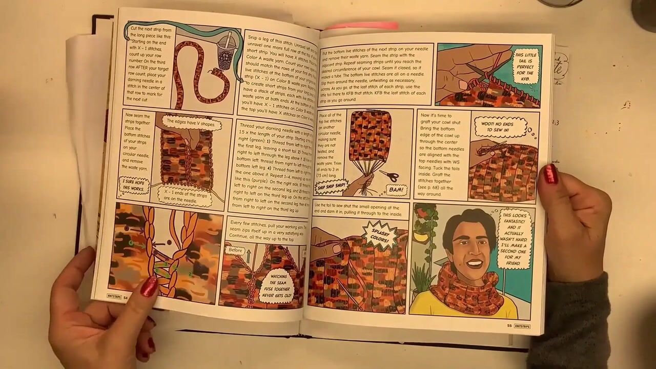
the Texas Cartoonists. I illustrated the book strips, the world's first comic
strip knitting book. I talk about art on panels and work as a presenter
at literary festivals. And I also teach classes on
comics and graphic novels. Now for our class project, we're going to be
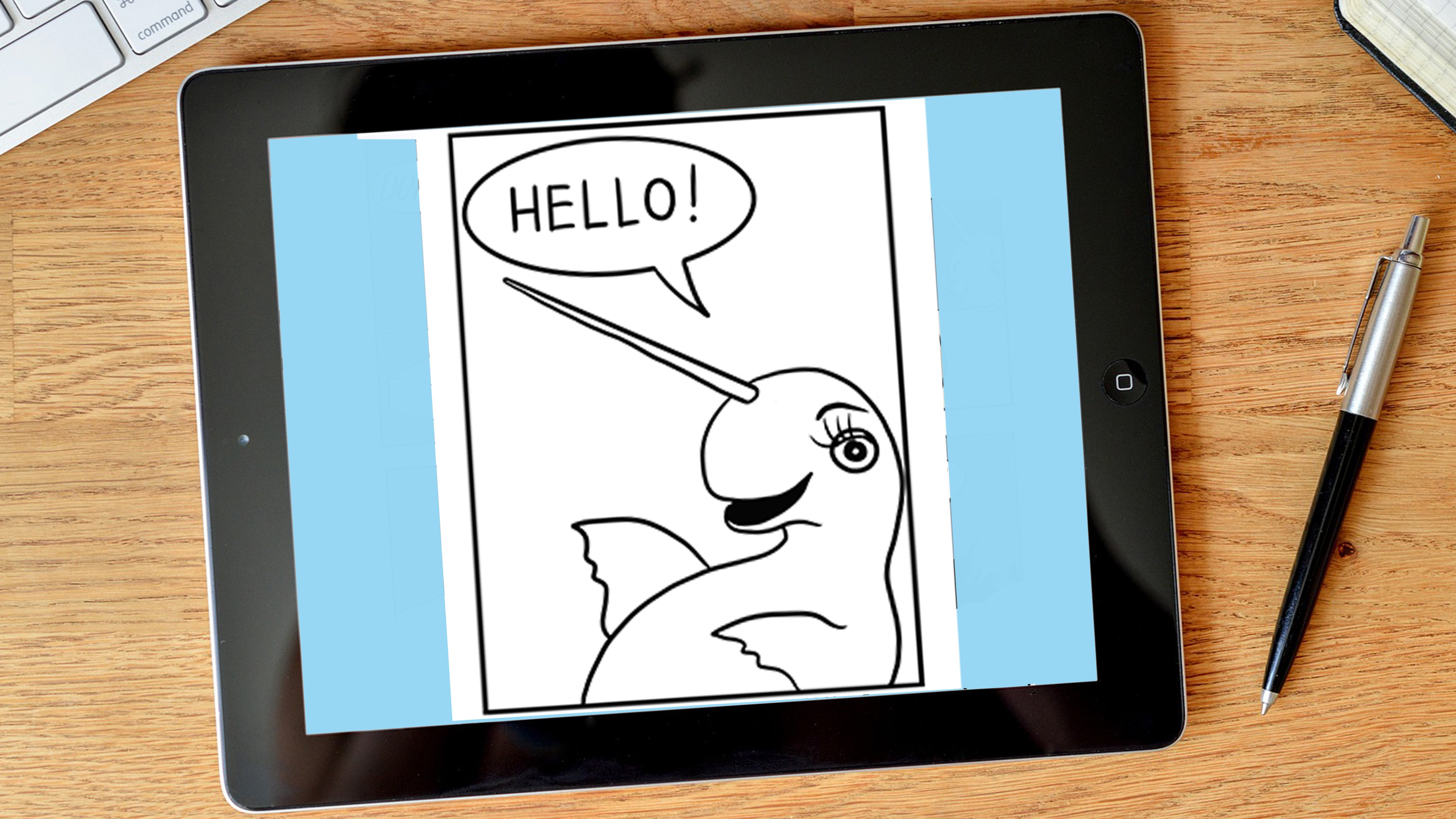
writing the phrase happy birthday because it has a lot of different
letters within it. Also, if you work in the paper
ingredient card industry, it is a phrase. You will be writing
over and over and over. We'll start with your
original handwriting, then we'll change it up
four different ways. I've created a template
for you to use, but I'll also show you how to make your own if you
want to do that. By the end of this class, you'll have four new
lettering styles to use in your own
artwork and projects. You'll be able to apply
these techniques to absolutely any letters or
numbers on your own work. All right. Grab your ipad
and let's get started.
2. Let's Get Started: Okay, I'm going to
talk to you just a second about supplies
for this class. It's really easy. You just need an ipad and an Apple
pencil. That's it. Now this one's optional, but they sell pencil grips that are varying degrees of
fancy and expensive. I just like a really cheap, rubbery little plastic
looking pencil grip. It's a tube and I cut
a slit up the top of it and then I roll it open and stick it
on my apple pencil. I'm really bad
about losing stuff, so I just buy a
big pack of these. They sell them for
elementary kids to hold on the pencils better. And I just think they're
easy to throw on my purse or my bag or
my desk or wherever. And just that little bit of extra rubbery grip texture
helps me hold onto the pencil. The pencil is a little bit
slick and slippery and it just helps with hand fatigue if you draw all the time anyway. To begin with, we'll need
to create a new file. Tap the plus sign in the
upper right hand corner. I'm going to choose
an 8.5 by 11 inch sized piece of paper so that I can print it out
later if I want to. Then I turn it
horizontally by using two fingers to pinch
and twist the image. If you want to create
your own template, open up the wrench icon
and choose canvas. From there, select
a drawing guide and slide it to the right. Click on Edit Drawing Guide. You can slide the grid
guide back and forth to create a small or large
of a grid as you would like. You can also adjust the opacity. You can adjust the
size of the lines. You're welcome to use the
template I've already created. If you look in the projects
and resources section, it's called Lettering Template. Save that to your ipad and
open it up within Procreate. In the next video, I'm going to show you
how to use the template.
3. Using the Template: Okay, I'm going to
show you how to use the template and also show you how to make your
own if you want to. There are a lot of
typography terms out there, and some of them sound
scary, overshoots, but today we are only going
to use a few simple terms. We're going to call the very
bottom line the baseline. This is the midline and we'll
call this the top line. Remember these have fancier
and official names, and if you're
curious about that, please do more research because typography is a
fascinating topic. We'll start with your
original handwriting, then we'll change it up
four different ways. By the end of this class, you'll have four new
lettering styles to use in your own
artwork and projects.
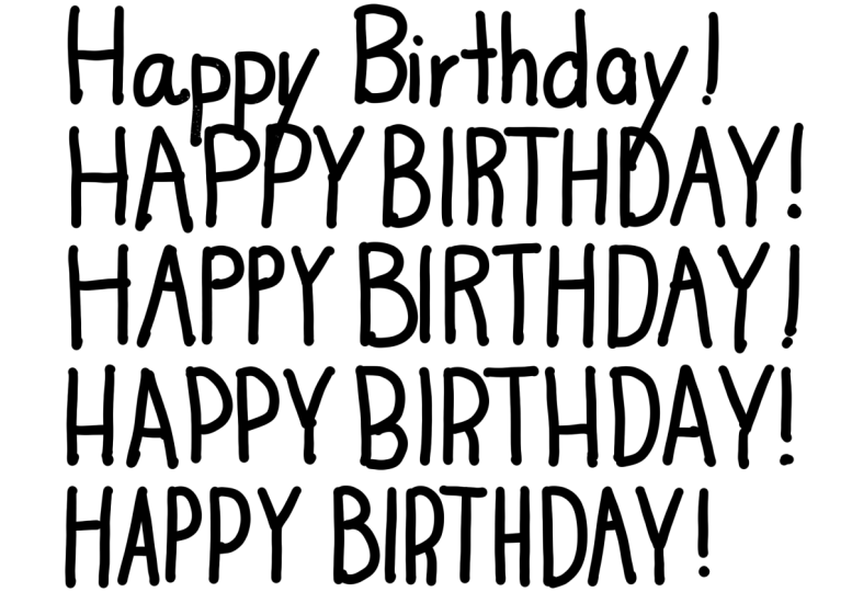
4. Your Handwriting : Okay, on the very first line, we're just going to create a sample of your
basic handwriting. This is your normal handwriting
without any changes. And we're going to
write Happy Birthday. For this project, we want to create these letters
on a new layer. Click on the layers tab in
the upper right hand corner, then click the plus sign. We will be drawing
these letters on top of the template from
the brush library. I'm going to choose calligraphy, then mono line, I'm going to work in black and
set the size to 50. Feel free to experiment with
different sizes and brushes. They will look vastly different depending on what
options you choose. But today let's stick
with mono line at 50. The first thing we will
do is write the phrase, happy birthday at the top. Don't try to make
it perfect or look like anybody else's
handwriting or a font. Just use your own capitals and try to fit it roughly
within the space, provided the most people's handwriting
looks fine on its own. But let's take what you've
got and bump it up a notch. Okay, in the next video
I'm going to show you the easiest way to elevate your basic handwriting
using the template.
5. Basic Midline : Now I'm going to show
you a super simple way to give your basic
handwriting more structure. On the next line, we
are going to take your regular handwriting but
make it a bit more uniform. There are three red guidelines that I want you to
pay attention to. The top line, the midline,
and the baseline. Really concentrate on starting the bottom of the
letters directly on the baseline and ending the top of the character
at the top line. Think of the bottom
and top lines as a border or a frame
for your letter. Try not to go above
or below these lines. Then when you have a
middle piece of a letter, align it with the midline. Let me show you what the letter H. I tried to start exactly at the top line and continue the vertical line all
the way to the baseline. I do the same thing
on the other side. And then to connect them
with the horizontal bar, I make sure to line it up exactly where the midline falls. Use the same technique for
the rest of your letters. Next, I'll show you how to
change the appearance of your lettering by changing
the elevation of the midline.
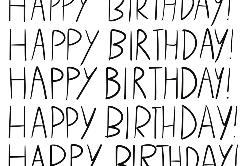
6. High Midline : Next I'll show you a way to
change the appearance of your lettering by placing the midline a little bit higher. For the next style, you'll
notice the template places the mid line
a little bit higher. Make sure to place
your junctions and bars on this
horizontal line. Let's use the letter
A as an example. I start the diagonal
line at the baseline, go all the way to the top line, then continue the second
diagonal back to the baseline. For the bar of the A, I make sure to use the higher mid line. Use this technique for
all of your letters. There we go, see the difference. It's a subtle change. But if you use this
technique for all of the letters that have something
going on at the midline, it gives more structure to your handwriting and gives it a slightly different flavor. In the next video, we're
going to lower the midline.
7. Low Midline : In this video, we're going
to change things up with your lettering by
lowering the midline. Okay, let's take a look at
the template on this line. The mid line is much lower. Make sure the middle portion of your letters lines up with
this horizontal section. Let's look at the letter
R. As an example, I start the vertical
at the top line and continue to the baseline for the curve of the R. I follow the top line and make the junction at this
lower midsection. Lifting my pencil, I
continue the letter at this lowered midline and make the tail go all the way
down to the baseline. Continue this technique
for the whole phrase. See, it's subtle, but it is different from
the other examples. Okay, in this next section, we're going to look at
mixing up your midline. That's going to give your
lettering a more random style.
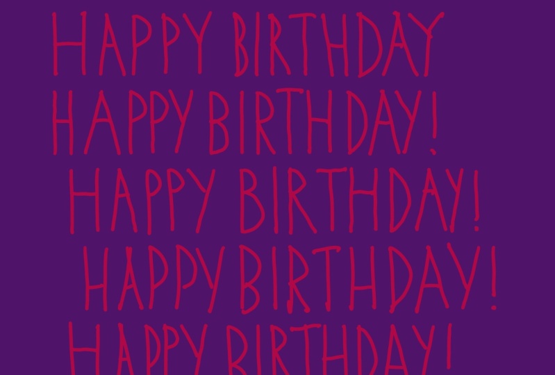
8. Mixed Midline : Now you'll notice in
this template we have our top line and our baselines like you did in the
previous examples, but this section has
three different midlines. The reason for this is
we're going to be switching up where the midline
falls for your letters. We are going to change from
high to middle, to low. For example, when I draw the H, I will place my midline
on the midline. When I draw the A, I will place the bar on the middle midline. When I create the, I will
use the lowest midline, then I'll start all over again. High midline, middle
midline, and low midline. Continue this technique
to the end of the phrase. This provides a playful look that's a little bit mixed up. All of these
examples are subtle, but they will allow
you some variation with your own
natural handwriting. Okay, moving on, we're
about to wrap things up.
9. Upload Project and Thank You : Okay, You're almost done. I'm about to show you how to
upload your class project. But first I just want to say thank you for
being here with me. I really hope these few
simple techniques gave you a new way to feel more confident about your lettering. These changes are subtle, but you should already be seeing a cleaner look to
your handwriting with a little more
structure while still maintaining your unique lines. If you enjoy this class, please consider
leaving a review. It really helps me as a
teacher in a couple of ways. First, it helps me
get paid so that I can create more content
and more classes. And second, it helps
other students, like you, find my class. Next, I would really like
to see your class project. Please share it. I'll
show you how to do it. All right, it's time
to share our project. I like to go up to the layers tab and turn off the template. We just have black letters
on a white background. To complete this step, I also turn off the drawing guide
and it removes the grid. Now to share this, I go into the wrench icon
and click, let's see, Share. I'm going to do a Jpeg. You can send it anywhere. You can send it to your ipad. You can send it to mail, Dropbox, wherever
you want to send it. Just choose, then I
like to rename them. Let's call this
one class project. You can call it
whatever you want. Whoops, I need to fix that. Then send it on its merry way. Click on Projects and Resources within the
main class screen. It looks the same
for all the classes. Then click Create, Project. It's that green
button on the right. Then you have a few
things to fill out. Upload your image, then choose a title and you can write
a project description. You can add more images
or a video if you want. Then in the upper
right hand corner, there's the green
button called publish. Click, click, click. Click it. Thank you everybody. I'll see you next time, bye.
 Laura Irrgang, Artist, Author, Illustrator