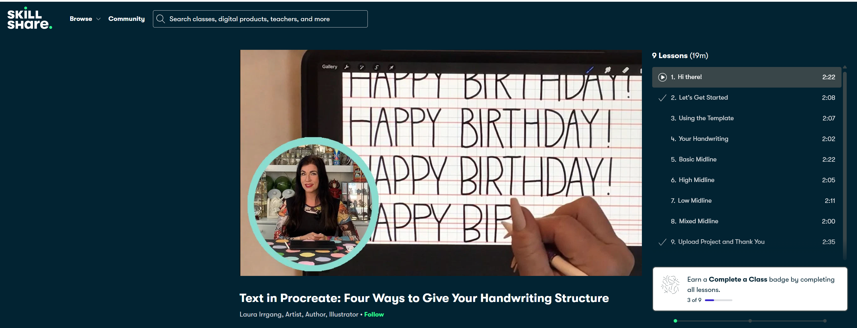
Transcripts
1. Intro: Hi there. Do you want to learn a quick and easy way to
curb text in Procreate? Then you're in the right
place within Procreate, there aren't as many
ways to move text into different shapes as there are in other apps like Photoshop, but it can be done. I'll show you a simple way
to curb your text using the liquefy option that
only takes a few minutes. Once you get good
at this, you can probably do it in seconds. I'm Laura Irgang, an artist and teacher
living in Lonok, Texas. I illustrate books, paint murals and have
work in galleries. I created the comic strips
Glitterville and Greg, and I'm a member of
the Texas cartoonists. I co illustrated the
book Knit Strips, the world's first comic
strip knitting book. I teach, talk about
art on panels, and work as a presenter
at literary festivals. I also teach classes on
painting and creativity. In my previous text class, I showed you four ways to give your handwriting
structure and procreate. Now I'm going to help you
expand your text skills. I'll show you how to take
your text and curb it. Using the liquefy function
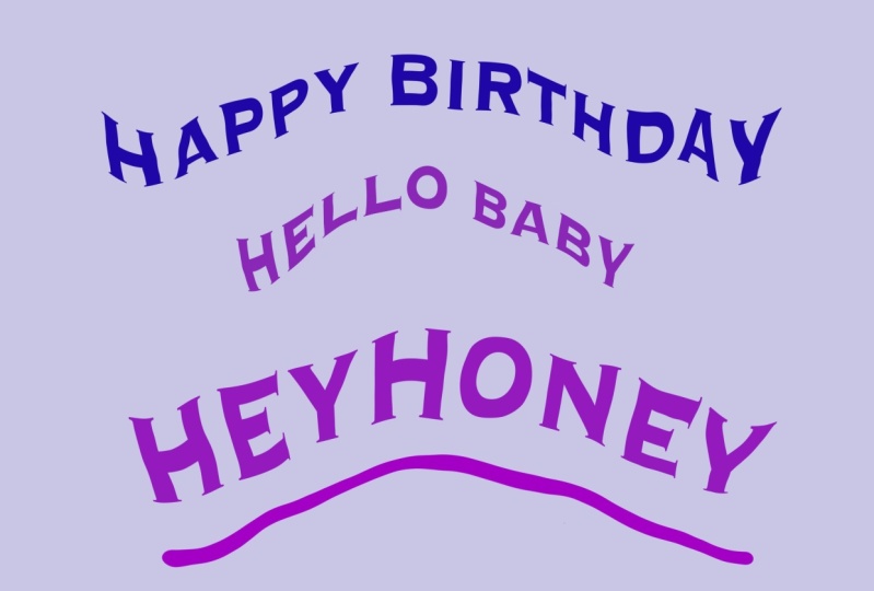
is fun, and it's super fast. It's great for simple
text curving like you'd see on a greeting
card or a gift bag. This method isn't hard, but it's not always intuitive to find these tools
without a little help. So join me for this quick tutorial on curving text, and I'll
show you how to do it.
2. Getting Started: All right, open
your Procreate app. In the upper right corner, you'll see a plus sign. Click that and
select New Canvas. It has a little folder icon. Select the width option. I want this to be eight by 10 ", so I'm going to
come down here to the lower left and
choose inches. I'll start with the
width measurement at ten and I'm done. Now go up to Hitus and I'm going to type eight. It shows me how many DPI and layers I get and
that all looks fine. Now I'll click Create. I like to use two fingers to
pinch and zoom in and out a little to be sure
I'm seeing all of the outside of this canvas area. You don't have to do that, but that's something
I like to do. Now we're going to
add your template in the background for
the first project, the liquefy project. Download it to your device. It's under resources. The first one we'll use
is the blue ribbon. We'll go to the actions
tool bar up here, click on Insert a photo
and select your image. There you go. Now, click to unselect the
Transform to a bar.
3. Liquify: Here's a quick tip. If you want your
text to be a color, then select it now
in the color tool. I want to use this darkest blue, so I'm going to hold my
finger down and slide it. See if I'm in the yellow, you see it if I'm in the blue, it selects wherever
you slide your finger. I'm going to hold
my finger down in the darkest blue
area and lift up. I should see that color up here. You could also click the
color selection tool and choose a dark blue color. You can select anything
in that color range. There are other ways to do it. You can click on disk
and choose from here, but I prefer the classic
one where you slide your colors from here
and then choose one. Now unselect the color tool. That will be the
color of our text. Now to start, we'll go up
to our actions tool bar. That's the one that
looks like a wrench. We'll click it and
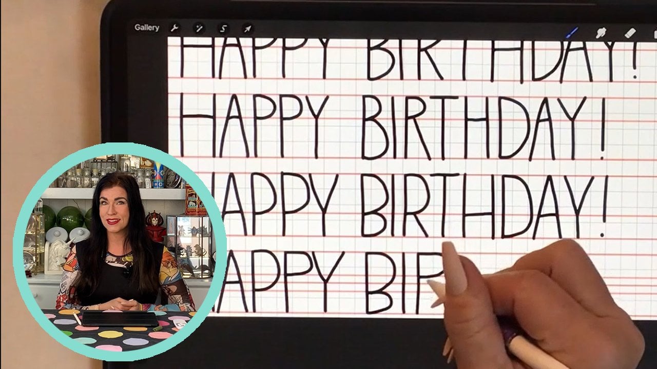
select Add Tech. Next. There we go. I'm
going to type on this keyboard option by
clicking Show Keyboard. Double click the arrow for all caps and type
congratulations. I'll show you a few
quick and easy ways to set up the font and
the size of your text. I'm going to take the blue
dot here and pull it to the side so I can see all
of my text on one line. Click the keyboard to remove it. Now, I'm going to
click on the word inside the box three
times with my finger. Triple click the
text three times, one, two, three, you
have to do it fast. That brings up a
bunch of options. This is the font option, select that and
scroll through here. There are all kinds of
different fonts available. I'm going to pick, let's see. I'll pick Impact. Once
you select a font, you can see that there are lots of different style
choices here like regular, italic light, medium, bold and all the stylistic choices
you'll find right here. Now, going back over to font, I'm going to make sure I click Impact and I'll
leave it at regular. Now, there's another
helpful option you can use to help you
get the size you want. You can type in your exact size, but it's easier for
me to just look at the screen and slide
left to right and say, that's too small,
that's too big. I'm trying to make the text slightly larger than the ribbon. For me, that's somewhere
around 65 or so. Another really helpful thing
is an option called kerning, the second choice
on the design menu. This controls the spacing
between the letters. Have you ever noticed
that sometimes when you make letters bigger or smaller, they are either too smushed
together or too far apart? Well, you can use
the kerning tool to separate them more or to
cram them closer together. I'm going to eyeball it.
That looks about right. I'm going to leave all of the other options
alone and click Done. I want to move the text. It's not quite centered. I'll click it and the shape around it is called
the bounding box. You'll see that
sometimes when you change your font style or size, it will get too big and stack the text on top of itself
and you don't want that. If you have two
words, it's fine, but we want a single line, click on one of these blue anchor points and slide it over. You can use either
side then ops. I'm going to undo that by
tapping once with two fingers. That's how to undo a mistake. Now, I want to move it. I'm going to click on this menu and center it over the ribbon. Now unclick this toolbar. We want to rasterize your
text so we can manipulate it. Click on the layers toolbar, then click the text
layer one time. Now come over to
this menu to the left and choose Rasterize. You have to choose this so we
can use the liquefy option. Now, unclick layers. By the way, you
need to make sure it's selected. It
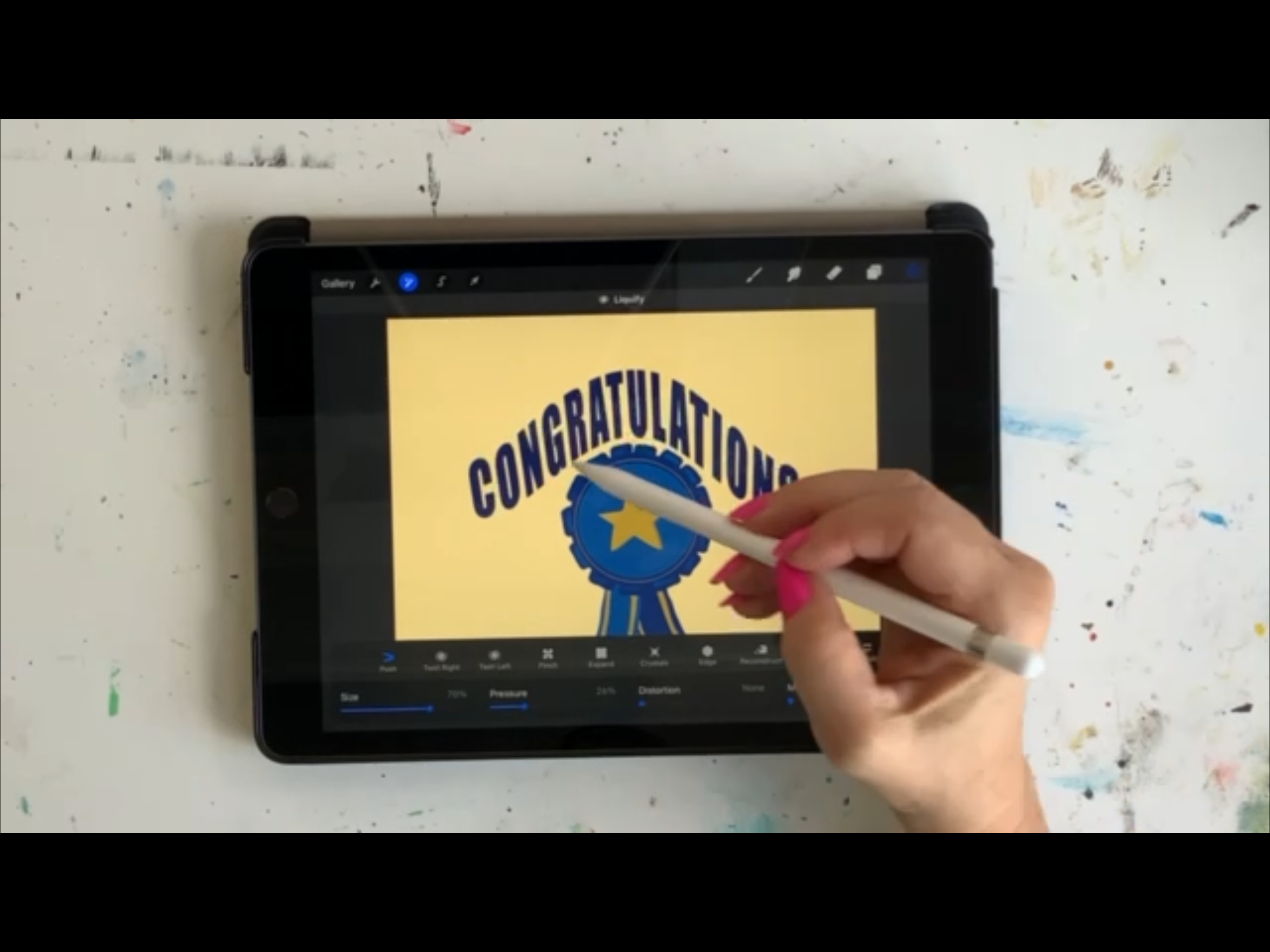
should be blue. Now we're going into the adjustments tool
bar and click Liquefy. Come down to the size
option on the lower left. You can experiment with
the different sizes. Today, I'll choose about 70% and I want the
option called push. You'll know you have
an option selected at any time because
it will turn blue. If I choose twirl right, that choice becomes blue,
but I don't want that, go back to push and
when you click, it turns blue. This
is the fun part. Place your pencil above the letters and pull
down to move the text. Then place your pencil above the letters and make upward
movements to curve it upward. It's pretty intuitive. Play around with it
until you're happy. Y.
4. Share Your Project: Projects and Resources within
the main class screen. It looks the same
for all the classes. Then click Create Project. It's that green
button on the right. Then you have a few
things to fill out, upload your image,
then choose a title, and you can write a
project description. You can add more images
or a video if you want. Then in the upper
right hand corner, there's the green
button called Publish. Click it, click it,
click it. Click it. Thank you, everybody. I'll see you next time. Bye.
 Laura Irrgang, Artist, Author, Illustrator