Take Better Photos of Your Works on Paper | Nadia Valeska | Skillshare

Playback Speed


1.0x


  • 0.5x
  • 0.75x
  • 1x (Normal)
  • 1.25x
  • 1.5x
  • 1.75x
  • 2x

Take Better Photos of Your Works on Paper

teacher avatar Nadia Valeska, Berlin based professional artist

Watch this class and thousands more

Get unlimited access to every class
Taught by industry leaders & working professionals
Topics include illustration, design, photography, and more

Watch this class and thousands more

Get unlimited access to every class
Taught by industry leaders & working professionals
Topics include illustration, design, photography, and more

Lessons in This Class

    • 1.

      Introduction

      1:28

    • 2.

      Take better photos of your work on paper

      4:33

  • --
  • Beginner level
  • Intermediate level
  • Advanced level
  • All levels

Community Generated

The level is determined by a majority opinion of students who have reviewed this class. The teacher's recommendation is shown until at least 5 student responses are collected.

29

Students

3

Projects

About This Class

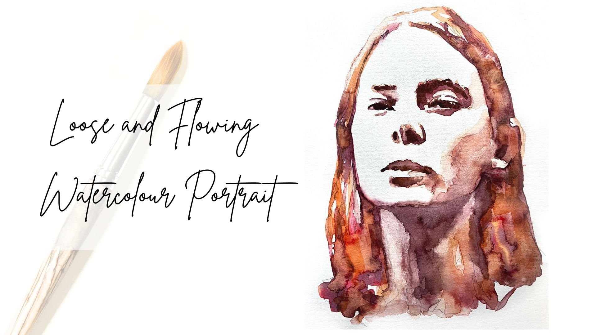
Welcome to this short class on how to take better photos of your artwork on paper, using only your phone or a camera, and natural light. Photographing paper pieces can be surprisingly tricky, often resulting in yellow tones, distortion, or shadows. In this short class, we'll look at a simple way to get clean, accurate photos without any special gear.

We’ll look at how to use bright, indirect natural light to avoid harsh shadows and colour casts, how to position your artwork and camera to prevent distortion, and how to make quick edits using free apps like Snapseed. You’ll learn easy adjustments for white balance (so important!), contrast, and composition so your final photo truly reflects your original art.

All you need is your artwork, your phone or a camera, and a free editing app (I will be using Snapseed). 

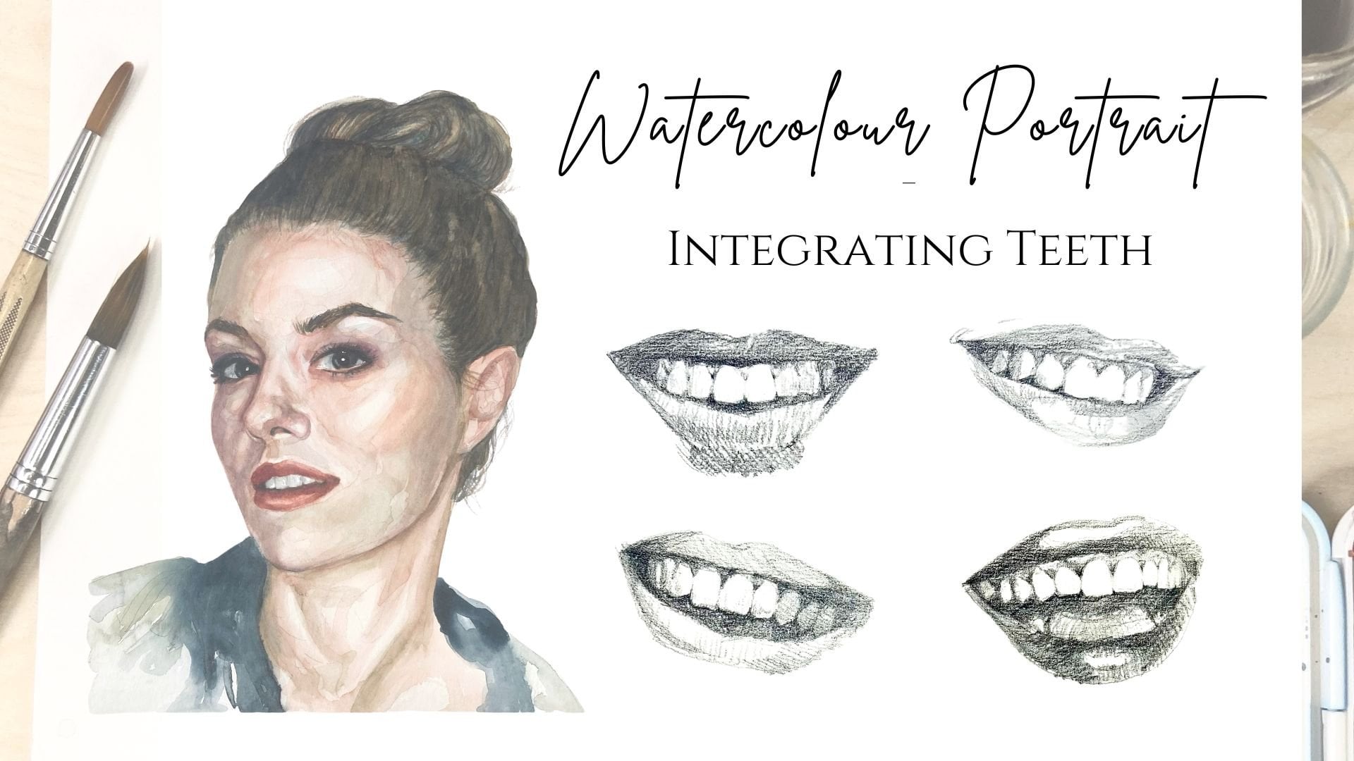
Let’s get started, and if you enjoy watercolour portraiture, feel free to explore my Watercolour Portrait classes and apply these tips to share your projects beautifully.

Meet Your Teacher

Teacher Profile Image

Nadia Valeska

Berlin based professional artist

Teacher


Hey there! I'm Nadia-Valeska.

I am so happy that you have stopped by.

I've been living in Berlin as a professional artist since 2015, and it has been one hell of a ride. Before I came here I was living and working in Spain, where I also studied (with some stays in New Zealand, Italy and Chile). Originally, I am from Germany, but my family moved to New Zealand when I was just 10 years old. After graduating high school I packed up my things and went travelling, and working, to Australia and the UK, before I ended up in wonderful Spain to start my studies (eventually).

I was so lucky to benefit from many different forms of teaching, as scholarships made it possible to study in four countries and at five different art schools. Although in my studio I work mainly w... See full profile

Level: All Levels

Class Ratings

Expectations Met?
    Exceeded!
  • 0%
  • Yes
  • 0%
  • Somewhat
  • 0%
  • Not really
  • 0%

Why Join Skillshare?

Take award-winning Skillshare Original Classes

Each class has short lessons, hands-on projects

Your membership supports Skillshare teachers

Learn From Anywhere

Take classes on the go with the Skillshare app. Stream or download to watch on the plane, the subway, or wherever you learn best.

Transcripts

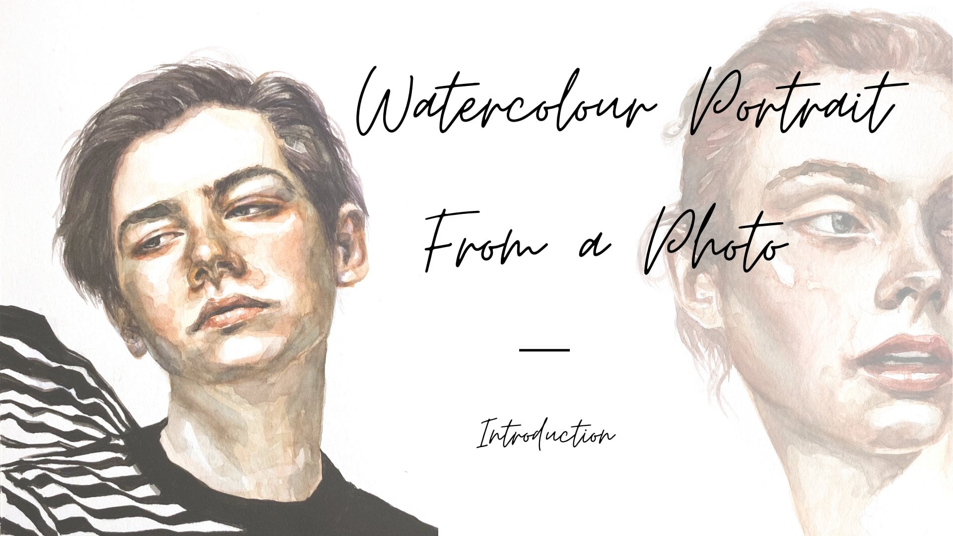
1. Introduction: Yeah. Hi and welcome to the short class on How to Take better photos of your works on paper. My name is Nadia, and I'm an artist currently based in Berlin. As you may know by now, I love to create portraits in watercolor on paper. Perhaps you've taken one of my classes here. If you're new to watercolor portraits, I recommend my watercolor portrait from a photo class. In fact, the portrait I will be using here as an example is the project I created in that class. Alternatively, you could dive in with my watercolor portrait in three tones class. Or if you're ready for a challenge, check out my 30 day challenge of painting eyes with watercolor. Now, if you've ever tried to photograph works on paper, you'll know how easy it is to end up with a yellow or distorted image or with shadows on it that make your photo look like something that has very little to do with the wonderful piece you've just created. In this short class, we'll take a look at some simple steps to photograph your work on paper so that the images are a true reflection of your art. And don't worry, you don't need any fancy year. In this class, we'll be looking at how to make the most of natural light. For the project of this class, you'll be taking a photo of a work on paper that you've created, and you will need a phone or a camera, a piece of artwork on paper, and also you'll need to access or install a free editing software. I'll be using Snapseed, but you can also use Photoshop Express. 2. Take better photos of your work on paper: Hi, and welcome back. Now that you know what this class is about, let's dive right in. And if you had joined me in the watercolor portrait class, the portrait we made there will be my example throughout this lesson. The first part we'll look at is the lighting. Direct sunlight is the most difficult. It's not just bright. It also creates shadows across the paper and a glare that's hard to edit out. Warm household lighting adds a yellow cast that makes paper look off white. And so we aim for bright indirect light. A shear curtain or cloudy day gives a soft and even illumination. We want to achieve a natural even lighting so that there are minimal shadows on the paper. And the white balance is a natural light, not yellow. Prove the still in the editing phase, but it's best to have a good base from which to start. Next, let's have a look at how to place the artwork and the camera so that the photo will be free of distortion. So I place the piece flat, and I hold my phone squarely above so that there's no distortion. We don't want to have it skewed. You want to make sure your lens is clean, and then you want to keep the sheet flat and on a neutral surface to avoid any dark edges. Sometimes the paper is a little buckled from the water, so I recommend either taking the photo while your painting is still taped to the board from painting or keeping it pressed flat for a few days to have it as flat as possible to avoid extra shadows on the paper. Of course, you can also tape it down again, but every time you tape it, you risk damaging the paper as well. Okay, next, let's get into editing your photo. I usually use Snapset or Photoshop, but you can also use Photoshop Express, that's also free. Okay, so when we open Snapseed, it'll probably ask you to accept access for the program to your photos, and you're going to be able to give it access to all your photos or select some photos. And once you've done that, you can come here into the setup, and we are going to start by cropping the image. So I'm going to go to tools. And I go crop, and then I'm going to choose the free format so I can crop it to the size that I want. And I just start dragging these corners across to where I like my edges to be. So I'm trying to also get rid of any dark edges here. And even if I cut off a little bit of paper that's not so dramatic, I prefer that to having dark edges. And when I'm happy with it, I'm going to go accept. And then I go back to tools, and I'm going to adjust the white balance now, so I'm going to use my white balance slider down here. You can just slide that across the image as well and just see where the best tone is. I just want to get rid of any tinges that are too yellow or too blue. And so you just choose a part on your image that is white that is supposed to be the white tone, right? So I've chosen this corner up here, and I go, Okay. And then I'm going to go and adjust the curves. So I can up the whites. We don't want to make it too dramatic, so I'm just going to up the whites, and I'm going to see how I go if I also up the shadows a little bit. Might just take this down a little bit. Look, if you click on anywhere that's not the slider, you can see what it was like before. Okay, so basically on this curve at the top right, you have the whitest white, and on the bottom left, you have the darkest dark. So by sliding these points on the curve, we're trying to establish some kind of balance. You don't want to go over the top with the whites, but you also don't want to have too many shadows. So I think I'm happy with that. If you want to add a little bit more contrast, obviously, see what happens when you do that. Don't really want to do that, though. Maybe I want to have a little bit more shadow in the shadows, and then I'm going to export that. So you can just save a copy, and that's it. And if you haven't taken my watercolor portrait class, I invite you to join me then now and then come back and take a photo here to share your project with the class. Thank you so much for joining me today. I can't wait to see all the wonderful works of art that you've created and the beautiful photos that you've taken of them. So please make sure to upload your project to the project section of this class, and I hope to see you again in one of my other classes.