Transcripts
1. Welcome: Well, hello, fellow
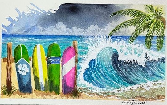
artists and friends. Thank you for stopping by today. I have for you a
cute surfing scene. We're going to do surfboards that are colorful and bright. We're doing a big crashing wave. And this is actually the second in my summer
series this year. The first was this
Glorious Goldfish. Oh. And if you haven't done bubbles yet, you need
to do this class. It is so fun. But today, we're going to be
doing this really bright, colorful, fun, quick class. And it's for people of all abilities unless you've
never painted before. If you've never painted before, I recommend that you take one of my other classes first and
then come back to this one. But if you consider yourself a beginner and you've painted,
you'll be just fine. I take you through this class step by step
from beginning to end, real time video, which means
you're in the driver's seat. You get to determine how fast
or slow you take the class. You can speed it up.
You can slow it down. You can stop and start it. All you need to do is look for the button on the bottom
left of your screen, and that will allow you to
speed it up or slow it down. I want you to be completely comfortable and have
fun while you learn. I want you to walk
away from this class, feeling more
confident and having a stronger love for art while you've improved
your skills as well. You know, I've been teaching
since I was 19-years-old, and I have been fortunate
enough that over the years, I was picked up by
a big box store, and a pattern book that I created was pushed out
across the country, along with pattern packets that went out
across the country. I have won awards in art
contests at galleries, people's choice, first place. I only tell you this so
that you understand really how I have enjoyed a life of art and sharing
it with others. That's what's important
to me is trying to instill that love of art
in everyone around us. There's an artist in all of us, isn't there? You must agree. All right. So in this class, we are going to be doing
some color mixing, some washing, some glazing, some splattering,
some highlighting, some shading, all
the things that are going to help you
improve your skills. And I hope that you will join me if this looks like
it's interesting to you, grab your supplies, and
let's get started together.
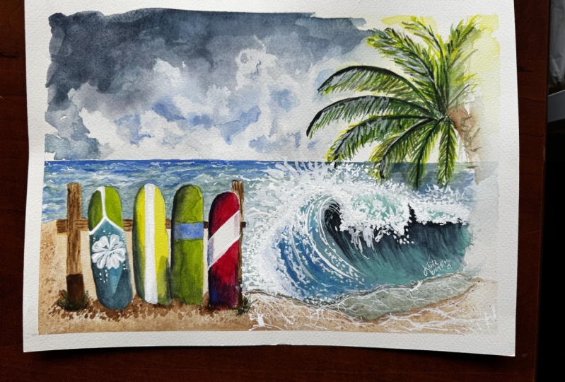
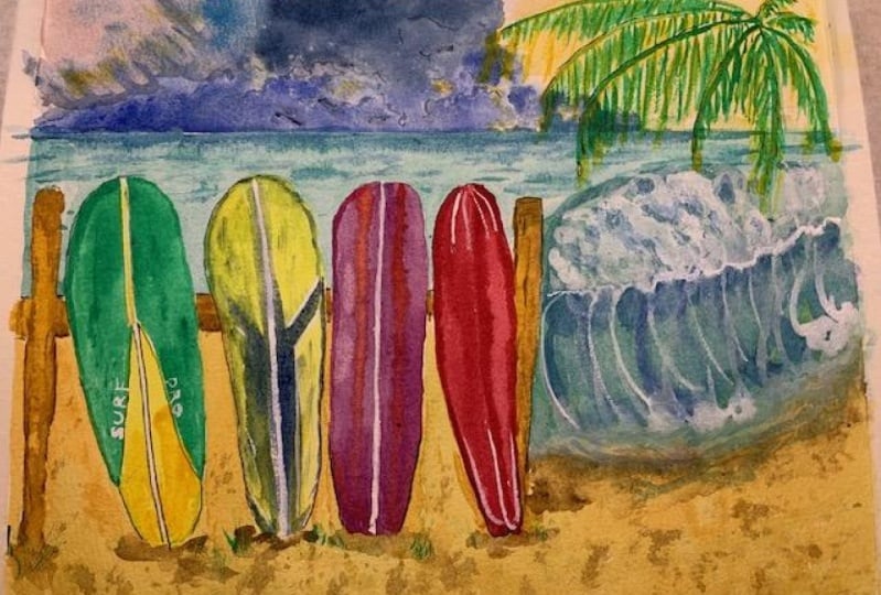
2. Class Project: Okay, my fellow
artists and friends. Your class project is to complete one of these
surfing scenes. And when you've finished that, if you could just snap a
pick and put that into our class gallery by looking for this button
I'm showing you. It only takes a second, and it is a great place for us to communicate
well back and forth. And even more important, it's a great place for us
to support one another. There's no judgment here, guys, nothing but love, and it's so fun to see what each
other has accomplished. I'm so anxious to see
what you've done. You know, I've said this before. It's kind of like
giving everybody the same recipe for a cake
or a casserole And they all turn out just a
little bit differently because you each have your
own talents and abilities, and you're going to put
your own spin on it. And I can't wait
to see your piece. So please share that with us. Also, if you could
take just a moment to click the follow button, I would love to
have you follow me, so you just get a little notice whenever a new class comes out, and it would be great to
have you join with me again. Thanks again for
taking this class. I will see you in
the next video.
3. Paper, Pattern, & Supplies: Let's go ahead and apply
our pattern to our page. You can also free hand sketch
this as it's quite simple. You could use this for
a sample to look at. But I have provided the
pattern for you as a PDF. All you need to do
is print that out, and you'll be ready to go. You will need a sheet
of raphite paper, and you'll need some
tracing paper and just trace that onto
some tracing paper. And I'll show you how to apply the pattern
in just a moment. I wanted to talk about paper. Today, I'm going to be
using a six by ten arches. It's 100% cotton co press. It's 140 pounds. I always recommend
my students to use 140 pound or better
watercolor paper because it is going to work
really well with your water, your brushes, your paint. It's meant to absorb, expand, contract, do all the things that
we want it to do, and if you're going
to put all this time and effort into watercolor, you want to have the best
outcome that you can. And watercolor paper is more
important than your paint. It's more important than
what kind of brush you use. So if you can spend a little extra money and
get a nice 140 pound, or better, then you will
have a better outcome. Okay. I'm going to show you
how to apply the pattern. If you already know how to do the next part, go
ahead and skip over. But for those of
you that haven't applied a pattern, here we go. Okay, I printed out the pattern, I traced it onto
some tracing paper. I've adjusted where
I want it to go on my watercolor paper and just secured that with
a little piece of tape. And I'm going to slide my
graphite paper underneath that. Make sure that you
have the proper side down that's going to
leave mark on your paper. Now, just a side note, if you're going to
use a larger piece of watercolor paper, which would be awesome. I've done it several times
on different sizes of paper. All you need to do is
scale it out a little bit. You don't have to measure
and all that stuff. But mostly what I found changes is where the
horizon line is. We have a pretty tight
horizon line here. You could move your horizon line clear up here if you're doing a bigger paper and then move your palm tree up a little
bit higher as well. So just a little
adjustment as needed. And I am not actually going to draw a line all the way
across on this horizon line. I'm just going to do an
indicator because we're going to put down a piece of tape
to help us with that. All right, I'm going
to go ahead and use my stylist because it will not leave a
mark on my pattern. I can re use this
pattern over and over. You also could use
a pencil or pen, whatever you have
would be great. I'm going to go
ahead and speed up the video and apply
the pattern with you. I was excited to start
painting M. Okay, guys, let's do a
quick review of what our palette is because once
we have our palette set up. We are good to go and you don't have to stop and
search for paints. You're just organized and
on it. So here we go. We are going to need
some indigo blue, some ultramarine
blue, Serian blue, and cobalt till blue. And these are going to be
our sky and ocean colors. We're going to need lemon
yellow, salo green light, and we're going to need hookers
green and undersea green, or you could use an olive green. And those are going
to be the colors that we use for our palm tree. For our beach, we'll be
using Naples yellow, yellow ochre, and burnt umber. So those will be the colors
for our beach and our sand. And then we're going to need the tiniest amount
of opera pink. It's only going to be
for one surf board, so you can substitute that
for something that you have. In fact, you can substitute any of these colors
for what you have. However, I do highly recommend that you use lead proof white. We will be using this
quite a bit for our ocean, and you can substitute
white guash. However, you don't
get the opacity that you get with this
blead proof white. So if you haven't
tried that yet, I really highly recommend
that you give that a shot. Now, for our tools, I always recommend
a Blackwing pencil. That's my favorite. I don't
get paid to say that, but if you haven't
treated yourself to one, it's amazing. It's
a great pencil. Always, we're going to be
using our handy dandy tissue. It's my number one
tool in the tool box, and you're going to be
eating some of this today. Since we are doing Ocean foam and a beach
with fine grain sand, you are going to
need a toothbrush that you can do some
flicking like this. I'll show you how
to do that, but you will need an old toothbrush. And then for our paint
brush tools today, for our rounds, just use
a variety of rounds. You need something on the
larger side for the background, and then a medium
and a smaller one. And of course, you know, my number four is always my favorite if you've
taken my other classes, and for our Flats,
again, a variety. And I would recommend just
something kind of larger, kind of medium, kind of smaller. So let's see what
numbers I have here. This is a ten, and oh, they're both tens. Now, see, this is interesting. So these are both tens, but you can see one is quite
a bit larger than the other. So you just need
something that's kind of larger, medium, smaller. And then for our line work, for our palm trees in our ocean, you are going to need a liner and something for
finer detail work. This is a five ought, and this is a number one liner. So gather what supplies
that you have. Feel free to substitute with what you've
already got at home, so you don't have to run
out and buy something. And we're going to go ahead and get started as soon as possible.
4. Sky & Clouds : I've gone ahead and
applied the pattern. You can see for the palm tree. I only did one line
for each leaf, just an indicator and a
dotted line across where the horizon line
is because we're actually going to mark
it off with some tape. You'll see that I made
a border of tape. I do this for all my sketch
books, for the most part, not 100%, but I just kind
of like that clean edge. Even though we're not going
to do a straight edge, it still helps define
things for me, and so it's a
personal preference. You don't have to do that. You just leave it off.
But it's up to you. I want to take just a
moment and review how to do clouds on the Hrizon line in case you haven't done them, or it's been a minute
since you have. And I like to start out with We're going to start out with a
little bit of indigo, as well as ultramarine. And once you start, you kind of have to work
a little bit quickly, and you want to have some good
whoops, ultramarine here. You want to have
some good water on your brush so that we have
enough to lift off with. So we want those two
colors to kind of blend. I usually do darker at the top, lighter as we get towards
the horizon line. And for the clouds, we're going to take this tissue, and we're just going to blot. And you can see that it lifts
off nicely, just like that. And then we're going to let
that dry and we'll come in. Remember that it's going
to dry one value lighter. And if we want to, we can come in later
with some more of the indigo blue and add
a little extra layer. We can pull out
some of the darks, emphasize some of them
like in here to make it look like some of the clouds are more
forward than others. But if you want to, you know, go ahead and practice
that a couple of times if you haven't
done clouds before, To get comfortable with it. The key is to have enough
water to actually lift off. So I have enough
water on your brush, but you don't want too much. You don't want any cau flowers. You don't want it
to be, you know, dripping down or anything. We've got our clouds
there or our sky, and just kind of mush
up your tissue paper. That's a technical term Mush up. And just kind of turn your
paper different ways, make it high different heights. So some are high, some are low, and Just like that. Okay. So try that a few times and then we're going to dive
into our painting here. First thing we're
going to do is apply a little bit of lemon
yellow, very light. Quite ware down. This is probably 90% water. You're going to hear me say
ratios throughout the lesson. 9010 ratio, 90%
water, 10% paint. And we're just going to put that underneath the palm tree. It's going to be like the sun is going to be coming this way. And we're not doing a sunset, but the sun is still going to be shining from a
certain direction. It's going to help us
with our palm tree. And we're going to go
ahead and put that in first so that you can see, I'm just scrubbing it in, just washing it in quickly. Very light. I'm not coming
down into the ocean. Okay. We'll let that kind of settle while we're working
on our clouds and whatnot. Now, one more thing
that I wanted to mention before we start
actually is the splashing. Let me show you
on this one here. So we're going to be doing
some splashing on this edge of our clouds instead of doing a scalloped
or a straight edge. And so when it comes
to doing that part, it has to be done right up
front in the beginning. And so what we're going
to be doing is just taking that same blue as
we're putting in the sky. So let's say that this is our horizon line, like
we did along here. And so we put in our
sky bringing it down. But when we get
over to this edge, we're going to flip
some of it out. And it just takes a little
bit of a watery paint. And Just kind of flip it out. I'm using a larger flat. This is number ten, and you
can do it with a round. You can have it as, you know, sharp edged as you want
or as few as you want. A couple of samples. You know, This one I
just did soft scallope, but I kind of like
this one better. So this is the one that we'll be doing for our lesson today. And you can see I
did quite a few actually just in that one area. So be thinking about that. And let's see how
our yellow is doing. Okay, I think we can
go ahead and lay in. Our clouds. And you notice I have a bunch of tissue
ready to go, two squares, folded over twice, 'cause I don't want to have
to worry about it when I'm doing clouds, and we've got to
move fairly quickly. I realize before we do our sky, we've got to go ahead and put in some tape for our horizon. One thing that you have
to be careful with, guys, is you never want a
crooked horizon line. The world cannot be
tilted on its end. So God bless tape. What I usually do is just
measure and measure, and then I plant the tape down, and that does the job for us. So that's what we're going
to do here real quick. Is just lay this tape down. And I just use painter's tape. You can use artist tape, but I use painter's tape
to save money most of the time unless it's a
real important piece. But anyway, there we
go. It's laid in. Now, we can go ahead
and add our Clouds. So I'm going to go ahead and just lay in a
little bit of water, just kind of get my paper going, but remember, paint flows
where the water goes. So be careful if you're throwing
in some water like I am. It's just that I'm using
100% cotton paper, and so I want it to start absorbing a little
bit of water first. If you're not using 100% cotton, your water will probably stay up on the surface of your
paper a little bit more. So I'm going to start with
some water down indigo. This is probably a 9010. And go ahead and lay
that down a little bit. And then our ultramarine
blue. Beautiful color. Now, I'm gonna
pick up some water and some more of
this ultramarine. And I'm gonna go ahead and just kind of flick some of this out. I'm going to add some
more indigo at the top. It's a little bit light for me. We could even come in and
add some after it dries. Okay. I'm just softly. This is water on my brush. Just getting a soft gin there between the
yellow and the blue, and I'm just going to soften
that edge with the tissue. Remember this is
going to be hidden, going to be tucked
under our palm leaves. I have a nice dark at the top, softer blue, softer
edge, ven it. Okay. Now, it's time to go
ahead and do our clouds. So go ahead and let's
take some tissue. I'm going to smish
that up a bit. And I'm going to keep these
clouds fairly distant. What I mean by that is I'm going to keep them
low to the horizon. If clouds are closer to you, obviously, they're
going to be bigger. If they're further away, they're going to be pretty low. I'm just going to kind
of bring those around. And maybe a little bit
higher here and there. Yes. Oh. How are you doing? Isn't this fun? It's so fun to create this cloud
scene in the ocean. It's just magic, what
a little tissue can do and a couple of
colors of paint. Great. Now you can see how I have different
heights going on, and it makes it
more interesting, and we're going to go ahead
and just let that dry. Once your clouds are 100%
dry, then we can pick up. I'm using my five t brush, and I'm gonna pick up just a
little bit of that indigo. Really ware down.
Probably 95% water, 955. I'm going to keep
a tissue handy. And what I'm going to do is just when you see
me touch my tissue, I'm just pulling a little
bit of the water off. Now, I'm just going to emphasize behind these clouds
right here on this side. Can you see that just behind? I'm just adding a little shadow. If you want something
light to stand out, you have to put something
dark behind it. And so I'm just going to emphasize these clouds
because they kind of blended in with
everything over here. But I don't want to
make everything dark. I just want to add
a little emphasis right behind that set of clouds. And then, if you
have a dark spot, like, I have a dark
spot right here. So I'm just going to
emphasize that a little bit. I'm just floating
in a little bit of this indigo, 95 and five. Same here a little
bit right here. And just do it wherever
your paper takes you. Just follow the guidance
of the shadows that you already have and just
do it here and there. This is just going to add
a little bit of interest. A little bit of dimension.
It doesn't take a lot. Remember it's going to
dry one value lighter. Now, we don't need to do much, so I've got a palm leaf
coming clear over here. So I'm not really
going to do too much. I might add a teeny bit down
towards the water just in case it shows between
these two palm leaves. That's going to be about it. I do closer to the water
here. No, that's too dark. It's too dark, just touch it with your tissue,
take it off. This is all going
to be so background that you just don't need to take a lot of time or be particular because you aren't
gonna notice it too much, but just part of your eye and part of your brain
is going to pick this up. And so it's just going to make it more
interesting for you. Great. All right. I think we're
finished with that.
5. Distant Ocean: Once that's dry,
you can go ahead and remove your
horizon line tape. Just go very slowly, just in case there was
something grabbing on the tape. You don't ever want to
tear it off really fast. And while we still have some
of this lemon yellow out, we don't do much with lemon
yellow on this piece, but let's go ahead
and just emphasize the vein line on
these palm leaves. So we're just basically
going to go right over that line that we
put in as our guide. Don't worry if it looks funny. It does look funny. Don't make me laugh. I'll shake my hand. That's okay. We're going to
put many colors on top of it. But this is going to
give it a little bit of mph, which is
just what we want. So that's looking good. Once your lemon
yellow is 100% dry, your clouds are 100% dry. Now we're going to protect
that horizon line once again this time on
the upper half. And obviously, now you see
why it has to be completely dry cause you don't want
to put tape on wet paint. There we go. Give
that a good press. And we are going to go ahead and paint in the upper ocean. We're not going to do
the wave just yet. We're just going
to give it a good little basic wash. A wash is when you water down the
paint and you put it all in as one value. So not lighter and
darker here and there, but just one value. I'm coming to our teal here, and it's probably going to
be 80% water, 20% paint. Okay. So we're just going to
go ahead and put this in. A bit ginger ale b careful
around our surfboard. Blues a tough color, guys. If you're trying to put anything on top of blue, it's
going to show through. So I'm going to be kind of careful here around
these surfboards, and you should, too. This makes me want to
be in the Caribbean. The turquoise. So beautiful. And I just went on my board, so I'm going to
touch that quickly. If you get paint where
you don't want it to be, take a clean brush, touch it, and then use your tissue and press it and
that lifts that right off. All right. Then you can't go
back to that spot until it's dry or it
will just bleed into it. Because remember, water flows paint flows, where
the water goes. So it has to be dry. Now, I'm gonna take
some this water on my brush and blend this down. I just don't want to sharp
edge where that wave is. But we're not really
gonna get into that wave for just a minute. Go above it. Again, I'm going to take
water on my brush and just judge it down a little
bit. Just to soften it. Now I'm going to be a little bit careful around my yellow. Because what happens when
he makes yellow and blue? That's right. You get green. Oh, I'm just going
around it a bit. Because remember, were
gonna put palm leaves on top of this, so it's okay. I'm going to soften this,
just water on my brush, soften that edge ale bit. We're going to come back
to this, but we want it to be happy. Let me
come back to it. I want to just a little bit more intense color right here. Chris our Palm leaves
stop up there, and we're going to have
a little bit of space. Great. Hey. Just go to block that edge to soften it even a
little bit more. Nice. See how there's
no hard edge there, and that's what we're going for. Continuing with my larger flat, picking up some of
this ultramarine blue. And this is a 9010 mix. And this is still just
a little bit wet, not terribly wet,
but a little bit. Pressing down my
tape a little bit. All right. I just want
to blend in a touch. So the ocean is dark, far away. It's lighter and lighter
hopefully it's clear when you get it up to your knees when you're in the water. But we want this to be
looking a little bit darker than the teal back
at the horizon line, and I'm just going
to blend that in. Now, I'm just going to
take water on my brush. Soften what I just added. Okay. Now I'm going to
pick up some more of this keeping it on the tip
of my brush this time. And I'm going to add So just adding some darker
here on the side. And I come back
in one more time. Just adding an indicator of little wave rolls
of waves far away. Now, I'm just lifting
off some highlights. You see me, I keep dipping
over here into my water. I'm touching my tissue, and you can see as I touch
the paper, it comes off. Just do that here and there. Maybe we have a
couple white caps or we have the sun is
hitting that spot. And here I'm going to
blend it just a touch. Great. Now, let's
come back in to our. And just add a little
bit more here and there. The ocean is not all one color, because you have the distance, you have seaweed or
sea animals even. You've got the sun hitting
it here and there, you have the depth of
the ocean. I don't know. I'm not a marine biologist, but it's never all one color. It's never all one
value, I should say. Go ahead and make it look
different here and there. Spotty. It all fades into
the background. We're gonna be focused
on this big wave and these beautiful surfboards. So don't be nervous. And have fun. Anyway I am. I'm just dabbing
with clean water. Pulling off a few
highlights again. We will come in with some white. Okay, I'm going to let
that dry. This is dry now. I'm still using my
number ten flat, picking up some
water and a little bit more of this
ultramarine blue, more of an 80 20 mix now, taking it a little bit darker, but I'm going to keep it right
up on that horizon line. And just emphasize. Hey, this is far away, and it's a bit darker up here. I'm not worried about keeping
it even as I go across. And now I just have
water on my brush. Just touching it here and there. Now that it's dry, you can see where you might
have darker spots, which is great to
emphasize those. The oceans always moving, right? So you're going to
have highlights, and you're going to have
shade areas. Great. Okay. Let's let that dry.
6. Beach & Posts: The next step that
we're going to do is we're going to
still skip the wave, but we're going to
put in the beach. And I wanted to just
point out to you, the pattern has two lines, and we're going to
take the beach up to this inner line because the water washes over
the beach, right? And so we're actually going to paint some of this turquoise, this teal over the brown. And so I'm sorry if that sounds confusing,
but stay with me. I'll walk you through it. So
the pattern has two lines. We'll bring our beach
up to this second line. And so let's go ahead and just start with our maple yellow. I love Naples yellow
for a lot of things. Beaches, especially,
it's so great as a base coat or sand. It's also great for
rocks and cliffs, mountains, all kinds of things. It's such a versatile color
as such a mutual yellow, and I use it a lot. So we are doing, remember what a wash
is, A one value. And we're just
being a little bit cautious about going
around our surfboards. Mm. I'm using a
9010 mix on this. All right. Now here is where you're like,
Oh, what's going on? The water is going to come
right up to that edge there. And then I'm going to take
it across the second line. So I'm going to
bring it over here. And right over the
first one. There we go. Leaving room for that little
fence post right there. Alright, now, I'm just
adding a little extra water. It's not soupy, and I'm
not getting call flowers, but we are going to fleck on, splatter on a little bit
of the burn number here. Now, because it's wet, when we splatter,
it's going to spread. That's what we want it to
do this first go around. We are going to let it dry and we'll splatter again
with a toothbrush, and we'll give us that
really fine, fine sand. But we want a few of
the larger splatters so that it looks
like dirt, I guess. Alright, so this is a
9010 mix of b umber, and I'm just going to
cover up my oceans. I don't want a whole
lot in my ocean. You see how that
splatter spreads out immediately
because it's wet. That's great. That's
what we want it to do. And I'm just protecting the
surfboards a little bit. I don't want my surfboards
to have a bunch of dirt on, so to speak, underneath, 'cause it'll be underneath the color. Okay. A touch more
for me anyway. There. Okay. If you get it up in
the wave where you don't really want it,
touch it with water. Use your handy dandy
tissue and. It lifts off. Sand with the surfboard. Great. We are going
to let that dry. We'll come in and splatter
again with more burnt umber. I've taken burnt umber. It's probably an 85 15 mix, and I've got my
toothbrush ready. Go ahead and dampen it, and then wipe it off. Just press that in. And again, I'm gonna
protect my ocean. Beautiful. This should give us that really fine grain look. And that really just
makes it look like sand. Oh, I love it so much. Great. And to add
a little bit more. Alright, let's add a
little bit more here. I'm not going to
bother putting some up there because it's
not gonna matter. Your eye is going to
take you other places, and you just kind
of put that in. Alright, let's let that dry. I picked up my medium size flat, and I'm picking up
some yellow ochre. It's about 85 15 mixture. And we're going to go
ahead and bring that into our wood fence. That. And that's wet. We can pick up a
little of this umber. And just on the bottom
where it meets the sand, we can let that start to
blend together a little bit. And I'm just going
to stroke that out a little bring it up. Just using the chiseled
side of my brush. Ohh in just a few stripes, like wood greenish. Wonderful. Hey, we're gonna let that dry. While this is drying, I went
ahead and pull off my tape, and you can see that
it bled through in a little bit here on the
edge. That's all right. That's no big deal. So
all we're gonna do is use our flat and just clean water
and our Henny dandy tissue, my favorite d, and we're just going to wiggle
ever so lightly, a little bit of water on
there. Just soften that. Great. Okay. So don't panic, guys. If you make a
mistake, guess what? Mistakes happen, none of us
are perfect. And it's okay. It's easy to fix in most cases. And all you have to do
is take a deep breath. And noodle it. That's what I say. Noodle it. Just play with it a little bit. So I'm just going to go ahead. It's not too bad down here, but I'm just going to
soften this a little bit. Since I'm in motion. Now, this part's going to
be underneath the tree, so I can stop. All right. Crisis avoided. Tea. Alright, so
this should be good. Let's go ahead and add just
a little more emphasis now, bringing up some of our t umber. And I'm using that
chiseled edge again. In other words, I'm not
using the flat side. I'm using the tip more so so that I can
get some little lines. I want it to look
a little streaky. You know, like, bold
sun dried wood. And it doesn't have to
be a perfect, you know, how old wood kind of
gets Kitty wampus, it bends, it curves. Like that. I love
that. That's great. Okay. Same thing here. Let's just add a little. Bring that out just
a little bit more. And, I'm going to bring
it down a little further. Good. I want to bring this
down a little further, too. Good. Alright, guys. Let's go ahead and lay
in our surfboards. I need to pencil in my design, so give me just a moment.
I'll be right back. M.
7. Wash in Wave & Boards: Let's go ahead and base in our surfboard so that
they can be drying, and I'm starting out with
this alo green light. And I'm just using a flat. We're just doing a wash. Remember, that's
just all one value. Don't worry about
your white stripe because it's going to
go right on top of, but now if you are
using white gouache, you might need to leave a
space for your white stripe. Ah, I love that color. Alright, while we
have this color, let's go ahead and do
this board over here. We're at the beach. We've
got this light green. Doesn't it make you
want Keelin pie? Some keine pie. Okay, let's just
finish this coming up. I want to have good
coverage on this. I don't know if I
mentioned, so I'm probably doing about 70 30. Now, at the bottom,
you want that to be kind of an uneven edge
because that board obviously is stuck
into the ground. Great. Hey, let's do our yellow. Oh Oh. Great, to make sure you
have some good coverage. Again, that's a 70 30 ratio. We want solid coverage. Let's come back to our blue. I'm going to use seran
blue for this one, but you can use the
ultramarine blue as a matter. Again, about a 70 30. Now, I'm not touching the green because I don't
want them to blend. The green could still be wet. Right, and our last color
is going to be upper pink. Now, this one, since the
white stripe is so big, and pink is so strong, I am going to respect
that and leave it white. This is about an 80 20 ratio. I love opera pink. It's great It's actually great for blending
a lot of colors. But it's super great for
any flowers you're doing. And who can resist a
hot pink surfboard? Awesome. Let's let those dry. Alright, I've switched
to my number ten flat, and I've pulled in some of
this beautiful bt teal. And it's probably an 85 15 mix. And we're going to
go ahead and wash in our wave and let that be drying while we
work on our palm tree. And we want to be
aware of keeping it really light right here at the crest of the wave that sunlight's gonna be
shining through it. And then the rest we don't
have to worry so much about. So let's just start right there while we're
thinking about it. I'm thinning it down just a little bit more
for that actually, so probably a 9010, just for that top
rest of the wave. Softening that edge
with some water. And I'm even going to
touch it. Just a little. I pulled off a little too
much, a little more on. I just want that
to be super soft. There. All right. Now we can go ahead and
pretty much wash this in. Oh. Oh This is that 85 15. We're definitely
coming over it with a couple more blues in a minute. I'd like to start by
leaving that top crest. That's going to be mostly white. Just leave it for a minute. Let's get the rest of this in. And then we have a
second one that's kind of a little crest
right there. 18. Hey. Now, we're going to
really water this down. 9010. And we're not
going to press hard. We're just going to go very
lightly over the sand. If you press hard,
it's going to want to mix with that yellow. We
don't really want that. We just want to put a light film over the top and just
to make it uneven. Like so. You can make it as
light or as dark as you want. I'm going to come
in and make it a little darker over
by the fence post. Remember it's going to
dry one shade lighter. Alright, now let's go
ahead and just add a light coat on the
crest of this wave. Let's go ahead and make it the shape that it's going to be, even though our strokes
don't really show, but we're getting our mindset. Good. Okay. And
let's let that dry. Well, this is drying,
Let's come to our palette, and let's do about a 955
on this burnt umber. I've switched to a
number six round. Take off some of that liquid. I just want to add a
little bit of shadow here, just lightly touching it. We're going to put some
bit of grass there. But go ahead and put a bit of emphasis at the base of each
of these surfboards. Like wet sand. All right. Coming into our burnt umber. We've got a 955 mixture. I'm using around a
little bit there. And we're going to come
in where our teal is, and we're just going to add a little emphasis
right along that edge. Remember we're going to
put white over it, too. So don't worry about
how dark it might feel. Just make sure that it's like an uneven edge because that water kind of
ripples in, right? And we're gonna put
a little bit under the second one as well. Just soften my
edge a little bit. F a little strong. Good. Okay. While that is drying, let's go ahead and pick
up some indigo blue. Take most of it off. You can use a flat or you
can use a round. But I'm going to add a shadow that goes
from the center of the top down the side. Notice I'm using
short broken strokes. You don't want it to look
like some fine line. There. Look, gives it some
dimension to your board. It makes it look a
little bit thicker. It's not flat. Yeah, we'll
do the same thing here. It starts about
halfway at the tip. N. Hey, I'm just gonna lighten
mine here and there. Goes on pretty strong on that
yellow, doesn't it? Oh. Great. How'd you do? Sticking with my number
six and indigo blue, 955, go to add a
little bit of shading. I'm going to use
more not the tip. We use the tip
before. I'm going to use more of the
side of my brush. And I'm just going to stroke
down on our shadowed side, and then a little
bit on the bottom, where it might be still wet. And a little bit, not as dark on the green just because it's
going to go on the dark. Plus this upper parts
more in the sun. Great. This yellow. I'm going
to take it down. This might even be
like 97% water. That sounds technical,
but I didn't need for it. So I would say, let's start
at the bottom and get a feel for how much pigment
you have on your brush. And then just bring
it up a little bit. I'm not going to bring
it all the way to the top cause yellow
is pretty bright. And I want it to stay. Okay. And then the same
thing for the green. I too dark. I get right over
that white stripe. You could use your flat
brush for this as well. I like this fine
tip for that edge. Okay. And last one,
this is going to go on. Pretty dark, so
let's lighten it up. L get to that 97 98. You can always add more, but it's a little
tricky to take it off. Notice I touched my paper
before I went over the white, 'cause I knew it was gonna go on really dark over the white. Beautiful. I might add just a tiny bit over here
'cause it's next to the post. I might have a hint
of the shadow. Great. How'd you do? Guys.
8. Palm Tree: Okay, we're going to start
with our palm leaves, and I'm picking up lemon
yellow with my number one t. And this is
about 80 20, 85 15. And it's not that
we're going to have a bunch of yellow
show underneath, but I like to use it as kind of a guide because you want
to get your palm leaves, your palm frons falling
in the right direction. And this will help us. So they're going to be a
little bit longer, shorter, shorter as they come to the tip, and they don't stick
out this they go fee. They kind of fall down. Think of gravity, pulling it
down, swinging the breeze. That. And I'm leaving tons of
space in between because we have three more colors. Alright. And as we start to swoop up, you start to see
less and less of the upper side and just more
and more of the bottom side. That's one more reason to
start with the yellow. Make sure that you have the
proportions that you want. So I mean, very little showing. Very little compared
to that side, twice as much length. Now on these upper two, I'm not going to show
the upper side at all. They are going to be. Nice
and long portion the trunk. Slightly curved, and
now they're going to get shorter. And short. Beautiful. And again, don't
be afraid to turn your board, Canvas, or watercolor paper,
whatever you're using. Hey. No, I did these
two short right there. Well, I've used to
extend them and because I'm in the yellow.
Never go to show. Matter. Great. And up here, obviously, we aren't
doing a trunk. Because there's just not
room, and it's unimportant. That's not the focus
of what we're doing. But we're gonna pretend like there's one
that's just kind of going standing up
at attention here. So we're going to do both
sides of the palm fronds. And then I'm just throwing
in a little bit of yellow. Is kind of going. Just
to fill in. All right. So that's gonna be
our first layer. Let's let that dry. All right. It's just Rinse and Repeat. Now we're going to use this
light green ilight green. And this is probably
an 80 20 mix. Still using my number one. And now we did all
the hard part, so we can just kind of follow the guidelines laid in yellow. Now you can really see how
they are longer at the top, sh at the bottom, and they're still just
kind of drooping down. And I'm keeping lots of
space between each of these. Leaves, fronds. Hey, this is the one
where it starts to be longer on one side,
shorter on the other. O. Now, you want to make sure
you're not dipping down into our wave here because
kind of a tight fit. And we don't want it
to be too confusing. I'm gonna turn this
just a little. Here's where they really
look long, remember? Sill get shorter, shorter. Now, guys, I don't know
if you've been noticing, but I am twirling the brush
between my thumb and finger, and I lift as I drag
it through the paint, and that gives me a really
nice fine tip on my brush. Notice how curved
these are. Good, good. And now, we're just
going to throw a f. Go cover that
little line I have. Start sparingly on these. Remember that you
can always add more. You don't want to overdo
it, right off of that. Alright, our next color,
still using my number one. We're going into
our hooker screen. This is a 9010 mixture. It has a lot of pigment in it, so I'm gonna go with the 9010. Pulling some of that
moisture off on my tissue. And Oh. It's really starting to take on some good texture, isn't it? All these different
colors coming together. Oh Oh. Beautiful. Oh, this is my
favorite at these top, too. They're just so graceful, the way they bend and flow. And I just love them. Alright. Now, we're gonna
do a little bit of filler. Oh don't get carried away with this
pretty dark color. Remember we just want our eye and our brain
and fill it in for us. I just a little
indicator. Not much. Our last green, still
using my number one is our undersea green, or if you have an olive
green, that would be great. And this is really going
to bring out some shadows. Awesome. We don't need to put in quite as many needles or
whatever they're called. Because they're going
to be quite strong. Oh. Oh. Oh, my. Ooh Isn't it amazing what putting in a
little bit of dark does to the dimension. It just makes everything
else pop because putting in remember how want
something to stand out, you put something
dark behind it. And that's what we've just done. Sorry, my hands in the way. 1 second. I goes on too dark to touch it. Great. Now, the last
thing we need to do is add a vein next to
the yellow one. It's just going to make
it look like one vein, but it will stand out better. Let's come into
our hookers green. A an 85 15 mix and
add that vein. It's going to lay it down
right next to the yellow. Remember, it's going to
d one value lighter. Now, on these curved ones, I'm keeping the yellow on top as if the sun were
highlighting it. It just gives that whole palm from some weight and
stand or sit down. Great. What a difference
that makes that little Little extra shading. Okay. I add just a little more. T. Okay. Great. We are going to leave our beautiful palm tree
until we get our white out, and then we'll add just
a few we to highlight. Really make some highlights pop. So, who's ready to tackle Oh.
9. Big Wave: Here we go on our big wave. I'm so excited to
do this with you. Everything should be
100% dry at this point. And I've gone ahead and prepared a little well of the
ultramarine blue. And it's probably, 9010, but I am going to
go ahead and just start by getting my paper
a little bit wet here. Not extremely wet, and
I'm going to stay on the bottom side of the
crest of the wave. And I'm not going up into
the highlighted area. I just want to have a
nice soft glen here. I'm not pressing hard. I'm just getting the paper wet. I'm going to be a
little wet on wet. And again, I'm not going
into the top of the crest. I'm over here. I'm not going
into the top of the crest. What we're going to do is
we're just going to lay in a little bit of a shadow right underneath
the crest of that wave. And bring it down. And because we've gotten it wet, it's just going to
have a nice little gm. And I'm going to do this
one on a chiseled edge, so just picking up some paint and just kind of
following that curve. Just going to add
a couple of those. Not too many, but a few lines. We're just going to indicate that motion of the
power of the wave. See how they're going
in nice and light. Ba it's wet, they're
blooming out a little bit. That's great. And
same thing over here. I have a few And then we're going to put a little shadow
up underneath the crest. Beauty some of that now. Great. How'd you do? If you were holding your breath, Oh, take a deep breath. We'll let it go. Now, we're
going to just build on that. So we want this to
stay nice and light, but we do want to add a
little more of this teal. Sh, I love this color. And we want that to speak to us a little bit through
some of these waves. And so I add a
little bit on top of that cobalt or ultramarine. Cobalt and ultramarine
are almost identical. No. Add a more. Especially out here to And I'm leaving it
kind of streaky. And let's go ahead and add even a little bit out
here behind the wave. Again, I'm not going into
our highlighted area, guys. Coming up to the crest. Good. Alright. God. Now, this you some water soften this
edge, and touch. Notice I'm following
the curve of the wave. I just pulling up a little bit. And this tight little curve, this little shape
upside down in shape. It's pretty dark as is right
underneath that weight. See how we just
slowly built into it. We didn't want to just slam
at all with the first. So to speak, See how
that's building. Alright. Now we're going to do the same thing with a little
bit of this indigo blue. It's about a 9010. Remember how strong
this goes on. Yeah. Let's just touch
and see what it does. I add It's just going
underneath that crest. That some right here. A
little dark spot you want. Almost using an up and down
motion, just dropping it in. Over here on the
other side. Nice. Now, I'm gonna pick him
up on the chiseled edge. My that's straight up and down. I want to be H. Great. Oh. Looking good. I'm gonna build this up with the
ultramarine blue. I just don't want it as dark because it's more out in
the sun, it's more shallow. Bringing some streaks down. I soften out right there. Looking great. This gently blending this. This is probably a
955 on this ill. It's tiny. This is gonna
help me with the transition. I'm going to bring that
shadow up just a little bit. I think I wanted
a little higher. Good. Good, good, good. Now, this area here, I'm just going to add
a little bit of Oh. These little marks.
There. It's like that. I'm gonna go ahead
and add a tiny bit. So we've got the light
and light up here. I'm going to add
this tiny bit of tel down here because that's going to be
underneath the white. And I want it to
stand out just a bit. Remember. We want your highlight to stand out. What do you do? I dark underneath it. We need this to dry.
10. Board Details & Froth Guide: Looks like I need to come in on my surfboard and put some
ultraren blue on this green. Unless you want to
do a white stripe. But I'm gonna do a blue stripe. And I just missed
it. That's all. Okay. Great. While
this continues to dry, we need that to be pretty dry. We can go ahead and put
some of our designs in. I like to work on a card. This is just a scrap
of watercolor paper. So I have it close to
where I'm working here. All right. I'm just
going to free hand these flowers in,
this flower in. And like that. It's almost heart
shape, isn't it? Notice I'm not closing
off the bottom. I mean, you can, but I don't really want it
to look like a heart. Great. And then I'm
going to add a few dots. Okay. Hey, I switched
to my liner brush. And I'm just going to in
this down a little bit more. And I'm going bring
down the white stripe. Now see how I angled that over because that's a different
dimension of the board, right? Okay. And our white one, I'm going to turn this sideways. It's easier to get
a straight line if you're pulling sideways
because you're moving your whole arm than it is to pull this way
because then you tend to press the brush down harder as you get
closer to your body, and then you get a thicker line. So I always try to
do straight lines by pulling sideways. O. Great. Hey, and our next one. I'm going to do the design
with a different brush. So while I still have
this one loaded, I'm just going to the edge here. Better. Right. Okay, let's come
back to our smaller. This is my five t. And you can add whatever design you want on your
board, obviously. Sticking with our five at, let's just add a few little
highlights on these posts. And then out here in the ocean, we might have a few
little white caps, right? So look for some areas that
you want to add that in. And these are far away,
so they're gonna be te. Ohh Great. Okay. Now, we're just
going to start by laying in just a rough idea of where we want to start
adding to this foam. And obviously, it's going to be around the curves
that we've laid in. I'm just starting out
by putting in dots. Now, on this top curve, I want that to stay
fairly smooth. I'm going to go
ahead and a line. That's our big emphasis. Is this beautiful curled over that we clearly
made bigger than life. But that's the beauty of it. So I made that smooth line
put in foam above it. If it looks funny right now, that's because it
looks funny right now. We're in the messy middle of our wave, and
that's all right. Don't expect it to look
like our final picture just yet 'cause we're not
there yet. That's okay. But you can see how doing
this provides us with a guide on how to proceed
and we don't get carried. It's so easy to
get carried away. You get lost in the waves,
you know what I mean? I want this to kind of
come up from behind. Kind of swoop over a little bit. And then we've already laid
in some of our shadow work, but we don't want to lose the
top the crest of this wave. So we're going to add
some here to give us a guide. Great. Now let's leave
that for a minute. Let's let our hand
rest and let that dry and come back to
our liner brush. And notice I'm rolling this
between my thumb and finger, pulling up to a
nice spine point. And I just want to indicate
some of these curls. Especially up here. So we want to follow the curve of our wave. Yes. And you see how that adds Hoh? We're gonna come in
with some darker indigo in just a moment. I want to keep this momentum going here. Great.
11. Glazing Wave & Adding Froth: While we have our fine liner
and our thin down paint. Let's go ahead and just add
in a little bit of a line. Now, notice I'm
doing a broken line, and I'm just kind of loosely. It's kind of the
edge of the foam. And then we're going
to have another edge where it's receded. It's like, it came and went. I usually have streaks. They almost look
like spider veins. Just kind of criss
cross every which way. H? And Right. Okay. We need to
strengthen our indigo. So let's do that real quick. Picking up indigo blue. Probably 9010, maybe 95. Here's where we want
it to be pretty dark. Right up underneath that wave. It's tucked underneath,
it's swirling up and over. It's casting a shadow. All the things that indicate
it needs to be dark. And don't worry if it looks
really stiff right now. Remember we're going to
add lots of foam on top of it. So it's okay. I'm grabbing my round. I'm just going to
noodle it a little bit. I'm grabbing around. I just want to use the tip and
pull some of that down. Now, this is just
water on my brush. Softening a little
bit here and there. Stick with my round brush, and I'm picking up
some of this tail. I just want to emphasize a
little bit here and there. Right. I think we're ready to
add some more foam. I'm gonna use my number
four now before round. O And here's what we want to make
sure we do guys is make sure you leave areas of the turquoise
showing through, the teal showing through. It gets really easy
to lose sight of that because we're going to add
a whole bunch of foam. But make sure you leave
some space for that to show as you go along, be aware? Okay. Here's where we're
going to come in a thicker. Again, I'm still just
doing the dots kind of Did you see that? As I start to build out. And I'm leaving that smooth edge where the wave curls over. Oh. Okay. We now have the
basic shape of our wave, and now we want it to
look a little more natural and not so stilted. So it's okay to add
some foam that's coming in from the sides and
kind of spills over. Sometimes I start out and end just so that I
don't go too far out. Okay. And here's where we
want to we're going to do kind of a little
webbing, so to speak. I want to make sure that we're leaving some of that
teal showing through. O. O. O. O. O Okay. I'm going to let that
rest for a minute. Sometimes you got to take your
eyes off of it, you know, and focus somewhere
else for a minute. And come back with fresh
eyes, and it's great. Alright. So this is going to be that main edge it
touches the beach. Ooh. I want some foamy areas that kind of come from
a little further up. We'll get carried
away, just a few. And then same here
on the outside, just a few thicker areas. More. Oh That's a little dark. Okay. So at this point, I'm going to stop and splatter because then
we can come back and see where we
need to tweak it a little bit and add a little
more foam here or there. Please be sure that you have all the burnt umber
out of your toothbrush from when we get the sand because that would be a
little bit of a disaster. Okay. And then I'm going
to protect my surfboards. And I don't really want
it up in my tree either. I'm trying to focus mainly
around the edge of the curl. Doesn't that look
awesome against the dark that we put
underneath there? Yes. Okay. And then here above it. We can let that go
up into the sky and That looks great and actually. Just a little bit on
the edge of that tree. A little bit on the
front of the wave. We go a little bit
more into the sky. Rod. And I'm going to looks like
our surfboards doing good, a little bit down
here on the beach. Great. How'd you do? That was fun. I could
splatter all day. If you've taken my
classes before, you know how much I love
to splatter. Oh, goodness. I guess there's a little
kid in all of us. Okay, so let's let that dry for a minute so
we don't smear it. And it's going to give us a better perspective on
where we need to blend. Right now, it's too. We need to blend some of
that foam together. Let's give that just a moment.
12. Wave Details & Signature: Okay, guys, we are so
close to being done. And let's go ahead and just
noodle this a little bit. I'm using my number four round and picking up
some of the white. And I'm just going to
blend some of this. I don't want it to
look so dotted. It looks gives me a headache,
looking at parts of bit. I go. So I'm just going
to blend a little bit. And then I'm making sure
where I'm on the crest. Brought that up into the sky. And we need to have some
foam flying up there, right? Even gonna have some
that's not attached. It's flying. To give
it some movement. Yes, that just went into
the tree, and that's okay. Alright, that's fun. So, this is a personal
preference, Portion, really. It's kind of you do you. You know, step back, six feet, take a look at it and
see how you feel. That feels better
to me. Alright, we are going to take
our liner brush, and we're just going to add a very few amount of palm fronts that are
catching the light. And so I'm inning this
down a little bit. I'm just gonna throw in
here. Here and there. More towards the outside, or it's catching
more and more sun. Nice. Let's throw a couple up here. Now, let's pick up a
little bit of green. A touch of grass at the base. There might be a little bit
of grass that's just kind of started to grow around
the base of this wood. I'm gonna go in. So. There I like that little touch. I imagine a little sea grass or something would be growing. Good. All right. Let's step
back six feet and take a good look and see if we
need to add anything else. Let's step back and take
a good look at things, and I want to add some more white lines.
At least on mine. You guys decide what you
want to do on yours. On this main curl. I just feel like it needs
to be I lost some of them. It needs to be emphasized
a little bit more. I'm using number one. I'm just going to bring
this curl around. Okay, I like that better. Also, I just added one I
just took a flat brush and added one stroke of burnt umber right there
because my tree, it felt like it was floating. We don't want any
floating trees, guys. Okay. And oh, I also just added a little darker
shading right here. You guys decide what
you need to do on your pie and make sure
that you're happy with it. And then we're going to go ahead and sign our name together. It is so exciting. This
is my favorite part. Taking the tape off is just so satisfying for some
reason, isn't it? It's just so gratifying. Beautiful. Beautiful, guys. Always sign your name. Always claim your art piece, and be really proud of
what you've accomplished. I'm so proud of you
for finishing this, and I appreciate your time. I know your time is valuable. So thank you so much for
spending this time with me. And let's go ahead and sign our name together and
claim our artwork. There we go. Thank you again, and I will see you in the next video where
we will wrap up.
13. Congratulations & Bloopers: Well, congratulations,
guys. You did it. You have finished
our surfing project, and I'm really proud of you. And I'm so happy that
you took this class. I hope that it was a benefit
to you and that you learned something new or that you sharpened some
skills along the way. And mostly, I hope that
you had fun and that you gained some confidence
in your painting abilities. If you felt like this class was a benefit to you and you know someone else
who might enjoy it, would you mind sharing
this link with them? And that will allow them
to get 30 days free, and both of you benefit financially from Skillshare,
which is pretty cool. Also, if you would like to
take more of my classes, please click the follow button, and you'll get a
little notification anytime I pop out a new class. But you can also just
go up to the search bar and click type in my
name, Carrie Sanders. And all the classes that I currently have on
Skillshare will populate. And hopefully something
there will be of interest to you because I'd really love to join you again. If you would like to
see what's happening in my world and see a little
more of my intensive art, my personal art, then you can
take a look at my website, which is are Sanders art.com. Or you can take a
look at Instagram, which is at Carrie Sanders art. And both of those places are a great place for us to
communicate back and forth. But really, the best place
is right here on Skillshare. All you need to do is snap
a pick of your project, upload that into
the class gallery, and we can have discussions. We can answer questions, ask questions, and we
can support one another. We, as artists need to
really support one another. I think that's so important, and what a great opportunity
we have to do that here. Okay, guys, I guess that
does it for me today, but maybe there's some loopers. I don't know why I embarrass
myself putting it on here. Have a laugh on me. Take care. Bye bye. I just did that whole thing
and it didn't record. Are you kidding me? I almost didn't
turn it on again. Kerry. Learn. Learn.
Learn. Push the button. Push the button. You can do it. You can't do it. Here we Oh, I'm
shaking the camera. Okay, steady. I believe
in you, you can do it.
 Kerrie Sanders, Artist, Teacher, Creator.