Transcripts
1. Welcome Back!: Hello everyone and welcome back. The weather is slowly getting
hotter and I'm already in the mode of summer
vacations, beach vacations, Bowl time, swimsuits and
ice cream, long days, short nights, sunshine, one
better and school holidays. Is it any wonder
that we associate the summer months with
feeling happy and carefree? Well, if you're not excited
for summer already, I have got all the
inspiration you need. I have come up with this
beautiful class where we will explore the summer
landscapes and beaches. Each class is designed
in a way so that you can chill with a summer drink
and paint along with me, or even just sit back, relax and watch me paint while you set up your
favorite mock tail. What are you waiting for? Come join me and enjoy your summer
vacation along with me.
2. Materials You'll Need: Okay, So let us take a look at the materials that we
will need for this class. First is the paper. So I will be using
the paper from the brand Saunders Waterford, which is let me show
you it up-close. It says that it is a 100%
cotton and it is 300. Okay. I suggest you to go with
some similar kind of paper which is a 100%
cotton and 300 GSM. The reason being all the
wet-on-wet techniques will work perfectly if you're going
with a 100% cotton paper. If you don't have a
100% cotton paper, you have to just spend more
time on wetting your paper to ensure that it stays wet for a longer
duration of time. Maybe for this class you can go with whatever you have got. But in future, if you want to invest in watercolor papers, then do try out the 300 GSM, a 100% cotton paper. This is of the size ten
inches by seven inches. And I'll be going
with this size, maybe a little
smaller than this. So I will be cutting out a
little based upon my needs. If you want to go
with the smallest size or if you want to go with any other size,
it's perfectly fine. Size of the paper
does not matter. The techniques,
what we're going to try in this class matters a lot. So just choose whatever
size is convenient for you, and then we can get started. So that's it for the paper. Now next, let us take a look
at the brushes that we need. For the brushes again, I think it's very
simple and familiar. First is we will
need a wash brush or a large flat brush
to wet our paper even. Okay, so you can go with any flat brush
that you have got. Alright? So that is the first brush, and next we will be needing
a set of larger brushes. So I had this quill brush from, I think this is from Sennelier. So this is basically
used to cover a larger surface area
and it holds lots of water and also
a lot of paint. So you can go with any larger
size brush you have got. So if you don't
have a quill brush, you can go with mop brush. Or if you don't have even that, then you can go with
any larger size, brush size number eight or 12. Okay. These are the brushes for the largest sized and
for the smaller sized, I will typically go with
my size number six brush. This is from Princeton
Heritage Series. And for adding the details, we will go with size number
four and number two. These are pretty
much the brushes that we will need for
this particular class. Next, let us take a look at
the colors that we need. Again, for the colors. I'm going with all the colors that are from the
brand White Nights, but it's not at all necessary for you to
have white knight. You can go with any brand of watercolors that you have got. The colors doesn't matter. Again, I'm repeating
the techniques is what is very important. So we'll choose whatever
colors you have, maybe from whichever
brand they are. So they those
colors and join us. For some paintings,
I am squeezing the paint from the tube. And for some paintings
I'm already using this squeezed pins
from my bands. So it's up to you again, if you want to have a freshly squeezed pain
from YouTube or do you want to use your art
bands, cakes, anything? That is it for the paints. And next we may need a masking tape to tape down
our paper onto the board. So you can go with any
brand of masking tape. There's no particular
brand because if you have the right paper, then the masking tape does
not have a huge impact. So go with any masking
tape that you have got. Then probably for adding
the pencil sketch, you will need some
pencil and it is okay. And if you're gonna
use a palette, then you can go with
any other palette or need not be the same
that I'm showing here. You can go with a
ceramic palette or a dinner plate
from your kitchen. Anything would be fine. So if you're using your
art, cakes or parents, that is also good, then you
may need two jars of water. One to wash off all the
dirty paint from your brush, and another is to
pick up fresh paint. So make sure you have
two jars of water. Then you may also
need paper, towel, auto cotton cloth to wipe off the excess paint or water that
is there from your brush. This is one thing. And I think lastly, we will have a board wherein
we will be fixing our paper. So you can go with
any kind of board. You have a hard book covered
also would do the job. So make sure you
go with any board. This is just to fix
your paper formally. And whenever we need
to tilt our paper, this would help
us to do the job. I think that's it
for the supplies. Grab all the art supplies, whatever you have got, and then I'll see you
soon in the next class.
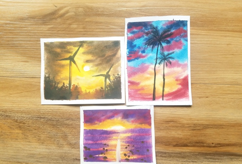
3. Sunset Windmills: Hello everyone, Welcome
to the first today. So today we are gonna paint this beautiful summer landscape. It's basically a summer sunset. So let us take a look at
the colors that we need. For the base layer, we will be going
with Indian yellow. It's a bright warm yellow. And next we will be going with Indian gold to add those clouds. Then for the deeper tones, we'll go with burnt umber. And for adding
more deeper tones, we will be going with when
**** brown and finally, for the most deepest tones, we'll be using sepia. So these are pretty much the colors that we will need for this
particular painting. Today, I will be using all of these shades that are from
the brand White Nights. But it's not a compulsion to
go with a particular brand. So grab whatever you have
and let us get started. So I'll see you soon
in the next section. Okay, So I have taped down
my paper onto the board. And I have also made the pencil sketch for
this particular painting. I'll show it to you up close. You can pause the video and take a screenshot of this or you can just copy the same
as I have done. So, yes, once the
pencil sketches done, the next step is to apply
an even go to water. And this, we always do it right? And all of her paintings. So I repeat the same
sentences again, wetting the paper, please, and important and a major role for the wet-on-wet techniques. When you're using
the watercolors. Let us make sure that we apply an even coat of water
gently onto our paper. For applying the water, I'm making use of my flat brush, which is a little bit larger. This way it will
allow me to cover a larger amount of area
in a single stroke. So you can make use of any of your flat brush that
you are having. And the idea here is to wet the paper until the fibers of the paper are completely
soaked in water. Okay? So I'm going and doing
this step again and again, repeating the same process
for at least 34 times to ensure that my
paper is completely soaked and all the
fibers at with. So I think now our
paper is completely wet so we can begin
with our painting. Okay, so first, let us
start by painting the sun. And I'm using my size
number four brush and using the Indian
yellow shade, I have painted the sun. And now with the same
Indian yellow shade, I'm going to go
ahead and fill up my entire paper with this color. This is our base shade. So the reason why
I'm using my mop or quill brush is that the
paper is big cured. The paper size is bigger here. And in order to cover a larger
area with a single stroke, I'm making use of
a larger brush. So I suggest you also
to go with a size eight or 12 brush in case
you don't have a mop brush. So I'm not worried about getting a nice
flat wash over here. The idea here is to get that Indian yellow shade
for our base layer. Now, I want to correct
the shape of the sun. It's looking a little bit odd, giving it a nice
circular shape with the help of my size
number six brush. So this is how it's
looking at the moment. And yes. So added enough Indian yellow. Now we'll be adding
some Indian goal, mixing this Indian goal
properly on my palette on top of the existing
Indian yellow so as to get a mixture
of both the colors. Indian gold is again a very
nice yellowish orange shade, and it is perfect for
sunset paintings like this. Now you can see the
movement of my brush. I'm just going from left to
right and right to left. Just a back-and-forth moment. And I'm trying to create some
cloud shapes in the skies. So it's very simple. A union not follow. The same as I'm doing here. Just randomly go in and
paint your sky and add some clouds you are in there and make it more interesting. You can see there's
no particular order. I'm just randomly going ahead
and dropping this paint. So yes, the idea here is to not cover the entire
Indian yellow that is present on the bottom, but to make sure to leave some Indian yellow gaps
in-between so that you know, you can have both the
tonal values in your sky, that is the orange as
well as the yellow. Make sure you're not
covering the entire yellow that you have already added. This looks nice,
and we have added some teeny-tiny fluffy clouds with this Indian gold shade. Next, we will be adding
more and more deeper tones. And for that, the
next shade that I will be using is
when **** brown. And if you don't have NDK brown, go with any other
brown that you have. You can also go with
burnt sienna or burnt umber if that
is what you have. So I think using a larger size brush is not making me to define the
shape of the clouds. So I'm switching to my
size number six brush. With the help of this brush
using the Van **** brown, I'm defining the
shape of the clouds. You can see focusing more on the corners and the top edges because those are the areas
which have to be the darkest. And the middle area, that is the area where
the sun is present. We're gonna we're gonna
withhold or keep, retain those yellow shades. So we just want darker tones on the top and on the coordinates. Again, I'm using the same
backend fourth brush movements. It's barely the
repetitive process, and you can just go ahead
and drop the Van **** brown. Another important tip over here is make sure
you're not covering the entire space with this brown because we want to
still retain that yellow. And the Indian goal that
we have added previously leaves some gaps in-between
and add these fluffy clouds. So yes, I think it's
looking good now. But we are going
to enhance this by adding more deeper
and intense tones. Okay, so we have
added enough of this, wenn die Kay, Brown. And it's all looking
good and nice. Now, I want to add
more deeper tones. And for doing that now, I will be switching to another
deeper tone that is CPR. Cpr is again a nice
dark, intense tone. So if you do not have sepia, then take any of your brown, add a little bit of
Payne's gray or black into it and you'll get
a similar shade as CPM. So yes, Now you can see we have a nice bold brown onto the top and the right
and the left corners. Okay? And you want to
retain that yellow and that warm golden
in the middle. So creating a nice
fluffy clouds sky. Gently. I'm dropping the sprint. And you can note
that I still see that my paper is wet because of which when I'm
dropping the shades, it is getting blended with
the previously added colors. But if your paper
has started to dry, then you may not
achieve this effect. So to get this effect, please wait until your
paper is completely dried, leaving the paper gently so that you don't disturb
the underlying paint. And then you can add the burnt sienna mixed
with black or sepia. Since my paper is still wet, I'm making use of the
time and dropping the colors as in when I needed. Okay, So you can just do this. Once I'm satisfied and just
going to stop adding CPM. I have added enough of this fluffy clouds and
now it's looking nice. Now let us start painting
our bottom areas. So we're just going to paint some random bushes and plants. So first I will be going
with my burnt sienna. And I'm using the same round
brush size number six. Because it has a
nice pointed tip and I will be able to get those nice bushes and branches. Randomly. We're
just going to add some dotted patterns,
lines, etc. And just make sure to fill out
this entire bottom region. For this bottom region as well, we're going to add more
and more deeper tones and we're going to retain a slight golden yellow
shade in the middle because that's where
the sun is and the sun's rays are
falling over there. But towards the right
end and the left end, we are going to have
that nice darker tone. So the idea is to entirely fill the bottom area and go with the different size of
bushes and plants. Don't go with a linear shape. So just randomly go ahead and
add these dotted patterns. And he is, as I
teach the middle, I'm just making the bushes to be a little bit
smaller and not taller. So the idea is to have tall branches and bushes
towards the both the ends. And when we are
reaching the middle, I'm just making it a
little bit shorter. So you can see I'm just
randomly pressing the tip of my brush and creating
these dotted patterns. So yes, we just want some random looking
bushes and plants. Okay. So go ahead and fill
up this entire space. Okay, so now we have
added the first layer. Now we're going to add more
and more deeper tones. And for this now I'm switching
to my wenn die Kay Brown, which is a little darker tone
compared to burnt sienna. Mixing it nicely in my
palette and going to drop this only towards the
edges and corners. The middle area should be
retained light and it should be very light compared
to the edges. This will give a
nice perspective and depth to our painting. So gently I'm dropping that. And yes, so this
is looking nice. Just go ahead and randomly
press the tip of your brush and create some dotted
tiny bushes pattern. So I'll be doing the same
on the right edge as well. And I'm going to retain
that lighter area in the middle where the
sunlight is hitting. Okay, so now I'm going to add
the darkest possible brown. So for that I'm going
with sepia and focusing only on the edges and
making it much more darker. Now you can see the darker
bushes towards the edges. And while we reach
the center portion, where the sun's
light is hitting, that area is retained and it is looking nice, golden, yellow. This is the idea that we
want to create over here. So you can go with any random shape of
bushes that you want. You need not actually follow
what I'm doing over here. So just fill out the
entire bottom area. We're just trying to create a nice sellout
since it's allowed. So just go ahead and fill out this entire shape and do
it until you're satisfied. Okay, so we have added enough of bushes and now
it's looking nice. Now the last and the
final step is to paint a foreground subject
that is the windmill. So I can still see the pencil mark and the pencil sketch that
I have already painted. So I hope even you
are able to see this. And we're just gonna make, go ahead and fill out
the shape for this. I'm not using black, I am directly going
with sepia as it is very much
dark and intense. So just following the outline of my pencil sketch and I'm
gently adding this paint. And now another trick over here is I'm not filling the
entire shape with the sepia, but I'm leaving some gap there. I'm going to fill it with
Indian gold just to show that the sun's light is hitting one part of
the windmill. Okay? So first I went with sepia. Now I will be picking up
a nice consistency of my Indian gold and blending that with the
previously added sepia. I already have Indian
yellow at the bottom. And now that will
get nicely blended. And this will show
as the sun's rays is hitting the edge
of the windmill. So this is necessary
because at the end, all that matters is
the perspective. And if the perspective is right, then your painting will look
much more realistic, okay? Yes. Now you can see the bottom and the left edge of
the windmill is dark, whereas the right edge, which is closer to the sun, is a little bit
lighter and warmer. So this is the exact thing that we want to
achieve over here. Now the rest of the
thing is very easy. You just gonna go
ahead and fill out the shape with the remaining
shape with this sepia. Okay. For the rest of
the blades as well. I'm going to go ahead
with this sepia up. But for the bleed, which is you're no closer
to the sun, again, we're going to go ahead
with a combination of Indian gold and sepia. This is to depict that
the elements that are closer to the Sun will have
the sun rays hitting them. And yes, this is looking nice. Now for the blades as well. I'll be following
the same technique, but only to this
particular blade, since this blade is
closer to the sun and the rest of the two blades
are away from the Sun. So I start with sepia again. And when I reach the
bottom of the blade, that is the tip of the blade, I will switch to Indian gold, blended with the sepia that
I already have and create that nice glowing sunny
effect. All right. So yes. So you can see we
have added sepia. Now, switching back to my
Indian gold and gently adding that following the
outline of the sketch that I already have and
blending with the sepia. You can see now we're
getting that nice golden yellow along
with the sepia. So the rest of the
job is very easy. All you have to do
is just paint and fill out that outline
that you have. So I'll quickly go ahead
and fill out the blades. And also for the second windmill that we have at the
bottom that is very far away from the sun
and it is also far away from the viewer. So you need not add the
lighter tones directly. You can go ahead
and paint it with sepia and create a nice sellout. Watch me how I'm doing this, and I'll just go
ahead and finish out filling both of
these windmills. Okay, and now the painting is finished and it is
looking so stunning. Let us quickly go ahead and
peel off the masking tape. I really can't wait to show
you the finished painting. I hope you are already in
love with your painting. So yes. Make sure you remember your masking tape only after your painting
has completely dried. And always peel the
masking tape at an angle. This is just to make sure
that you are painting is intact and nice and you're
not ruining your paper. Just gently take out
your masking tape. I just loved the warm colors in the sky that we have used. It's giving such a
nice WARMI, effect. And the light that is
hitting on the windmill, that is my favorite part. So I hope you enjoyed
this painting. And if you did enjoy, please try out this painting posted in the class
projects section. And I'll be very happy to see
your beautiful creations. So I'll see you soon
in the next class. Until then, happy painting.
4. Summer Evenings!: Hello everyone,
Welcome to the D2. So let us take a
look at the colors that we need for
creating this painting. To create that sense, that effect in the middle, we'll be using Indian
yellow and Indian goal. And to create those
pinkish stones, I will be using my carmine
for the blue tones. I will be going with
my bright blue, but you can go with ultra marine or city
Lynn blue as well. And lastly, to add
those palm trees, I will be using Payne's gray. These are pretty
much the colors, and I am using all these colors from
the brand White Nights, but it's absolutely fine. You can go with any
brand that you have got and let us get started. Okay, So let us start by
wetting the paper evenly. So today we do not have
any pencil sketch. We're just gonna go ahead
and directly paint. So I'm gonna make sure that
my paper is completely wet and it is read evenly
because I want to be, you know, my paper to be staying wet for a
longer duration of time because we are going to paint the entire
thing in wet-on-wet. So make sure you're applying
an even coat of water. And to apply this
even coat of water, I am using my flat
brush or wash brush. You can also go with any
other brush that you have, but make sure it's a larger
size brush so that you can cover the entire paper in a
shorter duration of time. And that way you
can save the time. So make sure you wet
the paper evenly. I think now the paper is ready. So let us begin
with our painting. First, I am going to
drop Indian yellow to the center just to create
the sunny effect over there. So I will be using my
quills sized brush so you can go with any larger
size brush like ten or 12. Next color that we're
adding is Indian gold. So we want to create that yellowish orange shade in the middle if we are doing that. And after adding Indian gold, the next color that
we need is Carmine. Carmine is a very nice
bright pink shade. And it gives a nice look to your censored
Cloud paintings. So you can go with carmine, or if you don't have Carmine, you can go with crimson as well. So it's up to you. I mean, you can go with any color of your
choice, doesn't matter. So just dropping
the paint randomly, you need not follow the
way I am doing over here. So randomly you are in there, just drop and make the painting look very organic and realistic. This is how it's
looking at the moment. I will just go ahead and drop
this scar mine everywhere. Okay, so we have added enough
of this crimson shade. And note that I am not adding the colors very dark
at the first place. So as we progress, we will add deeper tones. So at the start, make sure you go
with a lighter tone. Now I'm adding the
bright blue shade. If you do not have bright blue, you can go with ultramarine
blue or even civilian blue. That's completely fine. So I chose bright
blue because it gives a nice sheet and it looks
a little bit bright. But that's absolutely fine. You can go with ultra
marine as well. I'm just adding
the bright blue to the spaces where I can see
some whitespaces or left. So I'm adding this over there randomly just trying to create those fluffy, cloudy shapes. And yes, I think this
is looking nice. So I'm going to enhance all of this
because once it's dry, it's going to look very dull. So we're gonna add more
and more tones and make it more intense and bright. So I'm going to pick
up my car, mine again, and adding to the places where we have added
the Carmine before, it doesn't matter
if it is touching the blue or getting
mixed with the blue. Because once it gets mixed
with the bright blue, you can see that it is slightly forming a violet or
appropriate sheet, which is absolutely fine and it gives an extra beauty
to our painting. So it's absolutely fine if it's getting
blended with the blue. So go for it. I'm just gonna keep adding
the colors and making it more intense and more bright until
I'm completely satisfied. Okay, this looks nice. I think I'm going to make the bottom region
as well as indents. I'm just picking up
my Indian gold and adding more deeper
tones over there just to give the effect of the
sunset happening there. So this is completely optional, but you can decide the tonal value of your painting depending upon your choice. Okay, So I think that's it. Now, everything is looking good. So picking up my blue
and adding to the edges, just to the edges to give a
nice depth to our painting. But if you're completely satisfied at this point of
time with your painting, you can stop and there's no
need to follow along with me. But if you still feel
like some more tones are needed and you want to make your painting
look more dramatic, then you can go and go ahead and add more and more
deeper tones. Okay? Yes. Just giving some final touches to the painting and let us allow everything to dry and then we can start adding the palm trees. Everything has
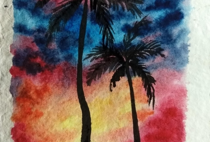
beautifully dried. Now let us begin by
adding the palm trees. For that, I will be using Payne's Gray and a
smallest size brush. You can go with black
if you don't have Payne's gray, that's
completely fine. Starting with the
tree trunk and make sure that you don't go
with a thick bold line. We want the trunk to be organic and realistic
as possible. Go with a ten delegates, a branch or trunk. And then as you come downwards, you can make the trunk
a little bit thicker. Not too much thicker because
the tree is ready tall. So when the viewer
is viewing it, the trunk looks thin. So we need to follow the rule
of perspective over here. You can see how delicately
I have added that trunk. Now the next step is to add the branches for the palm trees. For that I'm switching to
my size number four brush. You can go with any other
smaller size like two. So that will give a nice
fine tip for your branches. So yes, just go ahead and add these branches.
It's very simple. First, I will be
drawing the outline for the branches that I'm going to draw the
mean branches first. And then we will be adding the palm leaves onto
these branches. Okay, so now I have
added the branches. Let us start by
adding the family leaves to these branches.
It's ready symbol. You need to just drag the paint from the
top towards the down and make sure you do not have large amount of water
and paint on your brush. Otherwise you will not
be getting this effect. So it is just a simple, thin, delicate strokes
that you will be adding. So note the brush
movement and follow along with me. In this manner. I am going to go
ahead and fill up all the branches for
this palm tree already. So watch me how I'm doing
and then you can follow me. Okay, so we have
added one palm tree. So now we will add
another palm tree, but this time it's gonna
be a shorter palm tree. The process remains the same. It's just, you're not following
the perspective rule. Again. Make sure this tree
is a little bit shorter. So yeah. Again, it's a bit
creative process so you can just
follow along with me. Okay, looks like we have
completed the paintings, so now let us peel
off the masking tape. Make sure your painting, it has been completely dried
before you be lost the deep. We haven't got Tina
just this time. I'm happy about that door. You have not got clean
religious, It's absolutely fine. You can go ahead and
cut off those edges. Okay. So yes. Take a look at the
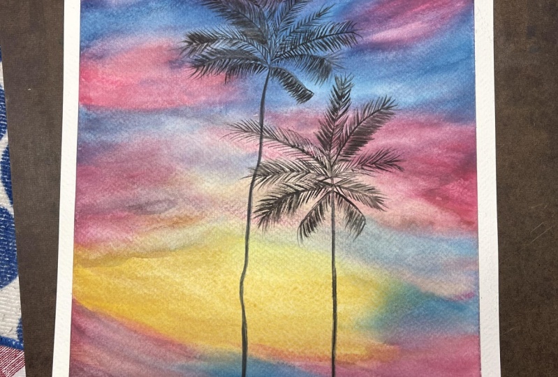
final painting. So this is how it's
looking at the moment. I hope you enjoyed
painting this. It was a very simple
and easy project. It was it was just about getting the wet-on-wet
technique, right? I hope you enjoyed this
class as much as I did. And if you didn't do post your projects in the
class project section, and I'll see you soon in
the next class. Thank you.
5. Summer Sunset Beach: Hello everyone,
Welcome to the D3. So today we are going to paint this beautiful
sense IT landscape. Let us take a look at
the colors for the sky. We will go with Indian
yellow and Indian gold for the bottom region. And for the top we will be
going with the Carmine shade. For the darkest tone, we will go with the violet. You can also use
poeple if you have the same colors will be
following for the beach part. And finally, to
add those stones, you can go with
your brown or any other darker color
that you have got. These are pretty much the
colors for this class. And again, these paints
are from White Nights. Let us get started. Okay. Let us start by applying an even coat of
water onto the sky. The Asian, make use of any of your flat brush or any other larger brush
that you have got to apply an even coat of water. So make sure the paper is
nicely and evenly wet. That help us to work on
the wet-on-wet techniques. So yes, I have applied the masking tape along
the horizon line to get a clean border and to get
a clean horizon line. But this is completely optional. If you want, you can
add the masking tape. You can totally skip it. So I'm going to go ahead
and gently wet my paper. And yes, you can
follow along with. Okay, so now our paper is wet and let us
begin the painting. First. For the bottom
of the horizon line, we're gonna create
a shape of the sun. So leave a tiny whitespace
for the sun and fill the entire space with
the Indian yellow. So gently you can do that
with your brush or you can just start take your tissue paper and
create that sonship. Next color is the Indian gold. I'm adding this from the sites that is towards
the left and the right side. And I'm retaining
that Indian yellow in the middle as it is, that we have different views and different colors for the sky. So I'm not worried about
getting a perfect blend. It's just that I'm
trying to create some clouds and some sky sheets. Okay? Yes. So now that we have added the Indian
gold and the Indian yellow, let us start by adding
different shades to our sky to make it more
dramatic and more colorful. So now I am adding the Carmine. If you don't have Carmine, you can go with crimson. That is absolutely fine. And I'm just trying to create some cloud shapes in the sky. It's absolutely fine if
the car mine is touching the Indian golden
yellow because it will not create a muddy
color over there. Rather, it can create
a different shape that is orange and it's
completely fine. So we will have a nice blended and a
dramatic looking sky. And that is exactly what
we are looking for. So without any fear, just drop that paint and let the background water do the magic for the
blending of the colors. You can see I'm already
blending the carmine with the Indian gold to get a
different tone like orange. Not exactly orange, but some
orangeish yellowish tone. And yes, I'm loving
the sky for now. And let us keep adding more and more tones until it looks more bright and intense. Okay, So now I think we have
added enough of carmine. So now for the
leftover whitespaces, let us fill up that
space with YA lit. If you do not have boil it,
that's absolutely fine. You can go with any of your purple shade
that you have got. So again, mixing this purple with carmine does
not create a muddy color. It will rather create a nice, beautiful pinkish purple shade and that is absolutely fine. Again, without any fear, drop this purplish
shade to your Skype. So there's no particular
brush stroke or any movement. I am just dropping the colors that I feel like it is needed. There's no particular place that you need to add
it here or there. Just drop it wherever you
feel like you have to and just form that fluffy,
cloudy sunset sky. So yes, I'm just
making sure that the corner and the top
edges are very dark. So this kind of gives a
nice depth to our painting. So you can easily see here that the middle region is light
compared to the edges. And this is what it will make your painting
look more stunning. So I suggest you also go with the same techniques as in men. I feel the colors
are getting lighter. I'm just adding more
and more tones. I'm just repeating
the same colors. And I'm just keeping on adding these until I get a
nice dramatic sky. So just feel free to go with your intuition and just
keep dropping the colors. And also make sure to stop when you are
completely satisfied, okay. And don't overdo it because otherwise you
may ruin your sky. So yes. Okay. So it looks like the bottom is looking
a little bit dull, so I'm just going
to go ahead and intensify the colors
only at the bottom. So starting with Indian gold, I'm adding that right below the Carmine that we have added. And I'm just going to add the Indian yellow as
well onto the middle. And I know that the sun
has disappeared now, but we can always create it. So just make your brush
a little bit done. Make sure there is no
paint on the brush, just water and
very little water. And you can create that
semicircular shape for the sun with the
help of your brush. Okay. So yes, This is the reason I tell you to
go with 100% cotton paper. You can do this so that the paper is still wet
and Anibal to do this. But if your paper
has already dried, then you need to wait for
the paper to completely, you know, get dried then reapply the water
and do this step. Okay. So yes, I still feel like I need
to add more colors. So I'm just going ahead and
creating those cloud shapes. But if you're already
satisfied with your painting, then you can stop
the sky as of now. Yes. Intensifying the
sun a little bit. Yeah. All right. This guy has dried. So now let us take off the masking tape from
the horizon line. So make sure to wait
until your papers right. Otherwise, you know,
the paint may start bleeding and it may flow
to the bottom part, which we absolutely do
not want to happen. So, yes, look at
that horizon line. I've got a nice and
clean horizon line. That is the reason I had
applied the masking tape, but it's absolutely fine. You can skip that part. Now. I will just go ahead
and wet the beach area. I'm just applying a clean
coat off even water again. Again, we're gonna
work on the wet-on-wet technique and the beaches, just the reflection
of the Skype. So we're gonna go with the same set of
colors that we used for the sky and just
create a nice reflection. So apply a clean code
of even water and make sure that while applying the water along
the horizon line, the water doesn't
seep into the skies. So take a smallest size
brush if you want to apply the water along the horizon line,
that's absolutely fine. Okay. Yes. Just be careful while applying water
along the horizon line. Yes. Okay. So I need some
more carmine and boil it for painting
the beach areas. So I'm just squeezing out
those colors onto my palette. So I have squeezed the toilet. Now I will take my carmine and squeeze that
onto my palette. So, yes, let me quickly do that. If you have your colors, then you need not squeeze it. My colors are over
on the palette, so I'm just your freshly
squeezing it again. Okay. So yes. I think we're good to go and
the paper is also wet now. Looks like a little bit
more water is needed. So I'm just gently
applying the water again before I start with
painting the beach area. So yes, you should be able
to always judge your paper, how much weight it is and how
much water do I required? Okay. Okay. So the paper is wet, so we'll let us start
painting the beach area, starting with Indian yellow. So I'm applying this
Stewart's the horizon line. I'm just going with a
very light tone first. Later on we can intensify the
colors as and when needed. So I'm applying this Indian
yellow starting from the top of the horizon line
towards the further area. And the next shade that I will be using is
the Indian gold. I'm applying this on top of the Indian yellow
that we have added and trying to create a nice
yellowish orange shade. Yes. Okay, so now we want to create that sundries
following on the beach. So I'm just taking my wet brush and just
cleaning that middle area. So you can see doing that very gently so
there's no more water. The brush is just damp and I'm just picking up some
paint from the method. So yes. Okay. So now I
will be picking up my carmine shade and
I will be adding it. I'm from the edges that is towards the right
and left edges. So yes, I'm simultaneously blending
that with the Indian gold and the Indian yellow that we
have added previously. Yes. So keep adding the SCADA
mine to the whole of the bottom regions starting from the horizon line
towards the end. Yes. Once we add Carmine, we're going to intensify this by adding YA lit on top
of this car mine. It's just a replica of the sky. So yes. Okay. So we have added
carmine to both the edges, the left and right and yes, I'm just wiping off the excess water that's
got collected towards the masking tapes so that the water doesn't
seep through in. Now, I'm just trying to create
that nice blend between all the colors and adding more and more of this
carmine to intensify. So since this is a
wet-on-wet technique, the colors may look darker now, but once it dries, it may fade off a little so you can go and add darker
amount of paint. So go with more paint
and less water. Okay, So this is
looking right now. Now let us begin by
adding more deeper tones. So I'm picking up my violet
starting from the top of the horizon line and gently
coming down towards the end. So I'll be just adding
this violet shade in different places and
trying to create the weaves pattern
for the beach. Just keep adding this. And yes, you can
follow along with me. And yeah. Okay, so this looks good. We're almost towards the end and when I'm reaching the edges, that is towards the bottom, I'm just trying
to intensify that she'd trying to add more
and more deeper tones, whereas the middle
area is left as it is. We're not gonna touch that, just those strokes by
dragging the paint from the masking tape
towards the inwards and stopping right where
the sun rays are following. So you can see I'm adding more and more deeper
tones towards the bottom. This will give a nice
depth to our painting. So keep adding this and
if you're satisfied, you can stop at that stage. Alright? So, yes. Okay, So it looks like
the sun rays that we created, God vanished. So I'm trying to create that really is
reflecting on the beach. So just picking some paint
and I'm not using much water, the brush is just damp
and it is very clean. There's no paint on my brush. And I'm doing this, so yes, I think that's
looking nice for now. So just trying to add more and more yellowish
and orange sheets. Yes, this is optional
union not do it. I'm just playing around
and seeing what's good and habits gonna look so
you can absolutely stop. Yeah. Alright, so let us wait for this to dry. Yes. It looks like
everything has dried beautifully
now the last step is to add some stones or
some rocks on the beach. But if you're happy
with your painting, you can make that as
your final painting. But I felt like the beach area is looking a little
bit duller and, you know, It's looking
a little empty. So I thought to add
these tiny rocks, not a huge ones. Teeny tiny stones are rocks. Just to give that realistic
effect to our paintings. So for that, I will be
going with when Nike brown, but you can go with
any other brown or burnt umber, burnt sienna. But make sure it's a
little bit darker, so it makes that shade
with a little bit of brown to get that
darker tone of brown. See that I'm not adding
very bigger stones. These are very small stones since they are far
away from the viewer. So there's no particular
place where I'm adding this and just dropping in wherever I feel
like adding them. Okay. So just just go ahead
and drop these stones. So the size of the stones again, it's not the same at some
places it is small and at some places it is a little bit bigger and a
different shape. So there's no exact
shape and size for it. And just follow your
intuition and add the stones. And whenever you feel like you have achieved the final stage, please stop adding it and mark
your painting as complete. So I'll quickly go ahead
and fill the beach area with these teeny
tiny rocks. Alright. Okay, so at some
places I am, you know, dropping shade of Indian gold on the stones just to show that the sun rays are
hitting the stones and the light is
reflecting on the stone. So I'm just trying to create
that particular thing, but it's again
completely optional. These all small details
and small things will give a nice depth and a realistic
look for your painting. Stones. You know, when the sunlight is falling
or hitting the stones, There's a little brownish
orange shade, right. So I'm just trying
to create that. Yeah. I'm just going to
quickly go ahead and add few more stones and then
I'll be calling it as done. So I think we have
added enough of these stones also have added some reflections
below these stones. It's not ready detailed
because they had far. Okay, So now I think it's time for us to peel
the masking tape. The entire painting has dried. I just go ahead and quickly
be off the masking tape. Okay, so take a look
at the final painting. Everything is looking
so beautiful. I absolutely loved
the dramatic sky and the reflection of it
falling on the beach. The stones give a nice realistic
field to our painting. Yes, I'm happy with it. So if you liked this painting, then do post it in
the class projects and I'll see you soon
in the next class.
6. Thank You!: Very big. Thank you to all of
you who made till the end. I hope you enjoyed this class. Let us take a quick
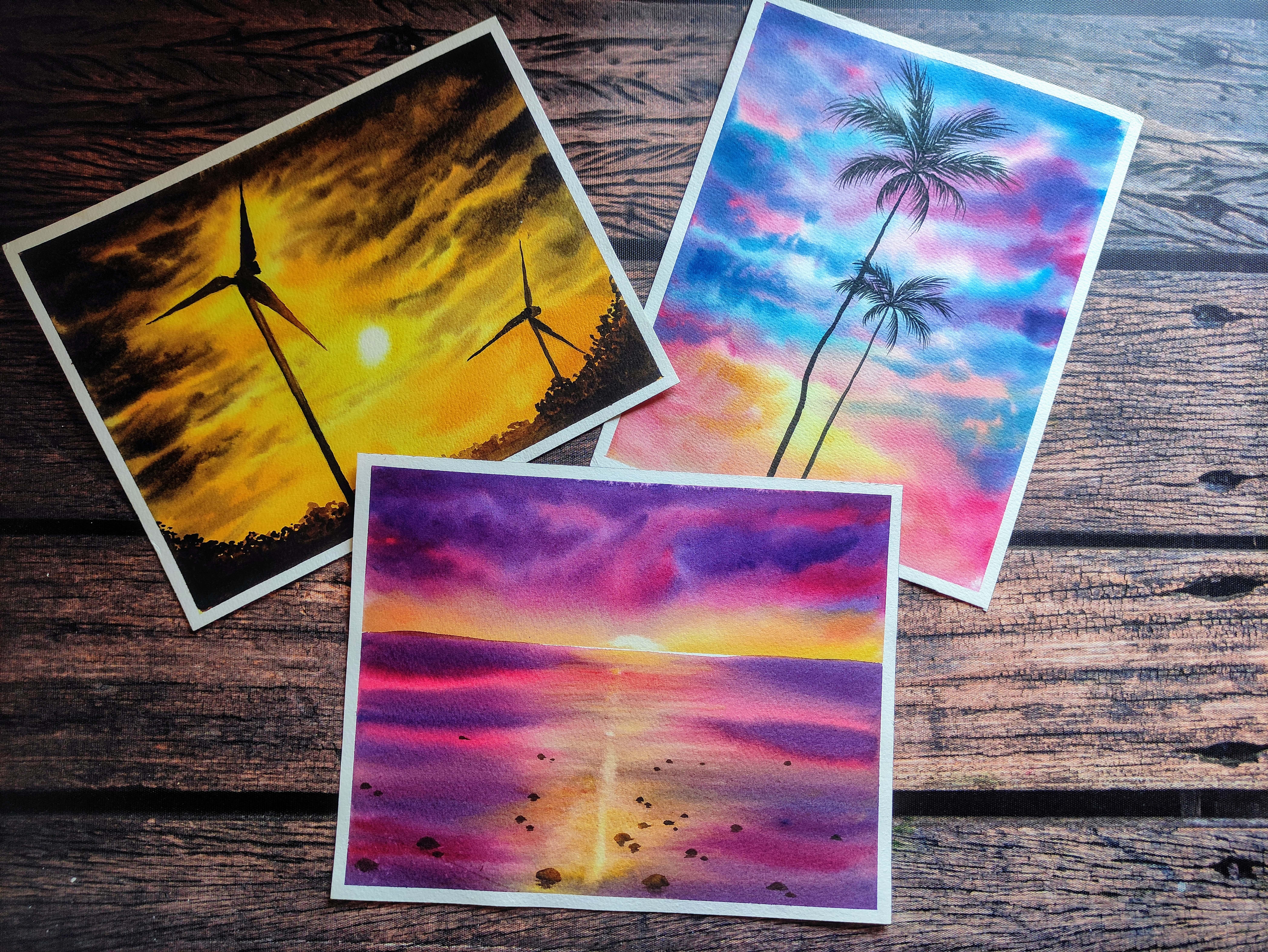
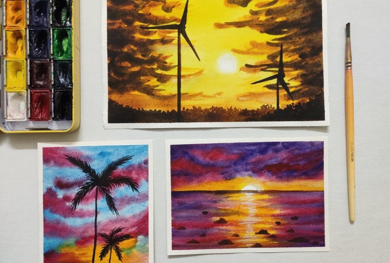
recap at the paintings that we have done.
For the day one. We went with this sunset
windmill landscape, and it was very simple
yet beautiful painting. And for the D2, we explore different
color palette for adding those fluffy clouds
and palm trees. It was another simple painting. And for the last
day we went with a sunset beach scape where
we explored a dramatic sky. I hope you loved all
the class projects. And if you did, do post it in
the class projects section, and I'll be happy to see
a beautiful creations. If you're going to post
this on social media, do tag me using my
Instagram handle, my paint story, and I'll see
you soon in the next class.
 Aishwarya Shetty, my__paint___story | Watercolour Artist