Transcripts
1. Let's go!!!: Hello everyone and welcome back. It's summertime
and I hope you all are enjoying your
summer vacations. Road trips are one of my
favorite things to do in summer. And today in this class, I'll be taking you on an adventurous road
trip where we will explore beautiful fields and
some scenic landscape views. I'm an engineer and an artist, and I enjoy painting
with watercolors. Watercolor is such a
fascinating medium. In this class, you
will learn some of the most commonly used
watercolor techniques, and you will also
learn how to make your paintings look
more realistic. I'll walk you through
all the steps in a simpler way and make
it as easy as possible. It's a very big enough
friendly class, yet this class is packed with a lot of useful information. So come join me on
this exciting journey, and I'd see you soon
in the next section.
2. Materials you'll need: Alright, so let us take
a look at the materials that we would need for
this particular painting. For the paper, I'm going to
go with Saunders Waterford, which is a 100% cotton
paper and it is 300 GSM. Make sure your paper is at least minimum 300
GSM and a 100% cotton. The reason being,
you can perform the wet-on-wet techniques
seamlessly without, you know, fearing for the
paper to be drying soon. All right, that is
it for the big bird. Now, let us take a look at the colors that we will
use for this painting. So I would go with my palette, which is already
prepared in advance. But if you want to use your tubed watercolors or if you would like
to use your pens, you can go with that. For this particular class, I'm using all the colors
from the brand White Nights, but you can go with whatever
brand that you have got. The detailed list of the colors I would be taking up
in the next section. All right. Next let us take a look at the brushes that we would need. The brushes are very basic. First of all, you would require a flat wash brush to apply even coat of
water onto your paper. The next set of brushes
are size number six brush. And this is from the
Princeton Neptune series. So you can go with
any other brush like size number eight or any other sites that you
are comfortable with. And for the smallest size brush, I'm going with size number four, and this is again from
Princeton Heritage Series. Lastly, you would also need
a needle liner brush or rigger brush to add those
grassy ten delicate patterns. Alright? And if you don't
have rigger brush, you can go with your size number 0 or size number two brush, alright, that is it
for the brushes. Next, you would need some pencil and eraser for adding
the pencil sketch. And you would also need
a paper towel or a clot, a masking tape as well to tape down your paper
onto the board. And then you would need
two jars of water. One being clean water where you can pick up the fresh paint and you can use the
antidote jar of water to wash off all the dirty
paint from your brush. Alright, so that's for the jars. And lastly you
would need a boat, basically a hard board. So I'm using an acrylic
board to tape down my paper. But if you don't have one, you can use a hard
book cover to tape down your paper onto the boat. That is it for the materials.
3. Colors you'll need: Let us quickly take
a look at the colors that we need for this
particular class. For this guy, I have
chosen bright blue. You can go with any other
light blue that you have got. Make sure to go with
a very light tone. We need a nice calming
sky for the fields. We will be going
with yellow ocher. Then we will need
some Indian gold. For the deeper tones. We will need burnt umber
and wenn die Kay Brown. For adding the fences. We will again need
when **** brown and sepia and burnt umber as well. So it's a mixture of
all of these colors. Then for the band, for
the roof of the band, we will go with lighter tone of Payne's gray for
the walls of the bond, we will again go with brown. That is Van ****, brown, burnt umber and all of those. And for adding the details, we will go with sepia. These are pretty much the colors that we will need for
this particular painting. And today I will use all the colors from the
brand White Nights, but you can go with
whatever you have got. So there's no compulsion to go with a particular
brand. Alright? Just grab whatever you
have got and join me soon, and I'll see you soon
in the next section.
4. Painting the sky: Okay, So I have the pencil
sketch already on my paper. So take a closer look
at the pencil sketch. Pause the video and you can
complete your sketching. It's already simple sketch with old band and some rustic fences. So once you have finished
your pencil sketch, the next step is to add a clean code of even water
onto the sky region. For that, I will be
using my flat brush. You can go with any of
your flat brush that you have or any larger sized
brush for that matter. So just go ahead and wet
the sky region evenly. So yes, I will quickly go
ahead and wet my paper. Don't wet the house. So living the ban the
rest of the region, we're going to wet it evenly. So yes. Okay, So let us start
by painting the sky. For the sky, I'll
be using serene blue or a lighter tone
of cerulean blue. You can go with any other
light blue that you have got. And I'm using my size
number six brush to add these strokes
into the sky. You can see I'm intentionally
leaving some white gaps so that it will form a nice
fluffy clouds into the sky. So the main intention here is to create a very calming and
the subtle looking sky. I'm not going with a darker
tone of civilian blue. It's a very light tone. So you can see that as more
water and less paint on my brush with the existing
paint on the paper. I'm just dragging them and creating some strokes
here and there. Alright? So we want the sky
to be very simple and make sure you're not adding
any paint onto the bond, leaving that hot area
to the other regions. I'm adding the blue Yes, washing off my brush and
with the damp brush, I'm just cleaning the edges
and making them look softer. Alright, let us wait
for this to dry.
5. Painting the Fields: So the sky has now
completely dried. Let us now start by applying
an even coat of water onto the bottom
area where we are going to have our wheat field. I'm using my flat
brush to gently apply the water evenly all
over the bottom region. So, yes. Okay, so now let us start
painting the wheat field. For the wheat field, I will be going with a
mixture of two colors that is yellow ocher
mixed with Indian gold. So the reason why I'm
using Indian gold is if you have typically
seen those wheat fields, desert tent of golden
shade mixed with yellow, yellowish shade that is
yellow ocher sheets. So that's the reason to make
it look more realistic. I have chosen Indian gold with
a mixture of yellow ocher. You can see how pretty
that color is looking. And yes, so It's not
only engineer low and so the Indian gold and yellow ocher that
we are going to use, we're also going to
use Van **** brown mixed with bond amber to
add those deeper tones. You can see I'm adding wide
variety of tonal values. You are in there randomly. But once it's going to dry, everything is going to look
stunning and more beautiful. You can see I'm dropping
the darker tones that is typically burnt umber
mixed with Van **** brown. Just to have that deeper effect over there at some places, you make sure that some places
you have lighter values of color and at some places
you have deeper tones. Alright, so now you can
see I am going to create a pathway in-between
and I'm gonna have my field on either sides. For the pathway, we're
just gonna leave an empty whitespace
and just blend out the colors on either
sides and create a nice pathway for
the wheat field. Alright, so you
can see I'm adding some grassy patterns,
some strokes. Now I'm adding
some deeper tones. So it's typically very random. There's no particular order
or any shape that I'm using. It's randomly. I'm following my intuition and I'm just
adding these scholars. I know it may look a little
messy at this point of time, but once it's going to dry, you're going to
absolutely love it. So just trust the process
and keep painting. So yes. Now you can see I'm mixing burnt umber along
with Van **** brown. And I'm adding more
deeper tones just towards the corners
and towards the edges. Towards the bottom
you can see I'm just creating some blades
for these V8 fields. You can, normally,
you can see that ad, different patterns
for these blades, sum or take stroke. Some are thin strokes and so on. So just keep adding them. And once you're satisfied
you can stop the process. I'll quickly go ahead
and add these strokes. Now you can see I'm adding
more and more deeper tones, some deeper tones towards the top and deeper tones
towards the bottom. Okay, so you can see I'm picking up more and
more color now. That is less water
now and more paint. So we want to have that
depth to our painting. So make sure you go with a nice intense tone
of this brown. Because once you're
painting is going to dry, the watercolors tend to
dry one shade lighter. So I suggest you to take a
nice concentrated amount of paint on your brush to add
these darker brown tones. All right, you can see our
painting is already taking its shape and it's going to look absolutely stunning in the end. Just keep adding more
and more strokes. So please go with a
pointed tip brush so that it will help you create these thin, delicate strokes. Alright? So if you feel like size number six is
not perfect for you, then you can also use
your rigger brush. I will also switch
to my regular brush to add those ten details. So now you can see I'm
using my regular brush. And this regard brush
is very helpful for adding these grassy
bleeds and patterns. And it gives a nice
finish to your paintings. Alright, so I'm
gonna add mode of this and once I'm satisfied, I'm just going to
stop adding that so you can follow me and
keep adding them. All right, So I'll
quickly go ahead and fill up the wheat field region, okay? Alright, so I have added
enough of these now. Just to intensify, I want to add still more deeper tones
using my rigger brush, I'm adding these grassy
blades or grassy patterns. It is very simple. You can first practice
it on a piece of paper. Once you are comfortable with the hand movement and
the brush movement, you can come and add it
onto your main painting. I'm just, you can just
watch my hand movement. It's just pulling the strokes from downwards to the upwards. Your hand should move very fast in this process
so that you know, it will create organic
shapes already. Just keep trusting the
process and without any fear, just drop your pins. Alright. So let's
wait for this to dry.
6. Painting the Barn: All right, so now let us
start painting the old band. So let us begin
painting the roof. For the roof, I'm using a
lighter tone of Payne's gray. So you can go with lighter
tone of Payne's gray, neutral tint, or even black. Just make sure it should be
light and not very intense. So there's no much water. I'm just using dry brush stroke and with the help
of little water, I'm spreading the paint
all over the roof. Okay. Once we add
the base layer, I'm going to add the other details once
the paint has dried. So make sure you do this gently and no paint fluids
onto the front area. So just keep adding shade. Alright, so now let
us start by wetting the front area of the
heart or the bond. I'm just adding a single
layer of water because we want to paint this front area using the wet-on-wet technique. With the help of my
size number four brush, I'm just applying an
even coat of water. So make sure while
painting the bond, I'm using a pointed
tip brush and also I'm going with the smallest
size brush just to be very sure that the paint does not flow outside
and ruin the sky. So make sure you go with
any smallest size brush. You can even go with a
size number two brush. Now I'm just picking up
some Indian gold and adding it right onto
the top of the band. Okay, so we're gonna
have a mixture of colors for this band. So starting with Indian
gold as the base layer. And then I'm going to
stop adding Indian gold. And right where we stopped
adding the Indian gold, I'm going to start adding the burnt umber mixed with a little bit
of Van **** brown. So I already have that
mixture over there, which is already
used for the field. The same mixture,
I'm using that and adding right where we stopped
adding the Indian gold. And I'm going to create a nice blend between
these two colors. We want to make the bond look
really very old and rested. So to get that realistic effect, we need to add these, the tones. Just keep adding that. And as I come down, you know, I'm not using more paint
and more water because I want that heart to be smudged
along with the wheat field. Now, I'm going to add
the shadow for the roof. So the roofs shadow
is going to fall. They're on different areas. So just making that portion, the triangular portion
a little bit darker, you can use a darker brown shade on the either wall of the barn. I'm just going to go ahead with burnt umber mixed
with Van **** brown. So you can see right now it
may look a little bit messy, but once it's going to dry it, it's, it's gonna
look more beautiful. And we're gonna add more and more details to
make it look more realistic. So now that the roof has dried, I'm just gonna add some borderline to it and
add the shadows, like intensify the
shadows a little bit more to give it a
more realistic look. So now you can see
the roofs shadow is looking more prominent and it's looking more realistic. So yes, don't all do this step. Because once you do, you may lose your base sheet. So we don't want to ruin
the base shape of the bond. So be sure when
you have to stop. I think now it looks good. I have blended out the colors. Well, now it's time
to add some details. Okay, So I'm just
fixing the color over there and giving
it a nice blend. Alright, so
everything has dried. Now let us add the
further details. So I'm gonna use my
rigger brush and create some dry brush
strokes on the roof. These are just normal lines. It's not straight, so
it's just dry patterns. Don't use a lot of water. There should be very less
water and more paint. And don't make it too prominent, it should be some broken lines. We need to have that realistic and old
effect to the bond. So make sure you go with
a dry brush technique. So now you can see
the closer details. I'm having very little amount of water and there's very
less paint as well. So I'm using sepia and adding
these dry brush strokes. These are just vertical lines. So yeah, let's keep adding that. Alright. Now that we
have painted the band, let us add a teeny tiny door. Okay. So I'm just creating
a dod shape and adding it, fill it, fill that door
with the same sepia color. Alright, so I will quickly add a final round of the
dry brush technique and let us jump to
the next section and paint the fences, okay. Yes.
7. Adding the fence and details: Alright, so now let us
add the final details. That is, we'll add defense
for painting the fence. I'm using my size
number four brush. And the color that I'm
using is when **** brown or you can go with any of your dark brown
that you have got. And if you have a lighter brown, you can add a pinch
of paints gray. You can even use sepia
for that matter. Just make sure it is a
little bit darker so that it will be contrasting
with the field. It's very easy to paint
these fans since you already prepared the
pencil sketch in advance, I hope you would be able
to see your outline, but if you are not able
to see the outline, then wait for me to
paint the fence. Once I completed, you can quickly follow along with
me and add it. All right? Yes. I'm just going
to go ahead and add fences on both the sides. So keep in mind there should
be a proper perspective. So don't make defenses
of the same shape. They should be of different
shapes and sizes. This will give a
nice realistic depth to our painting. All right? Yes, let us continue
adding these fences and you can see once I reach
the bottom of the fence, I'm not making it
a very sharp edge. I'm just trying to
blend that with the underlying field. Okay? Yes. Alright, so now that we have added the fences, let us attach these
fences of it, rope. So you might have seen those fences in the village
or the countries site? It's usually attached to it. I don't know what it is called, but I feel it's like a small thin rod which holds these wooden
fences together. Yes. It should be a very
thin, delicate line. Don't make it too thick, otherwise you may lose
the proportion of the painting and it may
not look realistic. So make use of your smallest size brush and go with a pointed
size brush. Alright? So this is how you
need to add defenses. And we will have to add these
fences on the either side, that is on the
right side as well. The steps would be the same. So just follow along with me. Alright. Alright, so we have added fences on both sides. Now we're gonna add some
textures onto these fences so as to make them look more realistic and more beautiful. So just on top of the
brown that you have added, go with a darker tone. You may go with
black or even paints gray and take your pointed brush and just keep adding some dry strokes onto
these wooden fences. You might have seen
those wooden fences. They will have a
lot of textures or different textures and they
may have cracks in between. Although we will not be able
to capture everything here, but whatever we
can from our site, we can add them to make our
painting look more realistic. Alright, so it's
an optional step, but if you would like
to make your painting look more realistic
and more beautiful, then you can go
ahead and add these. Alright? So, yes, I have added, I have added enough of these. And now it's time to add some more details
on these fences. And for that, we will
need a white gel pen. But if you do not
have white gel pen, you can also go with your
white paint or white gouache. So we're not going to
add too much of this. It's gonna be very light, it should not be too prominent. So I'm just adding few lines and few details just to
give it a nice depth. So you can see, again, this is an optional step. If you're happy with
your painting already, then you need not follow this. But if you want to
add more details, then go ahead and
follow along with me. Alright? Okay, so our fences are looking so beautiful. Now, I think I'm going to add few highlights to the old band as well to make it look
more old and more rustic. The mode, all that looks, the more beautiful
you are painting and more realistic your
painting will turn out. All right. Again, this
is an optional step. If you, if you are already
in love with your painting, then please do not
add any touches. Just leave your
painting as it is. And yes, so that's
looking nice now. And make sure if you are if at all you're adding
these details, then please don't go overboard. Don't make it too
prominent and spoil your initial
painting. All right. Yeah. All right. So in the next section, let us take off the
masking tape and take a look at our
final painting.
8. Final Thoughts: All right, So the painting
has completely dried. I'm gonna take off
the masking tape very carefully and very gently. So make sure your
painting is completely dried and then take
off the masking tape. Alright. So I'm so happy
with the outcome. I cannot wait to show you
guys the final painting. I hope you enjoyed
painting along with me. And I also hope you already are in love
with your painting. Let us take off the last edge. We have got all cleaner edges, but if you didn't
get cleaner edges, then no need to worry, just get rid of those
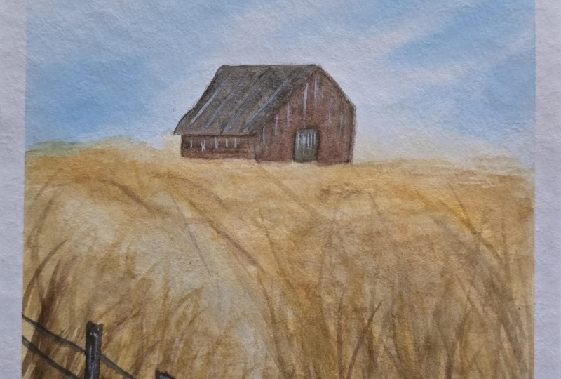
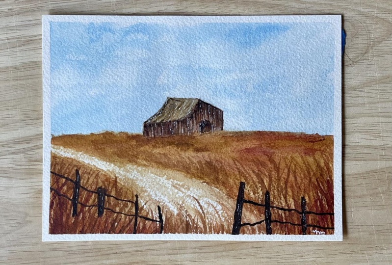
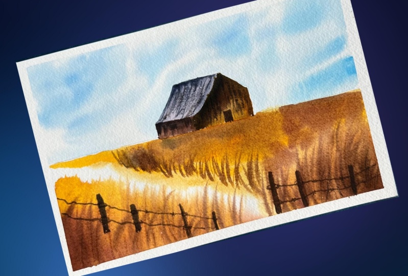
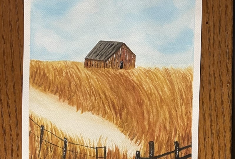
edges by cutting them. Or you can apply white gouache. So take a look at the painting. I absolutely loved the
blue coming subtle sky and the golden fields
are looking so gorgeous. The band is looking
so realistic. So thanks for joining me and if you enjoyed
painting along with me, then do post your class projects in the class projects section. And if you're going to
post it on social media, then tag me using my
Instagram handle, and I'll see you soon
in the next class. Bye.
 Aishwarya Shetty, my__paint___story | Watercolour Artist