Transcripts
1. Welcome to the class!: Waterfalls are incredible places that make you loose your words. Once you reach them, you simply gaze at them in awe and everything else disappears. Wherever I go, I
always search for waterfalls to visit
the something about their natural
beauty that inspires me and makes me feel
connected with Mother Nature. So with this inspiration, I have come up with yet
another beautiful and an exciting class for you
guys. Hello everyone. I'm Aishwarya, an Engineer, a Watercolor Enthusiast,
and an Art Instructor. I love to explore different
subjects using watercolors. And this time I thought, let's paint a waterfall
using watercolors. This class is designed
in a simple way with all the steps
explained in detail. The brush strokes to
create the waterfall, the misty effect, the details on the rocks and so
on and so forth. The Art Supplies and the colors used in this
class are explained in a separate section so that you will always set to
begin the painting. Hope you enjoy the class
and see you there.
2. Art supplies: Guys, so let us take a
look at the materials that you will need for
this particular class. So first as the paper, so I will be going
with the brand Arches, which is 300 GSM, 140 LB, and 100% cotton paper. And I will be going
with the size 8 centimeters by 26 centimeters. But you can choose
your own size. So look for any 100% cotton, a minimum of 300 GSM,
so that you know, your paper stays wet for
a longer duration of time and you can work
easily without any worries. So yeah, just look for 100% cotton paper with a
minimum thickness of 300 GSM. Alright, so the next
one is the brushes. So I will be going with the
Silver black velvet brushes. So yeah, you can go with any other brand
that you have got. So basically you all you
need is three basic brushes. And the first one
is size number 12. This is to do with
a larger washes. You can use even your
quill brush or EMR brush. Just make sure you have
a larger size brush. Then a smaller size brush, which is of size number eight. This is basically to paint
the water and the rocks. So yes. Then you'll need a
detailing brush. I will be going with
size number two, since it has since it
has got a nice fine tip. So you can use a detailing brush to add the birds
and other details. And then you'll also
need a synthetic brush to add the dry brush
details onto the rocks. So yeah, that's it
for the brushes. And yeah, next you will
need the colors obviously. So I have made a details
section on which colors will be using for
this particular paintings. So you can go and check
out that section as well. In the upcoming section, I have explained a
list of all the colors that you will need and
also the alternatives. If you don't have a specific
color for the colors, I will be going for
the brand Whitenights. Okay, the next one is
obviously a mixing palette. I will be going with
a ceramic palette since it is very easy to
clean the stains of the pain. But yes, again, it's up to you. You can use your
ceramic palette or a plastic palette or for
that matter, a dinner plate. Okay, So yes, Next you will need obviously to jars of water. One is to wipe off all the dirty paint
from your brush and the other one has to always stay clean to pick up fresh paint. So yes, to jars of water. And then you will need
a pencil and an eraser to obviously for making
the pencil sketch. And then you'll need a board like this that
is an acrylic board or any other hard
surface so that you can formally Tape
your paper here. And yes, you'll also
need a masking tape. I'm not able to find my
masking tape, but yes, you will need a masking tape
then clot basically to wipe off the excess
amount of water or the paint from your
sides of the board. So that's it for the Supplies
3. Colors: Alright guys, so let us take
a look at the colors that you will need to paint this
particular class project. So the first color that
you will need is the blue. This is the bright blue
from the Whitenights. As you always know. I love this color to use
in my landscape paintings, especially to paint the Sky. So yeah, if not bright blue, you can go with any other
blue that you have got. Just make sure we want
to settle looking Sky. Use it in a lighter,
lighter form. Alright, so the next
color is sepia. So I will be using this color to add the deeper tones
while painting the rocks. You can go with sepia, or if you don't have sepia, you can take a
little bit of brown, mix it with Payne's
gray and create a darker shade of brown
for painting your rock. Right? So next we'll
take a look at the greens that we will be
wanting to paint on the rocks. So this is particularly the
green color from Whitenights. But you can again go
with sap green or any, and the darker green from
any other different brand. So it really does not matter. So yeah, gaze,
there's no force are hard and fast rule
that you have to use strictly these colors. It's up to you what
color palette you want. And next is olive green. This is to add the
lighter tones onto the rocks so you can go
with the olive green, but if you don't
have olive green, you can go with leaf
green by mixing a little bit of
green and yellow. Okay? So, yes. Next, the next set of
colors that we will be swatching your wrist
to paint the water. So basically to paint the water, I will be going with
turquoise blue. I love this color
to paint the water. So if you don't have turquoise
blue than just chill, you can use ultramarine blue, you can use Prussian blue, or you can create your
own turquoise blue by mixing a little bit
of blue and green. So, yeah. The next color that I will
be swatching here is indigo. This is again, to bring that
depth into your waterfall. So I'm going to make this
turquoise blue, indigo. And finally to add more depth into the water to add those darker,
darker tones. Finally, I will be
using Payne's gray. So now I will be swatching the last color
that is Payne's gray. And yes, these are pretty much
the colors, simple, right? So you can choose the
colors the way you want. Go with whatever brand you have. Go with different greens, different brands,
and different blues. So that's it guys. And for this class, I will be using all the colors from
the brand Whitenights. But it's up to you guys. There are several
different brands like Shin Han and there's
Winsor and Newton. It really doesn't matter which brand of color
that you're using. So, yeah, go grab your colors
and prepare your palette. And I'll see you soon
in the next section.
4. Let's paint the Sky!: So first, let us start
with the pencil sketch. So it's a very easy
pencil sketch. So there's nothing complicated. Just going to outline the rock. So we're just going
to mark the shape of the Waterfalls where
exactly we want it to be. So that's it for
the pencil sketch. I think there's nothing much. Everything else that
we're gonna do here in this class is directly go
ahead and simply paint. Just mark two lines indicating the rock and the shape
of the waterfall. And yes. So at the bottom, I will be marking the
line until where I want the waterfall to
be exactly falling. And beneath that, we will
be having the actual water. So yeah, now let
us start wetting the paper and we the
first paint the Sky. So it's like simple. We're just going
to go ahead with a simple Sky with
some subtle clouds. So yeah, make sure you wet it properly and you
can use any brush. You could either use
your flat brush or your larger sized
brush for that matter. So yeah, you can see I have wet it only the
Sky adhesion for now. And let's begin. So for the Sky, I think I would be going
with the cerulean blue. I usually like using serene
blue for my Landscape skies. It's a very nice soft blue. So taking a little
bit of this blue and you can see the tonal value. I'm not going with
a darker value. So it's a very like medium, not even light, not even duct. So it's in-between
tone. So yeah. So you may not paint the Sky
in the way I'm painting. You can actually go with a
flat wash if you wish to. All you can add clouds
the way I'm doing. Alright, So, yes. Alright, so you can
see how I've created a nice soft looking
yet beautiful sky. So it's very some Burgess urine there leave some white gaps and you'll achieve this
beautiful sky in just minutes. Alright, so I'm just
gonna go ahead and keep adding the blue wherever I
feel it is, a little lighter. So if you're already
satisfied with your Sky, then you can just stop and
take a look from a distance, see if everything is proper and if your paper
has already dried, then I suggest you do not
do anything ahead and just stay calm and relaxed
for the next step. Alright, so, yeah, this is how my sky is looking at the moment. And a little bit of
color on the top. And I think I'm done and I can call it
that I'm satisfied. Let us allow this to dry and I'll see you soon
in the next lesson.
5. Painting the Waterfalls: Alright, so let us begin
by painting the waterfall. So first I will be painting
the rocks on either sides, and then we will proceed
with the waterfall. For painting the rocks. I'm using sepia and
green from Whitenights, as you can see, and I'm
not using it directly. I'm mixing both of
these colors and directly adding it
onto my dry paper. Yes. I'm using the wet
on dry method over here. So you can see the
way I'm adding. So you can go with a combination of different
shades of green, like olive green or
dark green sap green and mix all these colors with different browns
and sepia to get natural and organic
looking rocks. So now I will be picking up
the green from Whitenights. And you can see I'm
directly adding it and blending with the darker
sepia that I used earlier. So this way, you're
going to play with different tonal values and there's no particular
way you need not achieve a perfect
blend over here. Just ensure that, you know, you blend all the
colors really well and just create that
texture on the rock. You normally see a perfect
blend does not need it, but yes, just avoid
the dry patches. So now you can see I've
added a little bit of lighter shade that
is the olive green. And yeah, so as you
perform this step, if you feel like you have to adjust the shape of your rock, then this is the
right time to do it. Okay? So, yeah, so keep
adding the colors. And I think we are
going to repeat the same procedure on the
right-hand side as well. And both the sides need not
have the same kind of rocks. It can be like more darker or more greener
than the first one. So it's all up to you
how you want to make it. Because if you have symmetrical
rocks on both sides, then it's gonna look a
little bit artificial, so keep it more
natural and organic. So yeah, I'll quickly go ahead and paint the right
side of the rock as well. So yes, just follow
along with me. Or you can pause the
video later once I have finished and then
you can paint jars. Alright, so now that we have painted the rocks
on both the sides, now it's time to create the waterfall and the
water at the bottom. So make sure that don't allow your paper
to dry completely. V10 have a unity between the rock at the top
and the water at the bottom. So at this point, wherever you stopped
adding your Paint earlier, make sure you start
re-wetting it again. And we're going to wet the
entire bottom region now. So it does not matter if
you disturb the rocks. It's absolutely fine. You can go ahead and
reapply the pains. So now you can see I have I'm wetting the waterfall
region in the middle, and I'm also wetting
the entire bottom part. So it's natural for the colors to see pin, but no worries. You can immediately liftoff the extra paint and
wipe it with a clot. Okay. So yeah, this
is how I have wetted my paper from the center of the waterfall
towards the bottom. Just liftoff any extra paint that's flowing into
the waterfall region. Okay? And just give
us softer look. So naturally you can see how it's taking the
shape of a Waterfall. And now we're going to define more and more intense colors. So after reapplying the
water on the rocks, some colors must have faded. So you can absolutely
go back and retouch by adding
different colors that you added earlier. So another way to do this
is since I used the dry, I mean, the wet on dry method, you could have
chosen to directly go with the wet-on-wet method You know, for that, your
paper has to be really wet. And if you're not using
100% cotton paper, then it's a little bit difficult
for your paper to stay wet for a longer duration
of time, but that's fine. You can choose any method that you want to go, go ahead with. There's no one
particular method. You can see I have added few
more colors onto the top. Okay? So, yeah. Alright, so now that
we have achieved a nice looking rock and
also a paper as wet, we can immediately
start painting the waterfall and the
water at the bottom. So ensure your paper is nicely wet because we are
gonna be working on this area for
quite amount of time. So yeah. Now, for the water, I think I would be going
with the turquoise blue. And again, I'm not using
turquoise blue directly. I may be mixing that
with indigo later on. So, yeah, so first I'm
going to add some shadow onto the middle region where exactly your
water is falling. And I'm adding a little bit
of Payne's gray as well, just to create that
shadow effect. So when you see an
actual waterfall, it's not completely right. So you have some rocks hidden
behind the water actually. So we are trying to create
exactly that effect over here. So if you just keep
it plain white, then it's not going to
look organic and natural. These are some simple
tips and tricks to make your painting look
even more realistic. So shadow is an important
thing in the waterfall. So don't try to add
darker shadows. Just go with very
subtle tonal value. You can, you can
actually see me. I do not have lot of
paint on my brush. I'm going with very light
strokes at the beginning. So this way, if you
commit any mistake, you have the chance to
lift-off your paint. Alright, so yeah, this is how I have
added the shadows and keep adding them. And if you feel it is like
a little bit lighter, you can go back ahead and enhance the look of your shadow. But please do not work because at the end you
will be disappointed. And I don't want that
to happen to you. So just go with a lighter stroke and then you can just
try to build up. Alright, so now that we
have added the shadows, I think it's time to add the bottom of water where
exactly your water is present. So I'm mixing a little
bit of turquoise blue, and then I'm taking the turquoise blue and
adding a little bit of indigo to it so you can see how both the
colors are looking. So you can choose any
color for your water. You can either go
with blue or you can actually go with green, indicating the reflection
of your rocks. But I thought the
combination of blue and green to rocks
would look good. So I'm choosing turquoise blue for my water, but
it's up to you. How do you want to make your water look?
So it's up to you. You can choose any color. Now. You can see for the darker
shade, I'm adding indigo. So to make it even more darker, you can mix it with Payne's
gray if you wish to. Just make sure the bottom
always the bottom area of the water is a little bit
darker to achieve that depth. And as you move further away, I'm in towards the
waterfall there. The water has to be lighter. So let's paint the water so you can just watch
me how I'm doing. And while I paint the water, you can notice I'm
trying to create a foggy effect at the top, so I'm not painting
a lot over there. I'm just trying to
lift off the paint and create that natural fog look. Waterfalls. You can
see a lot of fog. Mist kind of thing is
created at the center. So I'm actually trying
to create that effect. So just watch me how I do that. So I have painted
the initial layer of the water and I know
when it's going to dry, it's going to look really light. I mean, it's going
to really fade away. So I'm just going to build up more layers by
adding darker tones. So I'm mixing turquoise
blue again with indigo or Payne's gray to have really dark
and intense look. You can see the dark
tonal value is being added only at the bottom
and towards the side. And I really want
the middle area to be really light and soft. So yeah, just don't go with flat wash. Add some
wavy patterns, add some ripples onto
your water to make it more organic and natural. Alright, so yeah,
I'll keep doing this until I'm
completely satisfied. So yes, you can just
follow along with me or just watch me and
then you can paint. Now, since I have still some time left and my
paper is still wet, I'm just going to wet
the center portion of the waterfall again and just try to create some shadow because I felt
it's a little bit flat. But if you're already
satisfied with your waterfall, then I highly suggest
you to stop at that point and wait
for the next step. So since I thought like, I need to still do
some modifications, so I'm just working on that. So you can see I'm just
lifting off the paint. Where exactly are waterfall
is falling and the water is meeting the line that I showed you while creating
the pencil sketch. So this is again optional. It's totally up to you if
you want to do it or not. And if your paper
has already dried, then please do not
perform this step. So now I'm just going to create few shadows to the central region
of the waterfall. And then I'll call it as done. So picking a little bit of indigo and just
adding few strokes, very light strokes, you
can barely see them. So wherever I feel it
is a little darker. I'm just lifting off so that, you know, I don't have
those harsh edges. Now, I'm trying to
add a little bit of that turquoise blue as well. So yeah. I think it's a
little bit darker. So I'm just going to lift off that paint and blend
it really well. So you can just play
around like this, but please do not overwork. As I really said before, if you're already satisfied, then this step is not needed. I am just trying to try out different methods and
see what works well. Okay, so yeah, alright, so let us leave this for drying and I'll see you soon
in the next lesson.
6. Adding final details: Alright guys, so in this class, let us add the final details
and finish our painting. For adding the final
touch to the rocks, I will be going with the sepia. So you could even go with the dark brown mixed with
indigo, any dark color. So I'm using my Princeton
brush size number four. This is a synthetic brush and I like it to use when
I'm adding details. So I'm going with
dry brush method. This is completely
dry brush technique. There's no water at all, very little amount of
water so that you get this nice rocky and patchy
structure on your rocks. So you can add it
however you want. There's no specific or any
particular way to do this. So you can just go ahead
and randomly added. So you can see I picked up a little bit of
Payne's gray directly and I'm trying to create
some patterns on the rocks. So if you choose to leave your
rocks as it is, it's fine. But I thought like they
were looking really flat. And I thought to give
it a nice texture. And hence, I'm adding
these final details. Alright, so you can watch
me while I do this. Alright, so now that we have added textures onto the rock, I would slightly love to add some details onto the
waterfall as well, and this is totally optional. Please do not perform this
step if you don't wish to. So if you want to perform this, then first, let me complete it and then you
can follow the steps. Okay. So there's barely
some paint on my brush. You can see I'm just
lightly going around the edges of the
rocks and trying to create that rough texture
just to show that the water is falling
and there are some rocks behind the waterfall. So yeah, I will continue to
do this until I'm satisfied. Alright, so now you can see
I'm adding few lines are some brush strokes onto
the center portion of the waterfall just to
give that shadow effect. And it's very light guys, you can barely see it. So don't go with bold paint, because once you add that paint, it's very difficult to take off since your paper
has already dried. And it's just going to create
a rough patch work there. So just be careful. So you can see I dropped
some water there. And yeah. So next I will be
taking my smallest size two brush and I'll be picking
up some amount of indigo. Okay, it's not indigo. I think it's Payne's gray. So taking this color and I'm using my zero number brush
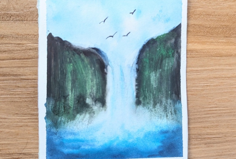
from Silver black velvet. So we're going to add some tiny little birds on the top right there
where we have the Sky. Now this is again
totally optional. So you would choose to
add some trees on top of the rocks and some birds
if you would wish to. All you can completely leave
it clean as it was earlier. So it's all up to you. How do you want to add the extra elements
onto your painting? And with that, we complete the painting and that's how
it is looking at the moment. Alright guys, so
I'll see you soon in the last section for
the final thoughts.
7. Thank You!: Alright guys, so we're
towards the end of the class and we have
finally made it. So I'm totally in love
with the process of the painting and I clearly
wasn't totally joy. I hope you liked your
painting as well. So I'm going to take off the
masking tape very gently. So do not rush
through this process. Wait for your paper
to dry completely, and then you can take
off your masking tape. Alright, So yeah, and I'm, I would be really
happy and eager to see all your unique and
beautiful creations. So I kindly suggest
you to upload your projects into the
class projects section, and I would be
happy to review it. So I would be like giving
personal feedback on each of your projects so
that it will be very helpful for your upcoming
future projects. Alright, so, and if
you're someone who would like to post
it on Instagram, then you could do so by tagging me onto my Instagram
handle, my paint story, and I would love to see your beautiful creations
over there and share it with others so that others would see your
beautiful creations. And they would also be benefited and they would love
to take this class. So yeah, I think
that's all for now. And I just don't have words. I'm clearly happy with the way the Class
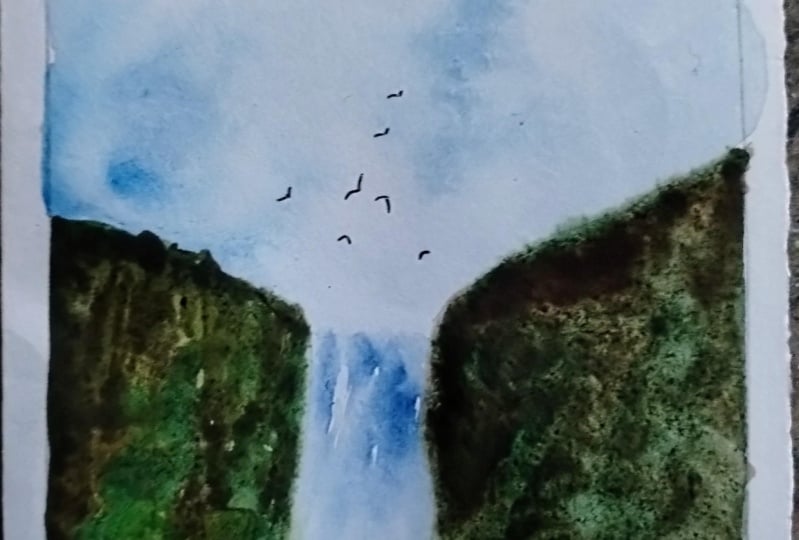
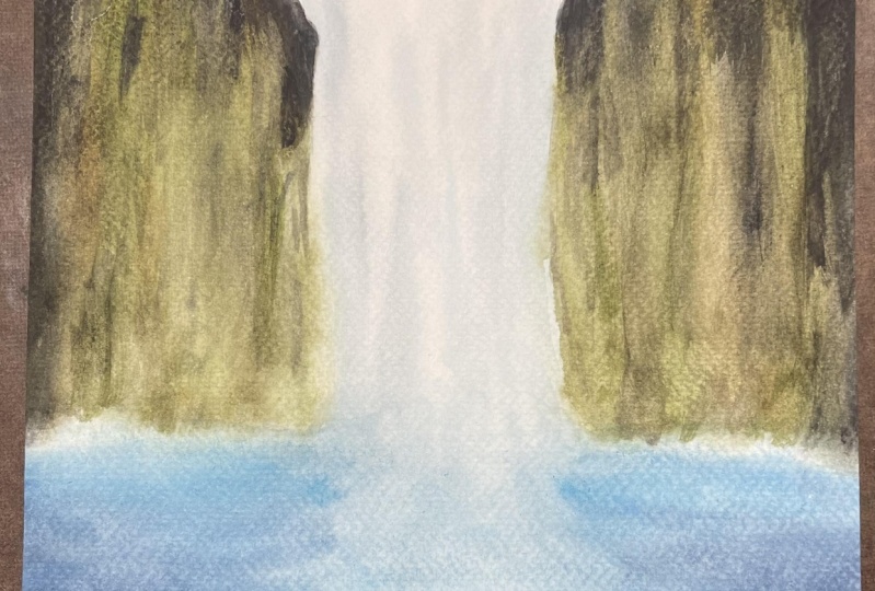
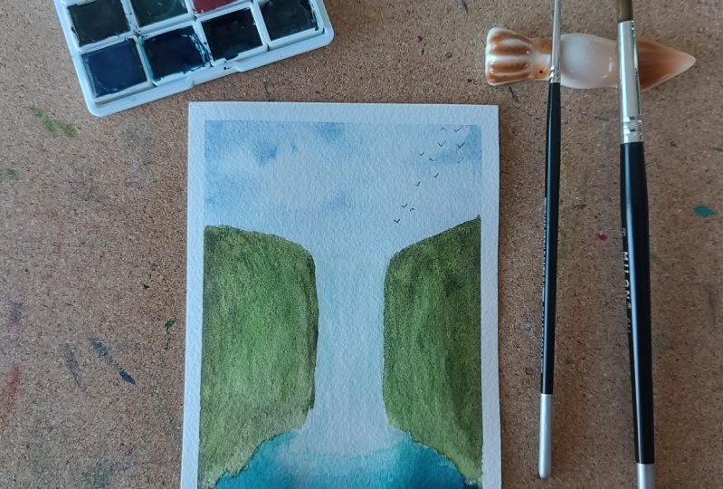
Project has turned out. You can just tweak
different elements. You can either choose
to add birds or not. That's completely your choice. So you can add
different elements like trees, bushes, etc. and make your painting look
a little bit different. So it's all about the
perspective guys. You can just choose
your own reference and try to paint it
in your own style. So that's it for now. And thank you guys. Thank you for always supporting me and thank you for watching all my classes and showing
all the love and the support. Until then, bye. See you soon
 Aishwarya Shetty, my__paint___story | Watercolour Artist