Transcripts
1. Welcome to the class!: Spring is the season of beautiful and bright
sunny days with flowers and trees
blooming all around. And along comes hope
and fresh beginnings. It is the season
to feel motivated, refreshed, and to rekindle
the spark in your soul. Hello everyone. I'm Ashley area and engineer, a watercolor artist
and an art instructor. Today I'm back with yet
another beautiful class. And if you wish
to feel inspired, this class will spark some positive vibes and
give you some hope. In this class, we will be painting a beautiful
spring landscape. You will learn how to
create those soft, beautiful backgrounds using
the wet on wet technique. And you'll also learn how to
add interesting details to make your painting look
more natural and realistic. So what are you waiting for? Go grab your supplies, and let's get started.
2. Art Supplies: Alright, so let
us take a look at the art supplies that
you'll need for this class. So first let's take a look at
the papers for this class. I will be using Arches
watercolor paper, which is 300 GSM and
100% cotton paper. So you can go with
any size you want. I will be going with
this particular size. You can see the texture
of the watercolor paper. This is a really
100% cotton paper and it is typically good for
the wet-on-wet techniques. So next, let us take a look
at the colors we will need. For the colors. I have made a detailed video, which is in the next section. So I'll show you the swatches
of the different colors. But basically for this class, I will be using the colors
from the brand White Nights. But you can go with whichever
brand you have got. And also we would need a little bit amount
of white gouache. You can use white
watercolor either. So I will be using the gouache from the
brand rule is true. So that's it for the colors. And now, most importantly, let us take a look
at the brushes that we need for this
particular class. So first of all, we would need a large flat brush for wetting the entire
surface of the paper. So you can go with
any brush you have. This brush is from
the brand silver, silver black velvet brush. Next you will be
needing three brushes. These brushes are again from the brand silver black velvet. So the first one is
the larger sized, that is 12 number brush. This is used for
the larger washes. And the next brush that we're going to use is
the size number eight. This is four, the normal
washes you can see. And lastly, you will need a smaller size brush
with a pointed tip. This is for adding
the fine details. So these are the brushes
that you would be needing, but you can go with the similar sized brushes of
any brand you have caught. So yes. Next, let us take a look
at the two jars of water. One you will be needing
for clean water and the other one is students of the dirty paint from your brush, so you'll need to adjust. Next is a mixing palette. So this is a ceramic
palette I have here, but you can go with any
other palette you have got. The advantage of using ceramic is it can be easily cleaned. So that was for the
mixing palette. Then you will need an eraser and pencil to make a pencil
sketch for yourself. Okay, So then we will need a clot or a tissue
paper to wipe off the excess amount
of water or paint from your brush and also
from the sides of the paper. Next, you will need a
masking tape to tape down your people
onto the boat so that you know the papers firmly fixed onto the
surface of the board. And lastly, you will
need a board like this. So you can go with a magazine
cover or any other board or even a book for
that matter? Yes. That's it for the art supplies. So go grab your art supplies and I'll see you soon in
the next section.
3. Colors: Alright, so let's take a look at the colors that we will need. So starting with the sky. So for the sky, I will be using the color surreal in blue. This is from the
brand White Nights. So basically all the
colors that I'm going to use for this class is from
the brand White Nights. So you can see this
surreal in blue is so such a fresh and a subtle
looking color. So basically, I love to use
this blue for the day skies. You can go with any other
blue that you have God, but make sure you're using it in the lightest tonal value. The next is for the
forest behind there, I will be using this sap
green or dark green. So if you don't have sap green, then what you can do
is take a little bit of dark green and put a pinch of Payne's gray onto that and makes it well to
get this sap green. So the next color that we will need is for painting the middle, at the bottom, we have
different shades of green. So you can see there are
different types of greens. The first green
that I have used on the top over there
is the main green. So as watched the color for you. So this is how it looks. It's a very fresh and
a very bright green. You can use in painting
most of your landscapes. And since spring is like a
fresh beginning of the season, so I thought of
using this color. The next color I have
used this olive green. Olive green is another
beautiful shade of green. So if you don't
have olive green, then I think you can
mix it a little bit of green and yellow and a
little bit of Payne's gray and create this
kind of green again. So just play with the
different shades of green. And again, I'll be using sap green as well
for painting the middle. So the next color is, It's Indian yellow
mixed with a little bit of white gouache to get
a pasty yellow color. Using this color for adding those teeny tiny flowers
you see at the bottom. So I'm not using yellow
directly because it won't be visible on top of the
grass that you have added. So you need to add a little
bit of white gouache or white watercolor to make
it a little bit opaque. And now for the pathway, I'm going to be using
the color Payne's gray. I'm using it in
its lightest form. Not exactly very light. So you can just see the tonal value that I
have watched for you. So don't go with a darker shade. If you don't have Payne's gray, you can use a little
bit of black, mix it with lots of amount of water and then you
will get this shape. Then for painting cottage
or the hat behind. So for the walls, we will be using Payne's gray. Payne's gray, we
will be using sepia, but if you don't have sepia, you can go with a
darker shade of brown. For the roof of the
cabin or the heart, we will be using red. I'm using cadmium red over here. So you can go with
any other red so that it pops out
through the fields. So that is it for the color is, these are the very basic colors. I hope you will have
all these colors in your basic palette. So go grab your colors
and get them ready. And I'll see you soon
in the next section.
4. Adding the pencil sketch: Alright, so let us start
adding the pencil sketch. So first we're going to start by adding the pathway
in the middle. So the pathway is very simple. Towards the vanishing point, the pathway should be thin. And as it comes towards the
closer towards the viewer, it should get Broaden. So to keep the rule
of perspective, we will be adding the
pathway in this manner. So it's as simple as
that, a simple pathway. And then now I'm going to
define meadow kind of shape onto the top where
I'm going to be adding my pine trees
of the forest behind. And on top we're going
to have the clouds. So just roughly
define organic line. It may not be straight. Alright, so now it's time to
add the final pencil sketch. That is, we are
going to be adding a teeny tiny heart
in the background. It's gonna be really small because it's far away
in the background. It's a simple heart. It's not complicated at all. So I would highly recommend
you to wait for me to complete the pencil sketch and then you can
pause the video, or even you can take a
screenshot so that you can take your own sweet time and complete a pencil
sketch for yourself. Alright, so I will quickly go ahead and finish
adding this heart. And then meanwhile, you can
prep your paper and you can keep this applies
ready so that you can also complete the pencil sketch. Okay, So that's the heart. And yes, the benzyl sketches
as simple as it looks. And now you can begin
adding your pencil sketch. And I will see you soon
in the next section.
5. Painting the Background: Alright, so let us
start our painting. So first I'm going
to apply a clean even coat of water
onto the entire paper. So for this purpose, I'm using my silver
brush, hockey brush. So this is a flat sized brush for it's usually used
for wetting the paper, but you can go with any kind of flat brush that you have got. So yeah. Lettuce evenly wet the paper. So since we are going to work on the wet, on wet technique, make sure you take your own sweet time to
apply even coat of water. And I highly recommend you
to apply multiple washes of water so that your paper remains wet for a longer
duration of time. And, you know, your wet on wet technique works
perfectly. So. Yes. Now that we have
vetted our paper, I think we're good to go and
let us start our painting. So first we're going
to paint the sky. Alright, so let us start. So for the sky, I will be using civilian blue. I like using civilian
blue for painting skies because it is a
very nice subtle blue. But you can go with any other light blue that you have got. Or if you don't have light blue, then you can use Prussian
blue or ultramarine blue, but make sure
you're not using it at the highest, the tonal value. You can add lots of water and
make it a little bit light. So you can see this cerulean
blue is so gorgeous. I'm adding this on to the sky in the form of simple
random strokes. So you can see, I'm trying to leave some white
spaces in between in order to or show that there are some
clouds in the sky. So there's no much paint. I'm trying to tone down
the value a little bit. So you can see I'm randomly
creating some strokes. It's very simple. You have to just create some simple small
strokes here and there. And then your sky will be ready. Alright, so keep adding these strokes until
you're satisfied. So I'm focusing more
on the top area. So I wonder top region of the sky to look a
little bit darker. And as I come down
towards the horizon line, I'm making the color
a little bit lighter. This will give a very
nice perspective and a realistic
look your painting. So you can see how this
guy has turned out. So every time I'm just
removing the excess water from my brush and trying to define
a proper shape to the sky. And that's how our sky
is looking as of now. So I'm using my size
number 12 brush for the entire painting almost. And for painting small details, I will be using my size
number eight brush. Okay, so now I'm going to
start painting the landscape, that is the Greenfield. So for that, we will be having
different types of greens. First, I will be starting
with some sap green. So even before we start
painting our landscape, we're going to add some
trees onto the top region. You can see how I
am painting this. So start by adding some small pine tree kind of
shapes using the sap green. You can, if you don't
have sap green, you can use dark green or any other kind of
green that you have got. But if you want to achieve
this kind of green, then you can mix dark green, a little bit of Payne's gray to get this
kind of sap green. Alright? So you can see how I'm creating
that particular trees. Since these trees are far
away in the background, we're not going to
add more details. It's just random bunch of
trees at the back over there. Let's keep adding some trees. You can see I'm not
adding the trees all in. Same shape. All the trees are of different sizes and shapes. So you can see how it's looking. And at some places I'm using a darker value of green and at some places I'm making use of
lighter value in this way, it will give a nice depth
and it will show that there are wide variety of
trees in the background. I'm also picking up some
olive green now and adding that amongst the sap green
that we have already added. So try to play with the different tonal values and
different types of greens. And this will make your
painting look more realistic. Alright, so that's how the background trees
are looking as of now. So I'm still going
to keep adding more and more deeper
values urine there. All right, so I'm going to add some trees on the
left side as well. So the plan is to cover the
entire horizon line with some small and some larger trees so that it
doesn't look empty. And we're going to depict that there is some forest behind. So don't add larger and bigger and thicker
branches because otherwise, you know, you're going to
cover up the entire sky and it's going to not look good. So as per the perspective, since the trees
are very far away, we're going to add
smaller trees. So keep the rule of
perspective in the mind and then add these trees
along the horizon line. Okay, So now I'm going to
start wetting the bottom area. Since it was already
wet previously, it has got write-up now with
the same 12 number brush, I'm just adding a
little bit of water and rewetting my paper. So if your paper has got dry, then you can also go
ahead and re-wet it. Just adding a little
bit of water. Okay, So now we're ready, now we can start
painting our landscape. So for this, I'm using
the first color is green. This is a very nice
leaf green color. If you don't have this, you can take a little
bit of lemon yellow and light green and create
this particular shade. Okay, so, yeah, one more
important thing is we are, we have drawn the
heart over there, so make sure the paint
doesn't seep into the heart. Even if it gets into the heart. Take a clean damp brush
and try to clean that. And later on we'll be adding
the heart over there. Doesn't matter even
if it gets covered. So no need to worry. Alright, so the next
color that we're going to add is olive green. So right where you stopped
adding the leaf green, you can start adding
the olive green. And now I'm adding a little bit of dark green or Sap green. We're not going to
use a single color for painting the landscape. Otherwise, it's going
to look very flat. To achieve that depth
and realistic feel, you need to play with
different tonal values and different shades of green. So yeah, accidentally
I picked up a lot of dark green and I'm just
cleaning off that. Since this is wet on wet, even if you make
any mistake like as when the paper is still wet, you can clear off your mistakes or you can
clean up your mistakes. So yes, that is the
magic of wet on wet. Alright, so let us continue adding more and
more deeper tones. So picking up some
olive green and mixing that with the dark green are the sap green that we
have added previously. And in-between, I will also
pick up my leaf green or maybe green and cover up
the entire landscape. So make sure your
paper is nicely wet so that you can keep adding
these different tonal values. If your paper gets dry, then you will not get a
blend between these colors. So make sure you pick up water when you are picking
up fresh paint so that your paper remains wet. Okay. So yeah. I'm just cleaning off the
hairs that are getting formed so that we
don't ruin our heart. Alright? So picking up some dark green now and adding random strokes, mainly focusing on that edge
of the pathway so that, that looks a little bit darker. So there's no particular
shape or there's no particular order in
which you're going to add these different
shades of green. It's up to you how
you add these. You know, the end
result will be, you'll be very stunned to look at the result because
wet-on-wet is such a technique that it blends all the different
colors and gives a nice texture to your painting. So I'm not just adding
it as a flat wash, I'm just creating
different structures, trying to make some
grassy patterns in between so that you
know, all of this. When it dries,
it's going to look very natural and very soft. Alright, so whenever
you feel like your paint is creating
some hair-like structures, just take a damp, wet, semi dry brush and clean off those hair-like structures
that are forming. So now we're going to move
towards the left side. And on the left side as well, we're going to add different
tonal values of green. So starting with olive green, then we're going to add some
sap green or dark green. Make sure you don't add
any paint onto the pathway because we're going to have a different color
for the pathway. Alright, so just cleaning up
some hair-like structures. Now, I'll continue to add
some sap green at the bottom. So at the bottom I'm going
to make a little bit darker because I want
to achieve that depth. So you can see at
the top we have lighter tonal values
of green and at the bottom we are making
it a little bit darker. So now you can see how the
painting is taking its shape. So I'm switching to my
smallest size brush. I think this is size number two. And with this size
number two brush, we're going to create
some grassy patterns while the paper is still wet. Make sure you do this step
before your paper dries. Otherwise you're gonna get
hard, hard grassy edges. So I would like to have this
in the soft background. So while my paper is still wet, I'm going to pick up some of
my dark green or sap green. And with the help of my
size number two brush, I'm going to create something
delicate grasp patterns. So yeah, let's keep adding this. So you can see it's looking so beautiful and so naturally, you can add those
grassy patterns onto the pathway as well so
that it looks as though the plants are blooming out and they are coming in the
middle of the pathway. So yes, that's how our
painting is looking as of now. So now for the pathway, I'm going to take a
little bit of sepia, not a dark and intense tone, but a little bit of
lighter tone of the sepia. And I'm going to add it onto both the sides of the pathway. And this step is also done
while the paper is still wet. So the entire background
that we're going to paint is gonna be on the
wet-on-wet technique. And in the upcoming sections, we will be adding more details when the paper has
completely dried. Alright, so, yeah, fine. So I'm just trying
to fix the shape of the trees that are present
in the background. Alright, so now
we're going to paint our pathway or the
reward in-between. So for that, I'm going to use a little bit
of Payne's gray. Note that the color
is not too dark. We're gonna, we're gonna have a little bit of lighter value. So you can see the texture or the tonal
value of the Payne's gray. It's really very light. So you can add a little bit of darker tone on to the bottom and then pull that paint upwards to give it a
more natural look. Just don't pick up a darker tone at the
first place itself. Always well starting the
painting go with lighter values. And if you feel like the
color has to be more darker, then you can pick up fresh paint and keep adding and
defining details. Because if you pick
up a darker tone at the first place itself, then if you make a mistake, it's very difficult to
wipe off that paint. So always start with
lighter values. Alright, so this is how
our pathways looking, everything is looking so
natural and so beautiful. I'm really enjoying the process. I hope you guys
are enjoying too. Alright, so let us keep
defining the pathway. So if you feel like the
colors are getting lighter, then you may go ahead and add
a little bit of more color. So I'm going to continue to
add some grassy patterns onto the right as well since
my paper is still wet. So I'm going to make use of
the time and keep adding more and more textures and
more and more grassy patterns. Alright, so I haven't added enough of these
grassy patterns. So if you feel like you
want to keep adding more, you can do that, but focus on the base layer, that's the bottom layer. So that's where the tonal values have to be a little bit darker. So make use of the time
and keep adding these. Okay, so I think I'm
loving the background. I really loved how soft
those trees are looking at the back and also these grassy patterns
that we have added. And now I think let us allow the painting to
get completely dried. And once it has
completely dried, we will be adding more
details and some flowers. Since it's a spring landscape, we're going to add some flowers and obviously the heart
in the background. Yeah, let us allow the
painting to dry completely and I'll see you soon
in the next section.
6. Painting the Foreground: Alright, so now that the
background has completely dried, let us start adding some
flowers onto the foreground. So for adding the flowers, I'm picking up my Indian yellow. And I'm going to mix this Indian yellow with a
little bit of white gouache. You know that the
flowers pop out on the field because if you're going to directly add the low, it may not be visible. So to make it a
little bit opaque, we're going to add a little
bit of white gouache. So I'm using my size
number two brush to add these tiny
little flowers. So you can go with size number zero or
size number one brush. It's up to you. So we're going to add a bunch of few of these teeny tiny flowers on either sides of the pathway. So take a look at
how I'm adding. And then you can similarly
keep adding these flowers. Alright, so you can see how the flowers is giving a
different look to our painting. So now I'm going
to continue to add some flowers on the
left side as well. So instead of manually adding
these flowers one-by-one, you can also make
the mixture a little bit runny so that you can tap and create these
small flowers. But I feel adding
it one-by-one makes it a little bit more
convenient. So it's up to you. You can make use of the tapping method to add
these small, tiny flowers. Or you can go ahead
and simply randomly paint yourself
these tiny flowers. Alright, so I'm quickly go ahead and finish up
adding these class. And meanwhile, you can
also paint these flowers. Alright, so now that we
have added these flowers, I'm going to define the
stem for these flowers. So with the help of my same size number two
brush and I'm picking up some amount of dark
green and defining thin delicate stems
for these flowers. Okay, So it should be
very thin and delicate. Please do not add
thick and bold lines. So take a look at how
I'm painting these. Alright, so I'm going to add some stems on the
left-hand side as well. So you can see I'm doing it
in a very delicate manner. Please don't add
thick and bold lines as you will be ruining the
perspective of your painting. So, yes, continued to add these standards. All. So now that we have
added these stems, I think I'm going to just take my white gouache a little bit. And I'm going to tap
randomly so that I can create a few more flowers. So you can see I'm picking up my white gouache and I'm
using my tapping method. Take a larger size brush so
that you can tap it and don't make them external
to r10 and don't allow it to be too
opaque as well. So just the right
consistency and you have a bunch of flowers
after you tap it, you can see, don't add too much. Make sure you don't
go overboard. If you're already
happy with the way you have created these flowers, then you can stop. And yes, so this is how we
have added the flowers. Now, the next step is to paint the heart in the
background over there. So it's a small heart. For the heart, I'm going to be using my sepia to
paint the walls. So we're going to
start taking by sepia. I'm still using my
smallest size brush. That is the size number two. So I recommend you to go
with the smallest size brush because the heart we have
added is smaller in size. And if you're going to
use a larger size brush, then chances are the Paint me, come out of the heart. So make sure you're going with the smallest size
pointed tip brush. Alright, so let us begin
painting the walls of the heart. So first I'm going to paint the left side wall of the heart. So I'm directly picking
up sepia and adding this bold tone on the
left side of the wall. Make sure you don't cover
up the entire width, the same tonal values. You need to wait
either tonal values. So the front wall of the heart, we're going to make it
a little bit lighter so that it gives a nice
depth and perspective. And it makes the heart to look
a little bit more natural. So you can see, first you
can watch me how I paint and then probably you can
follow along with me so that you don't
create any mistake. Alright, so you can
see how I'm adding it slowly and the tonal value is a little bit lighter
than the other wall. This kind of creates a nice
effect to your painting. So this comes by practice. So you need to practice several
techniques and check how the outcome of the
painting is that when you step onto new beginnings
and new learnings, so practice is the
key, I would say. So. Yes, Now let
us paint the roof. For the roof, I chose to go with a bold cadmium red so that, you know, amongst the
distinct Greenfield is the red roof hut
would look stunning. I felt, and that's the
reason I chose red. Alright, so you can go with any kind of raid you have got. If you do not have cadmium red, go with any other pyrrole red or any other rate
that you have got. It really doesn't matter, right? So I'll quickly finish
up painting the roof. Alright, so that is how our background is looking and this is how the
foreground is looking. I felt like I need to add more
stems towards the bottom. So I'm just picking up my
sap green or dark green. And I'm going to
add these stems. But if you're already satisfied with your bunch of flowers, then you do not perform. You cannot perform this step. It's totally optional. I just felt like some
stems are still need it. I'm just adding thin,
delicate lines. Alright. So, alright, this is the end of this
particular painting. And in the next section, I will be peeling off
the masking tape. And I will show you
the final painting.
7. Thank You: Alright, so let us
peel the masking tape, so make sure you're painting
has completely dried. And then you can go ahead and
peel off the masking tape. So don't hurry at this
particular stage. Be very gentle and be very careful while peeling
your masking tape. I can't wait to show you
guys the final painting. I'm already so excited and I'm happy that the painting has
turned out so beautiful. I hope you guys enjoyed
painting along with me. And I hope you guys
are also in love with the beautiful creation
that you have created. So fresh and so beautiful
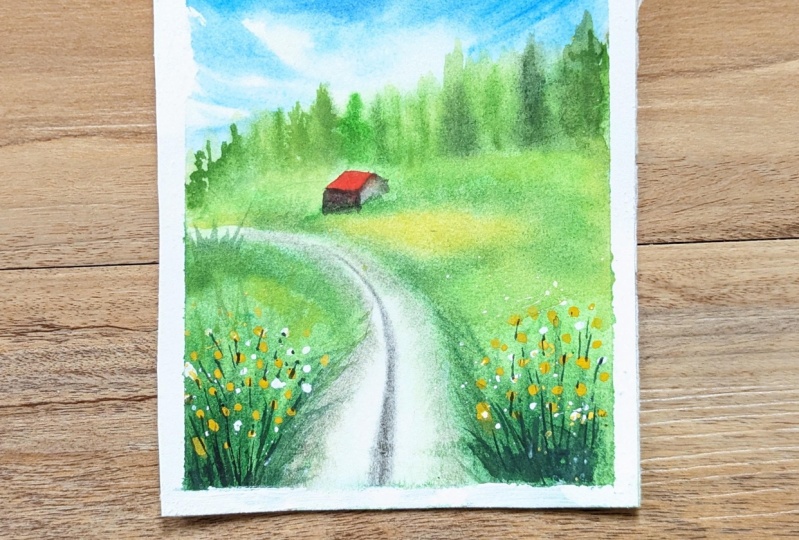
this painting is looking, I'm absolutely in love
with this painting. I absolutely loved the blue sky and the green meadow
at the bottom. And my most favorite
part is going to be that little red heart
in the background. So take a look at
the final painting. Everything is looking so
beautiful and so gorgeous. I loved how we have created those soft bunch of trees in the background and some
flowers in the bottom. So if you liked this
particular class project, then please post
your class projects in the project section. And I would personally review it and give a feedback
so that it'll help you in your future
upcoming creations. And if you're posting
this on Instagram, then do tag me using my
Instagram handle, my pin story. And I will see you soon
in the next class.
 Aishwarya Shetty, my__paint___story | Watercolour Artist