Transcripts
1. Introduction: Have you ever felt the
urge during summer? Typically watercolors. So you can lose yourself in
a sea of serine blues and greens or energize with vibrant reds,
yellows and oranges. Hi, I'm possible either I'm a watercolor artist,
mom, dreamer. And whenever I can, I like to experiment and share my findings with
other creatives. Whether it is doing a
workshop or a class or lady that I'm inspired by seasons. And I get a lot of ideas and
excitement from his room. Vision I have are
specific mood I'm in. But I noticed that
most times it feels like a long shot to translate them bought or feeling into a highly satisfying
painting experience. And I have to say that more than once I abandoned ship
because of that. And that's when this
class comes in because summer is a great time to
paint with watercolors. And I would like to help you
set cell and paint a fun, colorful and inspiring project. Or teaching tools and
techniques that will help you get more pumped
and ready to paint. Beautiful and relaxing
summer cityscapes whenever you feel in
the mood to do so. First, I'm going to show you what supplies
we'll be using. Then we'll sketch plenty of tips and examples for you to paint from a reference photo. After that, we'll prepare
a simple color palette, create smart color mixes, and we'll be ready
to start painting. I'll teach you how to paint a base layer for a landscape
that includes the sky, the sea, and gorgeous
crashing waves. Will then switch to painting
our majestic lighthouse and energize ourselves with
a beautiful shade of orange. In the process, you will
learn the ropes of adding gorgeous shadows and texture to your lighthouse and make it realistic with a
few quick strokes. We'll finish our
server painting with more fun by adding a few
highlights and spatters. And lastly, I'll teach you little tricks to add vibrancy to any painting
when it's done. By the end of adolescence, you will have gathered
enough practice and competence to start
painting more cityscapes of your own class is better
suited to create it, to have a little bit of
watercolor experience managing paint and
water all at once. That's not the case, but
you really like to join. I can suggest and practice water control first
in this galaxy class. For a smooth sailing. I'm excited to onboard new
for some major summer vibes. So if you're ready, meet
me next for departure.
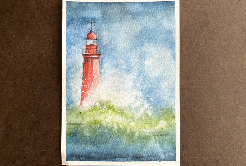
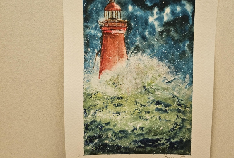
2. Your Class Project: Your project is a beautiful and energizing
Lighthouse with crashing wave painting to boot
summer inspiration from learning how to tweak a
reference photo to your liking, to mixing gorgeous blues and greens out of a limited palette. Or using white gouache to improve on the looks of
a cityscape painting. This class is full
of techniques, tips, and tricks that
will allow you to practice and create more
summer art in the future. To make the most out
of it and make sure to follow the lessons in
the order I placed them in and download
the available resources like the sketch,
references, supplies list. So my painting, I think it's helpful to remember that with watercolor
in particular, one painting will always look different from one
tried to the next. So don't worry
about being perfect or getting it to be
exactly like my painting. And actually I
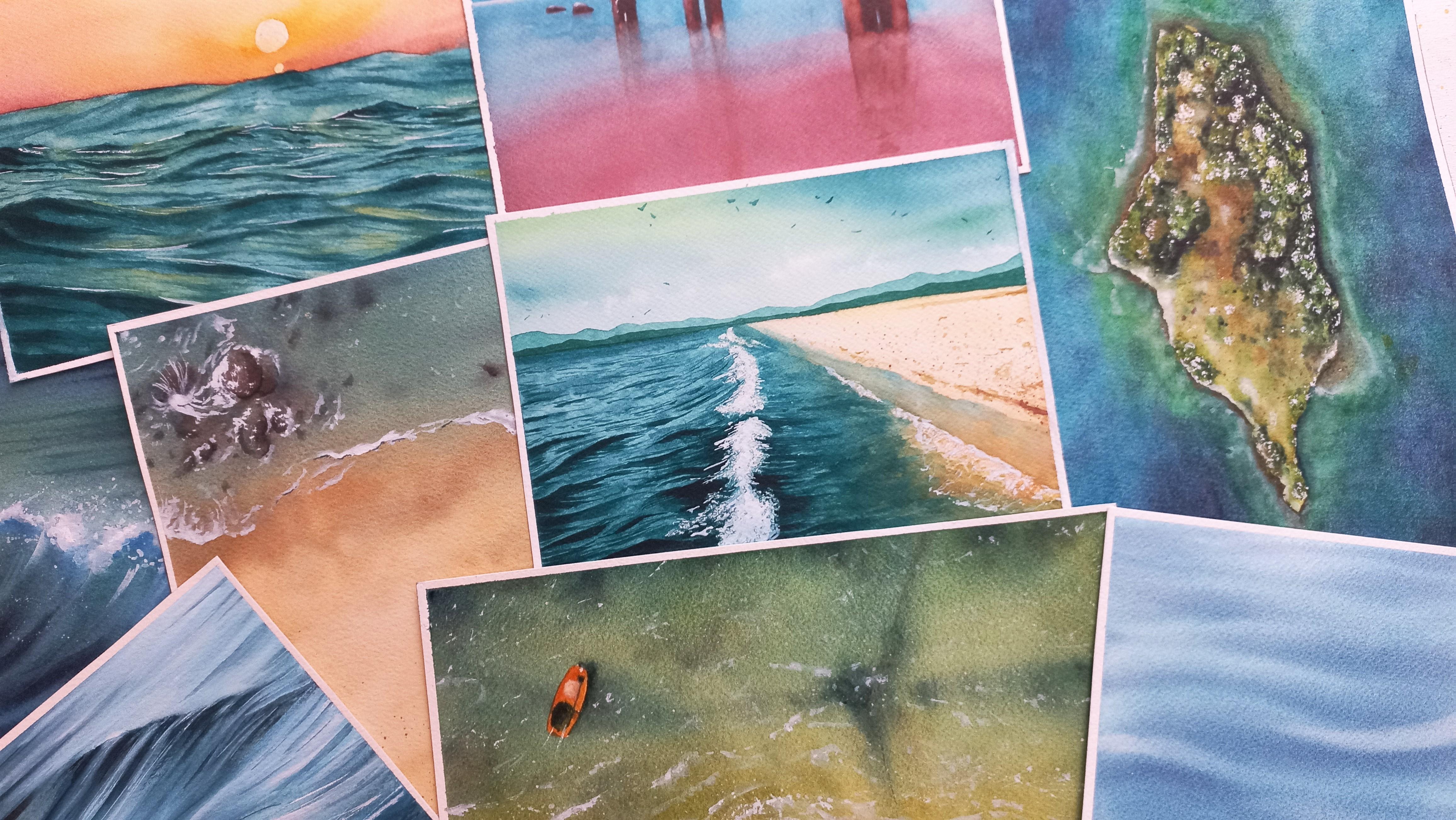
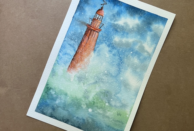
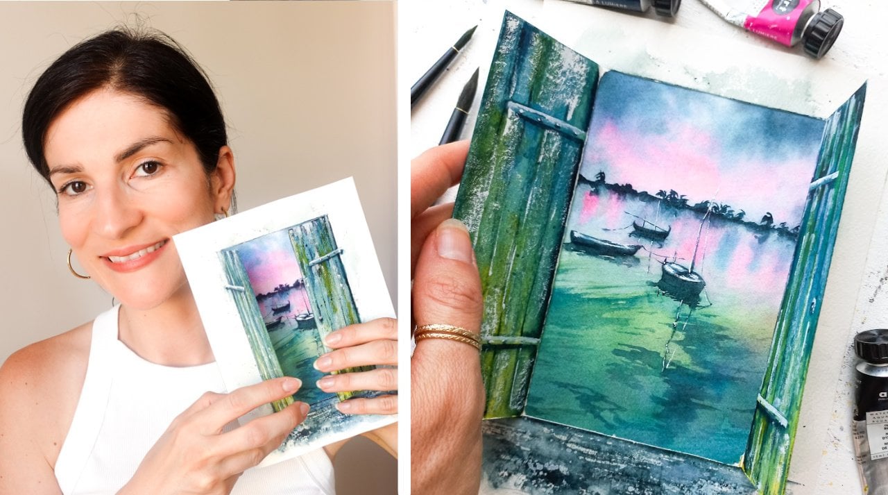
attached this photo of my own class projects
that I painted twice, and it illustrates just that. So feel free to
have a closer look. I would love to see
your final projects, so please share with us and then Projects and
Resources section. And feel free to reach
out if you need my help. But for now, let's meet next
to talk about supplies.
3. Watercolor Supplies: Whether I paint for
fun or practice, I noticed the same basic
supplies are always enough and possibilities
are endless. And I'm going to show you what my basic watercolor supplies still look like after three
years of watercolor practice. What I enjoy the most is
quality watercolor paper. And that's because it
makes painting and watercolors so much
more enjoyable. This is a sheet of paper
and is six by eight inches. No matter the brand you pick, I will suggest to look for
100% cotton paper with a cold pressed finished and a weight of 300 grams per square meter. In the supplies list I attached to the resources
section of the class, you will find more
suggestions as I've tried other brands
that I also like. The thing about 100%
cotton papers that are cold pressed is that
they do keep wet longer, which is great for the type of cityscape painting
we will create. And I find the colors
look better once dry. Blending is also smoother
than I'm cheaper papers. Don't worry if you're
using another type, what matters the
most is what you feel comfortable with right now. And as long as you
use watercolor paper, you will still be able to
complete this project, learn and have fun
experimenting. Masking tape I find comes in very handy in
watercolor painting. It will help you free up
your hands while painting. And when I'm using is actually plane and inexpensive
construction tape. And you can even use scrapbooking
washi tape if you like. First catching the
light household, go with a basic ruler,
pencil and eraser. Anything you have at home,
we'll do propane brushes. I suggest a few
round paint brushes and some with a fine tip
like the black ones here. I'll use these two-foot base
layers and splattering. And these will be
great for adding details and tracing fine lines. Of course, you can make
do with one round and one random pointing
paintbrush if you'd like. I like to have more, so I don't have to clean a paintbrush as soon
as I switch colors. For example. You can use watercolors
in tubes or in pans. Artists grade or
student grade paints. These parameters pretty
darn effective process. It's all up to you. I'm using tubes that I pour
into pants out of preference. And today's colors are red, orange, or bright and light
green, blue and brown. These are the exact
colors I'll be using. And what you could
substitute them with. This is the metal tin that
I pour my tubes into. I like its versatility
because of the large wells into
which I can mix my paints and any kind of mixing tray you
have will be perfect. I absolutely love white gouache in combination to
watercolors and I'll show you how to use it for our Crashing Waves and to
create beautiful highlights. I've been using this tube
since I started painting. So I say any kind of white
gouache will have what work? I always have some
paper towels nearby, mainly to soak up extra water and paint to my paint brushes. If you want to use a
rag, that's just fine. Two jars of water are
going to be useful. We'll gonna be using one to wet our paint brushes and
one to rinse them. I like to use the
scrapbooking heat gun, so I don't have to
wait in between base layer and whatever I
add the painting after that. If you're not patient,
I highly recommend that you can even use
a hairdryer instead. This is it for this applies. Remember, you can find a detailed list in the resources
section if you need it. See you next to draw the sketch.
4. A Simple Sketch: We're ready to draw our
lighthouse and we're going to keep our sketch very
simple and minimalistic. First makes sure that paper is taped all around
with masking tape. It will help you paint
without having to worry about the sheet moving
around constantly. I couldn't find a free stock
photo I liked for the class. So I decided to make up my own painting out
of several photos. This is something you might feel comfortable doing when
you get used to painting. Notice here how I use the lighthouse shape
from this photo. I loved the color and
texture in that one. This one had a nice crashing
waves to get inspired from. You will find these photos in the resources section
of the class. If you'd like a closer look. To place the horizontal line, I use the rule of thirds. It consists in dividing the
sheet into three parts. We end up with two
imaginary lines, one towards the top and
one closer to the bottom. And ideally the horizontal line should be placed on one of them. When you're not copying
of photo exactly. To decide where your own
horizontal line should be. Asked yourself what you
want to paint more off. Would it be the
sky, ground or C? You can also ask what it is you want to
emphasize in the painting. For example, I wanted to
focus on the lighthouse. So it makes sense to leave
more room in the sky for it and to place our
horizontal line towards the bottom of the sheet. Now let's use the rule
of thirds some more. And now imagine our sheet is separated into three
vertical parts. We end up with focal points. Now, those are areas
you want to place domain element in
your painting on from maximum visual impact. Our main element
is the lighthouse, and I'll place it
towards the left to make sure and center
our lighthouse nicely. Now we know it, we want it. It's a good idea to determine
where the top of it is. And that's because
I wouldn't want us to start drawing only to find out the
Lighthouse stands too low or too tall on the sheet. From the main line that indicates the placement
of the lighthouse. Check on the approximate length of each part of the building. I didn't get into this painting, wanted to copy a lighthouse
from my references. Exactly. So I don't
mind that it's slightly taller or larger as long
as it fits my sheet. And actually yours could end up being thinner or
thicker than mine. And it will just be fine as long as it fits in the sheet nicely. I'm drawing each
part one-by-one. Now let's erase that line that helped us place
the White House. To make a crashing wave effect will need to leave some
parts of paper white. It's easy to forget what areas should remain
white and what to paint. That's why I make sure to mark the spots where the wave
hits the light house. Once this is done, let's erase the part of the lighthouse that will
get covered up by the way. Remember that you don't have to go buy one reference photo. You can paint one thing
out of many references. Use the rule of thirds to find your horizontal line and place the main element
in your painting. Make sure the lighthouse fits the sheet before getting
into more detail. Clearly mark those areas where a crashing wave hits
your main element. We're ready to move on to mixing our colors. See you next.
5. Color Palette & Mixing: In this lesson, we're
going to go over our color palette for today's project and
prepare color mixes. The first color I picked for this lighthouse
with Crashing Waves scene is blue because it was summer
without blue, right? Mine is a bright Persian blue. And frankly, it won't matter much if yours is
different kind of blue, as long as it's not
very dark like indigo. I'm making this
mixed quite creamy. You can tell from the
consistency of it. It's a bit like a milk. To keep it the way
I like it creamy. I add water than paint, than water again,
more paint and so on. Until I have a big
enough mix that I know should last me a while. We'll be working on wet paper
to paint the sea and sky. And I'd like to make
sure this blue stays vibrant even after
the paint is dry. Since, as you may know, watercolors tend to look
a lot lighter when dry. And that's why it's
important to add enough pigment to the mix. This is a balance you'll find
on your own with practice. After some time, it becomes
easy to tell when you need more water or more paint to watch
you plan to achieve. Since the paint brush is
loaded with blue pigment, Let's mix a darker blue for shadows and ripples in the sea. To mix this color, you need to add brown to
your blue enough that it looks noticeably darker, right? Keeping a creamy
consistency or two. Don't forget to
reach a paintbrush when you switch colors. I decided at add a little
bit of green to my seascape. That was personal choice. I could have had blue tones
only the whole C painting. Again, we're looking for
this to be a creamy mix. Similarly to what
we did with blue, let's make a darker
version of this green. Aside from Brandon, black, blue is a great pick to
make most colors darker. So I'll use that. I really like the
orange red tone from one of the
reference photos that I used to paint the Lighthouse. I didn't have one like it. This is why I had you prepare at both orange and red
with the supplies. Notice how easy it is to create new colors
out of common ones. Again, a creamy consistency
will work nicely here. Later on we'll use
brown on its own. It will be for the details. There's no need to rush
into preparing it now, we'll have time later. Remember to take advantage of color mixing to create
new shades of color. Mixes creamy when you plan
to add them to wet sheet of paper as watercolors try a much lighter than they
appear when painting. See you next for our base
layer on the sky and see.
6. Sea & Sky Base Layer: In this lesson, we're
going to wet the paper and blocking all main colors
in the sky and the sea. Your round and round and pointed paint brushes
will come in handy here. Round ones for this guy, Klaus C and the splatters, pointing ones for ripples
and crashing wave details. Prepare the white
gouache as well. I highly recommend to watch the specific lesson
once before painting, as unlike the rest of the class, we'll be working
on wet paper here. And it's likely you will
feel a lot more relaxed and confident if you already know what the
steps are going to be. Let's start the clean
round paintbrush that will be large
enough that it's convenient for you to wet this sheet without it being
tedious. It's better. One is not too large either, so it's easy to go around the lighthouse since we will
not be wedding that part. Let's make sure
we're not getting any water on the lighthouse. The only area you
want to add it on is below the line
we marked earlier, the one that represents where the stopping point for
the crushing weight is. Notice I do a lot of back-and-forth and
I'm taking my time. This is so I know I'm getting into all the nooks and
crannies of the paper. And it also helps rub the
water inside the paper fibers. This will be helpful
as when the paper was wet inside and out. It will take way longer to dry and we'll we'll
have more time to work. A big mistake, I found that was making as a beginner
was too wet, only the surface of it. It didn't take me very long, but in return and dried
too fast afterwards. Let's wet this tiny area there. This is glass on
the reference photo that I used for the lighthouse. So it's see-through. And that's why I want
some sky colors there. If we add this guy colors later, when the sky itself
is already dry, it will look like we added
color when, right now, we're making sure
this tiny space belongs to the rest of the sky. Let's pick up a smaller
round paintbrush and use blue to start
painting this guy. Normally, I would keep a large round brush to paint
the sky as it's faster. But since going around the lighthouse will
require some care, I know all feel more
comfortable with a smaller one. You can use tapping motions with your paintbrush to
help create paper white gaps that will stand as clouds and the
final painting. Naturally you can very well make them more
visible in mind. Feel free to experiment
and have fun here to create the
background that you want. Make sure to leave a lot of whitespace around the
middle and bottom parts of the lighthouse for
the crashing wave will stop around the
horizontal line. And if you have paper is
100% cotton cold pressed, that you took time to
wet it and that is not too hot where
you're painting now, that should stay wet for awhile. Which means we'll have
time to come back and paint the sea
in a minute or two. Now let's pick up
the darker mix of blue and brown to paint
some darker clouds. I chose to add darkest
parts because it really helps to build
depth in a sky. When there's a variety of tones. We have blue already
for the mid tones, a little bit of paper whites
pause for highlights. And these clouds here it
will help place dark tones. Try and keep them towards
the top of the sheet as it will make sense that the closer we get to the horizon line, the lighter sky is going to be, since it's so much farther away. I want to make sure
my crashing wave shows when this dries. So I'm adding more blue here, so this area doesn't
try to like. Now, let's add our
dark blue tone again. But this time at the very
bottom of the sheet, this part of the seat is
closer so it will be darker. Let's add plain blue now. And the closer we
get to the horizon, the more greens I'll add, and the lighter they will be. For color harmony, I think it's a good idea to overlap a
little bit of one color on top of other ones to
create some kind of a bridge between each
shade variation. Make sure one of your round paint brushes
is clean and wet. We're making splatters
around the crashing wave and on the sea to create
highlights that look natural. It's a fast way to make anything like a
cityscape or a stretch of grass less boring and to use a fun watercolor technique. We're a bit early
into this layer now the paint is still very wet, so I expect they will remain
very subtle afterwards. Look at how pretty
this is looking to make our crashing wave and highlights in the
sea even better. Why not add white gouache? Now, when this is still wet, it will melt into the paints beautifully and it will
look natural when it's dry. Round and round
paintbrush will be better here for fine strokes. You can add just
a bit of water to the gouache that's
not too thick. We still want it to be
quite creamy, so it shows. First, let me add a
little bit of blue here. And now let's make fun. Waves were just enhancing the
crashing wave a bit here. You will see how much
lighter this dry. We won't see much of it, but it will help improve our
base layer in a subtle way. You can create fine
lines here and alter the shape of your crashing
wave if you'd like. And that's the
thing with gouache. I really love is how we can fix things in the way
that we want them. Let's clean our paintbrush
and pull a little bit of the green paint onto the top
of the crashing wave there. So it's not one plain color. Now if you like, you
can alternate between light green paint and white gouache to improve
the top of the sea, suggest some waves and so on. You are C will always look very different from
one to the next, even when you use the same
steps and techniques. So don't over think it. No. With the dark mix a blue, we can add some ripples. My paper is still wet enough that you can see that
it will blend into the painting nicely
if yours are more pronounced because the paper
is dry or don't worry. I like the way this is looking. So I'm going to try mind, make sure it's completely dry. Remember to take
your time to wet the paper that went to
paint ink dries too fast, dry it completely, wet it again and pick up
where you left off. Try and have light, mid and dark tones
in the landscape. The closer we get to the horrors in the
lighter the colors. Use white gouache
to add highlights and alter the shape of
your Crashing Waves. Great job on completing
this background, the rest of the
class should seem a very laid back after this, as we can take our time
painting a little more. See you next to paint the
base layer on the lighthouse.
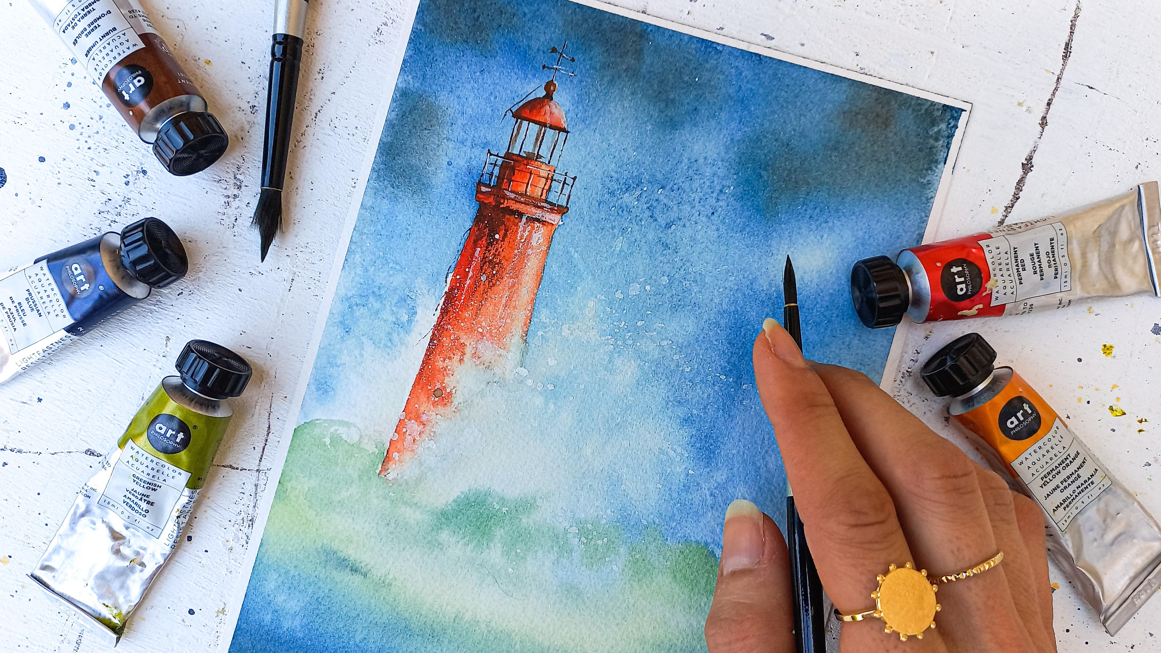
7. Lighthouse Base Layer: In this lesson, we're
going to add paint the lighthouse before
we get into any detail. You'll need your
red and orange mix. When I work with just
one mix like this one, a way to create several
versions of it is to add more or less
water to the paint. That's why I started with a
more opaque, thicker mix. And now I'm adding water. So this side looks
lighter in color. This is a good time to readjust the amount of paint
in your own mix. For example, I will mind
to look more orange, so I'm going to add that. Be careful when you add
water to make the mixed more transparent that your
paintbrush is not dripping wet. Otherwise you could end up with a bloom in your lighthouse. I tend to always dab my
brush on the paper towel quickly to get rid of the excess water while
keeping a damp brush. Look at how pretty
this color is looking against this guy and see colors. I find the summer vibes to be very strong hair,
thanks to that. Right at the base, let's make sure to soften any hard edge of
red orange paint. So the crashing
wave looks natural. And while it's still wet, next planet, some white gouache. I like to do it now. As in some spot, the gouache will melt
into the watercolors. While in other spots, this patterns will be more
visible. I like that. It looks so realistic when
it's done in that way. Now let's try this. As always, it looks a lot
lighter now, but that's okay, since will strengthen that way the effects later
on with highlights. Remember in this
lesson to use water to either make a mix
more or less light, which will bring dimension
to the Lighthouse with some opaque parts and others that look much more transparent. Also use water to finish the crashing wave that hits
the Lighthouse directly. And avoid a strong
start and stop point of paint between
lighthouse and wave. Let's make this lighthouse
pop with texture and details. So see you next.
8. Texture & Details: To paint texture and details. In this lesson, we're going
to use brown. Let's mix them. Ideally, it should
be quite thick. We wanted to show to contrast against the
color on the lighthouse. And that's why
we'll also keep it discrete so the painting
stays light and fresh. I suggest to start with
the top and move down and use one of your random point in paintbrushes of fine lines. Here, I add the paint
on the left side still, which is the one that I made darker already in
a previous lesson. And as we did with
the red orange mix, we can add water to create a gradient to make
sure that dark paint disappears into the
base layer very naturally to keep
lighter parts intact. I add what seem like the metal parts that
hold the glass together. I keep moving down and
refining each part. Take your time. There's no rush. When you find your
added too much paint. Simply wipe it off with clean water and a paper
towel before it dries. I pick up the thick
paint and I hold the paintbrush so it's almost
horizontal to my page. Then I gently brush
the paper and we have nice texture
showing through. This is called the
dry brush technique. It's achieved with pain that
has little water in it. Because the paint is almost dry, it's harder to
deposit it on paper. And the tooth of the paper shows through and we get
that texture effect. If you find too much
pains gets deposited, you will need that
that paint brush on your paper towel once or twice to suck the extra
water out and make it dryer. Here, I'm not trying to get the lines to look
straight and perfect. On the opposite, it looks more
charming when they're not adding a piece of rope
there is that kind of detail that finishes the
lighthouse beautifully. It makes it look
even more realistic. Don't want to overwork
the painting. So I think it's wise to
stop adding pain here. Remember to make the paint
thicker in this lesson, it won't contrast
better with the rest. Make for strong
shadows and details. Keep using water to make
shadows more subtle and places. Be careful not to overwork
the painting in this step, we'll lose the freshness
of it if we did. See you in the next lesson
for highlights and splatters.
9. Highlights & Splatters: This is my favorite step of all, when everything comes together and becomes even more beautiful. My secret weapon, as you might know from
previous classes, is white gouache will need a fine tip pen bar for detail
and around 1 first pattern. Let's add a tad of water to
the gouache so it's easier to apply even though we want to
keep it as pure as possible, because otherwise it will
look too transparent. Just like we did with brown. We can add gouache and then fade some of it with a clean
and damp paintbrush. So we get a seamless transition
and no visible hard edge. To me that contributes
to realism. For a more expressive look, you don't have to be as
peculiar as I am with it. Let's highlight the railing
at but not all of it. To keep it looking light, we have to find this
balance between being detailed and too much precision. Imagine here in particular, light with strongly reflect
on some parts of the railing. Not all. If you were looking at this
lighthouse in real life. I want my shadow here, so I'm going to add brown. Now, a touch of white gouache
press strong highlight, where you add your
highlight would be somewhere in the middle
or near the middle. The far edges of the lighthouse are going to be further back. So it wouldn't make
sense to highlight them. This should seem darker
from where we're standing. Now, the playful part
with a round paintbrush. Let's pick up some
paint and make splatters to emphasize
the crashing wave effect. You want them all around. It's even rate if Sam can overlap lighthouse
and see a bit. If you're splatters are big, you might want to add paint
as they will try very light. And if it's hard to
make them come out, the paint is too thick. So in that case had add
a little bit of water. The best is to have
enough water that the splatters do come
out, but no more. So the paint is as opaque
as possible when dry. I want to make the top
part here lighter, so it looks like
a wave with foam. Let's try this and if you
notice it turns out too light, you can absolutely add more. Try and adjust the amount
of added water though. Remember, you can
use white gouache to create highlights and make
a shape look more 3D. You may also use it to create splatters and add it to
the crashing wave effect. I'd like to show
you a little trick last, Let's meet next.
10. Easy Trick for Color Enhancement: I like to use the
glazing technique to improve a painting. I'll show you what
that looks like. This is another painting
I made on my lighthouse. Notice, while the sea looks more upheld than the
one in this class, the lighthouse is however
brighter, lighter. The first I want to
make with this is, no matter how many times
you paint one thing, it won't ever look the same. Just like your painting won't
look exactly like mine. It's absolutely okay and
normal it how it is, especially with a
medium like watercolor. My second is there are areas in the painting
that you can improve with a
glazing technique. Let's write enough this
lighthouse here, for instance, pick up red or orange, or a mix of both again, and add some on top of
what we did before. Since watercolor is transparent, this will add a nice
glow to the painting. I love to use this
trick when I find my colors look
boring or to turn. If we wanted, we could
even add yellow here. I'm keeping it
simple for colors, but I bet it will look amazing. Instantly the painting
looks brighter. I always use that
second clean and damp paintbrush to get
rid of any hard edges. Remember to use the
glazing technique whenever a painting needs color. It can be done in a
way that is as smart, as discreet as you wish. And you can be inventive
with a color you will add, preferably a lightened
bright one here. And please share your painting to the project
section of the class. I'd love to see what
color you used to glaze. I hope you enjoyed
this little trick. I love to say watercolors are way more forgiving
them with think, make a mistake and just wipe
it off before it dries. Find something you
want to improve, whether it is splatters or
color and just add some paint. It does take practice, but you can learn and make
watercolors work for you. Let's meet next for
some final thoughts.
11. Before You Go : Congratulations for
completing the class and now off you go painting. Morrison escapes for
the rest of the summer. I hope you enjoyed
your experience and what you learned from making a reference photo work
for you to mixing weights, summery colors, to painting a majestic lighthouse surrounded by beautiful crashing waves. I would like to ask you to
leave a review as this helps potential students coming in to the side if the classes
are writing for them. And it helps me to learn how I can help you better
with a painting skills. If you'd like to save data
to buy my future classes, I can suggest to follow me here on Skillshare and finally, awesome YouTube and Instagram
for Adam inspiration. You can also use the
hashtag create with counselors at to share
your work there as well. Thank you so much for embarking on this summary journey with me. And I'll see you soon for
more seasonal painting fun.
 Francoise Blayac, Professional Artist