Transcripts
1. Introduction: Hi, I'm Elisabeth and welcome to my Artist Inspired series. For this class, we are looking at the Indian artist
Jagannath Paul. In this class series, I share with you
different artists from the past and the
present as we get inspired by the work
that they created, their play with different
media and weave that into our own art making
practice in whatever way, shape, or form, you
get inspired by. Jagannath Paul is a
really fabulous artist. He is currently working
and he's very active. You can actually find him on
Instagram where he shares different paintings
that he's working on and his journey to date. Jagannath subject
matter is portraits, but not in the way
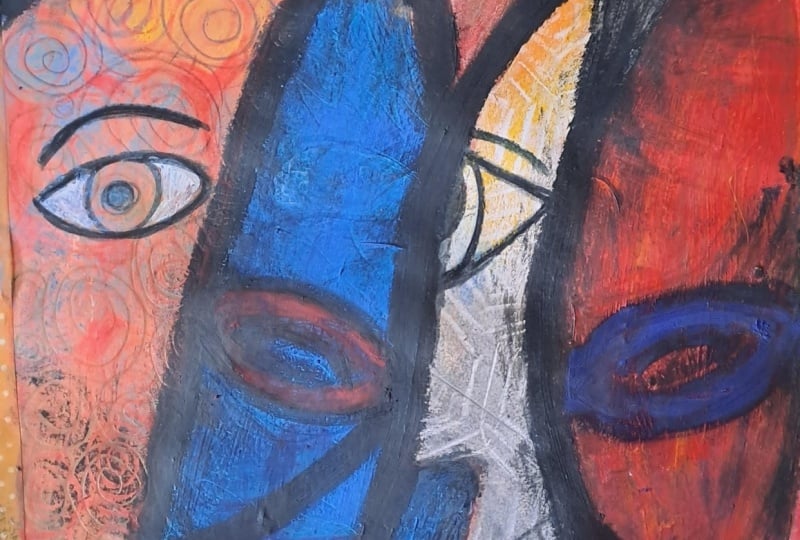
you would expect. He has been very influenced by the work of Cubist artists
like Pablo Picasso and the play of angular
lines and simplified forms, especially when we
look at Picasso's more mask like figures. We can see a lot of that influencing Jagannath
and that is one way that we can get inspired by Jagannath work
in our own pieces. But in addition to his play creating a combination of angular and curved lines to create simplified
portraiture. Jagannath is also playing
with a lovely play of color relationships
and contrasts between colors as well as really
bold dynamic contrast and values and layering
on and weaving in patterns and textures and imagery into these
simplified forms where he's leaning into those
color relationships and contrasting values on top of that and simplified
portraiture. The really neat thing is
especially his compositions. He is playing around
and exploring the different relationship of these anonymous
figures to each other. How they are filling
the composition, filling the canvas
right up to the edges. Jagannath Paul provides
a really wonderful range of ways that we
can get inspired. We can look at the
color relationships and what that is communicating. We can look at the
portrayal of the figure, either the individual figure or the figures in
relationship to each other and the way that he's getting
influenced by cubism. We can look at the
plate of contrast in his pieces and how although
they are very flat, there is also this
tremendous sense of depth. Then also the way that he's
incorporating imagery. So within the segments of the figures that he's
breaking them down into, he is leaning into different
imagery that relates to his Indian heritage and different symbolic imagery
and elements like that, but we can look at imagery
that brings us joy, imagery that we enjoy
drawing or painting, imagery that's inspired by our own heritage and background, although he is a
portrait artist, we do not have to lean
into that for our class. So as you explore him through this class and
see how I'm diving in and layering elements that inspire me from his pieces
onto my own art aesthetic, I really hope you'll join
me in this wonderful artist inspired class as we look at
the work of Jagannath Paul. Let's an hour to our
next lesson and we'll talk more about our class
project. I'll see you there.
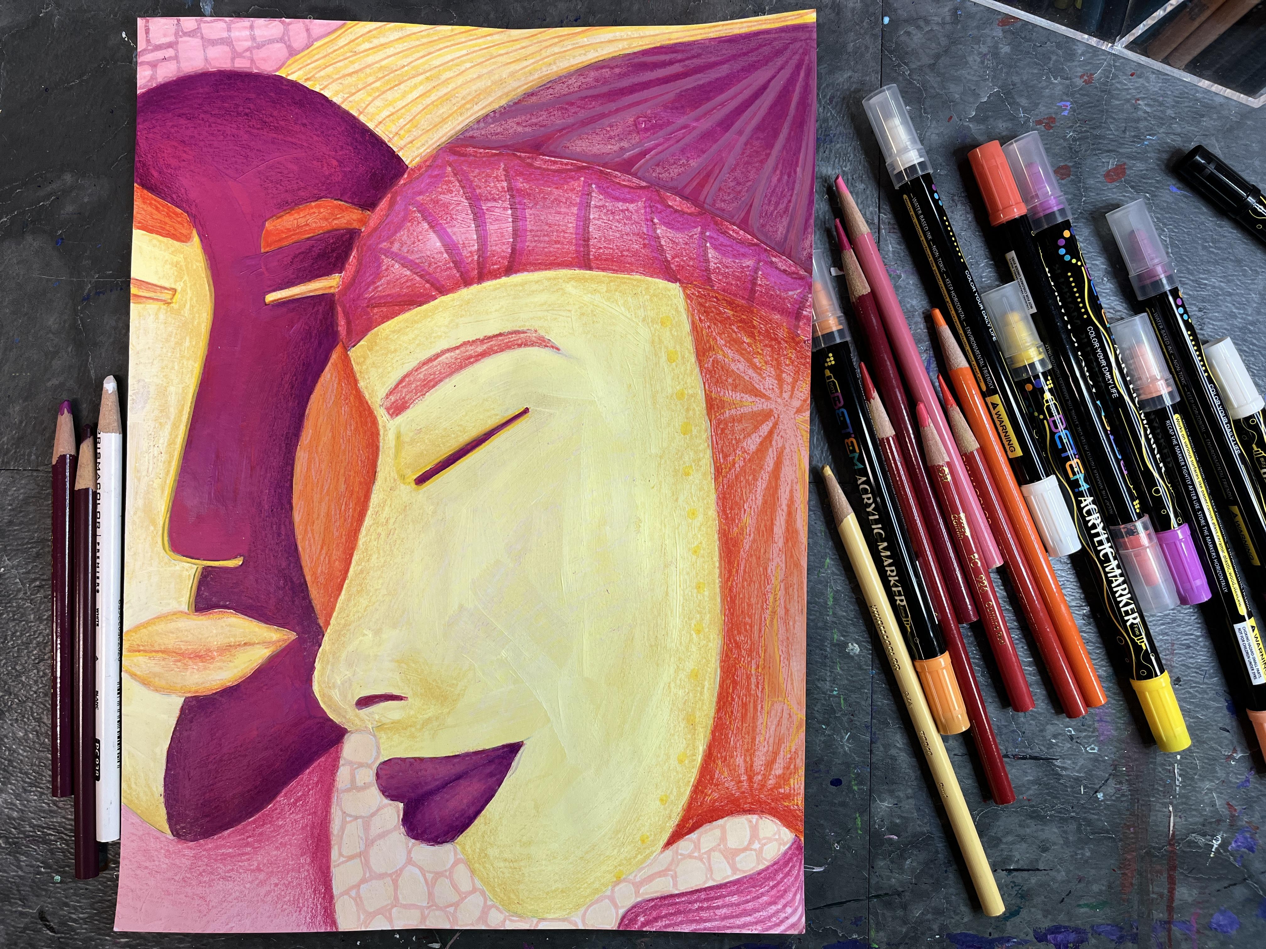
2. Class Project: For a class project, I'm
going to share with you how I am navigating getting
inspired by Jagannath work. But I also want to talk
about in more depth about the ways that we can look at his work and what we
can take away from that. I really love so many
elements of his work and he's someone where I saw a
piece in passing one time, I think, and had to know
more, wanted to know more. It's really neat because
Dagani is definitely incredibly stylized
and incredibly his. He's really made his own way of approaching these abstract, organic, simplified yet beautifully richly
detailed figures. You wouldn't see a
piece and not know that it was his once you
learned about this artist. But there's so much
we can take away from that and we can wave into
our own art practice. That's what these
classes are all about. Finding elements from the
artists we're looking at that inspire you
and get you excited, maybe push you outside your
comfort zone a little bit, but also maybe help you live in your happy
place as an artist. Now, portraiture is
something that I don't do a lot of in my
art making practice. I tend to live in the abstract, a chance to get inspired by an artist that I
really get excited about and to push myself to do portraiture
was really fun. I also really wanted to play with my own take
on the portrait. But you can absolutely lean
into the ways that he is molding and shaping and forming his own figures
in your piece too. You don't have to
do portraiture. That is absolutely not a
requirement for this class, and we're not even going
to talk about the portrait and the ways that you
would represent a face in. And he does a lot of distortion. He's got very long
noses, very plump lips, the eyes are usually closed, you can do simplified
portraiture if you want. You could also lean into
filling your composition up with simple angular and
curved shapes and lines, breaking up simplified
shapes into segments, playing around with
color relationships and contrasting colors
and harmonious colors. And play into his
use of value and shading and the way that
he is working very flatly, but also putting a ton
of rich value in there. Or you could play with
the role of incorporating textures and painterly qualities or imagery into those segments. There's a whole range of ways to get inspired
by his pieces. After we talk about what
materials I'm going to be using, we're going to learn more
about Jagannath art and what his intention is behind creating the pieces
that he does. I think by the time you get to creating your
own class project, you will have a
wealth of inspiration and knowledge and ideas
as a jumping off point. Lessen orbitore next lesson
and talk some more about the art materials we're
going to want to have on hand for class.
I'll see you there.
3. Materials: The materials for
Jagannath Paul and spirit artwork are mixed
media or painting paper. So acrylic paints, you only need a limited
selection of colors. You're going to want
to have a plate or a paint palette to
put those on a cloth, some acrylic brushes
in a variety of sizes, a container for water, for washing off your brushes. But it also might be fun to
have some acrylic paint pens, some colored pencils, a sharp and a fine liner on hand, too. I want to do a lot inspired by the detailed work that he
incorporates into his figures. Going to probably
lean more into these to add those elements than
I am the acrylic paint, and use more of my acrylic
paints for blocking and color. You're welcome to use
any art supplies that you have on hand or that
you're feeling inspired by, and you could also easily work
digitally for this piece. So let's hand it
over to the next lesson and we'll learn some more about the art created by
Jagannath Paul. See you there.
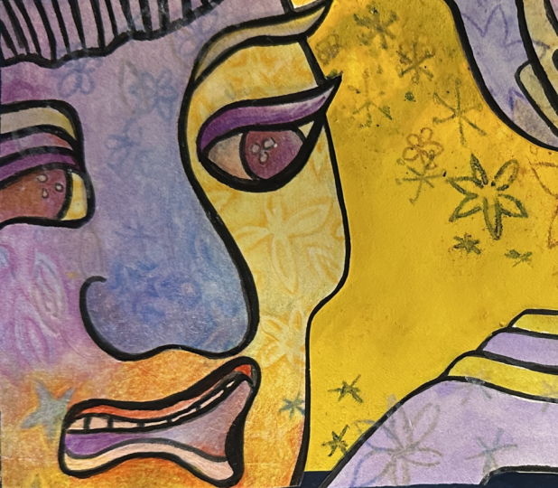
4. About Jagannath Paul: Jagannath Paul is a
mixed media artist. He was born in India. At a very early age, he started making sculptures and painting signboards
as a side business. He was kind of always
interested in art making, focusing on how to turn
that into a career. A lot of his early
work focuses on painterly textures and
building up layers. And it's really interesting
because there's a very organic, abstract nature to those pieces. And then when we start to
look at the work that he is known for that's where the
figures start to come in. We see a lot of relationships between how he
positions the figures. They fill the entire frame. There's really bold lines, but there's also a softness and a delicacy to the way
that he portrays them. And then there's also a
very strong play of color, value, and pattern or
texture that he creates, whether that's through
painterly abstract textures that are woven within the shapes that he
breaks his figures down into or the patterns that
he incorporates into. Also a lot of repetition that
we can see in his pieces. He creates his images
using charcoal over acrylic paint on
either paper or canvas. He's also very
influenced by cubism, which is interesting because
we've also seen that in other artists that we've
studied in this class series. He's very interested in angular and straight
lines and laying those on top of the curves of simplified
figurative portraits. His noses are very long, usually his figures
have plump lips, the eyes are usually closed, and all of the figures
are anonymous. There is very little distinction
between even genders. There's just kind of
this anonymous quality to these beautiful
figures that he's doing. But he has a lot of
facial expressions, and then there's different
straps of color, and the compositions
are very powerful, and yet they convey a tenderness
of human relationships. There's never just one figure. There's always two or more, and the figures are always position and placed
and touching in ways or overlapping in ways that show connection
and relationship. So let's head over
to the next lesson. I'll see you in a
little bit. Two.
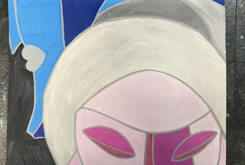
5. Sketching and Base Painting: O The first thing that I want to do is I want
to sketch out my imagery. I'm going to go ahead
and do this with a graphie pencil and he's
very much inspired by cubism. We don't have to go that route, but we do want to think about simplified shapes
and elegant lines. I'm just going to start figuring out where I want
my figure to go. I'm drawing pretty
dark so that you can see what I'm putting down. He also often does
the eyes closed. So we can lean into that as well and also has
more than one figure. So we can play with that too. Times the figures are
overlapped in some way, but we could also perhaps have another figure
behind this one. I haven't left a lot of negative
space, but that's okay. I can play with that. I can work my designs into
the figures too. Maybe I'm going to break
the shapes up a bit. I'm going to go ahead and
do some very flat painting just to block in some colors. Then the acrylic I'm
using is not very opaque. The great thing is, I can
see my pencil lines through. Oftentimes acrylic will have a very thick opacity and it will completely
cover what we've drawn. I also drew very dark, much darker than
I would normally. I recommend you draw lighter. And then you'll more
easily be able to block out your shapes or cover up anything that you
don't want showing. But I know I'm
going to lean into my paint pens and probably my
sharpie and my fine liner. I'm not worried too
much about that. Even where I went over the edge, not a big deal because
I really do want to emphasize the line and have
that be a much thicker, bolder presence in my piece. Now, I can also add in some more lines to break
this up even more. And you can absolutely put down another scrap of
paper underneath it. I like using construction paper and just sticking that underneath
to protect my surface. Then I can use the construction
paper that I've been using as my messy
painter surface for collaging and other
you also want to think about maybe doing some
repetition with your colors. A lot of his pieces have different colors
assigned to each figure. I want to have it be a
little bit more unified. So I'm trying to use my colors in a couple
of different spots so that it feels like it's unifying the piece and that nothing is
becoming terribly dominant. Then anytime you're working
with acrylic paint, you want to make sure that
when you're taking a break or you're done with a color that you wash your brush and
that you dry it off. Because that's a
plastic based paint, and we definitely
don't want that getting dried on our
paint brush hairs. I think I'm good with my yellow, and I'm going to
make a really light so anytime we're making
a lighter color, we always want to start
with the lightest color and then add a little bit to it. I keep it really pale. Because I've added white to it, it's a little bit more opaque than my yellow was,
and that's okay. It's like I'm doing a
sectioned underpainting. The other thing that's
great about acrylic is, you can decide as you go along. If you don't like a color,
you can always paint over it. That yellow is pretty
intense against the pink, but I think the
more I fill in with other colors and color values, the more I'll so I'm
going to play around with mixing these two together. You also want to
make sure you mix up enough paint because you don't want to run out
and have to remix. If you can help
it, sometimes you can't help it and you
have to mix again. You also want to make
sure that you're using the right size brush for the
area that you're painting. If it's a small area, definitely it's worth taking the time
to get the small brush out. It's a large area, it's worth getting out your
large brush so that you don't have to painstakingly fill an area, a small brush. If it's not covering as
thickly as you'd like it, you can always do another coat. Colors just need it
more than others. It's really important to dry
up your brush after you wash it because that water is going
to thin down your paint. There is a time and
a place for it, but if you're going for
a nice even thick coat, you want to make sure that you don't have your water thinning it but if your paint is
getting a little too tacky, say it's been sitting
out for a little while while you've been painting
with other colors, you can absolutely add a
little bit of water to it and mix it on your palette so that you get it flowing
nice and smooth again. You can turn your paper
any which way you need to to make it easier to fill in. The nice small areas you can absolutely do with your
paint pens instead. Then he has pieces
where he leaves it just the flat
color, the shading. Then he also has
pieces where he puts lots of decorative
detail and pattern. So you can decide
how you want to go. As you're filling in your solid
colors, think about that. Got all my solid colors in. I can see a little
bit through my pink, but some of that is
the drying time. I'm going to go ahead and
switch over to my drawing. After this dries, which
will be very quickly, we can start to go in with Sharpie and fine
and we can crispen up our lines and then we can start to add in some
pattern if we want to. Let's hand it over to the
next lesson and we'll start doing our line work on our
figures. I'll see you there.
6. Adding Patterns and Shading: A So since the last lesson, when I was doing the
base colors for this, I sat with this piece
in the base coat state and just felt like it
was screaming at me. Like, I was all very
bold and saturated, and I just I didn't like it. It didn't feel like I'd really kind of pushed the colors
as much as I could, and it definitely
felt like too big of a departure from
Jagannath Paul work. I really kind of
wanted to get back to his play of color but
with my own aesthetic. So I decided to tone
down almost everything. So the yellow and the orange
became much more muted. I kind of freshened up my pink, so that's a smidgen
different than it was. Majeta sections had
actually been red. There was just too
much pink already. So I couldn't really, like, tone down the red and have it work. So because I did this
with tube acrylic, I now am working with
my acrylic paint pens. You can use whatever you want for the
pattern aspect of this. And like I said, you don't
have to do the pattern aspect, again doesn't always do it. Sometimes he puts
really ornate patterns. Sometimes he just focuses on values and color
relationships. This is very flat right now. So what I want to do for my next step is I want to build up some pattern that's
going to also kind of create some textural effects, and then I'm going to go in and layer the shading over that. Also, since the last
time I filmed for this, I taught this class in person, and I tried showing them the charcoal aspect of what
Gigant does in his work. So he does, you know,
the acrylic painting, and then when it dries, he goes in with the charcoal. But I don't know
if it's the fact that I'm using paper or if it's the brand of acrylic
I'm using or what. But when I tried the charcoal, it got a little strange. So I'm actually going to do the shading with
colored pencil instead. I would encourage you to experiment with the
charcoal and try it. I think it's a really
great concept. He uses it so amazingly. I just love that aspect
of his paintings, but it didn't give
me what I wanted, and it just kind
of looked messy. So, he's a master.
He's been doing he's done so many of these
paintings that he really, truly knows how to work with these materials in a
very sophisticated way. Because I was doing
tube acrylic, I'm not going to
have exactly the same colors, but that's okay. I'm just going to kind
of play and build it up. I also want to keep it a
little bit more simple. Gogan patterns are pretty amazing and pretty
intricate in detail. They're also symbolic
and important and meaningful to him and him
personally and his culture. And that isn't my culture, and I don't have the
same connections. So I think I'm just going to go for patterns
that make me happy. So I've got lighter
colors and darker colors. I think I'm going to stick
to playing with the idea of autochromatic
within my colors, but then also play with some merging the colors
and overlapping new colors because these
will go on opaque over this. I'm going to bring up
some of his art so that I can really see what
is inspiring me. All right. Now, I could sketch
out the designs ahead of time and kind of have
really planned patterns. You could also pull
from patterns that you find online for inspiration
and kind of recreate those. I have a lot of areas where
my paints are very similar, so I'm hoping that
the pattern and the shading will then create
some of that separation. So I'm going to start
with the parts citric, but I kind of know
what I want to do. And the great thing about these acrylic paint pens is
they're dual tipped, so I can use the small end and I can use the big end to kind of go and add some really
neat design elements. So I decided that I really want to lean more
into colored pencil, too, because a lot of gigan patterns aren't
just linework. I've got some more
intricacies happening. So I'm going to use
colored pencil as well as the paint pens
as I start to, like, continue to fill in my artwork
until I get to a point where I feel like I'm satisfied with all of
the pattern I've added, and then I'm ready to add in
the really intense shade. I found myself starting
to want to add value, so I've moved from
pattern to value. I might add more
pattern. I'm not sure. But right now I'm just working through the sections that
I'm really enjoying. Adding in some shading
within the pattern itself led to starting
shade the portraits too. I did draw them relatively flat, so it is a little tricky. To kind of figure out where
to put that shading in. If we look at Jagannath work, we can see that he was kind of leaning into where
the lines were, where he created the sections
for where the shadows go. And they don't necessarily
always have to logically define the shape
that they're playing with. So we can kind of have
some fun with that, too, and kind of play around. But I think I'm
going to lean into some of what is accurate with the parts of my portraits that I've drawn and to start
to create some volume. And some depth in here, and then I don't actually know if I want to add
the dark dark black that he does because I
like the softness of this and this feels more in
line with what I want to do. But I'm going to try
to challenge myself to push the values where
they're really dark, more extreme, so I get
the drama that I love in his work and I do it in a way that works
within this piece. Pushing that pink darker, what I mean is I'm going
to find a darker pink, and then that's going to
be what goes even darker. I'm going to take this magenta. And I'm going to pop my edges really dark and
fade it out super quick. So I get the drama without
darkening everything. And then I can
still decide to put some black over the top
of this so I can kind of keep playing with
other darker colors that I have in my
colored pencils. But this, I think,
is going to get me closer to where I'm pulling the inspiration from
and then how I'm creating that putting that
through into my own work. And I'm probably not going
to do it everywhere. Like, I'm probably just
going to kind of put it where I want it
and where I need it. I'm loving that. I think
that's going to be great. I'm going to keep going along in this vein and kind of see how
the rest of it comes out. My ad is a little
bit more sheeting. Even though there isn't
actually sheeting, on the tip of the nose, kind of leaning a
little bit more into what Gigante
does and kind of putting the shading
to help define where you've added shapes and kind
of broken up forms a bit. Yeah, I'm really
happy with this. I'm incredibly happy with this. I wasn't super sure. I was definitely
not thrilled with the bold color that I
had originally painted, but going back into this
with the lighter colors, the later values has really
made a big difference. I'm really happy
that I stayed within the color families
I'm playing with for adding in shading texture, shading to define the
form and make things have a little bit more
volume instead of going the route of
the dark shading. I'm really excited
that my interest in Jagannath worth and
the things that I was able to pull out of
it turned into this. This is incredibly exciting. I love this. Let's
hand it over to our last lesson and we will wrap up the class.
I'll see you there.
7. Final Thoughts: Thank you so much
for joining me in this Artisan's
Barry series class where we looked at the
work of Jagannath Paul. I hope you had some fun
either settling into a nice, happy groove or pushing yourself a little outside
your comfort zone like I did, and I hope that you are very excited about the
ways that you can layer different
things that you pull from his work into
your own art making. I would love to see
what you created. I hope that you'll
pop on over to the projects and resources
section of class and share what you created in the student gallery and check
out the work of others. I love not only getting inspired by the artists
that we're looking at, but also the artists that we're creating with in these classes. It's really fun to keep circling back and
seeing new ways that folks are getting
inspired as they find classes fresh
for the first time. I would also love
it if you would take some time to
leave a review. That is one way that I as
a student, at classes, our time is so limited and it is a great way to figure out if a class is going to be
the right fit for you, if it's going to be
what you expect it to be when you start to look
at what a class is about. The students perspective
is incredibly powerful. It's also wonderful for
me as an instructor to hear what your
thoughts are about the class, what
you found helpful. And different things
that maybe you want me to add as I consider how to improve a class and continue to make
new ones in the future. This has been such
a fabulous way to connect about the artists
that we're inspired by. I hope that you'll click
the Follow button, you'll continue to join me on my teacher journey as I share more classes with
you in the future. If you'd like to connect outside of Skillshare off the platform, you can follow me on Instagram at Elisabeth Under
Square Welfare, where I share a lot of
different art adventures, what I'm up to in
the art studio. I have some exciting art
opportunities coming up in this next year
that I'm looking forward to sharing with
you over also have a YouTube channel where I share our different
art techniques, art adventures I've gone on. I'm hoping to get some
more art adventures in the future that I can
share with you and I have some ones that I've had in the last year that I haven't had a chance to edit and post yet. There should be some new stuff coming over on my
YouTube channel soon. All sorts of
different ways we can connect and stay in touch. I would love to continue
celebrating you and all the amazing things you're doing in your
own art journey. Thank you again
for joining me in this Artist inspired
series class. I'll see you next time.
 Elisabeth Wellfare, Artist, Art Educator