Transcripts
1. Introduction: Welcome to Part one in a series where we're going to
study the Masters, the artists of the past, who have created a legacy, either by their style or
by their subject matter, and we're going to
learn from them. We're going to study
their work, their lives, and what made their art special, and how we can use that to become better
artists ourselves. So, here we go. Today is
all about Vincent Van Gogh. And I know I didn't
say that probably very well because I grew up
boys saying Vincent Bango. I don't know about you, but it's gonna take a little while to
reformat that in my brain. It's a familiar artist. It's someone we can recognize immediately upon seeing
most of his work. He has created a lot of work that maybe is not
all recognizable to us. But today's lesson, we're
going to focus a little bit more on the latter part of his journey and use that as our influence as we kind of dive in to some exercises that help us get to know
Vincent a little bit. If you've never taken
class with me before, my name is Christina Moyer, and I'm an artist specializing
in acrylic paints. It's my favorite medium, but I love diving into other
mediums, giving practice, and honing new skills and new processes to build
up my own skill level. I've also been teaching for Oh, dear, more than two
decades, I think, now. And I started teaching
dance, I've taught art, I've taught at church, and I've taught ESL, and I just really love
connecting with students. So I hope that I will
see your project uploaded at the end so that I can give you feedback
and we can connect, and I can see how you
enjoyed this lesson.
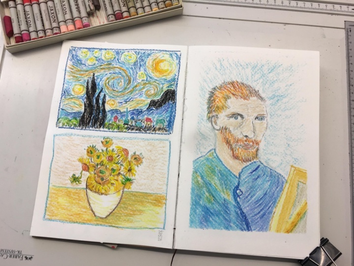
2. The Project : Project for this class is going to be really fun
because we're going to start with exercises throughout the lesson that
will help bring you to the point of being able to create a project
that is your own. So throughout the class, we're going to do, you know, studies of Vincent Benko' work, where it's going
to feel more like recreating another work of art. With a few exercises, trying still life, portraiture, and landscapes, which Vincent is famous
for doing all three. Then we're going
to select our own subject matter to create our final project using the
style and the things that we've learned in this lesson
to create this project. You'll see me create mine, but I want yours to
be special for you. The whole purpose of this
lesson is to be able to give you the tools
in your tool belt, as an artist, that
you can recreate that style with your
own subject matter. So that's why this is
the final project. And that's why this
is also more for intermediate
students because you don't need as much hand
holding at this point. You're diving a little deeper into what you want to create. But we will get you there
with the other exercises, with learning the
skills and the style of Vincent along the way
to get to that point. So don't worry, you've got this.
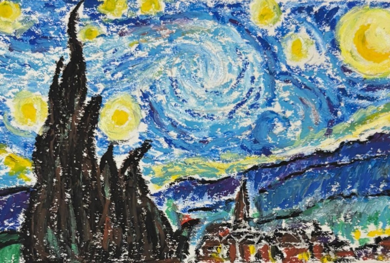
3. Preamble to Exercise One: Let's get started with
the first exercise, where we're going to take
the Starry Night painting, one of his most
famous paintings, and we're going to recreate it using whatever medium
that you want to practice. I'm going to be
using oil pastels, but you can use chalk pastels. You can use paints, whether that's acrylic
paint, gouache, or oil paints, whichever one you want
to want to practice, or just to get us a bit
familiar with his style. Because he painted in
oils quite frequently, I feel like I wanted to use
something similar to that, so oil pastels gives you
somewhat similar experience. Not the exact same, but I
decided to go for that. So let's get started by
getting out your materials, getting out your sketchbook,
and follow along.
4. Starry Night Demo Part 1: Let's begin by
labeling our page, giving it a little title. Put the date in
whatever information will be relevant for you. You can put the
title of this lesson in if that will be of use
for you in the future. I think it's always helpful to add in a little
extra information. Date. Absolutely. Title this, say who the teacher was. That helps you know
where to return if you need to head back to
this lesson at some point. So studying the masters,
Vincent Van Gogh. That's how we say it
in North America. But if you were Dutch, it sound more like and
now I'm not Dutch, so I can't say it very well, and we've already
gone through that. But Van is more like
a F sound like Van. And Go, they pronounce
it more like, H. And so because I'm in Canada, I'm going to say Vincent Vang. Hopefully, that's okay with you. So I've dated it, and I'm going to create
just a little frame. So I'm going to give myself a little frame to work
within on my page, and you could go large, small. This is just a small study, so I've decided to keep
it pretty small at about, you know, like a six
by four kind of size. So feel free to follow
along the exact same as six by four or
make it bigger, fill the whole page if you like. Then we're going to
sketch the image. So look up the Starry Night, and you'll find all
kinds of images. You can buy prints
of this painting. Try to find one that you
like and that you feel like looks good with good detail and that kind of thing
to follow along. Something more original, not somebody else's creation
of Starry Night, but the original that Vincent created is a
little more helpful. So I'm going to use
a pencil and sketch in the tree there and
just my hillsides. I'm not going to go
into deep detail, but just to give myself some boundaries as
to where to begin, where to put everything. It's always helpful. As
an intermediate artist, though, I'm sure this is familiar to you in
terms of creating this. Also, just want to make note, I did frame this with a pen.
That's totally up to you. You don't have to do that, but just you could use a
pencil if you want. But for me, I just I
didn't want that to kind of be something that needed
to be erased or hidden. And so having a strong frame with a pen was just fine for me. So then I look for areas. If you don't have a lot
of sketching experience, I look for areas of interest and that kind of
Mark a location. So the tree. That
one's pretty obvious. Then there's the horizon line. I don't know I had
difficulty saying that word. And then I put in that church. And then that helped me
to identify the location of other buildings
and mark making. So look for areas of interest that are really
strong visual moments. And if you can identify where
that is within the frame. Is it centered?
Is it off center? To what extent is it off center? Think of cutting a pie
or cutting a cake, you're trying to cut
equal amounts or cut the same amount that looks similar to what
you're looking at. So that's how some of
how I visualize things. If there's cake involved,
I guess that can work. And then even marking
in these little, I've decided to mark in the
swirl and just very lightly, especially where
it's going to be light with the particular
material I'm using. And now, if you're using a material that might
blend in with pencils, you just want to take
that into consideration. Didn't recommend watercolor. I'm not gonna say
you can't, though, but with the particular style, with this expressive
short brushstrokes, I don't think that
watercolors ideal for this. So, now that I have
things sketched out, I'm going to take out my medium. So if you're using oil pastels. Now, oil pastels,
you can blend them. I'm not exactly blending mine in a way like with
mineral with oils or, you know, you can use
you can use baby oil. You can use all kinds of
things to blend them. I'm going to use just kind of themselves to blend
and like each other, blend with each
other a little bit and keep that expressive
brushstroke look to it. So I'm going to make
little dash mark. So right now I'm
selecting my color. So If you can do this with your whatever
medium of choice, grab all the colors
that you're going to need in this particular study. There's a lot of blues, grays, purple, yellow, white, This is kind of a mishmashed
bin of oil oil pastels. So I don't always have
the exact colors. But what I want you to do is practice by making little marks. And if you don't have an exact color that
you're looking for, see if there's two colors that you can kind
of blend together. And you can use a finger to blend when you're
actually blending. You can try blending. I like to blend a light color
over a dark color. I find I need a white to kind
of blend those light tones. But just keep in mind how it's going to function once you
work on your actual piece. Why I like to do these
little swatches on the side. Test things out. See if
you can scroll in and see how the image really
looks really up close, can help to determine what
colors you might need. And it just depends on how well versed you are with your
medium that you've chosen. Maybe this is really
simple for you, and maybe this is a bit
challenging for you. You can see I grabbed a red. There's just like some
very small red marks, but it can also be useful in
blending in certain areas. Like even in the green, if I had a bright green, and
it was too bright, I could add red to it to kind
of dull down that green, which sounds counter intuitive, but it actually works. Looking for colors within
the tree that work nicely. And you can see if
I were to blend these pastels as someone would want to kind of
get that smooth look. You can see the tree that's
not how that would work. So I want to kind of keep that as similar to
this as possible, just for the sake of
practicing who Vincent was. And we're starting out
right now with a lot of talk about how to
create this piece and, you know, my oil pastels, and just setting up my
page and everything, and you can see my
fingers are getting a bit oilly from touching
all these things. Is there oil pastels? So that's to be expected. And still just make sure I
have my color is correct. So right now, you know,
we're setting things up. I'm hopefully helping
you to get things set up properly so you can get get
started, and so here I go. But further along the way, we will definitely talk
about Vincent's life, do a bit of an overview. So You know, probably
or possibly you don't. That's okay if you don't, that a lot of his work has this
expressive feel to it. It's very a bit loose feeling with the brush strokes because
you can see them. They're not all blended together with transitions
that are really smooth. They're a little
more harsh looking with really strong
outlines here and there. And as you learn about his life, you're going to learn
why he paints this way. At least to some extent, we might not have all the answers, but luckily, we do actually have quite a
bit of information. And we're going to
go through some of this as we go
through this lesson. So you're going to
learn some of his life. And for me, it was very impactful studying
about his life in preparation for this lesson. As I learned more
about who he was and what he went
through, and, you know, the challenges he faced and really the short lifespan
that he had I did affect me. And and in creating these
pieces, it was a way to, like, honor him in some way, but also try to gain what I could from his years
of experience. And even though he
didn't have many years, he created a lot of paintings. And so there's lots we
can learn from that, if nothing else, persistence, and just sheer effort, like, work ethic, to create so many paintings in such
a short period of time. It's just very inspiring to me. So hopefully, learning
about his life, as well as c, recreating his work will help to
influence you, as well. And then when you go to create the final project
in this lesson, you will have a good experience, something that is more personal and be able to think
about his life. If you haven't heard the song, Starry Night, I think
it's called Starry Night. Josh Goben sings it. And I never really
thought about it before, but it's definitely one
I would consider after, you know, studying his life. Definitely, go
listen to that song. You know, if you're working on this piece while you listen to the song, It's
even more special. It's very relevant. So
go ahead, put it on. So, as you can see, I
started with a light blue. And then now I'm going in
with this darker blue, and filling in some of the
areas that require that color, and then I'm going to
be blending on top. So sometimes it makes
sense to start with a lighter color and sometimes it makes sense to start
with a darker color. In any area where it's
supposed to be really light, I'm not going to
put a dark color to begin with in that area. But with oil pastels, it works pretty well to start kind of with
your medium dark and then add on
the lighter tone. It actually works pretty well. So if you haven't tried
your medium before, I definitely
recommend practicing a little bit before
diving into this, but this could be a
practice for you, and it doesn't have
to be perfect. We're just going in our
sketchbook and using, you know, this master artist,
their work as, you know, this
influence and practice. So Even if it doesn't turn out nicely,
don't worry about it. This isn't the final project. And even you get to that point. That's shouldn't be
a stressful moment. This is exploitative and just something that should be enjoyed and trying to you know, trying
something different. And that's part of what it is. So we're at the end
of this part one, we have three parts in
this demonstration. So continue on and keep
carrying on. You got this?
5. Starry Nigh Demo Part 2: Part two of this demonstration. Alright, sorry, if those
too loud. Excited, excited. Continuing on with
those kind of mid tone ranges in this particular
section, in this part two. Part three will take
us into the darks, the outlines, that
kind of thing, although I'm getting a
little outline in there. We're going to darken
that up later too. So getting those mid tones
getting the thing started. It's kind of like starting with our base in a painting where we, you know, cover
the whole canvas. This is a little bit different
because I'm not just covering the whole frame. I'm starting with you know, I started with my sketch, and then I'm building in areas. So working in sections, filling in with
these little dashes, that became part of
Vincent's style. This is important to his style. So keep working in those colors. And let's get started with
talking about Vincent's life. So what I'm going to do is
I'm going to start with a quick overview version of
Vincent Vang's life, okay? And why I'm doing this is so that if you want to refer
back to this video, you can get the quick
overview version and get, you know, the summed
up version of things. And then we will go into further detail into
future lessons. So be excited for that. So if you didn't know already, Vincent Bango grew up in the 19th century
in the Netherlands. So he's a Dutch painter. And surprisingly, he didn't
know what he wanted to do. For a long time, he
didn't really he didn't, you know, wasn't a 5-year-old, like, I'm going to be an artist. Like, that was not, you know, something that was very clear
to him in the beginning. But he did enjoy drawing, but he just didn't know
what he wanted to do. He tried a bunch of careers, and they didn't really
work out for him. Had a pretty good relationship
with his brother Theo, and his brother said to him, you know, you're
good at drawing. So why not do something with
that? Why not you know? And so he decided he's
going to be an artist. And he really took
that to heart, and I'm really
impressed by that. Oh, we're adding in
that golden color. Sorry, just excited going back to the picture
that we're working on, just for a moment here as I
start adding in some yellows, because when you have cool, cool colors to begin with, which we started with
these cool blues. And then we start adding
this warm golden color, it's just very
exciting because it creates that balance. And Yep. Okay. So what's interesting is he preferred drawing and painting the lives
of ordinary people, for example, farming, family. And you can see that
in evidence from one of his earlier works,
the potato eaters. This is a pretty
famous painting. And it's very dark. And it's interesting that someone would
want to paint this. You know, you think about what people paint now or what
you want to paint now. What are the topics
that you like painting? And he liked painting, you know, just kind of everyday things, which I find really pretty interesting. He was
proud of his work. He was, you know, but others didn't seem
to like it too much. He just wanted to
be a good artist. And he worked really
hard to become one. You know, he just
kept practicing, practicing and practicing. He made a lot of drawings,
a lot of paintings. He moved to Paris to
be with his brother, where his brother lived, Theo. There he was able to meet other
artists who inspired him. He was inspired by some of
these painters who painted these peasant type of paintings with workers in the fields
and that kind of thing. He started with bright, cheerful colors, bright, primary colors. He did not have very much money. He's kind of the stereotypical, we talk about the
starving artist. And I think a lot of
people think about Van Go because he didn't really
succeed in his life. And then as I hear this a lot,
you know, people will say, Oh, you know, when you're dead, like, that's when
you'll have success. Well, this was an
example where yes, this was the case for Vincent. Like, he didn't really have success in his life,
spoiler alert. But, here's a close up. But he created works that are, you know, world famous, right? So it's very interesting,
but he was low in cash. So a lot of artists would
hire models to paint from. You know, they didn't have what we have now in
terms of, you know, I can search on Pexels for a
model and paint from that. You know, if I had to try to
get a friend to sit there and paint that would
allow me to paint Them at that time
and everything. I don't think I would
have much success in that unless I paid them. So he couldn't afford models. So that's why you see a
lot of self portraits. He posed for himself. I think that's pretty ingenious. And he clearly wanted
to be an artist. He was going to make it work no matter what his
circumstances were. And that inspires me. He just posed in front of a
mirror and paid it himself. And there are a lot
of self portraits, and I hadn't thought
about this before. Like, Was he just
a conceded man? Oh, back to the painting
just for a moment. I'm going to call it a painting, even though it's I'm
using oil pastels, but as you can see, I'm using this white to create
the softness in the blend. And so rather than maybe using a finger or oil to blend it, what I love about blending with a lighter tone or blending
with another color. Sometimes it doesn't work
because you can if it doesn't take if the paper won't take enough of the material
with oil pastels, you're going to have
some issues with that, but like, it'll just kind of
build up and it won't blend. You'd have to use maybe the palett knife
to blend it if it started to get too much
material on there? What you can do? The white blending on top, if I haven't made
too many marks, or there's not too
much material on there works pretty well to
kind of blend that in. Also found that the
quality mattered a lot. Some of these had
pretty good quality, and then, were
really good quality, and then like this white
was not the best quality, so it was really pushing
to try to get it to blend. All of the thin oil pastels that I have are of
that lesser quality. The thicker ones, those ones are I think
all better quality. Maybe not all of them, but I found that there was a big
difference in how it blended and just the pigment, the way that it
went on the page. So sidetrack. But I just want you to get the information on what I'm
doing with the material, as well as this history that I'm finding pretty exciting,
pretty interesting. So low on cash. So another thing he
did to save money. You know when you're trying
to figure out color scheme, working the colors
like I did with little swatches and we'll do
little swatch work to make sure like practices in
the practice studies, like even, you know,
this is a practice. Instead of using his paints, his art material to test it out and see what worked and what didn't for coloring and
that kind of thing, he had balls of wool and used those to see how the
colors would look together. So I find that just
so interesting. And you actually can go to
the There's a ngo Museum, by the way, and in the
Netherlands, and you can go there. And now that I've learned
about his life, I want to go. And not only see
some of his work, learn more about his life. Listen to some of these
stories that I'm going to share in a more interesting way. And also sees. They actually have
some of the wool, those balls of wool, which I find that would be
interesting to me. I am not a history buff, but definitely studying
about his life. I found really quite neat, and especially when you
connect on a certain level, like, I felt like there are
ways that I connect with him. And I thought, you know, that always makes a story
more compelling when you feel a connection or you can relate
in some way to an artist. So hopefully you can
find some ways that you relate to Vincent that are positive that even if it wasn't a negative thing
that you relate with, or even if it was a negative
thing that you relate with, it can still teach you something and still motivate
you and inspire you. So that's my hope. So He was smart with his
materials clearly. So he was in Paris, right? And when he was in Paris,
it's a busy place. And no one wanted to
buy his paintings. So he moved further south. And the other thing, too,
it was just too busy. He was tired of city life. So he moved to further
south of France, and this is where he
painted the night, the sea, the fields. He wanted to paint life
as he saw it and felt it. But not everyone
understood that. So he had some heated
discussions with another artist. He connected with other
artists in that area. And I would I would
like to do that more. I don't think I do that enough. Sometimes it feels very separate or elitist in some
ways, the art world. And I want to be somewhere. I guess I don't want to be
somewhere where I'm too comfortable because you
want to be able to grow, and sometimes it's where your
discomfort where you grow, but somewhere that is
not toxic anyways. So he did not see things
the same way that Paul Gugin who he connected
with in the south of France, We'll go into more
detail about this, but he did have heated discussions about how
one should paint. And one night, they
had a big argument so bad that Vincent got
confused and injured himself. This is when he
cuts off his ear. What I think is
really interesting is how he actually paints himself, like self portraits with
the bandage over his ear. I just think that's
really interesting. I don't know exactly what
that says about him, but I guess it does
say that he's quite. So he's admitted to
a special hospital for for his mental
health issues, the things that he's going on, this confusion
he's experiencing. And he continues to paint. I love that, that he
continues to paint regardless of the
situation that he's in. And he paints a special piece for his new nephew that Theo
brought into the world. So that I love that he created
something special for him. And when he got better, he moved back up north to the
countryside near Paris, and there, guess what? He painted continuously. Yeah, you guessed
it. But once again, he became confused and
found life to be very hard. It was difficult for him. And so when he was
37, the summer, when after he turned 37, he enters a cornfield, and there he dies by suicide. And what a difficult, sad way to end this
beautiful story, this beautiful life of creating
hundreds of paintings and drawings bringing so much to the world that we all value now. So that's just a little
summary in our part two. Hopefully, it didn't
bring you down too much, but if you didn't know
part of his life already, that's a part of his
life he can't deny. So we'll get into part
three right away.
6. Starry Night Demo Part 3: Okay, we're in part three of three for the
Starry Night study. And I'm starting off with
this outline with this black, and it's pretty exciting. I mean, I already like
the look of my piece, if I just look at
the piece alone, but now adding this in, it's a little scary because
it's very dramatic. But we're going to go
ahead and not be afraid. I was going to create the
outline that he was part of the style and and then
kind of fill in these gaps. So we're blending in
with these other tones. See that happened there when
I added that purple on top. So let's get into the tree, this kind of Cypress. I think it's a cypress
tree right here. And starting with not
the black this time. I know. I've been saying you can start with the darker
and then colt lighter, but I think with a black, things can sometimes
be a bit different. I'm just trying this out. And what's cool about the
oil pastels is the way that they kind of blend in like oils do with other oils because it doesn't dry
the same way that, you know, acrylic paints do. So when I was when I'm
drawing on another color, I'm blending in a little bit
with the preexisting paints, so long as things are still
wet if you're using paint. With oil pastels, they
don't really ever dry. You could use some kind of fixative or
something, I believe. I'm not super familiar
with oil pastels. So it's not my forte, but this is what
I'm studying his, you know, Vincent's life
alongside this material. So something I can
learn about anyways. I haven't felt the need to use a fixative or anything like that to then work
on top of oils. Don't think there would be something when
you're dealing with an oil type of
material that you'd want to use another
material on top. But I could be wrong. And in fact, I think
I can think of one instance where we did
something similar to this, where we actually an art
project way back in the day, I think, grade five or four, and I had this fun art teacher, and we covered a whole page with red oil pastel,
I believe it was. And then she used, I don't know what kind of paint she
used on top of it, but she used some
kind of black paint, I don't know if it was
temper paint or something. But then we used a
tool to scratch off, and we kind of created a
scratch art piece with that, and we were studying, I
think, pottery or something, because we were
doing these kind of designs with scenes that
were, like, pottery style. Anyways, so I guess
there are instances where using another material on top of oil pastels
could make sense. So I guess I shouldn't say the whole never say
never type of thing. Anyway, as you can see,
I'm continuing just outlining starting to add
depth to these areas. Kind of like how we
started out this piece. You start out by mapping things out and then
you start filling in. When you have more confidence that you have the
right position. That's why I personally
don't like to finish off one little section of my painting before I
go on to other parts, unless it makes sense to do so. Like the whole sky. You
could work that in together. But I've sketched
things out first. So I guess if you feel
confident in your sketch, then you can kind of
work in that way. But I kind of like the method of working all over
the piece with the color or similar type
of method that I'm using. And there are reasons as to why Vincent paints
the way he does. You know, at this time, you've got these impressionist
painters, Monet and those types that are painting with these bright
colors that are happy. And why does he bring
in these dark tones? And, you know, in part, it could be because of
his emotional side. But he's also interested in
him and Theo both collect. And you can see him using that's the inexpensive oil
pastel right there. No, don't get inexpensive ones. Just get a few really
good ones over over, you know, a lot of cheap ones that are just very low quality. I love right here, where I'm
adding in this other tone, it's creating a nice blend. It's actually, you can hardly tell what color I'm
putting on there, but what it's doing
is blending for me. So I'm creating
some blended areas, so that it doesn't look
too rough looking, because his work doesn't look
necessarily super rough. There is kind of some
blended quality to it, especially because
he's using paints, but to achieve kind of that in between a rough and smooth,
that's what I'm doing here. So, anyways, going
back, him and Theo, they would collect these
Japanese woodcuts. So that's what they collect. You can see that these
contours kind of reflect that. So I think that's quite interesting to note
because sometimes we think that people just do
something for no reason. And I think sometimes we think artists do
everything for a reason, and maybe that's true. But in this case, it is true. He's inspired by those
Japanese cutouts that him and Theo collect. And I think his relationship with Theo is super
important to him. And so I think it's quite interesting that that's
what he feels to paint. Especially because he
paints what he sees. So I find that really
interesting how it has a bit of a cartoon like
method in some ways, but he's painting what he sees, even if it's not something necessarily beautiful to the eye, you know,
he's painting it. Like I said, with painting is self portrait when
he had his ear cut off, and he had a bandage over it. Like, to me, that's
really interesting. You know, if I have
some kind of wound, I you know, or
don't look my best, I'm probably not
going to, you know, grab my camera and start
taking pictures or, you know, use that as something that I would think people
would want to buy. I just find that really
quite interesting. So here, I'm trying to
just get more blending in, just trying to follow
the painting that I'm going off of and make sure
that it feels like that. So we're getting into
the final touches, the finishing touches of
this piece by examining, reviewing, and making
changes accordingly. So look at your piece and see hopefully you're doing well, no matter what medium you
decided to work with. And if you did need any help, you can always create
a discussion in this lesson that we can
help one another out. So right now I'm adding
in some black in areas that maybe seem
like I shouldn't, but they just weren't
getting dark enough with the blue that I was
trying to add in. It just wasn't I just don't
have the right color, so I have to add in
some black to get darker tones in those
areas that I want to, to create some
contrast and maintain those last little brush strokes that are super
visible in his work. So, just we're getting really close to being finished
here. Trying the purple. Again, those skinny ones
are the inexpensive ones, and I really had to
hammer them down to put a lot of pressure on them to
make them really work. And that's not how it
should be with pastels. So Definitely recommend
getting a few nice ones, trying it out, see if
you like the medium. That could be said
for most mediums. There's some that
you can kind of try with lesser quality, but even in the art
studio I worked in, we used good quality
for young kids. And maybe for the
background, like, think of the areas
where you can use the lesser quality product, and then make sense of where you can use
the higher quality. Because if you always
practice with low quality, and then you go to make a
nice finished piece with, you know, professional quality. Then you're going to have
some new experiences. Maybe it'll be easier,
but at the same time, you're going to be learning
new things on your, you know, final copy
type, so to speak. So definitely recommend
doing some practice with the quality of something
if you're working on a commission or you know, just a piece you want to
hang up in your own home. You definitely want to
consider practicing with the actual thing
you're going to be doing. Just like in dance,
we would practice our dance in the place we're
going to actually perform. And the times that we
didn't get to do that, I was a little nervous
because you're not used to the space
in the same way. And so there's variables that come up that affect
your performance, and that can be said
with art as well. Your whole environment
can change things. So I don't know, how did you enjoy doing this
landscape piece, recreating a piece
from the masters. Have you ever done
something like this before? How did yours turn out? How do you feel after learning a little
bit about his life. And are you ready to
move on to a new genre? So we've got landscapes down. He did lots of landscapes. Some of my favorite
things to do. Let's try one that I don't
normally go towards, which is still life. Still life is not my
preferred genre of artwork, but it's always good
to push yourself. So I'm excited to see what
you come up with and see you in the next lesson. O.
7. Sunflowers Demo Part 1: Let's get started with
our next exercise, which is a still life piece, and I've selected sunflowers. It's a very popular piece. And something I
never thought about, and as I'm getting my colors ready, which
is our first step, get all those colors ready, find out which colors I need, and then I can
keep those and not searching and
searching for colors. Is that these sunflowers are not all in their
first full bloom, which is often what
you'll see artists do is paint flowers
in their best form. But you can see, these are
sunflowers that some are, I don't know, are
they going to seed? They've lost their petals. So it's quite interesting what he selected for this piece. So, I'm scrolling in
zooming in, I should say, zooming in to see what
colors will work for those little sections that are quite small that have
a bit of difference, and also figuring out what yellows will be
right for this piece, because there's a lot of yellow. It's a very yellow painting with just minor areas of darks
that are creating a balance. So it's very interesting
to me the way that this painting works with
using so much yellow. Again, another lesson we can
learn and especially when you see that the
piece doesn't have a lot of varying tonal values, which I talk about a
lot in my lessons, is creating that balance
with tonal values. But by having just these small, minor areas of really
extreme darks, it does create interest. So he knew what he
was doing, I guess. He was pretty clever, and
do. Appreciate his work. So working on those yellows. And I'm trying to create the yellow I want when I'm
using those little thin ones that probably less than student
grade quality, it seems. It's just not giving me
the outcome that I like. It's just not pleasant
to work with. It becomes a challenge. And you can see I'm working
on the same page where I have my starry night piece. And that's okay.
It's just because I had so much space at the bottom. I didn't want to go on to
the next page yet, because, as you'll see soon, I have decided to go a bit
bigger on this piece. So I'm going a bit
bigger Feel free to stay within the same size as the
previous one or go bigger. And I was considering
doing, you know, initially, I was planning to do
my three exercises potentially on this page. But because my oil pastel has made a little bit
of a mess on the page, I didn't want to taint my
piece already to begin with. So take your time
selecting your colors, making sure you
have what you need. Do a little practices
as you're blending. I'm finding a color
I'm happy with. Very good. I searching through the mess of
an oil pastel bin. And you can practice your
blends on this page, not just one color,
but, you know, how are you going to
create these other tones, especially these kind of greeny yellows and
just subtle changes. It's the time to
practice is now. And if I'm pressing really hard, I might get that excess
oil pastel coming off. And in the future, what I would do is I would try a palette knife to see if I
could blend it with that. And then I could try
something else like one of these other methods like
using an oil to blend them, which I haven't really
explored very much. All my time in using
oil pastels has just been using the oil
pastel itself, maybe a little bit of
blending with the finger, but otherwise, there were
no other tools that I used. I don't think we did
a lot of oil pastels. I did more chalk pastel
in my day in my day. Exactly. So I've already
created my frame. It's quite large this time, and I just didn't want to have to do small flowers, I guess. I wanted to give myself
a little bit of space. It's like, like giving your
yourself space to breathe. And just because
we're going bigger doesn't necessarily mean
it's going to be harder. In fact, sometimes making a smaller piece is
more challenging. So I'm just going to
Sketch out the sunflowers. Gently. You can barely even see. We can kind of see
the previous page better than the actual drawing
that I'm doing right now. But as long as you can see,
that's all that matters. So just lightly sketching. And I don't want to draw with any pressure because that
will create dense in my page, and when you're
using an oil pastel, especially or any really lots of other mediums will be
affected by this too, is you're going to create
dents in your page, and that will create
an unwanted texture. Unless it is wanted, and
you're doing it purposely. But I don't want
that personally. So just going to
sketch out the vas. I started with the vas, brought in some of the flowers, and then I brought
in the table edge. And then we can add in
a few more details. Start with the flowers that give you a sense of the
whole composition. For instance, what's in the
center, what's at the top? What's the highest flower? What's the furthest
flower from the right? Those don't
necessarily have to be the very first flowers
that you draw, but sometimes indicating
where those might be will help you to draw
these other ones in. For instance, if I just
draw from bottom to top, I might not give myself enough space when
I get to the top, I might have to
scrunch everything. And we definitely
don't want to do that. So if you can kind of give yourself license to either
just make a small mark, that can be really helpful. And now to actually get in
once I've sketched out, and I'm happy with it, you can start coloring things
in with these. So I'm starting
with the base here. And you can start wherever
you feel comfortable. You don't have to
follow exactly how I'm beginning or
anything like that. Even if you're using the
same material as me, if you feel like you should
start with the flowers first or the
background, go with it. So even though I did some
color prepping and planning, I'm still kind of figuring
things out sometimes. So I'm just trying
to get that yellow, and I think I was more
focused on getting the flower yellow color than this particular
yellow on the base. So I was trying to figure
out. And you know what? This part here would be
a good opportunity to use a blending technique
with oil pastels. So if you're using oil pastels, maybe try blending
with your finger. Try blending with some baby
oil or mineral spirits, types of things,
something that you would use with actual oil paints
if you have that material. And if you don't, don't get stressed out by not
having a material. I'm not blending in
with those techniques, so I don't feel
like you have to. And hopefully, you have a
finger that you can bond with. And so I'm lightly
building up layers because I found with trying to create my
layers with oil pastels. If you go with too
much pressure, you're just basically
creating little shavings of excess oil coming
off your pastel. So then you have to
try to blend those in, and sometimes I kind of use the stick of color that I have, as you can kind of see what I'm doing right now,
to blend that in. And that's okay. That's
almost like using the palette knife
method to blend. Give it a try if
you're still working in learning the medium
that you're working in. If you're not, if
you're just using a different medium and
you're comfortable, think about the composition, the type of thing
that he's painting, the colors, focus on colors, focus on technique in terms of the brush strokes
that you see. One thing when I'm using another artist's work to do a study, especially, you know, those who have long past is, I like to look at how they created something,
like, kind of the method. Not necessarily copy every
single brush stroke, because I feel like when
you're trying to copy like, recreate someone's brush stroke. It's almost like trying to
recreate someone's signature. You definitely can do it, but I think it's more
about how they did it than getting exactly
those same brush strokes. Now, we're not in
reproduction here. We're just you know, the key thing isn't that we're reproducing the
art to its exact. We're practicing the actual
style with the you know, visible expressive
brush strokes. That's the key that
you should focus on, not copying the
exact brush stroke he made with every
single brush stroke. I think that wouldn't
be very fun, either. So I think it is good to have some fun when you're doing
this method as well. So right now, it
doesn't look like much. It's a little messy. And the other thing we
could potentially do is tape the edges of our piece if you're wanting
it to look a bit nicer. So here we got a little
pop of color happening, and I'm trying to create a
nice kind of shadow there. And just to make it darker, I added in that red
and with that yellow, it kind of gave me an
orangey brown color just with what's
going down there. So, oh. We have a little excess
there. Try to get it off. There we go. I don't want to smudge it. I have to be careful. Alright, so that
this is a conclusion of part one of this exercise. We have three parts to
complete our sunflower piece. So I'll see you in the next one. A.
8. Sunflowers Demo Part 2: Carrying on with part two of three of the sunflowers piece. So I'm still working
on the Vase area, the lower part of the piece. And then I think we'll get
into the flowers next. One question I have
for you to consider, do we need to approach still life differently
than we do landscapes? If so, what are your
thoughts on that? That could be an
interesting discussion to create for this
lesson. I don't know. I think that Yes, there are different ways
to approach paintings. Every single piece might
need a different approach. But I wonder what
your thoughts are on approaching landscapes
differently than still life. Is there something
we need to consider? Or is there just a one size fits all method for
painting in general. You know, start with the
background, build up from there. And maybe it's more about
which material you're using, because this is quite different than my
approach to painting. If you've taken any of
my painting classes, you'll notice that I often will start with a background and
then build up from there. Whereas in this piece, no, I'm not doing the background
first, although, you know, you could maybe consider
the table as background, but I'm not actually doing like, if I was painting
this, I would start with a wash and then
build up from that. And this is quite
quite a bit different. But would I approach
something differently, you know, landscape
versus oil pastel? I mean, landscape versus
still life with oil pastel. Is that going to be a
different you know, structure? Am I going to follow
a different step? That's maybe more of the way
that I would assume things. Because if I'm using
a certain medium, I'm going to approach a
piece differently and follow kind of a system within
that medium's rules, t. So that's kind of
my thoughts on it, but I'd love to
hear your thoughts because I don't know everything, and I love to hear other people's perspectives
to learn more myself. So if you have a different perspective
or the same perspective, feel free to share. And let me know your thoughts. Do we need to approach still life differently
than we do landscapes. Food for thought, anyways. And when I'm creating art, I think it's nice to have
sometimes these questions in my mind as I'm learning and growing and
creating new strategies. And the way that I'm approaching
this particular piece, and maybe it's not
exactly the same. I mean, with a landscape, you have different elements
than you do in a still life. So perhaps, you know, there are different
approaches to some extent. But for instance, with my landscape piece,
the Starry Night. I started with the sky, and that's pretty typical
for me with a landscape. So I don't know.
It's hard to say. I like to confuse myself, and that's why I was terrible at multiple
choice because I can often find a way to make
sense of both answers. I kind of think, Okay,
well, yes, you know, we should approach
them differently, and then no we could
approach them the same. Guess it depends on what those differences are that
you are referring to. But I think that with
a particular medium, you might find certain rules
of that medium to follow. So for me with this
particular medium, I'm starting with kind of a lighter feel and
more medium tone, sometimes the darker tone, but right This particular one, I it is kind of the medium tone of the yellow, and, you know, I don't have this exact
color that is very prominent in this piece with these kind of it's kind of this
almost dirty yellow. Kind of a yellow ochre, but mixed with a
little bit of green. So it's a bit muddy, let's say. And so you're trying to
create that with colors that you might not have
purchased to be muddy, because you want some
versatility with your materials. So it'd be really interesting
to see if we can create a discussion on this and how Is it any different to approach different genres of
painting or art? Is there any difference really? Like, in some way, I think when it comes to
drawing, for instance, drawing a person
versus a landscape, the only reason
really, in my mind, that they should be
approached differently is that it takes more effort to put away that to work with
the right side of our brain. I think it's a bit
harder to not see, especially if it's
somebody you know, that's even harder because it's so easy for us to see if something's wrong
in that piece, then it's less acceptable. You know, if you
make the eyes too far apart in a portrait, if you make all of that. And for this piece, you know, if I made the flowers too small or too big and maybe the vase got cut off or
flowers got cut off, that would just look so wrong
versus in a landscape, Yes, you do need good positioning
for a good composition, but you can also find a lot
of leeway with the landscape. You can you know, if you don't get things right with lighting and
that sort of thing, it won't look real. But it's a bit different
than, you know, somebody saying looking at a
face or looking at you know, this thing of flowers here, and being able to tell that, you know, proportions
are way off. I think proportions
is part of it that really influences
that right side, left side of the
brain where we see something that that's
familiar to us. We see faces all the time. We see faces and things. And so it's easy for us to recognize what's
wrong with that. Almost like how everybody, no matter their skill level, can tell when a
painting that's hung on a wall is just the
slightest degree off. If it's just off a little
bit,'s off. It's totally off. So I wonder if that plays into this whole idea of
whether or not you can approach a still life the same that you
would a landscape. I'm not as intimidated
by a still life as I am a portrait because you can play around
with some things, like in here when I'm
working with these flowers. I don't have to do the flower, 100% in order to help you
see that it's a flower. Still, I can do
that with a person. You could tell it was
supposed to be a person, but it could look just
horrible in comparison. I feel like But I'm approaching them somewhat similarly
with the tools I'm using, you know, mapping things
out, using light, brush strokes, and
then now using a little more pressure
as I build up on the piece and start to bring in some of
those iconic type of motions and mark making
that you see in the piece. And We're also studying
at the moment. In this particular instance, we're studying an artist who did have some
variety in this work. It wasn't all the same method of those small brush strokes. This piece did feel a little more fluid and
less visible brush strokes than the previous one. Maybe this was more developed, and the first was a little
more loose. I don't know. But it does seem like this one has more blending to it and that sort of thing. So I'm just bringing in
that first layer of green, and then I'm going to
build on another color. And I did the same
with landscape. So I feel like in a way, I am approaching it the same. But, again, I am curious to hear your thoughts
on this topic. So we're approaching the end of P two of this demonstration. And let's finish up this sunflowers piece
with the detail. Don't stop right here because
it's not quite finished. We want to get those
finishing touches. Remember those
really dark moments that really make it stand out. So see you in part three.
9. Sunflowers Demo Part 3: Let's begin the last part of the sunflowers,
Let's finish it off. So in the previous one, we
did some of the sunflowers, and now I'm creating
my layer of green over top of that bit of
yellow like tone. And it's almost like
a brownish yellow, kind of like a
sienna. We mentioned. And now I'm doing a
bit of green to kind of recreate the color that
I see in Vincent's piece. So now that we've done
a summary of his life, we did that back in
the Starry Night, Section two of that. What do you feel when
you look at his work? Do you see anything different
or even just knowing about his passion for the
Japanese cut out woodwork? What do you think
of that? Does that make any difference to
how you see his work? Does any part of his life, maybe the shortness of it, maybe how many
paintings he created, does it change, how you
feel when you see his work? For me, it does make
me think a little bit more when I'm looking
at his sunflowers, for instance, and and I'm
seeing and I'm thinking about, you know, they're not all happy. But overall, it does feel happy. But in a way, I would interpret it as an emotion he's
trying to share. Maybe he's trying to express some of the feelings he
has that this confusion, you know, the struggle, and sometimes that's even more beautiful when
an artist does that. You know, if you experience
something traumatic, sometimes you feel to create, sometimes you want to express it in a song and in
something creative. So, this kind of depicts that. Yet, at the same time, to me, it's holding back because he wants to be
this great artist, and he sees what
great artists are. And we'll dive into
a few more details about that in the
more detailed version of his life that
we'll discuss in the portrait section is when we're going
to dive into that. So, um, Going back to
the art piece itself, you can see now I'm kind of creating that blended look with the flowers by adding in this
other color back on top. So I started with that color, went in with this green tone, now I'm back with this kind
of beige kind of tone. It's kind of this wish I
had the name of the colors. But as they are all quite well used and hand me down materials. Sometimes you don't have
the names of colors. So you just have to go with the flow and do
little practices, and just appreciate
what you have. And that that was given to you and you didn't
have to buy it. But I'm creating these blends, and then we can address some
of the edges if we need to, as well and start
diving into some of these other detailed spots
that that need our attention. So we'll start applying. I like to use one color and kind of navigate multiple areas of a piece with that color. Within reason, I
don't necessarily use that color to its full extent throughout the whole piece
and then return to it. I will use that color here and there where
it makes sense, and then maybe add on
as needed later on. So I find it's helpful, especially when I'm using
like acrylic paints to use that color where it's
needed in the beginning, unless I need to blend it with
another color wet and wet. So for the background,
I'm going to just use the side of one of the colors, and I'm using this
pale light yellow. And I'm just going
over the whole piece. What's nice is because
it's this pale yellow, it's okay if I have
bits of white showing. It kind of works for
this particular piece. If we had a dark
background, you know, maybe I would need to approach
this piece differently. And I would probably find it difficult to
use oil pastel to do so because you're not
going to be able to you know, start with a black
background and then use a light
color on top of that. That's not really going to work if you need to have a pure, bright white or any color
that's pure, bright. It's just go to muddy it and give you a really moody piece, but not really diverse when it comes to
tonal values anyways. But, hey, if you want to try it, by all means, go for it. Go back in with the white, and this is going to blend
it out to soften some of those rough marks and help tone it down
just a little bit. Give us a lighter even white. A lighter yellow even. This I really love. I love these moments. Now, some people
might hate this. And there's possibly times in my own history when
I have hated this. But these strong lines
that it's just here, let's just put some strong blue. Like, it just seems
a little jarring, but it somehow works. Somehow it does. And
Sometimes you have to kind of push beyond those
boundaries that people say, this is how you do this. Even as a teacher that
seems kind of silly to say, because then you're like, Well, should I follow
anything you say then. But obviously, when
you're learning, there's valid things and things
we can learn from people. But you know, that doesn't mean you shouldn't experiment or somewhat question some of the things that
you've learned and try to play and explore, because you might
discover something. And maybe it works for the composition
you're working with or your style
that you develop. So don't be afraid to explore. And you know, maybe maybe people might not
like it, and that's okay. But I think it's important
to go for it anyways. So you can see how fun it is when we're adding
in these colors, there's something more
harmonious with the piece, I think, because it's
creating a balance that wasn't there before with just
kind of a one tone piece. And now we've added these bright bold moments that keep the eye moving
around the piece. They have those brush strokes that are more expressive and those short little dash marks
that that became his style. So maybe by trying this style with these
small brush strokes. Maybe you're like me, and you tend to have
very blended artwork, and you don't have very
many visible brush strokes. Maybe by doing this practice, you'll find moments to be
able to explore that more and have confidence to do that. Not that that is the
right way always, but maybe it's right for you, and you just haven't allowed yourself to explore that enough. So so satisfying to blend in with another color
as I'm doing right now. And that's giving myself
those moments of of shadow and kind of also just reducing some of
that jarring moments. I don't know if you
just heard my dog bark. So just blending them in, but still allowing areas to have some of
those marks showing, or if you don't like
them, blend them in. But I do think that it's
good to have some of those moments where the
strokes are showing. And you can always add them in afterwards if you want to have
kind of a blended look and then sections where you see
it more visible, right? So I can go back in
with those marks, and it will look a
little bit more natural, more realistic, more
developed piece. And by adding some of this blue, it gives even it
kind of helps to reduce the strength of that red. It takes away some of the strength that red has by adding some of
the blue in there. So we're reaching the end of this Sunflowers
demonstration. How do you feel
about your piece? I hope that you're learning
some valuable lessons, getting some valuable tools
for things that you can utilize for your own
style if you're still developing your style
and your own practice. And maybe it's something you like so much you want to put
up somewhere. Who knows? But at least we can appreciate ango's work and this
piece that he created. So I'll see you in the next exercise where
we look at portraits. So don't be afraid. You can do it. If you've never done portraits before,
hang in there. We'll have some fun with it. We'll see you in
the next lesson.
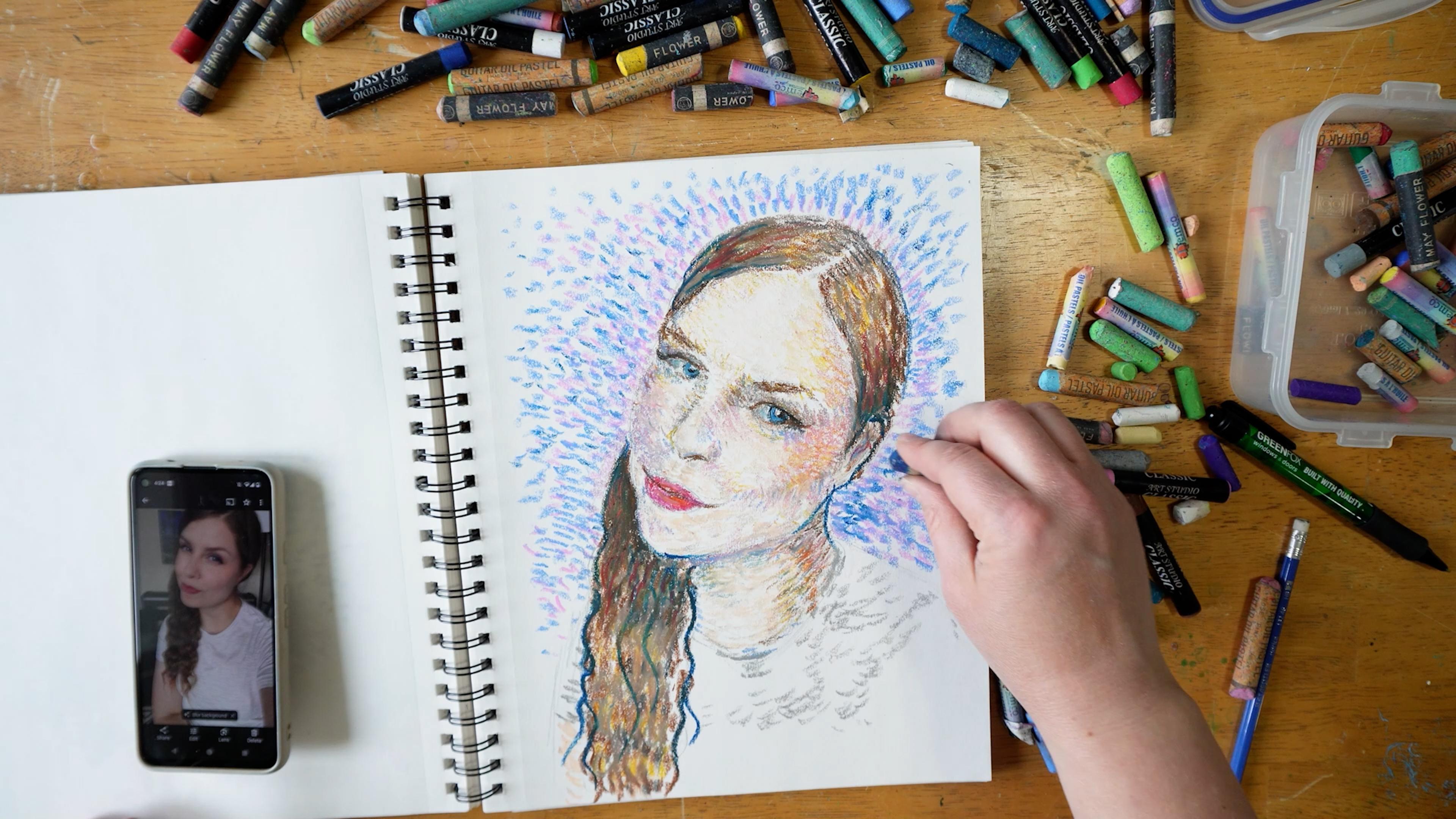
10. 1887 Self Portrait Part 1: Alright, let's begin
our third exercise, studying Bango with a portrait. Now, you can use this portrait, or you can use a different
one if you'd like. You don't have to use the
same one that I'm using, but feel free to follow
along with this one. It's from 18 87 self
portrait is the name of it. Just no fuss kind
of title Love it. Just self explanatory. When you hear the title,
you understand what it is, even with Starry
Night and sunflowers, just pretty simple.
That's what it is. But there's I think more
that we can find from it, but I think it's interesting
as I like to create all kinds of creative names
for my art pieces at times. So I think it's
interesting to just have, here, this is what it is. So I'm just going to sketch
out the piece first. And with portraiture,
that can take a little more effort than
it did for the landscapes, like I mentioned, So I'm using all the tools that I
have in sketching. So I'm going to use my pencil in different ways in terms
of how I hold it. And because it's nice and long, I can use it to help me
know what the angles are. Now, if you're really
struggling with drawing, maybe try some drawing
classes first. I do have some drawing classes
and then get into this. Or you can find coloring pages to just color in if that's
what you're interested in too. So I prefer to practice the drawing skills and have
those further develop. So I really encourage
you to give it a try, even if it's not perfect, and mine certainly isn't. Give it a try because the
more you practice this skill, the more your hand
will understand what the brain's
communication with it is. It's getting used to that. And obviously following
not just randomly drawing, but understanding,
practicing certain skills, like just getting the distance of things, the angle of things, practicing shapes, if you
really don't know how to draw, practicing shapes is huge. That will take you so far. So that's something to consider
is really give it a go. Take take an extra 10
minutes before diving into the medium and practice
your drawing skills. Look at the shape
of things in terms of objects that are familiar to you that
you've drawn before. Do you see circles? Do you see rectangles,
triangles? I see a triangle when
I look at the nose, but I also see some I imagine it in its three D
form in some sense so that I can try to create that shape in a better way if I give it enough space to be what it
is is part of the key thing. Measuring the
distance, if you see from the farest
side of the head, like the outer sides,
what is the center? What's in the middle of
that? That can help you in drawing just to
identify those things? Like where is the center? How far down is the ear
compared to the eye, you know, so establishing some of those points can really help you sketch it
out more accurately. And once you get it down and you feel pretty
confident with it, then you can go in
with your medium, but do take the time. You know, take 10 minutes. Or longer, if you need to, but this isn't going to
be a finished drawing. We're going to draw things, and then we're going to
use our medium on top. So just remember that.
This is the sketch part. But having said that, you also want to give yourself
the best start possible. When you can start
it out really great, then you can continue then you have a good head
start when you're starting to actually put in the marks with in my
case, oil pastels. If my nose is out of place, and I've already started
placing my oil pastels, I'm not going to do so well. So you can see that I'm holding my pencil in a different way. You can try this method. There's other ways to
hold a pencil as well. But this one offers an interesting advantage in
some ways for certain shapes, and also just in terms of filling in
areas really lightly, like when I'm
filling in the hair, if I hold my pencil
perpendicular, like how you might write, Which we don't
technically, typically, people don't write with
a 100% perpendicular, but we don't want that. We want to give ourselves
the best angle possible. And this is just something
to try if you haven't yet. So I'm just filling in,
especially because I've got all this facial
hair to deal with. And all of that. So I am implementing
some total values. It doesn't need to be
perfect in regards to that, but it's just helping me
understand for the future. Like when I start putting
in the oil pastel, I know what point of reference I'm referring to when I do that. So you can kind of
see how I'm holding my pencil over the image, my reference image, and
then bringing it back. And onto the paper. And I'm using my
finger to smudge a little bit or make
some erasing marks. Oh, that's an interesting
thing to say. Make some erasing marks. And you can draw with an eraser. And for me, getting the eyes is one of the
most important things. I mean, you could
have great eyes, and the rest can be horrible, and it's going to
not look great. But getting the eyes wrong
and having everything else great is just
it doesn't work. So just everybody
looks at the eyes, and having those
correct can really help the rest of the
image function well. So, as you can see, I am taking my time
to complete this, and not worrying
about perfection, but would like to get a
semblance of the real thing. I am trying to get it
more realistic looking, and this time without
using a grid, which I'm not against
using a grid, but I would like to try
and practice the skill. It's a good skill to have.
And if you can draw quickly, without using a grid, hey, save yourself some time. I want to make sure I
get that nose shape correct with the nostril. There's certain
areas that are just hard to get right because we're so we know what a nose
looks like in our mind. We know what what
its function is. But that's part of
the problem, too. We don't necessarily see it in the shapes that make up a nose. We think of a nose
a certain way. And we've probably
practice drawing them as two parts of a triangle, like two sides of a triangle. You know, the dirt, dirt. Looks like an that
has a little bit of a more acute angle. But so that's just
something to think about. But bringing the forehead in, making sure you can
see I'm kind of sectioning things,
making measuring. I'm using my own
measurement skills here. So if you use something
that doesn't change, I mean, my fingers can
easily creates an error. But if you have something
even part of the pencil, where you can use a
measurement of it, maybe it's the back
end of the eraser. Maybe it's the metal part, maybe your pencil has
little lines on it. You can use that
as a measurement and see how much you know, spaces between the bottom of the chin hairs to the
nose to the eyes, kind of see how far
that is on the image. And then that can help you get better proportions on
your drawing as well. So you just use that. And then obviously,
my drawing is bigger than the reference image. So you have to scale it
up to what you have. But you just use that
in terms of, let's say, it's the same distance from, you know, the chin is the
same distance as the nose. Then you can use that length
as your little measurement. It's a really good
tool for drawing. And also using the pencil
to get the angles, correct? If you hold the pencil over
top of your reference image, you can see what the angle
is and then bring that over and mark it
down on your page. Now, one thing with
my particular medium, I'm using with so much pencil, how I'm adding bits of shading and just the way I
sketched this on. It's going to muddy things
a little bit for me. And I'm just testing
it out anyways, and I'm just going
to see how it goes. It looks like this piece was
created on a tinted canvas. I could be wrong, but it looks
like it's on some kind of beige type of canvas or it had maybe a wash
on it beforehand. So I feel like having
dirtied my page a little bit with pencil
marks isn't going to affect the result
in a negative way, but it's worth noting, depending on what medium
you've chosen to do. Just don't want something
that's going to bleed into it. So good to review and
see how things are, and if it's the way
you want it to be. Just step back for
a moment and say, Okay, did I put things
in the right spot? And if it's really off, then now's the
time to change it. Don't wait till you've started
putting your material on. And I decided the eye was not
quite in the right place. And so I needed to move
it in a little bit. I kind of use smudging to
kind of erase a little bit, but it doesn't always work. Mark, indicate anything
that will be of use to you for your chosen medium. If you feel like you, you know, a simple sketch can do it, then don't need to add more. So we're just about to get into the actual adding in the medium. So we get in her
sketch down, finally. You did it. Yes. Good job. I hope you gave it a try
sketching in this manner, and that you are happy
with your outcome. We'll see you in the
next part of the lesson.
11. 1887 Self Portrait Part 2: Let's add some color. So let's get out our
medium and pull out the colors that go along
with the reference image. So have that reference
image nearby zoom in to find the right
colors that you need, and start going for it, start using scrap paper
to make note of it. Might be nicer than
just making marks in the sketchbooks next to the
work that we're creating. But at the same time, it doesn't bother me because I
know this is practice, and this is just you know, in my sketchbook, I'm
not worried about that. So depends on what kind of
sketch book you want to have. Maybe you can just
have a sketchbook, a separate sketchbook,
just for making marks in. That's what you want. You
could totally do that. That actually could be
pretty interesting. So I'm just going to keep
the ones that I want. Now, I'm trying to
find ones that I want, and it's just too difficult
in this little container, so go to dump them out. But if you're doing
something like that, just make sure you don't have carpet on the floor or anything like that
that might get ruined. So be mindful of that. And I have you know, a vinyl flooring, so I'm
not worried about it. And I'm just going to keep
finding and selecting my colors in this bit of a
mess that I'm looking through. So you can do the same. Mx up some colors if
you're using paint, and we can get
started on coloring. I'm going to start
with the eyes. And what's really cool
is he has green eyes. So I'm going to grab some green. I love the way that he
uses color in his pieces. And the expressive mark making just gives
it this emotion. So one thing I'm battling when I'm trying
to get this bright, if I want it to be bright green. Now, when I look at
the reference images, not really that bright, but sometimes we perceive
things to be a bit brighter just because we're looking at that one little spot. But I want to try and get that to be a little
bit bright green and then using a bit of a teal
around it for accenting it, and some black that I was
adding in to start the process of kind of
blending the shadows in. We're going to start
getting the color in there. When I find a color,
I think might work. I'll start inputting it. I'm starting with
this gray in the hair and just finding places
where that color fits, and then swapping it out when I feel I need to switch things up. I didn't do a lot
of preliminary, you know, blending for
this particular piece. I'm going a little
bit with the flow, but we just did two pieces, so I feel a little
more confident in some of my mark making, but also in my decision
making for color blending. You can gain confidence in the first exercises and feel
a little bit more free. And that's why I suggested, if you don't want to do
this particular portrait, he has other portraits you
can follow along with. But if you're still at a stage that you need a
little more guidance, feel free to follow along
step by step as I go. So make sure you take a
look at the direction of the lines that he
creates in his piece, and see how that flows with
different parts of the face. And this is going
to help you when we get to our final project. And just thinking
about how you can use this for your own
projects in the future as well by moving making the
marks in the direction, kind of like cross hatching, that type of thing
when you're shading. So it makes a lot of
sense to do it this way. If I did them in the
opposite direction, it probably wouldn't show
the shape of the item. It gives it an understanding of of three D effect and kind
of where it actually lives. Is it, you know, sunken in, or is it
kind of bulging out? You know, as the nose, especially around the
nose, around the temples, you can see at
directional line making. And so make sure you take
note of those things. Try to be very observant. And as you can see right here going into the ear and then
now into this chin area. The ear, especially,
I had so much of that pencil that it's causing a little bit of
muddying up of my color. If you did want to avoid this, you could erase those marks
and just leave a fine line Where you're, you know, sectioning off things like
the chin and the ear, and then add in those
details with your pencils or your pastels or your paints or whatever medium you're using, that
kind of thing. So I'm just going to
keep making marks, adding in the colors
as I go, slowly, but surely creating the tones and the transitions correctly. And I kind of like how it turned out with
the pencil blending in. I know it's, you know, there's still color I need to add to it, but I do like so far what
that's kind of doing. At first, it seems like I
don't know if it's going to be a good thing, but Yeah, it might be interesting
to try it without that and erasing most of the marks, even using a netable
eraser to kind of stamp off some of that, so it doesn't bleed into
your color as much. I love adding this orange
in. It's very exciting. And it can be a bit scary, but to avoid that fearful
moment of making a bold mark, start in the least
conspicuous area. Start in an area where you're confident that color should be. At least partially confident. Start somewhere. You
have to start somewhere. So I start in the places where
it's the brightest orange and where it's obvious that that is going to
be orange right there. You know, if it's a tiny
bit of orange up at the upper cheek area,
maybe don't start there. Maybe start with
the mustache where the whole upper
lip is, you know, mostly orange or on the chin, or on the corner
of the cheek bone. You know, find the area that feels certain and
start in that spot, and that helps in any situation where you are afraid
to get started. That's what I do. And it does help because
once you get started, then it's less scary. You just keep going
with the flow. Okay, I'm going to allow you to continue working on
your piece, follow along. And as I said before, I was going to go through a more detailed history of Vango. And you can also
check out Online, more information about
him, researching yourself. You can go to the Vango Museum and and learn a lot about him. Even online, they have resources
from the Vango Museum, and that's where I acquired
much of this information. So you can get it here, and I can get it to you, and you can dive deeper
by going to that site. And experiencing some of
his pieces in person. That's what I would love to do. There's nothing
quite like seeing original art by some
of the masters. It is really mind
blowing. It really is. If you haven't
experienced it yet, if you've only seen this type
of artwork at this caliber, just online or just, you know, digitally or in print, it's not the same as seeing the original piece that you
know that artist created. It's something magical, 100%. Okay, let's go back,
before he decided to start making art and
making that his career. And you know before
really diving into this, I want to say that a lot
of artists that I've met. Maybe not a lot of them, but there's quite a few
that I've met who say, you know, art shouldn't be something you try
to do as a career. And I completely I don't
really agree with that. You can make it a career. You can decide that this is going to be how you
make your income. But we're going to have to save this information
for the next lesson. So we're going to
actually go on to P three to discuss
some of the jobs that he did prior to becoming an artist deciding
that art was his thing. So join me for P three
to get that info.
12. 1887 Self Portrait Part 3: Okay, P three, we're
diving right into the history in a
little more detail than we went in previously. So that was kind of
the quick summary. So hopefully I can
give you more in depth information and a
few things that help you understand more about
Vincent and that hopefully will help
you as you step into doing the project. And this is our third piece. So maybe at this point, you're starting to feel some
connection there with him and how he created things, and it'll be really interesting
to hear more about him. So, let's get started with
before he became an artist, he was struggling
to find a place and Religion actually
became a thing where he thought that would
be his calling. He started as an art dealer
that really wasn't his thing. He admired the work of peasant painters like Francois
Milette and Jules Breton. He became a schoolmaster, then a bookseller at 24 years, and then a lay preacher, but his contract
was not renewed. And so he's not feeling
very confident. And can anyone relate? Hands up. His brother, Theo, said, You know what? Why not be an artist, you know, or do
something with your art. You have drawing skills and you love to draw. Why
not give that a go. And he went fully in dive right in and dove
right in and just said, Yep, I'm going to be an
artist. Okay, I'm doing this. What's really interesting
to me about that is I've met other artists that one
specifically that I remember, so I'm not saying every
artist I've met says this, but that person's
belief was that you don't work to become
an artist for pay, which I think is a really
interesting thing. Whereas, most other you know, even in the arts and whatnot, if you want it to
be your profession, you work it a bit
differently than if it's just a hobby or just something you
enjoy doing on the side. So I found that quite
interesting that for Vincent, he was like, Okay, he
made the decision. It wasn't necessarily, you know, he was born into this I'm going to be an
artist kind of scenario. This was a decision he made, and he felt that he could still do God's work
through being an artist. So very interesting to me to learn that
because that actually connects a little bit with
me and some of my beliefs. So I thought that was
very interesting. So, in 18 81, he moves back in
with his parents. His parents, they're
not happy about his choice of profession.
Can anyone relate? I think our parents want
us to have security, and, you know, it's not super secure to have your
own business per se. So he worked in a
lot of drawings. He did a lot of drawing. It's really the foundation, the fundamentals of art. And if you can
hone those skills. It's a communication between
your brain from what you observe to your hand and creating that muscle
memory so that you know how to create shapes that you see
or that you're imagining, and that's really what it is. So Anyway, so he works in a lot of drawing
working in open air. So Plan air is another
word way of saying that. And so that means you're
looking at something outside. You're you're drawing it. I mean, it could
be inside as well. It's also known as
observational drawing. So it's something where instead of drawing from a photograph, now, they wouldn't
have had really access to those back then. So the things that
we have access to, you know, we have a
different life now. So it's okay to try
things differently, but feel free in your project to work in open air
if you like um, and one thing I really, really love about history
is his brother Theo. His brother Theo is
throughout the whole story. And I think, too, because he writes, they write
to each other. So we have that history and knowledge to be able to
share with the world, you know, through that writing and through that
communication they had. So when Theo receives
a promotion, and he's working
as an art dealer, which is really
interesting, too. But that might be why he
suggested that because of his experience working
as an art dealer. When Theo receives a promotion, he's doing pretty
well financially. So he tells Vincent, Look, focus on your art. I will take care of
you financially. That really touched my
heart when I heard that. What a beautiful gesture and
confidence to say something, like, to give that
kind of offer. And then, you know, Vincent has falls in
love with his cousin, who's a widow, and that's
kind of interesting. But she was not
interested in Vincent. And then there's this
artist, Anton Move. And this is Vincent's
cousin by marriage. And this person he does
not fall in love with. But Anton finds out and Anton's well known
artist does really well. He paints peasants
working in fields. It's kind of his main thing, these beautiful, you know, realistic type of paintings. And Anton Move finds out
that Vincent decided to, you know, when he
learns that Vincent's, like, I'm going to be an artist, he gives Vincent painting
lessons watercolor and oils. So, you know, it wasn't just, I have all the talent I need. I'm going to be an artist.
I'm an artist. Here we go. It was I'm going to work
on the skills I need. I'm going to work hard every
day, creating, creating, creating and getting
the inspiration, getting the support,
getting some support. You might only have one
person supporting you. The parents aren't
supporting him. You know, but getting, you know, this cousin by marriage, that support through mentorship
there is very helpful. I'd like to find
more of that myself. And you can find that here. Myself as your teacher. So I hope I can offer
some of that to you. And that's partly why I
enjoy doing this teaching because you're able to share knowledge that others
may not have yet, and help them grow and learn, and seeing them flourish
is so exciting. Anyways. What's really cute
is his first paid commission. So it's not that he never
sold any art, okay? It's just he wasn't
as successful yet. I think if he lived longer, he would have seen the success. That's my belief. But his first paid commission
was from his uncle. It was 12 drawn
cityscapes of the age. This is a good practice
in perspective for him. And then he was, you know, he fell in love with
this prostitute. Who already had a child
and was pregnant. You know, Vincent's life choices sometimes are questionable, but I think we all
make mistakes. This one's a little bit strange, but it was Vincent's
model and his lover. So that was in 18 82. They were together for
a year and a half. He was determined to
take care of her. You know what? It shows the kind of man that
he was, you know? Then he realized, you know,
she was too far gone. You know, you can't
change people. You can't live your
life like that, and, so that ended. So Vincent gave Theo paintings to sell in the art dealership. Theo said, Hey, come
on, let's try this out. But unfortunately,
nothing came of it, because Vincent's
paintings were too dark compared to what
was popular at the time. You know, if you think
about some of the bright, happy kind of feeling
paintings by some of the impressionists that kind of had this romantic
vibe to them that, you know, idyllic kind of lifestyle and
that kind of thing. It just wasn't what
he was offering. So he would live with his
parents until his father died, and then he lived in the studio. And then he spent
a short time at the Antwerp Art Academy, and he would never return to
the Netherlands after that. He spent the rest of his time
in various areas in France. And he found the
drawing lessons at this Antwerp Art academy
to be too traditional, so I thought that
was interesting. So he went to Paris and had lessons in Fernet Common Studio. So 1886-1888, he has the, you know, switch from
these dark, you know, paintings to like the
potato eaters of 18 85, to these light, you know, paintings like the Hill of
Mont Mart with Corey in 18 86. So from just one year, you know, a lot of a big change. So it was in Paris that Vincent developed in this time period, his own recognizable style
with the bright colors. But after two years in the
city, it was too much for him. It wasn't inspiring anymore. So Theo, being the manager
of art dealership, introduced Vincent to the
work of Claude Monet. He also got to know
Henry D Talus Latrec and Emil Bernard. So these, you know, successful artists that
he was learning from and being inspired by and
that impacted his work. That helped him change from
works that are popular, like the potato eaters, to, like I said, that the Hill of Mont
Mart with rey 18 86, they were lighter tones and just more fitting for
what was kind of, I guess, trending at the time. But he developed his own style with these short brush strokes. And that's kind of what we're
working in here, right? These brush strokes that are visible in these
short kind of dashes. And his subject
changed to cafes, boulevards, countryside,
flower still lifes. And he tried sellable
subjects, such as portraits. So he was trying to make
a living as an artist. And I commend him for that. That's what I'm doing.
And so I appreciate that. And I feel like there's nothing wrong about
that. It's honorable. And, you know, he was like, I'm willing to create subject matter that is
of interest to people. But he still had his style. He still kind of
stuck to his style. And like I said earlier, he was inspired by
Japanese woodcuts. Him and Theo collected them. And so you would start to see, like these contours that
influenced Vince's style. So it's really neat
to see that it was from something that
he was interested in, not just a random occurrence, but something that he was
interested in that influenced. So from Paris to Provence. So he moves away from the hectic life of
the city into Arles. So the South of France
is our next venture. So we'll talk about the South
of France where most of his most famous paintings
were produced in P four, where we finish
off this portrait and discuss the last
bit of his life, the last few years. And we'll see you in
that next lesson.
13. 1887 Self Portrait Part 4: Alright, in the South of France, which kind of seems
an exciting time. He's really looking forward to this He has this vision of, you know, bringing artists to the South of France
away from the city. And this is where his style becomes looser and
more expressive. I feel like he's
becoming more confident, and it's pretty exciting. He has blossoming orchards, bringing in harvest, boats, all of these paintings
that come about in this area and time
frame 1888-1889. So he tried to create a
studio of the South in Arles with bringing a group
of artists to a house, and then they could sell
this work in Paris. There's a quote by
Vincent that was from May 18 88 that says, You know, I've always
thought it foolish that painters live alone, et cetera. You always lose
when you're alone. M. I thought that was
quite interesting. And he really believed in kind
of a community of artists. And that would be
another great thing to be able to create. And I think as you
are true to yourself, and as you share what
you've been given, whether that's the ability
to teach others or the ability to inspire others with your work
or whatever it may be, and freely sharing that and not holding on to it
and keeping it hidden, you build a community. Offering others. You're welcoming them
to join you in that. And I think that's
a beautiful thing. So he was so confident in this idea and this
vision that he had that he rented what is
known as the Yellow House. And he rented four rooms there. He anticipated more artists
that would be joining, but unfortunately, only one did, and that was Paul Gogan. So then becomes a struggle with we enter the struggle
with mental health, and I'm not going to assume that up until this point he didn't have any struggles with that, but this is where we
see that more obvious. Also, let's just go
back to this piece of art at the moment
and acknowledge the fun clothing
that he's wearing and notice how when
you have the close up, close together marks
that are lined up, how that really gives a sense of what the article of clothing is versus
those kind of loose, more random parts that kind of try to give you the sense of what type of fabric it is. Okay, back to the mental health. So what's interesting is they were quite
different artists, Paul Gog, if you know
any of his work. He worked mainly for
memory and imagination, whereas Vincent preferred to paint directly
what he could see, and that caused tension
between the two of them. So Gogan threatened to leave, and that created a lot
of pressure for Vincent. And this vision that he had,
you know, it's about to, you know, explode and and end. So he threatened
Gaugin with a razor. This is a really great way to
keep people in your tribe. Later that evening, he
cut off his left ear, wrapped it in a newspaper
and delivered it to a prostitute in the nearby
Red light District. Okay. Yeah, you've got issues. So he was admitted to
the hospital in Arles. And Gog left Paris. Surprise, surprise. That
didn't entice him to stay. So he was out of the
hospital in 18 89, and he was painting again. His mental health
was up and down. You know, he was afraid. So he admitted himself. So
that's really interesting. He recognized that he was struggling and to the point where he was able
to admit himself. So I admire him for that. So he admitted
himself to St. Paul D Mosel psychiatric Institution in St. Remy. And that was in May. And he was there for a year, and he makes 150
paintings in a year. I don't think I've ever made 150 I don't think
up to this point, I've made 150 paintings. So shame on me, because in one year, he did 150 paintings.
That's incredible. Despite that illness,
he continued to work. So from February 18
88 to May 18 89, he makes a over 180 paintings. It's incredible. So he copied prints by artists like
Rembrandt and Millet. And Like, we're doing now. We're taking some of the grades and working on making
art like them. He painted in the
garden, and for a while, he was only allowed to
draw because he was so confused that he ate oil paint. So he was clearly struggling
with issues of the head. His brother, Theo, in 18 89, married Johanna, and they had a birth announcement
in January of 18 90. They named their
son after Vincent. So you can see that Theo
and Vincent had a bond. And so Vincent creates a painting for him
called Almond Blossom, and it is one of his
most famous paintings. It's a beautiful, happy
kind of feeling painting. So six of Vango's paintings were shown in Brussels in 18 90. And one painting sold. It was the red vineyard. So that's pretty exciting. And, you know, sometimes things
start to take off, right? Maybe it just takes a moment and things start to
move forward, right? But we're talking 18 90. And as we know already, he didn't live past 18 90. So it was just as things to me, he was starting to get there, and it just He just didn't have enough time
to get there, you know? In March of 189010 works
were on display at an annual exhibition of the Salon Des en Ds
pardon in Paris, and he had very positive
reactions to his work. So this is what
leads me to believe that he was on his
way to success, but the mental health issues he was dealing with were just too much, and that
breaks my heart. Really does, because Probably
all of us have somebody in our lives who struggles with mental health or
died by suicide. And it's a very difficult issue that if you personally
are dealing with, there are resources to consider
and not just consider, but if you are
really struggling, there are people
around you to help. So I encourage you
to get the help you need and don't be alone in this because we're
not meant to be alone, just as Vincent
was saying, like, how artists are meant
to be together. I think that's pretty
insightful advice. The last months of his life, he was in A Curse, a village near Paris. So it was in May 18 90s
that he left the asylum, and that's when he moved
to that small town. It was peaceful, quiet, but still close to Paris, so he could be close
to his brother Theo. There was a doctor that
was keeping an eye on Vincent's health
named Paul Gachet. He was an amateur
artist, Paul Gachet was. Some may say that
Vincent was also, but no, we're talking
about Paul Gach. He encouraged Vincent to
focus entirely on painting. And at that time, he made
almost one painting every day. That's impressive.
That's something to try and live up to. But early in July, You know, he visited Theo, and Theo was considering
resigning from the art dealer to start
his own business, which was a financial risk. And remember, Vincent was being taken care of
by Theo financially. So that added worry to this whole mix of everything
else that you know, Vincent was dealing
with in his head. We can't fully
realize what that is. So he was worried. So
he returned back to O. And regardless,
like Theo and Joe, they really tried to
reassure Vincent that, you know what? Things
are going to be okay? Like, we're still
going to support you. Don't worry about it. Unfortunately, soon after that
return, he took his life. He shot himself in the
chest with a pistol, Wounded, returned to his room at Rav inn where he was staying. And Theo hurried
from Paris and O. He was there when his brother died of his injuries on July 29. And that gives me a little bit of comfort that his
brother Theo was with him. Whereas the shortened version, we just get that, you know, he was in a field
and shot himself, to know that, you know, well, it's quite sad that in a
way that he had to suffer, but, you know, knowing
that his brother was able to be there and say goodbye
does offer some comfort. And so he was buried in
O on 30th of July 18 90, and he left behind
a large number of works of art, as
you can imagine, more than 850 paintings, almost 1,300 works on paper. Sadly, only six months
later at 34-years-old, his brother Theo dies. Nervous breakdown, syphilis. There's questions about that. Vincent's paintings then are in the care of his wife, Joe. And in 1901, Joe remarries, and she remarries a painter,
Johan Cohen Gaslhak. And Joe dies at in 1925. The paintings are then passed
down to the son Vincent. Who loans the work to
a museum in Amsterdam. And this gains popularity. His work is gaining popularity, and they're loaning this work. And it just increases
in popularity. And as you can see,
now to this day, some of the works have sold
for millions and are just, you know, he's a very
well known artist. It's just an incredible
story to me. And, you know, it's
quite heartbreaking. I was quite It kind of
brought me low a little bit. But at the same time,
look at what lives on. He left this legacy of work
and these things that we can learn and apply into our work and not just
the works that he made, but the way that he
approached being an artist. Like, I'm going to be an artist, and so this is what
it takes to be one, and I'm going to work at it. And here's a quote by
Vincent on 25 October 18 88. Can't help the fact that
my paintings don't sell, yet the day will
come when it will be seen that they are
worth more than what we put into them
for the paint and my altogether very
meager livelihood. That was something that he
wrote to his brother, Theo. So very interesting,
very I don't know. You let me know what
you feel from that. I think each person's gonna have a different experience
hearing that story based on your own
perspective and the things that are happening
in your life right now. But my thought is that
we can always take the lessons from others' lives and their artwork as part of it. So I hope that this
has helped you to see more than just the artwork, but the person behind that. And that this will help you as you step into your project, which is coming up next. Yeah.
14. The Project Demo Part 1: Okay, it's time to
select the project. What are you going to choose? You have landscape,
still life, or portrait. Which one are you
feeling like working on? Go with your gut. Maybe it's something you want
to practice more of. Maybe it's something
that interests you. Maybe you have a specific
subject in mind. Maybe you want to take what you learn from and do
something kind of different, like an animal's
portrait or something, you know, a dog
portrait. Give it a try. It could be really interesting
in the style of ang, especially with all the fur. So you don't have to stick
within those genres per se. You could even go
into cityscapes. He did, you know, the cafes, boulevards, types of thing. Maybe a city city scape. It's exactly what I just said. Maybe an ocean
scape, a sea scape, that kind of thing, like, find a genre that is of
interest to you. I love the idea of
something kind of in the everyday life
type of scenario. Is me with a selfie. You can use a digital
image, like I am. It's a little hard for me to
use a mirror while filming. I guess I probably could have figured out a different setup, but I wanted you to see
what I was drawing. So it's kind of maybe I could have figured
something out. I'm creative. Come on. But select something, find
something of interest, and whether it's a challenge or just something you love to
draw and you've drawn before. I could even be something that yeah, you've drawn frequently. It's something that
you often create, maybe you're kind of known for, and you want to try it
in a different style in this Van goo style. So that is another
option as well. Sketch it on, whether you
want to create a grid, whether you want to practice the same way we've
been practicing, just using the pencil as a
guide, you need to decide. And you can erase some of the pencil marks
or keep them in, depending on whether you liked the outcome of what happened
in the previous one. The previous three exercises.
We learned from those. Now it's time to step
up and take flight. This is your time to make
it your own a little bit, and that doesn't
mean you have to be perfect at it or
anything like that, but it's time to take a little bit more ownership in terms of selecting
the subject matter. And then how are you going to use the tools that
we've, you know, worked on to make your
piece successful for you, whatever that looks
like for you. Going to start out a
little strange looking, and I find there's always strange parts in when
I'm working on my art. There's certain
moments that I'm like, this is horrific looking. It's kind of creepy. But that is just
part of the process. You just need to keep
that vision alive and understanding that
it will get better as I apply my practice. The things that I know,
the things that I've learned because right now we've just got that
single layer down, and I'm decided to kind
of start you know, not finish an area and then
move to the next area. You know, I'm adding just a
win won base layer of skin. Now adding some
color in the eyes. Now I might finish a section, like if it's a small section in the eyes or that
kind of thing, but I might leave some of
the details til a bit later, especially when
you're working with something that messes
up your fingers, your hands, and you don't want to smudge that in the
wrong area, right? So that's something to consider, like, adding the
black right now, Mmm. I wanted to blend
is a good idea, and if I don't want it to blend, I might might be smart to wait till closer to the end to
add those kind of details. But let's get that hair started. And with this method, sometimes it does feel like, Oh, this is taking, you know, a long time to fill this in. If I could just do one long
mark for each hair strand. Maybe it be faster, but I want to follow
the techniques that we used and that we've learned from Vincent and see what I
can create that's different, new, exciting, and challenging. And sometimes that
can be exciting too when it's challenging because
you're learning new things, and you're growing as an artist when you learn new things. So first, I started
kind of just putting it anywhere in the hair a
little bit systematically, but then here I really
start following a system because I
want the hair to have that kind of rippled effect that I have in my
reference image. So I've started that
and then I don't want it to look like
a zebra, either, so I've starting to add some other lines in there
to make sense of it. And because his style has
that contouring look, I can have that in there, too. So it all works out when you follow the system that
you have in place. Create the system, follow it. And then it can work out. And if it doesn't work
out, that's okay, too. It's just a practice. It might not be your favorite of all the pieces
that you created. That doesn't mean
you're not making progress. Just remember that. Just because you make a piece of art that doesn't feel
like you're best, it's not necessarily going to be every single piece of art
is better than the next. Hopefully, we have progressed,
like, over the years, if you keep working
at it and keep learning new things
and practicing new techniques that are
shown to be successful, and putting those into practice, you will see growth. You will. So you just
got to keep at it and take what we've learned from this incredible
artist Zenvango, because No one can say
that he didn't try. He really tried. And for what? Barely ten years. That doesn't seem
like a ton of time really to become a truly
professional artist, and yet he had already seen some success
right near the end. He just needed a
little more time. So going to honor honor
him while I create this. And as I was creating it, I couldn't help but think of
the song, Star Starry Night. It just went on
replay in my mind. So hopefully, you're
having positive thoughts about what you can become
and where you're at now, it doesn't, you know,
necessarily mean too much from where you can
become, where you want to go. Whether it's just, hey, I'm happy to make
art as a hobby, and I don't really want to make it my
career. That's fine. You don't have to
make it a career, like Vincent wanted to. So make it you make your
own decisions with this. But it's fun to learn,
and it helps us to grow as we find out what works, and then put that into practice. And see the growth
happen over time. You will find it easier to do this kind of sketching
if you stick with it. If you don't try it, it's
not going to happen. And if you don't experiment, you might just stay the
same with your work. Even if you make
lots of paintings. Remember that Vincent did take art lessons. He had mentorship. He had collaboration with other artists in
terms of, you know, discussions and that inspiration of just being close to
them, seeing their work. I know I'm inspired by that. So this part is a bit
fun because I'm adding in this golden
tone into my hair. And then I can add in
darker tones over top to get that more realistic look of the color that I'm going for, but adding in that
highlight gold really will help when I want to add
in some darker tones, and don't be afraid to
add in color on the skin. It can really create
a dynamic skin tone that looks more realistic because we think
it's just one color. But when you look at all
the shadows or your look up pixelated image of face. Every pixel almost
is different color. Like, you have obviously repeats of the same
color throughout, but you don't just have massive sections of
one single color. So that's something to keep in mind if you've never
seen that zoom up on an image that you can get
to the pixelated portion of, if you have, like
photoshop or something, and it's quite an
interesting experience. And this is starting to
come to life for me as I start adding the blues
and the pinks and yellows and really finding those moments where
the color ought to be.
15. The Project Demo Part 2: Welcome to part two of the
Project demonstration. Of course, yours is going to look a whole lot different
than mine because I'm assuming you're not going to be creating myself portrait, but something that is
meaningful for you. So congratulations for
making it this far. I hope that you worked on something that
is meaningful for you, whatever that may be,
and that you're willing to expand your
horizons through this. And I think just by
taking this class, you've already set in
your mind to do so. By studying the life and
the work of Vincent, it's been an interesting journey
and enlightening for me. I think there were
things I knew that maybe I just either didn't
listen to when I was, you know, in art history classes through the years, or you know, I just looked at the art and didn't
think about the person or the time that they were alive or the place that
they were living, you know, to have so many artists
that we see as influential, you know,
impressionists, for me, have always been some
of my favorite artists. I also love the work
of Renoir and Monet. Be really exciting to create more lessons to
studying the masters. So this is just the start
with this Vincent piece, and I hope that there's
something that you even if it's one thing that you've learned that will influence
your art going forward. I think that's going
to be powerful. And sometimes we
know of one thing, but we're influenced in ways
we don't realize fully. So that's why it's
important to, you know, be very intentional when we're selecting media
that we're watching, and the things that we're consuming for our brains, right? That should be
intentional just as we should have some intentionality
when we're putting what, you know, consuming food,
that type of thing. We what goes into our
brain will affect us. So just by watching this class, there's going to be
things that influence you that you don't realize it until maybe later on you'll realize it or
maybe you never will. And that's okay. But
Our brains are smart, and we don't always
have to be fully aware of everything
that's happening. That could be very exhausting. So we can take in things
without realizing it. So here's where I left a
little bit of space for myself to blend the skin around the
eyes before inputting this, you know, eyeliner
type of scenario. And and all of that. If I had put this in first and fully developed the eye
and then worked around it, I might end up having smudging
or that kind of thing happening in areas where
I don't want it to be because I tend to wear
an eyeliner that's very, you know, precise
type of eyeliner, not like a smudged
look eyeliner. So that's what I see, and I'm going to
paint what I see because that's how
Vincent painted. And a selfie is kind of an
everyday type of thing, especially in our world now. So I wonder what they
would say looking on us now with a the technology we have and how
we use it and how we create art similarly
and differently. And what he would
think about us, using him as a study
point as a reference for his style and
his body of work. It's kind of interesting
to think about that. And Another thing I found interesting as we're getting close to
the end of this. I'm, you know, pondering
my experience and all of this is just even using a material that I don't
use very often to create these studies and to create this examination of
somebody's life in this study. It's an interesting process, especially not having appointed, you know, I like to work with brushes that have
more precision. And so this is forcing
me out of that, which is really a
learning place to live. And that's where learning happens, that's where
growth happens. You know, if you want to grow, you kind of have to get a little uncomfortable and try something
you haven't tried before. If you Always stay in
your comfort zone, where are you going to learn, where are you going to grow? It's those moments for
me when I think back to my like all the experience
I've had so far in my life. It's those moments
that have been most uncomfortable that have
taught me the most. So I tried not to be too upset
when I'm in those moments, or I have those opportunities, and I'd love to get
to a place where I'm even almost welcoming them. Here's something.
I don't know if you do this already
with your art, but I want you to
think about eyes, and we think of the whites
of the eyes being so bright. But in reality, when
you look at the piece, the brightest point
is the shirt in areas of my shirt in the
reference image. White in my eyes,
there are highlights, but it's actually
not a bright like, I'm not having like light coming shooting out
of my eyes, you know? L so that can really change the realism of your piece is to be able to look
at it differently. And if you're struggling with
that, and all you see is, I see an eye, I see
lips, I see this. Instead of shape, instead
of color, instead of tone, try turning your piece
upside down or on its side, try different
directions that force the brain to look at
things differently. And that will help
to push to turn that off because we don't
see faces upside down as often or
from a sideways. We do see some sideways, but upside down, definitely
not as frequently. So it's a great exercise to try. Even if you're pretty sure
you're good to go with it, you've got things
down pretty well. Try flipping the upside down and see where things are
not quite right. And or just give
yourself some space. Put it away, come back to it later the next day, a
couple of hours later, take a break from it when
it's not in your mind, because when you
come back to it, you're going to
see what's wrong. As right now, I'm seeing it. I'm seeing the angle that I put the head on
isn't quite right, and that has messed up
some of the other points, especially when you're
using certain points as reference to other
aspects of the piece, that can really mess it up. Here's where I get
really excited. Adding that teal into, like, the contouring
of the teal, It just adds a layer
that was missing, and it makes it really exciting. And just see what happens when I kind of create this
contouring with it and the deepening
of those areas. There's that curl
getting in there. I got to have a few strays. It's not perfectly affed. And just a bit chaotic with
some of those squiggles, but that's what I'm going with. And so it's really fun to add
some color where you think, maybe there's not color here. But it just felt too sometimes a brown can feel too bright, and so by adding
another color to it, already takes away
some of that vibrancy. If you've never realize that, give it a try, practice
mixing more colors. How can you make a
bright color a little bit duller or a duller color
a little bit brighter? However, when you
when you mix a color, it's going to make them a
little bit less vibrant. But if you have kind of a dull color and you add something
really bright to it, it can help with anyways, like the vibrancy
to some extent, but it's not going to get it to brighter than the colors
you're using? Definitely not. So we're approaching the
end of this piece now. We're almost done. We got to
add in a few details here. As you can see, I'm
adding in some reds, and I'm going to have some
fun with the background. So select what kind of
background you want, whether that maybe you've already done the
background, actually, but whether you want it to be
kind of a more smooth one, I'm following a similar
pattern to what was done in the portrait
that we followed. But you can certainly
play around. I feel like I could
have added even more to the background
and had more fun with it. And who knows? Maybe I'll try another Vincent Vango inspired piece with a different medium. So now that you've
tried it, you know, the three exercises
and now this project, now it's time to see how else you can utilize these skills, these insights into your
work, and your life. What can you learn from it? How can you make it better
or make it your own? We don't want to fully copy, but what are things that you love And how can you
incorporate that? I in other ways I
think also about how can I be part of an
artist's community and, you know, support like, in
ways that I'm not already doing in new ways within,
you know, in person. You know, I often paint alone. I don't usually
have an audience, but maybe I can connect that
more in this digital age. You know, people are going
live and that kind of thing? Maybe there's opportunity to expand in that way
and take that leap, which is a little scary. But here it is The final piece. The finished project. Don't forget to upload it
to the student gallery.
16. Congratulations!: Congratulations for making it
to the end of this lesson. Give yourself a little
pat on the back. You deserve it. Gave
yourself a little rewards. You accomplished. This lesson. Well done. Thank you so much for being part
of this class. I hope to see your
work in the gallery. And if you don't mind, just
taking a quick minute to submit a review for this class. It really helps me
know how well I did in what areas did
I do really well, and what areas can I improve? Your feedback is
so valuable to me. Thank you so much. And I hope to see you in
the next class. So we'll keep this up with
learning from the masters. Let me know in the discussion, create a new discussion
and let me know which artist you'd
like to see and study. Thanks again. We'll
see you next time. Take care. Bye now.
 Kristina (Moyor) Choy, fine artist