Transcripts
1. Introduction: How special are the pets in your life? I love my little Charlie. And that's why I want to create this class so you can depict your beautiful pets that you just love, that are part of our families. Or maybe your loved ones, pets or somebody that you want to create something for in a realistic way, you need that extra help to learn what are the skills and maybe you're interested to know how other artists create realistic images. Joining me for today's lesson. My name is Christina lawyer, and I'm so happy that you've come, you've checking this plays out and I hope that you enjoy this class together. And if you do enjoy my lesson, I hope that you'll follow me just on here in Skillshare as well as my other platforms to see more fun things that I'm cooking up in the classroom. All right, so in today's class we have a few skills that we'll be focusing on. The great thing is this class is really good for beginners. Intermediates, like whether you've had experienced creating Grid drawings or not. I think that a beginner could work on this project and succeed quite well. The few skills that we'll be learning include grid drawing. So there's a lot of ways you can draw, but one of them is using a grid and this is kinda one of those ways that really helps us take it in as bite-size. When we see an image, it can be really overwhelming to try to get all of the perspective accurate and all of these things. Well, great drawing really helps us get the perspective and the proportions accurate. So I'll help you set that up both with your reference image as well as the images you'll be working on. The next skill will be working on is contour drawing. So once you have your grids ready to go, how do you actually start getting this image onto this? An accurate, efficient way? I'm going to show you by doing a contour drawing, following the line of the image, and helping you out. I know your image might be different than mine because you're probably not going to be trying my pet Charlie, you're going to find your own pet picture to use. And then in the end we're going to use this awesome method that I didn't know for so many years. And when I found out about it, it just changed the way I created drawings forever and it will continue to change it forever. I won't go back because I really love it. It really gets that realistic feel to it, that photographic realism that you might be looking to create. How do we do it and what is this method? So this last skill that we'll be learning, I'm calling it the drawing, blending, erasing, repeat method. What I really love about this project is it doesn't require expensive materials. Almost anyone has these materials and tools lying around their house already. The combination of these methods will result in this beautiful, realistic image and you'll be amazed at what you can create. And if you thought you couldn't draw before, suddenly you've created a realistic looking drawing. And I believe that you can do it. I believe that art is for all. And I hope that you have a really fun time creating this class and that you'll end up sharing what you create in the gallery. So I can see, I can give you feedback if that's what you want. And that we can improve our skills together and share the joy in our successes. Alright, let's get started with the project.
2. Class Project: All right, So what are we going to do in this class and what does the project? Today's project is creating your pet portrait and pencil. That is the project. Why would I choose this? Well, I think it's a really good starting point in creating an image of your pet. I want to do a pet series where we learn how to depict our pet and different types of mediums. And so I thought it would be really fun to start with pencil. It's inexpensive with materials and there are lots of skills that when you learn how to draw with pencil, will help you in using other materials as well. So maybe we'll go on to pencil, crayon, watercolor, acrylic. There are different materials that we could use in mediums. But first, we need to hone our skills in drawing before we can step into those other ones with more confidence.
3. Materials : All right, So here are the materials I'll be using to complete this project and all the lessons. So I have this sketch book and it's good for drawing. That's the key thing. Whatever paper you choose, you want to make sure it is good for drawing. You can even do a little test on the paper that you have. Can you erase on it? Can you blend? Can you draw? Is it going to tear when you do so then that's not good enough. Also, take a look at the texture that it gives when you blend and when you draw on it. And do you like that? There's more smooth or textured papers you can select. I use the same paper or sketchbook for previous lesson on drawing, which was a grid drawing as well, but a different style or doing tonal values. So that's the paper I'll be using for this one. I also like that. You can tell it the pages easily to put it up into a frame if you want to frame it, or you just keep it in the sketchbook. So I like the option of having none and the coil allows me to turn it all the way around if I need to. So I do really like this sketch book. And if you're not sure about what to use, go to an art supply store and ask somebody that works there and they can help you out. We're also going to be looking at pencils. So I'm using an HB and a for B in this lesson. I've also got a three B and a to b in the image here, but I'm only going to be using a for B and an HB. You don't need these specific ones. But if you're gonna do lots of drawing, I do suggest not just having an HB, but expanding your pencil offerings, your graphite offering by getting a higher being maybe like a three before b. And then you can always get an H2 if you want. And a 4 H or just an H just for fine line sketching. But they don't blend well if you're in the ages just so you're aware. We also are going to need a blending tool. So I'm using this blending tool, but you can use your finger as well. And then also erasers. We're going to need some erasing tools. So whatever Razors you have or if you want to go and purchase something, I suggest a kneadable eraser. I love being able to shape it to whatever I want. And you can also use it as a stamp to take off a bit of graphite, but not the whole entire mount. This one here is a retractable eraser and it pumps up and I can return it back into it. And if that would be considered tractable. And it just helps to get fine lines like the fine hairs that I want to erase off rather than drawing around them and blending around them. It's easier to just erase those off. And so that's what I'll be using that one for. You will also be needing a pencil sharpener. So you want to keep your pencils sharp depending on what aspect of the drawing you're, you're completing. Especially if it's just like a fine line, that type of thing. We're going to need a ruler. So make sure that the ruler is large enough for your sketchbook paper or it doesn't have to be a sketchbook paper. It could just be a loose leaf paper that you're using as well. I like this one with a cork on the back so it doesn't slide around. If you're looking to get something. I would also like a clear one is nice too, because then you can see underneath. So this one stays kinda put in place and it's a bit easier to keep it in the right place as I'm drawing the line. And then we want our reference image printed out with the grid on it. So I'm going to show you how to do that in just a moment. Here's a recap of what you need. Now let's get started with our lesson. Find that reference photo and let's get a grid on it.
4. Reference Photo Grid : All right, Let's talk about reference images for a moment. So when you're looking at your pet, your dislike, my look, my pay you have all these emotions that come into play. And I want you to step back from those emotions a little bit and take more critical eye when you're looking at the photo, you're going to select of your pet. First of all, look at the composition of it. So when I say that, I mean, look at how much space your pet is taken up in the photo and its position in the photo. Is it off-center? Is it awkward? Alkene, are there parts of the PET that actually this isn't how it really looks to me. I want you to find an image that really clearly shows your pet in a way that is positive to you that if somebody had never senior pet before, which would you choose to show? This is my pet. Is it facing forward? Is it kinda blurry? Is that you'd have to consider all of these things. I'm also going to change it to black and white, so make sure that your image has enough highlights and low lights in it. They'll know that as soon as you turn it to black and white, you'll see, is it just kind of all gray and really light? Is it washed out and you don't see any textures and your pets for or scales or whatever kind of pet you have. Then you need to consider that and maybe get a new photo. Or maybe fiddle around with some of the settings. If you feel confident with that. If you're not confident with that, maybe just find a new picture. You can also try taking a photo already using a filter that's black and whites that you already know what it's gonna look like when you're taking the photo. Don't you love technology? That's wonderful. Since my previous grid drawing less than I discovered, there are apps. There's always an app for that, right? Harrison app that can create a grid on your drawing and then you can print it directly from your phone, or you can save it and then print it from your computer, which is what I did. And so you can create a, make it black and white, or you can keep it in color. I'm going to do black and white for this particular video. And I'm going to change up how many rows I want to have in one direction, how many columns I want to have. It's showing currently in rectangular form. So I'm going to want to select the square little button there that's next to black and white. So once I select that, you're going to see that the image changes a little bit. So it's going to cut out some of my image to make it square. So it maintains the number of rows and columns that I wanted. And there in fact, square, you do want to work with squared instead of rectangles. And you can kinda see another, put it on an angle. It's not shining the light so much. You can see how it's created a grid for me. And from here I can just save it and print it from my computer. Or if you have your printer connected to your phone, even better, you can just print it directly. And because we're using pencil, we do want it in black and white. It's just going to be easier to see the tonal variations. You can see there's some good lights and darks and that one, that one would have been a good choice. But I selected a different photo already. Here's the one I selected and it's printed. It's quite large, so I can see it. If it's too small, it's going to be a bit harder for you to see it. So print it large enough to, to use. Now we're going to make sure that we know what each column is. So we're going to label the x-axis and the y-axis. So I'm going to start with, you can start with numbers or letters, just make sure that you be consistent. So if you're choosing letters across the top, make sure it's letters across the top when you go for the next lesson. So I'm choosing letters, so also make sure you go in the correct order. A, B, C, D. Sing the song if you need to. And each one, make sure I've labeled it correctly in their correct order so that when I made my other grid, I'm not confusing things, I'm not mixing it up. And then on the other axis, I'm going to write numbers starting at the top and going down. Think of battleship, right? The game Battleship, you can. That's how you're going to indicate which each, where each square is. And then you're going to locate that on your grid that we're making in our sketchbooks or on paper if you have a loose leaf paper. So let's go with 1, 2, 3, 4, 6, 7, 8, 9, 10. So whatever, however many you have doesn't have to be the same that I have, but as long as they're squares, as long as you've labeled them one through whatever and a through whatever from one axis to the other. Before moving onto the next lesson, I'm going to take my ruler and measure just to double-check that they're square. I can see that they're square, but are they actually an inch by one inch? Just to see that I'm following. If I want to duplicate this image exactly on the same size onto my paper. So just doing some double checks here and there. So we're going to measure just one of the squares to see, okay, we've got one inch. One inch. Excellent, It's good to go. We're ready for the next lesson. We're going to get that paper out and put that grid on paper. Let's go.
5. Grid on Paper: Alright, let's get this grid on paper now. See your reference images there haven't near you while you create those because you want to make sure that your grid is the same on your reference image as what it will be on paper. So if you have 10 across and 20 down, you want ten across and 20 down on your paper as well. That's the same even if you're doing a reduced size or a larger size. So if your square inches on your page or a page that you've printed out, and then you decide to do two square inches on your paper to make it larger. That's absolutely fine. You can do that. It's, you're following the same method, but just make sure that you still have your 10 by 20 or eight by 10, or however many squares you have from the horizontal and the vertical. So you have the total same amount and that you're not doing some weird rectangular shape. They're all square. Keep them square it, we'll keep it simple. All right, I hope that helps. As well as another tip is to draw very lightly. So use very light pressure and probably going to drill this into your mind because using light pressure is really important to be able to pull away the grid layer on, because we don't want that grid visible in the end of our piece. So set yourself up for success by following these tips. So I've got my ruler out and I'm marking an inch down on both sides. Now this won't be the same for everyone. It's based on the size of the image that you've decided on. My paper just happens to be a nine by 12 and I'm doing a 7 by 10. So it's exactly an inch border around the whole piece. So I can make a mark at an inch around the whole paper and then draw a line that will be equal and it will be level with the edge of my paper. So again, on this side, I would want to do the same thing. So mark an inch from the edge and I'm Margaret marking out from the perforated edge, not from where the coils began or anything like that. But you might not be doing an inch exactly. Just find the middle and leave enough space around. That would be equal around. So it might be an inch, it might be different size. Maybe your grid even fits exactly the paper and that would be okay too. That's not a problem. The only thing is you won't be able to mark the axis on the outside of your grid if there is no border. So it would be probably beneficial to have a little bit of a border, at least just so you know where to mark your grid. But if you don't, then I would just mark my letters and numbers inside the top grid and the side of it as well, because I'm assuming there's at least going to be some space around your pet that you're not filling the whole space. Like zoomed in on their face or eyes or anything like that. And because I'm doing square inches and marking inch every inch along the side. Now, I could have done this when I was drawing my line. So if you want to make it faster, just do that. But I had forgotten to do that and I didn't want to confuse the width too many dots here and there. So if you map everything out first, then you might get confused at what dots you're supposed to follow to make the lines. So now I'm just going across and this helps to make it exactly the right size that it needs to be. And if you want to practice a little bit with your ruler to see with your ruler and pencil where the marking is actually going to be. So how much in line with the dots you need to be? Maybe just, I find usually it's just a little bit below the dot rather than write lining it exactly on it because the pencil will go just above the ruler. And very light pressure. I'm not pushing down on my paper, but I'm also not just letting it be wobbly. You want to make sure it's in control, but you don't want to press into the paper and stress out your paper before you've even begun the project really will do the same thing along the top, marking every inch and mark in every inch on the bottom. If you've increased your zone, you're doing two square inches, then you'll make it mark every two square inches. Or if you're doing half inch squares, you're going to mark at every half inch. So it just depends on what you decided to do. I'm making mine the same size as my reference image. So I'm going to do square inches. And if you're a beginner, it's a lot easier to just stick with square inches. Or if you struggle with this part of the activity, then just stick with square inches. Or you can even print off onto printer paper, that kind of thing. Print off onto, print a grid onto your paper and you can just go from there. So you can do that as well. But I just want my grid to be able to be erasable. So that's why I prefer to use the pencil and draw it myself. Don't want it to be there permanently. And just make sure you're following the right dots. If you've created a dot to mark a different part of it, just make sure you're following the correct ones and don't confuse yourself by doing the dog markings first on everything. Make sure you're doing it in a systemic methodical way so that it doesn't throw you off. Great. See, It wasn't that wasn't that hard, was it? I hope you are able to do it. And it wasn't too challenging. And we want to make sure we're following the grid exactly. So I'm gonna mark at the top and the bottom alphabet on the top, just the same way I did on my reference image. Don't want to complicate things. Now, one thing that can be really helpful when you're doing this type of project is to create a little viewfinder so you can tear out a page or just get a scrap piece of paper. It doesn't have to be any special kind of paper. This is optional so you don't have to do this, but what we're gonna do is create a little grid. So I was going to try and trace it, but it's just better to just make a square. So just draw line, start with one line and then market in away. If you're doing inch squares, whatever size of whatever size to your reference image for this one. And then I'm going to make a little viewfinder. So I'm making a little square inch window. And with that window and try and make it exactly square and not some kind of other shape, like a parallelogram. We don't want that. We want to match up our squares. So I'm just double-checking to make sure that it is exact because sometimes our i kinda throws us off and we got to trust her ruler, but also double-check. And then I'm just going to use something to clip that out. And then it just helps me to view part of the image. And I'm not trying to look at the whole image and getting confused for my mind. So you could use scissors to cut that out or use box cutters safely. And then just make sure the surface underneath that you're using is like a cutting surface. And it's better to go a little bit past the line then to go less because then it just won't cut the whole square out. So I'll cross it over just a little bit. And there we go. My little square pops out. And that's Where's my little kind of viewfinder. I could use this side if I erase my pencil lines or it can use the other side. And look how I can just get one square at a time and be able to zone in on that square. And it will just help me to focus on that particular square as, as its own identity entity, not identity, its own entity. And not worry about the whole thing at once. We get confused in our minds and become overwhelmed. This really can help if you're a beginner or you just want to try it whatever level you're at. So I can find that really helpful too, when I'm at a point where I'm not sure where to put things. So now we have all of our materials ready to go. We have our grid on paper, we have our reference image. And now we're gonna get ready to start contouring. And take note that there's some parts of my image that I might decide not to include. Like I might decide not to do the rug. I'm just going to focus on my pet itself and maybe his accessories that he has, his little bow tie and things. And now that you're all said, we can get started with the contour drawing portion of the lesson.
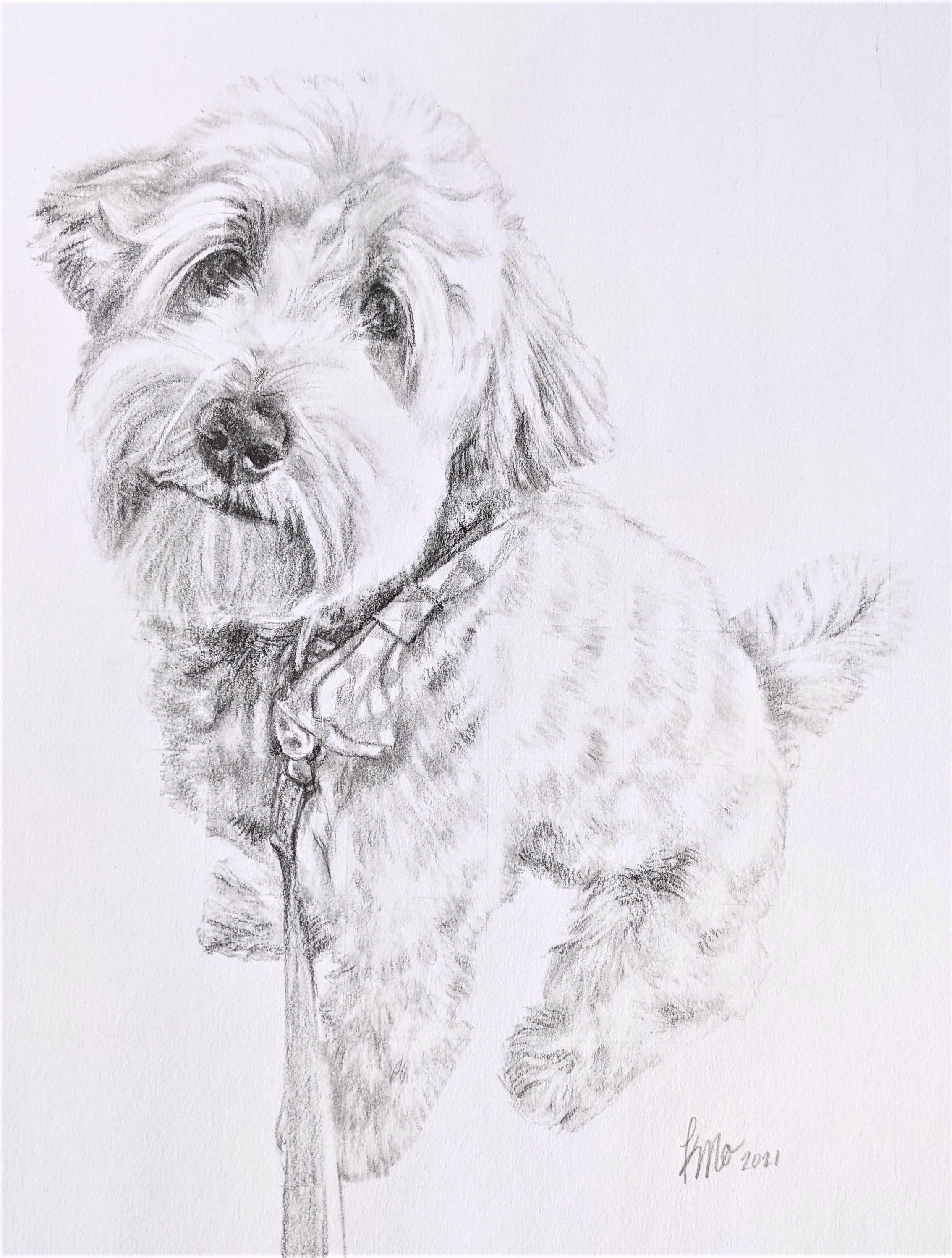
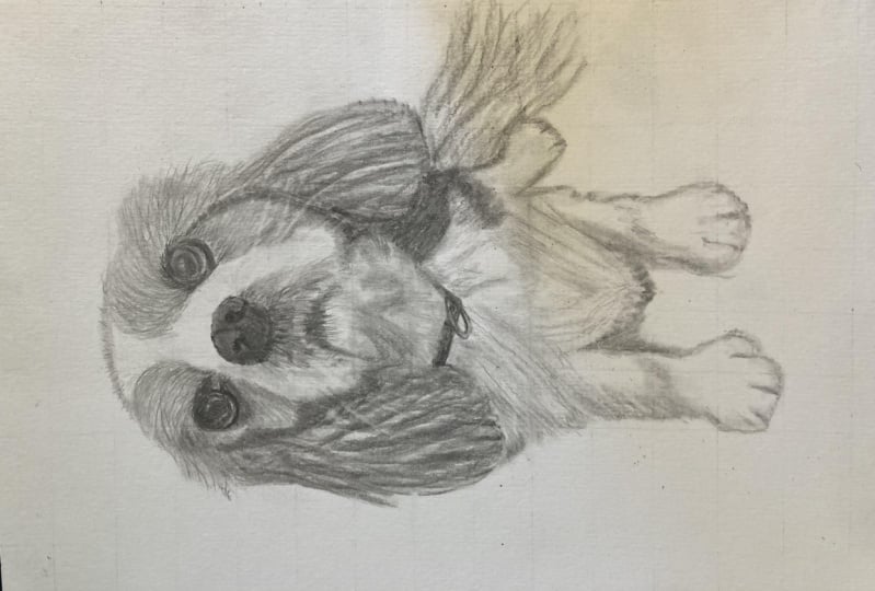
6. Contour Drawing: So let's get started. You can find a point wherever you want to get started. And I just decided to start at the top and find these little fine hairs that are showing up in C1 and try and get them as accurate as I can, just an outline of them. So think of silhouette type of thing and I'm making light marks so that I can erase easily. So just very nice and light I'm using my HB. Up to this point. I've only been using an HB pencil going from square to square as I follow the contour line. So the next one after I did see one than I did D1, and then it moves into D2. So I'm making marks along the edge lines of my grid according to the reference image. So if it looks like it's halfway, I'll make a marks that I know that that curved or diagonal, whatever line moves into the right spot so that the next line and the next square is accurate as well. And you can use the next section of each square to verify that it is in the right space. Because if it's not lining up quite right to the next square, then you'll notice, okay, maybe something went wrong in that previous square. So it's a little bit mathematical in terms of finding are kind of like making a graph in a way if you imagine it as a line. This kind of linear graph where we're thinking about the percentage of the line and the diagonal of it. All of these types of things could be seen a little bit as mathematical I think. But I'm looking at just at each square at a time, but verifying that with the following Square in connection to it. So we're just trying to outline. It's like blocking the colors when you paint or getting everything in its right place so that when we add in the shadows, we don't have to be thinking about the placement of this outer line. And this is just one way to do it. You could just look at each square, fill in the tonal values, but I don't want to have my background information. The deck, the deck really lean and the mat. I don't want to include that. So that's why I'm doing this contouring. And I feel like it really helps the next process go a lot more smoothly and it's a lot more fun. I think. Once you've finished this contour, It's just, you already see an image and it's kind of exciting to have that part complete. I do have a part of the tail cutoff. So at this point, I'm not going to draw it in, but later on, I might complete it so that it doesn't look like just a random cutoff. Just continue along. And sometimes you don't necessarily have to fixate on the letter and number of axis that you're on. As long as it is following into the next square correctly, that you're pretty calm, very confident that it is going into that correct square. Always good to double-check as you're moving around after a few squares, double-check that you're in the right spot. You really don't want to do most of the drawing and then find out that you did half of it wrong. I'm kind of using a bit of a hairy line. I call it a hairy line because, well, it kind of looks like that. Plus my image is of a furry animal. A hairy line works. In this particular image. If it was something quite smooth that doesn't have fur or hair, then you could do a stronger line. When I say stronger though, don't add extra pressure. But maybe more of a solid line than a hairy line. Something straight without an curved, but just doesn't have these little feathers on them. These feathery lines. I decided to draw in the leash. And I thought that it was fun and I didn't want to try and take away the leash because that would take away from part of the exercise. If you have Photoshop and you can remove something from Photoshop before you print your image. That would be ideal, especially if you're a beginner Illustrator drawer. If you're new to this experience, than trying to just change things in the image is going to be pretty challenging. So I decided to just stick with it to send an example of, you know, draw what's in your image. We're trying to fixate more on shapes and lines. The percentage within each square rather than the whole image as a whole. Not really thinking too much about, oh, I'm drawing upon right now. At least I'm trying not to. That's a really difficult thing to do. I feel like our brains are thinking about that. But I'm just instead turn to focus on the angle of each line, the spacing of it. How much space is taken up in each square? Is it just showing up a little bit like try and name of the percentage of it is at 90 percent. This current square is probably 90 percent for and then you have also the Strain deletion parts to it. Rather than trying to figure out what it is that I'm drawing. I'm just trying to figure out, am I drawing what looks like that square? And not using a viewfinder at this point because I'm not finding it too challenging to just follow that line. But later on I will be using it. And for now I'm just going to go around the whole outer edge of the drawing. But for my contrary, I also want to go around the head. And I will be drawing in the eyes and nose everything that kinda sets you up for the next step, which will be like shading and blending and all of those details, which is probably the part that takes the longest of this whole project. But if you don't set yourself up well right here, and from the previous point up till now, then you're going to have a lot more frustrations rather than the joy of drawing and blending and erasing and, and all of those things, getting those details in. So you can kind of see already, hey, catalogs like it. Good, good. So let's go into that beard section and continuing with a bit of a hairy line. Not totally formed because my image isn't like that. And I don't want just a solid line. I am thinking one square at a time, but I'm also putting it in relation to the other squares and lines that are being created. And it's okay to throw in a few hairs and things that are within the square, not totally outline only though contouring is mostly just an outline type of thing. It's not always a silhouette, but it is basically an outline of the piece and not the shading and highlighting low lighting type of thing. It's meant to be more of a solid line. But for this purpose, I'm calling this a contour line because I'm not focusing on the shading. I'm just mapping out the lines, the major roadways, let's say i in place. Remember to look at your image and not think, oh, this is an I because we're programmed to draw an eye a certain way, we practice it. I personally have drawn so many eyes and my sketchbooks. And so it can be difficult to switch off our brains in certain ways and switch them on in others. Our brains always want to relate to things. Helps us to remember things better. He always made puppy Charlie. He always gets these hairs that go right into his eyes. So I always have to trim his eyes very frequently. Almost it almost could be weekly trimming those eyes down. Maybe I just don't trim them down enough. But he's pretty soft and sweet. And he just turned nine months in August 2021. So that's pretty exciting. It's getting old. Not quite. So in here I have been adding a bit of shading, just minor, but it is helping me map out certain areas. So and because the face is so important, I don't have a problem with that. I don't have a problem if you want to throw in some of those markings as a bit of an outline blocking type of situation. I have my eraser on hand to fix those lines. I find curved lines can be very challenging. There's so much to it when you're making a curved line that it can be a challenge. Especially when it's just in the middle of your square. And what you could do is in certain areas, if it's extra challenging, you can make another grid within each square. So you can make in each of these squares little plus sign that makes four separate spaces. And then you would be able to further determine whether you're putting the nose and the correct space because the nose was a bit challenging. So that could have been a space where it could increase migrating and just certain areas. I would do that on my reference image and on my grid paper on the actual drawing so that I could accurately depicted. Noses are also something that I don't just randomly draw very often in my sketchbook. So I could definitely practice more with those. Something about the eyes is more intriguing to me, the noses. And that's just personal. But I think a lot of people do enjoy drawing eyes. And remember we can erase. So if you've been just fill in certain parts, then you can erase. Now as I'm looking at the nostrils and seeing my reference image goes on more of a diagonal and mine was going more straight across, so I needed to fix that. Trust in the process. Don't trust your mind too much. What you think you see, but what you actually do see. And at this point you don't really have to be shading or anything like that. We'll focus more on that in the next part of the lesson. But like I said, I was just getting a start on some of those areas. Will get his little mouth. It's so cute. Is you smiling? I don't know. It's more of a serious space. This is an after walk, sit, waiting to get inside and then be fed breakfast. So you can imagine he's eager to please by sitting like that. And he's really good. I want to take photos. I'm digging photos all the time. And I just want it capture him in so many ways. And it's quite delightful to be capturing right now, of course I am thinking about him, but just in a minor way. Still want to focus on my left-brain, right-brain. Getting the actual image depicted well. And I think I'm ready. It is a solid start. And we can get into the next section. So up next we have droplet, erase, repeat. Let's go.
7. Draw - Blend - Erase - Repeat: All right, I'm going to start in an area where there's high contrast. So I have my deepest darks in the nose and the face is pretty significant. So whether you feel like you want to start in a spot that's going to make a huge difference or a spot that is less conspicuous. Maybe fulfilling bit nervous, maybe start there. But I like having a spot where it's really contrasted. So I can work in this section, show you a bit slower and then we'll speed it up because this project took a few hours to do so. I can't show you the real time in a Skillshare length glass, but I'm going to show you all the steps you need. You're going to get everything you need to be able to successfully complete this. So as you can see, I started getting some drawing first in there so I can get some graphite onto my page and then I use my blender stick. And so this whole process, it doesn't have to be exactly draw, blend, erase, repeat every single time. But I do start with a drawing. And then when I start blending it in, I might start like go back to drawing again and then blending again and drawing, blending, drawn blending. And then maybe the reiterates. And then you repeat those processes all throughout this whole image, finding the tonal values and focusing in on the shapes that you see and the levels of tones that you see. And that's why we're doing this in black and white. To start, it's a lot easier to just focus on tonal value than if we were adding color into the mix too. Because then you're worried about the hue and all kinds of other factors and variables that come into play. So we'll just keep it simple by focusing on graphite, which will let us just look at those tonal value. So look at how light is that great compared to your photo or the print. And I found that when I printed the image, it did go a lot lighter. So you can look off of your phone if you want to have it more true to what you would see on your phone versus a printed image? Or get a higher quality print made at a store or something. So you can see how much time I'm taking two layer, just this one little square, right? I'm not it's not a quick process. It's something you want to take. Slow and steady, wins the race for this one. So this part I'm showing you a bit slower and then we're going to speed it up for the rest of the image. But you'll see how I complete it and will have different viewpoints and you'll just see how you go about doing this. So I do isolate the square with my little viewfinder. And I do find this to be very helpful because then I am just looking at that one squared, that little bite-sized piece at a time, step-by-step, rather than trying to look at the whole image and it does get overwhelming. So trying to be true to it. And I've got my little contour lines that helped me already in place. I'm also thinking about the texture as I'm doing this. So if the nose has a very smooth texture or whatever part of the body that you're working on. Keep those things in mind. Take a look at okay, note that there's hair there, but can you see a strong line of hair? Right? You'll notice I also have a piece of paper below where my hands are resting and that's to prevent any smudging from happening. So anytime you're drawing and you're moving around the page and that kind of thing. It's good to have another piece of paper just on top. And then carefully move it lifted and place it. Don't slide that paper around your image because that can also cause smudging, which would ruin all of your hard work. So let's not do that. Now I'm going in with my eraser and I'm getting those highlights. And so I find what can work quite well is if you have an area that has a lot of dark and then a medium light tone within that like this nose here. The highlight on it isn't very bright. So what I did is I just kinda smudge the color in throughout the section. And then you go in and take off with the eraser. If it's a really bright area, then don't do too dark around the area, but you can smudge quite a bit and then erase afterwards. And that really helps, especially with these little detailed hairs. If they're extra break. Use that thinner eraser to make them shine. And then you can even use the pencil to kind of finite that line. Because once you erase it, it can be, well, my eraser is not super thin. So I find that I needed to go back and to kind of create the shadow line of that. He's got these funny little hairs that kind of come around the nose and fall forward. And it's all around the eyes as well. So you're going to work a similar way for those two cms moving forward around the square that I started with. So start with one square and move along around it. And I do suggest that over this square and then going to the opposite side of the dog and then going, you know. Randomly start wherever you want to start. But I do think it's really good to, from that one square move around because you're going to maintain fluidity and more constant colors. Well, not colors, more consonant tones that flow from one square to the next. Otherwise you might end up thinking that was a bit lives, that was a bit dark, and then it doesn't really look cohesive. It might look more like squares and that could be an interesting project in itself. But for this, we definitely want to keep those tonal values blending through into one cohesive look. We don't want it to look like we did the separate grid type of image. That's just to help us get that realism. So I'm just going around and I'm showing you from a distance as well as closer up so that you can see what I'm doing. And so, so you can see you sometimes I'm not using my Finder and then other times I am and it just depends on which part I'm working on for the I I didn't need to or didn't feel like I wanted to at that point. And so you can see how that blending just fill that IN so nicely. And it did it in a quicker way than if I was just to use the pencil. And I'm trying to just follow the image. It's really hard when you have in your mind when an eye looks like and see how I'm not worried about those hair, hairs that are coming across the eye at this 0.1, I want to kind of do the background, the darkness behind it. And then I can erase those lines across the eye and add pencil lines on top of. I need to just to kind of give it a baseline frame, those lines. And slowly but surely it starts coming to life. Use a lot of patients when you're doing this, There's a lot of layering and that's why I say repeat, draw, blend, erase, repeat. Might even go from drawing to erasing. But there's plenty of blending in there too, especially when we have these medium tones and my blending tool, it, you can see it already has kind of it looks a little bit dirty. That's okay. Because I can just use it on the lighter tone areas to kind of create some shadow and tonal value in those areas without using my pencil. When I'm using the pencil, I definitely want to use it lightly in the most, for the most part. And then when I go into these darker areas, that's when I'm bringing in a for B pencil. And when I want to have really good smudge abillity, then I can use a deeper graphite to softer one. So that's the higher bees are softer. And so you can see I'm almost drying with the blending tool. And it creates this really blurry type of line. Which is great for some of those areas where it's just soft and it's not these harsh lines. And in the areas where you can see strong lines, definitely draw those strong lines in. But you'll notice most of them do still have some tonal variation surrounding them. Not always, but sometimes. So I do want to use the pencil, then blend it, and then add those detailed lines on top of that blend afterwards. I feel like it's so funny that I didn't really realize this method until I saw other artists using it and I thought, Wow, how did I not know how to do this? Nobody taught me. I feel like I was very much self taught in a lot of things. But nowadays you can learn so much from other artists through videos like this class. So you don't have to go at it alone. And you can get the advice that you need. So you can make this beautiful picture. And keep in mind it does take time and practice to get to a point where you can create a realistic image. But I do feel like this is one of the best ways to get there. If you're starting out. This is a really great way to get a realistic image quickly because you're taking it in smaller increments and just getting that one little square, right, and then getting the other ones afterwards. It's kind of interesting to see it at this point where some of it looks finished and then other parts are so unfinished. Again, I'm using my little viewfinder. Take away the distractions when you need to. I really loved these blending tools and you don't have to use a blending tool. There's other things you can use to blend even your finger. But I don't like to have dirty fingers myself. I've referred to use these blending sticks and they come to a nice point where my finger is more rounded. And for some areas might work really well. But we also have oils on our skin and I don't really want to put oils onto my paper. So the blending tool can work really well for that and they're inexpensive and they often come with a pencil kit. So you can buy a pencil kit with varying H leds and be leds and blending sticks and even eraser. So you can really get in, it's inexpensive typically to get those. And some brands will be better than others, but you don't have to get a super expensive one. I always say getting a student grade is a great way to start. I don't go cheap, cheap, but student grade is a really good starting point. And I often use student grade materials up to professional materials depending on what I'm doing. But for pencils, I feel like the student grade these scalars are good. And I'm sure there's many other ones that are good as well. I just like to use what I have. So square by square, we complete this image following the same procedure. I'm drawing. I'm using that blending tool. I'm erasing where needed. And I keep layering that until the image looks the same as that square. Then you just continue this method with each square until you're finished all the squares. And then I'll catch up with you once we get to that point. Okay? Okay. Hi. So now that my image is basically complete, I'm going to start erasing the grid all around my image. As you're going, you can erase some of the grid. And that can help. Just as you've finished, maybe forced four to six squares. Erase and then fix those areas where you needed to fix blending in some of the tones that you might have erased, that you didn't want to erase. But kinda hard to avoid when you're trying to get rid of the grid. So getting close to the image and once I do a, get a little bit more careful that I don't erase my lines, my contour, and everything like that. Now it's really coming to life as we take away the grid that makes it look KOBAS realistic in some way, kind of out of place. And it's okay if some of the grid lines are still in their invisible, but we don't want them to be too prominent. So remove any of them that are showing too much or stand out to you. And hopefully you did them nice and light so that they're easy to remove. And then I just go in with my pencil and fix up any spots where I've erased or need some extra fine tuning lines and that type of thing. I also decided to finish off the tip of his tail. And then we want to assign our piece. You can practice your signature to before you put it onto paper. And you can put the date somewhere within that as well. Well done.
8. Conclusion : All right, You did it. Now you know how to create a grid. You know how to use contour drawing to get the image onto the paper. And you know, this revolutionary method, draw, blend, erase, repeat. I hope that these skills have been really useful to you, that this lesson has been really fun. And that you'll take a moment to give me some feedback on this lesson. So I know you enjoyed and how it can improve in the future. And it also helped other students as they're looking to find the right class for them. Thank you so much for joining me. I've had so much fun being your teacher and I hope to be able to connect with you by seeing the work that you've shared in the gallery. Q and some behind the scenes of what I create and what I enjoyed. Then please check out my profile so you can see a website as well as my other media channels. Congratulations, and have a wonderful day. We'll see you next time in the classroom. By now.
 Kristina (Moyor) Choy, fine artist