Transcripts
1. Introduction: You your own worst critic? Welcome to the club. But what if it didn't have
to be that way? What if we could be our best
critic and offer ourselves constructive feedback
that would help us improve along the
way? Is it possible? Mmm. Well, I'm going to show you some steps that you can
take to analyze an image. So we're going to take an
image and analyze it together. I'm going to take one of
my own paintings that I created and show you how to analyze it in a very constructive way without worrying about
whether you like it or not, because that's not
really helpful in learning how to improve a
piece for the next time. So maybe you'll
actually like it. And hey, you may not be ready
to do this on your own. And even if you are
doing it on your own, you might still have questions. That's why I've created a one on one session specifically
for yourself, where you can book a class with me. That's
just a one on one. We can talk about your
art, where you're at, and analyze some of your
work and understand how to improve and the steps that you can
take specifically for you. Cause each person's on a
different part of their journey artistically and in life and
emotionally in everything. There's so many facets
and variables that can affect where we're at
for our artistic journey. Sometimes just getting a
mentor or coach can just help the process
move along so much quicker than sitting
in our own studio, looking at our own sketchbook, trying to figure
it out on our own. But try these tools and
see how they work for you. And I hope that it will help
you to look at your art in a more constructive way rather
than just saying if it's, you know, good or bad. And what's cool is you'll be able to better understand why you like an image versus ones that you don't
like so much. You'll probably see
certain principles and art elements that
support those feelings.
2. Principles of Art: Begin with the
principles of art. Pattern. Repeated elements in your artwork can create a sense of order and predictability. When critiquing, ask if the patterns you've
used contribute to the overall theme or if they
feel monotonous or chaotic. Unity and harmony. These principles refer to how well the elements of
your artwork work together. When critiquing, see if the different parts of
your piece feel connected, or if something
feels out of place, harmony creates a pleasing
and cohesive composition. Repetition. This reinforces a visual idea by
repeating elements, like shapes, lines or colors. Critique whether
repetition strengthens your composition or if it
overwhelms the viewer. Emphasis, focus on the part of your artwork that
stands out the most. Critiquing emphasis means asking yourself with a focal point effectively draws attention and whether it aligns with the
message you want to convey. Balance. Balance can be symmetrical,
asymmetrical, or radial. When critiquing, assess
whether your artwork feels stable or it
seems off kilter, depending on the
balance you intended. Rhythm and movement. These principles guide the viewer's eye
through your artwork. Critique, whether the flow of
the piece feels natural and if it leads the view to the focal points you
want them to see. Contrast. Contrast
involves differences in elements like color,
value, or texture. In critique, consider whether your use of contrast enhances the visual interest or creates
unwanted distractions.
3. Elements of Art: Now, let's take a look
at the elements of art. Shape and form. Shapes are flat and forms are
three dimensional. When critiquing, look
at how shapes and forms contribute to the
structure of your composition, and whether they create a
sense of depth or flatness. Tone and value. This refers to the lightness or
darkness of an element. Critique how well you've
used value to create depth, contrast, and mood
in your artwork. Color. Color choices
can set the mood, highlight areas, and
unify the composition. When critiquing, consider
how your color palette works together and whether it enhances the emotional impact
of your piece. Texture. Texture can
be real or implied. Critique how texture adds to the visual interest
and whether it compliments the other
elements of your artwork. Line. Lines can define shapes, create textures, and
guide the viewer's eye. When critiquing, evaluate how effectively your use of
lines contributes to the overall composition
and whether they help or hinder the viewer's
understanding of the piece.
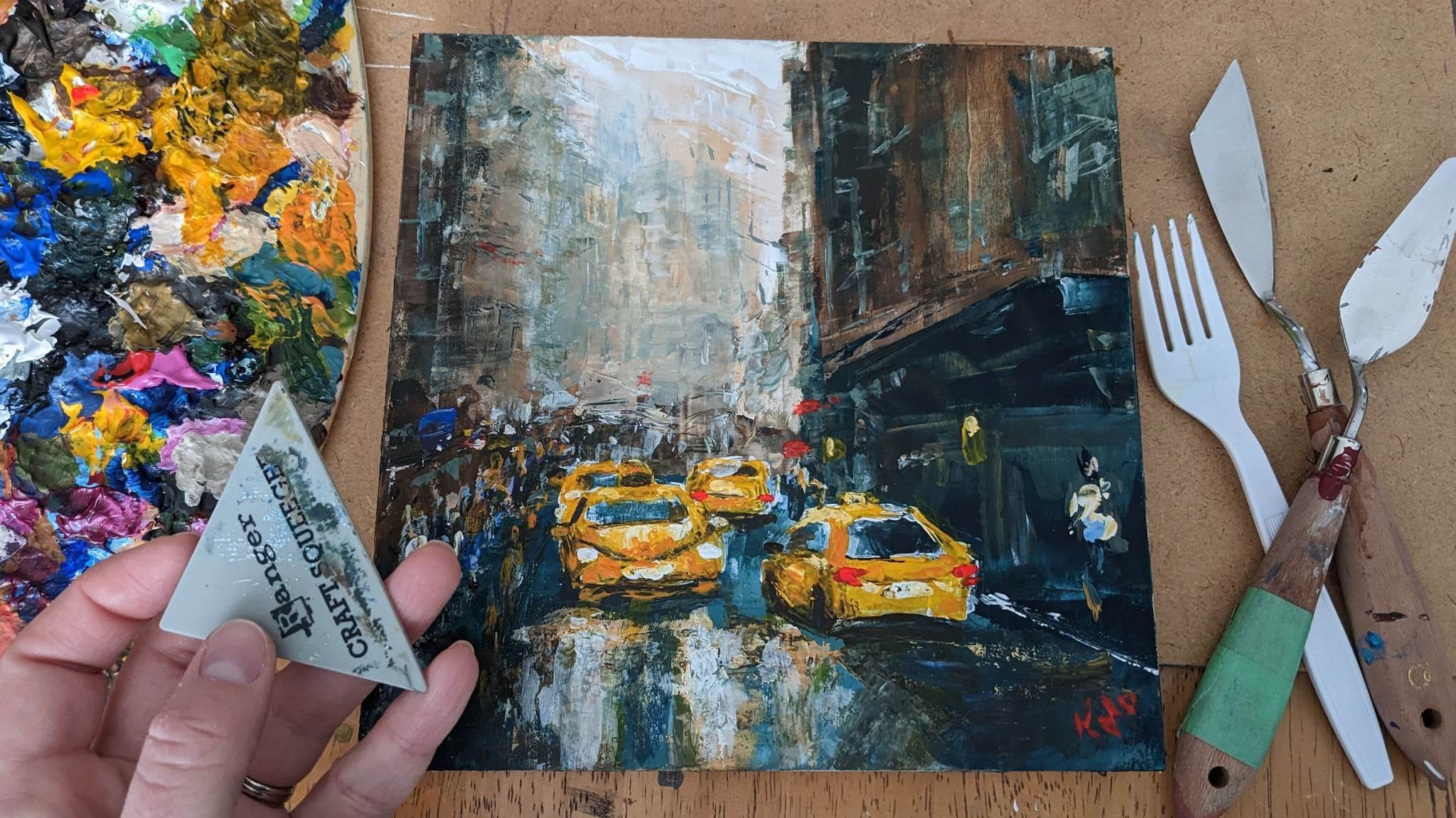
4. Project Demonstration: For this class project, I want you to take one of your own works of
art and critique it. Similar to what I'm going to do. I'm going to show you how we're doing that. So we're
going to do it together. But how you're going to show this in the student
gallery is share an image of your work
of art and the write up of your critique. That's as simple as we're going to do it. Okay? So let's get started with looking at
the principles of art. So some of them are
kind of overlapping, like pattern with repetition and balance and
all these things. So some of them they
kind of overlap. So let's talk about it and
make sure we hit each point of principles of art and elements
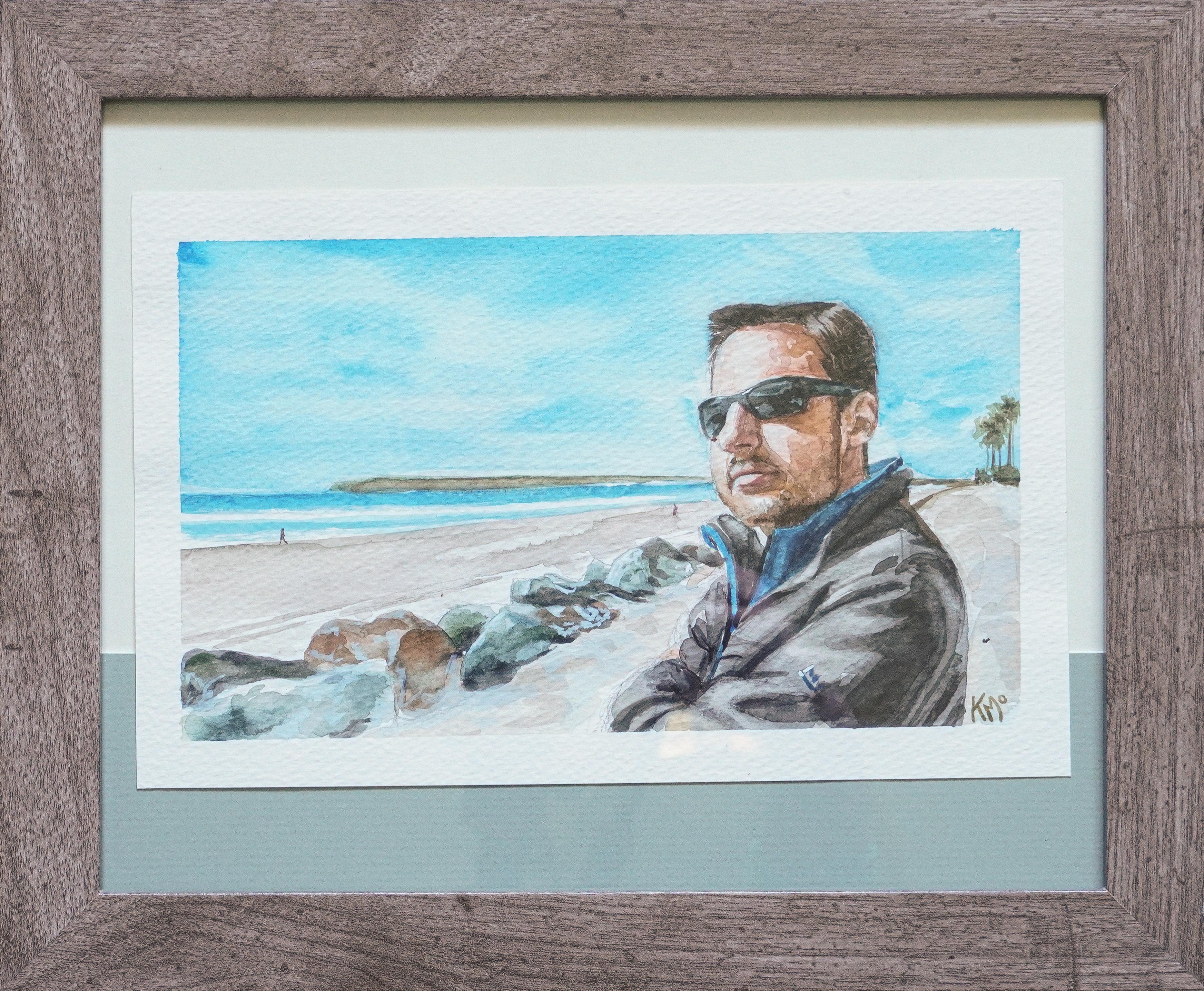
as we discuss this piece. So I'm going to actually
start with unity and harmony because that's a great place
to start where we say, Hmm, something about
this piece I like, or there's something that's
not quite right about it. And I'm not talking about
the actual subject matter, but just the overall feel
when I look at the piece. And sometimes the subject
matter does affect us, and it's hard to not
allow that to influence our decision making
process in this, but try to just tell me how you feel when
you look at the piece. Is there something
that's bothering you? You know when you have an
image that's on the wall, and it's just tilted
a little bit, and it looks not right. That's the kind of unity in
harmony I want you to kind of look at for a moment. So
when I look at this piece, I feel like it has a
pleasing element to it. I want to look at
it. It draws me in because the
emphasis is right. There's balance, the
rhythm and movement. We have these leading lines, these angles moving us
towards the focal point, which is that figure there. So I think that's really
effective in this piece. There's pretty good contrast
with our color value, all of our elements of art. So we're grabbing all of those in here when we talk
about contrast. The total values are good. If I had just a flat
color on the face, we wouldn't have this
sense of where the sun is, where the lights
coming, the sense of space that this figure is in. It makes you feel
like you're there. You feel the warmth of the sun, and the cool colors are balanced quite well
with the warm sand, with the warm face, although the overall feel is a little
more on the cool side. There's good rhythm
and movement, like I said, with
those leading lines. We have an asymmetrical. I love asymmetry. We have an asymmetrical
image for balance. And let's make sure we
hit all of our things. So pattern. There's not a
lot of pattern in here, but having those rocks
repeated and getting smaller, That works not only with
pattern repetition, contrast even, but rhythm and movement and helping
us to emphasize. So they kind of all these
principles work together, all these elements of
the shape and the form, giving us total value helps us have form rather than just
a shape that looks flat. And the color and texture, there's not a lot of texture, although if you look at the face where there's certain parts
of the face that I can see some texture and see some texture th
some of the rocks. And then in the background, I'm not getting
too much texture, which does help to
give me a sense of, you know, depth in the piece. So overall, I really
love this piece. I'm really happy with
how it turned out. And that's a positive
critique for myself. How I could go forward and
make some improvements for this particular piece would be some of the way that I used the watercolor. So some of those elements are throwing off the piece just a little bit, creating texture and shapes where it wasn't really
intended to be. So that would be something
that could be improved upon. And yeah, that's how I
would review this image.
5. Conclusion: Thank you so much for
taking this class today. I hope that it helped you and that you're going to
look at your art in a more constructive way and just be a little
kinder to yourself, 'cause we could all use
a little more love. And for ourselves, I think we can improve on that
a little bit too, 'cause we're just progressing. We're not finished,
we're not complete. So just take note of
that because sometimes an art piece in the progress
does not look so pretty, and maybe that's where
we're at. And that's okay. I hope you'll take
advantage of my one on one sessions if you're
needing a little bit of extra help and
push to understand and take a look at your art
in a more constructive way. Thank you so much. And we'll
see you next time. Bye now.
 Kristina (Moyor) Choy, fine artist