Transcripts
1. Introduction: I'm filming another intro and cornfield, because now the corn is taller than I am. And I just thought it'd be fun. It's much more fun than filming indoors. So this is a very quick design class. And all you need for supplies is you need tracing paper and you need a soft pencil. I suggest maybe a 4B, That might be good. You can use it to be, but therefore B would be great. Or you can use ink. But again, I'm suggesting a 4B pencil. So I have supplied you in the project area. I've supplied you with PDF files that you can print out. I've chosen some photographs, some of my photographs that will be great for you to do this project with. And then I've also provided you with a layout of sex up of each of those photographs. And you can use those with your tracing paper to do the project, to break it down. And the object of the project is to come up with six variations of design based on the photograph, the original photograph, which is in color. And then I've changed into black and white for you. So I've really done a lot of the tedious work of getting the image prepared. Okay, so now it is up to you. I would love it if you would use your own photograph. I don't know if you have the kind of software on your computer to do S6 up, That's offer you to figure out and you're certainly welcome to use your own photograph. But for those of you who just want a quick and easy class, a way to practice seeing design in a different way. Then, then you can use my PDF files. And so another hint about this is this is an experiment in what to include and what to leave out. And these are all choices you make. Whenever you create a painting, a drawing, you're always pulling things in and leaving things out. Now this is not an exercise in taking a tree and putting it somewhere else in the image. This is either leaving the tree out or including the tree. Okay? It's just a tracing and see what happens. What happens when you add the the painted lines in the road or what happens when you include the the electric power lines? What happens when you include the trees? But so that's what it is. And you come up with six variations. So you're going to be making choices. What shape will I make and what shapes will I combine? So you're just going to have black shapes and white shapes. The black shapes are the ones that you're going to shade in with your soft pencil. So let's get started out. We'll walk you through what I did and then I will post other examples in the project area in a few days or so by the time you watch this, there are probably already posted. So let's get started.
2. Step by Step: I start out with the photograph and I pick a photograph that has some pretty strong design points. In other words, some pretty obvious shapes. And in this case, I have the trees. I have the hills in the background, the sky. There's the rude. There are the trees that are next to the road on the left. They're kind of combined with the trees on the hill in the distance in terms of value in shape. If you squint, it's all the same, then there is some buildings. There's a fence there, the dotted lines in the road. And then there's that really strong painted line on the left that has that wonderful angle that comes in from the bottom and actually exits the left. So that's, that's what I'm starting with. The next phase is to turn it into black and white to eliminate the complication of the color. Because they're colored can often confuse things. After I've turned it into a black and white, I will reduce the size. And on an 8.5 by 11 sheet of paper. Or if you're in the UK or other places, whatever the standard sizes that goes through your printer, that's what you want to use. In this case, the pdf files that I've created for you, our Letter 8.5 by 11. So I have that setup six up. And in this case, the three on the left are colored. The three on the right are black and white. And all of the rest of the files, I've set them all up black and white. The next step was to lay a piece of tissue paper over that and to trace out the shapes. I'm showing this photo just because I want you to see through the tracing paper to the copies of the photo there underneath it. In this slide, you see just the tissue paper and you see the shapes that I've pulled out and each one, some of them are just slightly different. But then each of the six, there are different choices of black shapes and white shapes. And to me they're significantly different in what my eye does and what catches my attention. You know, which one of these six Do I look at first? Which one really grabs me and keeps me looking at it. That's where the design comes in. Composition comes in once you've engaged. Once the design is captured your attention, then steps in the power of the composition. Right now we're talking about design. I want you to just don't, don't overthink it. Just come up with different shapes and see how you physically and mentally and emotionally respond to each of the six variations that you come up with. Now I've enlarged them for you so that you can take a look at them more closely. And you can just stop the video and explore them more carefully. You can compare what's different between a and B, what's different between a and C? B and C. I've also included these as images in the project area so that you don't have to keep stopping and starting the video if you don't wish to. In the next video, I'll show you the images that you have to choose from and that will make it easier. You don't have to open up each PDF to see it. You can see what the images are. Some are going to be more challenging than others. So depending on, on how you feel about this, if you want it to just be quick and easy. If you wanted it to be more challenging or if you want to do all of them. And remember, you can always post multiple projects on your project page. And for every project you post, you earn entries into the current month's contest. So have fun with this. Don't overthink it. Just make, decide whether a shape is going to be black or white. Or you are going to combine shapes. Are you going to eliminate the trees? Just, just experiment. You can do 12 different variations of one photograph if you wish. It's up to you. This is just a really easy way to exercise your brain, your eye, and to maybe inspire you to see different elements in the landscape or in a still life that you may have overlooked. In this case, the lines on the road are, are really significant. Obviously the trees are and whether you leave them in or, or not. But some people will overlook the power of those painted lines in the road. And they are extremely powerful. So are the electric wires in the sky, if that's what you want. So this all goes back to choices. So have fun. And I look forward to seeing your projects.
3. Photos to Trace: You'll see in the reference materials that there are files that you can download and print. And there are nine separate photographs that you can work from. You can choose. If you don't want to use any of those, you can choose one of your own photographs. There are two files for each of the photographs. One file will be a larger version of both color and black and white of the photograph. And the second file is a copy of a page that you can print out that has six copies of the same photograph printed on so that you can just print that out. Put your piece of tracing paper over the top, and go ahead and create your variations from there. So have a good time and just be playful with it. First we have an alleyway in Paris. Next we have packed day boot stroma, which is I think one of the most beautiful parks in Paris. It's actually in Bellevue, yield just a few blocks from where I stay. And here is a pipe and a blue door that makes for a beautiful collage. And this is a window display of glass flasks, a firehouse, a bowl of the seashells I've collected over the years. Another window display. And this is the California road landscape again that I used as a demo. There you have the nine files that are available for you to work from. Enjoy. Remember to be playful and just experiment.
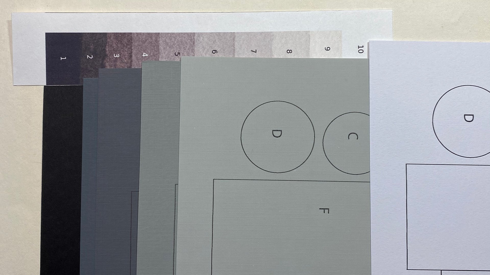
4. Bonus Lesson: Color Value: This is a bonus lesson on color value. Next to shape, value is the most important element in design, in composition in creating a painting. And when I'd speak of value, I'm really speaking of grayscale value. I think of it as ten steps going from one being black and ten being white. Some artists think of it in the reverse, ten being black, one being white. I just mentioned that because you may look at this and say, well, you know, I was taught that one was white. I go by the enzyme atom zone system because I really learned about grayscale value when I was doing black and white photography. So, so as not to confuse my brain, I use one is black, ten in this way. So this is a pretty strong designer composition. At first glance, I like it a lot. The reason it's strong is because of the use of color and it's deceiving color can be so deceiving, which in my mind is why often color photography can fall short when it comes to strong design, strong composition, because you are Lord into it by magnificent color, which is deceptive. Here is the same photograph changed to grayscale, and you can see that the composition, the design, is really totally different. Here we are again. There it is in colour. Here it is in black and white. So you may think, because your eye recognizes this as white. So you think, Ah, that's a light value. If you put your grayscale next to it, here's your flight. The highlight on this side of the wood is really way up there in white. But here few squinted this you really are way down in, in this area in terms of what value this white part, or it's probably silver. Silver medal is because it's in shadow. And here we know that that's white newspaper or magazine. But look at this squint at it and you see that it's really in this midtone area and this looks light, but this is not really light either. Ok. Look at how much darker it is than that. And that's all simplified when you turn the photograph into grayscale. Now when you squint at, at the only thing that pops out is this shape, this shape and the dark graffiti shapes plus, you know, the the little spots here and there. Okay, so this is really the design of this photograph. However, it's compensated. The design is strengthened by the layer of colour, which creates the illusion of it being a different value, x0, let's say you're going to paint that. Well, you can be inspired by this. And do a painting of this, but you can make it stronger. Now within my computer system, I bumped the contrast. Now this looks a bit stronger, but is it really, it really isn't very strongly. When I reprinted that, changing this version of it to gray and white, it was very much like the original. When I pulled that black and white version in, bumped that contrast, I was able to get something a little bit different. But here still this, and this is all the same shape. Okay, let's combine shapes. So still, going back to the original design, that design is this shape. Against the right shapes. If your eye is drawn into it in the original, you will move around through the composition of it that's controlled by the application of the blue color. Okay, now that may all sound confusing to you and I'm and I'm not surprised if it does. I just want to mention that to you so that you can start asking yourself those questions. Here is what I call my color value for diamond. I will provide the PDF template for this in the project area of this class so that you can create your own. This is the favorite tool that I hand out all my students in the live workshops. And what it does is it turns the color wheel into a diamond so that you can clearly see yellows are always light in value. They are always up there in the nines and tens. Why? Because as soon as you add anything to a yellow, to dark in it either turns into an orange or it turns into a green, and it's no longer a yellow. So yellow is always, no matter what, it's always a nine or a ten. And that's good to know because you can really put a beautiful bright light value in any painting by adding pure yellow. Now the purples, full saturation are always dark. You can make them lighter by either adding white if it's oil paint or quash are acrylic. Or by adding water, if it's watercolor, you can make it lighter. But if you want full intensity, if you don't want pale colors, your purples are always going to be dark. Now, what is interesting here is that the red and the green, even though we've been taught that complimentary colors really jump out. The red and the green, which are complementary colors, are the same value. They are a midtone value and full saturation. Whereas the yellow and purple, they really jump out. If you did a painting of it, of a banana against a purple background or an eggplant against a yellow background, you would see that it's an egg plant or a banana from a 100 feet away. If you painted a red apple on a green background or green apple on a red background and usted back a 100 feet. You may not be able to tell that it's an apple. Try it. You'll see that that's true. That's your bonus lesson on color value. As an artist, you can control the degree of your value. Maybe you want this to stand out a little bit more. Then what you do is you make a darker blue. This is really a pretty pale blue. It's beautiful blue. But look here, this is darker. You could make this whole thing darker. And then this shape would stand out more. Going back to this, you can alter this, but it's important that you understand that it needs to be altered and you may not want to make it too dark. It will combine with this shape. With that in mind, I'm going to walk you through making a choice as to whether the midtone grade, these greys in here. Are you going to call it a white shape? Or are you going to call it a black shape?
5. Deciphering Shapes: Thinking back on what I just talked about in the color value lesson, take a look at this area. When you first look at it, the blue shapes combined together, your brain is saying, OK, there's a pink shape, there's a blue shape, is kind of even gets mixed in with that blue shape because of that, there's the yellow shape and then there's this pink sheet. However, if we look at this, if we look at the gray scale version of this, this blue and this pink are the same value. And in this case, the real design behind this image, this color image, is using a different vocabulary. In this case, this is the shape. This is no longer the shape. This is the shape here where the red really shows you the pipe. In the design. The pipe gets pretty lost against the background, against the whole that it's in this read of whatever it is also gets lost within the building in terms of design, it's made more exciting with the color, especially this little blue down there. That's remarkable. And did you think that that blue was a lighter value? Then the sidewalk, we'll look over here. Really pops out there. Pops out because of the value here, pops out because of the color here. So this is a really strong element of design because it pops out both because of color and value. Now we can make choices. What do we want to have stand out? Maybe we really loved the pattern of the x's. Maybe we don't care about the pattern of the axis. Maybe we love the twist of the Pape. Maybe we don't care about the twist of the pipe. Maybe we just want the circle or we just want that to disappear completely. So what I'm going to do, I'm going to use a magic marker and walk you through decisions I'm going to make. And I've printed out two of these so that I will make two different sets of decisions and come up with two different designs. Neither one is right or wrong, neither one is better or worse. It depends on your personal likes and dislikes. I may say Yes, that's a stronger design. That's really only my opinion. Someone else may say, well, I don't think so at all. K, So I can tell you why I think things are stronger designs, but that's all from my point of view. You take a classroom and other artists, they will have a different point of view. So it's not right or wrong. What I'm interested in is you developing your personal sense of design, finding out what you like. Do you like to have little details popping out, these two details popping out. Maybe if you like the x's, you'll need a little detailed popping out so that these work well and don't just stick out on their own. There are ways to balance your personal preferences so that even if it's not someone's favorite kind of design, they're still going to smile and say, wow, that's a pretty competent design. So this is about experimenting, about playing and seeing what happens. It's not about making great designs or terrible designs. It's about seeing what happens, experimenting and then asking yourself, do you like it or don't like it?
6. Making Choices: There are a lot of half-tones in this photograph that aren't clearly Black and aren't clearly white. So I have to make those decisions. First, I'll draw the perimeter. That's important because this is actually quite this, meaning the edge. Now, I'm going to decide about some of these gray Shapes. I'm going to use this gray shape combined with this one and call that a white shape. I think I'm going to make this little square Y2 so that I don't have just a huge empty space. I could make this white or I could make it black. I'm going to call it black. I left this not connected. I wasn't sure what I would do with that. So that's all white. And this little tiny spot. I'm going to call that point too. Now, there is my design so far. And actually I kind of like that design just like that. This is white, this is white, this is black, this is black, and that's whites. So I will look to see, do I want anything else? I think what I want is just this little sliver to be white before I black in this all in, I want to show you how I could change this out a little bit. Now I could include this, but I think that would make it a little bit too complicated. But these are just floating. So I'll go back to my tracing and I will anchor this one to the edge. Alright, now this is clearly dark. But as I look at this, I think I'd like to visually connect, did not have this big chasm between. So I'm going to decide that this, even though it's dark, I can do whatever I want. I can make a shape dark or light. I am going to connect these like that. I can keep going back and making little changes. I'll look for something here. See this little white That's going to echo that one. I'm also going to do that. So this is one design. I will now show you another variation created from this same drawing. I'm going to start off with the pipe. And because I don't want this to be floating in the middle, I will call this bottom area white also. And whereas in the first run, I combine the gray and the white. I'm just going to do the flight to show you how different that can be This time I'm going to call this gray black. Very, very different designs right now. This is one big white shape and two black shapes that wanted to be a little bit more complex. I think even though this is white, very light, I think I wanted to just go all the way down this little area. Just to get an angle going. Again, I can do whatever I want. This tiny bit will be black. I'm going to make a small black shape there. And this line is also a shape. Two very different designs. I'm going to black and then the black areas. And I'll show you the results. Here are the results of the two different designs. After I've made the black shapes black and left the white shapes, white.
7. What's the Message?: The question I asked myself when I decide on the design that I want to move forward with is, why did I take this photograph in the first place? What attracted me to this scene? Was it was it the plumbing? People who know me well know that I absolutely loved plumbing, but I don't take a photograph of every single pipe that I see. Was it this pattern of painted design on the wall or the way that the wall was broken? Or was it the pattern of the gate or was it the color? It's like, why why did I choose this and why did I choose to frame it in this way? I would say it's a combination, of course of all those things. And definitely I love this because it has that collage like look that, that abstraction in reality that I really, really like a lot that I also find to be true here in the door with the ripped paper and the different textures in the worn paint. I love all of those things. When it comes to creating a drawing or a painting from this, there has to be something a little bit more than that. But for me there needs to be a greater focus if I'm going to work from a photograph, if I'm just going to create a collage defect, I'm not going to work from a photograph. I won't be directly inspired by the photograph you. So the question is, if you're working from your own photograph, what is it that you want the viewer to know? Do you want them to know that this is about the pipe? Do you want them to know that? It's about this patterning, about patterning on together. What is the purpose of that? Do you want the overall effect to be calming or do you want it to be agitating? What is the emotional impact that you would like the viewer to feel from the design. Then if we look back on these designs, this is a more agitating design than this one because of these x's. Ok, this is slightly more organic, a little gentler. It feels a little calmer to me. Now it may not to you again, this is a personal preference. This looks a little bit more like the continent on the globe. And maybe I don't want to subliminally, BY giving that message. This looks a little bit less like the continents. This looks like an object. I don't really see an object there. So take a look at your designs and see if you're giving a confusing message to the viewer just with the design, like what are you sang with the design? What does this design say? How does this design make you feel? What does this design say? How does this design make you feel? When you ask those questions, you're going to get some kind of an answer or you're just going to say, well, I don't really care about this at all. You know, I'm going to go on and do something else. That's also very valid and very important. Why waste your time conveying a message that you don't care about? The purpose of design is to capture the attention of the viewer. Once you have the viewer's attention, what do you say to them? Shouldn't it be something just to capture their attention isn't enough? There needs to be a message, wants their attention is captured.
8. Conclusion: This brings us to the end of this class on design. I hope that you've asked yourself a lot of questions and you've discovered at least one or two answers to your questions. I've included a bonus lesson on color value because I truly believe that value is so significant. I believe that without understanding how the gray scale value works and without understanding how the color values scaled works, it is very difficult to maintain control over your design and your composition. And when it comes to creating a drawing or a painting, there are so many layers of decision-making involved. I have attempted to make this focused on design, which is the, as I think of it, it is an image made up of light shapes and dark shapes that bring your attention to your drawing or painting. And once your attention is engaged, then composition takes over. And as you saw in the bonus lesson on color value, color shapes combined just as value shapes combine, texture shapes combined to redirect your eye, to redirect your emotions, to redirect your thoughts. And all of these. When studied one at a time, and those skills mastered, you can really use them as you use different pigments to express exactly what you wish to express in your artwork. So please have fun with these simple exercises. Don't try, don't try to make great design. See what happens when you make different choices. When you combine a gray shape with the dark shape or grey shaped with a light shape. Main decisions are made with the half-tones, the Greys, the gray scale in between the light lights and the dark darks. And it's those decisions that make or break your design. Please contact me with questions you have and remember to post your projects so that you can be entered into the monthly contest that I run for each new project post. Even if it's for the same class that you've posted a project on before you earn an entry in the current month's contest. And check out some of my other classes on pulling the puddle, which is a watercolor technique, checkout, Fluxicon fun, checkout, the body easel you can make for yourself where you can actually have your whole art studio attached to yourself standing in a crowd in the middle of a city if you want, or out on the top of the mountain if you want. You have traveled ket where you can fit all the supplies you need right in your pocket. So check out the other classes that I have. And I'm always inventing new classes for you. So stay in touch, post your project and I'll see you in the next class. This is Chris Carter for skill share.
 Chris Carter, artist, illustrator and explorer