Transcripts
1. Introduction to Grayscale and Color Value Series: I am Chris Carter and I'm so happy to be meeting with you and having this opportunity to teach you a little bit about value and color value. I'm trying to get the loose ends all tied together and present the course for you in little pieces. And this will be the first taste into exploring and understanding the importance of shapes and values in your art. And when I mention that this applies for all the art forms, I really do mean it when it comes to dance, film, sculpture, photography, painting, drawing. What they all have in common is that they depend on the strength of shape and value. If you have a dancer on a stage and it's very dark, let's say the stage is dark. And you want her dress to be part of the shape she makes when she twirls around on the stage. If the background is dark and black, theatre is dark, you wouldn't want her dressed to be black. Because then what you would see as you would see her face floating around on top of the stage. But if you gave her a white dress with a flowing skirt and she's swirled around. You would see these amazing shapes moving through space. That is Shape and value. Now you may be thinking of it as tone. And the United States, we often talk about it as value. And what I mean is the degree of lightness. It is white to black, all the greys. What is it? A light gray, dark gray, medium grey, black, white. That is value. And that is told the words mean the same thing. So sometimes I'll say tone and sometimes I'll say value because I, I teach in the UK and they refer to it as tone. So I'm used to kinda going back and forth in both places than sometimes I forget where I am, so I just hope people understand. Alright, and then now that you, you all don't want to be artists as an occupation in your life, but you don't have to be. You, you can learn so much that will bring joy into your life. Even if you never pick up a paint brush or a pen. It's your eyes. It's how you see the world and how, how you enjoy going for a walk or looking around your house. You know, you, you start to observe more. And that's, that's what it's about. Art is about observing and communicating. What it is you observe and what you think about that. This will be the beginning steps. You may not understand it all, which is perfectly fine. Some of these things took me years to understand. Some took me decades to understand. And now that I do understand them, I am I'm just enjoying every day putting them to use and learning more. I'm starting with the very most important parts. The first step to creating wonderful drawings, wonderful paintings, and appreciating art. Even if it's going to museums and galleries, it's it's appreciating and understanding what it is that you actually see with your eyes. Okay? Not what you think you see, but what you really see. So here we go. We're going to start this marvelous journey. And to shape and value.
2. The Inspiration to Create this Series: I am thrilled to be presenting this class. Finally, I've waited so along, put it off for far too many years. And I, I have to say that it was a school teacher in Germany who contacted me about a couple of months ago in October and told me that she'd seen my work and she was teaching her class, who are 910 year olds about complimentary colors. And she wanted to know if she could have permission to use some of my images to present to her class. First of all, I thought it was wonderful that she asked permission. A lot of people don't, and they can just go ahead and take them off the internet anywhere and use them. But when people do have the courtesy and the respect to contact me and ask me to use my images. It it makes me feel wonderful. And of course, I grant the permission. So that was the first part of it. And then she asked if I had time if I could just make a short little video and say hi to the kids because they would be thrilled to have a real artist say hello to them, especially one that they'd seen some workup. I happened to be taking a walk with a friend of mine in the fall and there was this amazing orange tree and the sky was so blue. And I said, oh, I got to Kathleen. Please, please take a quick video. I wanna make a video for the kids in Germany and that's protected. And about a week or so later, I was in touch with their teacher again. She said they were thrilled and excited and that they appreciate it so much. And I said, Well, what do you think about me doing a webinar for them? And she was absolutely beyond joy. So I was going to do that. But then with privacy policy and permissions, it turned out that I wasn't able to do that. She needed to get permission from all the parents. I wasn't filming the kids, but just just so that I had clearance to be live in their classroom. And by that time I was so excited about creating a class for them. And it was going to be on value because I thought if I had only understood value, if I only understood color value when I was really young, what a difference it would have made in my life as an artist. And I mean, for me, it took me, I didn't really understand color value well until I was in my fifties and I had already been a professional artist for 25 years or so, 25-30 years. That's pretty embarrassing to admit, but that's the truth. And so I said, well, what about if I create the class, the grayscale and color value class? And then I just grant you access to it. You can preview it, you can let the authorities know, get permission and you can present the class to the kids and they'll see me talking. And you don't have to present the whole class. But if they continue to be interested, you can present it as much or as little as you want. And so that's how I began putting this class together. There are two versions of it. There is a short version and a longer version, or the longer version is incredibly comprehensive because I am pouring my heart and soul into it. It means so much to me. All the breakthroughs that I had throughout the different decades that brought me a step closer to the joy that I experience now being an artist and having learned these things and being able to share them with people, especially young people, who have their whole lives in front of them. And by sharing my story and teaching what I've learned. I may change life or two. And that would be so important to me if I had a mentor when I was nine or ten years old, I can't even imagine what I'd be painting now. So I'm going to share a story of a thread that runs through my life and occurrences that happen that didn't seem to relate at all to becoming an artist. And they were really turning points from me.
3. Why I Play Games to Hone my Skills: I came into the world as an abstract sculptor, Not a Painter, and certainly not as a representational painter. I created sculptures in every way I could. Carving, nailing, gluing, tying, stacking, and folding. Drawing made no sense to me at all. I didn't see the world as flat objects, nor did I see the world as made up of stationary objects to be flattened onto a piece of paper. I loved splattering paint on paper and boards, watching the shapes change as one color overlapped another, or when the colors blend into one another. What inspired me then? And what inspires me now is movement through space, trees bending in the wind, bird soaring, bodies, dancing, water flowing, light flickering. I grew up playing games, board games, card games, Marble games, mind games. My father made up games for us to play while eating dinner. My siblings and I took turns naming the planets from nearest furthest from the sun. After dinner on Sunday, my father unlock the vocabulary box into which we'd slipped pieces of paper with new words we'd come across during the week, once a month, a dark blue mystery box with the yellow label came in the mail from a place called things. Inside was an experiment or a game to teach us about gravity, perspective, illusion, light, or some other scientific wonder. My first color mixing Spinning Top was made from a things kit. My gift at birth was not talent, it was insatiable curiosity. The world of two-dimensional art was mysterious and magical to me. I spent hours looking through beautifully illustrated children's books. My parents read to me. The simplicity of the black lines describing figures, clouds, trees and animals amazed me. Color combinations were magical, unlocking the universe of my imagination. As hard as I tried, I failed it, making marks that pleased me, or painting with colors that make my heart sing. But I didn't give up trying. I knew I wanted to be an artist. I wanted to create magic on a piece of paper was a challenge I've never grown tired of. I was a very slow learner when it came to drawing and painting. No matter how many books I read about color, I didn't understand how to manipulate it and make color choices to achieve the results I wanted. I didn't understand grayscale value and how it was the most important element in two-dimensional art. No matter how many books I read, I did not understand. We didn't have the internet when I was young. There were known tutorials to watch and the few art classes I took were utterly useless. Plopping a still life on a desk in front of the class and telling us to draw it or paint it was of no help at all when I couldn't even draw a leaf, how could I be expected to draw leaves, flowers, fabrics, pottery, and fruit all at one time. It would have been helpful if the tutors had done demonstrations for us, but they didn't. As I entered the ninth grade, my father influenced me, once again, encouraging me to take both typing and Latin skills he felt with served me well in the future. He was absolutely right. Over the years, I was able to pay many Bill's typing manuscripts and dissertations for college students. Remember, this was the age before desktop and laptop computers for the general public. Latin class proved to be a turning point in my life, though, languages are not one of my strengths. Fortunately, I managed to survive my first and only Europe Latin class. During my junior year of high school, which was 11th grade. I was notified that because I completed a year of Latin, I was invited to join the Latin club on a trip to Italy over Easter vacation. I hadn't enough money saved to pay for the trip because I had been working on a local farm. I signed up for the adventure. My father loan me his new small 35-millimeter camera to take with me on the trip. Unbeknownst to me, that was the next major turning point in my life as an artist. The camera felt like an extension of myself. An extra set of eyes that connected my hands to my brain and my heart. I returned home with unusual vacation photographs. Rather than snapshots of the tourist attractions we visited. I had photos, have forged hardware on giant doors, tears of seats in the Colosseum, weeds growing up between stones in the Roman Forum. Reflections in the water of the Trevi Fountain and rows of dead dogs hanging in the windows of butcher shops. Seeing the world through the rectangle of the viewfinder changed the way I saw everything around me. I save more money and bought myself and then larger. I made black curtains for the window after the sun went down, our kitchen was transformed into my darkroom. I switched from color film to black and white film was absolutely thrilling to watch the image materialize in the developing solution until it looked, just write to me the contrasts popping. At that point, I pulled it out and dropped it into the fixing solution. The blacks were the blackest black while still showing detail and the whites for the widest whites, while still showing detail. Fast-forward, skipping over my year of living alone in Germany right after graduating high school, my two years at a commercial art school in New Jersey, a year of working in a Bio Research Lab in New Jersey, to years of working as a waitress in Boston, and my first year attending Massachusetts College of Art in Boston. To put myself through college, I worked multiple part-time jobs. One of my jobs was cleaning house for a woman photographer. After asking several questions about the dark room equipment, she tested my skills by having me print or contact sheets. Within a month. I no longer cleaned her home. Instead, I developed most of her film and printed Oliver contact sheets and work prints. In addition to paying me, she became my mentor, giving me assignments each week and photographers to research. She insisted I learned the zone system developed in 1930 by annual Adams and Fred Archer. Understanding the zone system was the next major turning point. You might think that by now I'd learned to draw and paint. No, I hadn't. What I'd learned was how to see. I could see and recognize patterns created by shapes. Determined by the value tone of the shapes. I could see the differences between the photographs I took on sunny days when the range of values extended all the way from black to white. And on dreary days, when the range of values extended only from light greys to medium dark grays. I still didn't know how to see objects and colors because I couldn't see them. I couldn't replicate them on paper or Canvas. As a result, my professors continued to suggest I find another occupation. Until my final review. I had to hang a selection of my work on the walls of the review room. Up until this time, no one knew I was doing any photography. Wasn't that it was a secret. It just wasn't drawing or painting. I didn't think to present my photographs to my professors. I was majoring in painting. I didn't even take it photography class earlier in the year. During your critique session that included the entire painting department. We were asked to each hang one painting. I hung the only painting I felt expressed my feelings and my passion for experiencing the world visually. I thought for sure it would receive a favorable response. Abstract expressionism was still all the rage and the students who painted abstractly were favored over those of us painting representationally. I was still stuck with the notion that I had to have skills painting representationally before I could think of myself as an artist and paint the way that my inner artist desired. A week before the critique, I'd wrapped a striped beach towel around a painting to transport it to the studio and a rainstorm. I flung the wet towel over chair to let it dry. The way that it had fallen onto the back of the chair caused the stripes to appear like the ribbons of colored lights that had often dance through my head since childhood, my inner artist screamed at me to please paint the towel. I grabbed the biggest canvas I had spent the next three days painting my version of the towel. When I was done, I was more pleased with the painting that I'd been with. Anything outside painted proudly, I carried the painting of the towel to the critique where it was nominated and voted to be the worst painting and the painting department. Imagine that. This was not a critique during which participants voiced their opinions and share thoughts on how the elements of art had been handled in the paintings. This was a cruel and unjust judging of a student's attempt at finally expressing herself, guided by her inner artist. I left hurt and angry. The towel painting IT flung open the doors to a new personal world, art for me. And I wasn't going to let the consensus of the students in the painting department stopped me from further exploring this path. A path that bridge the gap between my inner world and my outer world, rather than break me down, forcing me to find another occupation. The critique session may be tougher, stronger, and more determined to find my way in the world of art, I chose to hang a towel painting along with several other abstract pieces created after the nasty critique on the wall. For my final review, I also hold a collection of 15 black and white photographs I printed at night in a borrowed darkroom. I didn't care anymore what anyone thought of my work. I become to be better acquainted with my inner artist and know what made her happy and how to observe the world in a way. That brings joy into each of my days. I sat on a chair at one end of the room and watch the professors enter. As I recall, there were three of them. They hardly glanced at the paintings. All eyes locked on my photographs. All three approached the photographs with eyes opened wide. One professor turned and looked sternly at me as if I'd done something wrong with an expression of shock and disbelief. He asked, who did these? A pretty foolish question, I thought since it was the final review of my work, anyone else's? I did. I replied for ten minutes. The room was silent except for the sound of their footsteps walking back and forth along the wall of photographs. I graduated from the painting department with honors in photography. Having not taken any photography classes at all at Mass College of Art, I still couldn't draw well or paint well, nor did I know anything about color. I was on my own, still floundering to find where I fit in, in the world of artists, I had to find a way to learn the skills I hadn't learned in either the commercial art school or the fine arts department of Mass Art. My limited skills had been learned from artists with whom might apprenticed sculptor whaling gregory When I was in high school, photographer Eileen to mana off when I was attending college and paint or Adolph Conrad before I attended college. These skills slowly improved due to the daily practice I developed after having been judged so harshly. Along with being insatiability, curious, I am undying Lee determined when it comes to learning how to draw and paint. I had to find a way to teach myself or I hadn't been able to learn in books or in schools. Finally, it dawned on me that I'd learned many skills as a young child because of the games my father made up for us, I decided to try making up games to learn to draw. I created many drawing games. The ones that work best were based on my understanding of the zone system. Playing the games worked. I became confident in my drawing skills and excited about exploring ways to use them and to continue to improve upon them. Painting was still not a strength, nor was color. It wasn't until years later that I found a way to leap forward in my painting. Playing games, worked with the drawing, and so it also worked with color. When I invented the color scheme game, it proved to be another turning point for me. It changed my experience of color as I see it in the world around me. I came to understand color by going back to the science of light and applying what I learned using the color scheme game. Never did I imagine the joy I now experience everyday understanding color and manipulating it to express what I wanted to express. The game changed my life as an artist and a teacher. A word about games. Unlike practice and exercises, games that are played and meant to be fun, practice and exercise sounds boring and unpleasant. I like to use the word experiment rather than practice or exercise. Experiment sounds exciting and productive. And experiment has a beginning and an end. Practice and exercise go on forever and make me feel as if I will never get to my goal. It's just a mind game I play with myself in order to be consistent and look forward to my daily practice of drawing and painting. The game I presented in this course is a game of shape manipulation with a focus on value tone. Remember to think of this course as learning to play a game. Remember to be playful and to allow yourself to have fun and to try things you think might not work. Just to see what happens. There are no rights or wrongs, no good or bad, and absolutely no mistakes to be made. Knowledge comes from all experiences. Allow yourself to take advantage of having as many experiences as possible.
4. Materials Needed for the Class: In this first class of the series of grayscale and color value classes, the focus will be on developing a strong foundation by understanding the importance of shapes and grayscale values. For this first class, you'll need seven sheets of 8.5 by 11 paper. One sheet, I recommend to be white covers stock. You may want this to be a little bit heavier than your regular printing paper, as this will be for your color value reference aids. The other six sheets will be two sheets, each of white, middle gray, and black. One of each, you will leave blank. The other three, you will print the color value landscape shapes template onto. If you think you might belong to continue taking classes in this series. For the very next class, you will also need six more sheets of 8.5 by 11 colored paper. One h of fully saturated colors, yellow, green, blue, purple, red, and orange. Now you may want to get those prepared now since you're going to be printing the template out on your white, gray and black paper anyway. In addition, you'll need a pair of scissors, a pencil. And as an option, you'll need glue or double-sided tape. To create your reference aids and prepare your paper for the course. Download the two files in the download section of this page. On the one sheet of 8.5 by 11 white cover stock paper. Print out the file. Color value workshop reference aids to print and cut. The reference sheet will include a color wheel, a color value diamond, and a grayscale value chart. I suggest that you laminate these using clear contact shelving paper. You'll be using one or more of these reference aids in this first class of the series, as well as in the additional classes in the series. Print out the color value landscape shapes template to print on the three sheets of white, gray and black paper. And the six sheets of the yellow, green, blue, purple, red, and orange paper. As a note, my purple paper is not as saturated as I would have liked it to be. Do the best you can to find or create colored paper at full saturation, not paler or diluted than the full intensity of the color. Regardless of what colors you end up with. You'll still learn the lessons taught in this course. Aim for full saturation and don't worry if you can't find it. Craft Stores usually carry a nice selection of bright, full saturation colored papers if you prefer, or if you are unable to obtain full saturated colored paper is listed above. Create your own colored paper on 90 pound or 140 pound watercolor paper. You can also create your own black and middle gray tone paper by doing the same technique.
5. Preparing Color Value Reference Aides: We'll begin by cutting out our reference aids. These are pretty straight forward. You're going to just cut on the outer circle and on the edges of your color diagram. Now when it comes to cutting out the gray scale, I want you to do something a little bit more specific. Make sure that you leave a section for the ten, this is your white. Then on one edge, we're going to make sure that you don't leave any flight. And on the other edge, you can leave white so that it's a little bit bigger to hold. The reason for this is you want to be able to lay the scale right down next to your colors. Notice that you can't compare number eight with green if the white strip is between it. But you can compare it by squinting. You can definitely see which is lighter and darker with the green and the aid, it's obvious, but when it comes to these, it's a little bit harder. So you want to squint and ask yourself, which is lighter, which is darker? Is the green darker than the four, or the four darker than the green? And you'll squinted, it's easier when you squint. I do an awful lot of squinting. Okay. So you wanted to leave that edge. Now these two, I like to laminate so that they're protected and I take them with me when I do plan air sketching these, I will print many of these out. I used to laminate them, but I found that the light, whether it's the sunlight or a light bulb inside my studio, will reflect off of the surface and I don't get the true value. These end up looking lighter than they really are. And then I can't compare them with my painting or my drawing. So I leave this strip just as it is with the surface of the paper. In the next video, I'm showing you how I laminate. And I'm showing you how I laminate full sheets, the same thing instead of a full sheet, you can just lay these down. You'll see it is a video that I made for the color scheme game. And rather than make a new video for every single one of my classes, I use that video so you'll get a glimpse at the templates and the parts of color scheme game. But you can apply the same technique of laminae waiting to eliminating anything else.
6. How to Laminate Reference Aides: What I use is a clear covering its men for covering cupboard shelfs. So that's what I used to peel it carefully to get it started. I put it down and kind of roll it down because you have to be careful that you are in alignment with it. Try to keep it the edges in the alignment. When I sit down.
7. Cutting the Shapes with a Paper Cutter: Go ahead and cut out the paper that has been printed with this template. I like using a paper cutter for all but the circles. But you can also use scissors, whichever works best for you. To save time, I often cut to pieces together very, very carefully. In addition, it's important to be able to cut two together because on the black, even though I've printed the template, you can't see the lines. So I need another sheet where I can see the lines in order to cut it out correctly. I'll show you how I cut it out on the paper cutter, keeping the pages together. You can cut it out any way you wish. I find this the simplest way to do it. I don't trust the guide up here because it can make things Kauket. So I go by the grids on my paper cutter. I lined up this edge with the blade. Heap does not have to be exact. These I put in the scrap pile, but I'm saving the scraps for a bonus lesson. The shapes with the letters go in a pile that I'll use for the experiments. The circles I will cut out by hand with scissors. And the I, the shapes marked I, these, I will draw my double these on and cut those out by hand also. So set these two piles aside.
8. Cutting the Shapes With Scissors: I'd like to show you how I cut to pieces of paper at the same time using scissors. It's really quite simple. You just hold the pieces of paper together, cut down. The, the important thing is that you hold them fairly tightly so that it doesn't slip around me. That it's so basic, I feel a little ridiculous showing you this, but I have been asked the question. So I thought I would just go through it and show you. So you can see how it can become out of alignment. But this is, this is not a big deal because it's not so critical in this experiment. And you can say that I'm not being super careful about staying alive and see how it's getting out of alignment a little bit. So I can readjusted. I tap the edges. And then instead of holding it way out here, as I work into it, I will hold it closer to where I'm cutting so that it doesn't move around so much. I can feel that it's really staple there. I'll move my hand up to hold it stable. Now if you are doing something other than experiment of making the landscape that we're going to do. You, you may not find this suitable, but for what we're doing, this is justified to hand hold it. Remember, this is, this is supposed to be fun and not an ordeal to worry about. So we have those strips and we just continue cutting these. Now, I'll show you if you did use a paper cutter, you still have to cut these by hand. And I just hold them nice and tightly. I go little bit at a time because I do want them to be round. And if I don't hold it tightly, it will slip. And the one underneath will be a little wonky, which is okay too. I mean, there are trees. There, kinda silly looking trees anyway. So why not have them wonky? Remember, this is not a drawing class. It's a value color value class where we learn grayscale value or tone. Value and tone are really interchangeable as words. I find when I teach in Wales, they refer to value as shown in the US. It's I've usually heard it referred to as value, although some people do refer to it as tough. Ok, so now we have our circles. The other thing that I want to show you in terms of cutting out is what we do with i's. This is where we do the only drawing necessary in the entire course. This is the landscape that we're making. And these are going to be our double V that I mentioned earlier. The only thing you have to draw as a double V, double Actually it's a y, it's a wife, but you making a v and I call it a V, I should have called it a why. Of what you're going to do is actually draw this. And you can draw it straight up if you want to, doesn't matter. Or you can make it more tree-like and they can all be different. Now, there's one thing that I want to mention about cutting the wise. You have to be careful not to cut one off. Save the scraps for the dark ones. I can use one of my other ones as a template or that's a much shorter. That's OK. And I'll show you what I do. I hold the yellow why tightly against the gray. And I'm only going to cut around the outside. And then I'll just guess it this because if I, if I cut to together, I easily could chop off one of the trunks and I don't wanna do that. So these I do separately, but don't do two at a time. And I I flip this over so that I am looking at this side. I'm right-handed. You'll do it the reverse if you're left-handed. So that I'm looking to say if I cut here, I can't really see on the other side of the blade. So I'm cutting, making sure that I have a narrow trunk. And I want to be careful if it helps if you have sharper tips on the end of your scissor, but you don't, you just work into it gradually till it falls out. So that's what you do with all of your eyes. And the next thing that I will show you is how to create your own colored papers. If you can't find the different, the yellow, the orange, the red, the green, the blue, and the purple. I know my purple is not as dark as I would like it. I want the purple to be darker than the blue and mine is not. So I'm going to create my own papers also. And you can work with either one. Doesn't matter. If you're purple is two litre if any of them are too light, that's okay too, because you will recognize that when we identify the value or the tone of that color, no matter what you do, it will all work out just fine.
9. DIY Grayscale and Colored Papers: In this session, I'll show you how I make my own colored paper to use in this exercise. For making both my primary and secondary colors. I will use just a warm and cool of each primary. For my warm yellow, I use a new bam bows, my cool yellow and Oreo and my cool blue is Othello, warm blue and ultramarine blue, cool read and Alizarin crimson. And my warm red is a cadmium red light. You can really use any warm and cool of each of the primaries, as long as it's not a neutralized colored to begin with. So these are the ones I use and you will see, I have listed some pigments as to whether they are cool or warm, just as a reference for you, I'll start with my darkest. I'm gonna make a really nice dark violet. So in order to get a good strong by that, that's not neutralized. I need to use the two primaries that are closest to each other because my violet would be right down here. And so for that, I need to use this blue and this red because they're closest to each other. This is a warm blue, this is a cool red and together they will give me the best purple. I like calling it believe it's just a pretty or word. I will be using plenty of pigment so that I don't dilute it too much. I want to mix just enough water in with it so that it flows nicely and is not opaque watercolor. So I'm going to use a nice big dish to mix it in because I will be applying at my paper with one of these brushes. I can use any of these brushes, but I wanna give a nice wash without any streaks. Not streaks would be fine too. But I just want to show you also how to make a streak with swash. Moisten my pigments. And I'm going to use two brushes so that I don't mix those up. You can also use an eyedropper to get things going. There. A lot of big clumps of pigment in here, so I know that I can continue to add water without diluting it. It's still the consistency. It a little thicker than cream. And I wanted to be more that consistency of whole milk. Cream will give me a little bit of opacity that I don't want. And it's looking to me as if it's a little bit too much of red violet. And you see that that's a little bit more of a red violet. Use more blue. Right? So again, good. Still pretty thick. All right. I'm going to put the paper on another little board so that I can tilt it so that the water will flow down. And that's the way I get a nice wash. Let's go with this, brush him and use this for files. So we'll see how this works. Dampen at first. And I haven't wet the paper. If I wet the paper, I will automatically be diluting the color. As it's wet. I overlap as if I'm mowing the lawn and I let it all drip down and with a dryer brush, I can wake up the bottom so that it doesn't bleed back up onto the paper. Alright, so now I'll just let that dry.
10. Learning to See: To begin, I'd like to ask you a few questions. And if you have a piece of paper and a pencil, you can jot down your answers. And you can pause this video to give you a little bit of time to answer my questions. Why do you like to look at art? First thing that comes to mind, One, 23 things. What kind of art do you like to look at? Sculpture, drawings, paintings, dance, photography, film there, all different kinds of art. So what kind do you like? Okay. Why do you create art? And how do you feel when you create art? How does it make you feel inside? Is it, is it just something you love to do? Or is it something that, that you feel you have to do a certain way? And so you need to practice and work hard at it. And maybe you think you're not good enough at it. And so it's not something that you enjoy doing. That's fine too. Hopefully, you'll start to enjoy it after spending some time with me. Who knows? Okay. Some of the answers that I get from asking these questions I'd following. It's to express my feelings. To observe something more carefully, to understand how something works. Because it's fun to remember something that I did, or an event, or a place that I went to capture a thought or a memory, or a dream, or a vision that I've had, or just simply to create something. And there could be so many more answers to this. But it's important to know why you create art. If you do, and you don't need to, you can appreciate art and never created. That's okay. But you're going to enjoy appreciating it more if you know a little bit more about it. And what the artist is thinking of when the artist is creating the piece of work. Okay? All right. Now, what do all the art forms have in common? The sculpture, that painting, the photography that dance, the film, and really even music though that's a little bit harder to understand the similarities. But they're there. What do all those other art forms have in common? What do you think? Take him in? What I think that they have in common is they all depend on shape and value. Just as I described about the dancer on a stage either wearing a white dress or black dress. I won't see the shape and the movement of her dress. If it's a black dress against a dark stage. But if it's a white dress against a dark state, I will see that dress, that skirt swooping around and moving. And it will, it will paint the magic for me. And her body is what controls the shape of the dress. Alright, so that, that's what dance is about. It's about, it's about where the leg is, where the arm is, how the whole body is shaped. Just think about that next time. Next time you watch it dance. Alright? It's about shapes that are formed by the body. And our body is so magnificent because it can make all kinds of crazy shapes. Look, look at the hand. It can be a fist and the Rumble. Look at that. There's a big difference between this shape and this shape. And do you know that when I've gone into schools and I was a substitute teacher for many, many years. I go in and, and I teach them art on the side. And I would ask, this is like first, second graders. So they were five years old, six years old, seven years old. And I wanted to prove to myself that people usually draw what they think they see and not what they really see. Because they're not trained to see clearly with their eyes. And I'm not talking about it being sharp focus. I'm talking about understanding and translating what you see to make sense. So I will ask the students to get out a piece of paper and a pencil. And I'll hold up my hand like this and say, OK, this is simple. Everyone, draw my hand. And this is true out of every class that I've ever done this with. And I've done it with a lot. Only one or two students at that age. At a young age of 567. We'll draw my fist, will draw a circle. Everyone else, in spite of my fist being like this, everyone else will draw my hand like this. Even though it was an open. Why? Because they know that a hand has a thumb and forefinger. And they would all be looking carefully at my fist. They would be watching, watching carefully drawing. And I think, oh my goodness, like this glass is could be different. Note, as clearly as they watched my fest. They still drew it like that. They were drawing with the brain, thought it saw because the brain knew what a hand looks like. They weren't trying but their eyes. So as a teacher, my goal is to teach my students to see. It's not so much about teaching them to draw and paint. They learn how to draw and paint. Once they learn to see. And I can guide them and give them techniques and, and really help them with their drawing and painting. But first, first, I have to teach them to see.
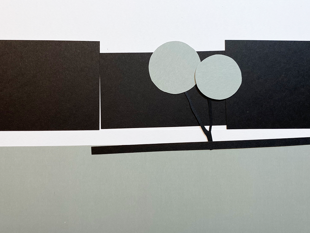
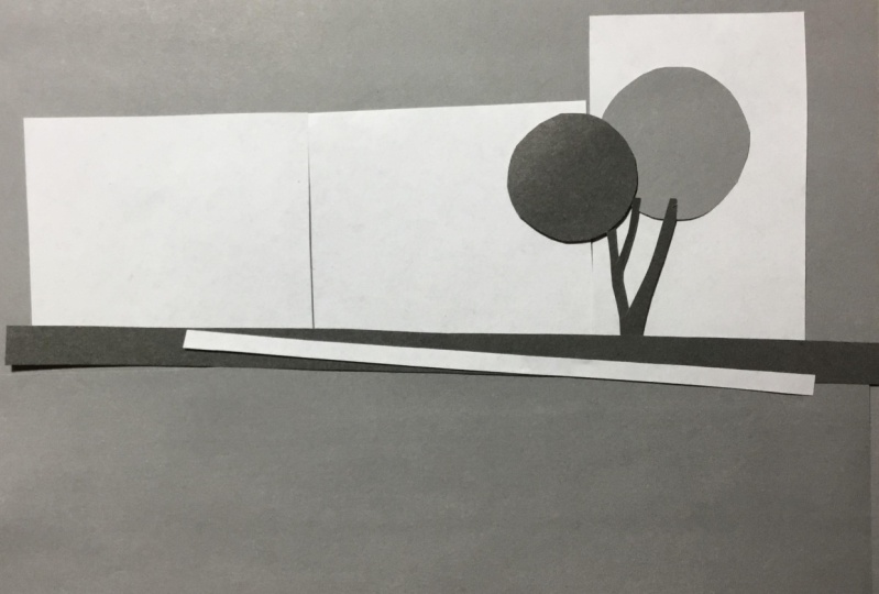
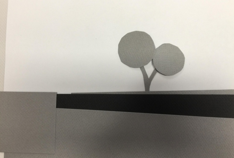
11. Create Foggy Tree with White, Gray and Black Paper Shapes: When I started making this class for you, I noticed the tree outside my window. And I see that tree every day all day long through my window or when I'm outside. And it's a tree that sometimes kind of vanishes. I I don't notice it and other times it stands out so clearly. And I asked myself, Why does it stand out so much sometimes and disappear at other times? And of course, I knew the answer to that. It was because of shapes and values. Now you have templates. You have black, white, and gray, and you have multiple colors of shapes cut out, and then you have a full sheet of white, gray, and black. So to begin with, I want you to gather together, make sure you have on your desk or your table. I want you to have your full sheets of black, grey, and white. And I want you to have your shapes that have been cut out, rectangles and circles. And you're little and v, you know, your little tree trunk shape. It's either a V or a Y, and they will be in white, gray, and black. So have those available right now. Here we go. First, I would like to show you a photograph of this lovely tree across the way. And I photographed it on a very foggy day so that you clearly saw the shape of this lovely tree. And here's the photo of that. Alright, so jumping right into it and want you to ignore the little sign post and it nor the the wires, the electric wires and the phone wires that are cutting through the sky. I've eliminated a lot of detail. I'm just going for the big shapes. Alright? So I would like you in any way you want to recreate this using your shapes, your value shapes. So you have to decide you're only given three choices, and black, white, and gray. You have to decide whether the foreground, the grass. Are you going to make that black, gray or white? Okay. Are you going to make the little strip, which is the stone wall? Are you gonna make that black, gray or white? And then the tree, the tree trunk, black gray or white. And then the branches, the circles that you have, you have two circles. Are they going to be black, gray, or white? And then you don't even see the distant trees or the field behind because of the fog. So what value are you going to make those so that they kind of vanish? And what value? Black, gray or white, or you're going to make the sky. So I'll give you a few minutes to play with that. And on your full sheet of paper, pick either a black, gray or white, and place your shapes onto that full piece of paper to recreate your version of my foggy morning photograph of my lovely tree. Okay. Give you a few minutes and then I'll share with you my version. And I just want to tell you there is no right or wrong, good or bad version of this, okay? This is your interpretation of it. And it is what it is. You're not being graded on this. This is, this is opening your eyes and forcing your brain to ask you questions. And that's how you learn to save. You ask your brain Questions. And it starts to pay attention to what your eyes are. Really saying. Not what the brain is already decided that it sees. Okay, here are the pieces that I get to play with. I have the foreground here. This is the green grass. These are the distant trees which we can't even see in the foggy photograph. This is the strip of field behind which we also can't see. Also could be the short hedge behind which we can't see through the fog. Here, the tree trunks. Here, my choices of tree branches. And this is the stone wall. Here's my grayscale. Just keep in mind all the different choices that I really have. But I'm limited to white. I'm using white for these values. I am using the gray for these values, and I'm using the black for these values.
12. My Variations of the Foggy Tree: I'll begin with the background and the fog. I'm going to leave that white because that's the lightest light in my photograph. And I can't see the trees in the background. So I'm going to make those white. It looks a little bit off right here because it doesn't quite match. Now my back hedge is also void. Going to skip by tree. The foreground. I'm gonna make the foreground gray Just so that the stone wall will show up little bit. And here's my stone wall. And now my tree. It's a little foggy. It's not quite as dark as a stone wall. So I'm gonna make my tree gray and I'm going to make the branches of my tree. Also. There's one version of my foggy morning. I found a piece of white paper that is the same color as my shapes. Look carefully at this. See the difference between this and this. It's very subtle. But here we go. In comparing it, you can see that it definitely is a slightly darker value than this. And that's quite a different look. Now that looks even more like my foggy morning. But I do like the first version better. Even though this is more like the photograph. I think that the other one with that slight difference between the sky and the suggestion of the back trees is far stronger as an image. And if I were to paint this, i would make this guy a little bit lighter than the fog trees. So it would be as if I saw the trees through the fog, even though my photograph doesn't have it that way, my photograph is just the inspiration. I am not locked into making my painting or my drawing the same as my photograph. It's only there to guide me, not to dictate to me. Take a look at the two side-by-side and decide for yourself which one you prefer. And here are some other variations when I just simply play and I don't care what the photograph looks like. There's my foreground. Here's my hedge in the back. Here, my trees in the back. Right tree trunk and gray tree branches. And here are a few more variations.
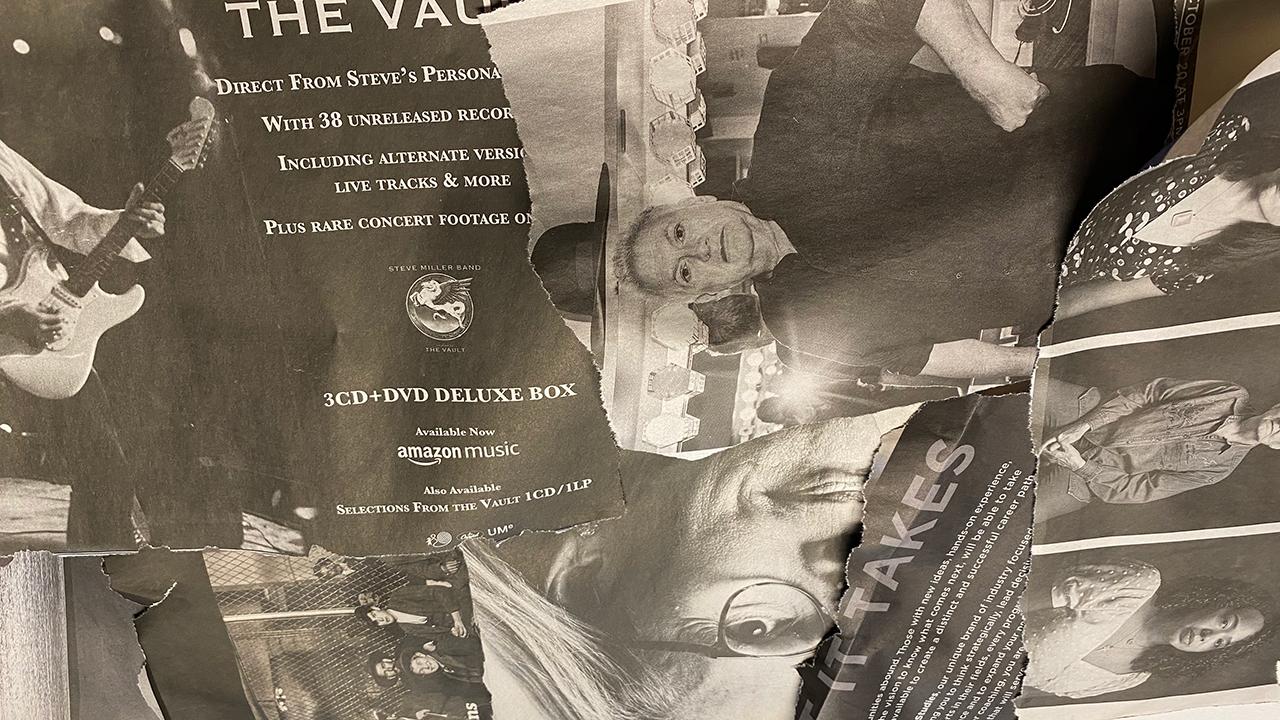
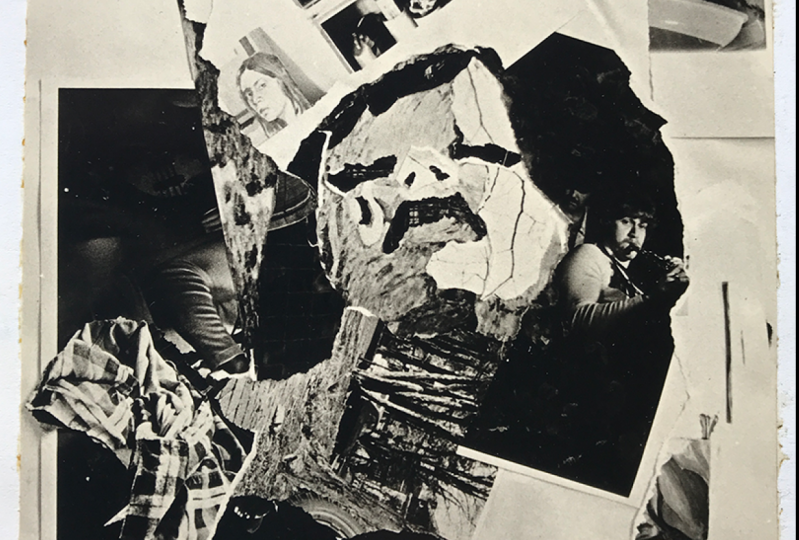
13. Bonus Experiment Using Newspaper Photos: Now that you've concluded the main experiment for this class, I'd like to challenge you to do a little bit of a bonus lesson. For this, you'll need black and white newspaper. And one that has a lot of or at least half a dozen or so fairly good size black and white photographs that will give you some dark values, midtone values, and some light values, and get a pile of those together and then rip out just the photographs. But you can also use the text because that might work as your mid value. Whatever you wanna do this is this is going to be very playful and maybe a little bit more challenging than you might imagine. I'm going to present a different photograph of the lovely tree. And this was taken in the evening with a street light shining down on it. And the branches look very orange. And you think of oranges light value. Remember to squint both at the photograph and also at your collage as you're making it, because it makes it much easier to see what the values really are. And you may want to test the value of the orange branches and the trees in the background with your scale that you've printed out. So just go ahead and try that. See what you come up with. And then I'll show you my example. And remember that you can use artistic license. And if you don't know what artistic license is, it means that as an artist you can change things. As I mentioned before, you can change a sky from being blue to being orange. You can change a fire engine from being read to being purple. You can put in a field where there's not a field. So you can, after you've done your best to duplicate the photograph with your collaged values. Then see if you can improve upon the photograph a little bit. And maybe make a little bit more dramatic by changing your values bed or maybe adding a little piece of something. And then that would be the sketch that you might do a painting from rather than pink from the photograph. Do a painting from the class and see how that works out. So I'll let you work on this for a little bit. You can pause this video and then return to it when you come up with your version. And I will show you mine. I began with a pile of newspaper photographs and then I trimmed off the extra text that was around them just so that I could see more clearly what I was working with. Here's the photograph that I used and then I provided for you. And I chose a big section of a photograph. Luckily, it was large and it looked so similar to my landscape. My photograph of the foreground, the stone wall, and the fog in the back. So I took that whole big strip and started my image there. And here I'm comparing the two. I am comparing the bottom area of my photograph to the strip from the photograph that I took. And here I have placed that big strip from my newspaper onto an 8.5 by 11 sheet of paper. Alright, so here I'm going for the trees in the background. So I want it to be a darker value than the fog and a lighter value than the sky. I've taken a section that shows the side of the woman's face. It's in shadow. I didn't have quite enough of that value to reach to the right edge of the image. So I took another photograph and I took some dark value from there. And now you can see how I have the foreground. I have the fog and the background, and I have the distant hetro. Now I've put the tree and, and you can see when you squint at it, they're just really aren't real obvious value shapes here. So it's, it's both blurry in the photograph and it's also blurry in my collage. And I have gone with a lighter value. Tree branches. I've left the sky white and now I've filled in the shadow side of the tree with another dark section of newsprint. This is my version of the photograph of the lovely tree created as a collage from the newspaper photographs. Now I'm gonna see if I can improve on it a little bit and make it a little bit more dramatic in terms of a design, maybe to base painting on. So here I've compared the two. The one on the left is the version I just showed you. And the one on the right you'll see I added some white paper That's similar to the sky as a highlight on the lit side of the tree and also down on the lit side of the park. Alright, so that's a little bit of an improvement. Maybe I can do something else, just add a little more interest. And what I decided to do was to add a small section in the foreground that breaks up that dark mass of the Stonewall and the foreground. And this creates a little depth of field using the signpost and that new little shape. Here you can compare the original photograph with my very final version, which I've taken advantage of artistic license. So let's see what you've come up with. Please remember to post your project. You can post your rich null experiment. The result of that with your comments on what you learned, what you didn't learn, what you question, just whatever your thoughts might be. And then if you have taken advantage of his bonus experiment, please, I would love to see what you come up with. And if you would like, you can use your own photograph. Try photograph of your own and see what you can come up with using a newspaper.
14. Planting Thoughts into Fertile Ground for Later Understanding: Hope you enjoyed that and I hope that, that it both confused you and and also clarify something for you because what I wanna do is sort of a jumble your brain up so that you have to start thinking a little bit differently. Because if you think in the same old way, you won't have learned anything. I hope, I hope you're understanding this. This is a lot to give you, but you know what? I have three children. I've identical twin daughters who are now 35, and a son who's 34. And even when there were very little, I I always assumed that they understood what I was talking about. So I explain these complicated things to them. Even though probably they looked at me like I was from Mars. But in the end, they did understand a little bit or they remember that they had heard me say it before when they got old enough to understand. There were things that my teachers in art school told me that I didn't get it all because I really didn't understand what was going on. And it was maybe 1015 years later that all of a sudden as I although that's what he was talking about. I get it. And I remembered what my teacher inset. So it doesn't matter to me if you understand it today. I am saying it anyway because I I believe that you will understand it. Whether you know it or not. Down the line, a light bulb bake off. And you'll think that's what CORS Carter was talking about. I get it now. Oh my alright. Okay. So as an artist you are free to adjust anything you want. You can exaggerate things to make people look at them more. Maybe this guy is blue and you wanna make it bluer. Or maybe the sky is blue, but you wanna make it purple or green or yellow or aren't go for it, do it. The only thing that really matters is how light or dark. And so that brings us around to color. And color is so confusing. And it's a trickster. Okay? It's, it's magical, marvelous. And a trickster.
15. Conclusion - What's Next in the Grayscale Color Value Series: Now you've come to the end of the first class in the series on grayscale value and color value. In the next class, you'll be exploring and experimenting in a similar way with the color sheets to explore value in fully saturated colors. That might seem to you to be very different from working with grayscale value. You can go back and experiment again with grayscale value and play back and forth with them until they start to make sense to you. In the next class will be doing a lot more experiments, a variety of experiments, and more challenges. So please remember to post your projects, post your questions, you can start a discussion in the class. And whatever you need this class is for you to open up your mind and to reinforce what you know. See, see what you can learn by taking a walk outside or around your house and try to see the world in black and white. And see if it changes the way that you think of color. Let me know. I'd love your feedback. And as this class progresses, it will be better because of the feedback that I get from you. Thank you very much for joining me in this very different sort of class. And I, I hope that you enjoyed it. I'm Chris Carter. Thanks for joining me on skill share.
 Chris Carter, artist, illustrator and explorer