Transcripts
1. Introduction: Welcome to part three of pulling the puddle.
I'm Chris Carter. I'm very excited about getting to this point in the
pulling the puddle series. In this lesson, I'll
be showing you how to charge the puddle with different pigments,
different colors. I'll be charging the
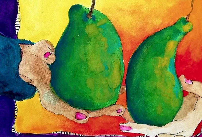
pair puddle with yellow, yellow orange and yellow green. And I'll be charging the
table color with oranges, a red orange to an orange
into a yellow orange and the background will be a blue violet into a red violet. While filming this lesson. The first time I did the
demo for the background. I made the wash too dark and
it was a beautiful wash, if it weren't for the fact
that I wanted to put a shadow on it in putting
the shadow on it, I had to apply far
more pigment and the pigment I was using was a pigment that had
a lot of binder in it, which meant that when I apply a little bit too much pigment, in a wash when it dries,
it dries a little shiny. Instead of cutting that out, I'm going to show
you that part too so that you can see
when it happens to you. Now I've done hundreds of these washes before
and it still happens, and that's just reality.
Things go awry. I still like the painting, but it does it's not something
I would put on my wall, not because of the darkness but because of the way that
the pigment tried. I will show you that and I
did do a second version of it so that I could
show you what I had intended on showing you
in the first version. That's just the way I am as
a teacher because I think you learn more
from your mistakes and you learn a lot
from my mistakes. They're really not mistakes
because I learned something. That's my attitude. Now, the other thing
that I'm going to include in this class is a
very special bonus lesson, which is going to show you how I combine these
different pull the puddle techniques in my real painting in the
painting of larger pieces. I'm not going to go into
an explanation of it. You'll see that I'm
using bigger brushes, you'll see that I'm using
a different palette. You'll see how I
overlay a straight pull the puddle with a graduated pull the puddle and then charging it with color. I'm going to show
you how I apply that in skies and in a
variety of things. It's going to be
very quick because I'm going to speed
it up and goes, what's the point of
learning these techniques. If you don't have an idea of what you're going
to do with them. I mean you're simply
not going to be making hundreds of
pair paintings. I hope you enjoy pulling the
puddle part three. Let's
2. Materials: Here are the materials
that I'm going to have available for
me for this class, but they are not all necessary. To begin with,
you'll need paper. I have watercolor paper. I'm going to use the Reeves
BFK printmaking paper, and this is my folder that I use as a template
to make my border. You saw me do that in part two. You can also use the
compass or the strip of paper that you saw in
part one. Not a problem. Brushes, you really are only
going to need these two, which is a ten, and this is an eight or a six,
probably an eight. I like to use the biggest
brushes possible, so I may also use these and I always have my little D
vinci travel brushes handy, but you really won't need those. These are the only
two you really need. You'll need a pencil. You'll
need paints, pigments. Now, these are two
paints that are squeezed out into
pans and half pans. That's just the way that
I like to use them. A scrap of paper
to test colors on. You'll need a water container. I like to use a water
container that has three separate sections or
I use three containers. One to keep clean, one to washing my brushes out and
the other one is for ink, even if I'm not using ink, I'm so used to that
that I do it anyway. A pipe which I use to
moisten my paints. If you don't have one of these, this is a laboratory pipe, then you can use an eye
dropper. Not a problem. Palette, I have wells here. And for this, because
we're going to be charging the puddles
with other pigments, you want to have
several mixing areas so that you can keep
some of the pigments you're adding clean and
you'll just be more in control of how you're
changing your puddle color. I have these. I'm not sure
what I'm going to use yet, but I'll just grab whatever
it is when I need it. I use the color wheel. This is for my
color scheme game. This is color scheme
number seven, which is the extended analogous
with three complements. This also is optional. You can use any color wheel. You don't even have
to use a color wheel. This is not a color class. This is about mixing
different pigments, whatever color you choose
in a single puddle. Play with whatever
colors you wish to. I'm going to be using
this color scheme. Because again, I'm
going back to the pair. The project will be
a pair painting that will easily hang with your
other pair paintings. The table will be orange, the pair will be yellows and yellow greens going into
a little bit of orange, and the background
and the shadows will be the red violet
violet and blue violet. Of course, paper towels so
that you can wake up nicely. That's it for materials.
Let's get started.
3. Drawing the Pears: First, I draw my border. I'm going to draw
two pairs this time. I like the tall, thin pair. More like bosque pair, I guess, and then a
little bit of a bartlet. I've done an ink tracing over
the top of the sketch that I drew because I don't
think that you can see the pencil very
clearly in the demo. So this is the drawing in ink. This is just on a piece
of tracing paper. I will be painting on the paper that just has
the pencil drawing on it.
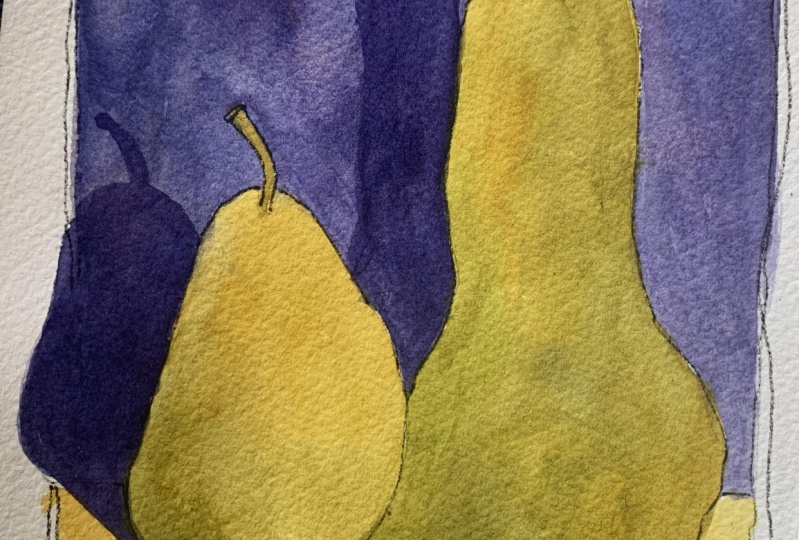
4. Basic Technique: This video, I'm
going to use one of the sketches that I decided
not to follow through with. I'm going to show
you step by step, the technique of
charging a puddle with different pigments so
that you can change from one hue to another within a
puddle as you're pulling it. Have clean water.
I have dampened my pigments so that
they're nice and juicy and I can get good
rich color with them. I will begin by making a couple of puddles
that once I get going, I can just keep moving along, charging my puddle with different colors
from the puddles I've created in my
mixing palette. I want to mix these to be a relatively close
consistency to one another. So that I don't have a one that's more dilute than another. If that happens, then
I end up running the risk of creating what we
call blooms in my puddle, which is that the
water will wash back into the area that
I've already painted. Now, with the pair,
I'm going to be using the different hues to change value rather than diluting the puddle to
make a more dilute puddle. In other words, I'm changing the value by changing the hue, not by changing the
consistency of the puddle. You'll see that I use my paper towel not only
for wicking up but also for cleaning my bh between dipping into
the different puddles. I don't want to pollute the
puddles because I want as clean a color as I can possibly get within
the transitions. I'm going to prop this
up on a slant so that I'm working with gravity and
the puddle is moving down. Notice that this is
starting to dry a bit. I want to make sure that
I keep it a puddle. I have a very big
puddle at the bottom that I will wake up, but slowly. I'd like for the color to have as much time to sink into
the fibers as possible. There we have one wash with all those beautiful
transitions of color. That's the basic technique of charging a puddle with
different pigments.
5. Painting the First Pear: I'm going to mix
the yellow, yellow, green, yellow
orange for my pair. I still want to mix
a lot of my wash, but I have a little
bit more flexibility because I'm going to be
changing it along the way. I want to make sure that
it's mixed enough so that I don't have any pigment
particles in it. Then I'm going to a little
bit of orange lister. That's a little orange here. Then over here, I'm going
to have some green. I have some very subtle green, and then I'll have
more intense green. And I'm mixing my greens. I'm not using a dian. I'm using athaloblue and I'll tone it with
ultramarine blue. By to I'm neutralizing
it actually. Here go my stretchers
again. Cardboard. Okay. If I were upstairs
in my drafting table, I have my drafting table
at the right slant. But here I'm just
setting this up just like you can set
it up on the slant. I'm not wetting my paper first. My wash is how I'm
controlling it. And if I wet the paper, then I don't have as much
control over the pigment. My light's going
to be coming from this direction because it's
casting the shadows there, so it's really coming this way. I'm just going to
play with that. Using a large brush
for this shape. Now, right away, I want to
add some change into it. That's more charge
it with more orange. Now I want to get
some green in there. Can you see I'm still pulling the puddle?
Now, I'm waking up. The puddle is continuing
to come down, so I'm going to wick up. Now, the color is a little thinner very transparent,
which I like. And the color is pretty subtle. I'm going to see at this
pair in the back if I can add a little more pigment, less water and more pigment. Well, that's drying, make
up some more puddles. When I see more
accumulating on the bottom, I just wick it up carefully so that it doesn't lead back up. I have to let this
dry completely.
6. Painting Second Pear: Okay. This is
totally dry now so I can put the h on the next pair. I want to keep it a
little drier this time. It's a little thick. I needed to add a little bit of water. I want to get the
translucency back into it, which you can do
as long as you do it while it's still wet. Keep that puddle a puddle. When I get to the
touching the other pair, I want to be very careful
that I don't overlap it. Okay. It's important to
wait until it gets to the very bottom
edge where you can wake up without actually
touching the paper. All right. Now we're
going to let that dry. Okay.
7. Painting the Table: This is now dry and I'm
going to do the table. I'll start with it dark
over here and go to light. But in addition to going
from dark to light, I'm going to be
going from orange such as this to a
yellow, more like this. I'm going to be
doing two things. I'm going to
transition in value, but I'm not transitioning
in value by diluting my wash as I did in part
two of pulling the puddle. I'm going to do it by
changing my hue or my color because full intensity orange is a darker value than
full intensity yellow. I'm going to take advantage
of that by going from oranges into yellows.
Okay. All right. And I'm also going to use
a smaller brush to start with because I want to be careful here not to
overlap my pair. So I will move to
a smaller brush, and then I'll shift back again. Okay. I'm going to use this. This is a travel
brush, this part, this end, falls
off all the time. So I just leave it off. That does, though, protect
the tip when I'm traveling. Okay. This is squirrel hair, which really holds
a lot of pain. You have to be careful
that this is not too wet. It should work just fine. I want to start with
plenty of puddle. Notice too that
I'm when I'm this close to the edge
of another object that I don't want to overlap. I approach it from
the bottom up. Sure, you keep the puddle going. I hardly have a puddle here. I'm running into
dangerous zone by not having enough of a puddle. G quite as slide
as I had hoped to, but I think it will be okay.
8. Painting the background: Now for the background. I'm
starting with clean water, I'm going to mix up new paints in clean palettes because I'm going to go from blue
violet over to red violet. We'll see how it turns out. I'm excited about it. I'm
liking what's going on so far. I'm going to mix
up red violets and blue violets and have some extra things to charge
it with along the way. We'll see what magic happens. I'm using an ultramarine
blue and an zar and crimson. Okay. And I'm experimenting
a little bit because this blue was
actually from a tube, a very old tube that had
broken apart at the end, and I had it in a ziplock bag. So it was very stiff and I
wasn't sure if I could use it. I was about to throw
it out when I thought, why not give it a try and
it's looking beautiful. It is reconstituted well because I squirted it with water and let it sit there
for quite some time. Don't be too quick to
throw out good paint. The lizerm crimson I'm
using is American journey, which I use for my large abstract paintings when I use the mouth atomizer. I usually do not use it
for paintings like this, smaller paintings
because there's a lot more binder in it. Find that it doesn't work as well for washes with a brush. It works beautifully for atomizing and it's
less expensive than the paint that I normally use on paintings like this, but we'll see how it goes. Both of these are
ultramarine blue. This is my thalo
blue over there. I use a lot of
ultramarine blue and that's why I have
two pans of it. Then over here,
I'm just going to have red that I can
dip into because I don't want to be dipping
into my palette of red or I'm going to be
getting purple into there and I waste a
lot of paint that way. I'm going to have a
puddle over here of the sin crimson and I'm going to have a puddle
of the pure blue. Because once I get going, I'm just playing and I'm
working intuitively. I'm trying to do it as simply as possible for this
class to illustrate it, but it's very hard after
so many years to not just go with the flow and
dip into this and do that. So I'm going to try my best
to make it simple for you. Starting over here and
I'll work this way. Now, the shadow is
not going to be too noticeable when I put it in
because this is so dark. Sure, the puddle keeps
going all the way across. This gets tricky here because I have to go all the
way down and then back and keep the puddle wet
on the edges on both sides. I'm going to really
drench that puddle. Adding to the puddle
all the time, they've got to keep the
entire line puddly. You see, I'm pulling from one side and meeting
up another side. It's a matter of working with gravity and making sure
that it's working with you. Okay. Looking good. No matter how many
times I do this. It's a little anxiety provoked. And it's so dark
that I'm just not sure how the shadow part
is going to come across. But we'll see, I can
barely even see the lines. I can't really see the lines, so I'm just going
to have to fake it. When you do yours, I suggest you don't make it
quite as dark as this. I'm going to let this strike
9. Painting the Shadow: The final step is to
paint in the shadow. I'm going to use a red violet. I've added a little bit more
of the zn crimson to this. Good. I'm going to
make it a little bit thinner because I really
want it to be transparent. This is a shadow. It's
not a real thing. You have to be very
careful not to lift any paint because the paint
underneath is so dense, almost opaque, that it will have a tendency to lift
pretty easily. You have to be very
careful not to drag along the paper too hard
because it will pick up the heavy
pigment underneath. So when this is drying, the shadow up there is
pretty much disappearing. It's too bad that I made
that quite so dark. We'll see how that dries. In the original demo
for this class. I painted in the background, going from blue violet to red
violet and playing around. It was very dark. It was so dark that we couldn't
really see the shadows. I decided to do a
second version of it. I quickly painted these up
and now I'm going to paint in the background again
without going quite so dark. Once again, I will go from a
blue violet to a red violet, will be a much more dilute mix. So when we cast the shadow, we can actually see the shadow. This is going to
be a lot lighter. Much better. I want to make sure to go
back to blue violet over here because it's just on the
other side of this same pair. To make sure that my puddle
off top is still a puddle. I'm going back and forth between the blue violet
and the red violet. All right. That's so
much better in terms of being able to show you what the shadow does when I cast it. I'm going to let this dry and then we'll put
the shadow on. Here goes the second
attempt at the shadow. However, a much
lighter background.
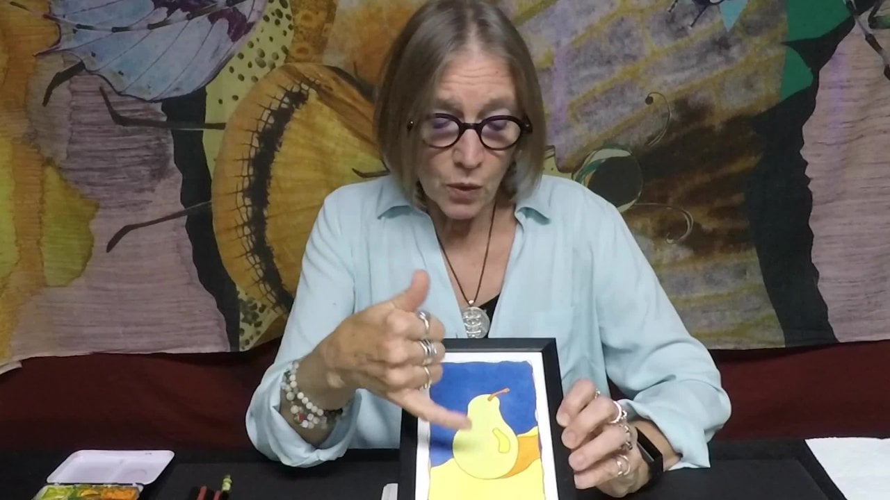
10. Comparing the Paintings: There's quite a difference
between the two of these in terms of values. Colors are basically the same, but certainly the
values and the contrast between the values makes a
big difference in the design. When you squint at these, they're really quite different. Some people will like
this one better. Some people will like
this one better. My preference is this one. This got too opaque for me. I mean, this is what I prefer, but I like the contrast and the design of this one
better than I do that one. It does not mean this is
better than that one. It just means it right now. The way I feel looking at them. There are parts that
I like. I definitely like the shadow better here. I like what's going on
with the pairs better. I actually like the
table better here, but the complete the overall
impact of the piece, I feel that this is stronger. I would hang this one on my wall before I would hang
this one on my wall.
11. Conclusion: This concludes Part three
of pulling the puddle. Just a little bit of a review. In part one, we learned
how to lay down a wash by pulling the puddle
so that we had streaklis seamless
flow of color. In part two, we
learned how to pull the puddle and create
a graduated wash, which went from a darker
value to a lighter value. Okay. In part three, we learned how
to charge our puddle with different pigments and different
colors so that there was a nice transition between color and some nice color
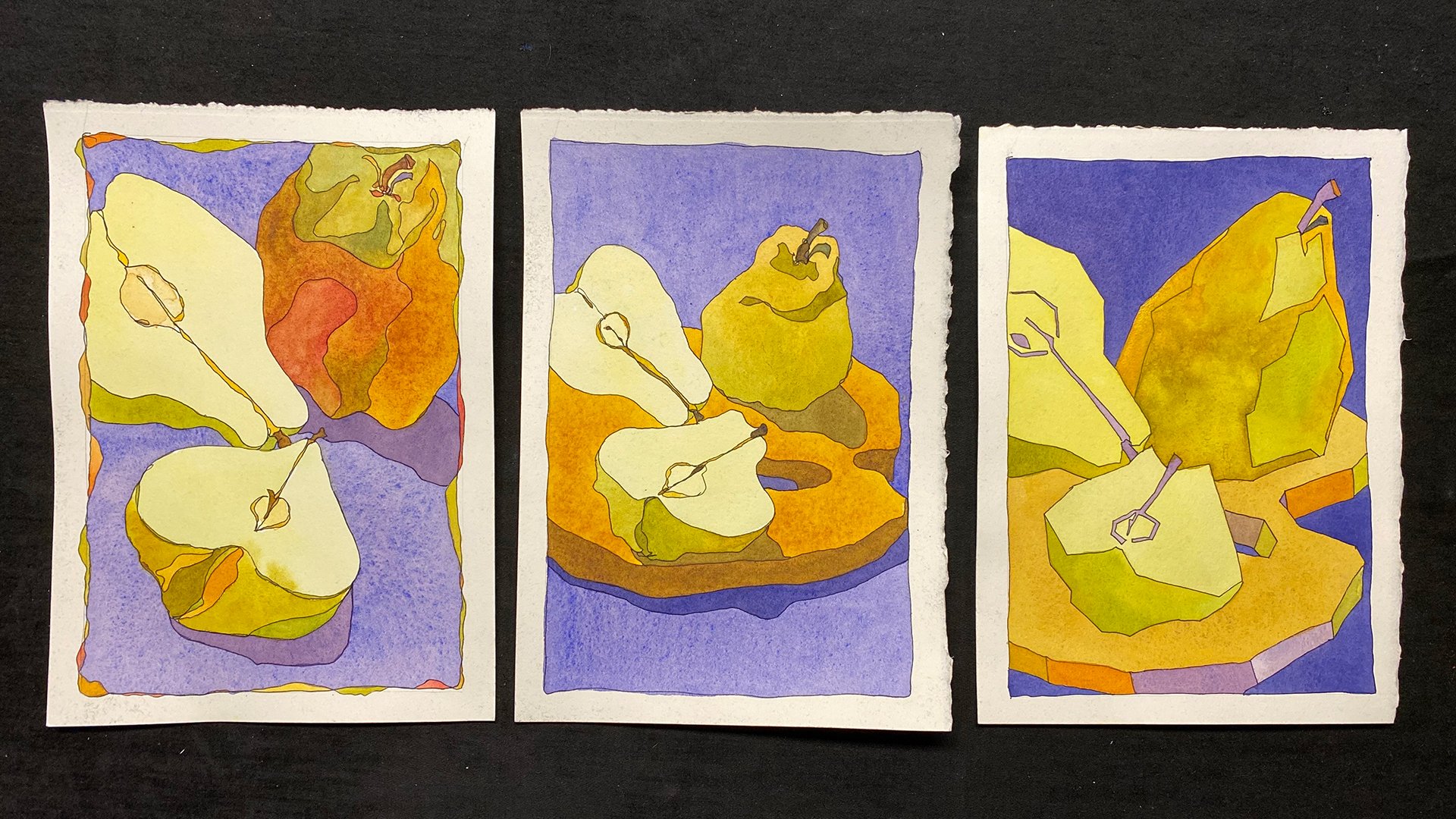
mixing along the way. This is our pair painting from this part of
pulling the puddle. Now, now that you've made three
different pair paintings, we're going to move
on to part four. In part four of
pulling the puddle. We're going to be using the
technique in smaller areas, smaller shapes, and
we're going to do something very fun
with our pairs. You'll see all kinds of
variations that you can come up with by changing your pigments using
this technique. Thank you for watching.
This is Chris Carter.
 Chris Carter, artist, illustrator and explorer