Transcripts
1. Introduction: Welcome to pulling the peddle Part four. I'm Chris Carter. Okay. Part four, I'm going
to be showing you how I pull the puddle in smaller
areas in a pair painting. We're going to continue our
pair series in part four, and then you'll have
a nice collection of at least four great pair
paintings that you can map, tack onto your wall, frame, whatever you want to do. In part four, I'm going to
do another pair painting, and I'm going to create more
small sections and show you how I pull the puddle
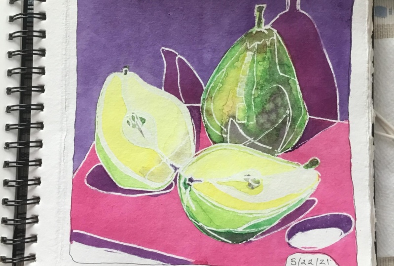
in these smaller areas. When it's all pieced together, it looks like a beautiful
stained glass window.
2. Paper: In this lesson, we're going
to prepare our paper, and it's really simple. I have three pieces of paper, Rebs BF K paper, print making paper
so that I can do three different variations of the drawing and then I'll pick one and I'll paint that 1 ". I've made a template for
myself that's 6 " by 9 " it's out of a file folder so that it's
thick enough to easily trace. My reason for this is that
in part one, two, and three, I did some other pair paintings, and I want this one to be the same size so that I
can frame them together. Okay. Do I just put this
somewhat in the middle. And then with a pencil,
I trace around. And that way, I have a
six by nine inch square. I'm not sure if you can
see this line because I do it lightly, but
you saw what I did. So in the next lesson, we're going to
draw in our pairs. Okay.
3. Drawing the Pear Part One: The other three parts
of pulling the pedal, I drew an imaginary pair. For this lesson, I'm
going to use real pairs. I'm going to use these
two beautiful Harry and David rivira pairs. You can use imaginary
pairs. That's fine. I just feel like I want to
play with these pairs today. I have two because I also want the option of
adding half a pair. I think that I'll cut this one. Okay. I half. Now I have these
beautiful shapes. I'm going to draw variations
of these beautiful pairs. I have two fountain pens. They are platinum carbon
ink fountain pens, and one is a fine nib marked
with this little green tab, and the other is a medium nib. I'm not quite sure I may
switch back and forth. I'm going to start with
the medium nib and I'm just going to playfully draw in my pairs to draw the pairs. I'll be using one of my
styles of contour drawing. My point in this is to make
a lot of small shapes. Not all small shapes
because that would be boring and
confusing and chaotic. I'm going to make
enough small shapes so that you'll see
how to do that. I'm going to start
with this pair Okay seem to be having some
ink flow problems here. Okay. No, I will switch
to my other pen. That one may have
been running out of. But for this, I
don't really care about odd ball scratches because what I want is a variety
of shapes anyway. Besides, I always just make
do with whatever happens. It often can lead to some fantastic images that I wouldn't have
thought of otherwise. Now, this is an outline and sometimes a contour
includes an outline or Maybe something
more like this. What I love about pairs
is that they have all these cool
funky shapes there. Okay. This is a shadow. And let's see. I'm also going to draw my outline because I want one of these pairs
to go off the edge. You can make it as as you want. Okay. I think that I want to
put another shape in here because this is pretty
much the same shape as that. I'm going to look for the section right in there.
I have a lot of shapes. That's one version. There is the hole that
I could put in there, but I think that there
are enough shapes going on and I'm not going to do that. This is one variation. Let's move on to
another variation.
4. Drawing the Pear Part Two: So this time, I'm going to
do it very differently. Haven't moved the pairs. Here's another
version of a contour. Here's the shadow. In this case, I'm going to put the
chopping block in. I left this so that this pair can overlap a little bit
because I like that. Okay. Pairs are great because you just can bend them and you don't have to worry
about how real they look. Because you're going
to look like a pair, no matter what you do. Pairs are very forgiving. This time, I'm going to put
the hole from the pallet in, and this is a bit
of a pair shadow. Okay, so I have a lot
of little pieces there. This because this
is going around, even though I don't
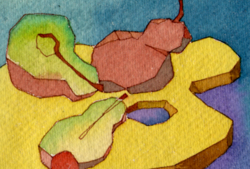
see it there, I need to connect it, so Okay. That's variation two. And now for the last variation. What I do? I'll make
it very geometric. How about that? All right. I'm going to start
with this one and I'm going to in this case, I'm drawing just
the outside shapes. It's not so much con. Here's the hole. I need some other
shapes in this case, so I am going to do
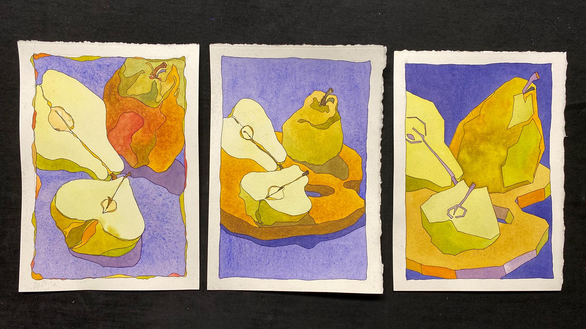
the chopping block. So here are my three variations. Well, I'm going to
paint them all in, and I'll show you the
results at the end. But the one that I'll
do for the demo, I think this one because I
have all these small areas. I'll choose this one to do
the demo for the class.
5. Intro to Bonus Quick Color Wheel: A special treat for
you before I go ahead and start painting
in the drawing. This special treat is
that I have inserted another one of my mini
classes into this class. The class that I have inserted is one about making
quickie color wheels. The reason for this is that we're going
to be playing with more shapes and have more
choices of colors to add. I would love for you to
have excellent results in your final pair painting of this pulling
the pubble series. I've included an
abbreviated version of my more extensive
color mixing class. The Next two videos will
be the quick color wheels. Right after that,
we'll get back to our pair painting
and you'll have whatever colors you decide to use to paint it in.
That's what you'll use. If you know all about color
and color wheels and you know exactly the color
schemes that you want to use, go ahead, you can skip
the next two videos and just move right into
painting your pair painting. But if you're not real
familiar with mixing colors or choosing colors
for your paintings, then I suggest that you
go ahead and you watch the next two bonus videos
and you make yourself a little color wheel and you limit your palette of colors so that you're sure
that your colors are going to look extraordinarily
beautiful together. All right. Enjoy the
next two bonus videos.
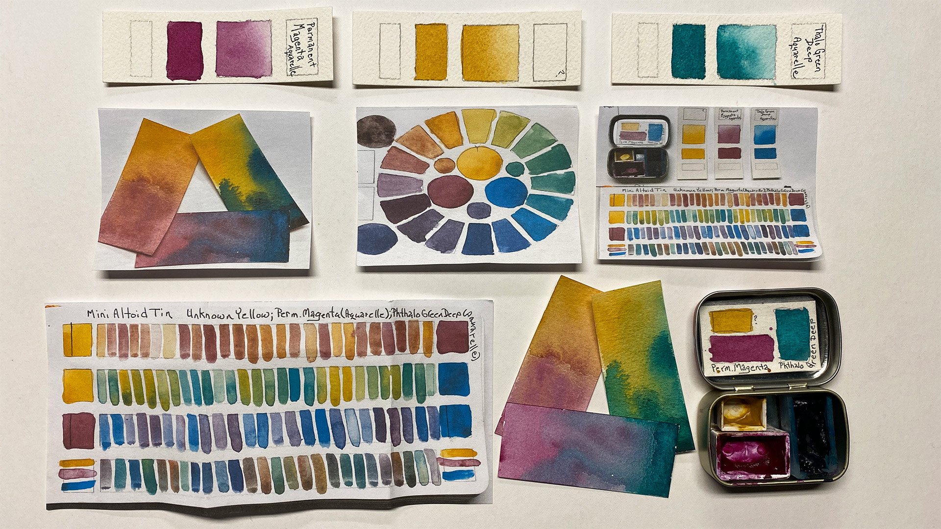
6. Quickie Color Wheels Part One: Okay. Today, I'm going
to show you how to make your own color wheel with the limited palette
that you choose to use. I suggest that you do this each time you change one of the
colors in your limited palette so that you have a reference of the beautiful full color scale
that you can create. Okay. I've chosen six
pigments, a cool yellow, a warm yellow, a warm red, a cool red, a warm
blue, and a cool blue. And on another sheet of paper, I've written down what
those pigments are. My cool yellow is an Areli. My warm yellow is a gamboge, My warm red is a rose Tyne. My cool red is a
permanent magenta. My warm blue is
ultramarine blue, and my cool blue is Joe's blue, which is a thalo blue. First thing I'm going to
do is moisten my pigments. These are all two
pigments that have been squeezed into full pans. Okay. Now, I have a
bucket of water here, and I use the three container, you can use any bucket of water. I have paper towels. What I will now do is shift over to my sheet that I'm going to make
my color wheel on. What I want to do is
I want to line up my color wheel in the same
way that my pigments are. So my cool yellow, warm yellow, warm red, cool red, warm blue, cool blue. I'll just paint in the pure
version of each color, washing my brush
off very carefully between and wiping it on the paper towel so that
I'm sure that it's clean. It doesn't matter which
colors you use for your warms and cools
as long as you choose from the category
of being warm or cool. And I have included a list of those pigments
in the notes. Okay. Now, the rose Tyne is
a pretty cool red. But it is warmer than
the permanent magenta. It's the rose Tyne
is not as warm as as academum red would be. Okay. Okay. I just want to show you that you can use any sort of colors. See this permanent magenta
leans toward blue. The rose tyrene
leads toward yellow, and that's what makes
the difference. We're simply going to begin with the cool yellow
and working quite quickly around this way then I'll blend these two. Moving around. Blue needed to soak a little bit longer. Okay. And I'm going to
blend the yellow into the blue rather
than the blue into the yellow because
yellow changes so quickly. Okay. If it starts to
bleed over that way, you want to wipe it
up a little bit. You just want to see
what the variety of hues are that you can
get with these pigments, and that's pretty
amazing, isn't it? Okay. I wake up the extra so that I can see
what the colors truly are. There you are. With
these six pigments, you can get all of
these beautiful colors. Then, of course, you
can get neutrals as you mix all three together. But I like to make a
color wheel showing the actual pure beautiful
hues that you can get as you're working
with just six pigments, a warm and cool of
each of the primaries. Thanks for watching.
This is Chris Carter. Okay.
7. Quickie Color Wheels Part Two: Here's a bit of a bonus lesson. Let's say you're
out in the field. You're either doing
some urban sketching or your own planar in
a field somewhere. You have your travel
palette with you, you have your nesting
water containers, and you have some
scraps of paper. You want to use a
limited palette, but you're not really sure. You didn't bring all your
extra reference wheels with you and you want to say, I forget what's possible, or I just want to have a
reference of what's possible. You probably have spray bottle instead of that. Here we go. Spray. Moisten our paints and
decide, I'm going to use my, my gb, cadmium red light, zar crimson, ultrain
blue, and Joe's blue. Those are my standards.
I'll show you my standards. I'm going to just start. Again, I always start with
my yellows at the top. It's the way that I think. I'm going to make that nice
and wet so that I can make my way around and wash it off, go into my gamos go
into my cad red, and there, again, I'm going to bring the yellow into the red, not the red into the yellow. Okay. The halo is really strong. And then I'll go back into my yellow and bring my
yellow around to the green. And I go for information. So I will adjust tweak this. I want to see what kind of
violets I get down here too. So I may bring this out a bit. Okay to see what violets I get. That's a very quick out in the field color wheel
with a limited palette. There's another step
that you might like. Here are your pure colors. What about your neutral colors? Let's do it just a little
bit in the reverse and put the cool
yellow on that side. The warm yellow on this side. Then I'm going to have the cool red to mix
with the cool yellow. That means that I'm really
adding a bit of blue into it. Then the warm red. Now, the magic is about
to happen to show you a neutralized file. A little bit more. Okay. All right. Watch this. Okay. Reverse those two and
look what happens. Doesn't turn into
a violet at all. It turns into a brown. Okay. So now I'm working
my way over here. What I have here now is my toe and my gamos. Okay. Two very different color wheels from the exact same pigments. This is all neutralized, and this is pure saturation. There will be another mini
class that goes into depth, a little bit more depth in mini bytes of why this
works the way it does. Just make sure when you
want colors that you go according to this
arrangement. Okay. Cool yellow, warm yellow. Warm red, cool red. Warm blue, cool blue. Okay. Okay. What I did for this second one
is I reversed them. I'll go over this one more time. This is the way that I set up my palette when I'm working. I have my cool yellow,
my warm yellow. I have my warm red, my cool red, then I have my
warm blue, my cool blue. This quick color wheel was
made from this arrangement. In other words, my cool
yellow, my warm yellow. My warm red, my cool red. My cool blue, my
warm blue. Okay. Now, Over here, I
did the reverse. Instead of cool
yellow warm yellow, I reversed them and I had cool yellow there,
warm yellow there. Instead of warm red cool red, I had cool red warm red. Instead of warm blue cool blue, I had cool blue warm blue. The reason that I got a
brown here instead of a purple is because
in my warm red, there's a lot of yellow. It's closest to yellow. There's yellow in
it, and what happens when you add yellow to purple? You end up neutralizing it. Yellow and purple are
complements and yellow will knock out a lot of the purple, you
end up with brown. That's getting a little
bit deeper than you probably want to right now and
that's for another course. Okay. But I had to mention
it to plant the seed because really color mixing is quite simple when you understand
the science behind it. And the science behind it does not need to be
complicated at all. It's about light. It's
about the science of light, and that's why we see
color in the first place. We live in a black
and white world. We only see color
because of the way that our eyes interpret light waves. So that's a science lesson
and a very quick way to make yourself some fantastic color wheels from a limited palette
wherever you are. Okay.
8. Reviewing Technique: A quick review of the pulling
the puddle technique. Mix only enough water
with your pigment to create a consistency
that's about 2% milk. You want it to be able to flow. You don't want it
to be too thick and you don't want
it to be too thick. It can be thin when you
want a really light value. But if you want a
good strong color, you want to make sure not
to use too much water. I'll do a larger section here, and then I'll go in
and show you that it's the same technique
in a small section. You want to keep
the puddle going. You start at one end. When it's little like this, you have to be careful, but you still want a puddle. Can you see that puddle? And then you keep adding to the puddle and you
pull it along. And you work somewhat quickly, but only as fast as you
can control your puddle. All edges of the
puddle must remain wet or it will dry and
you'll get a streak. So keep that puddle going
to the end of your shape. You see this puddle
still moving around. Now my whole shape
is painted in. At the end, you wick up the extra and it helps to
work on a bit of a slant. You can tip your paper and
I'm not touching the paper. I'm just touching the puddle. I dry off my brush to make
it dry so that it can act more like a sponge
and I wick it up. Okay. And I'd like to leave just a little bit at the end so that there's some
variety of the dark. Then I move on to another
area because I want this to dry completely before I paint
in the section next to it. I'll do that same technique
up here in a smaller area. And I fill it. I
drag the puddle. Can you see that I still have a puddle and I keep
adding to the puddle. Even though I have
plenty of paint there, and I tip my paper because it's just easier to work my
hand in the same direction. Notice that at the end, I'll work into the puddle just so that I can get the
fine t. Now I wick off. And now I'm wicking
up the puddle. Now there's a teeny weeny shape there and a teeny shape there. So I'm going to make each one of those slightly
different color. Just a little bit different. Okay. This is a lighter value. So I have added more water in this case to dilute it a little bit
and lighten the value. Yeah, I'm still
pulling the puddle. I'm not painting with
dry strokes of a brush. I'm just moving it around. It's almost like
working with clay. The important thing
is to let each shape dry before you work in
the shape next to it. The same thing will
be done over here. I painted that
whole section in in one swipe and now I'm going to go in and paint
the smaller shape. Dragging the puddle down. Very slowly, I'll work around the whole
painting this way. Take your time. Enjoy it, make some beautiful colors
and see what you can do.
9. Painting the Pears: Okay. Now that you've had a quick bonus lesson in the colors that you can mix with a very
limited palette. We're going to move forward and paint in the small shapes in our last pair painting in the
pulling the puddle series. I've chosen the color palette
that I went over earlier. I have an Oreo gamboge, a rose Tyne, a
permanent magenta, ultramarine blue,
and Joe's blue. I am going to be
painting this in. I'm not going to be
doing a lot of talking. I will be doing the same
procedure that I did earlier in the pulling
the puddle series. I'm going to be making a puddle, even though it's tiny. Enough puddle that I can pull it through the shape and then
I'll be wicking it up. I'll be doing that a lot
more rapidly because sometimes the shape is
so small that I just put the puddle in and
wick it up right away. I'm going to go
through painting it. I'm not going to talk about my decisions of
lights, darks, colors. I'm simply going to go through the whole process and
you'll see the result. I hope that you to follow along, be playful with your color. Think about lights and darks, but don't obsess over it, have a good time and see
what you come up with.
10. Conclusion: Congratulations.
You've just completed part four of the pulling
the puddle series. In part four, we
concentrated more on having more shapes and using the same pulling the puddle technique
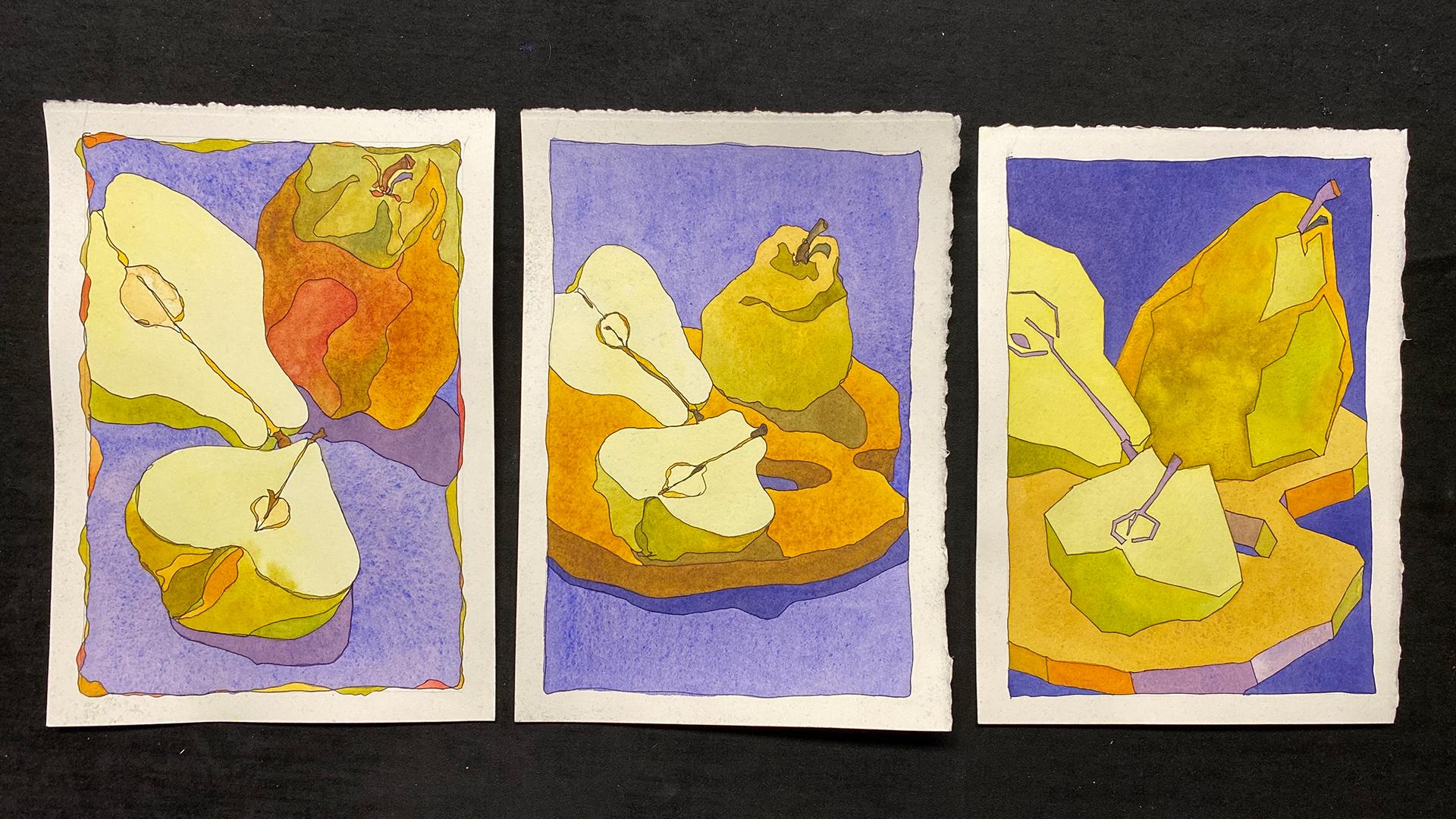
to fill in all the shapes, both the large and small. The results of part four, this painting, this
painting, and this painting. Okay. So they make
a nice tryptic. They can also be combined
with your other paintings. In part one, we made
a tiny painting, and then we moved to making larger paintings all of the same size so they
can hang together. We did this one and this one and this one and
this one and a few more. Okay. So I was
able to go through the basic technique of
pulling a puddle and then pulling a puddle and making
it work from dark to light. And then also
pulling a puddle and changing colors while pulling the puddle and finally pulling the puddle in large
shapes and small shapes. Along the way you learned
some other contour drawing and hopefully you picked up the bug to do a
lot more painting. So thank you very
much for joining me in these four parts
of pulling the puddle, and I look forward to seeing
you in future classes. They'll just be little
snippets of things like focusing on mixing greens or on special variations of contour drawing or
drawing with a pencil, drawing with a fountain pen, maybe a little bit
of oil painting. Whatever I come up with, there are always
little snippets that are helpful to refer
back to when you're taking some of the
more enhanced classes that are on my regular website. I am learning a whole
lot from making me because it breaks it down
into little snippets, and I think that that's beneficial for you and
it's beneficial for me. I think it makes my
classes stronger classes, and it's easy reference for
you to go back, do it again. I can always refer back to a certain class and
indicate that that would be a good one to reinforce a technique that I'm
presenting in a new class. I'm also going to be doing
some classes on bookmaking, so that you can make
your own sketchbooks, you can make a sketch
book out of grocery bag, you can do all things. You never have an excuse not
to sketch and not to paint. Thank you very much
for joining me and I look forward to being
with you the next time.
 Chris Carter, artist, illustrator and explorer