Transcripts
1. Intro and Materials: Welcome to my second class
on negative space shapes. In this class too, I'm focusing on the shapes created by the negative
space of the blue sky. I'm Chris Carter and I'll
be guiding you through these many classes that are focused on the elements of art, the elements of line, shape, value, color,
temperature, and texture. In this class,
you'll be tracing or drawing the blue
negative space shapes onto tracing paper
and rendering in either the negative shapes
or the positive shapes. To render these shapes, you'll be using parallel
black ink lines with a fountain pen, dip pen, or fine tip marker. You'll then learn how to turn these sketches into
beautiful note cards. I'm including two bonus lessons, both of which are also standalone lessons
here on Skillshare. In the first, you will learn
to tear handmade paper. The second, you'll learn to
tie beautiful ribbon bows. You could be a beginner and intermediate or an
advanced artist. And you can adapt this class and the project for the
level of expertise. To create the project
for this class. These are the supplies
you will need. Scissors, folded card, stock, envelopes, glue stick,
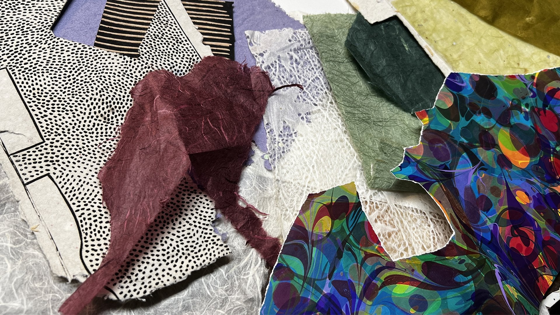
or double-sided tape. Possibly a metal ruler, some handmade paper to fold and use as a border for your card. Photographs to trace the
shapes of the blue sky. Or you can go outside
and draw your shapes directly onto your tracing
paper from observation, you will need one of
these three pens. You will need either
a fountain pen filled with black ink. You will need a dip pen that
you can dip into black ink, or you will need a
fine tip marker. Now you don't have to use black, you can use another color, but I suggest a
dark value color. You'll need a folding bone or a sharpie marker for running along the edge of
your paper as you tear it. Possibly, you'll need a
sponge and you will need some kind of flat fabric ribbon and of course, tracing paper. The result will be
a gorgeous set of notecards that you've
created from sketches of negative space shapes
that you can feel proud to give as gifts to
special people in your life. Let's get started.
2. Drawing and Rendering Shapes 100522: In negative space part one. You saw me draw the blue sky shapes on this tracing paper by placing the photo under the tracing paper and drawing
around the blue shapes. I'm going to show you
now how to make easy, very easy note cards
from these tracings, which hopefully will encourage you to do a lot more
of these tracings until you really get a
grasp on negative space. We're going to make a whole
set of cards like this with a lot of variations in what we're talking about
as negative space. This one is going
to be vertical. I'm just going to draw the
shapes of the blue sky. I'll start off this time
outlining the photograph. That's the blue sky
between his legs. No, I'm not outlining
the statue. I'm going along the
shape of the blue sky. And then they're also
very little shapes, very little of the blue sky. This time. I'm going to make
my parallel lines, not the blue sky, but everything that
is not the blue sky. So this will all be
the black lines. This is another vertical. And I will do this the same way. I'm going to draw
the outline first. Then I will draw the blue
sky shape and I will shade in everything that
is not the blue sky. So they're also blue
shapes in here, but they're just gonna
be too small to say. Okay, now, I'm not going to
film as I'm filling this in, I will just show you
the end result of that. The next two will be
the same subject, the trees and Luxembourg
Gardens and the lion statue. Very different compositions. And I'm just going to draw
the shapes of the blue sky. This first one is very easy. I'm counting the white
clouds as part of the blue sky outline of the photograph. This part can either be
viewed as being incredibly tedious or it can be
viewed as meditative. Depends on what kind
of mood you're in. You can decide you either
want to be miserable or, or you can be quite content. There's one. You may also find that this part of the process helps you to develop your
eye-hand coordination. There too. This is a building that's
on the outside of Park Andre Sichuan in Paris. And I was fascinated by the illusions created
by this building. What I'm going to do is
pull out the shapes, again, just of the blue sky, even though so much is blue and this guy is being
reflected by the glass. I still want to only pull out the negative shapes
of the blue sky. They are, are the negative
shapes of the blue sky. On this one, I will also darken the positive space,
the building shapes.
3. Assembly Decisions: Here are the finished
tracings in these two, the blue sky has been rendered
in width parallel lines. And then these three, the blue sky shapes
were left white and everything else was rendered
in with parallel lines. Here's where I am after
cutting these out. Now I have a little bit of
a mishap with this one. I cut too close to
the black line. So I cut the black line off and I had to come up with
another solution for this one. With this one, I've decided instead of mounting it on top, the side that has the
little petals on it. I find those petals a little
too distracting there. So I'm going to mount
it onto that side. However, with this one, this one is pretty boring. That's pretty boring. So I'm going to mount it there. Now here are those little
petals are always options. I find that those are a
little bit too distracting. So I will now turn it
in this direction. This one I just found boring. So I'm not even going to
do anything with that one. This one is square anyway, and I have some
ideas that I might do with this for a
set of square cards. And I'm not going to throw
this way because I'm sure I can use this for
something. Now. This one, I was thinking I could mounted onto the blue
and then hit the blue sky, or I could cut this out, but the value is too close. So none of those ideas we're going to work
to salvage this. What I did was I took a piece of paper that's just a little bit bigger than my tracing paper. I will mount this onto the white paper and then
mount this onto the blue, and then that I will mount
onto the card stock. This goes this way.
4. Mounting the Sketches: For this card, I'm using a five by seven piece of card stock. I folded it into five by seven. And this is handmade
paper that I've torn to be 6.5 " across and
four-and-a-half inches high. I will be mounting this
onto the card stock. I'll cut this out and mount
this onto the handmade paper. When it comes to
mounting tracing paper or any paper that you can see through that's either
transparent or translucent onto
another piece of paper, whether the adhesive is
glue or double-sided tape, you run the risk of it showing
through after having spent so much time drawing this in and shading this part in
with parallel lines. I'm going to run a test. This is another part of
being an artist that I love is all of this
problem-solving. I have two pieces of this
very same tracing paper. On one, I'm going to use glue and on the other I will use the double-sided tape
that I normally use. That looks pretty good, but I do have to make
sure when I do this to get all along the edge. Now let's try the
double-sided tape. I do see a slight indication
of where the tape is, but it's so subtle. I prefer this where it's perfectly flat to the
possible buckling here and perhaps not having it sealed all the
way around the edge. Now this is not sealed
around the edge, but it's uniform along the edge. That's okay. And I can put the tape very close to the edge. Remember too, that it's not
going to show up as much where I have the black lines and it will show up
very little there. That's not going to bother me. I won't use the
double-sided tape. You can decide for yourself, depending on what kind
of paper you're using. It's thinner than
this tracing paper. I don't know. You'll just have to make the test make sure that
you're on the back side. Both sides look a
little bit the same. But I want the ink
to be on the top. It might be easier to have a different color
rather than the white. I'll work on the file folder. I don't want to put
one in the middle because that's not inked. So I'm going to put
a little one here, a little one here, and a tiny one there. Maybe right there. Maybe one. Make sure your hands are clean when you're
doing this part. Ms. Anything that's on
your hands can be picked up by the tape if
you touched the tip. And I want the pattern inside. That worked out extremely well. And there's your
beautiful note card. With this one, I put the extra pieces along
with black there. And I'm putting this on
the non peddled side. And on this one, I put the
extra piece just there. I'll be taping this down to
the white paper first and then I'll attach the white to the blue and then the
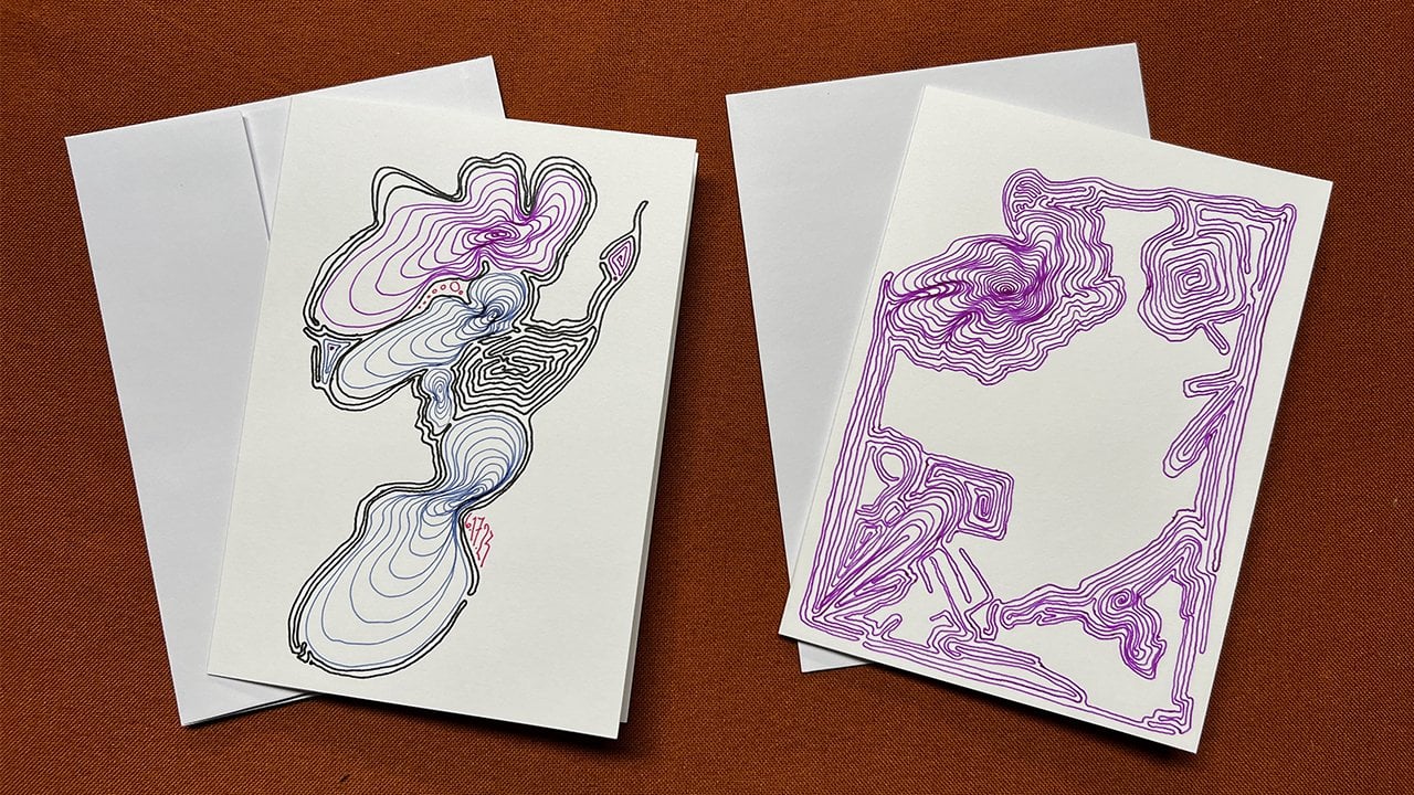
blue to the card stock. Here is my set of four note
cards made in this way where I've traced
the negative shapes onto the tracing paper, I've decided whether to create a darker value
of the negative space or the object may parallel lines to indicate a darker value. And then mounted the
tissue paper using double-sided tape
onto handmade paper, and then mounting
the handmade paper, also using double-sided
tape onto the cart stuff.
5. Bonus Lesson - Tearing Handmade Paper: In an earlier lesson, I referred to having
torn handmade paper. I would now like to show
you how I tear paper. Generally, I prefer a
torn edge to paper, whether it be handmade, no paper that's used to outline, to be kind of a map for an image or for the
watercolor paper itself. This is an example
of a cut edge. It's very sharp and straight. This also is a cut edge. This is a torn edge. I'm now going to show you how
I go about tearing paper. And I will show you with several different
kinds of paper. The first example will be a large sheet of ribs PFK paper, the size of the watercolor
paper that I work on to make a five by seven card
is four-and-a-half by 6.5. I will mark off the distance
very, very lightly. With pencil. I now
take a metal ruler. The heavier the better. A lightweight ruler
will not work as well with watercolor paper or
any heavier weight paper. I also will be using one that is just metal
on both sides, not one that has the
cork on the back. If I use one with
cork on the back, I have to use it this way flat because to rip paper this way, you can't have a gap between the sharp edge of the
metal and the paper. The metal has to be right against the surface
of the paper. Align this up to match up
with the pencil marks. There's a pencil mark
and there's pencil mark. Now I hold this tightly against the paper and
I reach underneath. Right? Once I creased it, will fold it gently, press it with my hand. One thing I want to
mention is that all paper has fibers going in
a certain direction. It's much easier to fold
paper in the same direction as the fibers than it is to
fold it against the fibers. You'll discover
that as soon as you start folding paper
for many years, I use the edge of a Sharpie like that to go along the crease. And that works, especially if you don't have
what I now use, which is a bone folder. And a bone folder is used for bookmaking
sketch we're making. There's two is being held flat. You don't want to
dig into your paper. Then I will fold it in
the opposite direction. Pressing it down first with my hand and then with the
bone folder on both sides. Now, this is the part that
really likes to have a ruler. But if you don't have one, you can just do it carefully
with what you have. And don't rush this part. Put your metal straight
edge against the crease. And not up here
but further away. You want to RIP, tear the paper, holding this down securely, pulling in this direction. And there is your
beautiful torn paper. Okay, big piece and
you do the same thing. Wherever you want to tell it. This is handmade paper, very fibrous handmade paper. And there are many kinds
of handmade paper. Of course, this sort of paper. I use a different method. I will fold the paper
just as I did before. Also using the bone folder, both sides to break the fibres, weakens the fibers. Now the key here, which was just so beneficial to me when somebody
shared it with me, is to wet the edge. Now, most of the time I
just licked the edge, sometimes the paper as
much too sharp or I'm ripping far too much paper to be licking the
edge the whole time. And I'm not suggesting that you do like it because
who knows what sorts of dyes or other
things maybe on the paper. So the alternative is
to take a damp sponge, not not really wet sponge, but a slightly dampens button. Ring the water out. And then you can even just
tear it apart like this. You don't even need
the straight edge. This doesn't work as well
with a thicker paper, but look at that,
that's beautiful. There are some
handmade papers that are very challenging to rip. I think that you can see
the fibers through here. Okay, that's what makes
it so challenging to rip. I'll show you what I do. And I never know if it's
gonna be successful or not. But this is what I do. Line up the edge so that
I have a square corner. My bone folder, I
will crease the Edge, hoping to break as many of
the fibers as possible. To be a little more
gentle with this paper. And this two has to be wet. I will have a sponge,
it's slightly damper. Okay. This needs a little
bit more coaxing, so gently pull it apart and
when you come to a fiber, sometimes you have to skip over it and then pull it through. You may have to cut the fiber. That was fairly easy ribs. Then you're gonna
come to other fibers. Now see how beautiful that is. There's where I had
to cut the fiber. I find that so much more attractive than this
where I cut it with scissors and look at how nice it looks against another
piece of handmade paper. This is yet another
kind of handmade paper. The fibers are going this way. This I find to be pretty difficult to fold
and tear. Also. With this, it will
pay a little bit easier to do the measurement
using my cutting board. These boards are great for this. And this kind. I also do just by hand very slowly because I never know for sure when
I'm going to run into a fiber. This back. So you can see this. You'll feel when
you start to run into trouble right there. And then it sometimes
helps to put a ruler down there to get
past those parts. You just have to take
your time and be patient, but seek a nice edge. Right here. You can
see that's one of those little rectangles
that's in the paper. So of course that didn't
rip first small pieces. I just use this often. I can also just replicates. So this is a piece
of stationary taper. And with this you don't
even have to solve it. You can just rip like that. I tear paper so
much that I also, in my little pen case, I have a tiny
little metal ruler. And this is specifically for tearing paper,
for making collages. And I can just there
like that. Okay. That's my method
for tearing paper. For large, heavier paper, I definitely use a metal ruler. Heavy metal ruler if possible. And I hold it very tightly
against the paper as I'm pulling the paper
across my body like that. For most of the other
papers, handmade papers, I will dampen the edge for all of them except these
really lightweight ones. I score, I fold it, push it down with my finger, and then use the bone folder or a sharpie or really
anything that has a smooth, rounded edge to it.
6. Bonus Lesson - Beautiful Presentation: Here are the four cards
we made in this class. Here are the four envelopes that go with the four cards that
we made in this class. The first thing to
do is to stack them together with the fold
going the same direction. Decide which will be on top. My case, I'm going to
put this one on top. Now. What I do is I
flipped two of them. So the top two, we'll have the fold on the left. The bottom two will have
the fold on the right. And when you do
this, you'll feel that it's now equal
in thickness. Otherwise it's a
little lopsided. I do the same with
the envelopes. 1234. The flaps are here, so that's actually
adding extra width. I flip these around. Then I stack them on
top of each other. The next step is to
select your ribbons. My favorite way to wrap
presence and cards is to use this chiffon ribbon
to tie around. And then the bot
will be made from the hana silk ribbon that you probably don't have
this kind of ribbon. Maybe you do, but you can start collecting
different ribbons. And this system
will work well with any kind of flat
ribbon like that. I don't really have
to measure anything. I will wrap it
around like that and leave plenty of room
to spare to tie off. Using sharp scissors. I cut them up and then I decide whether to have the
bow here or the bow there. I think I want this to show because the bone
is going to be larger. I'm going to have
the bow down there. My finger is holding onto the knots so that
it's nice and tight. Now, I'll choose the colors of the ribbon from my
selection of Hannah silk. Okay, now I get really
crazy with this. I'll start off with one idea. And then if the colors aren't working the way that
I want, I change it. I was going to go with this, but I think that that's
a little dark and I would like it to be
a little cheerier. You can do as many of these are his view of these as you want. Then I pi all them on
top of each other. The longer ones on
the bottom because these are going to be clipped. But also the narrower
ones on top. You'll see pinch
them altogether, lay them on top of the knot. And then again, using my
finger to hold it down, I tie this chiffon on top. I tried to pull it
as tightly as I can without moving my finger. And then I just bend it around this way before I
pull it really tight. Then I pull these apart,
separate them gently. Very sharp scissors. I trim it. I like having the angles all
go in the same direction. This I'm going to trim
a little bit more. These are a little too long. You can get as fast
as you want with it or not be fascinated. Now that's a lovely gift
to give to someone. For this one, I've
decided to use the silk to tie around and
I have to do that carefully because this
will fray easily. And I will use his accents. These blues, not the CEO gray, that looks lovely blue, but it just doesn't
work on here. So I'm going to
use these instead. This is where we have to be pretty careful with
the silk ribbon. There we have two beautiful
sets, note cards.
7. Review: Let's review what
I've presented in this class on negative
space shapes. First, you drew the blue negative space
shapes of the sky, either from direct
observation or by drawing or tracing the shapes using a reference photograph. Next, you rendered either
the negative shapes or the positive shapes with parallel black lines indicate light value shapes and
dark value shapes. The sketches were then
used to create a set of lovely note cards
by mounting each one onto a torn rectangle and
handmade paper that was then mounted onto folded card stock using glue or double-sided tape. And a bonus lesson, you learned how I
go about tearing handmade paper for a more
pleasing and artistic edge. And finally, I showed
you how to transform your note cards into a stunning gift by tying them together
with fabric ribbon. This has been one of several mini classes in
what I'm calling my pack series that focuses on the
elements of art, line, shape, value, color, temperature, and texture. As a reminder that bonus
lessons on tearing paper and time beautiful ribbons are also separate courses
here on Skillshare. Thank you for taking my class. I encourage you to post your projects so
that we can all be inspired by the beautiful
cards that you've created. I'm Chris Carter. I look forward to seeing you in my next class.
 Chris Carter, artist, illustrator and explorer