Transcripts
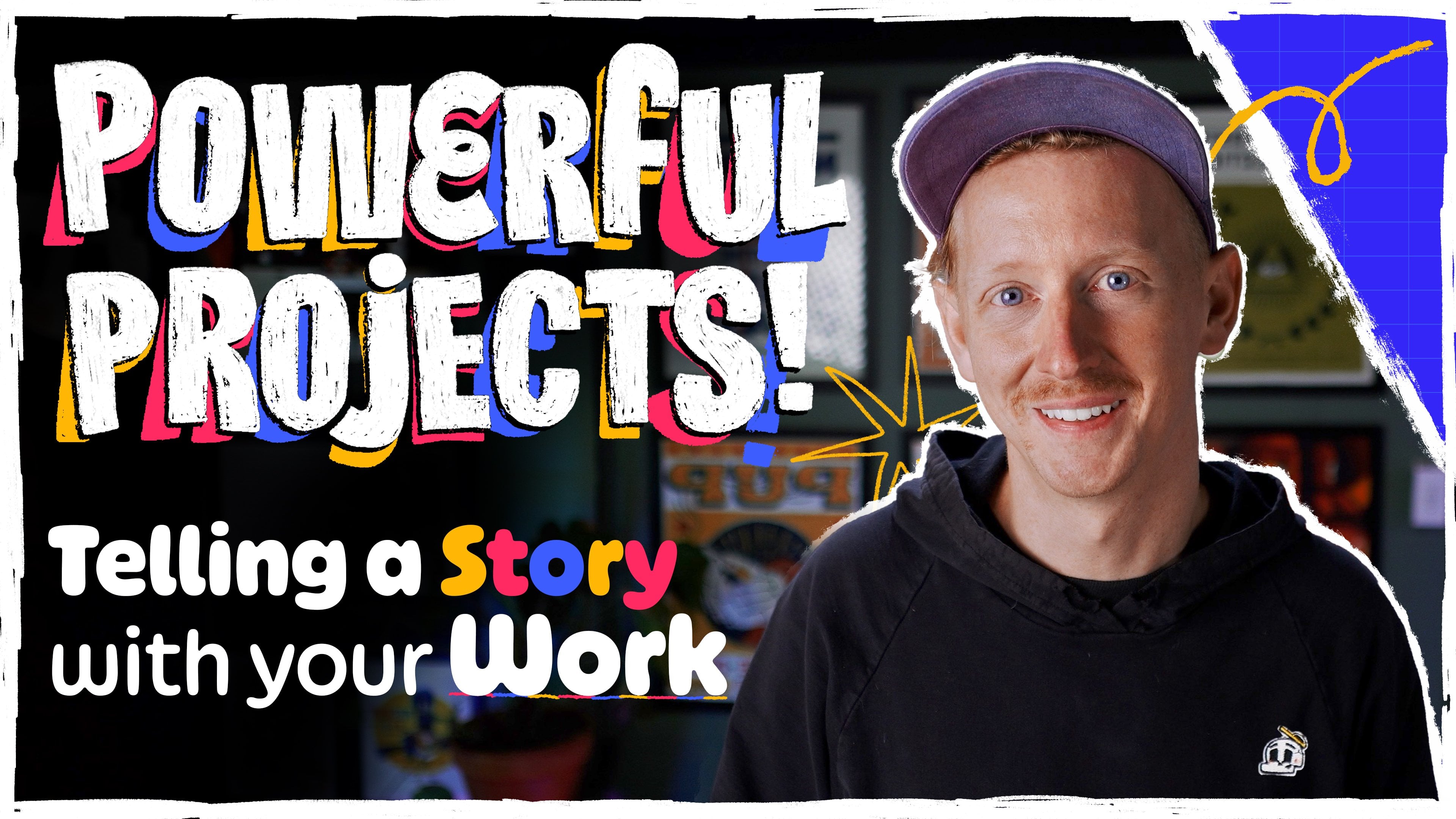
1. Course & Teacher Introduction: [MUSIC] Hey, my name is Kirk. I'm in illustration studio
here called Bonehaus. I spend most my time working on commercial projects
for my clients. You can see that I
put a ton of detail into these characters. Everything I do pretty much always has a character involved, whether it be a
little stapler or a human that seems like someone
down the street from you. We're going to end up
making a self portrait of ourselves with at
least five details. Think about when you were a kid, all the characters
that you loved in the cartoons and movies
and stuff like that. For me, I think
about Ninja Turtles and all the different sketches they had on their shelves, or the cool masks
that they wore, the weapons that they carried. Those are the things
that made me remember which character was which, and just make me remember
the story overall. We're going to start
with an ideation phase where we're just
writing down ideas, talking about the things
that make us unique, talking about maybe
our childhood. We're going to bring
in some references once we find out what's a certain starter
jacket that I want to make sure my character has. We'll move into the
sketching phase where we'll build our character
thinking like Mr. Potato Head or paper dolls. Moving into the details, we'll go into Adobe Illustrator, figure out how to make our flat shapes a little
bit of line in detail, and then we'll move
over to Photoshop, where we're going
to do texturing and lighting final details. In the end like I
said, we'll have our little self portrait with 5, 10, 20, however many
details you want to pack into your character. Then from there you'll be
able to use those same steps throughout the entire course
to make your full character. This is a class for
beginners and novice. You should be able to get
away with any digital tools, as long as you're
familiar with computer, you'll be able to keep up. My hope also is that, well, for me, I love seeing
other people's process. I like seeing a peek
behind the curtain. Even if you feel
like you've been in the game for awhile and you want to just level things
up or try a new trick, new tool, that'll be in
this as well. [MUSIC]
2. Resources & Downloads: Down below there's a download
link that's going to have a toolkit for you. This class isn't about
figuring out color palette. It's not really about how to
draw poses like I've said. I'm adding a lot of
that into this folder. I've got a couple of different color palettes
for you to use. Of course, you're free
to use whatever you want and go off script. But these are just starting
point because I don't want us to having
stuck on those parts. It's got a couple
of different hands, couple of different
legs, bodies, and those things which will make more sense in the later
videos I'll referenced them, but feel free to download that. It's got a couple of brushes
as well and as well as Photoshop files and AI files of the characters for you to
dig around and play with. It will all make sense when it gets referenced in the
later videos. [MUSIC]
3. Lesson 1 - Writing about Ourselves: [MUSIC] This chapter is going
to be all about writing. We're going to get
all the details that we need about our character. Whether it'd be
tiny little things, like our jackets and
hats and hair color, all the way to deeper things, if that's interesting to you. For your own self,
whatever you feel like is an important detail to
get out, write that down. It doesn't mean that
maybe we're going to draw that exact emotion or that
purpose that they have, but it might just mean that
they wear baggy clothes or they might wear their
hair a little bit messy. Sometimes what I'll
do is I'll write what I'm not or what
a character wouldn't be because I get so stuck on thinking of things
that I should be writing or drawing that I end
up having to write what I don't think the character is. I'm going to share my
screen in a moment, but what I really want
you just to do is go really wide on this and
just write a bunch of stuff. This is a very familiar process, I'm sure to most of you,
I'm doing on the computer. Grab a piece of paper and
pencil, it doesn't matter. What's important is
just start writing down the most
obvious stuff first. Where I've got my
name, for purple hair, tall, lanky, skateboarding, something that I really love. So I'm going to make
sure I put that down. I don't know how that's going to manifest in a character yet. I just know that it's important
to me and so that might mean the most obvious thing if the character is
holding a skateboard, but it also might mean that
there's a hole in their shoe because a lot of
skateboarders get holes in their choose from
the rough grip tape. Moving over, I'm
from New England, so a lot of layers for clothing are important
in the winter. I think it's turned into an
aesthetic choice for me. I like to have lots
of layers going on, especially in my torso. Then I think about New
England and I think about how I take the dogs
out in the cold, we walk around in the woods, I'm vegetarian for the
last 10 years or so. Super-important to me. I started thinking
about animal rights. Following this all
down, I go to music, punk music, bring me
to hardcore music, which I got with some
tattoos on this character. Patches could be
a cool way to do. Growing up in the punk scene, I was always making
my own clothes, sewing stuff, that's how
I learned how to sew. You might want to
doodle a little bit, just I got these gloves. Again, going off this
New England theme. I got these Patagonia, a little mittens
that I want to draw. They got a cool like
their fingerless, but they can fold over to
be a full glove mitten too. I'm not going to draw that exactly when I'm
doing the character, but I just want to have these
little notes to myself. I think of this process
a lot like paper dolls. You've got the base character that's boring in the underwear. Then you're piling on all of these different accessories and things like that that
make it interesting. There's these Flatbush Zombie shirts that I've
been really into. It's a hip hop
group that I love. I'm not going to be drawing
a Flatbush zombies shirt, but I will probably
be borrowing from the busyness of those shirts,
try to bring that in. When I was really
young, actually, until I was like the age of 28, I only wore Sushi pants, like the Adidas,
running track pants. I might have the character, have some Sushi pants on, maybe what they're
holding over here. I've got accessories. I grew up loving Legos because I loved that they could all
have different helmets, interchangeable parts
and they would have swords and shields
and all that stuff. For me, I'm thinking I've got a really nice custom rope leash that I got for the dogs,
for walking the dogs. I loved the colors that I
chose for it and all that. So maybe my character
will be having a leash. I went running through all of
it because it gets boring, but this is your time
to do this for you. For me it took an hour, for you, it might take five,
or you might get it done in 20 minutes. The most important part
of this is just to again, really just spread your wings and write down a bunch of stuff. It can be the tiniest
silliest little things like beard or hat, and it can be more philosophical things about the character and maybe that they're single child of a split home or
something like that, whatever you want to do. That's the process here. Think about all the different
details that make you special and you can
mix old with new. Think about jackets that
you're into right now, sneakers that you might
be into, put it all down, and then we'll sift through,
we'll organize it and we'll figure out the
things that we do want, we don't want. Maybe get a good diverse list
of from head to toe so that not all of our details just in the face or all of our
detail are in the shoes. They can choose a couple
of different ones and then we'll bring them into
the next step. [MUSIC]
4. – Writing Tip - Draw the Flaws: [MUSIC] Here's a helpful tip.
I think when talking about character design,
draw the flaws. If you think about
any good Pixar film or even cartoons
when we were little, always the most
interesting parts of a character were their flaws. I think about Chucky
Finster from Rugrats and he had the big glasses and
he was a little bit goofy, but that was what made us love Chucky and the crazy
messy red hair. Charlie Brown had his anxiety, the Ninja Turtles had the chips and scars
all over their shells. A perfect character is boring. A white t-shirt and blue
pants, normal, perfect, super handsome all that
stuff is not endearing. We don't want to
follow the story of that type of a character. Doesn't mean that we're
drawing ourselves in some negative light. It just means, for me,
I skateboard a lot, so my shoes have holes
in them almost all the time from the grip tape on
the top of the skateboard, scratching through my shoes. I'm going to probably
dial into that or maybe a character
was one of many kids, so they had lots
of hand me downs, so maybe some of the clothes
aren't fitting perfectly. There's so many different
stories that you can pack into those little things and if a
character is super perfect, super clean, and really
just no flaws, it's boring. Make sure you link
to those things, any of those peculiarities that you have, make sure
you write them down.
5. – Writing Tip - Reference Real Life: [MUSIC] One more tip I've got is to draw from real
life experiences. The other day I was
pumping gas for my car and I saw
somebody walking out with a ball like lava
on their face like a snow ski mask and
they had it rolled up over their head and I
just thought it was so cool. I put that in my back pocket and thought that might
be fun for later. I may end up drawing
that on my character today just because
I think it's cool. I'm always trying to observe the world and look at people. Because you forget, when you're
looking on the Internet, you're just always
seeing white T-shirt, blue pants like Homer Simpson. But the reality is people
who are wearing suspenders, they're wearing two
or three belts. They are wearing
their hair all crazy. They've got a sweater
around their neck. There's so many different
interesting details that people have when you're
looking around on the street. Those are the things that
help a story be believable. Make sure that you're
drawing from real life. Thinking about those things, put them in your
big list. [MUSIC]
6. – Writing Task: [MUSIC] Now, your
task with this lesson is to come up with a big list. However you want to do
it, you might want to mimic me if you've got
no starting point, but if you've done
this a million times, trust your own process. The idea is to
write down 20, 30, a 100 different little
details out because what happens is when you start going off some crazy
little tangent, you might find something really interesting way over there. Right, get a big list together, maybe a little bit of doodles
and in the next section we'll go over grabbing
some references, and inspiration,
and all that stuff.
7. Lesson 2 Finding References: [MUSIC] References. This is a super important
part to the process. Like every step is I'm trying
to be as brief as I can. Everything I'm teaching
you hopefully is really important but references are the crux to me of what makes these types of
characters special. We have our big list that you just made in the
previous lesson. Hopefully you've written down some specific things
like for me I wrote down I think Adidas
three stripes squishy pants. Start googling all these things on Pinterest, arena,
Instagram, whatever. Just get all of my reference
in the same location. Let me hop over to my screen
and show you what I mean. We can remember that
we've got this here. We were talking about
these squishy pants that I like, this
jacket, these gloves, this was the dog leash
that I had spoken about. Time to start pulling in
some specific references. I already got started here but you don't have to watch
me do every single one. What I started with
was a couple that were just pictures of me
because I was stuck. Whenever I get stuck I go with the obvious,
the easy route. We're not focusing on the perfect bone
structure of yourself. For me I'm going
to do a basic job of the way that I look. But when I have somebody look at the image
I want them to say, hey, that character or that's Kirk because the jacket
that he's got on, or the way that he's
wearing the hat, all the extra strings on his
sweatshirt, stuff like that. Pull that in, holding
some other stuff that I've been talking about. I think most specifically just some models and stuff that I like fashion
that I'm into. This was the dog leash
that I had spoken about, that I chose all the
colors of want to make sure that my
character is not only carrying a dog
leash but carrying this specific dog
leash in rare form I don't have my watch on
today but usually I'm always having a black watch on. It's a Nixon time teller. Again, you can print these out. You can put them into Pinterest. For me I'm just dropping
them into Photoshop, resize them, and
plop them around. I just want to be surrounded by my reference so that when I
start drawing I can look. I don't have to go searching
and all that stuff. this shirt I love. I've been really into
this hip hop group called Flatbush zombies lately. They've got these really
cool limited edition artists run shirts that I just love. But with this shirt in specific,
I'm going to pull it in. I do like the design
but more importantly it's less about it
saying Flatbush zombies, a glorious dead on it. It's more important that
it's got stuff on the arms. It's got a busy big graphic on the chest and that's really what I'm going
to be pulling from. Again, I don't draw super well, I don't feel really confident
in my drawing ability but I know that I can pack in
all these little details. This shirt might just
end up being like a normal black shirt with a bunch of scribbles
all over it. That to me will indicate the story that I'm
trying to tell with the character. What else? This is that Bodega jacket
that I had been talking about that I loved
somewhere here, new jacket that I
got for Christmas. Love this one. I
know the name of it. Again, I might not draw it
specifically or exactly. I'm not really super concerned with the right pose of
the jacket or anything. I just want to see, it's got
the green on the bottom, it's white on the top and it's got these cool
squares on the chest. That's more than enough for me. I'm going to take
it, bend it with my imagination and
make it my own. These were the pants
that I always wore when I was young all
the way up until I was 20 I only wore these.
This will work. Just again, what's
important to me about this is the stripes
and stuff but I love the way it tapers in
like this at the bottom. You get a smaller brush. This to me is really important. I'm just going to
have this here and I'll probably put a pair of
pants on that's like that. Just to reiterate, basically
what you're doing is taking that big writing list
that you've put out and grabbing as many references
as you can for it. [MUSIC]
8. – References Task: Getting mood board together,
however you want to do it. That'll be the task
for this chapter. Don't worry if the
references are perfect. We're just getting little chunks and pieces and we're
going to mash them all together and make
something super specific and unique
for our character.
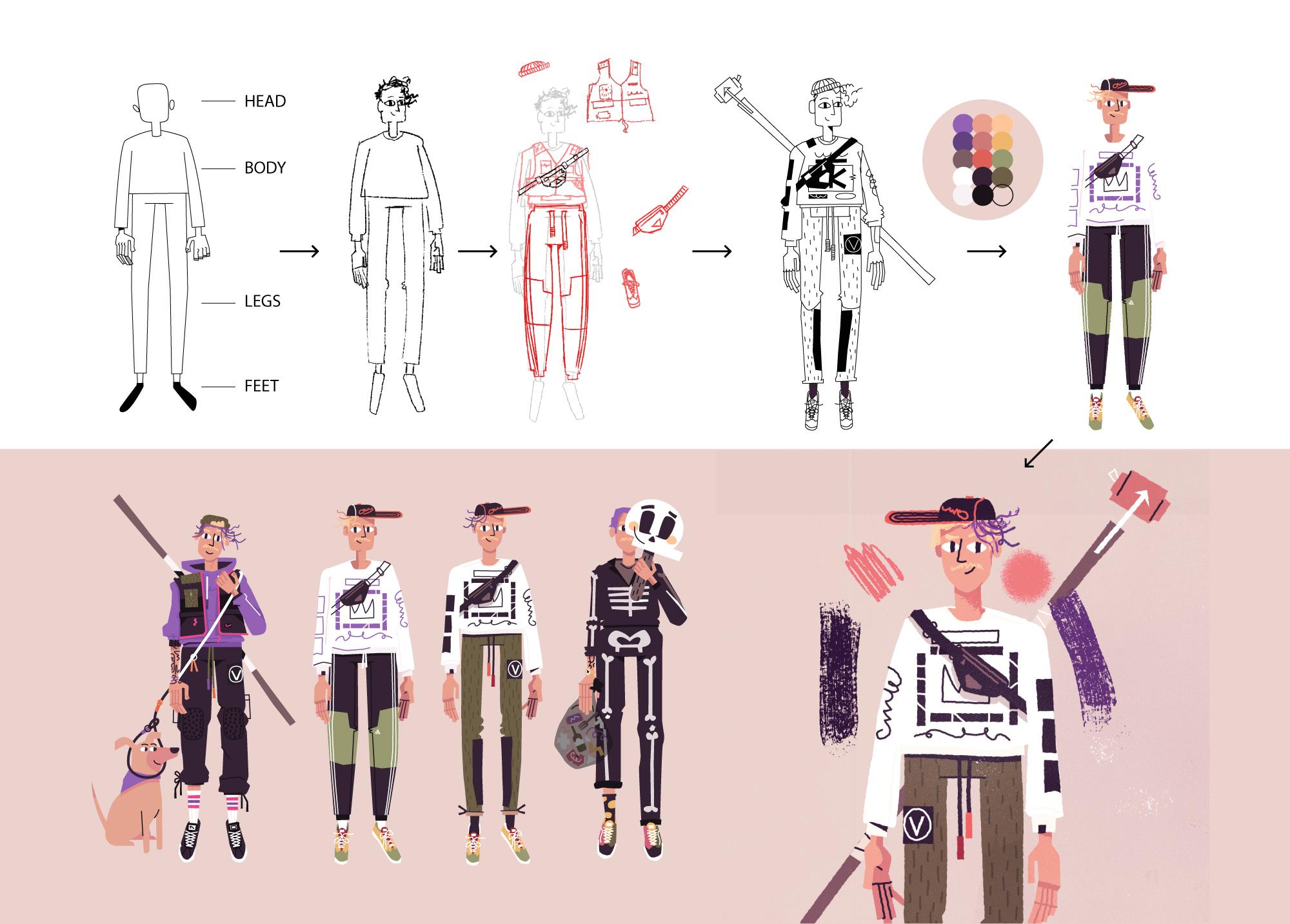
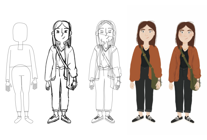
9. Lesson 3 - Creating a Base Body: [MUSIC] Time to
finally start drawing. We've done a lot
of work upfront, gathering all the references, and writing out all the
details about our character, but now we're finally
ready to start drawing. With this lesson, we're
going to make the, I'm calling it the paper doll version of our body
that we will then, in the next step, decorate. I've put in the files for
you down below a toolkit. I get intimidated with drawing. I don't always start
brand new and fresh, so sometimes I'll take an
old file and plop it in and then sketch over
that just to get the basic proportions
of the character. If you want, you can download
that file, open it up, it's both PDF and then there's
also an Illustrator file, and assemble your own
body if you want, and then draw on top of
that and make it your own. This is the file
that I've given you. I've got all sorts
of hands in here, heads, bodies, you get it. What I'm going to do is
I basically assemble the character by
grabbing the head, I'm going to make a copy
of it by holding down Alt, grab my head. A body that I think is
going to be good for my character might
be something simple. I like a low torso
or a short torso, maybe this one will
work. It's funny. Then long legs for me like that. I'm trying to put a decent
mix of curvy and then lanky, all different shapes and sizes, feminine, more masculine, but again, these are
just starting points and then you're going
to draw over it and make it more of your own. I just put what I could. Again,
I'm in Illustrator here. I'm just going to
resize some things to make it feel a
little bit better. Maybe I'm going to get rid
of this and bring it down. That might work.
Resize some stuff. This was another one that I
made that I liked as well. I might even hop
over to this one, but hopefully, you
see the same point. I like the wider
shoulders of this one, which I think was this body, so maybe that was
the better choice. But yeah, maybe I'll
work off for this one. I'll put this head on this body because I
like the narrow head. I've got a pretty
rectangular head and I'm just going
to put that here, even make the neck
a little longer, I've got a longer neck, and maybe a little wider. Again, this isn't the
most important part. If you don't have
Illustrator, that's okay. You have many other means
with Procreate and stuff like that to assemble these, but this is good enough for now. What I'm just going
to do is copy this, go back into Photoshop. This is my file that I had
with all of the references, and I'm going to paste this in, size it up a bit. I'm going to lower
the opacity of it, so 25% or something like that, and make a new layer
on top and just grab a painting brush or
a sketching brush. This is just a
really simple base. I'm not even drawing
the clothing yet, I'm not getting too
fussed about that stuff, I'm just drawing a body that I can then put on the
clothes on in the next step. I'm just going to draw
myself a little bit. We've got some hair here. I'm just going to redraw
the whole head just so that you feel like you've
got more going on, put some ears on. This is the hair. My hair is parted to one side. Get some eyeballs in there, a little bit of a nose. I'm going to give
it L-nose, eyes. Again, we can fix all
this up as we go. But what is important is getting the
structure of the body, so wide shoulders I like. I know that I'm
probably going to have long sleeves in most
of mine because again, going back to that New
England layers cold, especially right now it's January while I'm filming this, so I'm thinking long sleeves. But again, just not
to be confused, I'm not worried about what
shirt I've got on yet, I'm just looking for
basically a skeleton. As far as the silhouette goes, I might go a little bit wider
on the pants and my head, I've got those sushi pants on. But we're going to change
all that as we go, so not super important. I'm mainly just drawing so
that I don't feel like I just traced that thing entirely. It just helps me get my hand warmed up for when
we do a little bit more of the intense
drawing down the line. I'm going to go grab some hands. Because I don't
like drawing hands, so let's just grab. I'll just grab
simple ones for now, grab this one, make it a little smaller,
lower that opacity. Just draw on top of it. I like the idea of my wrist
coming out a little bit, maybe a bony wrist and
then just some fingers. It doesn't need to
be perfect yet. That's the nice thing about
the way that I like to draw is I can just keep making it better over time.
That's the knuckles. I might just go
ahead and copy that, rotate it over, and just pop it in here. What I'll do is I'll
just move it over so we can see where we
were and where we're at. Another thing I might do often
is just start a new layer, use some red or something, and just draw out the basic
like this is my torso shape, shoulders are going
to be like this. This will help me
like if I'm going to roll up the sleeves
or something, if I know where my elbows are, helps me figure out where I'm going to
roll sleeves up to. This feels like it's got
pretty good proportions. I'm going to move
that over and see. Yeah, that looks like a cool, funny character. I'm into it. This is just our base. We're going to put
everything on top of that. That's going to be the
fun part coming up next. In the next lesson,
we're going to start packing on all
of this detail that we see around the character and under the character.
See you over there.
10. – Body Tip - Stiff Poses: [MUSIC] Another tip is
that during this phase, you'll notice that I'm drawing my character very stiff
and just standing down. You'll notice that in a lot of concept art in things
like Pixar movies, when they're coming up
with character designs, they're not really fussed about the poses that
they're standing in. The story is more about in the choices that they make of the clothing that they wear, the way their hair
is, the shapes and sizes of the bodies, and proportions, and
stuff like that. We can pose the character down the line once we've
developed the character, but when we're creating
the spirit, and the soul, and the ideas, and the
details of the character, we're going to keep
it really simple. That's a great way to eliminate some of the more
complex things of, now you don't have to worry
about what this fancy jacket looks like when they're
twisted around like this. Just draw it straight first , deal with the
rest later. [MUSIC]
11. – Body Task: [MUSIC] Go ahead and get started and dig
through that file that I've attached to
this lesson, if you want. You're going to
assemble the character, again, like a Lego piece, and then lower that opacity or print it out,
whatever you prefer, and then draw over it, make your own character. Remember, it's just a base
template that we're going to start putting all of
our details; earrings, purses, pants,
jackets, accessories, helmets, whatever,
on top of. [MUSIC]
12. Lesson 4 - Sketching: This step is going to
be all about getting those details that we've been
talking about forever now. We've got our paper doll, it's called a base
or paper doll, or skeleton or body, whatever. We've got that sketch
out pretty well. Now this is going
to be all about charring that chest bag
that I've been really into or those squishy
Adidas pants I've been really into and
I'll probably draw a couple of different
copies of each of them and start dragging them
over my character and seeing how they look, and later, we'll draw the whole thing all in
one shot at the end. But for now, we're just going to test
a bunch of stuff out. Hop over to my screen and
show you what I got going on. I was drawing some of those masks that I was
talking about here. Again, just for reference. This is my body, my paper doll. Pretty basic. Nothing I could switch to show it very
easily if I wanted to. The first thing I'm
going to draw is I get the chest bag that
I brought in here. I know that this is not the exact bag
that I really want, but we see that the
bag is basically just like this trapezoid shape. It's got the zipper. I think the detail,
it's a little thing. I love the way Herschel has
their little white emblem. But I've seen some
other ones to have cool like plastic straps or plastic buckles and stuff that
I'd like to get like that. Then maybe they even have
another buckle on top of it. Ideally, if you're not able to find every
detail that you want, just go grab more references
of different bags and smash them all together
and make it perfect one. I also have this one. Let me just bring
this over here. I've got her bag
that I really like. I really like that triangle. I love this little purple bit. I'm going to make sure that
I get a little purple where the zipper slides into so that it covers up that
new I can steal from it. I'll just make a new
layer and start again. You may wonder like, why draw so many
different versions of things if you're not really
even going to use them, but it really goes a long way to draw these things
a couple of times. Now I've got that
purple bit here. I like her triangular badge, but I'm still going to
make sure it's white like Herschel one. Then of course our
triangle for the zipper. What I might do
now is just bring this over to our character. That test them on. I actually think I like
the first one more. Let's bring that on, size
it down a little bit, maybe even just warp it. Again if you want to
be using procreate, this isn't really a technical
course on how I draw. You can just be doing this
with a pencil on paper too, tracing paper and put it on top. That's feeling cool to me. That might be how I come
across doing at the bag. Let's do another one.
Let's do this fast. This first I really like. I'm going to start a new layer. I'm just going to bulk out
the shape for my own sake. Bring that over
here and size down. The reason why I trace once for the obvious way is
just to get that basic shape. But the reason why I pull
it off and then trace it again or rather start
drawing from the references, I think the
disconnection of what I think it looks like
versus what it actually looks like is
what makes it unique. What again, the things that really matter to
me at these details, I love this pocket
with the rain camo, just alluding to things for now. I'm not getting super perfect. I'm just giving
myself mental notes of what I think is important. Pink. I'll remember that. I like that it's
split in half here. I like this actually, I do think it needs to go out wider. Give it at that. I like that it splits across
the middle here. It's got these two pockets. I think I'm just going to add some other little badge there
would be cool, the zipper. Another thing I really like, I want to do is like a
pink piping around it. This is always been my
favorite part of drawing is that you get to make the things that
you've always wanted in life that other people
aren't making as much as I love this
new balance jacket, I think it would be that much color of
hot pink piping and I can't make close this
nice, but I can draw them. It gives me a chance to
be a fashion designer. When I'm going to be
a fashion designer, a weapon designer
when I want to draw weapons for maybe a night
or something like that. Just bring it over
here at this point, I'm going to grab this layer
and lower the opacity, so I can see a
little bit better. I might not end up having
the bag and the vest, but I might make
another version where I've got a more plain shirts. I'm just going to
pop this off for now and get this Vasco
a little bit more. Now again, same
thing and the lower the opacity and
draw on top of it. I might just use different color for a moment so I can see. I'm going to draw it to fit the character a little bit better. I'm going to tuck it
in under the arms. A little dent there. Nods to that. Rain camo. I love the shoulder
with the rain camo. Give myself visual
notes. That's all. That's looking good.
Let's do another one. See these pants. I liked this amalgamation
of these sporty pants. But I liked the patchiness
of these pants, I had this idea. I liked her boxing is going on, so I'm going to make some
pants, make a new layer. I might actually start with
bringing my character. I'm going to make
a copy of them. Bring them over here
just so I can see. It's going to be a
little bit messy now, we're just doodling
and we're going to summarize it all into one
proper sketch at the end. But we're just doodling
so as messier, as clean as you
want to do yours, I like them to go a little
bit wide then tapering. Remember what I was saying
about this situation. I like the way the
cuff gets tight. I'm going to make sure I get
that tight cuff there and then go baggy, widen them out. Make sure you're doing
exactly what you like. Whatever types of pants
that you think are cool if they haven't
been made yet, now you're a fashion designer. I always loved that these fish pants had
just the laces for belt. I'm just going to draw
some of those for now. It's looking good. I'm
also going to incorporate a little bit of
this I think having these knee pads would be cool. Maybe their patches that maybe even there's
another tone to them, like cut in this way, like this. Let's grab that.
Pretty good over here. I'm just going to bring
it back to my base one. That's working. I'll
do one more with you. I'm probably going to bash this shirt and this shirt
and this shirt all together. Again, the main thing is, I don't care that this is discipline and punish
or whatever it says. What I care about is
I like that it's got cool rectangle going on here. I like that it got
scribbles down the arm, I like that it's got words here, so let's do that. I'm going to make a duplicate of this character over here. I'm going to move
some of these things. I always love the
waste hips taper in. You know what, maybe this sleeve will be like bunched up
a little bit like this. I like it. I like the
scribbles down the arms. I like the big square. Maybe just start with
what they've got. Maybe some lettering here. But I also like that this one has more stuff all
over the place. It's got logos down here. It's got this circle. I like the weird
shapes so maybe it's got another circle here, maybe a box here with
some writing in it. It's got maybe three images
going down a sleeve, maybe this one has
gotten more scribbly stuff going down the sleeve. That's looking cool.
I like this shirt. This is fun for me now. I might even add a second shirt underneath the layering that
I was talking about from the New England
situation and put the little hem tag
on that I love. I think we can get away
with putting this on top of it because I have no issue with deleting that part of
the shirt or that. I'm okay with this graphic
getting covered up because the graphics not really
super sacred to me. It's more just the busyness
in the noise of it. Maybe I even bring these pants over and see how that looks. Now I have all these
different variations of the character that I
can start playing with, maybe I don't love these pants with this top and I can switch
and swap around. I might do a more
tight slim pant, but I might also do
a more wide pant and do a couple of
different variations. We've talked a lot
about accessories. I think I wanted to
just do one of those so that you can get a
sense of that as well. I'm going to do that stuff
that I was talking about. Donatello has this. You've all probably
seen it in just a stick that he carries to
battle bad guys with, and that has lots of cool tape on it that I always
thought was so cool. I loved it when I played
the street hockey, I always asked my dad to
tape up like I was talking. I really like picking up trash when I'm out on
a walk with the dogs. What I might do is make a little DIY thing with some tape and then a
little bit of like a pokey spear thing with a
ball of trash on the end. Maybe it's like my
superhero thing where I go around poking and stabbing trash and
putting it into a bag. I think it's probably
a little bit big. Let's just drop
the opacity again, start clearing some
of this stuff up. It's going to be hiding some of these other layers so we can make sense of
what we're doing. I think I'm going to
go the opposite way. I got the chest by
going this way, I'm going to go with the sphere. My spirit stick invention tape, of course, very important. Tape all of it. Then my little pokey. There might be a cool way
to do this pokey tool, but for now, I'm just
going to go with that. It's going to go down and
then going to be taped on. Then again, we'll
put a soda cannot. It's more obvious
that it's trash. Send it a thousand times
I'll say it again. We're going to do a better
drawing of all of this. This is just to get all
of our ideas out there. Big hide this one. We're feeling
pretty represented. But I got lots of stuff going
on and should work out. Actually, here's a picture of me picking up trash. [LAUGHTER]
13. – Sketching Tip - Abstracting Complex Objects: When we're drawing
all these details, let's say the sling
bag for instance, it's important to remember what really actually
makes the object. For me, it's not about saying Herschel Supply
Company on the bag. I want to try to abstract
this as much as I can while still letting the viewer
know what it is immediately. For something like a sling bag, it's really more about the
placement across the chest. Basically, if you
just put a square across someone's chest
going diagonally, it's probably going to
look like a sling bag. You've got the extra
benefit of maybe making sure that they know that
there's a zipper on it. That means you need
one extra line. Maybe you got some stuff pouring out of it to show
what they're carrying. One more example would
be those t-shirts that I really like
that are really busy. It's not about what it
says on the shirt for me, maybe even this Bodega shirt. I don't care that
this is a Bodega, but I like the purple on it
and I like the fact that the hood is different
color from the body. To me, that's the
abstraction level that I need to make sure that it's
this unique sweatshirt. It doesn't need to actually
say the company on it.
14. – Sketching Task: [MUSIC] Here's your task.
By the end of this, you should have your dummy now with some outfit
choices, whatever it is. I don't want you to
feel like you got to be anything even close to mine. Yours could be a knight
in shining armor, or it could be a ballerina, or anything in between. You should have a sketch
that looks like this. I finished up and added
a beanie to this one, I ended up doing the different
pants to the rope leash. Added a couple extra details, and I'm feeling pretty good to bring these into
the next step. You should have one, if not, maybe multiple characters or the same character
with different variations and different detail. In the next step we're going to drop the opacity
one more time, give it one more
solid draw through, and then we'll start
finishing up. [MUSIC]
15. Lesson 5 - Drawing the Tiny Details: [MUSIC] This is the
meditation part, I think. We've got our base character, we've got the
clothing and details. Now what we're going
to do is flatten it all down one
more time and make some final sketches that we can then bring to
color and finalize. Let's hop to my screen. Here's where I
ended up. I've got my three base models here. Because I think I'm going to do three different variations because I can't quite decide between these pants that are
like a cargo but athletic. Then I got these that
are a little bit more of a slim fit, blocked, maybe twill pants. Ended up adding a little bit of a mustache to one
of my characters because I forgot them
growing this sweet mustache. I've made things read just
to help me visualize them, but I might start dragging. Some of these elements maybe this character
has the beanie, just roughly placing things. This can be the character
also with these pants. I like the busy
shirts for this one. You could have that. I'll just make it red as well. Some hue that. This one should have the
watch too, make a copy of it. We're just holding down
Alt to make a copy of it. I drew some shoes. These are those patchy ones. Put those on there and
I'll just duplicate that shoe and flip it. This character feels outfitted. I'm going to do another
character with the vest. I was playing around with
this one that has like a hood underneath the
vest, which I really like. The way I would do that
is let's just bring the vest over on top. Roughly speaking anyway. Maybe this one ends
up having the, I don't know, these pants
just say, experimenting. I want one of them to
have our stuff for sure. I'm thinking I like it being on this one
because you've got the cross one way and
then the other way. I like that. I
think that's cool. Let's go with that for now. Maybe this character can
have that walking leash. I'll draw a dog later
inside the walking leash. They're not just walking
around with them. Now I have all three
of my characters. I'm almost really not even concerned with any of
this stuff anymore. I'm going to draw them
proper one more time. Then we start doing
the coloring stuff. We're almost there. Now I'm just really
focusing on getting clean shapes that
will be easier to trace in Illustrator
in the next step. You can see I'm repeating myself a lot throughout
this process. But if nothing else, it helps you get
better at drawing. This hand really had to get
a lot of details figured out because it was a little muddy the way I
sketched it the first time. But this is my chance to
really solidify those shapes and get a clean image of
what I'm trying to draw. You'll notice this
hand that I'm going to draw is still a little muddy. But I can always draw it again at an even
bigger size if I need to. Wrapping up the
feet on this one, that'll be perfectly
detailed enough for me. Remember for you, you're going to [MUSIC] crush down
all of your layers. You can lower the
opacity and draw one final pass at
your character. I'll move on to
the next section.
16. – Drawing Task: [MUSIC] At this
point, you should have gone through
this whole process, created your dummy paper doll, and decided on a bunch
of different references, details, and drawn them. Now we should have some really tight or
relatively tight sketches of your layout of characters. We'll choose one of these, and we'll bring it
to final color. That'll finish off
the course. [MUSIC]
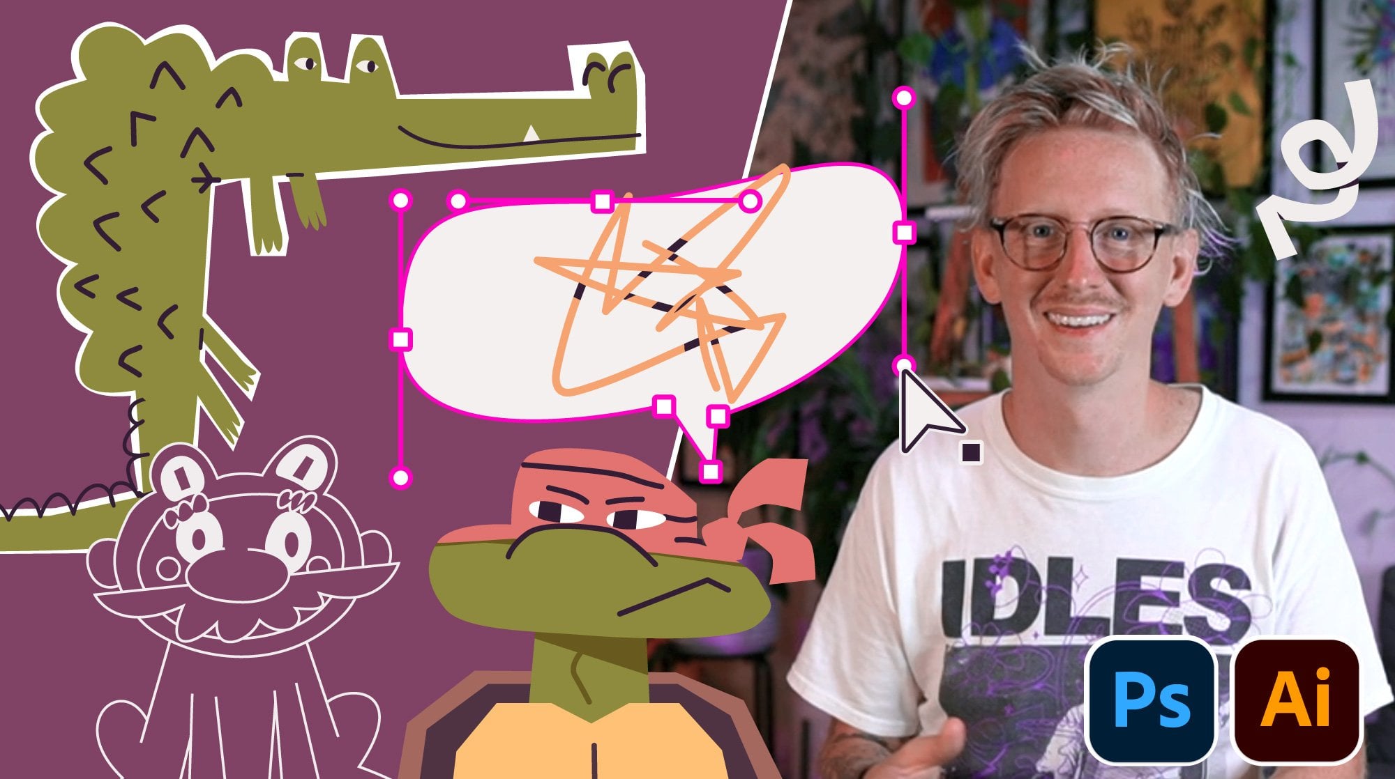
17. Lesson 6 - Finalizing Shapes in Illustrator: [MUSIC] Here we are
on the homestretch. We're ready to color
our character. I'm going to use Adobe
Illustrator like I had mentioned. You can use anything
that you want of course. The most important thing here is we're just basically
making shapes, flat shapes, flat color. I've included a
color palette for you to borrow if you'd like. It's got a couple of
different palettes in there that you can play with. Because this isn't
a color course, I don't want to
get too hung up on explaining my color choices
and stuff like that. That's a different course that
I can teach another time. The most important
part of this lesson is just that we've got
our detailed sketch, now we're going to build up
all of our layers and shape. I'm just going to do an outline
in black and white first, and then I'll drop
some color into it. I don't want working in Illustrator to be
intimidating for anybody. If you want to use again,
Procreate or Photoshop, or even just colored pencils, then by all means, stay along with this lesson. I am going to go grab my characters here
and just copy them, [NOISE] paste them over here. For the sake of this demo, I'm just going to focus on one. I think I'll start
with this one. It'll probably end
up being this one with maybe this one's face, but for the most part,
we'll stay with that. I'm going to once again, I'm going to cut
this with Command X, make a new layer, paste it, and I'm going to double-click the layer and just say
template so that it drops it down and
I'll opacity and it also makes it so I
can't select it. I'm going to be using
the pen tool a bunch to basically just
knock out my shapes. I'll probably end
up time elapsing over this and just
talking through it. I'm just going to basically
make a new layer on top. I'm going to make
sure that I have a black stroke with no fill. I don't know, I
didn't choose black. Here we go. I'm just going to block out my shapes like this. I've got his neck and I'm very fast with
the pen tool I realize. Again, I don't want
anyone to get intimidated by this part of the process. I just so happen to have been
doing this for a long time. Draw the speed run, and I'll make sure I talk over any parts that
are necessary. I try to use as few points as possible whenever I'm
doing any vector work. That way it makes it a
little bit easier for me to modify the shapes
and lines later. I'm also breaking as many of the shapes or of the body parts up into as many
layers as I can. You're seeing that I'm drawing the arms and the
body all separately, which will be easy for me
to pose things later on. Mainly just using the
pen tool and I'm getting a little bit of the
pencil tool as well. Like for the detail
on that left arm, we just use the pencil tool
and did a little swirl. Also just basically blocking
things out to start and then later I can zoom in and finesse any little quirks or
details that I want to include in the shape itself. But to start, I start wide and big first and
then narrow details later. [MUSIC] This is where I start nudging
things a little bit and getting a little obsessive. The hair, I realize I'm probably going to handle in Photoshop later with a paintbrush or something so I don't spend
too much time on it. [MUSIC] Zooming in a ton to get the details
of that rope belt that we talked about
that I really like. A little bit of
clipping masks there and a little bit of the
pathfinder I'm using as well. Again, you may be doing
this in Procreate or just with a pencil on paper. Tools are all very basic. I'm just using a couple of little tools
here and there that are illustrators specific, but you can achieve the
same with any program. [MUSIC] Whether it be black micron pen or a black
stroke in an illustrator, go ahead and dial in this final shapes and we'll get rid of the color
in the next lesson. [MUSIC]
18. – Vector Tip - Grouping Objects: [MUSIC] Here's a couple of
tips. Now once I'm finished with all of my outlines
like I've got here, what I will often do is, as I work on different shapes like maybe I finish
this whole hand, I'll do Command G to group it. You get the same thing
in any other program, but I just know that
I might end up moving the whole hand altogether
every once in a while. What I might end up doing as
soon as I do this as I go, I just group similar objects, that way it's easier
to select them later. I go through and I
prove everything. Then what I'm going to do is, I may hide that layer, I don't need it right now, I highlight all of this and
I make sure that it has its black stroke and
I add a white fill. That helps me be able to arrange the shapes forward and
backward a little bit, because I do design
so two-dimensionally, that way I can
basically take shapes, Command X or cut, and then highlight a shape
I want to go behind, just like basically
all of these, because I want this
shape to come back, and then go Edit,
paste and back. I just drop it in back there. What I'll end up doing is
basically just going through, now I'm cleaning up the file
by just selecting pieces, cutting them, and putting
them in front or in back of things that I need them to
go in front or in back of. I will time-lapse
through this once again to show you a
bit of that process. I'm also drawing through my shapes very frequently,
you'll notice, things like this arm I
drew all the way through, that way I can just
cut it and put it in back of various things. It will make life easier, especially when
sometimes I'll end up animating my illustrations,
it just helps. I'll also end up making
any shapes that I now urgently typically black and each shape is going to
be typically white, so dealing with that now, this is where I also
modify a lot of stuff. I feel like maybe this
stuff is a little bit thick so I'll thin
it up a little bit. Put the soda cane
behind the spear. I'll add my tape later. This part of the hat
needs to go behind. This part of hat, and
it all just depends on which order I drew it in. Now all of that's
going to be together. What I'll do is take
this whole hat, just group it because
that way you can just move it as
one object later. I take this whole
head, group it, cut it and then put it on top, paste in front of the body. This whole object will
become one big group. Group it. Then I can double-click
into the group and arrange all these letters here. That's going to behind that, this goes on top of that. Basically just again,
think about cut paper. I'm just moving things
forward and backward. Again, I'm sure I've
said it 1,000 times, but nothing super
fancy going on. I'm just basically making anything black that I
think is going to be a generally dark color
just so that I can see where the values of the colors are going to be and where the eye are going to go. You'll also see I'm modifying a ton of stuff during this part. For me, it's the part
of noodling with clay and massaging it to
become the perfect shape. I love doing it this
way, but again, depending on what
programs you're using, there's all different
types of ways to keep modifying the work
and make sure it's perfect, even if that's
just erasing apart and going back and
drawing it again. That hair's probably
going to get taken care of in Photoshop,
I said that. Adding in a couple
of details and lines that I literally forgot about. In here, I just brought in another variation
of the character that I had worked
on a little bit, and you can see the color
version on the left there. It's a bit of a preview of what the next section is going to be, I'm building up
the color palette, which I'll make sure
I provide to you, and see you in the
next lesson. [MUSIC]
19. Lesson 7 - Coloring our Character: [MUSIC] Now we're going
to color this thing. I use the ink dropper or eyedropper
and illustrator a lot. It's plop colors in however you feel best
is totally cool. Like I said, I put a color palette in
there for you to use, use it as a base. I put a couple in there
so you can try to play around with
different flesh tones and different basic pallets. But general rule of thumb
is keep it super simple. Start with as few colors as possible see what you
can get away with, and then just bring
in color as you need. In general, this is the palette that I
ended up with here. It's not perfect, but
it'll get us started. I'm just going to give us
a little bit of a gray. What I end up doing is I just start blocking this
character and loosely. You could do a million
different things. You could bring it
into Photoshop, do a rough painting
first, any of which. But I know the general
colors that I'm going for. I know it want like a
earthy green for the pants, probably a white shirt with
a bright purple graphic or black graphic on it and the
bag will probably be black. I'm inspired by that
baseball hat earlier, if you remember that
had the orange brim. I brought in a couple of colors. I'm also because I
want a white shirt I'm going to give myself
a background. I'm just going to use this pink because I know that it works. My color palette over here and I'm just going to start with the colors
that I really know. I know like the flesh color is going to be through all this. I'm just using, like I said, the eyedropper or ink dropper
tool and I'm just taking that color and I'm splashing
in anywhere I know, there's going to be flesh and
that might be good for now. I think I have a darker
flesh color as well. I will throw into certain
parts like the back of the hand and all of these little shapes and
I will do that I've got shirt and I'm
going to make white. Just dropping in color. They got some shadows here. I want to make sure that
this color is dark. I've really mapped this
out already in my brain. If it seems a little bit confusing as to how I'm
coming up with all of these answers so quickly,
that's pretty understandable. Like I said, I'm
not really treating this as a color or an
illustrator course. I will be doing one later. I will be a little
bit more direct. But the point is, we're just bonus round
coloring at this point. We're making our decisions based on all that
reference that we got. All the things that excited us, like this orange hat that has the stitching
through the brim, which I'm going to make black. That hat going it's
going to black. With that orange logo
on it which again, it doesn't matter what
it says a real Orioles, but that doesn't matter. It's more about it just
being that one hat. Back when my hair was
more purple and now it's faded because I've
taken so **** long. I'm just going through
dropping in all my colors. I think I'm going
to make the logo. I'm going to try
purple to start on the shirt but we'll
see where we go. You'll probably remember the
reference of that shirt, but maybe I can jump over here, inspired by this,
just loosely anyway. I have a fear this purple
is going to be overbearing and I'm going to make
it black but we'll see. I'm going to make it
brown for the staff. I still going to add that tape that I've been talking about. Nice thing about working
in illustrator or digital tools in general is you can edit so much on the way. These pants really makes
sense to just jump into the main colors first before you get to hunkered in
all the details. But I think I'm going to
make all these purples black which it's just a little
bit overkill the way it is. I like this a lot more already. This bag is also
going to be black, which may prove to be an issue. What I might do is reverse
this to be more of an outline. I might actually go back
to my purple who knows? I'm going to have
this be an outline. It should be a fill maybe. This is an undershirt
that he's wearing. Here's the undershirt and
this shadow that goes. The green camo I grouped together so I can just
grab all of them and say, I added these little ties. They just love. They like tighten the pants to the bottom. Again, if I haven't
said it enough to you, just a little
details that matter. This is that rope
belt that I love. There's a really specific. It's got this cool winding of pair cord the ends,
purple and black. I want to make sure
that I get those. I'll grab my purple. I'll grab my black. In fact, I think I might
actually do orange and purple, it'd be more fun. Then I'm just going to
make it a little bit of detail line inside of it
and use a clipping mask. Then what I can do is I can just lower the opacity
of this way like that and then do the
same thing here. Quick way to do it. Get those
little hem tag that I like. It's got the brand on
the shirt, little logo. These finger marks are
going to be that color. I'm just going to use this
orange or maybe this red. But again, I'm trying not to
create any new colors where possible. Less is better. I can always add if
I really have to, but I'd rather start
with as few as I need. Let's see if maybe even
this can be blond. I like the idea of the
blond hair with the purple just makes it look better. One thing I would also
do toward the end of all of this would
be start making some shadows so I might take this whole shape and then use the path finder to just
merge it in to one shape. Just put it behind and set it to multiply, opacity, multiply, and I just creates the
shadow version of it and maybe just lower the opacity to 60 percent or
something like that. That just helps give a
little bit more dimension to everything we're doing here. Sometimes I also happen
to outline mode, which is view outline, just to see if there's
anything I'm missing or a line that I
didn't color in. It looks like I got everything. But I just do some
quick tape real quick. What I would just do is
make a shape bigger than it and use the path
finder to cut it out like that and then maybe
make it a couple of lines, shorten them to fit in
the tape a little bit. Then same I might do up here. Cool. I'll look fast
forward a little bit to the final piece and give closing remarks and tips and
things like that. [MUSIC]
20. Lesson 8 - Importing into Photoshop for Textures: We're so close to finished. I'm going to show you now how
I take the illustration in character from Adobe Illustrator and bring it into
Adobe Photoshop. Then from there, we
can do a little bit of texturing in that next video. Again, we're in Adobe
Illustrator right now and I've grouped
my character like we've talked
about with command G. I don't want to grab
the background with it, I just want the character. Usually what I will do before I bring the file from
Illustrator into Photoshop, is I will take this whole
group and go up to effect, distort, transform, roughen. As you see, the
bigger and smaller, you can make this
interesting roughen effect. But what you can do, is if you set it to something really low, like 0.5 and you bring
up the detailed bunch, you zoom in, you get this nice textured edge
on the whole file. I can turn it on and
off, so you can see. I usually do that just to get a basic rough feeling to the whole illustration
before I bring it in. Now what I can do is grab
this group, Edit, Copy. Go over to my Photoshop
document which we just have a 2000 by 2000 pixel
size document, RGB and I'll go to Edit, Paste. This is going to pop
up and I want to paste it as a smart object. That way I can size it up
and down as much as I want in Photoshop and I won't
lose neither quality. Let me bring it up
to a boat size. Now I have and I can rename
it, I'll just call it Kirk. Now I have this layer and
again, we're in Photoshop. Now what we can start doing is giving a little bit of paint and texturing on top of that, which we're going to
do in the next video.
21. Lesson 9 - Texturing & Painting in Photoshop: [MUSIC] Time to texture. This is probably one of my favorite
parts of the process. I love them all so much but this is going to just be a really
quick overview on how to take that flat shape and
bring a little bit of earthiness and the warmness
to it with a couple of brushes that I've provided
down in the link below. We hop over to our screen here. I've loaded in the brushes
that again will be down in the description,
the download section. It's got five brushes here. Again, we're in Photoshop, so I'm going to make a new
layer so I can show you. I've got this line brush that is good for patching up over some of the lines that
we've done in Illustrator, because Illustrator
starts feeling a little bit computery. These brushes can help us
break up some of that. We also have a rake brush, which would be really nice for things like shadows maybe and we'll do a better
job in a second, but I can picture a shadow on his neck here
could be cool or maybe some shadowing
on the side of him to show that there's lighting here on a
certain direction. We also have this grain brush, which is super basic but
good for shadows as well. Then we get these big
subtle texture brushes, just basically scanned
in some dirt and dust on our scanner until we got that and then we've
got this one as well. I'll show you how to use
them all in a second. We have our Kirk character. I'm going to create a
new layer above it. I'm going to use our line brush. I think I'm going to start with filling in some of this
hair because again, I got a little bit lazy when
I was dealing with the hair. I'm just going to use this brush to brush on a couple
of purple strokes, use some of the blond
as well and just give myself a little bit
more of a natural hair. Maybe even these,
I can go over them just to beat that edge
up a little bit more and make it feel a
little more organic. Maybe what I'll do is
create a new layer again. What I can do is right-click it and say Create Clipping Mask. Now it's clipped
to the Kirk layer. Now anything that I draw will go inside the layer below it. What could be handy
for that is maybe I'll use the eyedropper
to grab this brown from our stick weapon
that we made and just get a darker shade. I might just draw some
wood grain like this. Obviously, you all can do a better job than I am
right now as I demo. That's another way to
do it. This line brush can be really handy
for those reasons. Say Create Clipping Mask again, because I also wanted to go inside and I'm going
to use this rake. In my head I got this
idea of I'm going to make this neck shadow a
little bit more beat up. What I can do is I can also use my lasso tool and just
isolate some part. That's still going to be
the clipping mask from the layer situation
but I'm also using another parameter
with the lasso. I'm going to size this
brush down a bit. I just want to just simply add a little bit of texture
to the neck like that, makes it feel a little
more painterly, a little bit more organic, a little bit less
of the computer. Even maybe this purple, you just add a couple of specs
like this really lightly. You can honestly
even do this with a mouse too, it'll work. You can just be more
gentle with it. Now, the third brush, this is grain brush, so I'll
make a new layer again. This one's like this. Sometimes this one
can be really handy if I take this dark black and I want to put
it another clipping mask. Right-click. I can just paint in this nice grain shadow
where the shadow would be, and it doesn't have to
be a dark black either, it could be a red. Paint that in. Then what
we can do is on this, I'm going to call
this grain because that's the brush
I'm using with it. The grain one, we can change this blending mode to
snowy multiply color burn, and bring the opacity
down a bunch. You can see we get just
a really subtle shadow. Maybe on the wooden stick, just adding a little bit of
texture in certain areas. It give a little shadow
like it's behind him. There's that one. That's
fine. Break and grain. For the last two that we have, I'm going to put a
new layer at the way top and just call it subtle. These ones are just a bunch of scanned papers and stuff like that over the
years that I've had. What you can do is just click and add a little
bit of texture. Go up to Filter,
Sharpen, Unsharp Mask. Again, it's going
to be really subtle I think through the video where you'll see you can
sharpen it up a bit. Then I can just set it to
something like overlay. Again, super subtle. Maybe turn it on and off,
you'll see just giving a little bit of a nice
fuzzy paperiness to it. You grab this Texture 2, maybe I'll just make my
brush white so I can get this speckly white like this. It gives a little of
that vintage look. I want to again say
that's nearly overlay. Bring the opacity down a bit. I'll zoom in so you
can see, on off. Lastly, I've got these paper textures that
I'm going to include, just scanned paper
that I've scanned in. This is all it is. I brought it in,
setting it to multiply, bringing the opacity
down a bunch. Now lastly, there's the
color correction that I do. I just use these adjustment
layers down here on the bottom and I
create a new one. Usually color balance
is what I use often. I will just pull some of these
colors around like this. Just a little tiny bit or is pointed in the extreme
so you can see sometimes it unlocks
these new color palettes that you weren't even
really aware of. Crank this way up,
in this way down, you get a cooler but if I crank that way
up in the opposite, you get these superior
vintage looks. I'm going to share my file
with you so you can play around this PSD
file in Photoshop. Tinker with it and turn
layers on and off and drag them around and just scribble all over it
and just have fun. Truly you would if you're a kid. Hopefully you learned
something from it and then make sure
you texture yours. I want to see you play
with all of these brushes, I want to see you add a little
bit of that extra detail. Maybe some wood grain
and a shovel that you're holding or
something like that. Use this to that advantage and move on to the
next lesson. [MUSIC]
22. Exporting & Sharing on Social Media: [MUSIC] Now we're going
to do a self-portrait so we can share it online. Going to hop over my screen, show you how to
export this file so that you can share
it on Instagram or whatever platform you want. I've got my document
set at 2,000 pixels. That's usually a
pretty good website. You can always go up and
go down if you want. You go to File. Again, this isn't Photoshop, and you go to export as. Then you're going to
get this modal pop-up. Usually, when you
have lot of texture, you want to stick with jpeg
rather than PNG quality. I usually want to bring it down until I'm starting to
see it's really bad. We stay at 100
percent here and see. If I bring it down to five. If you bring it down
to one, you see it's getting really junky. I'm going to stick
with five because it's still looks
very good to me. But I'm going to probably
save some file size and everything else I can just
keep default and export, and you can just save that to your desktop or your
documents or whatever, hop into the file
that you saved it in and then that'll
be your file there. I want to see what you made. I'm dying to see
these characters. I'm hoping that you can
show me the sketches, the lists, all that stuff. But this final image will
be the best thing to share. You can share it
on social media. Send it to me. I'd
love to see it, definitely post it
in the Skillshare project, all that stuff. Yeah. I'm really excited to see what
you have to make. [MUSIC]
23. Thank You!: [MUSIC] We did it. We're
done. I can't believe it. You made it through the
whole class [LAUGHTER]. I hope it was really exciting. I hope that you can share everything that
you've made with me. I want you to take
everything that you've done from the writing
to the references, sketches to the final output, all together in a
project down below in the Skillshare course and
share it online as well. Share it on social media,
make sure to tag me. All that information is
going to be down below. This is my first course
on Skillshare and I'm really grateful
that you've made it this far and I
really hope that you got as much out of it as
I got putting into it. It's just been really
fun learning about my process again and actually recording it
and all that stuff, it's just super special to me. So I appreciate you being
here, tell your friends, and keep up with me on social media because
I'm going to try to do more classes and hopefully
quicker than ever. Thank you.
 Kirk Wallace, Freelance Art Director & Illustrator