Transcripts
1. Introduction: My name is Kirk Wallace and I'm a full time professional
artist here in Boston. I work with brands
like Adobe, Apple, Facebook and Google
to create animations, illustrations that focus
on fun, playful worlds. My work has been used for
advertising campaigns, brand experiences,
product designs, packaging be name, and
it's been used for it. One of the questions I
get asked the most is, what software do you use to
make your illustrations? And people are often
really surprised when I say it's
Adobe Illustrator. People think illustrators for grids, topography, and logos. It's not sure, wacky, fun,
playful illustrations. But I'm here to kind of tell one they're wrong about that. In fact, illustrator is where most of my illustrations
come to life. You can see my
sketches, they're fine. But if you look at the
actual final results, there's such a big difference in a lot of that's
happening again. Adobe Illustrator, I've got a solid workflow from
beginning to end, from Ideas to Sketch
Illustrator to Photoshop. And I'm going to teach you
throughout this entire course. Specifically, we're going to be creating essentials of poster. So that's going to be whatever your favorite thing
is right now. It could be skateboarding, could be cooking your favorite recipe, maybe a movie that you're
into, or a video game. The point is, is
we're going to create a bunch of small little
illustrations that are going to add
up big composition of whatever your
favorite hobby is. Right now, this class is geared toward people that want to
learn Adobe Illustrator. We'll go through the
process really slowly. At first, show you how to use chap line color texture and then we're going to ramp up and
you'll be able to run on your own even if you're not the best of the drawing, it's okay. We're going to teach
you how to go through step by step if you don't use digital tools and you're a traditional artist,
that's fine too. I'm going to be teaching
a lot of theory and ideas throughout this that hopefully will be
valuable as well. In the next video, we're
going to go through an overview of the
entire process. That way you know
what's up ahead. And then we're also
going to break down a couple of examples of
posters that I've made in the past so you can see how I made them in my thinking
as I was approaching them. Let's go start to the next video and we'll
see you over there.
2. About the Project: Welcome to the overview.
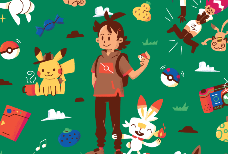
We're going to be creating a census of poster that's
going to have ten, maybe 20 elements that
are really small. Some elements can just be a little shape or a little swirl. And we're also going
to have larger elements like Super Maria. We'll start with our ideas. I'll show you how I
come up with my ideas. We're going to write
down lists and group them into different
priorities and groups. And then once we have all of our ideas laid out,
we'll start sketching. We can do our sketching
anywhere it can be on paper. Procreate Photoshop,
doesn't really matter. What we'll end up doing is bring those sketches into
Adobe Illustrator. And that's where I'm
going to show you how I lock down my artwork, Lower the opacity, trace
over all the shapes, bring in color
detail, some line, resize things, and build
up that composition a bit. And then once we
have an Illustrator file that we're
really happy with, we'll export it over
to Photoshop for some final details
like texturing and a little bit of roughed
edges and things like that. So hopefully that feels good for you and exciting if it does, let's keep moving
on to the next one where we're going to come
up with our ideas and concepts and we'll
have a whole video on that. So let's get going.
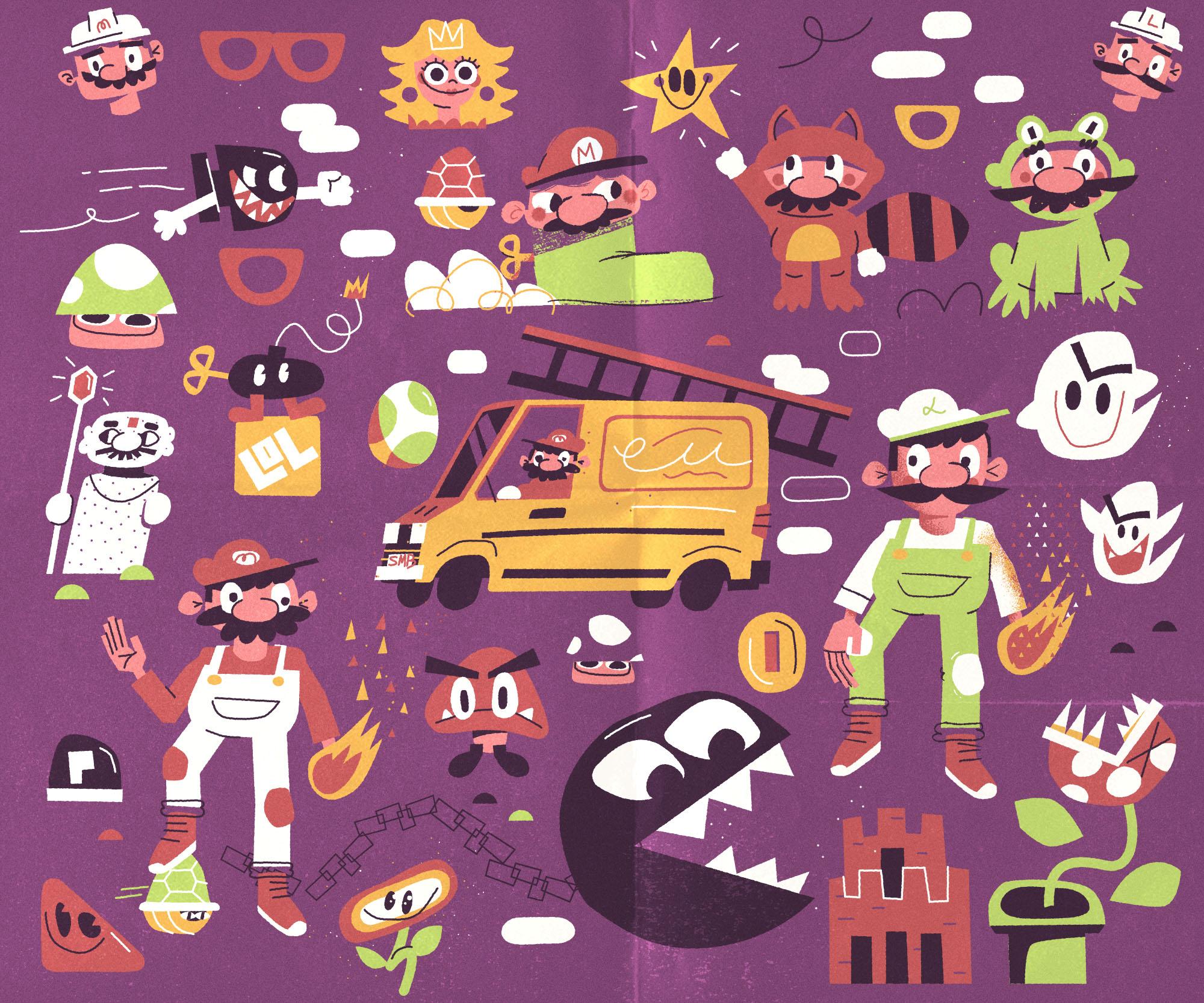
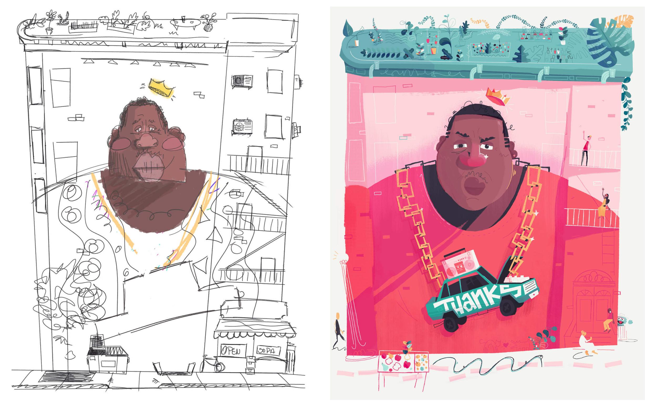
3. Writing Tip: Too Many Heroes: Something I think that's
important to teach. Before we get into
our ideas completely. Basically we're going to come
up with a list of things. Let's take Maria for instance. I'll be writing down ideas
like all Super Mario, these different outfits
that I mean to all of these different little upgrades and superpowers
that you can have. But I don't want to
have too many heroes. If you have too
many heroes both in physical size but also
in emotional weight, then kind of everything dies
down and nothing is special. Background elements are going to be the textural element that can kind of pattern throughout and fill
in some of the gaps. That way we don't have
too many superheroes all basically colliding at once and you don't really
know what to look at. So we want a little bit
of visual break as well. So you can see
here on my screen, I've categorized all of
my examples into large, down to extra small for the animals we have
large which is, you know, the deer medium might be something
smaller like the tree. It's not really nearly
as much of a hero. And then I have
small elements like this little ant and then
I have extra small, which just raindrops
or little lines. The eyeballs, your
really small things, don't need to be
that descriptive. They're just kind of
helping out of context. You might not know what the
shape is, but in context, when it's around all
these animals and stuff, you assume, okay, it must just be a plant or
something like that. So for Mario, I would
call large, you know, the van, obviously some
of the Mario characters. But my mediums might be the
Bogost or the ma small, probably the Yoshi and the coin, maybe even something
that the fire flower would be
considered small. And then the extra
small things would be just these little doodly lines. Some of the clouds, the platforms that
Mario jumps on. Even these little dirt mounds. Those are the elements
that we can sprinkle in, in between that'll tie
everything together. To put in one more time, let's make our list of all the things that you
want to communicate. In your poster, I would
say go way over to start. You might put down 50 or
100 elements to start. And then you can categorize
them into large, all the way down to extra small. And then we can start
sketching in the next phase.
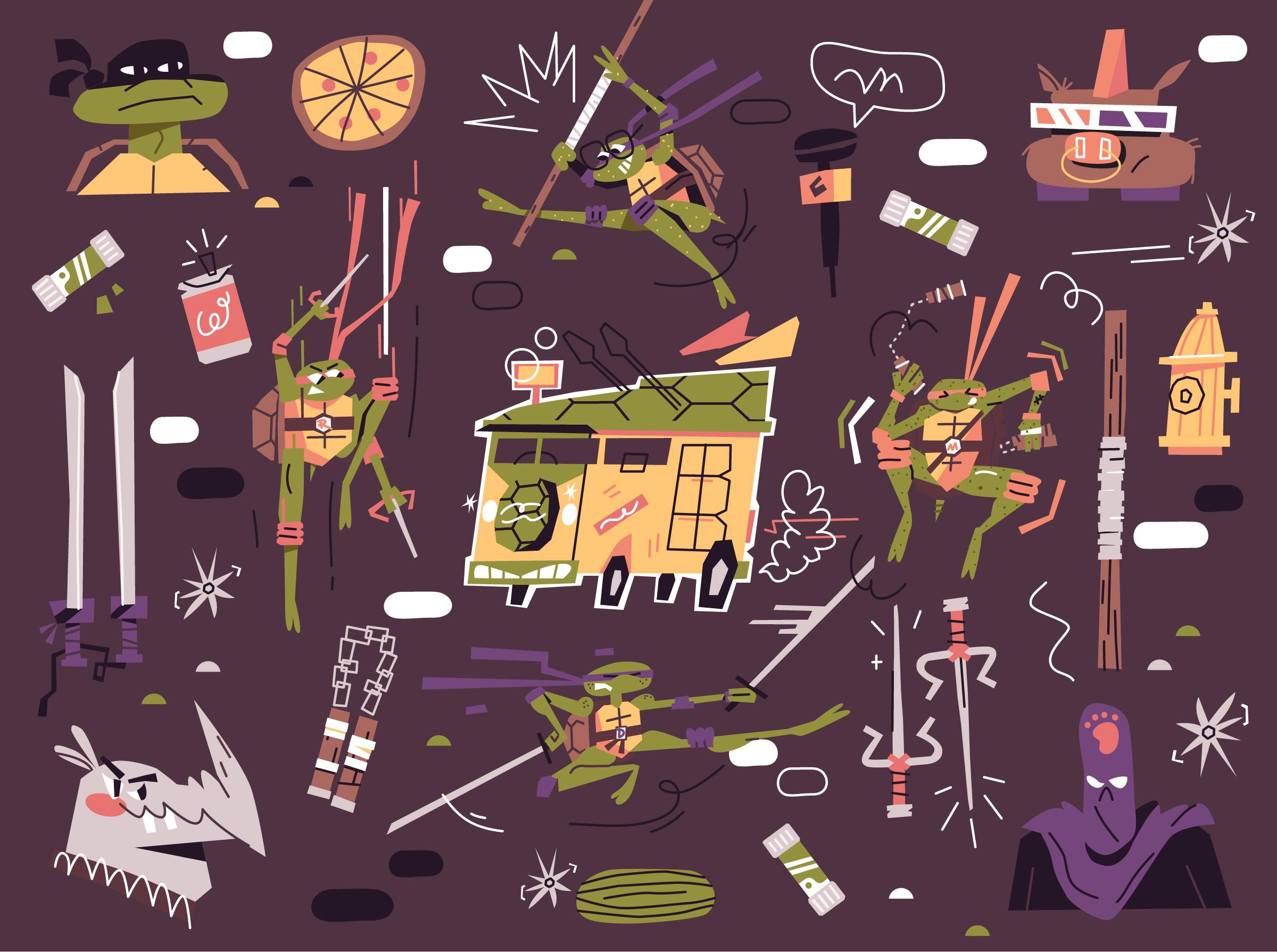
4. Writing Task: So here we're coming
up with our ideas. For the sake of example, I'm going to go with
the Mario movie that I'm really into right now. A couple tips that I
want you to do is try to come up with as
many ideas as you can. You might only want to put 20 in the illustration
or even ten. But if you can come
up with 100 ideas, it's going to force your brain to go a little
bit beyond what you would typically think and come up
with some of the weird ideas, some of the more obscure things. If you're thinking about
Mario, for instance. Yeah, of course you have Mario, Luigi, Princess Beach,
all that stuff. But maybe if you keep going, you start thinking
about, well, what about like, oh Dr. Mario. That was a cool game
that I didn't think of. And maybe all of
his little pills, that could be one of
those extra small elements that we
were talking about. Let me pull my ipad up. I'm just writing notes. You can do that with a
piece of paper and pencil. I'm just doing the pace. It's
a little bit more quiet, but I'm going to start by
just writing out Mario. And for me, the thing
I'm really excited about drawing and putting
into this piece is all of this costumes. So I'll put that out and I'm just going to write
some of them out. Like the raccoon
suit is really cool. This cape I always liked, He's got that stone
outfits, cool. He's got those like
boot that he jumps in, I forget what it's even for. It's got like a
little thing on it, we'll get reference later. But speaking of that,
we do have power ups, like one up mushroom.
Well you have the star. Got me thinking for some
reason or another about Yoshi and his wings. He had these little
wings around him. He has the egg that he comes in. Bower makes me think
of the enemies. And I don't want to
have too many heroes. And when I say hero, I
just mean like large items that are taking
up a lot of space or telling a lot of story. To me, a bower might be a little bit overkill to
have with Mario and Luigi. But some of the enemies
could be some of those mediums or smalls that
we've been talking about. Soper enemies might be
like the bullet bill. What I'm kind of
starting to do is like maybe this is my large group, maybe I've got some medium here. I need some that might be
things like the Pow box, coins, the smash blocks, I forget what
they're even called, but blocks that they smash. So starting to think of these like this might be
my small group. I got my large, I
got small mediums. These could be kind
of like mediums too. Oh, one thing I
really want to make sure I add in is that van, I love their like plumbing
van that's a large to me, like this is this needs a star. I want to make sure
I get that in there. So anyway, you can see the
process is like really rudimentary and I think you can get through it very quickly. But my main lesson would be
write down a lot of ideas. Maybe go for 50 to 100 of them. And then start grouping
them and categorizing them. Bold the ones that
you really like. And then from there,
in the next lesson, I'll show you how I
kind of, you know, scrap some references and
start doodling a little bit. So I'll show you
how I sketch and show you that it's really
nothing that crazy. Let's keep going
and have fun come up with lots of ideas,
go wide and far. Try to get as weird as you can. I'm keeping it a
little bit basic just for the sake
of the example, but my lesson you would
be go far and wide. Make a big list, then we
can call it out later. So see in the next video.
5. Sketching Tip: Repeat: Before we get into
the actual sketching, which I'll show you
the whole process of, I want to just go through
a couple of quick lessons. There's some theory
that I have with these sketches and
the whole course is meant to be really simple. Let's not get bent out of shape of how perfect we
are at drawing, let's just focus on basic shapes and a little bit of detail you want to give a viewer as little as you can for
them to figure it out. I think about it in
terms of storytelling with movies or TV shows
when there's a twist, you want the viewer guessing maybe what's
going to happen. And then when they
figure it out, you want them to think,
oh, I, you know, I could have figured that out, but it wasn't like
there's no way I would have ever guessed
that that was happening. Similarly with
illustration, for me, my preference is I want
them to look at something like maybe an alligator
or crocodile. I don't want to, if I'm going
to give them the shape of the crocodile with kind of the bumpy back and the sharp teeth. I don't want to also give them all the scales and
all of the texture. I want to just give as much as I can and leave as much
out as possible so the viewer is always
kind of wondering and to look a little bit
more intentionally with that and your practice
when you're sketching, let's try to keep things
a little bit ambiguous, like don't worry too
much if it looks exactly like a crocodile
or an alligator. We just focus on
those basic things. Make sure it has a long snout, make sure it's green, make
sure it's got the bumpy back. Ambiguity is good.
Simple is good. And let's focus on the shapes of things and not worry
too much about, you know, how every strand of hair falls on somebody's head. You just put some squirrels
up there and call it hair.
6. Sketching Task: Welcome to the sketching lesson. We're going to take all of our lists that
we just wrote out. We're gonna pull in a couple
of references, pretty basic. And then I'm going
to be in Photoshop sketching a little bit
just with one brush. Nothing crazy if you
want to use procreate, if you want to use markers, pencils, paper, it
doesn't really matter. What we're focusing mostly
is on shape and line. For this, I really like
flattening things out, really trying to get down to the essence of what
we're drawing. I like drawing things
multiple times. As many times as I can, as best. So if I'm drawing, let's say one of Mario's
little Mushrooms, the first time I draw them in, draw a really close
to reference. So I'm gonna stick to
whatever reference I have for the video game or a movie or something like that. Second time I'm
going to, you know, kind of base it off my first
sketch and keep evolving from there and eventually hide that reference
material altogether. And the more I draw it, the more confident I am
in taking a little bit of liberties and stretching
some proportions and squashing it around. It just lets me own it
more. That's a quick tip. Otherwise, I'll hop
in on my screen and we'll sketch and follow along. And fully you're gonna
be sketching too. This should be nothing new
for you at this point. Should be familiar. I've
added a couple extra things. I've color coded a
little bit and what I'd like to do is I bring
this into Photoshop. More importantly, I like
just having it around. So if you want to have it
on a piece of paper next to you on your desk while you're drawing,
that's great too. I just like having
everything in one spot. And then I pulled in a
bunch of references. Again, we want to be changing these so much
and making them our own that it's really just to get ideas and colors
and stuff like that. I might even start by just
drawing Mario himself first. You know, maybe this
reference here I like. So I might even just
draw him really close to the reference
just so I can see. So you know, he's got
this goofy hat and the hat's kind of got thing with his M. I'm just
figuring this out. It's like oh like he's got these side burns are important. His head is like this, kind of round and chubby. One thing I really like
about him is his big nose. Maybe his heads a
little too big here, so I can just keep
messing around. And the main thing is just keep drawing and don't overthink it. His mustache is very
important eyeballs. I'm not in love with these
proportions right now at all, but I can fix all that later. I'm just going to move
this down a little bit. I might even just
pull my reference down here just so I have
more space to draw. This one is terrible
and I'm going to keep doing more something. I would really
want to make sure. I'm just drawing
also everything on a new layer which is just down here in the
bottom right corner. And I'm just using one brush, which of the shortcut
is the tool? Every once in a while I'm
moving it around with the tool which is just
this select tool. But this one I want to
squash down and do command, just squish them, I want to
be a little bit shorter and pgi, my new layer. It's a good idea always to group and name your layers
a little bit. Down here in the
lower right corner, you can see him doing that. So let's go bigger
with the head. I think, yeah, he can use
these big ears. Big nose. Something I really think is
very identifiable by Mario. And that's what we're
going to be trying to do is finding the essence of these shapes and
characters and stuff. Is he's got this
big mustache and big eyes and always
the M in the middle. It'll depend the
canvas that I'm using. I think it's just
like 3,000 by 3,000 pixels and I'm
drawing at 72 DPI. But again, this is
just the sketch. So it's really not too important yet because we're
just going to be using all of this data that
we're creating for ourselves to be able to go
into Illustrator later. Right now, one thing that
I'm noticing is he's a little bit more Luigi
than he is Mario. And I think part of that is
his head needs to be bigger, and that's already
helping him quite a bit. The ears and liking, that's
definitely something I'm enjoying that feels
very Mario big nose. And his nose is
round and circular. His mustache is very important. Him learning his hat wants to be these three bumps that giving
the shape that I'm liking. And his advisor
now for his eyes, I'm going to take some liberties and
have them a little bit more shifty just because
that's how I like to try. Eyes, eyebrows. Yeah, I'm feeling more
comfortable here because again, I started here
normal little less. Now I'm getting a
little more confident. Sometimes what I'll
do is just grab a different color,
make a new layer. Just give myself a
quick skeleton of like, okay, he needs a plump body. The idea of having
a short pump body with those little legs, I'm drawing a little
bit more freely here. Arm's going to be
sticking out to the side. He's got his
overalls. It's good. And I'll just lower
the opacity here. Drop that down and go back to my other
layer and draw on that. So switch back to black and
get this round body going. This is more fun. Again to me, more the essence of Mario, which is really
important to grab. I'm not going for accuracy,
precision really. I'm just going for what
I think quickly looks like Mario to me and
what I know Mario to be. And he's the stodgy
funny characters. Overconfident. He's, he's big
fists. He's ready to use. And I can always use the lasso
tool and just do command X to delete certain
parts that I don't want. Command X is just cut. So basically this
is feeling better, starting to like
this and I can do command and you start fixing
certain shapes a little bit. You make us like smaller. Yeah. Now he's getting
the Mario that I identify with
undershirts important and I'll just color certain things and just to denote that they're different colors.
Yeah, I'm liking this. That might be good
for now. Often what I'll do is draw
something a little B. It less intimidating too if I
start feeling weird at all. How about we do a
bomb? Bombs are fun. I don't have a reference,
so let me grab one real quick, Grab this reference. I might just grab this
one for reference, copy and paste it in and
draw right next to it, which I like, draw my circles a little bit wide,
especially with this. He's cut that piece
and then that, and then he walks funny, one boot, the other boot and it's got these eyeballs
I'm going to do real big. He's got this cool like prank, which I think is one of the most important
parts about him. And then a spark show
that he's going, I'm going to draw it again just to see what I can improve on. I want to be a little bit
more square with him. Maybe that's fun because you're going to know what's
the bomb once you see like this thread. So you don't need to really have it be perfectly circular. That's fun. Maybe smaller eyes. I want to put the eyes a little
bit further on one side. And I'm just going to
redraw this so that it's going more this way, so it shows a little bit
more traveling motion and might even do its proper, so draw one line. Okay, cool. I like this one more
than the first one. So again, that's my point, is each time you draw it,
it's going to get better. It's going to be more
fun. So I'm going to fast forward and just show you what
I ended up coming up with. Again, I don't want
to bore you with this sketching for too
long, so fast forward. I'm just going to
entertain and kind of show you what some of
the decisions were. Hopefully that'll help
you with it. Hop over. Okay. You can see I drew a couple more of
everything here. The frog, I kept drawing
a little bit more, but what I liked was I
liked the spiky feet that I had going on in
the front here. And I just I added those to here because
I think it made him feel more froggy and
I just tightened up. It just basically drew it a
little bit better and made it a little more cute,
not a whole lot there. In process, I ended up drawing Mario a little bit more
too, which was helpful. I was practicing drawing his little feet and I was
liking this idea of him having one fist kind of like in a ball and one
held out in hand. Because I wanted to draw like some flames around it for when
he's like firepower mode. What I want you to do is take
your list that you have. They should basically
be from your large down to your extra
small. Start drawing them. Remember to draw multiple
times for each one. Focus on the shapes, focus on what makes
the characters unique and what
tells that story. Don't worry too, too much
about the details just yet. We're going to get to that a little bit later in illustrator, at least for this
process obviously. If you feel really comfortable sketching more
tightly, by all means. And again, don't focus
too much on a composition yet because we're going to kind of do that in
Illustrator as well. I want you to have drawn at least three or four versions of everything in your list. Even if we don't know if we're going to use them in the final, it's still worth having. Just drawing by nature
is really helpful. So grab your references, pull them in, doodle,
play, have fun. And in the next video, quickly, I'm just going to
show you how we prep this sketch and get it over into Adobe Illustrator and set up that file so we can get
started an Illustrator. And that's where the
fund's really going to begin. See you next one.
7. Quick Tip: Sketch Cleanup: In the event that you
decided to sketch with pencils or
anything on paper, I just want to show
you a quick little tip on how I make my
sketches look real nice. What you first need
to do, of course, is either scan in your sketch or take a photo
of it with your iphone, air drop into your computer, or e mail it however you
can get my nice clean, well lit photo of it onto
your computer like this. This is just a random
sketch that I had from a while ago open to
her in Photoshop. And I'm going to do a
couple things with it. Our goal is basically
to make the blacks as black as possible and the
whites as white as possible. So I start with an exposure. I will bring up the
exposure a little bit, basically, until I
start losing the image. So right around there is good. And then the other thing
I'll do is levels. And just bring up all of our darks to be darker and pull our lights
down a little bit, and even get this middle
out a little bit. Maybe right around there. If this were not
up to your liking, what you could always do is highlight all of these, right? Click them and just
say merge layers. And then make a
new layer on top. Maybe lower the
opacity of this one. Make a solid layer
which would just be a white background this. Bring it down to the bottom. And then maybe I'll just draw
on top of this altogether. Of course, I won't
do a great job. But just to show you, because
then when I had the sketch, we'll have a nice
really clean sketch that we can then bring into
Illustrator and work on. And this is only as
necessary as you need to be. The goal is basically to have all the
information that you need to be able to make
decisions in Illustrator. So if you feel like
you can kind of read your junky sketch, that's a little bit blurry, by all means, it's totally fine. I like having cleaner sketches in there. Whatever
is good for you. You'll see in the next step
what we're going to be doing. So if you need to go back a little bit and clean
up you sketch, you can always use this tip. In the meantime,
we'll see you in the next one where we're
going to get into Illustrator and start tracing some
of our sketch and bringing it to life
with lots of ships.
8. Illustrator: Intro: I'm going to do
Adobe Illustrator. I'm going to take the sketch that we have
that's in Photoshop for you. It might be a Jpeg that you already have or it may be
in procreate, whatever. I'm going to show
you how I set up my Adobe Illustrator files here. I'm still in Photoshop, so consider this your
sketch image for me. I bring in kind of a mess. But all of the sketches
are nice and clean. It gives me all the
data that I need. There's a couple ways
you can do this for me. I'm sometimes I'm lazy
and I just say command, which is select all you
can go to select all. And then I just do
edit, copy merged, which will copy a merged version of all of the layers together. And then I go into
Illustrator and I say new file, new in Illustrator. There's a lot of things
that don't really matter. We're going to be
doing this for screen, so I'm going to stick with RGB. If you were going
to do it for print, you might want to
do it with CMYK, But I'm going to stay with
72 DPI and RGB color. I'm going to start with
2000 by 2000 pixels. Illustrator is a
vector based program, so it uses math to draw
everything so it doesn't really matter too much
what your size is. And I'm going to say creates. What that's going to do
is it's going to give us an artboard that's 2000 by 2000. And what I can now do is,
because we copied earlier, we can do paste, which would just be edit, paste. And now we have our
sketch in Illustrator. What you could also
do, of course, is in Photoshop, go up here, it's a file, Save as, save it as a J peg. Put that on your desktop
and then click and drag it into Illustrator. It doesn't matter. Either way, you can resize
this a little bit. I'm holding down Shift while resizing so that it can
strains proportions. If I didn't do that, it
would stretch it out. What I'm going to do is I'm going to double
click this layer. This is my layer panel. If you don't have it, it
would be under window layers. And I'm just going to double
click it and say Source, which is just, it's our source, that's where we're going
to be drawing from. And if I double click over here, I can also change it to a template which is going
to dim the image 50% It's also going
to lock the layer that way I'm not grabbing it when I'm using anything. So if it wasn't that
and I went to go, you know, drag something,
I'd move the whole image. I don't want to
move it right now. So I'm again up a
click, a template. I'm locked in. I'll
make one new layer. And I can just call this
like line work for me. I don't pay a whole
lot of attention to layers or layer names
in Adobe Illustrator, but I do use a lot of As groups and we'll get into that later. But now we're ready, like we're basically just
going to be coming in here. I'll go over this
later, but, you know, we use the pen tool and we're going to be tracing all
of our shapes like this. We're going to use
some shape tool, some squares and rectangles and stars and stuff like that. Most of what we're going to be doing though is
going to be using the Pen tool as well as
some of the drawing tools. Another important thing
is I'm going to try not to use keyboard
shortcuts as much as I can, especially at the beginning, so that you can follow along. I'll do my best, basically
just to stay over here and click on
everything and tell you what tools I'm
using when I use them, especially the first
time I'm using them. But what I do do is I put all of my shortcuts on this
side of the keyboard. That way I can basically keep my hand over here
and stay over here. That way I'm not reaching
all the way over here to get it or so I would
advise you, you know, if you start getting
comfortable in any program to kind of
you can always rebind your keyboard
shortcuts and I can show you really
quick where that is. And it's under Edit
Keyboard shortcuts. And you can change any of your
keys to whatever you want, what feels comfortable
for you otherwise. That's the quick overview of Illustrator and now
in next lesson, we're going to get
into actually tracing our artwork and
bringing it to life.
9. Illustrator: Vectoring: We are going to start tracing some of our
sketch and illustrator. A couple of things I
want to stress as we go. The main goal is we're
creating shapes. We're not worried
about color just yet. We're going to be using
the pen tool quite a bit. We'll be going over things like cutting and pasting our shapes, moving them around, rotating
them, resizing them. Pretty basic stuff. If you need a really fundamental
illustrator lesson, there are plenty of beginner, you know how to use this. Again is more of showing
you might work flow. But I'll try my best to start slow so that
we can ramp up. So this is going to be the
slowest of the videos. Once you get the basics of it, then we'll start going
a little bit quicker so you can bear with me if you already know all this stuff. But hopefully there's going
to be tips along the way. So let's jump onto my screen and as we know we've talked
about this a couple times. We have our new layer here, the source source layer, and we're going to be
tracing on top of this. What I'm actually going to do is double click this
source and bring the dim images down to actually 30% times
a little bit later. In fact, 20% First
thing I'm going to do, start with the pen tool here. I think it's by default, basically what you can do with the pen tool is you can
either click a bunch, make shapes like this,
or you can click and drag and get like this. Of course, the pen tool takes
a lot of time to master, but once you get the hang of it, it can be really helpful. One overall, just
huge benefit to illustrators that you can
manipulate your shapes forever. With that pen tool,
I'm going to start by tracing out this
fun little guy. I've got all the
data that I need, so I'm going to
click and drag here. Here and here. You always want to try to use as few vector points as possible. That way it's easier to modify. For instance, if I
had my pen tool up and I made my shape like
this for some reason. And I wanted just
to modify and make this tail bigger like that and have to click all of
these and drag them all out. It's just annoying.
We can always add points later if we want to
make a little more perky. But for now, let's just start with the most basic
shapes we can. I'm also not going
for perfection. I don't want to feel like something that's
made an illustrator. I wanted to feel like a logo
or anything too amazing. I'm not using a grid,
nothing like that. I'm just playing
around. And you'll see I'm going to go off script
a lot from my sketch. I'm going to have more fun here. Another thing that
I do is I like to draw through my shapes
using the pen tool. Because I know you're
not going to see this is going to be behind him, but this is going to be his arm. And then I might draw
his hand here like this. It's well, I'm holding
down Alt to break this handle so that I
can come back like that. Start drawing out his hand. And I'll maybe draw his fingers individually as well like this. Because once again, I
can move them later, which will be really helpful once we start coloring
it in, you'll see. But I always try to draw through
my shapes as best I can. Sometimes I'm highlighting
multiple objects and moving them all together, this is feeling good. I can highlight all of these and go up to object group that way. The next time I can just grab the whole thing
together and I can always double click
into that group and move individual bits. And this one, I probably
won't draw separate fingers because I wanted
to look a little bit childlike and a
little bit less perfect. You'll see I'm just using
the direct select tool here. The white arrow, the black
arrow grabs the whole object. The white arrow lets me grab
each point of the object. I'm often switching
between those two. I have them set to V and A. I think that also
might be default, but the direct select the
white arrow also let me grab the bezier points which are the little handles that manipulate the
curves of the line. Also, I'm just sticking to
the black line for now. If I needed to, I can make all
these a little bit thicker and put my stroke up maybe to two just so I could see
it a little bit better. Or if the black wasn't
vibrant enough for me, I can always come down here, double click the stroke
and maybe make it like a green so I
could see it easier. Now, black is working really
well for me, so that's good. You may have some annoying
things on such as view snap to grid snap to pixel snap to
point any of those. I like turning them off
because what they do when they're on is they just kind of control what I'm trying to draw. And sometimes it's handy
when I'm lining things up, But often it's not going to
draw this eyeball like this. And a lot of this specifics that I'm doing is just
personal preference. I've just developed a style
over the course of years, so I have a certain way that
I like to draw everything. I want you to be exploring. You want to stick
to your sketch. You might want to
stick even closer. To what you have as your
underlying sketch. I'm not sure. Point is that we're
just making shapes that we can kind of play
around with and slide around. One basic thing about Illustrator is you can
have you have a shape. You can have it have a
stroke, which is the outline. You can have it have a fill, which you can see down
here in the lower left. This has a black
fill with no stroke. This one has a black
stroke with no fill. Or you can have it
have both where it has a black stroke but also,
you know, a red fill. So there's a three
kind of basics. What I do is I just start with a black stroke with no fill. That way I can still
see underneath. I can see what I'm doing,
highlight all of this. Go up to object and
group that way later. When I'm moving this, I can move the whole
thing together. And if I double click
in, I still have that hand group. And
then everything else. This individual, you can always group if
you don't want it. One thing I'd like to do next is add a white fill to all of this. Basically go here, double click, and grab a white fill. That way I don't see
through the shapes anymore. Maybe just for the
sake of example, I'll make it a little bit more gray so you can see
what's happening. I want to start arranging these shapes forward
and backward, like they're layers of pieces
of paper or something. Obviously, this arm needs
to go behind the body, things need to change
around a little bit. What I can do is double
click into my group. Grab this whole hand. And
this is a cool little trick. If I do command x or
cut, which is up here, it cut, I can highlight anything and then
do edit, paste in back. What that does is it pastes it behind whatever I have selected. I can also cut, select
something and paste in front with command or edit,
Paste in front. And that'll put things in front. If I have, let me
just hop over here real quick. Three
different shapes. Highlight something, cut it, command or control x, whatever you are of
your own windows. And highlight something, push command B or highlight
something command, it's going to put
it in front, turn back, whatever that shape is. Very quickly you can
arrange things in front and in back of all
these different shapes. So now we have our
Bola bill outlined. That's the goal of this lesson. Basically just go through
and we're going to do that for all of
the different things that we want to draw.
I'll do one more. Kind of slow, a little bit
faster so you can keep up. And then I'll do a time lapse, me going through a bunch more. I'm going to go with this Mario, and I'll try to go
a little bit faster here. Sticking with the pentool. I've got the head start
and I've got my shape. I can see here pretty well because we put that
gray or white fill in. I don't want that. So I'm going to click
on the fill and just push this and
get rid of it. I just want to be working with a black outline and
I'm going to draw a hat to make sure I get his
M. And here's a new tool. What I might use is what's
called the pencil tool, which will be here. The pencil tool basically, just even with your mouse. And again, I'm using a tablet, but it's only just
because it's a little more quiet
than clicking on you. But this one just lets
me draw a little bit and if I'm using my mouse,
I can do the same thing. I'm just going to do that just make a quick simple
M. It's one thing I can do is I can use the smooth
tool just to smooth out, I just scribble on the top. What I'll do is kind of get
rid of any extra points. I just don't like to
have too many extras, and sometimes the pencil
tool will create extras. The nose mustache is gonna be fun, so go, oh, here, here. I can't quite see
my sketch too well. And that's okay, because I
know where I want to be. Hopefully your sketch is more
clean if you need it to be, but I'm modifying as I go. Again, that's where
I'm having fun. Like I'm just playing around
and seeing what looks cool and I think it's working. I think I'll go smaller here, bigger as we go out wider, go real wide here, That's cool eyeballs,
I'm going to start with a sharp shape and
then go up in the middle. Sharp. I'm not
clicking and dragging. When I get to the corners
of the eyes that way I get those nice sharp moments. Just keep moving things around. Think about like cut paper. Just cutting paper
and moving it around. You notice when I drew the head, I didn't draw the head
and the neck altogether. That's because I want to draw the neck on its own
shape like this. Because it might be helpful if I want to move just the
head, but not the neck. I can slide it all together,
move things around. I'm not going to draw the
legs as a part of the shape because same reason
I just said legs, I might even do in two pieces. I might round them out
a little bit here. It's always nice to
round my joints. And I might do his lower
leg and his upper leg as two different pieces
that way later. I can rotate them if he wants to bend his knees again
for animation. Another cool idea I can do is I can highlight
both of these, copy them, and then paste them. And I can do the
reflect tool over here, I can see it and reflect it so that it's basically
mirroring it over. I can go here and
then I can modify it a little bit so that
it doesn't look like it's been flipped
to reflect it, but it saves me a
little bit of time. Another cool trick
is I don't want to draw both sides of this arm. What I can do is I can
draw a stroke here. And I can just make
the stroke really fat like that,
maybe 30 something. Then I have the perfect outline
and I can go to object, expand and expand the
fill and the stroke. And what I get is a black
fill with no outline. And I can just switch
those to have my outline. And then I have the shape
already ran for me. It's a little bit
easier, simpler, but I can also draw it this
way if I wanted to as well. Either way, point is
we're working chat. We're not getting hung up
in too much detail yet. Here's one more cold tip, basically with the eyeballs. I, I'm going to drag a copy over here so
you can see what I'm doing. So what I end up
wanting to do is having basically something to
fill in the eye like this, but I want it to be
fit exactly in here. What I can do is draw a
shape larger than it, and this is where that
pathfinder comes in handy. I can take this shape
and this shape, go to my pathfinder and
click this third one. And what that's going to do is going to take
the intersection of the two shapes like a N diagram. That great problem is I
lost my original shape. So what we do is we copy
and paste this one. Copy paste in front. What happens is it actually
pastes it right on top of it, so there's two copies of
it. So I'll do it again. Edit, copy, edit,
Paste in front. Now there's two versions. We can take this top one and
then this shape and do that. We still have that
old one left behind. So now we have the
perfect situation. I'll be doing that a
lot as we go through. As I do copy paste in front,
grab that Pathfinder. Same thing here, make
this shape too big. Copy paste in front. Pathfinder Snap, fast forward a little bit and I'm
going to show you how I have all these
different things, vector and they're
always going to be a nice black outline
with a white fill. One more thing real
quick. What we'll do is before we finish, I usually will highlight all of the stuff like I did before. Give it a white shill. I'll do a little bit off
just so you can see. And we'll see we got issues, we got things in front of
things that shouldn't be. So this is kind of like
a fine clean up time. Take this neck cut, command X, highlight
all of this head. I wanted to go behind all
of this, Highlight it all. Command B or edit,
Paste, and back. And now we'll go
behind same thing, mustache needs to
go behind the nose. Last thing I do really
quick is I will often go through
and just get black. Fills with no outlines
on anything that I know. It is going to be kind of
darker, like his mustache, things like that. Maybe a shirt. Just so I can separate the two different things and see how he's starting
to look and see, okay, he's looking funny,
he's looking good. I'm enjoying them. You know, if we wanted to highlight
this whole head and maybe rotated a little bit so he's
looking up or looking down, maybe make his head
a little bit larger. Can play around with his arm, you know, move things around. Maybe his legs want
to be smaller. So that's the benefit that
we have with Illustrator. All right, before
finishing this lesson, I want to show you
where I got to and just chat through a
couple of my decisions. So I stuck to all
of my sketches. All these were
based on a sketch. And what I would do is when I finish them, I would, you
know, highlight them, group them, and
just drag them over so I could work them
a little bit cleaner. And most of these are
pretty straightforward. You can see there's
some evolution that has taken place and
that's just me like working. You want to kind of
this low poly style of his buttons for his overall. So I made that decision
in the moment, but for the most part, I haven't gotten into
the details yet. We're going to do details next and a little bit of color next. But for now, this is like a good base structure
that we can even start, maybe playing around the
composition a little bit and go from there. So by the end, you should have a lot of your shapes figured
out like this. No color, just a fill. One thing, I'll
note that some of your lines don't want to have
fills in them like this. So I want to make sure I
go here and turn them off. I'll move this whole thing just because I want this line
just to be an outline. So I don't want to
have that fill in. You'll also notice maybe
on some of like if this Smiley had to fill
it would screw things up. So I just go here and
get rid of that fill so that it's just the
line without the fill. Yeah, once you're at this, they should all be
grouped as well. You want to group them all. And then we'll start
building a composition and go into Photoshop and tell you that, but that's
all the way later. Tuned. Next, start playing with a little bit of color.
See over there.
10. Illustrator: Composition: Okay, so if you'll remember, we've gone through
our writing stage, we've sketched everything
out, we've started tracing, we've got our base
traces in Illustrator. And now it's time to start building out a little
bit of a composition. We've got all these
different elements, and maybe you've already
started doing your composition. Maybe you even had
it when you were sketching, but for me, I don't. And so it's time
to start figuring out categorizing
my hero, my big, medium, small,
extra small items, and start playing
around a little bit. Here I go into my screen. Pretty much where we left off. Right? I've got all of my
shapes from my sketch. We might not even use
all these elements. So let's first get them into a composition and
see if we like it. Before we start committing to
working out all the colors. I've grouped everything into my primary, secondary, tertiary. And I'm just going to start
grabbing things and what I can do is select the
group, because again, I group the object
and I can hold down Alt and drag it that way I
don't lose that version. And this, I think is going
to be my center piece. I really like the
way it came out. I didn't know I was going to
love it when I first did it, but I'm really
enjoying this car. It feels like the centerpiece
of the film and all that. Luigi and hopes I'm going to make sure I
make a duplicate of it. Mario going in here, sees already like things are starting to fit
together a little bit. It's kind of exciting,
Start doing that. I know I want my frog in here. I just toss them up there. Quick time lapse
through this as I just playing around,
figuring it out, trying to balance
the composition again with large
shapes, small shapes, and really just dragging
things around and seeing what works and keeping a
squinted eye at it all the time. These tertiary elements
were meant to be like fire for the flames. Maybe they can just pop in
here and take up some room. Maybe even like two of
them rotate it so it feels unique piece switch.
What do I want this? So you see, I'll jump ahead a little bit and
finalize this composition. But you can already
see like it's truly starting to develop out with very little work. And you could make 20
different versions of this composition
if you wanted to. Very easily, I'm sure by
the end of this basically, I want you to have
something similar to this. It's not worry about
color just yet. And try to have a healthy
balance of our large, medium, small, and
extra small elements. And toward the end, we
start taking some of these extra smalls and just like put them anywhere
to fill in space. And they're going to work really well, these little mounds. But we're another one here
just sort of sprinkling these. The clouds are also
really helpful. Take some of these, plop
them in different areas. So at this point, you
should have, let's call it an 80% good
enough composition. We don't want to
go too far down on your rabbit holes because
we're not super sure. Once we bring in color, that's when we can really start
locking things in. Yeah, get an 80%
composition and then hop over to the next video reducing
color. See over there.
11. Illustrator: Color: Time to color. I've got a
couple quick tips on coloring. Before we get into
it, I'll try to shine some light on how I
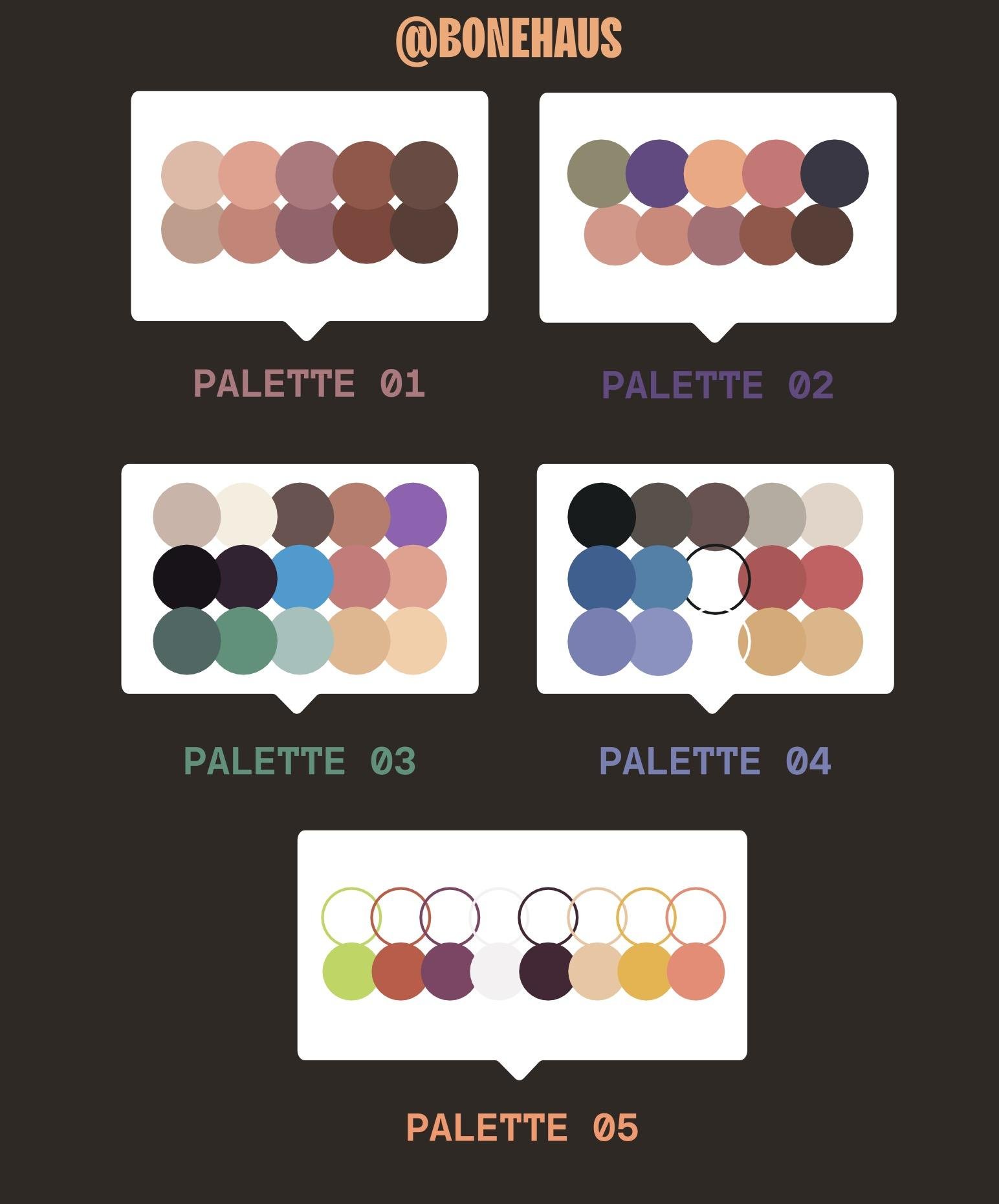
can with my color palettes. I am going to include a AI file, an Adobe Illustrator file, with a couple of different palettes that
you can play around with. And basically the goal
is start really simple. I always start with like
four or five colors, usually a couple neutrals
and then some bright colors. Sometimes I'll do a shade up and a shade down of my
base color palette. And what I kind of do is I treat this like
Microsoft Paint. If you ever remember being
young and you just clicked in all the different
colors and started guessing, that's
usually what I'll do. So let's jump into my screen is the color palette
that I came up with. And again, there's 1 million ways you can come
up with ballots. But the goal for me
was keep it simple. I knew I needed a red for Mario, I knew I wanted a
green for Luigi, and white was going to be
helpful, basically a black. And then, you know, I just started to think of
like what's here? What do I need, like
the vans going to be yellow probably
because of the movie. The main tools we're
going to be using here is I'm selecting and
dragging things around. As always, I'm in groups
and I'm going to be double clicking into groups sometimes to get into specifics. If I have a shape selected
and I eyedropper anything, it'll grab the whole appearance. What the appearance means
is the stroke and the fill, and the opacity
and blending mode. But not super important here. But basically if there
was a shape here, whoops. A shape that had a
bright purple fill with a lime green stroke. And the stroke also five point, I had this and I did
that eyedropper to this. It's going to grab
everything about it. What I can also do is
if I do the same thing, but instead of clicking
it all together, I hold down shift, it'll grab just the color. If I'm over here and
I'm on the fill of this and I shift click that,
I'm going to get blue. If I shift click this,
I get the green. If I shift click any of this, I'm getting just
the color again. Whereas if I don't shift
click and I just click it, I get the whole appearance. Last thing about the
Dropper tool is I can also, if I have this yellow for
instance, and I'm selected, I can hit Alter Option and then click and it'll cast that
appearance onto another shape. So I can say make that yellow, make that yellow, yellow,
yellow, yellow, yellow. I'm basically going to
be pushing and pulling color and pushing and pulling appearances
throughout this. I'm going to make
it small a it as a group so I can drag
it around easily. I basically carry it around
like a little tool for myself with some of the
most obvious things. Mostly I want a background
that's a little bit darker. I'm going to grab a
big rectangle which is just the rectangle tool
over here in the tool bar. You'll notice it when
on top of everything, what I can do is I
can cut this with it. I'm going to make a new layer over here and just call it BG. And I'm going to drag it
underneath actually everything. And then I'll do
edit, Paste in front, because remember I just
grab it and that layer, now I have this and I'm
going to make it this color. Sort of a nice neutral. I can bring lights off of
it for brighter colors, and I can also bring
dark colors to it. And I know I want a yellow car, so this band is
going to be yellow, so it might be like
entirely yellow. I'm just going to
like eye drop colors. I know I probably want the
windows to be kind of, this one's going
to be see through. I have all my shape tray, so this window might
be, will be dark. I know Mario's hat
is going to be red and his eyes will be white. Now again, it's funny, the flesh tone which I will
probably have to make one. So I'll just add a color here
and grab that color again. Now I have this
color selected and I'm just going to cast it, so to speak, with the alts. I know I want his flesh to be that color on all
of its flesh color. At the rate I know that all the Mario flesh is
going to be the same color. So I can just go
through and paint by number with all of these. There's not a whole
lot to share here. I've just sped it
up to a time lapse and you can sit back and relax. I'm not really talking
about anything useful down in the quarter there. This
is just the voice over. Okay. So you can see
here that I've got most of my color pretty
much blocked out. It's feeling okay. There's still a
lot of work to do. That'll be the next
video of details, But a few things I
want to stop on. Don't forget, you can
always do just an outline. So kind of like, you know, if you have five colors in your palette or
six or whatever, don't forget that
you also kind of have all of these colors. That can be an outline
version of them. That can be really
powerful as well. For instance, some of these
clouds might be taking up a little bit too
much visual weight. I can switch them over and maybe I'll make all of
my outline things. Two point outline versions
like I think that maybe that one and
similarly maybe her crown, a little too intense can
make it just an outline. You're going to start
finding that there's opportunities to twist
things around and play. I'm going to get rid of the
fills on these, of course. Ready. Click on the
fill and push that X. And then because I have
this black stroke, no fill, I can hold Alt with that eyedropper tool
and just click it onto that. And that I still got some work to do on
some of these decisions, but for the most
part that's done. One more really important
tip is sometimes I want to change a
bunch of one color, especially from my
old junkie black. I want to make that
into my dark purple. So what I can do is
I can select all of the dark black and
switch it over to a color. Let me show you how I do that. For instance, I have this really dark black that I was using just as a temporary color when
we were back at this phase. And what I may want to
do is say change all of this color black to this nice color black
that we have here. What I can do is click on one black that has
the black fill. Go up to select and
say same appearance. What it does is it
selects anything that has that black fill with
no stroke in it. The problem is selected
it everywhere. And maybe I don't
necessarily want to do that. What I can do first is
take all of this artwork, group it together
with command G, then double click in. Now grab that black and say
select Same appearance. And now it's only going to
select inside of that group because we're inside of it now. I can go ahead and grab that purple and you can see
it changes all of that. I'm just undoing and
redoing to show you a or all of those
blacks are now purples. Similarly, all of
these strokes I can do select same cooke color, grab all of those dark
blacks and change them over. But now what I'm going
to want to do is I'm going to want to hold shift down with my eye dropper
tool and grab that purple. And I want to make sure that
I'm on the stroke here. Click that purple and you'll see changes all this dark
black into dark purple. What you should have
at this point is a pretty damn solid composition and a pretty solid
color palette. We're always going to be
rearranging and rotating, and just shifting things
ever so slightly. That's the beauty
of Illustrator. But we want to be kind of
locked in at this point because we should know which
elements we want to have. What are our heroes, what are our background a little bit, what are our textural patterns? And now we're ready to dial in on detail. That's
going to be the next lesson. It's going to be a
lot of fun shadows, little quirkiness to the shapes. Just adding extra story gave me the next video,
Get into detail.
12. Illustrator: Details: Here's my personal favorite
part and that is the details. To me, this is where storytelling
really comes to life. It's where we can
add a little tires on the characters fabric. It can be where you add sparks to maybe a
lighter that you have. Really just where we show
like an extra bit of love that can always
add up to a story. So illustrator is
great for details. I'm going to dig into
the characters and push a little bit of
detail into a few things, show you examples, and then expect you to run
with it from there. This is where we were last time. This is where I
ended up with the colors pretty much the same. I just got a little more picky. One thing is shadows, so I don't like to
use a whole lot of outline with my work, You know. Again, kind of the way
that I was showing you was basically flat colors
and a little bit of line, but not complete outline like some comic styles
and stuff like that. So what I often
rely on like here, it feels a little flat. What I want to do is show a little bit of
depth on his hood. So what I can do is basically
draw that extra shape, like we've talked about,
purple shape here. Then I want to kind of
be inside this hood. And we could do that a few ways. Like we could draw
a shape like this, but it's going to be
hard to line it up. So what I like to do,
remember my trick from earlier is draw the
shape that we want. You can draw it outside of it. And then take this shape, copy and paste in front right, we're making a duplicate of it. Then grabbing this
and going back to our Pathfinder trick saying
take the intersection of it. And then I'm going
to command X cut. And then click on the
Shape I want to put it in front Command
put it in front. And now he has this cool
shadow going over him. He also needs a little
bit more distinction. We were talking about him
having just needs like some line here to separate
his ear from his hand. And I'm just going to take
that outline style with my eyedropper and just
get rid of the fill. Just use that. I might even give him a little bit of a chin here. It's looking good.
Maybe he can have like a belly line separate
that a little bit. He needs his other knee. I also think he
could benefit from some finger things and
maybe even here too. Now I'm going back
to that pencil tool drawing in some
more lying detail. Lastly, again, I want these
to feel kind of voluminous. I'm just adding in that stroke. One important tip is like, I'm always keeping my
stroke weight the same. So I'm using a two point
stroke with rounded ends. So you can see the end of
the stroke settings here in the appearance panel,
I have the rounded. Whereas if they were
here, they'd be flat if I went up or down. But it's important to have consistency in this
kind of style. I think his chin, what he could do is he
could get a shadow. So I can take a nice shape
here, chart in, then. This is the beauty of having those shapes separated earlier. Take this neck, copy
paste in front, grab this shape pathfinder. And now I have a cut out. And what I can do
is I can cut it, grab this shape,
paste it behind. So now I have face shadow. Neck has three different shapes. I think it's panic,
a little dull, maybe just giving him
some lines here to show that there's a little bit of depth to what
he's got going on. Also, his wrist could
use a cool shadow. So this is just like, you know, little tidbits of stuff
that I like to add. One other idea is some of these sheeps feel a
little too big and flat. So what I was thinking to do was take a little stroke
like this and just paint inside here and give like
that castle brick texture. And I'm just using the wind tool here and just making line
segments all over it. What it's going to do is it buries it into
the background, gives a little texture, makes it a little more
visually interesting. I think this needs a big shadow. I can do that. Like that. Purple. Yeah, that helps. I also think we need a
little bit of a line here. Seeing opportunities all over the place for little details. Little shadows. My favorite. So there, there we have it. We have our final composition. Lots of detail. There's always more detail that
we could put in, but I'll leave that to you. We have our annotated
version, right? We have all of our
medium, small, and big, which was really important to
think about earlier. And again, let's not forget
our other examples we have. And we have our whole
process, We're feeling good. The last step is going
to be showing you how to export this out
of Illustrator. Bring it into Photoshop, and do a little
bit of texturing. Be really simple and easy. So we'll do that in Photoshop, the next step and then
we'll be close to wrapping up and you can share
all your work, see there.
13. Exporting to PS: We're getting close
to the end here. The next step we're going
to be doing is taking our artwork from Illustrator and bringing it into Photoshop. There's a couple of things that I like to do to the artwork, the Vectors and Illustrator. Before moving it
over to Photoshop, I'm going to walk
through those and then we're going to
open up Photoshop, show you how to start
a new document there and just run through a couple
of those quick basics. Get the artwork into
Photoshop and save that. And then in the following video we can get to
actually texturing. So here I am again on my screen. Select all the artwork and
then I'll hold Shift and click the background layer
just so they don't have that. And then I'll do command
G or control G to group. So now all of this is one group. Usually this is a little
trick that I like to do is I will go up to effect distort
and transform and roughen. And you can see what
that does here. I'll zoom in before I
do it effect roughen. And you can see if you bring the size up and
you bring the detail up, it does all these
different things. What I'll often do
is set it down to the one and with a
high frequency or high detail and you get a nice little rippled edge
to all of the artwork. Just adds a little
bit of extra texture. If it's maybe even too heavy, I might set this back. You can select that group again. And then over here in
your appearance panel, it'll show you any
effect that's on here. And you can turn it on
off of the eyeball. And you can also click
it and modify it. Now you can make it
0.7 or maybe 0.6 and what that's going to do is make the size of that ripple
a little bit smaller. So now we open Photoshop and we're just
in a regular document, so we'll do, you know, command end and make a new one. And for the sake of this
I'm going to do 3,000 by 3,000 I don't really have any idea of what I'm going to be using
this for other than Web, so I'll keep to 72 DPI. If you're going to
be printing this, I would jump up to 300 and
I would deal in inches. Maybe you want to do an A 12
by 12 print or something. Just do whatever we need. Similarly, I'm going to
stick with argue becaus, I'm going to stay
on a screen now. I've got my square. I'm going to click on the
lock here and just make a new solid color set
of white for now. And just get rid of this one. Now I'm hopping.
You'll see me all tabbing often between
Photoshop and Illustrator. I'll try to keep you
informa where I'm at, but I'm going to go
into Illustrator and I can grab this whole group
now that I would be grabbed. And if we want, maybe we
can even cut this group, make a new layer and paste it in front and just
call it artwork. Again, I don't really
use the layers too much an illustrator
but can hurt to do. I go up here, say edit copy. Now come over to the
Photoshop at it Paste. And we want to paste
it as a smart object. And what I also want to do is change my background
to this purple. If I double click on this
background layer that we made, remember we made a
new solid color. If I double click in here, I can change the color of the background and I can just eye drop and I want to grab that
purple that I had before. The reason why I didn't bring the purple in with it
is because I'm going to be using clipping
masks and I want to be able to select
just the R work. If I brought it all
in as a square, it's just going to look
like one massive square and it's going to be hard
to tell the difference. Having it on a separate layer
is going to be helpful. Again, I can name this artwork. So that's the first
method of how you can bring all of your artwork in in one shape or one layer
rather, if you wanted to. You can also just copy and
paste as smart objects, each individual element, and keep copying
and pasting those. But you will have to arrange them and resize them
as they come in. So a couple of tricks that
you could do would be keep this one giant paste in
turn the fill down a bit, and then bring these
in, resize them, and line it all up. The reason why this
might be helpful is now you can have each of these. Maybe you want to move
them later down the line, but again, I don't
do that a whole lot. We're going to stick with
this method for now. The nice thing about having this be a smart object is one, you can size it up
and down as much as you want and won't
lose any equality. The other nice thing
is if I ever want to change some of
this vector artwork, I can double click the
thumbnail and what it does, and you can show the final name. It opens it up as like
a temporary item, but it opens it up. And then you can
modify something like, let's say maybe we want to make Mario's
pupil bigger here. We'll just do this for
the sake of silliness. Then if I save it,
file save command, and then once I tab
back over to Photoshop, you can see if I undo and redo that modification
is made in the artwork. It's really great for revisions
and things like that. You hop between and
keep modifying. Now, I can basically
paint on top of anything like maybe I want this rake texture on this ghost with maybe this yellow
as like a shadow. What I can do is I
can right click. Let me just call this texture, I might call this
like boo texture. Because this is the boo ghost. And I can write click it and
say create clipping mask. And what's going to
happen here is it's going to create a
clipping mask of whatever artwork
is underneath it. So it's clipping into
all of my artwork, which is really helpful sometimes
What I'd like to do is, because I have a really
limited color palette, is I will use my magic
wands and I will select, I'll come up here and I
will turn this off to make sure that it's grabbing
every instance of a color. And I'm going to grab
all of my whites. And then I'm going
to make a new mask. And so what that does is
I'll call this white mask. I'll show you now if I make a new layer here and call
it texture test whites. Let's just say I grab a black and I scribble it
all over the place. If I drag it into this folder, it's going to only exist
on the white because I basically made a mask of all of the white
parts of the artwork. That's going to be handy later. And what I can do is do that for all of my colors because we have a simple color palette. Grab all my greens, make a new folder, and then click here,
Make a new mask. Call that green mask. Do the same for red. And now just
repeating the process for every color, a new group, and then a new mask with this purple layer or
with the purple color, I want to make sure that I turn off this purple layer first. So that I can grab all of my purple without grabbing
background as well. And same thing, purple, turn my background back on. Now I can pretty much make a new layer in any of my color. And that if I say pink, new layer inside and
I grab my brush, it'll come up on the pink here. And lastly, I can also just make a layer on the weight
top and call that all I can Alt and click on the thumbnail
of my artwork itself. Or rather command
click or control click and then do that. And now this one, if I
make a new layer inside, it'll stay inside of any of the artwork but still stay
away from the background. So that should be good for now. As far as setting up the file are basically just
gonna be using a couple simple brushes. I'm going to include the ones that I made
and can share with you, Otherwise I'll send links to free ones that you
can get through Adobe. But we're not doing a ton
of different brushes here. We'll probably use one for lying detail texture brush
to do some shadowing. And then also kind of a specky
flicker brush at the end. And it'll all make sense
to the next video. But by now, you should
have all of your artwork imported from Adobe
Illustrator into Photoshop. And I want it all to be a
smart object so that you can resize it or you can
modify it if you need to. And we'll probably
do a little bit of modifying as we go and
I'll show you that. So in the meantime,
set your file up, get ready, and then we'll
see you in the next video. We're gonna start
painting, texturing, and doing a little bit of
color correction in Photoshop. And then finally, we'll
be able to export your image and share it
on line. See over there.
14. Textures in Photoshop: We're going to start texturing. We're in Photoshop,
we're ready to go, we got our file all set up. I'm going to introduce you to a couple of
the brushes that we use and we'll start
painting a little bit again. I'm going to be using
a Wacom tablet as a little bit more quiet
than clicking the mouse, but you can do this with
a mouse or a track pad. It's really not a huge deal. Let's hop over to Photoshop
and see what we got. As a reminder, we have all
of our folders set up for different masks if we want to draw inside of a certain color. And we also have this all that will help us color
instead of everything. And the other thing we
can do is we can make a new layer on top
of our artwork. One right click it and
say create clipping mask. And that will also
allow us to paint inside of our objects. So basically what
I do now is again, I'm going to stick with all
of our base colors still. So I'm going to be using
the Eyedropper tool, which when you have the
brush tool out with B, if you hold down Alt, it will turn into
the Eyedropper tool. I'm over here and I draw on
here and I can do anything. I want to add a little bit
of a shadow under his neck, maybe with my rake brush. And I think I'm going to
have it this purple color. If I am in the clipping
mask and I draw, I'm, I'm running
into shoot already. So what I can do is go up to my green mask and make
a new layer in there. And that will give me
the ability to draw a nice little texture
shadow under his neck, and I'll only go in the green. I also might add a little
bit of texture here overall. That should be
plenty. Another thing I like to do is sometimes put a new layer behind
my artwork and call it, I just call it opaque because it's not going to
be transparent at all. And I might grab my
outlining brush, size it up a little bit. I'm using the brackets,
right bracket and left bracket to change
the size of my brush. You can also just go up
here to your brush panels. If you don't have any
of those, they'll all be under window brushes. I also have layers on
properties and tool presets. I may just draw a little
bit of extra wavy, bumpy outline to some
of these shapes. And again, use an
eyedropper tool with Alt to grab just to give it a little bit more
of an organic feel. I might even have
parts go outside the lines just as a way I'm basically just decorating on
top of my flat vector image. I may also grab some
black and just fill in some of these gaps
that happened. This was a result of
that rough in effect. One more thing I want
to do real quick is these outlines still feel
a little bit too vector. I'm going to make a new one
and call it boots line. And I'm going to also make this a clipping mask to
grab this black color. And I'm going to draw over it, I can't really see
what I'm doing, and I also don't want it
to be a clipping mask. So I'm just going
to move this boot line all the way up to the top. That way I can draw
outside if I want, and I'm going to
draw on top of it, but I can't really
see what I'm doing. Before that I can come back. This is where our smart objects are going
to be really handy. I double click on the artwork. Now I'm in this temporary file and I can come into the boot, double click into
the group and I can select same stroke color. Grab all of those black strokes. I can lower the stroke weight
down to like 0.5, Save it. Hop back over to Photoshop, It'll update like that. Now I can go back up to my
boot line and I can draw over it nicer and
overwrite it all. Get my line back here, get my nice nose line here. But this just, again,
gives it a little bit more of an organic feel. And it's also just fun to paint some of the
lines yourself. Maybe even a little
bit more black line right here to his hats. This again where you
just play a little bit, now you can see the
difference between something like the
Raccoon Mario over here. This Mario, it's just
got a better quality to, it feels a little
bit more handmade. I would basically
just go ahead and do that for every element, So we just did Mario. Now let's do Luigi real quick. And you can start
grouping some of these if they start
getting cumbersome, so it'll slick both of these. Go down here and click
Group Call Luigi. Now inside there have all
of the Luigi's textures. Get back to Luigi
line and eyedropper, I'm going to grab my line, brush size it up a little bit, test it out, and do
that same trick. I'm going to go
down to my Vector smart object here, the artwork. One double click the thumbnail. Go over to Luigi. Double click in and
then double click on. Remember we made each
thing its own group too, so I can double click
again. Now, same thing. Go to all my lines and say
select same stroke color. And I'm just going to set
that down to 0.5 or so. It's almost invisible. Save it with command S
or control, say yes. Hop back over to Photoshop, And now they're nice and small. And I can go to my Luigi line and just draw over them
and just get a cool, nice shape that feels a little bit more organic
than illustrator did. This is the most fun
part for me is just. Pretending like I'm drawing more than I am. I'm
really just tracing. But I'm tracing my
own artwork so it doesn't feel as guilty. One other thing I want
to do is go to my group, make a new layer inside,
and call it Luigi. Pardon, any spelling. It
doesn't matter too much. And now I can draw inside of all of the pink inside Luigi. So I'm going to get my
grain brush or my rake. Let's do grain.
And just give his face a little bit of
a shadow like that. Maybe his hand can have
a little bit of a shadow under his cuff.
Same with this one. And add a little
bit of yellow to show like there's
some flame emitting, some yellow and
red with my grain. That so it shows he's
got some texture on him. So those are sort of the
painting components of it. The last step I want
to show you is how I add some general texture
over the whole thing. So I'll show you how you
can grab some textures. I'll also leave a link to some really nice ones
that you can buy, and I'll provide some
that I've made on my own that you
can apply as well. We're basically going to just overlay a texture
over the whole thing, so I'm going to make a
new texture at the top, up here, make a group and
just call it general texture. Make a layer inside
and put it in there. I have 1 million
textures and all that, but I'll provide the ones that I can that
I've made myself, but I'm also just
going to use a couple. I have these from retrosupply,
which are really nice. They're just these kind
of half tone textures. These hardware textures
are really nice. I can just kind of speckle them all over and what I usually do is I do white and just
click a couple times, go to the next one, click
a couple more times. Of course, everything
that I'm doing, you can do in a much more
methodical and intense way. I'm just trying to
show you one idea, but I'll grab some
of these textures and just put them all over even if I go
a little heavy. What I also can do is set
the blend mode up here down to something like overlay and lower the opacity
considerably. What happens is you get a nice subtle texture
to the whole thing, and I can call that my overlay. I can make a new one called
multiply or color burn. And I sometimes I like to
use the lasso tool here, let's say right around here, I want to add some specks of white like his teeth are
sort of spitting out. I'll just do that
because the nice thing is if I draw over anywhere else, they don't pop up just
inside the marching ants. So a couple of those and then maybe same here
at this Mario flame. I'll do some specks just
like yellow and some red. Maybe I want to add some
yellow specks inside of the frog suit. Very subtle. I'll try to be a
little less subtle for the sake of example, just do a couple way too many. And if they're going on top
and I don't want them to, maybe I just want them
to go on the purple. I can make a new speck line
way at the bottom here called specs back and
put those way back here. And they won't appear on
top of any of my artwork. They'll just go
behind everything. One more quick thing
we can do is we can always look for textures. And of course, you got
to make sure you're paying attention to ownership. But for the sake of education, I can just send you like
paper texture overlay images. Just for the sake of example, let just grab like a crumbled piece of paper or something. And we won't spend too
much time fussing. This probably won't
be big enough. But again, I'll send some links
to some really good ones. But let's just say this were
like a high resolution, we could grab this
and then come down here and set it to something like color burn or overlay
Screen is always nice too. Let's do color dodge and just
lower the opacity a bunch. And you can see if I
turn it on and off, you get this nice paper
texture over the whole thing. If you do that with some
really good resources, you can get a very, very cool result and that just adds an
overall nice warmth. And I'll make one more and call this CC or color correction. Inside this layer, I'll come here and grab these
adjustment layers. And sometimes I'll do
like a color balance here up in your properties. You can change your midtones, your shadows and
your highlights. And just starting
with the mid tones, we can do something
like if we crank all the reds up or
bring the scans down, we can start getting
some interesting colors. So like out of the gate, if we push the sense play
around with us a little bit. And I'm not, I'm not never
very methodical with this, but I'm particularly
not going to be very methodical
with it right now. But I'm just playing
with different colors and I can turn it on
and off really easily. Like, okay, maybe that's an
improvement to me. I like it. And the thing is I
can also come into, I can turn it on and off, but I can also lower the opacity. So maybe it's just a
little bit of a change, maybe like 25% and just
unifies things a little bit. We got all the way
through this process, we realize like actually
we want to make this coin, maybe we want to make our
star a little bit smaller. It's actually touching here
a little bit of a tangent. I don't like that. Come
down to my artwork. Vector layer, double click it, move over to it.
Double click in. Grab our group, just going to
size it down a little bit. Go up the file, save, say yes, and then tab back
over and you can see updated. All of our textures
are still there, nothing has changed
in that regard. I always do this process with
all of my illustrations. For the most part, I'll show you a couple before and after. I think the texture brings a lot of life and
quality into it. Obviously, our goal
is to get our vectors in the illustrator as
plentiful and fun as possible. But there's always an
extra quality that can be achieved with
reps or graphics, so there's no shame in that, and you should have fun
in that process as well. And finally, at the
end where we're going to export this J Peg, make sure that it's
super high quality so that it looks really good on social media or your portfolio or anything you're
going to do like that. So we'll see in the next video, we'll wrap all that up and
we'll be on our way, see.
15. Sharing to Social: We're at the end,
we're finally ready to export our image, so we
can share it on line. Show friends, show clients. I'm going to show
you the way that I like to export my images for a balance of quality but also file
size is really important, especially when you're
hosting images on the Internet. A few
rules of thumb. We don't want our files to be
too big because when we're loading them on the website
or the Internet overall, we want them to load quickly. But obviously, we don't
want to sacrifice quality when we're working
with, let's say, an image with very few colors, like a flat vector
icon or something. If we were exploiting just
this ghost over here, this is only three colors, we might want to use
a NG file format. Png allows for alpha channels, which is really helpful as
in transparent backgrounds, but it also is very efficient for file sizes when
it comes to flat things, because we added texture
to a lot of our images. We're going to want to
use a Jpeg for this one. So what I would do is come
up here, fill with exports. And this is going to bring
up a screen that lets us, if we wanted multiple
file formats, we can. But what we want to
do is basically, so we want to Jpeg, we might
not need a 3,000 wide. It's good to have if we
are printing or something, but for the web be able to
get away with something like 2,400 wide or even 2000 wide. So I'm going to drop
that to 2000 here and we're down to 1.2 Meg,
which is much better. Our quality is at seven. The nice thing is,
and you can read about the Jpeg compression
algorithm and all that, but we might be able to get away with
something like a five, which brings us down
to 600 kilobytes. And the quality is probably
going to be pretty good. It looks perfect
to me, especially because our image is
already textured. Anyway, so we don't mind a
little bit of artifacts. So let's go with that
and just export it. Just put it on the desktop
or whatever for now. Here and now I come
into my finder, or maybe you'll be
somewhere else in Windows, but ultimately we'll
be right here. I'm previewing the
file. I can even double click it and
open it and show you. I found a lot of success in
sharing my work on line. I love showing process. That's why I always try
to show you, you know, make it duplicative
of everything and always keep working
on new versions. That way you can show people all the process that
you went through. Because I think it's really valuable for people
to understand that we're not just making art out of thin air
with a magic wand. It takes lots of iterations
and it takes lots of times. Yeah, again, I'm going
to wrap up video next, but cool. We're done. We exported, we did it, and we killed it. So thank you.
16. Final/Outro: So you finished your
project, we made it through. And I really appreciate
you being here. I'd love to see
whatever project work, so please feel free to submit projects in the project tab. If you want to share any of it online, I'd love to see it. You can tag me on Instagram
or Twitter or wherever. And I'll be sure to reshare
all of my students work. And if you want another
course, I've got a character design class that is also here
on skill share. It's a little bit
more theoretical, so a little less technical. And there's a lot of
really great ideas in it, so feel free to check
that course out as well. Lastly, I'm making content on
all the social media stuff. I recently started
doing Youtube more, so if you want to go subscribe, were there any of those things
will be very appreciated, hopefully, always
valuable to you. And yeah, you can message me any time or
send me an e mail, let me know how I can help and let me be a resource to you. So thanks again for being here. Hope you had fun and see soon.
 Kirk Wallace, Freelance Art Director & Illustrator