Transcripts
1. Intro to Botanical Illustration: Hello, and welcome. The spring has finally arrived and the flowers are
blooming everywhere. It's really hard not
to get inspired. I find myself drawn to all these fresh and vibrant
spring colors. I'm Joe. I'm an artist and illustrator, and I'm passionate about
nature inspired art. I love painting flowers,
animals, and landscapes. In this class, I want to
show you how to capture spring by painting
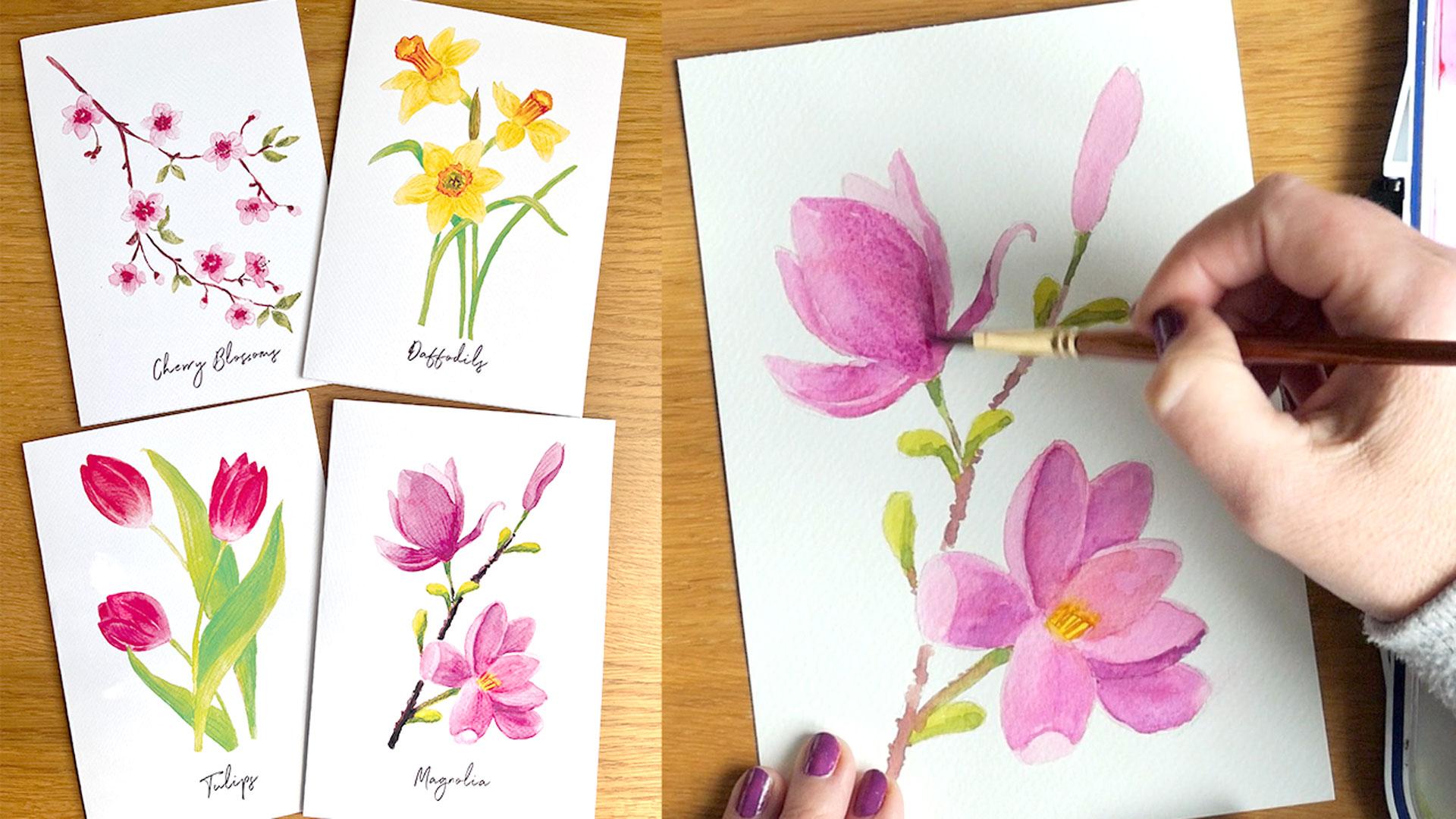
four spring florals, tulips, daffodils, cherry
blossoms, and magnolia flowers. However, if different flowers bloom where you
live, don't worry. You can use the same
techniques and apply them to paint your
local spring florals. We will use gouache
or watercolor and colored pencils to create a beautiful botanical
style illustrations. We will go step by step
through the process of sketching the floral
composition, painting, editing details
with color pencils, and finally digitizing
our artwork and applying it to
greeting cards. This class is perfect
for any skill level. If you're a beginner,
you will find this step by step
process easy to follow. If you're more experienced, you will learn an effective
technique to create a botanical style illustrations and preparing your
artwork for printing. Grab your paints and
let's get started.
2. Essential Materials for Painting: Hello, and welcome back. Let's talk about all
the art materials we'll be using in our class. Let's start with paint. What I have here is the Windsor and Newton
designer gouache, which I normally use, as you can see, my
palette is very limited, and I advise a good quality
student grade paint or if you can afford it a professional grade paint
for your illustrations. It doesn't have to be
Windsor and Newton brand. There are many other brands. So buy something that is easily accessible and affordable
in your country. Another option is
to use watercolor. So if you already have
a set of watercolors, there is no need to buy gouache. We'll be actually
using gouache the way I would normally
use watercolor, so you can absolutely use watercolor paint if this is
what you currently have. Now, let's talk about brushes. I'll be using these brushes. These are just ordinary
round synthetic brushes. So these have a
good snap in them. So a good size, I think I seven or
eight would be great. And I also have six,
and this one is four, but I'm not even sure if
I'm going to be using this one because I try
to use bigger brushes. If I was about to
recommend any brushes, I would say, go with a bigger one than a really small one. In terms of paper, I like to use watercolor paper for my gouache illustrations. So what I have here
is my favorite paper, which is watercolor
or cold press paper. I pre cut it to A five size because that's what I'm going to be
using in our class. But you can use a pad
or even a sketchbook, if you have, if you want to keep your illustrations
in a sketchbook. I just wanted to show
you the difference. This is the hot press paper. And as you can see,
it's completely smooth. It doesn't have any texture. So if you prefer
your illustrations to be quite flat
and quite smooth, and without any texture, this paper probably
work better for that. However, I really enjoy the paper texture in my drawings
and in my illustrations, so I'll be using this one. I also noticed that
the cold press paper absorbs the water
soluble paint better. Whereas the hot press, it's a little bit
less absorbent. So the paint on the
water tends to sit on the surface for a
slightly bit longer. Another paper that
we'll be using is just the ordinary
computer or copy paper. Again, I pre cut it
to the A five size. It's always good to
have more sheets because we're going
to be sketching, practicing, maybe testing color. So something cheap
and easy accessible, it's also good to have on hand. In terms of painting palettes, I have this big palette here. I use this now
almost all the time because it's got a
little sealant around and it keeps my paint nice and moist and prevents
it from drying and cracking and also has this lovely big space
to mix my colors. I tend to mix a lot of colors. So for this project,
as you can see, we're going to be just using
mainly primary colors. I have two blues, but
you don't need two. I have light one and dark one. You can just use these three. You can also use
watercolor palette like this one or plastic one. Again, whatever
you have on hand, we're going to be edding
details with colored pencils. So now I have a bunch of
polychromos obviously, we're going to need a sharpener. For sketching, I'm going to be using just
ordinary pencil. This is HB pencil for sketching for sketching on the
actual watercolor paper, these are water soluble pencils. This is graphite water
soluble pencil again by Fabri Castle this is just the
ordinary watercolor pencil. So if you have a set
of watercolor pencils hanging around
somewhere, like I did, pretty much any color would do something neutral, hopefully, is going to melt as you
start using water and paint, and these pencil marks
won't be visible. If you don't have
water soluble pencils, just use the ordinary pencil and just try to
make your lines a little bit thinner on
our final painting. I've got a eraser, and of course we need water container
with some water, and some napkin or paper
towel to dry the brush off. If you'd like to digitize your illustrations at
the end of this class, you'll need either a scanner
or a high resolution camera, along with some photo
editing software. I'll be using Photoshop, but you can also use Canva, affinity, or any other editing program
you're comfortable with.
3. Inspiration & Photo References: One of my favorite parts of the creative process is
finding inspiration. Whenever it's possible, I love to paint from real flowers, studying their shapes, color, and all the little details. If you have fresh
flowers around, I definitely recommend sketching
or painting from life. Seeing them in different
lighting and angles can help you understand
the structure much better than a flat photo. But of course, flowers
aren't always in season, and sometimes we just
don't have the right ones. That's when the photo
references come in handy. I often use my own photos. Once I've taken in my garden on walks or at the
botanical gardens. That way, I can choose
exactly what I want to paint. If you don't have
your own photos, there are plenty
of great places to find great quality
reference images. Websites, such as AsplashPexLs, Pixel Bay have lots of
free photos you can use. Another amazing
source of inspiration is the biodiversity
Heritage Library. It's full of historical
botanical illustrations. I also love going to our local library and finding inspiration
in physical books. Looking at these can give you great ideas for
composition and color. Whether you're using
fresh flowers, your own photos or images
from books or online sources, take some time to really
look at the details, the way the petals fold, how the colors shift, the structure of the
stems and leaves. All these things
will help to make your illustrations look more
natural and full of life. Now that we talked
about gathering inspiration and
photo references, let's move on to
choosing our colors. I'll see you in the next lesson.
4. Choosing a Floral Colour Palette: Welcome back. In this lesson, we talk about choosing colors for our botanical illustrations. I want to show you
my way for creating color harmony by using
limited color palette. It all comes down to color
theory, but don't worry. I'm not going to lecture
you and instead, I'll share with you a simple
and practical approach for choosing and mixing colors
that I use in my own work. The method I use is based on mixing colors from just
the three primary hues, red, yellow, and blue. The key is to choose the right version of these primaries to achieve
the color you want. Let's take another look at some spring botanical
photographs. This time, let's focus on
colors and day temperatures. I see yellows, I
see some soft pink, purples, and very fresh grains. The spring colors are
often on a color side, and they are the type
of vibrant pastels. Let's see how we can mix these colors using just
three primary colors. When choosing colors
for our illustrations, the main areas of focus are the flowers with pinks
and purples and yellows, but also the greens for
the leaves and stems. To mix vibrant colors, we need to pick primary colors that are similar in temperature. For example, if we want to
mix a very vibrant purple, we would probably use a color red with a color blue. As you can see, it creates a wonderful purple
color, very vibrant. If on the other hand,
we're going to mix a warmer red with warm blue. The purple we will have
look completely different. For this reason for this
particular project, I chosen a color red
and a color yellow, molaca lemon yellow,
and this blue, which is cerulean or cyan blue, which again is a color blue. The reason why I decided to include ultramarine
blue as well. Is to be able to create a
darker tones when needed. Color value, so how light or dark the color is is
also very important, if not even more important
than color temperature, and having darker blue will help me to create more
contrast in my paintings. Now let's go and
test our colors. The best way to find your own color palette is experiment with your own paints. Different brands use different
pigments and fillers, and the colors may
behave very differently. We can't always predict how
the color will look like by just looking at the
label or packaging. So the best thing I can do is to encourage you to test
your own colors. Let's see how we
can go about it. Grab a piece of
paper and something round that you can use to create a circle for
our color wheel. It doesn't have to be perfect. It's just for us for
our own purposes. You can even draw a
circle if you're able to draw a perfect circle. And we want to divide it
to roughly six parts. The easiest way for me to
do it is go straight down, and then I'm going to go
across and then across again. This way I have six parts. Now I'm going to use the primary colors I've
chosen for my project. In this case, I've
got here already my red on the
magenta side of red. This is very intense color. I don't need quite as much, so I'm just going to dilute
it with water and I'm going to fit in
one of the parts. This is a gorgeous color,
very, very intense. As you can see, when
I add more water, it creates a
beautiful pink color, perfect for our flowers. Let's go ahead and use blue. I'm going to use a gap here
for our secondary color, and I'm just going to
fill in this part here. I don't know what you think, but I just think that these colors scream spring to me already, even though I only have
two of them on my paper. Now let's paint the yellow. Before you start painting
with your yellow, make sure that your brush
is completely clean as the yellow gets very easily contaminated
with other colors. Again, very roughly, it
doesn't have to be perfect. You can make your circle
obviously smaller. I made it bigger for
our class purposes. Now we can mix our
secondary colors. I'm going to split the
yellow to two parts and one part we'll have a
little bit of magenta. This creates a
beautiful orange color. Just look at this.
It's so vibrant. Absolutely beautiful. Even though I am mixing the colors there
on a cooler side, I can create the color that is actually quite warm
and very vibrant. And to the other
part of my yellow, I'm going to add my cold blue, and this creates a
wonderful fresh green. Now, of course, you can divide
your circle to more parts. You can have, for example, another two parts on
side of yellow and blue and add more yellow, less blue, and then on the other side more
blue and less yellow. This way, you can see what
the color variation would look like and how many more
hues you can create this way. Basically endless hues
with the primary colors. Our final mix, of
course, is this purple, which we already
have, but let's just mix a little bit more. So we can fill in our part. It's not enough blue,
let's just mix the blue, it looks more like
a purple color. But that's exactly what I'm
trying to say is that if you want the purple to be on
the side of red or pink, you can obviously add more pink and if you
want your purple to look cooler in temperature, you can simply add
more blue This way let's demonstrate
this quickly. Your color looks again. Different to this one.
I hope this all makes sense to you and I hope
I explained it well. I just wanted to quickly show you what the other color
palette might look like. When I use the warm colors, the warm version
of primary colors, the secondary colors look
completely different. I think you can tell
that this palette looks a lot more vibrant and a lot more spring
like than this one. Now that we have our colors, see you in the next
lesson when we going to sketch our floors.
5. Sketching Tulips Step by Step: Hello, and welcome back. In this lesson, I'll
show you how to sketch and paint a composition
with tulip flowers. I have a real example here, but of course, this is
not necessary for you. You can use the reference
photos you found earlier. I'll be just using the
regular sketching paper here, the cheap computer paper, and regular pencil
just to get a sense of what kind of composition I want to use for our
final illustration. I encourage you to do the same. You can explore
different compositions. You can decide to just
paint one flower. I sort of think of
bunch of three. I don't want to make
it overcrowded, but I want to have some variety. So I'm going to try to show the tulip flowers from
slightly different angles. So what I normally do is I try to fill in
the space I have. So I'm going to just roughly sort of mark the boundaries
of my illustration. I try not to leave
too much white space. Tulip flowers are quite tall. I want to place the flowers
towards the top of the page. So I'm going to start
with the first one. And I think this egg
shape is quite good. Another one might
be facing this way. I'm trying to imagine how
this composition would work and trying to make
it pleasing to the eye. I want to incorporate a little bit of variety in
this illustration as well. Then I want the third flower, a little bit lower down, but I don't want it to be
directly below this one. I'm just going to
move it sort of down and slightly to the side. Also, I imagine that this
one is closer to me, so it might have a little
bit more open shape than these ones at the back. I'm just going to start
with simple lines. I like this one is very band. I just want to make
a simple curve. Try to avoid straight line. In nature, rarely, we see
those straight lines. I'm trying to keep it looking quite natural and another
curve going down this way. So I think we have
a good base here. Now, looking at this real flower but also looking at
the reference photos, the leaves tend to be almost hugging the stem of the flower. I'm thinking I have
this space here, so I definitely want
a leaf coming here. Maybe I'll start from
the top actually. I quite like this little curve here and it's
probably going to be leaf of this flower.
Just create that. Then how I'm going to
shape this leave it should be thicker because it is towards the top
of the flower. So again, just
creating a nice curve and maybe hugging the stem here. I might as well just thicken it and to show that
this is the stem. Also, I noted this kind of
curving situation here. So I think I'm going
to add this here. And also slightly
on the other side. And this is going to add more realism into our
final illustration. Now, this line is not going to be visible because the
stem is going to be behind. And I decided that this stem actually is also
going to be behind. I want to just show the this flower and this flower I decided is
going to be in the front. This one is going to have
stem coming out this way. Because it's slower down, you can have a smaller leaf. Also, it's nice to
do some overlap. Again, it looks a
little bit more natural and we can just finish it here. Now, what we're going to do with this flower, first of all, I like to create
a real stem here. So we have this slight
crisscross here, but we could eliminate it by just simply
adding another leaf. I think we need to position
it on the side as well. So I'm going to just
simply go for it and start drawing it here. I quite like over the flower overlapping the
leave scenario because, again, this looks more natural. And I will carry it
to the bottom here. This criss cross, I'm
just going to remove these lines and pretend
that this leaf is actually on our side and the stem is hidden
within the leaf. In terms of petals, again, I want to try to make
it a little bit more varied. This one I want
the main petal to cover majority of
the what we see. So this is kind of like most kind of the outer
petal that we see. And there is a line sort of
here that I want to draw, and it's like a curve. Now, this one already gives
us a perfect petal here. This one I want to show a little bit more
of the outer petals. I think I might just see if I can create this
smaller petal here, and then this one is the
biggest one visible. There is a little bit of variety and there is a one
picking up from here and maybe just a tiny
bit of another petal here. And we can refine this
shape a little bit. We have a slightly
different looking flower. Now, this one is going
to be interesting. I'll start with the
one facing me here. Again, I just want it
to be maybe like this. And this one here, we can see quite a lot
of this one behind. And if I make this
one slightly thinner, then I can possibly
fit one more here, just peking out here. This one looks a little bit
more round rounded shape. Not quite like it like that. I think I'm going to
leave it like this. And then this line will be here. So this is the composition
I'm going to be using, and I'm going to copy
it to my main paper. I use the normal paper for sketching first because
as you can see, I'm doing a lot of rubbing
out and changing my mind. So I don't like doing this on the actual watercolor paper that we're going to be
using for final painting. Use a light box to transfer my sketches onto
watercolor paper. But if you don't have one, a sunny window works just well. Just remember to tape your
paper to the window with some masking tape to keep it
in place while you trace. Now provide a copy
of the sketches in the resource material that
you can just download and then you can print it
yourself and then copy to your final watercolor
paper before painting and just concentrate
on a painting part if that's your preference. This is it for the
sketching part, and I'll see you in
the painting part, which is in the next lesson.
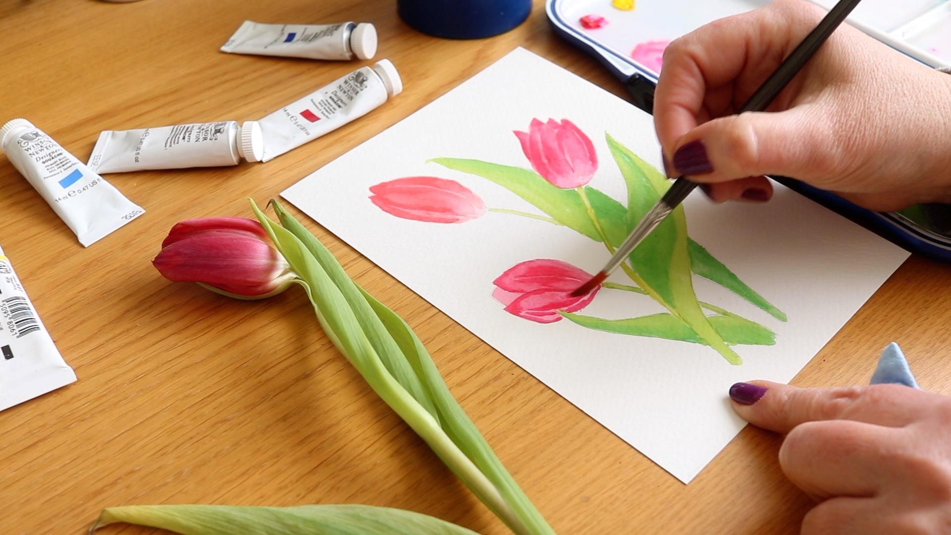
6. Painting Tulips with Gouache: Hello, and welcome back. As you can see, I've got everything prepared
for our painting part. So let's go and mix our
colors without further ado. This color, you'll see
is very, very bright. I'm going to add to
it just touch of yellow to warm it up. I'm just going to go
and paint everything, making sure that the
layer is quite thin. Yes. I completely forgotten
that this color, you can see on a
real flower is not very saturated
here, not to worry. I'm just going to wet my
paintbrush quite a bit, and I'm just going to pull
this color out or you can just wet this area and then use your tissue and
just press it down. You can see this color was very nicely removed
from this part. So let's mix a little bit
more of color we want to use. Don't worry if color
is not exactly the same because in nature, you rarely have
exactly the same. This one is a little bit
warmer. It doesn't matter. Actually, it adds variety, and I think it looks very, very pretty. I'm
doing the same thing. I'm just literally coloring
in that tulip shape. Here I'm just going to remove
any pigment from my brush and I'm just going to pull this color down so it's
very, very watery. And very, very pale, just like in a real flower here. You can even go further and just even pull it out and
make it more gradual. I'll add a little bit of pink again and do the same
with our last flower. We just want to
our aim is to just fit in the color at the moment, to the whole shape. Then we're going to
refine it in a moment. Again, I'm trying to remember not to paint it all
the way to the bottom. As you can see, I rinse
my brush still having a bit of water and
putting this color down, but a lot more
watery than before. For now, I'm just
going to leave it dry just a little bit. In the meantime, I'm
going to mix our green. I've got our yellow. I'm going to remove it here
just to show you how I do it. Again, don't be scared of the variety when you get
to your green color. This is a very fresh, very bright spring green. I think that this part
is a little bit darker, but that's okay because what I think is the inside of this leaf can be
slightly darker. This is what I see when I
look at the real flower. I'm avoiding painting in that stem because I
want it to be lighter. But the inside of
the flower can be a little bit darker. It's okay. I'll probably paint this part
a little bit darker too. Of course, we're going to be using layers, as you can see, we just very much using the
gouache like a watercolor. Okay. It doesn't have to
be exactly very precise, but you might be a
little bit more careful. With this one, I think
I also want the side of this leaf to be a
little bit darker. Then we're going to be mixing and blending with
the other coral afterwards. This part needs to be
again a little bit darker because it is underneath. H. Just a touch of water. You want enough water
to make the paint flow, but not too much, so
it's completely watery. Because this is
underneath is going to also be slightly darker. This is quintan I'm
just going to pull this color across here. Let's mix the green that is a lot lighter, more yellowy green. Let's mix more so
we have enough. I want to add a
little bit of blue. You want a yellowy green color. Now, this needs quite
a lot more water. This is going to be
very intense mix. I will just keep this as well and just move it down a little bit and make it a
little bit more watery. This is a good color for stem, so I'm just going to go in
with my stem and paint it. It's quite intense. Again, using just a little
bit of water on a brush, I'm just going to pull it down. Now, this one can be, again, a slightly bit darker, so it looks different, so I'm just going
to be mixing it. It's also underneath.
This is very dark. Again, I'm going to add water dab it on a
paper, and mix it. This is much better. This one is going to disappear somewhere here under this leaf. Now, I like this color and
I'm going to use it here. This is the fold
that we see here. It's quite amazing
that we mix two of the same colors yellow and blue, and these colors look
completely different. This one looks a lot more blue. What I'm going to do
is I'm just going to cover it with this
yellowy green. So it's a little
bit more cohesive and it looks like a part of the same leaf rather
than a separate leaf. This is our second fold, so that works perfectly fine. Now this leaf looks like it's a one leaf rather
than made of two parts. At the moment, I just want
to concentrate on this stem. I'm just going to paint it very lightly,
should be quite pale. Now I'm going to use the same
method I use on this leaf, but I'm going to use it
on the leaves behind. Just to make the leaf look
like it's the same leaf, I'm going to blend this hard line and paint
over the darker part. I still want the
pot to be darker, but I'm just trying
to blend it together. If this doesn't work very well, I'm just going to again, add a little bit
more blue to my mix. And blend it this way. The reason why I wanted it to be a little bit darker
because I wanted to show the stem in front of the
leaf that is in the back. That's why when painting this botanical
style illustration, I like to use layers and
I like to paint thinly. I'm going to use
the same technique on this last leaf
that we have here. There was a bit of a block here. Again, you can just
use your brush to wrap it to reactivate this paint again and this way
you can color it up. You still have one
edge slightly darker. But now it's blended
with the other color. And it all looks like a
part of the same plant. We're going to slightly
refine our flowers. As you can see on the real
flower here that we have, you have this shadow when the
leave the petals overlap. I can just add more pigment
here because I can see more color and more intensity
at the top of the flower. Then just to show that shadow here that the petal is creating, I'm just going to add it here. Now, again, you have the line. The line is actually lighter and then there is more
pigment on the side. That's what I'm
trying to do here. The line is here in the middle. I'm going to leave it unpainted, and then I'm going to I just rinse my brush
from the pigment, try to blend it, and this line is therefore then visible and I need to drop
it down a little bit, but no all the way to
the end because that's when the flour
becomes more pale. Again, you can rinse your
brush and dry it off on a napkin and just pull
with semi dry brush, this color down a little
bit and this line. Okay. And again, the outer edge
should be slightly darker than the middle so I'm just going
to add this line. And already, this flower looks a lot more three dimensional
that you was looking before. I'm quite happy with this, so I'm going to leave it alone. Now I can tell that this flower
is a lot cooler in color. I'm going to add a
little bit more pink. Again, I want the color to be more intense than
the one we used, the mix we used before, which had a lot of water in it. Here again, I'm doing
the same technique. I'm putting more
pigment to the top. Then I'm going to
drag this down. Where the shadow is, but only to a certain extent and then this one as well
as good pigment on top. Then that line is here. Again, I'm going
to make it quite dark here and on the other side. But I'm going to leave it
unpainted in the middle. This way, I can blend this here. I also need a little bit more because this is the petal
that is underneath. It's peeking through. I need a lot more pigment here because it needs
to be quite dark. I wanted to show
that this petal here is behind this one and
also behind this one. Now, this one, also have this line here. I'm going to but the
line is here somewhere. I'm going to indicate
it this way. I'm going to rinsol the pigment. Going to remove some of the
pigment here because I think it's too strong and I'm going to use it to fill in this petal
a little bit more. I had a bit of a dry brush, so that's why I
dipped it back in the water and by rinsing my
brush and then drying it, I can now blend these
harder edges because this should very seamlessly blend into the lighter
part at the bottom. Going to remove the axis here. Now, this petal again need to be darker because
it's hidden under. Especially the outer edge. Again, unraise the
brush, dried it off, and I'm just going to pull this pigment across to
blend it seamlessly. I'm happy with this. I
don't want to mess it up. I'm going to leave it alone. I'm quite happy with the shape. We have finally our last tulip. It's a little bit more pink, but I add a little
bit of yellow. As you can see on
the white plastic, you can see more pigment. You can see there's more
intense than the previous mix, which was a lot more watery. Getting the same principle, putting the pigment
here at the top, and then I'm going to
pull it down here. This is where the line is. Same with this petal here. Now there's the line here, so I'm going to again
paint around it. Then I'm going to
use dump brush to blend it all in and to look
a little bit more natural. I must not forget that
this needs to be pale, so I'm conscious of that. Rinsing my brush, drying it. So it's just dump and blending this pigment
into the petal. You can also add more pigment if you feel that you've
removed too much. Color now the bottom
should be more pale. Again, I'm just going
to remove it by wetting this area and using dry brush, trying to soak up this color to leave a
little bit lighter bottom. We have the last part and
this is the petal behind. I mixed a little bit
more yellow this time. Because it doesn't have
to be exactly the same. Again, I put the pigment at the top and then I'm
going to drag it down. This is it for this
part of the lesson, and I'll see you
in the next one.
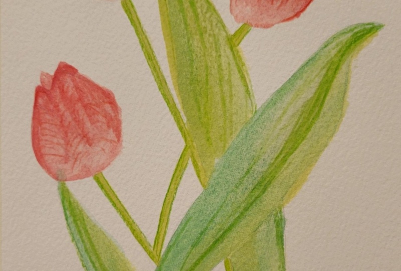
7. Adding Details to Tulip Art: Hello, and welcome back. In this lesson, I'll
show you how to add details to our
gouache painting. I selected several of
the color pencils, and I thought that
these colors might be similar to what we see
here in this illustration. This dark color is quite good for this kind of
darker flower, I think. Where the shadow
falls from the petal, I'm just going to make
it a little bit darker. This is also a good moment
to refine our petals. This part of the flower
and the petal is darker, so I'm just going
to shade it down. And blend it down
with the outer edge. Now, when you look closely
on the tube flowers, there is these kind of
lines on the petals very, very fine that go to the middle. So they sort of shape this way
and they go to the middle. So I'm using the same sort of strokes as I was
using with a brush, but with my coloring
pencil this time. I'm just trying to show some of these lines they go
the opposite way from this middle line of the petal as the petal curls behind the
same situation is here. Again, I'm going to
refine this edge. There's a little
bit of shadow here. I'm going to show this and this is the direction
of those lines. Starting from here,
they go this way. And then they meet with
the rest of the petal. The petal is here. Now, this area is
probably darker, so I'm just going to
add this shadow here. And same way here. I'm just going to add these lines I think that
refines this very nicely. I can just blend this together because this is supposed to
be quite dark as it's behind. I think already by adding the very subtle lines
this suddenly looks a lot more like botanical
illustrations that we see in a book sometimes. I'm going to do the same
to the petals behind. I'm just going to add that
shadow that is inside, and I'm going to do the same
to the rest of the flowers. Now, this flower is a
little bit different. I think this color is a little
bit closer to this one. If you have colored pencils, if you have a bigger selection, that allows you to
use warmer red, then you can do that. If you of course follow the same colors as
I'm using here. Again, I'm just going to use this color pencil
to add these lines. Now, this color
is a lot lighter. I see if I have
something similar. This is a little bit darker. These lines are
not very visible, so I'm going to use
this one instead. That already looks a lot better. I can add this
darker color here. And these lines are close together and they
just go all the way down. This color is a lot darker, so I need to be more
careful with it. So just don't want to overdo it. I need to press lighter. If you have a color
that is darker, just lighter strokes and don't press so hard on
the paper, basically. The lines go this
way and on this one, the lines will be
going this way. Now, this tulip again is
more on the purple side. I'm going to try
with this color, but I might have to go
back with a darker one. Again, I'm starting from the top and the lines are
going to go this way. They go all the way
down and the same here. I can just blend this color, it blends with the colors
we used in our painting. Same here. I added
to the top and now I just going to use this
to create these fine lines. Let's move on to our
stems and leaves. I have this green,
which I think it's pretty much very similar color to what do we use for the paint. I need to refine this edge a little bit because I wasn't too
careful when I was painting. And I guessing that the light, since this part is lighter, the light comes from this side. So I'm just going to shade
slightly, first of all, underneath the ball
of the flower, and then it's slightly
on this side. So I'm just kind of guessing that the light
falls on this side. I'm going to try to Oh,
that's actually okay. Make the lines on the leaves. And I'm just going to draw them. Now I need slightly dark
color for the inside. Again, I'm going to kind
of refine this part, show that this is also
kind of curling here. There's a little bit of shadow, especially if the light
is coming from this side, then there will be
a little bit of shadow under this fold. I'm just going to add this. Then just indicate these lines. If this is too light, I have
even darker color here. So you might find that
actually you need to use quite a lot darker colors of
the coloring pencils that you maybe initially
thought were suitable. That's what happened to me. I'm actually using
the darker green. To show these lines and when the color is
lighter, I just press less. The same is going to refine the stem a little bit,
slightly shadow here, and then on this side, and definitely darker here because it's
underneath this leaf. Which means that this part of the leaf also is
going to be darker. The coloring pencils are
great for adding this. We have the lovely
light stem here, so I don't want to make it. But you see how I can
just refine this shape, even if I wasn't too
careful with my paintbrush. Then I'm just going to add
light shadow on this side. All I have to do is add a little bit of those
lines on this leaf. So I'm going to start with
this color and see how I go. I might need to I'm just
following the shape of the leaf. Yeah, this one is okay
for the lighter part, and I might need
to switch to the darker green on the other side. Now, this spot is
definitely darker. And this is it. This is
the final illustration, and I'll see you in the
next lesson when we go into sketch and then
paint daffodil.
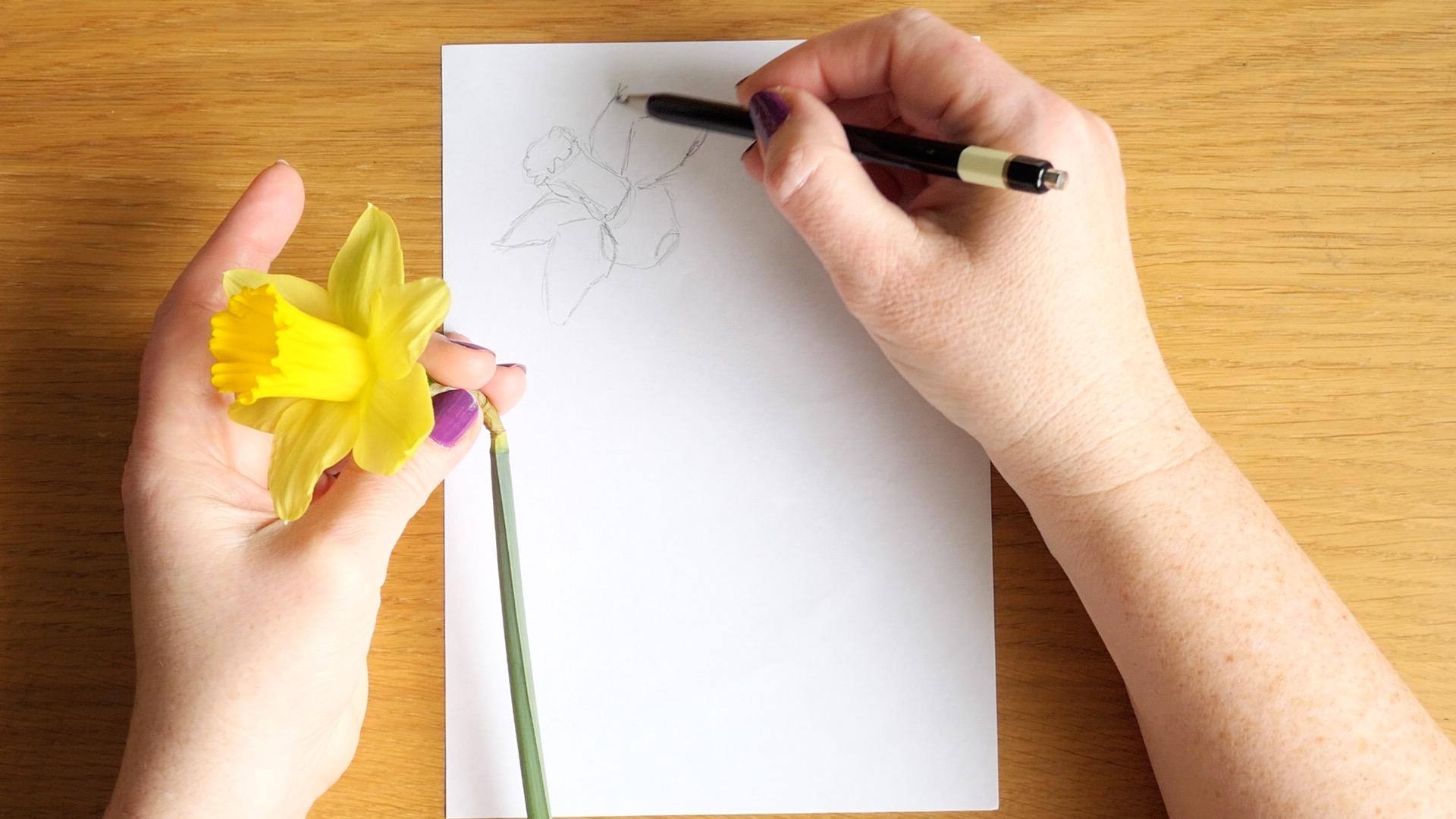
8. Sketching Daffodils Easily: So let's begin sketching. I decided I want
to draw and paint three daffodils
similar to the tulips. So I want to evenly space
them out and I also want them to face slightly different way so we can have some variety. So I'm going to start
from the top one, and I imagine that this will be the top of our flower trumpet. I position it a bit like this. So this is going to
be our jaggedy line. This is the trumpet going down. The daffodils are more
complicated than tulips. But I'm sure if we look closely on our reference
photos or on the real flowers, if they available to you, we can manage to sketch them. So I'm just literally
following what I see here, and I see this
petal coming here. I like this little upturn here, so I'm going to capture that. And then this petal sometimes
it's easier to just capture the angle before trying to capture the actual
curves of the petals. Again, this one is coming
slightly like this. And then I see This petal here. This one is visible behind, very, very narrow
because it's behind. And I see one more petals more it's more of
it visible here and then it just hides
behind this one. So that's our first flower. The next one, I would like
to position like this. I'm just going to
hold it like that. Hopefully I can do this with one hand and the other
one used for drawing. I just wanted to be slightly below and the top of
the trumpet here. Let me just catch this quickly. This is our jacked line
of the trumpet the top, and I'm going to hide
the other petal behind. Now, this one is the angle I see is there and then it goes
down a very narrow triangle. Then I can see this petal here and the angle of that
one is quite wide here. Again, sharp angle and a
nice curve going down. There is a petal just
poking out here. These ones are overlapping,
which is quite nice. Then there is a one
petal visible here. I will deal with
the stems later, but I want to paint
the last flower facing us around here. I'm sharing with you the
process how I approach the sketching when I'm
using the wheel flowers. But of course, you can just
use your own knowledge or your own reference photos or your own reference flowers if
they are available to you. So I'm quite happy with the
position of the flowers, and I'm going to try to
figure out how I'm going to position our stems and leaves. So this stem is going to be probably
coming down around here. This one, the sepal will be
here, bending downwards. I can imagine it's going
to be coming out this way. And then this last
the one facing us. I just don't want to
create this tangent here, so I'm trying to come
from As you can see, there is a lot of rubbing
and thinking because I don't want it I
think I'm going to position it closer
to this one here. And we might hide some of
the stems behind the leaves. I really wanted to have one of the leaves sort of bending and creating
this lovely flow here. I think I might use
this one, in fact. So this is it. I think I'm quite happy with this
particular composition. I'm going to transfer
to my watercolor paper, and I'll see you in the
next lesson when we go into paint these
flowers. I'll see you then.
9. Painting Daffodils in Gouache: Hello, and welcome back. In this lesson, we will paint
our beautiful daffodils. So as you can see, I transferred my sketch already onto
the watercolor paper. I also cleaned up my palette, but I just left a
little bit of green because we are going to
be using green anyway. And this is also a good
time to change our water. So I only have one
water container, and I decided I'm
going to change it. So my yellow doesn't get contaminated too much with the magenta we
were using before. I'll start with mixing a
nice light yellow wash. I'm going to again, I'm making it quite
loose with water, very, very light,
like watercolor. We're going to paint the
whole area of each flower. It's pretty much like
coloring in at this stage. Making sure that
it's quite light. I'm starting with the
main flower here. But I'm not too concerned
because I'm just going to coloring the whole flower area. This is lovely bright yellow. I feel that especially when you use the professional
grade guash, you have these beautiful
color intensity. So as you can see, I just cover the whole
area of the flour, and I'm going to be adding
some refinements later. I'm going to let this layer
dry somewhat when I'm just coloring the
remaining flowers. Again, I'm going to do pretty much the same with this one. Color I'm probably going to make this line a
little bit jaggedy, but it doesn't matter
because we're going to go over this part with another layer
of paint later. I'm just coloring in
the shape I sketched. At this stage, I'm just using the yellow paint
as it comes from a tube. I didn't mix it with
any other colors. It's pretty much straight
from tube, yellow. And this way, I know that my yellow is going to
be lovely and bright. And that's what I want
for this illustration. I want this
illustration to be very nice and fresh and springy. These flowers like
tiny little sunshines. I just mixed a little
bit more of paint with water so I can carry on
with my last flower. And now I'm going to move on to mixing slightly darker hue. Again, I'm going
to add the yellow. It might be called lemon yellow. It's the cooler
side of the yellow. Now I'm going to mix in a
little bit of that magenta. I don't want to make
it too dark yet, but I want to add some
shadow into the petals that perhaps are behind because
these petals overlap. I decided that it's a good idea to make this petal behind
a little bit darker. Of course, I have my
handy paper towel here to mop up any excess. I'm going to do it a little bit to this petal because
it's also behind. Basically, adding a
little bit of shadow and blending with the rest
just to show that this part is behind
the other part. If I wipe my brush almost dry, then I can basically
blend this area here. Of course, this area is going
to also have a shadow here. I'm going to add this here too. Again, I wipe my brush
and just blend it in, add a little bit more here. I think I need more
shadow in this area here. This way, we can see which petal is slightly behind and
which one is in front. You can even add these lines that you can just see here. Follow the shape of the petal. I just need to mix a little bit more paint
because I run out of my color. So I'm just going to
mix a little bit more. And just to show that this
is the base of this trumpet, this one is quite dark. So back to yellow and
a little bit water. Wipe it off, and then I'm
going to drag it down. And this way, it looks
a little bit less flat. I literally dried
off my brush now, and I'm just going to pull
it down a little bit. This time, I want my paint
to be quite a lot more intense without quite
that much of water. I'm just going to make
another mix on the side. This is definitely too dark. As you can see, is very,
very intense color. This is still too dark. I need to add pretty
much all of this yellow. Now this is better. It's a very, very dark almost a gk yellow. So I'm going to load my
brush with this color and I'm going to move
on to the trumpets. Let's start with this one. The line is somewhat jiggy here just to
show this part. Then I'm going to drag this paint down and show
the shade the lines, the textured lines that
are on the trumpet. Again, I'm going to wipe
my brush, clean it, wipe it, almost dry, and then blend it. Let's make more mix. Yes, I probably
need more yellow. I think this color is okay. It's light orange color. This one is slightly more open. I'm basically moving my brush up and down to make this shape. Then starting from the edges, I'm just going to
pull down this paint. And I'm cleaning my
brush, wiping it off. And I'm going to somewhat blend it down with
the rest of the trumpet. I think I might need to add a
little bit more paint here. And I want a little bit
more here at the base. This part should be quite a lot dark. I'm just going to add more
color because I can see as it it dried a lot lighter than I wanted it to be
and I want to create some contrast between the
petals and the trumpet itself. And now we have
this intense mix, not too much water here and I'm going to paint the
middle of this flower. Again, just moving my brush
in up and down manner. I'm following the
circle but showing that this is not even. Then when I look down, I can see that it's a
little bit darker inside, but the color is
not as saturated. I'm actually going to
use a little bit of that green mixed in with the
yellow that we had earlier. This is the color that I'm
going to use at the inside. I just realize that I need to paint the underneath first. This is this part here. I'm trying to paint first. I'm going to leave it for a moment and I'm
going to come back to it and the same for
this flower here. I'll probably come back
to this one as well and refine it a
little bit later. I'm just going to add
more yellow here. Touch of blue. Again, this
mixes a little bit looser, a little bit more watery, and then we will refine
our final colors later. There is the leaf that
is going to go here. This spot should be darker, but we can refine it later. This leaf is just behind
here and comes out here. I'm going to proceed
with this stem here. I need a little bit more water, my paint dry already. Just a tiny bit darker. And again, I decided to sort of bend this
leaf and let it turn. Can clean this with a towel. And perhaps tiny bit darker. Open this one. Behind. This leaf is creating a shadow. It's nice to add a
slightly darker tone here. I am going to use this
orange that I premixed, and I'm just going to add a little bit of that
green from here, and that should give me more
or less the color I'm after. I need to make it more
intense and go back to it. What I see here is
something like this. I'm going to add this
saturated green, dirty green color to my petals just to make them look more natural because
as I look at these petals, yes, my daffodil started
to dry a little bit. It's just to refine
it a little bit. This is what I'm after. Now I'm going to
try to just drop in that shadow in between where the pollen sits,
something like this. As previously, we're going to add details to this illustration
with color pencils. At the moment, I'm just going
to let it dry a little bit. I'll see you in the
next lesson when we're going to add the details
to this illustration.
10. Refining Details on Daffodils: Welcome back. In this lesson, we will add some details to this illustration with color
pencils that I have here. Now, I just wanted
to point out to you, there are some pencil lines that I can see quite
visible on my illustration. So I'm just going
to get round with my trusty eraser and try to
at least remove some of them. It's obviously quite
impossible to remove the ones that already been
covered with paint. However, I think that
sometimes they actually add a certain charm
into the illustration. And since we're
going to be edding the details with color pencil, they don't really
matter that much, so I'm going to leave it
as it is at the moment. But I just wanted to point
out that if you want to remove some of
the graphite lines, it's a good time to do it after you painted and
everything is dry to touch. So I'm going to
grab some colors, so I'm definitely
going to grab orange, light green, perhaps one
slightly darker green. I have some yellows here. Something like this
should be enough, so you don't need
a lot of pencils. I'm not even sure
if I'm going to use this one, but let's have a look. This orange looks
like a good color to refine our trumpets here. I might just add a little bit of shadow here and there just to indicate that this one is it might even
need a darker color. I just realize I've got
this very dark orange here, so I'm probably
going to add this. I just want to indicate the shade underneath
there. That's it. That's much better,
and here as well. So I'm just literally going around not exactly everywhere, but in some places just to
make this a little bit darker. And on the inside, a little bit as well,
and certainly here. So this part will be
needs to be more defined. Then I lost my shadow lines, the ones that are
quite strong here. I'm just going to go back with the color
pencil this time. This line, I want to be
more refined as well, so I'm just going to go over this one and just a little
bit more color at the base. I think this is enough. I'm
not going to add anymore. Now I need something
almost brown. This brown might actually work to just add a little bit of refinement around
them pollen stems. So I'm just really showing that they there and the darkest part should
be right in the middle, right in between of these. So something like this.
I use the same color to refine this sapo here. So I can see it's
quite dark here. And then it's got these
lovely kind of lines. And it's very crispy and
a little bit darker here. So that's fine. Now, this part here, I can see quite a
bit of green here, and I didn't manage to
edit quite with my paint. So I'm just going
to help myself here with my light green
color pencil. And I'm just adding
this green color here. That's already better. And I think I'm going to
do the same here. And this way, this petal is going to stand
out a little bit more. That's better. And now
with a darker green, I'm just going to just go there and here just
to sort of refine. I think I want to show that this is the leaf that overlaps. So this is also a
chance to refine the edges of any leaves. The ends are usually darker, so I'm just going to
sort of blend this. And I'm going to do the
same here, darken this tip, and then just maybe line
in between in the middle. I think I have
even darker green. I might try this
one. If this one is a little bit more refined. Now, this leaf turns over
and that line ends up here. I'm going to make
the bottom slightly darker and I'm going to define the edges of
that leaf a little bit more happy with that. Then this stem will have a little bit of shadow
here underneath the petal, so I'm just going to
add it here and again, refine this edge here. It's just a few little details, and I think this already looks
a little bit more refined. Of course, I can add
the line here and refine this leaf that is
sticking out from this side. I just add a little
bit of this color just to make it
more balanced here. Now, with our yellow petals, this yellow is my
darkest, I think, before I go to oranges, so I'm just going to try
to use this one to refine these shapes just a little bit more I've already added
this line with a paint, but I'm just going to follow the same with the color pencil. So just and the same here. Follow the shape of the petal, the same on this flower here. So it's curving this
way and then this way, this petal is turned, so we need to go down this time. But very similarly, I just want to indicate
that this petal is behind, and this one is in front. A few lines here. So notice that I'm moving
my pencil or trying to move my pencil to follow the
shape of the petal. And I'm happy with this. I think I'm going to
leave it as it is. And we're going to move on and sketch the cherry blossoms. In the next lesson.
I'll see you there.
11. Sketching Cherry Blossoms: Welcome back. In this lesson, we will sketch a composition for our spring floral blossoms, tree blossoms, similar to these ones in the style
of cherry blossoms. I think I want my branch to come perhaps from
this angle here, and then we will go
down a little bit out. Perhaps finishing somewhat here, and then I want another
branch coming this way and shape like this or perhaps even
going like that. Now, this part will be
a little bit thicker. I want this one to
be the main branch, so I'm just going to thicken
up this line a little bit. This one will be a
little bit thinner. Now, I noticed that at
the end of my branches, that's where I see the leaves. I'm going to just
quickly sketch. They only just emerge. These are not very big leaves. We don't have many
leaves on the trees yet. They tend to be
the smaller kind. Then they are also
occasionally visible. Somewhat in the
middle coming up from the sort of something like this, perhaps, and it's time to
decide on our flowers. We have some flowers perhaps
coming from the main. I think it's easier for me to sketch them as a
circle and ovals. The ones that are going to
be facing us are going to be circles with the middles here. The ones that are going to be facing sideways, perhaps here. They're going to be ovals. Something like this, maybe
a little bit bad here, and I would like
another facing here, perhaps an oval here and another circle here. Let's make this one like this
and then another one here, and then another full flower. Here. Of course, we also have these lovely
tiny buds that we can add. I don't want to make this
composition too busy. As I can see, these
flowers are quite sparse, so I'm just going to
add a little details, obviously, that can
be added later. And perhaps perhaps
move this a little bit further out like this. I'm quite happy with
this composition. Let's just refine our flowers, our petals a little bit. These type of flowers
have usually five petals. These ones are quite
simple to sketch. The petals have a rounded shape and they don't have very sharp corners,
they rather round. If we look straight up, we probably see where the pollen sits,
something like this. They basically little
dots little marks. Let's make our petals
nice and round and there should be five
petals on each flower. It's easier for me
to concentrate on the ones that are
facing me directly. First of all, and then I'm
going to refine the ones that are facing the sides. We have this one as well. They're just like
little short marks and perhaps some dots and then beautiful round petals. So it's another flower here. Now, this one is
perhaps going this way. Actually, I want to
make it more like this. In this position, the petal here will be
looking like an oval. The one on the side also like ovals coming out from
the ends of this oval. The petals behind
are going to be looking a lot more
fuller than this one. Then behind this
front petal here, we can see the pollen. You can make a bad
the buds are covered partially by the tiny sepose
then we see the end of them. Again, the same leaf or sepora and then
round the shape here. We've got another flower here and here I think I'm
going to make another bud. Again, this petal here is going to look like an
oval going this way. Then these are going to be ovals and then behind
are these larger petals. We see the pollen
coming from the middle of the central petal here. This way we have a nice
sideways facing flower. I might even add one
here just a small one. This time we're painting
a lot more flowers and the smaller flowers might
even do a little leaf here. Following the same principle. Very simple. This
is our bud here. The couple of leaves. They can overlap
this petal here, and our final central flower
here, nice rounded pets. Series of short marks, slightly curved and
then a few dots that indicate where
the pollen sits. This is it. I think I'm quite happy with
this composition. I'm going to copy it to
my watercolor paper, and then we can
paint it together. I'll see you there
in the next lesson.
12. Painting Cherry Blossoms: Hello, and welcome back. In this lesson, we will paint our beautiful
cherry blossoms. As you can see, I already
transferred my composition, my sketch onto the
watercolor paper, and I'm ready to mix my colors. I cleaned my palette. I added ultramarine blue
to my palette as well. I also replaced my water
so it's nice and clean. And let's start
with our flowers. I'm going to wet my paintbrush, use some water, and a little
bit of that magenta color. This color is very bright. I'm going to do
something similar to what I did with our tulip. I'm going to add a
little bit of yellow. It's now very orange, so I need more pink. I just need a lot of pink with a slight warm
from the yellow. This color looks very good to
me and I'm going to use it. Again, the same principle. I'm just coloring in the
shape of the flowers. This color is very, very dark, so I need more water. I'm going to dilute
it quite a bit. This petal is very dark, so I'm just going
to press it down. And continue with the
rest of the pets. I need quite a lot of
water in this mix. When my brush is dry, I can soak up the
excess of paint. I'll do the same with
the flower buds. I'm not worrying too much about the details
at this moment. I'm just blocking in
the color and I'm going to refine our petals afterwards. The color mix should be
very light at this stage. This is our buds. Wow. Whenever you see the water
pulling in into one place, you can just dry your brush and then soak up all the
excess of water. So for our leaves, we need somewhat the
saturated color. I still want to add a
little bit of this magenta. I'm going to add quite
a lot of yellow. And I'm going to try with this lighter blue first and see what kind of
color I can get here. This is a very sort
of dirty wash. This is a little bit better. So perhaps a little bit more blue and a little
bit more yellow. To mix the green and then add a tiny bit of that
magenta color here. This magenta is very strong. As you can see,
sometimes it takes few attempts to get
the color I want. Now, this is more like the
color I'm looking for. So it's kind of very
desaturated green. And I'm going to use it
with quite a bit of water. To paint the leaves. We don't have many
leaves in this case. It's usually the flowers that are the star of the
show on the trees at the beginning of
the spring before all the leaves become
more prominent. And here. I'm painting in the
same color for now, and I can always
drop a little bit of the lovely magenta or maybe yellow even to
some of them later. If I'm going to drop a little bit more
magenta into this color, I can use it for the sepose our buds and also I'm going
to use it of the branches. So I can see one here. And here. I'm using the very
tip of my brush. Although I'm using a big brush, I just put the paint on the
very tip and I use the tip of the brush to create these very thin lines
of our branches. And here we go. Another T one. We can turn it into early to
leave. It's not a problem. If you make a mistake like this, it's not actually
a mistake anymore. That looks quite Natural. I'm quite happy with this shape, and I want to add a little bit of
definition to this later, but let's just color in the
rest of our beautiful branch. A now I want to paint the petals and I want to refine
them a little bit more. I'm going to go back
to our magenta again. I'm just going to add
a tiny bit of yellow. Not adding too much
water this time. I'm going to drop this color in the middle of the flowers. Just be careful. The ones that are on the side, this dark color is going to be visible on the side as well. Whilst the one facing forward, I wanted to be in the center. The same here. I just quickly want to add this color and then
we're going to blend washing my brush
and drying it off. As this paint is still I need the more intense
mix. For this one. This paint, although
dried still I can just drag a little bit of this
color towards the pets. And let the color bleed into the
petals a little bit. Maybe a little bit
too much here, but we can mop it up
with a dry brush, not a problem and
blend it around here. When the petal is wet, we can just drop the more
intense color again. Dry brush and blended
with the patas. Sometimes you need to pick up
a little bit more pigment. If you see any hard lines, you can just go over with
sort of semi dry brush. That looks already a lot better. The paint dries very quickly, so it's important to
from time to time, add a little bit of
water if you can see the dried I'm just going to pick up some of the color, the tiniest bit of yellow. This is a lot more
intense pigment here. I'm just going to add
because this area is already wet because we
literally just blended it. I just want to add a
little bit more contrast and just add it just there and there and it will beautifully spread into the still wet parts. This can be also added to the sepals visible
on the flower buds. This just adds a little
bit more contrast and makes it a little
bit more interesting. But I just want to make a slightly darker color
for the branches. The best way to go is to use a slightly darker blue and
this will look purple. Beautiful purple. But when
we add our yellow to it, we should have a kind of purply brown color. Purply brown, magenta brown. It's a little bit darker
than the one we had before. This way, I can just add some more definition and a
little bit more contrast. I'm simply going over these
lines again in some places. They don't all have
to be this color. But here and there,
I'm just making this branch a little dark. This is it for our painting pot, and I will let it
dry now and I'll add the final details with colored pencils in
the next lesson.
13. Cherry Blossom Details: Welcome back. In this lesson, we will refine this
illustration further, and we will add
some final details with the color pencils. So I selected few colors here. I have this kind of very
dark kind of auburn color, and I have another one which is kind of
like a dark magenta. I found a very dark
saturated green as well. I think these three colors
are pretty much what I need. If you have some brown, dark magenta or pink
color or bug and color and a dark shade of green
that should suffice, I'm going to start
with my darkest color, and I'm going to define and clean up the lines of the
branches a little bit. It's easier to do that with color pencil than with brush. I also find that
I can do it a lot quicker doing it this way. That's why I very much
like this technique of using gouache
and colored pencil, watercolors and colored pencil. It also gives me this
beautiful texture. Now, we need to add the pollen. So like in our sketch, I'm just going to make
a series of lines. They like little semicircles. They like little curves, and then I'm adding few loose
ones, almost like dots. The ones that are coming from the side petals coming this way. Some of them are longer Now, with this magenta color, I can refine the
Petros a little bit. First of all, I'll clean
up the edges a little bit. A some lines, some creases on the petals. I don't want to outline
every single petal, as you can see, I'm going
around them quite sparingly. I'm only refining the
edges where I feel I need to especially on
this side flowers that might be necessary. I'm just going to add a
little bit variety here on the leaves perhaps making one side slightly darker, adding some shadows
with the color pencil. Look at this beautiful
texture here. The leaves tends to be darker as they come
in from the stem. Then usually this is where
the light hits them. They I light it towards the tip. You can of course, use
your pencil to refine any shapes if they
need refining. I think this is it for our cherry blossom illustration and I hope you enjoy
process as well. I look forward to see you in our next lesson in which I'll show you how to sketch a beautiful magnolia
flower. I'll see you there.
14. Sketching Magnolias Easily: This lesson, we will sketch our composition for
beautiful Magdolia flowers. But before we do that, I
wanted to quickly show you something that I found
in this amazing book, which is all about
anatomy of the flowers. So what's inside the flowers? Perhaps we don't normally see unless we obviously
dissect the flowers we pick. So this photograph is what's
inside magnolia flower? As you can see, this
particular magnolia is still enclosed and is cocooned
around in this shell. And it's surrounded by tiny, tiny, tiny hairs called bracts. Also, I learned from this book that the magnolia flowers
doesn't actually have petals, but something called tapos which is somewhat between
petals and sepals. So it's a little bit
harder than petals. So I just thought that's
quite interesting. And I just wanted
to quickly show you because we
don't normally see flowers in sort of this kind of view when it's cut across. But let's move on to our sketch. So let's think how we want
to position our flowers. Again, for the
composition's sake, I think always three flowers or the odd number of
flowers works best. And I also want to show magnolia flowers in the
different stages of blossoming. So I want one flower
to be fairly open, one kind of emerging, and one perhaps
as a magnolia bud still sort of with petals
quite close together. I would like the main
flower to be on this side, and perhaps slightly
tilting this way. I'm going to just circle here that this is where I
want this flower to be. And perhaps there will be a branch here and another
flower coming this way. And this is, I think,
where I want to position the flower that is
opening slightly, but not quite completely. And somewhere here, perhaps even I create
a little split here, and I'll show the kind of
beginning of a leaf here. And then here as well. And then here we will have the magnolia with the petals and cloths, I think it needs
to be a little bit larger, something like this. I kind of already
thickened the stem, so this works fine. I can also create a little
bar going this way, and that should do. Actually, I might
need the space for the tapos so we'll see. We'll see if we put maybe
a little leaf here. So let's start with
our first flower. I sort of envisage I sort of imagine that this
stem is coming out this way, and therefore, the center of the flower will
be somewhat here. I would like to show a little
bit of the pollen stamens, maybe some few
stamens around here. Perhaps the temples are
sort of curving this way. As they open, they are
still a little bit bent. So we see that overlap here. And I'm thinking
there will be a tempo behind there and another
one coming this way. There should be another
one and sort of this way. I'm going to create one behind, and there should be
one around here. I also learned that magnolia flowers have
depending on variety, but it can have six to
I think 12 event tapos. I think I want this petal to come a little
bit closer here. Yes, that looks better. And this pet will be
a little bit wider. So as you can see,
adjusting things. I think I'm quite happy
with this open flower here. Now, I think I'm going to create this little bad of the
leaf coming this way. I just want things
to overlap nicely. Then I'm going to carry
on with this branch here. This is a good
opportunity to put another one of these
leaves emerging perhaps. There's another stem here. And this is where our
petal is going to be. So the petal shape is quie white at the top and
then narrowing down to create sort of and then
we're going to have those beautiful
lines that sometimes the veins that we
see on photographs. And this one I want to be
a little bit more open. So I'm just going to
add a few tapos here. Perhaps here as well. Then one slightly more open and perhaps we see
it curving inwards. What I also notice that some
of the tepos to start with are the ones on
the very outside. This one is a
little bit too big. I think perhaps I'll
just make this one. We don't have much space here. I don't want to
overcrowd things, so I'm just going to leave it, and I'm just going to
add one on this side. I think this branch is
going to go this direction. And again here, we're going to have the perhaps not as long. The sort of budding
leaf and from here, we will create the the bud. And we only see as
much of the flower. Usually, the leaves come very close at the
bottom of the flowers. I notice just looking
at the photographs. This is where we
see these kind of green buds from which the magnolia leaves
are going to emerge. So I'm quite happy
with this composition, and I'm going to
leave it at that. I'm going to copy it to
my watercolor paper, and I'll come back to the
next lesson where we're going to paint these
beautiful flowers. I'll see you there.
15. Painting Magnolias in Gouache: This lesson, we will paint our beautiful magnolia flowers. I want my magnolia to be somewhat between
purple and pink. I'm just using water to mix
it all up and reactivate it. I'm going to create
my mix around here. Because I want it to be
a little bit purple, I'm going to add a small amount
of this ultramolin blue. It's like a color side of pink. Again, using quite
a lot of water. I am going to fill in
my magnolia flowers. I'm just going to drag
this color around. I'm just going to try to avoid
this area because this is where I want my stamens to
show through a little bit. If your color is already
quite intense on the paper, you can just use water. I left my sketch lines
quite heavy this time. As these flowers are a
little bit more complex, I thought that that will make it a little bit easier
for you to find out and figure out
what's going on. Again, I am just filling
in the whole shape first. Just color blocking
everything apart from this area where I
want the stamen to show later, something like this. The petals don't come
to quite points, so they are a little
bit rounded at the end. I'm just trying to round
the ends a little bit. This one is a little bit sharper because we
see it from side. I'm just going to
leave it this way. My paint dries
very, very quickly, so I need to add more
water to our mix, and I'll continue this way. I'm just going to mix
a little bit more of my very light purple pink
purple color and make sure that I have quite a lot of water because I want
this first layer to be a watercolor wash. Again, this is not a very sharp tip. It's actually quite soft. I'm going to fill
in the whole flour. Here because I've got
quite a lot of pigment, I'm going to use just water. This tip looks more sharp because we see it
from the d angle. But the petals that are
more in front of us, I don't want it to be
ending in a sharp point. This one is okay to be sharp
because it's on a side. As you can see, I'm pretty much coloring in the
area of the flower. I'm just going to
add this tapo here, just coming off the side and
unfurling as it blossoms. I'm going to do the same
to our smallest flower. The is still in a bud form. Again, this is the easy part, just to fill in the color. I'm going to take care of these lovely green
buds of the leaves. I'm going to mix my very
light spring yellow. I'm going to take some
of this yellow here, move it to another
area of my palette. I'm going to add
this lighter blue. It's just because
I know it creates this beautiful
spring fresh green. I'm just going to fill
in the leaf buds. They look a little bit
like a bean shape, so they slightly wider at the
top and they narrow down. Now I'm going to
address the branch. I'm going to mix another color. I'm going to take this magenta. I'm going to add quite a
bit of ultramarine blue, and this is very much purple. But I'm going to add
yellow to the mix. This is a very nice color
for the main branch. It's a tree branch.
It's not a stem, and therefore, this
part actually is going to be green later. I'm just going to leave it. Again, I'm just trying to follow this raggedy shape
of the branch. I'm going to add a
little bit more blue to my green mix and I'm going to paint this stem This kind of slightly darker green or more
pronounced green, I'm just also to add a little bit of
dimension to our leaf bads. And this way they look a
little bit more t dimensional. I want to use yellow this time, so I'm going to take
this yellow as it is. Actually, I'm not going to
mix it with any other color, and I'm going to
paint our stomach. I'm now mixing a slightly
more intense color, you can see, maybe not as dark. I'll add a little bit more pink, and I need to add more and I'm going to think
where the shadow would fall. So I want this petal
to show that it's actually kind of
curving this way, and this is going to
be the top of it, so it's going to
be lit the most. This color is a little
bit too purple, so I'm just going to
add a little bit more pink and dilute it with water. I'm just going to
drag this color out Now, with almost
completely dry brush, I can just blend this area. Now, another shadow is
going to be here because this part is curving inside and the light is
coming from this side. I'm going to create
this hard edge here just to show that this
is the edge of this petal. This is actually beautiful
blending already, but I'm just going to
wet my paintbrush, dab the excess of water and
with a damp paintbrush, I'm just going to mix this color with the
rest of the petal. Now this petal also has the
bend and it's around here. I just about see it. I'm going to follow
the same principle, dragging the paint down to the bottom of this petal. I want this petal to have
more light on this side. I'm just going to wet this area, dry my brush and just mop up the excess of
paint on this side. Wet where I have too much
pigment and then dry my brush and wipe this sort of away from this area.
That looks a lot better. Now, this petal also going to have a little bit
darker shadow here. Gain wet, dp the axis of water and mix it with the rest
of the petal or tapo. I'm going to leave
this one quite light, but I'm going to
add a little bit more color to the bottom. This part is darker, the middle part is darker
than the outside edge. Just make it a little
bit more round here. Actually, I realized that
this petal is going to be lighter on the top as the sun or light
will be heating it here and it will be more
intense on this side. I just want to make sure that
these parts are slightly darker and this part is
also going to be dark. Painting white and wet. Adding the color slightly more purple now showing
us the nice shadow. I decided to use
it here as well. And whenever I feel we need
a little bit more shadow. Now, again, the same thing
with a slightly down brush, I'm just going to blend it with the rest so it looks a
little more seamless. I'm going to do this on
the special as well. Now, I want to somewhat
refine our stamin. I'm just going to put this
pigment at the very tip of my brush and I'm
just going to create a gaps in between the stamens. I'm going to mix more paint, a little bit of my
red and ultramarine. I'm going to add a
little bit more water just to make the
paint flow better. Again, I'm thinking
where the light falls. At the very bottom, there will be a shadow here. I'm going to have the
hard edge here because this petal is bending outwards. Now I'm going to
clean my brush from the any pigment and
dab it on my tissue, and again, just
blend this together. Like so. This is
our biggest petal and it's in the
shadow at the bottom. There will be shadow just
behind this largest petal. And now I'm going to
clean my brush and I'm going to blend it. This bad needs to
be slightly darker. I'm going to try to blend all the hard edges
because this is our one whole petal.
That's better. I just imagine that this
petal will be very light and this one again have
slight shadow to it. I have still color here. I just need to add a
small amount of water. To define our last petal. Again, if the sun is heating
this way, this petal here, the one little one
behind is going to be in the shadow and this is
going to be our hard edge. I'm going to wipe my
brush off the pigment and with a slightly damp brush, I'm going to blend this in here. I think I'll leave it and we add some details with color pencils. I'll see you in the next lesson.
16. Refining Details on Magnolias: This lesson, we will add some details to our
beautiful magnolia flowers. Magnolia flowers have these beautiful lines
quite clearly visible. They tend to be more visible
on the outside petals. So they're going to be very fine and they come
in to the center. It's sort of this
movement on this side and the curving the opposite way on the other side of the petal. These lines also help us to
define the shape better. Using the pencils also gives us a opportunity to refine
some of the lines and edges like this one, perhaps here. Just to separate
these tapos more, I'm just going to add a stronger line here
and just blend it. I'm going to do the same here. We can do a lot
with color pencils, so we can use them
to our advantage. I think this part
of the painting is still quite a little bit damp, although it doesn't
feel like it, but I can see I have
some resistance when I'm using the pencils. I'm just going to add a little
bit more definition here. And to the underside
of this tapo here. Now here, I'm just
going to strengthen that edge and you see that this create
a lovely transition. Now, this tapo is
curving this way. We have to remember
that those lines are going to follow this way. Let's move to our lines. I think the lines are going to be slightly visible here. They going to follow this way. And this way. Now, this will be visible here. We can now go in and
refine this area somewhat. I noticed that usually
there is one line in a center that tends to be stronger than the other ones. A this urge needs to be refined a little bit too. I'm going to put my pink away and I'm going to concentrate on the
green parts now. I think it just needs a very small refinement
here and there. I'm just going to add a
little bit more shadow on this side and here. Here and there. I don't want
to outline every shape, but I just want to strengthen that three dimensional effect
that we created with paint. I think this area also needs
to be a little bit darker. I'm just going to add this
with my coolor pencil. Refining this edge. And finally, I'm just going to add purely for the texture. A few Jacki Day lines
here and there. But I think the color that I use the gouache is
pretty good already, and I don't really need
to add too much to it. This is it for our final
Magnolia Flower illustration. I really hope that you enjoy this process as much as I did, and I hope I'll see you in the next lesson in
which I'll show you how to digitize our hand
painted illustrations. I'll see you there.
17. Scanning & Digitising Art: In this lesson, I'll show you how I digitize my illustrations. I use a scanner to transfer my illustrations to Photoshop. If you don't have a scanner, you can use a high
resolution camera or a scanning app on your phone. I scan my images with
600 DPI resolution, but 300 DPI is also good. I select the TIF format for my files as TIF provides
better quality. After I scan my illustrations, I open it in Photoshop. Photoshop is great as
it allows me to remove background from the images
in just a couple of clicks. But first, I need to duplicate my layer to save
the original just in case I switch off the visibility of
this original layer. If you scan it upside
down like mine, you can go to Image, Image rotation and
select 100 degrees. I use the new Object
Selection tool in Photoshop to remove the
background from my object. I like to work in a
non destructive way, so I use a layer mask in case there's parts that
I want to adjust later. I actually noticed that there
are a couple of areas in this illustration that I
want to adjust slightly. To remove the unwanted
part of this image, I need to add this
area to our mask. We need to do it by painting it over with a
paintbrush in black. Select your mask if it's
not already selected, then select a hard round brush and make sure you are
painting in black. If white color is on the top, simply press X to
switch to black. Now paint over the
unwanted areas. I will make a few corrections. I will now apply the layer mask. You can do it by
right clicking and selecting apply Layer mask. Make sure to save your image in a PNG format and also save your file as PSD so that you can come back and make further
adjustments if needed. I will use my
illustrations to create a set of spring flora
greeting cards. I'll show you how to do
this in our next lesson.
18. Designing Botanical Cards: Let's design and print
our botanical creations. I have already opened a
card template in Photoshop. I will include this template in the resources section of this class so you can
use it and follow along. This is a template for
five by 7 " greeting card. The red lines in my template indicate the area of
the so called bleed. The margins are
indicated in yellow, you shouldn't put
any important part of your designs in this area. Everything in gray is considered
a safe printing area. I added a few rulers to this template to
make things easier. Let's place our design
into this template now. I click File, Place, embedded. I choose the embedded
option as my image will be automatically
converted to Smart Object. I can now carry on transforming
this image as I like, and I won't lose
any pixel quality. I will now reduce the
size of this image slightly and place it in the
middle of the front cover. I also want my logo
with a couple of links to feature on
the back of the card, so I will place
it there as well. Now it's time to think of other design options
we might want to add. I will add simple lettering
at the bottom of the card. Select the text tool and the area where you
want the text to be. I want to use a
script font as it matches the style of my
botanical illustration. I will just simply
type Magnolia for magnolia flower underneath to
give it a traditional fell, but you can personalize
it as you wish. Floor cards make
perfect birthday, thank you or Mother's Day cards. Once you are happy
with your placement, you can switch off
the visibility of the card template and
have a better look. You can add to your design by placing more elements
if you wish, or you can change the
background color. You can simply click on the background layer and add
a solid color adjustment. I'm going to keep my cards simple and print them
on textured paper. I will use my Cannon Pix Ma
printer to print my cards. I'll show you how I go about it. I normally allow Photoshop
to manage the colors, and I use printer profile
for my computer display, which is calibrated to
show accurate colors. In print settings, I make sure that the paper
size is correct. I then go to printer options, quality and media and select
paper type I'm going to use, and I set the quality too high. I save the settings
and print my cohorts. I use the same process to create cards with all my illustrations. I can't wait to see
what you've created. In the next lesson, I'll talk about your assignment
for this class.
19. Your Project & Class Gallery: Welcome back. I hope you've
been able to sketch and paint along with me or at least watch some of the lessons to
get a feel for the process. By now, you should
have all the tools and techniques you need to
create your final project. And your class project
is to create one or all four illustrations
or even just a sketch. If you prefer to jump
straight into painting pot, you can use the
sketches I provide in the resource
section of this class. Once you completed your piece, I would love to see
what you created. So please share it in
the project gallery. It's a great way to connect with fellow students and
get a feedback. All you have to do is take
a photo of your project, then go to the project tab
just below the screen, and then follow the
instructions on how to submit your project
into the project gallery. You can also share your work on Instagram and don't
forget to tag me. I would love to see
what you created, and I would love to
share your work too. So take your time,
enjoy the process, experiment with
colors and details, and we have one more lesson
to go, so I'll see you there.
20. Final Thoughts & Next Steps: Congratulations on reaching
the end of this class. I hope you enjoy the process of painting these illustrations
as much as I did. There are many ways to use
your illustrations and create beautiful products such as greeting cards, stickers. You can even use
them as a motif for similars pattern designs
for fabric or stationary. Thank you so much for
joining me in this class. If you found it helpful, I would really appreciate
if you leave a review. This helps other
students to find this class and lets me know
what you enjoy the most. And also, please don't forget to follow me
here on Skillshare. This way, you get notified every time I
release new classes. If you're interested in exploring more botanical
illustrations, check out my first
Skillshare class in which I go
through the process of painting whimsical
mushroom illustrations in very similar style. I'd love to see what you create, so don't forget to
share your project in the gallery and
tag me on Instagram. Thank you and happy painting.
 Joanna Zygiert-Kan, Nature inspired artist and illustrator