Transcripts
1. Hey there! : [MUSIC] Hey there and welcome. In this class, we will be
working our magic to create a social media post template using the Procreate
app on the iPad. Hi, my name is Brian, I am a content creator and graphic designer based
in Montreal, Canada. I'll share with
you how to create a cohesive and seamless post. We will create four
compositions that can be used in any
social media projects. We will apply some basic
graphic design principles to create a good contrast, color harmony, patterns,
engaging contents, and implement brand
guidelines in every post. This might look complex
but don't worry, just believe in the process
and go with the flow. This is an intermediate class. But if you're a beginner with a good understanding
of Procreate, I'm pretty sure you'll
be able to follow along. Whatever you learn here, you can definitely apply to your future social
media projects. So grab your iPad and
let's get started.
2. Brief Description and Layout: [MUSIC] What we're going
to do today is going to be a template for Instagram post or social media
post for Pet Shop. Let's go for a
guideline of how are we going to start to create
our own social media posts. This is actually applicable for any type of social media post. You can utilize this technique. All you have to do is put
your brand guidelines, your fonts, and colors. It's going to be a
social media template. Well, you need to have
a guideline when you are creating a post
for a company or for your brand just to
make sure that it's consistent so your
viewer won't be confused of what
you really are and what you're trying
to put out there. These are the guidelines of
what we're going to work on. Guidelines is going to
be friendly and written. I custom-made font
for this project. Color tone is going
to be a little bit of warm and a bit of cold. In-between has a good contrast with the elements
is art of fonts. Create a custom font
for this project but you can pretty much use
any fonts that you like. These are the colors, colors, warm to cool tone. We need this to blend in with animals are usually this
kind of color, usually dogs. We're going to be
posting it on Facebook. [NOISE] It's going to be
2500 pixels by 2500 pixels. We are going to go with 150 PPI or DPI so we
have a good result with the quality of the image and we're going to be
exporting as a PNG. But feel free to do
it on JPEG since PNG is a little bit less
compressed compared to a JPEG. We're just going to
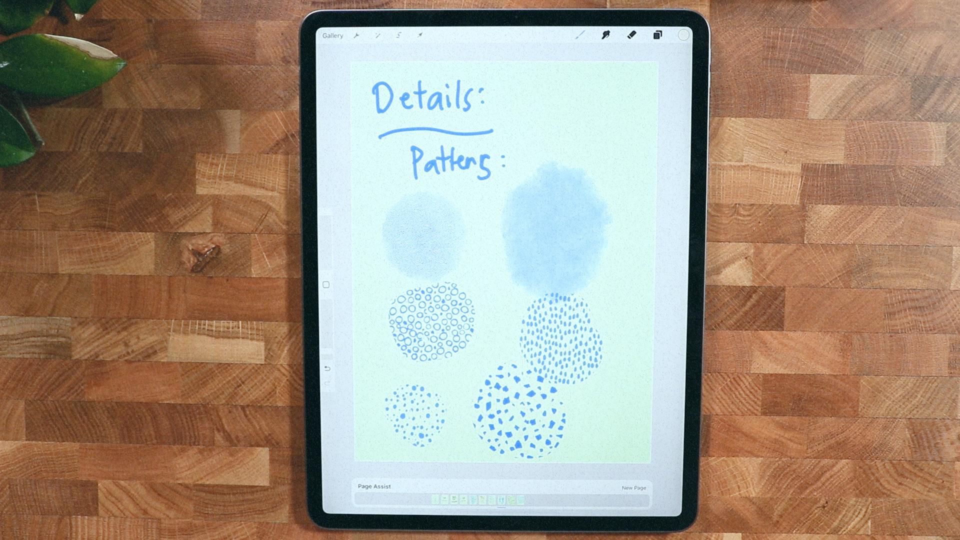
use our PNG for this. These are the fine details. Beside the font and the
colors and the guidelines, we have these patterns that we can also incorporate
into the post. We will get into these details. Moreover, they have
here textures. It just gives it
more human touch. Compared to just a
plain colors with tags. The layout is going to be just a guideline on
how we created it. We have a consistent and
it's just going to be like guidelines it's not
going to be forever. We're going to start with
reviewing testimonial, so we can put a text here
and photo here and overlay. On the background,
it's going to be like texture to give it
visual interest. For the service, since we
offer delivery for pets, like grooming and treat, we will put that
as well in here. We're going to put
a phone in here, like an app for the store. Then we can put the
call to actions here, and some texts, big text, short and sweet
so it's easier to digest. A photo here, a text photo, and the call to
action is there of a statement that
we are who we are, and this is what we do, this is our mission. A little bit of texts in here, probably a little bit
of text to back it up, and a little bit
of photo here of a pet or someone who's holding their pet and
they are pretty happy. [MUSIC]
3. Class project: [MUSIC] For this project, you will create a couple of social media posts that resonates with what
you're passionate about. The main goal is to play with colors, textures, and patterns. Be relevant and mindful of all the elements
you're putting in, also to cut and clip
images and blend them together to create a
seamless and cohesive post. You can create your own post or you can follow along with me. You can download
all the materials on the project and
resources tab. When posting your project, I would like to hear
about your process, inspiration, anything you
have in mind while making it. It gives me a
better insight into your artwork and help me
better connect with you.
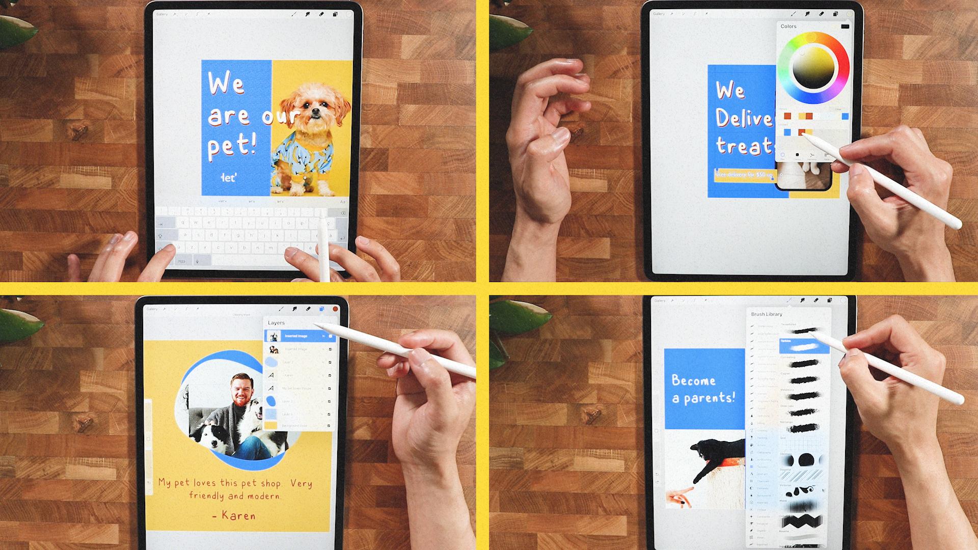
4. Product Template: [MUSIC] All right guys, this is the time that
we create our posts, so we established that
we're going to create a canvas of 2,500 pixels. If you're not in pixel mode, you can just change
it, just here. Our DPI is 150, I think that's going to
be enough for a screen. But if we're printing, I think we have to go 300, but we're not printing. Make sure that you're on RGB. Make sure that you get
all the colors though, we're going to go create. You get your own square post ready to fill up with
some good stuff. This is going to be photo here, and some statement here
and call to action. That's what we're
going to do exactly. But before that, we
have to establish our margins and
guidelines actions here, if you want to go drawing guide, and edit drawing guide, you can establish a
good alignment here. If you go to grid size, make sure you're in 2D grid. You can go grid size like this. I'm going to increase
the opacity, so you can see you should
have a grid size here. You can go all the way until you don't have
other lines here. It's just like a four sections, and you should have a better chance to
have all the objects, and good places clear
up to layer right here. I have a clear canvas
size with my ruler. Get your monoline brush. We're going to fill
this up with shape. We can clip our
image after this, so I'll just hold
my pencil here. It will give you a
a straight line, and we can edit the shape
if you want to be precise. We can do some minor
adjustment here and there. I guess that's good, and I'm going to fill
it up with colors, so you just have to drop
the colors right there. I will duplicate the
first layer here, and I'm just going
to position it here. I will just rename this one because I'm going to clip
some images and distance. I don't have any distinction
on what they are. I could probably put colors, but it's better to rename it. I'll put this one up, and I'm going put this down. When I clip the image, I know which one to go. I'm going to insert
the photo right now, I'm just put it here so
I know that it's down. I'm going to clip it, so it
stays on that container. I'm going to insert
another photo on a nice cute cat right there. [LAUGHTER] I will just
above the app layer, clip it just like this. I can just rearrange
them just like this, I think it's cool. I could change the background easily with the color
palette that we said. I'm just going to go
to my color here, and I'm going to go here. I have my color
palette loading here. I'm going to select
this set as default, and you should see it on the
layer of the background. I can just go ahead, and pick that right there. I can just go change
the color right here, we can change the image if it doesn't go
with the background. I think there's a
problem with the images. I think the images
are very busy, so I would like to change the images to something
less busy alternative. I could just bring it down, and it should clip
automatically. Probably change
this one more time, and let's see if I have more. I think this is quite good since they have the good
color combination. Now I can start putting some text here to
fill up information, so on the action I
can go insert text, and I could start
become a parents. I think that's good, and I could edit the text here, I could just select all. I'm going to change
it to the file that I created for this course. I'm going to go with this one. This font is a custom
font that I created, and there's another
problem here. Select align to the left, so it's easier to read, so I guess it's cool to be here, and I'm going to put
some texts here as well. A text, put it here, and I'm going to put
a call to action. Visit us, and I'm going
to put something here. I'm going to put here
for more information. [MUSIC] Probably
put the dog icon just to give it a playful twist. I forgot to change the font, so I'm just going to
select all of it. I'm going to go for Gill
Sans, something here. Just for variation of font. I think they pair
good enough for this, and I could just put this
here just at the bottom. Now I could turn on again the drawing guide just to make sure I don't go
beyond the margin. It still looks good, and I could put the snapping
here just to give it a good alignment with the
square, or the containers. This one gives me
a good alignment, and also the visit us, make sure that you can
see the alignments here. I'm not sure if it's visible, but I think it is
something like this and this one the
become a parents, it's not going to be in the
center but I want to put it center, something like that. I could even make
it become bigger, so it's a bolder statement. This visit us, I think I could probably make it bigger,
something like this. Think it's too low. I'm going to just put
it somewhere here. I could turn off the drawing
guide to see how it looks. I think it's quite good, I have a good sense with
what's going on here. It's a minimal post, and now I could put another layer and I'll put it just below the
upper layer here. I could start
putting the texture a nice touch to it so
I can go here texture. Probably going to go tar kind, or this one right here. I probably will color
it, this one right here. You should probably get some, this looks like a denim. Also you can do this
one right here, and I'm going to get this color. I'm going to make it
a little lighter, I'm going to go to desk. Probably something like this, so it doesn't overwhelm
the entire canvas. Something like this, a better personality
here, vintage here. This is also a good texture, I prefer this one, so I'm going to
go to that layer. I'm going to clear up, and I think it's a little bit
more playful this texture, and let's see if I
could change this. It's on Myrtle, so if you go to vintage, there's a little bit
more nicer texture here. We can just decrease
the opacity, so it's not overwhelming. But I think it's pretty bold, and easy to read. It's not distracting,
it's a minimal design, put some texture here. The dogs are just the
main focus of this one, and this is pretty much done. I'll see you guys
on our next video.
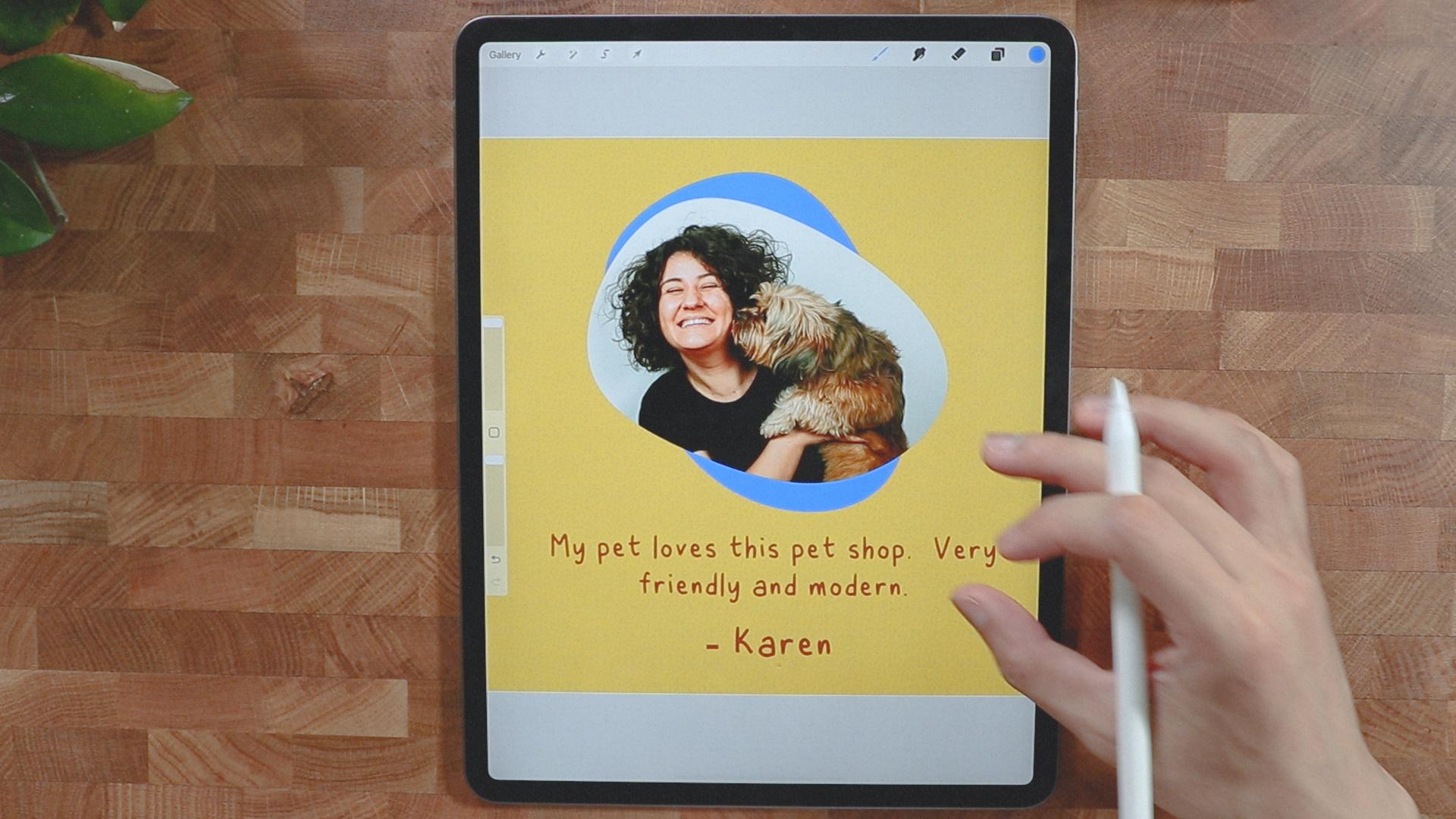
5. Review Template: [MUSIC] All right.
Let's go straight ahead and create a new canvas. I have my history here so the same canvas
size, 2,500 by 2,500. As we establish on the layout, we will have something here like image of the dog
or with the owner, a background lighter tones, the texture that we establish. We're going to put
some testimonial here and also the name of the customer of the dog and we're just
going to do that. As while we explained, we need to establish
our drawing guide so I'm going to do
the same thing layer. I'm going to delete
this one here. I'm going to create a circle. Make sure it's perfectly circle. I'm just going to tap a
little bit here and that's a perfect circle and
I'm going to pull it in with any colors. We're going to go for
ends form or arrow here. We're going to go warp and we could make it a nice shape here, some organic shape and I
think that's good enough. We can duplicate it to
give it the other tone. Make sure that you're all
uniform so you have that nice. I'm going to turn off
the snapping because I don't need it at the moment. I'm going to put
the first layer in the front and insert some of images here just to put this one because it looks
like it's very nice. I'm going to clip
it just like that and that should give us
some idea how it looks. Probably we'll make the shape bigger here because they have, or I'm might position
it just like this. I'm going to delete
the first layer, and I'm just going to copy
this layer right here. We're going to get one
of the colors here, probably the yellow just
to give it something warm. I'll get the background, probably this one or
something this one I think is good and I think I'm going
to choose a color of this one right here with the blue and I'm going
to just put it. I think this is quite good and probably we're
going to duplicate this again and I'm going to color it with warm
tone just like this. I'm going to put this below and I think that's
too much going on. I probably just decrease the
opacity thing is too much. I'm going to remove
one of the image or the object here and I'm going to change the
background to this one. I think this is quite
good for a good contrast. I'm going to add
texts and I'll make sure that the text color
is this one or blue. We're going to take a
look at that first but I am going to okay.
I guess that's good. I will just change the text
to the handwritten font. I'm going to go this
one right here. I think it's pretty sharp and I'm going to
add another text. I'm going to just
duplicate this one right here, and I'll put it here. I'm going to empty this one. Select all. I'm going to put the name of Karen and let's put this
all a little smaller so it has a hierarchy of
what's happening so I guess I'm going to see
if it looks great. It looks great. I
think it's good. All we have to do
now is to insert a new layer and put
some interesting. We're going to go to
our brush library. We're going to go to Vintage
to get some texture. I will probably use
the blue color. Let's see if it's going to work. This is nice and I will
decrease the opacity just to make it less distracting but still there
so I guess this is good. It still have all
those texture and the testimonial and it's
the best time to turn on the magnetics and
the snapping to know where the center is. We have ourself a nice layout
for a product review or testimonial so is to have a good color combination
here and warm texture, pretty much done with
the same template. What are we going to
do with this template? We can easily change the image here since
this is a customizable. As you can see, we can
just clip the image here and we can resize or we can move a reorient and
the shape that we just created and we can even change the background color here
with something lighter. Since it's our color palette, we should never get
lost with all of this. We can change the color or the text as well so this is very customizable and easy to edit since we have
it's own layer. We can just go to their layers
and change it and we can export it on here pretty easily.
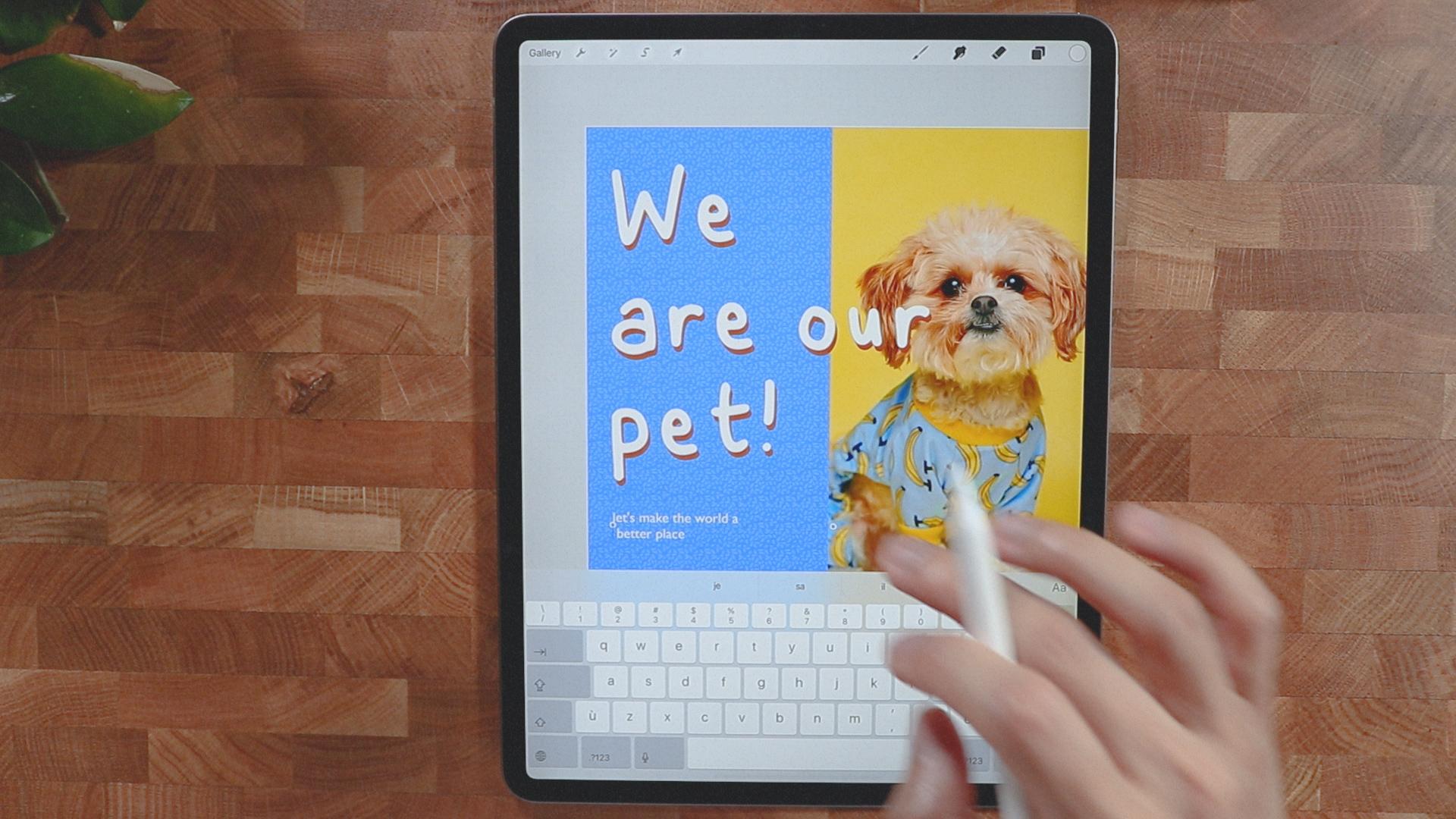
6. Awareness Template: We're done with our second
to the last template here, and I just go straight to create our Canvas 2,500
by 2,500 pixels. The layout that we're going
to use as picture here, and there's a statement here, follow up with some fine print. But first, we're going to get to our wrench here to Canvas. We're going to turn on our drawing guide
just to make sure that we're on point with everything that
we're going to put in. I guess that's pretty good. Since we have our
guidelines right here, it just gives you where
to put [LAUGHTER] our image head into my
background color layer. I'm going to go probably get
this one just to begin with, because this has the
strongest contrast. I'm going to clear this layer because we don't
need it anymore, but I'm going to use it to create a shape here
like a rectangle. I'm just going to
quickly do this right here and just hold it. It gives you this straight line. Then I'm going to fill
this half with color, and insert one of
our pictures here. We're going to clip it
just to see how it looks. We might modify the
shape a little bit, but let me turn off the drawing guide here
just to see how it looks. I think it's okay, but I think we're going to
push the image a little bit to the side just to be proportioned,
something like this. But I don't want to cut the dog's ear so what
I'm going to do here, I'm going to modify the shape. I'm going to go Freeform
and I'm just going to make it a little bit bigger just like
this just to give it a nice space for the dog here. Make sure uniform, and I think this is a
good scale for this dog. It has a yellow contrast, I think that's pretty good. I'm going to insert some text. I'm going to go Add Text. We'll be using our custom font, probably going to
make it bigger here. We are our pets. Probably should select all
and align to the left. I'm going to turn on our
drawing guide again. I'm going to go to the
Leading because right now it's too much space
between the words, so let's fix this
with Leading here. I think that's good
enough for me. We can always make it
bigger just like this. But the problem is
there's a contrast issue, so I'm going to
duplicate this one. I'm going to add the
other text right here, select all, and I'm going to color it white just
to give it a good contrast. I'm actually going
to overlay them like this so it gives
it a good contrast. I should probably do this in all the composition that we made so it has a little
bit more playfulness, put some texture. What we're going to do here, I'm going to create a new layer and put it just above
the background color. Probably going to
use the Myrtle, it's just going to
be right for this. Decrease the opacity
right there. We can turn off our
drawing guide here, see if it looks good. Yeah,
it's going to look good. I think you can see this
once we've posted it, is the opacity quite
a bit just like that. Put some follow-up text. Add text right here. I will use the [inaudible]. I don't know,
[LAUGHTER] let's make the world a better place. Let's try that, a
little smaller. That's too small so
I'm going to break it. I think this is quite
a little bit easy to read once we post it.
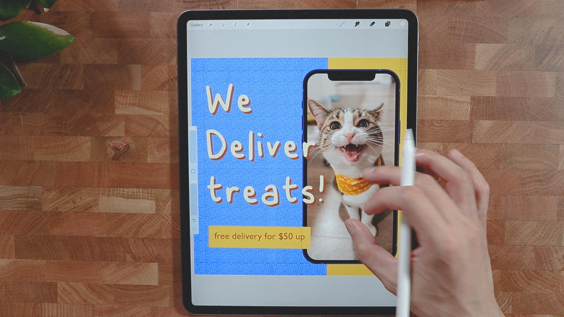
7. Service Template: We're going to create a new
canvas here to finish up. I pretty much the same do
read the background first, we're going to set the
background to blue. We're going to insert
photo of a smartphone. I'm going to put
it on this side. I want to make sure that I have a good alignment so I'm
going to put it again, something like this, and I think that's good enough. I'm going to clip some image
on the smartphone screen. I will just make sure that I get the screen shape so
you can clip it. All we have to do is
to get the selection. We're going to go automatic. We just kept the screen
size right here, I mean the screen itself, I'm going to go
invert and I will just probably three fingers
swipe down, cut and paste. There you go. There's a layer, put it on top, so it's easier for me. As you can see, we were
able to cut the layer here and all we have to
do is to put an image. I don't know if it's big. We'll try this. We're going to clip it
and it's quite big. Probably this one. I think it's good. [LAUGHTER] I think
it's a very playful. I'm going to draw a
yellow container here. I'm going to insert a new layer, put it just above the
background color. I'm going to get
a monoline brush and I'm going to
draw something right here like a container. I think that's good. I'm going to color it to
this yellow right here. I think it's a good contrast. Re-size it. I'm going to go free form
and just a touch of this. I think it's good. I don't like the image, it's too much sharpened. Probably we'll look
for something else. Probably this one, clipping mask. Probably, yeah. I think I like it. It suits with the color, it's less distracting
and it's cute. [LAUGHTER] Insert a text. We're going to use
our custom font. Let's just move it right here so you can see what's happening. I'll make sure it's
aligned to the left. Put it back here. I'm going to just put
we deliver some treats. [LAUGHTER] We deliver treats, I think it's better. We deliver treats. We're going to
duplicate this one, same as what we did
on the last one. I'm just going to go select all and get
this brown right here. We have a consistent
overlay between here. I'm going to change it
to something not yellow, probably this one
right here, white. It's a little bit
more contrasty. I will just put another text here but we're not going
to use the custom font, we're going to use
Gill Sans just for fun pairing, for delivery. I guess that's good and we're
going to make it smaller. This one right here, I think I would just make
it bigger just like this, so it fills up the space, so it's a little bit
bigger and more pop. I'll just draw a rectangle here to highlight
this part right here. I'm going to make a call
to action rectangle here. Let's see if it's going to work. I'll just hold it like that. I'm going to edit
shape it rectangle. I think it's quite good. I'll probably color it
with this one here, and a text layer, I'm going to put it
up just like that. I don't think it stands out. I probably will color it yellow, something like
this and the font, I'm going to go back to this. I think this is quite good. All we have to do now
is to make a layer here and put a texture to it. I'm going to go to
my recent brushes, myrtle and probably
put white here. I'm just going to fill this up. I'm going to decrease the
opacity and it should. Gives it a little bit
of texture to it. It's not the most
important thing to look at. We're good to go. We have our template here. I think they're all
cohesive to each other. They have a common theme
which is the colors, all the elements are
consistent to each other. On the next video, we're going to go and group them together. See
you guys there.
8. Prepare to Export: [MUSIC] All right, guys. So I have our font
template here, which is very customizable. We can change all the font. I could take picture
easily and clip it. What I'm going to do
here, I'm going to select all of these here
and we can stack it. Just rename it. Here we can rename it to
pet shop, just like that. You can also rename
all the names here. So this is kind of a service
awareness view or product. Now we have the template
for the pet shop so we can easily just go here and not be distracted with
all this content. Can just go ahead and just go to each and every post here. We can just change
all the content. We'll just export it right
now since we're done. I'm going to export it, share, I'm going to use PNG, easily insert another photo. Something like this, clip
it and it should be there. I think that's good. Share, PNG. I'm pretty much going
to do all of this here. This one, I'm going
to just save it. I'm going to put this one here. I'm going to just clip it. It should be okay. We're
going to make sure that the kitten is big enough. Since we have a blue color, we're going to switch
the background to yellow so it has a nicer
contrast with each other. Probably going to change the overlay of this
one here as well. I'm just going to select all
of it and change it to blue. I will change the
texture as well. Probably select and I'm
going to fill it up, fill color with blue. I'm going to increase
even the tone. If I'm not really
happy with this, I could even hit the image here. I could adjust to color and saturation just to
give it a little pump, so even you goes with the color. Make sure that it
looks unnatural. So I'm going to just disable
the guide right there. I'm going to just
make this one bigger. I think we could reposition this shape right here
to fit the subject. You're going to just
save it right now. We're going to export
this one as well. I think we're good to go. All right, so we are able
to export everything here. I'll see you on the
next video where I put them altogether on
Instagram. See you there.
9. Show it on Instagram: [MUSIC] Hello guys. Right now, I was able to export everything. I was able to post
it successfully on Instagram just to give you
how it looks in real life. I just put one of the
cutest ones here, like a logo or something. I put some description
here and I just put toys, grooming, and
supplements and treats. I'm going to start from here. Like where I said
on our layout plan, we will sandwich this
into something like user-generated or some
real life picture. It has a little bit
more dynamic than to pose just all of this pose here. It's nice to know I have something that resonates
with the brand as well. So we start with this one. As you can see, we
have a good texture with all the things
going on right there. I think that texture
makes it a little bit different and a
little bit playful and a little bit
perked her to it compared if it's just
like plain blue. Gives us more an edge and the custom font right
here gives it more into life and it's a
little bit more like handmade and other
computer generated. Also this one right here, it looks pretty good. It's just a place holder. We still have the pattern or the texture that we
placed and also this one, I like this one. Just the cat is very engaging. If you see this one
on your feed you probably will stare at it
for a couple of seconds. I still like how
the texture brings. [MUSIC] Overall, I think it's a good way to start your social
media template. Again, the template
is very customizable. You can switch it off, change the font,
change the color, and change the images. You can even lay it out, put some different
stuff out there, but this is just a guide
for you to get started. I'll see you guys
on the next course.
10. Thank you! : [MUSIC] Hi again, and
thank you so much for spending your time with me
and watching this class. I hope you enjoyed it and learn new things and
inspired you to create social media posts and apply these skills into
your future projects. As always, I'll be
here waiting to see your beautiful project. If you have any
questions or something, feel free to ask
anything and I'll see you on the next one.
 Bryan C'ngan, Graphic | Web Designer