Transcripts
1. Hey there!: What comes into your mind when you hear about the
Procreate app? Let me guess, digital drawing, digital art, illustration
or painting? Yes, for sure. But what if I told you
that Procreate can also make a basic conflicts graphic design for any type of content, like poster, collages, social media content, even animation. And the list just goes on. Yes, we can, and that's what
we're going to do today. In this class, we will learn
the basic of graphics design using the Procreate app by
creating a beautiful poster. Hi, I'm Ryan, and I'm a graphic designer
living in Montreal. And I work with
different companies, dissolve and help them with their visual branding and
social media content. I also teach graphic design
on different platform, which I am passionate about. This is a quick fun
class that will change the way you look at
what Procreate can do. As we consume lots of information online
and everywhere we go. Learning the basics
of graphic design is a great way of expressing
your creativity, but also gives you
more opportunity as it allows you to communicate. The more efficiently
and effectively. Learning the basics of graphic
design is very important. Real life skills that helps you express yourself in
a structured way. Whether you're going to create
a poster for your family, events, social media content, or for your personal
journey as a designer, this will be a
great foundation to all your content
creation in this class is for beginners and want to learn more
about graphic design. All we need is our iPad Pro, apple Pencil and
procreate app installed. And we're good to go. A breakdown of what the
class is all about. First are learned the basic
principle of graphic design, also the elements
of graphic design. I will show you my
go-to resources to streamline your workflow will be getting some inspiration. And lastly, we will create a fun project to sum up what
we learned in this class. And as we go along
with the project, we will touch on
the basic tools, tips and tricks, and how to make our workflow seamless
and all the while, all the tools and techniques
using the Procreate app, all the skills that
you'll be learning in this class are all clickable or graphic
design project graded software that you
will be creating the future. By the end of the class, you will be able to create your poster using
the Procreate app. I can't wait for you to
share what you come up with in the project
gallery down below. And we'll love to
give you a feedback. So let's get started. And I'll see you on the
next video. See you there.
2. The Project: For your project, you'll be creating a post-survey
from scratch. Together, we're going to be making this beautiful posterior starting from the sketch all the way through the
Advanced Details. Then when your own, taking everything
that you learn, I want you to create
your own poster. Be sure to post
your projects down below in the project section. And I can't wait to see
them. Let's get started.
3. Basic Principles of Graphic Design: Hey guys, welcome to
this class and let's get into the basic design
principle first. Before we get into creating
our own posterior, I'm going to create
a new canvas first. This is just like Crash
Course do graphic design. Bow will make it concise. I'll give you some examples so you will understand
it even more. So it's very practical. And yeah, let's get into it. We're gonna make
it basic for now, but we'll get into
a little bit more. Graphic design principle is pretty much I learned
from design school. This is very much the foundation of what my design
looks like today. And this really guides
me every time I create a content or
videos or anything. I usually ask myself this and to have this
acronym right here, I'm going to just change colors. So this is going to be the acromial acronym
that I usually put it in my head before I
create or even if I created already contents. Contents, I usually ask myself
if these questions or if my contests has a
good contrast to the difference between
like a black and white. So you can just make
a content white over white or black over black
because there is no contrast, doesn't make sense to
make a content like that, you need to have a
little bit of contrast or make your composition pop. And that was, contrast
is all about. So we're all gonna get into these one-by-one
ER is repetition. Repetition is live
pattern or anything that kind of make it like a signature of your composition. And these are elements
that you have to repeat two or 34 times
to make it noticeable. A is the, one of
the most important. Sometimes we neglect
this like alignment or you can say it like a
margin of your composition. Redo it on purpose
because we want to make things balance or
make Gas symmetry. E is proximity. Actually it goes
hand in hand with alignment balance of
everything in between. So you cannot just put all
the texts and n1 corner. So you need to have like tag
content in one foreigners. So you need to have like a
proximity or day alignment. So this goes hand in hand. We're gonna get into this first. So we're gonna get
into contrast first, I'm going to show you one of
my composition that I made. Let's take an example of this social media posts
that I created while back. And as you can see,
there's a good contrast. There's a repetition of elements like those textures right there. There's a good proximity. There's a good contrast
between text and everything. So everything pops. They don't have anything
that you can read or you can recognize there is
a repetition of elements, those flowers right
here, as you can see, I'm not sure if you can see, but those are just
like a detailed that you will notice after
all the important parts. So there's a focal
point in here. Basically, the focal
point is going to be phone with the gentleman
right here holding glands. We have this tax rate here, which is one of the
focal point as well. We have a secondary focal point right here and call to action. Take example of what
contrast is going to be if we don't implement
a good contrast. So let's say this
background right here. And as you can see, this is still a good contrast because you can
still read the text. But if you put it
just like this, I don't think there's
a good contrast between the background
and the text, is a good contrast. What I'm talking about, there is definitely
an alignment here, as you can see, I'm
going to go to, and this right here
drawing guide. I did put an
alignment right here. I'm not sure if you can see we'll change the color for sure. And as you can see, I put an alignment on
purpose right here. So elements look or decomposition look
professional and it doesn't just like throw stuff in your canvas or that
is like alignment. We have a perpetuity
of everything. So here's a certain
proximity between the logo, the tax, and some other
texts right here. Yeah, repetitions
are the patterns behind or the background. So basically that is the basic principle of
graphic design that I usually use before and after
I create a composition. So we did repetition desire
like the pattern and different elements that repeats in your composition now usually make it more
engaging if you have like pattern repetition
of elements. Our contrast,
alignment, proximity, and we were able to action that. And it's just a brief
graphic design principle. There's quite a lot more. But these are the only one
that I just ask myself, CRAAP, you can read
it as one word. This usually makes my
composition professional, engaging and usually I don't get wrong with
principle in here. And I'll see you on the next video or elements
of graphic design. We're going to combine these basic principles of graphic design and
some elements. We can make a cohesive, engaging and content-wise
and say right there.
4. Elements of Graphic Design: Hey guys, thank
you for tuning in. So we were able to
have a little bit of Crash Course of what the basic principles
of graphic design. Now, we're going to
learn a little bit of a crash course of what the elements of
graphic design are. So there's quite a few elements, but these are the
only one that I usually take into my content. We're gonna be looking into like six or seven different
elements of graphic design. Some of them you might know, and some of them
will be like mu. But first one I'm going to be sharing is gonna be the shape. The shape will be
different variation you can have like a circle
shape, a rectangle. You can have squared, but these are the basic
shape that usually follow. You can have like different
shape, like organic shape. Your geometric shape,
just like this, shape is probably the most basic graphic
design that you will use. And the number two is
going to be color. One. Graphic design elements
that you will miss, even if you're using
black or white, That's still colors, so it
doesn't matter which one. So black read different
colors as you wish. And another thing is line, like a straight line, you know, like a wavy line or zigzag. Use it for anything. It can have a frame on it and
have like an arrow to it. It's like usually
use this to anchor something like a leading lines. It's more, it's going
to be type or texts. Let's just put texts
right here is one of the indispensable part of making content because you have to have inflammation
in your content. So I'm going to include quiet space or pacing
and between elements, but important to put
the space in-between, though it doesn't look crowded and it's easier to read if you have like a is between
shape tax and all that. We'll get into some example in a little bit extra dessert, the one that you saw in a
previous video, like patterns. Because if you
don't put texture, it looks like it's
just like main. It's kinda basic pudding
texture in your design usually level it up a little bit like texture over layers and layers. So it creates some, a little bit less
generic because you put kind of different
touch to it. And lastly, who will
forget a photo or images? One of the most important
part of design elements, product images, your photo, your logo, or
anything like that. So that's pretty much hit the elements that are
usually incorporate before I handed my composition
to a client or to myself, I usually ask this
if I have minimum five of these into
my composition. So let's get into some of the graphic design
opposition that I created. Alright, so this is
one of the example. This is actually the one
I created a while ago. And just to give
you an example of what a good graphic
design looks like, also, graphic design is
very subjective, so some of you won't see this
is a good graphic design, but I find is a good example
or is off, we need to shape. So this is definitely
a shape right here. It's a rectangle, or actually it's a triangle shape color. So we have this
color right here. This is a magenta color, blue colors and white and
kinda like a dark blue. So we have a warm color
and a cold or cool colors. And I usually is good
combination because they haven't been
contrast me the image. So this is an image right here. The photo that you look at here is definitely an
image of a product. We have a good space right
here, texture, right here. It's kinda plane texture, but as you can see, we have a reflection
of the shoe, which is kinda like a texture
repetition of elements. We did repeat the
elements like the shoes. We have a focal
point right here. We have a text for sure. This is definitely
a text right hand. We do have a lined
I believe this is considered line as well
in this one right here. And we have a contrast between the big tax and the
smaller text looking back, the contrast is pretty
good right here, because between
all the elements, we have a smaller
elements right here, which is not a problem since
it's not a focal point, this is going to be
the focal point. Alignment can see
this part right here, and this part right here is
pretty much equally aligned. And the proximity of
everything is just on point. And that usually is
why end up like this, because I implemented the
graphic design principle. Some of the elements
of graphic design. They're usually it's gonna be
the one that we're gonna be using when we are going
to create our poster. That's it for this crash course of elements of graphic design. And I'll see you in another
topic. See you there.
5. Where to get Inspiration?: Hey guys, thank you
for chiming in. Almost done with all the Theory
of a good graphic design, we're going to learn more about, sometimes we have
a creative block or sometimes we have like an impostor syndrome
that you can't think of anything and you're supposed
to work on some projects. So what I usually do if I have this creative block or I
cannot think of any design, I just go ahead and
check what's on B. This is B hands right here, so it's a b hands.net. And this is usually where
I found my inspiration. I also go for injury bowl and
Pinterest is our three of my favorite things to look into when I'm having a hard time
coming up with some things. If you're struggling,
let's say you're, you're trying to
create a logo design of like let's say Logo Design. And you can just check on it. And then you can see all
the logo design right here. Not just for logo but
poster for music. If, if some of your
clients want you to create music posterior
or like an event, you can always go ahead
and here as you can see, they have good resources, right? They even have a
mock-up of how it looks like we go for dribble, let's say poster, social media. This is usually the
keywords that I typed in. And you can see it's pretty good here that you can put
into your composition. If our heavier, just
new to creating or designing doesn't necessarily
mean you're copying. It just takes some
of the elements in graphic design
principle that was implemented in these
different composition. And then you're just going
to put your personality it, I think that's what's
going on right now. Everything has
already been created, so I don't think there's some kind of originality
at this point. Only thing that sets you
from different composition or content is your personality, the branding that
you're working? And you learn this
along the way as I did usually the first few
years is gonna be higher. You're finding your
own inspiration, you're finding your own
style and all that. But along the way it's gonna get better because when
I was starting, I usually create stuff that's already been
created just like this. I usually copy this. Well, I still learn
how to create this. The brain is being wired to create stuff and also Pinterest, also good, can look for, let's say, let's look
for t-shirt design, Halloween, stuff like that. So let's take a look
what's in here. So you can definitely
just go ahead here and see what usually is good
or what's not good. Usually, if it's here in
contrast, they are really good. So you just take all
the elements that was implemented here and you
just make it your own. But your style, couple of inspiration usually
will go a long way, and they usually is my process. You can also use Google for sure they're pretty
much universal with Google is so you can
just put it in like so. Poster for UPS can just
say poster, design, Halloween, minimal depending on what you're looking for you can, it's good to have a specific keyword for you to get what you're looking for. So these are a good
design as well. Pretty much it for inspiration. Hope you learned something
from this quick one. Do you guys onto the next video?
6. Go-to Resources: Guys, thank you for tuning in. This is gonna be the
last theory that we're gonna be discussing
before we move on to the actual creation of what we learn or implementing
what we learned. I'm just going to share
all my resources that I usually use when I'm
creating different content. Since I work as a full-time
graphic designer, I only have few hours to
complete some projects, so sometimes I don't really usually create
it from scratch. I usually sores some of my materials just like
on different graphics, images, icons and all that. So I get some help from different websites because
if I do it all by myself, I don't think I could
finish the task. Usually I get like
different tasks, like maybe ten different
contents to make each day. So good thing that I have these different sources that I usually get mostly for free, but these are just free. And some of them I do recommend for beginners since
these are all, some of them are free and I've been using creative fabric
or for a little bit, I've been downloading
a lot of templates. I also considered their fonts. And you can find
different stuff right here depending on what
you're looking for. But mostly I just use it bonds because they
have a good font. We're gonna go for the font. So one of the websites I use, mainly when I was starting because they're
kinda like free for, mostly for personal use. But some of them that you
just need some attribution. So whatever font you need, you can just customize it here. Now you can just hold school, can have all these
old school being good Mexican fonts right there. So pretty much easy to use. It's called the font.com. They're free stock photography that you can use for
your composition. You don't need to attribute
them since they are pretty much
royalty-free depending on what you're looking for. Let's say example, you need, you're trying to get a
shoes kind of good quality. Or maybe you're looking for a Halloween since
Halloween around the corner and just type
Halloween and you should be able to get some of
the Halloween photos. You can put it into your
competition, same as Paxos. You can pretty much have the
same thing, female flowers. You can just type flowers
and then you can get all the flowers that can
also be specific to it. Maybe you're looking for
rows and stuff like that. There's definitely rows
here for everyone. So the one that I usually
work with right now is icons into my graphic
design content. You can just go here, maybe need some check in,
you have all the checks. These are also
free at some sort, but this is a good way to some personalized icons that usually guides your
audience module.com. So when you use it
interior composition, I'm gonna be hard for them to understand what
you're trying to say. So let's say we want some heart. You can just get
this heart rate here and we can have this. I just save them, mainly use these
emojis for attack. I was surprised
that I have to use this mostly because some
of my clients wants some emoji in their
composition content just to be more relatable,
colors as well. You can go to Colors C-O-L-O-R. And then I look for
trending colors. And these are all good colors and they usually have
a good contrast. So you won't go bag with this. You just have to click them. And then there are hex
code right here, RGB CMYK. So whatever you need here, I just print screen this one
here and then I'll export it to my Canvas and then I'll
just copy all the colors. And another one is where
u vector resources. So if you're looking at
for a Halloween vectors, yeah, you can have this
vector for your project. It gives me a good result since I don't have to do
all of the graphic, you just have to
attribute the name of whoever created this. These are mostly the resources that I go through pretty
much every day for my graphic design journey
makes my workflow a little bit faster because
I don't have to do pretty much anything
from scratch. And so I can mark more and
move on with another project. Now I'll see you
on the next video where we actually create our poster implement while we learn from the design principle, elements, duration and all that. So C right there.
7. The Project: Create a Poster: Hello guys, thank
you for tuning in. This is the time that
we're going to implement. All learn from the
previous videos. So to start with, we're going to
make a new canvas. I'm going to click this
part right here is a plus icon on top. So
I'm going to click that. I'm going to create
screen size for now, since I want to highlight the entire composition is
a full screen on the iPad. So also the screen size
is good for printing like 11 by 17 canvas or paper. And we haven't, you
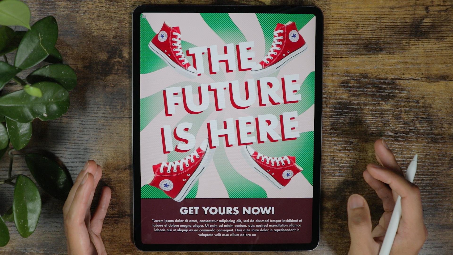
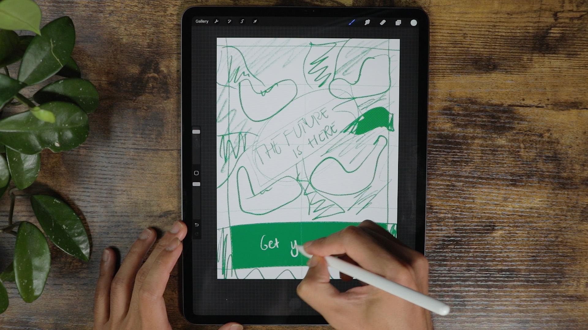
can just write here. So what we're gonna do first, we're gonna do some wireframe, I'm thinking to illustrate
in with a poster, kinda like a shoes poster. And we're going to
add a little bit of elements that while we
learn, we always do. Before I create content, you make sure that I do a
lot of brainstorm wireframe. And what I do is to put some
kind of alignment for it, because this will guide you to have your competition a
little bit more professional. Compare if you don t have a certain margin into your
composition or Canvas. So since we're
working with shoes, I want to put kinda like attacks are focal point
on top of the shoes. Put a grid just to make
the divide the canvas. We're gonna put the
title right here, not in the middle per se, but I want the title
to have a sense of movement,
something like this. Maybe a little bit
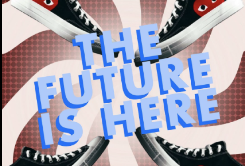
of a statement like the future is here,
something like that. It's not centered. Yeah, but we're
going to fix that. And since we're
working with shoes, I wanted to put
the shoes in here. The scale is pretty
much not right. For now. We're going
to work on that. I'm not really good at drawing, but you get the point. This is the shoes gonna
put a kind of like a hypnotic circular
pattern that will draw the attention to this
part of the screen. So we're going to create
Something, something like this. This is going to be filled with colors and all that thing gets, it's hard to imagine right now, but you will see it straight to fill it up with color now
it doesn't work for now. So this is the pattern. And on top of the
pattern we're gonna put like a texture through here so it doesn't look
like it's pretty soft and it's pretty plain. So we're gonna put, probably use a filter which
is called Halftone. We're going to use kinda like his style on top
of the patterns. So it looks a little
bit original. It feels not generic. We're going to make
solid bar here, a little bit of text right here. Get yours now and some call
to action to the posterior. So this is gonna
be our wireframe. It's a little bit off right now, but this is usually what I do when I start
creating a content. And usually it
works well for me. In die, you can do
what's best for you, but I'm pretty sure
this will work for me. Decrease the opacity. We're going to lock it, toggle it on and
off to see what's our progress right now we're
gonna make a new layer. I'm going to put it in
here below the layer one. This layer right here
is gonna be just on top of everything to see
what's going on. I'm going to disable it for now. We're going to make,
I usually make the alignment first, but since, since we're gonna be
applying different approach, we're going to make the
margins after this one. So right now, as we can
see on our template, we do have a circular
hypnotic pattern. Well, I'm going to do is to create a drawing
guide right here. So click the wrench icon, drawing guide, edit
drawing guide. We're going to go symmetry. Then options. We can go radial. Usually this is how you make those hypnotic or
circular background seated in a little bit. But for now, that's the process. So make sure when you get into layer two,
this is going to be, we're going to rename it to circular pattern and we'll make sure that the
drawing assist is on. If it's not on, it's not
going to make a difference. So make sure that you turn on the circular or the
Drawing Assist. Here, as you can see, it's going to make
our life easier. And I started something
like here at the bottom. Because as you can see, this bottom part is
longer than the top one. Alright, so I think
I'm good with this. Alright, does this good? And we're gonna make one in
the center and one more here. We're going to fill it up so it looks like a circular pattern. So before that, I'm going to just turn off the
Drawing Assist so it doesn't mess up with
the next step which is filling up all the
parts right here. So you have the
circular pattern, okay, so we're done with it. We can go now to the next step, which is making it a
little bit more circular and kind of like a
movement because right now it doesn't look like
it's trying to move. And we're gonna do
that with the Liquify. And we're, we're gonna play
with the twirl, right? I'm going to make the brush size maximum and the pressure we're gonna play with 14 distortion
23 in the momentum. We don't really play with it. So I'm gonna go start with this. And I think it's
doing pretty well. I think this is good. We can turn off
the Drawing Guide right now since we're
done with the step, actually we're not going to
turn it off, get modified. A drawing guide
can just go here. And we're gonna go
into the grid to create our alignment or margin. Think this is good. I'm just going to
move it right here. Alright, so we're good
with the alignment. As you can see, we
have a little bit of a kind of alignment right here. Or margin is usually guides me to the next step where I put my texts or I put my images and put all the elements that
we're going to build in. I'm not really a fan of the
super white background, so I'm going to go to
background color right here. I'm going to go change it
to something a little bit. This color, maybe read
ish that we're going to start inserting our pictures so we'll see what
we're working on. So I'm going to hit
this wrench icon, Add, insert a photo playing with
this red color right here. And this is one of the main focus that we're
gonna be working on. Duplicate it four times, but it's somewhere
here, buddy right here. Probably I'm going to put
it on side just like this. Something like this so I
know what we're working on. I'm going to turn
off our alignment or the Drawing Guide for
now since I don't really need it at this point. Let's go back to
our template and as we discussed a while ago, we'll going to create a texture to it so it doesn't
look boring and all that. I'm going to duplicate this
circular pattern right here. We're gonna go to texture
and we're gonna go halftone. Let's try to work it out. Creates these different texture to it, as you can see in pat, a different layer a here and put the green
color right there. I'm not sure if
it's going to work. We're gonna go halftone
and something like this. I'm not sure if
it's going to work, but we're gonna make
lower the opacity. Maybe I'm going to clip
it and let's try it out. Something like this. Now it looks good and
a duplicate this. And I'm gonna make the layer less opaque and I'm gonna put it all
the way down right there. So it just gives it a
little bit of textures. You can see here, I think
this is quite good. The design is not final yet, but I'm going to
try to put a tax. I'm gonna go to the
Wrench icon right here, add and texts. So hit this a right here. And I'm going to be using
future app for this. I'm going to hit bold, put the texts which is going to change the
color first, like this. And we're going to put, The future is here. And I'm going to
put it right here in the lending that good. So I'm going to go ahead
and change the letting because right now as you can
see there, so separated. I want to make them a little
closer to each other. It's a little bit not really easy to read
because of the contrast. So to fix the contrast, I'm just going to
duplicate it right here. Let me get this
color right here. And usually it will
go to the history. And I'm gonna go to
that second layer. I'm gonna select all
and choose this color. And I'm just going to
put it right here. And they usually solve the
issue of the contrast. We're going to move the shoes
probably just like this, so it has a little
bit of movement. We're going to work on
just like this last one. Move it like this as well, and we're gonna make it bigger. I can dislike this thing. I'm going to solve
some issues here because it's a title
is not that big, so we're going to
make it a little bit, something like this. We're going to make the
title a little bit bigger. So it stands out a little bit. Think this is good. I break the line between
the, in the future. As you can see, it's
now a different layout. Then I'm going to
duplicate it again. And this one right here. Just select the red
color and that should fix some issues with the design. Now it's a little bit
easier to read over. You have to do is
to position some of the elements like this. We can actually
make a little bit of glowing factor, right? You sell the future is here, is a little bit
more controversy. So what I'm gonna do here, okay, so this layer right here, the layer eight and
the circular pattern, I'm just going to merge them together since I'm
happy with the results. So I can apply a mask to this. So I'm gonna be using
the mask here to remove. Some of the, some of the part
of the circular pattern. I'm going to use a
soft brush for this. As you can see, if you go to the layer mask layer,
it's highlighted here. I'm just going to
something like this. Maybe just the center part. If you don't like it, you can just maybe a little bit. So it just makes it a little bit more controversy
with the future is here. You don't have to
erase everything. The green part is overpowering, will just make it a little bit. Focus on the shoes
and on the text. Okay, I think we're good. We can make this on top. Let me try to experiment with. Shoes. Will try to do some
overlapping here, so it has a little
bit of dimensions. Let's try to put this on top. And this one right here. I think it's good. The idea is to create an anchor to the
title of the poster. So the future is,
here's the style. So these for shoes right
here is kind of like the arrow that points into
what the posters are route. And also at the same time, the shoes is being there and the color palette is just
as good as everything. These are a good
color combination. So I don't think there's a
contrast issue right here. Alright, this time I will check the layer,
this one right here, the template that we created
to see if we did kinda follow what we were trying to do a wireframe of what we
said in the first place. So I think we did it right. We're going to just
continue what we started. So I'm gonna put a little
bit of solid bar right here and we're gonna be
using maybe a muted ran. We're going to try it out. We're going to make a new layer, going to change our
brush tool on the line. Strain like that and
make your fingers on the screen so it creates
a straight line. Otherwise, it's going
to be like sloppy. So put it right
there and like go, I might want to make it all
the way down right here. So we can make those shoes
like overlap in here. So it's create a little
bit of interests. And we could actually, I'm going to move
all of this here because they're too low. We can move some of the shoes, make it way down here, so it has a little bit more
interest in a little bit of tweaking right here
to a little bit smaller. And I think that's good. And now we can make our
way like texts right here, my own texts layer a here. So add, add text. I'm going to put it
all the way here, make the text white. And the text is kinda two bald. I'm gonna make it medium. Get yours, k. And the text is too big for me, so I'm gonna make it
smaller like this. So it's doesn't
overpower everything. Well, we just created. You can enable the
snapping right here. So it gives it to
the right place. Something like this. I think that's good. I'm going to disable
the drawing guide for now so I can see
how it looks like. This point. Probably will move
title a little bit higher, something like this. And this one as well. I'm going to move
it a little bit higher so it has a balance. And we're gonna put a
little bit of extra ideas. So it looks like a
little bit legit. And I'm going to make a
placeholder texts right here. Like I'm going to select all of it and make the
size of the text. And I'm going to go paste it, make it a little bit like this, make it in the center. And that usually makes it
a little bit more legit. We can probably, we can make this a little bit darker so it doesn't
overpower everything. The only thing that
you can see is the future is here the
shoes and get yours. Now, we can make
this Gettier's now, maybe maybe bolder, so it has a little
bit more punch to it. But we were able to implement the graphic design
that we will discuss. We have a kind of a pattern right there that we establish
which is the green. We put texture to it, put an image right here, which is one of the elements
of a good graphic design. And at the same time
we repeated it, we put it on repeat. So it looks good. And it has like these cohesive
story that we're telling. We put like tax and
the contrast between the background and
the text is good. I don't see that
there's a problem with the reading of what
we're reading here. The text is consistent with the contrast in-between
hierarchy of texts like this. I like the title,
the biggest one. And next one is this and this. So we have like three
hierarchy of decks were able to put alignment is pretty good as
you can see here. They have a good alignment
on top f, right? And at the bottom, proximity of all the elements
is on purposely done. How he put it like overlapping
and all that to create these dab of the composition, the color is very
much into a spectrum of complimentary colors
because we have these green, which is very cool color. The red is very warm colors. They are very good contrast, just as a good graphic design, it's a little bit retro, a little bit modern, and a combination
and everything. You just have to implement all the things that
we learned today. And you will come up
something on your style. I hope this video
helps out guys, and I can't wait to see
what you can come up with. And I'll see you on
the next lesson. And they'd care buh-bye.
8. Closing: Whats next?: Hey guys, welcome back. This is actually the
end of the class, and thank you so much
for spending the time. I really appreciate
it and I hope that you learn something new here and inspire you to create your poster using
the Procreate app. The big question is, where do I go from here? Well, there's a couple
of steps you can take, whether this is the beginning of your creative journey or he'd been on this
drug for awhile. I feel that expressing yourself creatively is one of the
most satisfying feelings. I do have a couple, of course, related to the posterior
and graphic design. The way I encourage you
to take a look at it as my primary software that I
use is mainly Procreate, but feel free to
use other software as they have similarities. This class is a
bit overwhelming. That's okay because
this skills takes time and lots of
practice over and over. And I can't wait to see
what you come up with. And I'll be happy to see
your beautiful project. And if you have any
questions and clarification, feel free to send me a message on the discussion
panel down below. I would appreciate
if you leave me a review or feedback how the course is and so I can prove my teaching in
the future classes. They'll be creating
here in Skillshare, and I'll see you in
another class by now.
 Bryan C'ngan, Graphic | Web Designer