Transcripts
1. Hey there!: Hey there and welcome. In this short class, we will go back in
time and recreate this vintage poster that
was popular in the 40s. Hi, I'm Brian. I'm a
graphic designer living in one trial and most of
my work is designing, marketing, social post
in video editing. I also work on different
companies for their content. Besides working as a
professional graphic designer, I also have a passion for
retro design just like this, I do have a collections
of kind of like a vintage poster, vintage
inspired postcard. I love redesigning or recreating all designs because it's
a great way to learn, discover what's the benefit, and at the same time, apply my own style. So then a new
composition is pouring. Taking this course,
you will discover new things and skills and
tools in vintage design. And we will also
experiment with colors, effects to create a basic to a beautiful,
engaging composition. On top of it, we will apply some textures and all we
need is our iPad Pro. I am using the iPad Pro. The iPad can do Apple pencil and a procreate app installed on your iPad and
you're good to go. This class is an
intermediate cores. But if you have a little bit
of knowledge of Procreate, these are the breakdown of
what the class sell about. First, we're going to discover
IPE tools of Procreate. We will be using
Transform tools to make it 3D text effect, selecting, isolating element and clipping
them to detect and apply texture and color grade to match the vintage look
that we're aiming for. By the end of the class,
you'll be able to create your own postcard that
you can post or print. And I can't wait for
you to share which come up with in-depth
project gallery. I would love to
give you feedback. So yeah, let's get started. And I'll see you on the
next video. See you there.
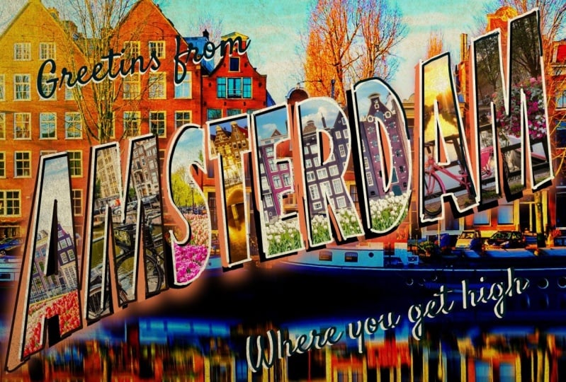
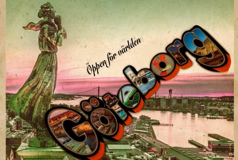
2. Inspiration: If you look at these amazing
postcard right here, they're kinda like
vibrant and really showcase what the
city is all about. As you can see New York, they showcase all those
teacher liberties and all these iconic
buildings right there. They're kinda have this good
contrast, actually very, very strong contrast
compared to what we used to. So the most common colors, as you can see, it's kind
of like blue and orange. And I guess that's because
of basic colors back then, you can see just a clip
images in each letters. And I have no idea how
they did that in the past. And how do they reproduce
in the 30s and 40s. But I'm a fan of this artwork. That's what we're
gonna do today. We're gonna be only
using Procreate to recreate this iconic postcards. All we need is our iPad
procreate app right here. And I actually already
created this one awhile ago, but we're going
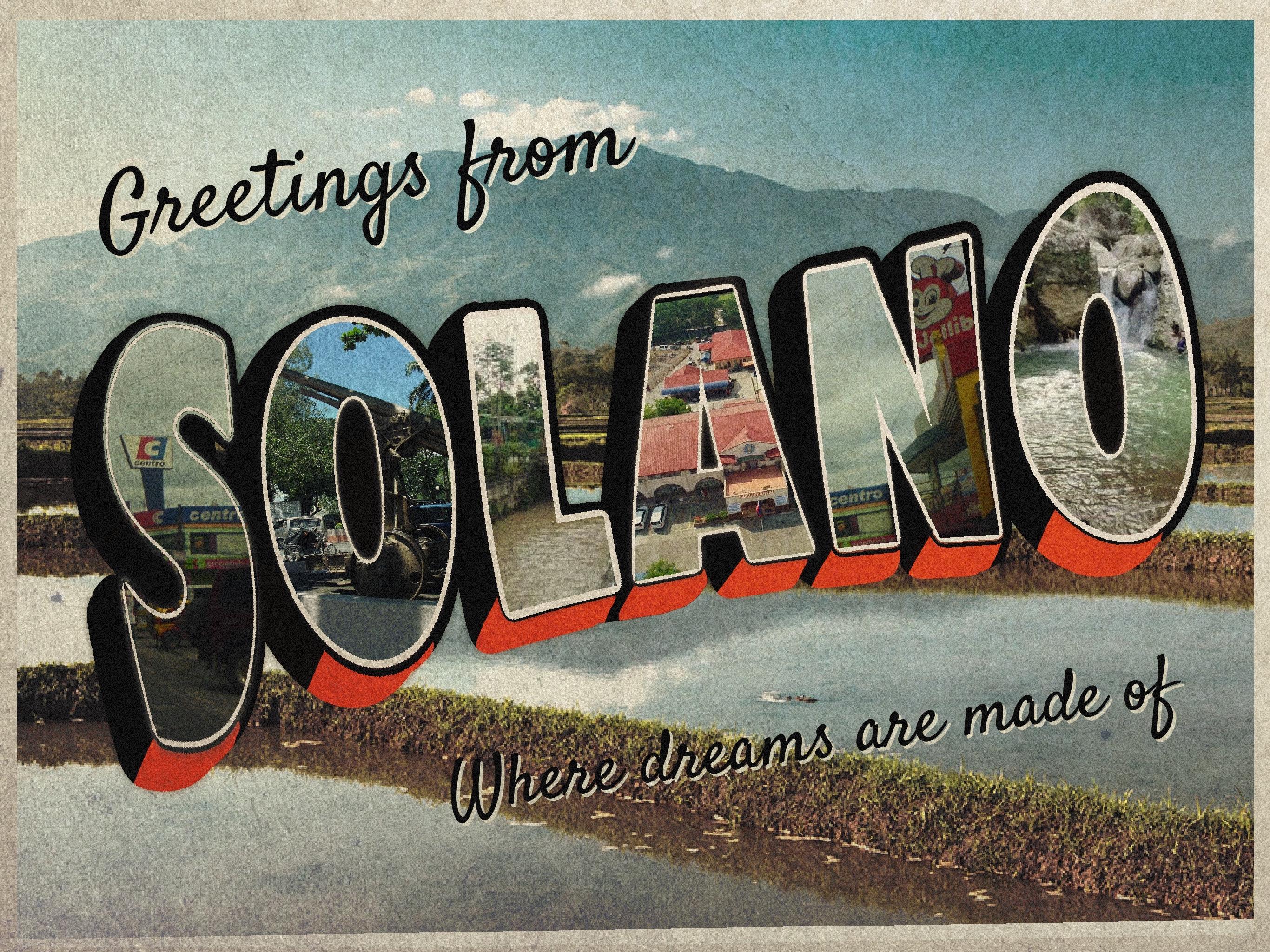
to recreate this. This is actually my
hometown right here. I grew up in a small
town in the Philippines. And this reminds me
of the old times. And then those Cholly
effect and the textures and the colors just brings back a childhood
memories and all that. But before we get into those
emotions and all that, I will just gonna go ahead and create this vintage postcard. We're gonna, it's
gonna be a fun project for everyone to consider trying. If you have Procreate.
3. Text Tool: I'm gonna go ahead and exit, and I'm going to use screen
size right now so we can take advantage of the
full screen procreate, also the iPad along
I'm going to do first, we're going to create a text. And all we have to do
is to get into here the wrench icon and I'm
going to go add texts. And this is very crucial
because you have to pick the font that has
this thick bold font. So you can showcase all the pictures that will
be clipping in each letters. I'm already thinking of future
Condensed Bold right here. And feel free to
explore the gallery. You can also use impact, and I'm going to type my hometown right
here, which is Delano. And I'm going to expand it
similar to a vector mode. So we had to take advantage and you can
see it's very sharp, but once we rasterize, it is going to lose
all the quality. If you have a chance, you can just make this
as big as possible. And then you can downsize it
once you're working with it. So it's quite good. I'm going to change the
background right here so I can see what I'm
gonna be working on. Probably this one
is good enough. I am going to
duplicate this first, this title right here. I am going to rasterize it now. So there's special effect, like I could transform
them and warp them.
4. Transform Tool: The first thing, I'm just gonna go free form here and make it a little bit stand the
size of this one right here. So I'm going to free farm it and make it a little bit longer. And from there, I can
duplicate it right here. And this one right here, I could go to, I'm
going to select it. You can go selection right here. And you can actually
go to layer. You can go select. Or there's actually a
shortcut for this one. If you go onto the layer, you can put your two
fingers here and it will automatically select
that layer right here. I'll do it again. As you can see,
fingers right here. I'm going to hold, press and hold and going to color fill it. And as you can see, it's now white
before it was black. So we're gonna go back to
selection right here with the color fill active,
gonna go Automatic. And then let's try
to feather it out. As you can see, it brings out some kind of outline
right there, change the background so you can see what's
happening right there. We're going to change the
background to a little bit darker so you can see what's going to happen
in the next few steps. So I'm going to
like kids I care. Make sure you're
an automatic with straight to select one of those. And I'm gonna go further. You can see we're
building some highlights, actually were building
like an outline. You can see right there. I'm not going to
be crazy about it. Alright, so I think that's good. And we're gonna go out
from that selection. And we can go back
to the selection. So we're on automatic
mixture of color fill is on. I'm going to select part
of this outliner here. Just be careful. Sometimes it's really hard, but you can try a couple
of times and then you can select the
threshold right here. Once you're happy
with the threshold, go to the next letters,
something like this. And just be careful
because if you go out of the threshold, you might get building up. But I think I kinda like that. And again, we're gonna go
duplicate the layer a there. And the third layer, I am going to just
do the same thing. So I'm gonna go hit it, select it, and I'm
going to go color, fill it with black
and something like that and I'm going to feather
it out just like this. I think that's okay. Maybe a little bit more.
5. Create Outline: And then get out of there. And then select it
again and go to Color Fill automatic. Select it. And then you can change
the threshold to. Okay, let's try it again, because sometimes
it's kinda glitchy and sometimes it's hard. So Selection Automatic. And then we can go
something like this. Can select all the letters now. Yeah, sometimes it
really does mess up. So I'm going to go
inside, are ok. So just be careful with this. Probably can think we're good here
with this setup. We can start putting
our background right here so we know
what we're working on. So I'm going to go Insert a photo right here.
Insert Photo. I'm going to use this
photo right here as a background so I
know the perspective I'm working am going to
make it sure that I highlight the scenery
of my hometown. And I think this is good. I'm actually going to
put it all the way down. I am going to lock this one
so it doesn't move at all. So Locke thing, we're good to go with all of
these layers here. You can actually duplicate this one as a backup
just in case. I'm just gonna put
it right here. And I'm going to
select them all. And then I'm going to group it. I'm going to lock
them and hide it, put it on the bottom just
in case I mess it up. So I am going to group it. I'll hear what I'm gonna do. I'm gonna make this smaller
so it fits into the Canvas. Maybe I could just rotate
it just like this. Make it a little bit smaller.
6. Create 3D Text Effect: And now I can take advantage of the Warp feature right here. So as you can see, can now make the letters or make a little bit of wave
or kind of a wavy look. And I think it's quite big, but we can work on that. You can go and advanced mesh. If you want to control more
of the letters right here, you want to make it thicker
or something like this. It is this doing great. I think this is okay. And I could duplicate
this layer right here. I will go uniform and I'm
going to drop it right here. So I could create
a false 3D effect. And this is quite
good right here. I'm just going to move them both and make it smaller because
now it's kinda big. That is this good. I just have a problem
with this one right here. Alright, so this
layer right here, I'm gonna make it pure black, so it's easier for
me to work selects. And then I'm going to
call our fillets to black and just turning to
block dislike that. And actually I'm
going to turn this into kind of orange,
this one right here. I'm gonna go back select
and then Color fill it automatically being filled because I am on
the default fill. And what we're gonna do here, we're going to actually fix
some issues right here. I just want to connect
this one right here. So I'm going to use
the brush tool, monoline and the same
color right here. I'm just going to connect
them just like this. And hopefully that will
help out this one as well. And here it looks good.
7. Clip Images: I'm going to try if I can extract the
letter S right here. So I'm gonna go to
this layer right here, and I'm gonna go selection. I'm just going to expand a threshold. I
think that's good. And I'm gonna go with
my three fingers. I'm going to go like swipe down, cut and paste, and let's see. Okay, I think I
got it correctly. I'm going to test it
out with one picture, so I'm going to
insert picture here. I think I'm gonna go with
this picture right here. I'm going to make it
bigger just like this. And we can use our
fingers as well. And from there I could just
click this one right here. Clip it and you can see, and we can even make
it smaller so we could fit a little bit more
details on the pictures. Something like this. I'm gonna go back to
this layer right here. And we're gonna go
selection, automatic. Boom. And then we can go three
fingers, cut and paste. And we can go to the same
thing as long as we're, we actually need to go back to this layer to
continuously do this. The paste. We're gonna go to
letter S to letter a. So same thing, selection point. And if you cannot get that, if you don't get it directly, can move your
threshold like this. And if you get this
like all of it, you can just lower the
threshold like this. And it should be okay. You can see here. Alright, so I'm gonna
go three fingers, cut and paste, and we're gonna
go to letter N, election. That are n ket pays, that are o, select. Okay, so we're all good with
all the letters right here. So all we have to do, it suggests go on the letters w1 to wr are clip the images. So from here, I'm going
to go Insert Photo, any photo that you like. So I'm looking for
this photo right here. And you can just, you know, properly align it right here. And then you can just
clip it and you can see it starts to show
up just like that. And you can start with, I'm gonna go with the letter L and Insert Photo, probably. This photo right here, make it bigger.
But it right here. Clipping mask. And I can
go to letter a case n. Alright, We're good to hear. So I just clicked all
the images right here. Hi, I'm just going to
organize this and put it in a folder so I
don't mess it up. So I'm going to group it. You go to this layer right here.
8. Add Dimension: Orange one, I
actually need to get another layer and put
a black coating on it. And from that, I'm
going to clip it. As you can see. It's just pure black,
but that's okay. That's what we're aiming for. We're gonna go for, we're
going to make a mask. And I'm going to go for
the mono line brush. And let's try. Yeah. So right now,
it's all good. I think I liked the colors OVN to do is just to
reveal some orange in here as like what I see as we see on those vintage poster. So I'm just going
to revere orange here just to give it a contrast. And kind of interesting also
has a contrast right here. So I'm just going to
use this right here. So as here just gives
you a dimension. I kinda like this. The next step is going to be, we're going to actually
tried to position this as good as possible and also take advantage of the space
that we have here. Because also we're going
to put a text right here.
9. Add Greetings: Alright, so before we go ahead and put all the
textures we're going into, just put another text
right here. So add tags. I'm going to put greetings
from I'm going to change the text to satisfy I downloaded the
font from Google fonts. If you want to download this
font as well, you can do so. They like the font pairing of
Sans-serif and Sarah here. We're just going to
put that right here. And I'm going to duplicate it. Change the color to white. So it has a shadow. But this white colored
decks at the back, and we're just going to offset it a little bit right here. You don't see much right now. But once we put
all the textures, it will make sense. And I am going to
duplicate this again, put it at the bottom right here. And this is gonna
be just a subtext, a little bit of maybe
where dreams are made of. Thing that's quite,
it's quite long, but we're going to
make the text smaller. So it fits into,
put it right here. Maybe smaller and same here. We're going to
duplicate this one and this one right here. I am going to edit it
and color it black. And probably I'm
going to exchange the layering and we're going
to offset it quite a bit. Maybe something like this. Okay, I think that's good. Make it a little bit bigger
and fit into the canvas. I'm actually going to unlock the background ray here
and make it uniform. And we're gonna put kind of like a whitespace,
something like this. I'm going to on the snap, so have a good alignment. There's this guy, I'm going
to change the background to wait in a line this again, to have that perfect alignment. I think this is quite good. Probably we're going to make
this a little bit smaller. So also we can showcase the
background right there. Here. Actually, I'm going to, I'm
going to group them too. So I could easily move
them wherever I want to. This one here, you can group mips and positioning array here. Thing it's a good position and make it bigger
so you can read it.
10. Apply Vintage Texture: And lastly, we're
going to insert another photo or texture. I think this one will
change the game here. Okay, so this one, we're going to blend it to think linear burn is going to be
my best bet right here, as you can see, it gives it a little bit vintage
look right now. If it's too much, I think this is the perfect one. And I'm going to color
in the background to something different color
because from that time it has, they have a different
calibration of colors and probably desaturated a little
bit and make it brighter. So the title right here, or the town is gonna be
like the focal point. I'm gonna go
something like this. And also they have this
sepia colored tone before. So I think this is quite good. Let's try full screen it. This is the final product that
we do while we did today. And hopefully you
learn something on how to create your postcard. Make it like a vintage looking.
Thank you for watching. Hope you learn from here. And again, See you
next video. Bye bye.
11. Closing: Thank you!: Hey guys, thanks so
much for spending the time with me and
taking this class. And hopefully you were able
to create your own hometowns, vintage postcard that you can show on your social media,
or you can print it. And if you have any questions or recommendations
about this class, feel free to post a comment
on the discussion panel. Also, I would love to give me feedback about
my teaching so I could prove my
productions and by Albert all teaching
on Skillshare. Thank you once again, and I'll see you in
the next lesson. Bye now.
 Bryan C'ngan, Graphic | Web Designer