Transcripts
1. Hey there!: Hey there and welcome. Hi, my name is Brian. I'm a content creator
and graphic designer. In this class. I'll be showing you my
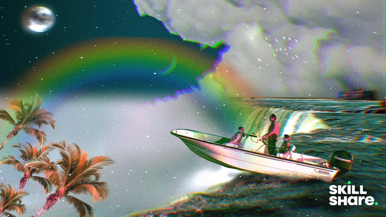
process on how I created this trippy mountain surrealism poster collage in Procreate. Just to give you a heads up, I made this class on this path and I didn't
plan anything at all. I allow my unconscious
mind to express itself. And I hope I did. Great.
I'm always looking for better technique and workflow
to share to everyone. So if you pick up
something new or you can share something
unique tricks, feel free to share on
the discussion below. As always, I applied some basic graphic
design principles to create a good contrast. Color harmony, imbalance
of all elements, create magic and strange
beauty in unexpected results. This class is a total
self-expression, so you can make up
something totally different or you
can follow along as I provide all the materials under Projects and
Resources panel. Grab your iPad and
let's get started.
2. The Project: For this project,
you'll be creating as surrealism poster
of your choice. Or you can follow along
and use all the assets that we'll be providing
in the project and resources tab down below. The main goal is to play with colors, movement,
composition, and cutting images, blending them and making them
fun and trippy. Once you've finished, go to the project and resources
section of this class and click on the Create
Project button and share what you've made
and tell us a bit about your process and results.
3. Resources: Find your Mountains: These are my go-to website
that I like to go. This is Unsplash and Pexels.com. I'll also go for PNG, IMG.com to have some
transparent images. These are all free. All you have to do is
to attribute them. Let's get ahead. I'm going to type in kind of
like a sample images here. You can pretty much select anything that's
pretty interesting. So, or this one, I actually like this one, so I'm going to download it. And you can easily download, you can do that, but
I like to just go in. And then the photo, if you want to print it out, makes sure that you get the
original size somewhere here. So you get the best
quality of the images. And we can also download
that by this guy. So these are kinda nice. Yeah, This one right here, this kind of free. So you can just get that part. And pretty much the same. I can just add the photo. It should be on the photo. So this is kind of a
transparent background. You just easily incorporated
into your composition. That's all there is for here, I'm going to have all the
images for the project of this class so you can
follow along, hey, there.
4. Set up and Brief: Thank you guys for tuning in. So let's get started and
let's create our canvas. I usually use 11 by 17
inches art board just because sometimes I want
to print it out and also if I want to sell
it out in the future, I can always do that. So 11 by 17 right here. So I'll just kinda make
it just like this. So I'm going to make
it inches 11 by 17. You can go for three hundredths. So it's, when you print it, it's going to be super
high definition. I want to change it to CMYK
if you want to print it, but if you don't really want
to print this RGB and also some printers now accept
RGB color profile. So I'm going to just go for RGB and I'm going to
hit Create right here. And we have a new art board. So what are we going to do
right now or just kinda keep inserting images and also
masking and cutting them. And we're going to
color grade them and blend the colors together. Be mindful with the lights
and the color harmony, and the textures and all that. So we're going to do
that along the way. But first, we're going
to insert one of our photo or images here.
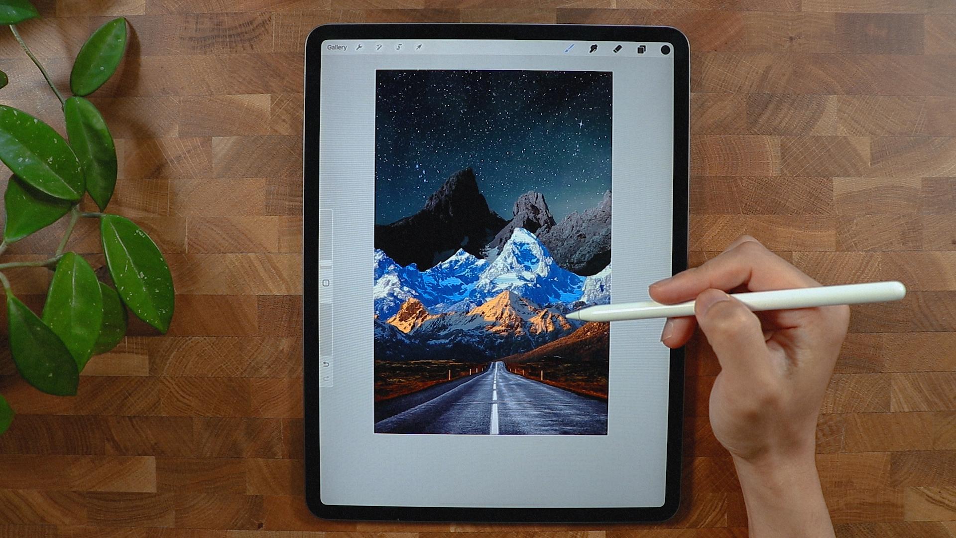
5. Lets Start: So I'm going to hit the
wrench icon right here. I'm going to go
for insert photo. This is my first
photo right here. So this is just one of the
photo that we'll be using. So I'm going to get
from this photo is just kinda like this
part right here. So I'm going to
cut the mountains. I will just de-select it and make sure that they
have a good proportion. I'm going to use this
selection right here. I'm going to use
free hand because I think it's the best way to
cut this image right here. And you can experiment with
maybe automation here. But I don't think it's
the best way to do that. So I'm just going to
flip actually my, my canvas right here. So it's easier for me too, because it's kinda like
straight line right here. So do what's best
for your workflow. So I'm going to just trace
this just like this. I'm not really
careful with if I hit all of the horizon
while you call this, this part right here, I'm going to, I'm going
to connect them here. And what I'm gonna do, I'm gonna go to the
layer panel right here. And I'm going to go for mask. And you can see we
were able to get rid of the sky and a mountain. But don't worry, it's still
there just in case you want to get the mountain
and all the other elements, we can always do that. So I think that's pretty
much it for this layer. We'll leave it like
that just in case. And we're going to
insert another photo, solving using this
photo right here. So the theme of this collage is all about
finding your mountains. And so you can always
find your own Mountains. So I'm going to drop the first
just below all the layers. So as you can see, I
don't really need to cut anything except I have
to cut the sky as well. But as you can see, it looks real right now
because the light's, does the proportion
and horizon is kinda like the same place
or something like that. So I'm going to just cut this
guy right here so you can continue building our
mountain stack of mountain. All the same here. We could probably try automatic. Let's see if we can get Cp. Then I'm going to invert it and we're gonna
go to Layer Mask. We're gonna go mask. And let's see if we can have
this. I think it's good. And now we could use the, if you go to your
layer mask right here, we can get one of our brushes
for probably soft brush. I'm gonna go for the block
to delete her to get rid of the excess part
that we don't need. So I'm just gonna do, oops. I'll make the brush
a little bit bigger. Just going to get
rid of pretty much all the archives here are the remnants from when
we were masking it. And this one right here, I'm gonna go switch to white. I can store back the, this part right here. So it's kinda easy to do this
since are using the mass and we didn't really delete
or gary of any parts. I think are good to go
and just got to make sure that I did a good job
here and here as well. I think the second
mountain looks good. So what are we going to do? I'm going to insert
another mountain. So this is the next mountain
that we're going to work on. So as you can see, they have different light
and different color tone, kinda like a cold tone
and this is kinda warm, so we'll take note of that. And we put this mountain just
above the background color. Let's see if this
one looks great. I think I'm going to
retain the Cloud here. I think a little bit of a
break in-between the mountain. So good selection
in automatic again here in that they
have the same color. Start here, and let's see if we could manipulate the
threshold thing. I'm going to use the
free hand for this one. It will be easier for me. I'm just going to just
trace it just like this. I think this is good. It's not that hard
actually to trace, especially if you're
doing the free hand. And especially if you're
tracing a mountain, because they're not really that they're not like you're
tracing your hair or face. So you can pretty much show
for D layer and gotten go mask and probably move the mountain a
little bit like this. I wanna put more
information here or more, or mountain, maybe one
of the last one day, I probably will
insert this here. And we will take note of the color because
this is kind of bark, so we're going to blend
that easily later on. And we're just going to
position it just like this. We can even flip it
horizontally or vertically. I really make the mountain
here a little bit smaller, or make it, move
it a little lower. And think that's good. I also want to move
this image right here a little bit,
something like this. And I'm going to
duplicate this one. And the first layer, I will actually going
to mask it as well. So I'm going to get the
selection and then I'm going to roughly select this
mountain right here. So I'm gonna go to
my mask, layer mask, and I'm going to mask
it so as you can see, has its own layer. And we have the layer
for the background. So as you can see, we have a lot of different tones and different colors right here. We want to decide which
color are we going in. So we might go for
this kind of color, but I think I'd like to
contrast in-between.
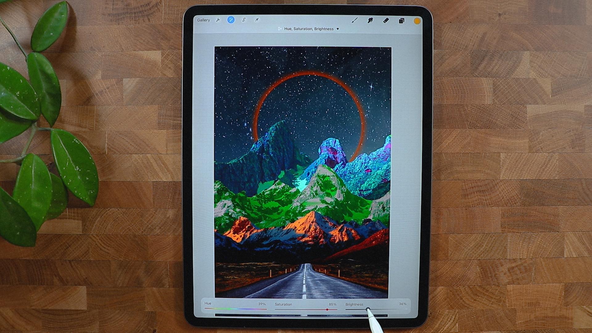
6. Experiment with Colors: So as you can see, we have a lot of different tones and different colors right here. So we want to decide which
color are we going in. But I think I'd like to
contrast in-between. I'm going to disable or hide the background so I
could focus on this one. So I'm gonna go to adjustments and then
hue and saturation. Let's see if we could
do something with this. Because I want to blend it
with the other elements. It might be helpful to
turn on the background. Let's try again with
the adjustment. And let's see if we
can pump up the color, make it not really
make it brighter, but put more colors in there. We're going to manipulate the
background because it looks like it's overlapping
a lot I can do here, I'm going to just position
it just like this, bring it down and then
pull it up again. Something like this. So we still have different
issues right here and we're going to color
grade this one again. Let's see if we could
find solution to make it a little bit more colorful
and goes with the flow. So I'm going to pump up the saturation again,
as you can see, this kind of a color that's
going out from the mountains. So I like that color and it might give us some
good result later on. So I'm just going
to probably darken it a little bit and then go
back again, applied the same. I'm going to just
make it saturated until you get the perfect color. We might need to color grade all the other mountains
as well as you can see, I'm trying to heat
it, trying to get the perfect color for this that really can blend into the scene. I think I'm gonna
go with this color right here. Not too bright. I'm going to decrease
the brightness. And I'm just going to play
with this saturation here. Okay, that's good. I'm gonna go to the other
mountain right here. And let's see what
we can do here. I think I'm gonna go can you just go with
this one right here? Okay, So we're having a
lot of layers right now. I think it's the best
ways to rename them. I'm going to rename
this background. I'm going to name this test
is going to be the road. So I'm going to name it road. And this is gonna be
first mountain first. And this one right here, I'm going to name it second. And this one is just
gonna be the third.
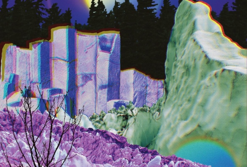
7. Halo Effect: Alright, so we're able
to name all the layers, so we're not gonna be confused. The third layer, I'm going
to create a new layer. I'm going to make a
circle right here, so I'll make sure I had
the monoline brush. And on that layer, I'm going to draw a circle here. I'm going to tap it so I
have a perfect circle. I'm going to fill up with
color just like that. One thing I put it
in the wrong layer. So I'm going to put this
above the background and I'm going to make
this kind of big, actually going to duplicate
the background layer. Put the background on top of the orange circle and
I am going to clip it. And I'm gonna go to
the layer ten Haar. I'm going to rename
it orange circle. And I'm going to
duplicate that as well. And on the first, the first layer, I'm gonna
apply kind of effect. Let's see if that works. So bloom effect and
it should gives you some kind of
like a halo effect. We can even enhance it by
going to Gaussian Blur. And we can even
increase that pan of a halo effect right there. We can even change the color
because I think it's kind of a yellowish and I
wanted to be super orange. Or you can even make it a
different color as you wish. But I kinda like orange. And just trying to find
the perfect orange for me, I think that's, that's
a perfect orange. I'm going to make the
saturation a little bit and decrease the brightness
or increase the brightness. I think I'm gonna go
another Gaussian blur. So it's more like Keno
going a little bit better but not too much because
I don't want it to be the total focal point. I'm going to insert
a moon image and I don't see it because
it's on the background. And I'm going to put it just above the background
layer and save. This one. Looks good. I think it's kinda good. It's
kinda like a focal point, but not too much.
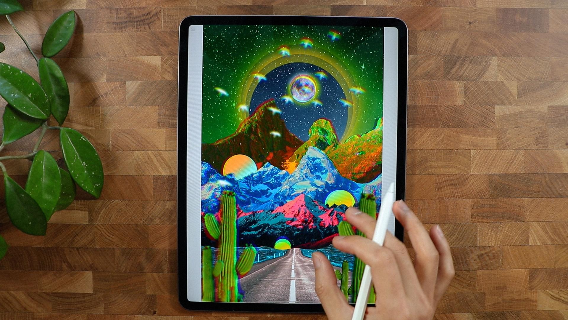
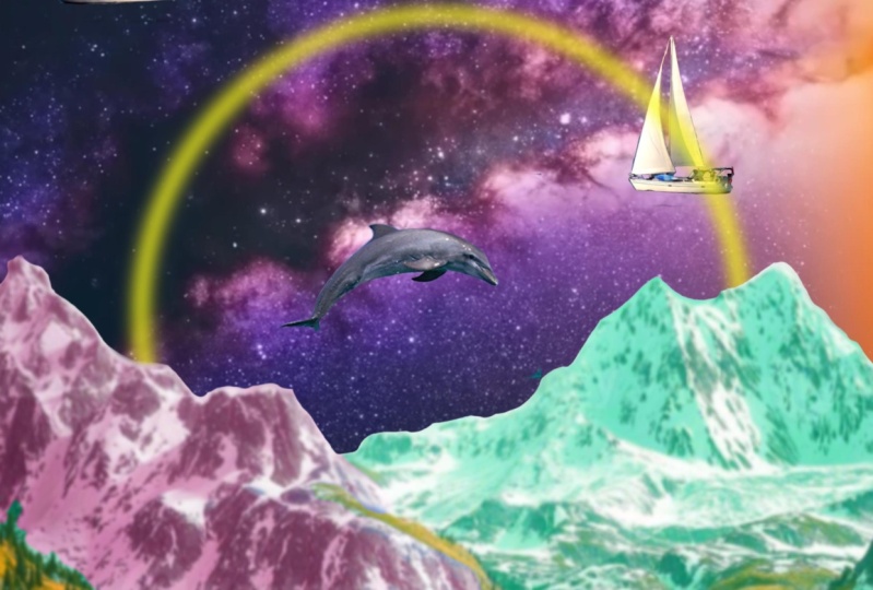
8. Adding Interesting Elements: We're going to put
another image resistor burned and you don't
see it at the moment. But we're gonna go to Adjustments Brightness
and I'm going to increase the
brightness to the max. So you can see it flying around the composition
right here. I like to put bird
just because it gives a little bit more life and
movement to the composition. So I think I'm just going
to put it right there and I'll make a new layer to
put it on the third layer, just above the third layer. And I'm going to make
another circle right here, just to break the
darkness in this part. I'm gonna make a circle, make it perfect circle, and let me just try
to put it here. Paying debts, I get
position right here. Maybe I'll make it smaller. So it's not the highlight
of the composition. I probably will duplicate
it and see if I could put it just above the first layer and see if we could make something
out of this, probably on the second layer. So it needs some kind of darkness here as
well as Anna thing, it's quite cool and
it just gives it a little bit more atmosphere and out a little bit
depth of the composition. A proud blue color
grade the road layer. Let's see if I can make
it a little bit brighter. So because at this point is it's so dark and I don't
even notice it. So I will just change the color. Maybe. I'm going to increase the saturation just
like test probably I'll make it blue to make to break
the orange color in here. So it's, it's, it looks
a little bit better. And I think that that
makes a big difference. And I'm probably going to color grade at the
first layer as well. And let's see if we could make
it stand out quite a bit. I think I could settle with
pretty close to this one. And probably gonna
do this second one. Again just to make sure that it has a good
color combination. I'm gonna make it kind
of bluish color here. So it breaks this one
because this is really warm. I want to make it kind of something like
this, I guess is good. On the third layer. I could even make changes here. I'm going to make it
a little bit warmer. So it breaks this kinda cold
tone and then we're gonna go bright or kinda warm
tone. Probably this one. I think this is the
best way to do that. And I'm going to
color grade the sky. So I'm gonna go to
the background here, I'm gonna go to hue
and saturation. Let's see if we can find
a good result in here. I want to make it a little bit, a little bit like this
color right here. Let's see if we could find
a good color for this. Pink. Kinda liked this effect right here because it
counts like super warm. And I also liked this one because it gives it kind
of like a color in here. So kinda thorn between the
warm tone and color tone, but I guess this one will,
will compensate Brown. We could maybe increase
the Gaussian blur effect. I probably will put
an overlays a stars or galaxies and probably
I'm going to make it super big, just like this. Probably going to blend it. So I just want to get these
kind of texture right here. It's quite good. I'm going
to decrease the saturation. So it's not super overpowering, but if you want,
you can do that. And I think this is
quite good enough.
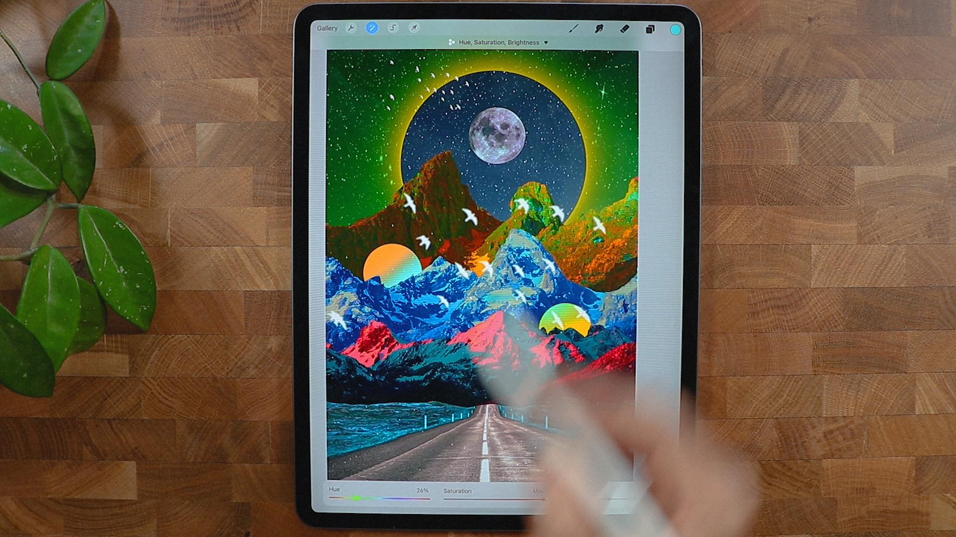
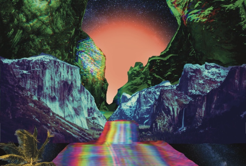
9. Gradient: Let's see if we
can try to modify the color and see if we can get good result with changing the color of this
particular one right here, because it's super warm, it's already warm over there. I want to cut the wildness. If I can do that. Or we can make a gradient
on this layer right here. And I'm gonna make a soft brush. I could probably get a kind of I'm going to Alpha
lock on the layer 15, this one right here. I'm going to alpha lock it
and I'm going to color it. It kinda like dance. I'm going to Gaussian blur. Let's see if I can get good result that too much
because I kinda want to retain are probably
going to hear that. I think it's a good result. Probably going to Gaussian
blur it quite a bit. And I'm gonna go to
this layer as well. I'm going to alpha lock it. I'm going to pretty
much do the same. Maybe the blue is
kinda come here. Yeah, something like this. I could probably duplicate
the bird and put them pretty much
where they have. Here. I think that's a good way
to put the burnt careless. Put this one right here. Hello bit more. Safe. This one looks good. Let's put it below. Probably going to remove that and put this
one right here. I think it's a little
bit better with this. And we can color grade
and the moon, I think. I'm going to put to saturation. And I could probably
use this one right here and put it just
below this layer. And I want to make sure
that I'm going to release the Alpha Lock and I am going
to put a Gaussian Blur. And so it has kind of like a glow effect that
is happening, right? They're probably increase the
saturation and brightness. And I can go saturation again. So it just keeps
on getting better. Alright, so I'm gonna
put a cactus in here. I'm going to put
it all the way up. So it shows everywhere. I'm going to put it right here. So it has a little bit of perspective what's
going on here? And make a smaller one, flip it and put it under here. I'm going to duplicate
this one as well. I'm going to pretty here. So it has kind of like it
opens up the door, kind of vibrate like that, and probably going to make
this a little blurry. So it kinda focuses on
actually all of them. I have to go, I'm going to
blur them a little bit. Probably will apply kind
of a chromatic aberration to some the mountain. So I'm gonna go to this
here, the third mountain. I'm gonna go probably create
a chromatic aberration. I'm going to duplicate
this one right here, and I'm going to put it just above here and see if
I could get a good result. I'm gonna put it here.
Yeah, I think that's good. Kinda like Aldi
information there. I just want to just want to
get a little bit more focus. So what I'm gonna do, change the color
right here because it's not really standing
out at the moment. And probably I'm
going to duplicate this hue and saturation. I'm going to increase the saturation and
the moon right there. I'm going to apply like
chromatic aberration. Let's see if I get
a good result. And I think it just
solve the problem. Because now it looks, it looks, it stands
out quite a bit. And the bird as well, I'm going to play chromatic
aberration as well. So it goes with the moon. Probably all of the
cactuses as well. So it's kinda get a
little bit more trippy. So chromatic aberration.
A little bit, not too much layer right here. I'm going to unlock the Alpha Lock and
probably going to apply kind of chromatic
aberration as well. Actually, all of them. I'm going to unlock and apply
chromatic aberration thing. It just breaks some
of the rules here. And I probably will do the same with can
I apply? Let me try. Oh, yeah. That is DO I liked that? So I'm going to keep that. And this one right here, this third layer, I'm gonna make it, I'm going to merge them. So when I do, when I played the
Chromatic Aberration, it has also good if
something like this. And probably I'm going
to apply to all of it. So I'm going to merge
all the layers. Let's see if I can get more. Something like not too
much for this one. And this as well, I'm going to merge them. Play chromatic aberration. I'm not sure if I
do want to do that, but yeah, I think I'm good here. There you go, guys. I was able to finish it. I think we were able
to make a masterpiece. Hope you enjoyed this
jeweler, something new here. And I'll see you on
the next project.
10. Thank you!: Hi again, and thank you
so much for spending your time with me in
watching this class. I hope you enjoyed it
and learned new things inspire you to create
surrealism poster. As always, I'll be
here waiting to see your beautiful project. If you have any
questions or something, feel free to ask anything and I'll see you
on the next one.
 Bryan C'ngan, Graphic | Web Designer