Transcripts
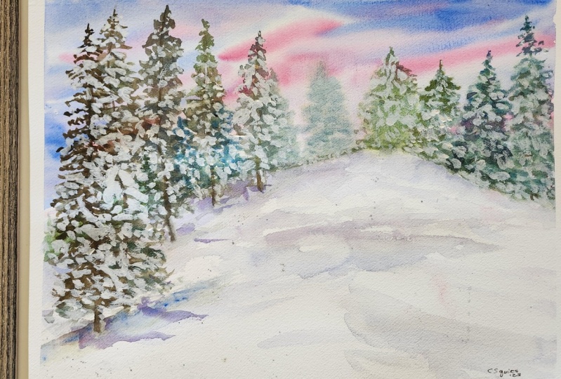
1. A Snowy Winter Landscape In Watercolour: Hi, Welcome to this snowy winter landscape
watercolor lesson. In this class, you're
going to learn how to apply wet into wet. You're also going to learn
how to apply wet on dry, because we're going to
be painting some of the trees onto dry paper. You're going to learn how
to mix new colors just by using a limited
primary palate. So we're gonna be using
only a few colors, and we're gonna be using
mainly primary colors. I'll be teaching
you how to paint a simple fruit trees
and also show you how to push some of
those cheese into the background so they look
further away from you. I'll also show you how you
can add a light source into your paintings to make certain areas of the
paintings nice and bright. We're gonna be using some
gouache in this painting. So this is going to
add lots of highlights and we're going to use it for the snow on the trees as well. This is suitable for intermediate
to advanced painters. But if you're a
beginner, suits me, give this a go because
I learned how to paint myself from following
tutorials like this. So certainly have a go and if you get stuck with anything, That's what I'm here for. Ask me any questions and
I'll get back to you. I'll also show you some
simple techniques like blend in an edge to
make paint soft. And also how to add splatters
into the snow to give your painting lots of texture if you've not followed any of
my other classes before. Hi, my name is Lindsey. I'm a self-taught
watercolor artists living in the UK and Wales. And my mentor for children, and they've also got
a dog now as well. I'm also absolutely
obsessed with Harry Potter superheroes and t. And I've made some really
interesting watercolor lessons on my class profile. One of my favorite classes
is the sea turtle. So if you're interested in having a look at my
other tutorials, head over to my class
page and you'll find some exciting watercolor
tutorials over there. Let's get straight into
the first lesson where I'm gonna be showing you what
Kelly's and supplies I used.
2. Colours and Supplies: The colors I'll be
using our cobalt blue, lemon yellow, permanent rose, and also some indigo. I'll be using gouache to add snow so the trees afterwards. This is a Winsor and
Newton designers gouache. And if you don't have gouache, you could use white acrylic or white gel pen or
something like that, just whatever you've got really, then I'll be using
my favorite brushes. So I've got an oval
pointed wash brush, that's a large brush. I've also got smaller brush. This is a size ten
pointed round brush. And then I've got a size six
printed round brush as well. I'm gonna be using this
on smaller details. I'll also be using my favorite
ceramic mixing palette. But you could use an old dish or a plastic palette or whatever
you've got like a bowl. Then I'm using some 100%
cotton watercolor paper by Canson. I've got to clean jars of water. So the first jar of water I used to clean off my brush
and this gets off most of my paint and then I'll use the second jar to give it an extra minutes to
make sure I've got a clean brush to
pop into my paint. I'm going to be using
tube colors today, but you can use pans or whatever you've got at home and some cloths and an old paper towel for WMD my
brushes onto as well. Next we'll be painting the
first layer on the snow.
3. First Layer Of The Snow and Sky: I'm going to use my
mechanical pencil now to lay down a simple
sketch of the snow. So with the snow,
we're just going to create a mound shape. This is a really simple
shape, as you can see, I kind of slipped
it on the one side. And then using my large
pointed oval wash brush, I'm going to wet the sky. So I'm carefully
painting that water over the top of where we've
laid down those mountains. So that bottom area is
going to be the snow. So I don't want to paint the
water over my pencil mark. And then I'm going to
add lots and lots of water to the cobalt blue. So this is gonna
be very diluted. I'm also going to really
dilute that permanent rose. And then using my
size ten brush, I'm going to start
painting a little bit of the cobalt blue at
the top of the sky. I'm also going to leave
areas of white showing. So there's gonna be areas
of the sky which are still white and this is very
light as you can see. So start with a very light tone. We can always build the color
and make area's darker. But if you start with paint that's too
dark to start with, then you're not gonna be
able to make that any better because of course we can't make watercolor lighter. We always need to work
from light to dark. So I'm starting with a
really nice light layer and you can see that I'm just taking some of that paint off
with a quite a dry brush. I'm using a cloth to
dab my paintbrush onto the cloth to take
off the moisture. And then I'm just using a damp brush to take
off some of the paint. And that's going to leave
bits of highlights. We're going to have parts of
white in the sky as well. Then putting some of the
permanent rose into the sky. I'm using a very light
tone for this as well. And when the permanent rose
mixes with the cobalt blue, that's just going
to create a purple. So don't worry if it's sorted in purple,
it's really fine. This color scheme is
going to be purple, pink, and blue anyway. If you don't want too
much people in the sky just lay down the
permanent rose once. So just use a one stroke or one quick stroke
with your brush. And then try not to wiggle your brush back and
forth and sort of mix that paint together because then it's going to
become more purple. I'm using slightly thicker permanent rose now
I'm dropping that in. And I wanted this to
travel a little bit further out with so I wanted
it to be a bit more blended. I'm just using a clean, damp brush here to
blend some of the edges out because I felt like
it was a bit too harsh. And if you don't want
your permanent rose to be so dark and intense than
just use a lighter tone here with more
water mixed into it on the cobalt blue with
more paint mixed into this, so it's not so diluted. You can see that I'm really building up the
layers in the sky. So I'm leaving lots of that lighter undertone
wash coming through. So I want to leave lots
of the lighter tones in the sky because I do want to have lots of
light in the sky. See me leaving lots of that
lovely light undertone there. And I'm just using a sweeping
motion with my brush. So I'm just sort of making
long marks with my brush. Now with a dry tissue, I kinda scrunched
it up so I can make this lifting technique
in the middle and take off a little
bit of the paint. And that's because
I want this area to be really nice and light. And you'll see why when
we put the trees down, I'm going to make
some of the permanent rose into the cobalt
blue now to get a very light lilac purple color, this is beautiful. Actually. I'm using lots of
water mixed into this. And what I'm gonna do is
use my large brush and start laying down that
color on the snow. You do want to make sure
that your colors are nice and light because when you're
painting a white object, or in this instance, white snow, you do want to just have a lot of the
white paper showing, but because white objects have
reflected colors in them, it's quite alright to put
curlies into white objects. Or they love art in
Colette or snow. I just think there's something
so magical about adding a bit of color to
white piece of paper. I'm laying down some
more of the purple now, but this has got slightly
more paints mixed into this. So it's still very
watery and very light. You do want to keep your tones
super light at this point. And you can see the
consistency here. So this was the cobalt
blue mixed with a little bit of
the permanent rose to turn it slightly purple. I'm going to add that
into certain areas. So this background
wash is still wet. I'm working on the wet
paper and you can see how lovely and soften
those edges are. I'm going to add a bit
to the edge here and we will build up the color a
little bit on the snow. So don't worry about it for now. I do know it looks
a little bit flat. Births will fix that
in future layers. Next we're going to start
painting the trees.
4. The Trees in The Distance: We're gonna start painting the
trees behind the snow now. So these are gonna be the
trees in the distance. I'm going to start off
with a nice thick mixture of the cobalt blue mixed
with the lemon yellow. And I'm mixing two different
consistencies here. So I've got more one which
has got more water with it, which is the one at the top. And then when which has got
not much water mixed into it, so it's a bit thicker and
it's going to be darker. And I did mix in some indigo to that as well to
make it nice and dark. I'm going to start off
with my clean brush now. So this is just some water
go in onto the paper. I'm going to wet this area
in the middle because I want this area where we lifted some of the paint
off the paper to be more up to focus on. When I put the paint
down for the trees, those trees are gonna
really blew out into the background
because we're adding lots of water to
this and making them nice and bled out
and very watery. They're naturally going to look like they're more
in the distance. And that's what I particularly wanted for those trees
right in the middle. And you'll see why
a little bit later on you'll just get a
really nice effect and it will look like
some of the sun is shining through
those trees as well. Where we've got some of the
paper showing in the middle. So I'm just popping down a nice watery mixture of that green using the tip
of my brush in areas. So you can see I'm just
using the tip on the top of the tree and just add in
some little blobby marks. And then I'm just using a nice clean damp brush
to blend out the middle. And that's because I wanted that middle area to be
really out of focus. Now I'm not painting
on the wet paper, so this is a dry paper. And you'll see on the
left-hand side it is still a little bit wet where it's
bleeding a little bit, so it's more of a soft
out-of-focus look. And I think I really
like that effect. But then on the right-hand
side and in the middle, you get in more of a crisp look where I'm painting
on the dry paper. I'm starting with a wiggly
line down the middle, and that's gonna be the,
the trunk of the tree. And then I'm just adding some sort of wiggly
marks back and for making them really
uneven and irregular shaped. And then as you move towards the bottom of the
tree, make it flow. So there's not much
of the paper showing. She moved towards
the top of the tree, leave more of the
white of the paper showing all the background
color shining through. And that's going to
make the tree look more sparse or more gappy at the top, then that's going to make
the tree look fuller. So it's gonna look
fuller at the bottom where you're not
adding too much space. And then at the top, you're going to really make
those branches stand out. So at the bottom, those branches are
going to be wider. And that's because
with a fear tree, they are naturally
thinner on the top. So we're going to
paint some very short remarks on the top and a little sort of pointed
tip to this as well. I've got the thicker green now which I'm just
going to drop down the trunk of the tree
just in a few marks, just using some
blobby little marks while those trees are still wet. And that's going to create
some shadows within the trees and just adds
a bit of interests. I'm going to wet this
area here as well, just with some clean water and then adding on the
lighter mix of the green. So this wasn't a
different color. It was just the consistency of the paint was more diluted. It's naturally lighter. Then I'm going to take the
thicker green which has got hardly any water mixed in
and drop it into the middle. I am using my size six brush for these smaller trees
at the back and that's because I want
them to look thinner. I'm painting the trunk
of the tree thinner. And I'm also being
very careful not to paint over my pencil
mark where the snow is. And you can see I'm adding a
bit of the darker green into the middle to really make
thoughts and trunk standout. And also to the bottom where it's going to be
naturally darker. We're going to have
some shadows there. I'm also going to use just
a little squiggly marks with my brush. Using the tip of
my brush to create this wiggly trunk in the middle. And then using a
back-and-forth motion just with the tip of my brush
on the side of my brush, not using the whole of my brush to create these
little wiggly marks, which kind of reminds me of where we can
eat caterpillars. So just take your
time with this. I would have a
little play around on some scrap paper beforehand. If you're not very good or very clued up
with painting trees, then have a good practice
on some scrap paper. So you get some confidence than before going into your
main piece like this. You can see that I'm painting these trees on the left,
shorter and shorter. And that's going to make
the trees look like they're moving out
into the distance. And it's also going to
work with her perspective because of course these
trees are behind a mountain. When you paint the small trees, they're going to look like
they're more in the distance. And then the larger
trees are going to stand out and look
closer to you. I'm not going to add some
of the dark mixed green here into the middle and
also at the bottom as well. If you're not getting a
darker enough results, just use a dark color like
an indigo or a Payne's gray, or a nice dark color that
you've got in your box and just adds a nice thick
mixture to the wet area. I'm using this opportunity
now to really smooth at the bottom because I want that snow to be nice and smooth. So I'm just using the
tip of my brush to tidy up some of the edges. Because when I
painted the trees, some of the snow got lost
a little bit and it looks a little bit kinds of messy. So I'm just using a damp brush now to blend out that edge, makes sure that the trees are
completely dry before doing this because you
don't want to add extra water into the trees. Next, we'll be adding some
shadows and depth to the snow.
5. Adding Shadow To The Snow: I'm going to add some
shadow to the snow now where the trees closest to us are going to be in
this shadow is going to be underneath those trees
when we paint them in. So I'm taking that color
that we got from mixing the cobalt blue and
the Permanent Rose. And it's slightly thicker,
not much thicker, but slightly thicker
as you can see, it's a bit darker than the
first layer we put down. And this is a purple color, so it's lovely color. If you didn't want
to use purple, you could always use blue. That's a really nice
color for shadows. Or you could use a
gray if you preferred. And you could get a gray
from maybe mixing the blue, yellow, and red together so
the permanent rows together. Imagine a few wavy lines
in the snow because of course snow is like
mounded together, so those shadows are going
to be lumpy and bumpy. And then I'm just
using a damp brush here to soften
some of the edges. So you could always leave those shadows hard
edged if you prefer, but I just prefer
to have it soft. I'm going to take
some of that blue. I've just added a little
bit more blue to this, so it's more blue toned. So it's got a bit more of
the cobalt blue in this. And I'm just going
to add that to the purple while that
purple is still wet. And then just blend in the
edges out with a damp brush. Next, we're going to be painting the trees in the foreground.
6. Trees In The Foreground: I'm going to make
up a brown now. So I'm going to mix my three
primary colors together, which are the permanent rose, the cobalt blue, and
the lemon yellow. So I'm going to mix
those three colors together and have a play
around with those mixes, mixing different consistencies
of certain colors. So I'm realizing that this
is a bit too purple now, I'm adding a bit more yellow to this to make it more brown. But you could of course, use a pre-made brown
that you've got. So any brand will
do like a sepia or a Van **** brown or a
burnt umber with brute. Really nice for this paint, this tree starting with a wiggly thin line at the
top and then at the bottom, I'm going to make it wider. I'm going to use a damp
brush to blend the edge. So when just touching my damp brush with
not much water in it, I'm just sweeping that across the bottom of that
tree to blend it out. And the reason why I
did that is so that it looks like the bottom of the
tree is stuck in the snow. Because if we have a harsh edge, then it's going to
look a little bit like a cardboard cutout or something
just stuck on a page. This technique just
makes it look like the tree is stuck in the snow and it's within
its surroundings. I'm adding this tree a little bit higher up
in the snow and that's because they wanted
this tree to be further in the background. So if you add the
cheese higher up, that's gonna make them look
like they're further away. And I made this tree
a little bit lighter, so I did add a little bit
of yellow to the brown. You can see that when I
move my brush upwards, then the paint is a little bit lighter and that's
because the paint is just running out of my
brush and it's not naturally becoming a
bit lighter at the top. I'm having a nice wide base. So the bottom of the
tree is nice and wide. And then the top is narrow, so it's really nice
and thin and I am wiggling my brush at the top. I'm also adds in some of the indigo to the
left-hand side of those trees while
the paint is still wet and that's to create
a bit of a shadow. I'm concentrating on the
fact that the light is coming from those middle tree. So it's coming from the
right-hand side hitting those trees which
are on the left and it's creating
a lighter side. So those trees, so
the lighter side of the trees is going to
be the right-hand side. This tree on the right hand
side is lovely and thin. And that's because I just
wanted a bit of variation. So some of those
cheese are wider, some of them are narrower, and that's just to make
it look a bit different. Now without dark green that we mixed up for those
background trees, I'm going to start
adding a few trees here. So unjust using the tip of my brush and this is my
large size ten brush. And I'm just sort of go
in from side-to-side, tapering those marks
downwards a little bit. But you can see that
I'm leaving lots of gaps at the top
and that's to make the tree look more sparse with
less branches at the top. Because if you have a
look at a fair tree, the top of the tree will
always be less dense. And if you leave some gaps, then that's going to make
that tree look more natural. I'm using the side
of my brush now to get those wider branches. And this is just going to make it look more full at the bottom. So I'm using the side, which is the belly
of my brush as I'm also painting over
the middle branch. And that's so we don't have
just a stick showing through. You are going to see areas
of thought middle branch, the middle trunk, sorry, show it through anyway, you can see these branches are not the same on both sides. So I am making them look very
different on both sides. And that's why I'm working
from left to right, so it makes sure that they're
not going to look the same. Some are going to be
a little bit wider. Some are going to be pointed
down a bit more than others. Some are going to
be a bit thicker. But I am always starting
with very short, tiny little strokes at the top. So I'm just using the
tip of my brush for the top of the tree
and then I'm pressing more with the belly
of my brush as I move from the middle to the
bottom of the tree, always pointing my brush
strokes downwards as well. So I'm just wiggling
my brush along. Hover goods, a little
practice, like I said earlier, on a piece of paper
because this is something that you do when you need to have a practice of. I had the good practice of
these brush strokes because it does take a while to get used to painting trees like this. I prefer to use a larger
brush for these trees because I just find that it creates more
of a natural look. And it also saves
me from fussing too much and I'm getting
finer details. I don't know what it is
about using a larger brush. I just find it so much
easier for painting trees. I thought I was quickly show you how I'm creating these marks. I'm just using the
tip and the belly of my brush and just touching
my brush to the paper, moving my brush
along and joining up those marks but tapering
them downwards. So I would concentrate
on the top. They can be more
outwards or straight. And then as you move from
the middle downwards, point those branches down
more so than more diagonal. So like I said, just
move from side to side. I am working quite quickly here. As I do find that when
you work quickly, it stops you from being
too precise and to perfect because trees
are never symmetrical, they never look exactly
the same on both sides. You can see here
that I'm just adding a few sort of wiggly
marks at the top, making it nice and
thin at the top. And making those brush
marks very short as well. And then I'm just wiggling
my brush back and forth. I did add a bit of water to
this screen now because I wanted the top of this tree to be lighter than the bottom. And that's because
I wanted it to look like there was light
hitting this tree. So that's why it looks
noticeably like to, and I think the effect
from this was Fab, actually, I really
liked the effect. And this is slightly
darker paints now, so it's a bit darker at the
bottom and in the middle. And that's just gonna
give the effect that little light is shining on the tree through the middle of our painting and onto
the top of that tree. I'm just adding a little
bit of the darker color in the middle where
the trunk would be with this tree
now because it's closest to our source of light. I did add a little bit of lemon yellow to the green mixture. And I've got more water
mixed into this as well. So it's not completely dark, but you can see that it's
more of a yellowy green. And that's because
I wanted to have this tree a lot lighter
than all the other trees. So I'm just using the same
technique with this tree. Wiggling my brush back and
forth and making it lighter at the top and more sparse and
then thicker at the bottom. And then using a darker
color in the middle just on the trunk and in a
few little areas while that tree is still wet. To add shadow, I'm going to use my eradicated brush now
just to tidy up a few areas because some of those tree marks in the backgrounds came onto the foreground snow and they wanted that snow to
be really smooth. So I'm just taking off
a bit of the paint. I'm using a damp brush and rinsing my brush
off in-between. Next, we're going to add
shadows under the trees and some textured splatters
in the snow as well.
7. Shadows Under The Trees and Splatters: We're going to add some
shadows under the trees now. So taking that color
that we mixed from the cobalt blue and the
permanent rose again, I'm going to add some
of the shadows under the trees and this
is nice and diluted. So I've added lots
of water to this. But because we're
gonna be painting, layer on layer is going to
naturally look a bit darker. I'm going to think of the light
source coming from behind those trees and hitting the
trees on the right-hand side. So that's going to
be creating a bit of a shadow leaning
towards the left. So I'm just adding a little
strip underneath the tree and then using a
damp brush to blend the edges up to keep
it nice and soft. This is really easy to do. All you need to do is
concentrate on the base of one tree and then paint a
line to the left hand side. You could make this very irregular shaped or a bit bumpy as well because of course, we're going to be
painting those shadows over snow anyway. And then I'm just using a
damp brush just on the edge. I'm just hitting the edge of that paint with
my damp brush. You do want to make sure that
your brushes only dumped so you're not adding lots
of water into the color. Because if you do, then
you'll push the paint out and this will
cause back Wrens. I've got some purpley, sort of a more of color now. This was the cobalt blue mixed
into the permanent rose, so it's more pink tones. And I'm using a nice
watery mix of this. So we got lots of paint
splatters onto the paper. I'm actually using
my finger and just brushing the end of my
brush over my finger. So this sort of puts little
splatters onto the paper. I find that instead of tapping the back of the brush
or using your finger, tapped onto your tapping your paintbrush
onto your finger. Sorry, I find doing it this way. You get more direction
with those splatters lie. And I just got more
control like that. I'm just going to add a
bit of clean water to this background area here just to blend it out a bit more. On the next, we're
gonna be using our gouache to add
snow to the trees.
8. Adding Snow To The Trees and Project: For the snow on the trees, I'm going to use some gouache, and this is white gouache by Winsor and Newton professional. I go to start off by adding a slight shadow to the
snow on the trees behind. So I'm just going to grab that
blue that we used earlier. And you could add a
slightly darker color into this if you wanted to add
a bit of violet into this, or any of the other colors
that we premixed earlier, just add a little bit to
the white to dull it down, make it a bit darker. This is going to be
for those back trees that are gonna be
in the distance. I want them to be
less bright because I don't want them to be in focus. We are going to put some focus on the trees right at the front. So these ones are
going to be more diluted as well with water. So I've added a bit of water to the squash to really
dilute it down. And also it's got that
blue mixed into it, so it looks slightly darker. I'm just using a wiggling
motion with my brush. You can see that I'm
leaving parts of the tree green and I'm not adding this
snow to all of the bunches. I am sort of wiggling my brush and adding that snow to
the top of the branches. So the marks that I'm making
with my brush reminds me a little bit of
wiggly caterpillars. I'm just using the tip of
my brush in areas as well. So I'm adding some little dots. And that's gonna be for the
branches that are facing us. So we're only going
to get the snow on the very end of the branch
that's pointing towards us. And that's what
we're going to see. This quasi is nice
and bright now, so it's not got any
other colors mixed into it and hardly any water, so it's lovely and thick. And you can see that I'm angling my marks downwards because
with a fruit tree, the branches points downwards. So I wanted to pop
the snow facing downwards as well in a
directional like a diagonal way. You can see that I'm just adding some little circular
marks right at the front. And these are gonna
be the brunch is like a pointed towards us and we're only going to see the snow on the end
of that branch. So this just gives
the tree a bit of fullness and it gives it lots of depth and direction and makes it look lovely in
full and more realistic. I'm also using the
tip of my brush to bring those branches that's
a little bit further, so they're very narrow one eons, just going to make those
branches look nice and long. And I'm also just filling
in a bit more of the snow. I'm going to also add snow
to this tree so you can see that I'm out in the snow
to the top of each branch. So if you're not quite sure
where to put the snow, haven't looked at the branches
on your tree and just pop the thick gouache on top of
each branch, wiggly along. So it kind of reminds me
of a wiggly caterpillar. And I'm just wiggling my
brush back and forth, really using the side of my
brush on the tip as well. Here's a zoomed in look at how I create these marks
with my brush. So you can see they're
not completely straight. I'm just adding the tip
to the paper and then wiggling my brush upwards and just add in like
little blobby marks, really some I'm going to use
with the tip of my brush. Just add in a little
bit of appoints the end of those branches to
make them really taper. Because if you have a
look at a tree branch, they do become
thinner at the ends. That's the look that I
wanted to get there. Then I'm going to add more
snow to this one so you can see I'm just blot
it on nice and thick. I'm adding a little bit into
the middle as well because we might have some branches
facing towards this. And I'm just bringing those nice thick
blobs of gouache out. You can see that these
trees at the friends, because we're adding lots of whites to these trees.
It's really bright. And in contrast, it's making those trees really
stand forward. So those are gonna
be the focus of this painting because
they are nice and bright. And I'm just adding
a tiny bit of that gouache to the top
of the trees as well. Just to make that pointed
the tree really stand out. I'm going to continue
with this question now. So I'm working on this
left tree as well. So just work from site to site. I wouldn't go all on one side and paint
the one side all in one go because you might
make the tree a bit too uniform and all the same. And you want to vary
your brushstrokes. I would work from the top, from left to right, in the middle as well. And just really vary those
brush strokes to make it look very interesting
and really different. And that's going to make the
tree look more realistic. Then I'm going to now add some of that quashed to the right-hand side of
each branch at the bottom. So the big trunk at the
bottom of the tree. And then I'm going
to blend this out with a damp brush to soften it. The reason why I'm out in a white mark on the
side of the trunk is because if the light is
coming in from the right, then that's gonna be shown in the light on the tree there, and it's going to be creating
a nice light highlight. I'm also going to add a bit of gouache to the snow
area here where the sunlight shining on
the snow and creating some nice white marks
within the snow. And it's going to just
make that part of the snow look very interesting. So your project now is
to go ahead and paint your own snow scene using the techniques and skills that you've learned in this class. Remember to upload
your projects and paintings in the projects
and resources area. I would really love to see
your amazing masterpieces. I would also be so
happy if you could just leave me a little
review on this class just so I know how you fund this class and it helps
me with future planning. Have a lovely rest of your day. Happy painting, and
I'll see you soon. Bye.
 Lindsey Dawn Art, Watercolour Artist