Transcripts
1. Autumn Watercolor Painting Tutorial: Hi, I'm Lindsay and welcome to this watercolor lesson centers
around full and autumn. In this class, I'm gonna
be showing you how you can paint this lovely painting. I'm gonna be showing
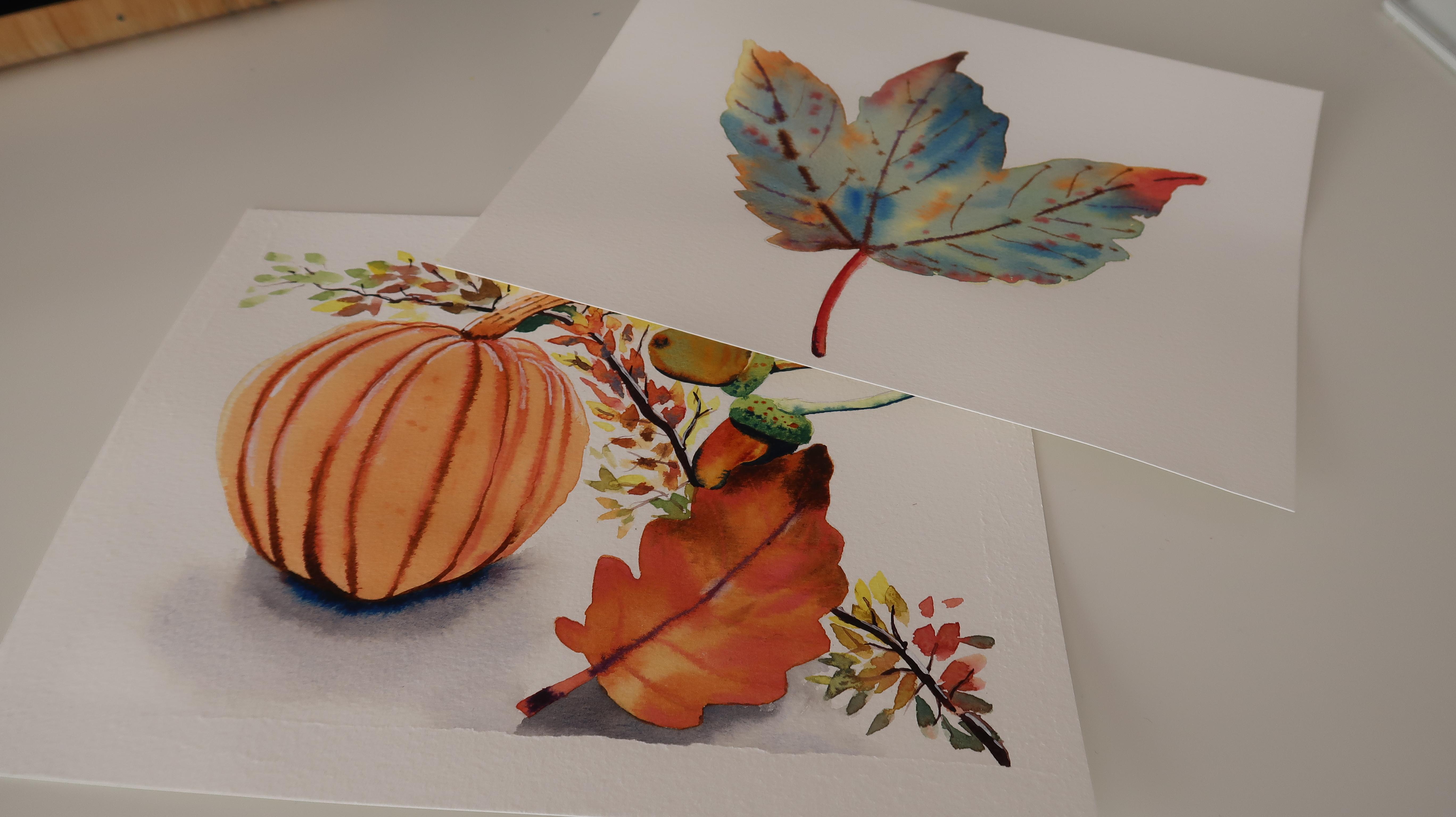
you step-by-step how I painted each individual item. So we've got a pumpkin here, ideal for Halloween time
and also autumn are full. And then also an acorn because I thought a
concert rho is seen around awesome and follow on and off course and autumn leaf. Then I'm going to be popping in some autumn leaves
changing colors, all the greens,
oranges, and the reds. Jello. So this is an ideal
little painting that you can put together. You can paint each
individual item or you can do what I've done and you can
paint this as a painting. This looks so beautiful on
my mantle piece next to this leaf painting that
I'm also going to include. I'll also be showing
you how to paint this beautiful
colorful Autumn Leaf. This is a really
simple when to do. These are all simple lessons. So if you're a beginner, please have a go at this. I'm gonna be leaving
all the line drawings down below
for you to print off. You don't even have to worry
about the drawing process. Of course I will
be including how I sketched these items as well. So you can learn how to
sketch these items yourself. I'll be explaining in small and simple steps how I painted each individual item. So if you haven't got time to
paint this all in one day, don't worry about it. You can allow each layer to dry in-between and take your time. This is for you to paint at your own pace whenever
you've got the time. This is gonna be a refund class with lots of different colors. So what are you waiting for? Grabbed those paints and
follow along with me.
2. Sketching The Pumpkin and Leaf: I'll sketch the pumpkin using
my non photo blue pencil. Now, I'm going to start sketching in the main
shape of the pumpkin. So the shape of the pumpkin
is not completely rounded. This shape reminds me
of an apple shape. So I'm gonna get
that main shaping. And I'm also going to
start drawing in the lines or those creases that
a pumpkin house. I'm also sketching in the stalk. And the stalk is not completely
straight up in the air. It has bent over
to the one side. So in making sure that I
look at my reference photo carefully and you can
make this smaller. You can turn it a
different way if you don't like the way
that it's sitting. I'm just getting in
the rough shape of the tip of the stomach as well. So I've just drawn in a chunky L shape and then I'm just fixing
that up a little bit. Now I'm going to continue with
drawing in these segments. That's a pumpkin has. And they're not
completely straight. They are very curved and curved to the one
side on the left. So if you move your left hand side of the
pumpkin to the left-hand side. And then the top also
has these curves. Have a look at your
reference photo. I did spend quite a
long time looking at the segments and figuring
out where they were. The middle one is
rounded on the bottom. So it kind of looks
like a sausage shape. And you can see I'm not actually drawing those lines
completely straight. I am curve in them
and wiggling them a little bit and then making
them rounded on the top. So it looks a bit like
a gone wrong sausage. I'm going to also curved
the ones on the right over to the right
so you can see them more curved on the
right-hand side. And I'm making them a
bit shorter as well. So as we move further out towards the edges
of the pumpkin, those lines are becoming
shorter because of course, the perspective, the pumpkin is shorter
on the outside edges. So they are also going to
be a bit thinner as well. And again, that
all comes down to perspective and
that's going to make the pumpkin look more rounded. Also, don't forget to put these segments in
at the top as well. Now I've taken my
mechanical pencil, I'm going to fix the
outside shape of this. So I'm going to get
in the main details of the pumpkin now, I'm going to get in that sort of zigzag shape that the tip has. It's not completely
square or rectangular. It does have lots of
little cutouts in it. And it's very irregular shaped. Then I'm really going to
curve up the segments. Always feel like you can make adjustments to
your original sketch. That's why I put the
first sketch down in this light and non photo blue pencil because
this is easily, easy to erase and it gives me a rough outline
or a rough shape to guide me for when I pop down
the main details and the main shape of the pumpkin
with my mechanical pencil. So I allowing myself to make
adjustments where I need it. And you might see me
changing the shape ever so slightly or the length of these segments ever so slightly. And just give yourself
the freedom to do that. I noticed with this segment, it needed to curve
out a little bit, so I made it quite irregular
and a bit more curvy. And they're not so straight. And then also this one is
nice and curvy as well. So I'm just moving
it a little bit. I'm making it really irregular. It's going to make the
pumpkin look lovely and bumpy and more organic. So I'm also curving
the outside edges. And there is our
finished pumpkin. Moving on to the leaf now. And please feel free to draw any shaped leaf that you want. I just found this reference
photo on Pixabay, so I'll leave the reference
photo down below for you. This is a lovely,
easy to follow shape. So the outside shape kind of
looks like a cloud to me. So I'm just curving and
moving my pencil up and down, up and down in a curving motion. And of course I started off with that middle line to guide me. So that's the vein in the
middle and main vein. And I'm just going to not, I'm not going to
make this completely symmetrical because of course leaves are not
symmetrical anyway. So you'll see those
two different sides are completely different. I'm Diane and using
my reference photo is a little guide to how
those shapes move, but it doesn't look exact. I'm also going to thicken
up this main area here, so I'm making it a bit thicker on the bottom
with the stalk of the leaf is and also a bit thin then moving up to the tip. I'm going to also draw in
the veins of the leaf. And you can see I'm
curving them upwards. So I'm starting in the middle
and then curve in them towards the middle of
those outside shapes. So I'm just using those
outside shapes as a guide and moving them into the
middle of those shapes there. If you're not
working on a block, It's always a good idea to tape your paper down to keep your
paint in nice and flat. I'm going to start off by
using some thick masking tape, and this is by uni brands
and I get this from Amazon. I first laid down line
masking tape and then I use the edge of a ruler
to score the edges. And then I'll use the flat of
the ruler to press it down. To transfer your design, all you need to do is
take a soft lead pencil and color of the
back of the design. So I'm using a for b here. I think it's a phobia anyway, it's a very soft lead pencil. And then flip your
design over and use appointed pencil or pen without a nib and
trace over the edges. And that will transfer your
design onto your paper. You can always lift up your
paper as well to check that you're not leaving
any areas and drawn. In the next section, I'll be showing you the
supplies that I used.
3. Supplies: The paper I'm using is A4 size. It's 140 pounds and it's
blocking foods, wood pulp paper. I'm also using two
pencils for sketching. So I've got my non
photo blue pencil and also my mechanical pencil, which is a harder lead pencil. I love this for
using for sketching. And I've also got a range of
silver black velvet brushes. I've got a large
pointed round brush. This is a size 12 Islands. I'll be using this on the
main areas of the paintings. The smaller details,
I'll be using a size six and also my very
small size two. Then I'll be using a
ceramic mixing dish. I'm going to use this
for mixing my colors. And then I've got
my main paints, which are in my
large ceramic dish. I've got some cloths for
dabbing off my paint brushes. I'm using a paper towel and
also to clean jars of water. I'll be using a range of
highlighting recruitment. So I've got a paint marker, but you can use Posca pen or white pencil gouache
if you caught it. But of course these are
completely optional. And next I'll be showing you what colors I used
for the paintings.
4. Colours: The main colors I'll be
using our burnt sienna. Burnt umber, dioxazine violet for the
autumn colored leaf will be using a mix of yellow ocher and Alizarin crimson to get this lovely orangey
burnt sienna color. But of course, you
couldn't just use burnt sienna if you don't want to mix these two
colors together. I'll also be using yellow
ocher mixed with burnt sienna. It's got this lovely
orangey color that we're going to
use on the pumpkin. Who will be using
that color mainly on the darker areas
of the pumpkin. I'll also be using lemon yellow mixed with
Alizarin crimson. And we're going to use this for the main orange color
of the pumpkin. So as you can see, it makes
a beautiful orange color. But of course, if
you've just got a lovely orange, just use that. As I'm also going
to be mixing in a little bit of alizarin crimson into that ready-made
orange to get this gorgeous sort
of orangey color. But then again, it looks
like burnt sienna. I'm also using ultra
marine and we're gonna be using that for the second leaf
that we're going to paint.
5. The Leaf: I'm going to start painting
in the brown leaf now. I'm taking that color
that we got from mixing the yellow ocher with
the Alizarin crimson. And if you want to use burnt
sienna really watered down, that is completely fine as well because those colors
are really similar. Anyway, I've watered this down. It's got lots of
water mixed into it, so it's very diluted
and see-through. And I'm just going
to place it on a nice transparent wash of this. It's a nice light tone and we can see the paper shine through. So I'm just going to pop
that all over this leaf. Now I've got that
reddish orange color, which is very similar
to Ben's sienna. So please just use burnt sienna
if that's all you've got. We got this from mixing yellow ocher with
Alizarin crimson, but it's slightly thicker now. It's a thicker mix is noticeably
darker and I'm going to add that to the first layer while that first
layer is still wet. And you can see that I am
missing a few lighter areas. So I do want that first layer
to show through in areas. So you'll see me not
covering the whole of this leaf in this
orangey red color. You also saw me
just rounding off that little area of the leaf as well because I felt like
it was a bit too printed. So take this opportunity
to fix any mistakes. You can always tidy up the edges and then just
basically dropping in the paint. Very nice watery mix just
on the outside edges, a little bit in the
middle as well. Now I've got some
Alizarin crimson, and I'm going to add
up to a few areas, just mainly on the
outside of the leaf. And I'm also going to add a few areas on the
middle as well. So just wanted that
variation really because if you have a look
at the reference photo, you can see a bit of red in that leaf and I wanted
to get that in. But of course it's not
full in your face red. It's not a full intensity red because it's mixed
with the yellow, orange that's on the paper. So I'm gonna continue
with adding a few of these red marks on the
outer edges of the leaf. And you can see that I'm
working wet into wet, so I'm applying wet
paint onto wet paper. And I haven't unload those
first two layers to dry before actually moving on
with Alizarin crimson, I've got a nice thick
mix of burnt umber. So sorry, it's not mix, it is just burnt
umber on its own. And I'm taking this
nice and creamy from my pan on zinc going to
just drop it onto the top. And now ever so
slightly watered-down, I'm going to add that
to the middle as well. So I'm keeping it
darker at the top where we've got that lovely dark
value at the top of the leaf. Maybe that leaf has
started to rotate a little bit and it's
becoming darker as leafs do. Now I've got a mix of the alizarin crimson,
I'm burnt sienna. I'm just going to
use this opportunity to use my very fine brush now, wet into wet on
the middle veins. And you can see I am
just using the tip of my brush because if I press down too much with the
belly of my brush, I'm going to add too much
pressure onto the paper. And that's going to
apply too much paint and water on the leaf. And you just want to use
the tip of your brush ready to cut these
lovely fine lines? I'm going to start painting
in the stomach as well. So I've just made a little square shape on the edge and now
I'm extending that. I'm making it a bit
longer because I felt like it was a bit short. So feel free to make your stem a bit longer if you
want to do that. Is it called a stem or
stalk? I'm not really sure. Anyway, it's taking a little
bit of dioxazine violet and I'm dropping
that in a nice thick mixes the dioxazine violet. And when that mixes with the
reddish brown on the paper, it becomes more
of a brown color. Then I'm also going
to take it up. The middle stem. Here is only finished. Next, we're going to
paint the pumpkin.
6. The Pumpkin: I'm going to start
painting the pumpkin now. So I'm going to
start off by wetting the pumpkin all over
with some clean water. I'm making sure that's
a really smooth, that outside of the pumpkin really well with
my brush because I don't want any of this water to go outside my pencil marks. I also want to make sure that the pumpkin is
lovely and smooth. I'm just carefully smooth
in that water out. And now I'm going
to take that color that we got from mixing the lemon yellow with
the Alizarin crimson. And this is a lovely watered
down or orange color. So I've put lots of
water into this. And I'm going to drop
this all over the pumpkin while the paper is still wet. And the reason why I
wet the paper first is so that I could work
on this for longer. And we kids got lovely
seamless edges where there's no harsh edges dry in and it's all lovely and soft
and one layer. I thought a little bit more of the alizarin crimson
into this mix now. And it's still orange, so it's a lovely orangey color
that a pumpkin might have. I'm going to start
dropping that on, although it does look a
little bit like burnt sienna, I tell you this has not
been sienna that I'm using. I'm using that lovely
Alizarin crimson mixed with the lemon yellow and
it's more of a orange color. And I'm going to drop
that onto the wet layer. And the reason why I'm doing this is because
I wanted to have a brighter layer underneath to make this pumpkin really shine. And just see what I
mean a little bit later on because I'm going
to leave a little bit of a highlight on the left-hand
side there so you can see that lighter undertone
showing through. With my size two brush, I'm going to start drawing or painting on these
really thin lines. And that's going to be the
segments in the pumpkin. And I am painting these
lines onto the pumpkin while that first and
second layer is still wet. So this is going wet into wet. So you can see that those
edges are blending outwards. But because the paint
is nice and creamy, the paint is not
traveling too fast. So you've got a nice thick
mix of this burnt sienna. And if you're wondering what
brand of burnt sienna I'm using this is by Winsor
Newton professional. And it's a bit thicker and
a bit more concentrated than the Winsor and
Newton Cotman range. You can see I'm
curving to the left, on the left-hand
side of the pumpkin. I'm really curving those lines around and try not to put too much
pressure on your brush. Because if you put
pressure on your brush, then more of your brush is
going to be on the paper. And you're going to
get thicker lines. Although the segments
are quite thick. I did mainly use
the tip of my brush because of course
the paint is wet, so it's going to bleed out a little bit so
you don't want to have too much water in your brush
or too much water repaint. So try not to have
too much water in your brush because of course
there's water on the paper. So if you've got too much
water in your brush, then that paint is going to
start spreading everywhere. And you're not going
to end up with a nice line like
what we've got here. You just saw me
dropping in a bit more concentrated burnt sienna
with my small brush. So I'm just going over
those lines while the lines are still wet and just dropping in a bit
of a thicker paint. And then using the tip
of my brush to add some little texture marks. Because if you have a look
at the reference photo, There's some little markings on the pumpkin and I
thought I'd get those in while the paint
was still a bit wet. I'm just going over these
loans, darkening them up. Then with burnt umber, I'm really going to start
painting down the middle of those loans to create that lovely shadow
or the lovely dip. But those segments have
within the pumpkin. And that's going to bring the
pumpkin segments inwards. So I'm going to just paint these into a few certain areas. I'm not actually
covering the whole of the pumpkins lines in these, you'll see me
missing little gaps. And that's because if you have a look at the reference photo, those deep crevices
don't actually form along the whole of
the line or segment. So I'm just going
to use the tip of my brush and very
thick concentrated, burnt umber just to paint
some of these little lines. And you can see I'm not actually having one straight line. I am wiggling my
brush a little bit to get more of a jagged feel. And then curving over
the bottom as well, because the bottom
of the pumpkin is going to be the darkest area. Because of course
it's sitting on a surface and it's going
to be creating shadows. I'm going to start
painting the stalk now in that lovely light
orange color that we used for the first
layer of the pumpkin. And we got this color
from mixing lemon yellow and a little bit
of the Alizarin crimson. But of course, if you've
just got burnt sienna, just water that downloads and you can use a nice
light tone of that. I'm dropping in
some burnt sienna onto the wet store canal and then using the
tip of my brush to draw or paint some lines. So I'm just painting on some really thin
lines really and allowing it to bleed
out within the water. Now I've got some burnt umber
which is nice and dark. And then dropping that onto
the bottom of the stomach. So right at the base where
it hits the pumpkin, that's gonna be
the darkest area. I'm also painting
on some thin lines and this is going to be the
texture within the stalk. I'm also going to take some
of that color onto the tip. So we're just trying to
get the gist of the tip. And I'm just adding a
little blob there and also painting it underneath
the stomach where there's going
to be a shadow. So let the pumpkin dry. And next we're going to
add some highlights. I'm using a white paint
pen and to get it moving, you do need to press it down. So these are our teaser pens, I believe I will leave a supply
list in the description, but these are quite
new pens of mine, so I'm not used to
using them very well. So trying to get the pain tone
to them was a bit tricky. But all I'm going
to do is just paint a few little highlights
on the left-hand edge. And then I'm just
using my fingertips to smudge the paint out. It's just completely optional. You don't have to do that, but I just felt
like I was going to practice pressing down
the paint a little bit just to sort of take out
the brightness of the white and blend it into
the pumpkin a little bit. So that just helps it to
blend out and not be so harsh and so white and
sort of in your face. And it makes it look a
little bit more natural. So I'm just painting
on a few highlights onto the right-hand
side as well. So you could notice that on the left-hand side
of the pumpkin, I kept those highlights to
the left of each segment. And then as you move to
the right of the pumpkin, you put the highlights on the
rights of those segments. And it mainly focusing on the top of the
pumpkin with a light, might be hitting the
top of the pumpkin. It's a bit more shiny and
a bit more highlighted. Like I said, you can use
goulash or all white pencil. If you've got a really
good white pencil, I do use a Qur'an dash pencil, which is amazing and it's
by is the luminance range. And it comes out really white. So those are really
good pencils. Next, we will draw
and paint the acorns, and this can be loads of fun.
7. The Acorns: I'm going to paint the
acorns now and this is going to be really simple to do
and lots of fun as well. I'm going to start
off by showing you how to sketch the acorns. And again, this
is really simple. So I'm just taking my
non photo blue pencil, which is a pencil that's
really easy to erase. And then just getting in the general gist of
the shape first. So this is going to be rounded
on the left-hand side, more pointed on the
left-hand side, and then more squared
off on the end. And then I'm gonna get this
little area in which is, which is supposed to
be like the base, well the cap of the acorn. And this reminds me a little bit of a
shape like a rocket. So it's looks to me
like a short rocket. I'm just using my
mechanical pencil now to go over the sketch so you can
see this a bit better. So I use my mechanical
pencil to get the actual shape that I want. So first of all is
my blue pencil. I'll get the general shape and
proportions of the sketch. And then I'll use my
mechanical pencil to tidy it up and put the actual shapes in and just get the
sketch more accurate. Now I'm going to draw in
a little branch as well. So I'm just using a
few straight lines and on the bottom and then some crooked
lines on the top for some branches coming off or
some little twigs coming off. I'm going to draw the
bottom acorn now and it's completely up to you if you
want to add two acorns, I'm going to put this
acorn behind the leaf. But then again,
it's completely up to you if you want to
draw this acorn in a different area or not touching the lethal
going behind the leaf, then please use
your own initiative and just put it wherever
you want really. So it's the same shape as
the first one because it's got more of a rounded ends to the branch
or the little twig. So I just rounded
off the edge there because we're seeing a come
from a different angle. We're seeing that acorn
from the bottom of the acorn is got a slightly
different shape to it, and also a slightly different
shape to the cup as well. Because of course we're
seeing it from the side. I'm going to put this little
area in the acorn as well. So I'm also using
my little eraser, and I'm going to just
erase a few areas. Now with the French Ultramarine, I'm going to add a
little bit of the lemon yellow and get this lovely, lemony yellow, green,
lovely vibrant green. I added a bit more lemon yellow to get a nice light green. So can you see it
kinda reminds me of a very fresh apple green. And this was lemon yellow
mixed with French ultramarine. I'm also going to be
using burnt sienna, a little bit of
yellow ocher as well. So I'm starting off with a
lighter wash of yellow ocher. And they put lots of
water into this because yellow ocher can be
quite as strong color. So I want to get a nice light
layer of this down first. The reason why I'm doing
this is because if you have looked at the acorn, to me, it kind of looks like
a yellow mustard color on underneath. So I'm taking that light green that we mixed and I'm
going to drop that into a few areas of the acorn while that acorn is still wet. And I'm trying not to
have a watery mix. If you add quite a
watery mix on top, then sometimes you
can get blooms. So with this burnt sienna
that I'm adding now is slightly thicker than the
first layer that I put down. And I found that was going
onto the paper look better and it was also not spreading as
far because it's thicker. Now I've got an ultra marine. So that's the blue
French ultramarine mixed with the burnt sienna. I've got a really
lovely dark gray color. But of course you
can use burnt umber if you weren't too
nice and concentrated, or a Payne's gray might
work really nice as well. Imagine lemon yellow
to this area now. So this is nice and bright, quite thick paint, so
it's lovely and vibrant. And I'm just painting
in the base, the cap of the acorn. And you can see that I did
get a little bleed with the burnt sienna
bled into that area. And if you don't want that to happen just like the acorn dry completely or leave
a little gap so you're not actually
touching that wet paint. I didn't really mind this because sometimes I
live a happy accident. So this is lemon yellow
again under yeah, I'm watering it down quite a lot to paint the little twig. And also this triggers well, so this is very nice and watery. And I have added lots of water, so it's a nice lighter tone. It's a lot lighter than
the base of the acorn. I'm painting the yellow ocher
onto the next acorn now, so just smoothing it
out and I was very careful not to paint the leaf. I did find the, find
this a bit tricky, actually painting this
acorn behind the leaf. And in the end, I
kind of wish that I put it in a different area. But I think it worked
out quite well, but I did find it a bit tricky. So if you are not so confident with your
painting at the moment, I would put this acorn
in a different area. Maybe make the twig a little
bit longer so you can put the acorn just
above the leaf, so the left hand side of the
leaf, so it's not touching. I've got burnt sienna now. So the burnt sienna is a bit thicker than the yellow
ocher and it's going onto the acorn while the
yellow ocher is still wet. I'm just going to use
the tip of my brush now to bring down these lines. Because in the
reference photo There's that lovely line texture within the acorns and I was
trying to get that in. I'm using the dark mixture
that we got from mixing the French ultramarine or the ultramarine with
the burnt sienna now, so it's a lovely dark gray. But like I said, you can use Payne's
gray or burnt umber really thick and it
will do the same job. So I'm just painting that around the bottom of the achondrites at the tip and also at the base with the acorn touches the cup. I'm also going to paint
around the leaf because of course that acorn
is behind the leaf, so you're gonna get some
nice dark shadows there. And I made this part up. So if you're not painting
behind the leaf, then just paint the
acorn all in one color. And just add a bit of a
shadow at the base where the icon sits within the cup. You can also add shadows around the edges as well where
it might be a bit darker. Taking my green now
that we got from mixing ultramarine
on the lemon yellow, I'm just going to add it into a separate little
mixing area and then add in some more lemon yellow to make it
lovely enlight. I'm going to use this
on the, on the cup. This I'm painting over the dry lemon yellow
that we put down. And I wanted to put the
lemon yellow down because those cups in the
reference photo is so bright and luminous. I just wanted to get that lemon yellow done because if
you put that into green, it makes things, it makes it green so
fresh and so bright. And I was taking a
darker green there, so I just added a bit more of the ultramarine to
the green area. I darken it, darkens it up
with some more ultramarine. So I've got my light
color in one mixing area, and then my darker, darker
color in the other area, which has got more blue in it. I'm just adding this on wet
into wet into a few areas. I'm also painting on a very concentrated mix of the burnt sienna
into this area here. Because I noticed there
was a bit of a shadow, so I'm just popping that on
while the paint is still wet. And then using the
tip of my brush with the concentrated
burnt sienna, I'm just going to add
a few little dots because there's lots of texture within those cups of an acorn. I've also got some
French ultramarine on. I'm dropping that in as well. So once that mixed
with the green, you're going to get
more of a green color. Now I'm going to
wet the twig with some clean water and then drop in on a watery
mix of that very light green that
we got from mixing the ultramarine with the
lemon yellow and just drop that on the bottom
of the branch or the twig and then
going to allow it to bleed up with my darker green. I'm going to add more
ultramarine blue. And this is going to make
a lovely dark green. And I'm going to
start using that on the bottom of the twig
to create a shadow, which is gonna make the
twig look more rounded. And it's just going to give
a new dimension to the twig. And I was just using the
tip of my brush to follow my pencil mark and paint that on while the
paint was still wet. I'm gonna do the
second the same thing with the second twig. Now. I'm just wetting it first
and then add in the very light green
onto the wet paper. Now I've got some burnt
sienna and I'm going to drop that onto a few
areas just as a bit of texture to this
branch or twig because that top twig
was a bit more brown. So I'm just going to add that
on while the paper is still wet and then taking
my damp brush. So rinsing it off
really well and just blending out a few edges
to soften them up a bit. Now with my small brush, I'm just going to add some
clean water droplets to the branch while the
paint is just about dry. So it's still dump. It's not quite dry. And I'm going to add
those water droplets now with my french ultramarine, ultramarine and drop that
onto the bottom of this twig. So just following my pencil mark with the tip of my
very small brush, I'm just going to
paint some dark areas just around the tip where the copies and also just adding a few little markings with
that dark paint as well. Because the blue is
gone onto the brown. It's gonna be lovely and dark. Now I'm going to
use yellow ocher. I'm going to drop
that onto this twig. So it's going onto the
twig just to sort of make it a bit more yellow toned because I felt
it was a big queen. I wanted to tone it
down a little bit. So this is just
watery, yellow ocher. Now I'm going to use some
more of the ultramarine. So it's nice and thick. And I'm going to just paint in this little mark
in here to really darken it up and also around the bottom
edge of the acorn. I'm using my size six brush
here for the tiny details. I'm also using the
tip of my brush to run a nice dark mix
of the ultramarine. So it's got lots of paint and hardly any water mixed into
it just underneath the twigs. So you've got that
lovely dark mark in underneath and that's going
to really round out the twig. Next, we're going to paint
the autumn leaves branch. And I think this is
my favorite part.
8. The Autumn/Fall Leaves and Branch: In this lesson, I'll be painting the autumn
leaves branch. And to be honest, this came completely
from nowhere. I just decided to grab a few
colors and decided to pop a few autumn colors within this space because I felt like I needed to use this spacer. Default like this
worked so well with the composition and
the painting together. So I'm going to use a range of colors that I've
already pre-mixed. And these are just
colors that I used on the pumpkin and the autumn
leaf and the acorns as well. Because I feel like if
I use those colors, then they're going
to tie really well together and make
everything harmonious. I'm using a range of the
Autumn, not yours, I'm sorry, the lemon yellow mixed with the Alizarin crimson and
also the burnt sienna. I'm using a bit of yellow ocher. You can see me flitting
in-between my colors. So I'm popping the
ultramarine on the leaves wet into wet so that you get a bit of a darker
edge to the leaf. And then I'm just using
the shape of my brush. So I'm just pressing
down with my brush. And you can see here I
was just adding a bit of green and a lot that goes into
mixing the yellow as well. That was on my brush
because I just felt like it didn't
really matter those colors mixing together
because you're going to get a lovely autumn color anyway. I've got darker green now. So this was our darker
green mixed with the ultramarine blue and
the lemon yellow, but lots of ultramarine
blue in it. I'm adding a little bit
of alizarin crimson. I've got burnt umber. You do your own colors because I thought because I'm
using quite a few colors, I can't really explain
every color mix. I just thought I would just
show you he is a slow, slow version of me showing
you how I make these shapes. So I'm just using the pointed round brush to my advantage and just
using the shape of that. So this pointed round brush is really good because it's
got a very fine tip. And what I'm doing is allowing the point of the brush
to hit the page first. And then I'm pressing
down ever so slightly so that the belly, which is larger
edge of the brush, hits the paper and it makes
this lovely leaf shape. I'm just using the natural shape of my brush to
help me out there. I thought these colors tied
in really well together. So you'll see me
flitting back-and-forth, taken a bit of green, then going back for a
bit of alizarin crimson, taking my burnt umber. I'm not even washing my
brush in-between colors. When I was going
into the yellow, I was washing off my
brush a little bit, but not too much. Now I'm going to take the
lemon yellow and I haven't even allowed those
first leaves to dry. I'm just going to pop a
few lemon yellow leaves because I wanted this branch
to be quite bright in areas. I thought the lemon
yellow helps to really brighten that up and add a bit of warmth to the
painting, which I love. And that lovely pop of yellow
is just what it needed. Now I've got some very
thick burnt umber and I put some French ultramarine and dioxazine violet to
get this lovely, very dark brown color. And I'm gonna be using
this on the branch. Then I mixed in a little bit of that brown color in that first
orange color that we got, that this was the yellowy orange that we use on the
pumpkin to start with. So this was lemon
yellow mixed with a little bit of
alizarin crimson, but of course, you
could just use the burnt umber
very watered down. And what I wanted to do was get a lighter tone to start with, to paint this branch. And then we'll come back
with a darker color and add a bit of a shadow
and darken areas app. You'll see I'm
just using the tip of my brush to get these very fine wiggly tweak shapes. And these shapes are not
gonna be completely straight. So you'll see me wiggling
my brush a little bit. I'm also not adding these
lines or shapes everywhere. I am being quite selective
where I put them because I didn't want to go overboard
with a tweak shapes. So you've got that main
twig or branch shape right down the middle
of those leaves. And you can see that I'm curving that branch
because of course, if you look at a
twig or a branch, they do move the head off
in different directions and they're not completely
straight and that will make your brunch look
more natural that way. On some of the leaves, I used the tiny tip of my brush just to add a few middle veins. But I'm not going wild with
the detail in the leaves. I just added a few little very, very fine tweak details. And like I said, I'm holding my brush up a
little bit more vertically, so that is straight down so that just the tip of the brush hits the paper and yogas a finer tip, Daniel gap, finer lines. So you can see I'm just painting the bottom of
this branch as well. This tone is light because we wanted this, this paint down. In a minute. You'll see me coming along
with my nice thick paint. So this has got hardly
any water in it. I've also dried my
brush off quite a lot, so there's only a little bit
of dampness in my brush. I'm going to use the
tip of my brush to paint the tip of the
branch a bit thinner. So you can see the very
top of that branch is thin and then it gets a
bit thicker in the middle. And I'm only painting
that dark color down the left-hand side so that we still have that lighter tone. We've hopped down fish
shown here through. So it's got a few lighter
tone shiny through. You can hardly see
it in this picture. But believe me, when I say the branch was a
little bit too tones. So you've got the lighter
value on the right and the darker
value on the left. I'm also taking some of this dark paint into some
of these trig shapes. And you can see a bit of a closer look here
where I painted it down the left-hand side
and then also taking it over the twigs just to
darken it up because of course, watercolor does dry
lighter once it's dry. And now we're gonna be adding the finishing touches
to our painting.
9. Finishing Touches: In this section, I'll
be finishing off the pumpkin and also
the leaves as well. I'm going to start off
with my burnt sienna and adding a little bit of
French ultramarine to it. Now this is a nice watery mix. So it's got lots of
water mixed into this. And because those two colors
are complimentary colors, they make a beautiful
gray color. I'm going to start
off with wetting the paper just
underneath the pumpkin. And then taking my
very, very watery mix, I'm going to swipe my brush
across the paper where it's wet and create
this lovely shadow. And I'm going to take that up to the bottom of the pumpkin. You saw me leaving the bottom
of the pumpkin area dry. I'm also going to take a little bit ends of the leaf as well. So this is just some
wet water, wet water. Clean water go in
underneath the leaf and then apply in that very
watery shadow mix. I felt like this really
grounded the leaf of the pumpkin and stopped it from looking like it was
floating in the air. Because of course, if
something is on a surface, then it's going to have
a shadow underneath it. So I'm taking a slightly
thicker mix now and just apply in this mid
tone just on top of that wet area and
allowing it to bleed out and taking a
thicker mix now, so this is quite dark, I would say this is
a creamy mixture. And applying some of that
ends underneath the leaf, I am applying this to
the wet paper so that first shadow layer is still wet. And you can see I can still
see through that color. So it has got water
mixed into it, but it's a lot darker and
it's a lot more noticeable. And then I'm just using a
clean damp brush just to blend up some of the edges to make
it look a bit more seamless. I'm also going to
take that thick color just underneath the pumpkin. Because when you have a shadow, the shadow area is going to be darkest nearer to the object. So I want to really darken
up underneath the pumpkin, but I don't want it too
dark that it overpowers the pumpkin and takes away that lovely orange
color from the pumpkin. I'm taking a thicker mix now
and just dropping it in. So this is nice and thick. And I was just adding
a little bit more. So this has got French altering Rumi Marine mixed with
the burnt sienna, makes a beautiful gray. Now I'm going to take
my white paint pen. I'm going to add
a few highlights just on top of the branch. So you can see me
leaving little areas. I'm leaving little gaps. So I'm not actually painting
that white all the way down. That's going to give
a lovely highlight to the branch and
make it stand out a bit more where you've
got that lovely contrast between light and dark.
10. Bonus Lesson: Green/Blue Leaf: Now for your bonus
lesson here is the single green and blue leaf
that we're going to paint. I'm going to start off
by sketching this. So I'm using my non
photo blue pencil again. And we're going to
start off with a bunch of teardrop shapes
or leaf shapes. The reason why I'm doing this is so we can get the basic shape of the leaf as it will help
us a little bit later on. So I'm starting off with three curved triangle
leaf shapes. Then I'm using my mechanical
pencil and I'm really going to start adding in the
actual shape of the leaf. So they're very curved edges. And you'll see now
why this under, under drawing actually helps
us to get the perspective, not the perspective, the positioning and the
proportions of the leaf. So I'm just following
the outline that I've already put down
just to help me a little bit. But you can see I'm not
following it exactly. I am choosing to go
outside the lines. I'm choosing to stay
inside the lines. I'm just basically looking
at my reference photo at the outside
edges of the leaf. So choose to change the shape of this leaf
if you really want to, because you don't have
to follow it exactly. And to be honest, I don't think this even
resembles the actual leaf. I don't think I
follow this exactly. I did make a little
bit of it up, so I'm going to start drawing
in the veins as well. So we're just going to
pop in the main veins, but we won't go into, or we're not going to draw
those in to start with, we are just going to
draw the outside shape of the leaf onto our
watercolor paper. And then we will
paint the veins then. So if you want to
draw in the veins, that is completely up to you. But I decided that I didn't want any
pencil marks showing, so I'm not going to
put my veins in verse. I'm a bit more
confident now I've been painting for
nearly three years. So if you don't feel
confident enough to do that, certainly get your
pencil and put some veins into
follow the colors. I'll be using lemon, yellow and French
ultramarine or ultra marine. And I'm going to start off with a very light wash of
the lemon yellow. Lemon yellow is a
very strong color. So I did water this downloads, this has got lots
of water mixed into the paint and just a little
bit of the lemon yellow. The reason why I'm
popping lemon yellow down first is because I want to
have a nice glow to the leaf. And lemon yellow being
a nice vibrant color, just will add a beautiful
glow to the leaf. And when we go in with our blue, it will help to change
that color to green. And I wanted a nice, vibrant but darkish green. So I decided to mix
colors on the paper. But of course, if you
didn't want to do that, you could always mix up
a green ahead of time. But I just wanted to
have a nice wet layer. So putting a nice wet layer down to start with
helps with the wet on wet method that we're gonna be using
for this leaf. And if you find that
parts of your leaf, a drawing are starting
to dry, rewet them. And that's what I did
because I wanted to make sure that this leaf
stayed wet for long enough for me
to actually add the other colors on top so
we could work wet into wet. So again, just using the tip of my brush in the
corner of the leaf, carefully, using the tip of my brush around
the edges as well, because I wanted to make
those nice and smooth. I've got my burnt sienna
now and I'm making sure I haven't got
too much paint, watery paint to my brush. So you did just
see me swipe from my brush on the sides
of my paint palette. That was to get up
most of the moisture, but there is lots of
moisture on my brush. It's just not dripping wet. I'm going to start dropping this burnt sienna onto
that yellow layer. While it's still wet. You can see it's
just bleeding out. So I'm pretty much just
letting the paint do its own thing and not
fussing too much. I'm not moving the paint around. I'm just placing it down and
then just leaving it alone. And I love this effect that
you get from watercolor. Because watercolor can be a nice surprise medium and
just let it do its own thing. I'm going to add two bits
of the French ultramarine, ultramarine on top of
the wet lemon yellow. And when those two
colors mix together, you're gonna get
more of a green. So that's why I popped the
French ultramarine into the yellow mix that
I already had down on my palette to
change it to green, but it's still very
blue because I didn't want that sort
of bluish green color. And of course, when you mix
the colors on the paper, the yellow will turn
blue into green anyway. So I love mixing
colors on the paper. You just got a really
vibrant color that way. And it just keeps your
paints very fresh. It also provides some
lovely surprises. Now with my ultramarine
on its own, I'm going to start
dropping that in to a few little areas as well. Need to the outsides
and also just on the edge of a few
parts of the leaf. I'm using the tip of my brush
to get right into the edge. And then you can see me just swiping down with
my brush and using the tip of my brush
to create like little textures within the leaf. We're pretty much just drop it in and let it do its own thing. You want to use
slightly thicker paints that you have already put down. Because if you've got too
much water in your paint, That's going to start
creating watercolor blooms, and you don't want
that to happen. So I've got burnt sienna
now for this stoke and you can see I just added a little
bit to the leaf as well. So I'm just painting
lots on stalk. And then I'm adding
a little bit of Alizarin crimson to
the burnt sienna. And I'm going to start
just adding that to a few tips are on
the leaf as well. I'm still working wet into wet. So the first two or three
layers is still wet. I'm just going to add
it into a few areas. I'm not going to go wild
with this Alizarin crimson. I just wanted to get
that ready coloring, which is in the reference photo. I found out this made the leaf look nice and warm
and very terminal. Yeah, it did look very
much like a full leaf after I added the
Alizarin crimson. And now I'm going to
use my burnt umber. I'm going to just use the
tip of my very small brush. To be honest, I
thought I wish I had used a smaller brush than
I'm using right now. This is a size six because the veins were a little bit thicker than I
wanted them to be. So if you've got a small brush, I reduce that or
a script brush or a liner brush would be
absolutely perfect. I am just adding a little
bit of that color to the very tip of the leaf
at the top as well. I'm just painting in
these very thin lines, wiggling my brush a little
bit so they're not completely straight and they were a
little bit curved as well. Then these side veins, I want to be even thinner again. You can see I'm just
missing a few little areas. I'm not painting
a complete line. I am missing gaps. So it just makes them look a bit more interests
in like that. So it doesn't look so
much like a cartoon leaf. And you can see that there are these blobby marks on
the ends of my lines. I think that is because
there was too much water on the paper and also too
much water in my brush. So after I finished this leaf, I did kind of wish that I had left this layer to dry first. So the first two layers
to dry first and then to go in with the
veins afterwards. If you want to do that, that is completely up to you. Now I've got some
burnt sienna slightly thicker and I was just running lock down
the left-hand edge. And then with a dump brush, I was blending that out. Annoying pop in a little bit of burnt umber on to the tip. On here is the finished leaf. You can change the colors
up on this half and experiment with this leaf
and use different colors. And don't forget to share your lovely paintings with us because we get so
excited to see them.
 Lindsey Dawn Art, Watercolour Artist